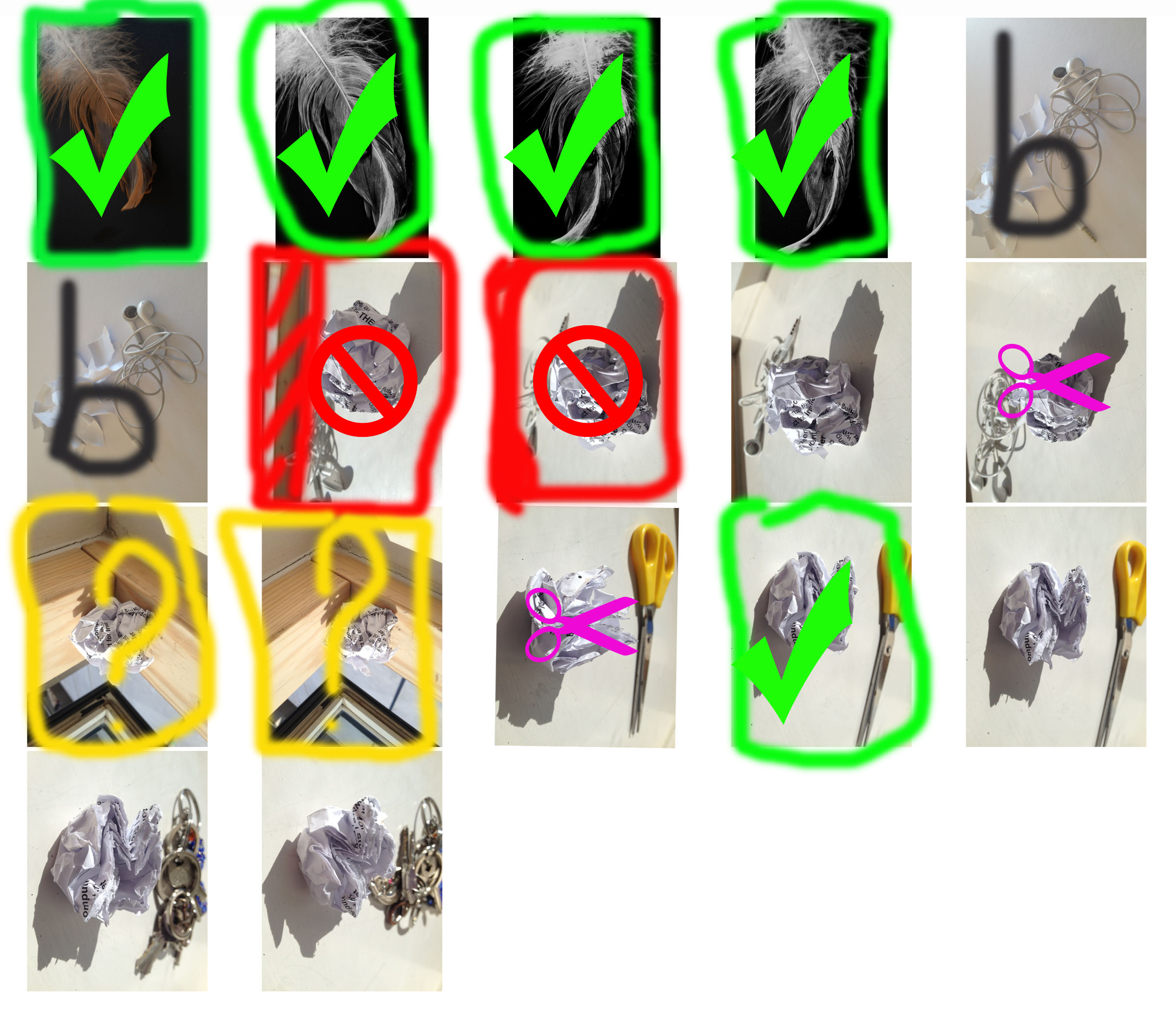
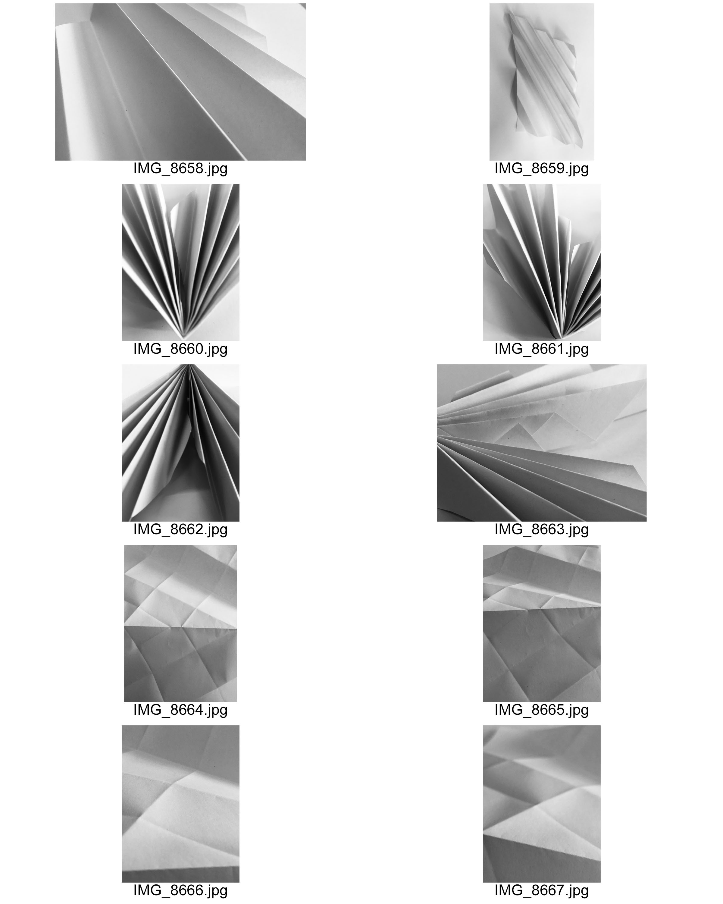
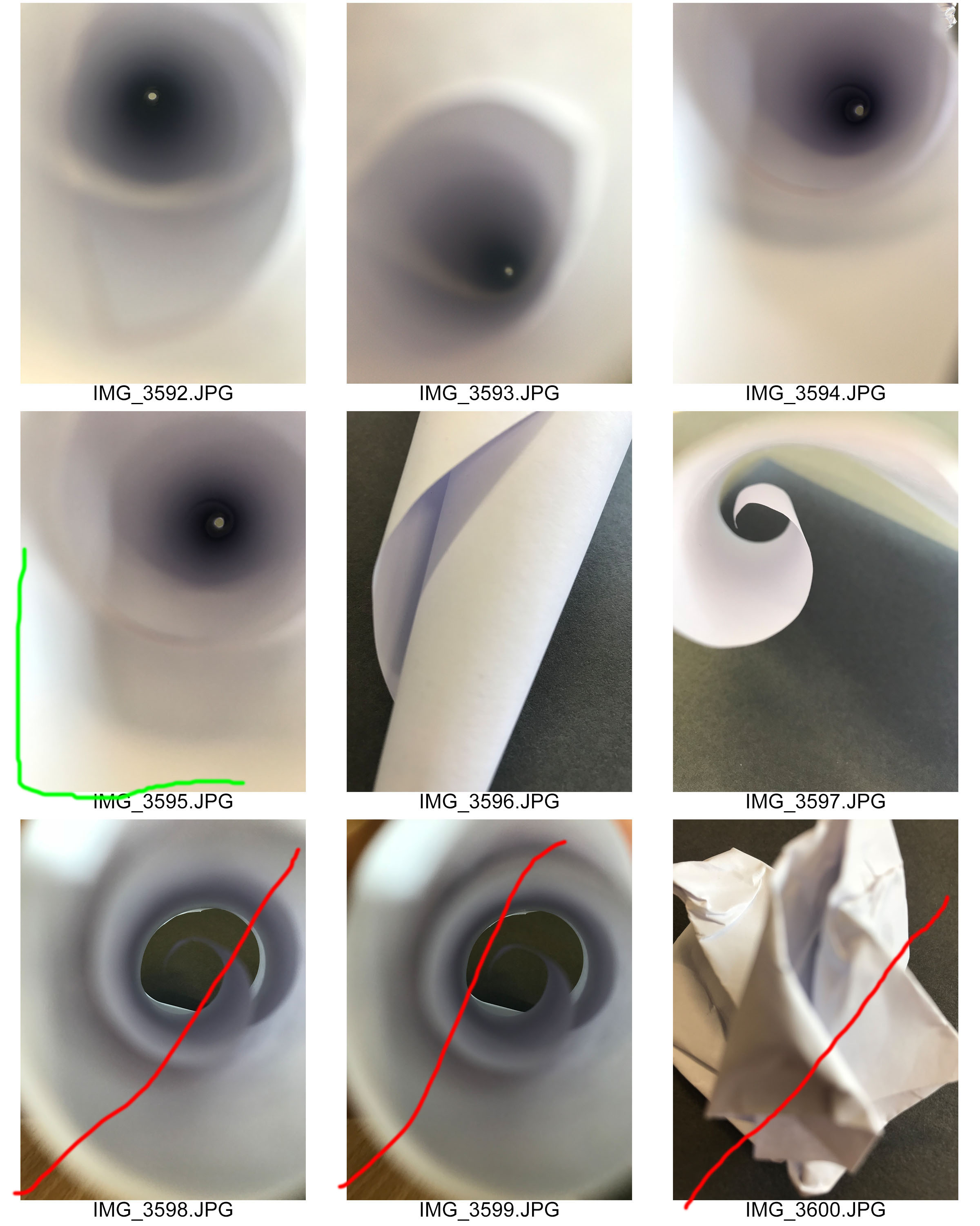
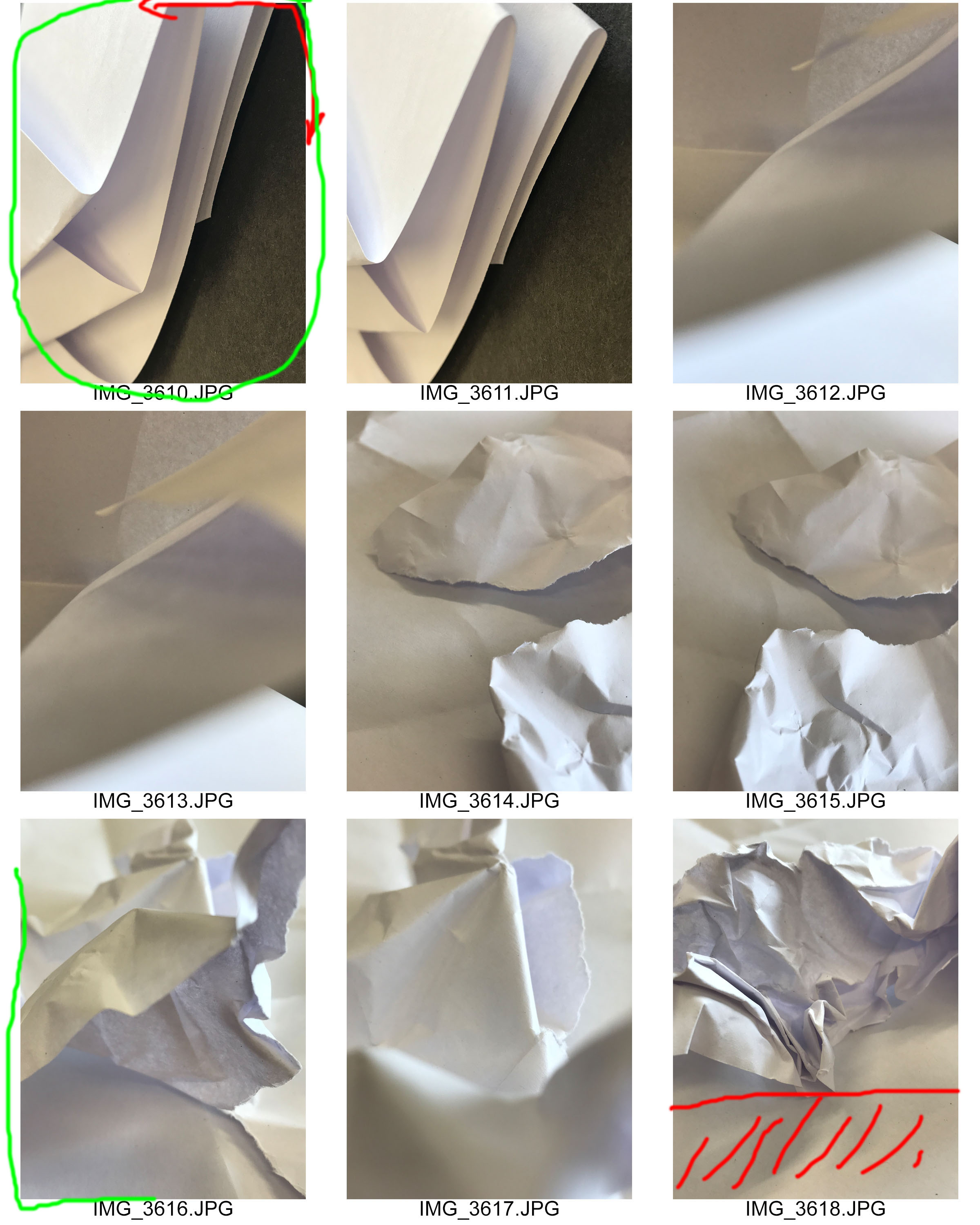
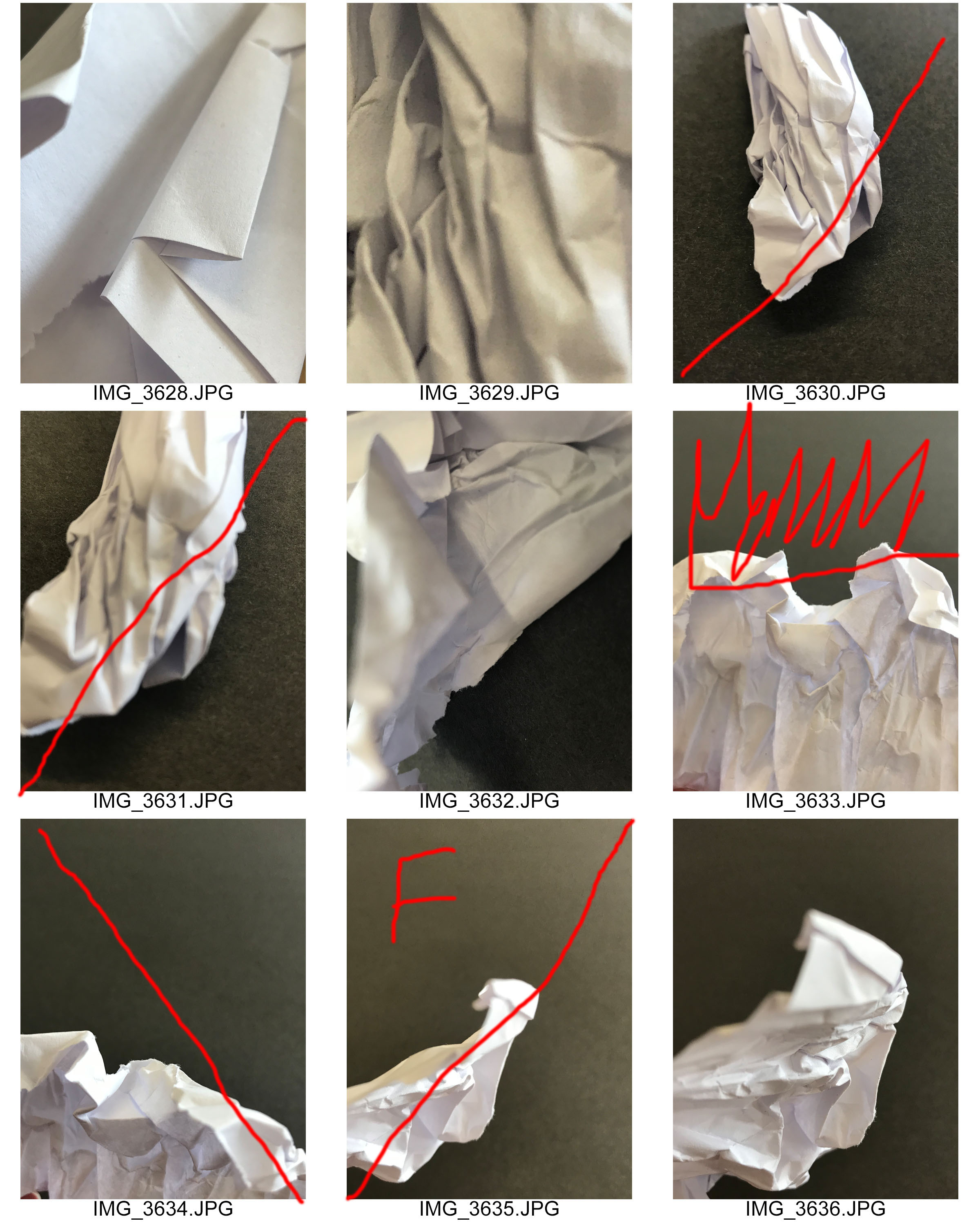
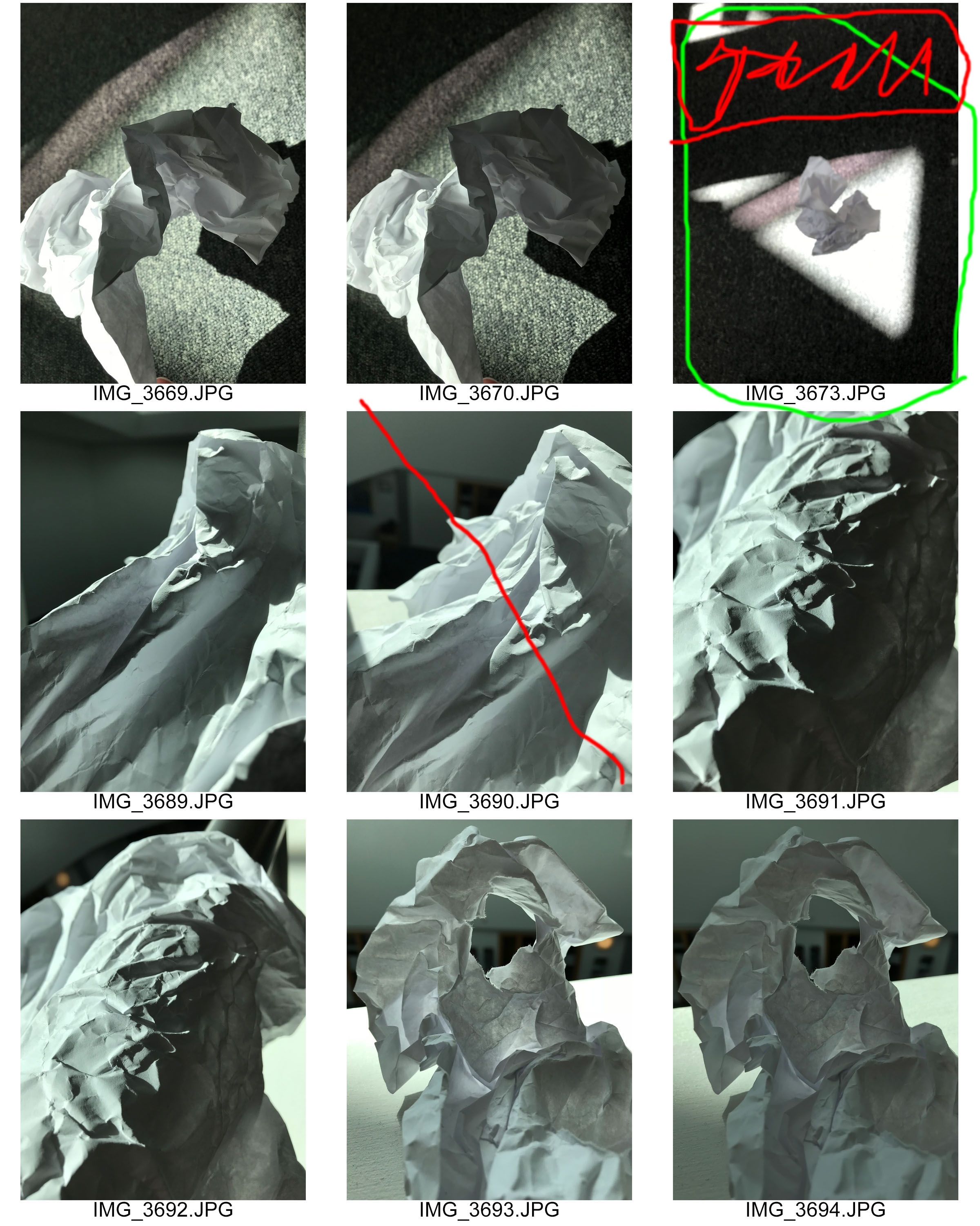
Photo Editing
My edits within this project have been kept simple, to play on the idea of how basic capturing paper is. For all edits I leveled them to make them slightly darker or lighter and ensure that the tone and sharpness of the photographs where good. For some I then decided to turn them black and white and adjust the Hue to allow the creases in the paper to stand out. I also inverted some allowing texture to be presented. For some photographs I adjusted the blend mode which helped to create the cool effect. I also decided to try experimenting with the layers and blending options to create different effects. Most of these edits I believe where successful and I am happy with most outcomes, however there are a few photographs edits I do not think where the best but I left them in to show development and experiment.
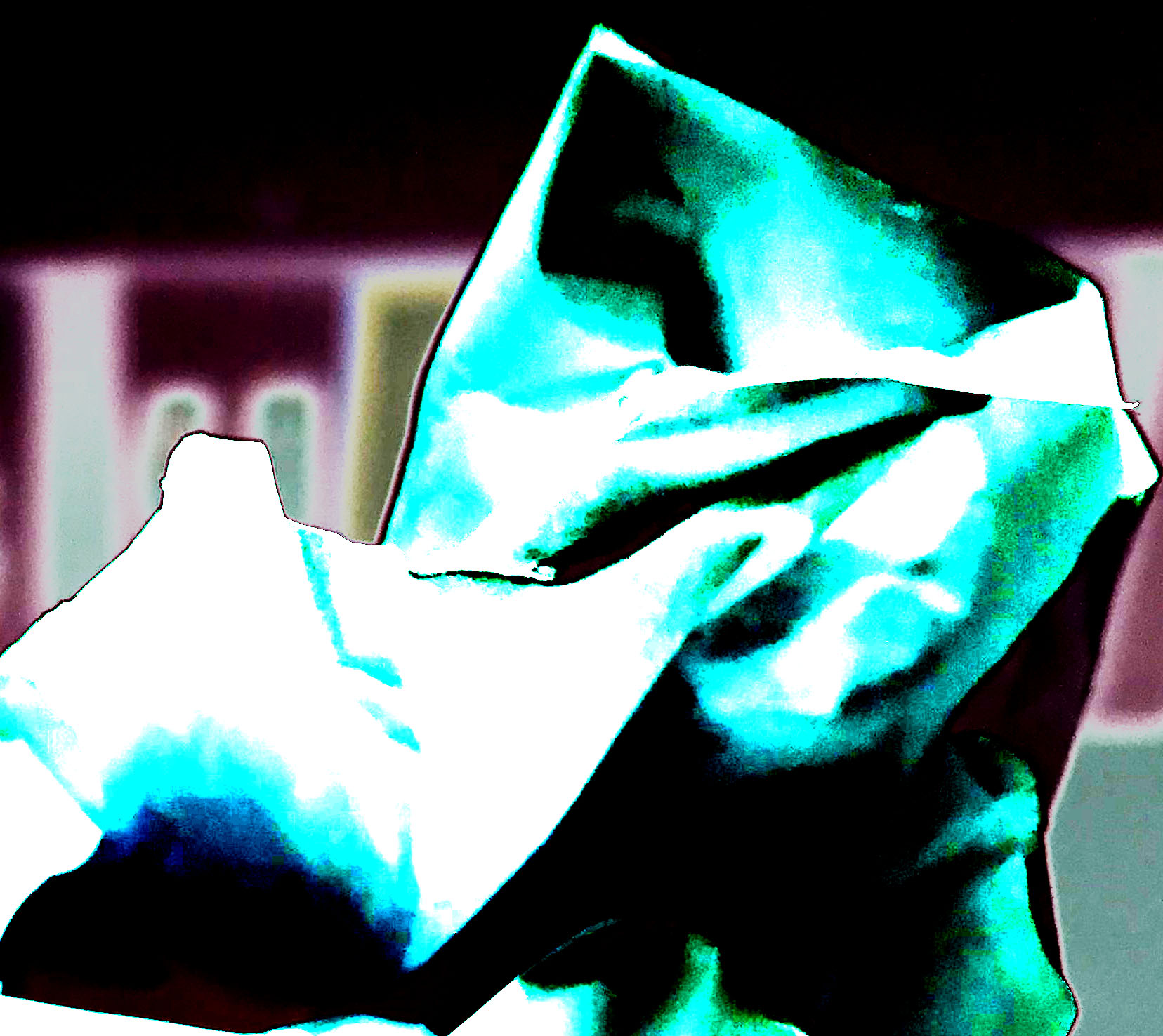
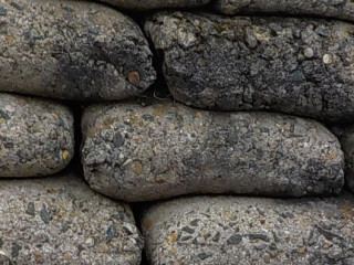
For my first edit I started turning the image black and white. I then decided to invert the image which made black areas white and white areas black. I then changed the hue to a more green colour. Finally using the curves I made the image lighter creating noise in the photograph. Overall this edit has been successful in the fact I got to experiment with different tools on Photoshop. However, it is not my strongest edit.
This second edit, in my opinion, is my strongest edit as it shows a contrast in tones and is interesting for viewers to look at. To do this edit I started off by turning the photograph into black and white, I then adjust the levels to make the photograph seem darker than what it actually is. I then proceed using the paint brush tool to pain the background black allowing the main focus to be on the paper itself.
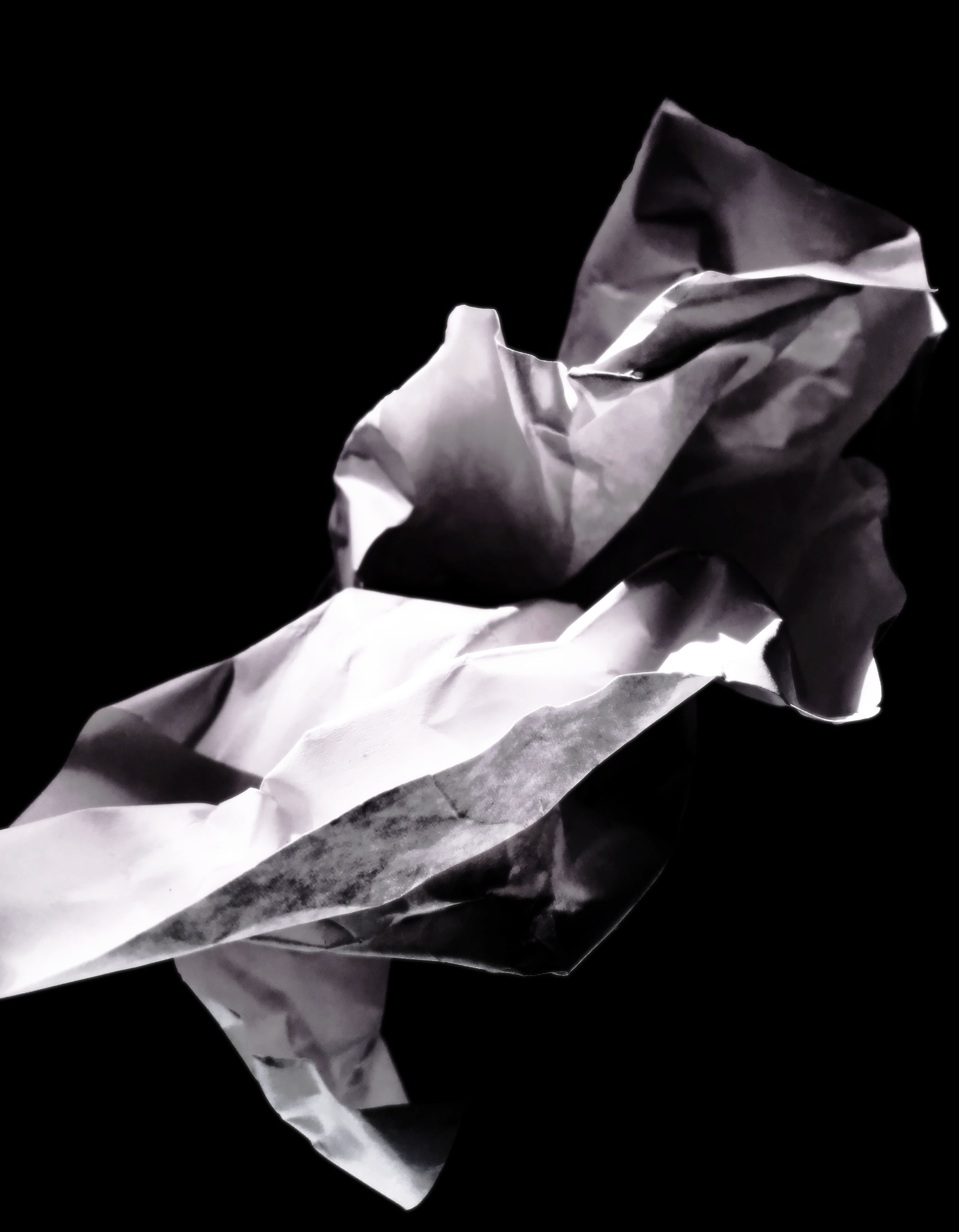
In my third edit of this photograph I decided to level the photograph to make it seem naturally lighter. I then turned the photograph into black and white and inverted it. I then changed the blend mode until it gave off this effect, which clearly shows the texture of the paper.
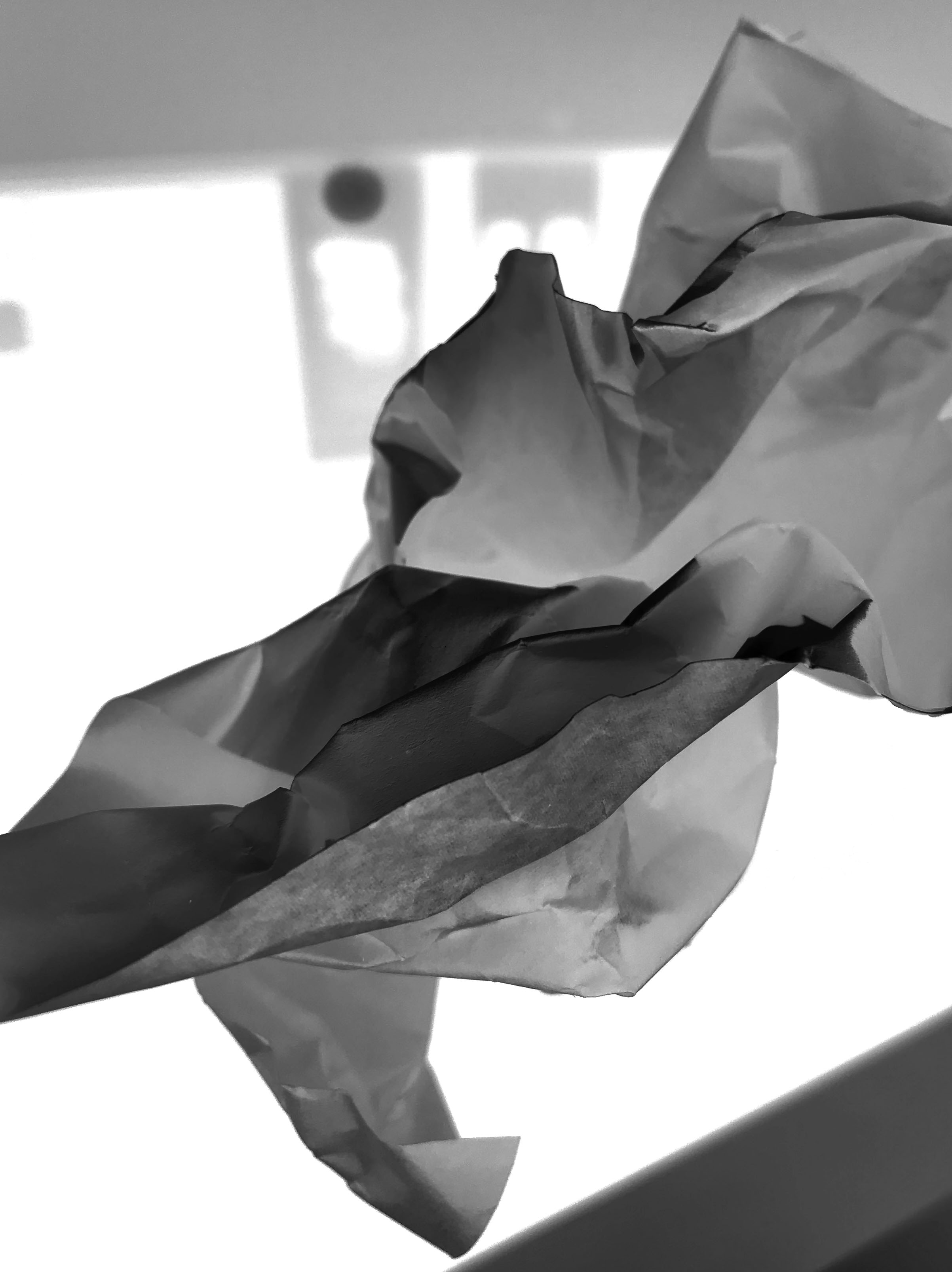
For my next edit I decided to use a different photograph. I carefully cropped the image to take away most of the background. I then turned the photograph into black and white and inverted it. Moving on I adjusted the curves to allow the different tones of the photograph to clearly be presented.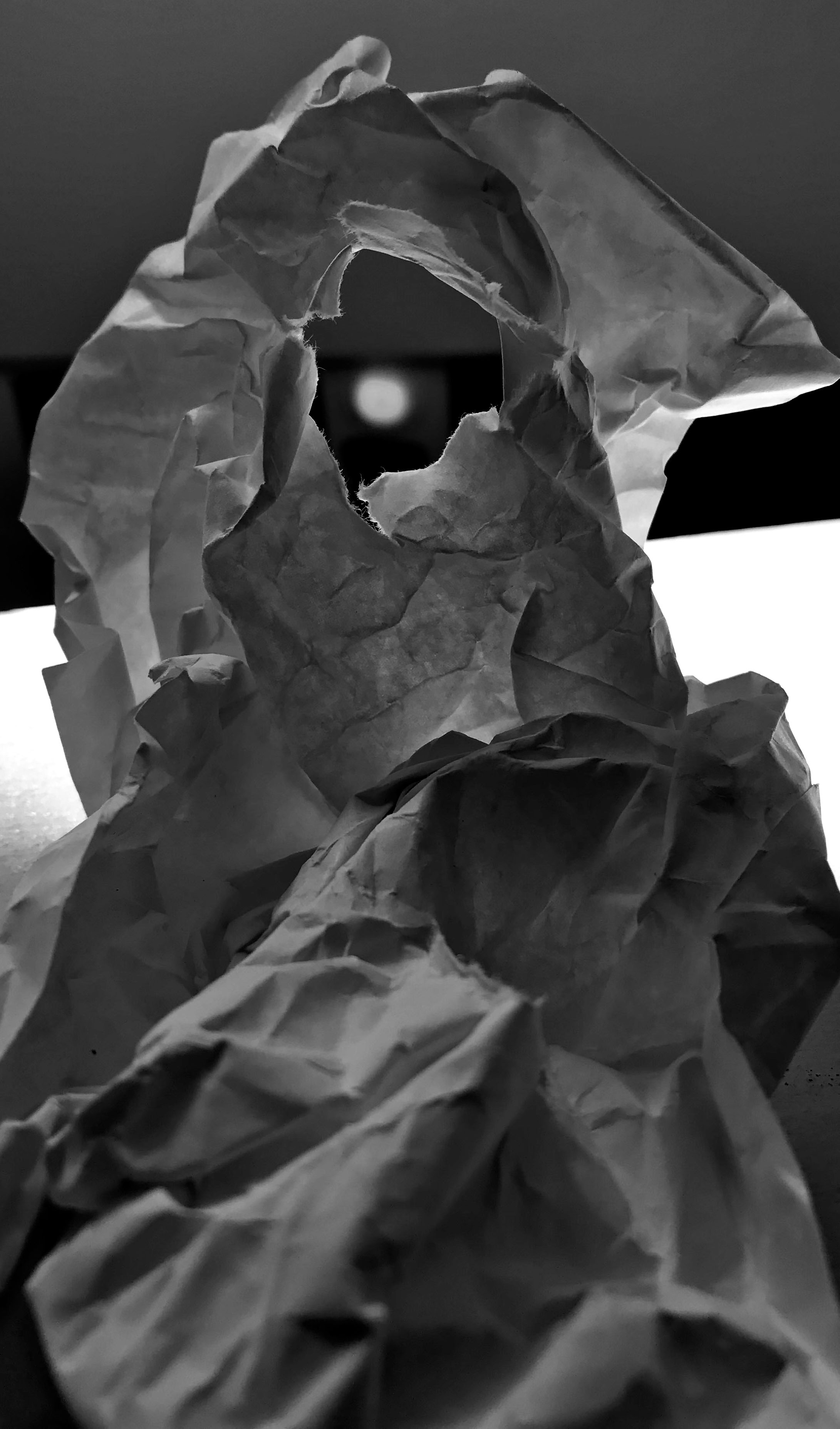
In this photo edit I wanted to clearly show the light which is beaming through the hole in the paper. I thought the best way to do this was simply turning it black and white which allowed the different tones to clearly illustrate the light.
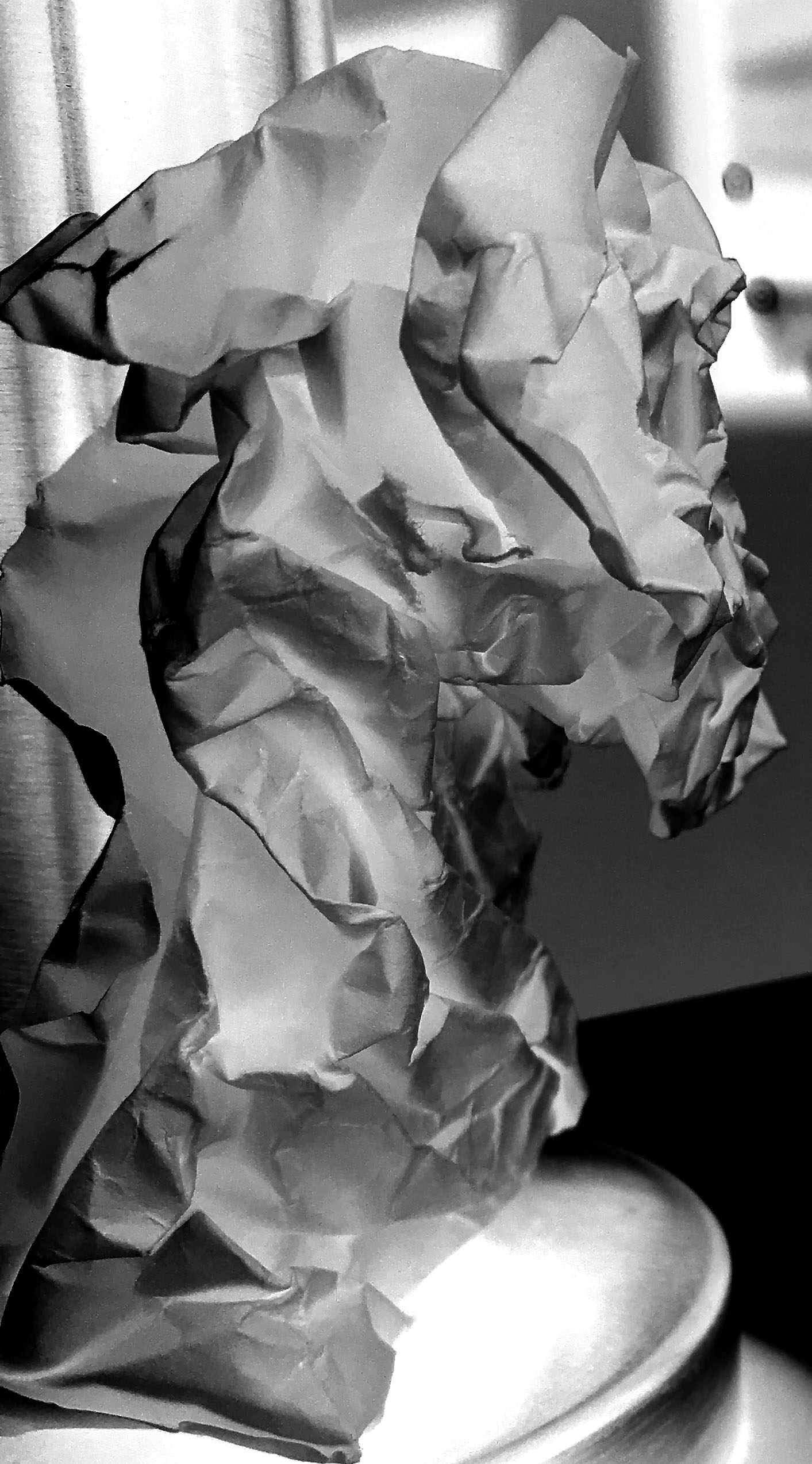
Due to this simplistic photograph I decided to keep this edit simple. I simply adjusted the curves to allow the different creases and tones to be shown. I then decided to turn the photograph into black and white which has created this cool effect making the photograph more pleasing to look at.
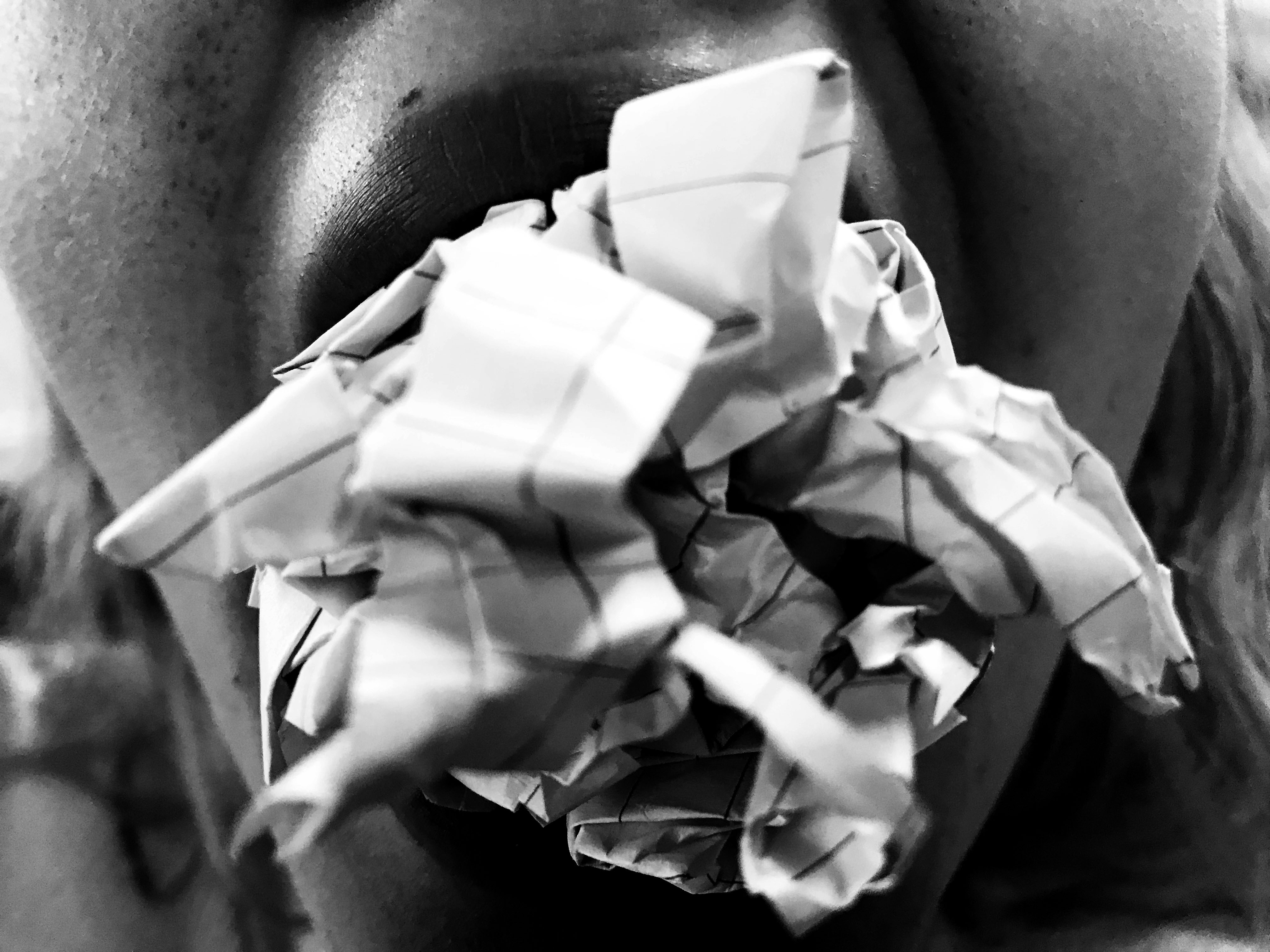
For this edit I wanted to show the context of where the paper has been placed, thus I decided not to crop the image. To allow the texture of the paper to be shown in this image I simply turned the photograph into black and white and adjusted the curves to allow the mouth and paper to be clearly shown to viewers.
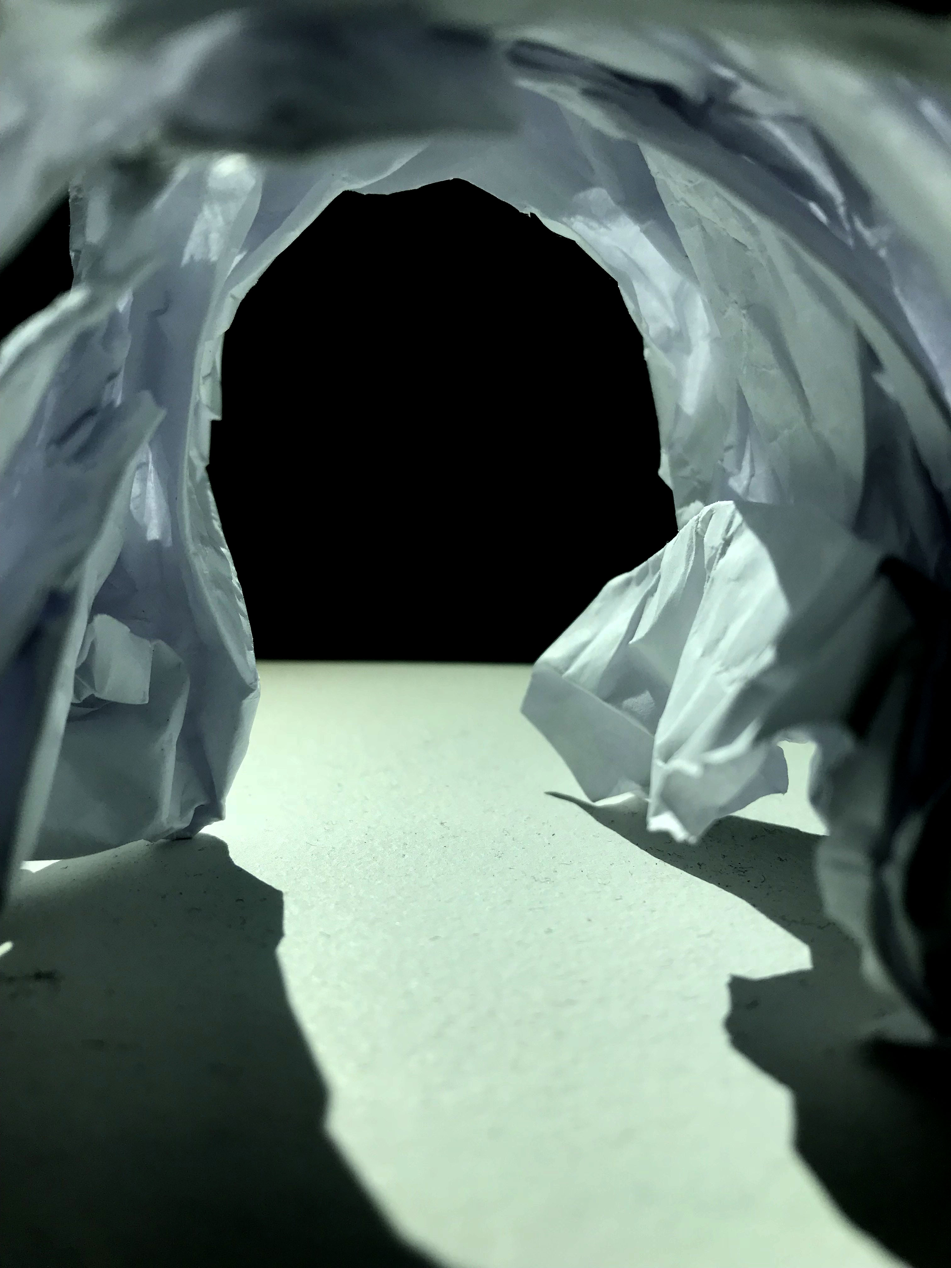
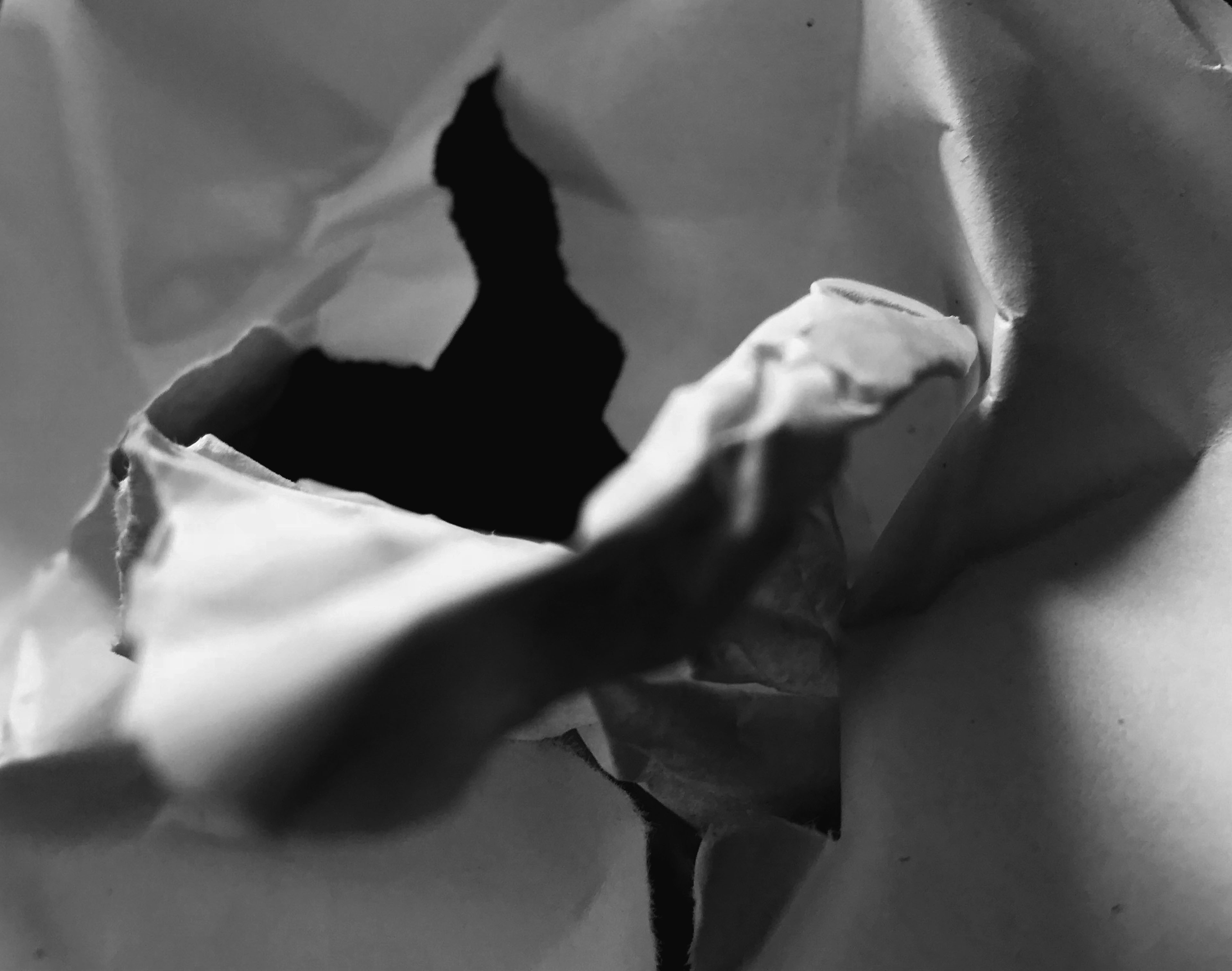
For this edit I wanted to capture the paper trapping the light into what looks like a tunnel. To do this I made the image darker than usual by adjusting the levels, this made the background black. I then experimented with different settings, however I believed that this was the most effective way to present the tunnel.
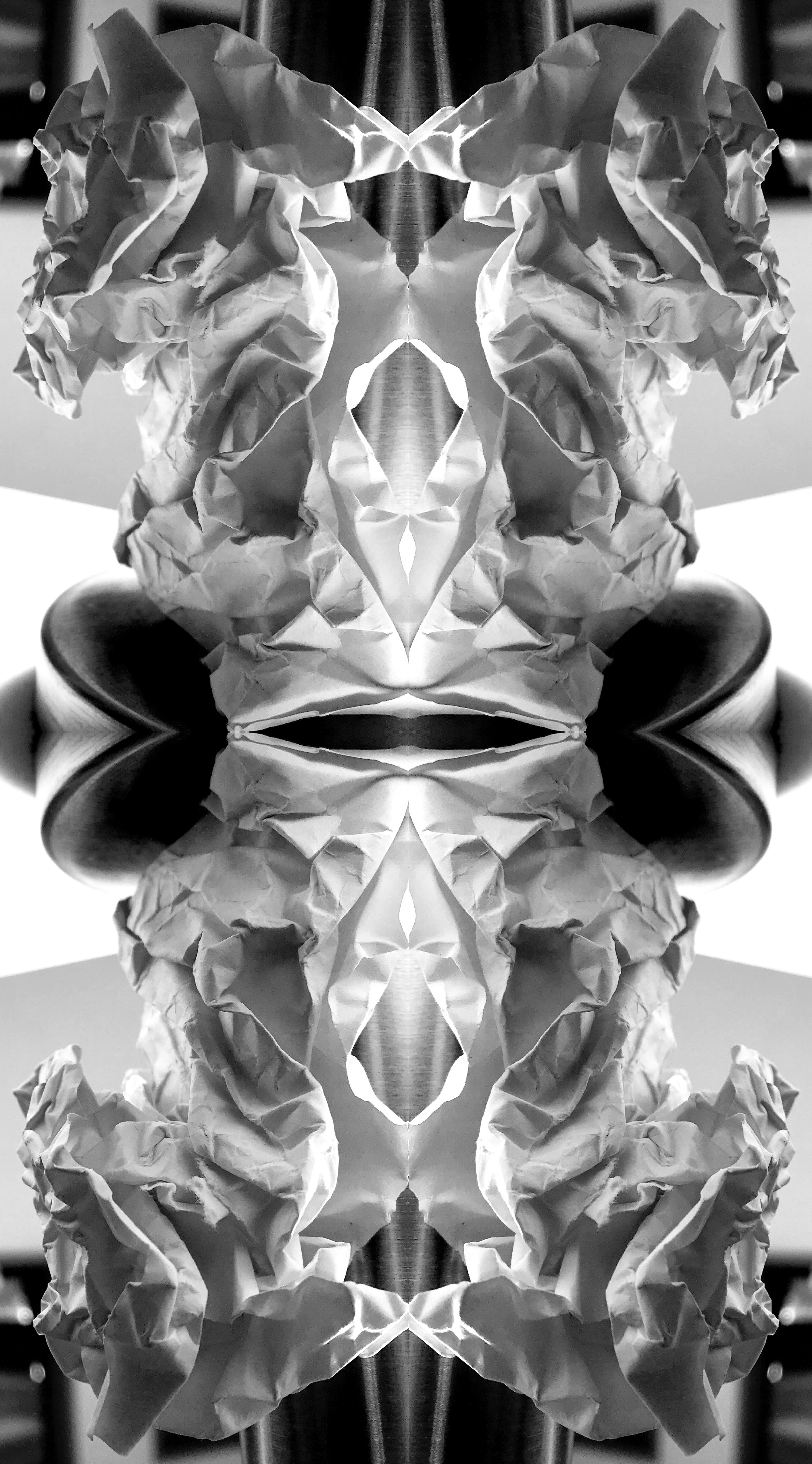
For my next edit I wanted to create a mirror effect. I thought the best way to do this is two duplicate the layer and increase the canvas size. I repeated this four times until I was given the effect. This edit now present the formal element of shape and repetition, which makes it more interesting for viewers to look at.
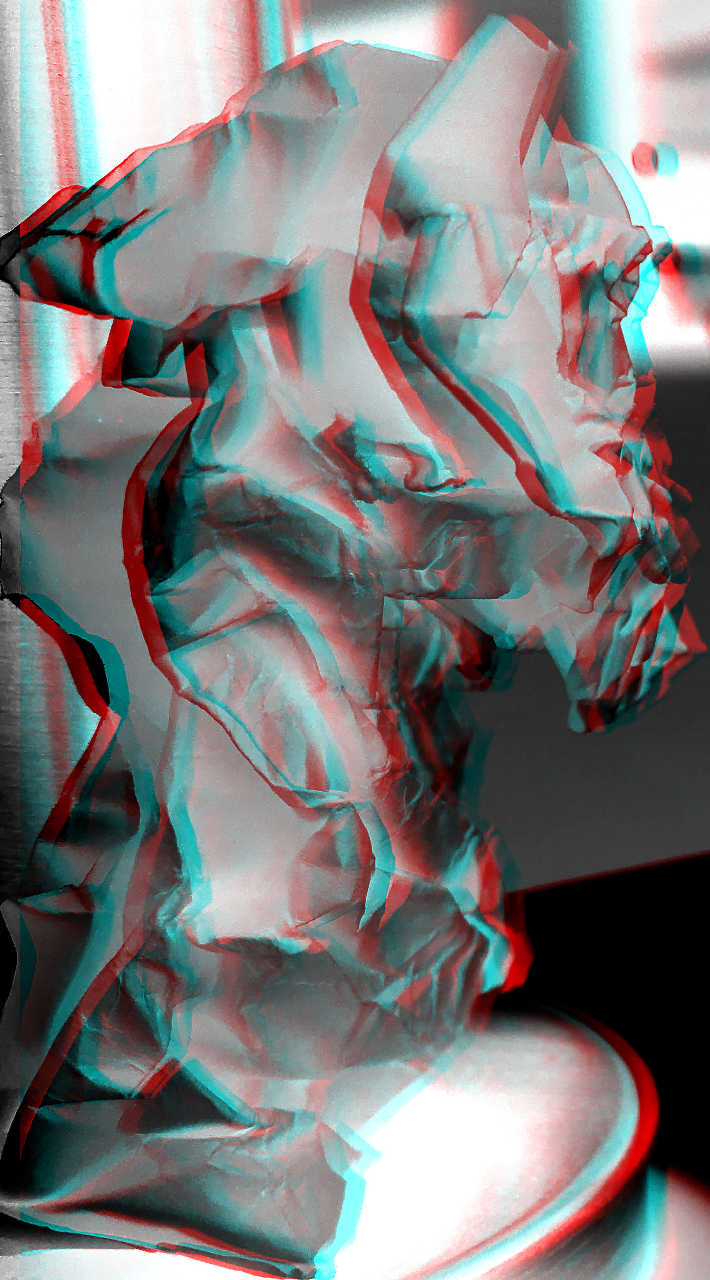
This next edit I wanted to make the photograph seem more ‘3D’ by adding in a blur. To do this I duplicated the layer and went under fx and changed the blending options. I deselected the green and the blue but left the red. Then I used the arrow keys to move the top layer which presented this effect. I like the way this edit has turned out as it makes the paper seem distorted and is more visually stimulating.
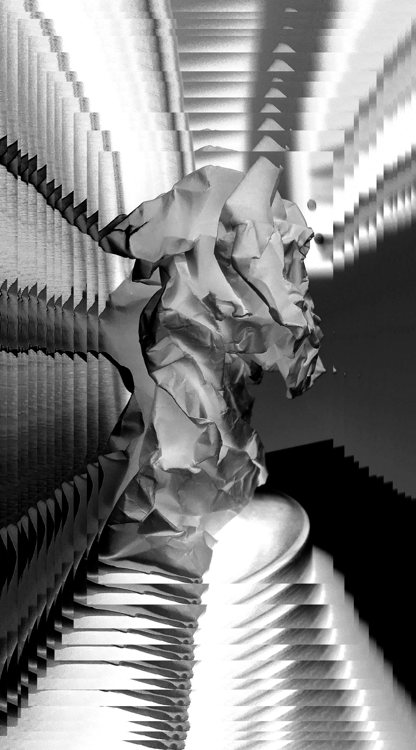
In my final edit I wanted to experiment with layers. I decided to duplicate the image layer and slowly decrease the size of it as I went along. This has made the subject seem further away than it actually is, making it almost seem like an optical illusion. I am really impressed with how this edit turned out as it has made a simplistic photograph seem more interesting.
Favorite Outcome
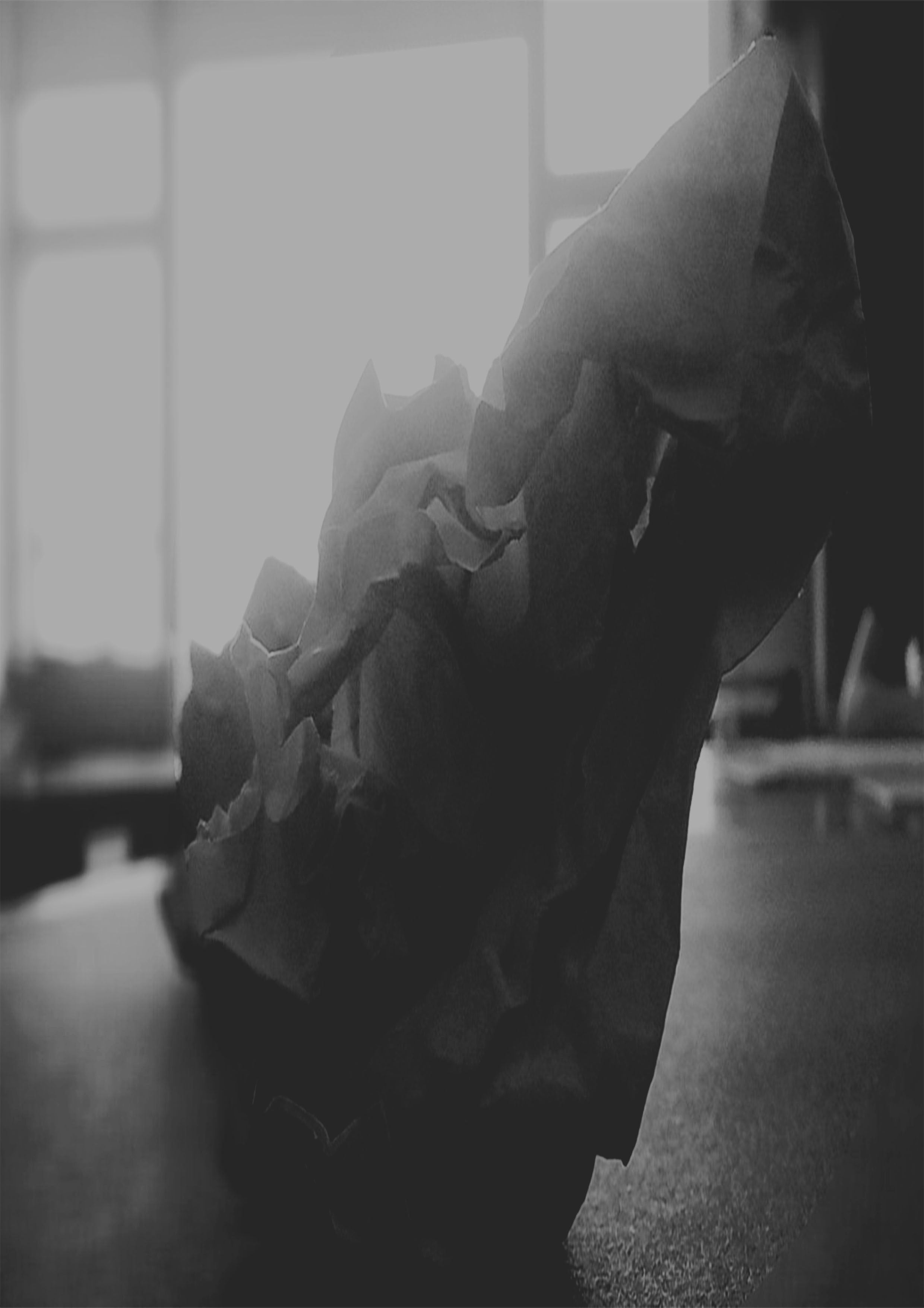
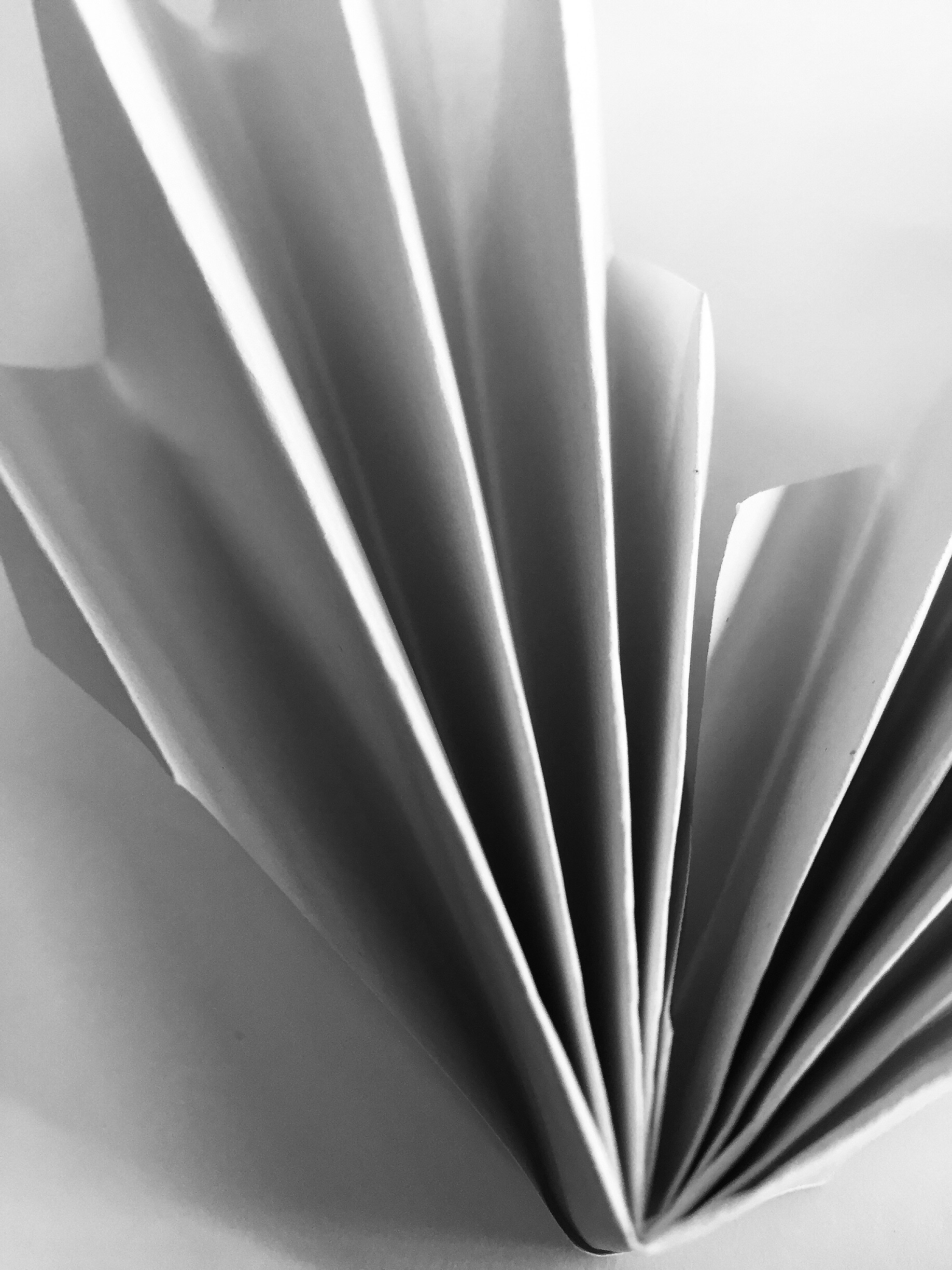
I really like the way this photograph has turned out. To begin with I have managed to present the formal elements of shape and texture within this photograph. Texture and shape is shown through the folds and creases on the paper. The Macro shot, taken from a straight on angle making it interesting for the viewer to look at. Moreover, I like how an element of 3D is created through the different tones of the paper. Also, to present tonal regions I decided to display this image in black and white. I decided to make the background plain to allow the viewers focus to be solely on the piece of paper located in the center of the frame. Moreover, I attempted to use Creed’s effect of using light to guide the viewers eye around the photograph on my image. I love the simplicity of this edit as it captivates viewers. Finally I believe this edit is my most successful due to the fact it is similar to Creed’s image.