
Jerry Reed
Jerry Reed is an English photographer who focuses on contrast through shadows and highlights on a piece of paper. Jerry Reed’s three year project called paper work has twenty-six image. In his studio he has shaped paper creating edges and volume with them. He lights the images dramatically using Fresnel lighting to emphasize the three dimensional forms. With this lighting he can manipulate the shadow transition making it shorter to emphasize form and line or longer to show surface texture. His inspirations for this paper project are Francis Bruguiere, Juroslav Rossler and Abelardo Morell.
Tamara Lorenz
Tamara Lorenz is a German artist who creates artwork by hand and then takes pictures of them to emphasize certain aspects of the piece. Her photographs focuses on the abstract properties. Tamara Lorenz focuses more on the constructions she makes with the paper rather than light and shadow which Jerry Reed uses to enhance his paper work. She uses vivid, bold and strong complementary coloursto create contrast with the lines and shapes of her work. Every photograph is difficult to distinguish and makes it hard for the viewer to recognize what the subject really is. This makes her photographs visually interesting and abstract.

My Response
By looking at the two artists I will combine elements from both their work to create my response. I will use manipulate the light to create highlights and shadows on my paper like Jerry Reed’s paper work series. However, instead of having black and white pictures I will incorporate colour card to some of my images like Tamara Lorenz to create bold and vivid abstract photos. To experiment I will fold, tear and roll the paper to create different effects and compositions.


Best abstract images
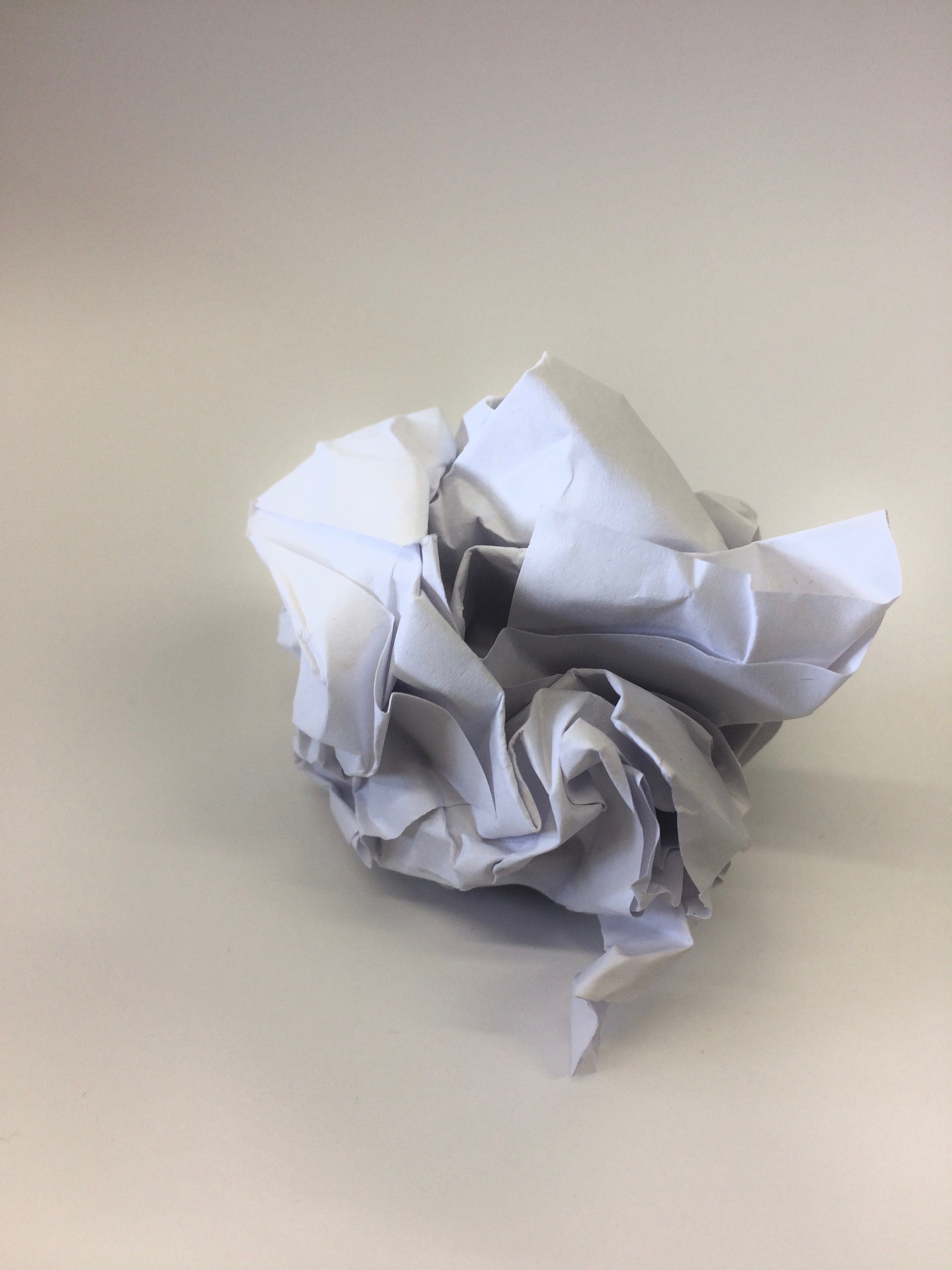
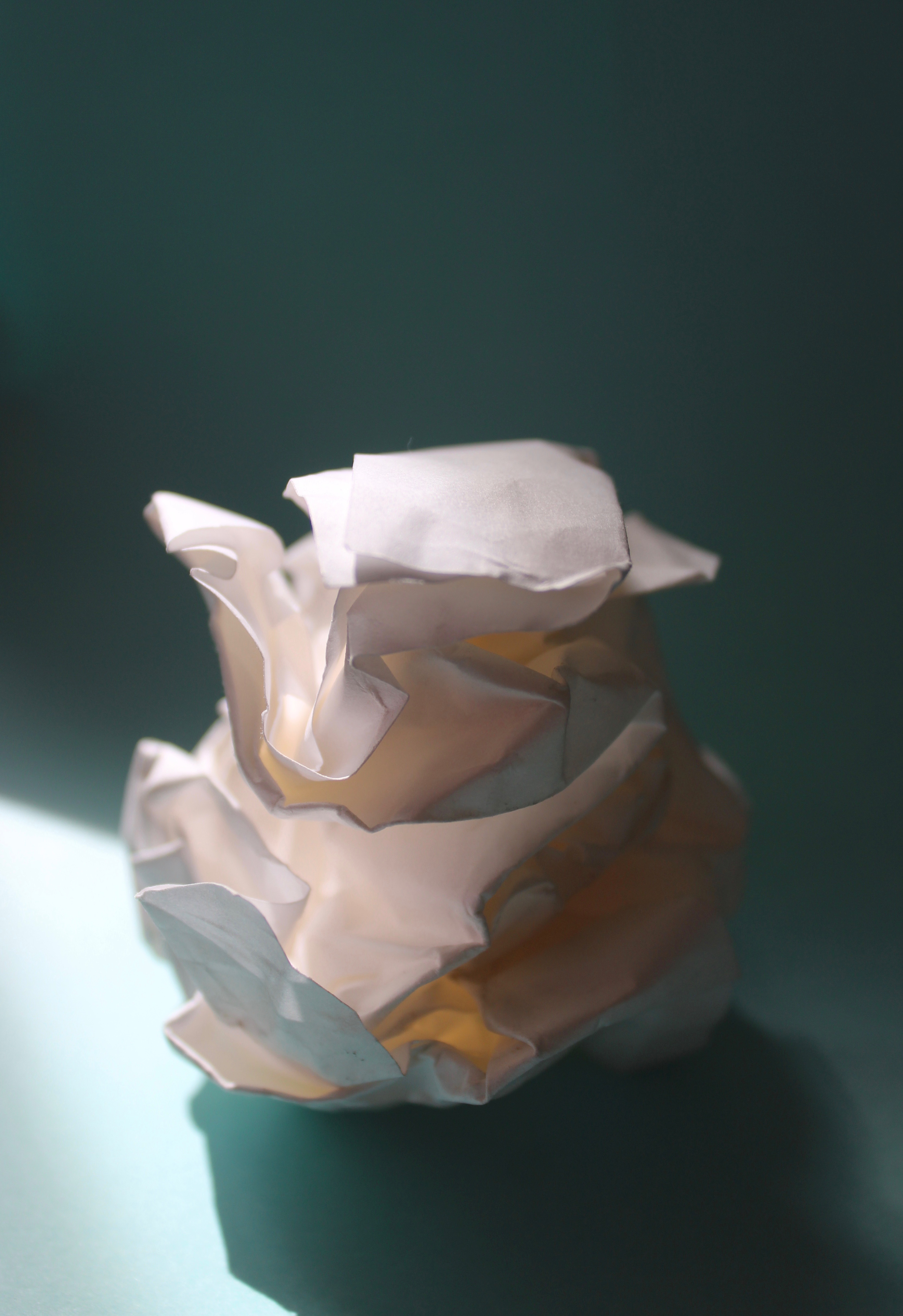
With an A4 piece of paper I scrunched it up into a ball. By doing this I created form and depth with the shadows and highlights casted from the natural lighting. The background was taken with another sheet of A4 paper. I slightly curved the paper while taking the photo so it would appear like a never ending white background. I like the composition of the photo and how your eyes focus on the scrunched paper since it’s the only object in the frame that has shape. This idea was inspired by the photographer Martin Creed.
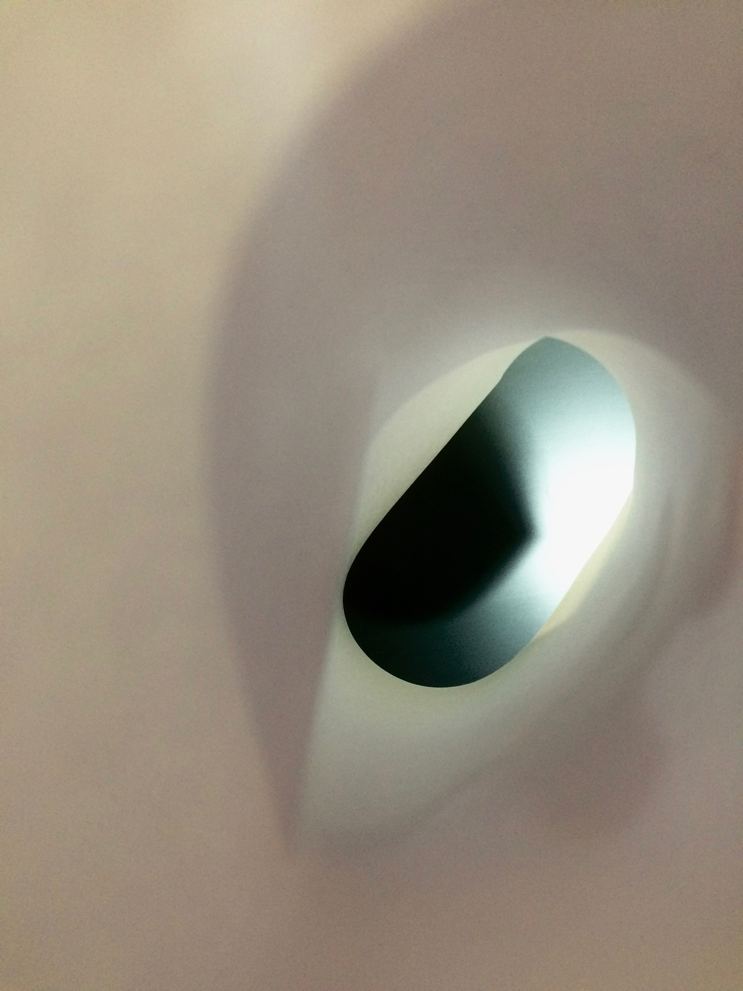
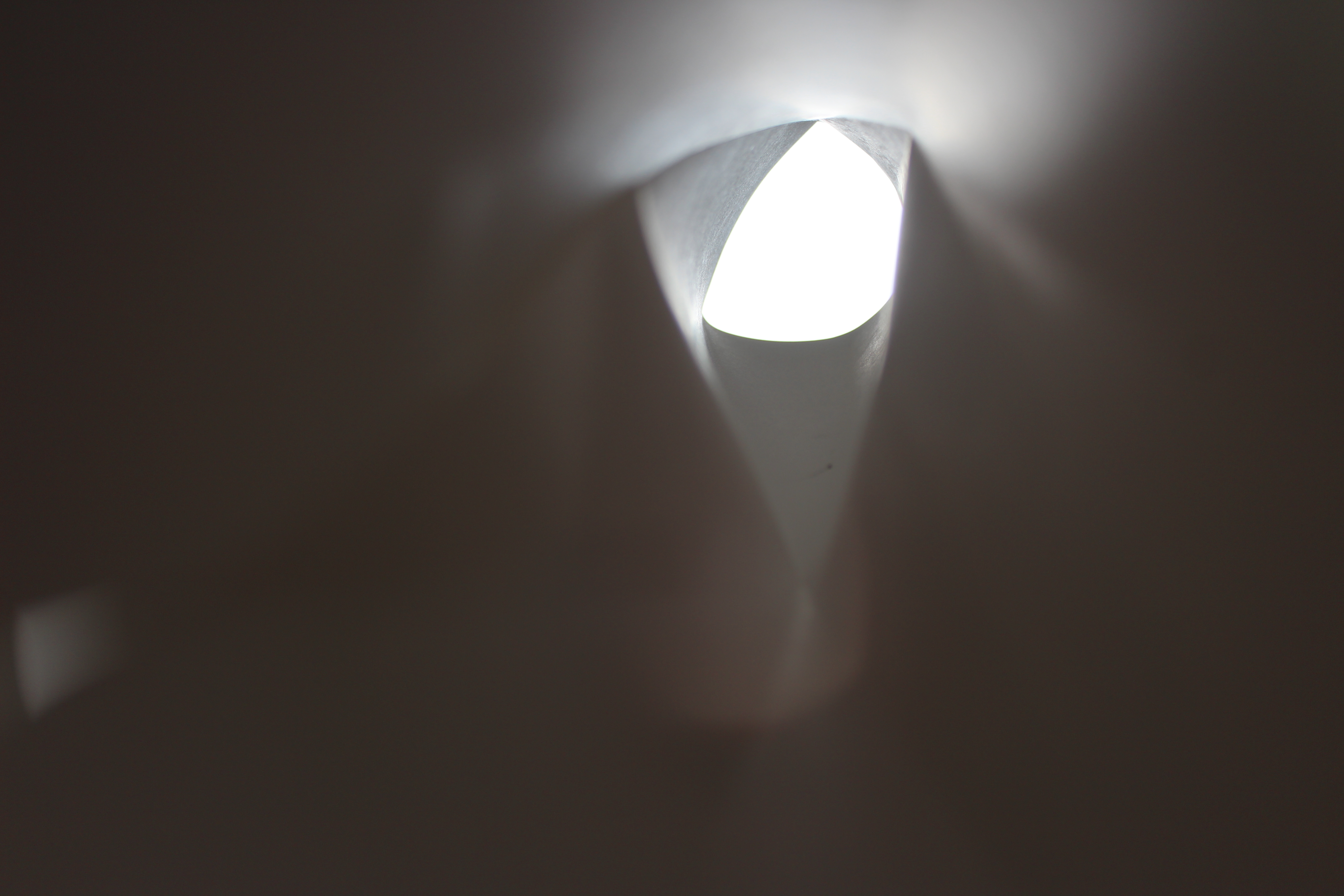
I captured this photo by rolling a piece of paper into a tube and putting my phone lens through it to create a different perspective. I really like the blurred effect around the edge and how the main element in the picture is the focused black screen on the other side. The slight beam on the other side was created from the flash while taking the picture.

The most dominant aspect of this photo is the form created from the scrunched paper. The photo is taken up close and captures the detail of the creases. This photo is abstract as it appears to look like a mountain landscape. Highlights are created at the peaks from the light above and shadows are casted down below. The form of the paper covers the whole image making it visually interesting.

To create this image I curved a singular piece of paper twice to create an unusual form. For the background I placed a yellow piece of card so colour would shine through and make it visually appealing. While taking the picture I slightly moved the camera to create a motion blur which came out with an interesting effect. This is one of my favourite abstract images of paper since its very difficult to distinguish what it is since it appears to look like its part of a sculpture.
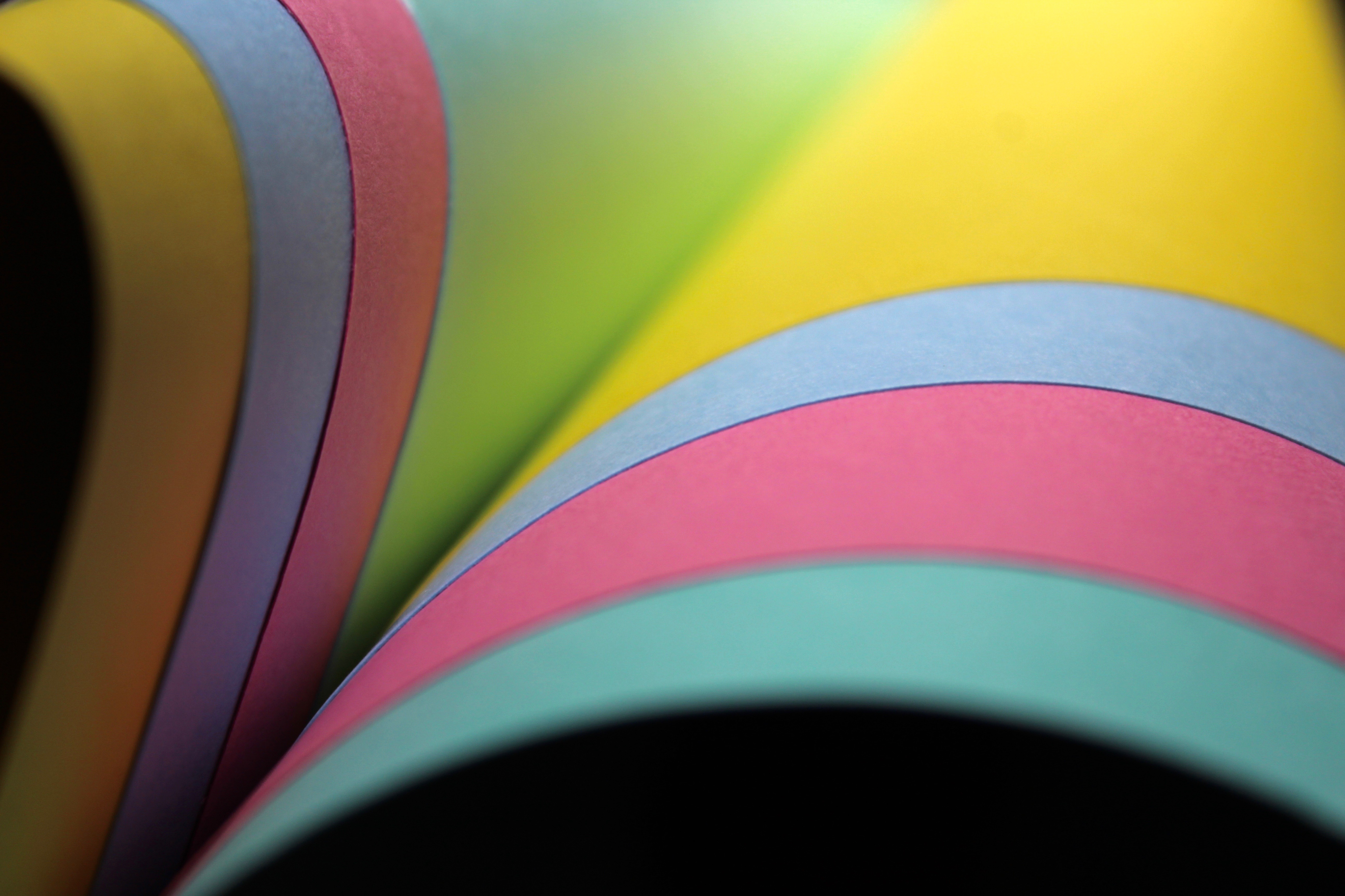
I used several pieces of coloured card for this image to make it vibrant. Thecurved lines are very effective in this photo as they create a more graceful composition. The composition also makes it appear like it’s a book since they are all coming out from one corner. The black background ,that can be seen below the card, contrasts greatly with the colour and makes it visually interesting since they both stand out from each other.

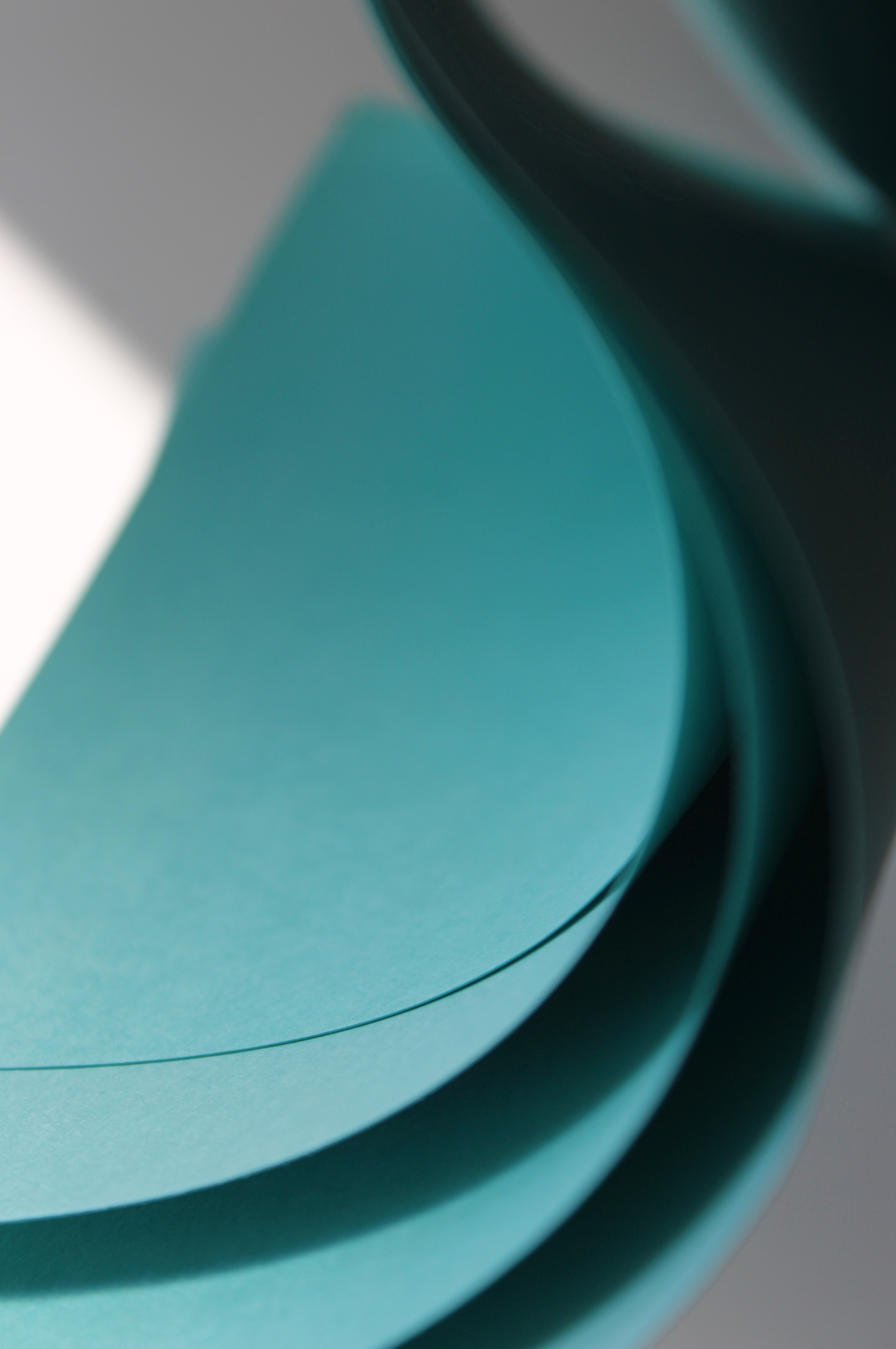
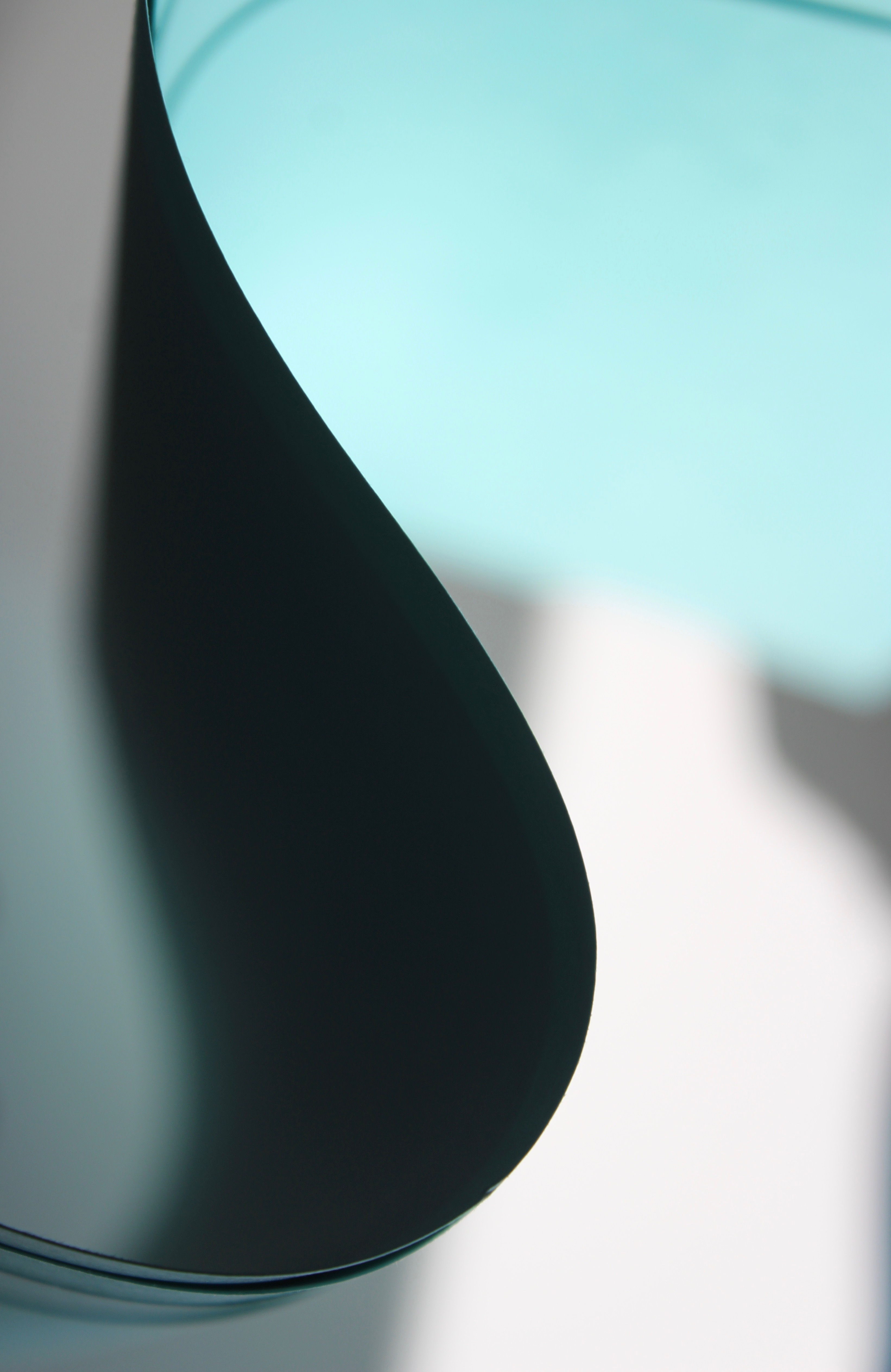
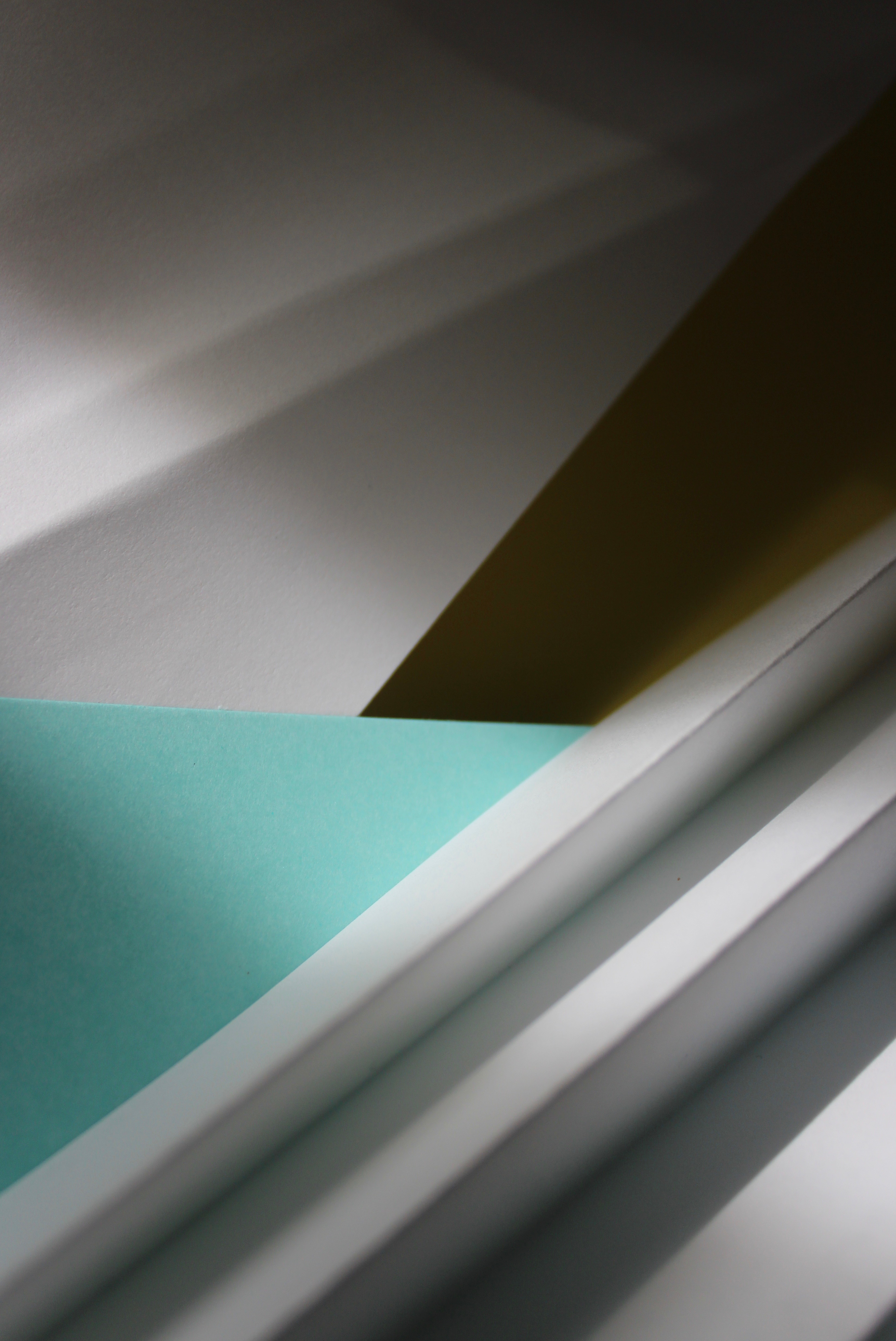
This abstract photo makes the card appear like a curve of a building. The shadow areas are dark and contrast greatly with the blue making it stand out. The right hand side area is focused making you pay attention to the lines created from the curve.
Favourite outcome
This is the best outcome out of all the abstract pictures I captured on my Canon camera. The composition consists of layers which has been created with two different coloured card and two A4 pieces of paper. The layering creates an interesting composition because paper has been laid out in different directions. The four layers create a sense of depth to the image as it progressively gets darker further back. The folded paper that I used on one of my previous images was incorporated into this image because it creates texture which a flat piece of paper doesn’t. The folded areas cast shadows in the direction the light is shining; this creates dark lines and contrasts with the highlights that are seen at the peaks of the folds. I used Jerry Reed’s technique of using light to dramatically emphasizes the dimensional forms of the paper. While editing the image I increased the highlights and shadows so the dramatic light that comes from the side becomes more defined. My favourite element of this image is the blue triangle because the colour pops and catches your attention since it’s vibrant and bold compared to the rest of the photo. The colour aspect of the photo was inspired by Tamara Lorenz who uses vivid colours in her crafted paper works.