Paper photography

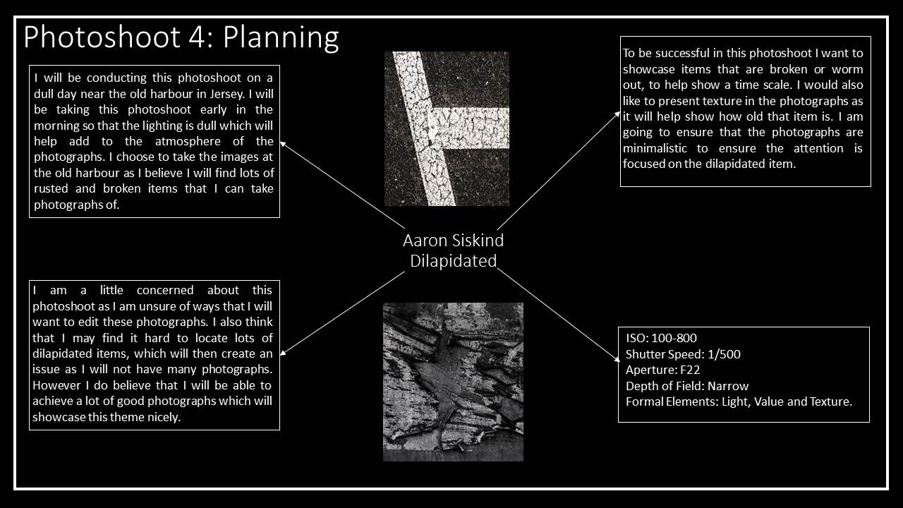
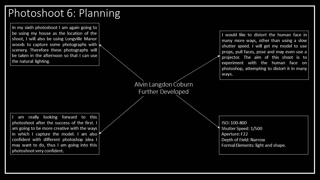
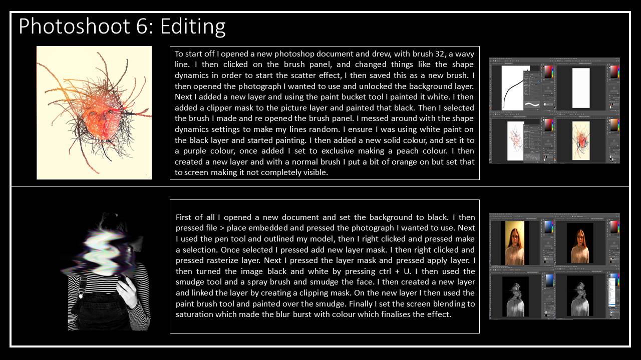
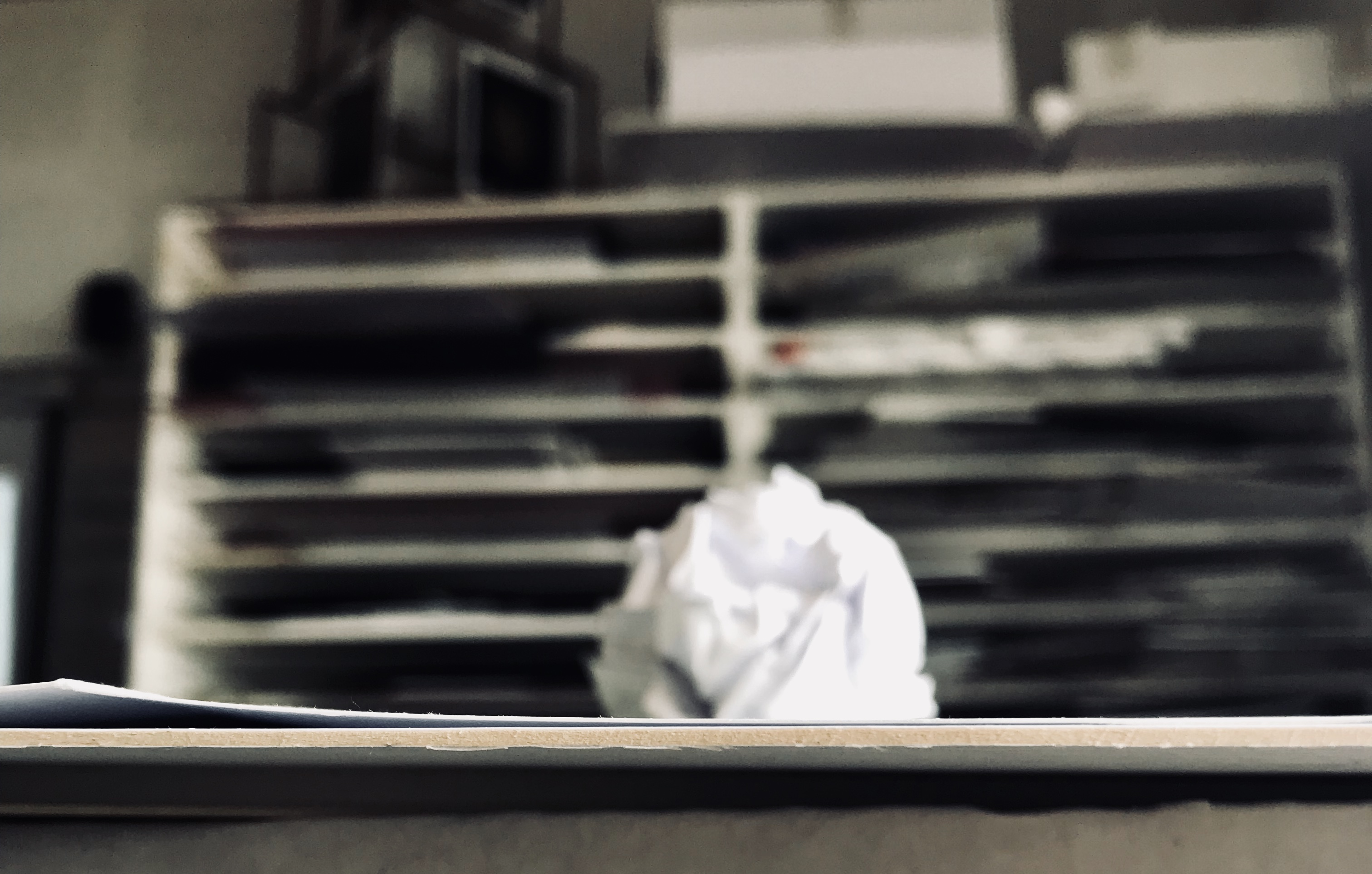
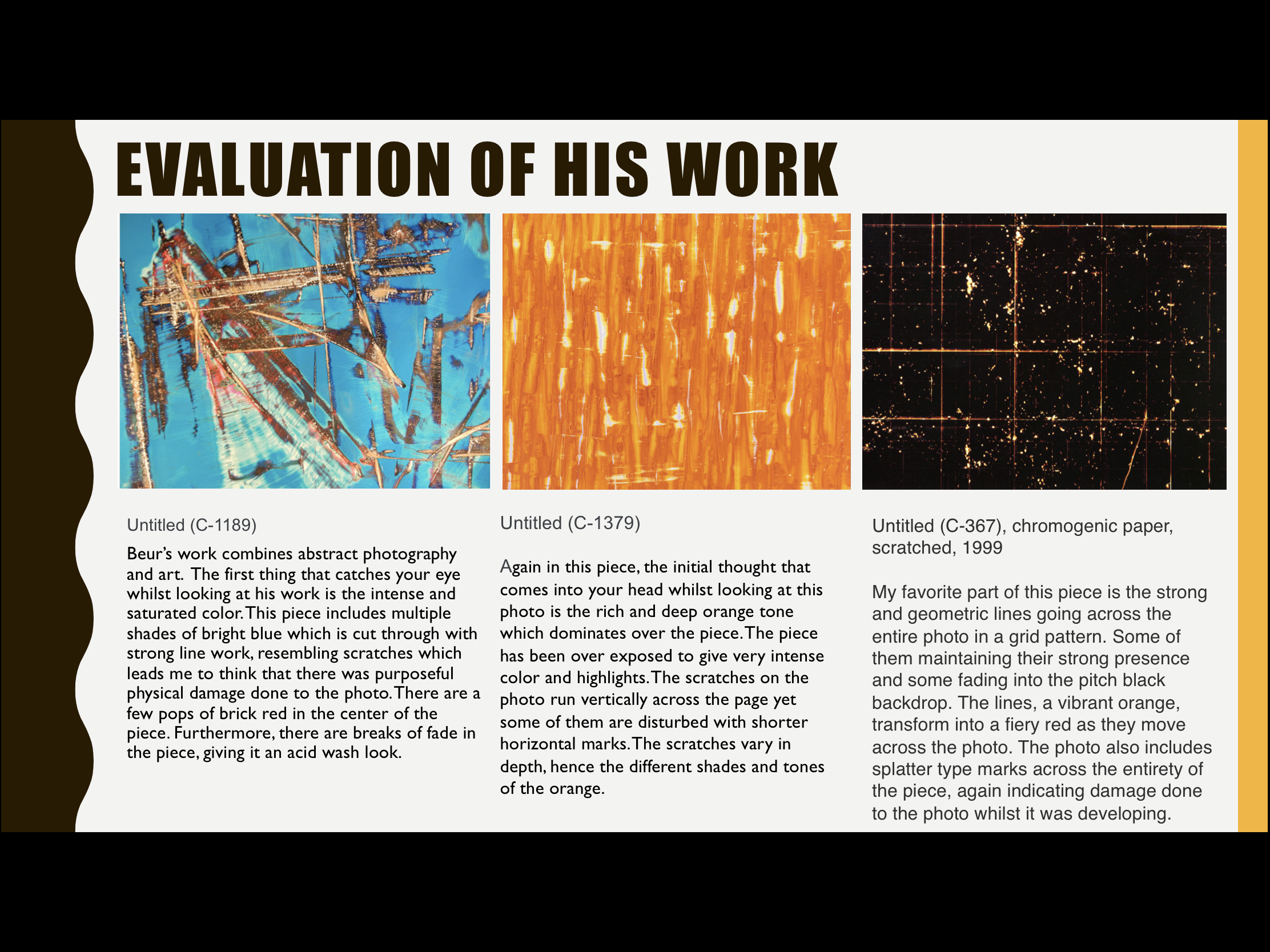
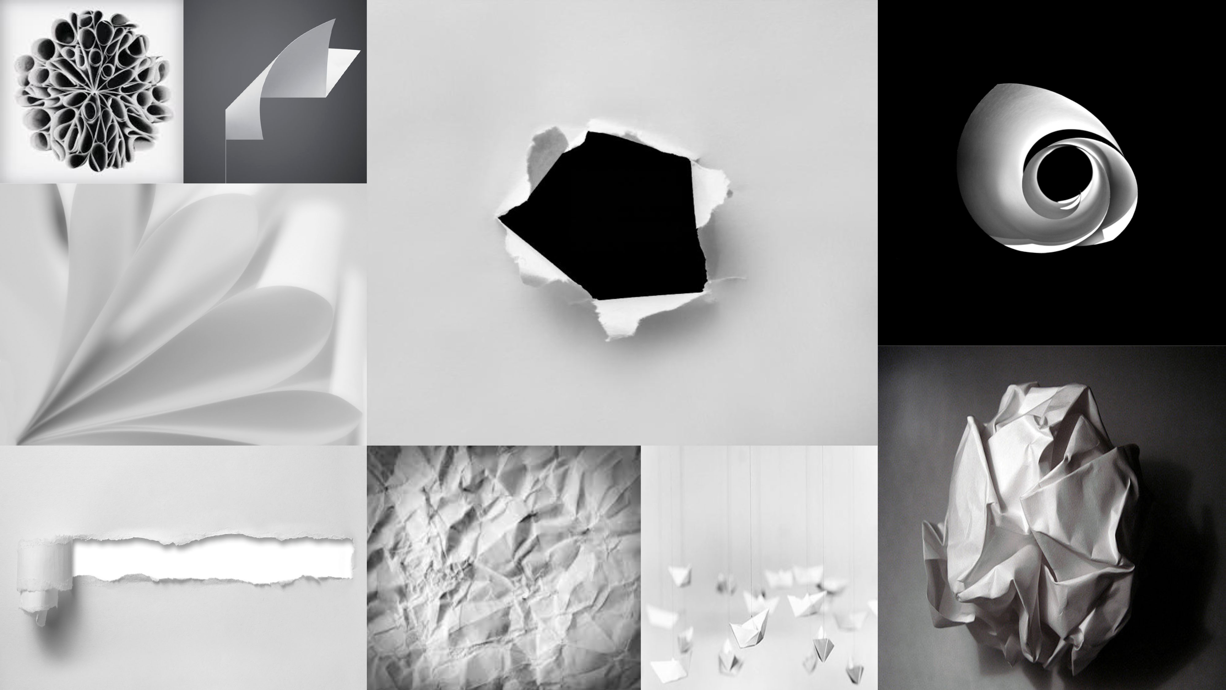
CONNCEPT AND IMAGE TAKING

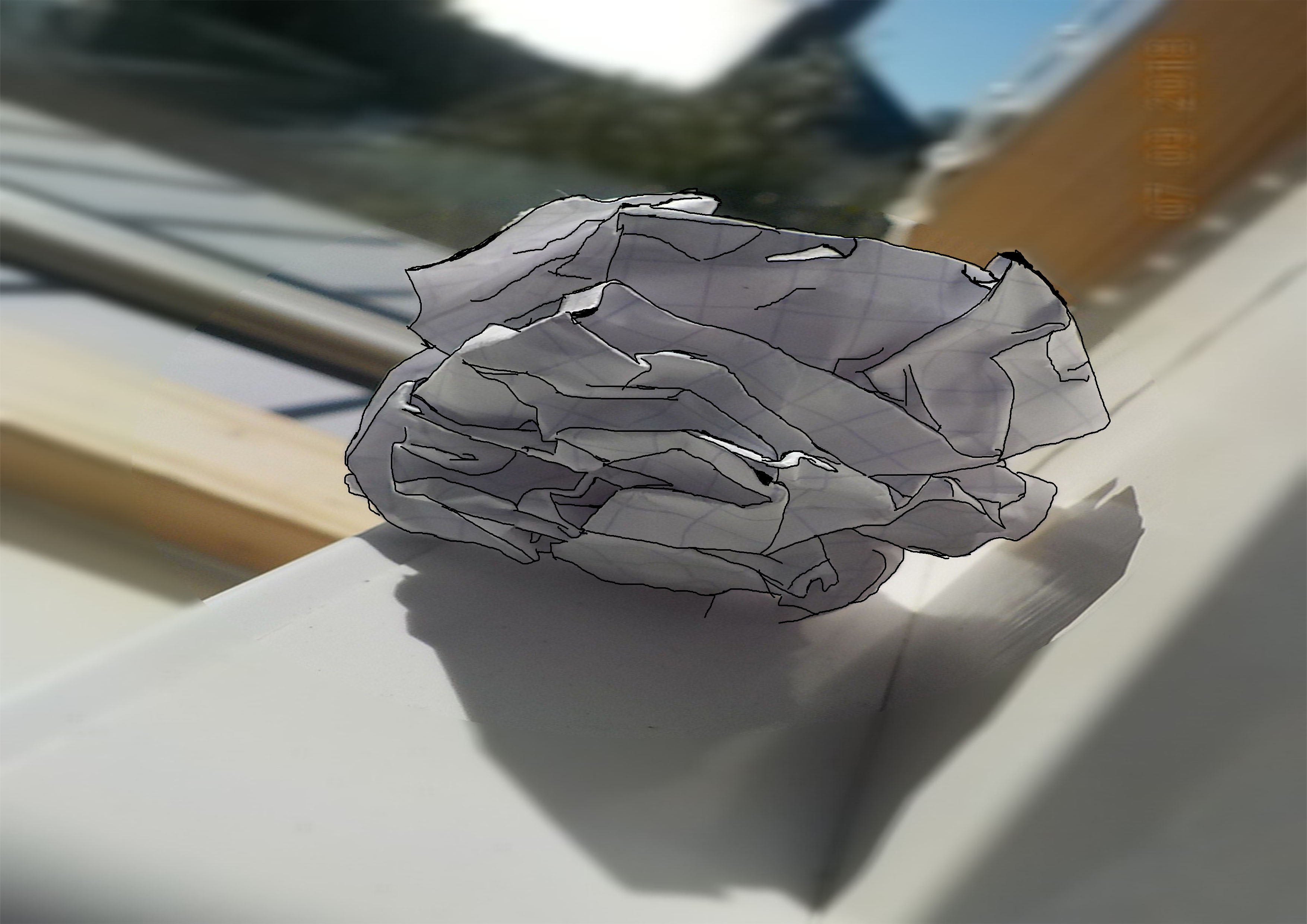
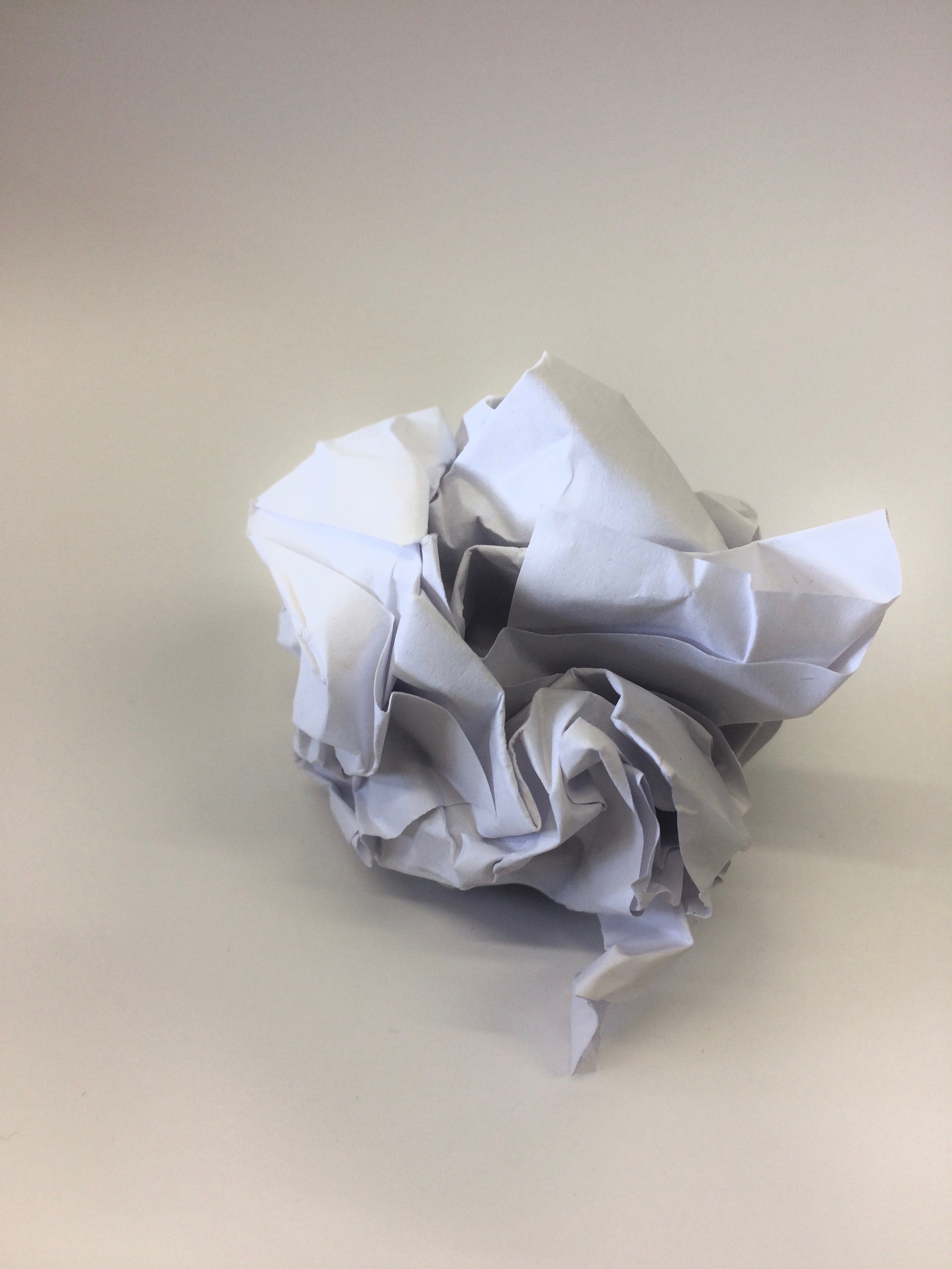
The concept of this mini project was to capture an ordinary scrunched up piece of paper, in as many ways as possible, placing it in different environments and photographing it. I captured these photos on my iPhone therefore the exposure, shutter speed etc. options were very limited when working on taking these images; paying particular attention to composition to make up for what was lost in image resolution. I started this task first by capturing some very simple photographs near a window, the light hit from the right side of the room creating a small shadow. The blurred, yet very busy backdrop for the photo really made the crisp and sharp lines in the scrunched up paper stand out.

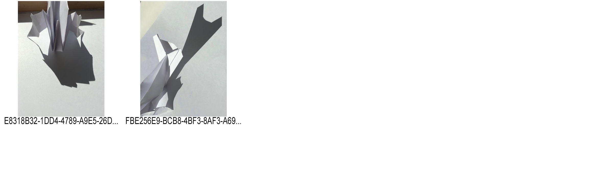
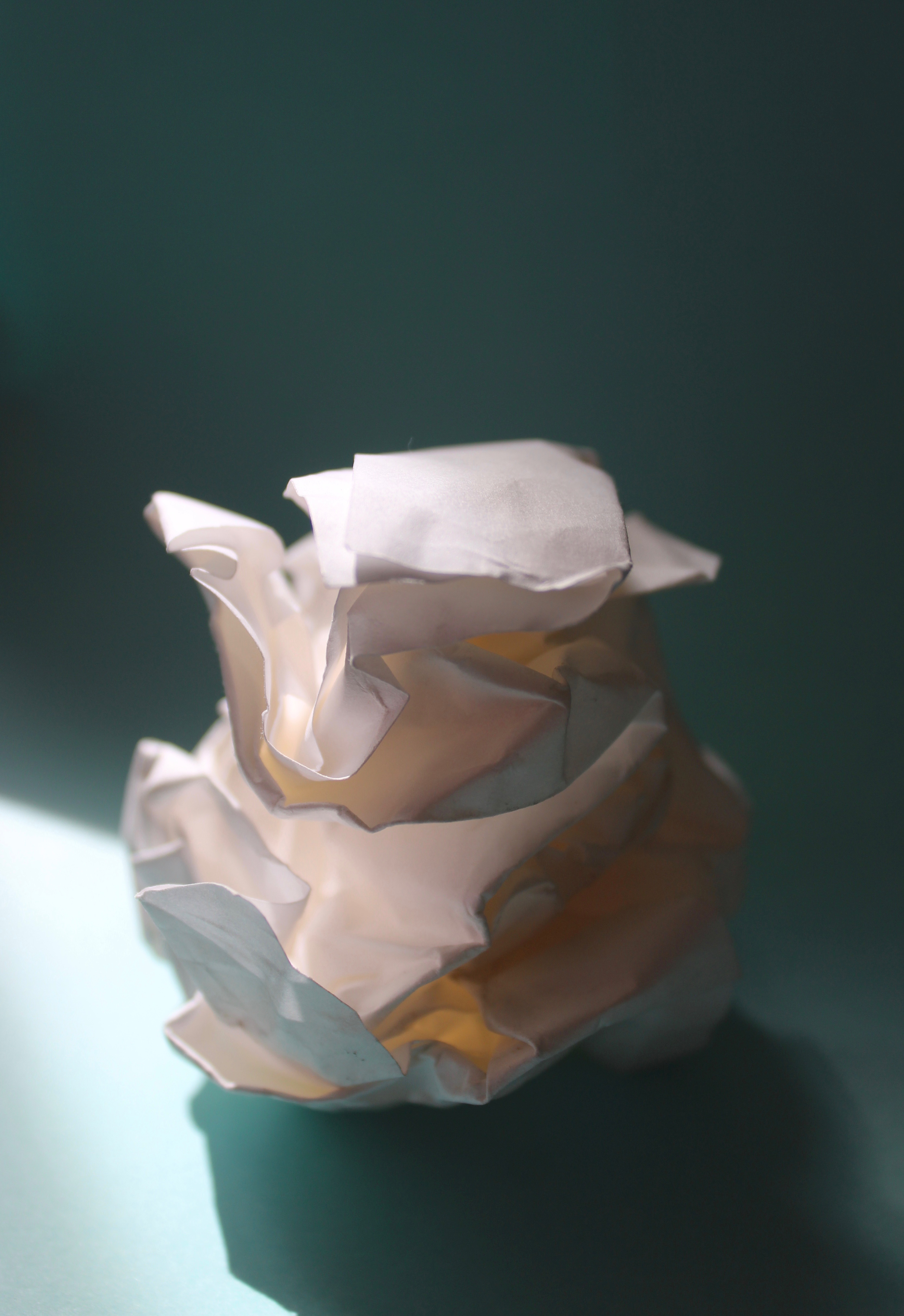
I then moved on to making a black infinity screen on which I would capture my next set of photos. The stark contrast between the bright white paper and pitch dark background, again make the ball stand out. There is some differentiation created on the infinity screen by the light shining in from the right hand side, giving it tonal differences that can be clearly seen and make the balls shadow be seen more easily.

I then thought about incorporating movement into my photos, therefore I asked a classmate to drop the ball from a height. Although difficult to capture, I was able to get a few shots which illustrate the dropping motion of the ball. These photos though are compromised in quality with the ball having motion streaks.

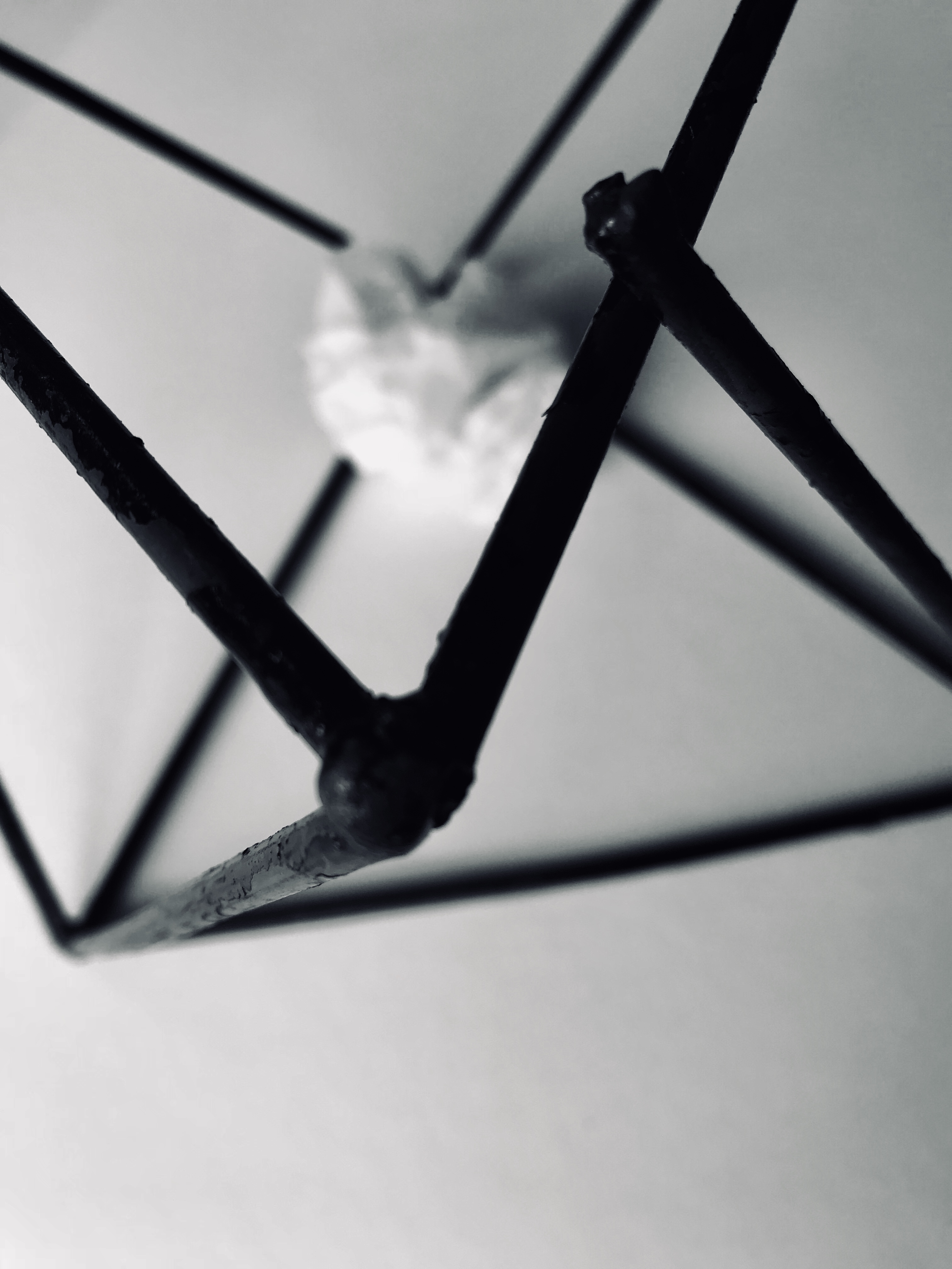
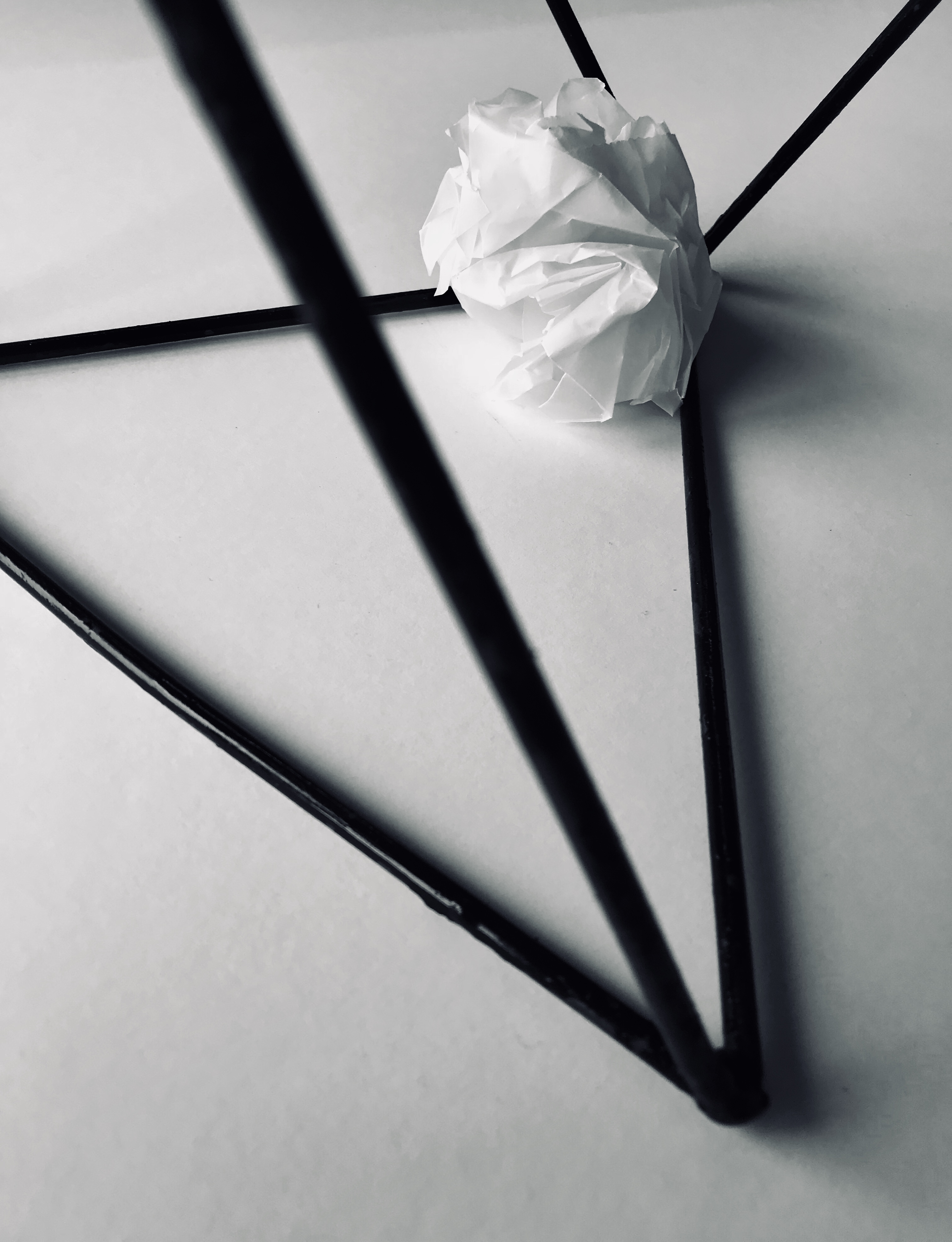
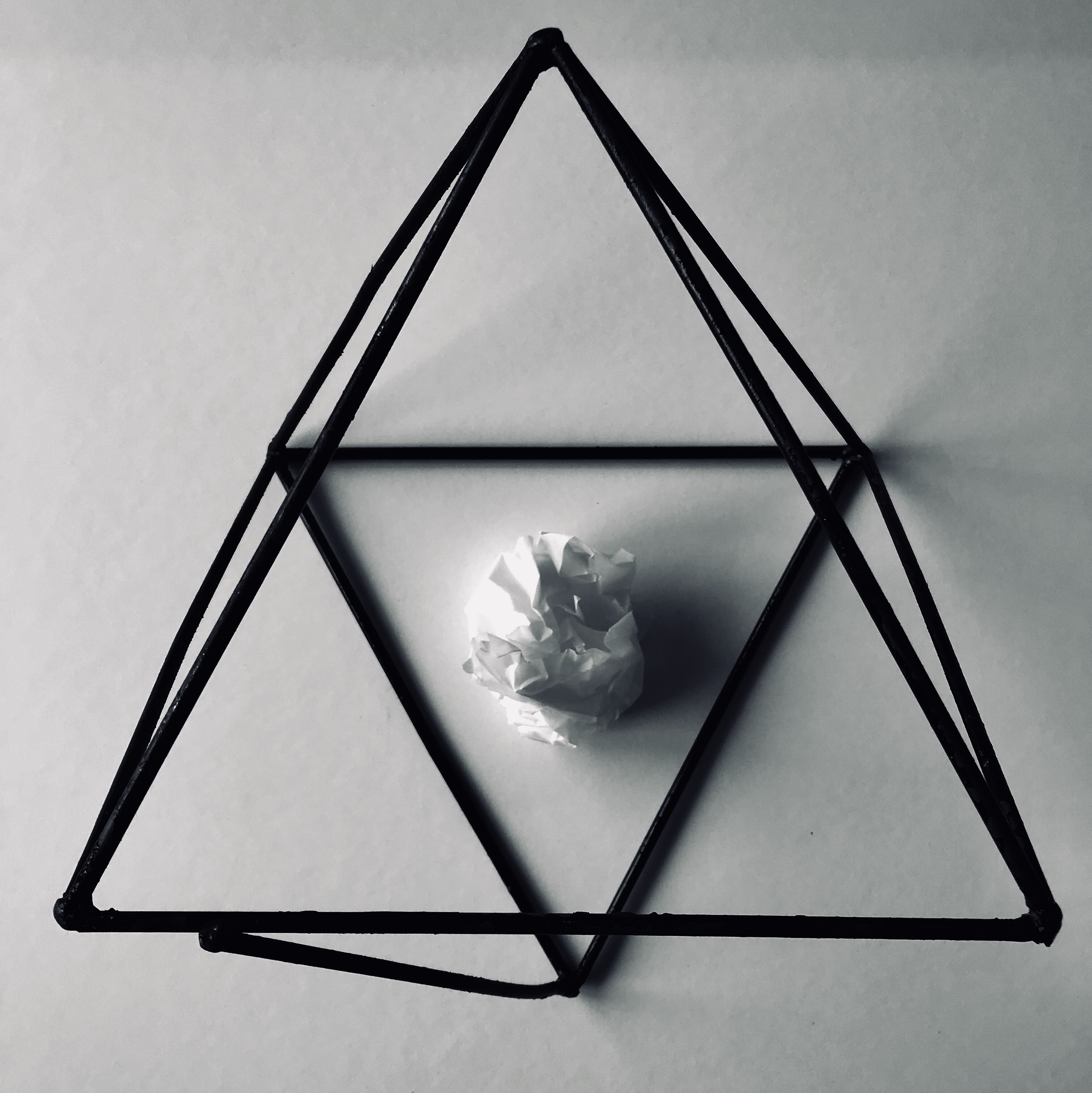
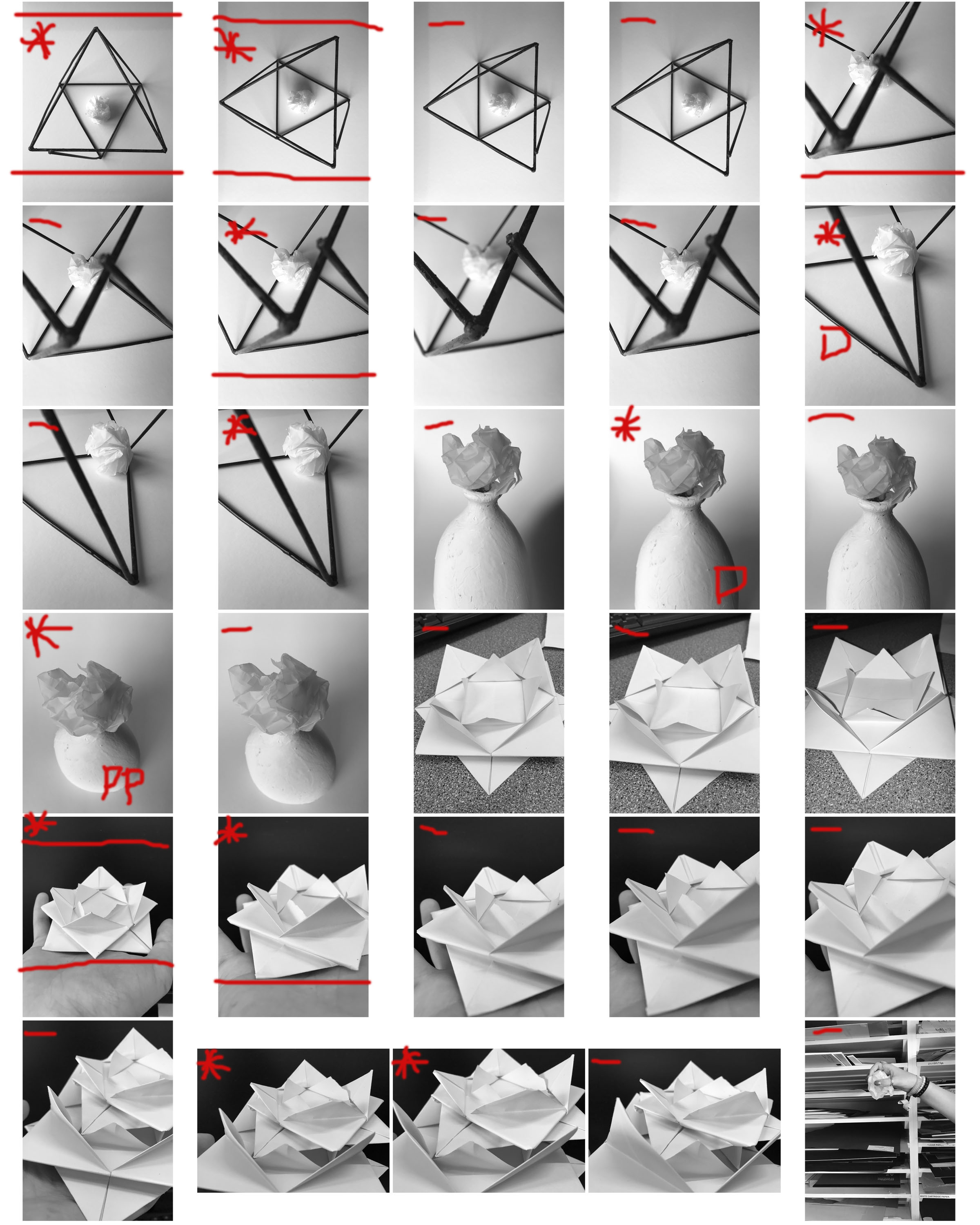
I then again thought about different items I could incorporate into the images, therefore I placed the paper ball in a geometric sculpture. The wire sculpture is again very dark giving good contrast between the ball and paper. Also the contrast in shape from the randomly scrunched paper and the sharp, geometric lines of the sculpture give it a point of interest.

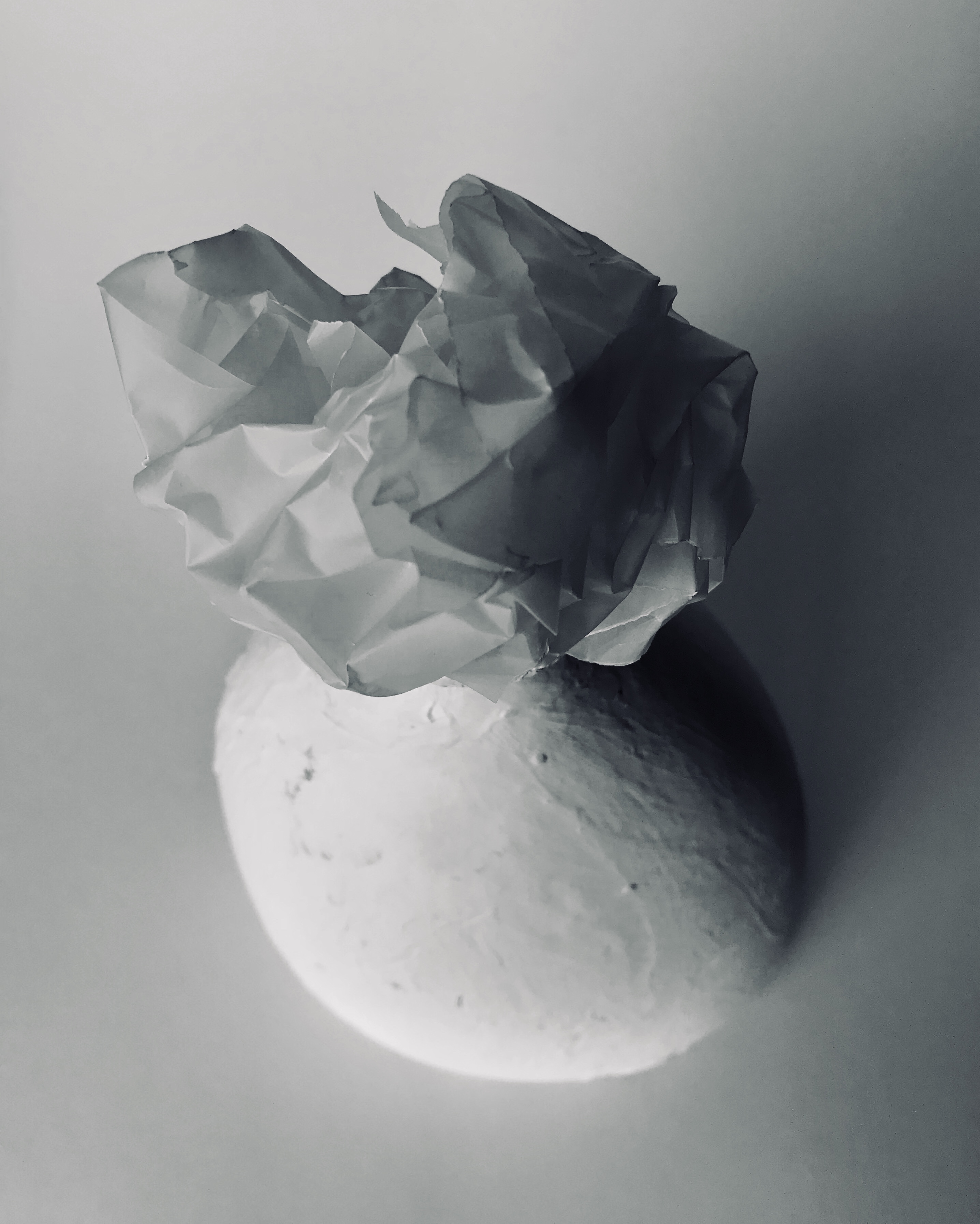
I then moved into placing the ball on top of a bright white vase. The incoming shadow from the left hand side of the picture give both the vase and the paper very dramatic and deep shadows which cut through the sea of whiteness giving the illusion of tonal differences. Lastly, I played around with the concept of geometry again, creating some origami which I then captured on a black backdrop, I think this gave a similar effect as using the geometric sculpture in my photos.

This overall mini project was very interesting to do. The challenge of creating many different photos with just a single piece of paper was very challenging yet this made me think about photography in ways that i have never done before. The simplicity of paper can be adapted and changed to become beautiful images that are very captivating and interesting.

MOST SUCCESFUL PHOTOS

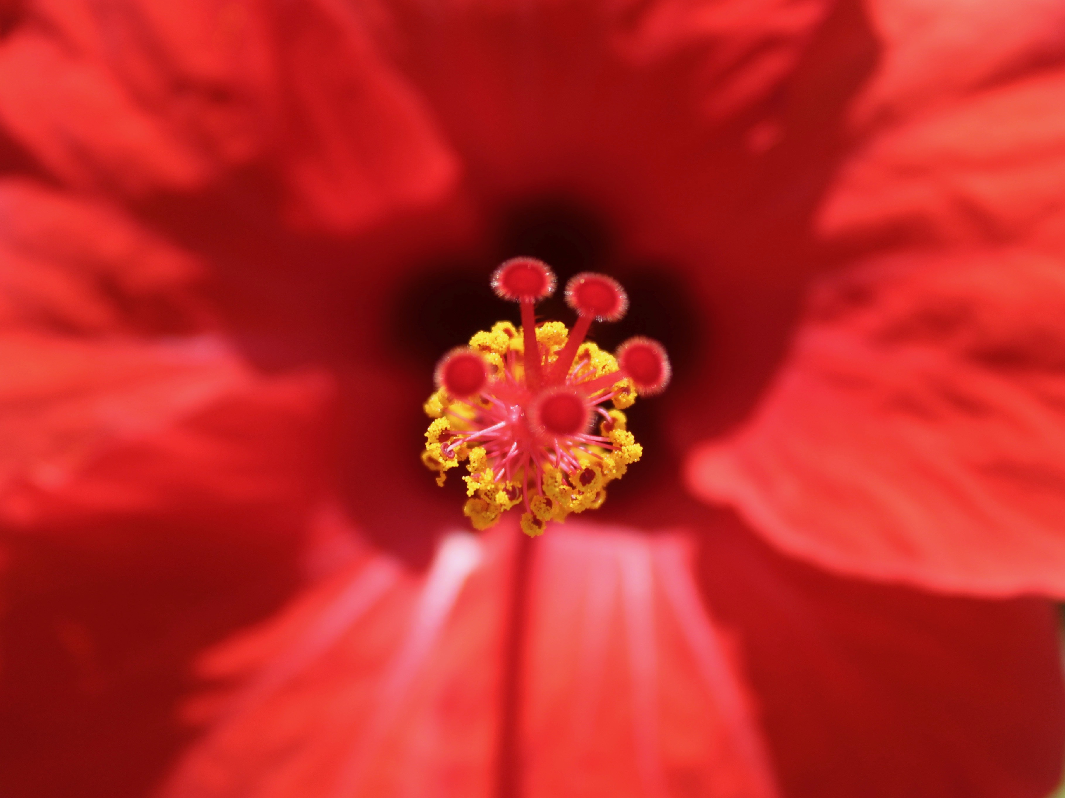
In my opinion the most successful photo was indeed the paper ball atop of the white vase. I feel that this photo was really able to capture multiple interesting aspects of the vase and the paper ball. Firstly the light hitting from the left side of the picture creating the dramatic shadows, highlight the irregular creases and folds within the paper which are an important and interesting aspect of the paper ball. Furthermore, the shadows are able to distinguish both the white background and the foreground. The vase in these photos is also an aspect which further illustrates the interesting nature of the paper ball by again creating contrast in shape. It is very smooth, with regular curves all around, the ball on the opposite, possesses sharp and linear edges. A noteworthy aspect of the paper ball is that it was made from transparent paper, the thicker texture allowing it to create stronger geometric shapes. There are slight tonal differences with the vase, backdrop and ball. It is slightly more yellow toned whilst the ball and the backdrop are a lot more blue based.

Another very successful photo was the paper ball inside the black wire sculpture. This photo again captures the contrast between geometry and the random edges and curves of the paper ball. The dark metal is the center of attention, bringing it into the foreground of the photo whilst the white paper ball sits in the back ground. The light shining in from the left hand side of the photo creates a slight shadow from the paper ball and the wire sculpture, which fades into a darker shadow into the right hand side. i cropped the image and increased the contrast in order to make the photo more dramatic and dark.

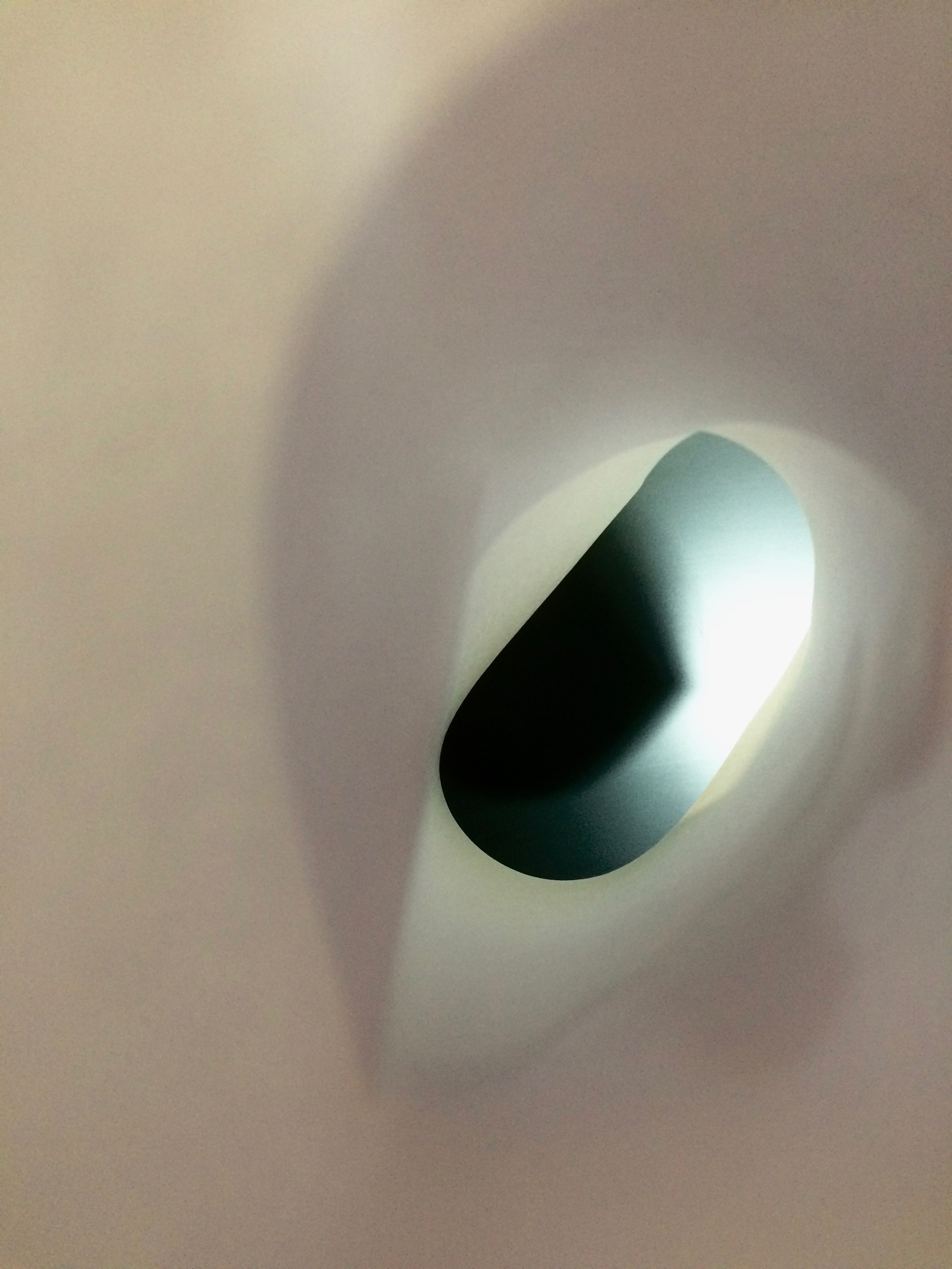
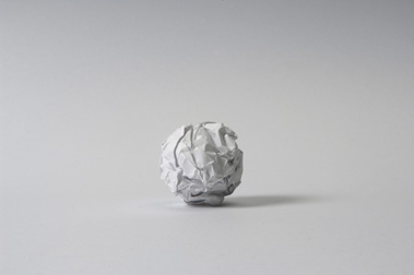
The last photo which i thought was very successful was the paper ball on the black infinity screen. the paper which the ball sit atop of was very blue based in co lour therefore when i saturated the image, you are able to see different tones of black and blue. The contrast between the black screen and the white ball is also very striking in this photo. by increasing the contrast, I was able to create a pitch black backdrop. The light incoming from the left hand side of the photo creates a very slight yet noticeable shadow from the ball onto the screen.
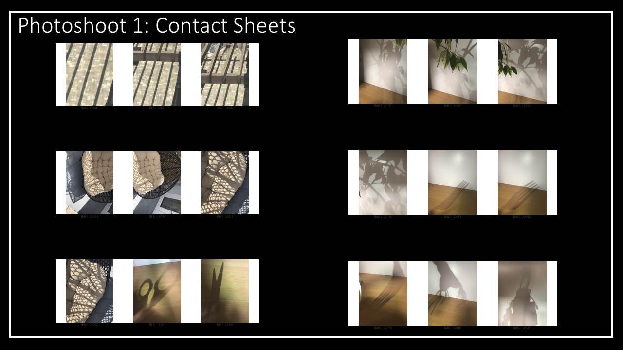
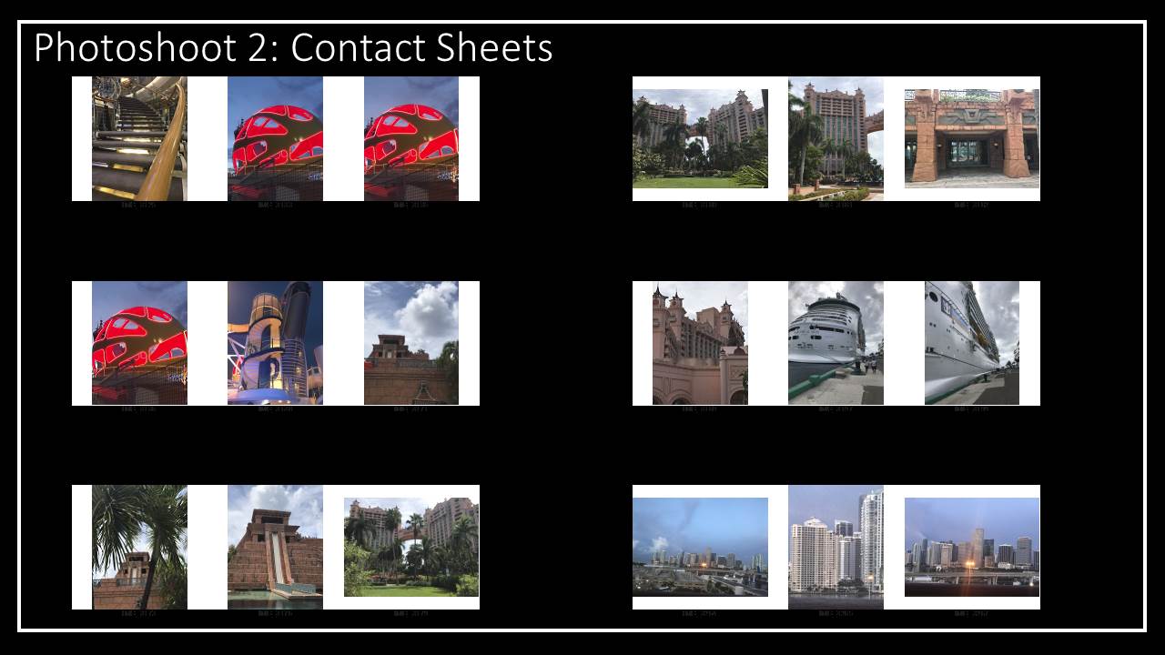
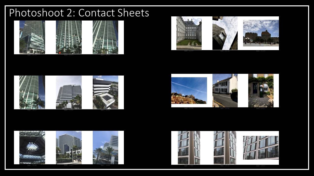
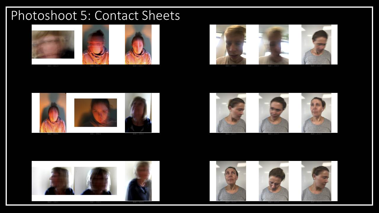
CONTACT SHEETS

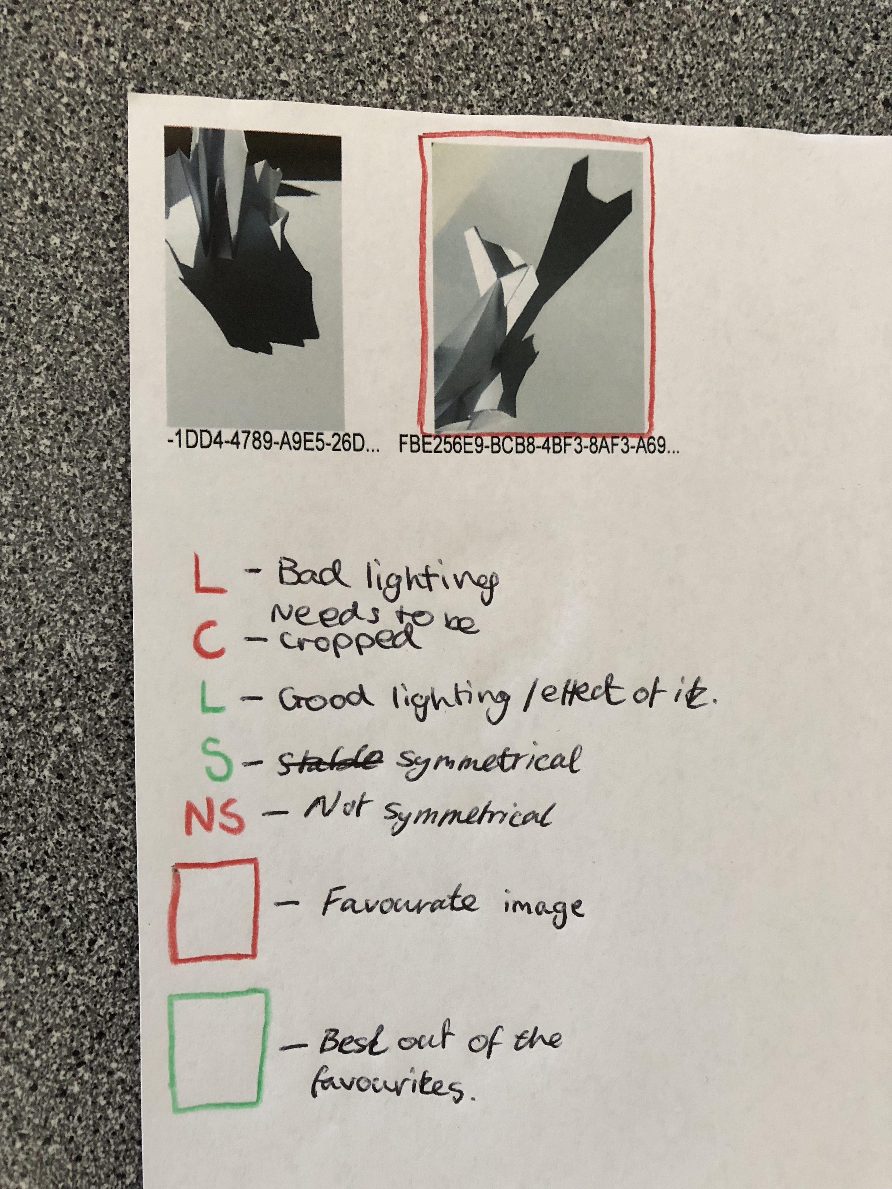
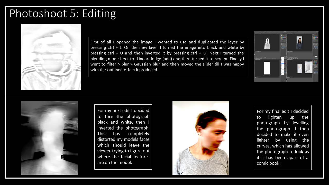
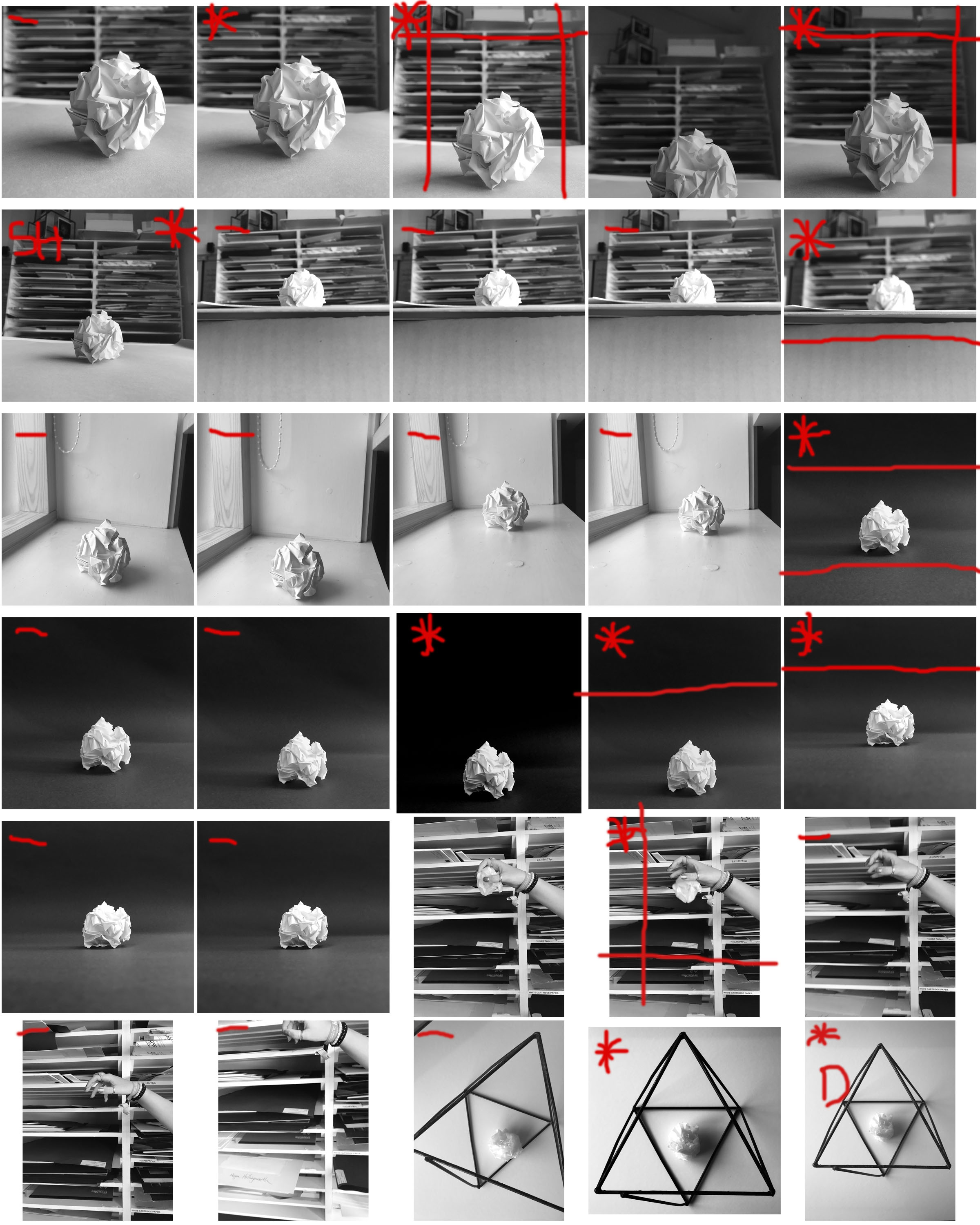
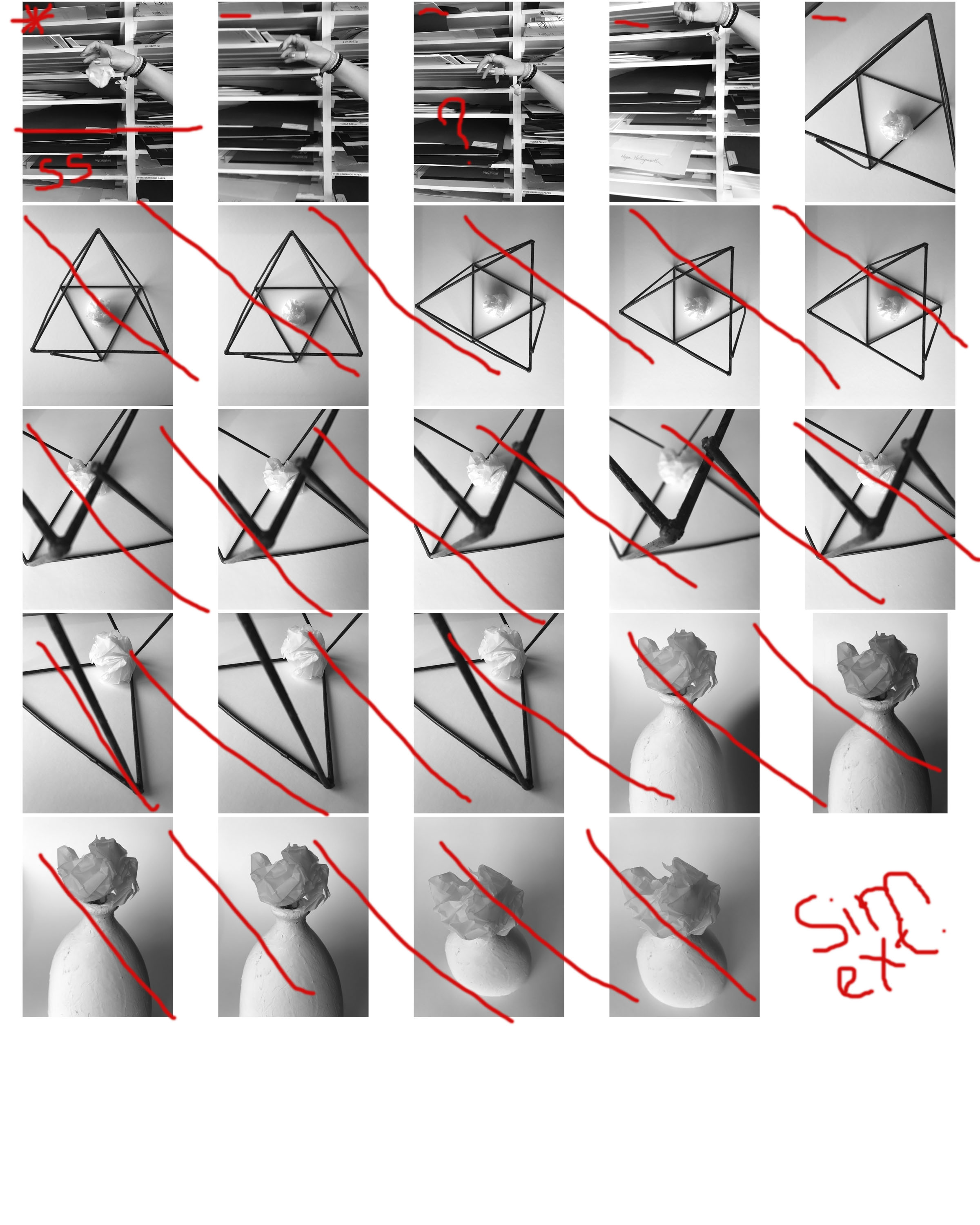
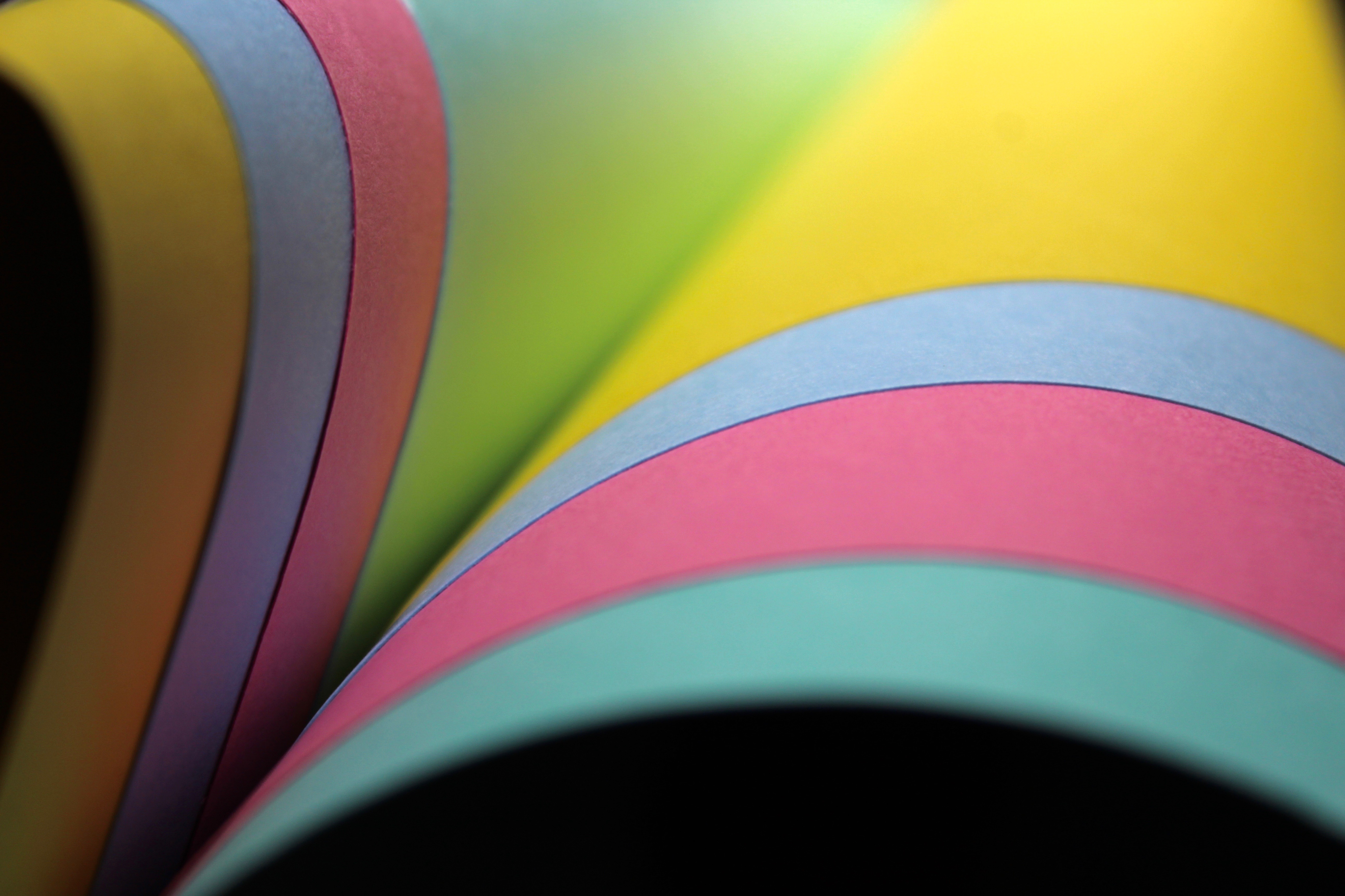
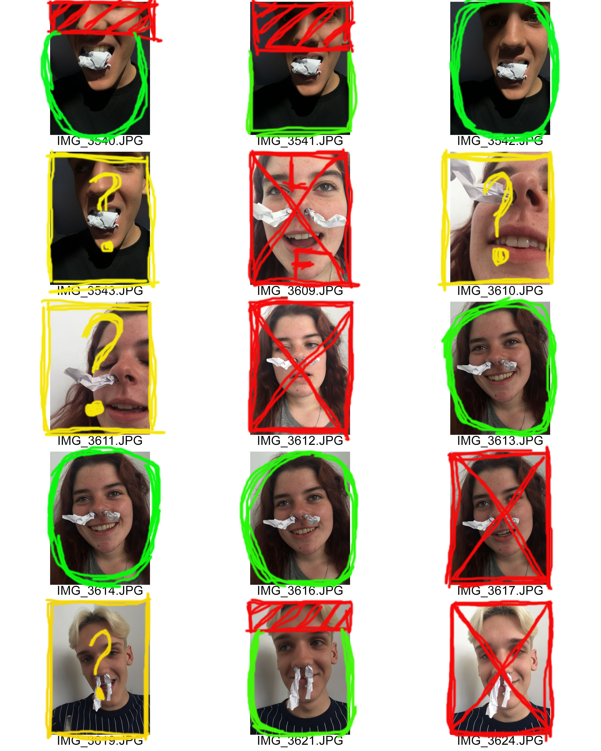
i made my final selection of images from the 86 I took by using contact sheets. I uploaded these onto Photoshop which I was able to manually draw onto with the brush tool. This was a very useful step i took when choosing the most successful photos from my selection. The red marks on top of the sheets made artwork in itself. The marks seem random yet to me they were a very useful prompt that reminded me of the steps i should take when editing and selecting the correct photos. I chose to make the photos monochrome as my final images are mostly black and white, therefore this helped me to visualize my final photos better.

Introductory Project to Abstract Photography

Mood board and ideas. This is the mood board I came up with as to what type of theme I would like to persue in my photographs. I would like to focus on color and abstract forms of art and paint. I find that color is able to convey a multitude of aspects such as mood and how eye catching the image it is for the viewer. I may capture my images indoors in a well lit setting or go outdoors and explore nature. Breurs work is largely focused on capturing photos of his own artwork therefore I will explore this options too when it comes to abstract photography.

Paper Photography

Jerry Reed

Jerry Reed is an English photographer who focuses on contrast through shadows and highlights on a piece of paper.  Jerry Reed’s three year project called paper work has twenty-six image. In his studio he has shaped paper creating edges and volume with them. He lights the images dramatically using Fresnel lighting to emphasize the three dimensional forms. With this lighting he can manipulate the shadow transition making it shorter to emphasize form and line or longer to show surface texture. His inspirations for this paper project are Francis Bruguiere, Juroslav Rossler and Abelardo Morell.

Tamara Lorenz

Tamara Lorenz is a German artist who creates artwork by hand and then takes pictures of them to emphasize certain aspects of the piece.  Her photographs focuses on the abstract properties. Tamara Lorenz focuses more on the constructions she makes with the paper rather than light and shadow which Jerry Reed uses to enhance his paper work. She uses vivid, bold and strong complementary coloursto create contrast with the lines and shapes of her work. Every photograph is difficult to distinguish and makes it hard for the viewer to recognize what the subject really is. This makes her photographs visually interesting and abstract.

My Response

By looking at the two artists I will combine elements from both their work to create my response. I will use manipulate the light to create highlights and shadows on my paper like Jerry Reed’s paper work series. However, instead of having black and white pictures I will incorporate colour card to some of my images like Tamara Lorenz to create bold and vivid abstract photos. To experiment I will fold, tear and roll the paper to create different effects and compositions.


Best abstract images

With an A4 piece of paper I scrunched it up into a ball. By doing this I created form and depth with the shadows and highlights casted from the natural lighting. The background was taken with another sheet of A4 paper. I slightly curved the paper while taking the photo so it would appear like a never ending white background.  I like the composition of the photo and how your eyes focus on the scrunched paper since it’s the only object in the frame that has shape. This idea was inspired by the photographer Martin Creed.

I captured this photo by rolling a piece of paper into a tube and putting my phone lens through it to create a different perspective. I really like the blurred effect around the edge and how the main element in the picture is the focused black screen on the other side. The slight beam on the other side was created from the flash while taking the picture.

The most dominant aspect of this photo is the form created from the scrunched paper. The photo is taken up close and captures the detail of the creases. This photo is abstract as it appears to look like a mountain landscape. Highlights are created at the peaks from the light above and shadows are casted down below. The form of the paper covers the whole image making it visually interesting.

To create this image I curved a singular piece of paper twice to create an unusual form. For the background I placed a yellow piece of card so colour would shine through and make it visually appealing. While taking the picture I slightly moved the camera to create a motion blur which came out with an interesting effect. This is one of my favourite abstract images of paper since its very difficult to distinguish what it is since it appears to look like its part of a sculpture.

I used several pieces of coloured card for this image to make it vibrant. Thecurved lines are very effective in this photo as they create a more graceful composition. The composition also makes it appear like it’s a book since they are all coming out from one corner. The black background ,that can be seen below the card, contrasts greatly with the colour and makes it visually interesting since they both stand out from each other.

This abstract photo makes the card appear like a curve of a building. The shadow areas are dark and contrast greatly with the blue making it stand out. The right hand side area is focused making you pay attention to the lines created from the curve.

Favourite outcome

This is the best outcome out of all the abstract pictures I captured on my Canon camera. The composition consists of layers which has been created with two different coloured card and two A4 pieces of paper. The layering creates an interesting composition because paper has been laid out in different directions. The four layers create a sense of depth to the image as it progressively gets darker further back. The folded paper that I used on one of my previous images was incorporated into this image because it creates texture which a flat piece of paper doesn’t. The folded areas cast shadows in the direction the light is shining; this creates dark lines and contrasts with the highlights that are seen at the peaks of the folds. I used Jerry Reed’s technique of using light to dramatically emphasizes the dimensional forms of the paper. While editing the image I increased the highlights and shadows so the dramatic light that comes from the side becomes more defined. My favourite element of this image is the blue triangle because the colour pops and catches your attention since it’s vibrant and bold compared to the rest of the photo.  The colour aspect of the photo was inspired by Tamara Lorenz who uses vivid colours in her crafted paper works.

CONTACT SHEET: PAPER SHOOT 2

The Meanings of my Editing:
Red X: This means that I do not want to use this image at all.

Red F:  This means that there is a focus issue in the image

Red Shading: The shaded area is the area that I wish to crop out of the image.

Green L: This means that there is a lighting issue in the image, but I wish to edit the image and fix the problem.

Green Circle: This means that I am happy with the image and wish to begin editing and manipulating the image.

Yellow Question Mark: This means I am unsure on whether to use continue to use this image and whether to edit and manipulate it or not.

Paper Photography – Preparation

Mood Bored

Martin Creed

Martin Creed
Martin Creed’s Simplistic Photograph Of Paper

Martin Creed has been one of my main inspirations for this mini project. He has managed to capture a piece of paper in an interesting. There are multiple element which has made Creed’s photograph inspiring. First of all he presents the formal element of texture, line and shape through the crumpled piece of paper. This also helps to outline the different tones within the photograph which creates an element of 3D.  The shadow of the paper tells us where the artificial light source is coming from. Knowing this information will help to guide the viewers eyes through the frame of the photograph, starting at the lighter area of the ball moving to the darkest. Creed has kept the background of the photograph plain which ensures that the viewers eyes will not be distracted from the main focus point of the photograph, the ball of paper. Moreover, it creates space within the photograph as the frame is not filled. The image is taken as a landscape image at a straight on angle which helps to present the context of the photograph. The simplistic idea of Creed’s photograph makes it effective as he has taken an ordinary, simple object and made it something more interesting that what it actually is. In my eyes the camera settings that I believe Creed has used is: ISO 100-800 as there is no noise created from the lighting which has been used, a normal shutter speed as Creed is not capturing anything moving and the photograph is in full focus and an aperture of roughly F22 as there is a narrow depth of field. Personally I really like Creed’s photography as he has such a simple idea and object and has made it into something better. He has shown creativity to be able to think of taking a photograph like that. I also love the way he has used the artificial  lighting to help guide the viewers eye around the frame, I think that this is very clever and I would like to try it when capturing my photographs.

Plan

Setting, Time and Place

The photoshoot will take place at Hatulieu school in the afternoon, allowing the midday sun to be used, which means I will be using natural lighting.

Aim

I want to use paper as my subject, to present a theme of still life photography. I will be using one sheet of paper and explore different ways I can use it to make an interesting photograph. This simplistic aim will allow me to explore and present my creativity. I would like to use a plain background  to allow the tones and textures of the paper to be presented. However, I would like to capture photographs using  a background which may be busier. To do this I need to ensure that the focus is on the paper, and the background is not in focus, which will not distract the viewer.

Camera Settings

ISO: 100-800

Shutter Speed: 1/500

Aperture: F22

Depth of Field: Narrow

Formal Elements: Light, Texture and Shape.

Thoughts and Feelings

I have a lot of different ways that I can manipulate the paper in my head, making the capturing process easy. I definitely want to experiment with light to not only create tones and shadows, but also using it to guide my viewers eyes around the frame of the photograph. However, when it comes to editing I am not too sure what I am going to do. With the editing I would like to keep it simple in order to match the simplistic theme of the project. Currently I am thinking about turning photographs black and white to really emphasis the different tones and shadows within the photographs I will be taking.

Abstract

Ernst Hass

Ernst Hass was born in Vienna in 1921 and decided to do photography after the war. His early work on Austrian returning prisoners of war brought him to the attention of LIFE magazine but he declined the job as a staff photographer in order to keep independence. In 1951 he moved to the US and began to experiment with Kodachrome colour film. He soon became the first colour photographer of the 1950s. In 1962, his work was the first color photography exhibition held at New York museum of modern art. Throughout his career he has traveled and taken pictures for publications such as LIFE, Vogue and Look.

Style

  • Pioneer of colour
  • Abstract, lines, reflections, texture
  • Creating mood through colour and light
  • Beauty from the mundane

Hass used a lot of black and white film for most of his career but colour film became very important to his photography. He frequently used techniques such as shallow depth of field, selective focus and blurred motion to create metaphorical works. Once he began working in colour he often used Kodachrome which is known for its saturated colours. To print his colour work he used a dye transfer process which is expensive and a complex process and allowed for great control over colour hue.

Ernst Hass shows beauty in mundane views or objects. Most of his photography involves creating simple but eye catching pictures, ones that are heavy with texture, have beautiful light and create feelings through colour. Ernst Hass takes simple pictures by finding something fascinating and paying close attention to it. He captures detail through his zoomed in images, making it hard to distinguish what it is. Ernst Hass takes things down to their simplest elements to make it interesting for the viewer.  I like the vivid colours you see through his images and the concept of making everyday things that we see look visually stunning. To respond to his work I will focus on elements in nature as well as building structures to create images that have a seemingly unreal appearance from the real object.

My Response

Best abstract images

As you get increasingly close to a subject the detail that was not apparent at regular viewing distance will emerge as an abstract photograph. In this case the detail of the stigma is captured instead of the form of the flower. The petals and shadows casted have been blurred in the background so the colour yellow stands out in the image creating a visually interesting photo.

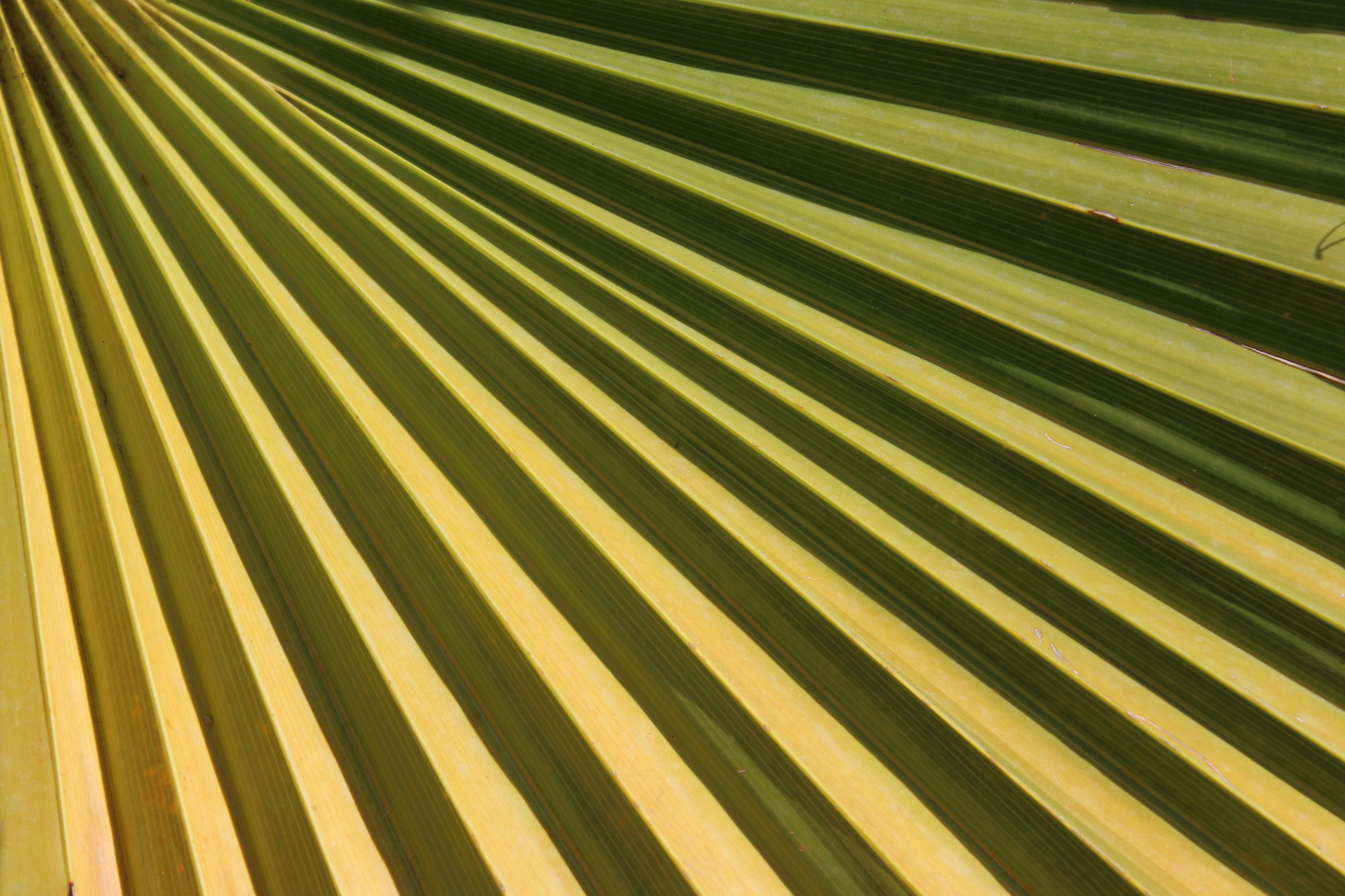
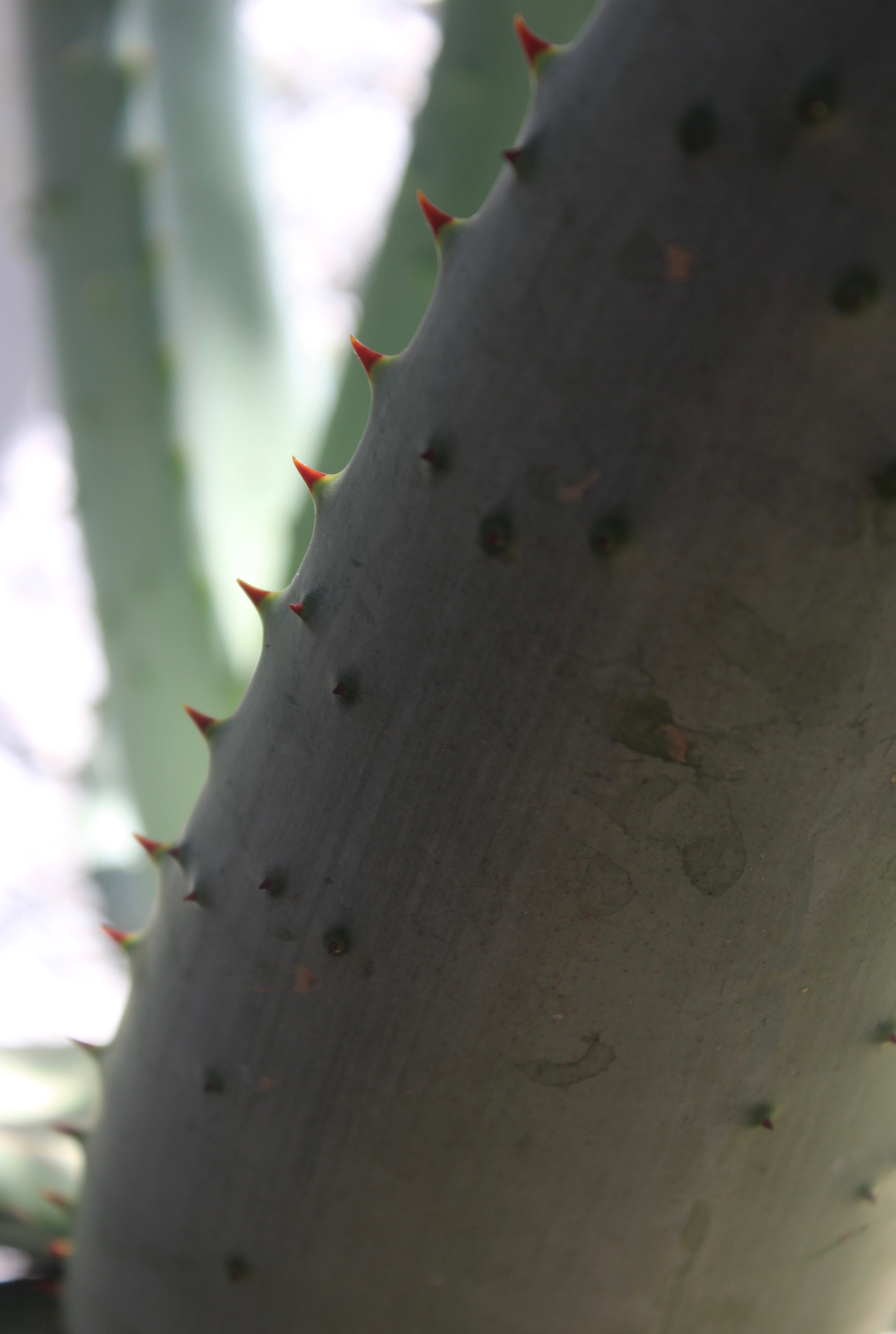
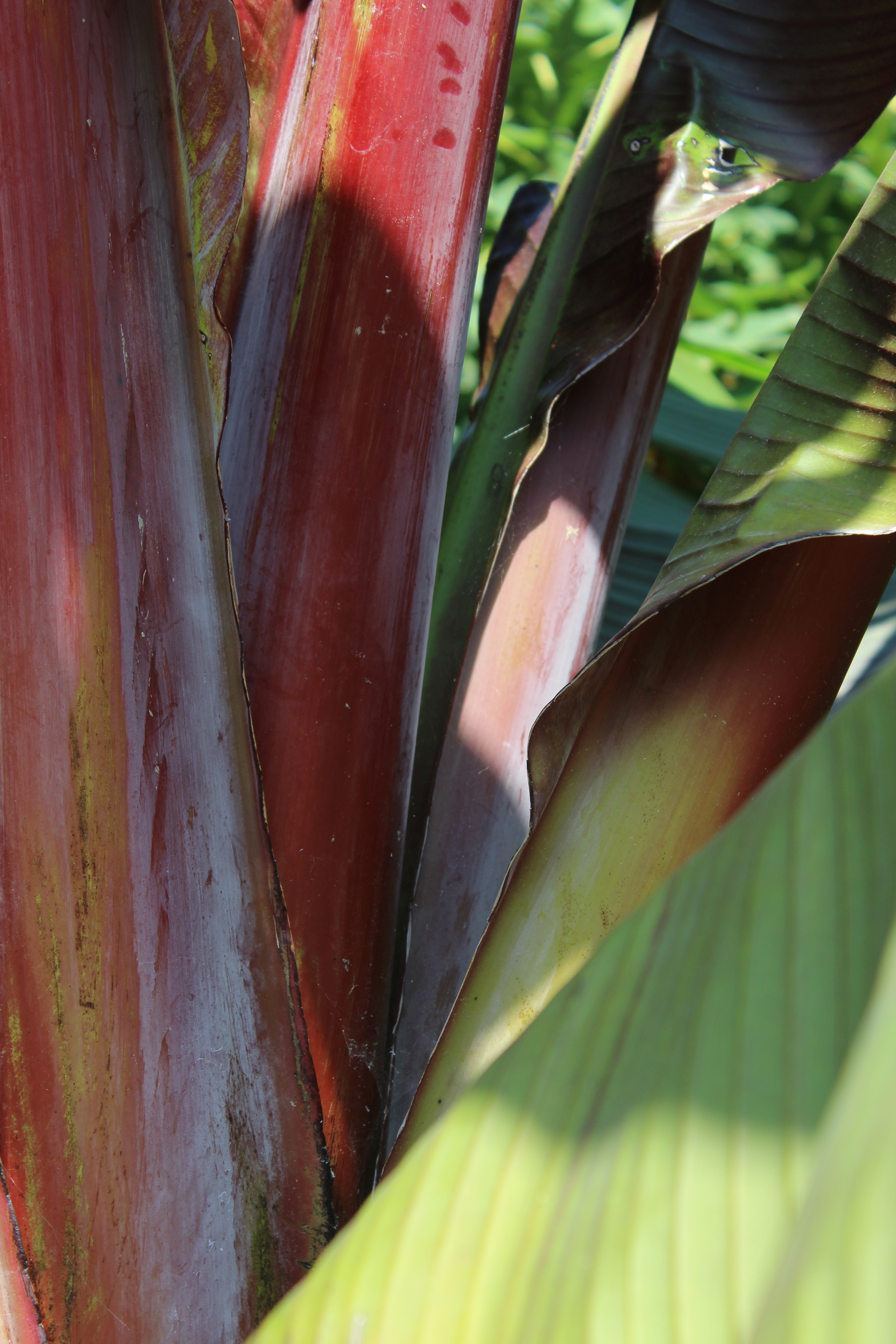
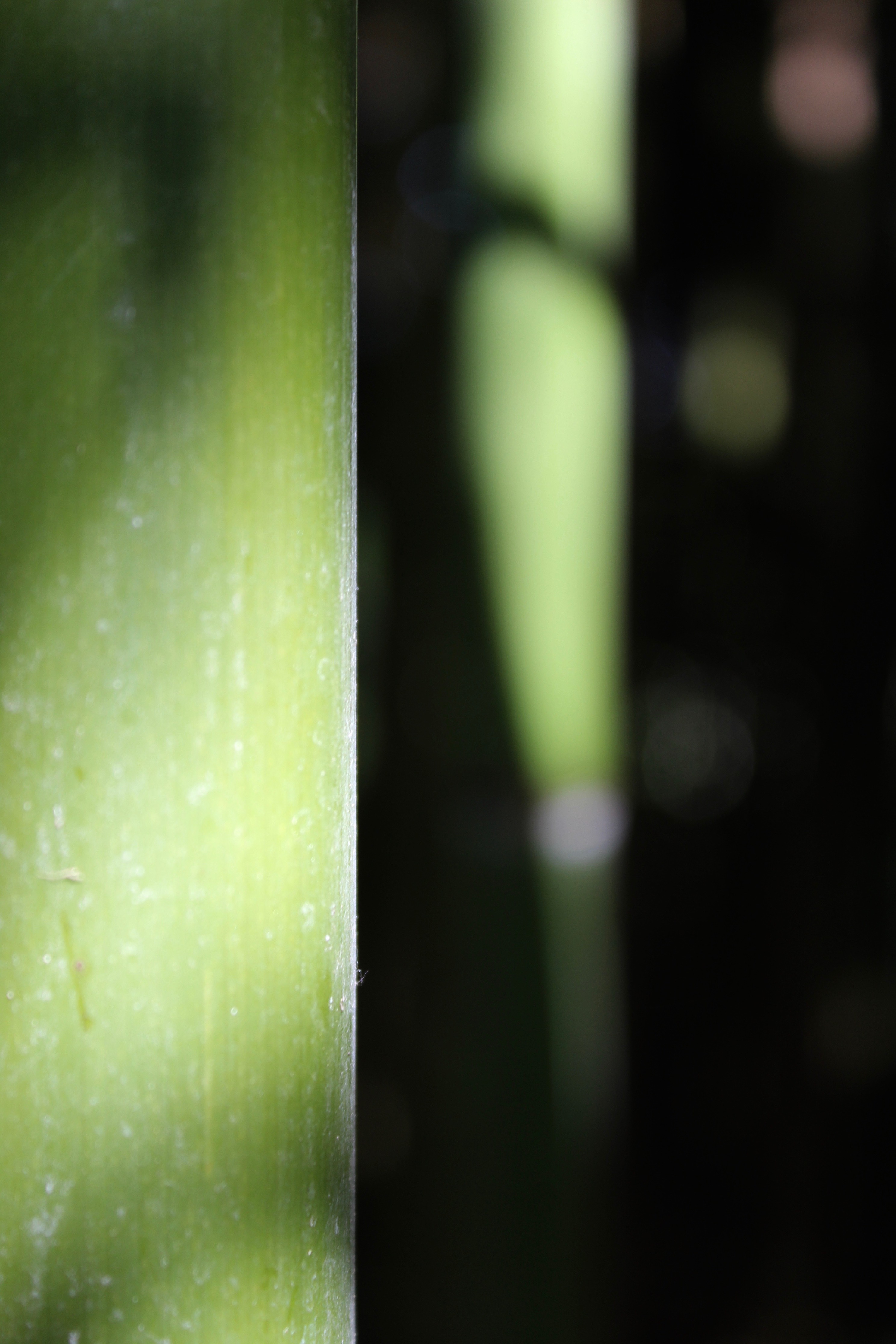
By capturing a section of the fan palm I have filled the entire frame with the subject, eliminating the unwanted background making the image appear abstract. The different shades of green fill the entire picture creating visual impact. The diagonal lines make the image more dynamic and provide a better overall balanced composition. They add a strong visual interest and make your eyes travel across the photo. They are dominant in the image and are the main focus point.

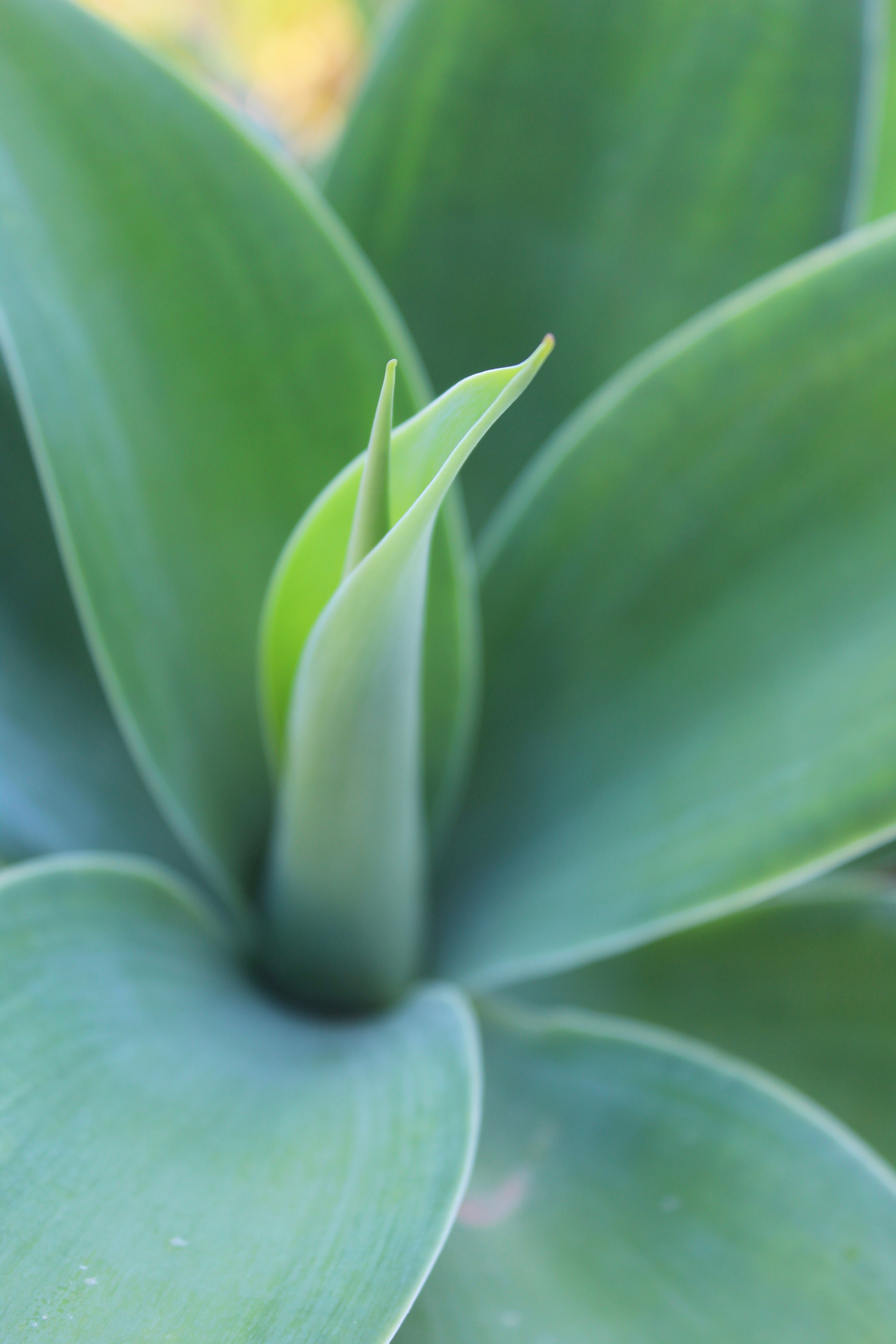
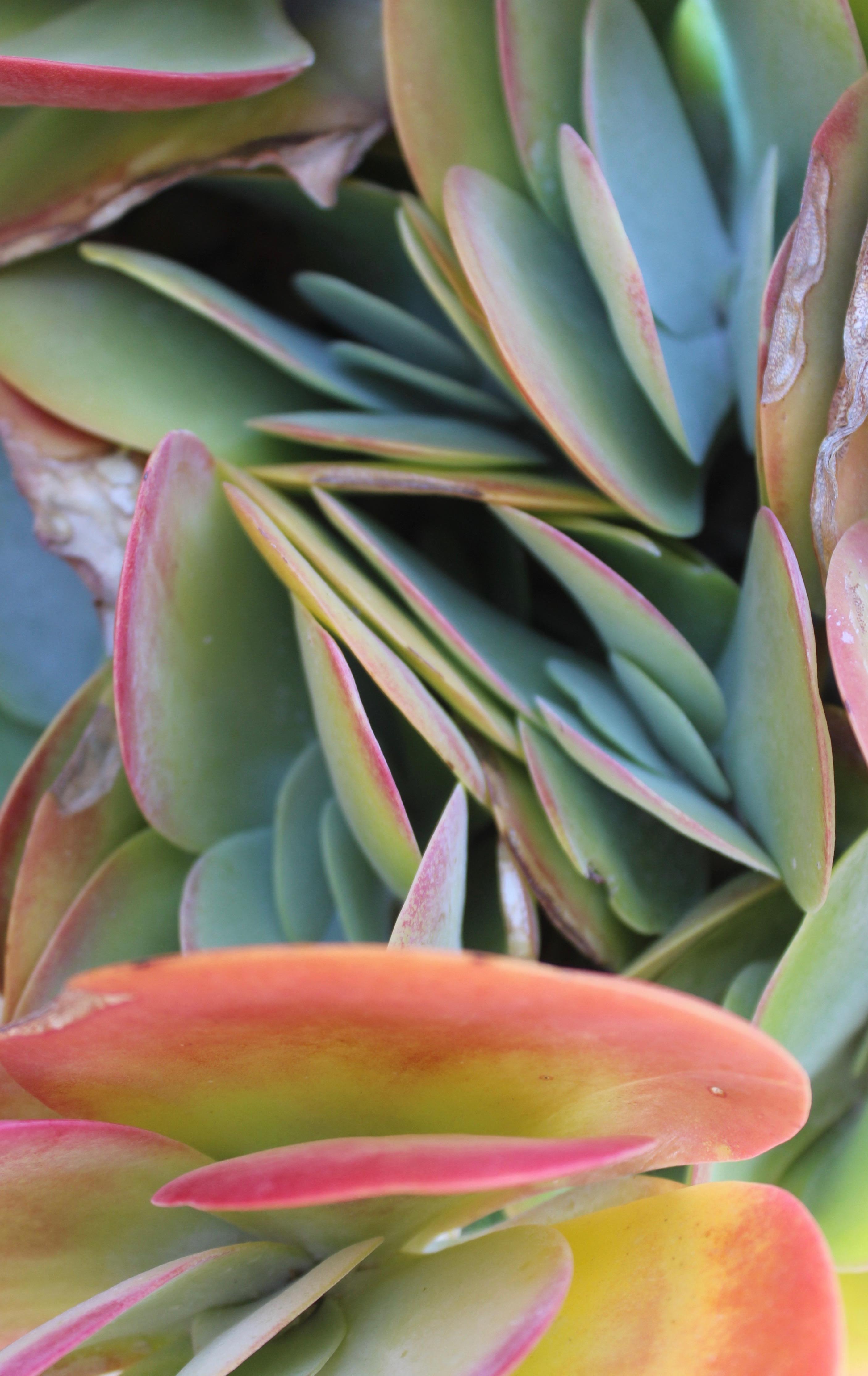
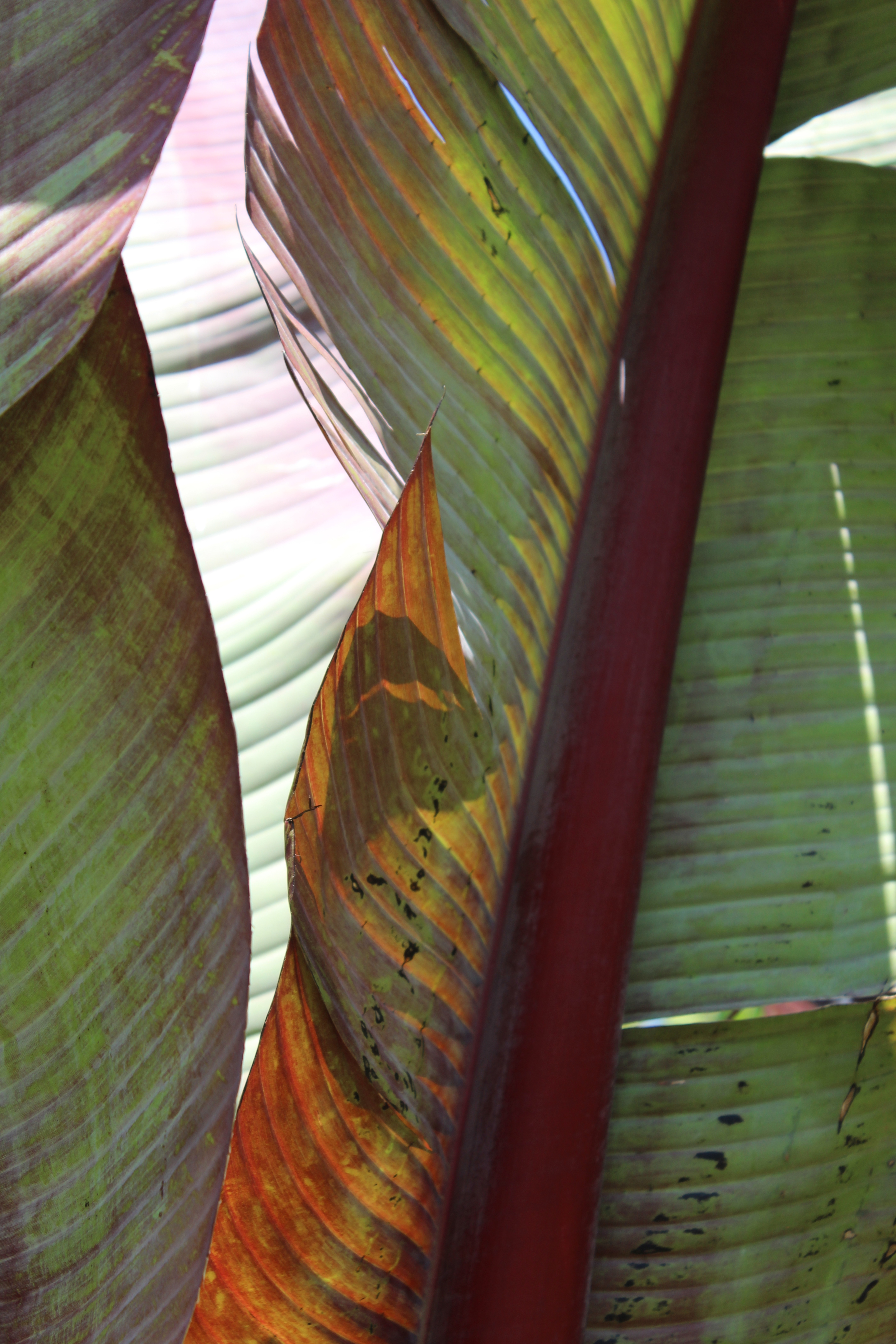
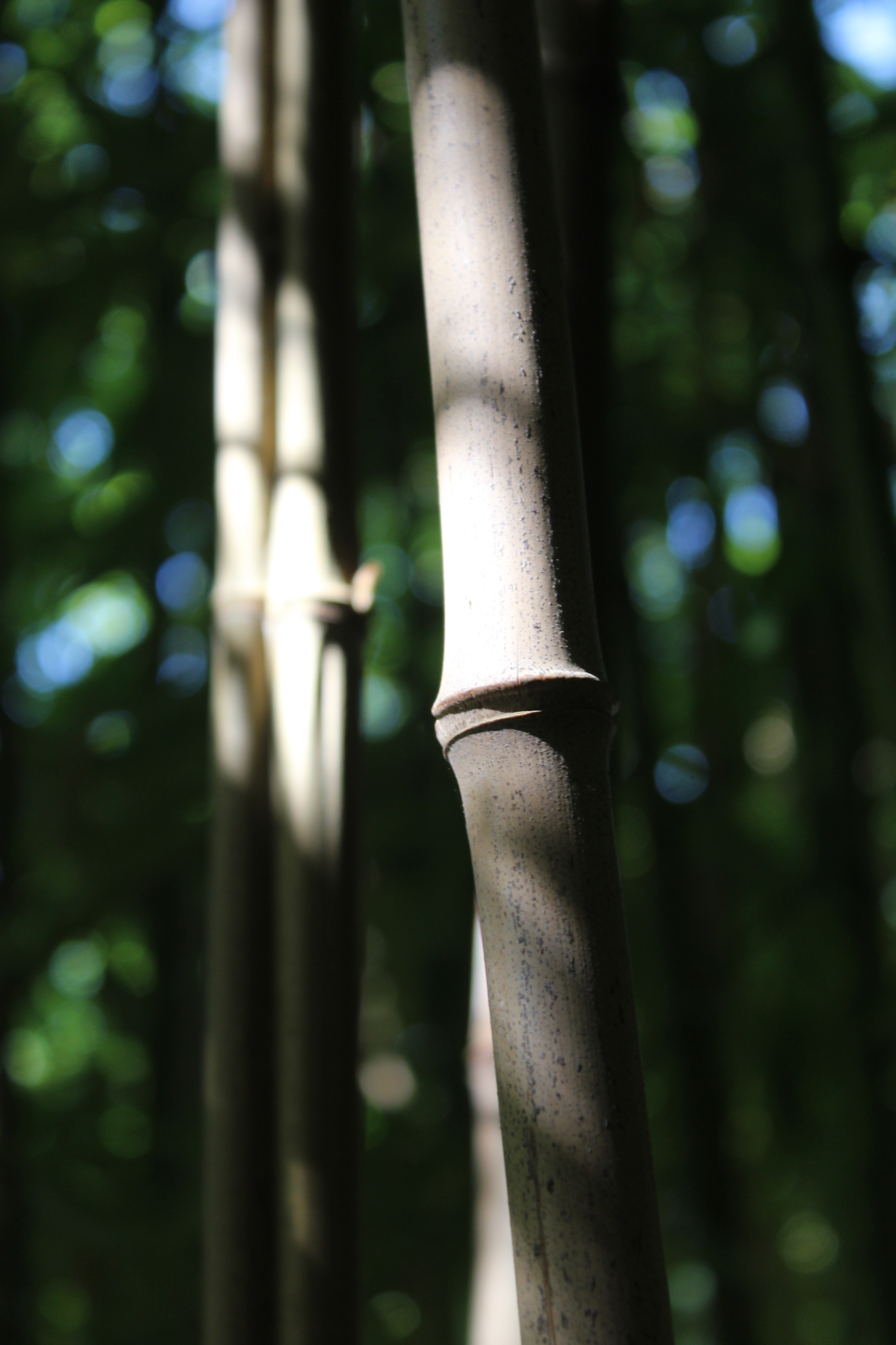
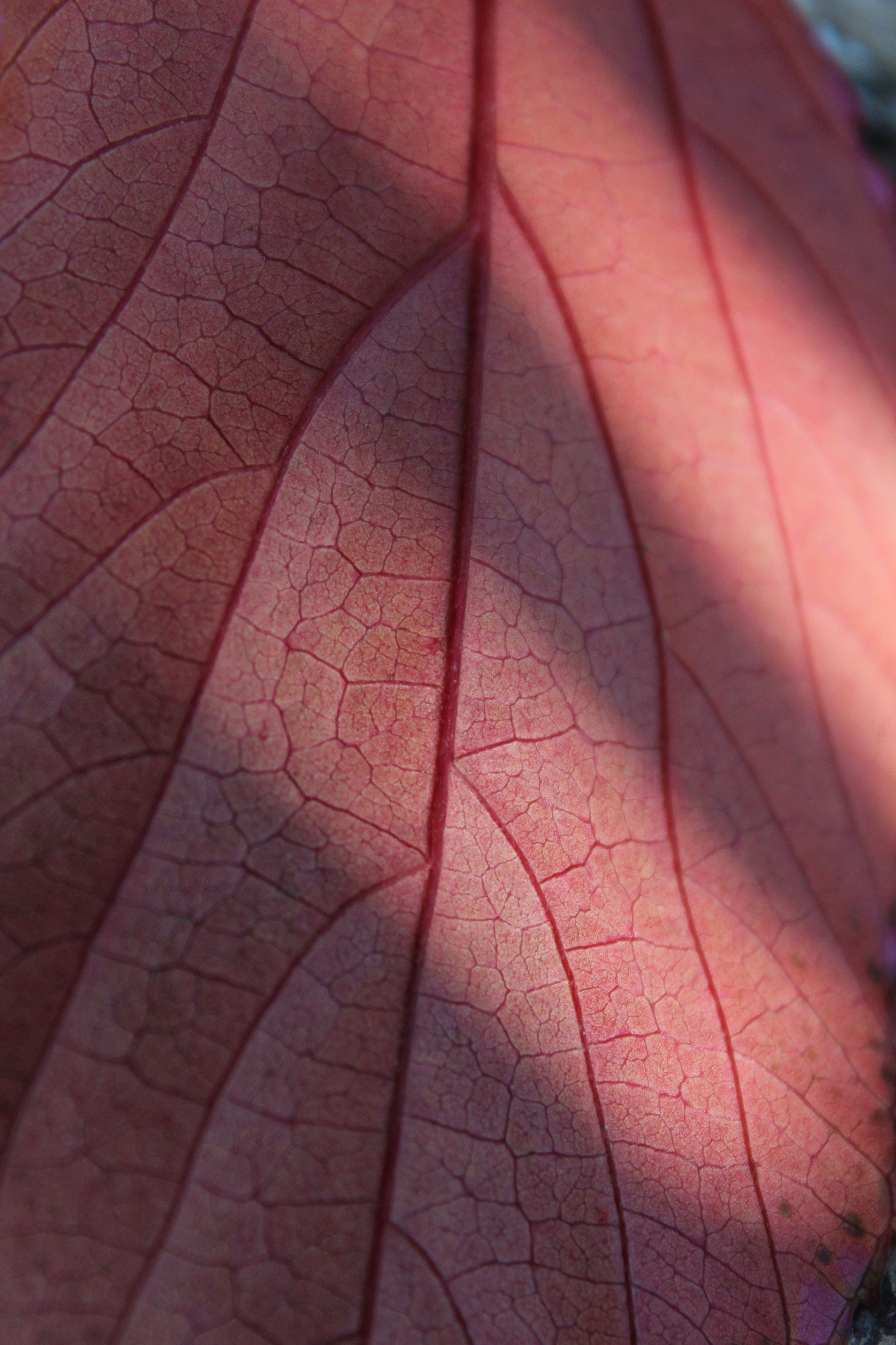
The zoom lens has captured close detail on the leaf as well as texture which can be shown through the focal points.  The curved lines coming out the stem are very effective in this photo as they create a more graceful composition.  By rotating the photo I created a different orientation, making the image more interesting. The shadows casted on the leave also catch the viewers attention and create a sense of depth to the picture.

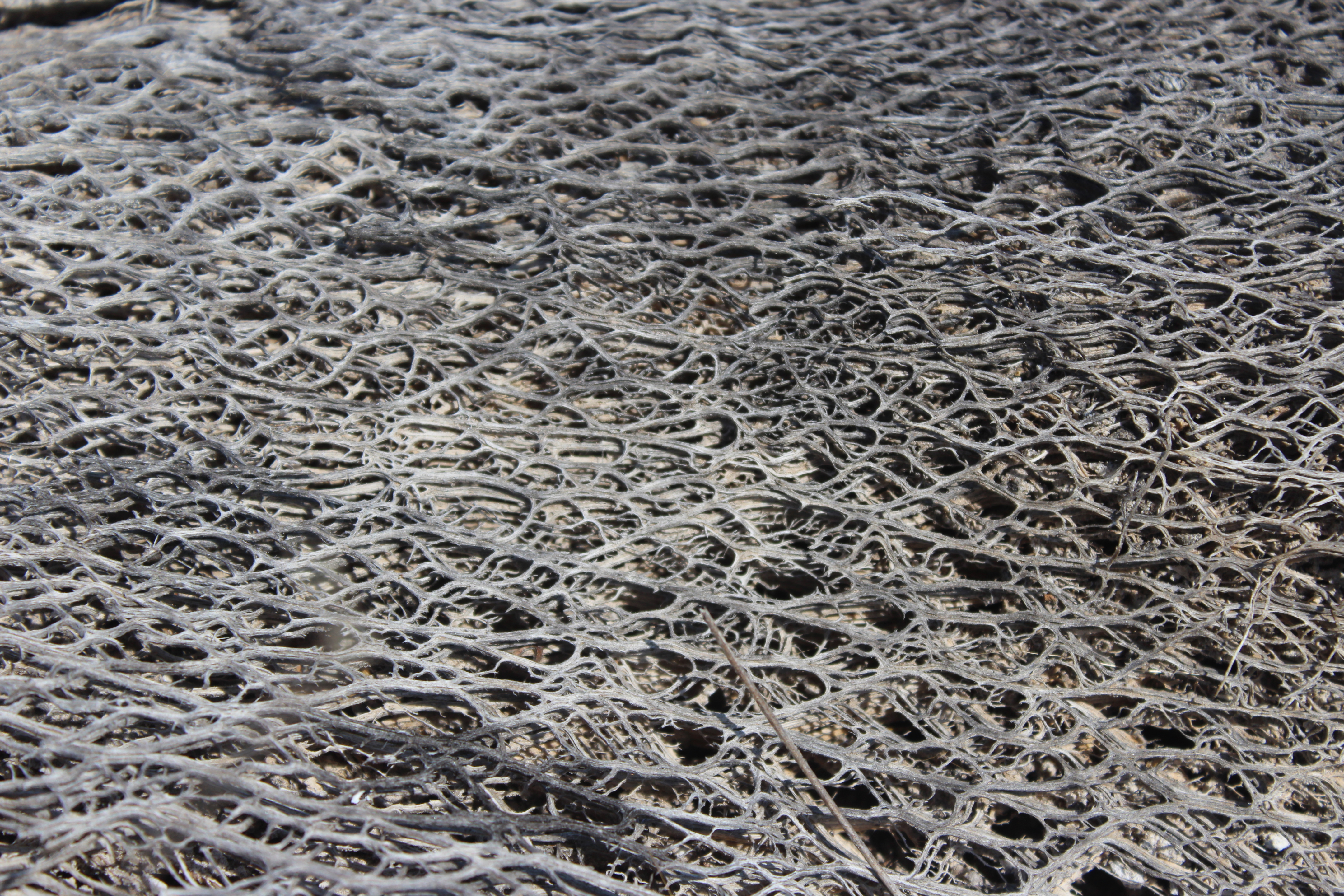
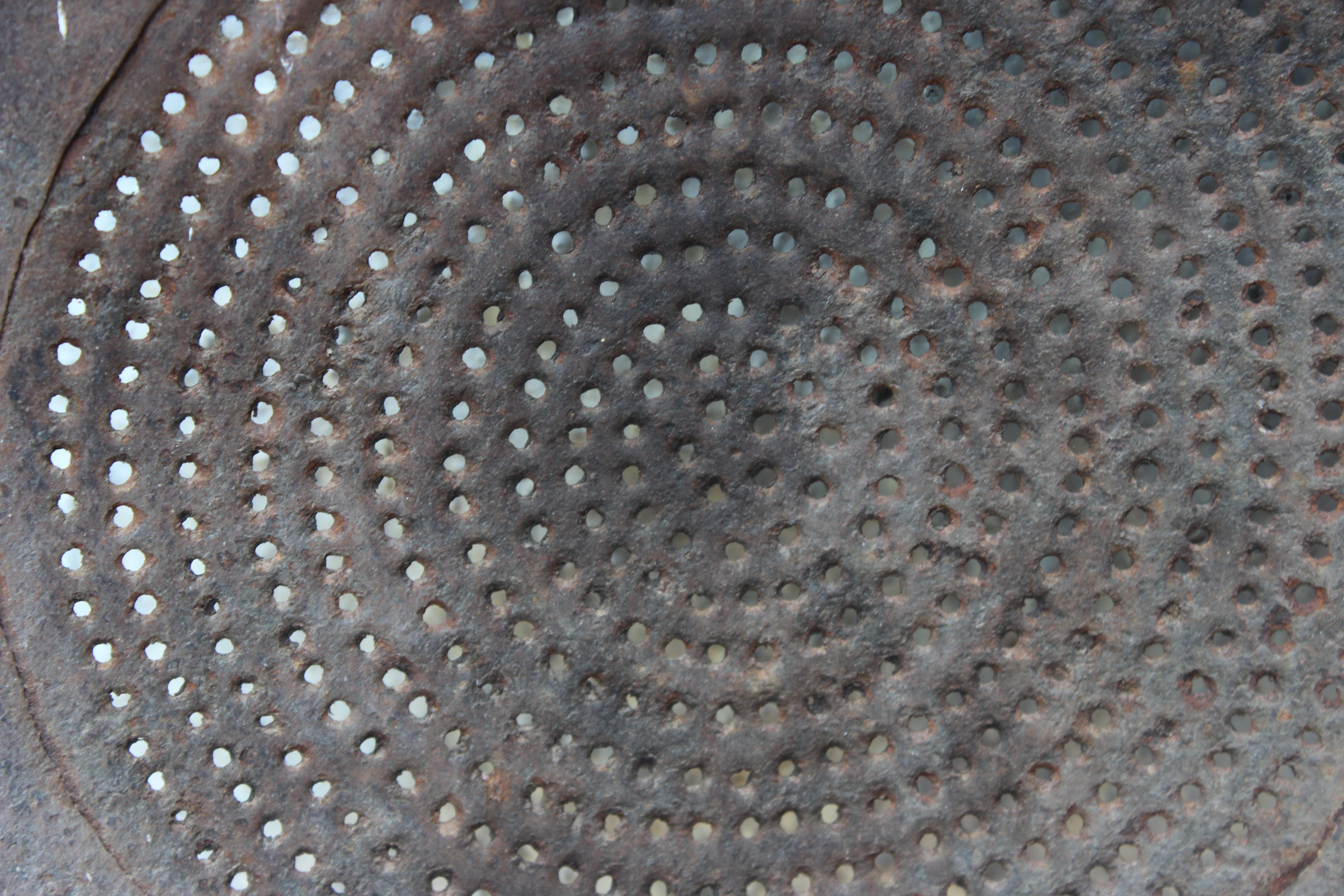
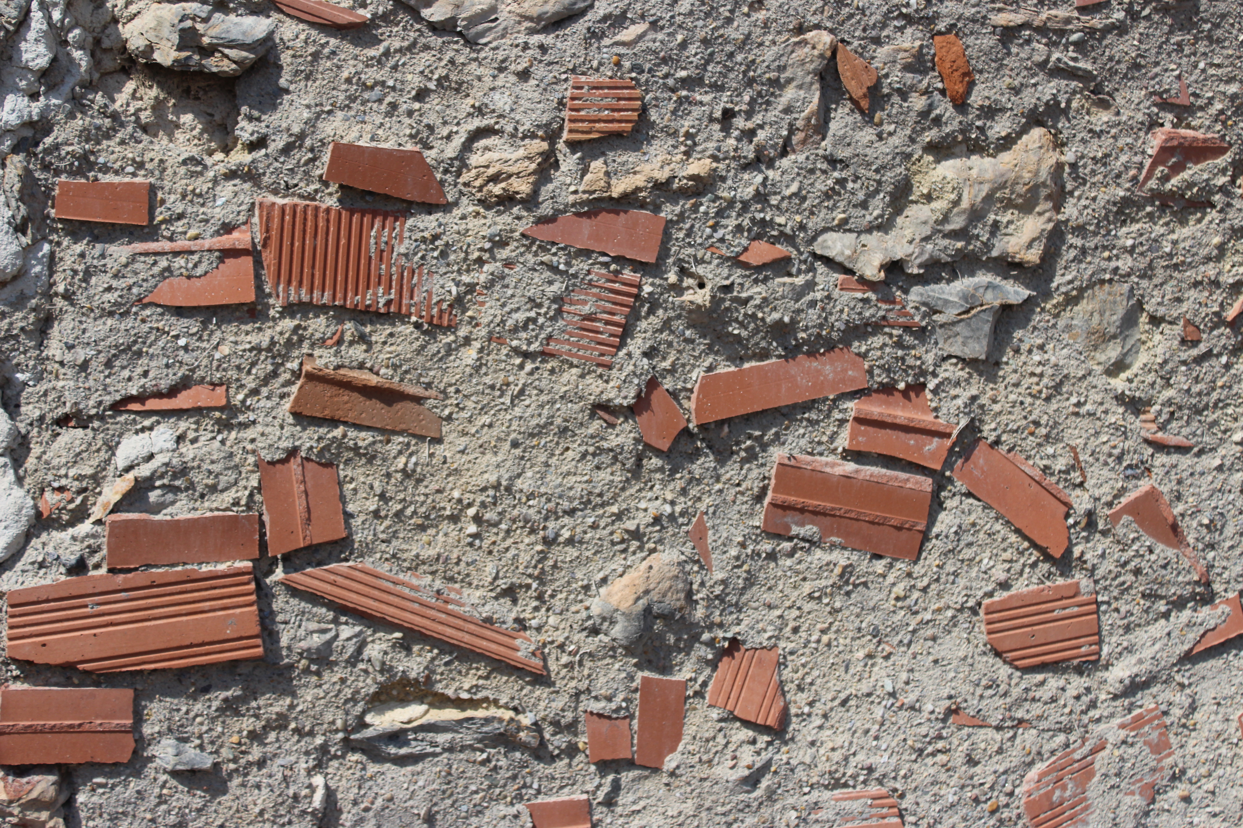
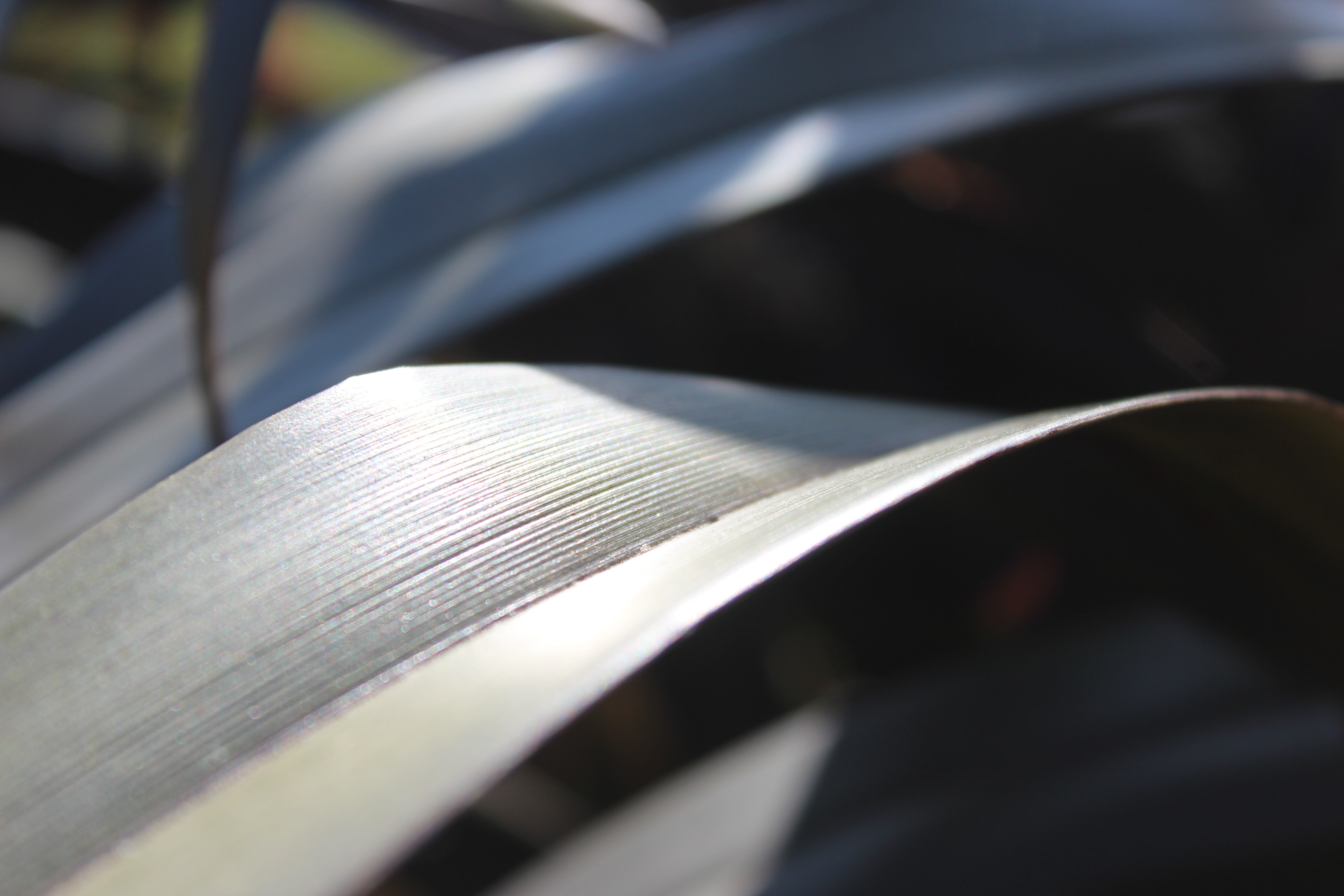
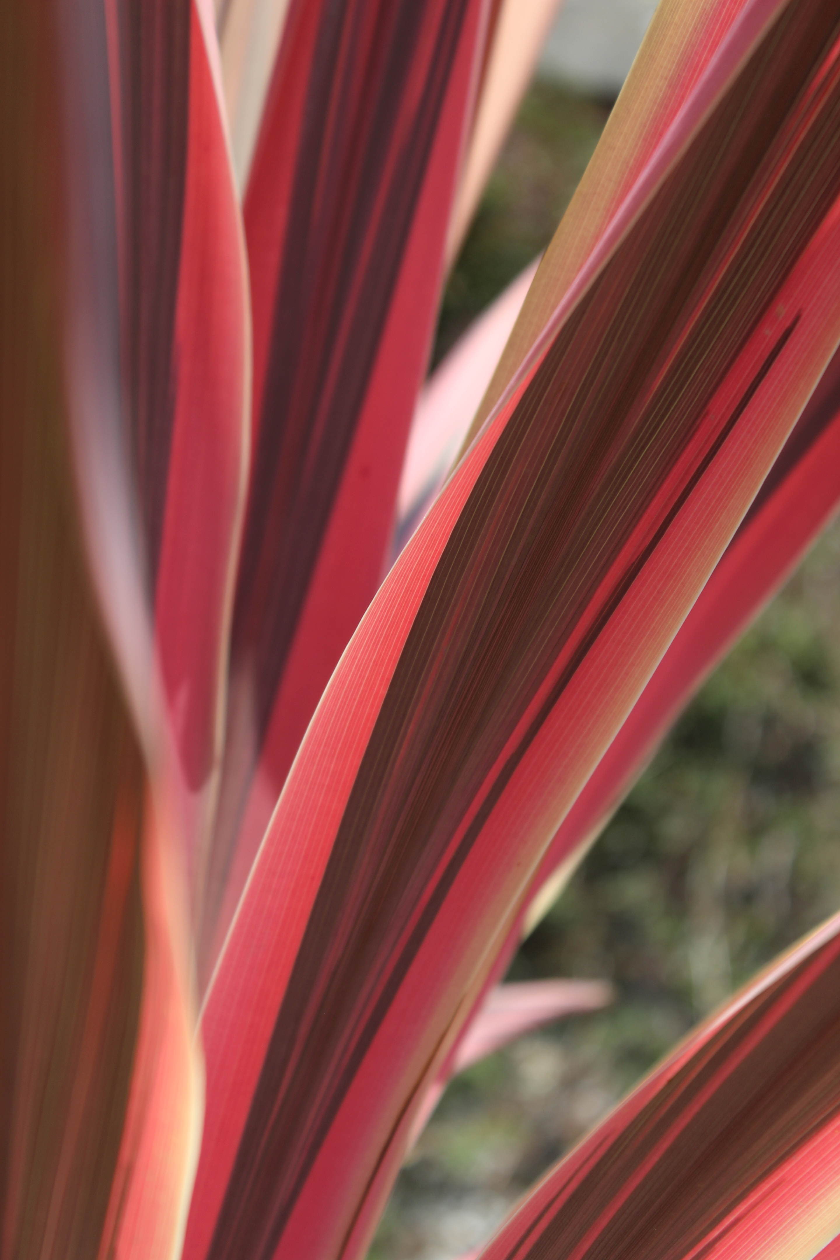
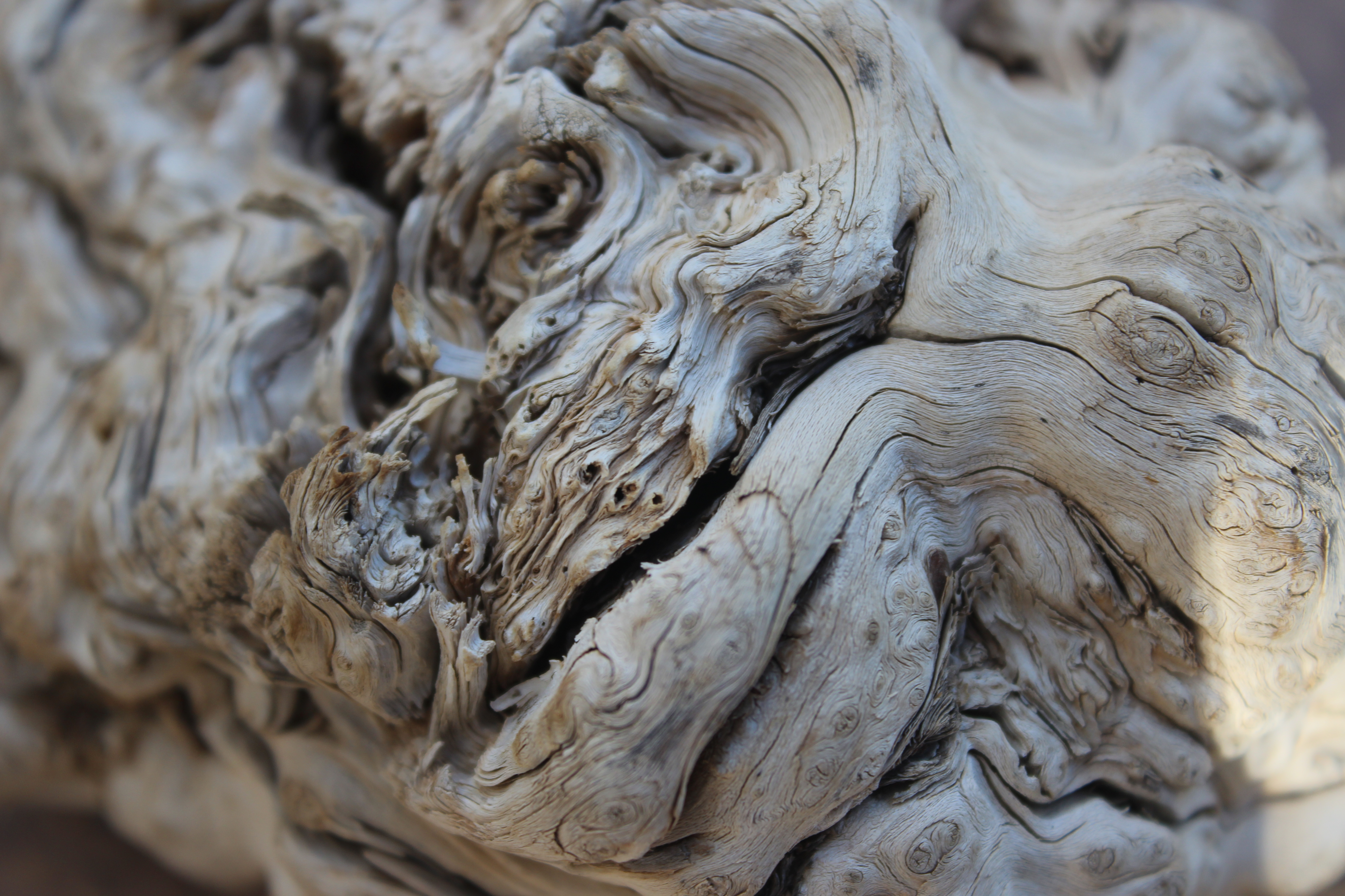
The various width of lines are the main attention in this photo. Since this photo was taken up close you can see lots of detail and texture to the bark. Most of the lines are curved and seamless and create a smooth effect to the image. There’s a lot going on in the image because of the amount of detail captured, creating an unfamiliar image.

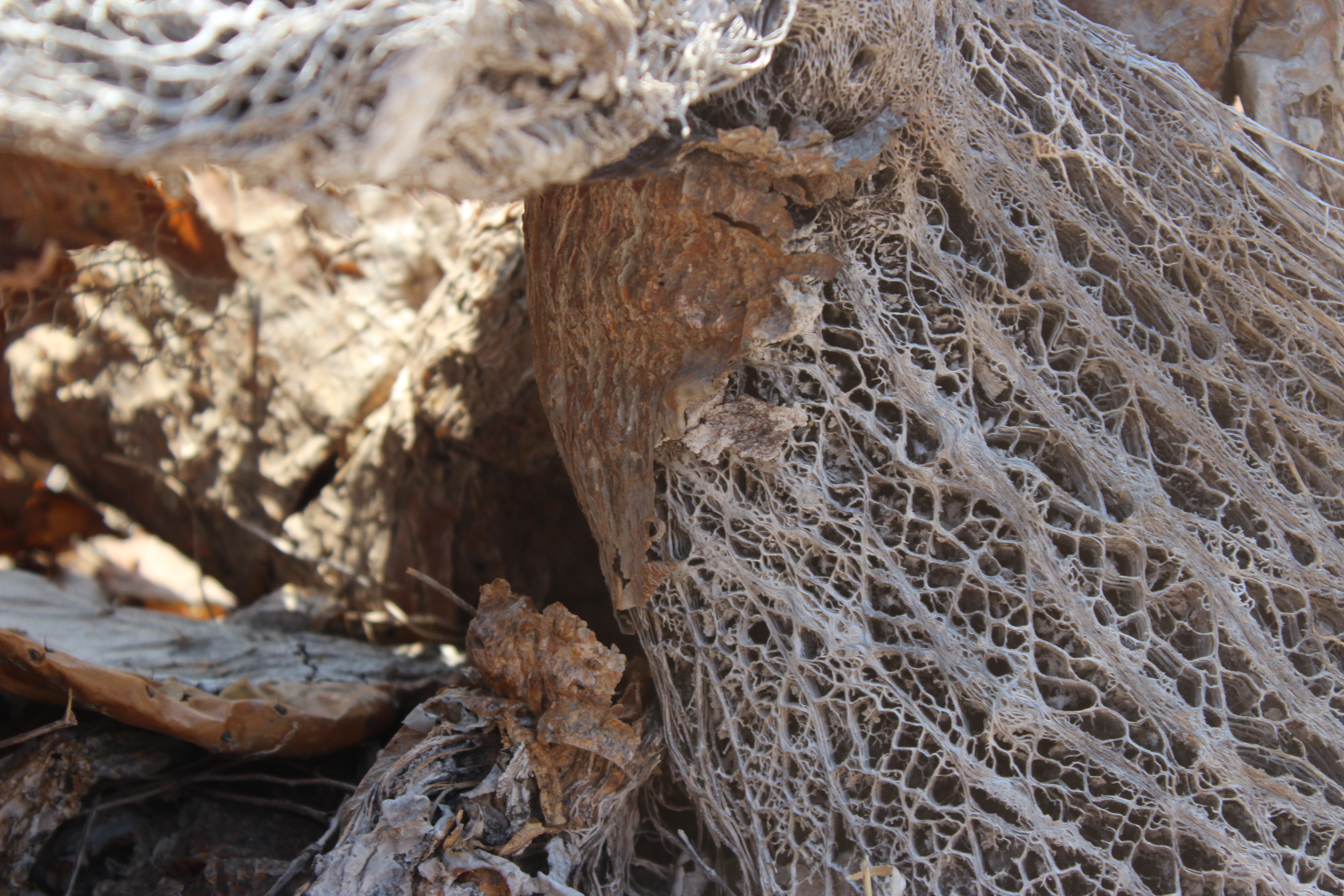
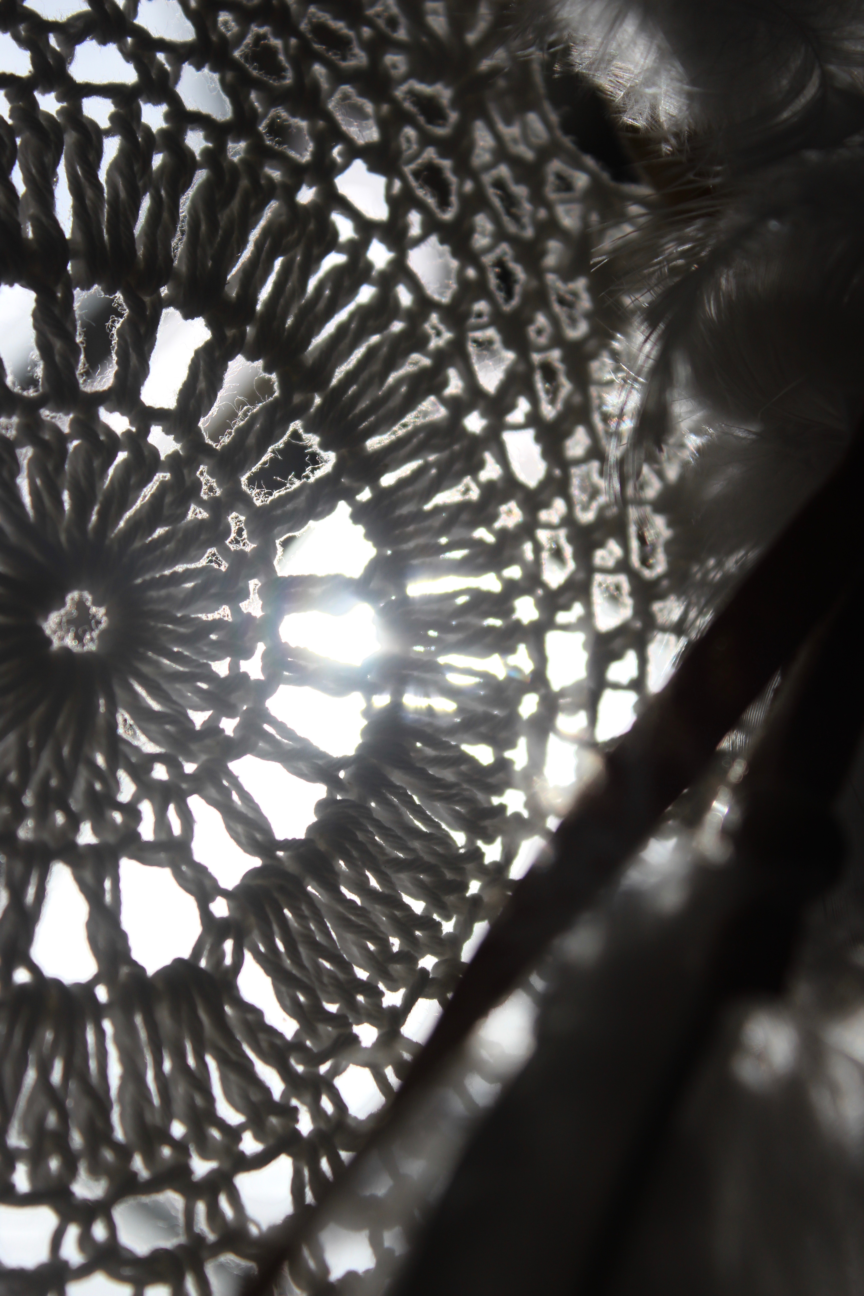
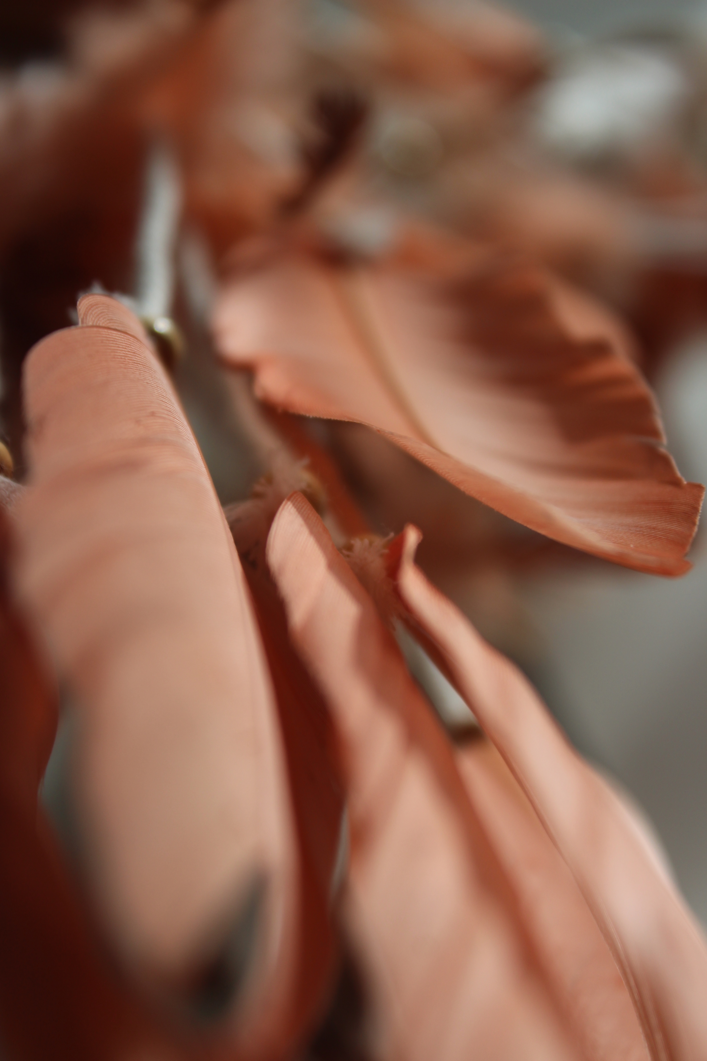
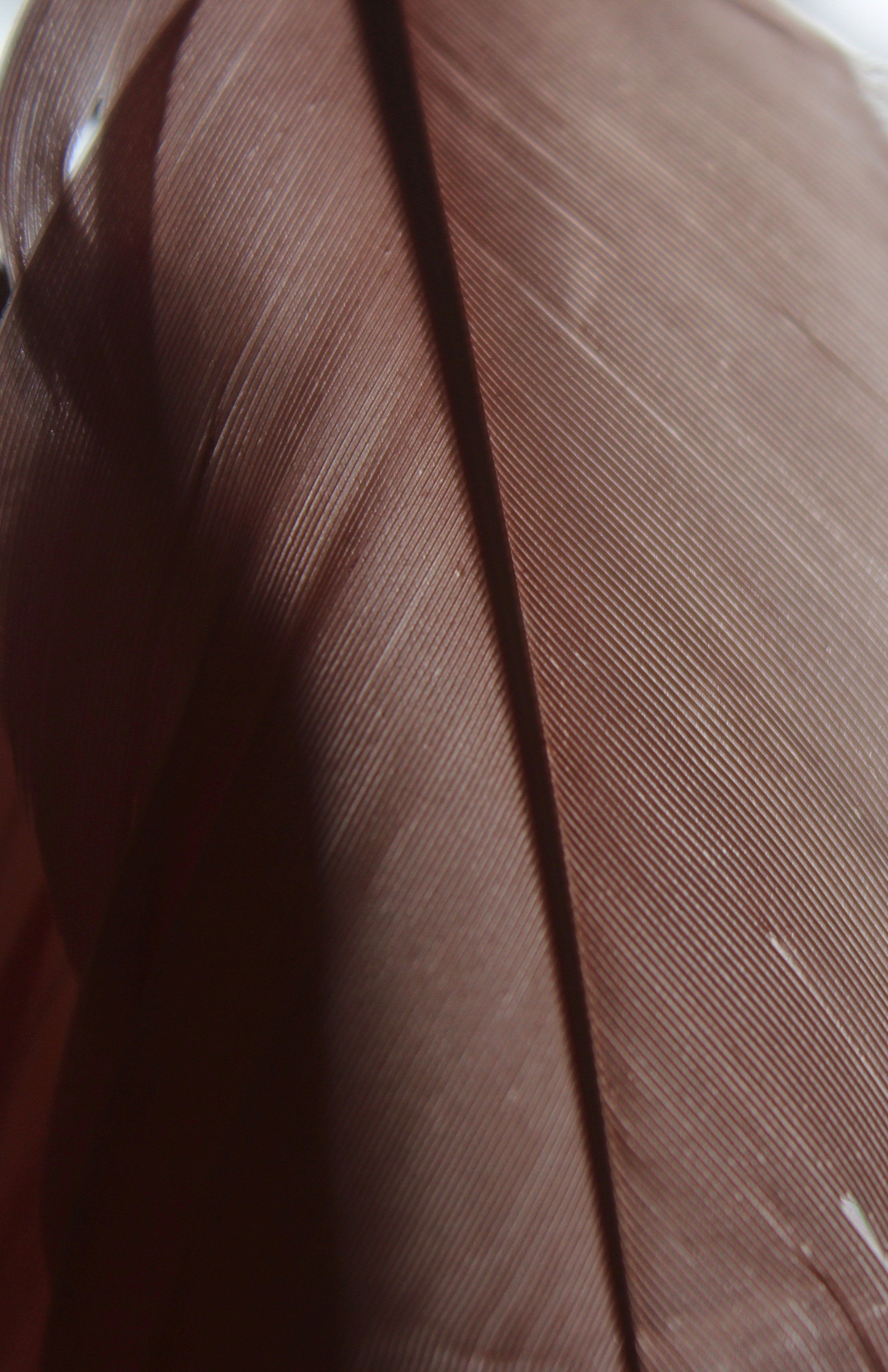
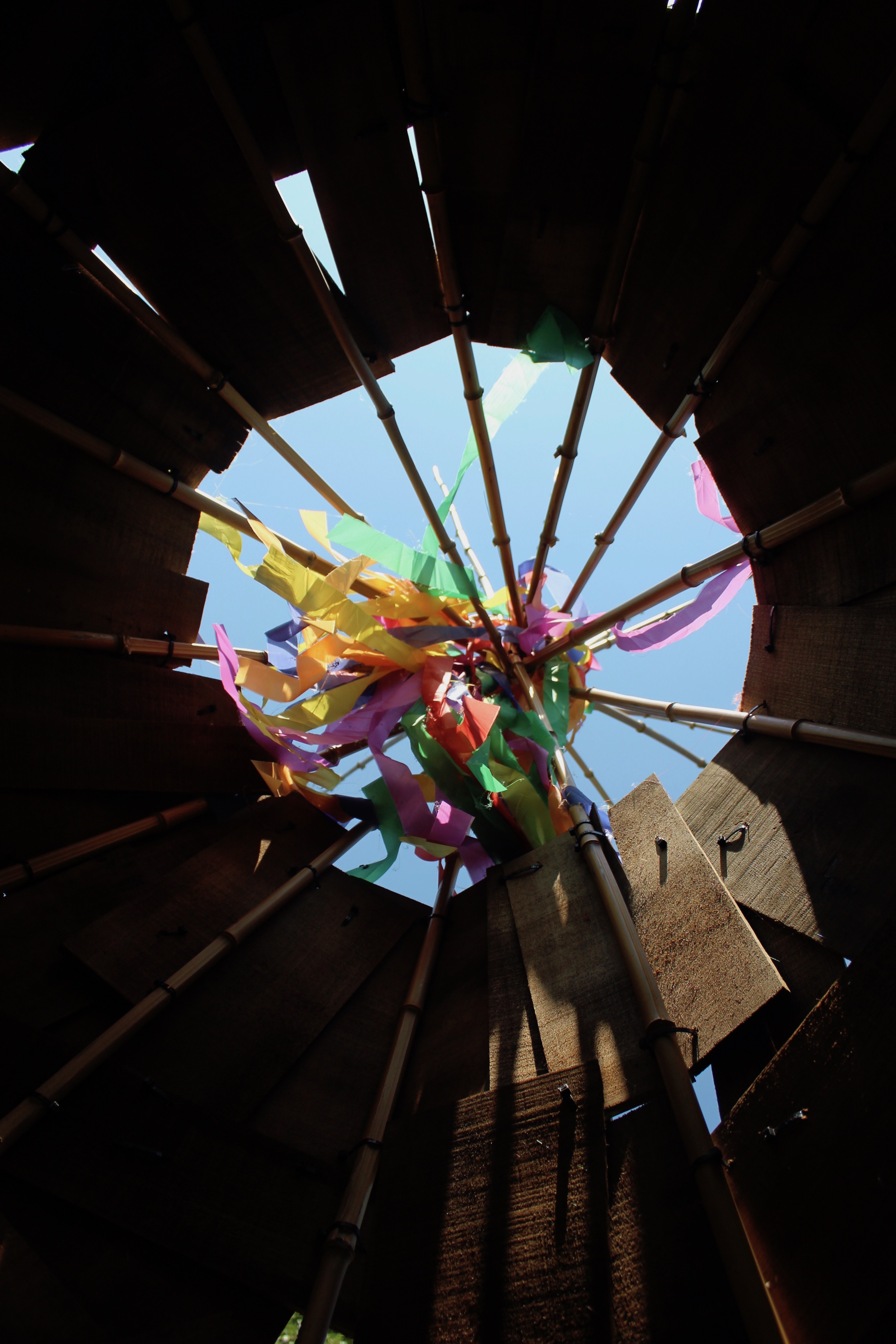
To capture this image I held a dream catcher towards the sunlight so that a light source would shine through the netting. By manipulating the lighting I created shadows and highlights to add depth and interest to my image. The feathers on the right hand side are out of focus by motion so that the main focal point is on the pattern of the dream catcher. I like the composition of the photo and how the foreground is slightly blurred to create layers.

To take this photo I scrunched a bunch of towels together to create an interesting form. The composition is complex and interesting and makes it appear like a ‘landscape’. Texture from the towels can be seen in the front and slowly begins to blur out further away. The aspect of the photo which most grabs the viewers attention is the different shades of blue which greatly contrast with each other.

This photo is of feathers that hang down a dream catcher. Most of the image is blurred since I moved the object side to side so it could create an effect of motion. I like how the photo only captures the edges of the feathers while the rest has been unfocused. The further back, the more blurred it becomes creating a sense of depth which the shadows and highlights also help create.

The sharp vertical line in the middle is the first thing that grabs your attention when looking at the image. I like how one side is focused while the other is blurred. Even through the blurred side the colour is still visible and creates interest to the image. The light specs can also be seen in the background, creating highlight.

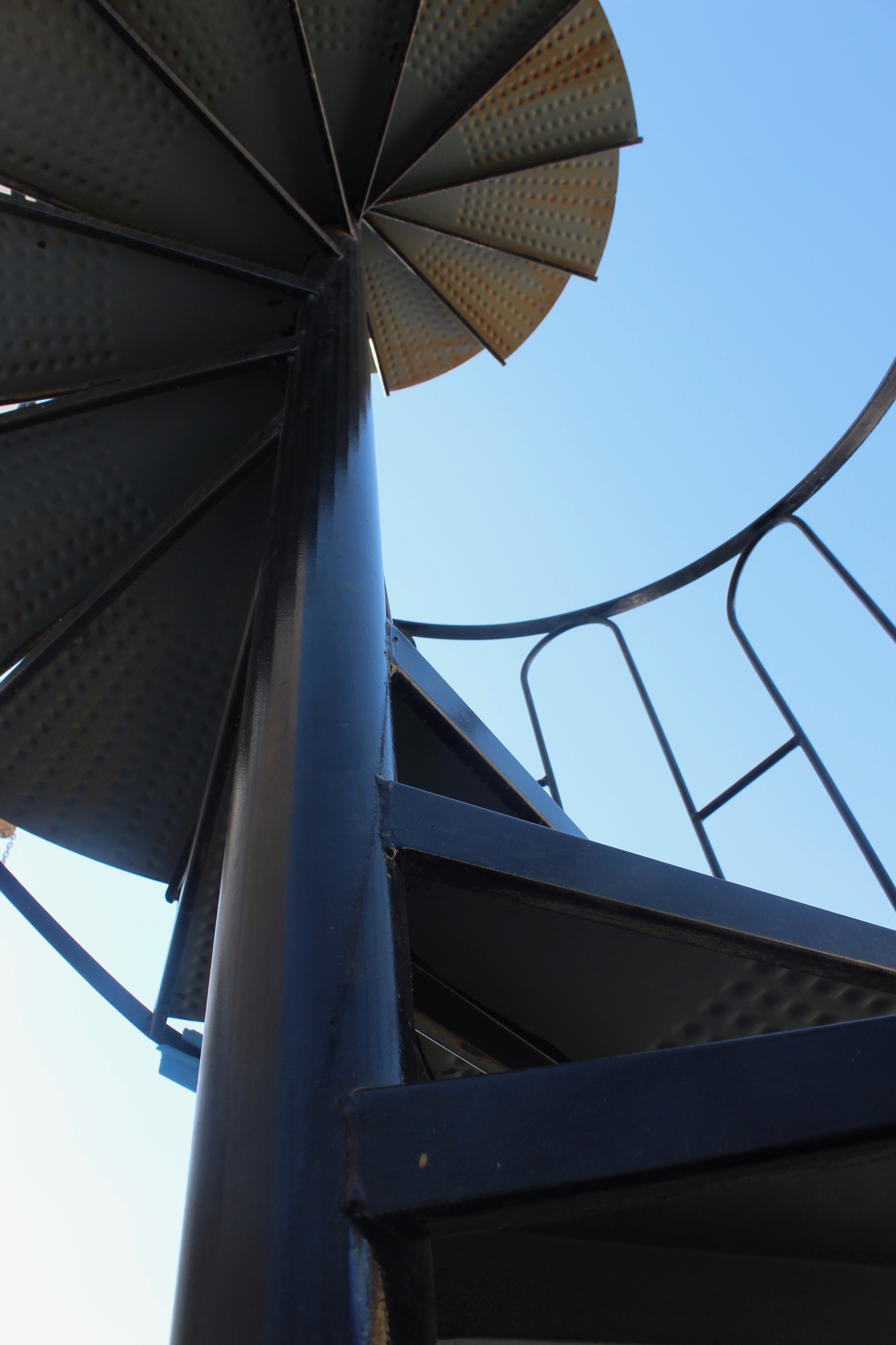
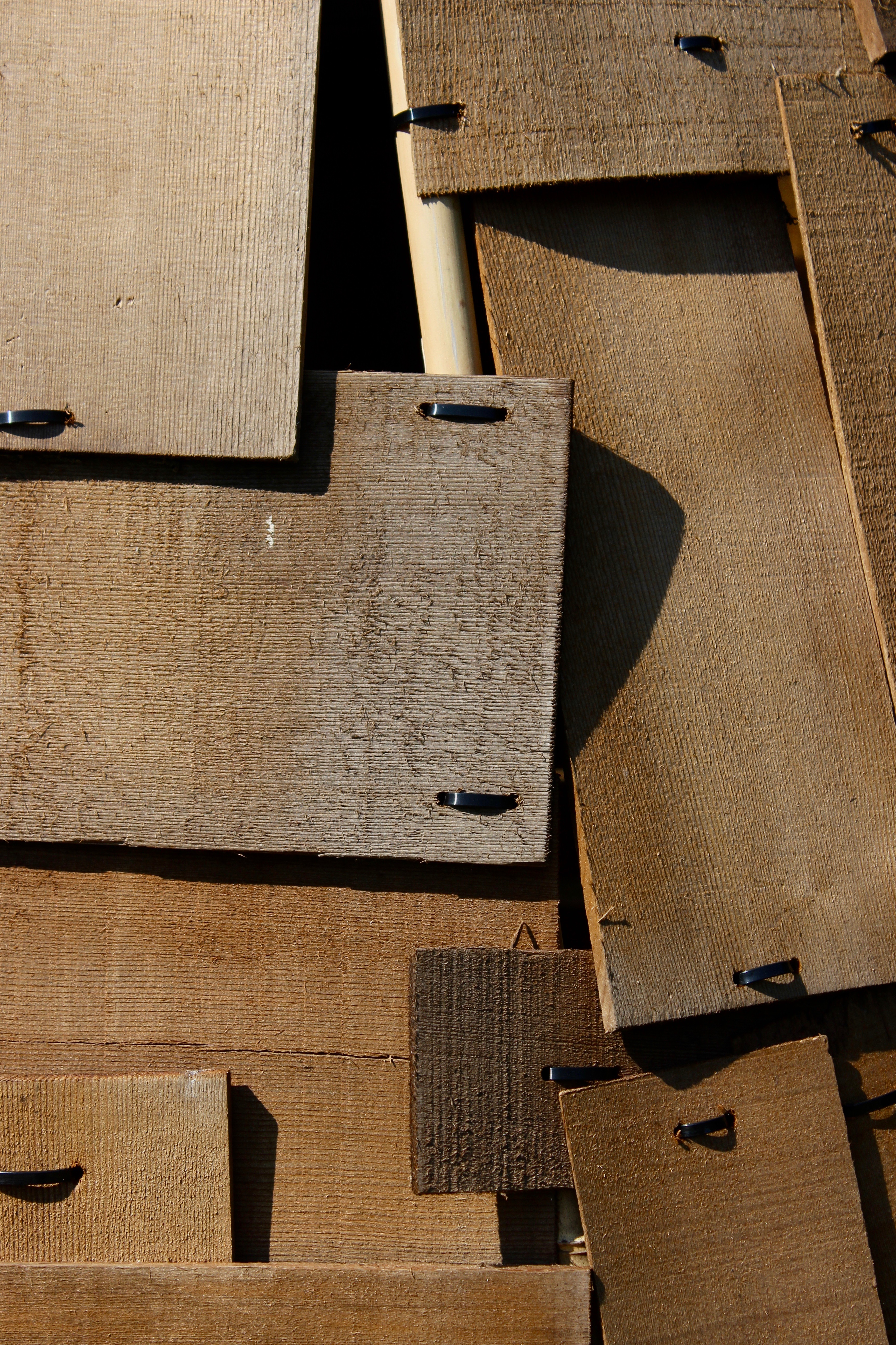
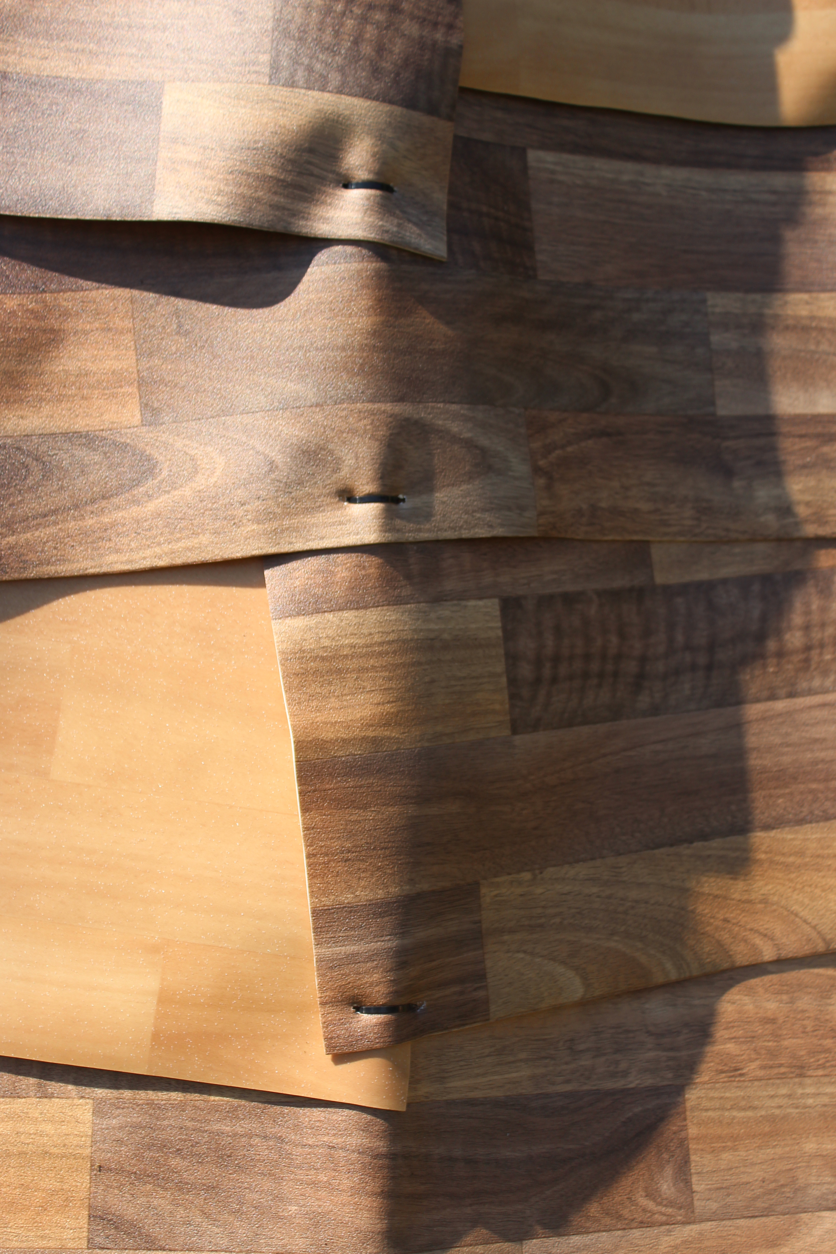
The rectangle shapes form structure to the image and attract the viewers attention. These strong geometrical shapes with straight edges give the photo a powerful visual impact. The shadows casted by the overlapping wood panels create layers to the photo and make it visually interesting.

Evaluation

My understanding of abstract photography has changed throughout the photo shoots as I have learned different techniques on how to create an abstract image. At the start, most of my abstract images were close ups of subjects to make them appear unrealistic. Later on I learned that you can create abstract images by taking pictures of objects with dynamic shapes, texture, patterns, lines and curves, shadows etc. As long as the photo appears seemingly unreal it will count as an abstract photograph. My photos later on did become better abstract images because they had interesting compositions and were becoming more complex than a close up of a subject. The editing afterwards also enhanced my photos to make them appear more abstract however, to create more effect I could of used Photoshop as it has more editing tools to use and experiment with.

Favourite outcome

My favourite abstract image out of the ten is the section of the fan palm. Since the photo is a close up of the subject it appears to look different from what it actually is. When I look at the picture I see stairs because of the wide diagonal lines and the different shades of green that fill the entire frame. My favourite aspect of the photo are the lines since they help make the image more dynamic and provide a better overall balanced composition. The lines are the main feature of the photo because they are dominant and makes the image visually interesting since your eyes travel across. The lighting which is coming from the left hand side helps dramatize the form of the plant since the right hand side becomes darker through shadow, creating an illusion of a staircase. To further emphasize this aspect, I edited the image so there would more shadow; This made the photo a better abstract picture. This image is inspired by Ernst Hass work since the saturation of the colouris high and he has lots of bold colours in his photography. The composition is also well balanced and is simple at the same time which is what make Ernst Hass photos visually interesting and stunning.

edited photos draft

the comparison of the original vs edited

  • here  I have decided to use the pencil tool on Photoshop and draw the creases which where on the paper so it could bring out the shadows on the paper and also on the self.
  • I think that the lines are effect because it brings out the details within the picture.
  • i think that it is a good comparison to the original as it shows the difference on the details and the shadows that the paper ball produces.