EVALUATION 2/3

Black and white grass VS the coloured grass

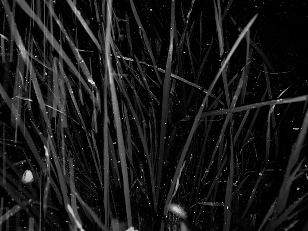
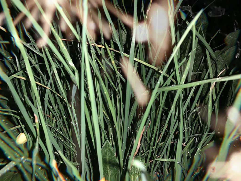
My second favorite piece that I have created were my images of grass using both a black/white adjustment and a colored one enabling me to present the contrast between them. This also allows to emphasis how simply just the color of the image can affect the overall feeling and end results followed by many different types of interpretations. Firstly the black and white image presents us with a much darker type of image with a clear use of flash to capture the photograph. Alongside this the original image would have had a low exposure around the point that the flash reflected of the main subject’s area. The same with both these images I used a canon camera with a much smaller lens enabling me too focus on smaller and minimal subjects however led to an overall greater quality of the end result image. For this first image I evidently used a black and white adjustment to filter into the bright green grass to quite the opposite this gave the image a much colder and darker overall finish to the image. The photograph does have some features of textures due to the white spotty like over lay which add more depth and feeling to it and furthers the idea of the photographing giving a 3D effect. On the other hand the arrangement of the image is somewhat disorganized in the sense of lacking symmetry, due to the disorientated grass leaves in an irregular pattern almost completely avoiding the point of symmetry and straight line. With this all in consideration the colored grass image is all very similar how in contrast provides the opposite feeling for example the green grass image gives off a much warmer and vibrant feeling alongside the fact the image somewhat feelings clearer and of higher quality due to the more obvious shadows from the background adding a further 3D affect compared to the darker images. When displaying these images it was essential that I continued to shows the idea of the two photographs in a complete contrast therefore I presented the images of contrasting shade that complement the end images. The dark, black and white imaged was framed on a black frame compared to the colored grass image which was presented on a white frame, providing more evidence of over comparison. Overall I was extremely pleased with the end result of these two images, although this was not my original intention for this particular set of photographs I’m glad this idea followed on from the previous black and white images.
Making of Final Display

THE PROCESS OF MAKING MY FINAL DISPLAY:

STEP 1: In order to display my final images in a clear and interesting way I came up with the idea of displaying them inside of a cube. The first step in making the whole display was cutting out the appropriate materials. Initially I wanted all 6 faces of the cube to be clear but I ended up using 3 faces of fiber board instead. This made it a lot easier to work with as the clear acrylic sheets can be easily scratched and therefore can end up looking messy after working with them. Each face of the cube is 210 mm x 210 mm, which is the same length as the shorter side of an A4 sheet of paper. I did these measurements purposely as it would make measuring out and cutting my final prints a lot easier.

STEP 2: The next step in assembling my final display piece we gluing all the components together. The easiest way I found to do this was using a glue gun. I thoroughly coated each side of the acrylic and stuck them together, repeating this process with the fiber board.

STEP 4:I then moved onto painting the edges and part of the sides white. I did this as when I was measuring out my prints and seeing if they fit the display, I found that a small error margin was inevitable. I used white acrylic paint to make the whole piece look a lot more uniform and neat. It also meant that there was a more seamless transition between the white boarders of the prints and the edges of the display. It was overall a lot more harmonious looking,

STEP 5:I then moved onto sticking in place my final prints onto the fiber board. I used spray mount adhesive in order to secure the pieces to the wood, coating each piece thoroughly with the glue, sticking it down and using a ruler to smooth out any bumps. I used a Stanley knife to even out any rough edges of the wood and display.

STEP 6:Finally I put on the clear side of the cube and used a cloth to remove dust and other particles of the surface of the acrylic.

IMAGES OF THE PROCESS:

Assembling the materials into one half of the cube
Measuring the inside of the cube and marking the images to fit
Cutting the images to scale
Painting the edges of the cube white in order to look more uniform and neat
Using spray mount in order to stick the images to each side of the cube

Comparing Final Images to Marko Köppe

My final images are inspired by Marko Köppe’s style as I love how he uses random photos of things that relate to the main part of the image. I think I was able to capture his style but still keep my style in the photos.

I think this photo shows Köppe’s style the best, but still shows that it is my own style as well. I also think I managed to get down his aesthetic perfectly.

I also think these three photos capture Köppe’s style really well and I think they were edited really well.

Heath Ledger Response-2

Below are my 4 final responses to Heath Ledger’s art/photography. I used the photos which I took and edited in my previous blog post on Ledger. In the end I didn’t end up using all my photos because some weren’t that interesting or good and I didn’t have time to think of an idea of what to create on them, etc. The materials I used for these were tubed water-colour paint, acrylic paint, white ink and a piece of wood which I used to scratch into the pieces.

Leah in my bedroom.

This is my favourite out of all of my responses, as it uses the most materials/colours and really stands out. I took inspiration from Ledger’s version of his girlfriend. I used the same dots of paint on the face and on the wall. I also filled in the background part in solid colour like he did. Another thing I took from heath was the white lines/scratches which I’ve used in almost all of my responses.
Materials:
pink border – pink stabilo highlighter
green dots – sap green tubed water-colour paint
red splats – cadmium red acrylic paint
yellow background – yellow acrylic paint
white lines – uni-ball white pen

Street in town near Springfield.
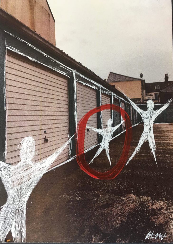
Garages near millennium park.
An old man on the bus.

Ryan Mulford

“Ryan Mulford (b. 1987) is an American artist.

His career began as a designer, creating award winning work for leading advertising agencies and global brands. In 2010 he transitioned to contemporary art.

As an artist, Mulford has developed his own distinct style—appropriating imagery and redefining the context. He has pioneered an innovative creative process that seamlessly blends vintage materials, modern technology, and traditional mediums.

Mulford lives and works in Northern California.”
https://www.ryanmulford.com/about-ryan-mulford

Examples of his work:

Ryan Mulford
Ryan Mulford
Ryan Mulford

My Plan:

For this project, I will be using photos from my beach photo shoot and my bus stop photo shoot. I will be using the style of the shapes of the beach photo on top of the bus stop photo. I will mix my style with Mulford’s style.

Final Outcomes (Editing Process):

First Image:

Placed the beach photo on top of the bus stop photo
I then used the rectangular marquee tool to cut out sections of the beach photo
Final Outcome

I really like how this image turned out. I think the blue and colour of the sea and the brownish colour of the bus stop image work well really together. I also really like the contrast between the two images.

Second Image:


Placed the beach photo on top of the bus stop photo

I then used the rectangular marquee tool to cut out sections of the beach photo
I then turned the background to black and white
Final Outcome

I am really happy with this photo. I think the black and white really compliments to the diamond shapes of the sea.

Third Image:

I first turned the image to black and white

Placed the beach photo on top of the bus stop photo

I then used the rectangular marquee tool to cut out sections of the beach photo
Final Outcome

I am really happy with the outcome of this photo. I really like the simpleness of the four lines, I think it gives the photo a very clean and aesthetic feel to it. I also again like the contrast between the colour of the sea and the black white background photo.

Final Displays: Layout planning

I have decided to display my final pieces in a range of different ways that are shown and explained below:

1)For my first display, I will be displaying the images from photo-shoot 2 on foam board, all 3 separate images that are not physically connected, but will be shown next to one another. I have decided on this as I feel it is the best way to draw maximum attention to all 3 images, and as they are bright, A3 images, I feel that by not adding a boarder, the colors and brightness of the images can be better emphasized.

2)The ice images from my 3rd photo-shoot will be displayed on black display card, with a frame that boarders the whole image. I will not be using the frame to separate the images, as I feel that by leaving the image and not segmenting it, I can better create a sense of continuity between the 3 images, showing the ongoing journey of the ice from solid to melted.

3+4) The other 2 3-panel images will be displayed using the same framing technique, but will have the frame separating the 3 panels. I will be doing this as I feel in this circumstance, each image is different ans separate enough to show the 3 images as 2 completely separate points in time of the flowers lifetime. I feel that by basically framing each image individually while overall having them framed together, I can draw attention to each individual image and the differences between them, while also showing that the whole image together represents the journey of the same flower over time.

5)The final display includes 2 images, that will be displayed together to show the similarities and differences between them. One of the images is portrait, while the other is landscape. They will be displayed perpendicular to one another, (making a right angle between the 2 images) in a portrait display. I will do this, as the final product will be able to stand either vertically or horizontally. As one image is portrait and the other landscape, I feel that this will disconnect the 2 images, as one will always be turned the wrong way whichever way the display is stood. By disconnecting the 2 images in this way, I will be able to emphasis the contrast between the 2 time periods, while still displaying them in the same display.

EVALUATION 1

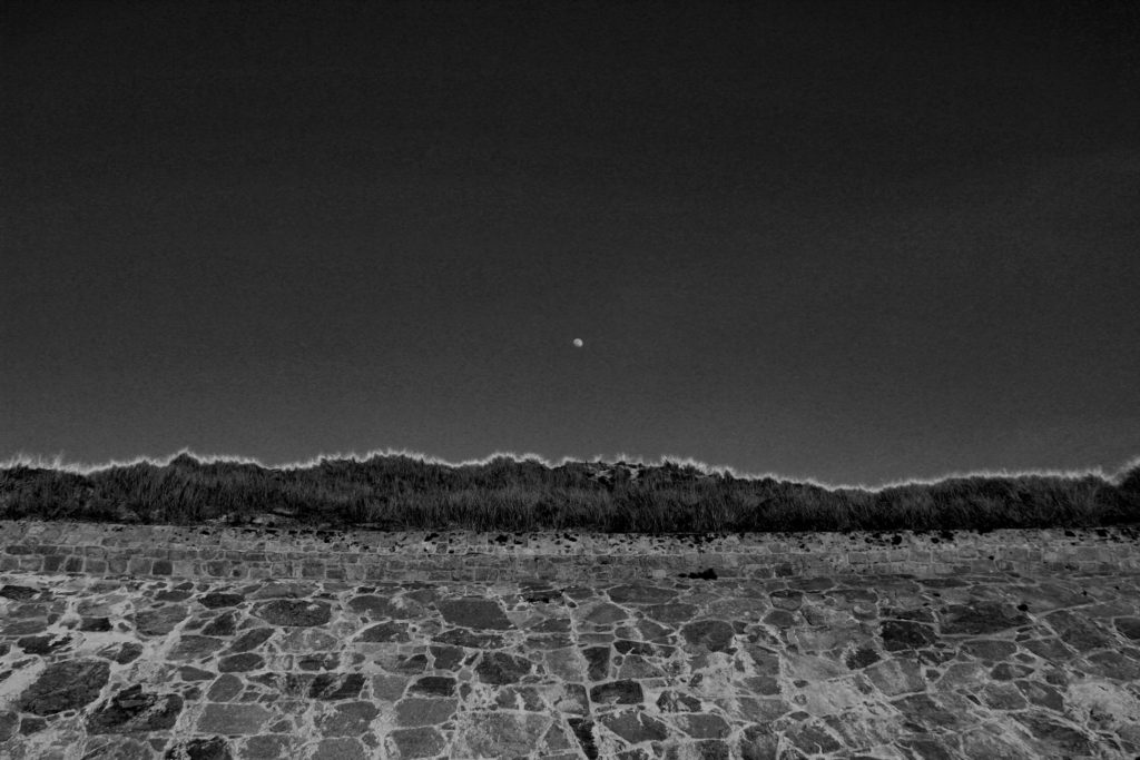
Overall I was extremely happy with the final outcome of this image as when picturing the final outcome in my head and then the final outcome proved to be extremely similar. This image is effective due to the contrasting in shades of black and white. As previously mentioned in the editing blog for this image, it was essential to me whether the photograph stayed in color or convert to black and white that the moon was clear and completely contracting with the sky color in order to give the most dramatic effect. I can happily say I believe I achieved, with not only the moon standing out in the white shade against the grey sky back ground, but along the top of the bank I have managed to enhance the yellow tips of the plants in order to create a further more powerful effect on the overall image. The due to the editing of the black and white shades the lighting of this image had proven to become much darker than the initial image and has removed most removed most natural lighting effects and almost gives off the feeling that a flash was used overall to me producing a much colder and evidently darker image, with burst of white and light grey shade beaming through. The photograph clearly is intense due to the differential shades being portrayed throughout with a regular exposure enabling the darker shades to be edited on to the image. As previously mentioned I used a 18-33mm canon lens to help capture this image, this image allowed a large zoom out to be able to capture a large majority of the wall, moon and sky. Visually the photograph has a clear sense of symmetry due to the the straight wall, clear sky and the moon being center, this to be provides a more aesthetically pleasing view to the eyes. Of course portraying an organised layout and proves the view point to be pretty much looking straight ahead at the wall, however could be argued with a slight angle up more towards the sky and the top of the wall. On the other hand the images very much lack texture this could be due to the sharp shades used and the lack of shadows being presented leading to a more 2D feel. Overall I am extremely happy with this image, if I were to redo this photograph I would try figure out a way to interpret texture to give a further feeling leading to even more opportunities for interpretation.