The Next Step – Reworking my Images Process

For my first final piece, I cut out the outline of my grandma with a stanley knife. I then got a piece of plain white A4 paper, spray glued it and then added the gold glitter dust to it. I then spray glued the back of the photo and then layered it on top of the glitter paper. I then used red thread and sewed an outline of my grandma. I then layered the photo on a piece of black paper and made a border for the image. 
For these images of my dad, I used a stanley knife to cut out the outline of my dad. I then spray glued him onto the original image, and then sewed a clock and an outline around the smaller image of my dad. I then spray glued the image on top of a piece of black paper
For my final image I used a stanley knife to cut around the outline of the original image. I then spray glued the original image into the reworked image, and then sewed around the children in the reworked image.  
I then spray glued the image on top of a piece of black paper

Evaluation

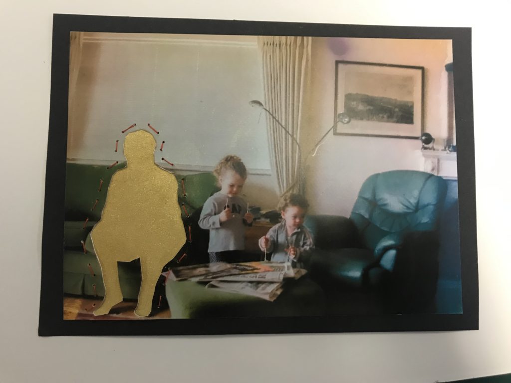
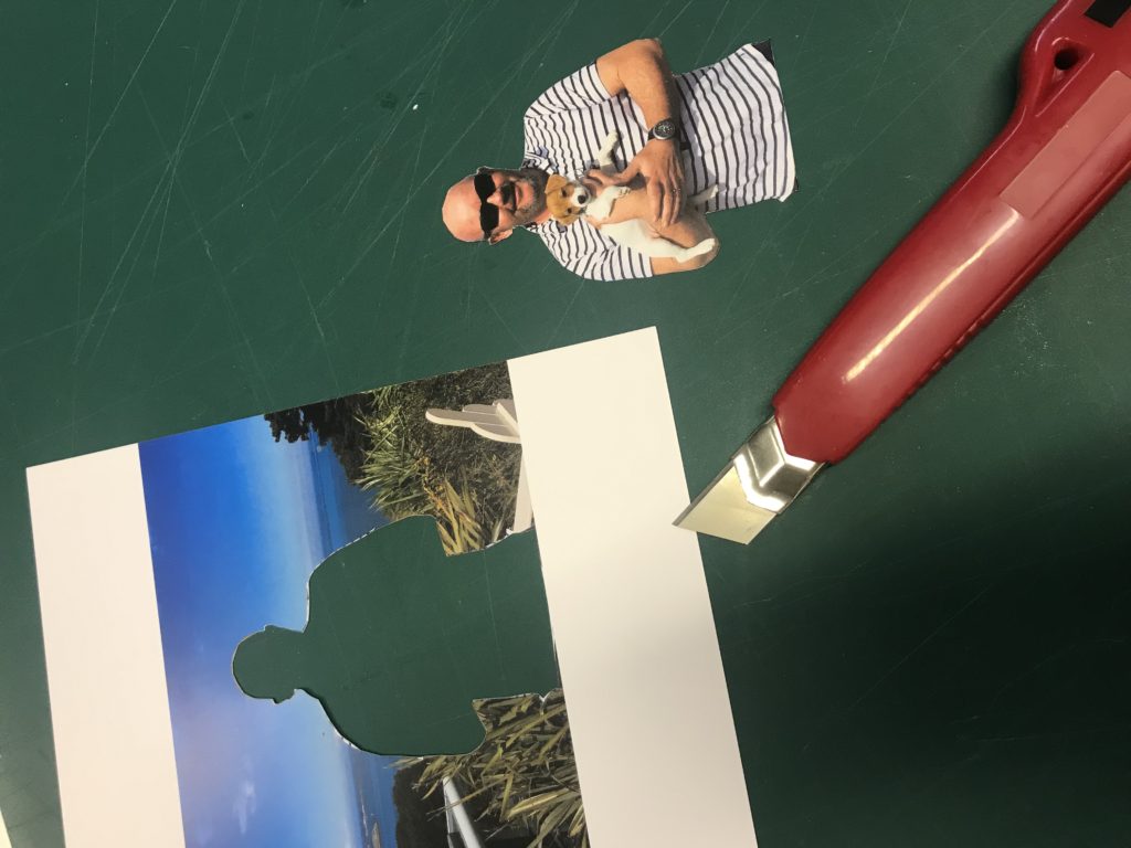
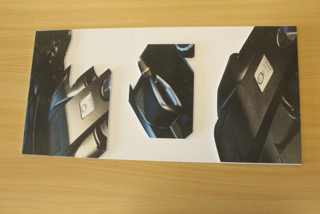
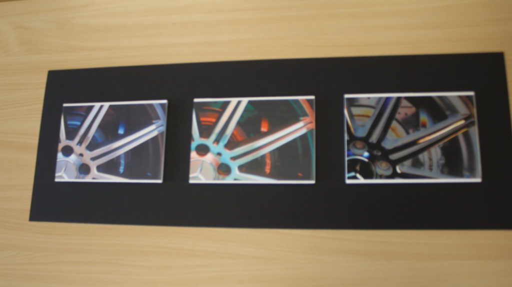
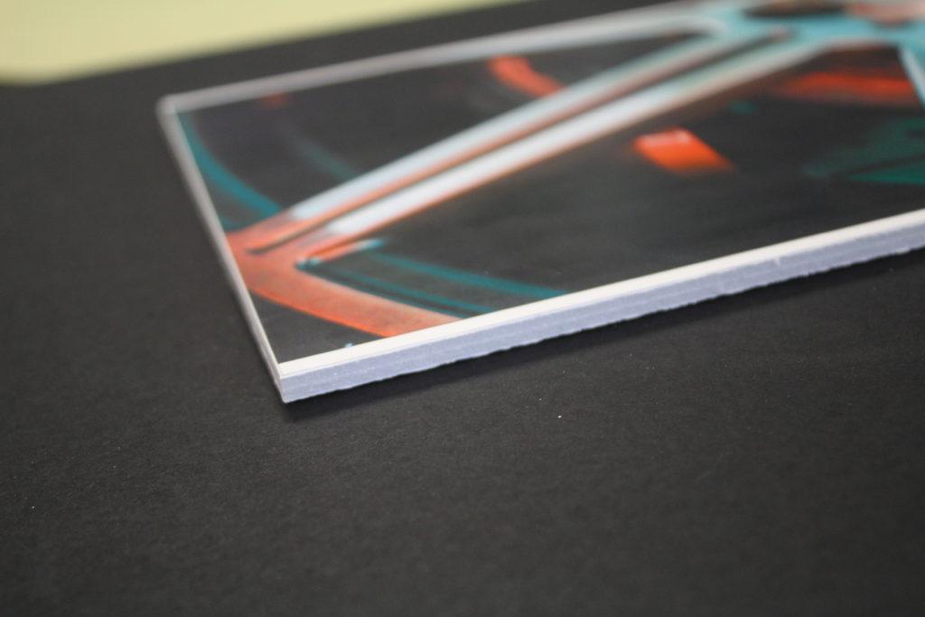
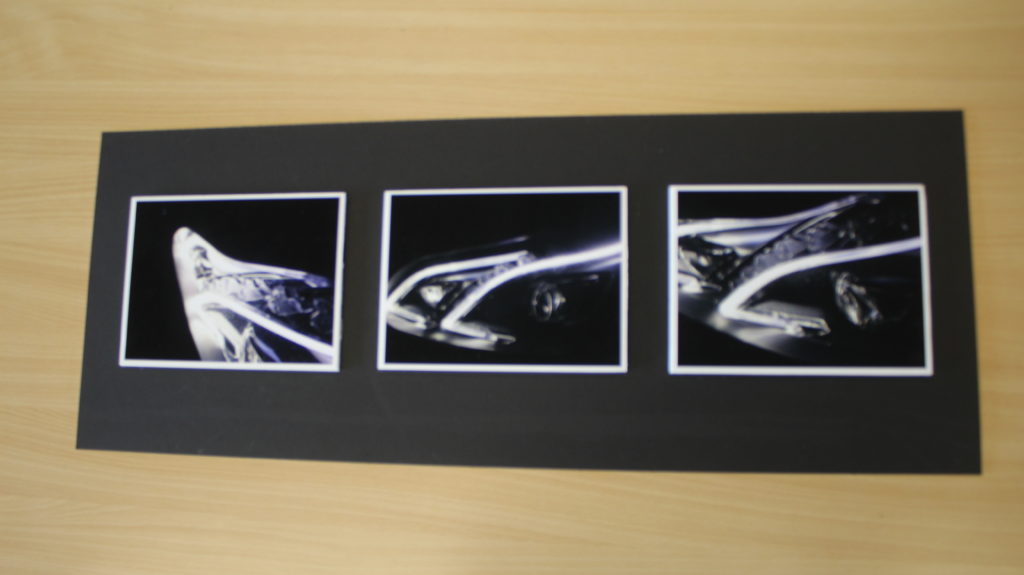
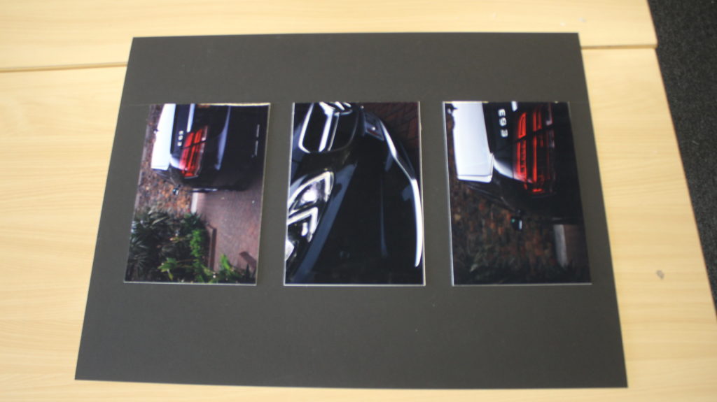
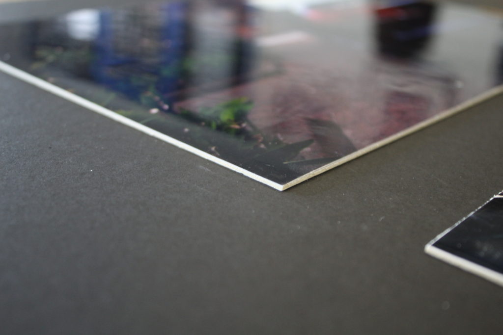
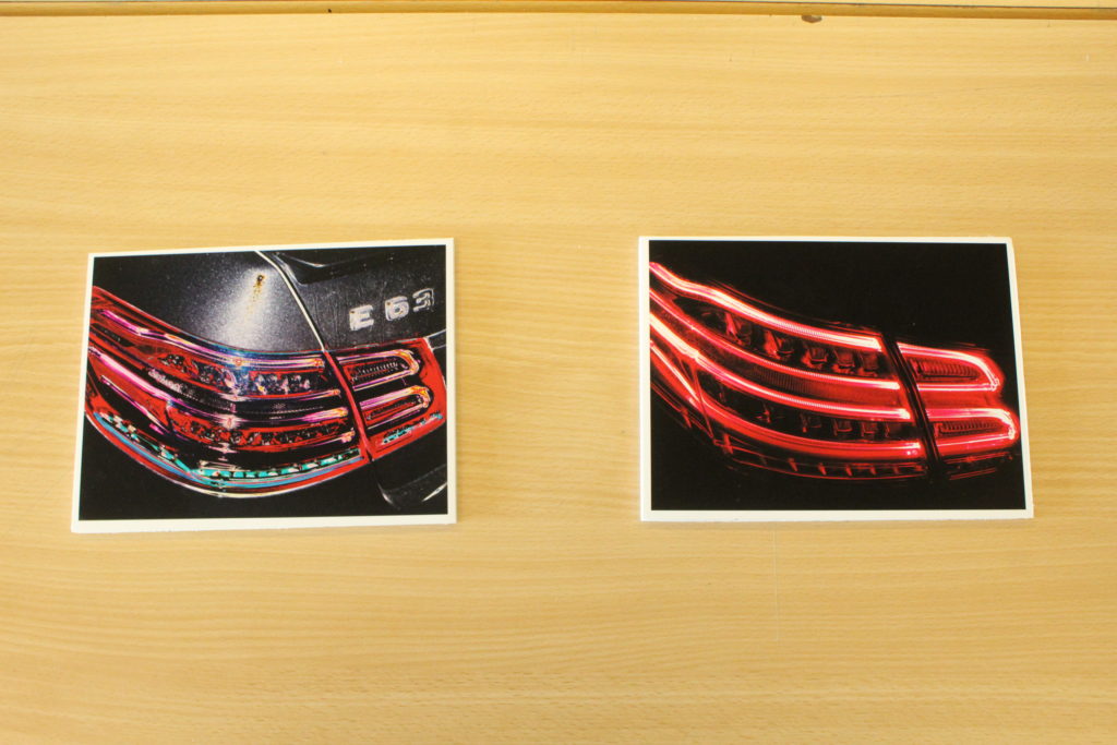
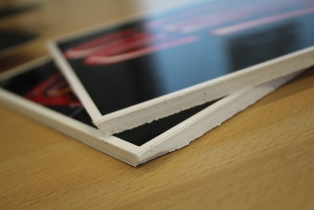
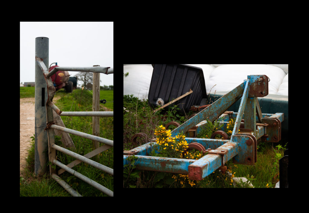
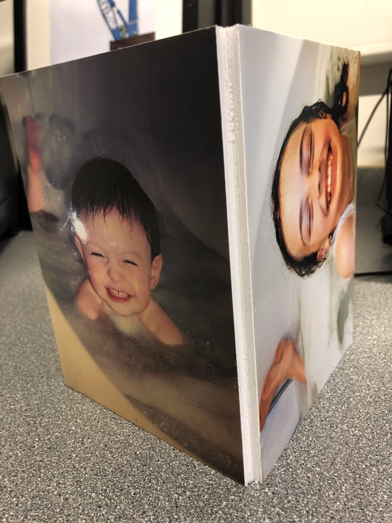
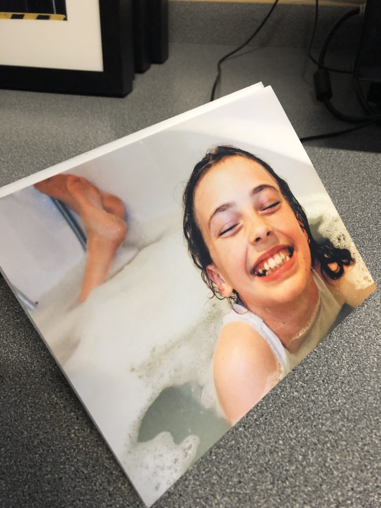
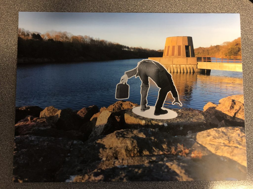
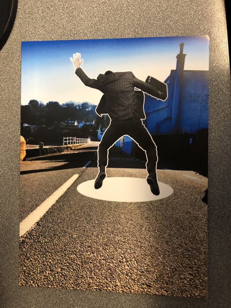
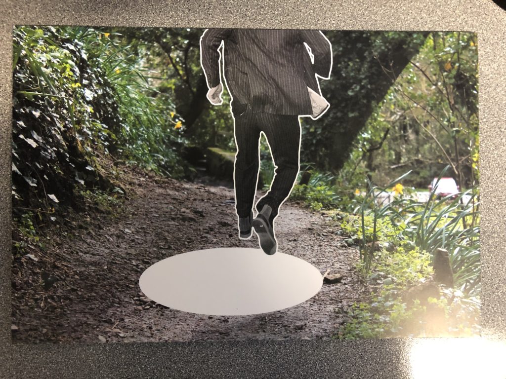
I am pleased with my final piece, I have produced a scrapbook/photo album of holiday photos of my chosen destinations of Jersey and Thailand. My concept is of the journey of these two places in the world of tourism and economic incline. I focused on how Thailand has taken a pathway of in the short-term a success as after the tsunami they managed to get back on the horse and rebuild their lives, but in the long term their argent need to return to normal life has destroyed their once bespoke and isolated scenery, now all it is a tourism feeding ground, the sustainability of their pathway ceases to exist. Whereas Jersey’s plan, although we are running out for houses to provide for people we are thinking of our landscape on the coast and the importance of it’s preservation. My concept hasn’t always been clear, at the start I was steering towards the idea of time, then I thought about the concept of travelling, with led me to my final concept. Overall the theme of ‘journeys and pathways’ is a reasonably broad area and I found it could be easily linked landscapes, which is ideal for Jersey, so I went on my fourth photo shoot to my favorite beach and the most popular tourist destination, St Brelades Bay. Even before knowing the theme I wanted to explore landscape, as I hadn’t done any to my best standard throughout the duration of the coursework as it was focused on abstract and portrait. I took my first inspiration from Mark Powers when it came to my Jersey photos as I wanted the focus to be on the sea and how powerful it is in its looks and movement, but then as I progressed I veered away from Power’s ideas of how dependent people are on the ‘shipping forecast’ and more into how the people of Jersey are dependent on it’s beaches and weather because it’s our islands main marketing point for tourism, which is a huge sector in our economy. When taking my photos in Thailand I took inspiration from my case study photographer, Andrew Quilty and how he took photos in artificial lighting rather than the sun and I wanted to do this as a contrasting point to my Jersey photos which are in completely natural lighting from the sun. As well as that I wanted to highlight like Quilty the culture in the country I was photographing and how it’s completely different to ours. For instance how night life for locals is so important, it’s the time when you get the most customers, as it is when it’s cool enough to actually be away for air conditioning. Night markets in particular are very popular, where fakes, food and merchandise are sold, to locals these stalls may be their only source of income, which supports my concept that Thailand is overwhelmingly reliant on tourism. My editing process could have been made more complex if I were to have done it again but I feel that overall the simplicity of it worked well with my final display as it looked like genuine holiday photos a person would print off. I did go through problems when editing my photos as it was pointed out to me that although the photos were clear on my computer, they won’t be as bright when printed off, so I had to rethink my selection process and also consider the images with reasonable amounts of light in order to have the best outcome when in print form. This meant that I had to experiment a lot with exposure and brightness and I found it challenging to be able to keep the quality of the photo as well as increasing exposure, but I worked around it to create 12 final outcomes for my Thailand night photo shoot. If I were to have more time I maybe would have looked more in depth into Thailand and how it affected the people who leaved their and their personal accounts of what they had to go through to get back on their feet. In conclusion, I am happy with my final outcome and the concept I have based it on and in my opinion the theme the exam board set was very ideal for me and I found it enjoyable to come up with a concept and execute it.

Framing prints

The following are photos of my prints after I have framed them.

This is a photo of one of my displays; I stuck two A4 and one A5 photo onto foam board, then cut out empty sections to emphasise the focus of the images.
This photo shows the thickness of the foam board.
For this display I cut out three A5 photos and stuck them onto foam board, then stuck them onto black card with equal spacing between them.
Again, this photo shows the thickness of the foam board which the images are stuck onto.
This display was made just like the previous one with foam board and black card, except these photos are printed with a gloss finish.
For this display I have used three A4 photos. They have been stuck onto white card and cut out, then stuck onto a larger piece of black card with equal spacing between them. These photos also have a gloss finish to them.
This photo shows how the white card is much thinner than foam board, but still raises the photos above the surface of the black card.

The following 2 images are of two more images which I have just stuck onto foam board due to running short of time, they are also printed with a gloss finish.

Presenting The Negatives

To present I wanted to show the film and push the fact that I was using film. I could have done this by printing the images and then saying that they were taken on film but using the slides also gives a certain aesthetic with the fact that the colours are inverted on the negative slides.

The way that I framed the negatives is by cutting a hollow rectangle out of some hard card and then sticking the negative to this in the order that they were taken, I then numbered the frames so that they could be easily kept in order. Finally, I made a small box from foam to contain the 6 sides that are not on the light box.

Journeys and Pathways – Evaluation

At the beginning of the Journeys and Pathways exam I wasn’t sure which subject/topic to focus my time on. Therefore I started mind-mapping and creating a mood-board of my ideas. Initially I was thinking about urban landscape and street photography, which I did end up doing for a part of my project. Later in the project I wanted to move on to a more art related topic such as street art and how it has evolved. I also initially wanted to do some work on Alice Wielinga and make some comparative photo-montages of expectation vs reality of Jersey, however I didn’t end up making a response to that as I wanted to focus more on the art side of things and reworking photos as that’s what I am more passionate about and enjoy more.

My first photo-shoot was for developing the archive photos into something more. I went into the same places that the photo had been taken in 40 years earlier. I planned to print out the two versions of the 3 different photos and then to take some acetate and cut them to size so that they would fit over the modern photos. Next I took a fine tipped white ink pen and drew over the outlines of everything in the modern photo this was inspired by my case study on Gosia Wlodarzak. Once I had finished this I displayed it over the top of the archive photo, however just off at an angle so it could show how much the same place has changed overtime. The pieces of acetate didn’t exactly match the photos which is what I predicted would happen, however I still really like the way it has turned out.

After this, I moved on to looking at art on the streets (or the lack of it) in Jersey. At first I wanted to go out and try to picture local murals/graffiti around in town. Unfortunately I couldn’t really find any and most of the ones I did find were discoloured and old. So I came up with the idea of just taking photos of some streets and whatever else I thought was interesting and drawing over the top of it. As a part of my response to the Journeys and Pathways title I wanted to explore topics such as street art and how it has evolved over the years. I also wanted to experiment further with editing my photos by hand and using different mediums such as paint, coloured pencils and cutting/ re sticking things together, this was in order to show what usual everyday streets in Jersey could potentially look like if more street art was incorporated. Therefore, when I was searching for artists and photographers to make case studies on and develop from I saw some of Heath Ledger’s art and photography work in amongst these. I have always really loved his acting work as he was very talented but until recently I wasn’t aware that he was also a keen artist. Overall, I did really like how my set of images turned out, I think I researched into Ledger enough and acknowledge the methods and mediums that he used to create these, but also added in my own personal touches, drawings etc. of what I wanted as well.

Final Presentation

I have decided that I will first back my images with foam board and present them on a piece of black card in 3 different configurations. This will leave 2 images that I liked however didn’t fit with the image sets.

I chose the images to group together based on color palette, composition as well as the tonal balance of the images.

I chose not to include this image in the 3 compositions since I found it too dissimilar from the other images. I also didn’t want to change the orientation of the piece as I thought it would take away from the strong shapes in the image.

I found this image too similar to one of my A3 prints to include in the compositions. It also wouldn’t fit on the black card in my original compositions. This was another image in which i didn’t want to change the orientation.

Editing and Selecting Final Images

For my final images, I wanted to play around with a few styles of photo montage, so I edited a photo around two times until I got the final image.

Final Selection:

Edits that didn’t make it:

These are some edits of photos that could of potentially made it, but I preferred the other photos more. I have also included the editing process of these images.

Editing Process:

I placed the beach photo on top of studio photo
Then I used the polygon lasso tool to cut out this shape into the beach photo
I then used the eraser tool to clean up the sides
I then used the paint tool to give it some more shadow and depth
I then duplicated the layer and placed it on the other eye
Final Outcome

I do like this photo, but I think it is too simple and I prefer the other one more.

Overall Project Evaluation

In the first couple of days of the project I struggled to generate clear ideas of where I wanted to take my project, initially in the begining the first ideas that were coming to my mind surrounded looking at buildings from new ones to old ones and also portraits of aging and photographing that journey of aging in both people and buildings howver after I had done some brainstorming and thinking I came across the idea of looking into the idea of the journey of adverts throughout the past couple of hundred years, (the final time span being from 1939-2016) specifically looking at women in adverts, this interested me as I thought it was different and is something that I enjoyed the sound of that I thought could be quite fun.

I started out by looking into Cindy Sherman and how she works and what ideas and photographs she produces as she is an artist who generates images questioning the representations and ideas of women and ideals, I feel for me Sherman was a very useful artist to have looked into as it helped me to generate ideas easily. From looking in depth at Cindy Sherman I decided to start recreating images some more famous than others from adverts across a 100 year time span, the first couple of shoots worked well and gradually throughout the project I developed more and came to a collection of 8. While developing these photo-shoots I also researched into feminist movements such as Feminist Art and the Guerrilla Girls as well as Kourtney Roy and again Cindy Sherman, from researching these I found the wide in-depth thoughts that go into challenging feminism and looking at how it had developed. This made me want to produce two very different ads from the same era (1993 and 1994) this allowed me to show not only a difference of the journey across decades but also across a 1 year time span which seemed interesting to me the drastically different way that they were being represented.

Overall I am happy with the way that my final images developed and finished not only as individual prints but as well on the mount and foam board, I feel I have been able to explore on a bit of a different take on the title of journeys and pathways and have explored something I enjoy. I think my final outcomes have been successful and work together well in the series, I think that I have been able to show my ideas well and continually expressed my thoughts at various times and reinforced my ideas around why I was generating the images and recreations that I was. I would have like to generate another outcome with my unused image had I had more time to develop the extra image needed however I still think that it was a useful experiment and recreation at the begining of the project to be able to start myself off into my ideas. I am happy with the way that this project allowed me to develop more of my editing skills which I feel have got better as I have been able to develop them, however I don’t feel I was able to develop my camera skills as much as generally across the project I was working in the studio with artificial lights which stayed roughly the same throughout all of my photo-shoots.

Overall I am happy with the final images that I was able to produce and how I came to my final images during the project as a whole and I feel it was quite successful.