Editing and Developing: 1

Chosen Photograph:

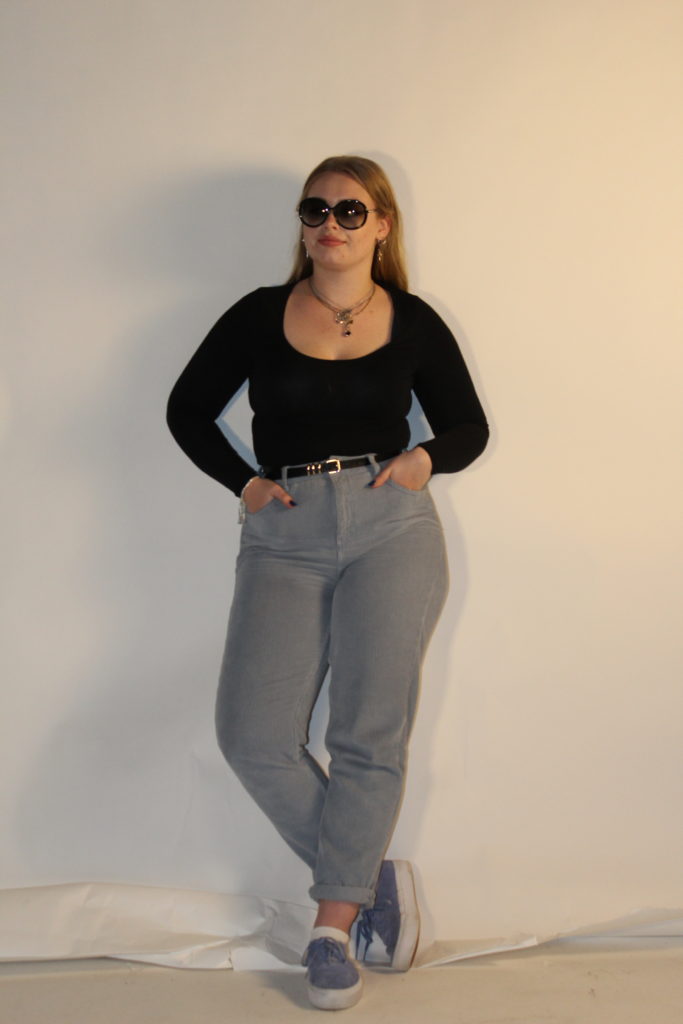
Above shows the photograph I have chosen to edit in response to the fashion photograph I was recreating. I have chosen this image as it was one of my most clear photographs and I feel replicates the original best. I also feel that in this photograph the lighting was working well compared to some of the other outcomes I produced and the subject is standing in the most similar way to the original photograph.

My aims while editing this photograph is to not adjust the photograph too much but to adjust the light and contrast to then put a black and white filter over the top to then create an accurate final outcome.

Editing Process:

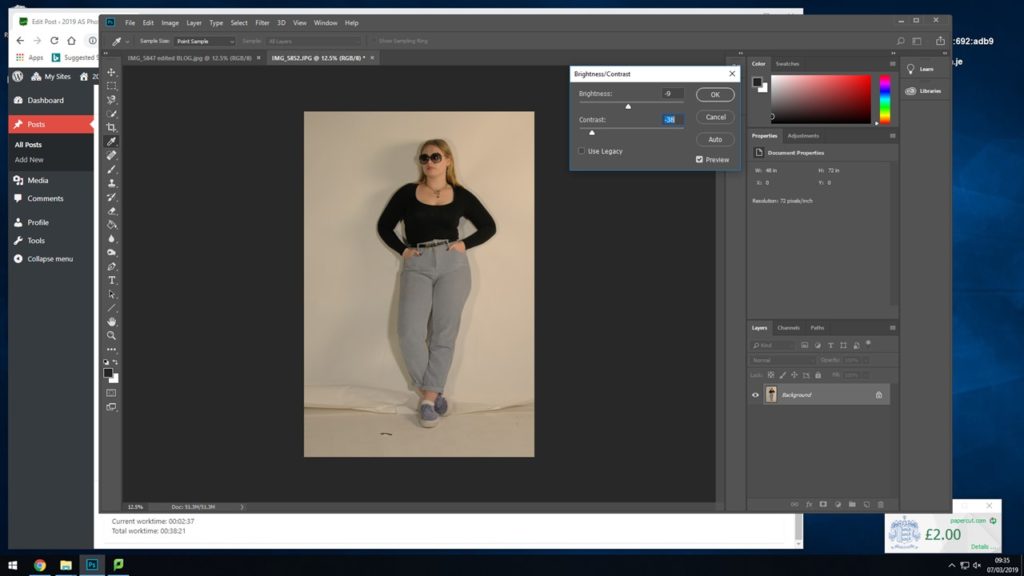
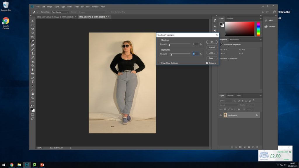
For the first step towards turning the photograph into black and white I started by adjusting the brightness and the contrast slightly so that I had the best amount of shadows and highlights that I felt would work well once in black and white.

Next I went in and only slightly adjusted the actual shadows and highlights just to enhance what I previously did with the brightness and the contrast.

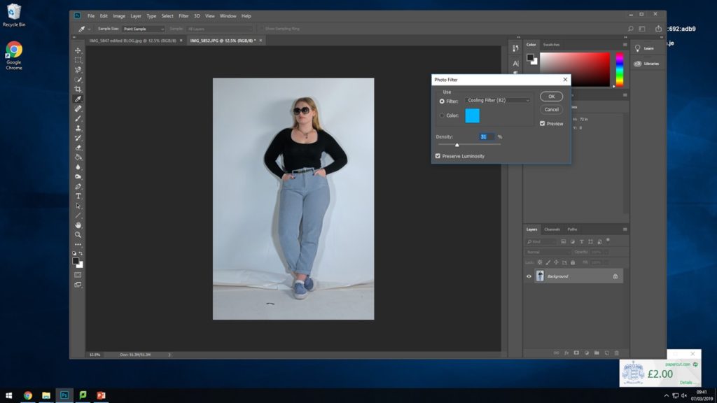
For the next step I experimented with placing a cooling filter over the top of the photograph to see how this would effect the image when putting it into black and white to take away the yellow and warm tones.

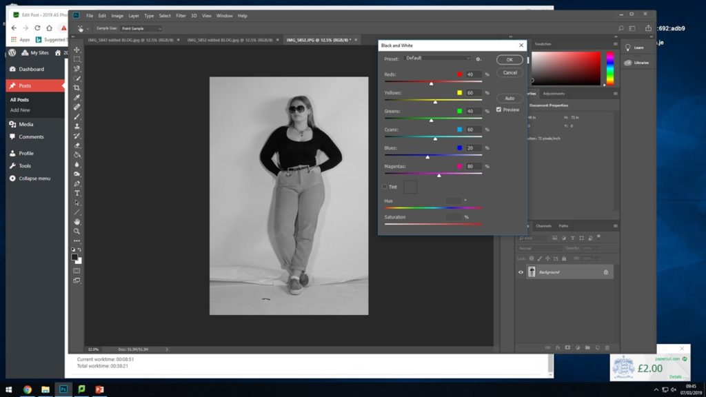
Finally I placed the black and white filter over the top of the photograph to recreate the final photograph best and to enhance this photograph itself more.

Final Outcome:

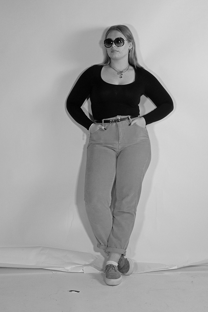
This shows the final outcome for my finished edited photograph, I feel the photograph worked well. I feel it works well in the black and white tones and placing the cooling filter over the top also worked well with enhancing the photograph.

Recreation 1 // 60’s/70’s

Background:

The early 1960’s featured a number of diverse trends.  It was a decade that broke many fashion traditions, mirroring social movements during the time.  During the late 60’s there was a backlash by radical feminists in America against accouterments of what they perceived to be enforced femininity within the fashion industry.  Instead these activist wore androgynous and masculine clothing such as jeans, work boots or berets.

Plan:

For this photoshoot I will be taking the images in the studio to give me the best lighting for recreating these AD’s I will use two different subjects one in each of the images.  I am going to be dressing the subject in clothing that is almost exact or close to what the subject in the original image is wearing.

For the first recreation seen below I have found someone I feel will work best to take on this photograph and I have asked them to dress in a way similar to that of the original picture for the best possible recreation I can gain.

I will be trying to show my inspiration from Cindy Sherman by the way I am having my subjects try to embody the way the original subject was standing and acting.


First recreation:

60/70’s

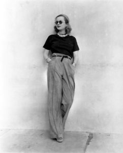
Above shows the photograph that I have chosen to recreate.  I had my subject stand against the wall and try to recreate the pose that the model was standing in herself.  What I feel could have been done better would be to find an actual wall to take the photographs against rather than in the studio however I feel the rips on the floor of the studio I feel help with the recreation.

Contact Sheet of Outcomes

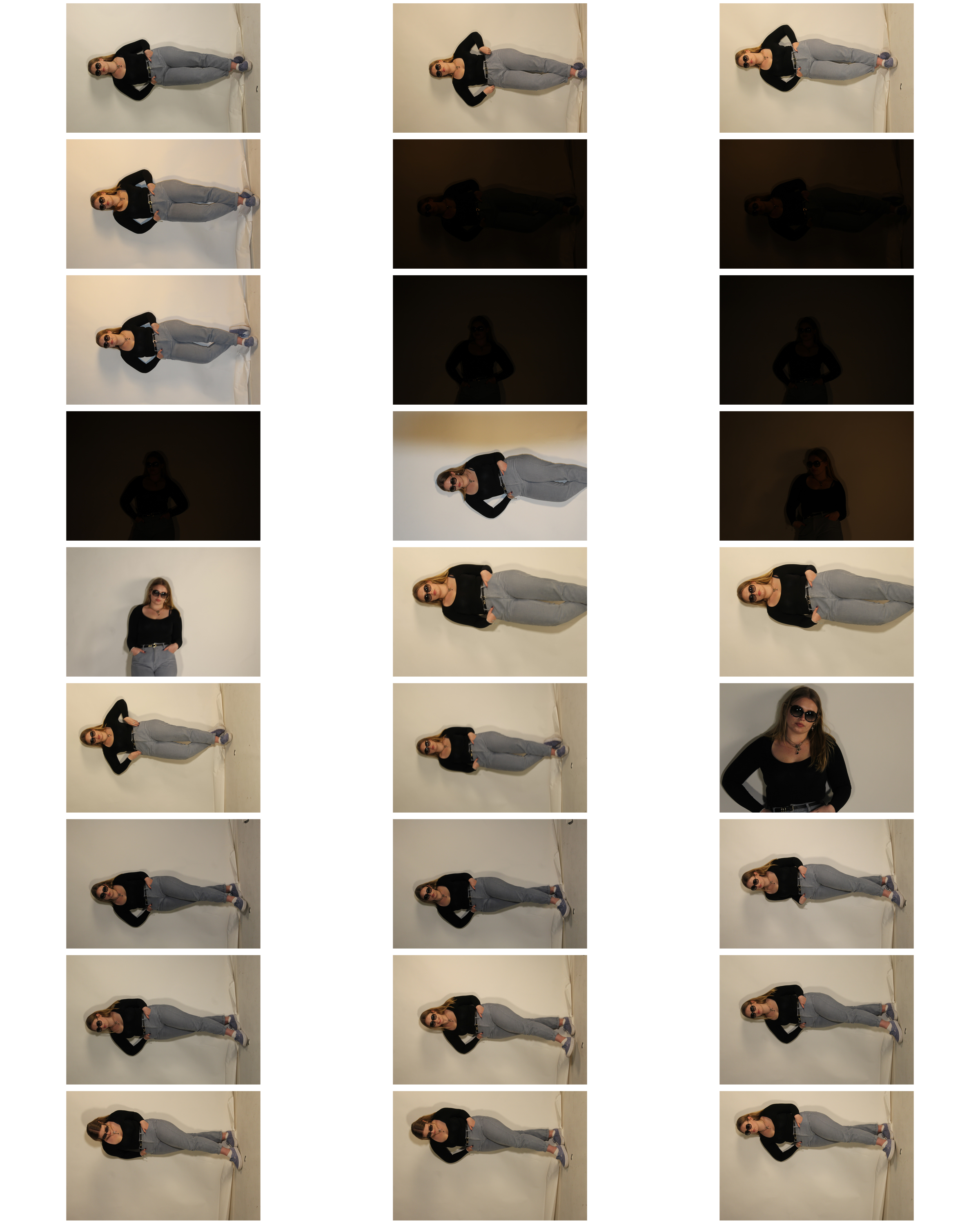
Above shows a contact sheet of the images I produced on the day of the photoshoot.  As can be seen some of the photographs came out too dark when I began to adjust the light, however this was able to be fixed in the camera settings with some adjustments.  Taking and thinking of the inspiration from Cindy Sherman I tried to have my subject embody and look at the original image a couple of times to try and recreate and represent the woman in the original photograph.

Unedited Best Outcomes:

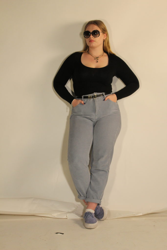
Below shows my 6 personal best outcomes from the photo shoots.  After selecting these I will go in and start editing my 2 favorites to be more like the original picture and to enhance them more.

First Photo shoot

HOW: I used my regular DSLR camera for this photo shoot.

WHERE: 

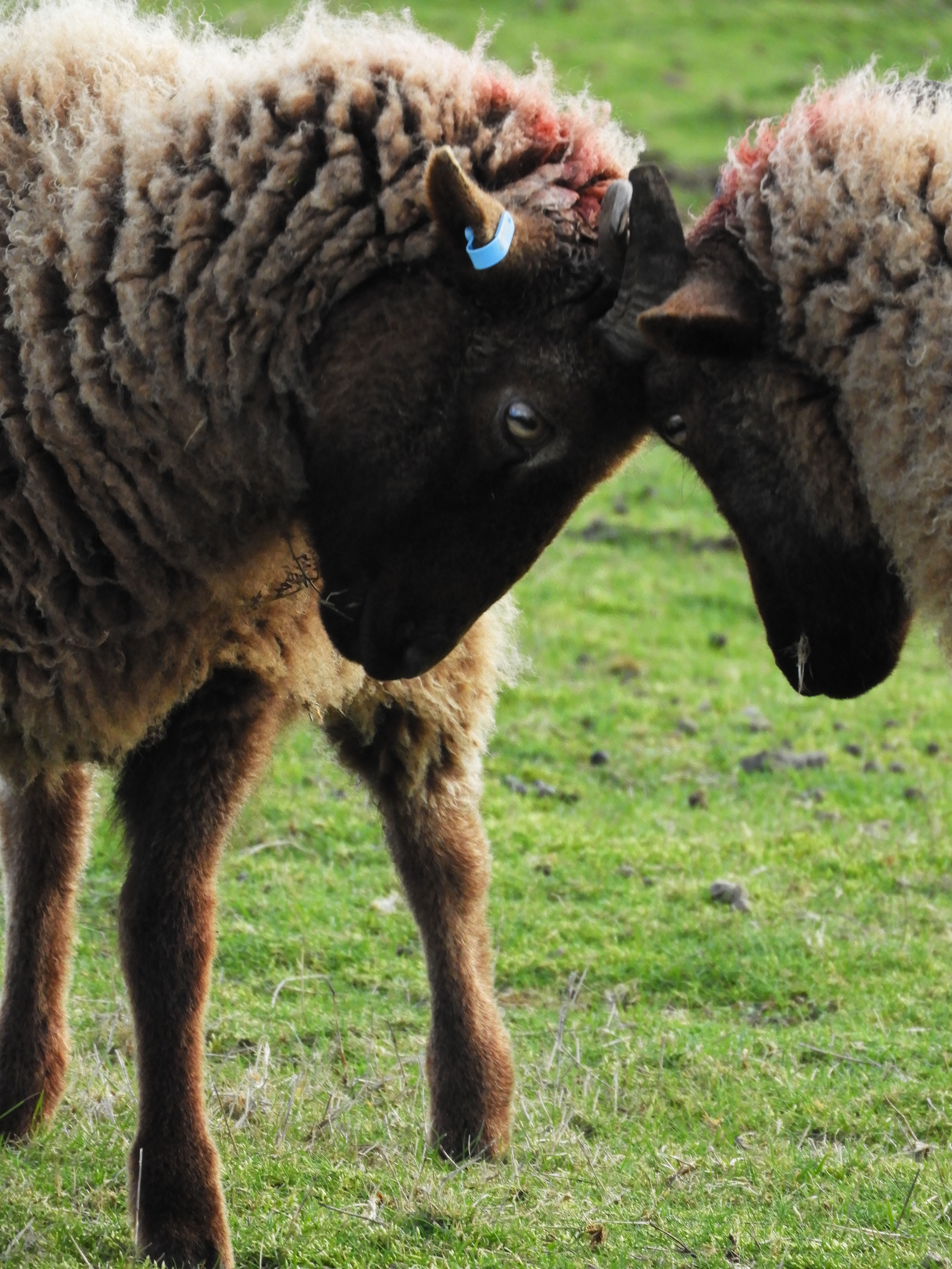
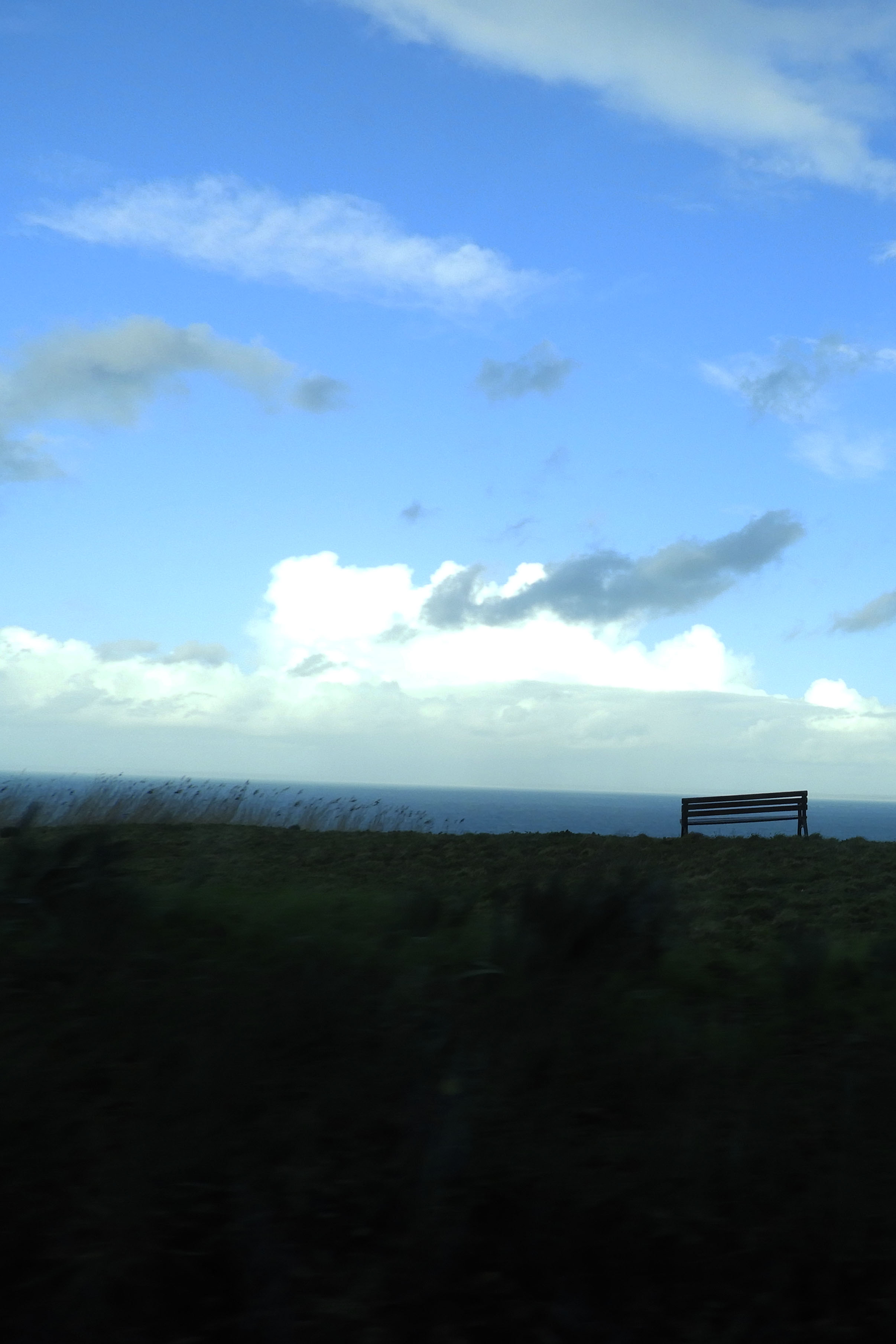
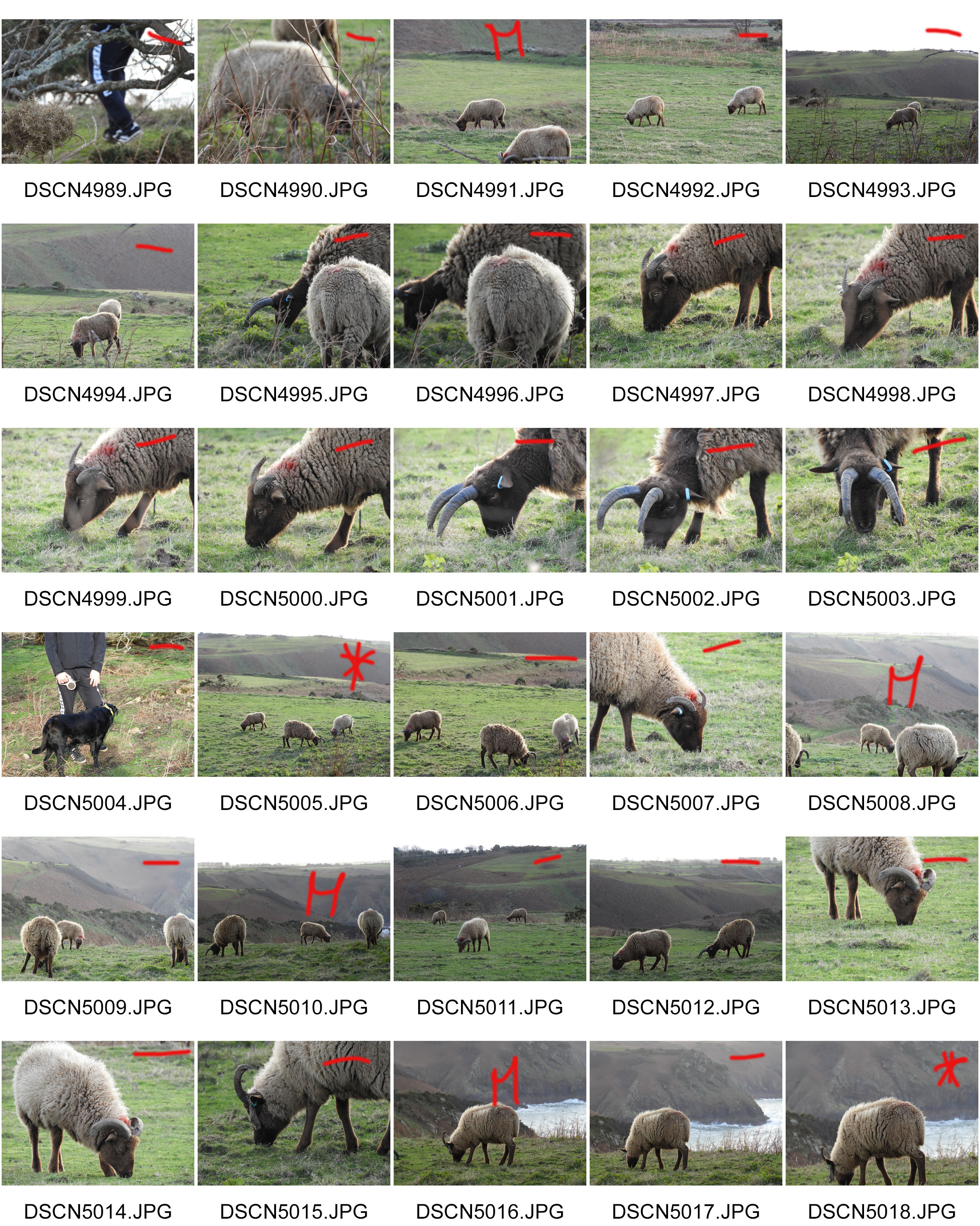
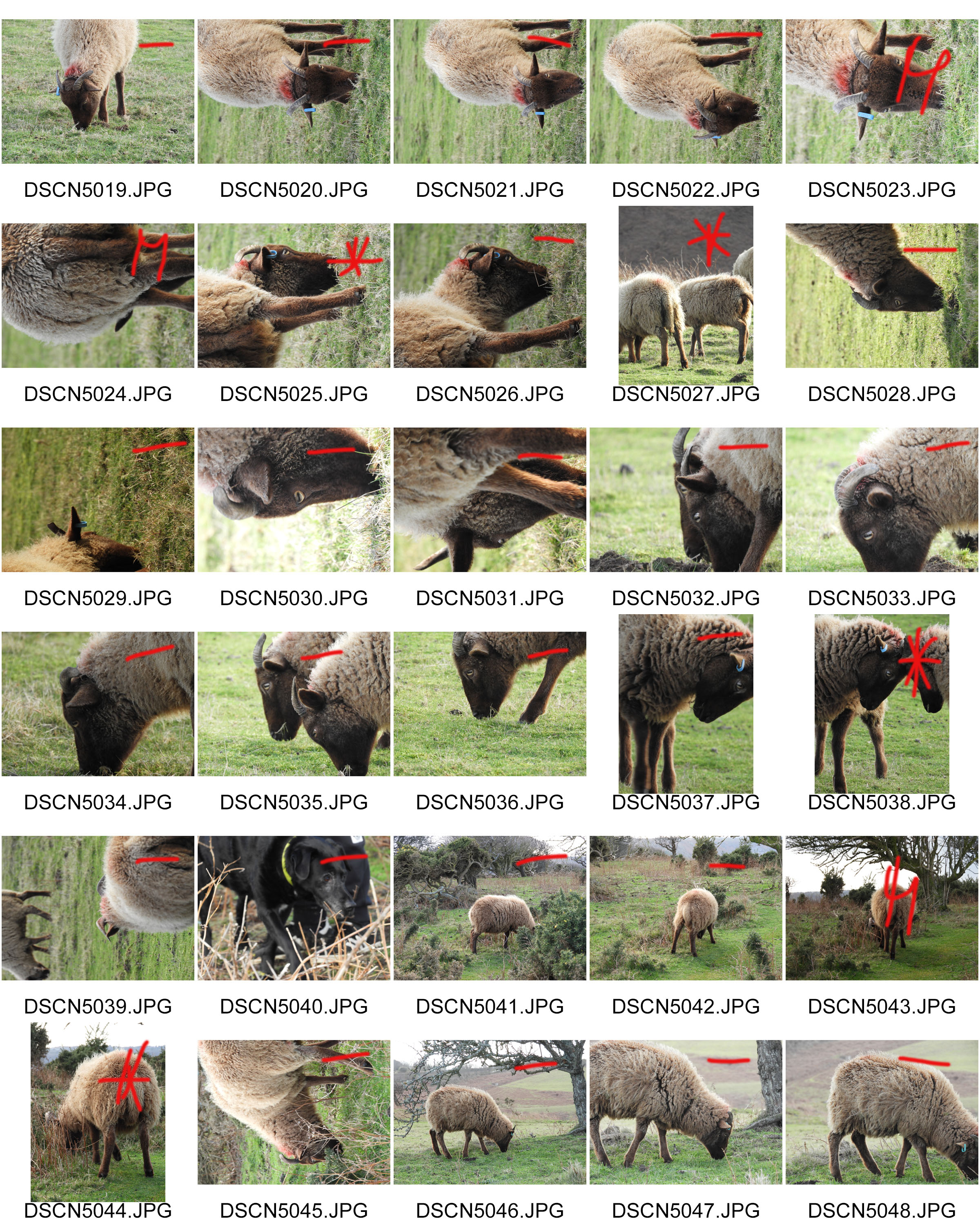
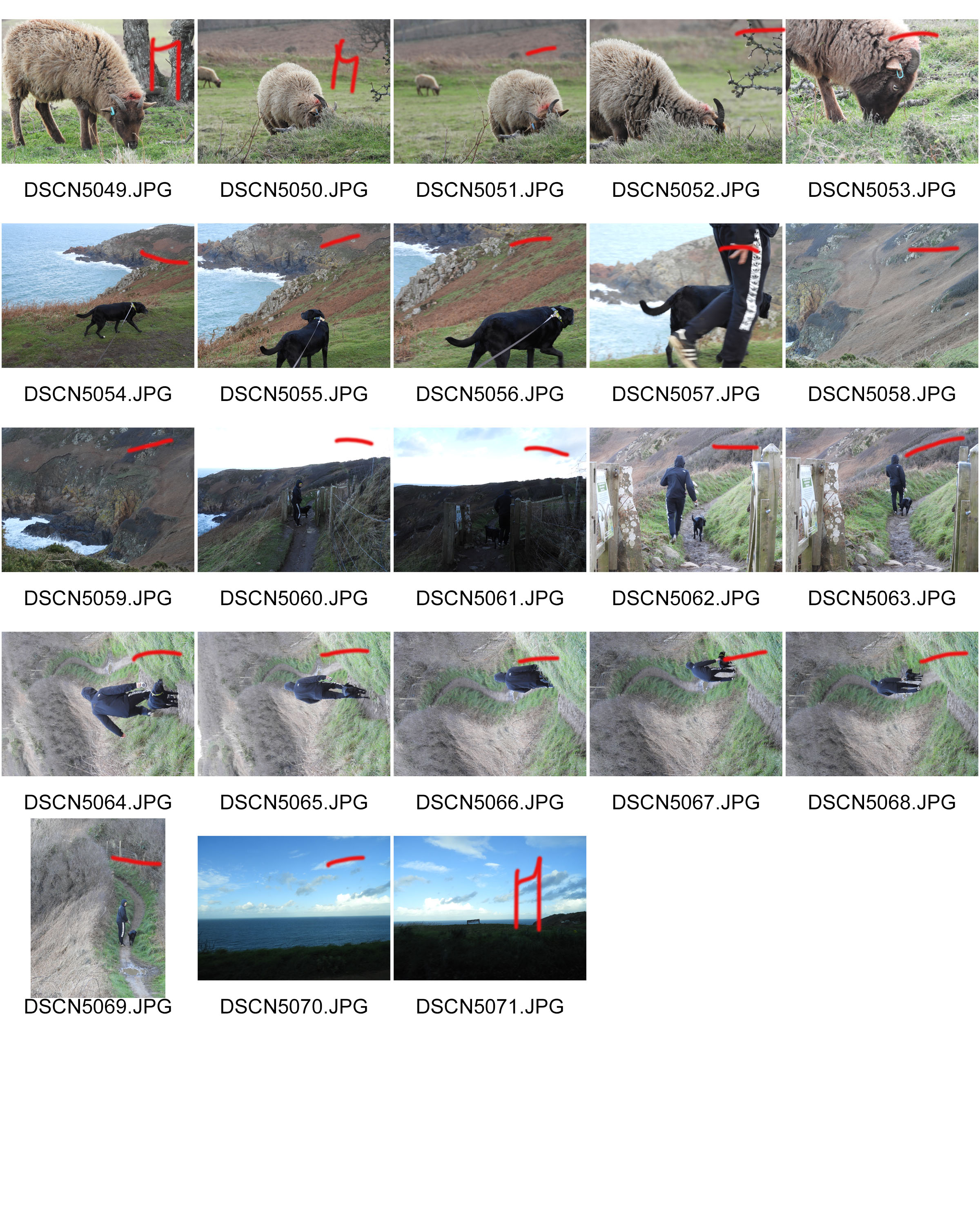
I chose to conduct the photo shoot in an area which I find very interesting and I find myself visiting this walk over and over again due to the natural beauty it has. It is a small cliff path walk in St.John which is situated within a sheep farm, therefore whilst conducting the photo shoot, I will be able to incorporate not only the landscape but also the animals.

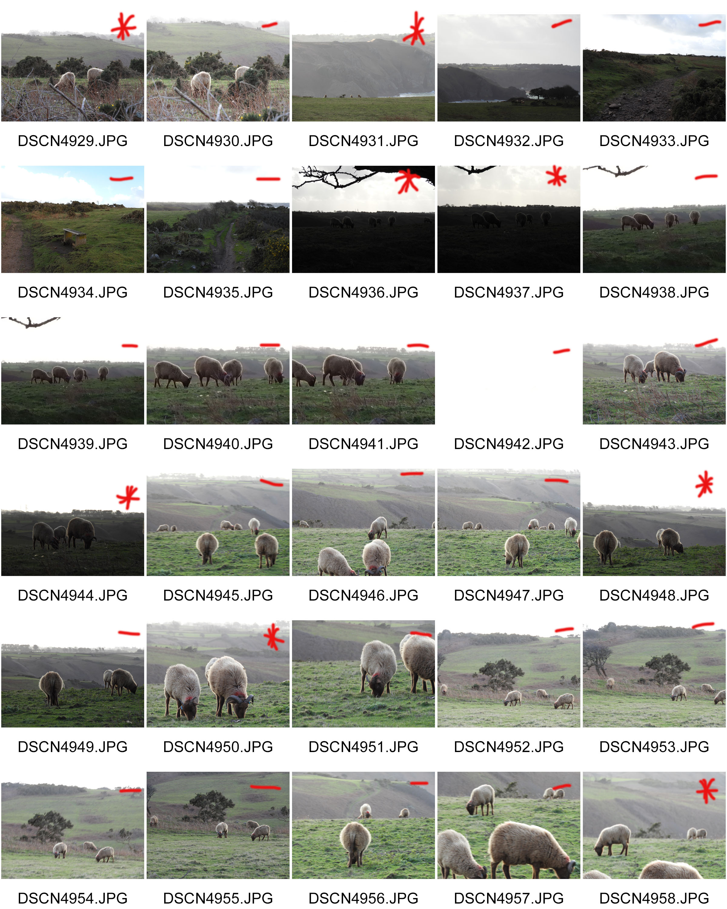
WHEN: In order to avoid direct sunlight I went out during the early morning to take photos, this meant that shadows were cast in different directions which provided variation. The cloudy weather conditions also meant that the lighting shifted a lot throughout the photo shoot, being very light and dark at points.

WHO: I was initially attempting to capture the pathways around Jersey, as an experimental concept, yet when I got there I captured an abundance of images of the sheep there as I found them to be quite interesting.

WHAT: This was an experimental photo shoot which was an initial idea from the title “journey’s and pathways”, there was no specific theme or subject I was attempting to capture with this shoot.

WHY: This was my initial response to the title of “journeys and pathways” project, it was a basic response to the title which fulfilled its literal meaning.

CRITICAL ANALYSIS:

VISUAL:

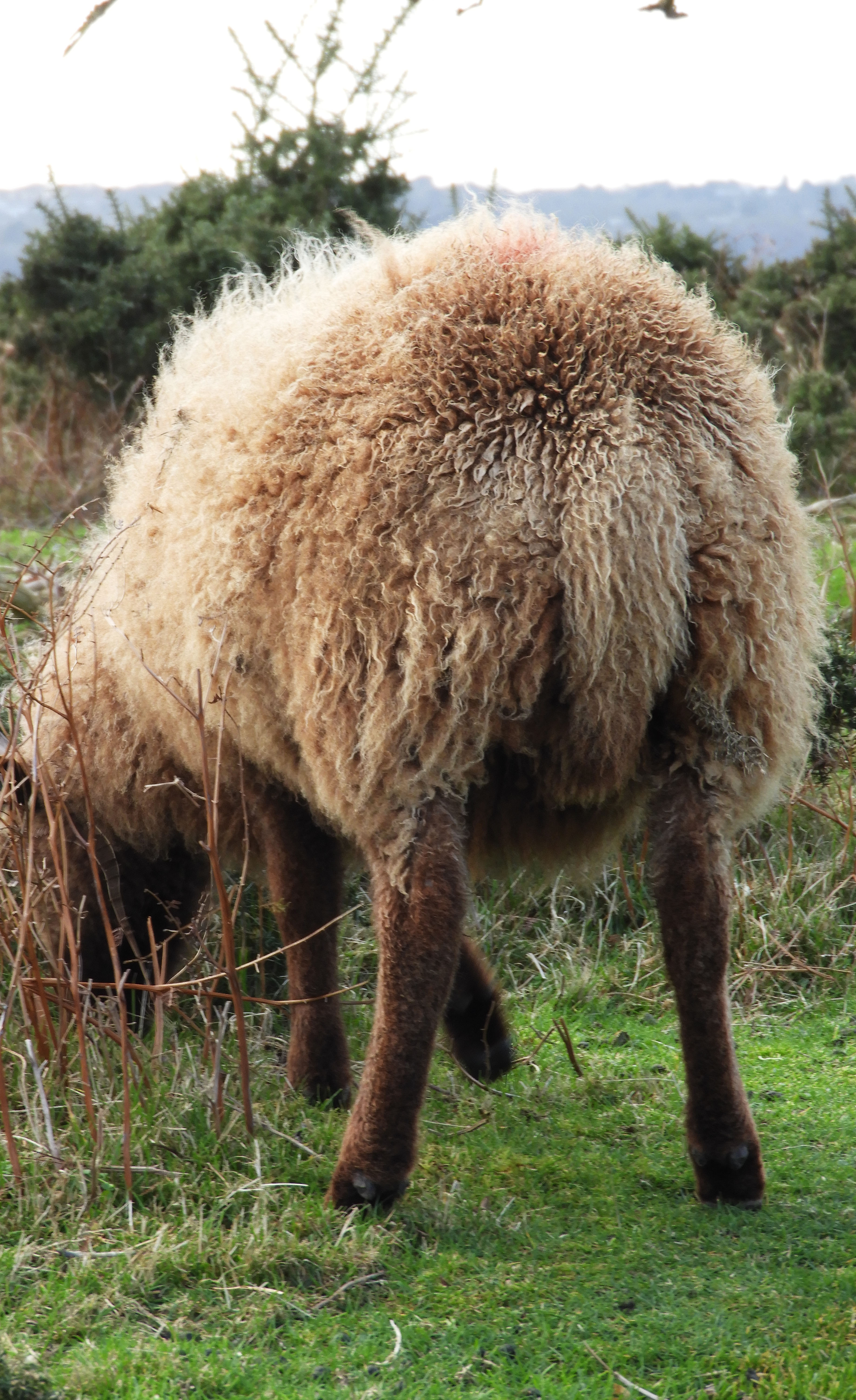
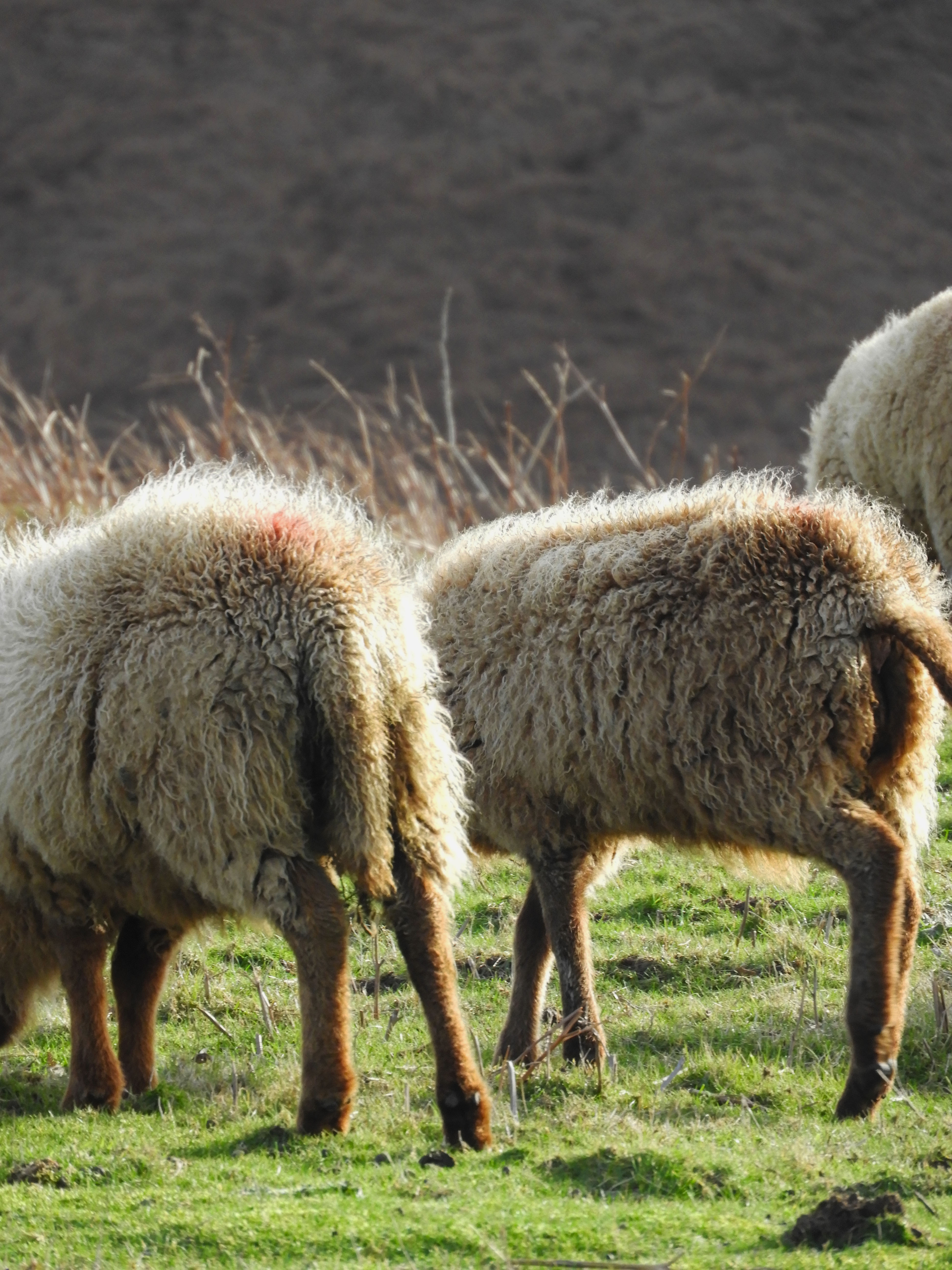
This photo shoot was done during 2pm in the afternoon when the sun was not directly above in the sky but shifted slightly to the right, therefore in the image we see a shadow being cast of the sheep to the left hand side of the image. The light which is cast onto the sheep is also trapped in its wool, making it have a sort of halo effect. There is an element of comedy to this image with the fact that you cannot see the faces of the sheep and only their backsides. Whilst taking this image, I zoomed in quite far in order to capture the detail in the wool. There is a distinct foreground and background in this image, the distant hill being located in the background and the sheep in the foreground.

TECHNICAL:

This was one of the most challenging photo shoots to do in my opinion due to the less than ideal weather conditions that I experienced during the shoot. At Sorel point, the cliff path walk where I did my photo shoot, the wind was extremely strong and unforgiving on the given day when I took my images. I was unable to use a tripod as during previous shoots with similar weather conditions, the set up would simply be blown away. Bulky set up like that would have also likely scared away the sheep, who I was very keen to see up close and capture pictures of.I had to crouch down for most of the shoot as this ensured that less wind was blowing against me and therefore the camera was more stable.

CONCEPTUAL:

As an initial concept, I took the literal meaning of “journeys and pathways” and took a literal journey at one of my own personal favorite places in Jersey, Sorel point in St.John. An area full of natural beauty, highlighting the beauty of Jerseys varied coastline. It was taking a trip into the beauty of natural, touching the concept of landscape romanticism.

Although its definition has been debated profusely for decades, Romanticism generally defined was an artistic and intellectual movement originating out of the late 18th and early 19th century Europe. Its movement was seen to reject the typical ideas of order, calm, harmony, balance, and idealization.

As an artistic style, it is strongly emotional, evocative of a vivid imagination. Sometimes, it actually represents the irrational emotions and subjective experiences of the artist.

CONTEXTUAL:

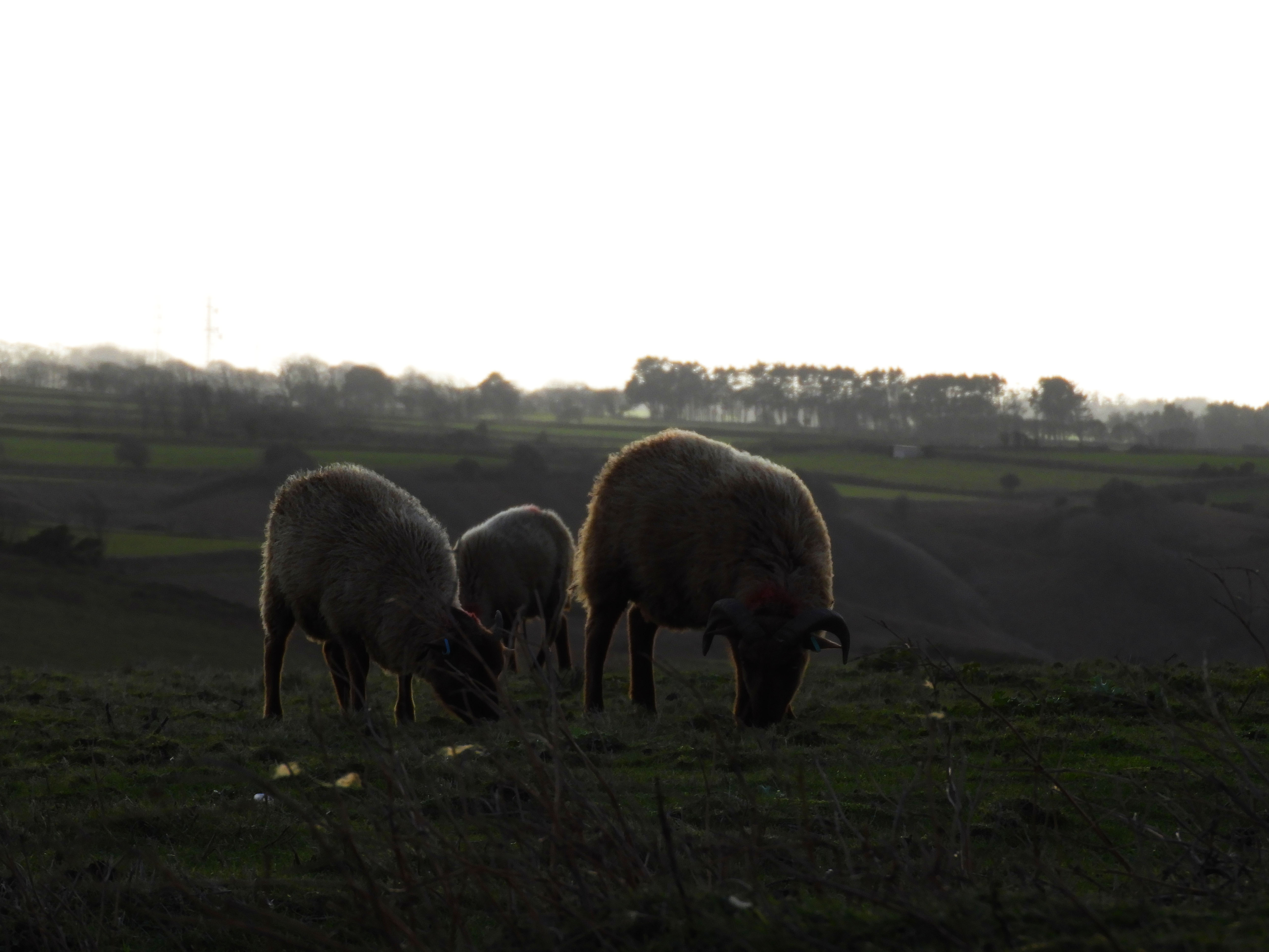
The sheep which reside on the pathway from Sorel point going to Devils Point are called Manx Loaghtan, a rare breed of sheep native to the Isle of Man. It is sometimes spelled as Loaghtyn or Loghtan. The sheep have dark brown wool and usually four or occasionally six horns.

The Manx Loaghtan is one of the Northern European short-tailed sheep breeds, and descends from the primitive sheep once found throughout Scotland, the Hebrides, and Shetland Islands. The word Loaghtan comes from the Manx words lugh dhoan, which mean mouse-brown and describe the color of the sheep. This breed is primarily raised for its meat, which some consider a delicacy. The meat has recently received EU recognition and protection under the Protected Designation of Origin scheme, which requires products to originate in a specific region.

The Rare Breeds Survival Trust has characterized the Loaghtan as “at risk”. By the 1950s there were only 43 surviving specimens. Manx National Heritage developed two healthy flocks. These have given rise to commercial flocks on the Isle of Man, United Kingdom and Jersey. Even so, today there are still fewer than 1,500 registered breeding females
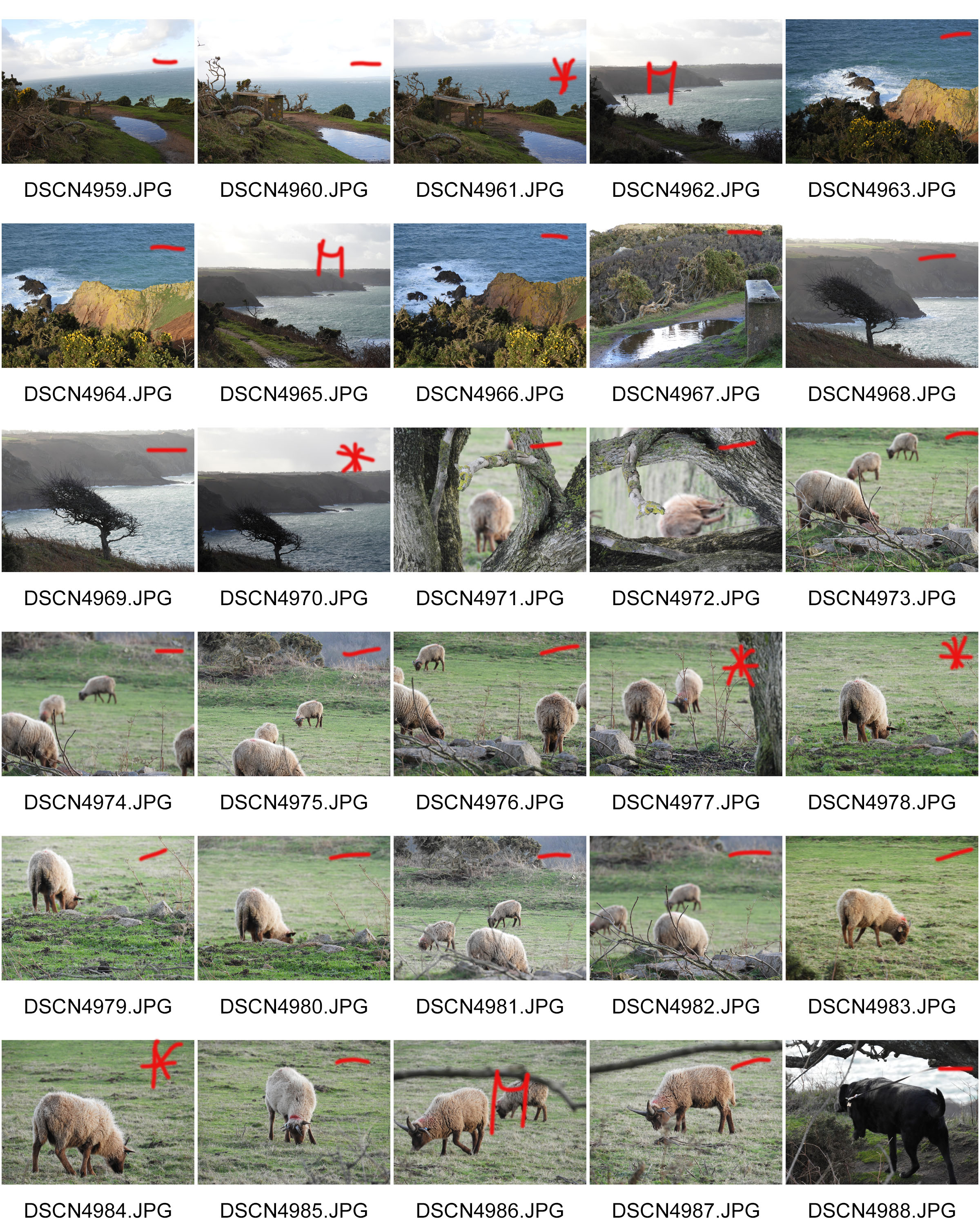
CONTACT SHEETS:
3. Project review No.1:

To start my ‘Journeys and Pathways’ project, I began by looking at The Boyle Family. I was intrigued by their approach and was fascinated by their accurate replications and attention to detail.

However, I decided against continuing with my own response to The Boyle Family as I didn’t want my final outcomes to have a similar style to that of The Boyle Family’s work.

Next, I want to look at the works of American photographer, Lee Friedlander.

Photoshoot 1 – Seawall

Planning:

The aim of this photoshoot is to capture images which are able to capture the contrast of Jersey’s seawall during the war compared to now, the same aim as Gina Socrates. In order to do this I will capture more macro and texture photographs, to capture the war side as it showcase the more unpleasant side of the sea wall. To capture the walls beauty, I will look at capturing more landscape images which outcast onto the beach. I want to be able to show experimentation with camera settings and so I will be adjusting the ISO to create a subtle noise to work with the textured images. Moreover, I will look at experimenting with different angles, shutter speeds and white balances. One thing I noticed from Socrates images was that her images seemed to have a hint of orange/yellow to help show historical factors, by adjusting my white balance and using the Hue setting on photoshop I believe I will be able to achieve this effect within my work. The location of the photoshoot will be down at First Tower// Saint Helier sea wall, as it is a long wall which will provide multiple opportunities to capture different images of the same stimulus. I will also capture St Ouen’s sea wall as that is the wall Gina captured when she conducted her photoshoot.

Contact Sheets:

Evaluation:

To evaluate this photoshoot I believe that I have been semi-successful with the images that I have taken. I believe that I have met my artistic aim by capturing the two bipolar uses of the sea wall, in order to present Jersey’s journey through the second world war. However, I do believe that I could have taken more images in order to have more outcomes to work with during the editing process. I was able to capture my images at different viewpoints, from a straight on angle to a birds eye view (which where not as successful as they where captured on a plain ride create a blur to the images). In order to further develop this idea I am going to manipulate my top outcomes on photoshop. I am wanting to create double exposures, level, adjust curves, hue and saturation in order to not only make my images have stronger links to Socrates, but to further develop my presentation of the change in the sea wall in the second world war.

Easton Chang case study

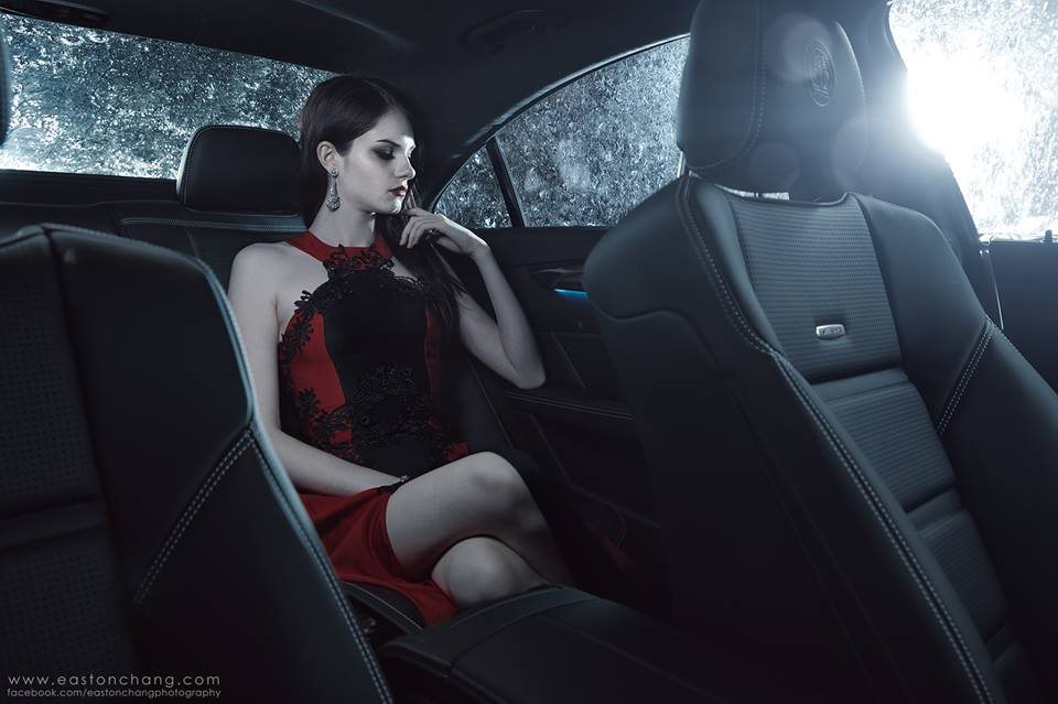
Easton Chang is an award winning photographer who specializes in capturing advertising and commercial photographs. His work is based in Sydney, Australia and comes to cover North America, Asia Pacific and Pan-Europe. He captures his automotive photographs in studio and on location to achieve the best results. He has received several awards for his creative and stunning photographs such as 2013 Australian Advertising Photographer of the Year, 2012 Australian Advertising Photographer of the Year and 2011 Automotive Photography Awards Judging Panel.

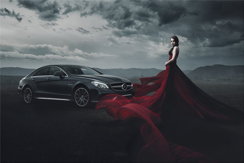
These are my favourite photos by Easton Chang:

This is my favourite photo by him, its main features are strong, bold shapes throughout. The sculpted shape of the car in the middleground strengthens the image and adds structure to it. The lighting of the photo helps achieve these shapes and lines, it is angled to catch the different depths of different areas of the car. The woman in the dress in the foreground as has very strong shapes But these aren’t as straight and organised as the ones of the car, but they have a deep red colour and real sense of depth which makes the photo much more eye catching. This is strengthened by the red dress being the only element of the photo which  has strong and brighter colour. It also draws your eyes to the right side of the photo, and away from the centre which is the weakest point of any image. The lighting also changes throughout the photo, as you look from left to right the photo gets much darker; the right side of the dress, the clouds, and even the mountains are much darker. The mountain range in the background adds more depth to the photo, it also helps minimize any blank space in the photo.

Overall, the lighting, structure, and layering help make the photo look sleek, eye catching, and full.

How/why the case study will influence my work:

He has influenced the way I will utilise colour in my photo shoots. Being very reserved with the use of colour makes the colour that is there more powerful. I will also be more careful with lighting in my photo shoots; using less lighting creates more shadows and makes shapes more prominent.

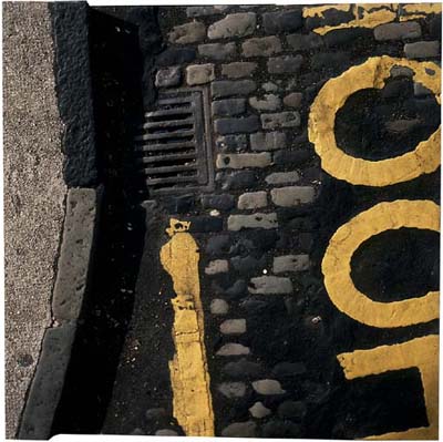
The Boyle Family

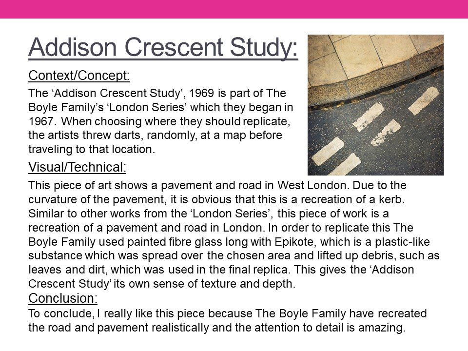
Mark Boyle who was born in Glasgow, collaborated with his partner Joan Hills during the 1960s. Their project ‘Journey to the surface of the Earth’ began in 1968 – 69. After being blindfolded, they threw darts at a world map, in order to pinpoint 1,000 areas of the earth’s surface to duplicate. When travelling to a selected site, the Boyles would throw a T-square in the air to select a random area to replicate. In the 1970s their two children assisted in producing these works. Together they operated under the name ‘Boyle Family’.

Image Analysis

This photograph depicts a street corner and a road with yellow markings and different textures of tarmac and cobbles. The image shows exactly what you would see if you looked down onto an area of road and because of this I think the image was taken handheld due to the angle that is shown through the photograph. The colours of the photograph are typical and natural, along with the shadows and lighting created by the natural light. The road looks like it’s damaged and decaying which shows the viewer what you can find by simply looking at places that are usually overlooked. The photograph doesn’t have much depth, except for the curb but even this appears to be on the same level as the road, possibly because of the bird eye view style of the shot. The photograph reflects the time period, with a new style of making roads. The tarmac covering the cobbles shows the advancement in society as well as the destruction of the pattern. The photograph gives a profound sense of reality since the image is so simple yet effective since it displays the view that everyone would be able to see on a day to day basis, but would never look at twice.

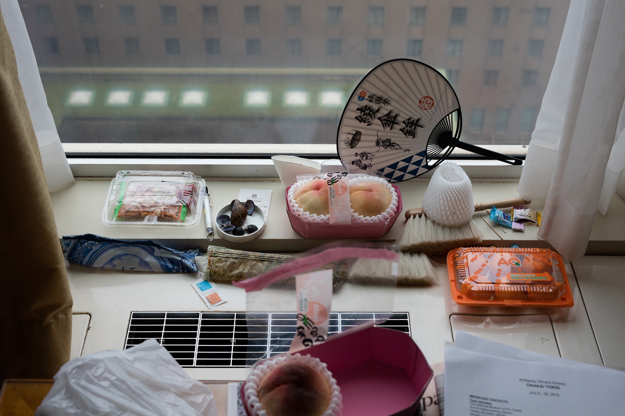
Wolfgang Tillmans – Case Study

Alongside portraiture, landscape and intimate still lifes, Tillmans pushes the boundaries of the photographic form in abstract artworks that range from the sculptural to the immersive.

German-born, international in outlook and exhibited around the world, Tillmans spent many years in the UK and is currently based in Berlin. In 2000, he was the first photographer and first non-British artist to receive the Turner Prize.

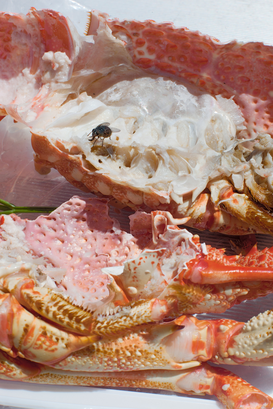
Osaka Still Life

Photo Analysis

Technical

Natural lighting has been used within this photo due to the light source being soft and warm toned casting soft shadows that follow the silhouette of the once alive crab. This warm toned helps bring out the warm colour palette of pinks and oranges. To capture this image, Tillmans used an analogue camera due to the warmth of the picture and the low contrast throughout the image.

Visual

The focus within the image in my opinion is the fly feasting on the lifeless colour-explosion. I think this because the whole image is soft toned and brightly coloured with the interruption of this black figure. At the bottom of the composition, the first exposed shell is facing ‘bottom up’ with the once living crab’s legs surrounding the exposed shell. In the middle of the image, there’s a gap on the left that gives a glimpse of a green basil leaf. At the top of the image, the rest of the exposed crab is facing upwards along with a fly on top of it.

My responses


Best Image

Visual:

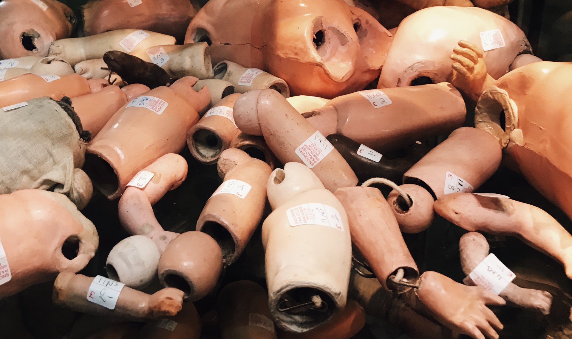
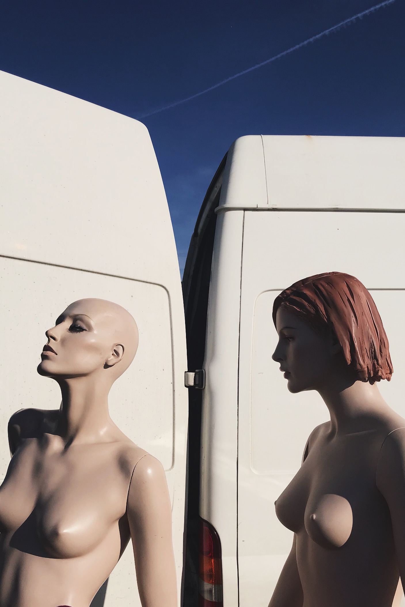
In this image i see this as a rule of three, the first section being the solid blue sky, then the white of the van then the bottom being the mannequins. This rule of 3 gives the viewer a pattern that is memorable and easily recognizable. I also like this because it hasn’t got a busy background making the central subject the mannequins. This picture was taken on a very early morning, this is casting sunlight onto the mannequins from the right direction, thus creating flowing shadows and contrast on the perfectly sculpted silhouettes. Due to this also being taken on film, the picture is very warm. 

Technical: 

Again, this image can be divided into a clear rule of three : solid blue at the stop, solid white in the middle, then the skin coloured mannequins. This contrast of colour palette due to the white and light blue complementing the fair skin tone of the mannequins. The shadows cast on the mannequins reinforces their “perfect” silhouette and refines their shape and posture.

Contextual:

I took this photo at a flea market in Brighton when the sun was just rising. I would’ve happily bought these mannequins home with me due to them having more refined bodies compared to boring plain white ones we have around us. I asked the seller where he found or got them from and he said that his husband worked for Selfridges in London and these specific Mannequins where left for rubbish just because they were never used. So this man took them home and used them to model his artworks and designs he made to promote and sell his work. 

Journeys and Pathways – Shoot 2 (Tilt-Shift & John Davies)

Contact Sheet:

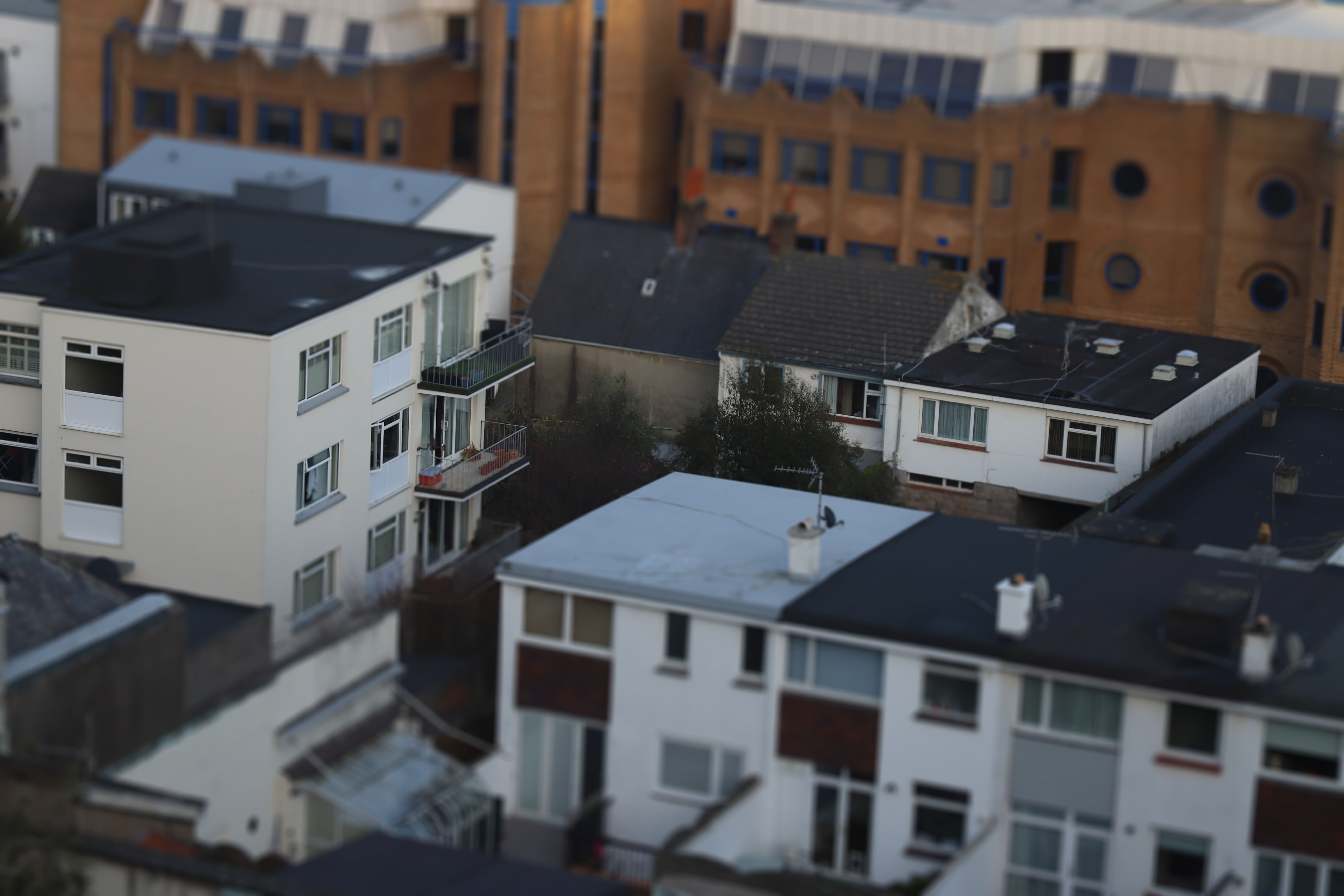
For this shoot I originally wanted to focus on a recreating the work of John Davies, however when editing, I found that using a tilt-shift lens effect in Photoshop (by using the quick mask tool in Photoshop, then using the gradient tool to select which area I wanted to be in focus, then deselected the quick mask, and finally added a lens blur from the ‘tools’ section of the quick bar) made the idea of ‘Journeys and Pathways’ stand out more than just landscape images. I utilized this effect to show how small everything really is, or at least how small it can seem. The final outcome of my images looked like this:

Final Images

Out of all my images, I found that this one worked better than most others taken in terms of creating a realistic looking tilt-shift effect, in essence making the buildings look like tiny scale models. I think the angle, and visibility of what is behind the subject in focus helps create this effect.

For this image, I liked how the wider angle helps this it in showing much more than some of the other images, making it look more like a smaller model city. However I think that the shot would have looked nicer if the houses in the foreground weren’t there. Despite this, I do think it once again supports the message of showing how small we are, especially seeing the Avenue in the background, stretching into the mist on the other side of the island.

Unlike the first 2 final images, I wanted to show a more close up view on the buildings, and personally I find this image looks most like a model building set, and really emphasizes the miniature/model look that I was aiming to create. However, I struggled in photographing more interesting buildings for these shots as they were taken around the Fort Regent area, and therefore meant I had very little to work with in terms of getting nice buildings at the right angle, yet I still think this image works for the message I’m trying to put across.