Adams – Face of Half Dome Monolith – Analysis

My favorite image of Adams is “Face of Half Dome”. The reason for this is because it is a sharp image that has a large amount of detail within it.

Technical

This image was taken on film in black and white originally. He also used a very high f-stop meaning that the image is sharp throughout. He also used a deep dark red filter.

Visual

The monolith is the main focus of the photo but there are other things like the ledge on the bottom right section of the photo and in the bottom left of the photo has detail showing the snow and the tree.

Contextual

Adams went to the spot where the photo was taken, first when he was 14 and then 11 years later, he want back to take this photo. When taking the photo he had his camera on a large tripod and had to take it on a two day hike to get to the spot.

Conceptual

The concept that Adams was aiming for and the point that he was trying to make to the viewer was that the American national parks are something that has undergone some change and he wanted to preserve the image before they changed beyond the point of no return. He also wanted to show the views with a level or Romanticism meaning that he would exaggerate the beauty and the views that he saw the ways that he did this is using colour filters and using very high focal lengths.

Le Hocq:Experiment 1

My Concept + Photo Shoot

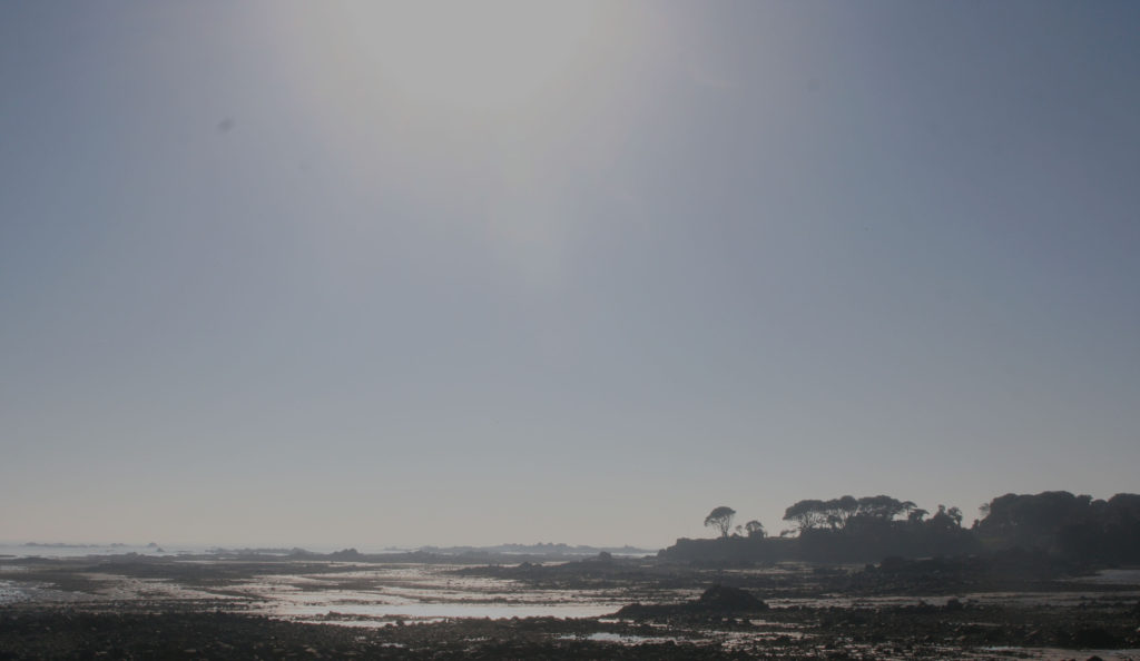
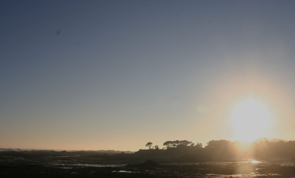
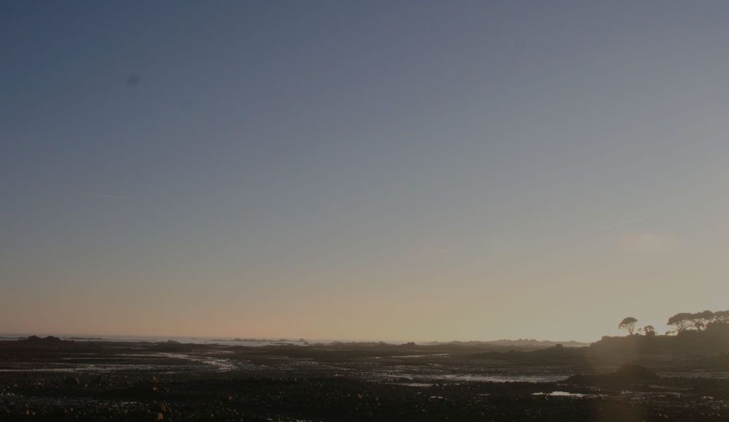
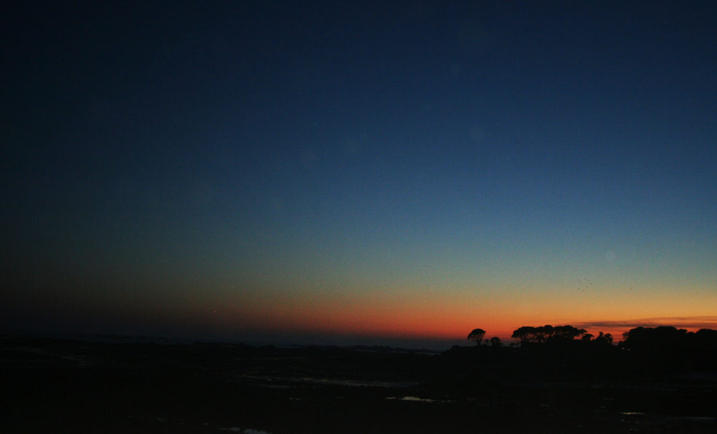
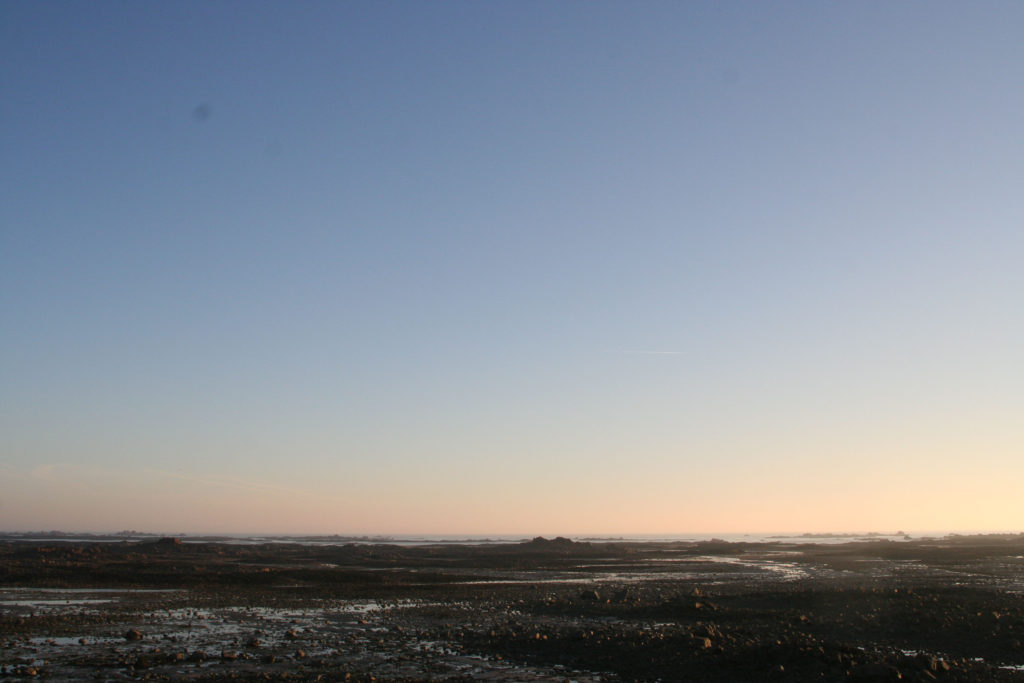
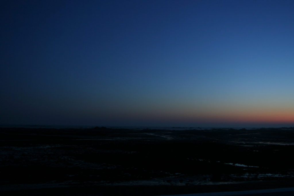
I wanted to focus on Le Hocq beach as I lived nearby and I wanted to be able to take pictures throughout the day. I wanted to capture the journey in which the sun, clouds, water takes on a typical day in Winter. I was lucky to have enough that the weather was good and the sky was clear, but that did mean I had to ensure my pictures weren’t over exposed due the harshness of the sun, this was difficult. I started taking pictures at 1 pm and took pictures every hour until 7 pm. I held my camera for the post part but for several photos I put my camera on the wall. The picture below aren’t of every hour but are the best to represent the movement of the sun and change in brightness. I aimed to create a timeline for an afternoon at the beach, to show the true beauty of one of my favourite beaches in Jersey.

trees 2pm
trees 4pm
trees 5pm
trees 7pm
front 4pm

Analysis

Overall I found my first experiment to be reasonably successful. If I were to do it again I would have used a tripod and kept it in the same place for the duration of the shoot in order to have more emphasis on the change in just one particular part of the beach, but this is useful to know for my next photo shoot. I feel like my photos are pretty self explanatory, as they are just a timeline of Le Hocq beach, I used a medium to large lens for my photos as I wanted to focus in on specific parts of the beach but also capture the full atmosphere. I edited my photos in Photoshop by lowering the brightness, increasing contrast and lowering the exposure for the pictures I took earlier in the day. These pictures are personal to me as they are the view I having being seeing for the last 8 years, day in day out, so for me it’s nothing special in day light, but when the sun goes down it creates a different scene for me, something familiar yet exciting. I wanted to empathize how repetitive views don’t always have to be boring, the weather changes, the sun position changes, the sky is never the same, clouds are always moving, they change shape, the sun is always moving.

First photo shoot planning

My first photo shoot will be based on cars, and partially the scenery around them. I will most likely edit them afterwards to look like grainy 90’s photos, this will give all the photos a common theme which will help them fit together more as an exhibition. The coursness might also help distract the eye from imperfections in the photos. I will also take some inspiration from Easton Chang (a photographer I have previously researched) in the form of using colour very sparingly in these photos. If

Editing and Developing: 2

Chosen Photograph:

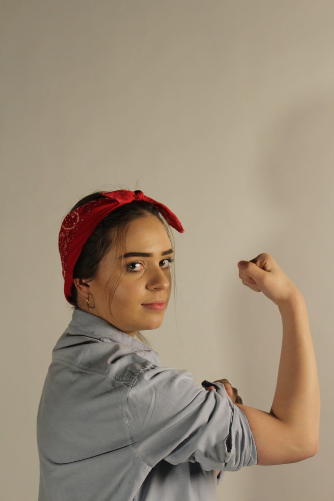
Above shows my chosen image to edit and experiment with, I have chosen this photograph as it was one of my most clear image and I feel that my subject is positioned well in the frame and there is good eye contact and facial expressions with the camera. The lighting is also good for in this photograph there is no need for too much adjusting of the brightness in this photograph which is why I have chosen to edit this photograph.

My aims while editing this photograph is to create a yellow tint in the background of the photograph to replicate the yellow background of the original poster as I feel this will really help the photograph to become better and enhance it.

Editing Process:

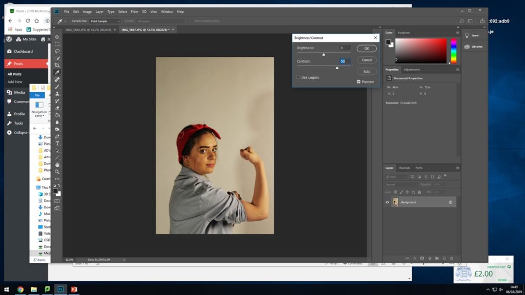
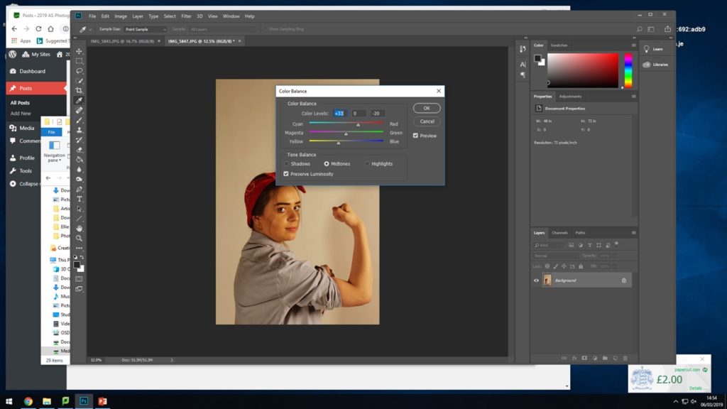
I began by adjusting the brightness and contrast so that I have a good base for adding on the filters for the colours.

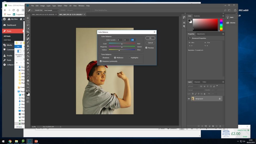
For the next two steps I experimented, adjusted and edited the strengths of the yellow and red colour tones coming through in the photograph. I did this so that there were already tints coming through and to make it easier to place the yellow warming on top.

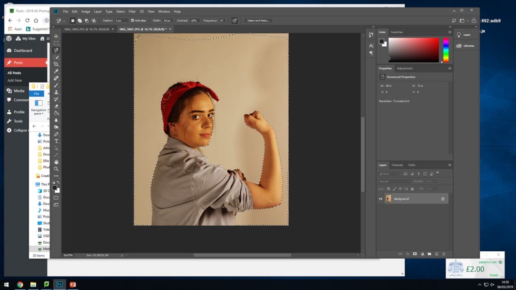
Here I selected the whole background area surrounding my subject, when adding on the warming and yellow filter I didn’t want them to mess and alter the colours and tones of the subject in the image, I wanted to try and keep the red and the blue of her shirt and head band so I selected al the way around her body and around the frame of the photograph to have a specific place to add the filters.

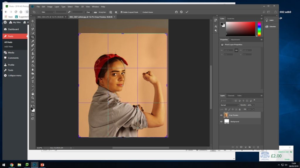
After adding on the filters I experimented with cropping the photograph down so that the subject fills more or less of the frame and see where it sits best as I did not want too much unnecessary blank space above her head.

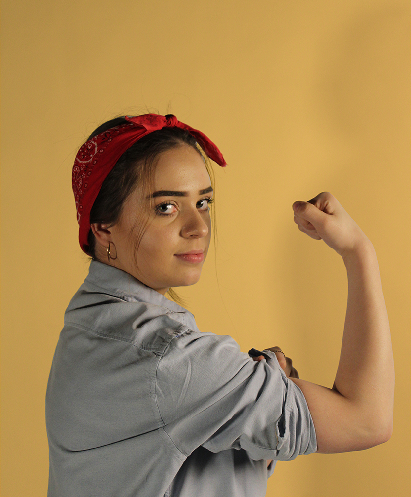
Final Outcome:

This shows the final outcome for how I edited the photograph, I used the warming filter (81) as it had more yellow tones in which I felt worked well with the original photograph and also worked with this recreation. I feel this photoshoot and editing was a success and that it generated an accurate outcome I am happy with that I feel works well.

Recreation 2 // Rosie the Riveter | 40’s

Background:

“We Can Do It!” is an American World War II wartime poster produced by J. Howard Miller in 1943 for Westinghouse Electric as an inspirational image to boost female worker morale. It was seen little during the war and was rediscovered early 1980’s and was widely reproduced, often called “We Can Do It!” but also called “Rosie the Riveter” after the iconic figure of a strong female war production worker. The image was used to promote feminism and other political issues begining in the 1980’s, it was incorporated in 2008 into campaign materials for several American politicians. Compared to all this during the war time the image was strictly internal to Westinghouse, displayed only during February 1943, and was not for recruitment but to exhort already-hired women to work harder. People have seized upon the uplifting attitude and message to remake it into many forms including self empowerment, campaign promotion and advertising.

I am choosing to recreate this specific poster to indicate the changes in this era of the 40’s as I feel it has that showing of development and progress and is a widely known poster, it represents how woman were being treated at the time and suggests towards how they were being advertised as they now took on ‘mans work’. I feel that it is a good example to show how women began to be portrayed when men weren’t there and then that it got picked back up during a strong female movement.

Plan:

For this photoshoot I will be taking the image in the studio to give me the best lighting for recreating these AD’s I will use two different subjects one in each of the images.  I am going to be dressing the subject in clothing that is almost exact or close to what the subject in the original image is wearing.

For the second recreation seen below I will adjust the persons hair and find clothes and props best suited to the photograph. The aim of this photoshoot is to create an accurate recreation of the photograph below and try to show and explain some of my inspirations coming from Cindy Sherman.

Second Recreation:

Above shows the Poster I was recreating, for this recreation I took the photographs in the studio as this enabled me to have a plain background as to edit the image on and the poster itself also has a plain background. I dressed my subject the same or similar as the figure in the original and took the time to get her to pose in the same manner.

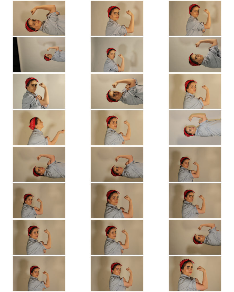
Above shows the contact sheet of my outcomes from the photoshoot, some of the photographs came out a little dark however I should be able to edit these images and fix that in Photoshop.

I feel I have tried to show my inspirations coming from Cindy Sherman through the work by having my subject en body the person in the original ad and begin to represent herself in that way.

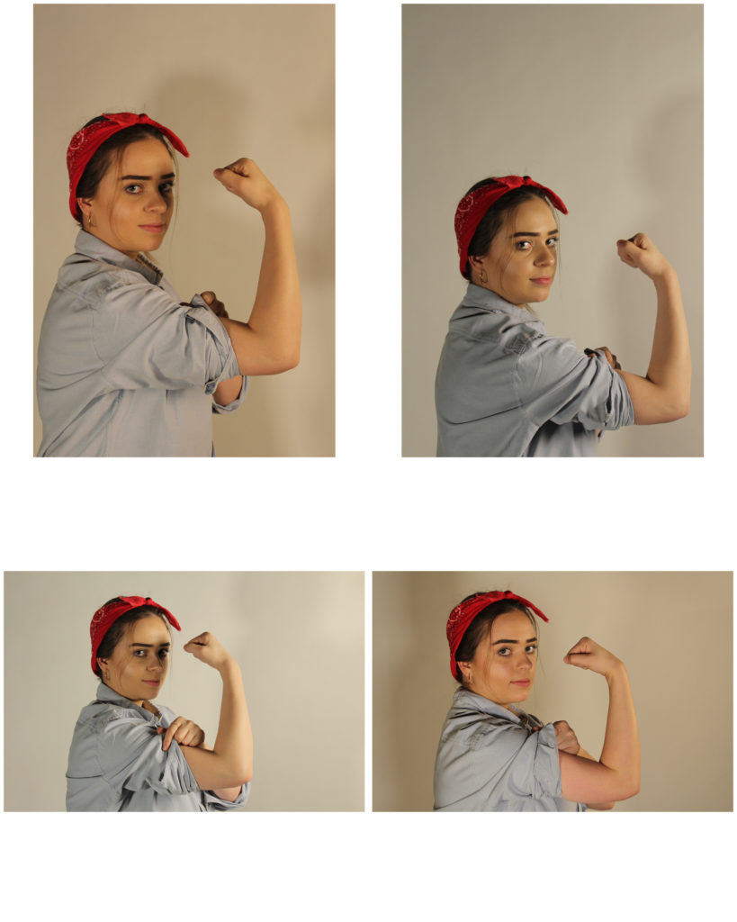
Unedited Best Outcomes:

Below shows what I think to be my best outcomes before I am editing the images to enhance them more and edit them to be more like the recreation. These are the four I think are the best however I will only experiment with editing one or two of them.

The Boyle Family

Boyle Family is a group of collaborative artists based in London. Mark Boyle and Joan Hills met in Harrogate, Yorkshire in 1957, Joan a single mother who had left her art and architecture studies to bring up her son and Mark was serving in the army. Within months they were collaborating, initially exhibiting their work under Boyle’s name until their work became widely known and they exhibited as Mark Boyle and Joan Hills. When their children, Sebastian born in 1962 and Georgia born in 1963, began to collaborate with them from the late 1970s onwards, the group became established as Boyle Family.

Boyle Family is best known for the earth studies: three-dimensional casts of the surface of the earth which record and document random sites with great accuracy. These works combine real material from the site (stones, dust, twigs etc) with paint and resins, preserving the form of the ground to make unique one-off pieces that suggest and offer new interpretations of the environment.

Their project ‘Journey to the Surface of the Earth’ was launched in 1968 – 69. After being blindfolded, they threw darts at a world map, in order to pinpoint 1,000 areas of the earth’s surface to duplicate. On travelling to a selected site, the Boyles would throw a T-square in the air to select a random area to replicate.

Image result for boyle family
The Boyle Family

Visual:

In this image done by the Boyle Family you can clearly see what is the side of the road and part of the pavement next to it. At first glance there’s not much to the image, but with closer inspection you can see all kinds of details and history within the part of the floor they decided to take. You can see every individual texture on the surface, the cracks on the pavement and the light hitting the bumpy surface of the road.

Technical:

The lighting coming from the left side of this image seems a bit artificial, as if coming off of a street light since it’s only lighting up that part of the image and, from what I see, nothing else. As this image is actually a painting replicated from a photo that the Boyles took, it’s hard to asses the technical factors of it but what I can say is that, to take this image which they painted from, it looks like they might have used a long-lensed camera to get that close-up, focused effect in the image.

Case Study – Paul Graham

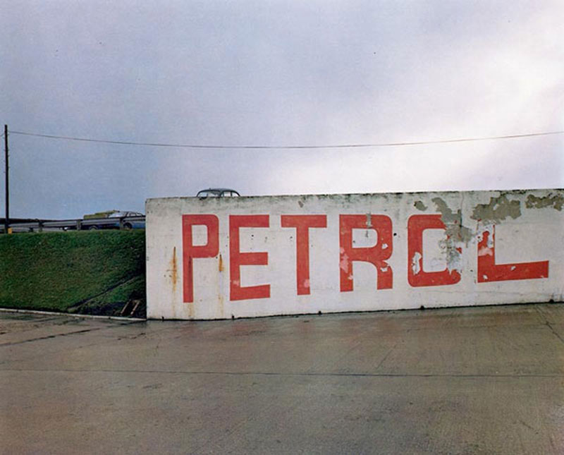
Paul Graham is an English born, self taught documentary photographer whose work has won various awards including the likes of the Deutsche Börse Photography Prize as well as the Hasselblad Award. Graham is a very prolific artist with many published works and exhibitions. As stated before he is a documentary photographer and as such most of his work features small aperture to capture a lot of detail in the scene. I like the flat tones he uses juxtaposed with strong colors, often sticking to two or three main colors as to not over saturate the image.

The image appears to use a high F stop due to the wide range of detail captured. The photo’s look as though they were taken using a Digital SLR with a low ISO due to the abundant natural lighting in the scene (using a higher ISO would leave the image overexposed) as well as the lack of noise in the image despite the age of the camera considering this work was published back in 1983. There is some slight color noise in the darkest areas of the photograph however this is likely due to the age/ quality of the sensor. There is a strong tonal contrast image between the lights and darks however the highlights aren’t too overpowering. The vibrancy of the colors despite such a flat scene suggests the use of a slow shutter in conjunction with a tripod due to the lack of any motion blur.

The image features two strong key colors, that being the orange of the paint as well as the bright green on the grass/ trees in the area accompanied by some more subtle blue tones. There as some light purple tones visible in the darker areas of the image. The image uses the Fibonacci curve as to draw attention to the writing on the wall. The images composition features very strong lines separating layers of the foreground and the background. There is a strong sense of texture created in the image by the rough surface of the concrete as well as the detail in the grass/ trees. The roofs of the houses almost create the effect of a repeating pattern.

Image result for paul graham photography

Photo shoot 2: Corbiere

HOW: 

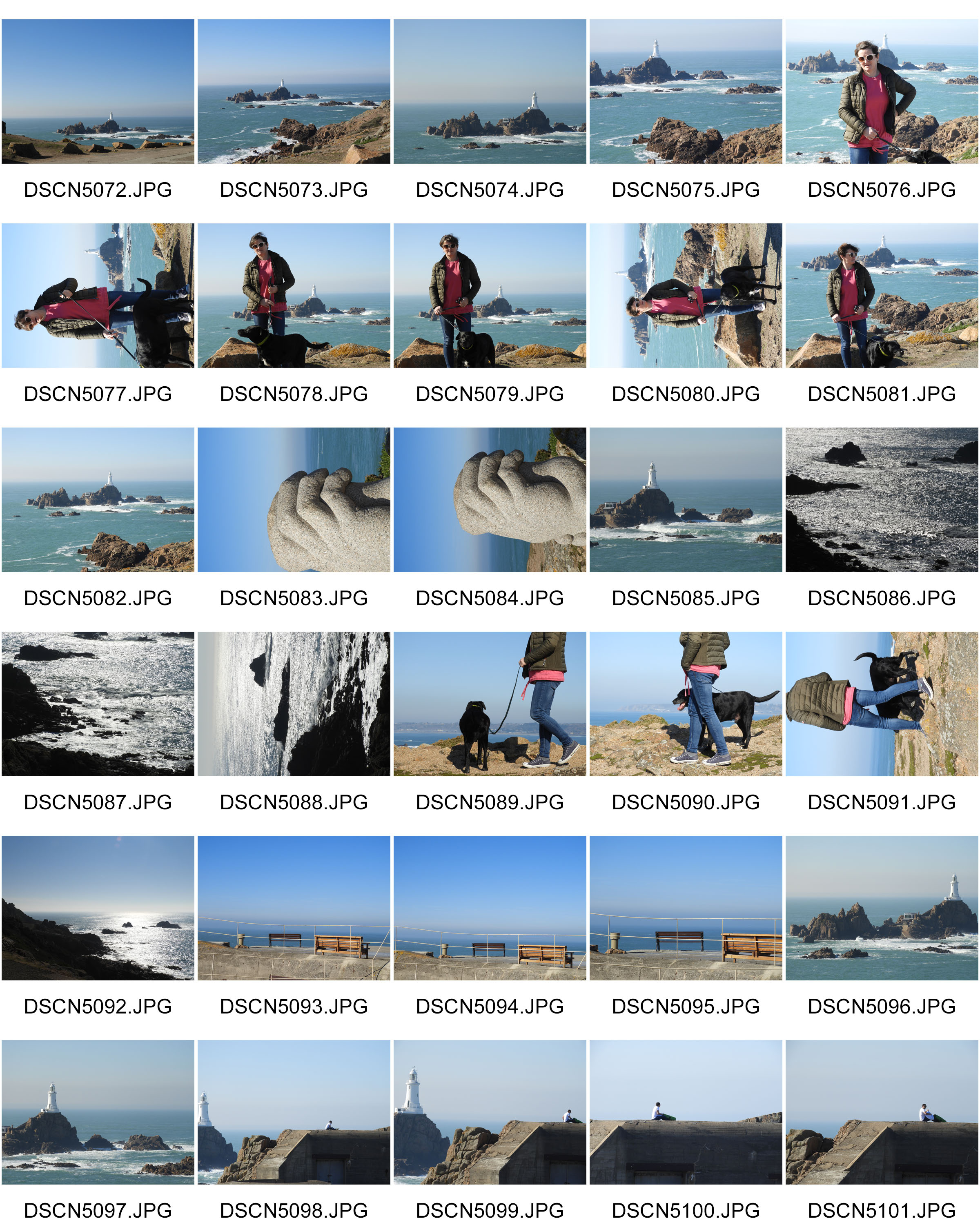
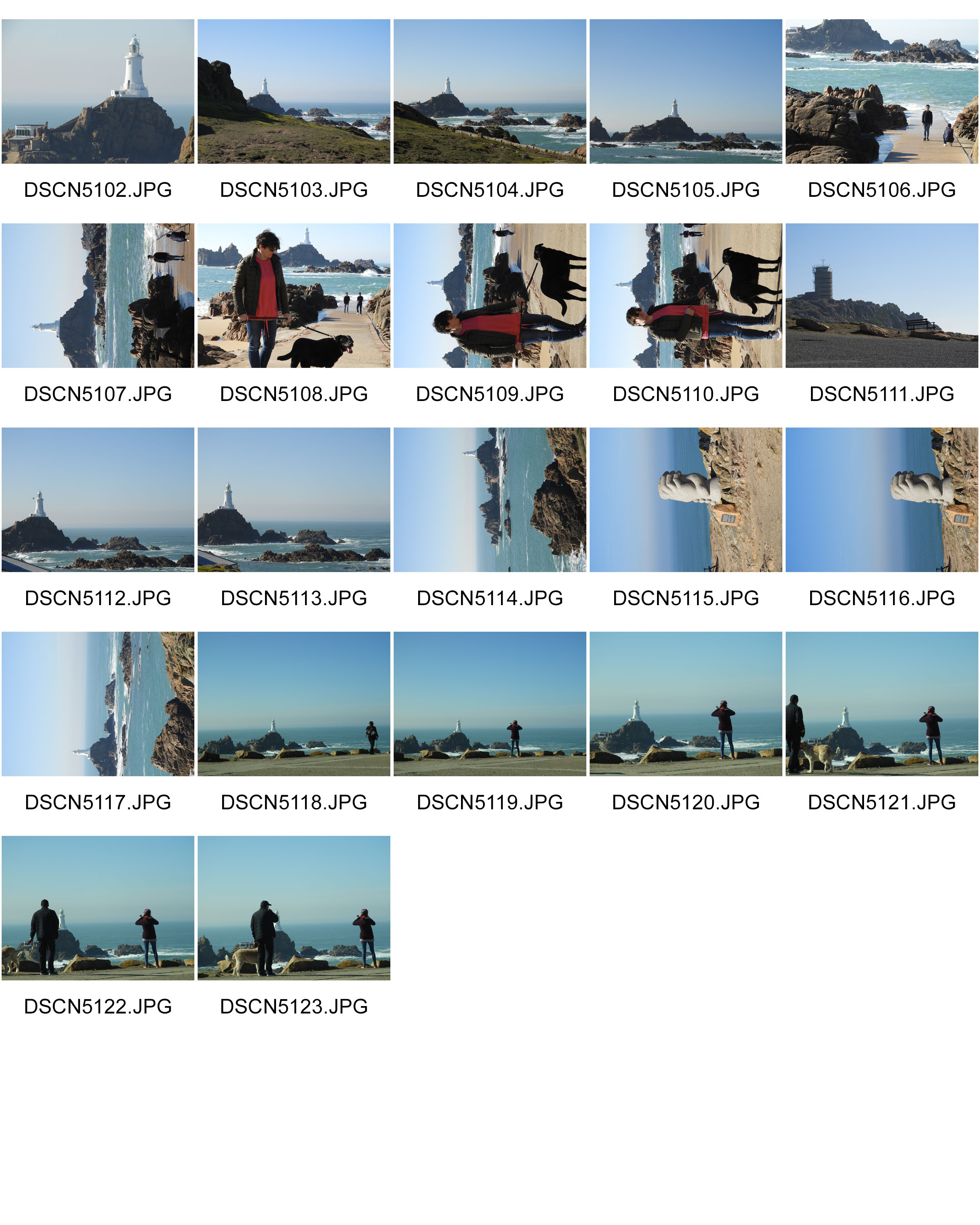
For this photo shoot, I used my regular DSLR camera in order to capture the images.

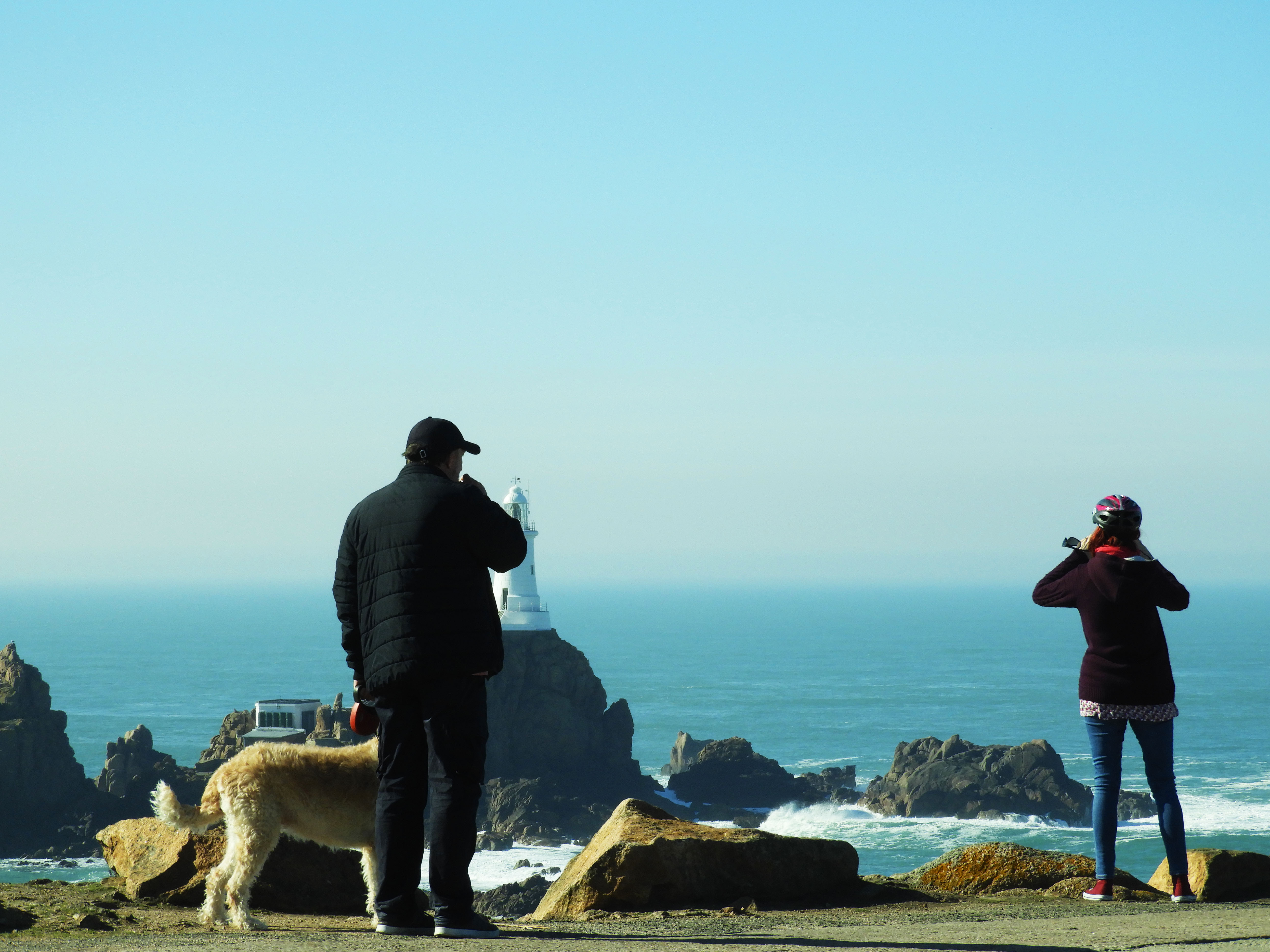
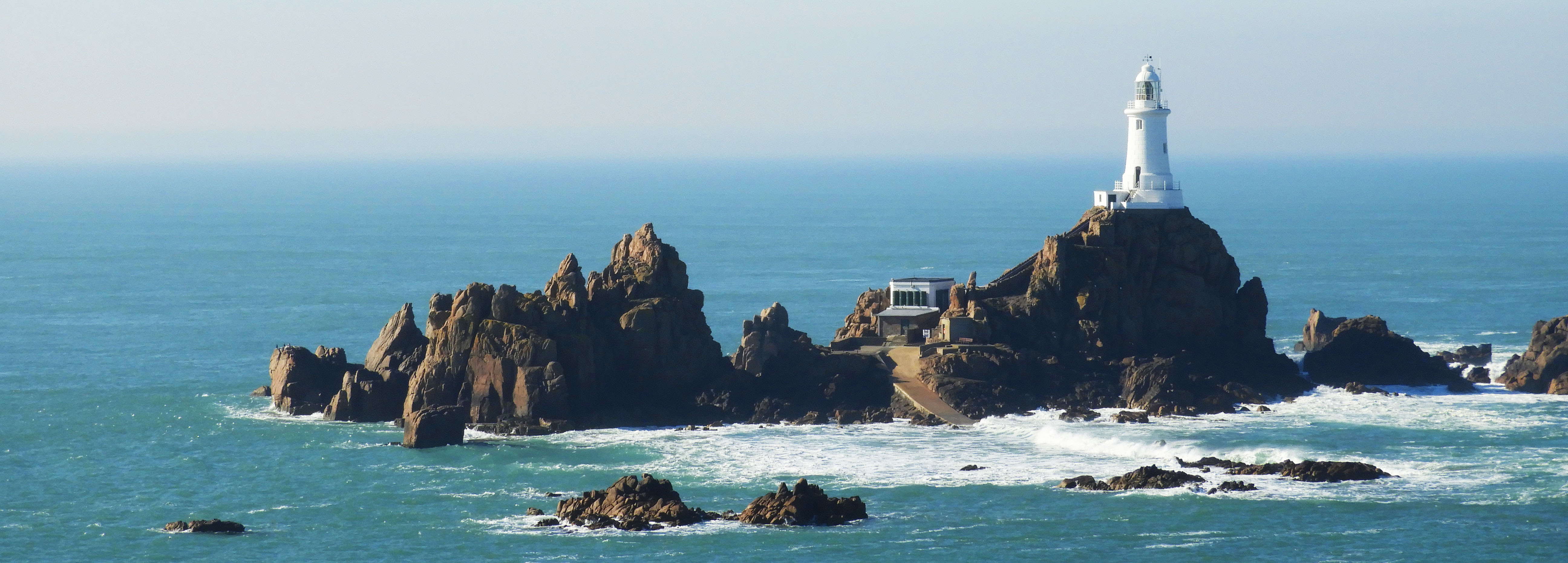
WHERE: I conducted this photo shoot in Corbiere as I thought it represented well the natural beauty we have here in Jersey. I also found the different skyline and horizon very interesting.

WHEN: This image was taken during the early morning meaning that the shadows which are cast are at a very steep angle, giving different shadows than if it were to be taken during mid-day.

WHO: I attempted to incorporate both the landscape and people into my work as I was experimenting with different themes and subjects to take forward into my project.

WHAT: Corbiere is very well know for its stunning cliffs and amazing lighthouse which is situated in the middle of the sea.

WHY: One of the themes which I was trying to convey through my work was landscape romanticism therefore I tried to capture the sublime nature of the landscape and how it has been altered through man-made forces.

MOST SUCCESSFUL PIECE:
CRITICAL ANALYSIS: 

TECHNICAL: 

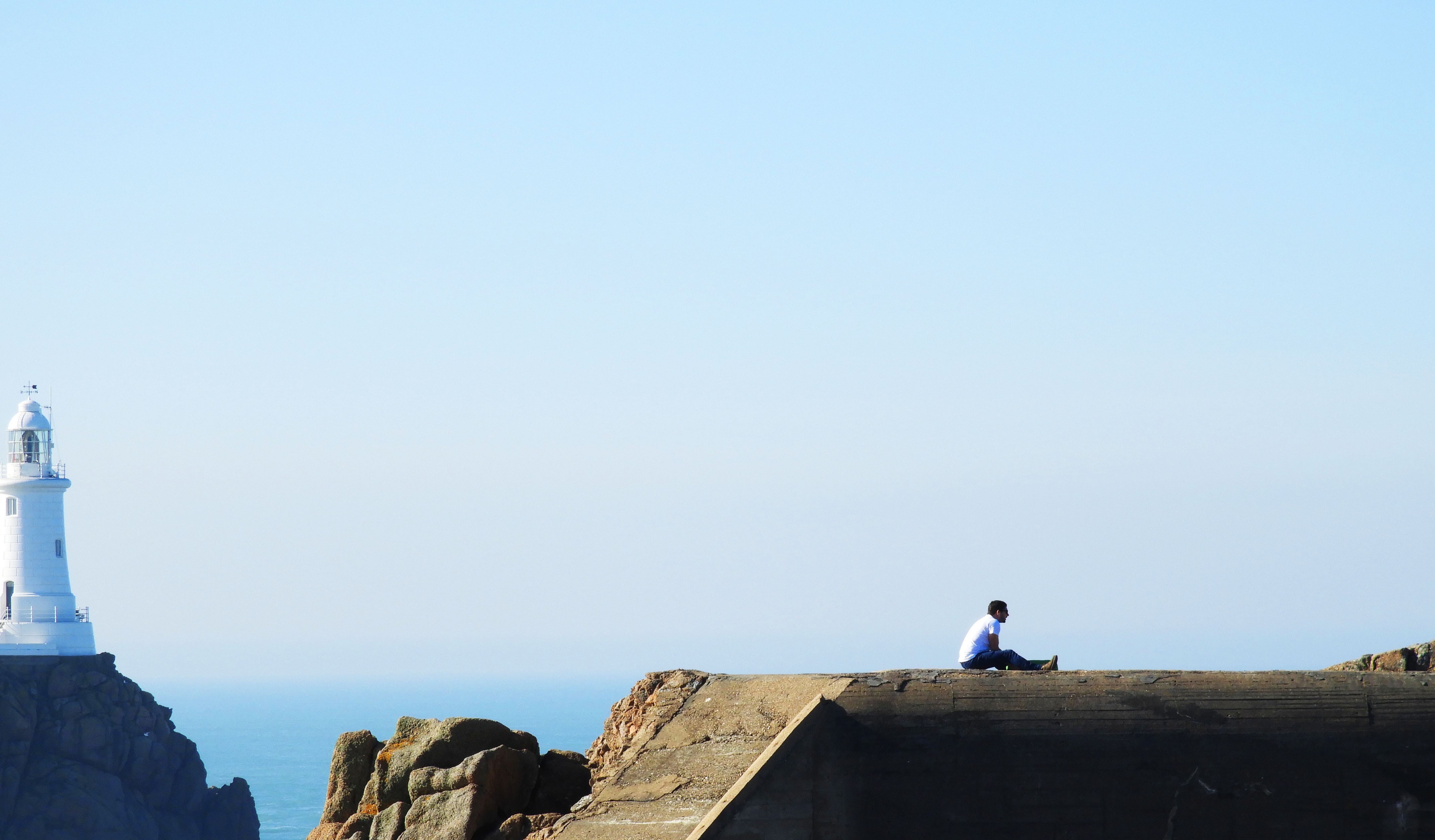
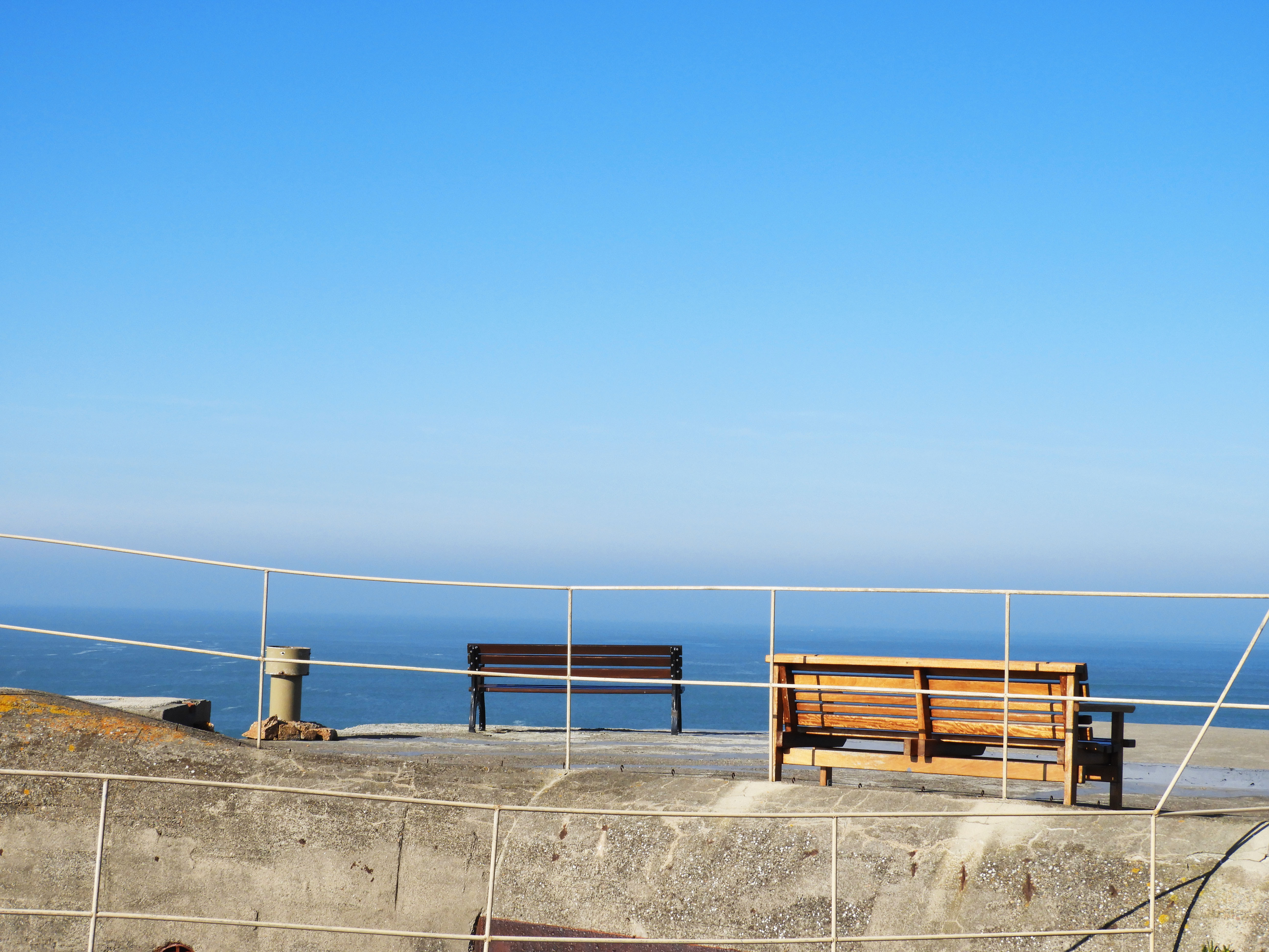
In terms of actually taking this photograph, no special changes had to be made overall. I used the manual setting on my camera, using ISO 200 as it was a fairly bright day and I did not want the image to be overexposed. The image above was taken using manual zoom on my camera, increasing the focal length to 35mm as this allowed me to capture a detail shot of the landscape. The original image encompassed a lot more of the landscape but I decided to crop it in order to draw more attention to the man sitting atop the bunker, as this better captures the themes which I wanted to portray through my photography. 

VISUAL: 

The editing techniques which I used in this image means that a sort of minimalist image was created, yet retaining elements of landscape romanticism. An aspect which can be looked at is the minuscule looking person sitting atop the bunker, being overridden by the sublime nature of the landscape which appears massive in comparison to the measly human.  One of the most striking things about this image is the symmetry created and the continuation of the line between the sea and the top of the bunker. It sort of mergers the two elements into one and creates harmony between the two. Another contrast in the man made and natural is the color pallets of the two entities, the lighthouse and sea being mostly blue based whilst the bunker and human have orange and warm tones. The majority of the attention in the image goes to the bottom third of the image as this is where the focal point lies. The combination of the 3:1 ratio between the emptiness and focal point mean that it is a fairly minimal image, with simple linear elements and few colors overall.  Although touching on the minimalist style, it is style evidently exploring landscape romanticism and human impact by including the bunker and sea in the backdrop. As this image was captured quite far away, there is no real sens of foreground but rather only a mid ground and backdrop. The bunker and man being in the mid ground and the sea and light house being in the back drop. 

CONTEXTUAL:

Violent seas have caused many a shipwreck at Corbiere over the years. The name, which is probably derived from corbeau, the French for crow, is commonly found elsewhere in the French-speaking world, notably in Guernsey, the north Brittany coast, central France and Switzerland.

Jersey’s Corbière is first recorded in the 1309 Assize Roll, when the issue arose of a tub being washed ashore there, and it was a regular occurrence for a ship to founder on the rocks when rounding the corner of the Jersey coastline in stormy weather and its cargo to be washed up on the sands of St Ouen’s Bay.

It was not until 1873 that the lighthouse was constructed which now allows ships to plot a safe route. It is 11 metres tall and was the first lighthouse in the British Isles to be constructed of concrete.

The light can be seen from a distance of over 25 kilometres, but this has not stopped smaller vessels from taking a short cut through the rocks off the coastline en route from Jersey to Guernsey and coming to grief after striking a hidden rock.

CONCEPTUAL:

Two of the major styles my work tackles in this photo shoot is landscape romanticism and minimalism, each being very distinct from each other yet creating striking impact within visual media.

Minimalism is a style employed by many 20th Century artists, using a minimum amount of components such as colour, shape, line and texture. Within the art world it is considered an extremely subjective concept, leaving interpretation and meaning up to the viewers perception of the work.

Some appreciate the openness of this idea, embracing the freedom of interpretation, where others despise the lack of direction or subject matter. For photographers, this is less of an issue, as more often than not, a photo remains a real-life moment captured on film. Despite this, we can employ some of the techniques of minimalism to enhance the impact of our work.

Romanticism was (and is) an international movement that swept Western Europe and Russia at the end of the 18th and beginning of the 19th centuries.  It expanded to North America beginning around 1830. As a movement, Romanticism drew its inspiration and energy from various sources:

  • the “rage for roots” triggered by linguistic discoveries
  • a growing sense that the creative possibilities inherent to the rigid formalism of Enlightenment philosophy and art had been exhausted
  • growing fatigue with “rule by the few”
  • the resounding successes of the French and American revolutions and such later popular wars for independence as those in Greece, Poland, and Spain.

OTHER SUCCESSFUL IMAGES:
Experimental photoshoots

Before I started to do photo shoots based on other photographers, I wanted to get a rough idea of what would be good to photograph to start me off on the theme of Journeys and Pathways. As an experimental photo shoot, I went out on multiple occasions and took pictures of what I thought could fit into the concept of the theme.

Contact sheets:
In these images I concentrated on getting images on which I thought could relate to the theme. I took images such as actual pathways, the water and waves coming in on the beach, pictures of my feet walking, pictures of the view from when I was on a plane, and footsteps on the beach.

Chosen images:

Final edited images:

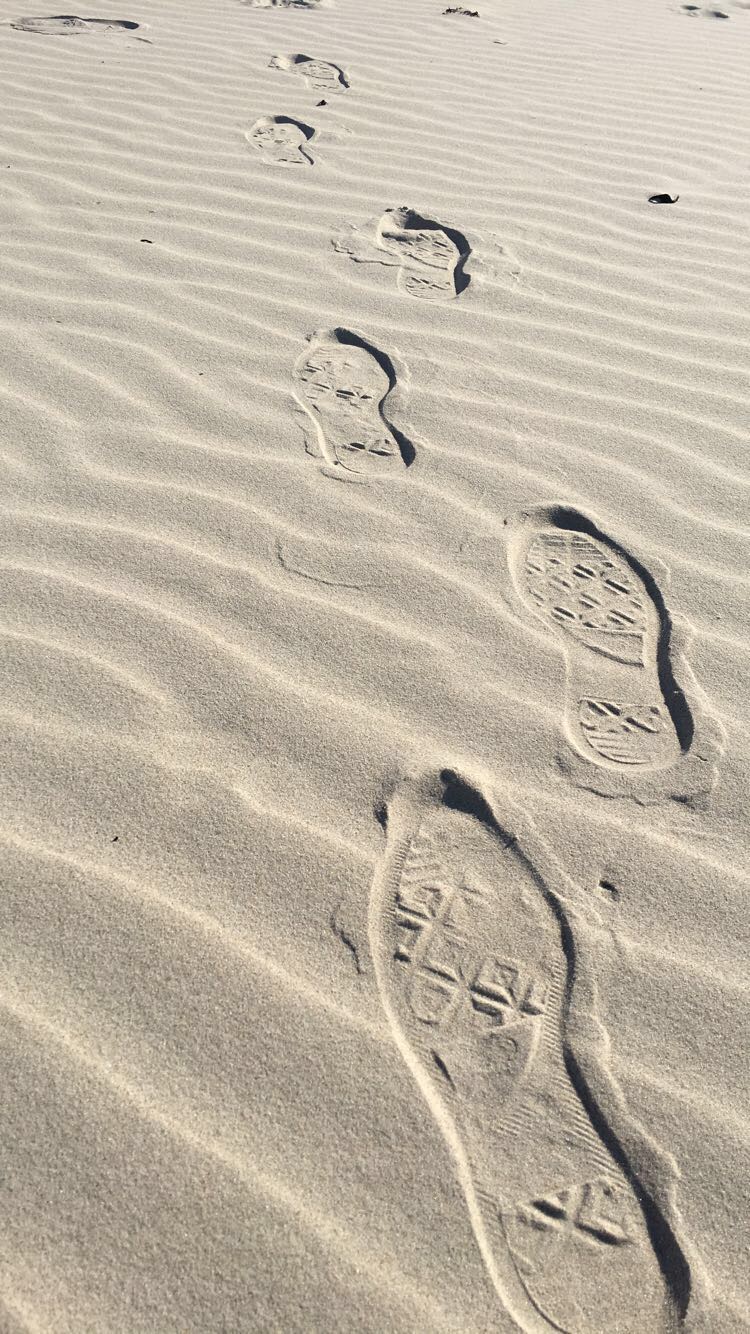
In this image I decided to add more colour and to blur out the further steps to create more of a depth to the picture. To do this I first cropped the image to get out the unwanted parts in the background and then played around with the brightness and contrast, increasing them both equally to lighten the light areas and darken the shadows. I then went and increased the exposure a little bit, and increased the vibrance and saturation a significant amount, making the sand look more golden. I finished with changing the hues in the image.

What I like about this image is the neatness of it, the sand around the footsteps seem calm and natural, and then the footsteps in the sand bring some sort of chaos with them, messing the sand up as they go. This could portray the effects which the journey of someone can bring, making their imprint on the surroundings around them. I also like how the image becomes darker as it comes closer towards the camera, as it adds to the depth of the picture.

What I should have done to improve the picture was to maybe angle the camera more upwards, maybe getting more of the surrounding beach which would have added more to the image. I also think I should have maybe darkened the edges of the image when editing, which would have given it a nice effect and made the viewer focus more on the footsteps than the actual sand.

In this image I decided to edit it only a little bit. I first cropped the image so it was smaller and focused more on the moving leg, and then I went and increased the brightness and contrast in the picture. I then followed on by going straight onto the vibrance and increasing that only a little bit to give the image more of a colour to it, and then finished off by using the dodge tool to brighten the whites of the shoe, making it pop out against the dark background and rest of the shoe.

I like this image because it has a certain movement to it, as if the person in the image is in a rush to get to a certain destination, and I feel as if that’s clear in the image. While the surroundings are all blurred and moving, the foot in the middle of the image seems to be more focused than the rest of it, although it too was caught in the middle of movement like the rest of the image, and I feel like that gives it a nice affect.

However, I feel I could have done better with this image by getting it more focused on the foot and leg in the image. While it’s not as blurry as it’s surroundings, it’s still a bit out of focus and I think it would have been more successful if I had been able to get the camera to focus on it a bit more.

In this image, I wanted the viewer to focus more on the path and less on the beach surrounding it, so to do this I started editing this image by dropping it down to a point where the stone pathway was the only thing you can see in the middle of the image, removing the sky and most of the sea out of the photograph. I then blurred out the surroundings which were further out, and a little bit around the image to make it easier to focus on the pathway. And then, to add a bit of colour and light, I increased the brightness and contrast like i’ve done on my other images, and then increased the vibrance and played around with the hues until I got my desired outcome.

What I like about this image is that the stone pathway is right in the middle of the image and continues vertically until right to the end, which was the effect I was looking for. I also like how each side of the pathway are different, with one side being nice and sandy while the other side seems almost swamp-like and covered in seaweed, which could be interpreted in many different ways.

Although, what I don’t like about this image is the quality. Since I took it on my phone, it didn’t come out as good of quality as a digital camera would take it in, so I think i’ll be re-taking this image again but using my camera instead of my phone, and see what kind of results I get, and hope that it’s much higher quality then what the phone could give.