Journey of Urbanization/Unknown journeys: Landscape Romanticism

PHOTO SHOOT PLANNING:

WHO:In this project I am mostly focusing on landscapes and scenery therefore my images do not contain models as I was attempting to capture the beauty of untouched nature.

WHERE:The images were taken at St.Aubin’s bay, a large and open beach which was perfect for capturing the surreal qualities of nature and the sea.

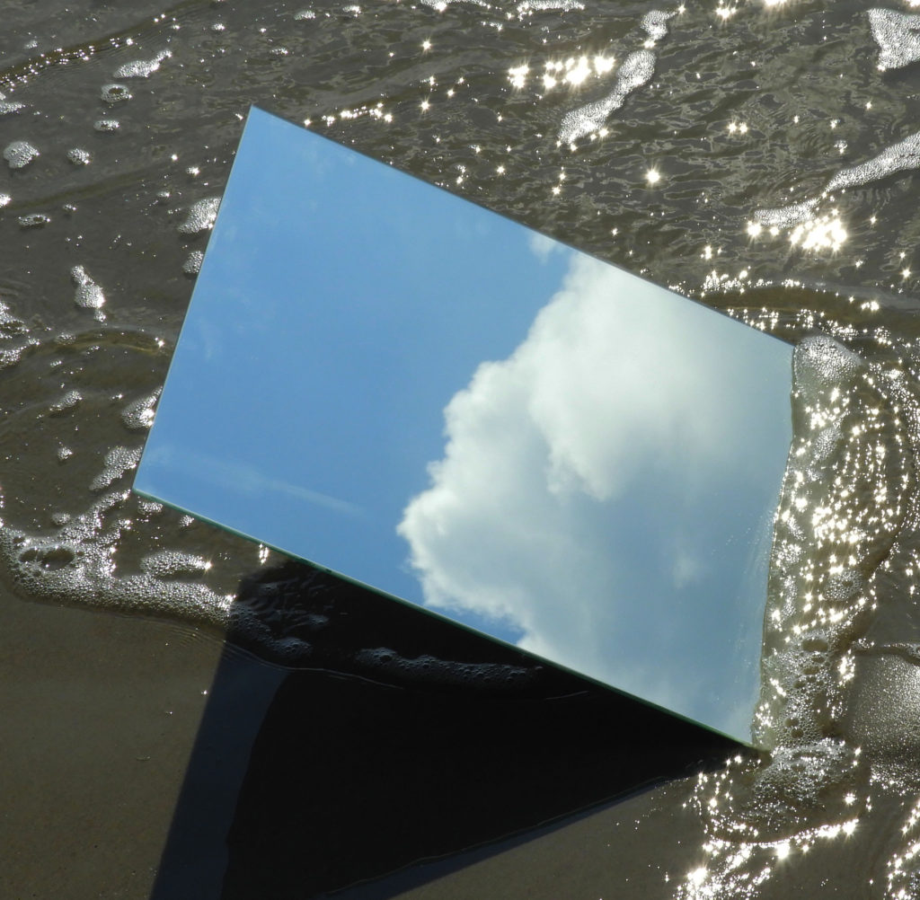
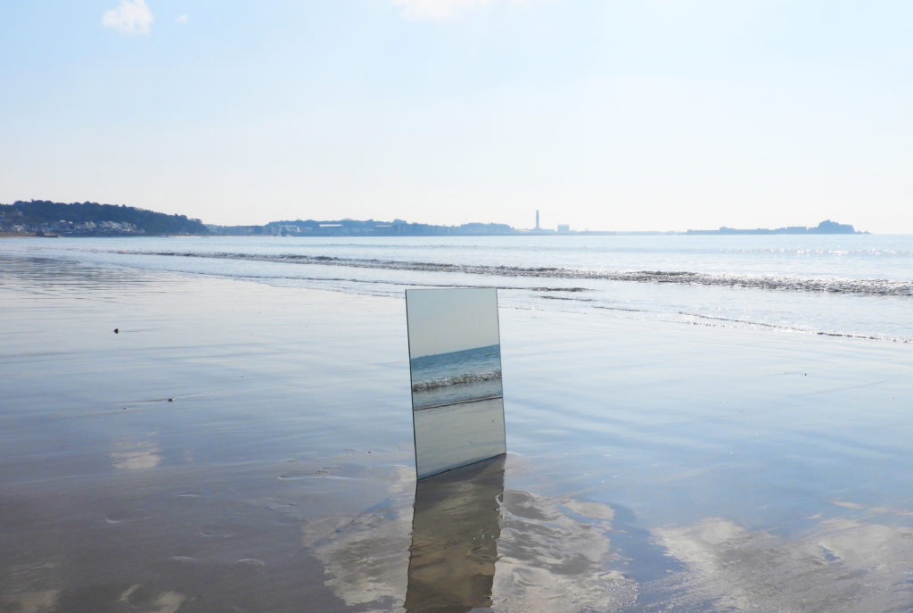
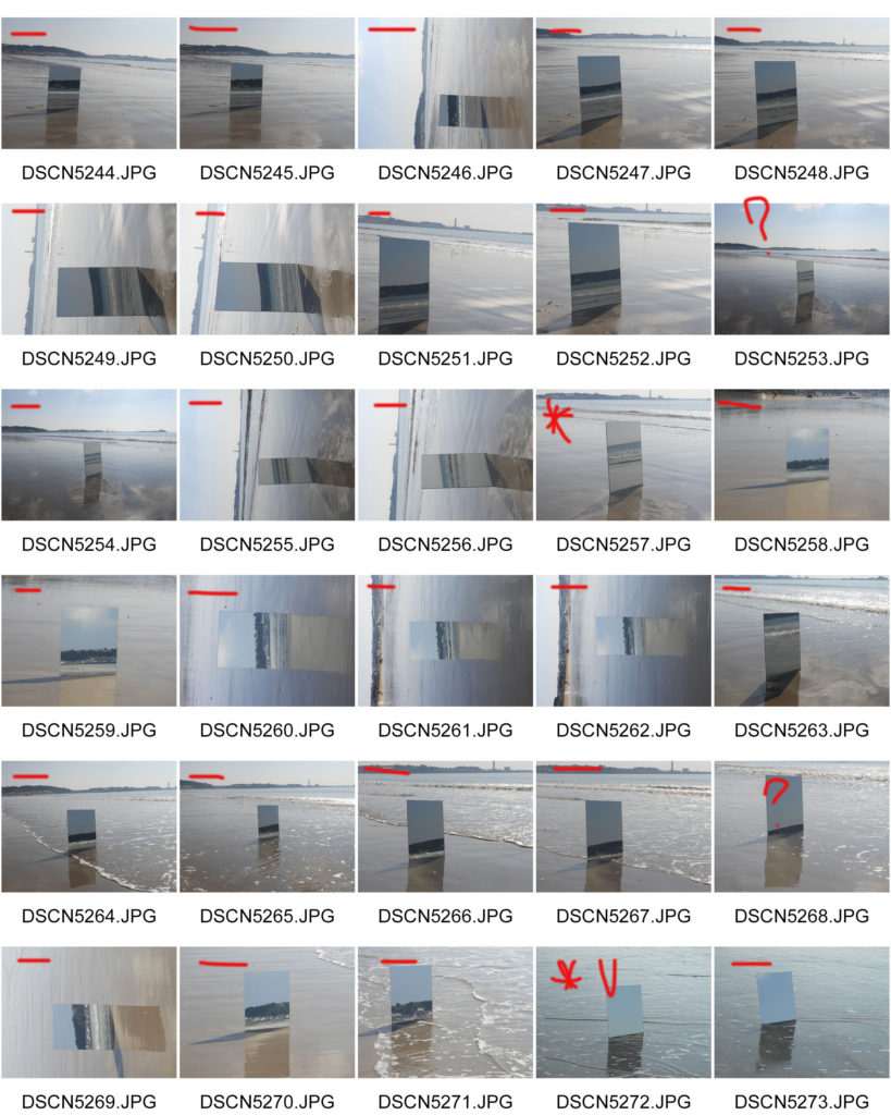
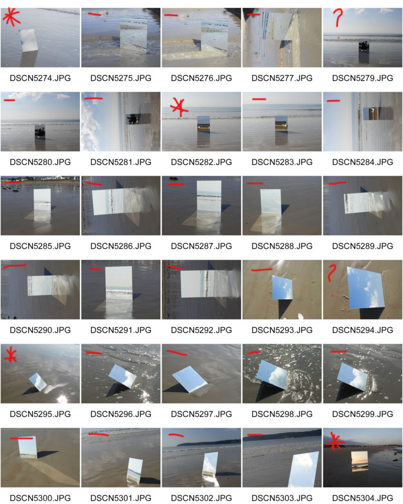
HOW: In order to capture the images I used a large rectangular mirror and dug it into the ground in order to capture the unseen aspects of the landscape, tying in with the whole theme of unknown journeys/a double journey. I used my regular DSLR camera to capture the images.

WHEN: The images were captured on a clear and sunny day which reflected the light of well in the water and provided the clear blue skies which I wanted to be reflected in the mirror. I went out around late morning/mid day to capture the images.

WHY: With this photo shoot, I was taking a different approach to the title “journeys and pathways”, selecting the theme of unknown journeys/a double journey to focus on. I used a mirror to capture the other side of the landscape, one which we cannot see from the perspective we stand at.

INSPIRATION:

My main inspiration for this photo shoot was Cody William Smith
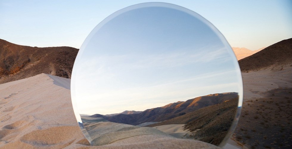
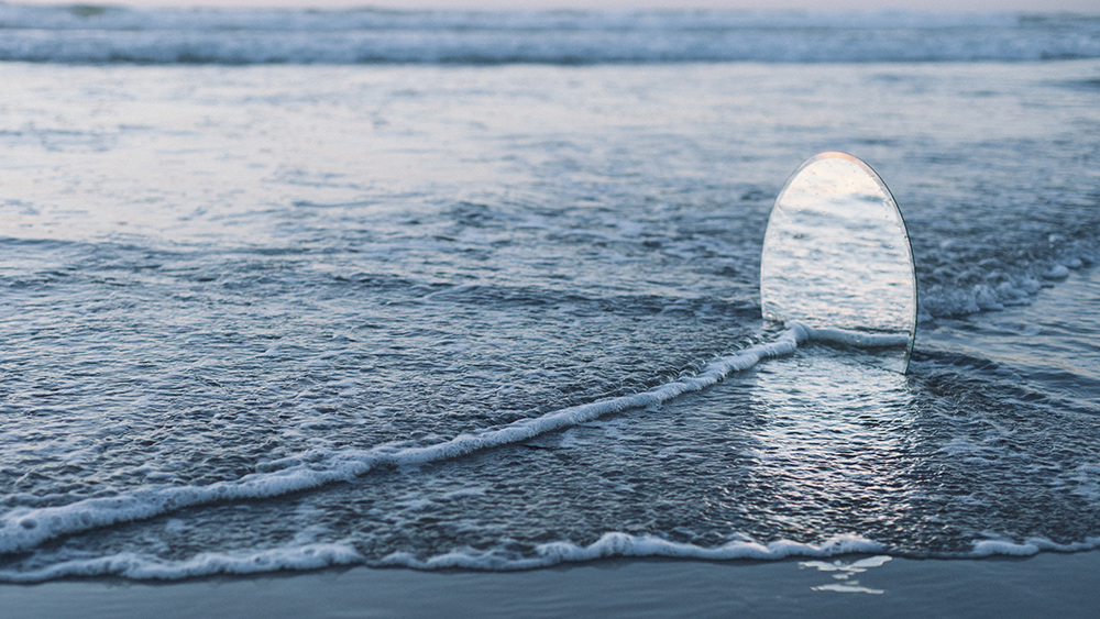
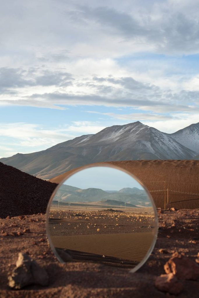
American photographer and director of photography Cody William Smith mirrors the world upon itself in these contemplative landscapes. The series, entitled A Moment’s Reflection, features a large, round mirror placed unmistakably into the sand, the dirt, or the sea in various settings. Standing upright and partially buried, the mirror disrupts the normal landscape with a reflection of a different space located close by.

EXAMPLES OF HIS WORK:
MOST SUCCESSFUL IMAGE:

MOST SUCCESSFUL IMAGE

CRITICAL ANALYSIS:

VISUAL:

The overall image is very simplistic, containing both organic and angular shapes. The waves providing rounded curves which stretch across the image which are disturbed by the rectangular, harsh shape of the mirror. Although juxtaposing each other with the natural aspects of the water and the man made mirror, they work together harmoniously to create a balanced image. One way in which this is done is through the continuity of the blue tones. They differentiate throughout the image, being more saturated within the mirror and subtly reflected on the surface of the water. There is also a sense of pattern in this image with the ripples and repeating lines on the surface of the water which cut through the image horizontally. The pattern is disturbed by the white foam on the water which in a way creates a pattern by itself. It also creates some texture in the image which is a nice contrast to the smooth and flat mirror. Within the center of the image, within the reflection of the mirror is a very clear color gradient of the blue, fading from a more saturated to a more subtle blue. There is a varying degree of light within the image, getting stronger the further up the image you go. The mirror also reflects a fairly strong shadow on the bottom half of the image. Although not following the golden rule within the image, placing the mirror in the center works well overall to create a balanced image.

TECHNICAL:

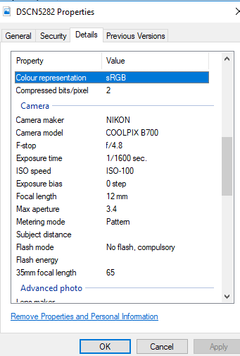
In terms of capturing the image, the most difficult thing was placing the mirror in the sand and taking the picture in time before the sea eventually knocked it down. Logistically it was one of the hardest photo shoots I have done due to the fact that it involved props which needed to be transported as opposed to just taking images of the landscape or people who are already there. Good weather conditions were also essential for this photo shoot as I did not want rainy weather which could interfere with the reflections in the mirror. In terms of camera settings, I set the ISO fairly low at 100 as it was a very bright day and wanted to avoid overexposure as much as possible. I set the white balance of my camera to 5500 k as this is ideal for using outside in direct sunlight, creating images which aren’t too cool or too warm. The aperture of my camera was set at f/4.8 this meant that the exposure of the image wasn’t too high and the focus was universal.

DETAILED CAMERA SETTINGS USED:
CONTEXTUAL:

In the 19th century the Industrial Revolution in Jersey took place on the shoreline – this was where the shipyards were and the beach between First Tower and West Park was the site of some of the island’s largest shipbuilders. Deslandes, Le Vesconte and Grandin between them built over 100 vessels here. The remains of the yards lie beneath Victoria Avenue. In 1860, when Jersey was the fourth largest ship building centre in the British Isles, George Deslandes priced a job at £14 per ton. This was £3 per ton cheaper than builders on the mainland. However, the industry began to go into decline in the late 1860s and 1870s as Jersey was unable to build the more modern iron ships. The new railway built between St Helier and St Aubin did not help as it cut through the yards. However on a bizarre note, the train service was halted for two days in January 1875 when a ship became stuck on the tracks as it was being launched from the Deslandes yard.

source:
https://www.jerseyheritage.org/heritage-landscape/first-tower

CONCEPTUAL:

One of the themes which I wanted to explore in my own work was the journey of urbanization and also unknown journeys. When conceptualizing the mirror idea and getting inspired by the photographer Cody William Smith, I realized that an interesting aspect of the images, they show reality which we cannot see from one perspective, only being revealed when you place a mirror can you see this reality. This further contributes to the surreal aspects of landscape romanticism, as not only are you showing one perspective, but multiple, in a way creative a hyper reality in the image. I also like the fact that a lot of the images appear photo-shopped when reality it is all done with a mirror and camera and very simply edited in the selection process. Increasing small things such as saturation or fixing the exposure of the images. Another large theme which I am keen to explore with this method is landscape urbanization. In image 1 and 4, you can again see two perspectives, one of the untouched sea and shoreline and the other the urbanization and industrialization of Jersey. Humans have altered and changed the natural landscape we have all around us with homes, businesses and industries.

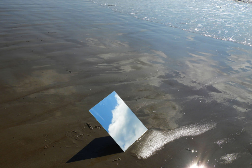
IMAGE 1
IMAGE 2
IMAGE 3
IMAGE 4
IMAGE 5
IMAGE 6

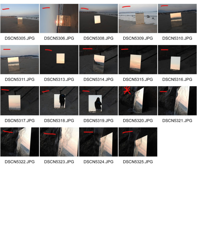
CONTACT SHEETS:

Photo Shoot Planning: Cody William Smith Inspiration

WORK AND LIFE:

American photographer and director of photography Cody William Smith mirrors the world upon itself in these contemplative landscapes. The series, entitled A Moment’s Reflection, features a large, round mirror placed unmistakably into the sand, the dirt, or the sea in various settings. Standing upright and partially buried, the mirror disrupts the normal landscape with a reflection of a different space located close by.

The stunning arrangements create a unified balance of multiple realities linking in unexpected ways. Some circular shapes and forms stand out against shady surroundings and show off the bright skies in the distance while others blend seamlessly into the setting in an optical illusion of shapes.

Smith reveals, “My intention is to draw new connections between familiar forms by introducing specular reflections to environments where none would typically exist. The mirrors serve as a focal point within a given scene and also function as a window to provide an entirely unique perspective on the same location.”

Smith is a professional Photographer and Director of Photography. Originally from Reno Nevada, he moved to Los Angeles in 2011 and earned his BFA in Cinema from Columbia College in 2012. As a photographer he specializes in landscape, fine art, and environmental portraiture.

source:
http://www.domusnova.com/domus-loves/story/135/time-to-reflect-cody-william-smith

CRITICAL ANALYSIS:

VISUAL:

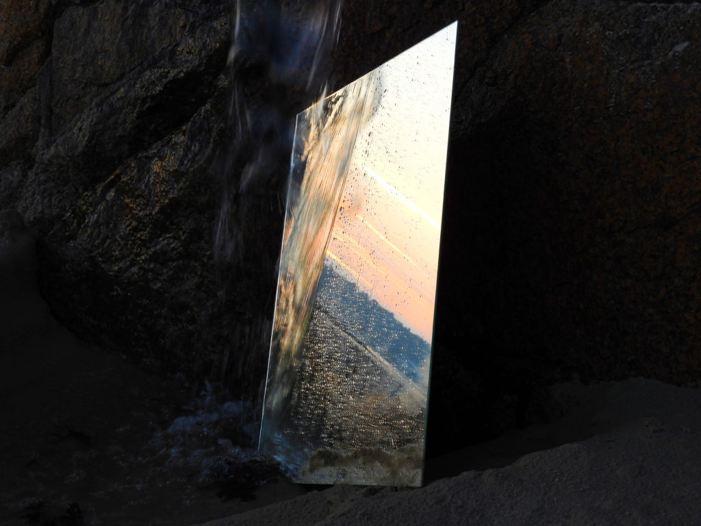
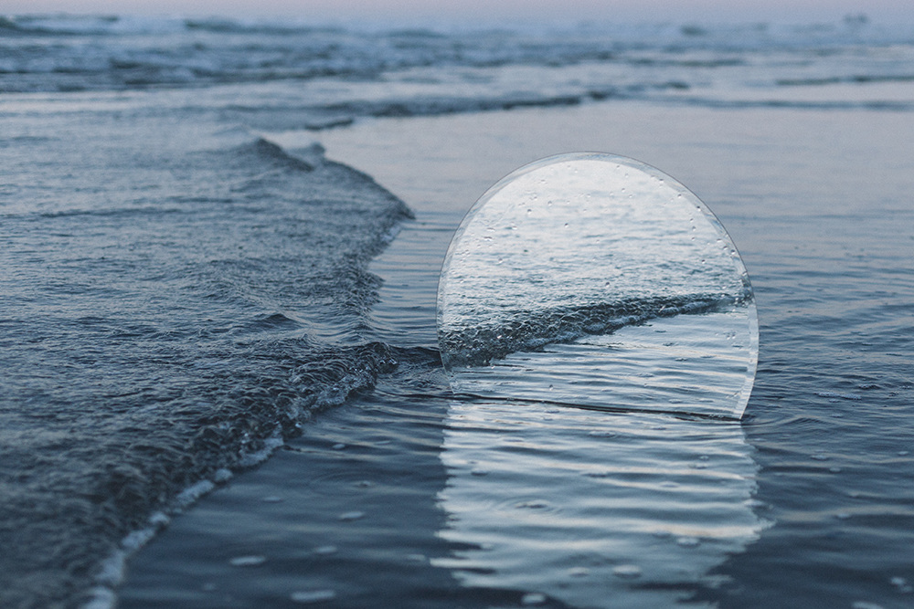
When looking at this image the first thing the eye is drawn to is the circular mirror which reflects the small and delicate waves within the sea. Unlike the surrounding sea, it is a lot brighter, reflecting strong and white light of its surface. It is a juxtaposition between nature and man made objects as the strong, crisp and round outline of the mirror is contrasted by the organic and free flowing shapes of the waves. The ripples within the water also provide repeating shapes which create a sense of pattern. The mirror provides a sort on continuation of the sea, the linear pattern being reflected in it. The image is mainly composed of different tones of blues and very subtle oranges in the background of the image. The image also provokes many ideas in the head of the viewer, such as the repetition of the image they can see within the mirror and the reason for the mirrors presence in the first place. Within the image we can see the linear repetition of the line of the wave, giving the photo a whole another dimension.

TECHNICAL:

In terms of technicality, the image was likely taken in the early morning/late evening due to the low angle at which the light hits the water and the darkness lower down in the image. I believe the ISO of the image was likely to have been set to 400 as the image and environment is slightly dark, avoiding under exposure. A tripod may have also been used in order to capture the image in order to get the mirror into position and before the tide comes in too far and knocks down the mirror. The aperture was likely set to about f/8 as the image is fairly dark with dark shadows and subtle highlights.

CONTEXTUAL/CONCEPTUAL:

It is possible that you catch a glimpse regarding this kind of  landscape photos processed with a mirror effect on a geometric shape. American photographer Cody William Smith did the job straight-shooting and made 4 very beautiful series called “A Moment of Reflection”. He took pictures of impressive landscapes seen through mirrors: the sea, a sunset, the desert or mountains.

Decay – Case Study

‘rot or decompose through the action of bacteria and fungi.’

Heikki Leis

 Heikki does mostly hyper realistic pen and pencil drawings and also sculpture. 
Since 2004 he is also an avid photographer and takes part in exhibitions. 
His biggest passion is analogue photography, he uses both mid- and large format cameras.
The project that took the longest time, the most effort and has also become the most famous is his series of molds called “Afterlife”. A book by the same name, consisting of photographs from the series was also published in 2017. 

Afterlife

‘ Molds belong to the kingdom Fungi. They’re kin to more friendly fungi like the yeast that leavens your pizza dough, and the mushrooms atop your pizza. This great kingdom of life spans the gap between microorganisms and macroorganisms (like us). In fact molds and other fungi are the closest relatives of animals; of people. We have a lot in common, including our love of pizza.  
 The earth already has all the carbon atoms it will ever have; they are the very stuff of life. Plants use their superpower, photosynthesis, to extract carbon from thin air using sunlight. They fashion that carbon into new molecules, like carbohydrates and proteins, that are the building blocks of the beets, the potatoes, the turnip, you and I, and all life. In the end, the special task of molds is to dismantle what once lived, and exhale that carbon back into the air again. To recycle life.
Recyclers don’t get much glory, but clearly there’s an underappreciated beauty here. Because of recyclers like molds, there is life after life.’

Shoot one – Image Selection and Edit

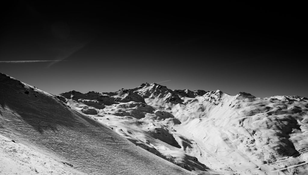
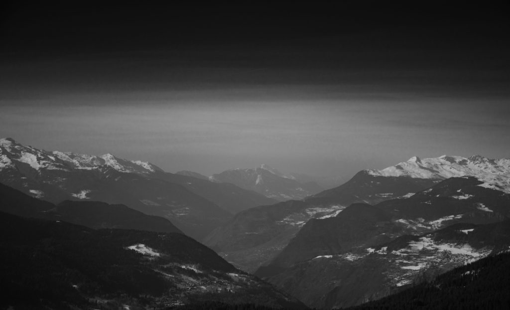
When editing the images in light room I converted them first to black and white then changed the exposure, shadows, contrast etc. until I had an image that had the desired level of contrast and made sure that I was using Adams’ work as a reference the whole time. My aim wasn’t and isn’t to make images that could be his but to use his methods and his themes to try and show the landscapes that I know and love as they are changing and when I saw the way that Adams did it felt that that it was a good way to do it felt that that it was a good way to do it. In the edit I decided to add a gradient filter to the top of some of the images to draw attention away from the sky as it is dead space in these images so the filter brings it back down to the actual landscape, the filter does this without completely removing the sky from the image.

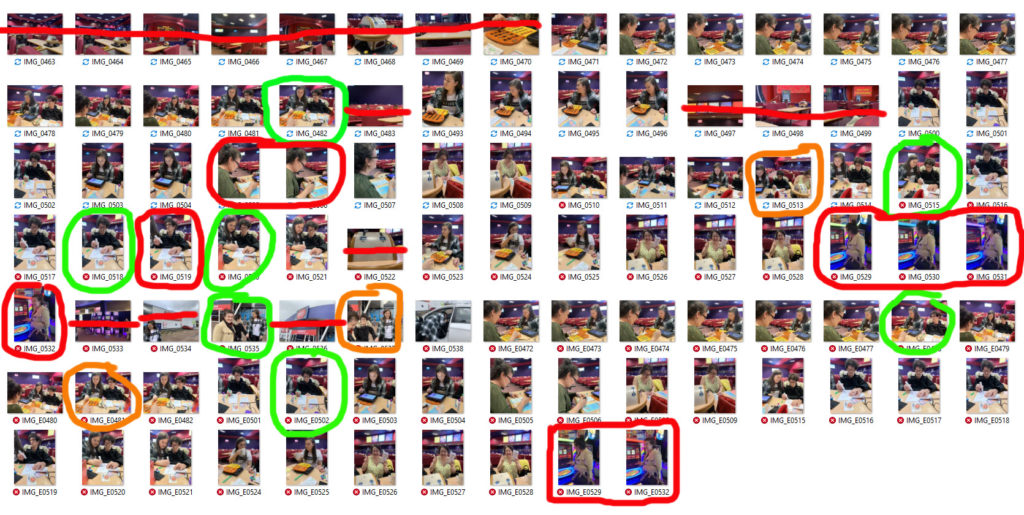
Shoot one – Contact sheet images

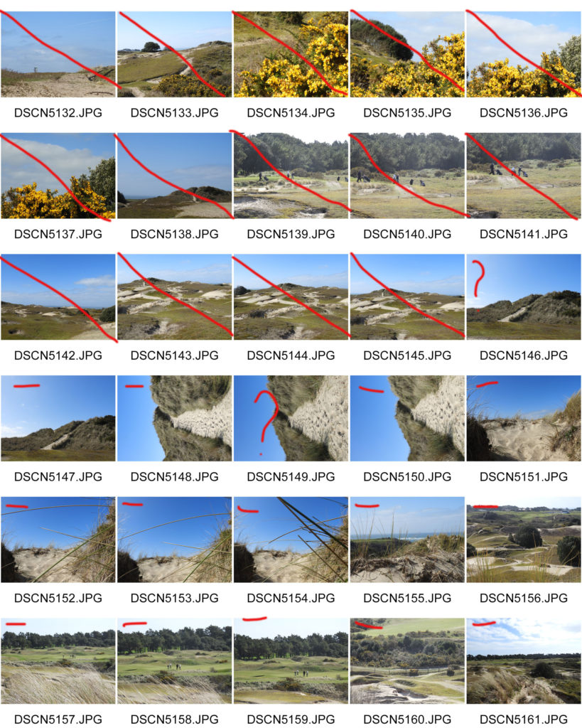
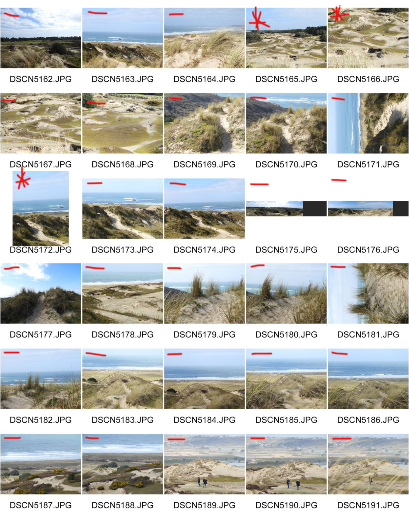
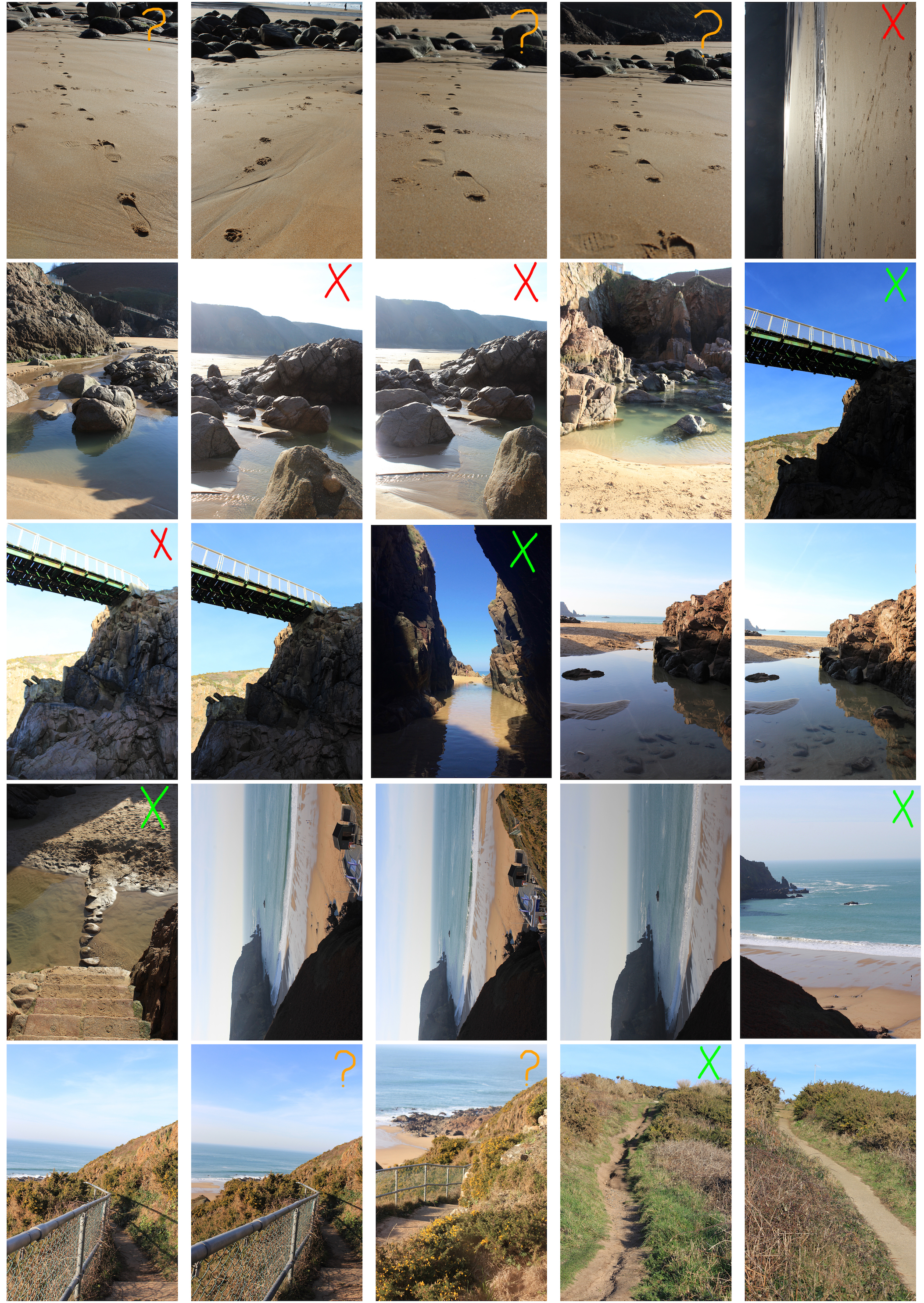
When shooting I only took a few images as there were limited views that I thought were suitable for me to link to Ansel Adams. The things marked in red either need to be fixed or aren’t good and the orange boxes are where the images need to be cropped.

All of my images were taken with a high aperture, the reason for this is so that as much of the image is sharp and in focus at once. This was done because Ansel was a large believer of using high apertures so the true nature of the image is shown and that there was nothing that couldn’t clearly be seen in the image.

All edits and final images I do will be making the images into black and white because all of Adams work was in black and white and it is easier to make the images imposing and bold and it is easier to make the parts I want to stand out, stand out.

When I went to take my photos I made sure to wait for a day when it wasn’t snowing and the sun was right. I also timed my photos so that the sun was always behind or above me when I was taking the photos so that there was no sun in the frame of the photos because at this altitude the sun is very powerful and the snow makes it stronger and brighter. Ideally I would have taken the photos when there was a bit of cloud in the sky to add some drama so the lighting but there wasn’t a day where it was possible.

Photo Shoot 3: Sand dunes (landscape romanticism)

PHOTO SHOOT PLANNING:

WHO: As I am mainly focusing on landscape romanticism in this photo shoot, there are no models or people playing a role in any of the images. It is all about the beauty of untouched nature.

WHERE: During this photo shoot I was aiming to capture images based on romantic romanticism, therefore choosing the sand dunes as the place to do so due to the extensive scale of it. It also hosts a variety of landscapes from the dunes, grasslands and beach.

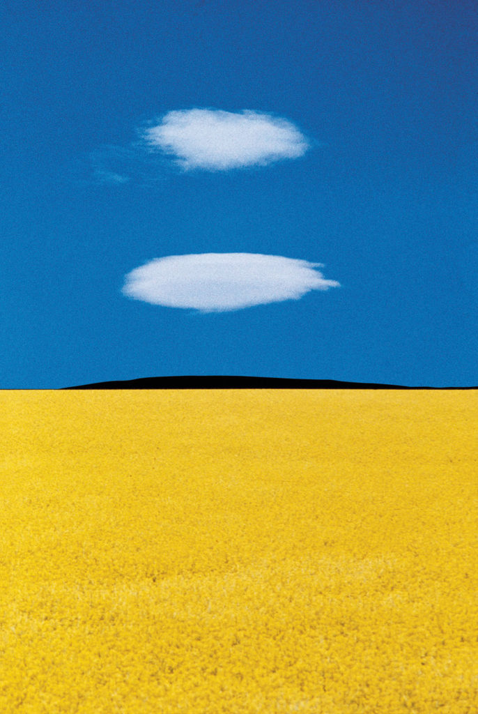
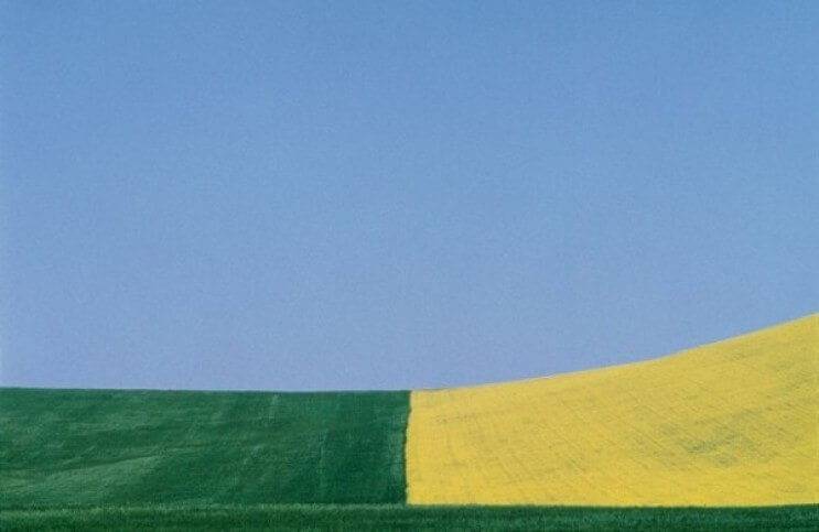
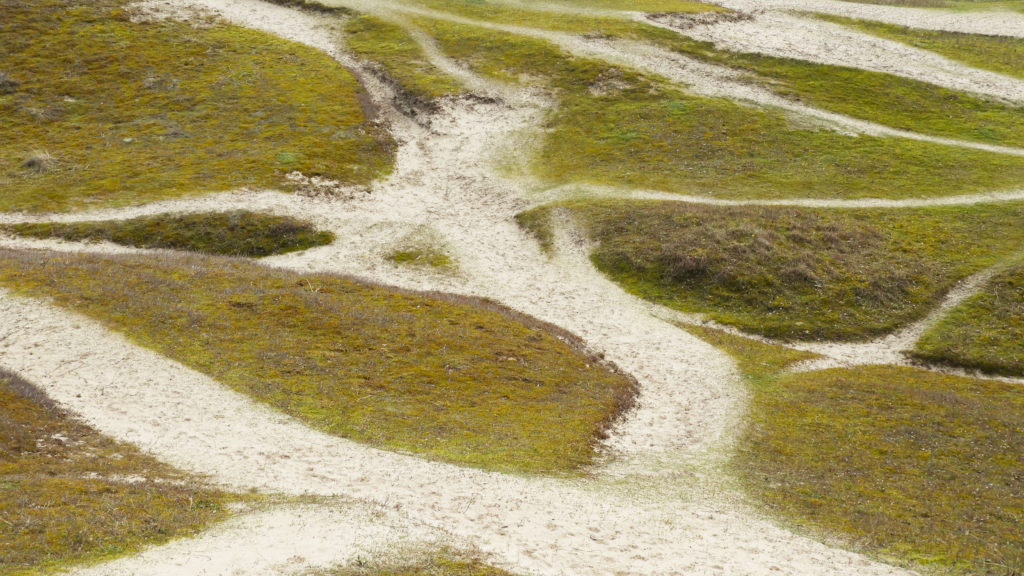
WHAT: My final images are all fairly simplistic in nature as one of my main inspirations was Franco Fontana and his minimalist landscape photography. During the editing process , saturating colors will be the aim.

HOW: I used my regular DSLR camera in order to capture the images, mostly taking them at the top of the sand dunes in order to get a wide field of view which is able to capture a variety of landscape images.

WHEN: I took the images during mid day when the sun was fairly strong and direct. The skies were clear for the majority of my photo shoot yet towards the end the weather conditions changed quite drastically and it started raining so some of the images are more dull and darker.

WHY: Landscape romanticism is a widely used theme for photography which I myself particularly enjoy due to the results of the photography, often times capturing images which are highly surreal and breathtaking.

FRANCO FONTANA INSPIRATION:

FRANCO FONTANA’S LIFE AND WORK:

Franco Fontana was born in 1933 in Modena. He took up photography in 1961 and joined an amateur club. He held his earliest solo shows in 1968 in Modena, his native city, which marked a turning point in his career. He has published over seventy books with Italian, French, German, Swiss, Spanish, American and Japanese publishers. His photographs have appeared worldwide in over 400 exhibitions, solo and collective. His images are in collections in over fifty public and private, Italian and international galleries, including: the Bibliothèque Nationale, and the Maison Européenne de la Photographie, Paris; the George Eastman House International Museum of Photography, Rochester, the Musée de la Photographie, Arles, New York, the National Museum, Beijing, the Stedelijk Museum, Amsterdam, the Metropolitan Museum of Photography, Tokyo, the Galleria Civica d’Arte Moderna e Contemporanea, Turin, and the Victoria and Albert Museum, London. Many companies have asked him to collaborate on advertising campaigns, he has published photographs in Time-Life, The New York Times, Vogue Usa, Vogue France, Il Venerdì di Repubblica, Sette del Corriere della Sera, Panorama, Frankfurter Allgemeine Zeitung, Class, Epoca and others. Fontana has been invited to hold photography workshops in various schools, universities and institutes such as the Guggenheim Museum in New York, the Tokyo Institute of Technology, the Académie Royale des Beaux Arts, Brussels, the Toronto University, and so on in Rome, Paris, Arles, Rockpot, Barcelona, Taipei,  Politecnico di Torino, and the LUISS University, Rome.  He has collaborated with the Centre Georges Pompidou, the Japanese Ministry of Culture, the French Ministry of Culture.

CRITICAL ANALYSIS:

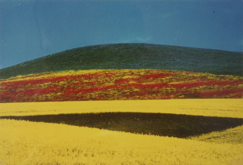
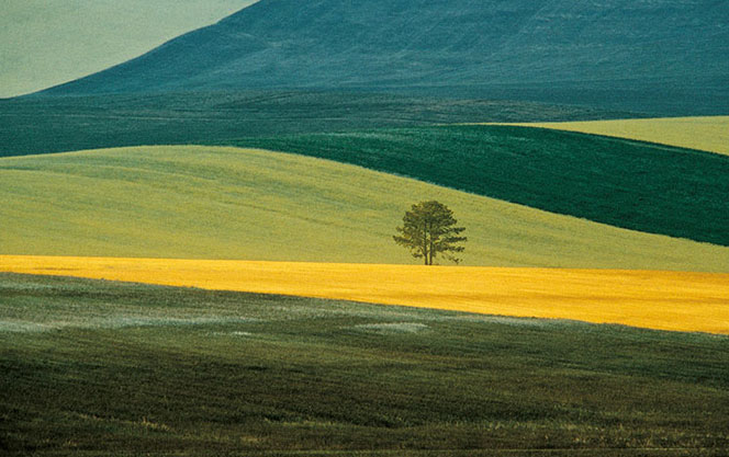
This piece by Franco is very simple in composition, only consisting of simple line work, going along the rolling hills of the grasslands. There are large blocks of color which separate the photo into 3 sections, blocking each color into a section. Even through the photo contains a very simplistic color pallets, the colors merge and harmonize together to create an overalll “tied together”look. There is no real foreground, mid ground or background, therefore the landscape appears 2D and flat. The length and width of each block of color is fairly relative to one another therefore there is a slight sense of pattern and repetition. I believe that during editing, the colors have been over saturated in order to create impact and boldness. The natural lighting coming directly above from the sun, gives the image brightness yet lacks any sort of shadows or tone differentiation. Even though this is a photograph of fields, the image does not feel organic or natural in any sense due to the symmetry and geometry seen within it.

His reasoning for creating these images are “my goal is to interpret reality. Anyone can see the landscapes I photograph, but with my camera I try to capture the details and features that the eye cannot see. Some tell me, “I went to Provence and I saw ‘your’ landscapes”; sometimes they will have seen those places before coming to an exhibition, but only after looking at my work they see that part of reality pinpointing something they had not noticed before.”

MOST SUCCESSFUL IMAGE:

CRITICAL ANALYSIS:

VISUAL:

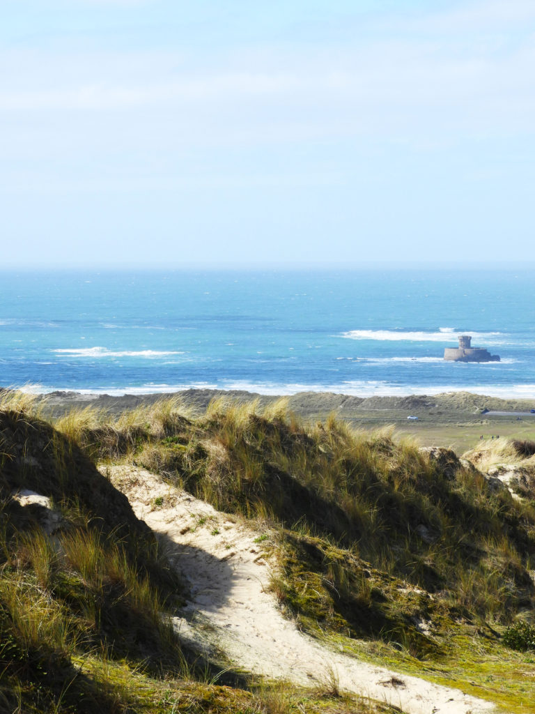
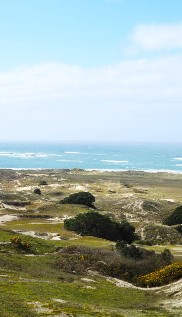
The initial thing which hits the viewer when looking at the image is the strong and saturated colors of the grass and sea which stand out and bring the sand dunes to the forefront of the image. There is an immediate sense of scale in the image with the sea being in the background and the dunes in the forefront. The hazy and blurred horizon of the sea further accentuates this sense of endlessness. The picture is quite clearly cut into two distinct parts, the sand dunes and the sea and the sky creating almost two images of landscape. The untouched beauty of the dunes is interrupted by the presence of the man made castle which introduces themes of industrialization and human impact into the theme of landscape romanticism. Relating to the original theme of journeys and pathways, there is a very clear path leading through the middle of the image, again showing the impact that humans have on nature and how over time we have altered it. The light is very strong in this image being very bright overall in the image due to the direct overhead light coming from the sun. The time of day when this image was taken also means that the sun was bright and very powerful. The exposure of this image is also quite strong being more on the overexposed rather than the underexposed side of the spectrum.

TECHNICAL:

In terms of ISO, it was set initially at 400 making the image slightly overexposed, later on in the photo shoot turning it down to 200 in order to make the images more balanced. Due to the bright white sand in some areas of the dunes, I found it crucial to have the correct white balance set on my camera. I experimented around with this technical side of the images, trying different white balance settings, even the fluorescent lighting setting. I eventually settled on the direct sunlight setting in order to get the desired white balance in my images. The focal length whilst taking this image was 19mm, I zoomed in slightly as I wanted to offset the focus setting on my camera to focus mostly on the sand dunes and capture the sea in a slightly blurry and hazy way. In terms of logistics, the sand dunes were fairly easy yet difficult place to get to due to the terrain that I had to get across to in order to get a good perspective over the dunes and of the sea. The weather was also crucial as I wanted fairly clear skies in order to replicate similar as Franco Fontana, who’s photography is clearly distinguished by the clear blue skies which he includes.

CONCEPTUAL:

During this photo shoot, I was aiming to further explore the theme of landscape romanticism. more than there is a basis to secure either a national or international style of Romantic Landscape painting. When we speak of Romanticism we are speaking at best of a particular tendency of creative sensibility. As regards Romantic landscape and/or mountainous settings, a common and sentient focus of both Romantic poets and painters, their relationship exists most often in a tendency to an intensified personal subjectivity. The sand dunes in my opinion were a perfect example of untouched nature in Jersey, being an important historic and environmental heritage site.

CONTEXTUAL:

The sand dunes of St Ouen’s Bay, and at the heart of the Jersey National Park, are recognised as among Europe’s most important sand dunes. Les Blanches Banques, as they are called, are designated as a site of special interest (SSI) because of their special zoological, botanical, archaeological and historical features. As the most extensive area of sandy soils in Jersey, the dunes support good populations of many animals and plants not found elsewhere in Jersey. The site is mostly publicly owned and covers 1.15 km2, from the marram grass-covered seaside dune, back towards the scrubby wooded valleys at Les Quennevais.

The stabilisation of the dune system caused by the construction of the seawall now allows for the growth of less specialised fast growing vegetation which out-competes the plants adapted to sand dune conditions. The acidity of the grasslands is increasing over time – consequently changing their ecology. It’s essential for rangers to mow selected areas and cutting back scrub i to maintain the grasslands.

source:
https://blog.gov.je/2018/02/28/jerseys-ecological-sites-of-special-interest-les-blanches-banques/

MOST SUCCESSFUL IMAGES:

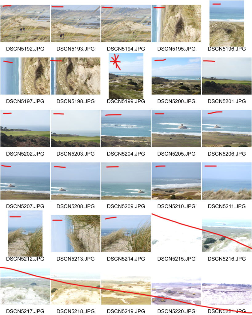
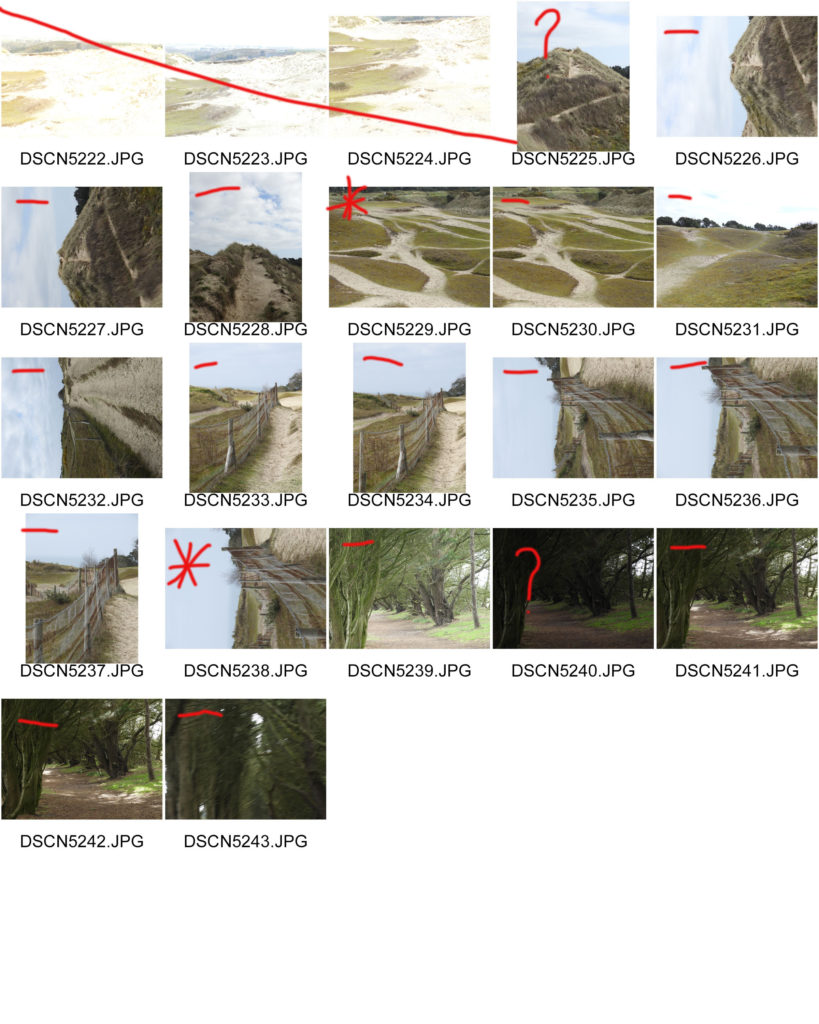
CONTACT SHEETS:

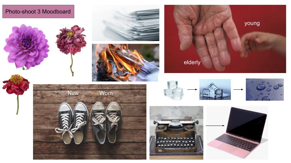
Photo-shoot Mood-boards:
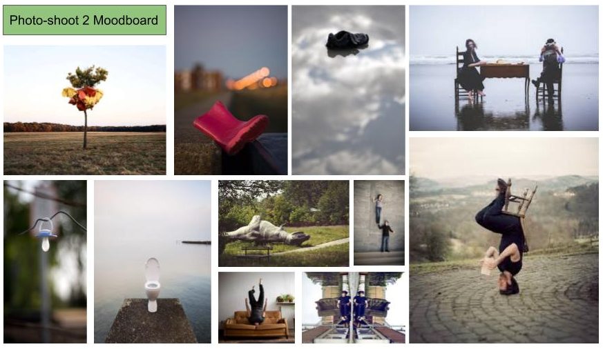
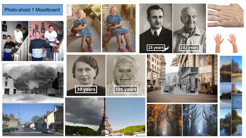
I have created a mood-board for each of the ideas/concepts I have developed for the “Journeys & Pathways” project. Along with the inspiration I have taken from my artist research, I also took inspiration from examples of similar concepts and ideas online, and have developed a mood-board based on these findings, which will help with my inspiration for the different ideas:


My first photo-shoot involves recreating vintage/archival/past images using the same subjects and the same environment, in order to show the differences and similarities between the 2 times, showing the development of the subject and how their journey through life effected their looks, attitude and the environment around them. I have taken inspiration from other photographers who have recreated vintage images, as well as images that show objects and monuments at different times, displaying the differences and similarities depending on the environment.

My second photo-shoot involves placing subjects in an opposing or incorrect context or environment, to create a contrast between the subject and the background, showing that the subject is on the incorrect or a countering path to one they should be on. In order to make this mood-board, I took inspiration from images that depict subjects in odd places, where they do not belong. I also researched into images using human subjects, where the people have been placed in the incorrect settings so that their involvement in the image does not make sense to the viewer, and rather creates an element of confusion and mystery.

My third photo-shoot revolves around showing the decay of objects through their lives, and documenting the different stages of this process. I have taken inspiration from a variety of objects (household objects, flowers, people) in order to provide myself with the chance to work with multiple objects.

CAROLLE BENITAH

Carolle's work is described as "a subjective interpretation of childhood memories and a refashioning of image and identity".

Carolle often describes her feeling of isolation and alienation when she looks through family photos of her from when she was a child. Benitah began her career as a fashion designer and set out to amend and rework her childhood photos with methods such as cutting, sticking, sewing, collaging. Her extreme minute details that she incorporates displays an almost re-connection and de-connection the the photographic archive to her childhood. Carolle embellishes and embroids her work with thread that is either red, black or gold; also adding beads.

Benitah describes that "The precise and slow process is a metaphor for remaking myself and for the passage of time". She further on explains that "The red thread is a connecting thread, leading me through the maze of my past". Benitah uses the red through her childhood photos. "It's the colour of violent emotions, of blood, and of sexuality."
Benitah uses the black thread for the photos of her in her adolescence. "Adolescence is represented by black for the anguish associated with this period of my life.
The colour gold is used for the photographs of herself during her adulthood. She describes how the colour gold is "the colour of affective ties, of fidelity and of dis-incarnation".

Benitah describes her work as an exorcism, as she explores how the memories of her childhood aids her in understanding the woman she has become. She also believes that the past is never permanent but its constantly being evolved and constructed by the present.

Kristen Lewis Analysis, Contact Sheet and Editing

Image result for kirsten lewis photography

Lighting: I think this image has artificial lighting because the subjects are indoors. The light is probably coming from the side be cause part of the subjects’s faces are in shadow. There’s a lot of contrast in the image because the tones go from their illuminated faces to dark shadows with out much in between.

Visual: There’s an almost symmetrical look to the image. This is because of the lines in the background and how the subjects in the foreground look similar and take up the same proportion of the image.

Conceptual/ Contextual info: The subjects in this image are of the photographer’s grandma and the grandma’s best friend. At the time the image was taken the two subjects had been friends for 70 years. The photographer said, ” They have taught me that friendships and love are what keep you youthful and happy and they are 2 of the most important things in life”.

I like the images in green. To me they represent the same idea that Lewis’ goes for in terms of a day in the life. Some of them also show the generational journey in the way it shows different generations and the difference between them. The ones in red I don’t really like. The first one is blurry and the three in a row is too staged.
In terms of journey these images are important to me because Bingo is my Grandma’s only hobby and she’s been going to that specific Bingo Hall for decades. Back then instead of a massive empty room with hundred playing online, you couldn’t get a seat sometimes. She used to go with her brother but stopped after he died. My Aunt has recently been taking her back to the Bingo after my Grandfather died. What’s also important about these images is how you have three generations in them and you can see the difference between the generations. My Grandma is playing bingo by stamping with a marker like she always has however my Cousin is playing it on an ipad. I like the ones in green because they have good framing and they show what I want to be shown. The ones in red are either blurry or too staged.

Reflection on My Edits

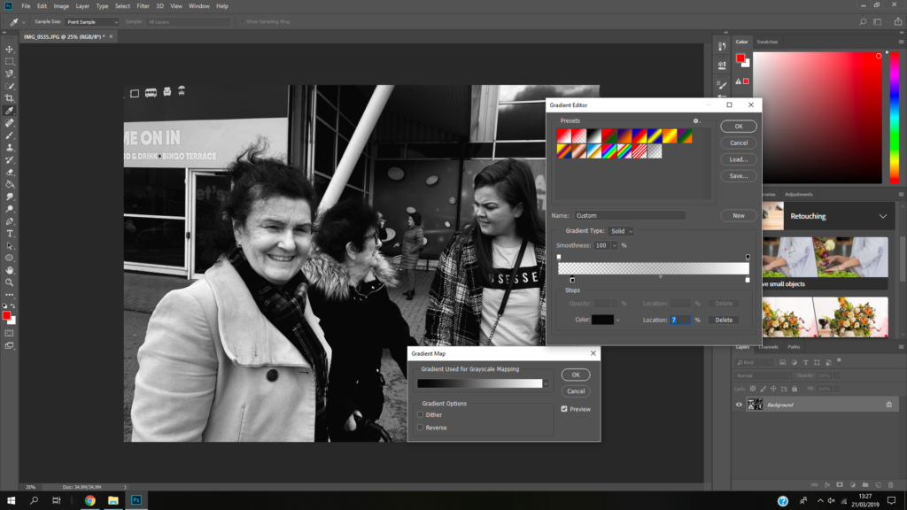
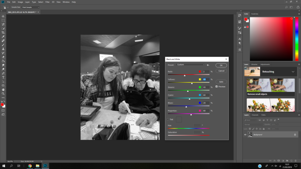
I think my images reflect the photographer’s style. I have taken picture of a family’s journey through a day. I’ve documented events that happened through the day just like the photographer. I made them white because then I could make them sharping by creating contrast and because the photographer edits her images to be black and white a lot of the time. I like my use of depth of field when taking the images because the subjects stand out and there’s a softness to the images.

Response to Luke Fowler

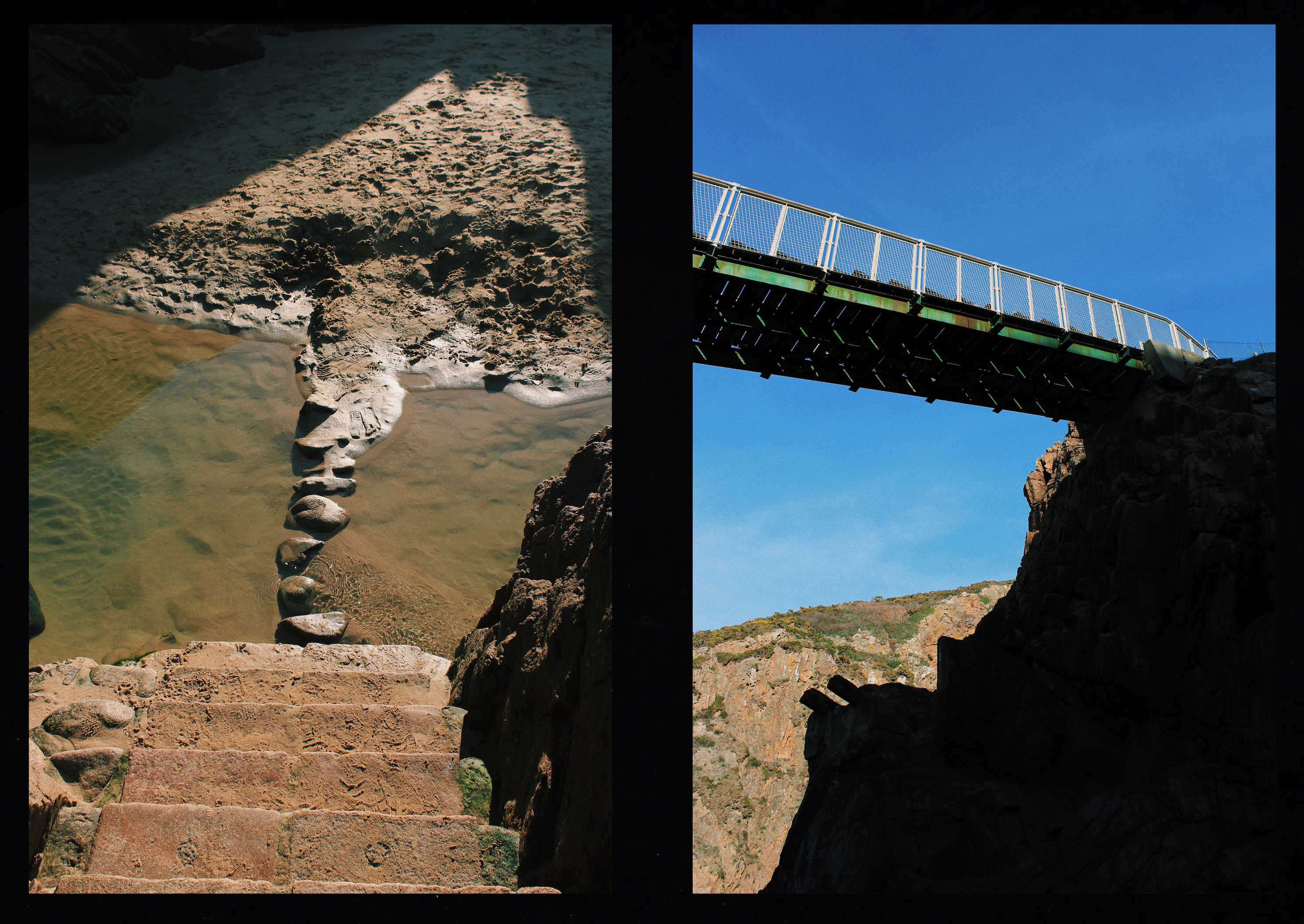
To respond to Luke Fowler’s photography work, I have exposed two images on one frame. I have them side by side to explore the relationship between two juxtaposed images. The images that I paired will seem unrelated in terms of subject and viewpoint, but there is a link that connects them together. I also included a black frame that surrounds the two images to replicate his two-frame films. Like Luke Fowler, I wanted to create a story between two still images so viewers can explore the visual dialogue between them. 

I went to Plémont Beach to capture images that link to my theme journeys and pathways. Once I had taken several images on my camera, I downloaded them onto my phone so I could edit them with VSCO. I used this editing app to create a film effect on my images to replicate Luke Fowler’s photography style. I did this by altering the exposure, contrast, saturation and grain as well as applying the same filter to each pair. Once all the images had been edited, I joined the pairs on Photoshop with a black background which created a frame around the images.

Contact Sheet
My Response

This pair shows juxtaposition through calm vs dramatic. The image to the left depicts a calm scenery since the cave at low tide has a pool of still water. A cave is an enclosed area and creates a sense of security. However, the image to the right shows a view facing outwards towards the sea where you can see the dramatic waves crashing against the coastline.

These two images depict a bridge. However, the bridge on the left is natural since it has been made by cobbles whereas the bridge on the right is man made and resistant. The image on the left captured the bridge from above making it seems small and insignificant unlike the bridge on the right which has been captured facing upwards, emphasising the fact that it is more powerful.

This pair of images show the difference between natural and manmade pathways. The pathway on the left has been formed by people damaging the vegetation so water can erode the soil and create a rough footpath. The pathway on the right image has been constructed by man. They link together since they are both pathways but created in different ways. Both pathways are steep, heading upwards in the same direction and have been captured in a similar composition.