How To Display Images

Contemporary Approach:

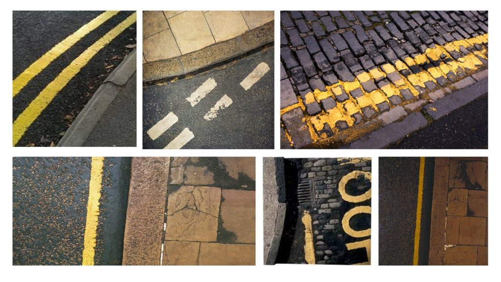
The contemporary approach to displaying images is very naturalistic, and is the method used the most often. This is simply displaying images in a frame, window mount or next to each other. The simplistic method of framing allows the imagery to be shown off and the meaning of the photographs to clearly be displayed. This method should be used for more naturalistic photographs and any high quality images which showcase good camera skills and successful editing technique.

Sculpture:

Using sculpture to display our photographs is the opposite to the contemporary approach. This his when we use images to sculpt a bigger image or object. The method is much more hands on and showcases our photographs in a new and different way. This method can be considered more abstract but, showcases imagery in a unique way. Sculpture is most appropriate when wanting to display abstract images, images that work together and photographs which can be used to display the meaning in a different way.

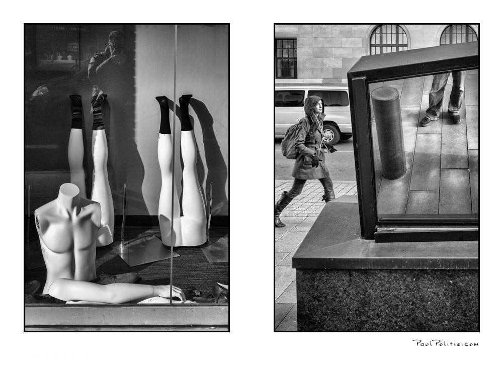
Diptych/ Two Frames:

The diptych method is when you display two images next to each other, which usually work well together or juxtapose one another to convey an overall meaning to the two images. The method of displaying these images is very much taking the contemporary route, so the imagery and framings is more naturalistic.
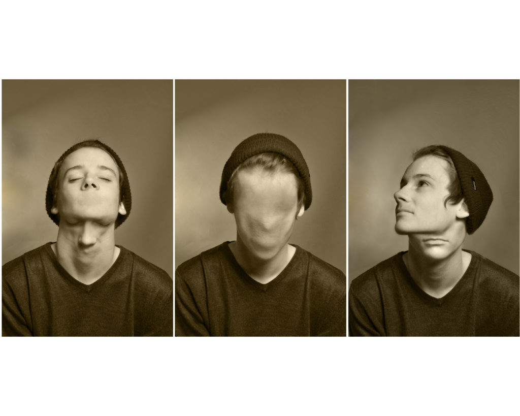
Triptych/ Three Frames:

The triptych method is when you display three images next to each other, these photographs usually work well together or juxtapose one another to convey an overall meaning to the two images. The method of displaying these images is very much taking the contemporary route, so the imagery and framings is more naturalistic.
Grid:

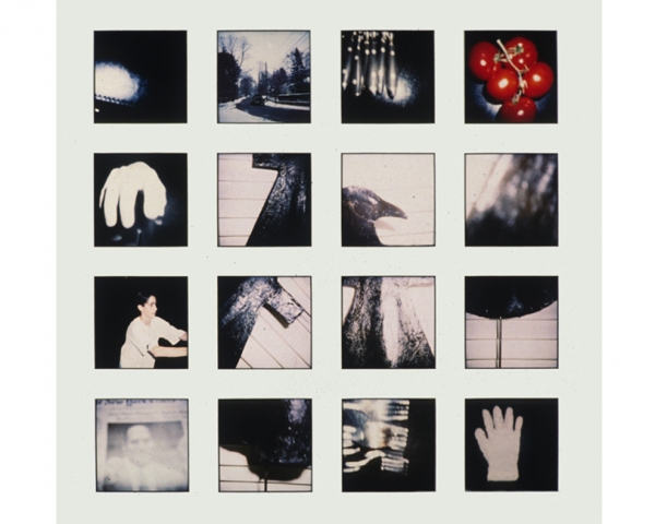
This method of framing is when we display multiple images together, as these images are apart of a photo series, work well together or juxtapose each other to convey an overall meaning to the two images. The method of displaying these images is very much taking the contemporary route, so the imagery and framings is more naturalistic.
Eclectic:

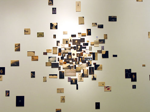
The Eclectic method of displaying is when we display multiple images of different sizes, shapes (landscape and portrait) in a random (spread out and different locations) manner in order to present a series of images. Usually these images are apart of a photo series, work well together or juxtapose each other to convey an overall meaning to the two images. The method of displaying these images is very much taking more of an abstract route to framing due to distorted and unorganised layout.
The New Topographics

The New Topographics: photographs of a man altered landscape

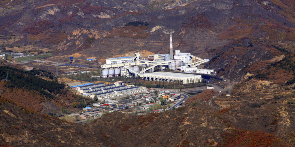
The New Topographics was a term created by William Jenkins in 1975 to describe a group of American photographers such as Robert Adams and Lewis Baltz. Their pictures had a similar banal aesthetic, in that they were formal, mostly black and white prints of the urban landscape. They brought a new perspective to landscape photography that focused on an objective documentation of locations.

These images of the man altered landscape carried a political message and reflected the growing unease about how the natural landscape was being eroded by industrial development and the spread of cities. Work labeled New Topographics emphasised the relationship between man and nature through the documentation of Industrial intrusions on land and scenes of suburban sprawls, motels and parking lots.

These New Topographic photographers were less concerned with portraying an ideal image of nature and were more interested in showing plainly how man has altered it. They were photographing against the tradition of nature photography.


Theme of Landscape Urbanization

WHAT IS LANDSCAPE URBANIZATION:

Over the years, numerous landscape studies have described the impacts of urbanization, such as fragmentation of habitats, loss of farmland and loss of historical connections and previously coherent cultural landscapes. Thus, the story of how landscapes fall victim to urbanization (and, more generally, to the march of societal progress) has been told and retold. While the object being lost varies, the overall story remains the same. The course of events seems to have been decided in advance: landscape sacrificed for the progress of cities. The process of urbanization is thereby depicted as a fight between city and countryside, a fight in which the countryside loses every time. Rural landscapes of the past are set in contrast to advancing suburbs, shattered habitats, shrinking farmland and placelessness. Documenting, analyzing and raising public awareness of losses of past landscape qualities is no doubt an important task for landscape research, but is it the only one?

Urbanisation: Reductionist approaches to urbanisation have come to focus on quantitative measurements of a limited number of parameters for such a long time that these limited and very specific insights into urbanisation seem to have affected (or even replaced) the very idea of a complex and multidimensional process. This issue provides richer illustrations of the process by widening the scope of the features studied.

Landscape: Rather than viewing landscape as a passive arena for urbanisation, this special issue discusses the complex role of landscape and engages in landscape theory to gain a greater understanding of the processes of urbanisation.

Histories: With histories, in the plural, this special issue opens the way for a more diverse understanding of urbanization, beyond the standard modern perception of urban progress/expansion and rural decline. While these three concepts form a common base, use of relational thinking in the papers included in this special issue offers ways of altering and revisiting existing ideas of landscape, histories and urbanization.

LANDSCAPE URBANIZATION IN PHOTOGRAPHY:

Plan for photoshoot two

For this shoot I will be using 35mm film as it is the closest method I can use to how Adams took his photos. I will aim to produce 72 images with one roll being in colour being mainly based in the alps then with the second roll roughly 10 images from it will be taken in the alps and the remaining frames will be taken in the marsh lands near me as it is a natural site and there will also be some taken of a cliff face and large rocks.

PROJECT 2- STEPHEN GILL

Stephen gill born in 1971 Bristol, UK began his love for photography at an extremely young age due to the influence from his father and his interest in insect which created Gill’s initial interest with collecting bits of pond life to inspect under his own microscope.

Gill now focuses on his inspirations from the surroundings of the inner city life in East London and heading towards looking at Sweden as well and looking into the idea of reflecting and portraying images that help describe and emphasis the times we are currently live in. His work is often made up of long-term photo studies exploring and responding to the subjects in great depth. Throughout his career Gill has experimented with a large array of trials for examples, he mainly worked with black and white imagery from 1984 then followed by a lot more colour interpreted in his work in mid 1990s.

It’s said that until around 2003 his work has been said to have an extremely descriptive and typographical approach towards the subjects.

After working mainly in black and white from 1984, his practice since the mid 1990s was mostly in colour.Eight of his photo studies made between 1997 and 2003 were assembled and published as chapters in a book called Field Studies in 2004, which also toured as an exhibition. As previously mentioned Gill enjoyed to experiment and in January 2003 he bought a Bakelite 1960s box camera produced by Coronet for only 50 pence from Hackney Wick Sunday market, which was near where he lived at the time. The camera had a plastic lens, and lacked focus and exposure control.
Over the next four years he had used the camera to photograph within the extremely varied environment of Hackney Wick, including waterways and allotments; and to make portraits of people at the Sunday market and who lived and worked in the area.

It was then announced that the area Gill had been focusing his photography on would be redo eloped for the 2012 summer Olympics and 2012 Summer Paralympics.

Gill claims that this finished body of work was steered, informed and shaped by the place itself. And his approach to making the work was more reacting, responding and being carried by the subject rather than seeking out ideas that were already formed in the mind. This stage of photography he named as an idea as starting over or walking away from the old. It was important that his content was first as he believed it played an important role in rather than the technique.

An obsession with this part of London lasted over ten years and led to many different series including – Hackney Wick, Archaeology in Reverse, Warming Down, Buried, Off Ground, A Series of Disappointments, Talking to Ants and Best Before End.Best Before End looks at the phenomenon of energy drink consumption. This time rather than describing the subject, Gill used the drinks as an aid to make the finished images as the negatives partly processed in energy drinks of different kinds. It allowed the drinks to shift and alter the images with a small amount of manual intervention.


Shoot one – Final images and comparison

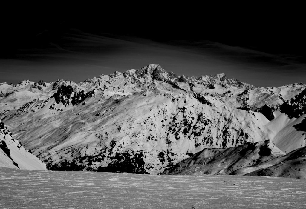
This image was taken with the intent of showing the contrast from the light and shadow on the mountain. The reason I chose this scene was that it was an untouched face and there were no ski tracks on it and no-one had used it so it was still ‘pure’.
This image is called Monolith the half face dome by Ansel Adams and it was the main inspiration for this image as it shows the snow, the rock race and the trees.

When comparing my image to it there are lots of similarities but his image has a greater sense of perspective and depth withe the cliff face being the main subject but he also has the cliff and trees to the right and then the mountains in the distance. Whereas my image only has the far mountains and some trees in the slightly closer section.

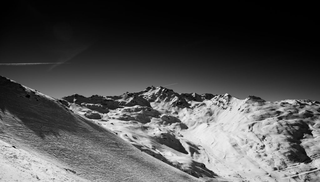
This image was taken to emphasise the one peak in the middle of the image, it also shows the valley in front of it and the other peaks to the side of it and there is a small bit of the ski run in the foreground but it somewhat helps to show perspective.
This image is cathedral peak and lake by Ansel Adams; withing it there is an amazing composition with the rocks being close and just below with the lake leading into the mountain with the boarder being broken up by trees and snow. There is also a dramatic and cloudy sky. Because he has used a very wide depth of filed so that everything in the image is in focus.

In comparison my image has clear elements of Adams in that there is a good sense of depth of field with the run in the front and some smaller mountains to the side and everything leads up to the main focus, the mountain, even though the sky was completely blue for me so i had to dramatise it in post with things like gradient filters and highlights.
This image shows another peak but it is of a mountain that has run coming down to the bottom right of the frame and there is a slope to the left of the frame that has some tracks on it which gives some more shadows and texture.
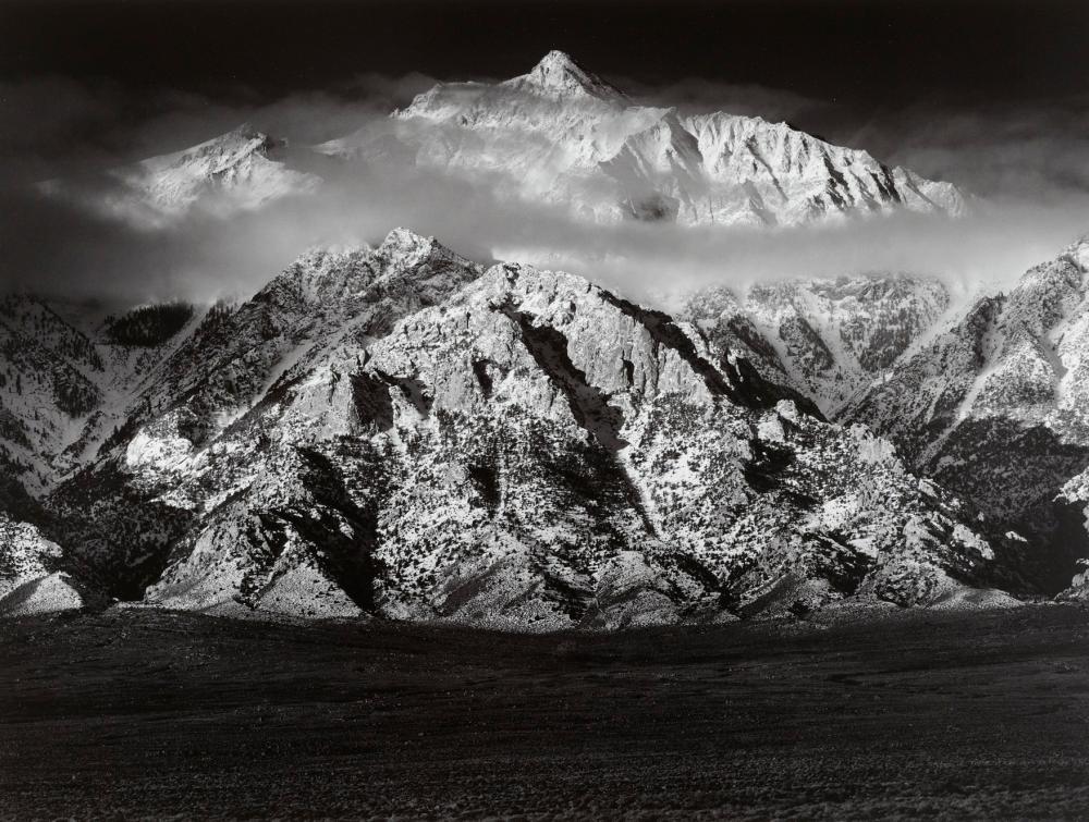
Ansel Adams photo of Owens Valley, California
This image is called cathedral CA by Ansel Adams and in it it has the lower set of mountains and then a cloud splitting it from the higher peak just above it, the colour composition goes from dark at the bottom then getting lighter and lighter then the sky at the top is dark again.

ACTION PLAN; THE BOYLE FAMILY

For my second shoot I wanted to create an action plan in order to stay organized;

  1. Select an appropriate area to set out on a work to find good different patterns on the ground to photograph. I ended up choosing St Brelardes beach which has a wide opportunity for different textures, shadows and lines.
  2. Next select camera lens that will work well and is appropriate for creating clear images from the distance of the lens to the floor. I ended up using a 18mm-135mm lens which made sure I could focus on all texture. For example when photographing the sand, this particular lens ensured clear texture emphasis the lines and foot prints with in the sand.
  3. Finally go to the location at an appropriate time of day that will work efficiently with the types of images I want to select. In this case I went to St Brelardes just before sunset and walked around for about an hour in order to have different shadows and almost a warm textured feeling due to the suns warm rays reflecting on to the beach creating lots of shadowed in which I tried to use to my advantage

For this photoshoot I will be concentrated on capturing the similar ideas and remain influenced by the Boyle Family. In this particular instance I will be focusing on the concept of looking down at the ground and creating individual shapes to portray a different meaning and focus point.

For example

Marko Köppe

Marko Köppe
Marko Köppe

“Marko Köppe, collage artist from the north of Germany, loves art, the classic art, like Leonardo da Vinci, Sandro Botticelli, Hieronymus Bosch, the modern classics, like Salvador Dalí, René Magritte, and also modern art like das Bauhaus and all its influence: Kurt Schwitters, Mark Rothko, Giorgio Morandi, Olafur Eliasson, Banksy, and so many more.

Nature, music, and especially life are important influences of inspiration, and together with the famous German proverb: Everything develops in the eyes of the viewer!, he starts to play around with the style, aesthetics, and contrast between pictures—tries to create something different, something new, that hits the eyes and through them the brain, the imagination, fantasy, the viewers’ internal feelings, wishes, and thoughts.”
https://flexiblepersona.com/marko/

Examples of his work:

Crazy Woman - Lisa Lara Bella by Die blauen Reiter, via Flickr
Crazy Women – Lisa Lara Bella (Marko
Köppe)

Marko Köppe

Marko Köppe

My Plan:

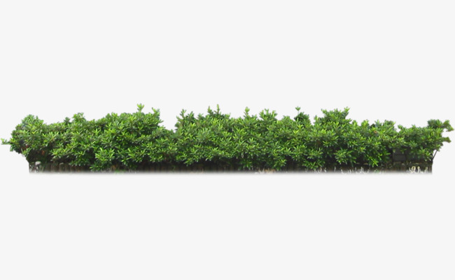
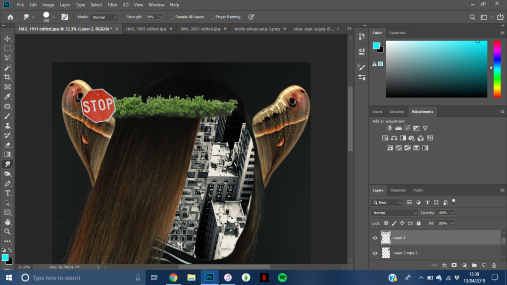
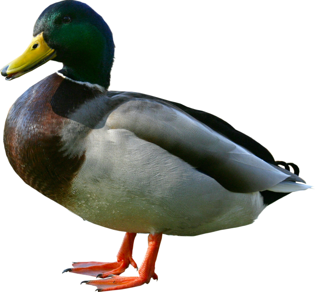
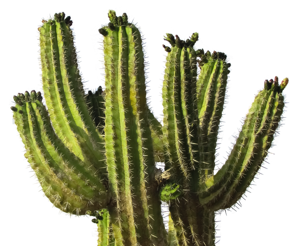
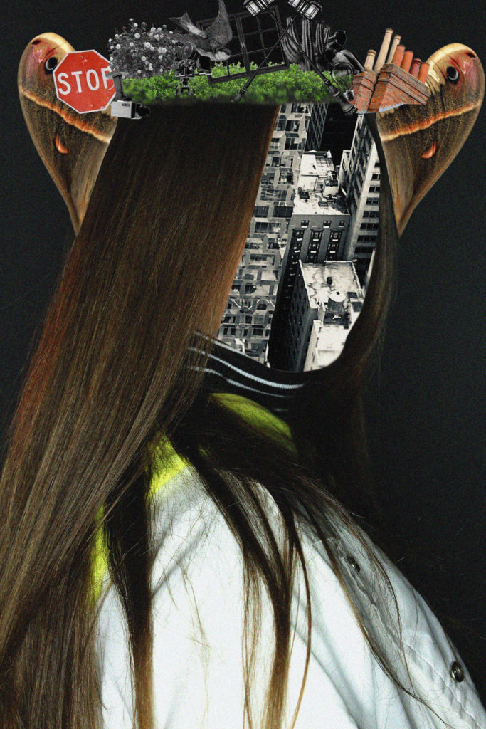
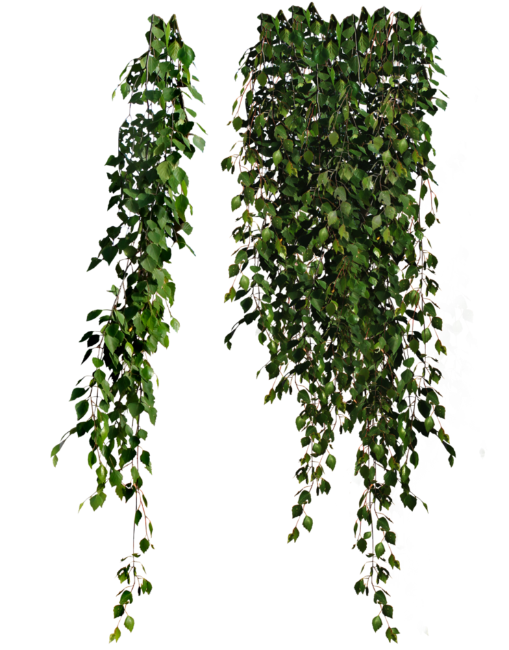
For this project, I will be using photos from previous photo shoots and putting images of buildings from my New York trip in June 2018 on their faces. I will also taking some images from Google Images like butterfly wings, birds, leaves and other things from nature and also putting those on the photo. The concept of these photo is that I am taking things that I saw on my journey through New York and things you would see if you went on a walk through Jersey. I also wanted to show the contrast of New York and Jersey, as one is very modern and industrial whereas the other is more natural and neutral.

Photos I Will be Using:

Final Images (Process of Editing):

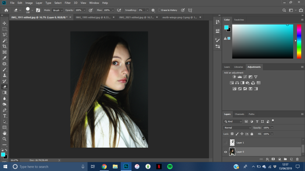
I took all the images from above, turned them into black and white, adjusted contrast and then placed them in different spots
I then added noise

I am really pleased with how this photo turned out. I really like how the moth wings look like ears, and I like the contrast of the black and white images and the coloured images.

I really like the way I put the washing line on the hand. I think this photo is edited really well and I am happy with the outcome.

I really like how this photo turned out. I think I placed everything really well and I think I edited it quite well.

For each photo I tried to capture Marko Köppe editing style and I am really happy with the outcome of these final edited photos.

Carinthia West Photoshoot 2 plan

-This photoshoot will be done over a period of time, half term.

-I plan to take vernacular photos of the members of my family who’s photos I collected from their youth and picture of people my age like my sister and my friends. I plan to document the journey of youth. I want to show that the generation are completely different but are the same. They are different in what they wore and sometimes what they do but are the same.

-The lighting will be natural and artificial lights depending on whether I’m inside or outside.

-I think I will use my phone because it’s easier to take personal images of someone where they don’t have a big camera in their face.

-Where? When? Who? The days I’ve planned to take photos are when I go to my friend birthday meal and the cinema and when I see some of my old friends for a meet up and chat.

Further Ideas developing and Vernacular Photography (not finished)

Vernacular photography is the creation of photographs that take everyday life and events as their subjects.
Examples of vernacular photographs include travel and vacation photos, family snapshots, photos of friends, class portraits, identification photographs, and photo-booth images. Almost like a celebration of the mundane.

After looking at Carinthia West and Kristen Lewis I see that the idea of Vernacular photography applies to them in the way that they take pictures of people just living their lives, famous or just a normal family.

I would like to look at the idea of the journey of people and society through generations.

I’ve collected images of my parents and even some of my grandparents of their youth.