Photo-shoot 4:

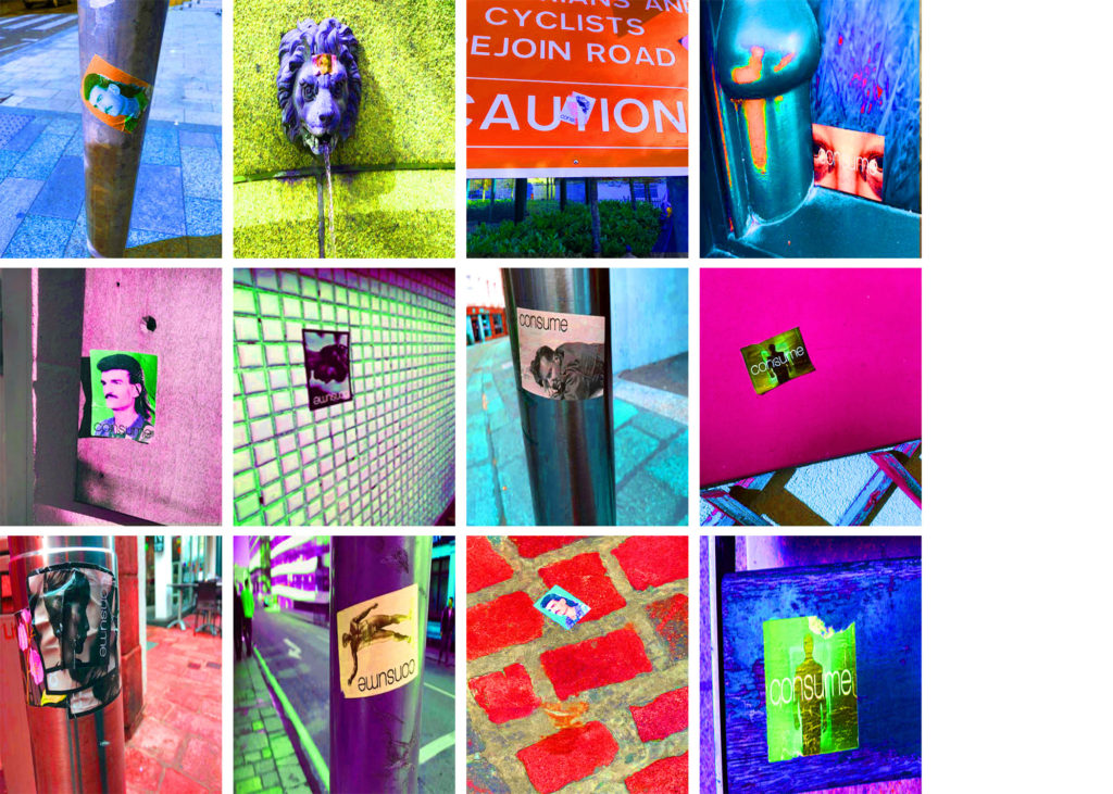
I devised a plan for a shorter and slightly less developed photo-shoot based on following the journey of advertisement for a brand. I came to notice a range of stickers placed around the centre of town, and decided to document the stickers, as they all came from the same source (the same brand). I found that in doing so, I was able to record a story of the town, following the journey around town by following the stickers. As a 4th, admittedly less developed photo-shoot, I decided to include these images in order to act as a mini-project, as it links to the “Journeys & Pathways” brief by showing the pathway marked out across town by these stickers, which led me myself on a journey around town. In this way, this photo-shoot had a more personal touch to it, and due to the fact it was taken in a natural, uncontrolled environment, the variety of these images is broad:
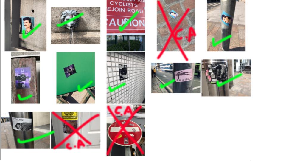
After deciding which images I would be using in the final edit (I had to decide on 12 in order to make the 4×3 final montage), I used photo-shop to edit together the images, and finalize the piece:
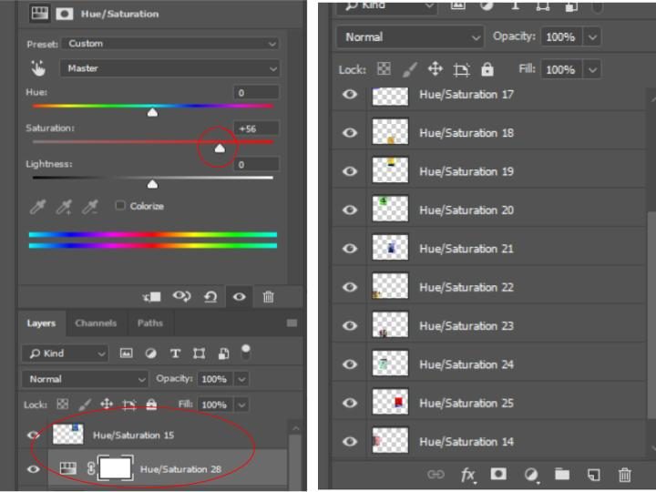
In order to make the final image, I adjusted the hue and saturation of each of the images in order to make the colors extremely bold. I did this as a way to show continuity through each of the images presented (as they now all have the same colour scheme and style) and also used it as a way to draw maximum attention to the image, and allowing each individual image to stand out on its own, due to its individual overall hue. The final image is seen below:
Display possibilities

This is how I’m planning to display my final images when my prints are ready. I will position the images of the Subject walking so in the first image she is taking the step and the second one is her having taken the step.

I will place the photo of the hands in the centre of the the two images of my other subject to break them up. i will have them in a line so it looks like an old film strip to resemble Bill Volias ‘birth life death’ film, which inspired that shoot.

Image Selection / Final Images


I decided that I wanted to narrow down my 23 images that came from the contact sheet down as I didn’t want more than 10 images from this shoot.

The way that I decided which images to keep was if there was more than one image showing the same scene but either with small changes or a different focal point i would choose from them. I would also see some that might not fit the style of romanticism, this means some that are a bit dark and gloomy from the marshlands would be out.

Here are the images that I chose:
  1. I selected image one because it was the best exposed image from the few that were taken in the mountain and partly because it has the large lens flares in the top section.
  2. This image just has a nice composition and shows the beach and the sun without having too much going on within it so it doesn’t distract the viewer from the main focus of the image.
  3. I used this image because it has the fallen tree on the top and another below it to create a kind of frame that draws the viewers attention to the center of the photo, the problem that I have is that is was quite dark and I had to use a wide aperture meaning that it doesn’t reflect Adams work amazingly but i still feel that it follows the theme of Romanticism.
  4. This image is inspired by the work that Adams did with close ups of small things like flowers and pine cones, once again I have contrasted Adams work by having a relatively blown out background because it was dark and and I didn’t have space to use a tripod.
  5. This image was taken with the intent of showing the reflection of the trees on the pond that was below it.
  6. This image is the reverse of image 3 (looking through the same hole but the other way) it also has a different style of ‘frame’ as the ivy is drooping down into the center of the image. It also has a shallow depth of field so the background it not perfectly in view.
  7. This image is taken to show the Romanticism in the sea and the coastline, I have achieved this by framing the rock in the front of the frame and having the rough sea and the waves crashing against the rock in the left of the frame. There is also a small development fault in the middle of the frame that can only be seen properly in print.
  8. This image shows the drama in the sea and then there is a lot of detail in the plants in the bottom left of the frame there is also also of groups of rocks in the sea and there are some small development in the empty sea on the right of the image. At the top of the image there is a large area of light leakage which also follows onto the next frame.
  9. In this photo there is a lot going on but the things that are happening are simple and nothing too over dramatic so there is a lot of subtle detail for the viewer to explore. Some of the aspects of the image are: two curved light leaks on the left, rough-ish sea, waves hitting the rocks, small development fault below the light leakage on the left and finally there is a small lens flare in the top middle section of it.
  10. Once again this image shows the waves the rocks and some plant s but what sets this one apart is there is a large scratch in the middle right of the image it helps draw attention to the rocks and the waves. This was also taken with a high aperture so the rock in the front is in focus and sharp and so are the rocks in the distance where the waves are crashing.

Final Piece Display Idea

THE IDEA:

In order to display and present my work, I have decided to take a totally different approach to the conventional, making a sort of cube in order to showcase my work. Each element of the display will have a symbolic meaning attached to it, linking it all in with my overall theme of landscape urbanization and the title “journeys and pathways”. I have devised a plan on making my final display step by step which I will record whilst making it. The final outcome will hopefully resemble the product which I have made a mock up of below.

SYMBOLISM:

CUBE:

A cube is symbolic of many things yet the aspect which I am focusing on is the relation it has to industry and man made structures. Being such a precise and linear object, it is totally different to what we see in nature. There is nothing organic or nature about this sort of form, therefore this is why I thought this would nicely juxtapose the images which I have created that include nature. It is also symbolic of the start of surrealism in art and the evolution of art. Cubism is an early-20th-century avant-garde art movement that revolutionized European painting and sculpture, and inspired related movements in music, literature and architecture. One primary influence that led to Cubism was the representation of three-dimensional form in the late works of Paul Cézanne.

CLEAR GLASS/ACRYLIC:

The clear glass/acrylic which I will be using whilst making the cubes is symbolic of untouched nature. The faces which I will be covering with the images will be representative of the parts of our landscape which have been altered by humans, the images showing clearly the sort of impact we have had. It also allows the viewer to see each image much more clearly as opposed to if the images were opaque.

CLEAR IMAGES:

A possible aspect which I am still debating about is if to make the images clear, being printed on a clear sheet of paper as opposed to card. This is more for viewing reasons. making it easier to see the rest of the images which are situated underneath.

PLACEMENT/ARRANGEMENT:

For this display, I am making two cubes which will display each set of images separately. Although theoretically the cube would have 6 faces to display work upon, I will only be displaying work on 3 of them. There are two reasons for this choice. Firstly in terms of visuals, the bottom face of the cube would be obscured from view therefore it would not be able to be seen . The other reason for this choice is that the clear faces of the cube would be symbolic of untouched nature which we still have here in Jersey.

MOCK UP OF FINAL IDEA

Archive Photos and Recreations

All vintage photos taken by Pierre Mette

Pierre Mette was a keen amateur photographer and his work for Falles Garage regularly took him out-and-about in the island, and his camera always went with him. His images of the island and the company he worked for from the 1950s to 1980s were taken on film, and digitised by his boss and lifelong friend John Falle. Most of the photos he took from the 1950s up until the early 90s, were processed onto colour slides, which were then transferred onto cd discs by a good friend. Pierre died in 2016 and his collection passed to John Falle’s son Helier, who has made them available to Jerripedia, both as a record of island life, mainly in the 1960s and ’70s, and as a tribute to Pierre Mette.

Analysis of Photos

These archival photos were taken by Pierre Mette between the 60s/70s, throughout the streets in St Helier.

File:P17CharingCross2.jpg
File:P17Colomberie5.jpg
File:P17ChringCross4.jpg

Contact Sheet

Final Recreations

Below are the final images I have chosen to print out and draw from.I did edit the contrast and brightness of the images in Photoshop in order to be able to see the shadows and outlines clearer. I plan to print out the two versions of the 3 different photos, and then to take some pieces of acetate and cut them to size to fit over the modern photo. Next I will take a fine tipped white ink pen and draw over the general outlines of everything in the modern photo, and once it is finished I will display it over the top of the old photo so it can show how much the same place has changed overtime. I don’t think that the two versions will be exactly the same or that it will be extremely seamless because a lot has changed and I found it quite hard to get the exact same spot that the Pierre Mette photos were taken in.

Recreations

Above our the final pieces which I have made as a response to Gosia Wlodarczak and as a response to the Journeys and Pathways title. The layers over the photos don’t match perfectly which I was expecting as it’s very hard to get the exact same angle, especially as it’s been so long between the time that both photos were taken. I do like that the pieces are messy and not exactly on point as I can still see the development on time.

Different Types of Displays

EXAMPLES OF CREATIVE DISPLAY IDEAS:

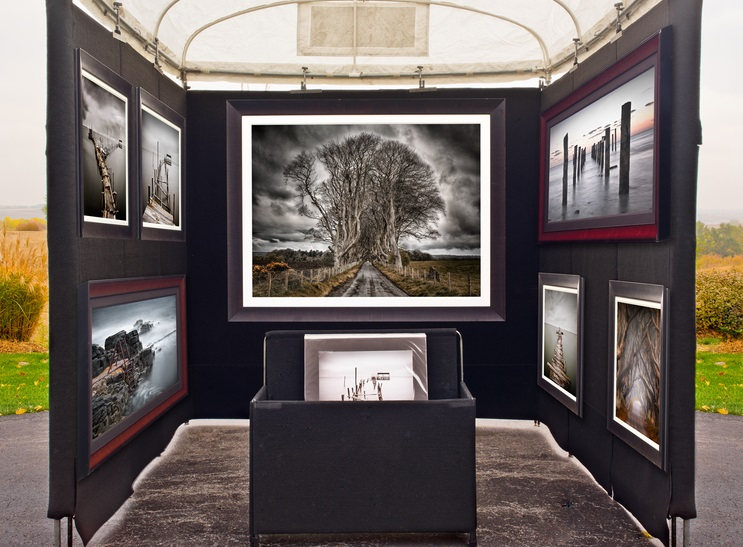
For my final selection of photos, I was keen to display them in a way which is unique and unconventional therefore I wanted to take inspiration from other artists who display their work in ways which are different. I didn’t want to stick to the traditional method of simply mounting or framing my images as I feel as though this would take away from my theme and intended message which I am aiming to deliver with my images. In order to show my images to their full potential I think it is important to display the images in a way which is creative yet subtle so as to not take away from the images themselves.

PROJECTION/FILTERS:

PHOTO-BOOK:

SEE THROUGH IMAGES/LAYERING:

POSTCARDS:


INCOPORATING OBJECTS:

MOUNTING/FRAMING: