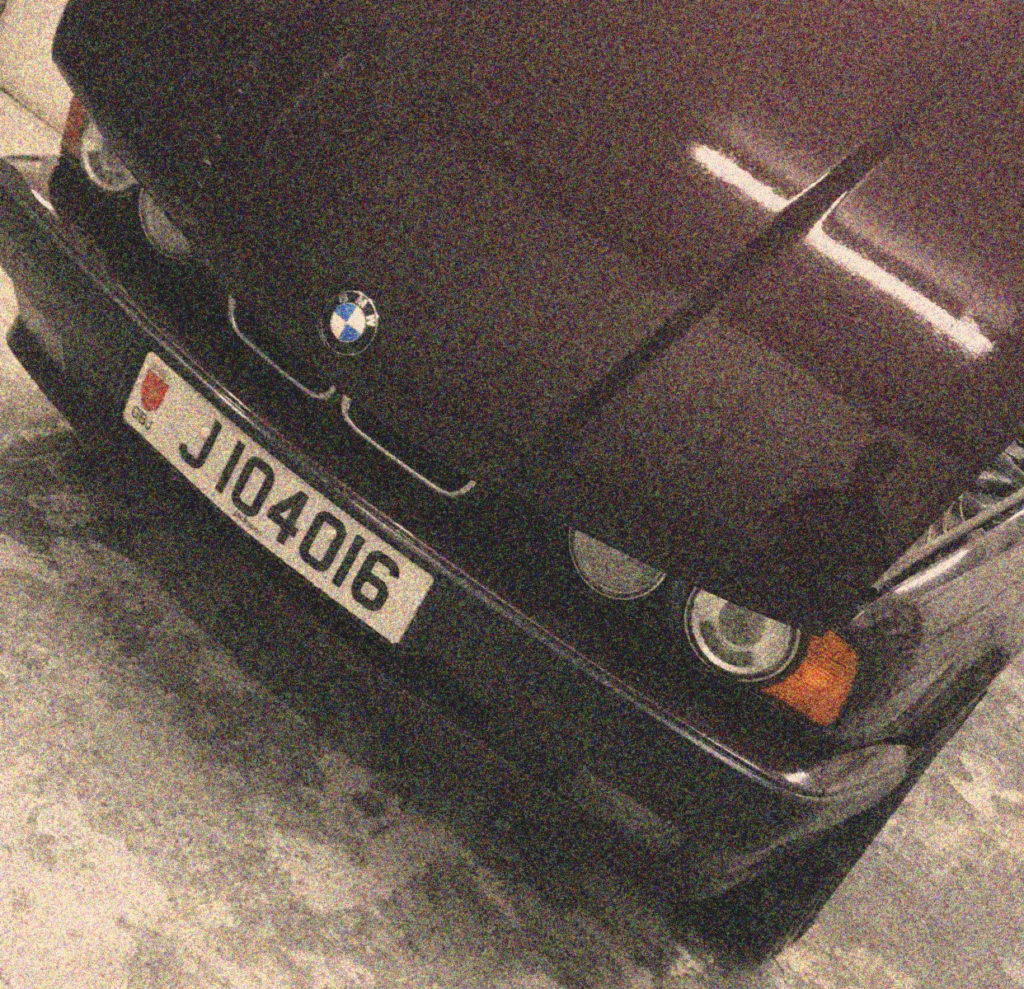
Presentation Plan

My thought for framing the images is that I will buy a light box that is designed for displaying little letters, I will then custom make holders for the rows of negatives and then the light behind will show the pictures that is on them. Because the images from my second shoot are in black and white they will be only slightly inverted but the images that were taken in colour from the third shoot will be very different colour wise.

Project Evaluation:

Overall, I feel that this project, developed from the title “Journeys & Pathways” has been a success. I feel like my approach to the project and final ideas fit appropriately with the brief given, and I feel that they represent an original and intriguing take on the brief itself.

My ideas developed throughout the beginning of the project, and I was able to settle on 3 very different yet individually distinct and strong ideas, that I would develop in order to produce a range of final outcomes that match with the brief for “Journeys & Pathways”. My ideas included 3 different styles of photo-shoot and ideas, and these were:

  • The concept of being on the wrong journey/path
  • How people develop and change over the course of time
  • The concept of life being short, delicate, and ultimately futile

I feel that all 3 of these ideas and the concepts behind them fit well with the “Journeys & Pathways” brief, as they all fit the theme of following a subject on a journey, and documenting their progress through that journey.

In terms of my images themselves, I feel like they have the correct ratio of camera skill to editing, and I feel like the editing that I have included enhances certain aspects of the original image, rather than completely altering the image or distracting from the subjects and overall meaning. I feel like the different ideas and photo-shoots show a variety of skills, for example the idea including a subject “falling through” the wrong scene includes more editing in order to show the subject as disconnected from the background, whereas the photo-shoot that involved recreating archival images used less editing, and more skill surrounding the camera angle and the position of the subjects within the frame was used. I feel that, overall, this project has allowed me to experiment with a range of skills from editing to camera skills, which I feel I have successfully shown throughout the process.

My final images have all been chosen based on a variety of factors, such as the quality of the image, the quality of the editing, and the way in which it can be used to convey the correct meaning when displayed in a physical format. I have produced a range of final images that will be displayed in a variety of ways, from together in a series, to individually, in order to best showcase the images, to best present their link to the “Journeys & Pathways” brief.

To conclude, I feel like the “Journeys & Pathways” project has been a success. I feel like I have been able to effectively stick to the brief, while showcasing a range of skills. I also feel that my final images effectively convey the meaning they were originally intended to, and I am pleased with the final outcomes of my project.

Analysis Of My Own Work

This is one of my favourite outcomes from my photo shoot at St Brelade’s Beach. Firstly I used natural lighting of the evening sun to take this photo, it’s of the view out to sea of the pier from down on the sand. I love the simplicity of the photo and how the pale colours create a cool tone, whilst working in harmony together. The subtle glare from the sea and the still reflection of the pier creates an almost eerie feel to it, as if nothing is moving at all and this emphasises the image of Jersey to tourists, a quiet seaside resort with stunning beaches. This is the view the tourism companies of Jersey wants everyone who doesn’t live on the island to have because tourists expand the economy greatly. Also the rule of thirds is prominent in this photo and how the foreground is the sand, the middle ground is the the sea and the pier and then the background is the sky. The eye is led straight away to the pier, which exaggerates the journey Jersey has taken to get where it is today. The pier is significant because it was build a long time ago in order to increase trade and expand the fishing industry, it may not now play and important part in Jersey’s development but it once did. I didn’t crop this image as I felt the gradient in the sky suited the image but also represented how life on Jersey has changed gradually in comparison to Thailand, we haven’t had to rush into tourism, it’s happened naturally as more people have become aware of how ideal it is for a holiday.

Editing Process

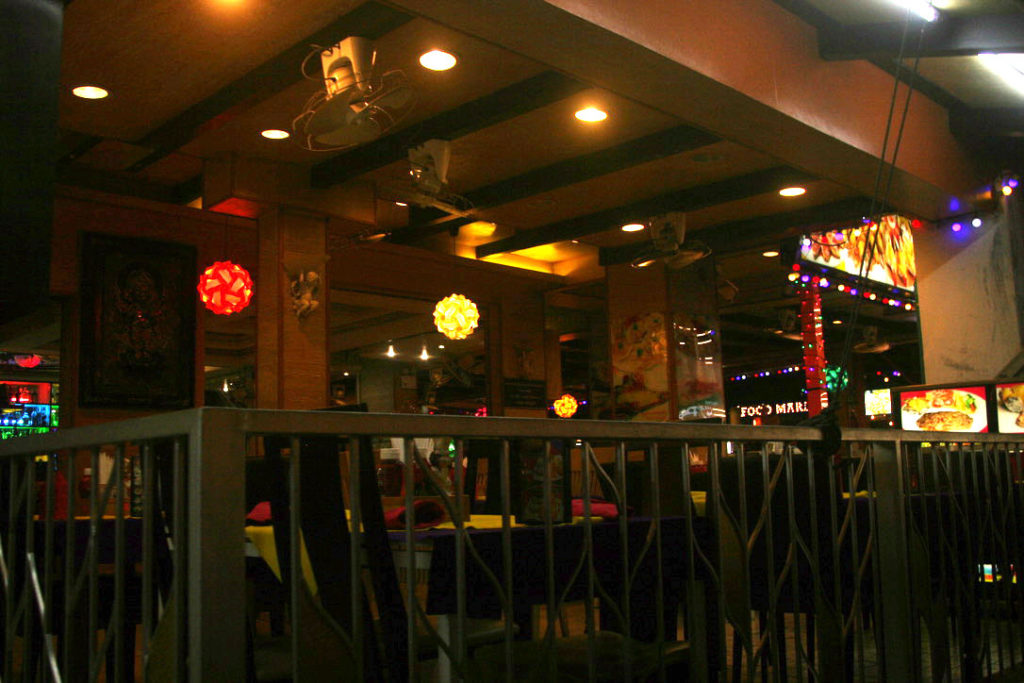
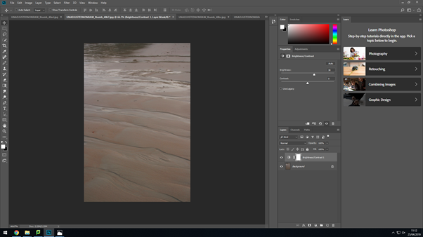
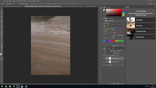
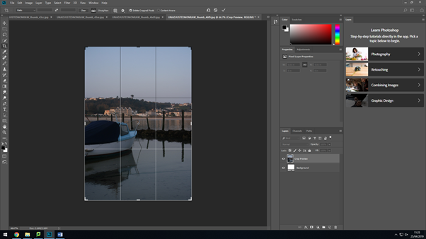
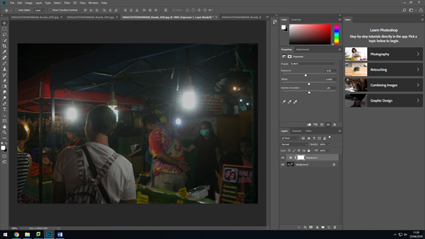
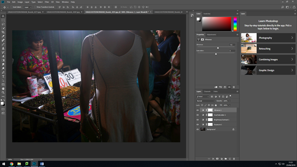
My final images were chosen though a selection process, then I put them onto Photoshop to improve them further. I conducted minimal editing as I wanted them to be as raw as possible. On my Thailand photos because they were taken at night I focused on increasing brightness and exposure.

Brightness and contrast.
Saturation and hue.
Cropping and scaling.
Exposure.
Vibrance.

Selection Process

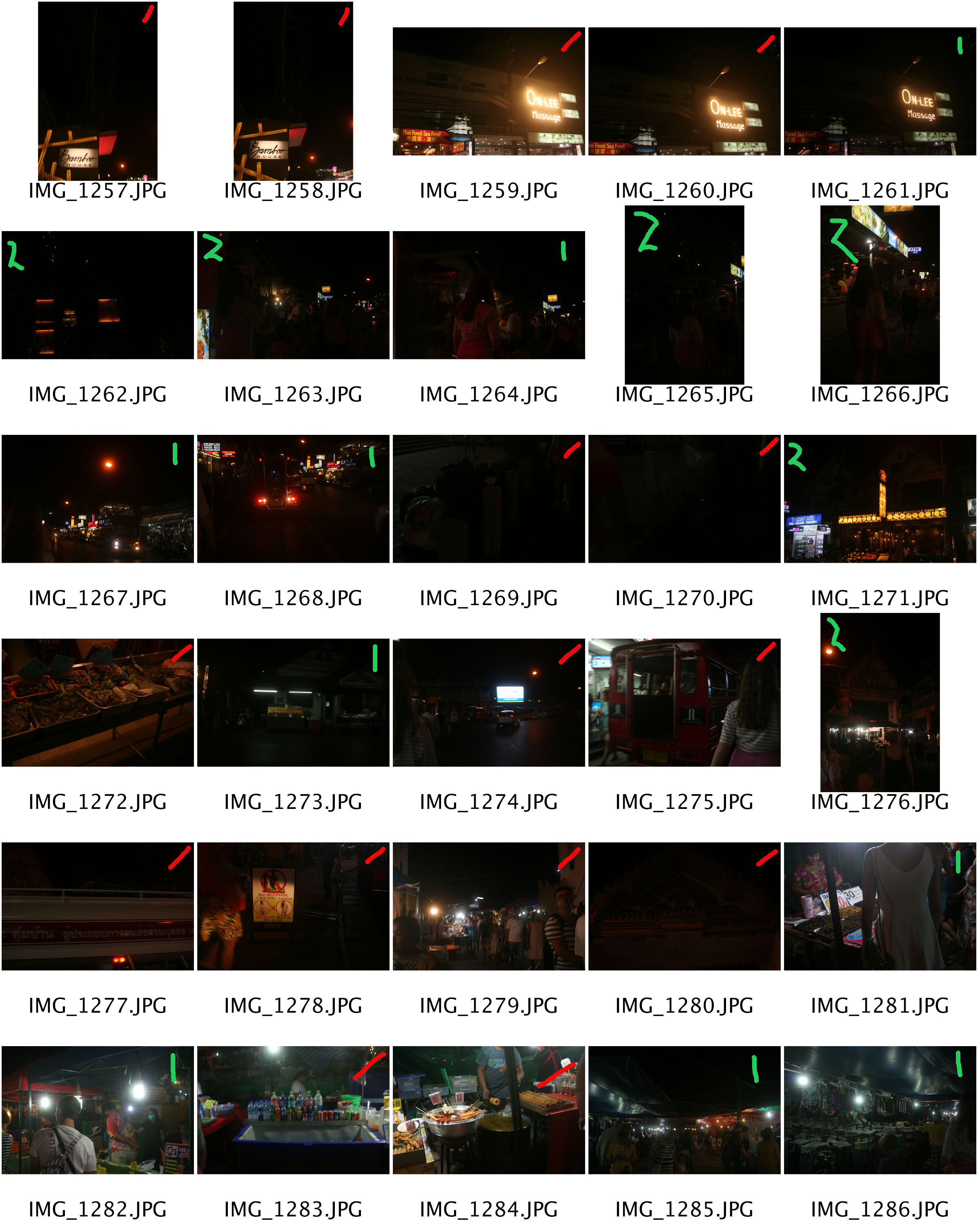
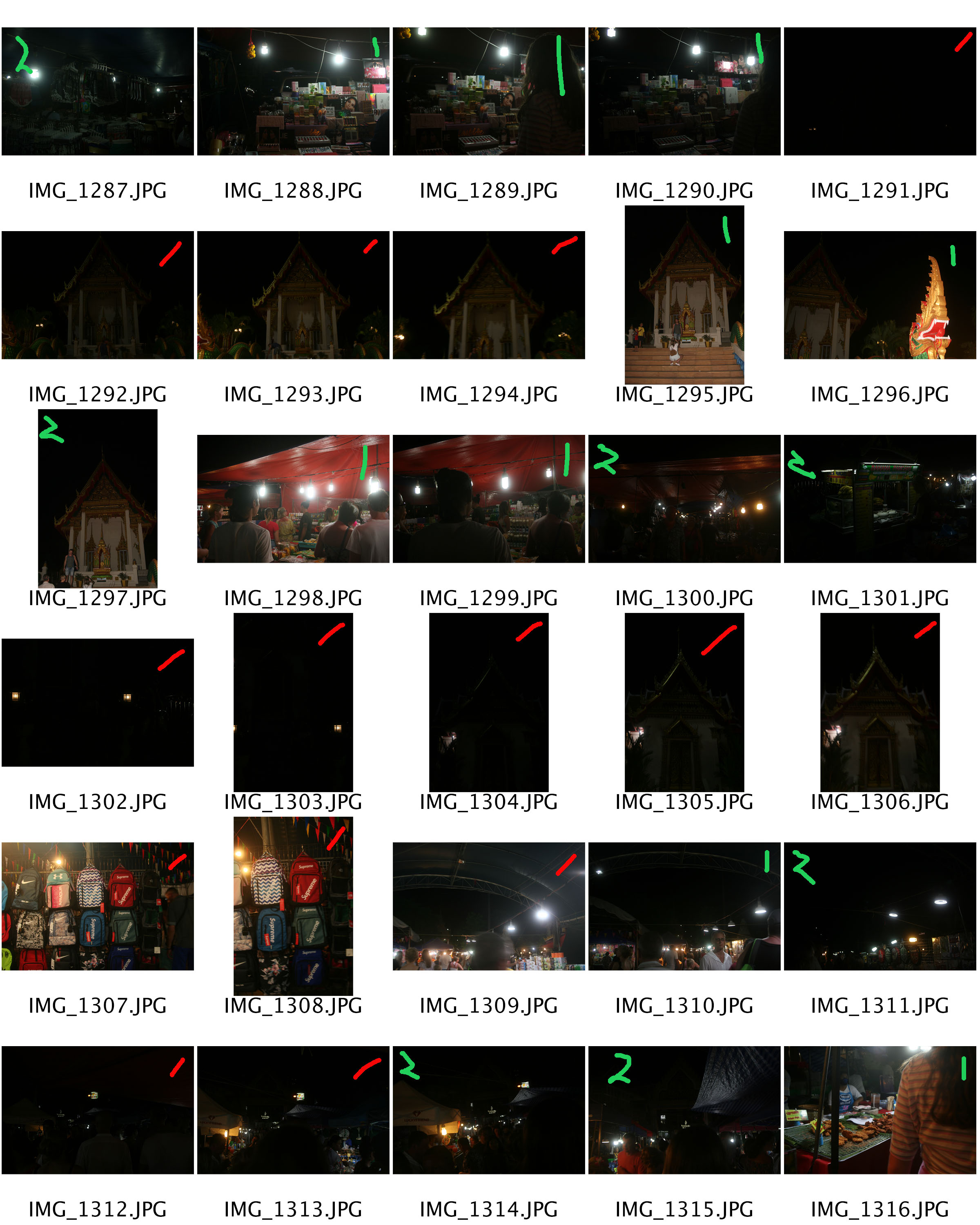
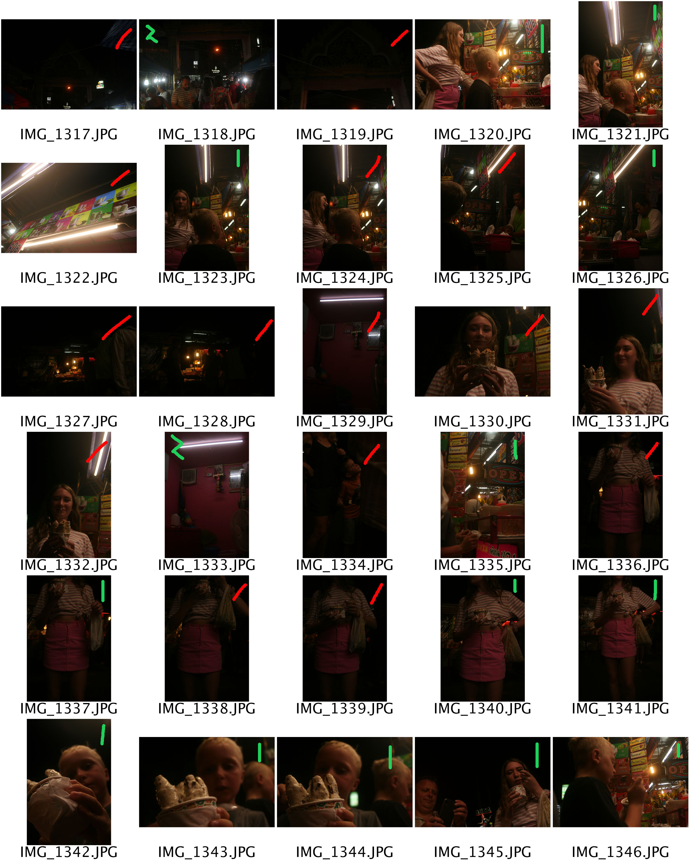
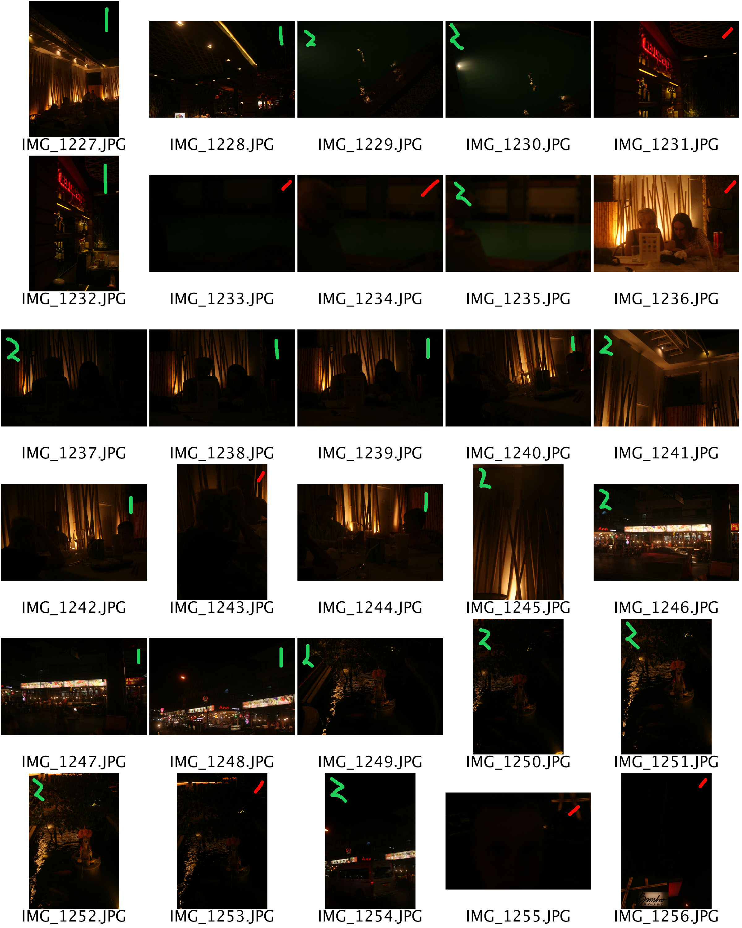
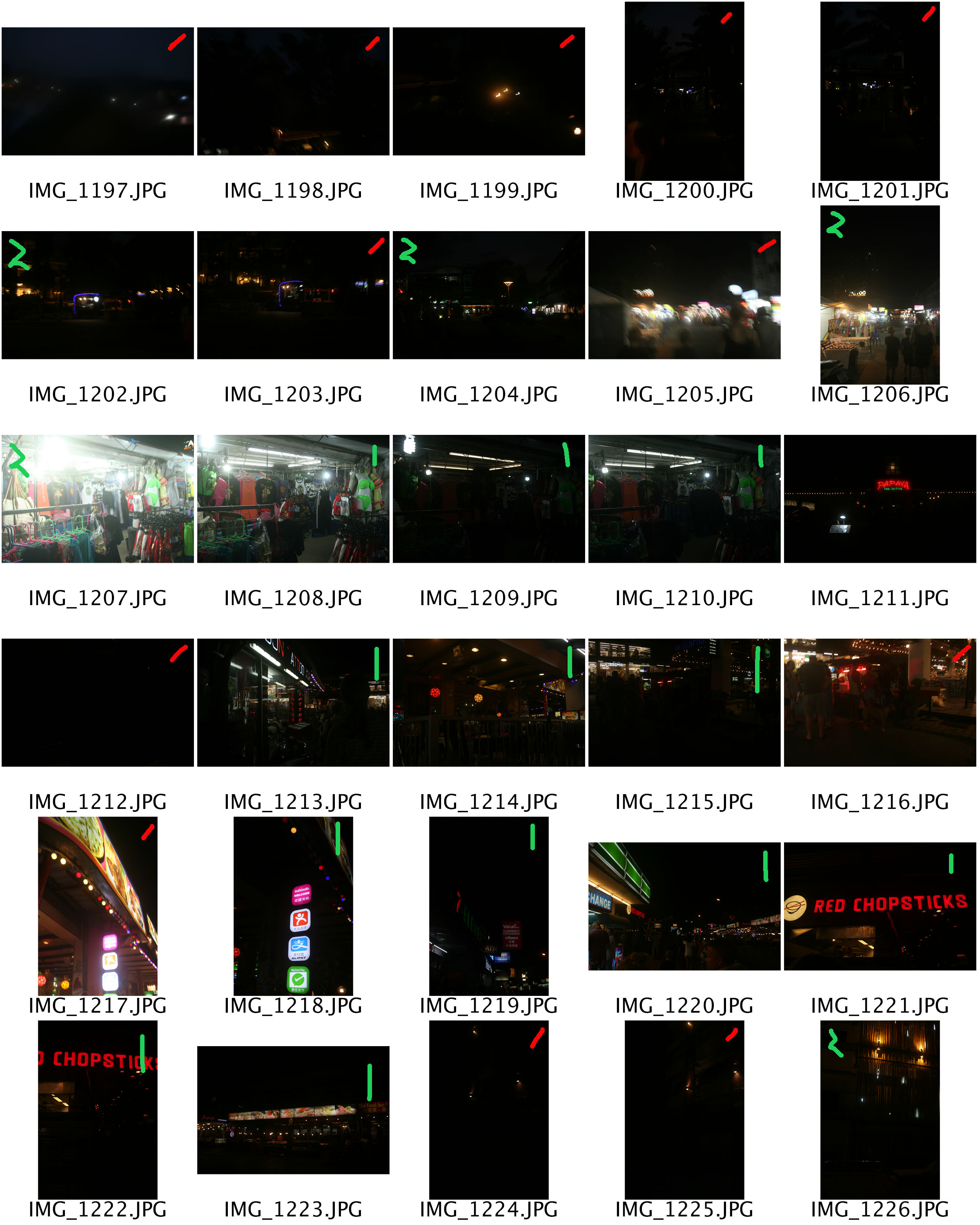
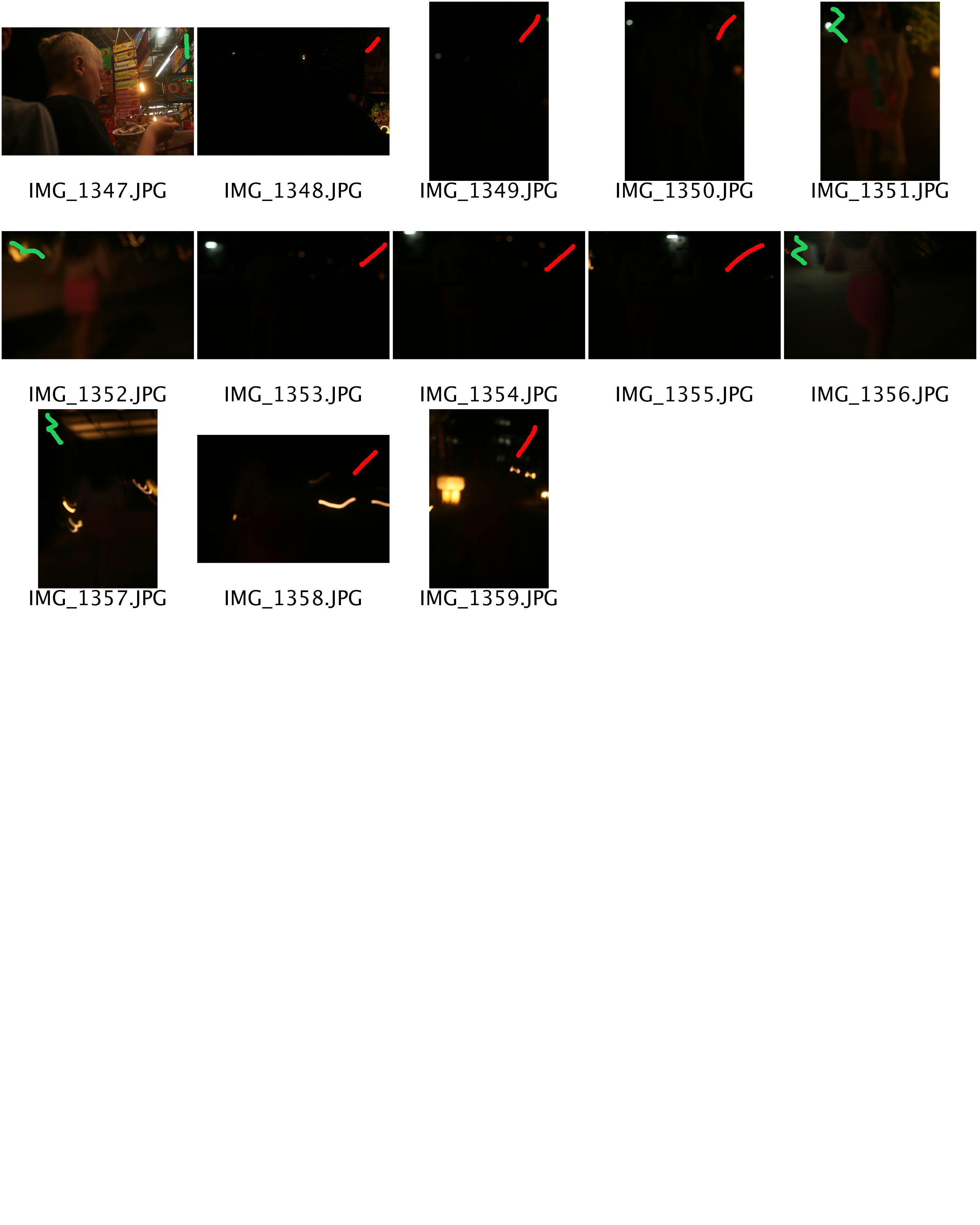
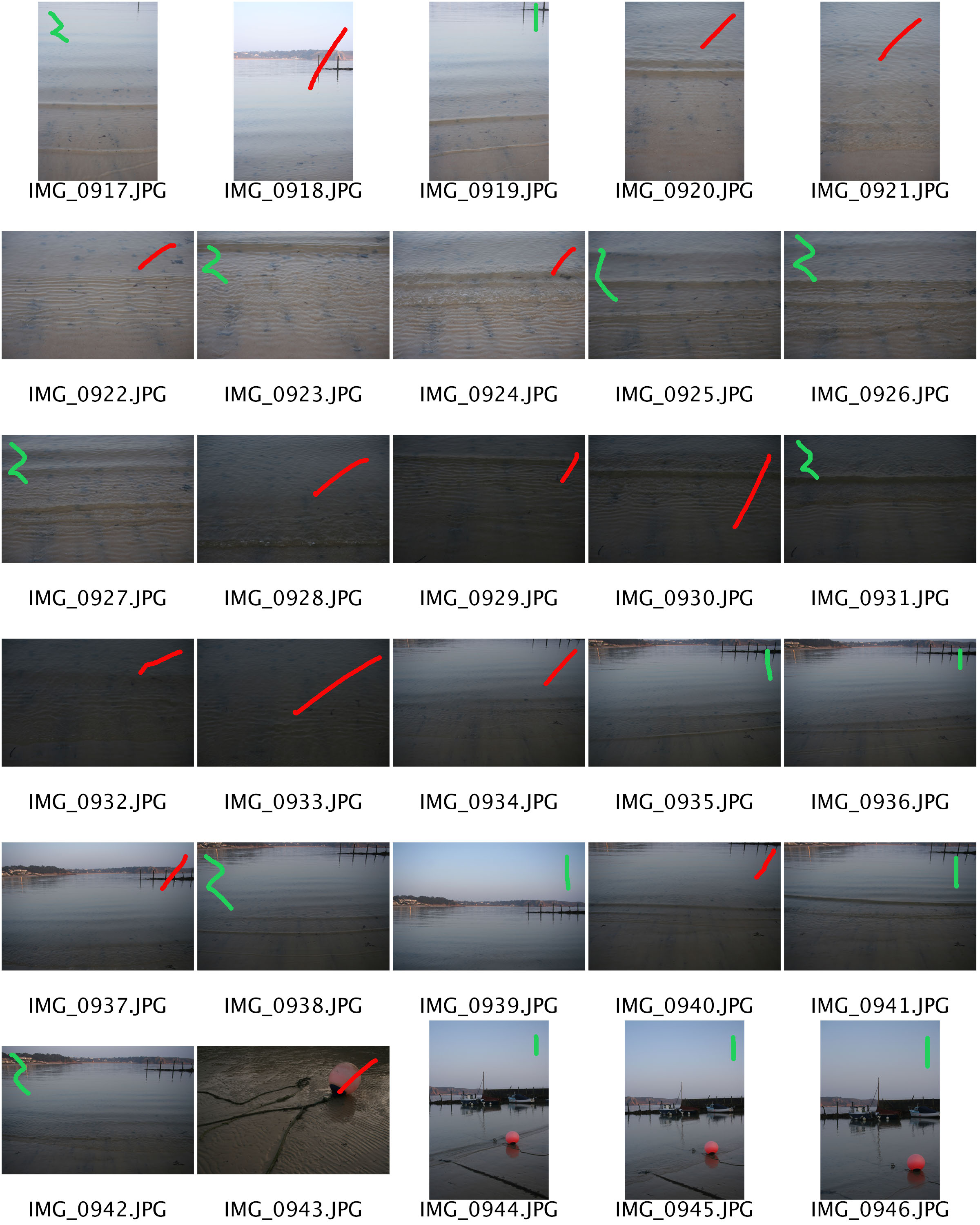
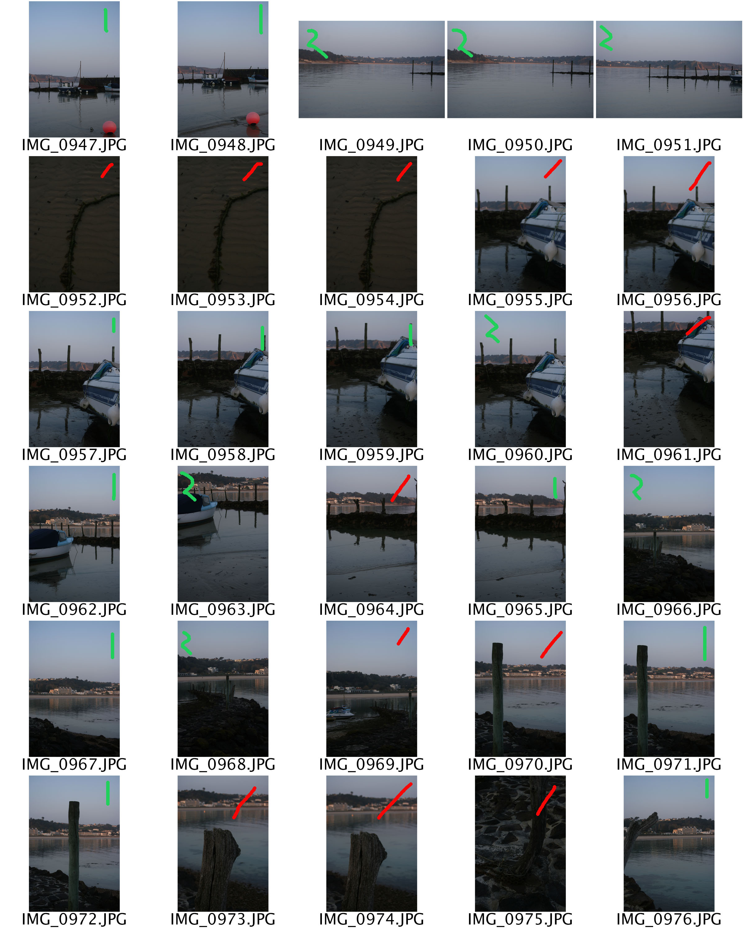
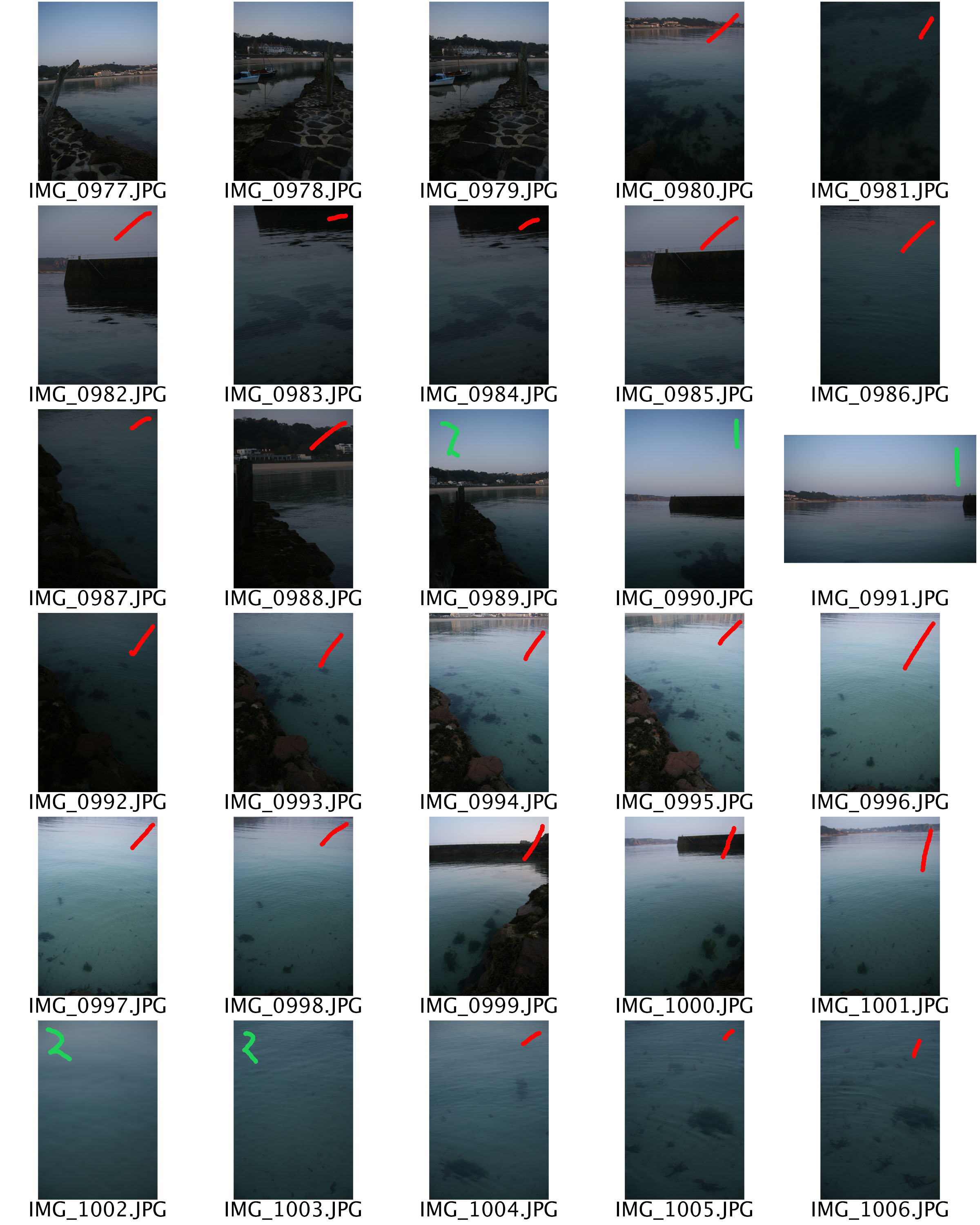
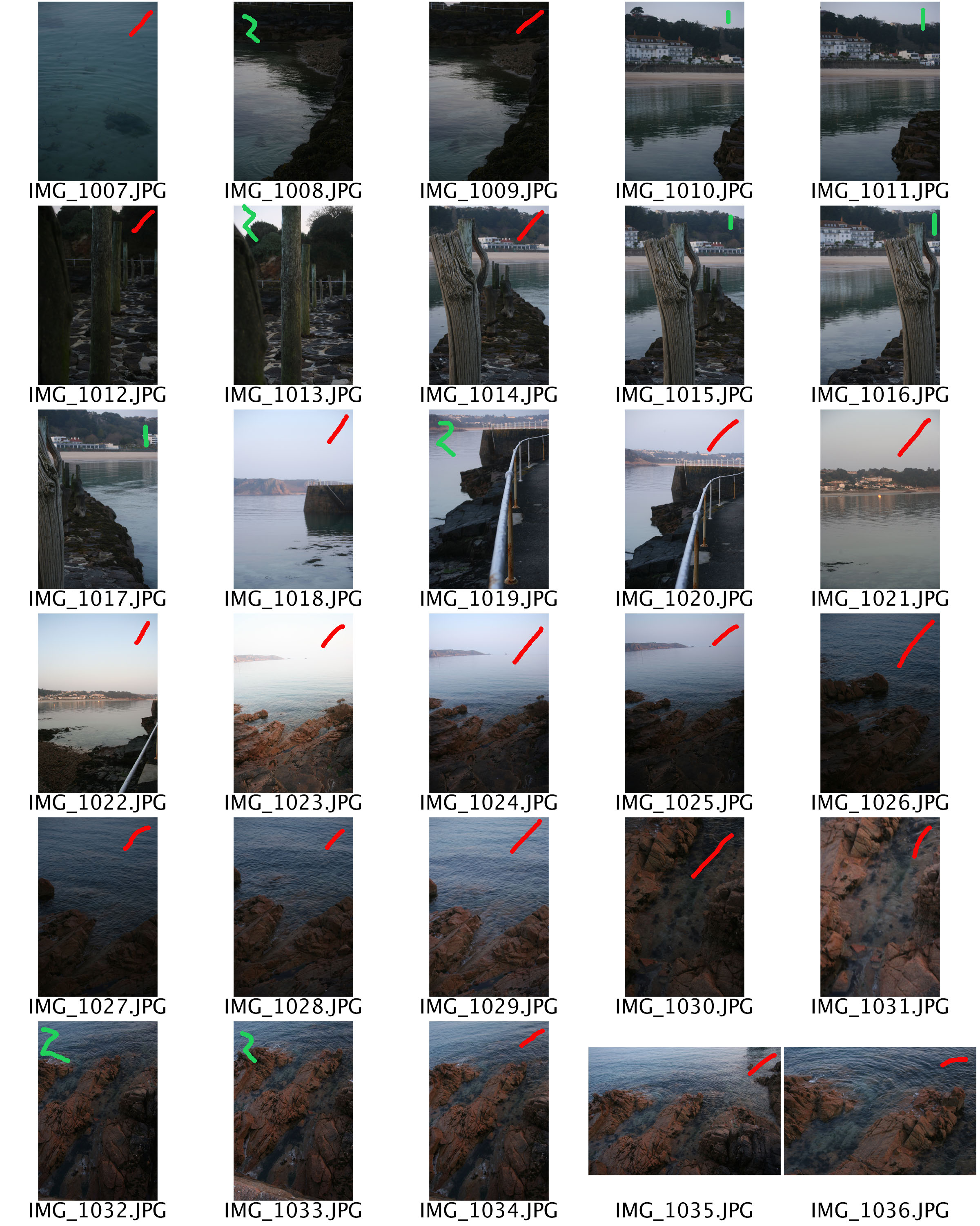
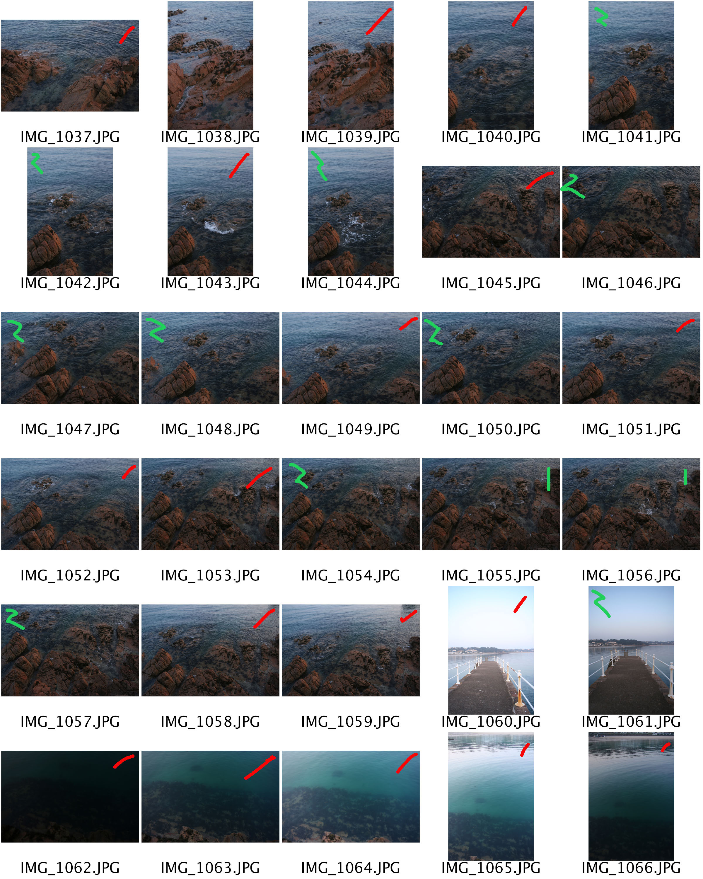
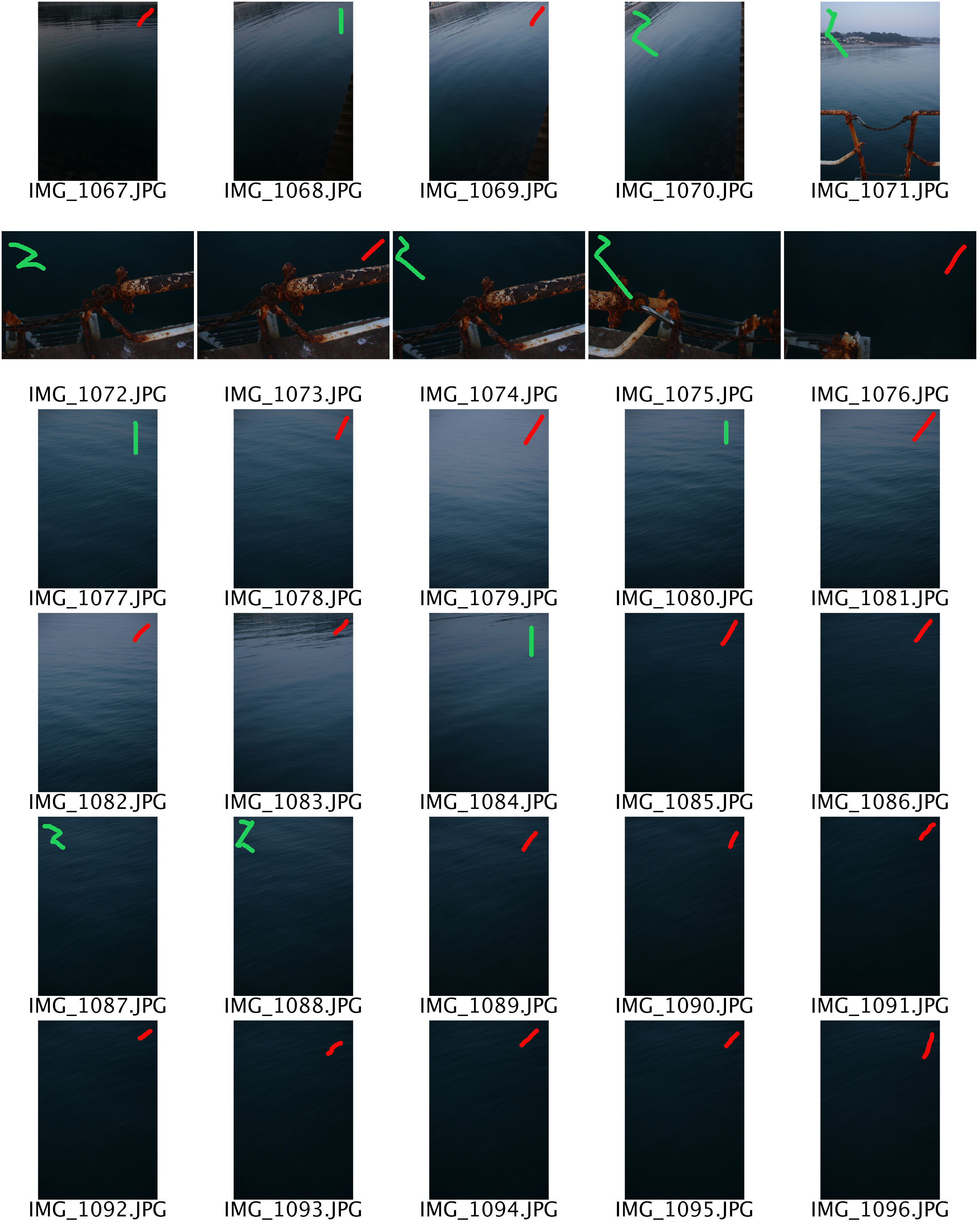
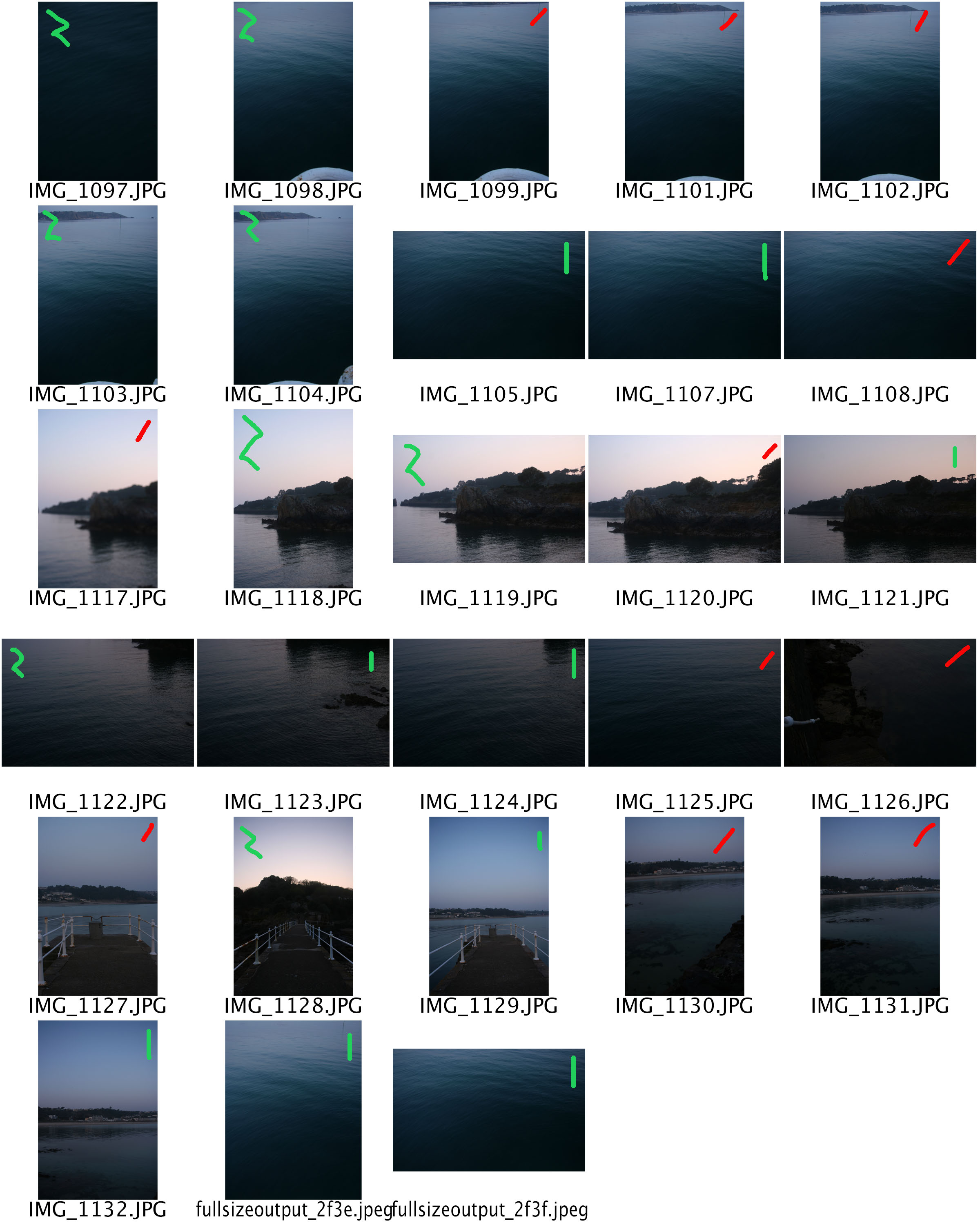
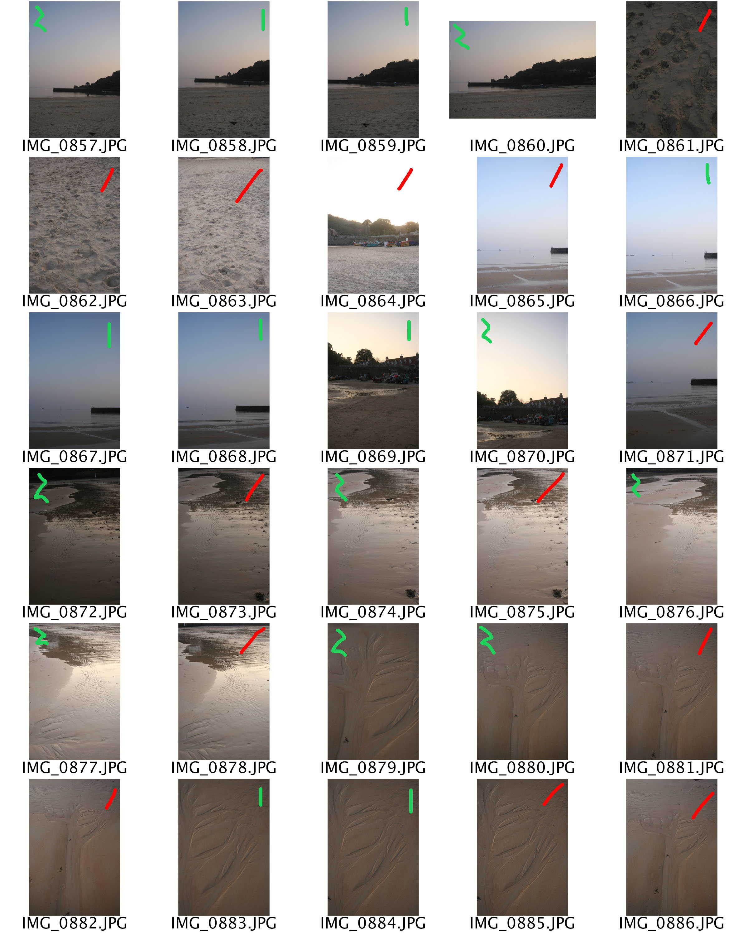
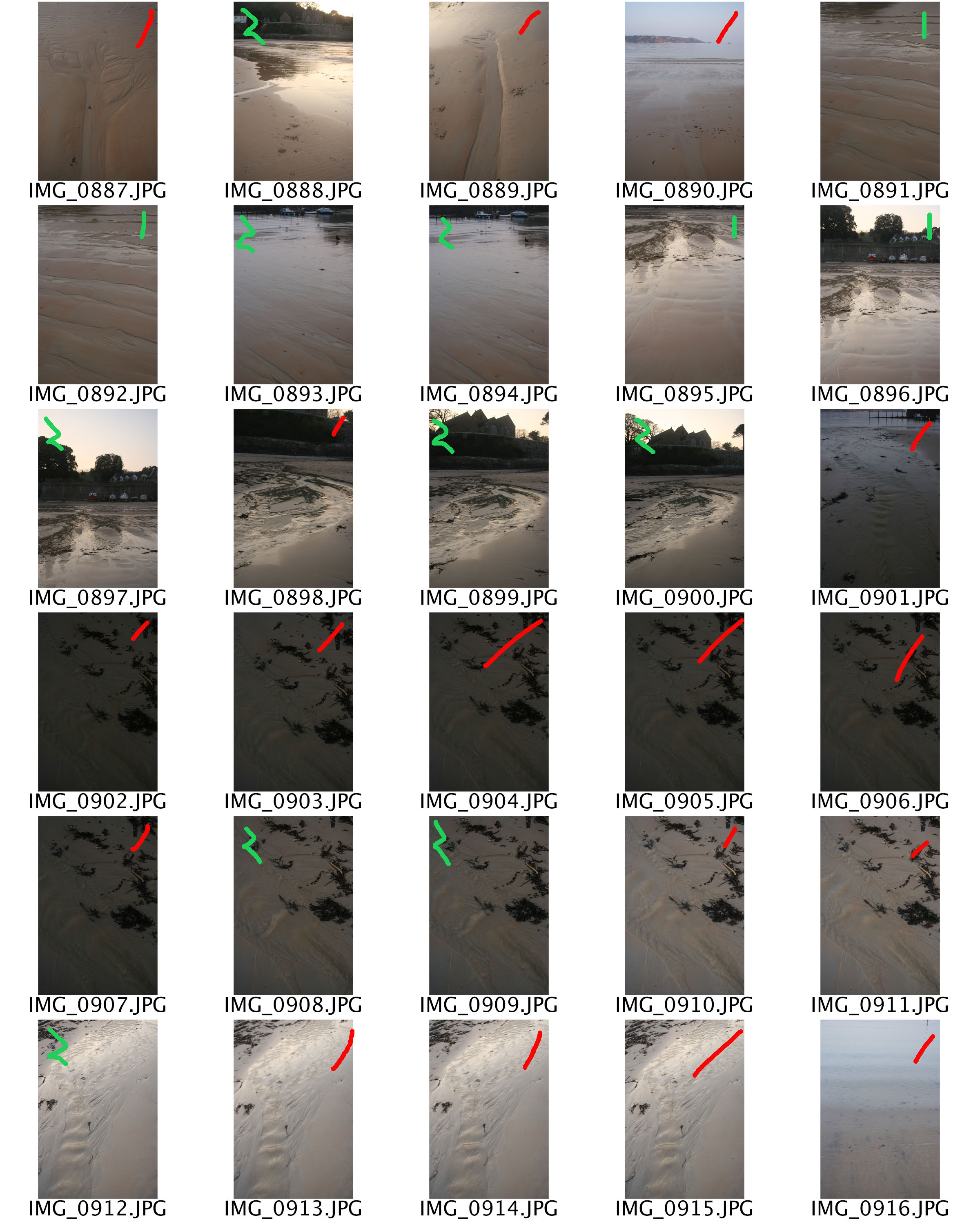
I collated all my photos into contact sheets on Photoshop. The red means I won’t be editing them, this could be because, they aren’t sharp or in focus. The zigzag green line means that the photo needs editing, for instance increasing/decreasing exposure, the striaght green line means that minimal editing is need, for instance cropping.

Thailand Concept 2

It’s a Southeast Asian country, known for tropical beaches, opulent royal palaces, ancient ruins and ornate temples displaying figures of Buddha. In Bangkok, the capital, an ultramodern cityscape rises next to quiet canal side communities and the iconic temples of Wat Arun, Wat Pho and the Emerald Buddha Temple (Wat Phra Kaew). Nearby beach resorts include bustling Pattaya and fashionable Hua Hin. I stayed in the in Karon, Phuket, this southern area is well known to tourists. Patong not too far away from where I stay it is very popular to young adults for it’s western culture and party night life. In my opinion this is sad, my dad he had visited Patong about 20 years ago was saying how he remembered it to be much nicer. When we visited Phi Phi Island, he was telling me how the coral used to be more colorful, there were hundreds more fish, half the amount of people, no litter and no Mcdonald’s. This urbanisation of Thailand is very disappointing in many ways but it’s the journey the country had to take to rebuild it’s self after the boxing day tsunami in 2004, which is the deadliest in history, it killed around 230,000 people. Thailand had to do something in order to stay afloat after this huge step back and the constant increase in other countries wealth. It was essential to their government to They used their stunning views and cheap exchange rate to make tourism their way of increasing their economic wealth. I wanted to express this idea through my photos by only taking them in the night and in land, of the busy towns and markets. In conclusion, I want to capture a series of photos of Phuket’s bust market places and town centres to create an idea of how tourist orientated Thailand is and how for the large majority of locals it’s their only source of income. This half of my concept also relates to the theme of journeys and pathways because I am aiming to empathsise the journey in which Thailand has had to take ever since the tsunami in order to keep it’s place in the world.

Image result for phuket before and after tsunami
The short-term and long-term affects of the Tsunami.


Photo Gallery

This is a virtual photo gallery I have created for this project from some of my final images.

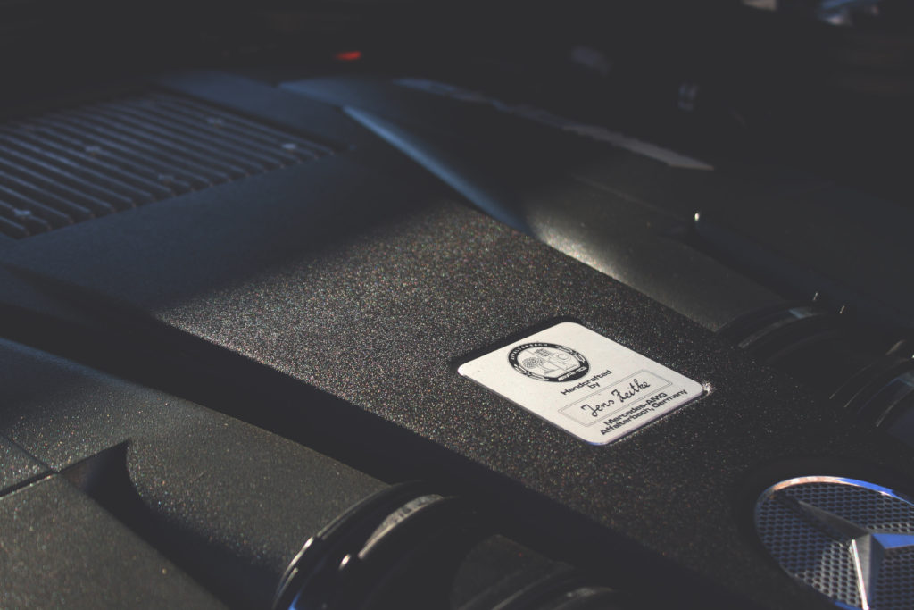
It is split up into three sections of photos grouped together based on their similarity. The first group on the left are in pairs of photos with similar colour grading and of similar objects, these being an engine and a gear selector.

I have chosen to put the middle photo on its own as its colour grading and effects don’t match those of my other final images.

The group on the right consists of the same original photo which has been edited in three different ways. One being filters and colour grading, another being colour mapping and masking, and the final being posterizing.