RED = Don't like the image/ technical problems with image

YELLOW = Considering/ unsure about using the image

GREEN = Definitely using the image as part of my final piece


RED = Don't like the image/ technical problems with image
YELLOW = Considering/ unsure about using the image
GREEN = Definitely using the image as part of my final piece


THE IDEA:
In order to display and present my work, I have decided to take a totally different approach to the conventional, making a sort of cube in order to showcase my work. Each element of the display will have a symbolic meaning attached to it, linking it all in with my overall theme of landscape urbanization and the title “journeys and pathways”. I have devised a plan on making my final display step by step which I will record whilst making it. The final outcome will hopefully resemble the product which I have made a mock up of below.
SYMBOLISM:
CUBE:
A cube is symbolic of many things yet the aspect which I am focusing on is the relation it has to industry and man made structures. Being such a precise and linear object, it is totally different to what we see in nature. There is nothing organic or nature about this sort of form, therefore this is why I thought this would nicely juxtapose the images which I have created that include nature. It is also symbolic of the start of surrealism in art and the evolution of art. Cubism is an early-20th-century avant-garde art movement that revolutionized European painting and sculpture, and inspired related movements in music, literature and architecture. One primary influence that led to Cubism was the representation of three-dimensional form in the late works of Paul Cézanne.
CLEAR GLASS/ACRYLIC:
The clear glass/acrylic which I will be using whilst making the cubes is symbolic of untouched nature. The faces which I will be covering with the images will be representative of the parts of our landscape which have been altered by humans, the images showing clearly the sort of impact we have had. It also allows the viewer to see each image much more clearly as opposed to if the images were opaque.
CLEAR IMAGES:
A possible aspect which I am still debating about is if to make the images clear, being printed on a clear sheet of paper as opposed to card. This is more for viewing reasons. making it easier to see the rest of the images which are situated underneath.
PLACEMENT/ARRANGEMENT:
For this display, I am making two cubes which will display each set of images separately. Although theoretically the cube would have 6 faces to display work upon, I will only be displaying work on 3 of them. There are two reasons for this choice. Firstly in terms of visuals, the bottom face of the cube would be obscured from view therefore it would not be able to be seen . The other reason for this choice is that the clear faces of the cube would be symbolic of untouched nature which we still have here in Jersey.


Pierre Mette was a keen amateur photographer and his work for Falles Garage regularly took him out-and-about in the island, and his camera always went with him. His images of the island and the company he worked for from the 1950s to 1980s were taken on film, and digitised by his boss and lifelong friend John Falle. Most of the photos he took from the 1950s up until the early 90s, were processed onto colour slides, which were then transferred onto cd discs by a good friend. Pierre died in 2016 and his collection passed to John Falle’s son Helier, who has made them available to Jerripedia, both as a record of island life, mainly in the 1960s and ’70s, and as a tribute to Pierre Mette.
Analysis of Photos
These archival photos were taken by Pierre Mette between the 60s/70s, throughout the streets in St Helier.


Contact Sheet

Final Recreations
Below are the final images I have chosen to print out and draw from.I did edit the contrast and brightness of the images in Photoshop in order to be able to see the shadows and outlines clearer. I plan to print out the two versions of the 3 different photos, and then to take some pieces of acetate and cut them to size to fit over the modern photo. Next I will take a fine tipped white ink pen and draw over the general outlines of everything in the modern photo, and once it is finished I will display it over the top of the old photo so it can show how much the same place has changed overtime. I don’t think that the two versions will be exactly the same or that it will be extremely seamless because a lot has changed and I found it quite hard to get the exact same spot that the Pierre Mette photos were taken in.


Above our the final pieces which I have made as a response to Gosia Wlodarczak and as a response to the Journeys and Pathways title. The layers over the photos don’t match perfectly which I was expecting as it’s very hard to get the exact same angle, especially as it’s been so long between the time that both photos were taken. I do like that the pieces are messy and not exactly on point as I can still see the development on time.
EXAMPLES OF CREATIVE DISPLAY IDEAS:
For my final selection of photos, I was keen to display them in a way which is unique and unconventional therefore I wanted to take inspiration from other artists who display their work in ways which are different. I didn’t want to stick to the traditional method of simply mounting or framing my images as I feel as though this would take away from my theme and intended message which I am aiming to deliver with my images. In order to show my images to their full potential I think it is important to display the images in a way which is creative yet subtle so as to not take away from the images themselves.
PROJECTION/FILTERS:

PHOTO-BOOK:

SEE THROUGH IMAGES/LAYERING:

POSTCARDS:

INCOPORATING OBJECTS:

MOUNTING/FRAMING:
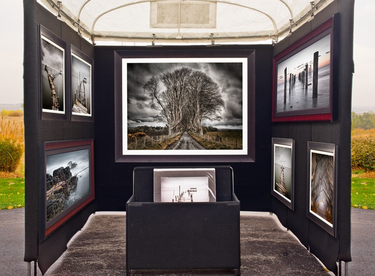
These are the best photos from my third photo shoot. I will use some of these to print as my final images as they turned out really well.






Gosia Wlodarczak is a Polish artist who now works and lives in Melbourne, Australia. ‘Gosia Wlodarczak’s cross-disciplinary drawing practice has extended into performance, installation, sound and film. Her work is motivated by a fascination with the mind’s relationship with the outside world conducted through the senses. Using only what she sees around her, she uses the drawn line as a materialisation of being present in the world and in a moment. She works in private and public spaces rather than an artist’s studio, interacting with the stimuli of the outside world and ordinary life, translating her ‘living energy into the drawn line’. She has been exhibiting her work since the 1980s with her most recent solo exhibit being A Room of Facial Deconstruction, Queensland University of Technology Art Museum, Brisbane (2018).
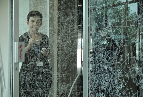

Wlodarczak does not produce her artwork at home or in a studio. Instead she does them in real time at the exhibition. The artists’ explorations into video document and expand her multi-discipline practice. The core of her work is drawing, using surfaces such as walls, floors or even set dinner tables as live environments in which to draw “in the moment”. I plan to experiment with the techniques that this artist uses in my own work. I have already began working a blog post on recreating archive photos of Jersey using the methods that Gosia uses. I intend on using a piece of acetate and tracing over 2 different photos with a white pen to create the same effect she has, and then create some layers over the top and then experiment with that.
Gosia Wlodarczak
‘I draw my environment as I see it, in real time – tracing and re-tracing the visible. I only draw what I see. Seeing, the act of drawing and the drawing itself are evidence not only that I exist, but also that I exist in the present moment. I never draw from imagination. The immaterial (energy and time) are converted into the material (pigment forms line). Every single glance produces a drawn shape. Every drawn shape both embodies and documents corporeal existence.’

WHY I CHOSE THESE IMAGES:
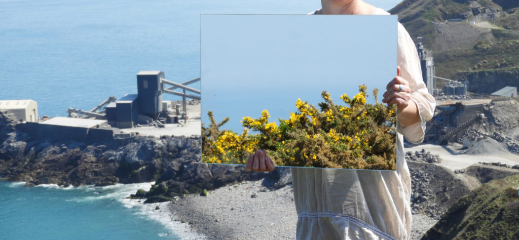
The main reason for me selecting these final six images was due to the fact that they follow the theme of my overall project very well which is the exploration of landscape urbanization around Jersey. The first set of images is fairly simplistic and minimal. The way in which we see the human impact is very subtle, for example in image 2, in the reflection we can see a man made structure yet it is surrounded by a dull and calm sea. The color pallet of the first set is a lot more subdued therefore making them great to pair with images which may be more complex or dramatic in other aspects. Set 2 , although similar, has some key differences which make it perfect to pair with set 1. They both follow the same theme and tackle similar issues, yet the addition of a model in set 2 means that more symbolism is added to the images. It is very much like set 1 but additional elements. Instead of having a subtle color pallet, the images are bright and saturated. They include organic and man made structures in them such as the quarry in the backdrop and the various rock formations around it. It is a lot more clear what the suggested theme is in these images as opposed to set 1, allowing the viewer to understand them with the aid of set 2. The theme of surreal nature and landscape romanticism is also a lot more apparent in set 2. The vast expanses of sea and high cliff tops in the backdrop allow the viewer to feel a sense of awe whilst looking at the images.


