Category Archives: Uncategorized

Filters

Author:
Category:

Final Piece Evaluation

Below is a photograph which showcases all of my final outcomes for the Journey’s and Pathway’s Project. As you can see all of the outcomes work together to showcase the Journey of the Second World War, as it shows different aspects which impacted Jersey Journey. I have been able to display my final images in many ways, to showcase different meanings and affects. Overall, I am very happy with the way my outcomes have turned out as they meet the project title, and showcase my top outcomes.

My first final piece is my most successful outcome, the simplistic way of framing showcases the already abstract and distorted images of the bunker. The image itself is strong enough making it effective to display it by itself, Moreover, it has strong links to Jersey’s Journey through the Second World War. If I was to redo this edit I would look at using a black frame as it would help to present more of a tonal contrast, making the overall outcome more visually stimulating.

My next final outcomes showcases two images which was inspired by the artist Knez. Originally, I had three images to display but scrapped one of the images as it was not as strong as the other two. I vertically displayed the two images on foam board, allowing the contemporary framing method to be used. If I was to redo this final piece I would look at using a more abstract and sculptural way of framing, to some extent distort the way we view the images.

My next final outcome was inspired by Talmor, as I showcase three images which have been teared to create one final image. This image is successful as it is ascetically pleasing to look at and has close links to the artist. I placed the image segments on a large piece of foam board. I really like the way this outcome has come out, due to the uniqueness of the design and how the viewers eyes are guided around the image. To improve this idea I would look at using foam board to slightly raise some segments to make an eclectic way of framing and it would also help to add to the overall effect.

My next final outcome showcases my 7 top images from the propaganda section of the project. The way of displaying is simplistic and allows the different posters to showcase my competence in camera and editing techniques. All the images compliment each other and clearly showcases my project title, Journey of Jersey through the Second World War. In my opinion this final outcome would be more successful if I used a larger cork board as the posters would not be overlapping one another.

For my last final outcome I have displayed my three sea wall edits, which was inspired by Socrates. I really like the way the physical wall displays my images of the walls as it allows the viewers to really thing about the purpose of the sea walls, which emphasizes the Journey of Jersey through the Second World War. I like how the wall is white as it does not distract viewers from the actual images themselves, and compliments the images. To improve this final piece I would look at making the wall and images bigger to emphases the size of the wall, and metaphorically shows the big part the walls played in the second world war.

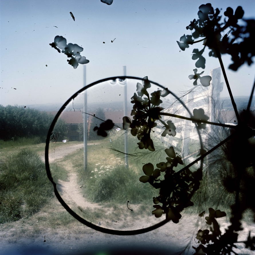
IMAGE ANALYSIS

Image result for stephen gill

Technical;

When first looking at this image it is clear that there is an initial contrast of light and dark presented straight away. Firstly the background image, the photograph is represented as a image taken in daylight, from a high up location due to the smaller buildings that can be seen in the background, this give the image a good view point when looking at the image itself. To me this adds more depth which is essential for a decent image to be produced. With an evident use of high over exposure to ensure the clear contrast between the background image and the much darker shapes placed on top. On the other hand the use of the over whelming white blurs seeping through from behind the heavy black print in front is a consistent technique used through out Stephan Gills other work. The temperature of this photograph provides us with a much colder feeling due to the use of paler shade used and the idea of the color emerging from the image, the over exposure almost leads to all the main colors to become extremely pale. However this help emphasis the much darker shapes on top which is clearly a critical point to be bought across from the image.

Visual;

As previously mentioned the main color presented in the image are much paler than what would be presented in real life, this would be due to the over exposure used from the camera to give a much colder and harsher effect and lead to a much further evident contract between the background image and the dark shapes presented in front of the photograph. These black images presented in front of the photograph give the image depth and texture which yet again adds more detail enabling different view and perspective from the viewer to be interpreted. The texture of the photograph to me is still represented in a flat smooth way rather than a ’lumpy’ texture, although there is a clear texture that must be presented due to the over lays on the images. The black images in front to me give an almost stain like feel this can be seen through the circle which could be translated to a coffee mug stain. On the other hand the other patterns are more of a floral type or a plant pattern that have been possibly imposed on the image by using chiffon giving the overall feel to the images and the essential contrast. As mentioned the texture of the images isn’t necessarily rough or uneven but the photograph for sure gives a strong 3D effect. The organisation of the image to be proves to be unorganized and almost random display of the gloomier images, with the placement of the plants and circular ring being placed out of center and unsymmetrical, although I believe this to add the end product and feeling of the image.

Contextual;

For the creation of these images Gill in Brighton and Hove during 2010 added features of objects and creatures that he had found and picked up from the his local surrounding, use his natural environment to help produce his most famous work, and the introduced that into the body of the camera to give this new effect. Gill hoped through this particular approach it would encourage the spirit of the place to clamber aboard the images and be encapsulated in the film emulsion, like objects embedded in amber. The aim was to evoke the feeling of the area at the same time as describing its appearance. Gill said that this particular technique gave him less control, and provided a considerable an element of surprise, as how the image ended up was not always a plan and was for sure at times not what was expected. Some results included some highly detailed macro recordings amongst and within the landscape of the portraits. Gill said ‘ like to think of these photographs as in-camera photo-grams in which conflict or harmony has been randomly formed in the final image depending on where the objects landed.’ Some of Gills technique to get these particular effects on the image were, by using a magnifying glass to concentrate the sunlight onto some of the negatives in order to etch markings directly onto the image or sometimes Gill would even dip his negatives into the sea.

Conceptual;

The types of images Stephan Gill produced left a wide option for different interpretations and different ideas to be produced from the viewers of the images, this was due to the different types of backgrounds hat were over exposed and the dark shapes over laid on top of the original image. That’s one of the best things about Stephan Gills work there is so much opportunity for personal explanations of what the images means and represents.

My Recreations of my Images

These are the selection of images that I will use as my final piece. After manipulating the images on adobe lightroom and adjusting settings such as contrast, vibrancy, highlights, shadows, whites, blacks, cropping, changing to monochrome, saturation, vibrancy and clarity. 

The first two images that I have inserted below are similar to the original image in terms of the subjects are both holding animals in both the old and recreated photo, a similar(ish) stance is also replicated in the new photos and the emotions/ facial expressions are similar. The images are of my dad. My dad has always shared a love for animals, and these images clearly portray that. Unfortunately animals don't tend to have a long life span, however these images show that although death occurs, life can also begin as other animals are brought into their lives.


For the images of my dad, the original image was taken on his travels in Australia. There aren't any koala bears in Jersey anyway, however I still wanted to replicate my dad holding an animal so I thought it was best fit that I recreated him holding my dog Salty instead. I like the colour scheme in both the images, it's almost like the denim blue of my dads shirt in the first image swapped with the background of the recreational image, and the white background of the original image swapped onto my dads t-shirt in the recreational image. I also like how both the koala bear and the dog are looking in the same direction. I also took this photo on my iPhone 7.
I decided not to recreate this image of myself, my sister and my grandma, and instead just simply rework into the image. I am inspired by Carole Benitah's 'à la plage'. Especially the cut out of the figures in it. What I plan to do is to cutout my grandma from the image, then sew around her cut out. I will also get a separate piece of paper and place glitter on it. I will then glue the photo on top of the paper so only the cutout of my grandma will display the glitter. My reasoning for doing this is that I want to expand on the negative space. My grandma was also a very glamorous lady, and the glitter can display some elements of that glitter. My reasoning for cutting out my grandma  is that she has now passed away, and although she is in that photo, the loss of her feel like there's almost a hole that's missing from my childhood.
A manipulated image of myself, my sister and my grandma when I was a young child.
For this recreation image, I decided to take some elements of the original image, but change up the image as well. I decided to change the subjects in the image to our family friends, I also changed the location of the image - the original image was taken in Ireland, to our family friends garden, I also changed the angle of the shot to a one closer to both the subjects and to the ground. I like how there are trees in both of the image as it shows that all children no matter what age of time still like playing outside in gardens. I also like how the element of playfulness remains in both images and the innocence that remains in the recreation image. I took this photo with a DSLR camera and used a 50mm lens. 
For this final piece I am incorporating a few elements. I recreated my mum with my little sister, however I decided to keep the school photo of myself and my sister and will be cutting us out with a Stanley knife and then inserting ourselves into the recreational image. I'm doing this because both of the photos of me were taken at a similar time, and I remember meeting my little sister almost like it was recently. Therefore although time has changed and my little sister has grown up, the memory is still fresh and young in my mind. To take the photo I used an iPhone 7. 

CONTACT SHEETS FROM STEPHEN GILL PHOTO SHOOT 1/2

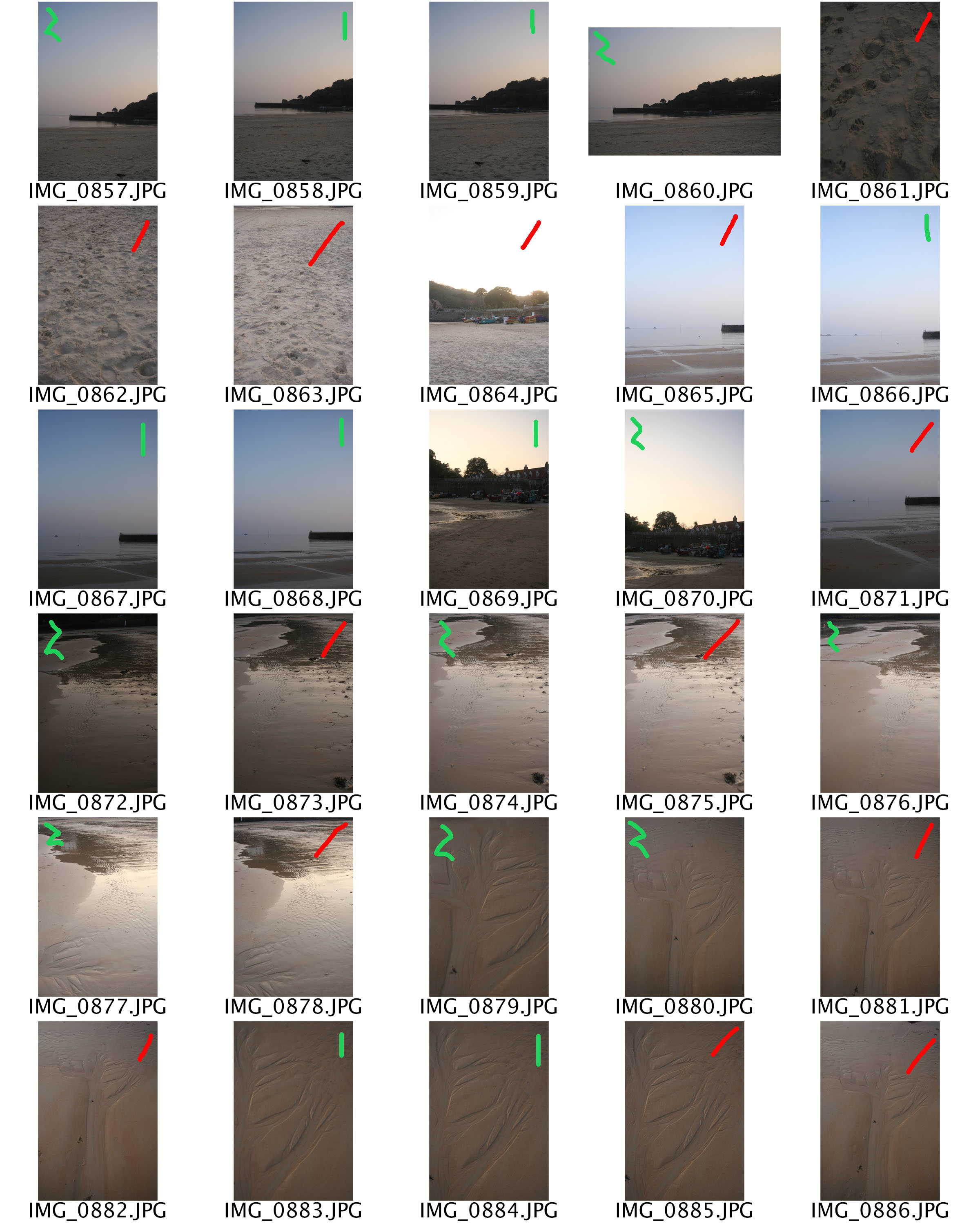
For this first photo shoot I set out in the evening and I wanted to capture much darker images with minimal exposure in order to create a much darker and effective photograph. For this particular photo shoot i ended up photographing a the majority of plants, trees and nature and to me that would allow me to have more opportunities for editing in the future. Along side that factor, when photographing these images positioning and point of view of the camera was something I really wanted to concentrate on. I included image where the camera was pointing straight down, straight up, in front off and at diagonals.


Red= I will definitely not use, either not focused enough, no what I expect or simply just have better images that I can use instead
Yellow= I will maybe use or maybe use part of the image (cropping) or with the right effects and editing will end up being efficient to use
Green= I will most likely lose, really like that particular photo, or particular part of the photo

PHOTO SHOOT 2- CONTACT SHEET

For this photos shoot I wanted to do something completely different to the previous shoot in order to allow me to a have a variety of images. First of all I chose my location that would have the best sunset lighting so grasp the best quality images with the correct warmth feeling. I ended up going to St Ouens before sunset and simply walking along the beach and taking images of anything that caught my eye at the time. The ripples in the water with the sun reflecting of the water gave an extremely good effect, along side the foot print in the sand. This is where I got one of my final pieces from, of the stone wall and bright blue sky, and placed with the perfect moon.


Red= I will definitely not use, either not focused enough, no what I expect or simply just have better images that I can use instead
Yellow= I will maybe use or maybe use part of the image (cropping) or with the right effects and editing will end up being efficient to use
Green= I will most likely lose, really like that particular photo, or particular part of the photo

Analysis Of My Own Work

This is one of my favourite outcomes from my photo shoot at St Brelade’s Beach. Firstly I used natural lighting of the evening sun to take this photo, it’s of the view out to sea of the pier from down on the sand. I love the simplicity of the photo and how the pale colours create a cool tone, whilst working in harmony together. The subtle glare from the sea and the still reflection of the pier creates an almost eerie feel to it, as if nothing is moving at all and this emphasises the image of Jersey to tourists, a quiet seaside resort with stunning beaches. This is the view the tourism companies of Jersey wants everyone who doesn’t live on the island to have because tourists expand the economy greatly. Also the rule of thirds is prominent in this photo and how the foreground is the sand, the middle ground is the the sea and the pier and then the background is the sky. The eye is led straight away to the pier, which exaggerates the journey Jersey has taken to get where it is today. The pier is significant because it was build a long time ago in order to increase trade and expand the fishing industry, it may not now play and important part in Jersey’s development but it once did. I didn’t crop this image as I felt the gradient in the sky suited the image but also represented how life on Jersey has changed gradually in comparison to Thailand, we haven’t had to rush into tourism, it’s happened naturally as more people have become aware of how ideal it is for a holiday.

Editing Process

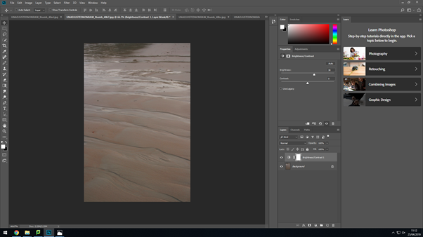
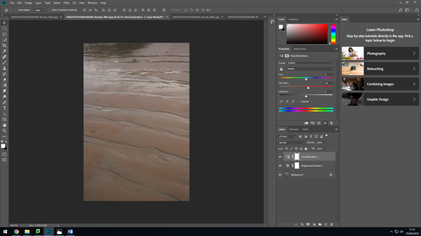
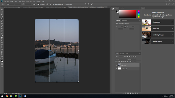
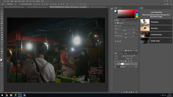
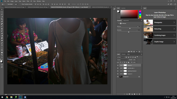
My final images were chosen though a selection process, then I put them onto Photoshop to improve them further. I conducted minimal editing as I wanted them to be as raw as possible. On my Thailand photos because they were taken at night I focused on increasing brightness and exposure.

Brightness and contrast.
Saturation and hue.
Cropping and scaling.
Exposure.
Vibrance.

Selection Process

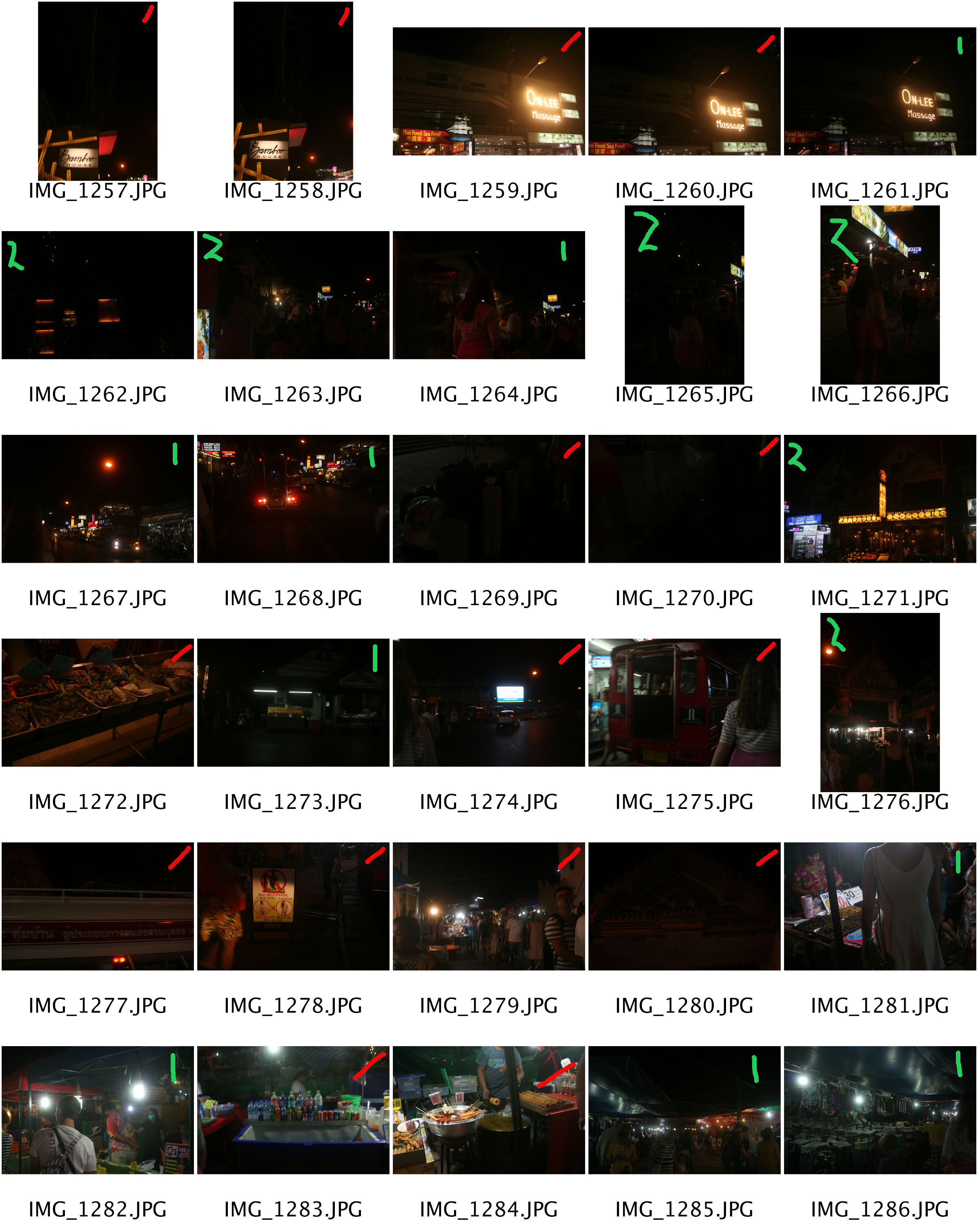
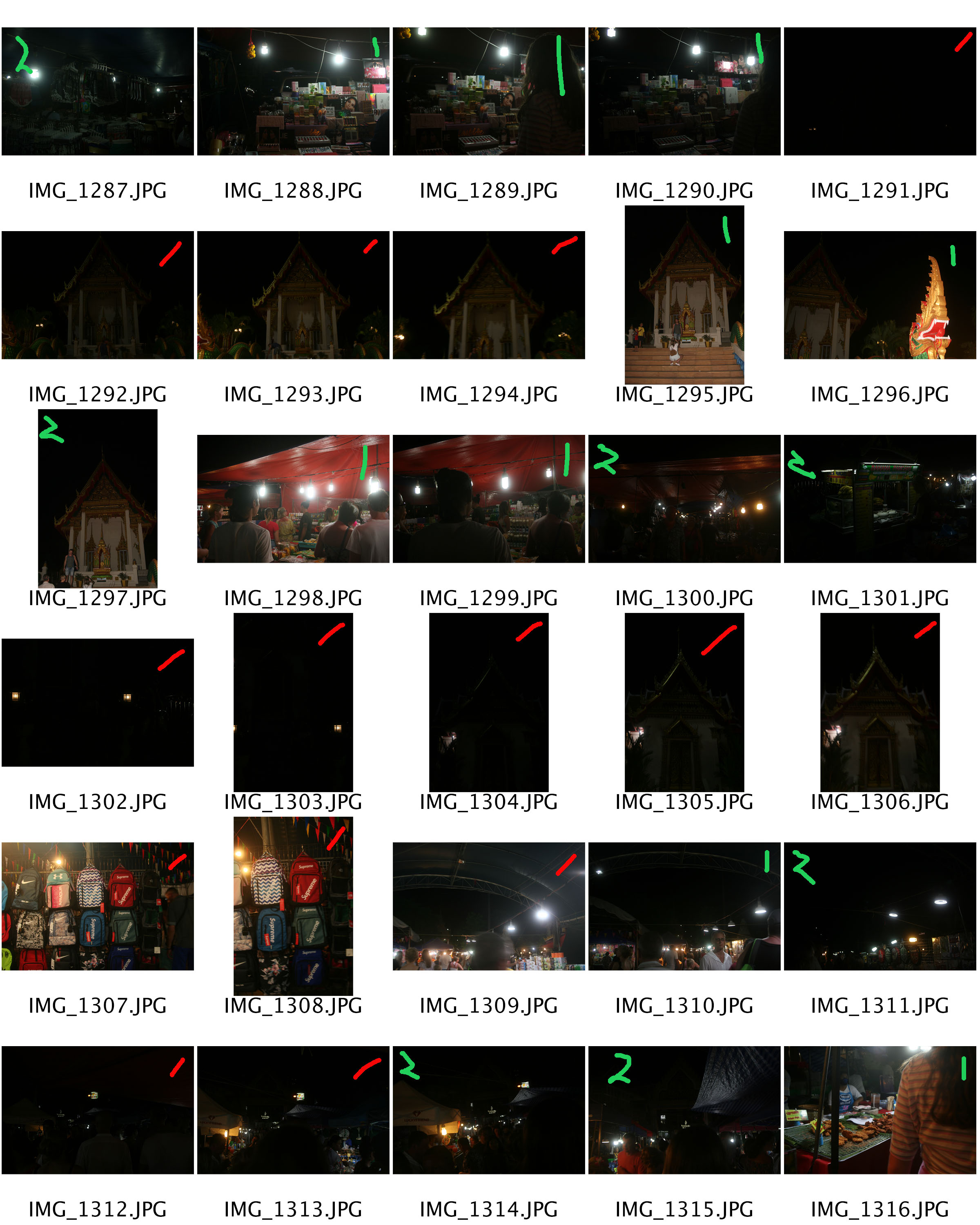
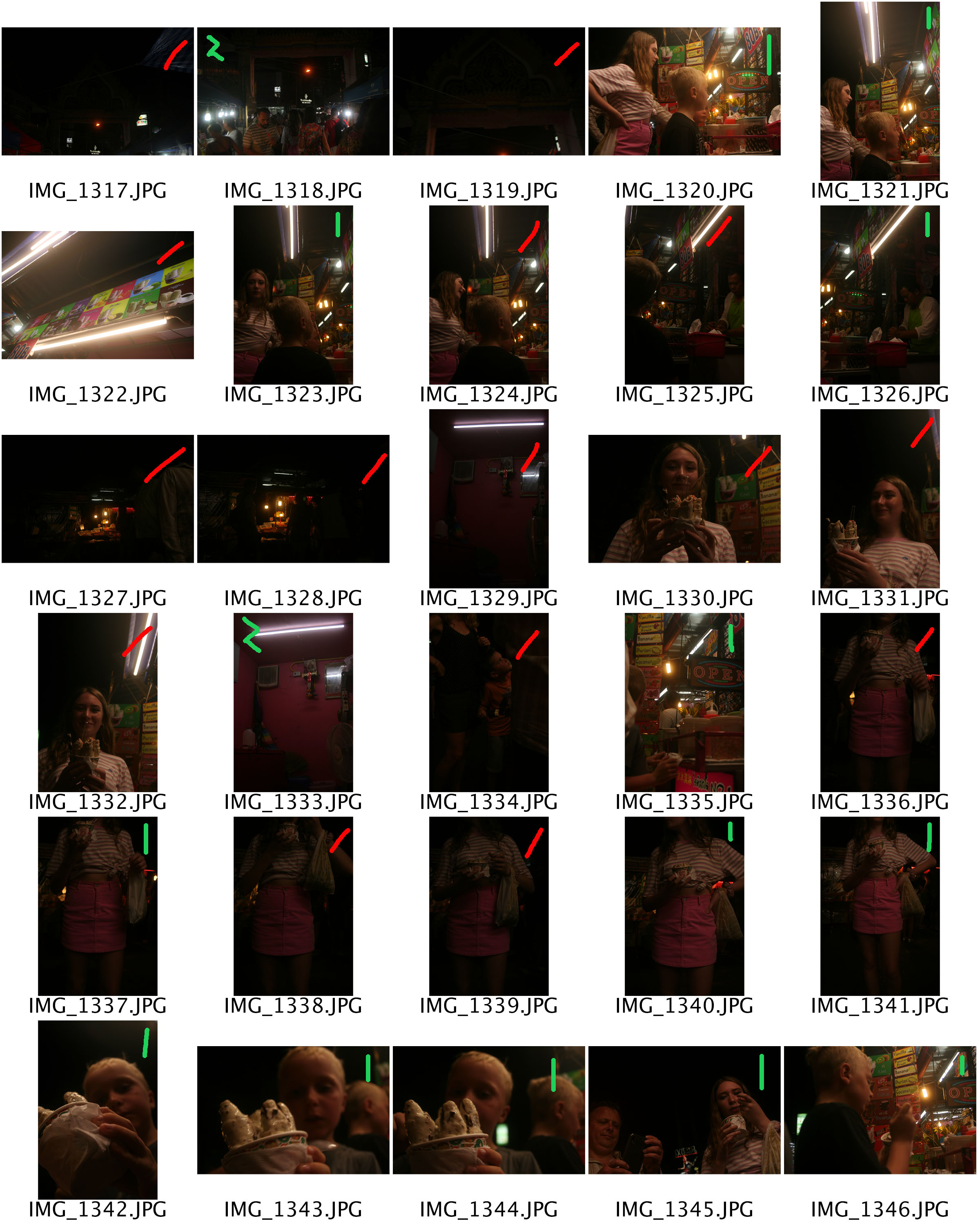
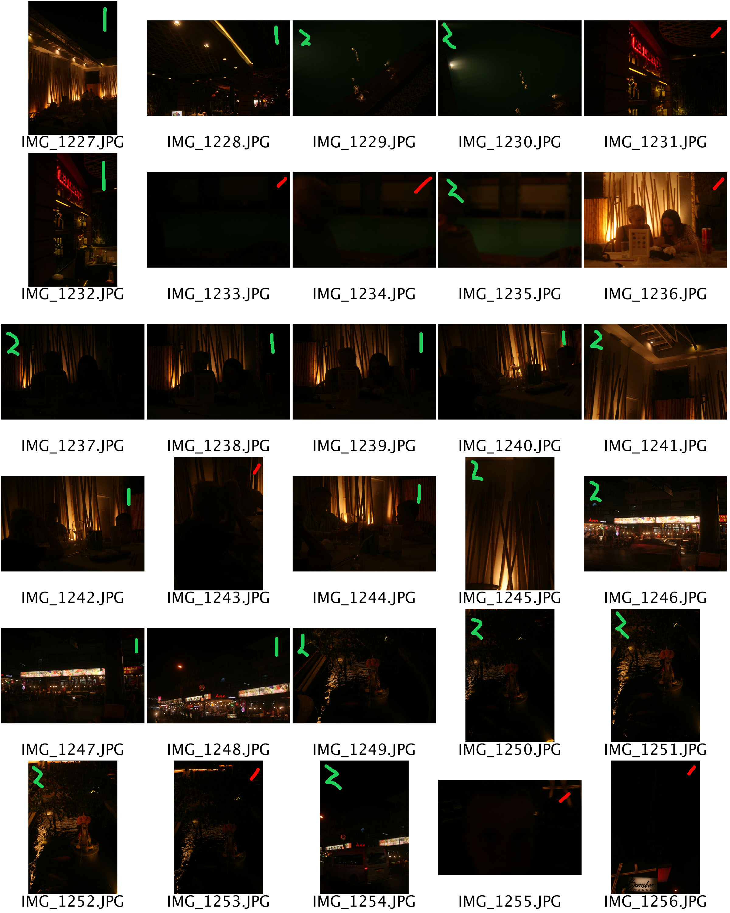
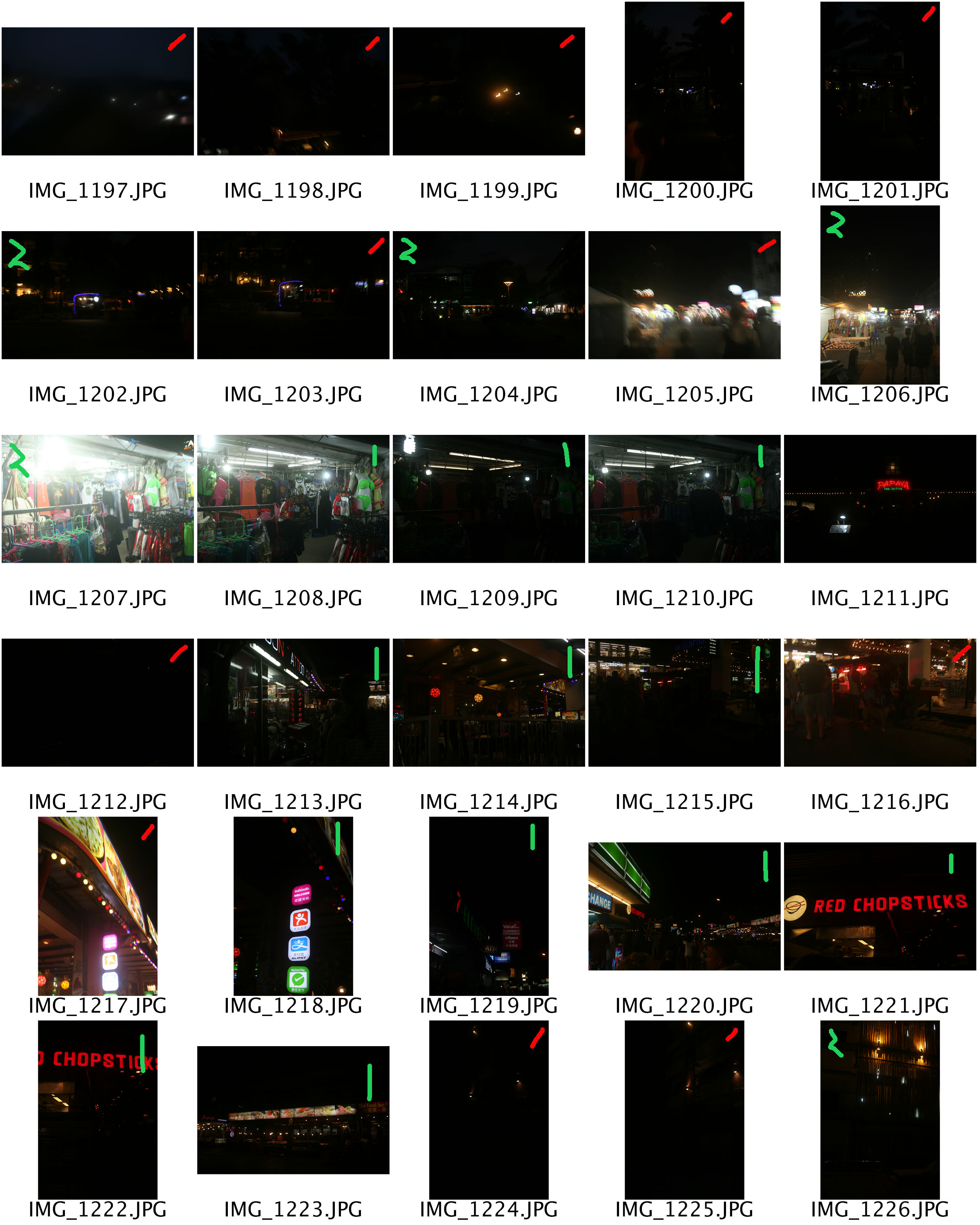
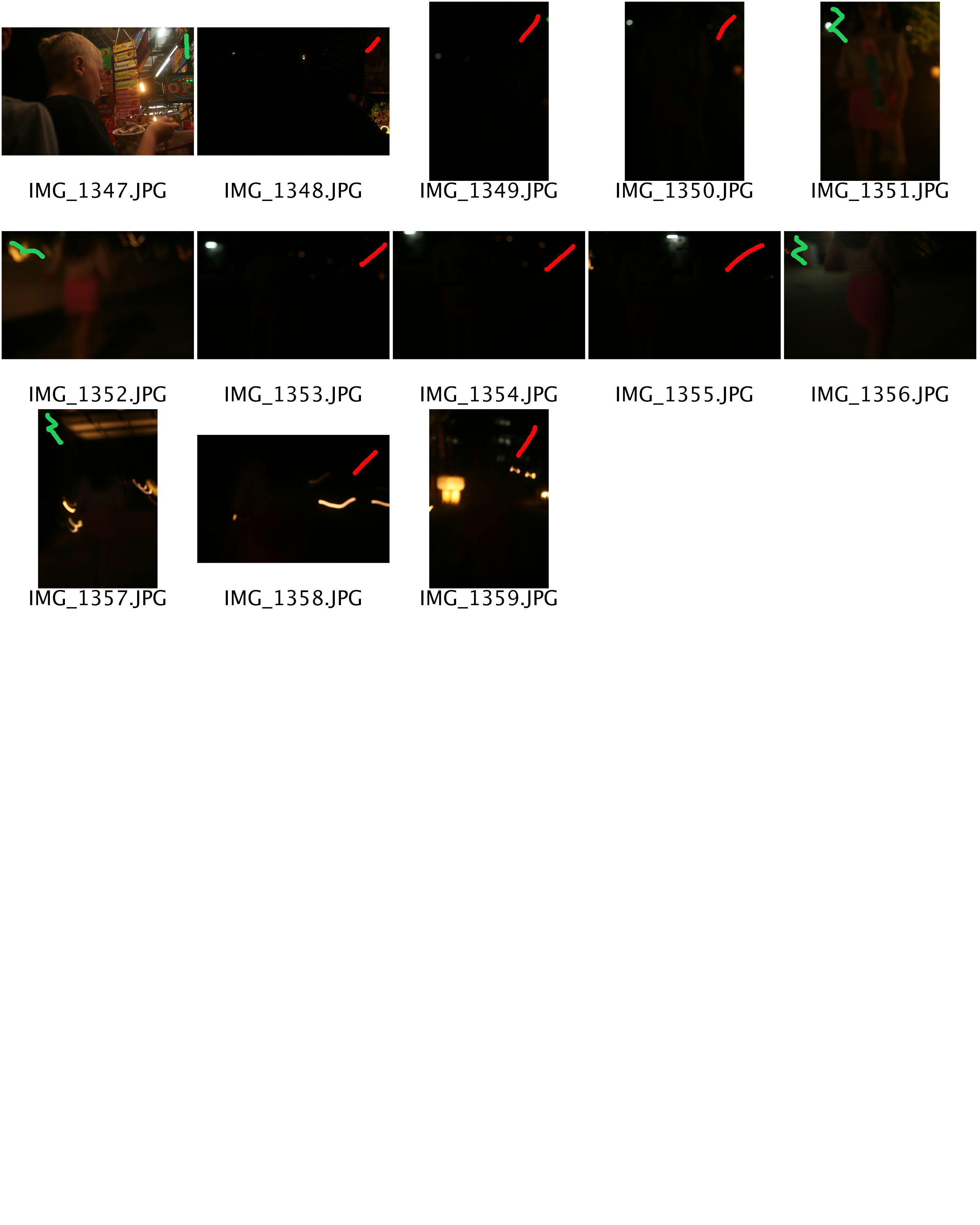
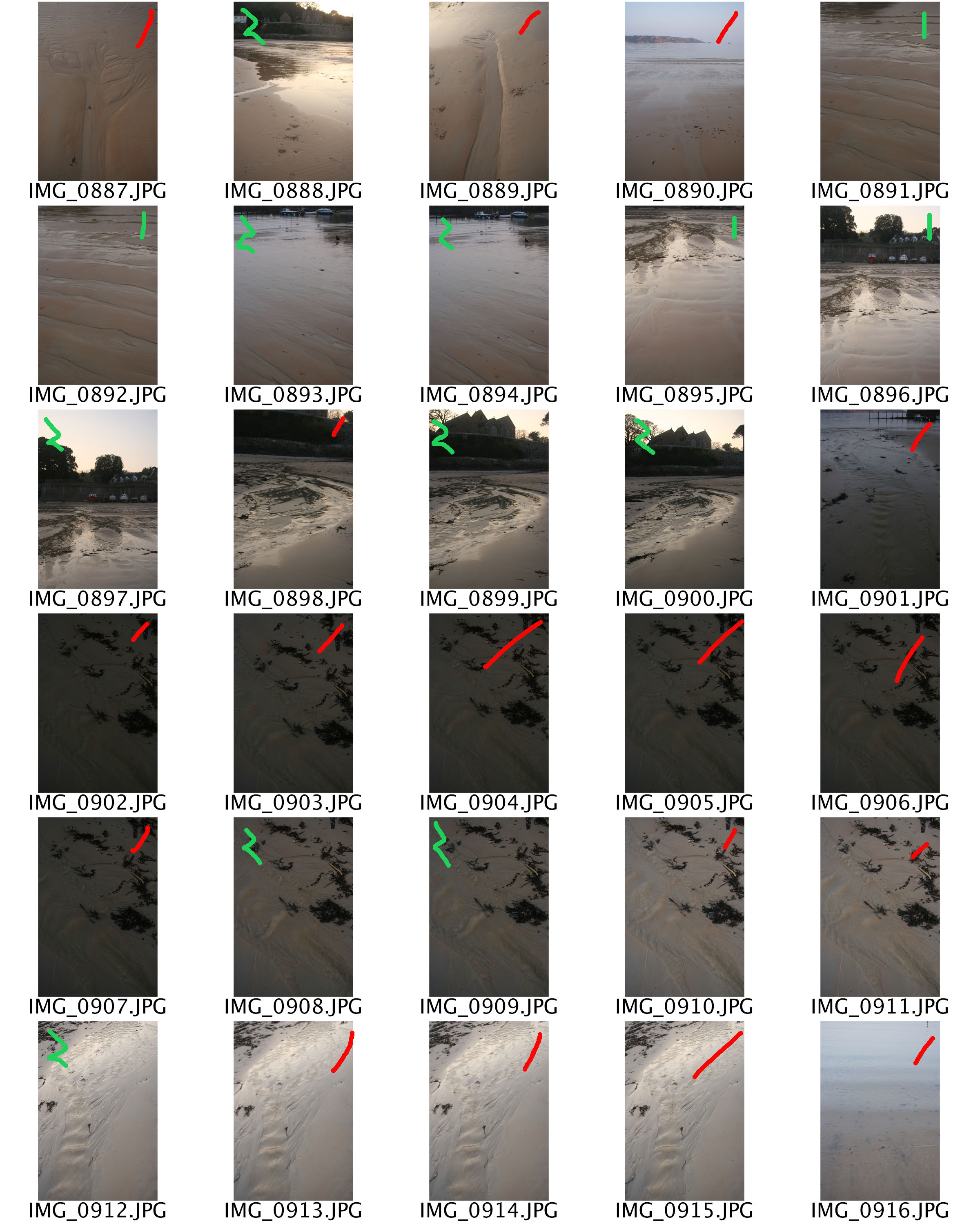
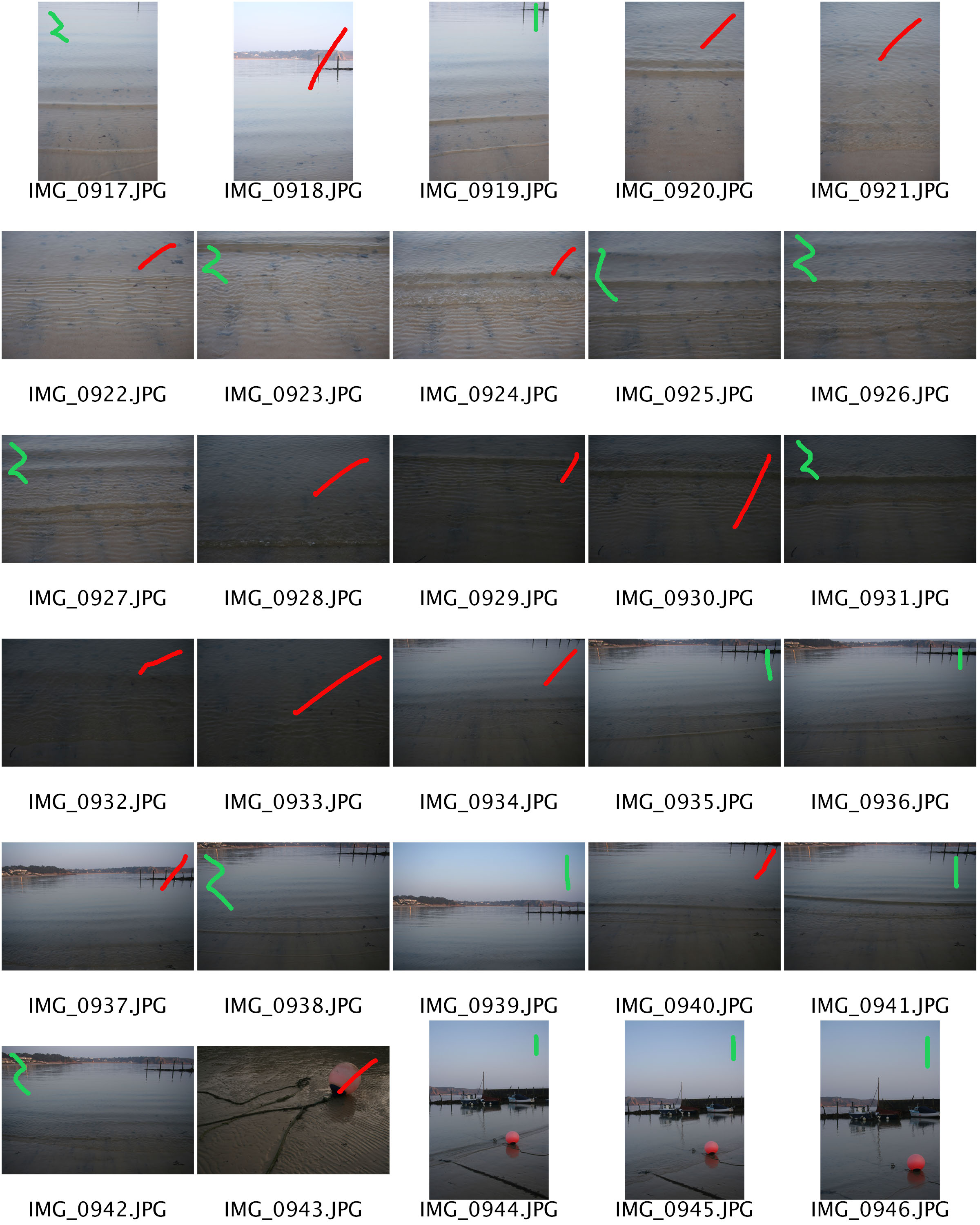
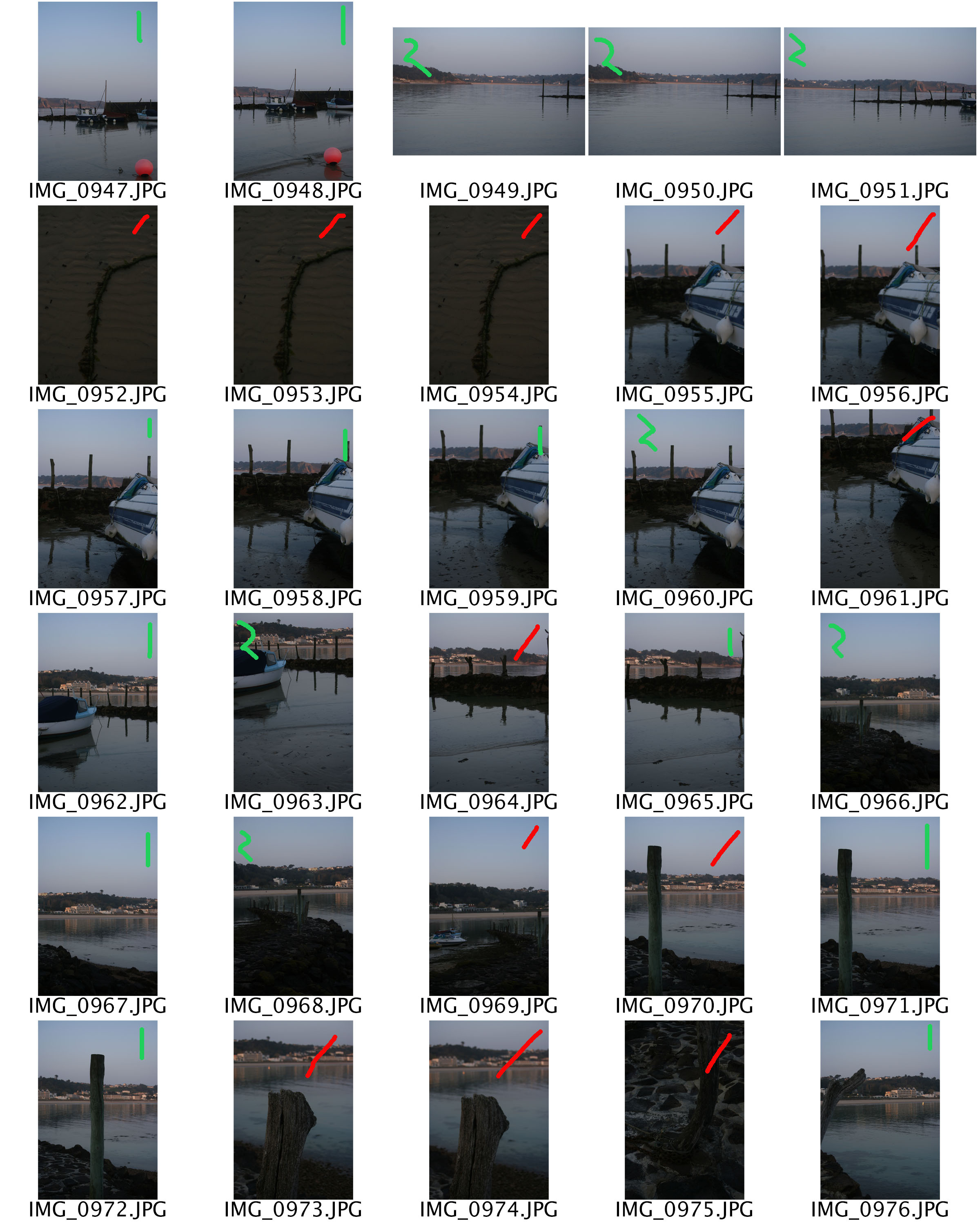
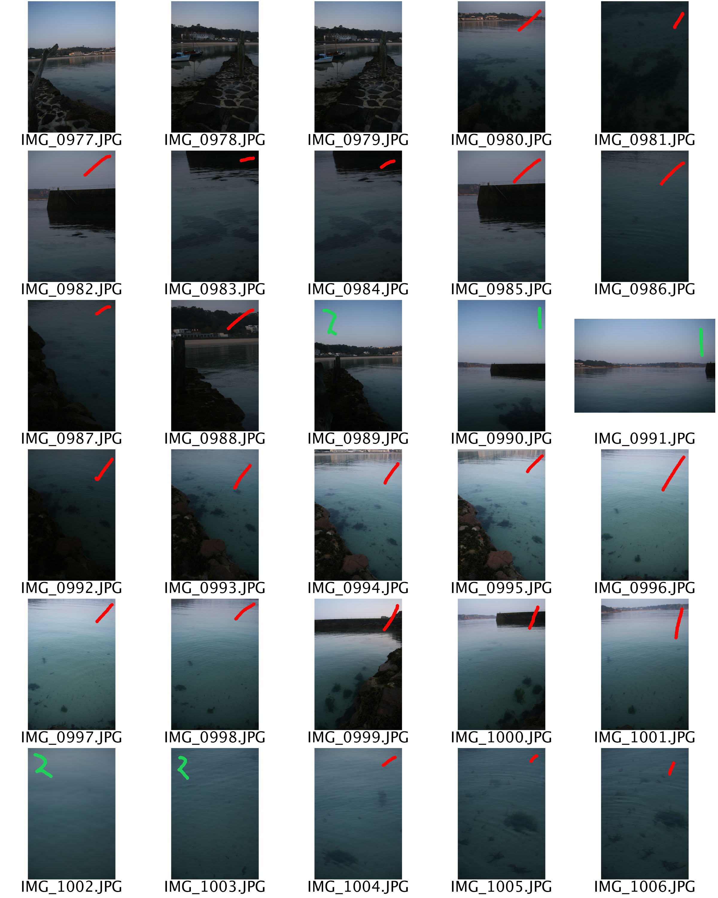
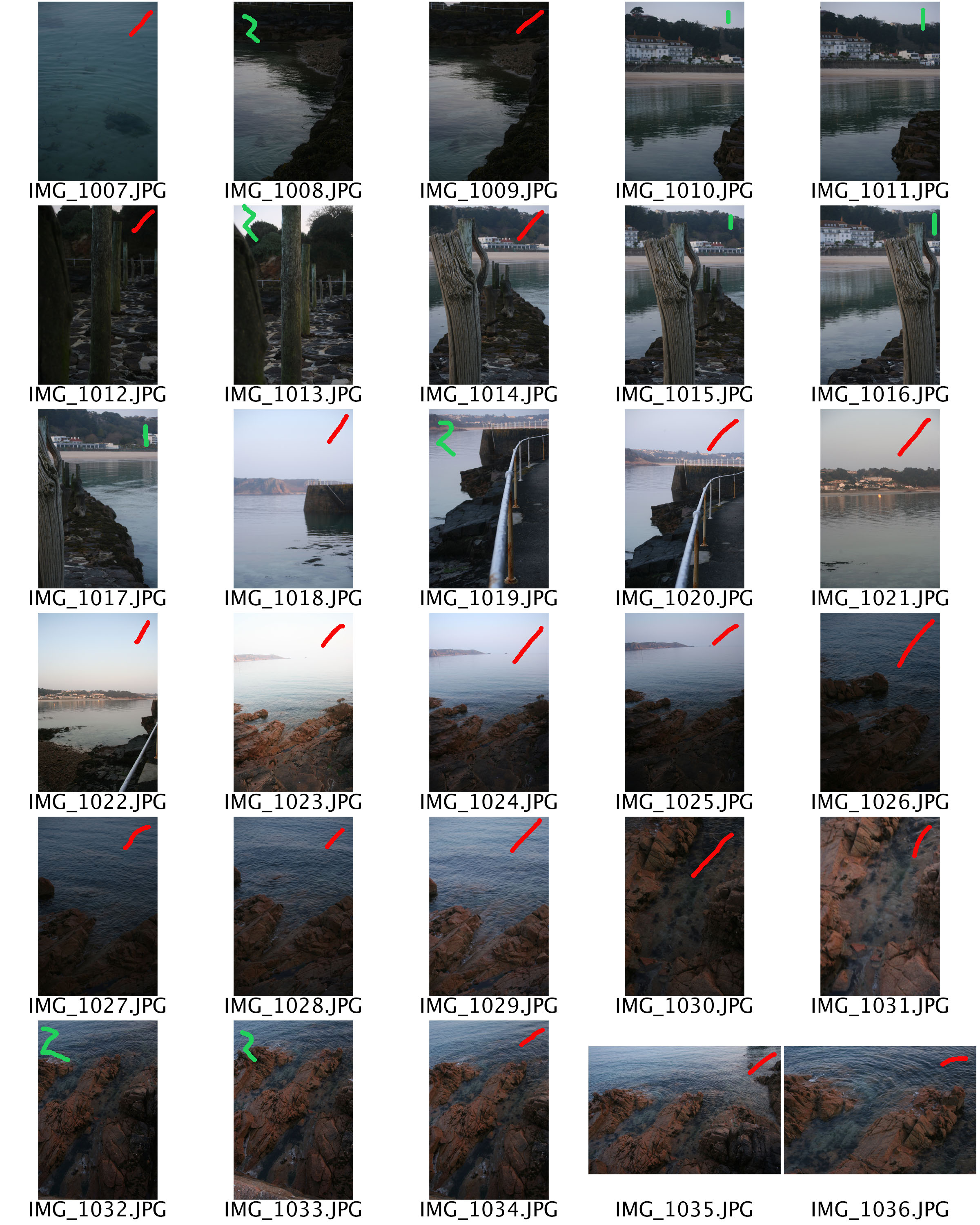
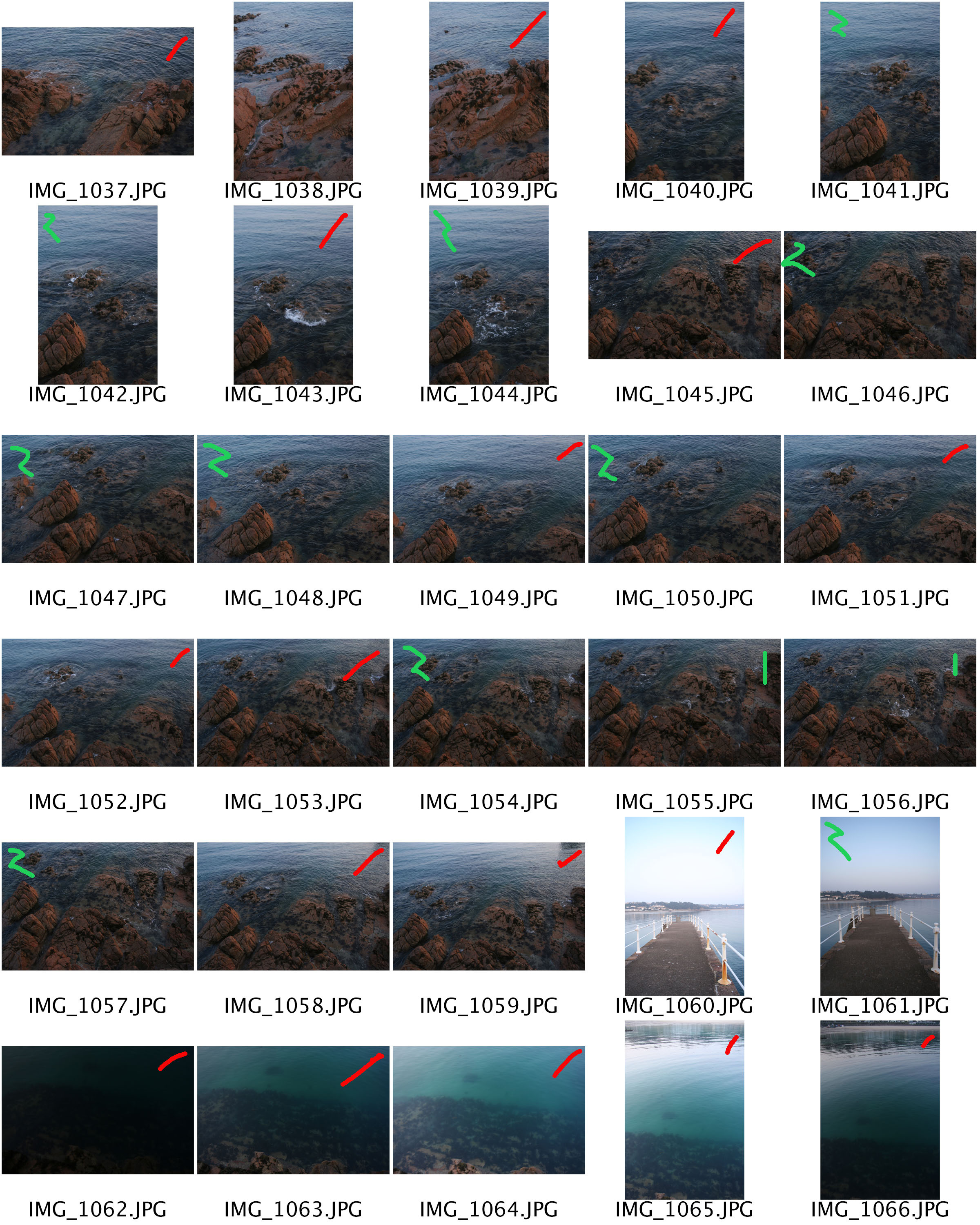
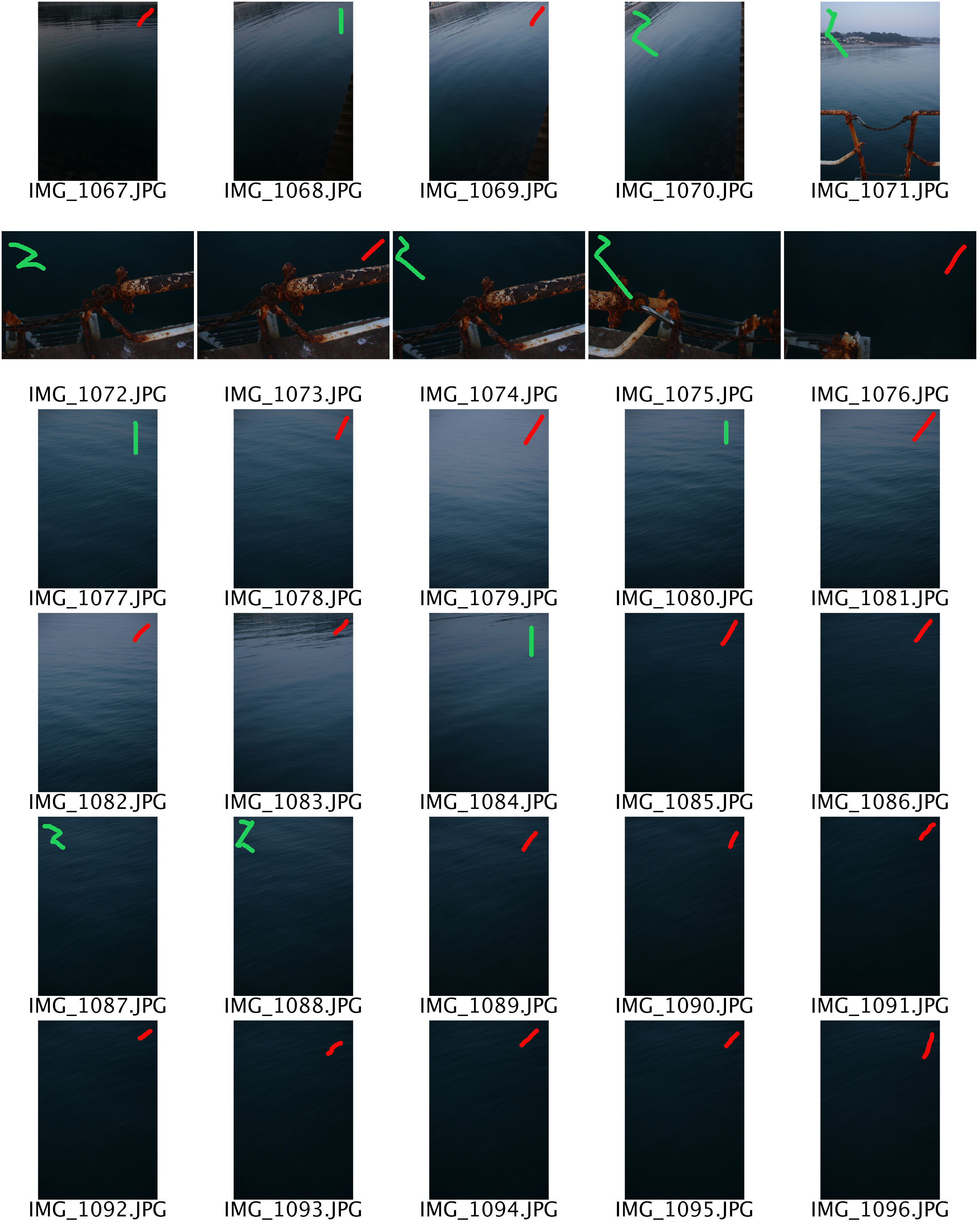
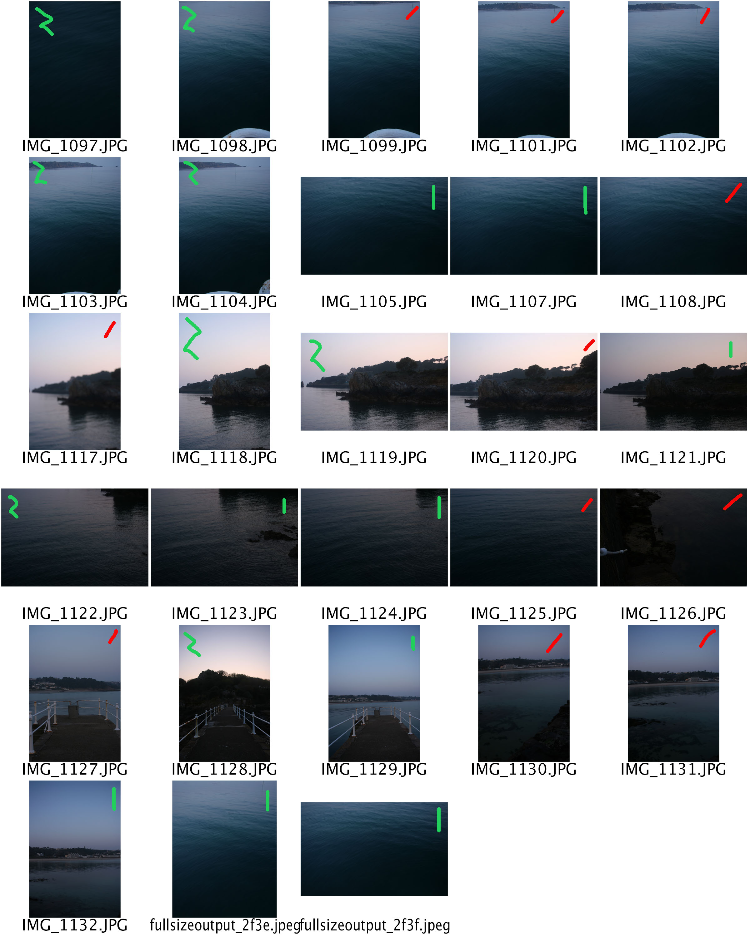
I collated all my photos into contact sheets on Photoshop. The red means I won’t be editing them, this could be because, they aren’t sharp or in focus. The zigzag green line means that the photo needs editing, for instance increasing/decreasing exposure, the striaght green line means that minimal editing is need, for instance cropping.

Thailand Concept 2

It’s a Southeast Asian country, known for tropical beaches, opulent royal palaces, ancient ruins and ornate temples displaying figures of Buddha. In Bangkok, the capital, an ultramodern cityscape rises next to quiet canal side communities and the iconic temples of Wat Arun, Wat Pho and the Emerald Buddha Temple (Wat Phra Kaew). Nearby beach resorts include bustling Pattaya and fashionable Hua Hin. I stayed in the in Karon, Phuket, this southern area is well known to tourists. Patong not too far away from where I stay it is very popular to young adults for it’s western culture and party night life. In my opinion this is sad, my dad he had visited Patong about 20 years ago was saying how he remembered it to be much nicer. When we visited Phi Phi Island, he was telling me how the coral used to be more colorful, there were hundreds more fish, half the amount of people, no litter and no Mcdonald’s. This urbanisation of Thailand is very disappointing in many ways but it’s the journey the country had to take to rebuild it’s self after the boxing day tsunami in 2004, which is the deadliest in history, it killed around 230,000 people. Thailand had to do something in order to stay afloat after this huge step back and the constant increase in other countries wealth. It was essential to their government to They used their stunning views and cheap exchange rate to make tourism their way of increasing their economic wealth. I wanted to express this idea through my photos by only taking them in the night and in land, of the busy towns and markets. In conclusion, I want to capture a series of photos of Phuket’s bust market places and town centres to create an idea of how tourist orientated Thailand is and how for the large majority of locals it’s their only source of income. This half of my concept also relates to the theme of journeys and pathways because I am aiming to empathsise the journey in which Thailand has had to take ever since the tsunami in order to keep it’s place in the world.

Image result for phuket before and after tsunami
The short-term and long-term affects of the Tsunami.


Photo Gallery

This is a virtual photo gallery I have created for this project from some of my final images.

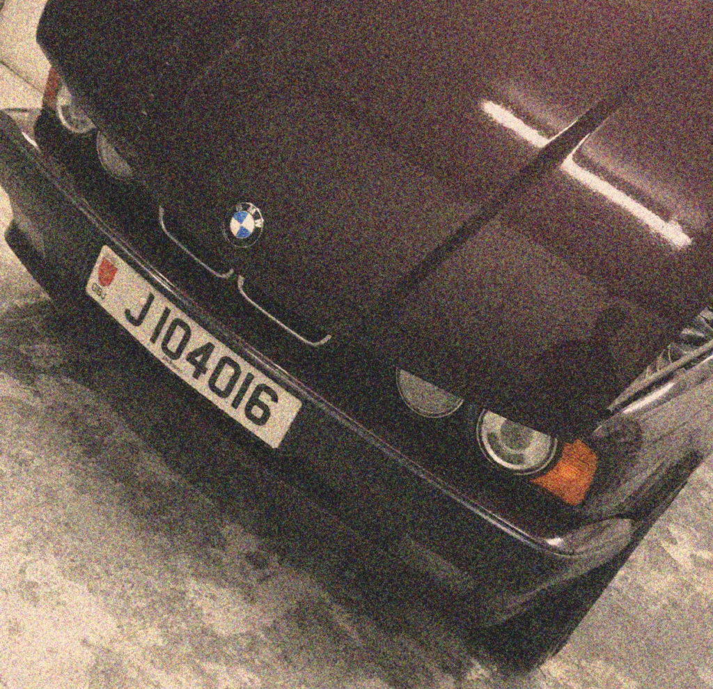
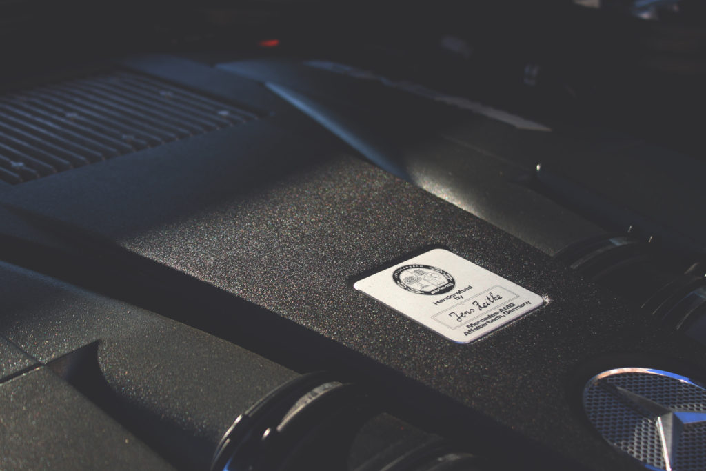
It is split up into three sections of photos grouped together based on their similarity. The first group on the left are in pairs of photos with similar colour grading and of similar objects, these being an engine and a gear selector.

I have chosen to put the middle photo on its own as its colour grading and effects don’t match those of my other final images.

The group on the right consists of the same original photo which has been edited in three different ways. One being filters and colour grading, another being colour mapping and masking, and the final being posterizing.