These are images which I have printed after finalising the rest. I have still printed the others, but printed the following images outside of school:

These are images which I have printed after finalising the rest. I have still printed the others, but printed the following images outside of school:


Below are my 4 final responses to Heath Ledger’s art/photography. I used the photos which I took and edited in my previous blog post on Ledger. In the end I didn’t end up using all my photos because some weren’t that interesting or good and I didn’t have time to think of an idea of what to create on them, etc. The materials I used for these were tubed water-colour paint, acrylic paint, white ink and a piece of wood which I used to scratch into the pieces.

This is my favourite out of all of my responses, as it uses the most materials/colours and really stands out. I took inspiration from Ledger’s version of his girlfriend. I used the same dots of paint on the face and on the wall. I also filled in the background part in solid colour like he did. Another thing I took from heath was the white lines/scratches which I’ve used in almost all of my responses.
Materials:
pink border – pink stabilo highlighter
green dots – sap green tubed water-colour paint
red splats – cadmium red acrylic paint
yellow background – yellow acrylic paint
white lines – uni-ball white pen


These are the final images from my fourth photo shoot. These have all been edited at least slightly to emphasise their strong areas. There is quite a lot of them as it was a large photo shoot.








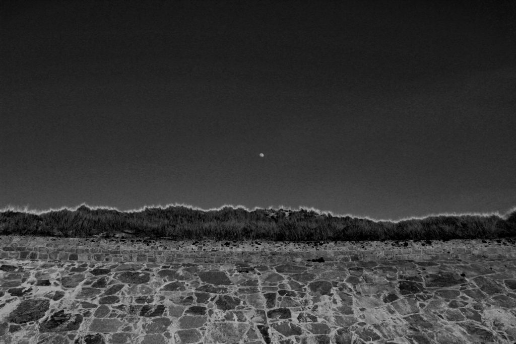
Overall I was extremely happy with the final outcome of this image as when picturing the final outcome in my head and then the final outcome proved to be extremely similar. This image is effective due to the contrasting in shades of black and white. As previously mentioned in the editing blog for this image, it was essential to me whether the photograph stayed in color or convert to black and white that the moon was clear and completely contracting with the sky color in order to give the most dramatic effect. I can happily say I believe I achieved, with not only the moon standing out in the white shade against the grey sky back ground, but along the top of the bank I have managed to enhance the yellow tips of the plants in order to create a further more powerful effect on the overall image. The due to the editing of the black and white shades the lighting of this image had proven to become much darker than the initial image and has removed most removed most natural lighting effects and almost gives off the feeling that a flash was used overall to me producing a much colder and evidently darker image, with burst of white and light grey shade beaming through. The photograph clearly is intense due to the differential shades being portrayed throughout with a regular exposure enabling the darker shades to be edited on to the image. As previously mentioned I used a 18-33mm canon lens to help capture this image, this image allowed a large zoom out to be able to capture a large majority of the wall, moon and sky. Visually the photograph has a clear sense of symmetry due to the the straight wall, clear sky and the moon being center, this to be provides a more aesthetically pleasing view to the eyes. Of course portraying an organised layout and proves the view point to be pretty much looking straight ahead at the wall, however could be argued with a slight angle up more towards the sky and the top of the wall. On the other hand the images very much lack texture this could be due to the sharp shades used and the lack of shadows being presented leading to a more 2D feel. Overall I am extremely happy with this image, if I were to redo this photograph I would try figure out a way to interpret texture to give a further feeling leading to even more opportunities for interpretation.
My editing procedure;
For my second images I went in the same direction as my previous image as i almost wanted to create a collection of similar images which would further be evident when framing up and displaying my photographs.
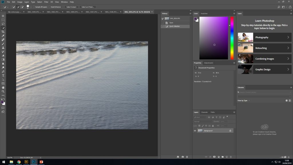
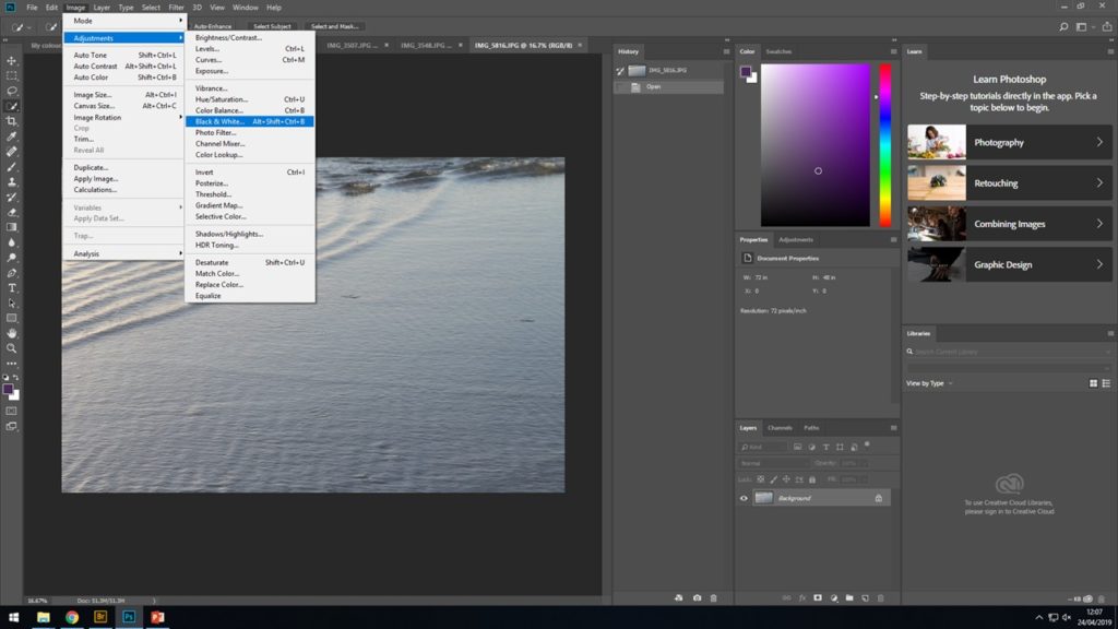
After finally selecting the best image related to water ripples from among the rest, I opened it up on to Photoshop and proceeded to IMAGE > ADJUST > BLACK AND WHITE and from there I began to play around until I was able to finish the image with enhanced wave and ripple in the ocean to give off the best effect. The detailed ripples was something i wanted to be the main focus of the image.
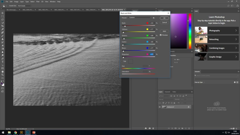
THE FINAL IMAGE
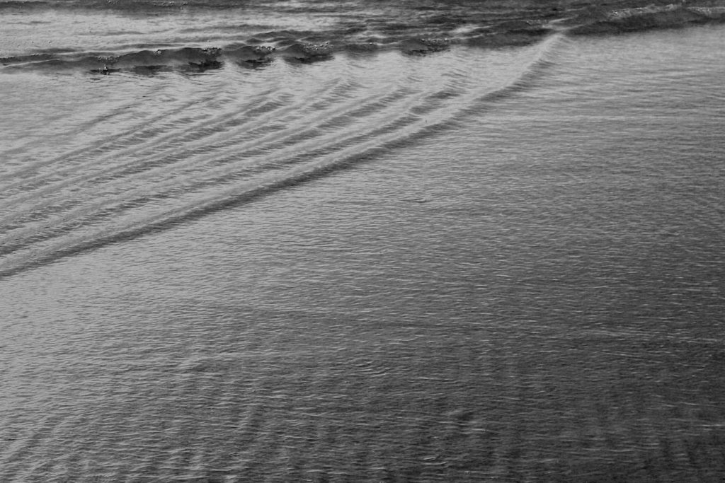
ANOTHER EDIT THAT USED A SIMILAR METHOD
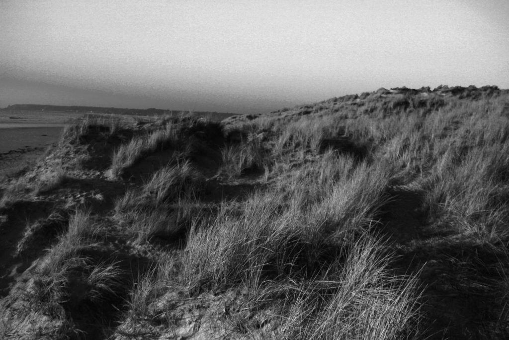
After i had tried similar techniques with the previous images i wanted to try something else that would further the editing skills of my image and add something more to the photograph to encourage a more detail photo to be produced. As well as still having Stephen Gill in mind i went on to the idea of adding more layers to the original images. For this image i used the previous steps to create a detailed and focused black and white images, then followed by adding what looks like white dots to help improve the texture and overall felling of the image.
This was the final image that came out;
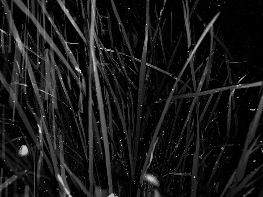
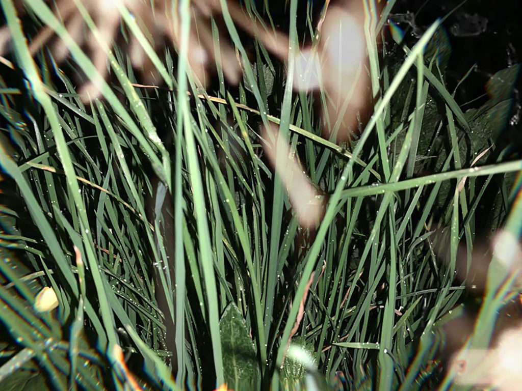
Now that i had fully completed four black and white images with a mixture of landscapes, greenery and the ocean, it was time i took a different path with of course still considering Stephen Gills work and what made his photograph work so well. Firstly to branch out i added color, i used the same image of the grass as from the above black and white image and kept in the original color, although saturated the image to add more texture and create a deeper feeling of a 3D effect. Then as previously mentioned over laid that now in color looks like extra lights or just part of the plants that had become blurry. I now plan to display these tow images together in a contrasting way to help emphasis contrast and the distortion of the shapes placed on top of the photograph and how this has very much added to the overall feeling of the image.
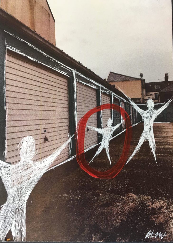
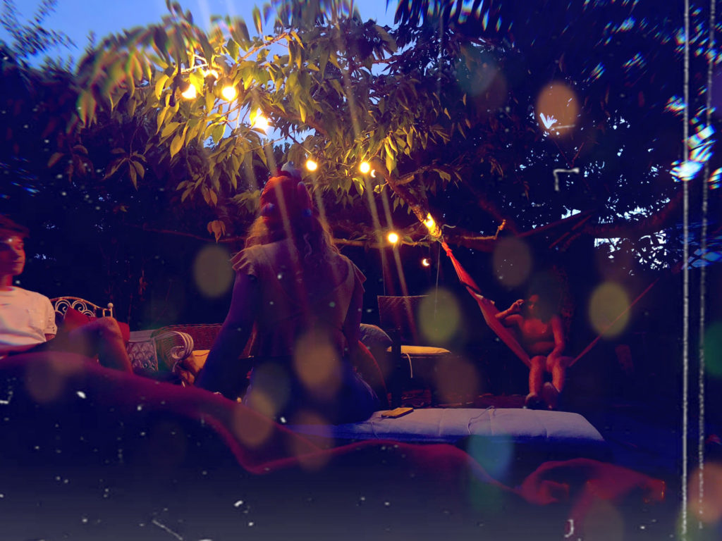
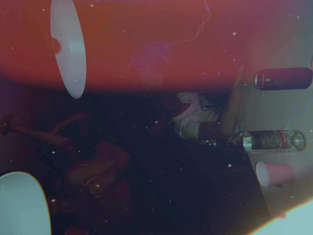
As carrying on with inspiration still from Stephen Gill and experimenting further with what i had done in the images above i produced the following two images, however unlike Stephen Gill in these last images i used people as the background subject rather than the plants, landscapes or the ocean. However to me this made the over lays look a lot better and improved the overall feeling of the images. For these photograph and filtered and edited to a much higher level with adding white lines and circular colored shapes to give the idea and effect of them being reflected off other light from the image. Overall adding a much warmer and theatrical aspect to the final images.


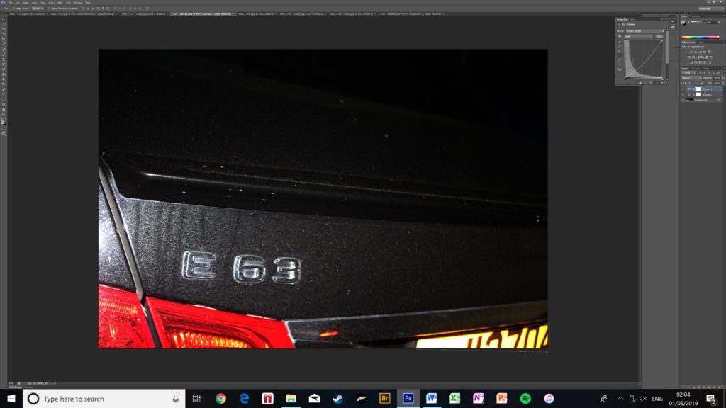

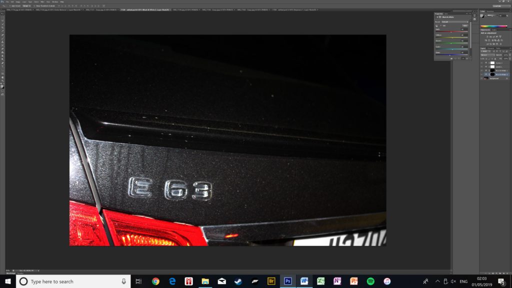


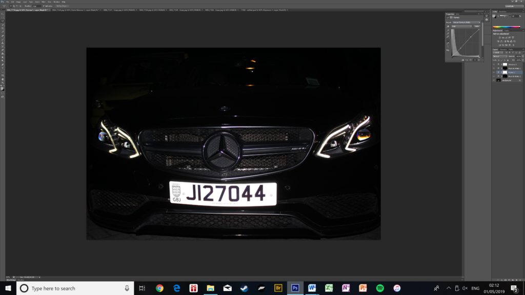

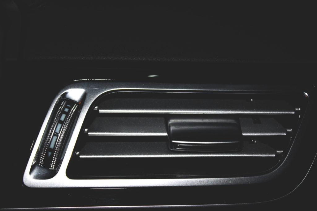
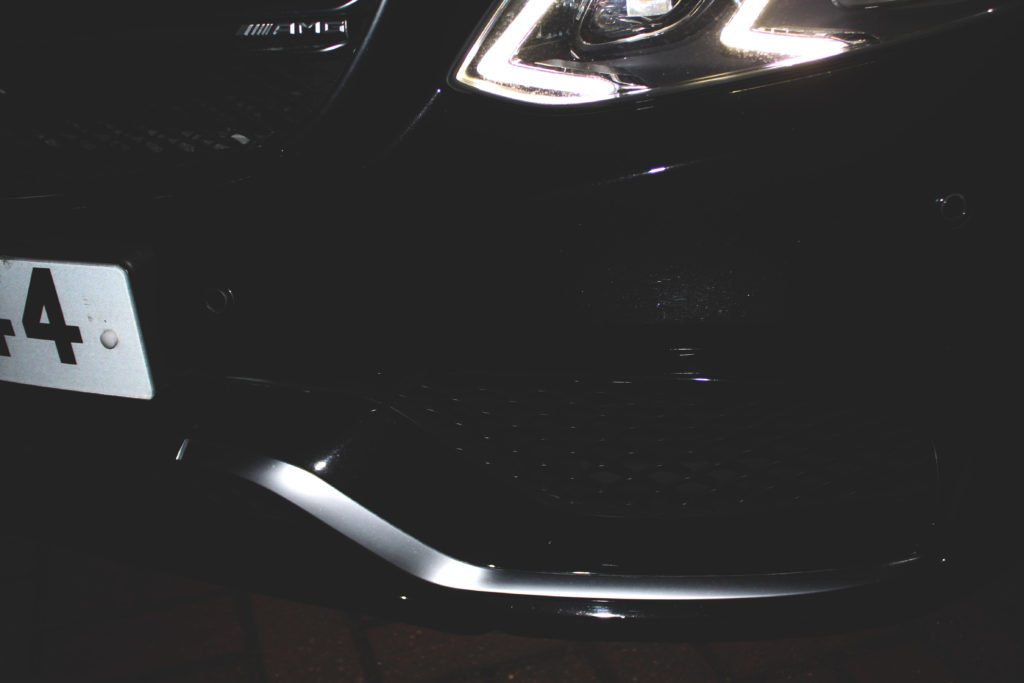
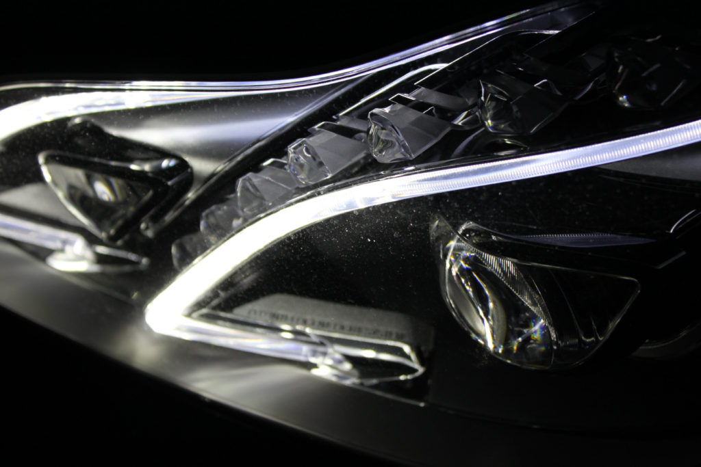
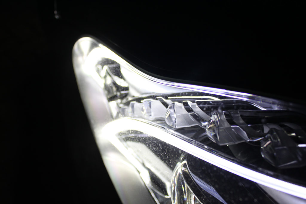
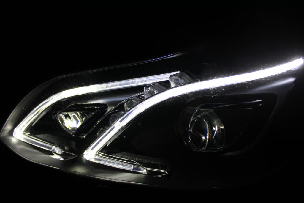
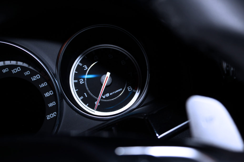
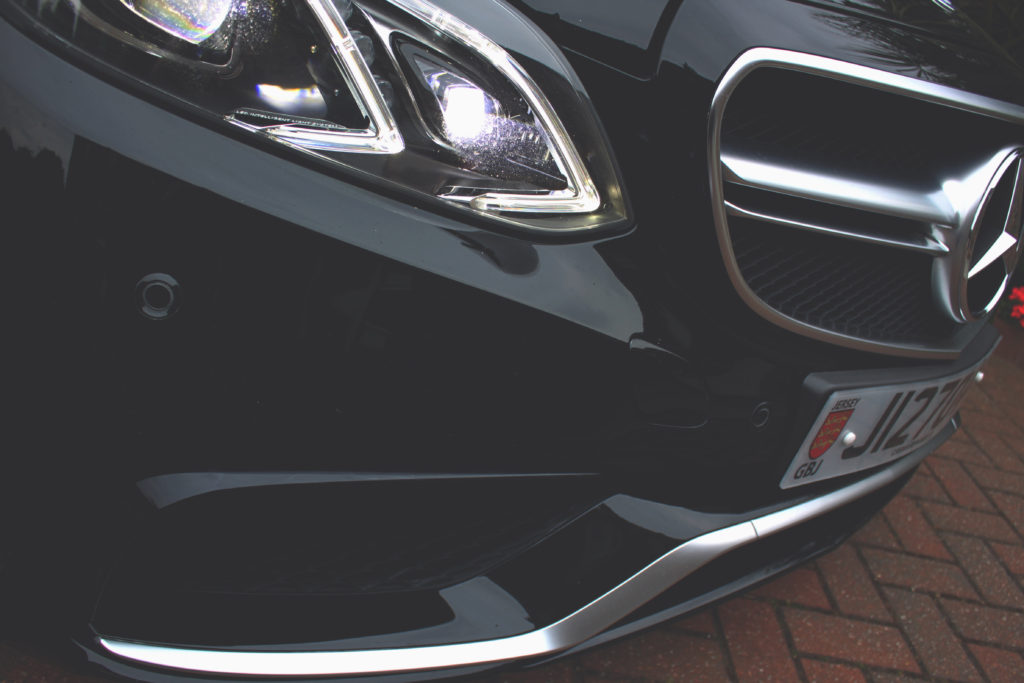
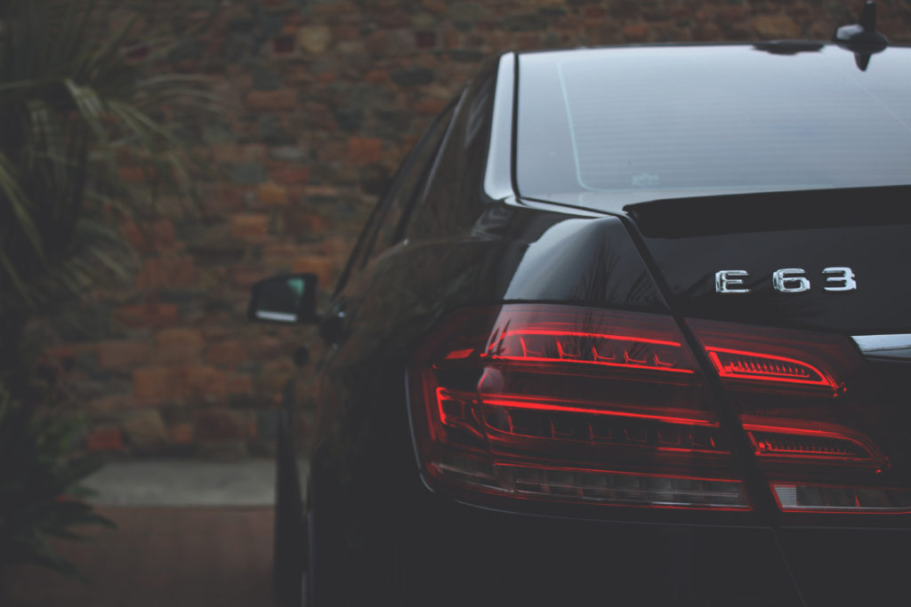
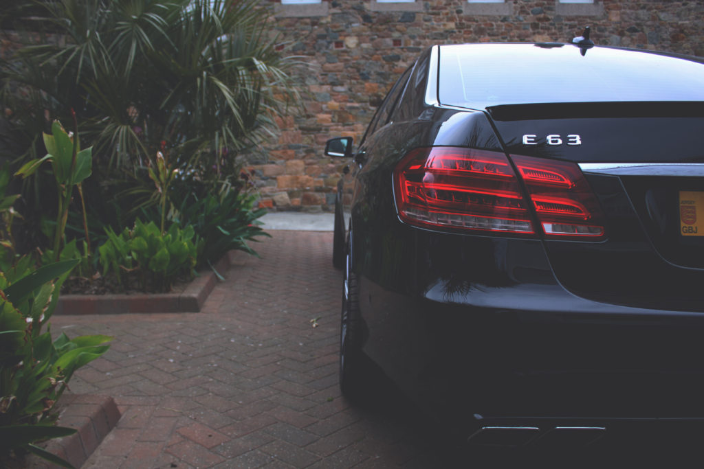
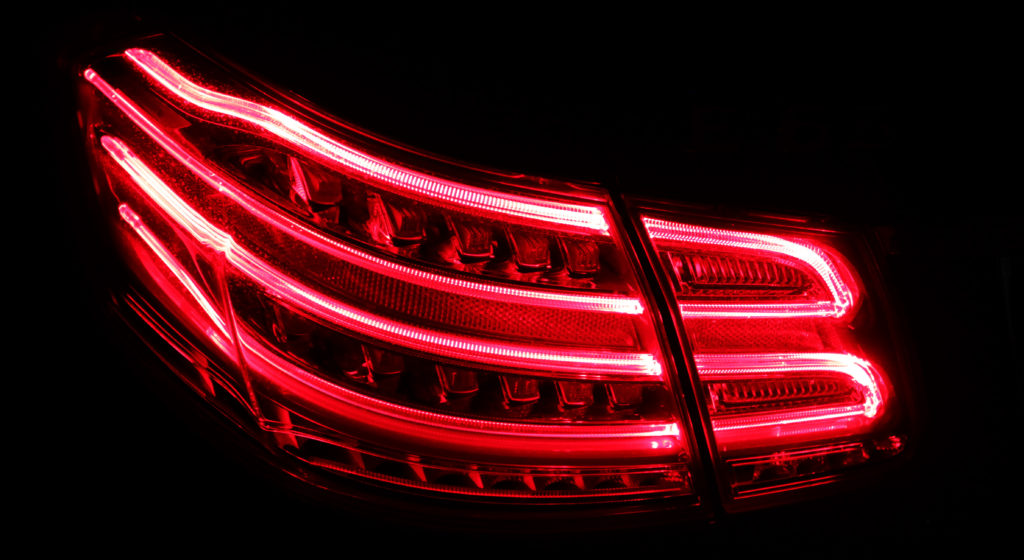
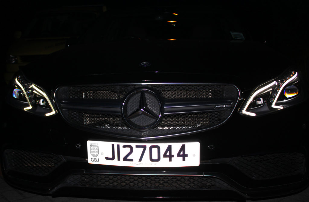
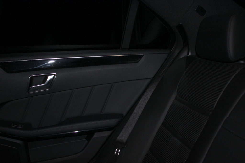
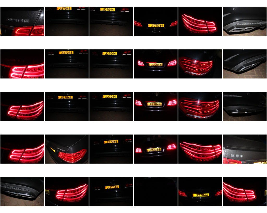
This photo shoot took place over 2 days, but the bulk of the photos are from the first day; which were taken after sunset to add effect to the lights of the car. There is one image that isn’t from this shoot as it was just a test image to make sure everything is in working order.
These are all the images from that photo shoot:



FIRST FINAL IMAGE EDITS;
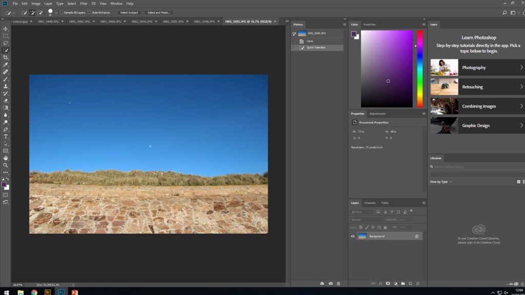
Firstly, after careful selection decided on my final images that I wanted to look into further for more editing. Then i opened the image up in adobe Photoshop and worked on from there.
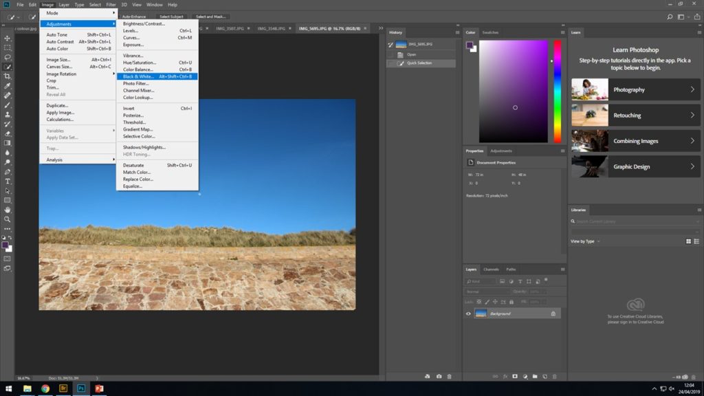
Next, was deciding how I wanted to approach the photograph and what i wanted to change if anything. I needed to think ahead and picture what I wanted the final product to look like. This is where I made the decision that black and white filters would be most effective as I would be able to enhance each of the natural colors in the original photo to different shade of black and white in order to create the most successful photograph.
To achieve this look select IMAGE > ADJUST > BLACK AND WHITE…
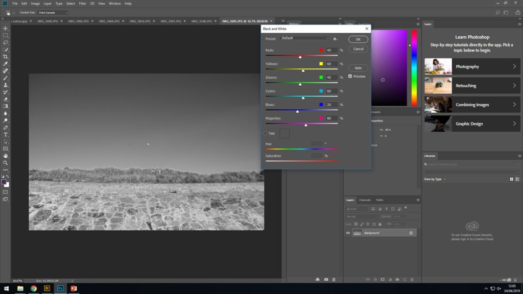
After selecting the previous instructions a box will appear with the different color representing different shade of black and white. By scrolling up and down on this it will change the darkness and brightness of each shade on each different color on the photograph
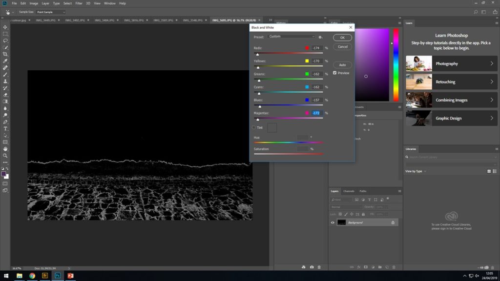
When considering how dark to have the background (the sky) i wanted to make sure the the bright moon could still clearly be seen and contrast the white moon as much as i could with a black sky in order to give a strong effect and leading to a more abstract image to be produced. I spent a while messing around with the different intensity of the image to see what i could create and what controller changed which color from the original color
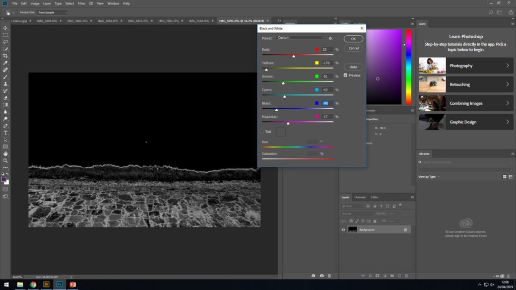
After a long time of selecting different shades of black and white to represent the different colors, i finally produced my final image that i was happy with.
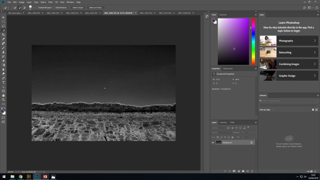
^FINAL RESULT AFTER EDITING ^


I’m going to display my Polaroids in a simple black background or in a frame. I think for these images I am better to keep it simple but polished in order to not take away from the editing I’ve done to the images.
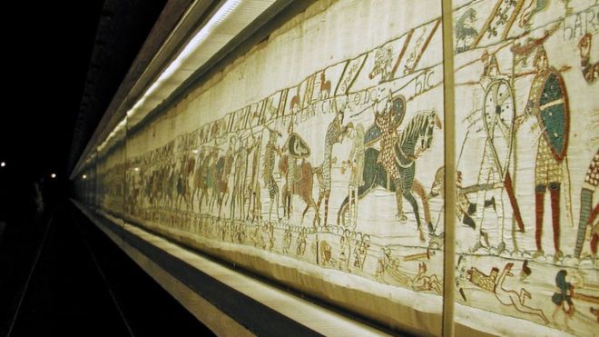
I want to display my generational journey images images in a Bayeux tapestry style showing events in chronological order but looking almost like this bellow.I will use images of my parents and grandparents and also the images I took whilst exploring family and generational journey.

