MARK GRAY:
LIFE AND WORK:
Mark Gray was born in Melbourne, Victoria on February 20th, 1981 to parents with Latvian, English and Irish heritage.
Mark’s primary schooling was undertaken at Bennettswood Primary School in Box Hill South. He then attended Camberwell High School for one year before relocating to Donvale Christian College where he developed a keen interest in graphic design. For his final year of secondary college Mark moved to Box Hill Senior Secondary which offered a highly specialised course in Graphic Design and the Arts.
Brought up in a Baptist family, Mark attended Wattle Park Chapel and became a Christian in his early teenage years.
During Mark’s mid-late teenage years his artistic side began to show, spending many hours painting graffiti art along railway lines and any blank walls he could find. Unfortunately, graffiti artists were viewed as criminals during this time and he had many run-ins with the law. Thankfully times have changed and graffiti now receives the respect it deserves as an art form with many collectors paying thousands of dollars for pieces to hang on their walls. Mark’s experience with graffiti art gave him an excellent introduction to working with colours effectively and composition techniques which came in handy later in life when he first picked up a camera.
Mark had attempted to capture the sunrise with their new digital point and shoot camera but became extremely frustrated because it simply couldn’t do it justice. He soon decided that he wanted upgrade his camera and learn the skills required to accurately record those amazing moments in time. Particularly so that he could share them with the rest of the world.
It wasn’t long after this that Mark realised landscape photography was his one true passion. He sacrificed his extensive social life and dedicated all his spare time to pushing his own boundaries and learning everything required to capture those incredible moments. His background in graffiti and design certainly gave him a head start with composition techniques however the technical side of photography was something very foreign to him. He spent many hours reading photography books, researching information online and using basic trial and error in the field until he mastered the techniques required to capture technically perfect landscape photograph’s.
Overtly ambitious, it was only 6 months later in 2005 when Mark decided to have a go at selling his work. While still working full-time as a web designer and with only a handful of prints in his portfolio, he established his first photography business ‘Australian Landscapes’ and setup a website using his existing web skills. His first clients included a number of family members, friends and even his next door neighbor.
SOURCE: https://www.markgray.com.au/about-us/about-mark-gray.php
LINKS TO LANDSCAPE ROMANTICISM:
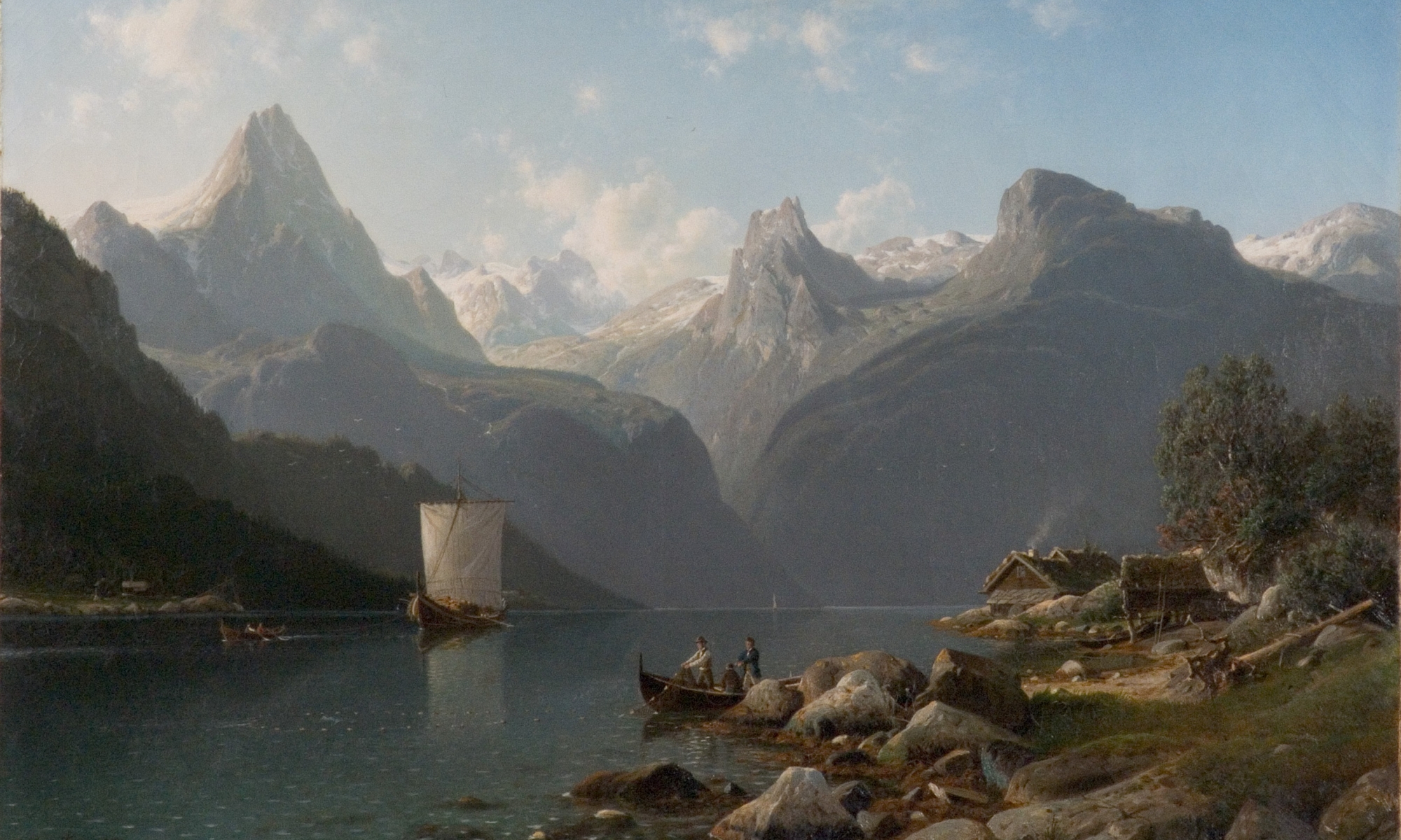
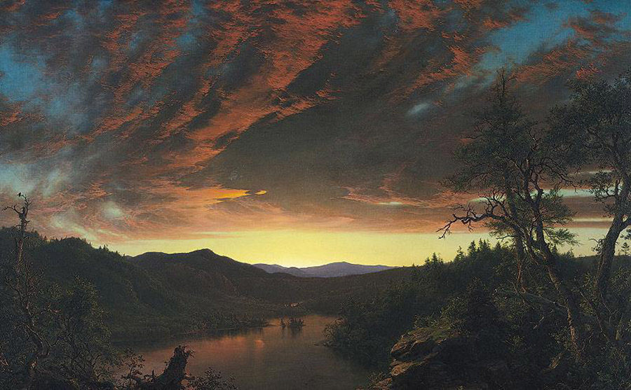
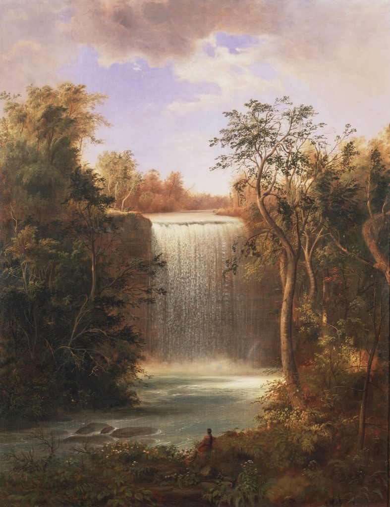
Romanticism was an intellectual and artistic movement that originated in the second half of the 18th century. It was a reactionary response against the scientific rationalization of nature during the Enlightenment, commonly expressed in literature, music, painting and drama.
This was regarded as undesirable and leading to the degradation of the humans. According to the romantics, the solution was “back to nature” because nature was seen as pure and a spiritual source of renewal. It was also a way out of the fumes of the growing industrial centers for the new industrial rich.
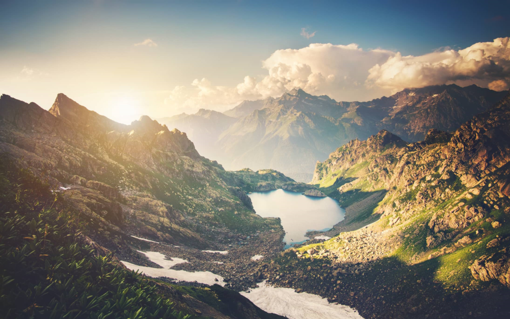
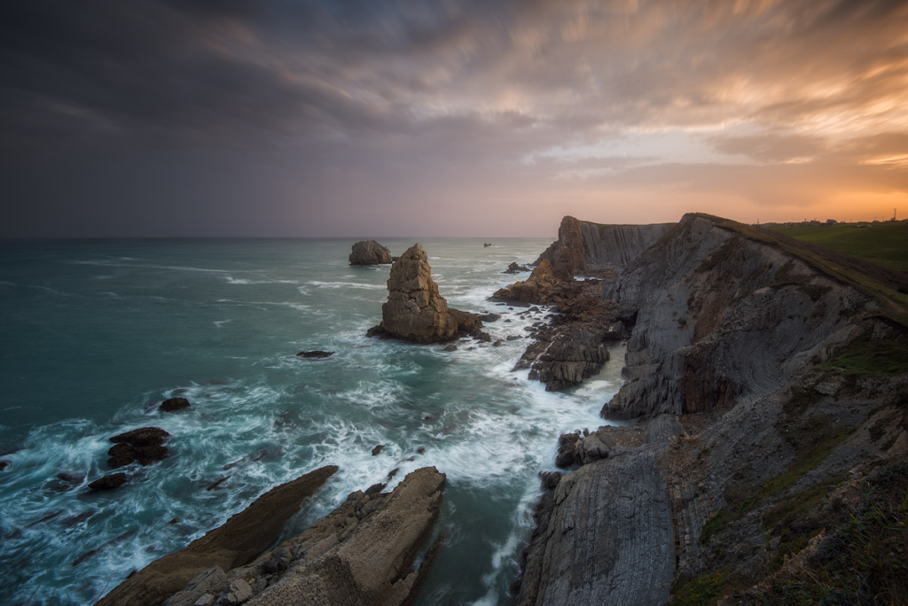
Gray’s work takes the surrealism approach and puts a very modern spin on it. With the aid of specialized cameras and editing techniques, he creates work that is surreal and very exaggerated, with colors that stand out. He captures images in Australia, the country which he is based in, a place know for its natural beauty and charm.
HIS WORK:

CRITICAL ANALYSIS:
TECHNICAL:
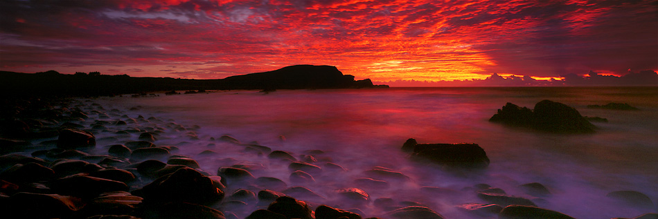
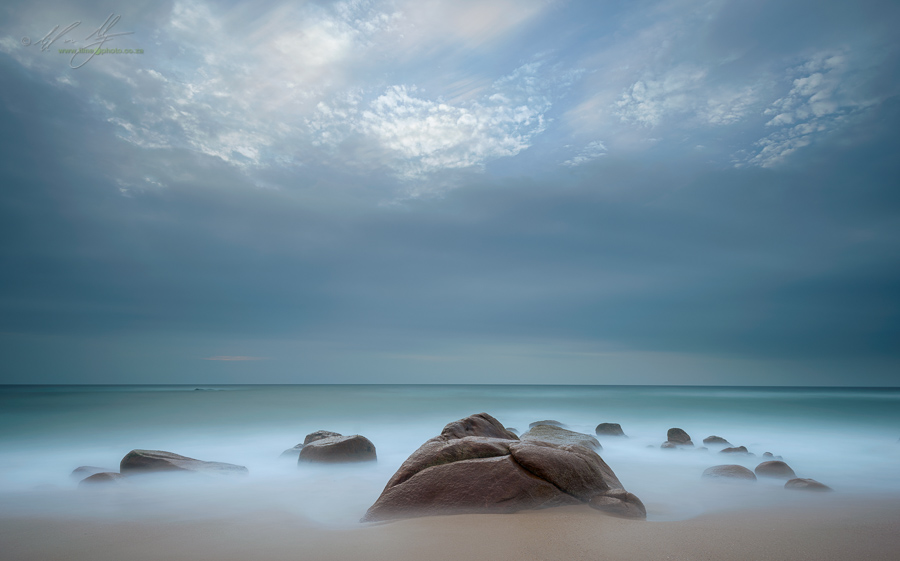
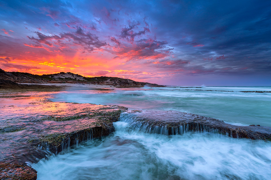
In terms of editing, the saturation of the colors was increased to create the fiery orange sky, and it is probable that the exposure was also adjusted to make the image darker which would allow for the bright colors to pop more. During the photo shoot, it is likely that the exposure was set fairly low in order to allow the colors to pop more and create darker shadows. It is likely also that a tripod was used in order to take the image as it very crisp and the angle is low down yet very straight up. The white balance of the camera which has been used was likely set to 3000k – 4000k as this is most suitable for the time of day when the image was taken. Again, as the time of day when the image was taken means there is less sunlight, it is likely that the shutter speed was quite high to allow more light to go into the camera.
VISUAL:
The most notable aspect of this image is the bright and vivid colors of the sky, being composed of oranges, pinks, purples and yellows which blend together to create a vast expanse of sky. The eye is led to the sky with the ripples of fog which travel vertically up the picture. The eye is alternatively led around the image by the curvature of the rocks and mountain which create a sort of c shape. The rocks and mountain in the background are dark and block out the sky creative a contrast between it and the sky. It also balances out the image and makes it less busy and overwhelming to the eye. There is again contrast created in the image with the dark rocks and the light,pastel lilac fog in the bottom of the image. All the colors are in one way or another mirrored in the bottom half of the image, whether that be on the water or the reflection of the rocks. The different colors in the sky are reflected in the water yet softened out by the fog creating suppleness and fragility. In a way the fog represents the fragility of nature and how easily it can be disturbed. It sits like a vale on top of the water. A repeating pattern is created in the bottom of the image with the repeating rocks which round of halfway in to the image. Most of the light is centered in the middle of the image where the sun reflects and the bright orange is most prevalent. It then darkens of on the sides as the light sunlight fades. Some of the light also bounces of the top of the wet rocks which gives fades them more into their surroundings. The rocks which have been more submerged into the fog fade out more as the eye travels to the center of the image. The rocks in the bottom of the image are in the foreground, yet the eye is still most drawn to the background where the bright orange sun is setting. The rocks situated on the right hand side are in the mid-ground of the image.
CONTEXTUAL:
“I hadn’t been interested in photography before,” he says. “I had a girlfriend who was into it, but I thought, ‘Why would you be into that?’ It seemed like a lot of effort for not much reward.”
As he looked out over the ocean at Apollo Bay he says, “When I saw these colors, I realized these moments can happen.”
He shot some snaps of the scene before him, but he was disappointed with the results. He didn’t feel they did justice to what he had seen. So he started researching photographers and how they captured their images.
“I asked a guy in a store what kind of camera Ken Duncan used, and he told me it was a panoramic, but he talked me out of buying one,” says Gray.
At that stage of his development, it was sound advice. Instead he bought a Fuji S7000, a neat digital unit, and put panoramic photography “on the back burner”. Initially, though, he started cropping the images from his S7000. However, with its fixed lens he says he soon found he was pushing its boundaries. But he was happy to use it as a learning tool, and he kept the camera for around nine months.
CONCEPTUAL:
Gray aims to, “get it right in-camera as much as possible” and doesn’t use colour filters. “If the colour’s not there to begin with, I don’t feel I should have to add the colour. I’m quite happy to go back to a location and wait for what I want.”
Despite his youthful training in digital technology, he’s keen to minimize any post-production work with his images. “If you’re spending more time editing on a computer than shooting the image, the work is becoming digital art,” he says. “One thing that really inspired me to get into photography was that I was sitting in an office in a corporate environment. I feel more at home in nature. Really, my view is that some people enjoy editing on a computer and I think that should be called digital art.”
