Category Archives: Uncategorized

Filters

Author:
Category:

Artist Research – Paul Virilio + Jonathan Andrew

Paul Virilio:

Mood Board showcasing Paul Virilio’s photographs
Bunker Archaeology – Paul Virilio

Paul Virilio is a French photographer, who was born and raised on the Northern coast of France. The Second World War created a big impact of his city, and impacted his personal life. His city was bombed and held captive by the German Navy. In 1958, Virilio conducted a phenomenological (he science of phenomena as distinct from that of the nature of being.) where he looked at military space and bunkers built by the Nazi’s during the Second World War.

“Historian of warfare, technology and photography, a philosopher of architecture, military strategy and cinema, and a politically engaged provocative commentator on history, terrorism, mass media and human-machine relations.” – Quite describing Virilio by two Geographers.


In the image above, the subject of the image is the bunker which is located in the centre of the frame, which is the main focus point of the image as my eyes are instantly lead there. My eyes then move towards the background which is empty, clearly presenting the formal element of space. This presents an eerie tone towards the image and presents the idea that the Bunkers are desolate and have not been used for a while. The bunker itself presents to formal element of texture and shape which are used to present and emphasise the contextual features of bunkers. The image itself is presented in black and white, which allows the image to show high tonal contrast, which shows how the Bunkers are almost worn out, as its been a long period of time since they where used in the second world war. A small depth of field is presented as the Bunker seems to be the subject most in focus, the background and grass in the foreground is slightly out of focus, which allows the viewers to mainly concentrate on the bunker. Moreover, the Bunker seems to be slightly lighter than the background which also makes the subject visually seem the most important in the image. The dark background is almost pathetic fallacy as it represents the depressing times the war brought to Jersey and represents the depressing reasons of the Bunkers. The image seems to be in focus, suggesting a quick shutter speed, and there is no intended blur which implies that a low ISO and a normal aperture was used to capture the image above. Contextually, the Bunkers where built by the Germans to protect themselves from other army’s and to make and reload their weapons. These Bunkers are located near the sea, allowing the Nazi’s to attack those trying to enter Jersey, moreover the bunkers where well hidden and hard to find. Conceptually, I believe Virilio was trying to present the aftermath of the war, and the marks it has made in certain locations, reminding us about the horrible times of the second world war. In my opinion I like the way Virilio has presented the bunkers as isolated and makes them seem ‘horrible’ reinforcing the idea that the bunkers where used for horrible purposes, making the image successful.

Jonathon Andrew:

Mood Board Showcase Jonathon Andrew’s Photograpgy
Jonathon Andrew – Bunker

Jonathon Andrew was born in Manchester and currently lives and works in Amsterdam. He has many years of experiences capturing multiple locations. He travels the world capturing different aspects of different places, with his work being displayed in magazines such as National Geographic. His current project is capturing ruins of WW2 defence, so far these images have been presented in the Daily Mail and multiple blogs. Due to his success he has won many awards for his photographs and has helped teach lectures to students on how to capture landscape photography.

To analyse the photograph above, the main focus point is the bunker which is located in the centre of the frame. This is presented not only by the positioning of the bunker in the frame, but also by having the Bunker lit up and the background being darker. The image is taken at night time which allows the technique of lighting up the bunker to stand out more. The bunker itself clearly presents the formal elements of space, texture, shape and line. This is presented by the bunker being ‘worn out’ and old helping to present the contextual factors of the image. Space is presented through the location of the bunker, the subject is the centre of the frame and the background and foreground is empty, which represents how the bunker has been isolated leaving nothing left. The subject of the image is in focus and the background of the image is slightly out of focus which shows a narrow depth of field, it also showcases a quick shutter speed as the image has a clear focus. This is further supported by the ISO being low as there is no intended blur, and the aperture is low. The lighting used seems to be natural, but the white light surrounding the bunker seems artificial. A back light could have been placed behind the bunker or could have been added using a photo manipulation software. Contextually, the image is presenting the same contextual factors as Virilio, which is: the Bunkers where built by the Germans to protect themselves from other army’s and to make and reload their weapons. These Bunkers are located near the sea, allowing the Nazi’s to attack those trying to enter Jersey, moreover the bunkers where well hidden and hard to find. Conceptually, the image is presenting the impact of the bunkers during the war and is showcasing how the bunkers have been isolated but kept to remind people of the horrors of the war. In my opinion this piece is eye opening as it reminds viewers of the horror of war, through the Beauty of the bunker in this image, which almost creates a Juxtaposition within the image, making the photograph strong providing my reasoning to why I find the image interesting and successful.

Action Plan:

As an action plan I want to produce a photoshoot where I capture Jersey’s bunkers in order to showcase another aspect of Jersey’s journey through the second world war. This will present the defence mechanisms that was put in place by the Nazi’s. I have been inspired to follow in a similar style to Virilio but edit my images more like Andrew’s work, creating a combination of both photographers work.

WHO WHERE THE BOYLE FAMILY?

Who is part of the Boyle Family?

The Boyle Family is a group of collaborative artists who are now based in London. The main contributes to the Boyle family were Mark Boyle and Joan Hills. Mark Boyle was born in 1934 in Glasgow working along side Joan Hills who was born in 1931 in Edinburgh, both now live in London with their two children Sebastian and Georgia Boyle. Mark and Joan met in April 1957 in Harrogate, Yorkshire. At the point in Mark Boyle’s life he originally considered himself as a poet soon to be influenced by Joan Hills painting and began experimenting which proved to have triggered the love for visual art. Mark Boyle continued to praise Joan Hill as being the biggest influence to all his work saying she was  “she was gentle, brave and immensely resourceful” in an interview.

Where Mark and Joan’s studio was at a specific point during their life was often where they lived, this created a natural feeling of family and friends when investing time into their studio. It became important to them to  include family whenever their was a big show going on they always tried to incorporate family and friends help into the creation of the show. From early on, Mark and Joan both encouraged their children, Sebastian and Georgia to go around the studio doing bits here and there leading to getting much more deeply involved later on:  going on working trips, expeditions, helping to finalize and hang exhibitions.

When first creating the image, most images went under Mark Boyle’s name, this was due to the them being much more focused on the work and being ore unconcerned with fighting the stereotypes that artists were solo and usually male- the print was labels never mattered to them. As the became wildly know  and at the same time the artistic stereotype began to broaden, they became to present their work by ‘Mark Boyle and Joan Hills’. As they grew Sebastian and Georgia continued their work and entitled there work produced by the ‘Boyle Family’ this continued till 1985. In 2005 May time, Mark Boyle passed away and the  Boyle Family continues to work and exhibit internationally, and to progress the execution of their best known work, the huge global World Series. When producing image, the Boyle Family’s idea is not have a focused subject but aims to make art that does not exclude anything as a potential subject. Over the time this has included things like: earth, air, fire and water, animals, vegetables, minerals, insects, water creatures  etc.

Daniel Antune

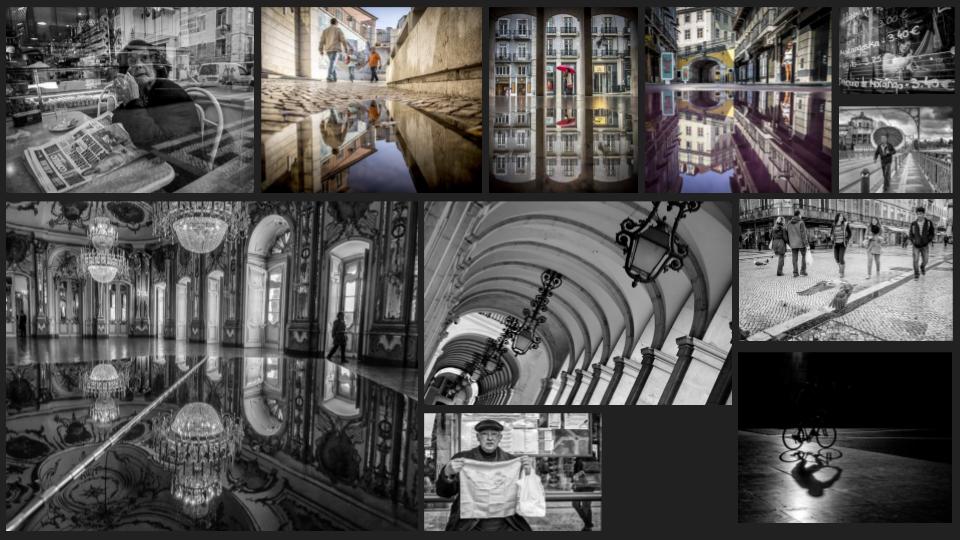
Mood Board of Daniel Antune’s Work

Daniel Antunes

Daniel Antunes is a self taught photographer mostly known for his black and white street photography. He was born in Portugal and began his photography education at a young age but only really began to develop and present his work two years ago.

by Daniel Antunes

There is natural lighting from the outside as well as the lighting from the chandeliers. Light from the chandelier is also being reflected off the top of the piano and the floor. There’s a lot of contrast in the image as you can see with the really dark tones next to the light shades. There’s not a gradient because of the high contrast. The focal point is the reflective surface because it immediately draws the eye. There’s no colour in the image because it’s a black and white which Antunes’ is more known for. I would say the image has a smooth and shiny texture to it because of the shiny smooth floor and piano. I would say there’s quite a bit of depth to the image because you can see across the room and the trees outside. The image is composed so you can see the ceiling reflecting on the piano and so you can see the whole room including the ceiling upright and upside down. I think the leasing lines are the door ways and the outline of the piano.

Contextual info-

Daniel Antunes was born in Portugal . The place in the photo is the Queluz National Palace in Portugal built in the 18th century. People often compare it to Versailles.

Editing and Developing: 2

Chosen Photograph:

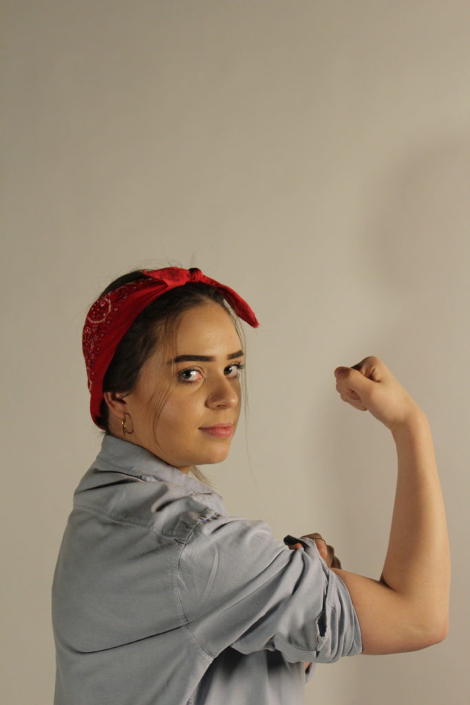
Above shows my chosen image to edit and experiment with, I have chosen this photograph as it was one of my most clear image and I feel that my subject is positioned well in the frame and there is good eye contact and facial expressions with the camera. The lighting is also good for in this photograph there is no need for too much adjusting of the brightness in this photograph which is why I have chosen to edit this photograph.

My aims while editing this photograph is to create a yellow tint in the background of the photograph to replicate the yellow background of the original poster as I feel this will really help the photograph to become better and enhance it.

Editing Process:

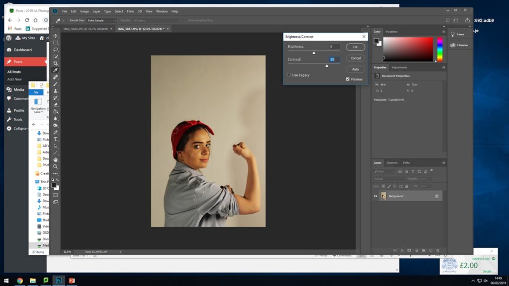
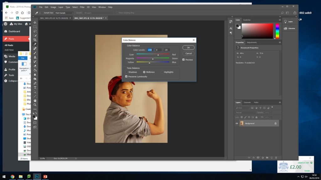
I began by adjusting the brightness and contrast so that I have a good base for adding on the filters for the colours.

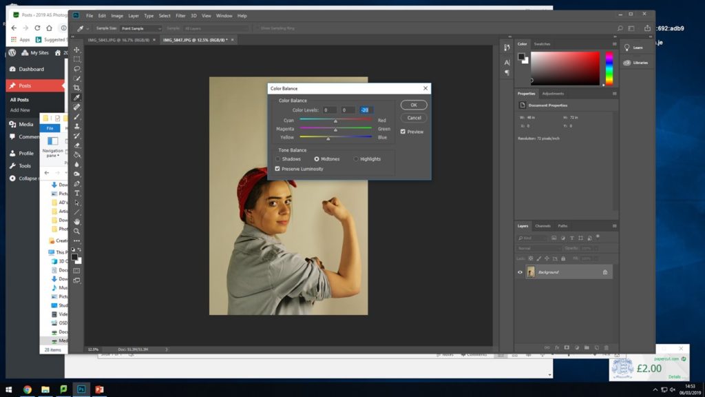
For the next two steps I experimented, adjusted and edited the strengths of the yellow and red colour tones coming through in the photograph. I did this so that there were already tints coming through and to make it easier to place the yellow warming on top.

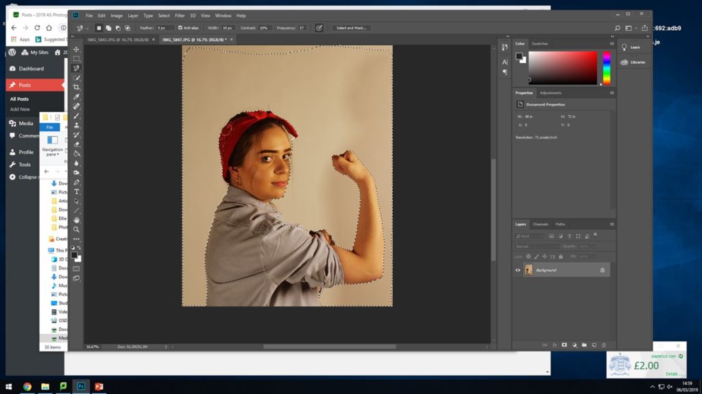
Here I selected the whole background area surrounding my subject, when adding on the warming and yellow filter I didn’t want them to mess and alter the colours and tones of the subject in the image, I wanted to try and keep the red and the blue of her shirt and head band so I selected al the way around her body and around the frame of the photograph to have a specific place to add the filters.

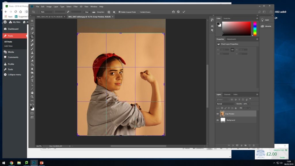
After adding on the filters I experimented with cropping the photograph down so that the subject fills more or less of the frame and see where it sits best as I did not want too much unnecessary blank space above her head.

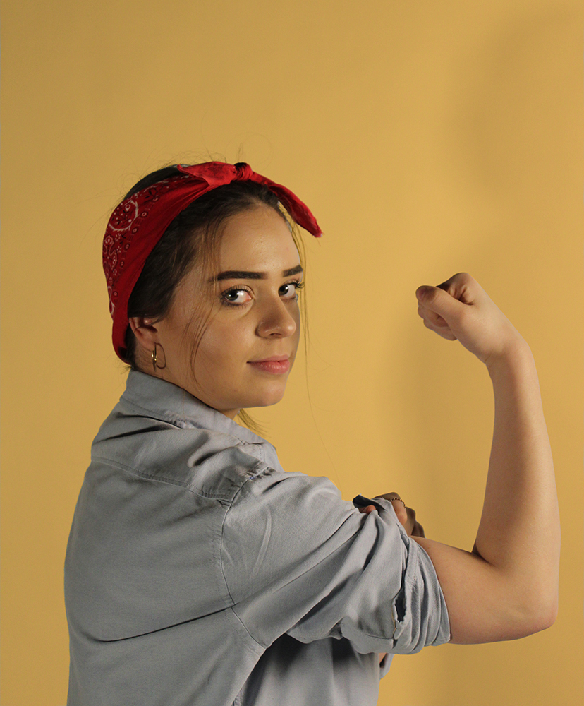
Final Outcome:

This shows the final outcome for how I edited the photograph, I used the warming filter (81) as it had more yellow tones in which I felt worked well with the original photograph and also worked with this recreation. I feel this photoshoot and editing was a success and that it generated an accurate outcome I am happy with that I feel works well.

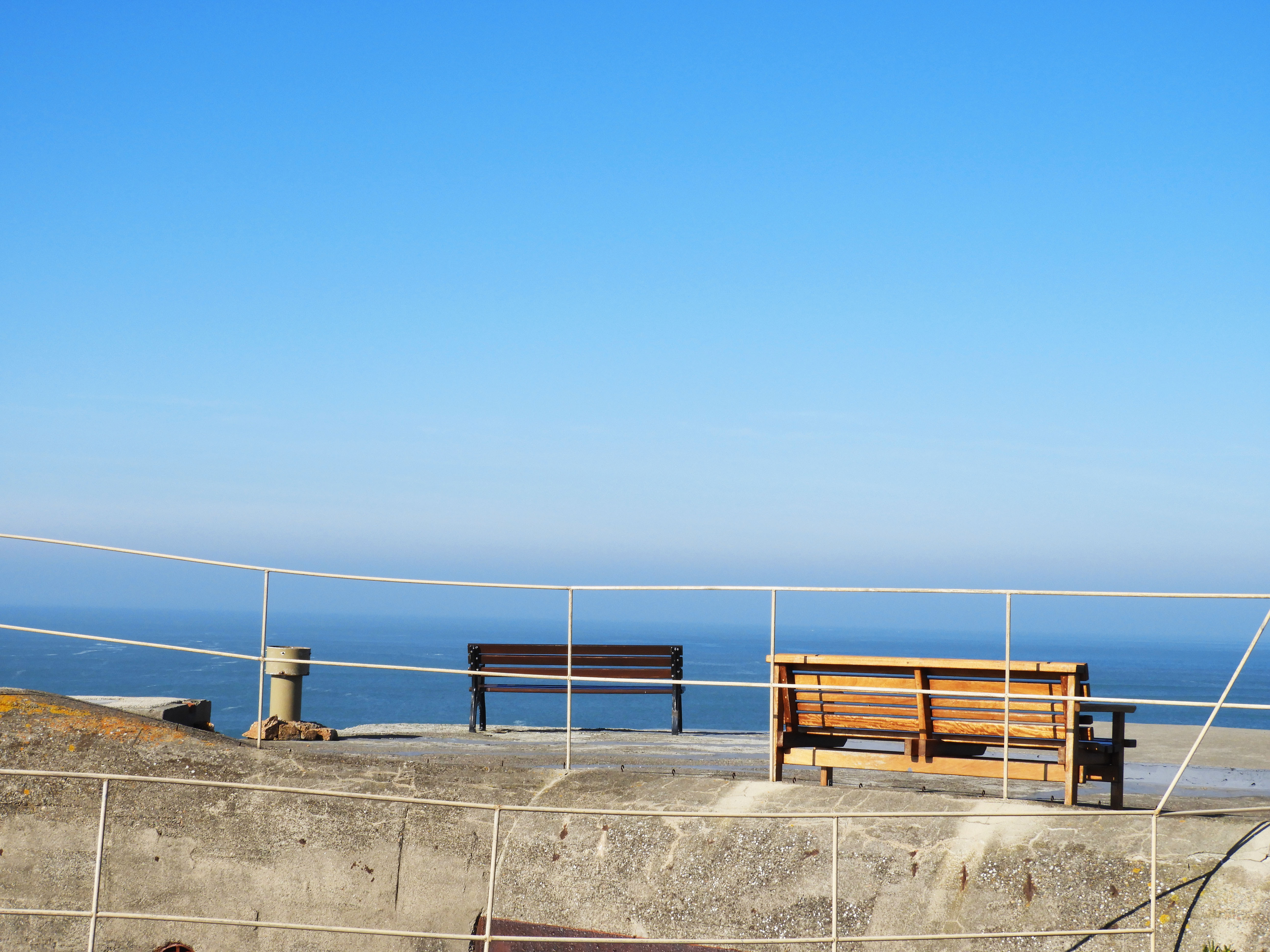
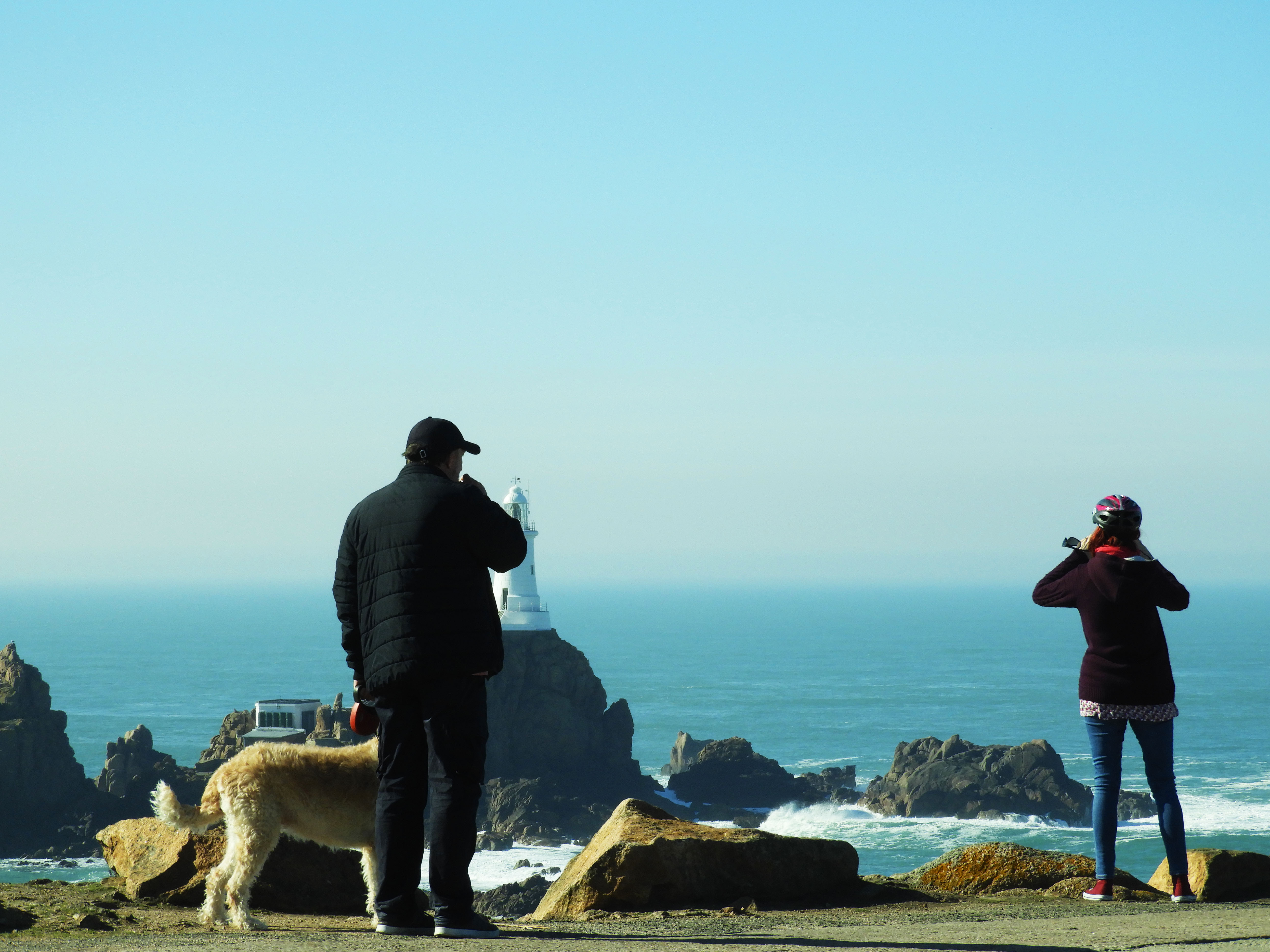
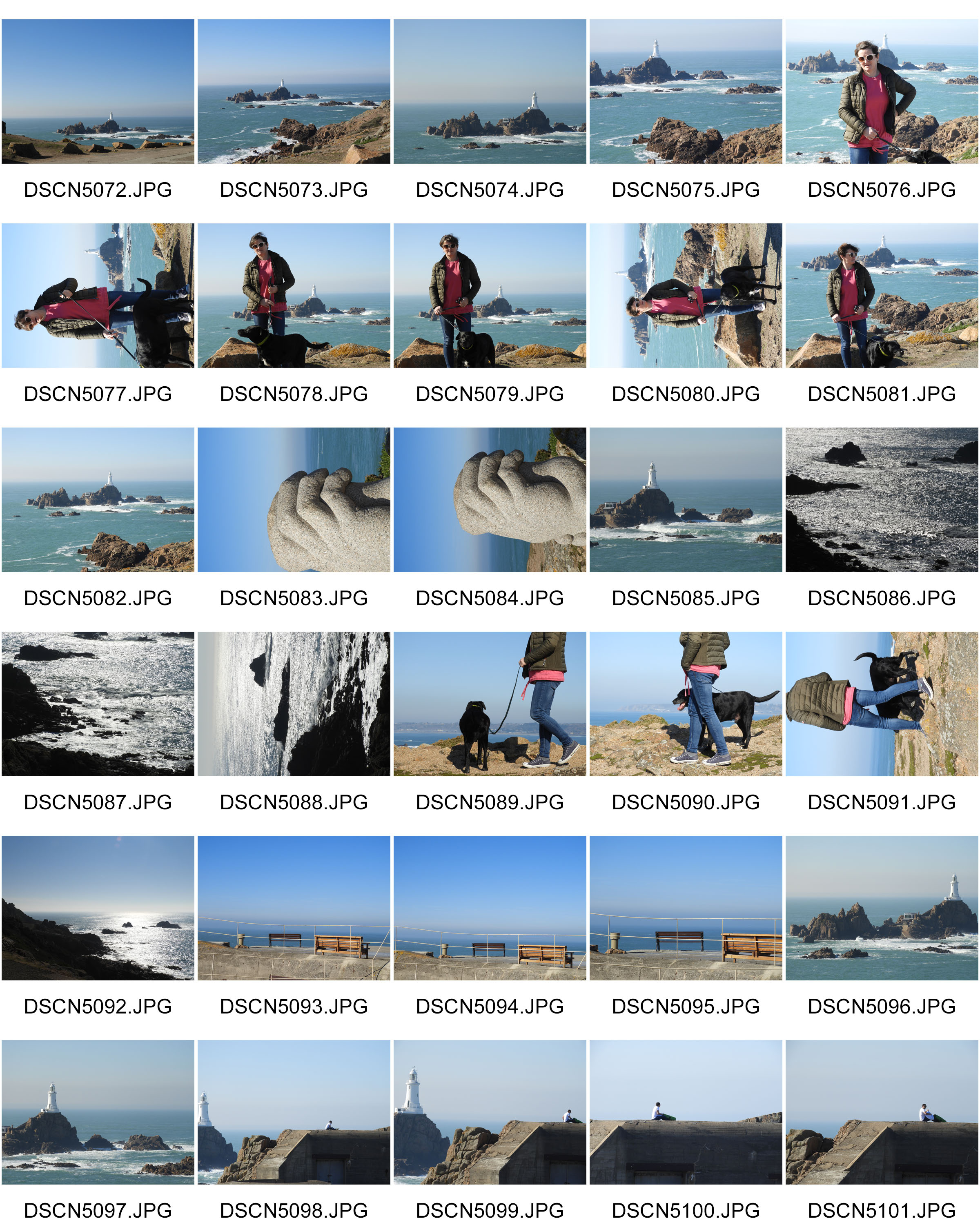
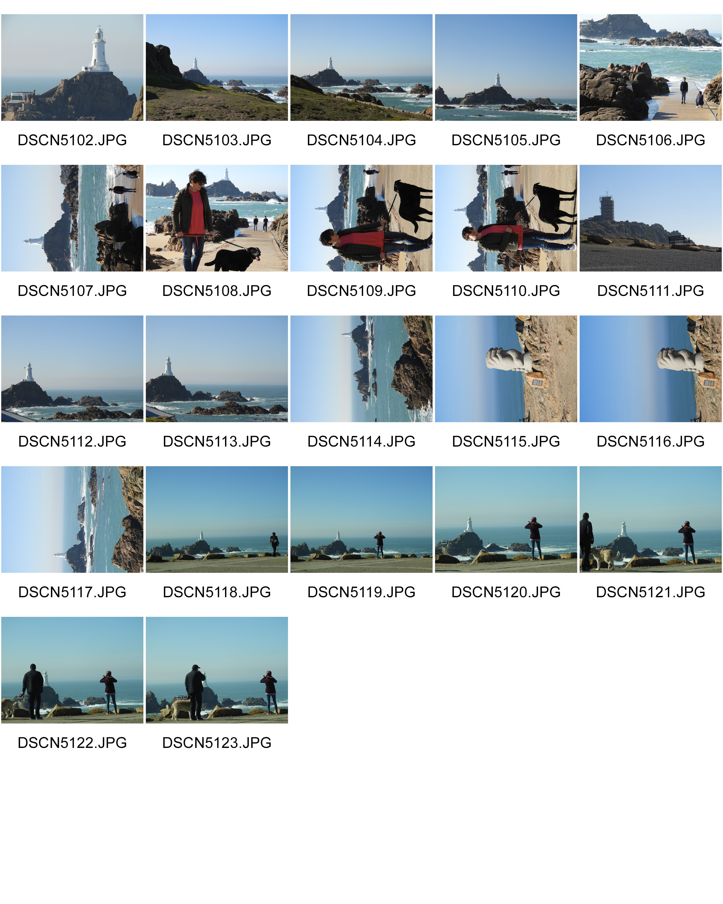
Photo shoot 2: Corbiere

HOW: 

For this photo shoot, I used my regular DSLR camera in order to capture the images.

WHERE: I conducted this photo shoot in Corbiere as I thought it represented well the natural beauty we have here in Jersey. I also found the different skyline and horizon very interesting.

WHEN: This image was taken during the early morning meaning that the shadows which are cast are at a very steep angle, giving different shadows than if it were to be taken during mid-day.

WHO: I attempted to incorporate both the landscape and people into my work as I was experimenting with different themes and subjects to take forward into my project.

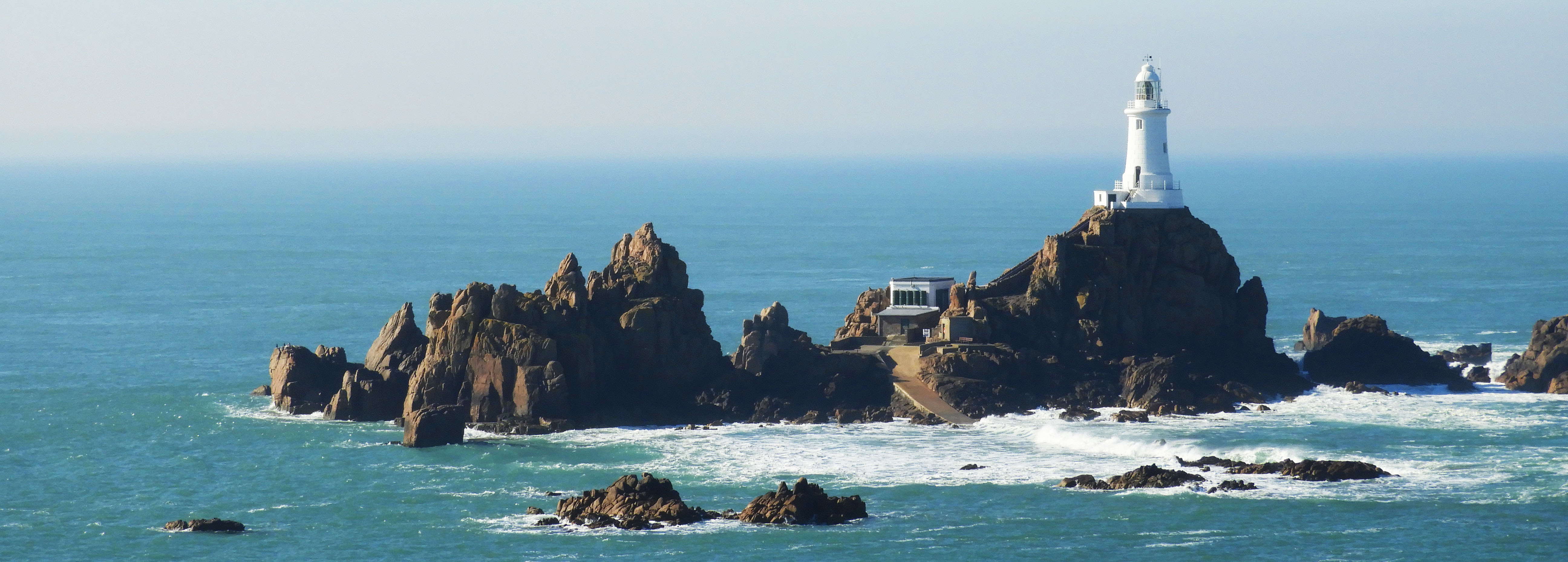
WHAT: Corbiere is very well know for its stunning cliffs and amazing lighthouse which is situated in the middle of the sea.

WHY: One of the themes which I was trying to convey through my work was landscape romanticism therefore I tried to capture the sublime nature of the landscape and how it has been altered through man-made forces.

MOST SUCCESSFUL PIECE:

CRITICAL ANALYSIS: 

TECHNICAL: 

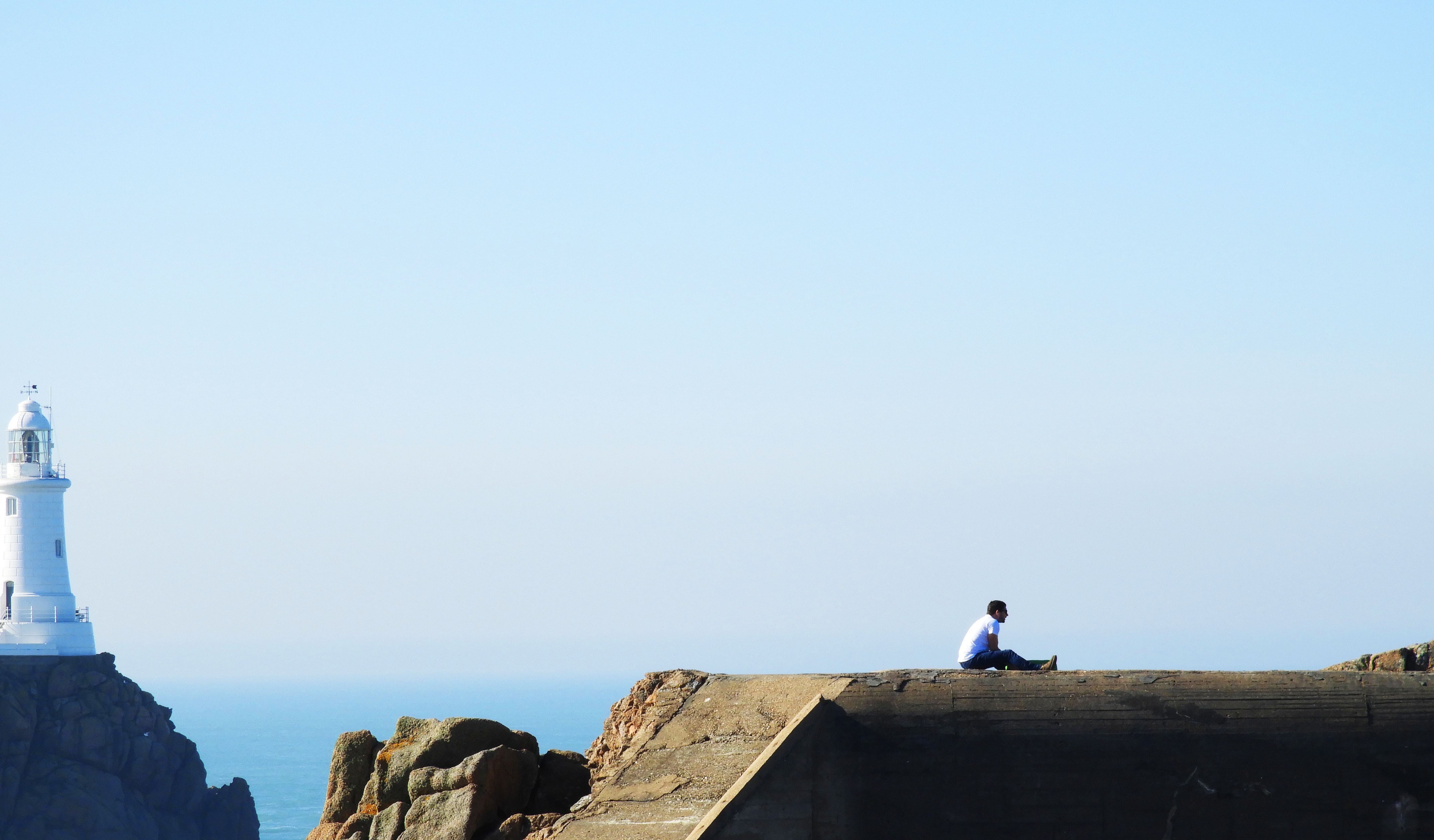
In terms of actually taking this photograph, no special changes had to be made overall. I used the manual setting on my camera, using ISO 200 as it was a fairly bright day and I did not want the image to be overexposed. The image above was taken using manual zoom on my camera, increasing the focal length to 35mm as this allowed me to capture a detail shot of the landscape. The original image encompassed a lot more of the landscape but I decided to crop it in order to draw more attention to the man sitting atop the bunker, as this better captures the themes which I wanted to portray through my photography. 

VISUAL: 

The editing techniques which I used in this image means that a sort of minimalist image was created, yet retaining elements of landscape romanticism. An aspect which can be looked at is the minuscule looking person sitting atop the bunker, being overridden by the sublime nature of the landscape which appears massive in comparison to the measly human.  One of the most striking things about this image is the symmetry created and the continuation of the line between the sea and the top of the bunker. It sort of mergers the two elements into one and creates harmony between the two. Another contrast in the man made and natural is the color pallets of the two entities, the lighthouse and sea being mostly blue based whilst the bunker and human have orange and warm tones. The majority of the attention in the image goes to the bottom third of the image as this is where the focal point lies. The combination of the 3:1 ratio between the emptiness and focal point mean that it is a fairly minimal image, with simple linear elements and few colors overall.  Although touching on the minimalist style, it is style evidently exploring landscape romanticism and human impact by including the bunker and sea in the backdrop. As this image was captured quite far away, there is no real sens of foreground but rather only a mid ground and backdrop. The bunker and man being in the mid ground and the sea and light house being in the back drop. 

CONTEXTUAL:

Violent seas have caused many a shipwreck at Corbiere over the years. The name, which is probably derived from corbeau, the French for crow, is commonly found elsewhere in the French-speaking world, notably in Guernsey, the north Brittany coast, central France and Switzerland.

Jersey’s Corbière is first recorded in the 1309 Assize Roll, when the issue arose of a tub being washed ashore there, and it was a regular occurrence for a ship to founder on the rocks when rounding the corner of the Jersey coastline in stormy weather and its cargo to be washed up on the sands of St Ouen’s Bay.

It was not until 1873 that the lighthouse was constructed which now allows ships to plot a safe route. It is 11 metres tall and was the first lighthouse in the British Isles to be constructed of concrete.

The light can be seen from a distance of over 25 kilometres, but this has not stopped smaller vessels from taking a short cut through the rocks off the coastline en route from Jersey to Guernsey and coming to grief after striking a hidden rock.

CONCEPTUAL:

Two of the major styles my work tackles in this photo shoot is landscape romanticism and minimalism, each being very distinct from each other yet creating striking impact within visual media.

Minimalism is a style employed by many 20th Century artists, using a minimum amount of components such as colour, shape, line and texture. Within the art world it is considered an extremely subjective concept, leaving interpretation and meaning up to the viewers perception of the work.

Some appreciate the openness of this idea, embracing the freedom of interpretation, where others despise the lack of direction or subject matter. For photographers, this is less of an issue, as more often than not, a photo remains a real-life moment captured on film. Despite this, we can employ some of the techniques of minimalism to enhance the impact of our work.

Romanticism was (and is) an international movement that swept Western Europe and Russia at the end of the 18th and beginning of the 19th centuries.  It expanded to North America beginning around 1830. As a movement, Romanticism drew its inspiration and energy from various sources:

  • the “rage for roots” triggered by linguistic discoveries
  • a growing sense that the creative possibilities inherent to the rigid formalism of Enlightenment philosophy and art had been exhausted
  • growing fatigue with “rule by the few”
  • the resounding successes of the French and American revolutions and such later popular wars for independence as those in Greece, Poland, and Spain.

OTHER SUCCESSFUL IMAGES:

First Photo shoot

HOW: I used my regular DSLR camera for this photo shoot.

WHERE: 

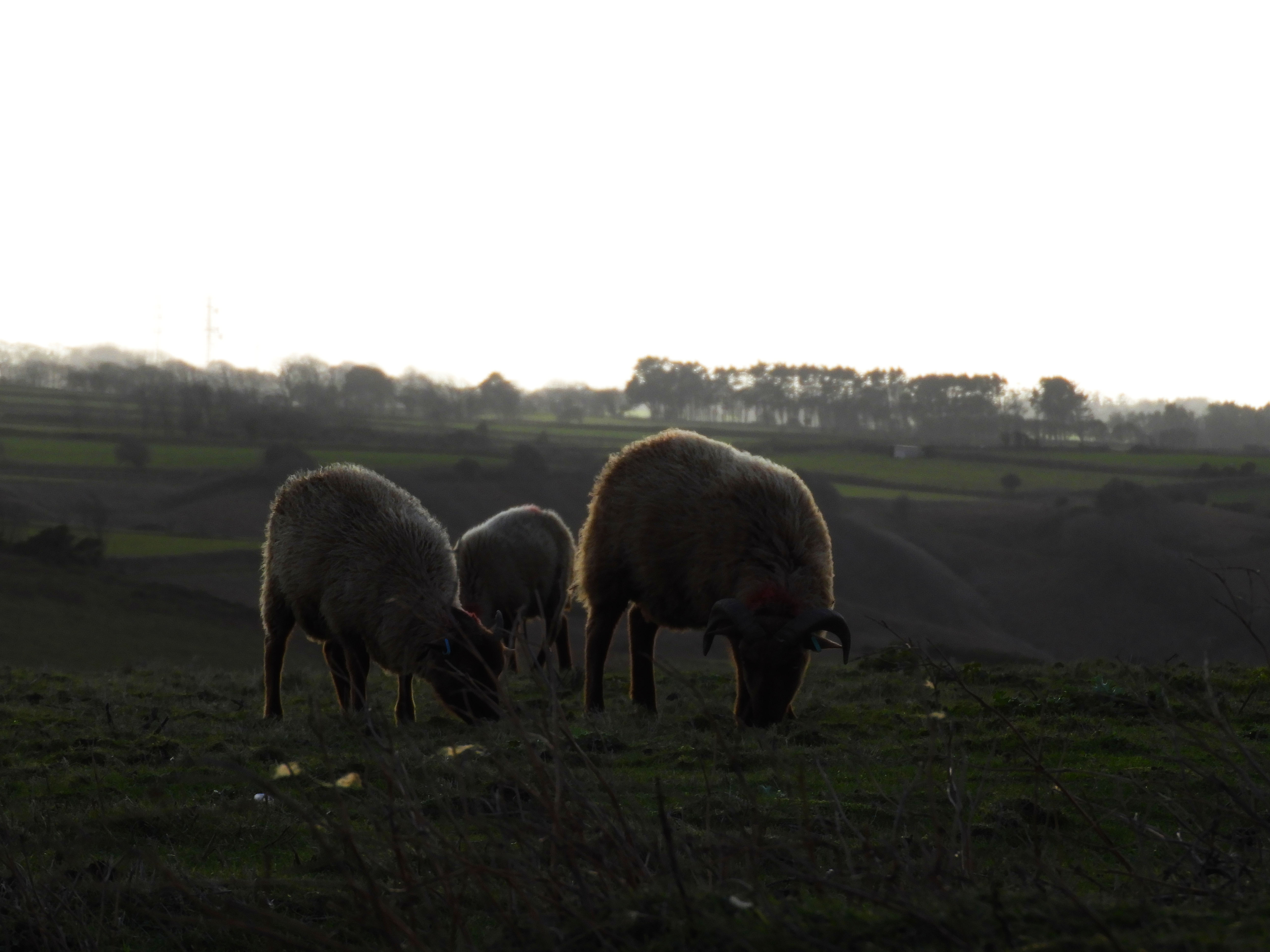
I chose to conduct the photo shoot in an area which I find very interesting and I find myself visiting this walk over and over again due to the natural beauty it has. It is a small cliff path walk in St.John which is situated within a sheep farm, therefore whilst conducting the photo shoot, I will be able to incorporate not only the landscape but also the animals.

WHEN: In order to avoid direct sunlight I went out during the early morning to take photos, this meant that shadows were cast in different directions which provided variation. The cloudy weather conditions also meant that the lighting shifted a lot throughout the photo shoot, being very light and dark at points.

WHO: I was initially attempting to capture the pathways around Jersey, as an experimental concept, yet when I got there I captured an abundance of images of the sheep there as I found them to be quite interesting.

WHAT: This was an experimental photo shoot which was an initial idea from the title “journey’s and pathways”, there was no specific theme or subject I was attempting to capture with this shoot.

WHY: This was my initial response to the title of “journeys and pathways” project, it was a basic response to the title which fulfilled its literal meaning.

CRITICAL ANALYSIS:

VISUAL:

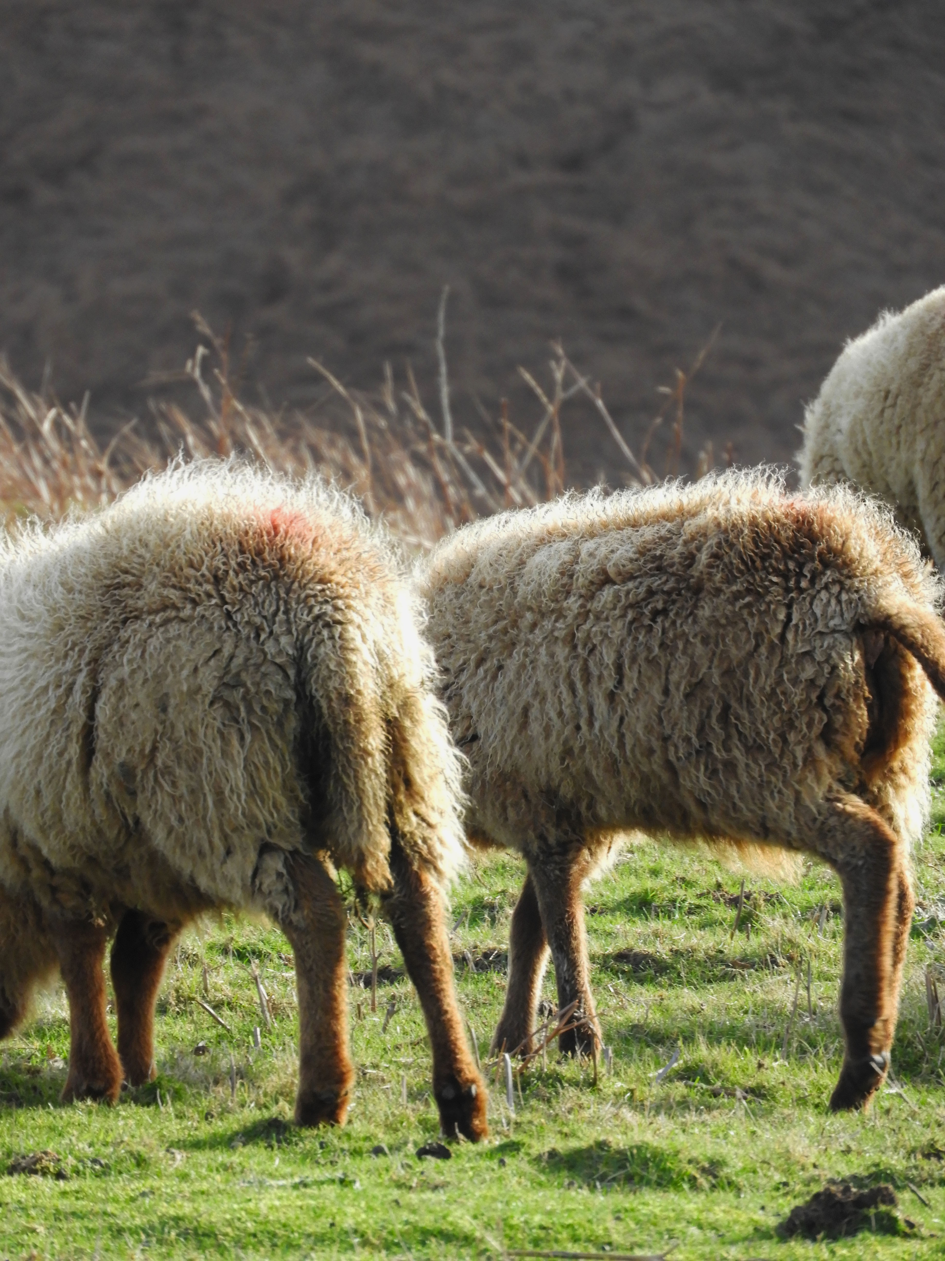
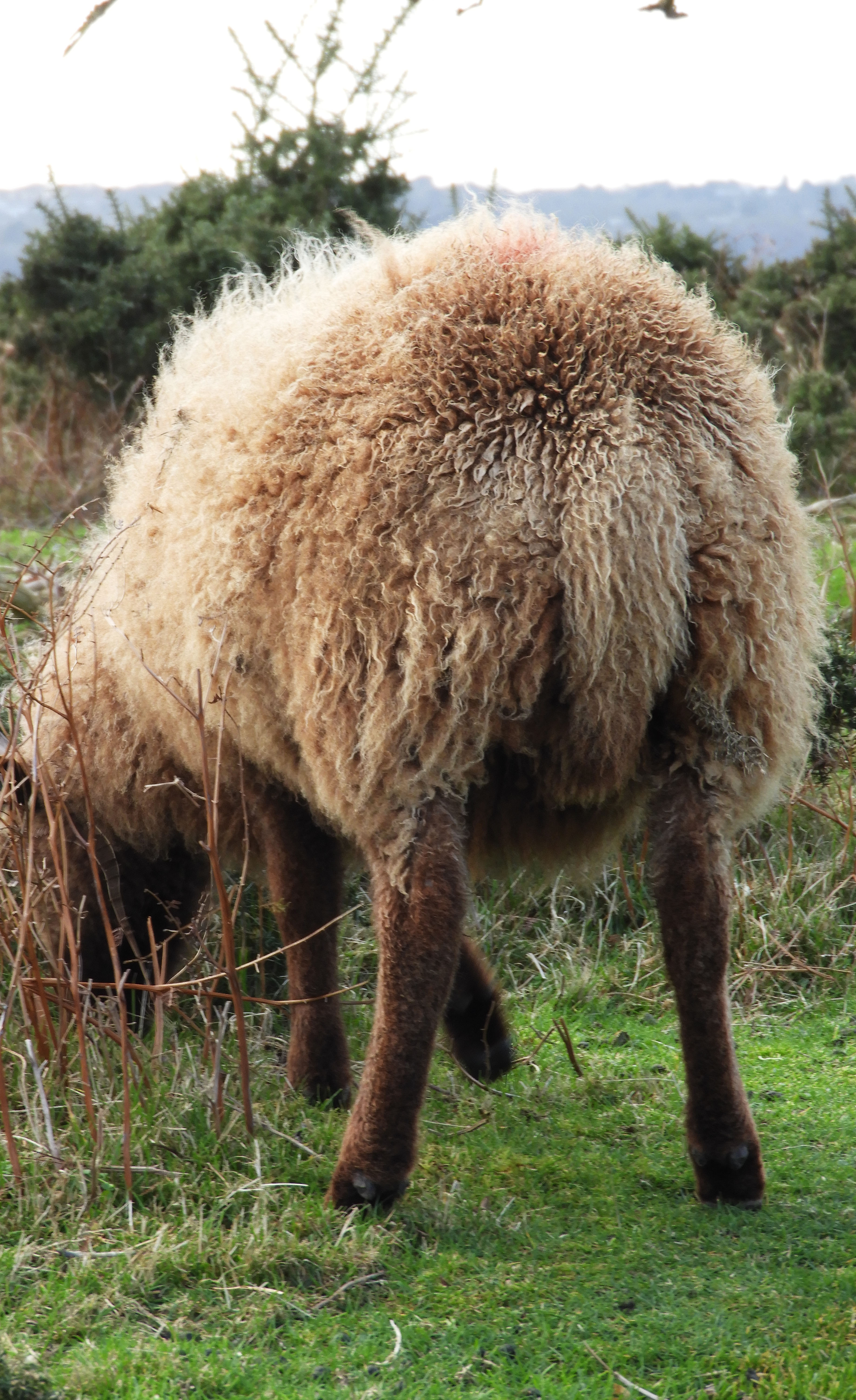
This photo shoot was done during 2pm in the afternoon when the sun was not directly above in the sky but shifted slightly to the right, therefore in the image we see a shadow being cast of the sheep to the left hand side of the image. The light which is cast onto the sheep is also trapped in its wool, making it have a sort of halo effect. There is an element of comedy to this image with the fact that you cannot see the faces of the sheep and only their backsides. Whilst taking this image, I zoomed in quite far in order to capture the detail in the wool. There is a distinct foreground and background in this image, the distant hill being located in the background and the sheep in the foreground.

TECHNICAL:

This was one of the most challenging photo shoots to do in my opinion due to the less than ideal weather conditions that I experienced during the shoot. At Sorel point, the cliff path walk where I did my photo shoot, the wind was extremely strong and unforgiving on the given day when I took my images. I was unable to use a tripod as during previous shoots with similar weather conditions, the set up would simply be blown away. Bulky set up like that would have also likely scared away the sheep, who I was very keen to see up close and capture pictures of.I had to crouch down for most of the shoot as this ensured that less wind was blowing against me and therefore the camera was more stable.

CONCEPTUAL:

As an initial concept, I took the literal meaning of “journeys and pathways” and took a literal journey at one of my own personal favorite places in Jersey, Sorel point in St.John. An area full of natural beauty, highlighting the beauty of Jerseys varied coastline. It was taking a trip into the beauty of natural, touching the concept of landscape romanticism.

Although its definition has been debated profusely for decades, Romanticism generally defined was an artistic and intellectual movement originating out of the late 18th and early 19th century Europe. Its movement was seen to reject the typical ideas of order, calm, harmony, balance, and idealization.

As an artistic style, it is strongly emotional, evocative of a vivid imagination. Sometimes, it actually represents the irrational emotions and subjective experiences of the artist.

CONTEXTUAL:

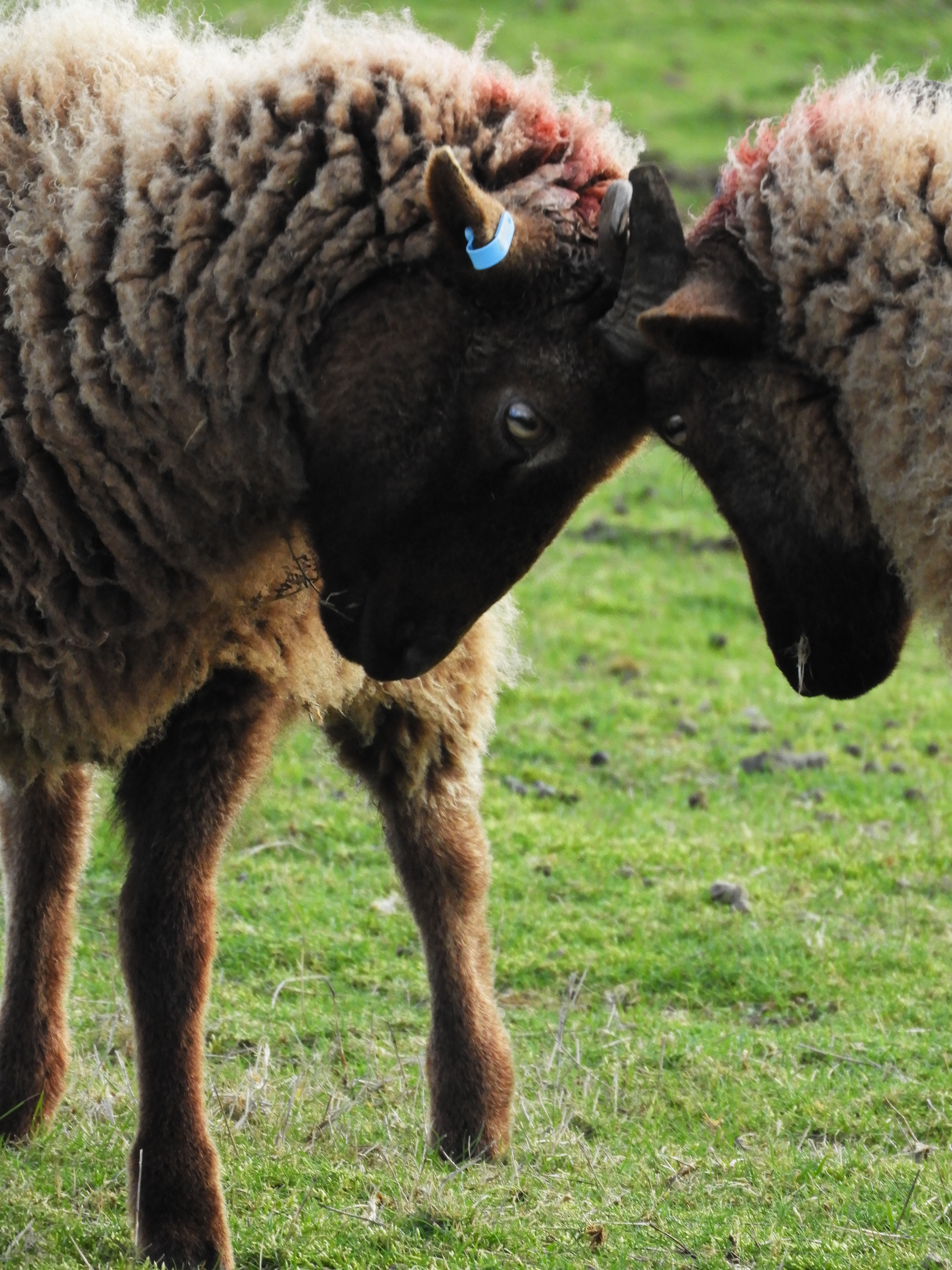
The sheep which reside on the pathway from Sorel point going to Devils Point are called Manx Loaghtan, a rare breed of sheep native to the Isle of Man. It is sometimes spelled as Loaghtyn or Loghtan. The sheep have dark brown wool and usually four or occasionally six horns.

The Manx Loaghtan is one of the Northern European short-tailed sheep breeds, and descends from the primitive sheep once found throughout Scotland, the Hebrides, and Shetland Islands. The word Loaghtan comes from the Manx words lugh dhoan, which mean mouse-brown and describe the color of the sheep. This breed is primarily raised for its meat, which some consider a delicacy. The meat has recently received EU recognition and protection under the Protected Designation of Origin scheme, which requires products to originate in a specific region.

The Rare Breeds Survival Trust has characterized the Loaghtan as “at risk”. By the 1950s there were only 43 surviving specimens. Manx National Heritage developed two healthy flocks. These have given rise to commercial flocks on the Isle of Man, United Kingdom and Jersey. Even so, today there are still fewer than 1,500 registered breeding females

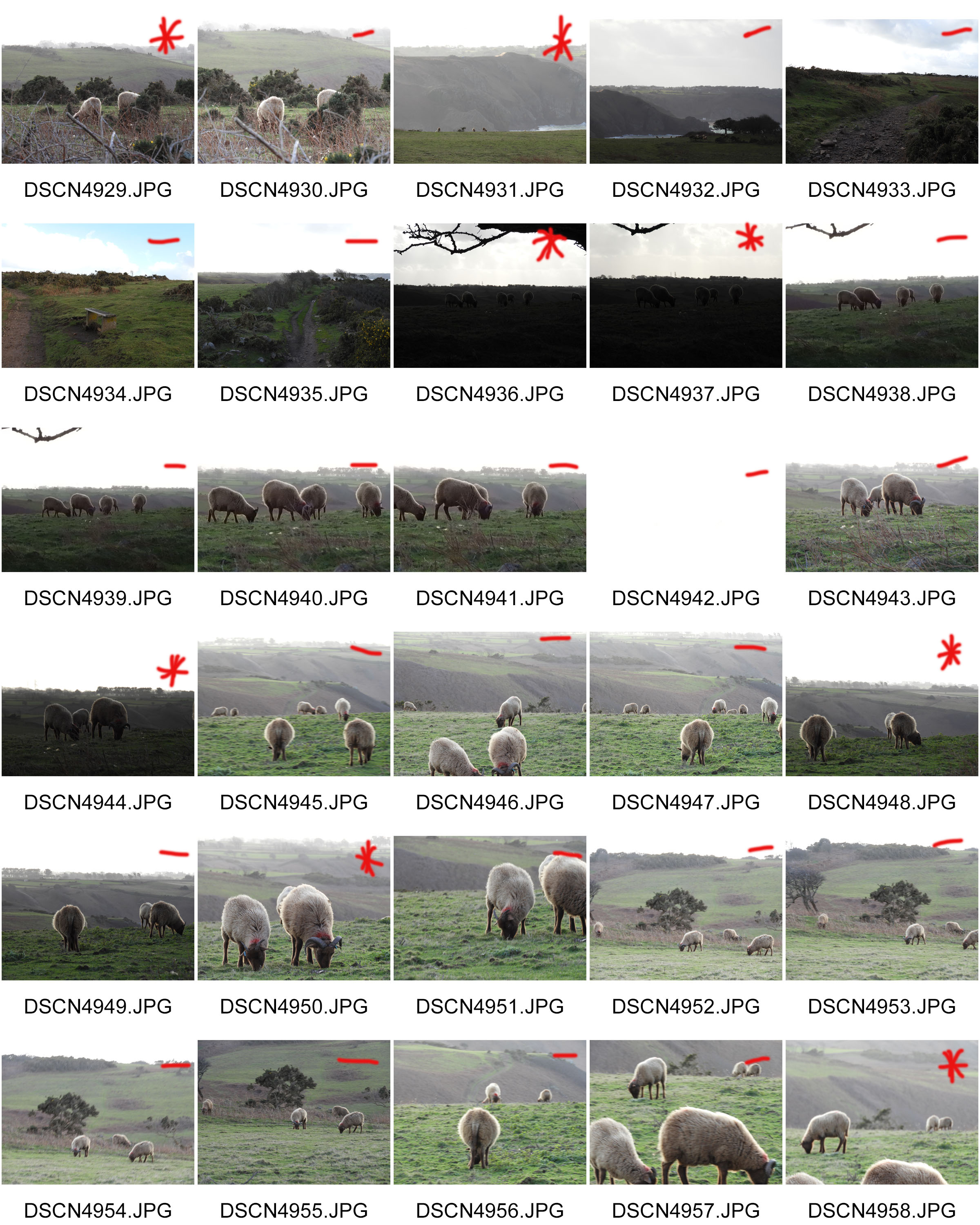
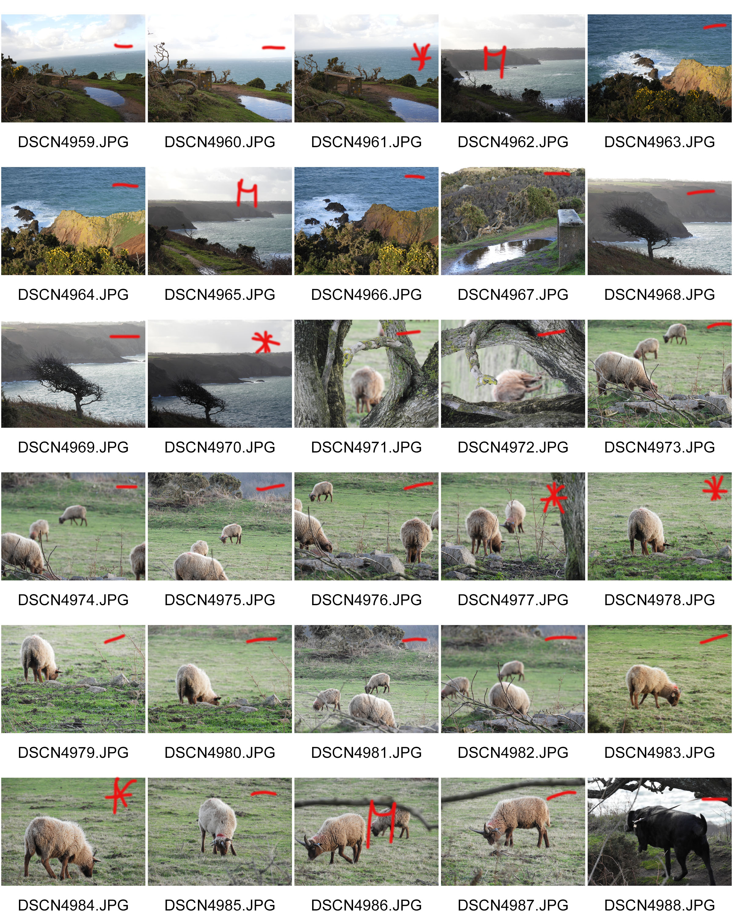
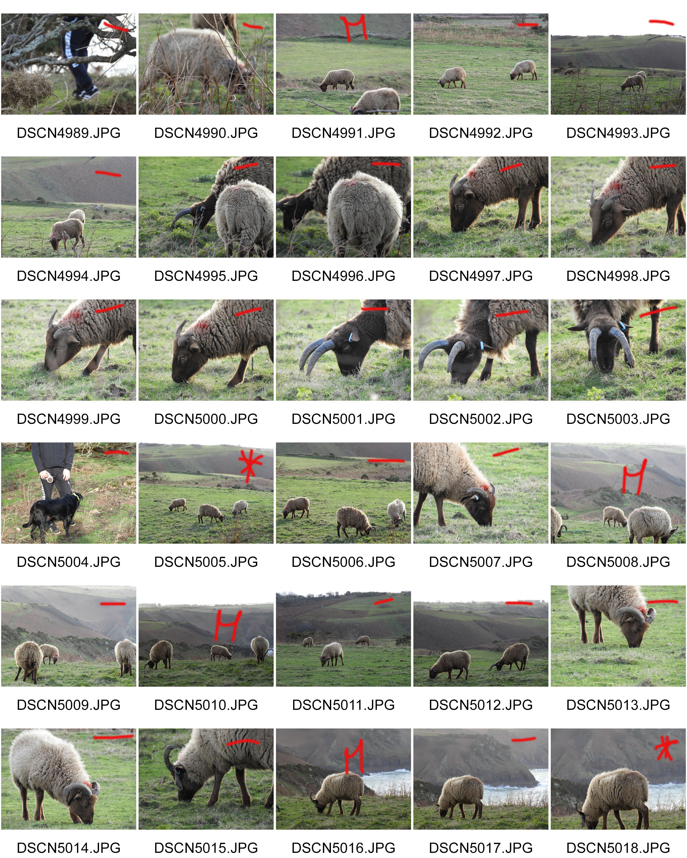
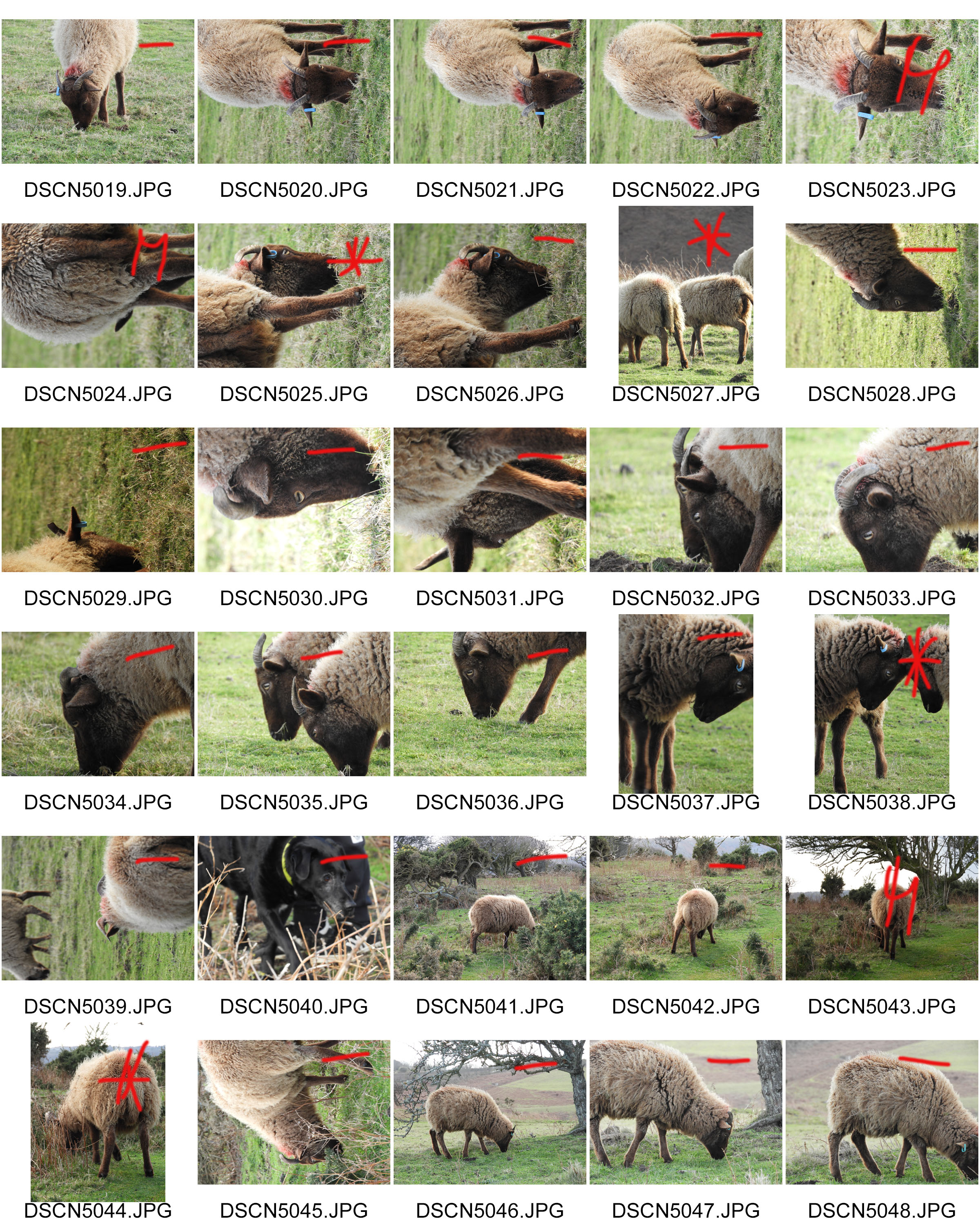
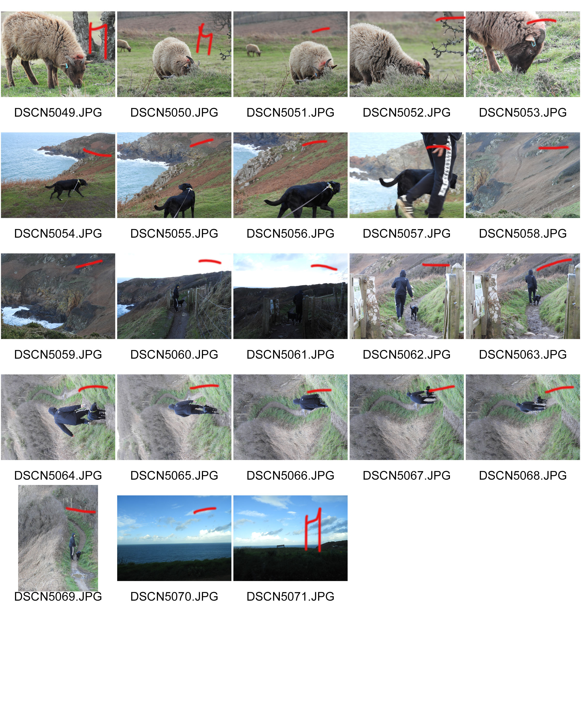
CONTACT SHEETS:

JOURNEYS AND PATHWAYS – CHRIS PORSZ

THE JOURNEY OF LIFE:

The idea that I have for my project is to find old photos of my family and friends and recreate those photos. I think that this will link to the exam title 'Journeys and Pathways' because it shows how their journey through life have changed them, through natural causes such as growth and age, and also experience as they will be reliving their experiences. I will also be recreating photos of myself through self portraiture to show how I have developed and grown and how my own pathway has changed me. 

CHRIS PORSZ:

https://www.boredpanda.com/photographer-recreates-images-40-years-later-chris-porsz-reunions/?utm_source=google&utm_medium=organic&utm_campaign=organic
Chris Porsz is a photographer who captured hundreds of images in the city of Peterborough in Cambridge in the 1970's, 80's and 90's. He is a street photographer, however, years later he tracked down the subjects of his photographs and recreated the photos in the same places with the same people. 

IMAGE ANALYSIS:

This image is called 'Sisters'. The first image was taken in 1980 and the second image was taken in 2013. 
In both of the images natural lighting is used, however, in both of the images there is also a reflection of the buildings opposite. The focal point of the images are the three sisters, however you could also argue that the dramatic change of both the girls and buildings is also a focal point of the photographs. Although the white balance of the first image incorporates the cool tone of the purple, it can be arguable that the main tone of the image is a warm tone due to the intensity of the sisters vibrant red jumpers and the warmth of the bricks of the building. However, the second image can be seen to have a more muted and controlled white balance. The first image has a clear contrast to the second image with its intense saturation compared to the second image with its casual almost under-saturation. The second image is a lot crisper than the first image with it focused and un-grainy quality. The first image is a lot more grainy and unfocused than the first.

The contrast of the intensity and vibrancy of colour of both images can show multiple aspects such as the quality of the cameras, the concept of the images at the time and could also show how time has affected the girls approach to colour by the way they present themselves. The textures in both images are also contrasting, the first image is a lot more rough looking with the bricks and rough paintwork of the window, however the second image seems more smooth with the smooth wall and cleanly installed window. Line runs through both images from the lines in the windows, to the lines of the bricks, to the lines from the curtains in the first image.There are also lines from the building that are being reflected in the windows. 

The windows could represent the separation the girls have from the outside world. Also, in the second image the women have a more somber expression on their faces which could represent how aging and growing up can be viewed as a negative aspect, and how childhood lures the girls into a sense of security and happiness. It could also display the girls innocence and how adulthood transform them into women, and how their experiences have influenced their outlook on life. Their clothes in the second image can be viewed as "toned down". This could represent how society has shaped them and manipulated them into believing what is acceptable to wear and what is not as their clothes in the first image is a lot more colourful as children aren't as pressurized to wear certain things and dress a certain way. In the second image, the woman on the far left is wearing a hijab. She wasn't weaing a hijab in the first image and this could represent how as she has grown up, her religion has forced her to look a certain way, or it could represent how she has become more dedicated towards her religion. 

Left to right, Shehnaz Begum, her twin sister Rukhsana and their older sister Itrat were spotted sitting in the window of their house on Cromwell Road. 'We often used to perch in the window and watch what was going on in the road,' said Shehnaz. 'My twin sister and I were about seven and Itrat was nine. We loved riding our bikes with the other children in the street and were good friends with another set of twins. Mum said we were quite a handful'. The three sisters still live in Peterborough and see each other regularly. Shehnaz, who is divorced, has a daughter and looks after elderly and disabled people, together with her twin, who is re-married and has five children. Itrat works for the post office and is married with six children.
https://www.boredpanda.com/photographer-recreates-images-40-years-later-chris-porsz-reunions/?utm_source=google&utm_medium=organic&utm_campaign=organic

HOW THIS MAY INFLUENCE MY WORK:

I am going to use Chris's concept of comparing images taken in the past with the current and recreating the scenes in the photographs. I am going to look through my family's photo albums and find images that I will recreate with my family members. 

I will then place them next to each other to display how they have developed and changed over time and how they've had to adapt to their experiences and environment.


Exploring Journeys and Pathways – Nature Walks

One idea I have for the topic of journeys and pathways is going on a nature pathway. I went for a quick walk and documented some of the things I saw such as the landscape and the different flowers/plants that I encountered on the way. What I need to improve on some of the images is the focus and exposure, as some of the images such as the buttercups are over-exposed and out of focus. However I do like some of the landscape images I took. 

Although I do like the idea of documenting nature walks, I don't think I would like to document them for my project. My reasoning is that I would prefer to study something more conceptual and meaningful. For example, I believe that documenting people would be more suited to my project because each and every person has a different and I could explore the journey of life.

Just below the gallery are some of the images that I manipulated from this photo shoot. I used adobe lightroom to manipulate the exposure, contrast, highlights, shadows, whites, blacks, vibrancy and I cropped some of the images. I wanted to bring out the vibrancy and colour of the images and also fix some of the exposure problems. My favourite image is of the fox gloves because I love the pop of magenta, I also like the depth of field in the image.

My Manipulation of Some of the Images From the Photo shoot

CCA GALLERIES VISIT – CARINTHIA WEST, RUPERT TRUMAN AND MIKE MCCARTNEY

As a class trip, we visited CCA Galleries and viewed the works of Carinthia West, Rupert Truman and Mike McCartney. Carinthia's drew me emotionally as I think she captures the emotions of her subjects so naturally. I also like the way she portrays her celebrity subjects in such a natural and carefree environment, showing how away from the limelight, they're just normal people. I also really liked Truman's photos because the more you look at them, the more minute but significant details you spot. 
A photo of West’s work
My teacher discussing his opinions on West’s work.
Some more of West’s work.
One of Truman’s portraits.
Some of Mike McCartney’s work, including a variety of portraits and architectural photographs.
I also liked a lot of Truman's work because you have to really analyse the image to make sense and realize the multiple underlying indexical meanings hidden in the images. Also I like how some of the meanings are difficult to interpret, leaving the imagination to try and sense what is going on. 

I liked some of McCartney's work, however I feel they weren't as emotionally involved as West's work. Carinthia West's work seems more raw and really catch the normalities and fun the celebrities have, and McCartney's work seems to me more forced, almost like they're staged. Although his images are aesthetically pleasing and are very interesting, especially to Beatles fans, i feel they aren't as natural and raw as West's work.