Category Archives: A04 Personal Responses / Final Outcomes

Filters

Author:
Category:

Final Finished Displays and Mounts

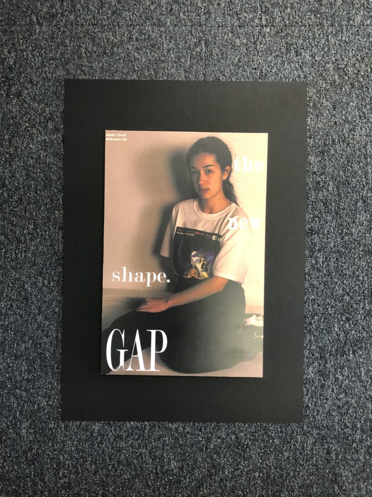
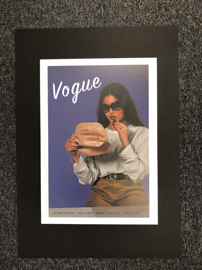
Below shows how my final outcomes turned out ones printed and displayed, I chose to display them on foam board and then onto black mount board as I feel this is what worked best with the photographs and it made them stand out off the page which I feel was effective in displaying the types of photographs that they are.

I am happy with the way that my final displays had turned out and the actual photographs themselves. I feel that putting them on foam board rather than a window mount helped to make a difference and stand out for the types of photographs they are in the style of adverts and what they are presenting.

All of my final photographs have stemmed from inspiration and ideas from people such as Kourtney Roy and Cindy Sherman and the message that they also try to send across to people and the style and way that they portray those ideas I feel is effective and stand out which is one of the reasons as to why I placed my pieces on mount board. I feel that adding the writing and actual advert elements helped to make a better impact and I feel was more effective than just leaving the images as they were.

Below shows a created image of a virtual gallery to suggest what my work could look like in a gallery and all displayed properly together. This helps to give a sense of all of the photographs being grouped together and how I may show them if I was to have a real gallery space to put them in and I feel helps to give it a different perspective.

Comparing Final Images to Marko Köppe

My final images are inspired by Marko Köppe’s style as I love how he uses random photos of things that relate to the main part of the image. I think I was able to capture his style but still keep my style in the photos.

I think this photo shows Köppe’s style the best, but still shows that it is my own style as well. I also think I managed to get down his aesthetic perfectly.

I also think these three photos capture Köppe’s style really well and I think they were edited really well.

Final Displays: Layout planning

I have decided to display my final pieces in a range of different ways that are shown and explained below:

1)For my first display, I will be displaying the images from photo-shoot 2 on foam board, all 3 separate images that are not physically connected, but will be shown next to one another. I have decided on this as I feel it is the best way to draw maximum attention to all 3 images, and as they are bright, A3 images, I feel that by not adding a boarder, the colors and brightness of the images can be better emphasized.

2)The ice images from my 3rd photo-shoot will be displayed on black display card, with a frame that boarders the whole image. I will not be using the frame to separate the images, as I feel that by leaving the image and not segmenting it, I can better create a sense of continuity between the 3 images, showing the ongoing journey of the ice from solid to melted.

3+4) The other 2 3-panel images will be displayed using the same framing technique, but will have the frame separating the 3 panels. I will be doing this as I feel in this circumstance, each image is different ans separate enough to show the 3 images as 2 completely separate points in time of the flowers lifetime. I feel that by basically framing each image individually while overall having them framed together, I can draw attention to each individual image and the differences between them, while also showing that the whole image together represents the journey of the same flower over time.

5)The final display includes 2 images, that will be displayed together to show the similarities and differences between them. One of the images is portrait, while the other is landscape. They will be displayed perpendicular to one another, (making a right angle between the 2 images) in a portrait display. I will do this, as the final product will be able to stand either vertically or horizontally. As one image is portrait and the other landscape, I feel that this will disconnect the 2 images, as one will always be turned the wrong way whichever way the display is stood. By disconnecting the 2 images in this way, I will be able to emphasis the contrast between the 2 time periods, while still displaying them in the same display.

Final images – layout

For my final images, i’ve decided to plan out how i’m going to be placing the pictures, and how i’m going to present them.

A5 images:

For these 6 images, I was originally going to stick them onto a large cube, however since i wasn’t able to make the cube in time, i decided i was going to stick them onto a large piece of card instead, in descending order like shown in above. However, i had the images on the left more elevated then the others, which made it resemble stepping stones.

A4:

For this image, I decided I would cut it up into 6 strips, and then stick them to a small piece of black board, with each piece becoming higher and higher as it went along, since I stuck pieces of card together to create this effect. I did this to make it similar to stairs.

A3:

For these images, I decided the best I could do was to cut out window cuts into a large piece of card, and place them into the cut outs. Since one of the images was longer than the other one, I decided to place it underneath, giving it a neater and nicer look.

Evaluation – Journeys and pathways

For Journeys and pathways, I looked at multiple different ideas which could relate to the theme. At first, I wasn’t basing my photoshoots off of any photographer, simply taking pictures of things which I believed related to my theme, or could be edited in a way which made it relate. This included any pathway, water movements, sunsets and sunrises, clouds, and movements done by living things, such as myself or animals I was able to take pictures of. This started me off and gave me a wide range of photos which I could play with, and possibly use for future case study responses if it related to the photographer.

I then started to look at The Boyle Family, a group of photographers who travel around and take pictures of floors which they find interesting, unique and has some sort of history to it. I chose these photographers as the way they took the images related to the themes, where they traveled around many different places to find the right picture, and what they took photos of, pictures of floors which have been on their own journey, changing over time. The photoshoots I took for these were simple and needless to say, I enjoyed taking the abstract images. I managed to take around 300 images, from places all around Jersey and Central London, many of which have some interesting history behind it. I chose 6 of the 300 images I took, and was originally going to display them on a large cube, but as I wasn’t able to make it in time for the exam, and wouldn’t have enough time during the exam, I decided to put them on a large piece of black card instead, with them doing down in the middle, and with one side of the images being more elevated than the others, in some way making them look like stepping stones.

For my second photoshoot, I looked at Paul Reiffer, a photographer who takes stunning pictures of scenery, mainly in the sunset and sunrise area. I chose him because he did what I wanted to do since I started the theme of Journeys and Pathways, pictures of sunsets, which can relate to my theme as the sun makes a journey across the sky daily. Reiffer’s images are particularly colourful, with many colours such as purple, blues, yellows and oranges. I enjoyed taking pictures based off of this photographer the most, as i’ve always been interested in landscape and colourful scenery, For my final images, I chose two of those which I based off of him, one being a sunset in St.Helier and the other being one at the River Thames in London. To get it as colourful as his, I added colours on different layers on top, and then reduced the capacities until i got the desired outcome I wanted. To display them, what I did was create two window cuts into a large piece of black card, with one of the images being longer than the other below it, as that’s how it was when it was printed out.

For my final photoshoot, I focused on Mikko . Although I wasn’t able to replicate the nighttime skies he implemented into his photos, I still based my photos on his pathway works, finding interesting pathways which could be edited in a way which made it stand out. I chose one image for my final piece, and it was of a pathway in Peckham Park, London. I first edited it in photoshop, increasing contrast, brightness and vibrance. When it came to framing it, I cut it into 6 separate pieces, and then stuck them onto a small piece of black card, with each strip getting higher and higher as it went along, since I stuck strips of card together to make platforms. I did this to make it similar to how stairs look, which could also relate to the theme of Journeys and Pathways.

Overall, I enjoyed this theme from the start. There were lots of ideas I could implement into my work and it was hard limiting them down to only a few choices, however I am pleased with my final pieces and how they turned out.

Final Display

For my final displays I decided to do a lot of overlaying of images. My first composition on the left is 3 A3 printed images stuck straight onto white card in a diagonal line, the top and bottom images also have smaller A5 images which where first stuck onto foam board then placed on top. I did this because firstly, to the eye it all fits together so having them apart would make the images lose their meanings, and secondly it continues my idea of the life cycle : natural material decomposes into soils then new things are planted until they die and decompose into the soil. My second composition is all of my off-cuts rearranged into an order that still makes sense. Although all of the images are mixed up, the idea of time being the killer is still present.

Framing Ideas For Final Image Selection


My only A3 print will be the set of images on the left and I will be mounting them on a foam board, and then on top of that I will be adding cut-outs of from the other set of A5 images (Right). I originally wanted to gather up some leaves and small computer parts to stick onto my A3 Print but after realizing I would not have time to gather all of the parts needed, I decided to change my idea. I will instead mount the A5 pictures on foam board to make them stand out on top of the image.

My framing idea for these two sets is to either have them side by side as above, or vertical, with the tractor being above the ground. I will have a large piece of card as a background, with two smaller foam boards holding each set within the larger piece.

Evaluation

Overall, my project has been constantly evolving and adapting from day one. At the beginning of my project, I focused on ‘The Journey of an Object’, this was too simple for me and I wanted to challenge the idea of a journey of pathway. The journey I ended up focusing more was ‘The Circle Of Life’. I represented this with flowers frozen in ice – so I could physically freeze a moment in time and retain it, press flowers – so as they decay they stay flat and create their own composition, and I also captured deceased animals to capture their ever-lasting last moments and how their bodies responded to it. This collectively in my opinion, shows how time cannot be created or destroyed but can be held in a single moment.

My original interest for ‘The Circle Of Life’ came from a case study I did about Wolfgang Tillman’s still life photography. The specific image that inspired me was called ‘astro crusto’, an image that showed an open dead crab with a fly feasting on it. This sparked my whole idea of decay and time.This was all then followed by my case study of Heikki Leis who focused on the decay of food. I couldn’t really catch onto the idea of rotting food due to two variables, one being a time constraint (I didn’t have enough time to let my fruits and veg rot with a sufficient amount of decay present) and secondly handling these rotting foods causes many illnesses and put me off. However, thanks to some generous cats I was able to handle some deceased rodents easier because firstly they were brought into the house so I didn’t have to go and find them, and secondly the cats only bring them in as trophies so there was only puncture marks.

Editing wise, I kept it simple with just colour adjustments and cropping, however during this project I became more accustomed to the use of cameras and I could set them up for images that didn’t needing much editing due to me having already capturing what I wanted. For my final images, I decided to layer my images over each other because I think it really ties in my whole idea of ‘The Journey Of life’ and how death is inevitable.

Overall, I’m happy with the content i have produced because it all ties into one clear topic and they’re not reliant on editing and manipulation.

Final Outcomes & Display

I chose these two images to be paired for one of my final outcomes because they respond to The New Topographic, which I have been focusing on through the ‘journeys and pathways’ project. The New Topographic relates to the project because it is showing man altered landscapes, often connected by roads and urban developments.

These two images present the same subject from two different viewpoints. The building appears as a substantial part of each scene emphasising the dominance of urban structures over the natural features. Cables form an integral part of the urban landscape dominating the skyline, competing with the natural beauty of the palm trees.

For my first pair of A4 images, I will be displaying them onto white card because of the clean and simple look it creates. The white card will match the white building that can be seen on both images.

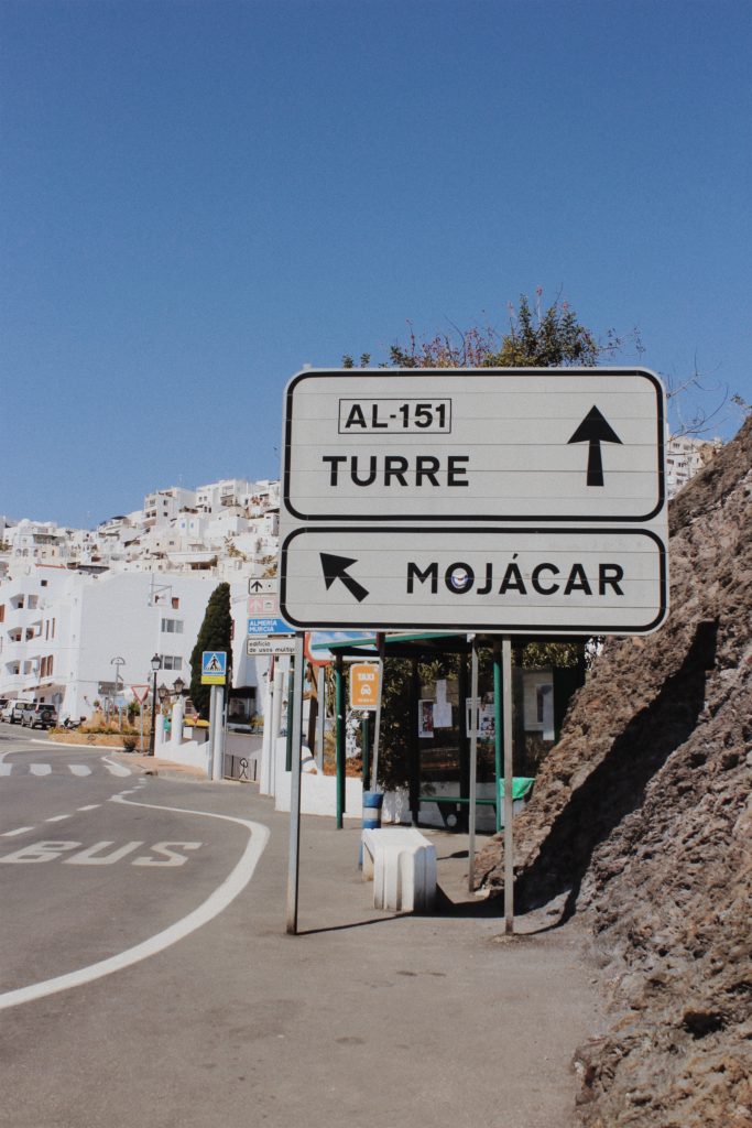
This pair of images also respond to The New Topographic but are from a different photo shoot. The image on the left depicts a sign showing the direction into Mojacar town. Road signs are often seen in photography work labelled The New Topographic because they appear as intrusions in the landscape being both bold and obnoxious. The image on the right depicts a close up view of the white washed houses that can be seen from a distance on the left hand image. The houses appear cluttered and demonstrate the impact people have on the landscape and how urban development is increasingly taking over.

For my second pair of A4 images, I will be displaying them onto white card. The white card is colour coordinated with the road sign and the moorish houses. I didn’t select black because it would create contrast and fail to produce the simplistic look that I’m after. Additionally black would clash with my images.

A4

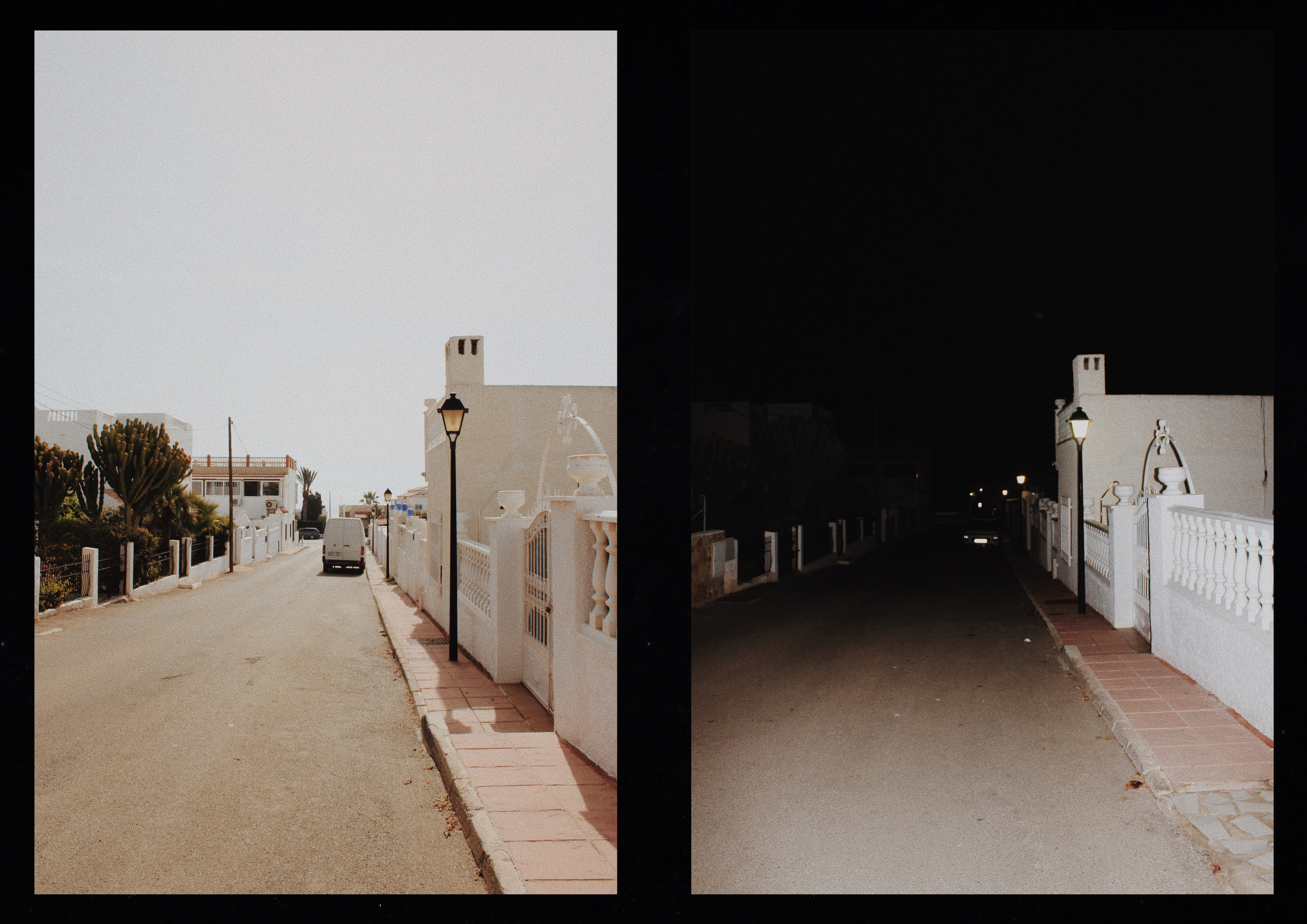
I wanted one of my final outcomes to show my response to Luke Fowler who creates two frame films which are juxtaposed yet linked to each other in pairs. This pair is different when it comes to the lighting but the same in composition and subject.

For my third pair of A4 images, I will also have a window frame to reveal the images. I decided to use black card to replicate Luke Fowlers style of two frame film. The black card will frame these two images together and replicate the photographers style.

A5

I have experimented in the project ‘journeys and pathways’ by taking pictures throughout the day every hour. Taking pictures of the tide every hour was one of my strongest outcomes because it shows the journey of the tide from high to low. The composition in each photo is the same and the viewer can see the gradual progression of change.

For my last set of images I decided to mount them onto white card to keep it simplistic and so the viewer can focus on the movement of the tides. Before mounting them onto the card I will stick each individual photo onto foam board so the images appear raised to capture the viewers attention.

Day & Night

For my second response to Luke Fowler, I decided to take pictures in Mojacar during the day as well as the night. When two images are exposed in one frame, the viewer is able to see the relationship between the juxtaposed photographs.

I captured images during the day under natural light and used flash photography for some of the night time shots when there wasn’t enough light source to capture the image. When returning to the same location during the night, I had to make sure that I was in the same postition to get the exact composition as the day time image.

On Photoshop I included a black frame that surrounds the pair of images to replicate Luke Fowler’s two-frame films. I edited the images on VSCO to create a film effect to replicate his photography style.

Evaluation

Overall, I think the side by side comparison of the two images in day and night was successful because you get to see the same location under different lighting. The black frame helps to link the two images together while the comparative images using different levels of lighting creates contrast to emphasise the juxtaposition.

In order to improve upon my technique, I would change the order of my photoshoot and capture the nocturnal images first of all. A number of my night time images weren’t clear due to inadequate lighting, blurring and the limited range of the flash. After capturing clear images at night it would be much easier to replicate the same composition during the daytime. Additionally I would ensure that I had a tripod available to maintain camera stability and reduce movement that made some of my photos blurry.