Category Archives: A04 Personal Responses / Final Outcomes

Filters

Author:
Category:

Print Presentation

When think about how to layout my images I thought that setting them as a window mount but there were some possible problems with it, firstly that the frames might distract from the images and that some are in portrait.

In the end the layout for the images that I decided upon is a grid with the layout being from light at the top to dark at the bottom. The two images that were lost would have gone at the bottom. The reason that I put the images on black card is because they are black and white images and the deep matte black and the glossy black and white on the images.

This presentation is made to twin with the negative slides and the light box as it is the same set of images and the negatives.

Final images

This is how they ended up and how I displayed them.

Analysis of images

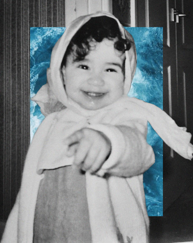
First 3 – these images are inspired by Katies joy crawford and her use of double exposure. the images give a sense of confusion and uncertainty and show the distress someone goes through while dealing with anxiety and depression. the images are lacking colour but not black and white so it gives a sense of dullness and emotionlessness. i the lighting is dim but still bright enough to be able to capture any visible facial expression. the mounting bring in rule of thirds with the leadings lines in the top image brining your eyeline down the piece. i used soft lighting to enhance the lack colour. These link to journeys and pathways as it is my experience of my journeys through various mental health struggles. I found it a good way to express my feelings. Rather than a physical journey, it is a mental journey of struggle.

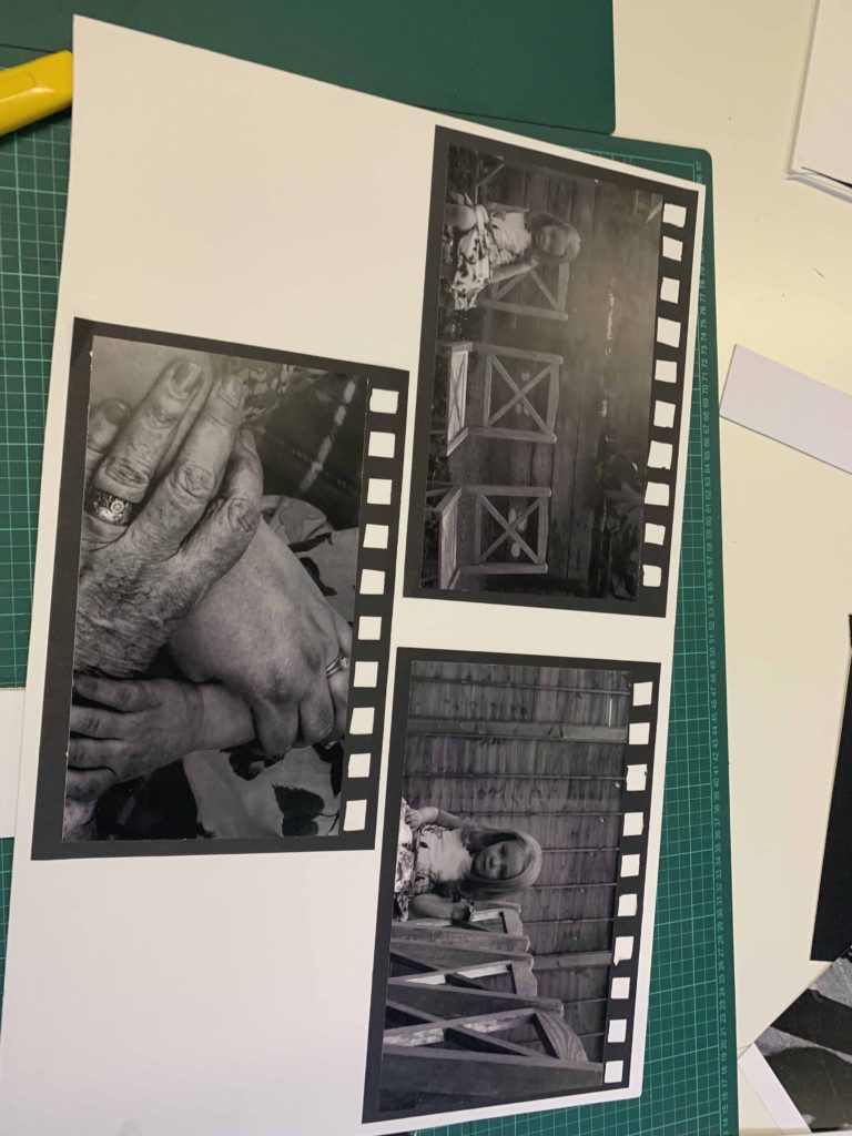
Second 3 – the images are inspired by Bill Volia’s still image of his film ‘birth life death. the framing is to resemble old film to bring in that resemblance to the video. the images are in black and white to give a moody look and to also bring out the shadows of the lines in the hands to distinguish between the others. and also give a dated look. i keep everything in focus but keep my subject in the centre. the textures of the hand accentuates the age which is what these series of images is focused. natural lighting. kept depth of field of the hands small so it seems dreamy. It links to journeys and pathways as the hands shows different generations and the different stages of life, starting with a young child, and progressing to adult/parent, then to elderly/grandparent. The child is alone in these images as it is meant to be she is the only one in her family left with other members sadly passing on. I wanted to keep the chairs empty and keep them in view to capture this emptiness. This is rather an existential view on the journey through life, and again, rather than being a physical journey, it is a metaphorical one.

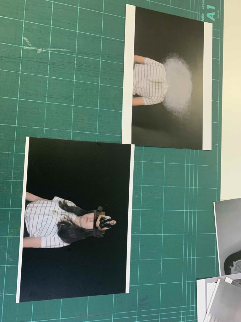
Third 2 – these images are also inspired by katie joy crawford, mainly her birdcage photo which i modelled the ‘box head’ and ‘clouded head’ directly after. i placed the clouded one at the top so its like head in the clouds which is what is feels like to deal with depression; a sense of disconnection. i used a black background to contrast the whites in the photograph. the textured cloud against the smooth background also shows the disjointed feeling depression gives you.the box is to represent how trapped you can feel inside your own mind dealing with these issues. i used harsh studio lighting to resemble the harshness of these thoughts. Again, this is represent my view on a journey through mental health and links to journeys and pathways through the idea of mental health journeys.

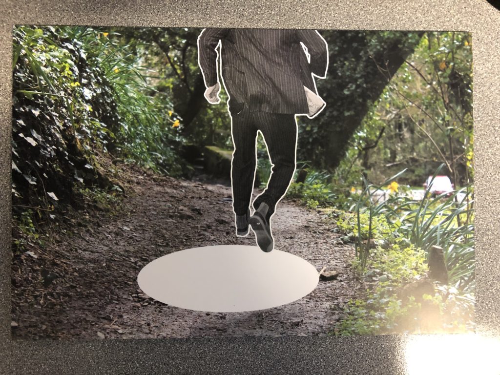
Final 2 – links to journeys and pathways as it is also embodying the ideas of mental health journey as well as a physical journey (walking along a path). She is stepping between the cracks as it links with the obsessive nature of OCD and also the childish superstition that stepping on cracks is bad luck. The blue boxes I edited in enhances the space she is stepping between and shows how he mind when in this place of mental state actually views this simple pathway.

Final Images displaying practices

I first placed out my images to see if my ideas I had out on paper would work. some of them, I realised wouldn’t, and others I ended up having better ideas once I played around with placing them. In the end I ended up using foam board to create different levels and I used black paper to create the look of old film slides. laying out the placement of photos and grouping them together really helped see what was effective and what wasn’t. I had so many more better ideas once I had the prints in front of me and was able to use my images more effectively.

Presenting The Negatives

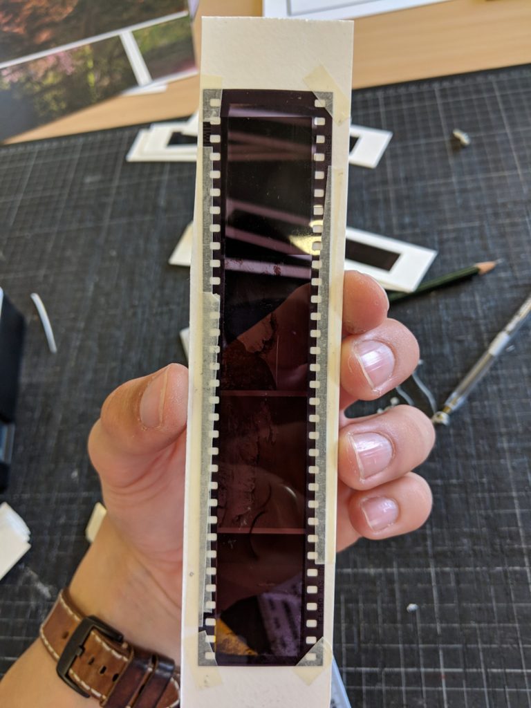
To present I wanted to show the film and push the fact that I was using film. I could have done this by printing the images and then saying that they were taken on film but using the slides also gives a certain aesthetic with the fact that the colours are inverted on the negative slides.
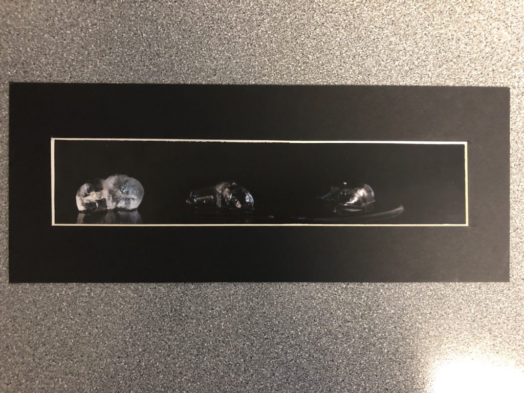
The way that I framed the negatives is by cutting a hollow rectangle out of some hard card and then sticking the negative to this in the order that they were taken, I then numbered the frames so that they could be easily kept in order. Finally, I made a small box from foam to contain the 6 sides that are not on the light box.

Final Presentation

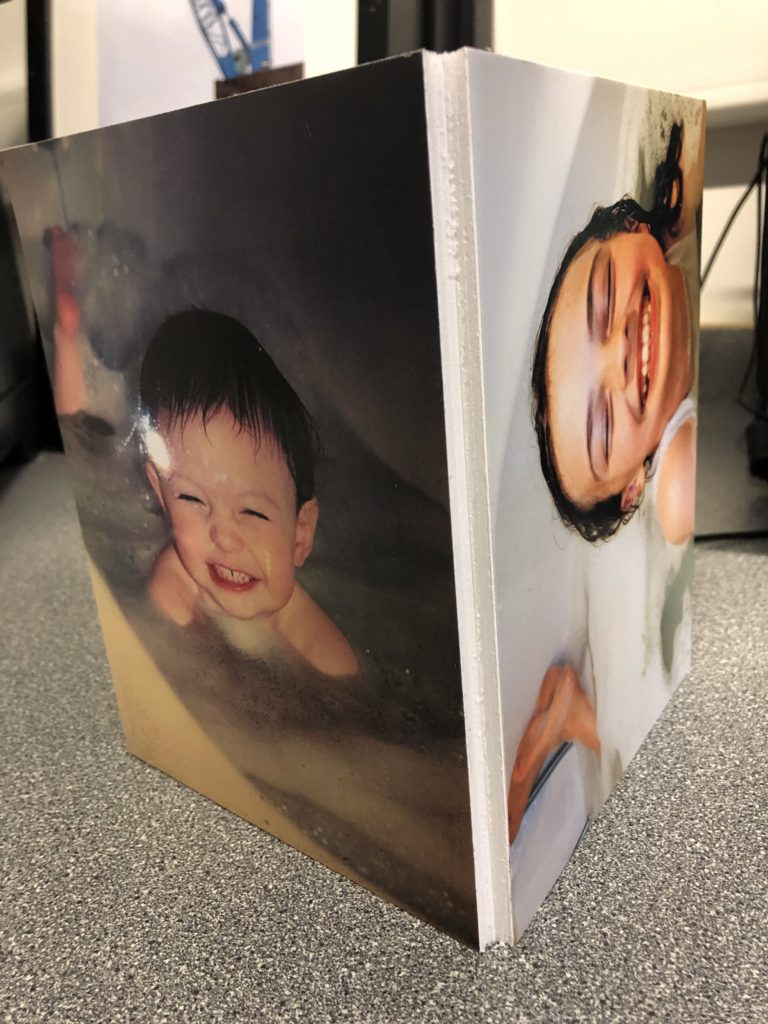
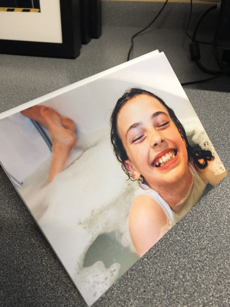
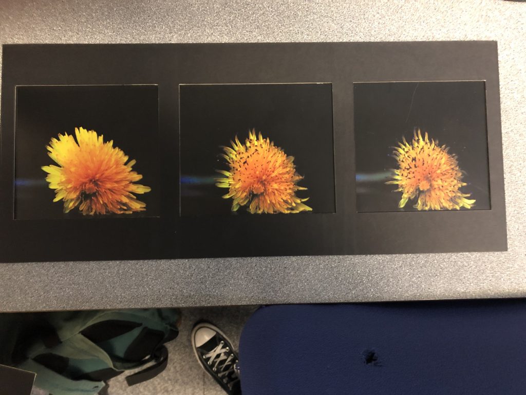
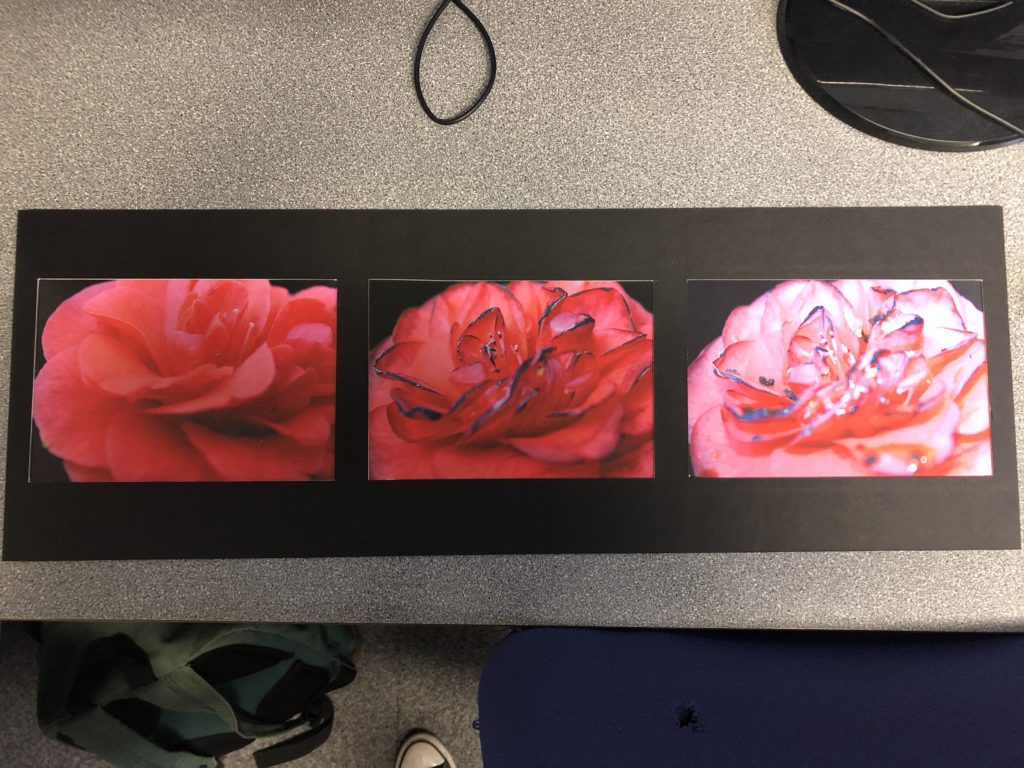
I have decided that I will first back my images with foam board and present them on a piece of black card in 3 different configurations. This will leave 2 images that I liked however didn’t fit with the image sets.

I chose the images to group together based on color palette, composition as well as the tonal balance of the images.

I chose not to include this image in the 3 compositions since I found it too dissimilar from the other images. I also didn’t want to change the orientation of the piece as I thought it would take away from the strong shapes in the image.

I found this image too similar to one of my A3 prints to include in the compositions. It also wouldn’t fit on the black card in my original compositions. This was another image in which i didn’t want to change the orientation.

Editing and Selecting Final Images

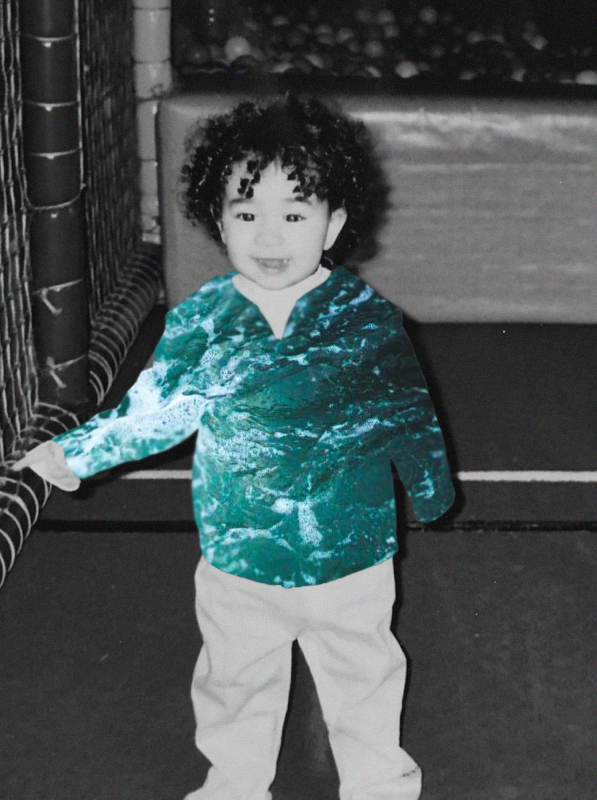
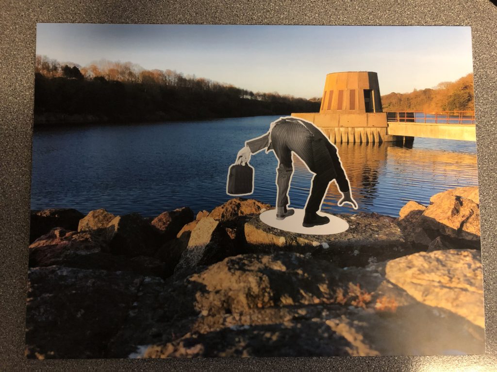
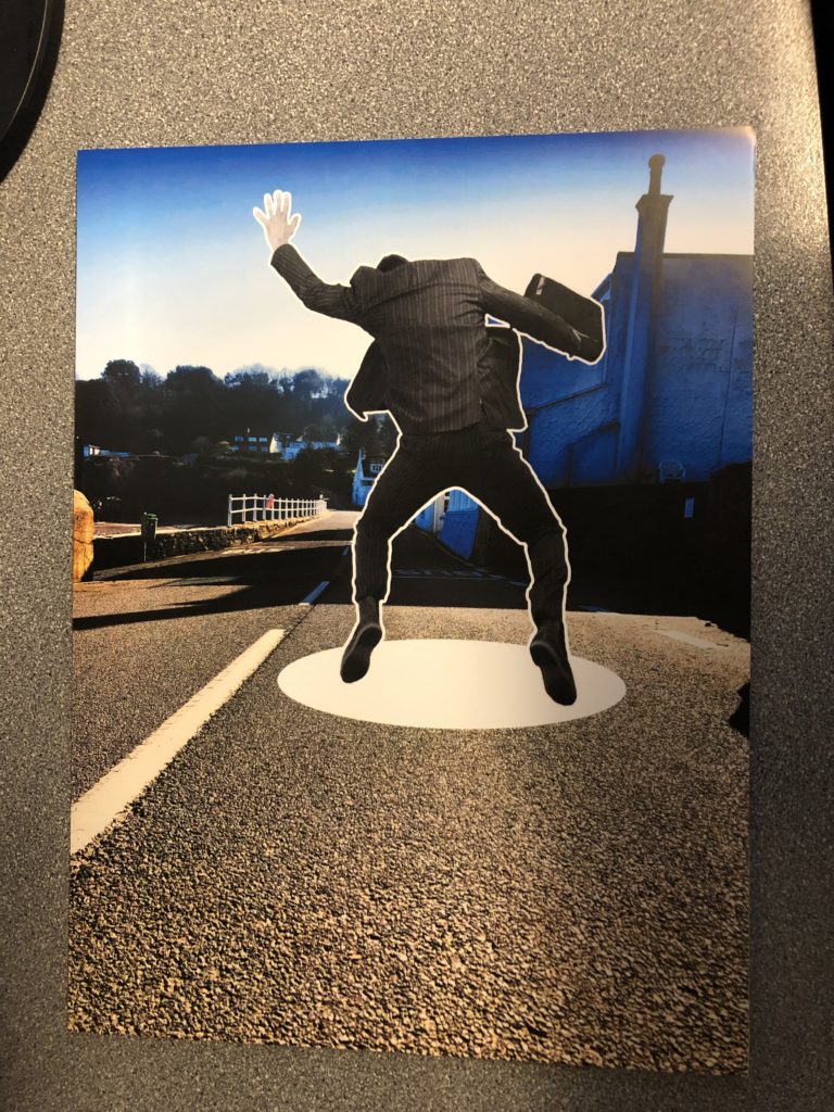
For my final images, I wanted to play around with a few styles of photo montage, so I edited a photo around two times until I got the final image.

Final Selection:

Edits that didn’t make it:

These are some edits of photos that could of potentially made it, but I preferred the other photos more. I have also included the editing process of these images.

Editing Process:

I placed the beach photo on top of studio photo
Then I used the polygon lasso tool to cut out this shape into the beach photo
I then used the eraser tool to clean up the sides
I then used the paint tool to give it some more shadow and depth
I then duplicated the layer and placed it on the other eye
Final Outcome

I do like this photo, but I think it is too simple and I prefer the other one more.

Overall Project Evaluation

In the first couple of days of the project I struggled to generate clear ideas of where I wanted to take my project, initially in the begining the first ideas that were coming to my mind surrounded looking at buildings from new ones to old ones and also portraits of aging and photographing that journey of aging in both people and buildings howver after I had done some brainstorming and thinking I came across the idea of looking into the idea of the journey of adverts throughout the past couple of hundred years, (the final time span being from 1939-2016) specifically looking at women in adverts, this interested me as I thought it was different and is something that I enjoyed the sound of that I thought could be quite fun.

I started out by looking into Cindy Sherman and how she works and what ideas and photographs she produces as she is an artist who generates images questioning the representations and ideas of women and ideals, I feel for me Sherman was a very useful artist to have looked into as it helped me to generate ideas easily. From looking in depth at Cindy Sherman I decided to start recreating images some more famous than others from adverts across a 100 year time span, the first couple of shoots worked well and gradually throughout the project I developed more and came to a collection of 8. While developing these photo-shoots I also researched into feminist movements such as Feminist Art and the Guerrilla Girls as well as Kourtney Roy and again Cindy Sherman, from researching these I found the wide in-depth thoughts that go into challenging feminism and looking at how it had developed. This made me want to produce two very different ads from the same era (1993 and 1994) this allowed me to show not only a difference of the journey across decades but also across a 1 year time span which seemed interesting to me the drastically different way that they were being represented.

Overall I am happy with the way that my final images developed and finished not only as individual prints but as well on the mount and foam board, I feel I have been able to explore on a bit of a different take on the title of journeys and pathways and have explored something I enjoy. I think my final outcomes have been successful and work together well in the series, I think that I have been able to show my ideas well and continually expressed my thoughts at various times and reinforced my ideas around why I was generating the images and recreations that I was. I would have like to generate another outcome with my unused image had I had more time to develop the extra image needed however I still think that it was a useful experiment and recreation at the begining of the project to be able to start myself off into my ideas. I am happy with the way that this project allowed me to develop more of my editing skills which I feel have got better as I have been able to develop them, however I don’t feel I was able to develop my camera skills as much as generally across the project I was working in the studio with artificial lights which stayed roughly the same throughout all of my photo-shoots.

Overall I am happy with the final images that I was able to produce and how I came to my final images during the project as a whole and I feel it was quite successful.

Final Display

Below are my mounted and displayed final pieces for the theme “Journey’s and Pathway’s”. I am very happy with how these displays turned out and I was able to capture exactly what I wanted to present.

Final Display 1
Final Display 2
Final Display 3

Gallery Display:

Below is what my photos would look like displayed in a gallery –

Overall I am very happy with how the displays turned out because they look very effective and well made.

Final Images in Gallery