

For my third sets of edits I wanted to showcase my ability to use different elements of photoshop in order to showcase further development into the importance of bunkers during Jersey’s journey through the second world war. Due to my top outcomes already looking somewhat distorted I wanted to keep the edits simple but still make them further distorted. My Initial ideas of edits are:

For my first experimentation I wanted to use the acetate as an image which was taken back in the war and the bunker behind it as an image taken from now, which begins to present Jersey’s Journey through WW2. The image itself looks as if the acetate is being peeled back to reveal the idea that the bunkers have been isolated since the war and nothing much has changed to them, which successfully allows the aim of the edit to be showcased. To make this idea seem more realistic I used the quick selection tool and selected the acetate part of the image, once selected I pressed ctrl + u and lowered the saturation so the acetate was in black and white and the background was in colour. Then I adjusted the levels and curves to allow detail to be shown within the edit. I believe that this is my top outcome from the photoshoot as it shows clear camera skills such as depth of field, focus, ISO and aperture. It clearly presents the formal elements of texture, shape and space due to the use of camera settings along side the editing use. Moreover, it showcases my ability to use different tool within photoshop in order to manipulate and image to create a certain effect. I really like the way the photograph has turned out as it is visually stimulating to look at and allows Jersey’s journey through WW2 to be presented.
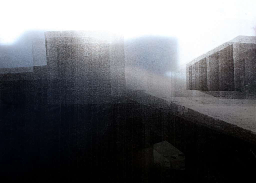
In my second edit I used an image where the acetate was held up to the camera and the shadows of the bunker is found in the background of the image. Already, this image is very distorted so to add to the effect I decided to add a blur to the image which creates texture, almost as if I have raised the ISO on my camera to create noise. The idea behind this is to make my viewers rethink the way the bunkers look and realise the use of them during the second world war, which allows the journey of the subject to start to be presented within the viewers head. I believe that this image is successful as it allows contextual and conceptual, how and why the bunkers where used in the war (presented in a unpleasant way due to the blur and acetate and shadows) and how they have been left alone factors to easily be communicated to the receiver due to the distortion created. This image is also successful as it shows my ability to think creatively and critically towards what I am wanting to capture as well as my camera and photo manipulation techniques.
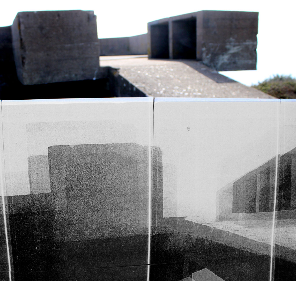
This next edit is not as successful as the others, needless to say I have decided to keep it in order to showcase my exploration and thought process. I selected this image as it is of the bunker and the massive image of the same bunker that I printed off. The idea was to showcase the size of how large the bunker is, which would metaphorically show how big of a role the bunkers had within the second world war. However, I do not believe that this idea is presented through the edit. I also used a colour splash to create this edit, having half in colour and half in black and white, same steps as the first edit. The final outcome is not great as the edit is not visually stimulating to look at, which is due to the image itself. The way it was taken is not the best as it is clear that I have used the wrong camera settings. In my opinion the conceptual factor is still slightly being presented, but the technical, visual and contextual aspects are not as strong which is making this edit less successful.

The idea behind this edit was to make the acetate blend into the sky, making it seem like a past memory, as I purposefully made the image over exposed. To do this I made this photograph naturally lighter by adjusting the levels and curves, I also cropped the image to take away the bottom of the image, which slightly distracted the viewers eyes. Although, I do like the way it looks I believe that it could have been more successful, there is something to it which is missing or needs changing which is making me not like the edit that much. I think it is due to it looking too artificial which takes away a strong link to the contextual factor. The edit clearly presents the journey of Jersey through WW2 and allows the conceptual factors to be presented, I think it is again the technical element which is lowering the successfulness of the image. Needless to say, I have been able to show my creativity to produce a new concept to present the same ideology.
Evaluation:
To evaluate I believe that I have been able to show my ability to think creatively to produce outcomes to a follow up photoshoot to an idea. I have been able to show clear further exploration to an initial idea and have been able to create links between the images and Jersey’s Journey through the second world war. The images themselves, showcase my ability to adjust and use camera settings to create different effects, and show that I have carefully thought out how and why I am capturing an image in that way. Furthermore, I have been able to show my ability to use photoshop to manipulate my images, using the different tool provided in order to create a stronger link between my photographs and the theme of Jersey’s journey through the second world war. Although, these edits are not my strongest set of edits produced I still believe that they have some elements which makes them strong, but they show my exploration to this theme. If I was to further manipulate these images I would look at printing out an image of a bunker in colour, then using the acetate I would place it over the top, which creates a distortion but also presents then VS now. This would be further development to the first edit and would show Jersey’s journey through WW2. Although I have enjoyed looking at Jersey’s bunkers and there importance I feel as if I have explored them in enough detail, and if I was to do further exploration it would be to much and the images would not be ‘as good’ as the images above and the first photoshoot.
For my response, I will be going around town and taking photos that are out of the blue and unique. Most of these photos will be in the spur of the moment, so I don’t know what the outcome of these photos will be until I take them.


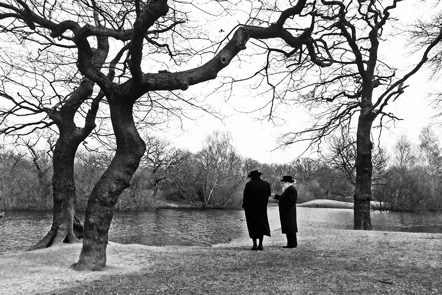

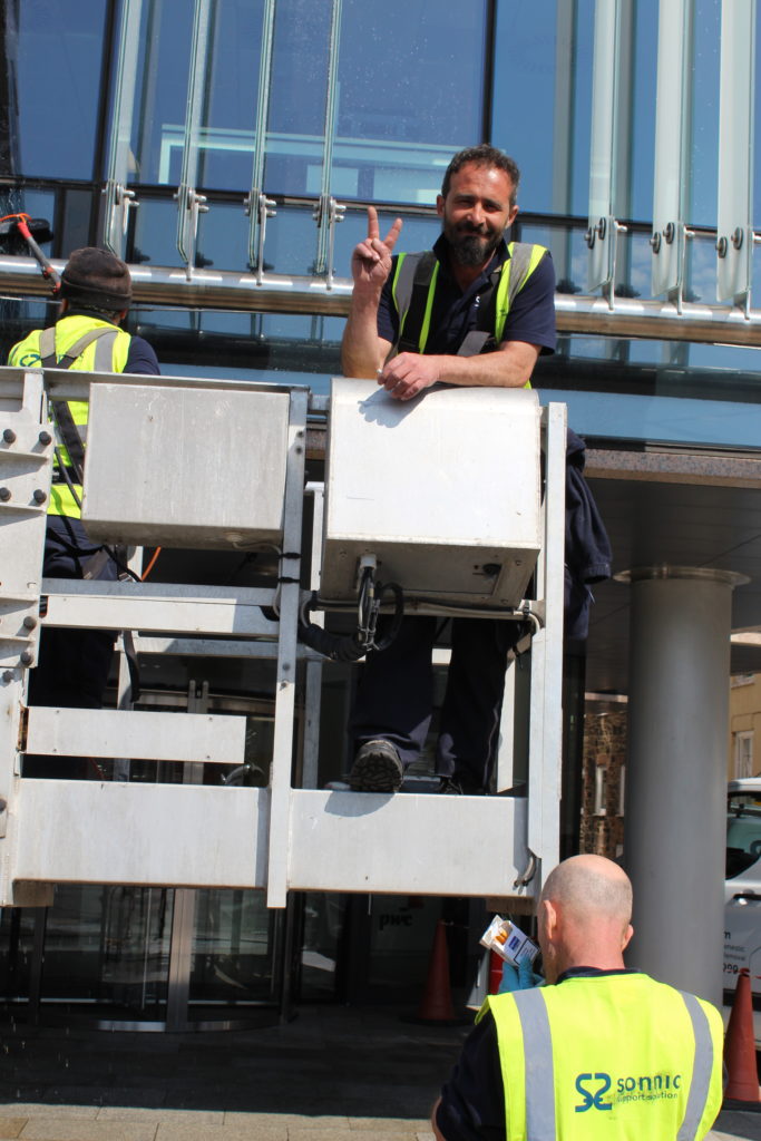
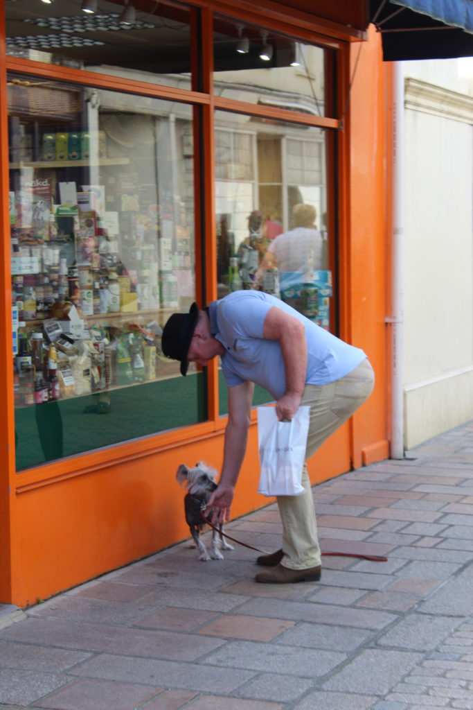
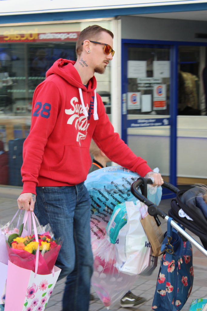
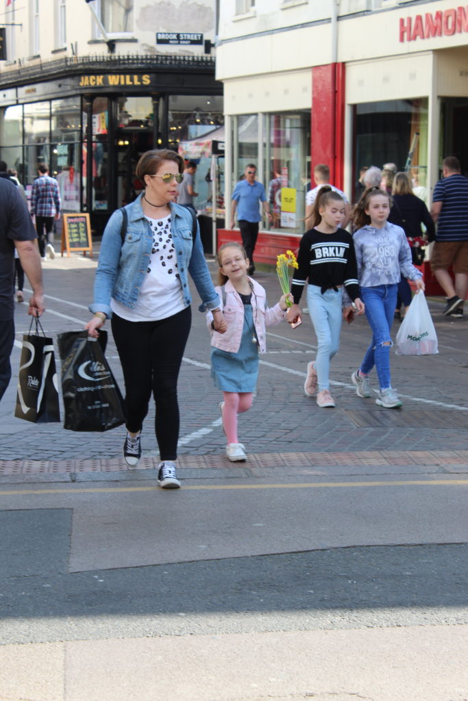
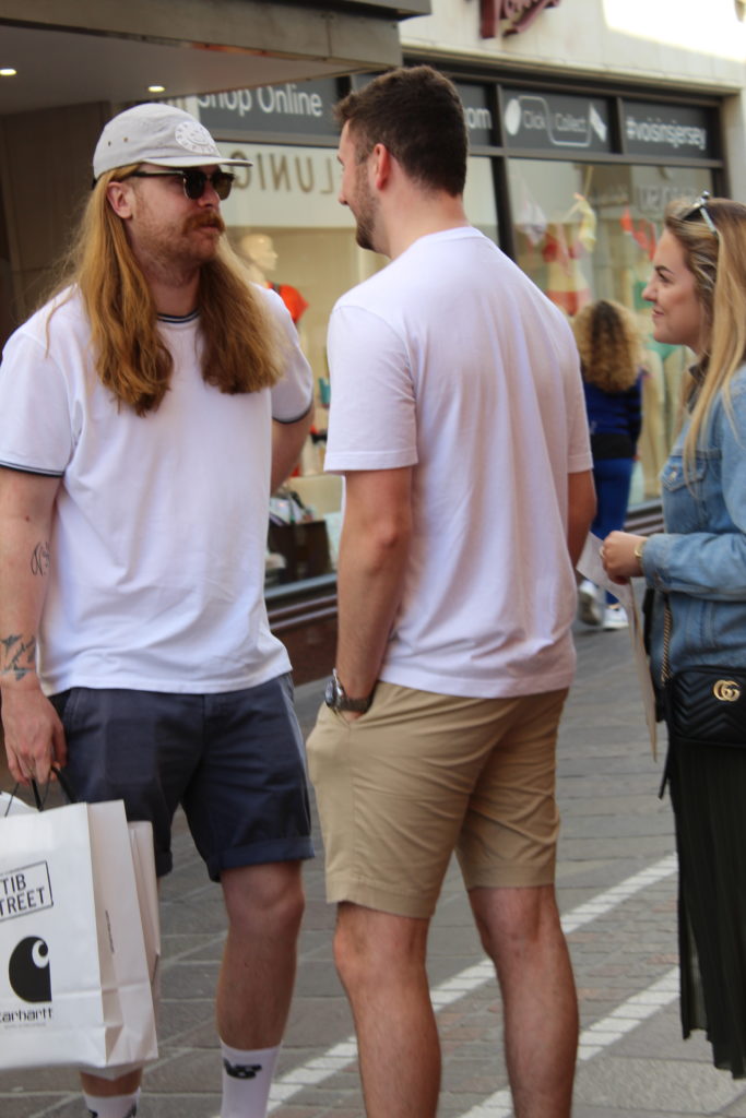
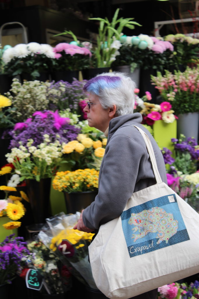
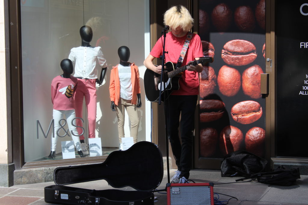
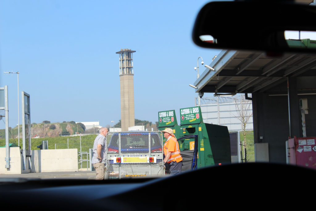
I am really happy with how these photos turned out, but I think if I edited these photos they would look much better.
I edited these images on photo shop
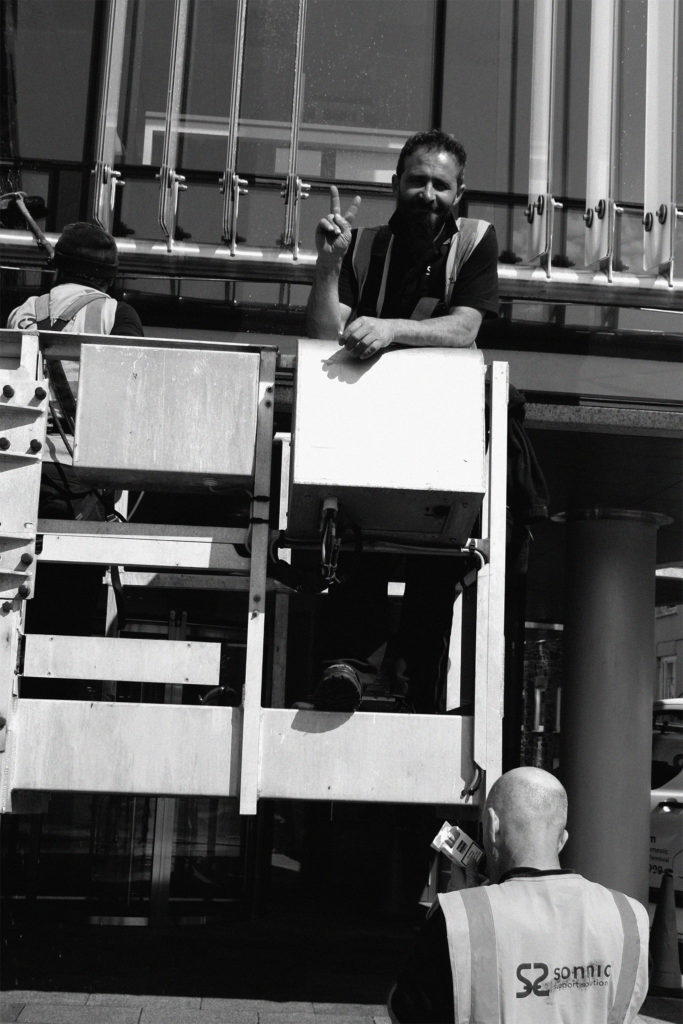
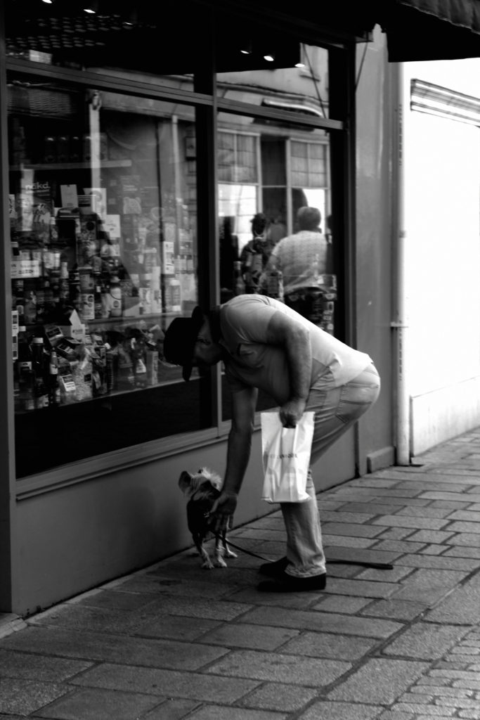
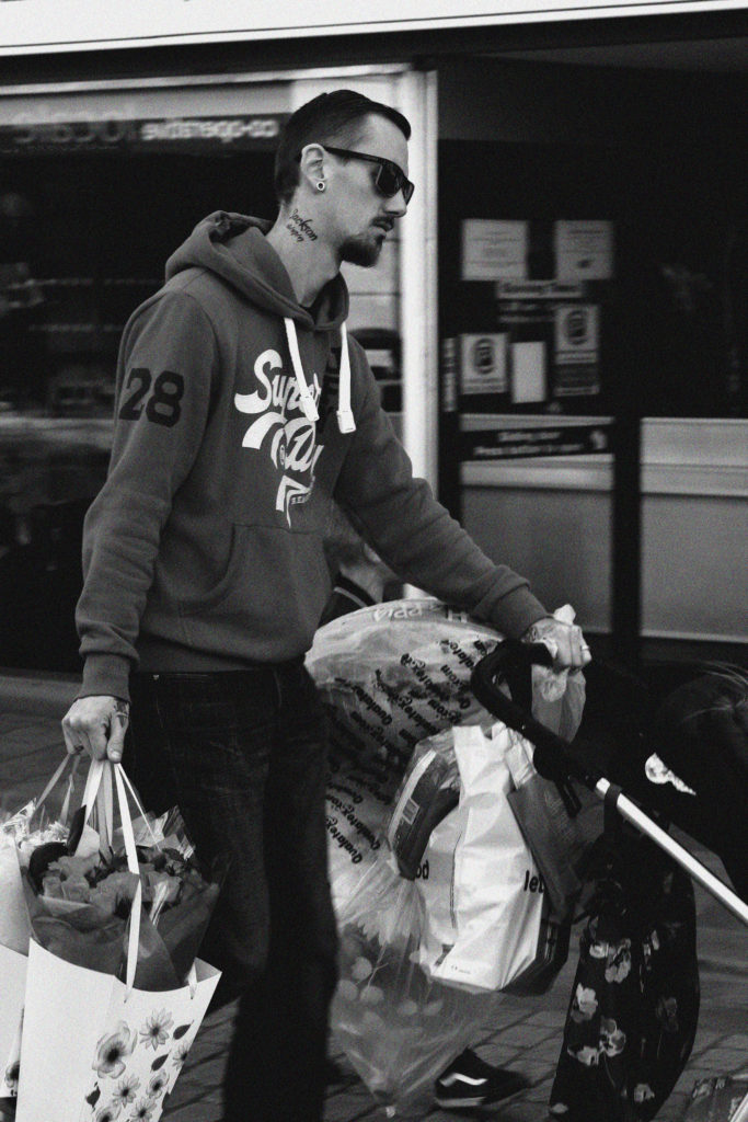
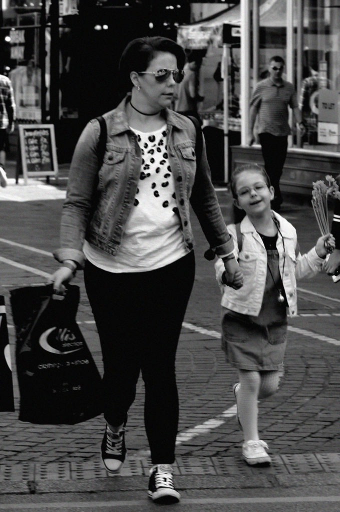
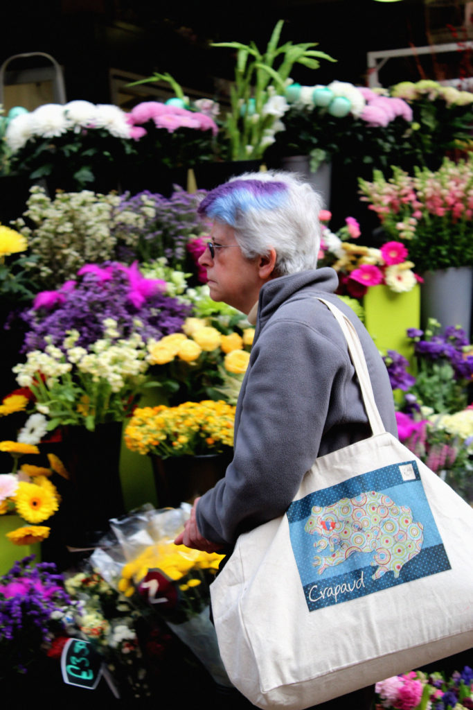
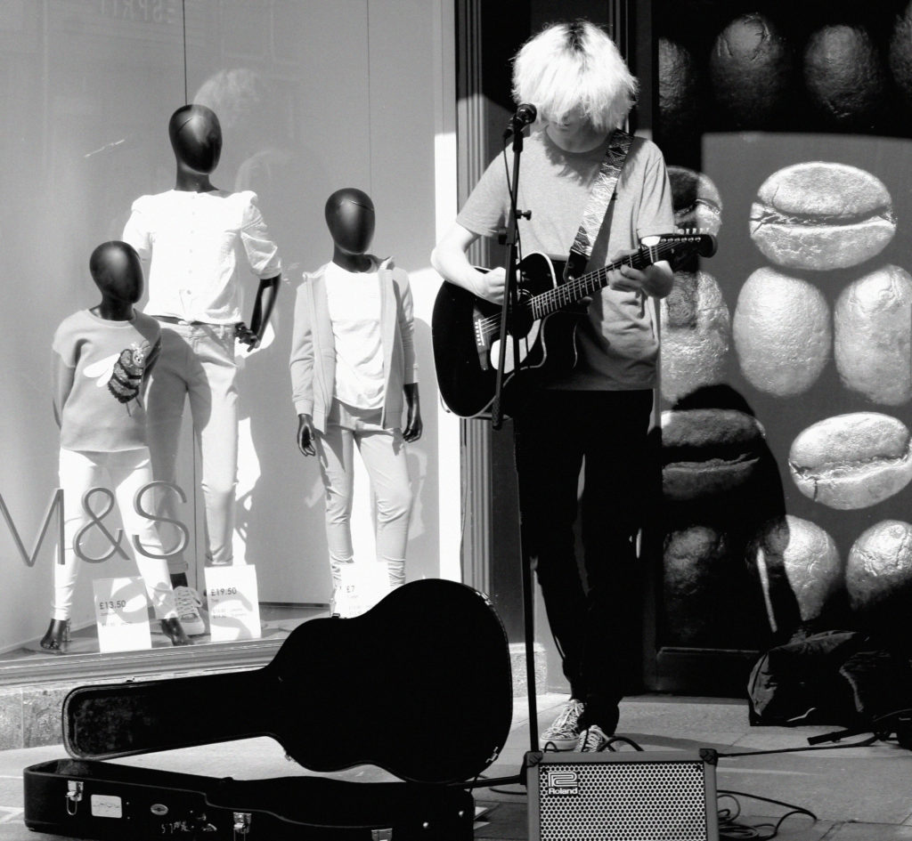
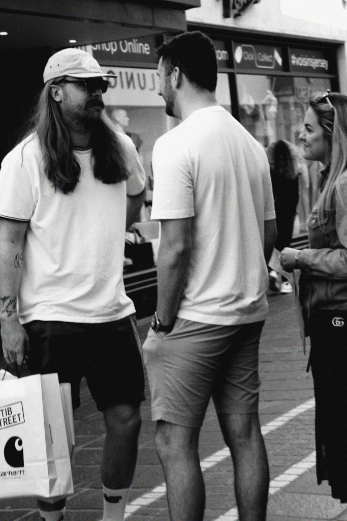
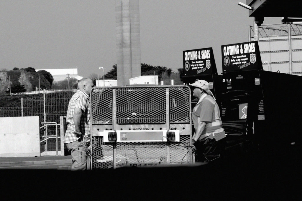
Overall, I am really happy with how these photos turned out and I think I captured Damian’s style really well. I really like this style of editing and I think I will utilise it again.
Planning:
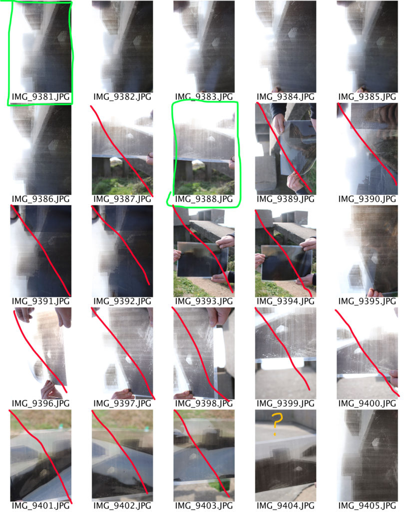
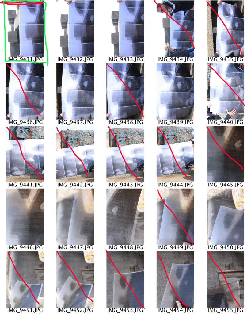
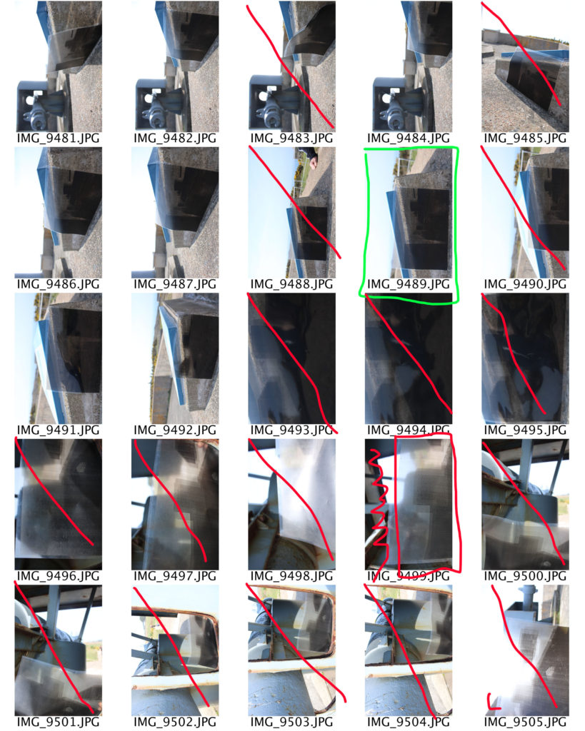
In this photo shoot I intended to go back to the bunkers and recapture some of my successful images using my images which have been printed out on acetate, A4 paper and and 8 A3 sheets of paper to build up a massive image of the bunker. Doing this allowed me to show further exploration into the bunker idea, as I felt that this idea allowed me to come up with multiple ideas and I wanted to be able to look at different ways of capturing the bunker. The idea was to hold the acetate images up to the lense in order to create a distorted image, I will also hold the acetate next to the bunkers and in different positions around the bunkers, I will also hold the 8 A3 images up to showcase the size comparison and wanted to emphasis how isolated the bunkers have been and to show how they change overtime. Moreover, I believe conducting this photo shoot will help to showcase Jersey’s journey through the second world war. I intend to use my DSLR canon camera with manual settings, which will allow me to control my white balance, ISO, shutter speed, focus and aperture. The shutter speed I will be using should be quick as I am not wanting to have an intended blur, I will also have the ISO low so there is no noise created. However, at some points I do intended to experiment with the ISO to really emphasis the idea that the bunkers have been isolated and almost make it seem like the images where taken during the war. I will be using artificial lighting, as the bunkers are outdoors and it will allows the images to seem more naturalistic and will portray my intended effect more successfully. At the moment I am unsure what I will do when it comes to editing the images, however I believe that ideas will come to me and allow me to show experimentation with my images.
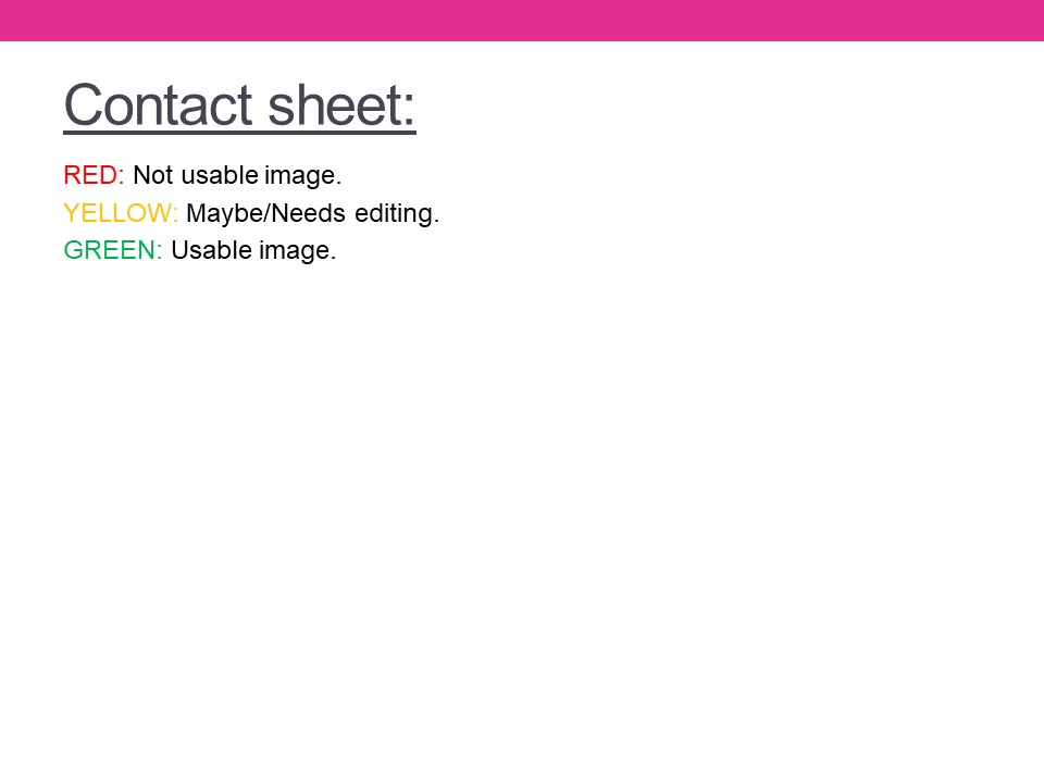
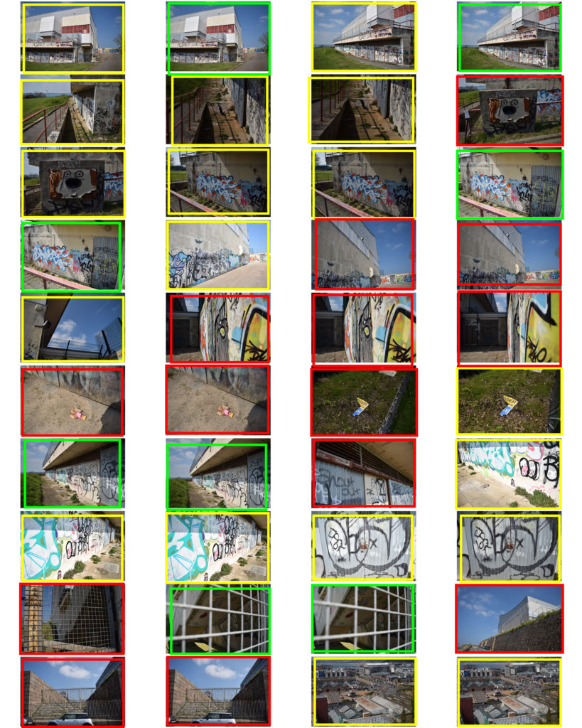
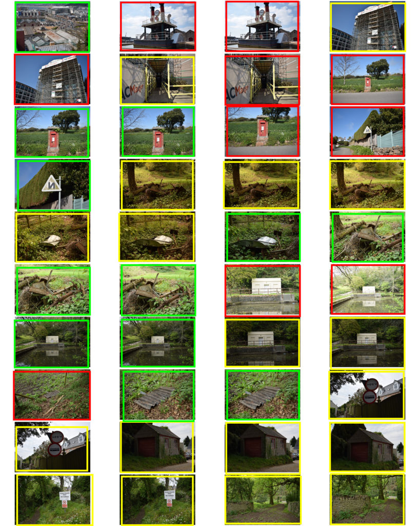
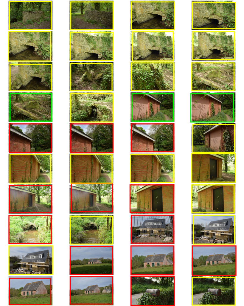
Contact Sheets:



Evaluation:
To evaluate this shoot I believe that I have been able to produce some successful outcomes which showcases the bunkers as being isolated and also shows how they where used during Jersey’s Journey through the second world war. I believe the idea itself had a lot of thought and showed clear experimentation, but was harder to execute then I originally thought it would. One issue was that it was highly windy so I had to use assistance to hold up the images next to the bunkers so it did not blow away, which means that I will have to crop a lot of the images. Moreover, the acetate was not as see through as I thought it would so it only produced shadows of the bunker in the background when I held it up to the lens of the camera. Although this was an issue, it also helped to produce a strong outcome as it created abstract looking images which I believed presented the isolation of the bunkers in a new and different way. Another issue was that it was hard to hold the image and adjust the camera settings, so some of the images taken are over exposed, or the picture within the image is moving which has created a blur. Needless to say I have managed to collect some successful outcomes, which has allowed me to explore the bunkers in a new way to showcase there importance during Jersey’s second world war. In addition, I believe the good images show my ability to adjust and confidently use different camera settings to create different affects as well as showing my creativity towards a simplistic idea and subject.
Action Plan:
As an action plan I am still unsure how I want to edit the images, but I am sure when I start to manipulate the images I will be able to think creatively and produce strong outcomes from the photo shoot. I intend to level and adjust the curves, I want to experiment with the different types of blurs, use of layers and potentially using a color splash in order to showcase these images in to present how they are isolated and the bunkers importance during the second world war.
As a continuation of my experimental photo shoot to collect images which I could use in the future, and to gain ideas of what I could focus on for my final piece, I took a few more images which I believe could relate to the theme of Journeys and Pathways.


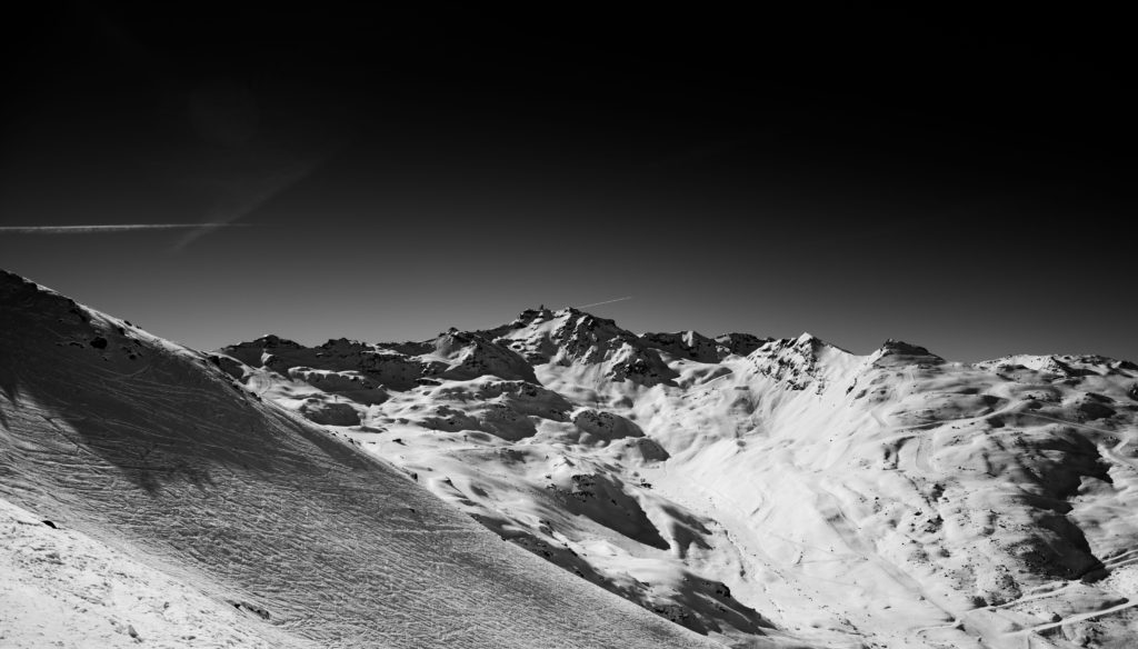
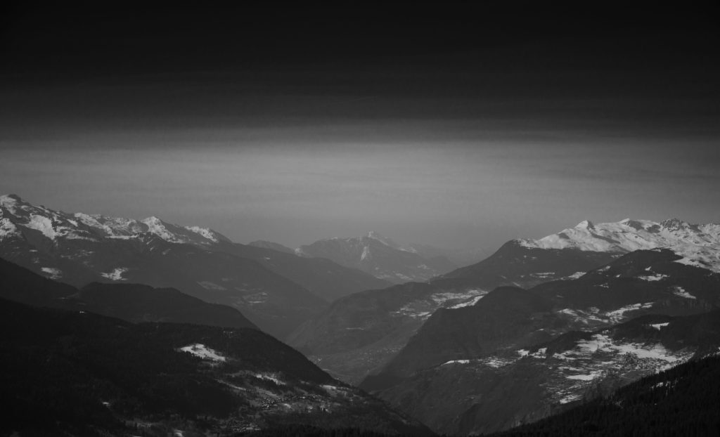
When editing the images in light room I converted them first to black and white then changed the exposure, shadows, contrast etc. until I had an image that had the desired level of contrast and made sure that I was using Adams’ work as a reference the whole time. My aim wasn’t and isn’t to make images that could be his but to use his methods and his themes to try and show the landscapes that I know and love as they are changing and when I saw the way that Adams did it felt that that it was a good way to do it felt that that it was a good way to do it. In the edit I decided to add a gradient filter to the top of some of the images to draw attention away from the sky as it is dead space in these images so the filter brings it back down to the actual landscape, the filter does this without completely removing the sky from the image.
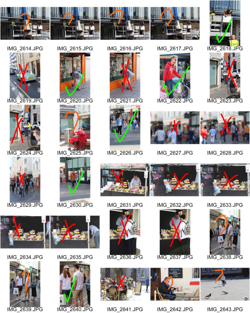
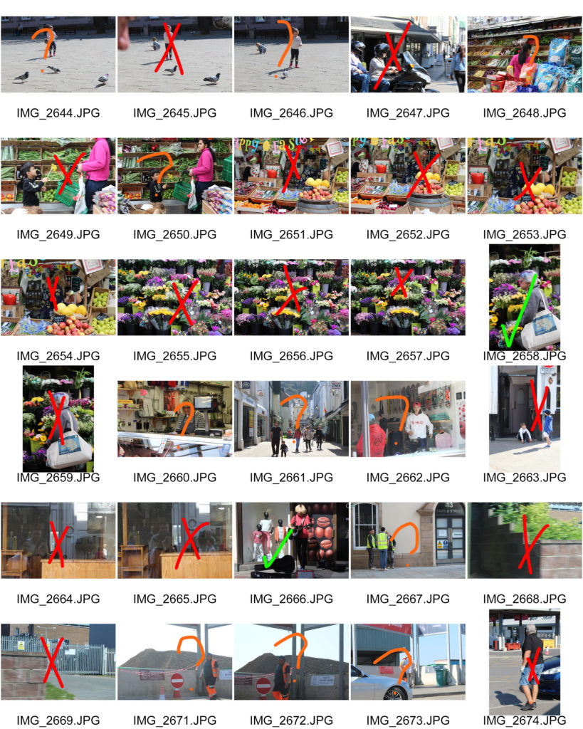
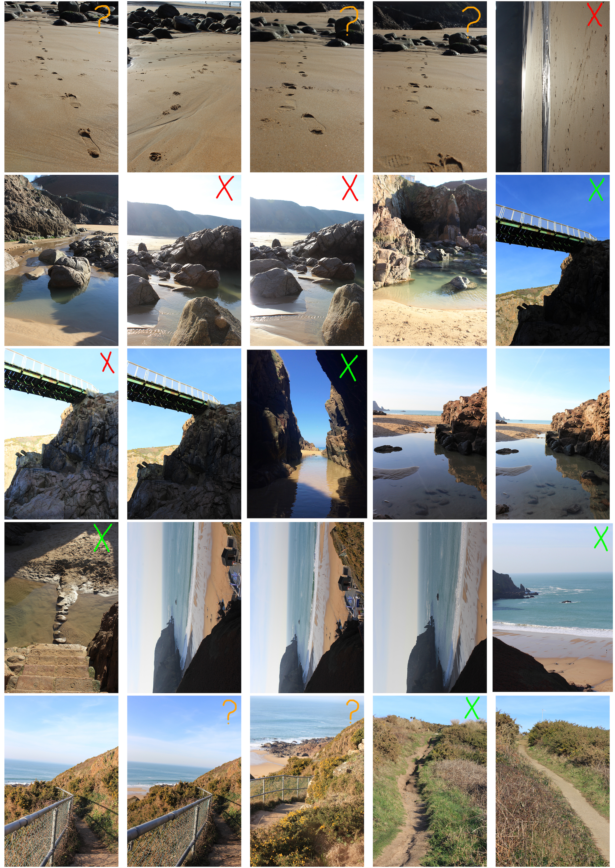
When shooting I only took a few images as there were limited views that I thought were suitable for me to link to Ansel Adams. The things marked in red either need to be fixed or aren’t good and the orange boxes are where the images need to be cropped.
All of my images were taken with a high aperture, the reason for this is so that as much of the image is sharp and in focus at once. This was done because Ansel was a large believer of using high apertures so the true nature of the image is shown and that there was nothing that couldn’t clearly be seen in the image.

All edits and final images I do will be making the images into black and white because all of Adams work was in black and white and it is easier to make the images imposing and bold and it is easier to make the parts I want to stand out, stand out.
When I went to take my photos I made sure to wait for a day when it wasn’t snowing and the sun was right. I also timed my photos so that the sun was always behind or above me when I was taking the photos so that there was no sun in the frame of the photos because at this altitude the sun is very powerful and the snow makes it stronger and brighter. Ideally I would have taken the photos when there was a bit of cloud in the sky to add some drama so the lighting but there wasn’t a day where it was possible.
To respond to Luke Fowler’s photography work, I have exposed two images on one frame. I have them side by side to explore the relationship between two juxtaposed images. The images that I paired will seem unrelated in terms of subject and viewpoint, but there is a link that connects them together. I also included a black frame that surrounds the two images to replicate his two-frame films. Like Luke Fowler, I wanted to create a story between two still images so viewers can explore the visual dialogue between them.
I went to Plémont Beach to capture images that link to my theme journeys and pathways. Once I had taken several images on my camera, I downloaded them onto my phone so I could edit them with VSCO. I used this editing app to create a film effect on my images to replicate Luke Fowler’s photography style. I did this by altering the exposure, contrast, saturation and grain as well as applying the same filter to each pair. Once all the images had been edited, I joined the pairs on Photoshop with a black background which created a frame around the images.


This pair shows juxtaposition through calm vs dramatic. The image to the left depicts a calm scenery since the cave at low tide has a pool of still water. A cave is an enclosed area and creates a sense of security. However, the image to the right shows a view facing outwards towards the sea where you can see the dramatic waves crashing against the coastline.
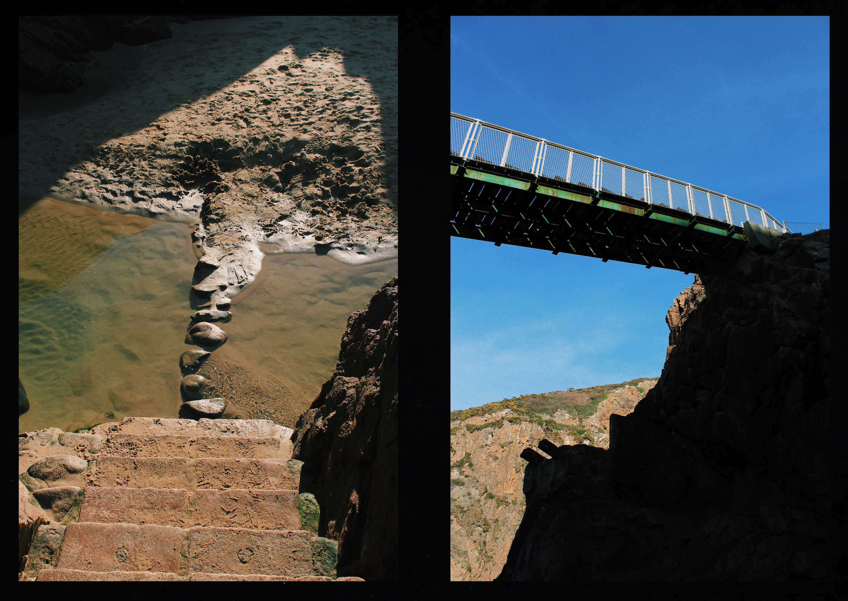
These two images depict a bridge. However, the bridge on the left is natural since it has been made by cobbles whereas the bridge on the right is man made and resistant. The image on the left captured the bridge from above making it seems small and insignificant unlike the bridge on the right which has been captured facing upwards, emphasising the fact that it is more powerful.

This pair of images show the difference between natural and manmade pathways. The pathway on the left has been formed by people damaging the vegetation so water can erode the soil and create a rough footpath. The pathway on the right image has been constructed by man. They link together since they are both pathways but created in different ways. Both pathways are steep, heading upwards in the same direction and have been captured in a similar composition.
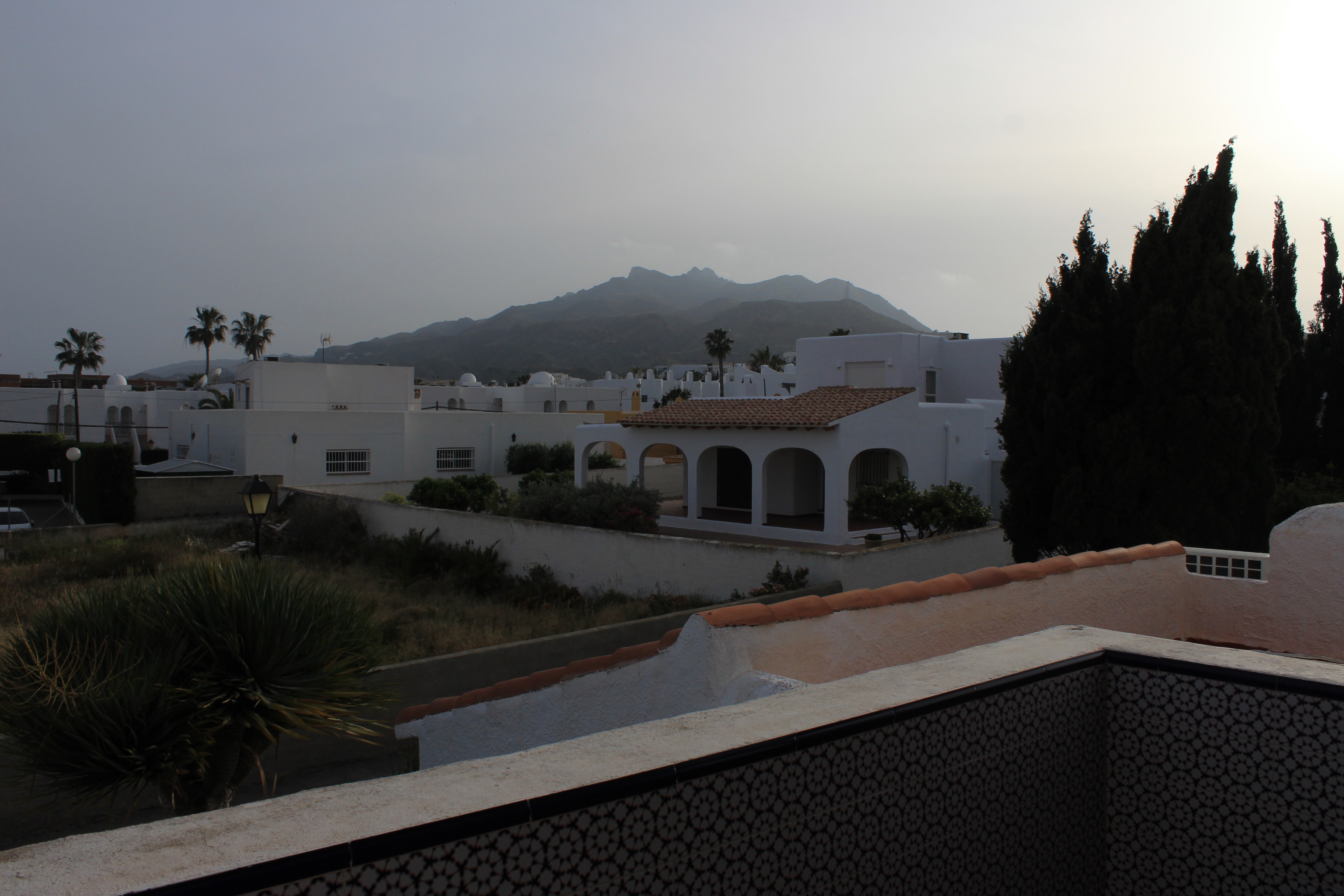
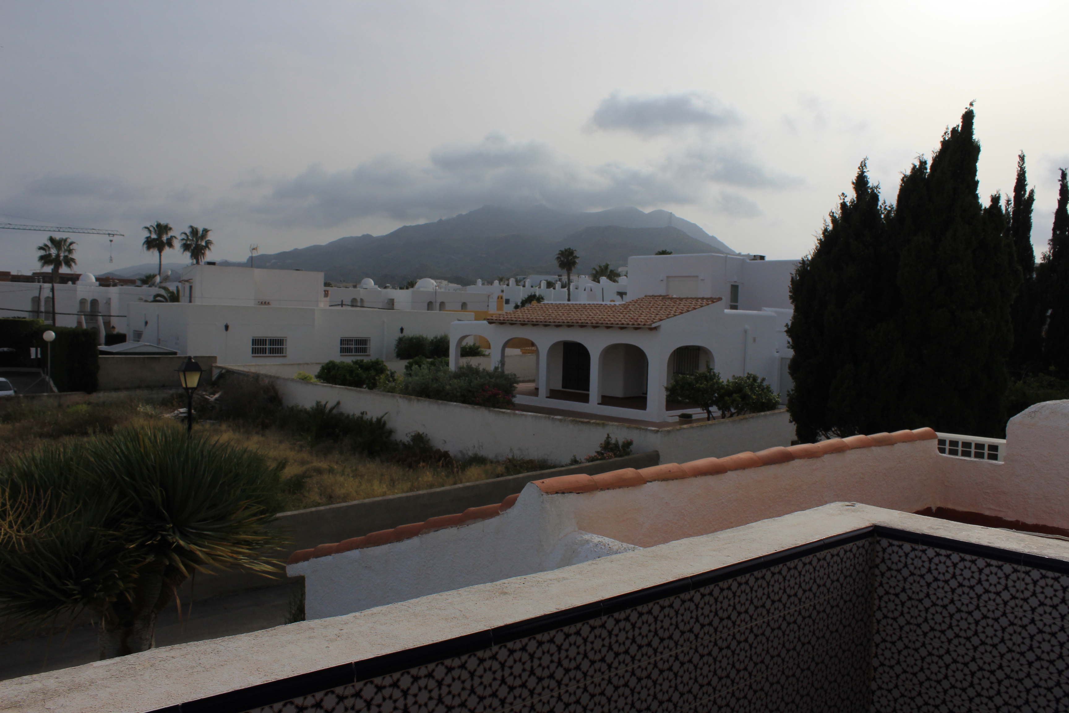
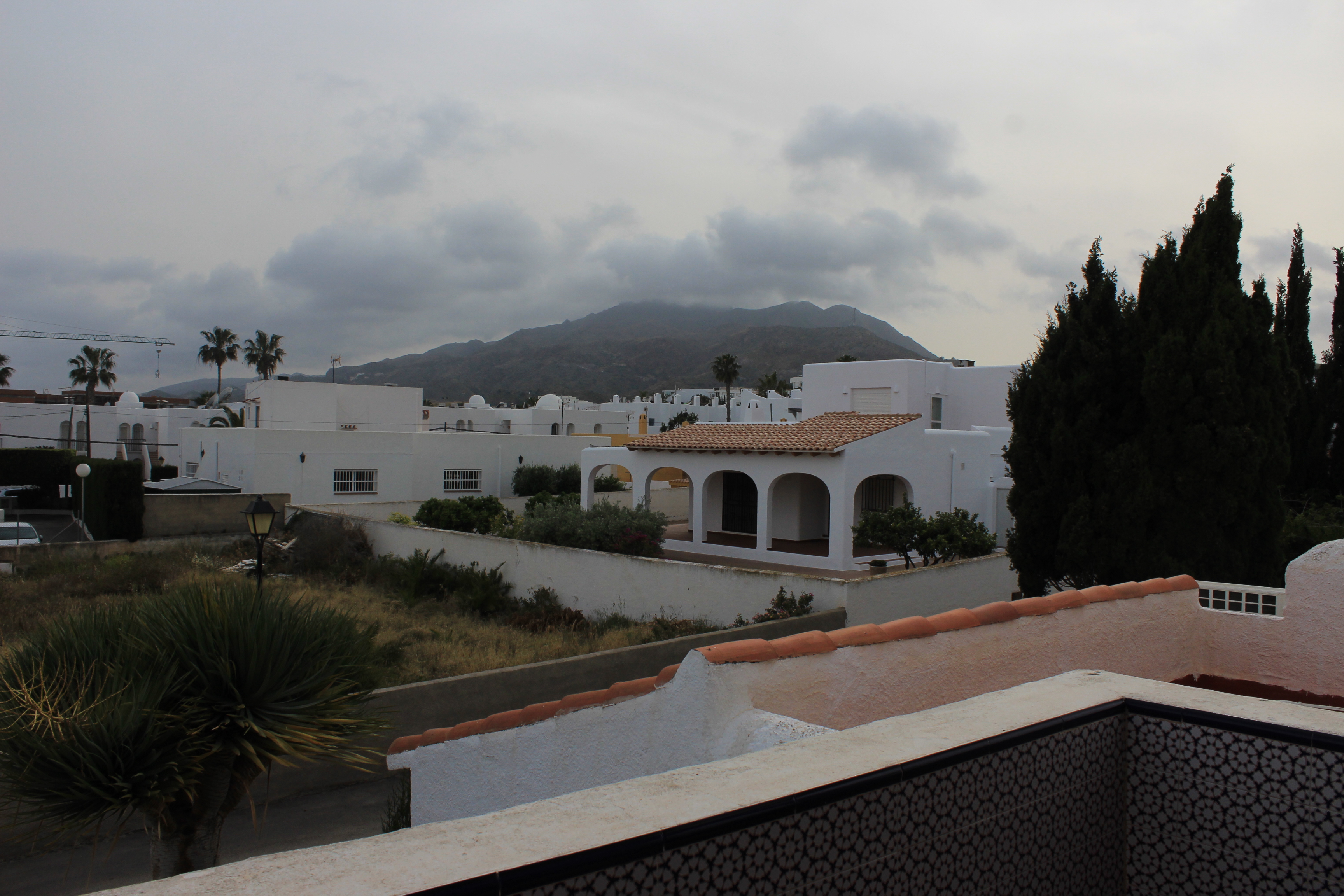
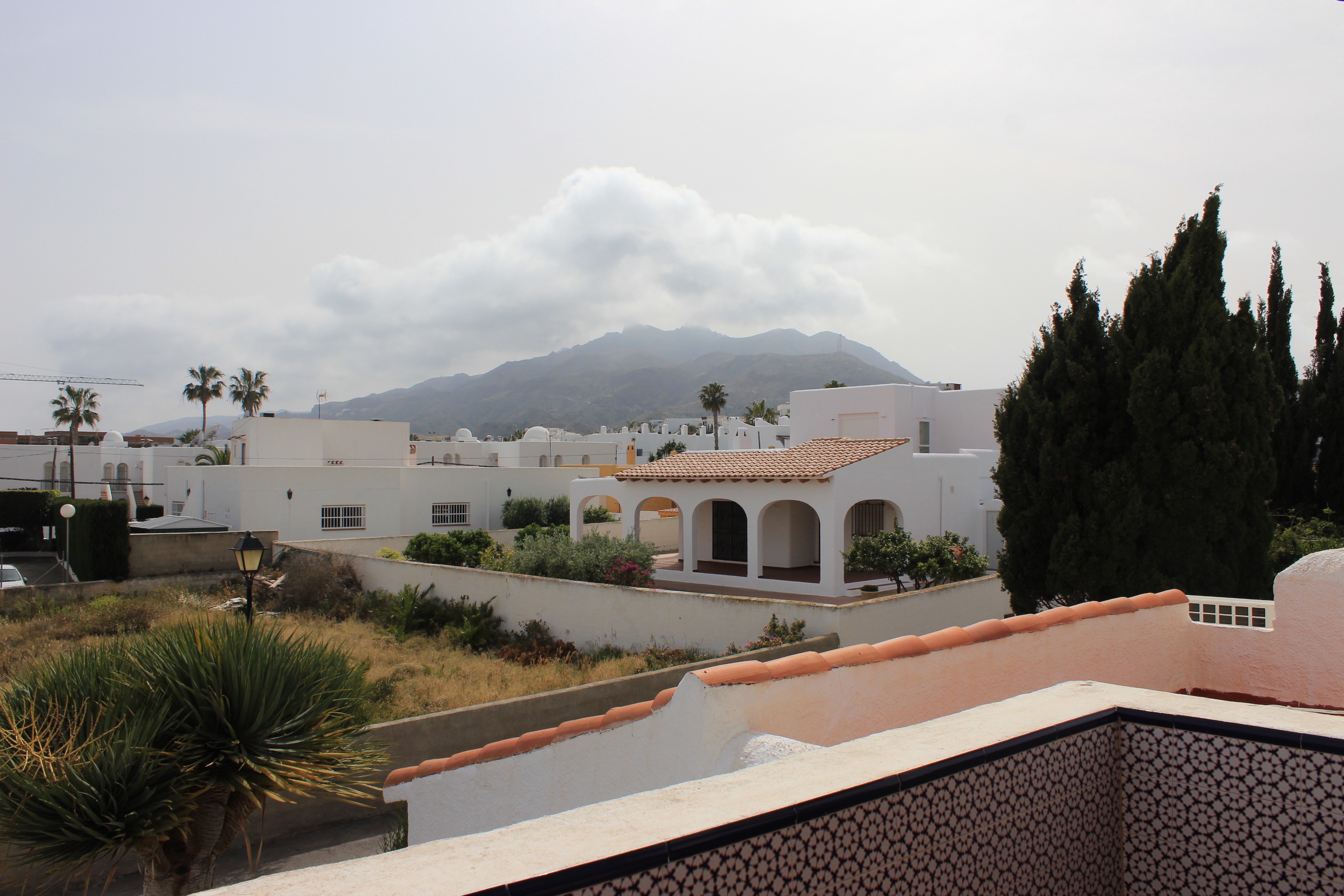
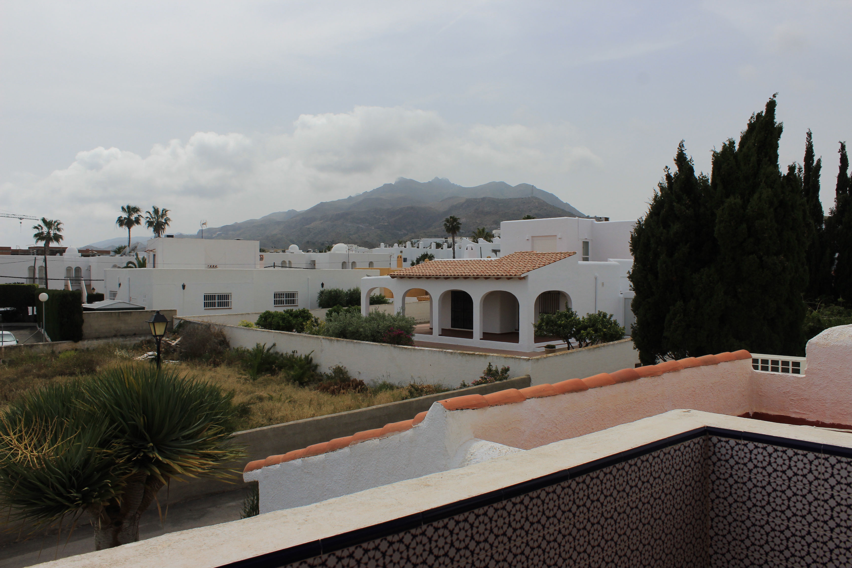
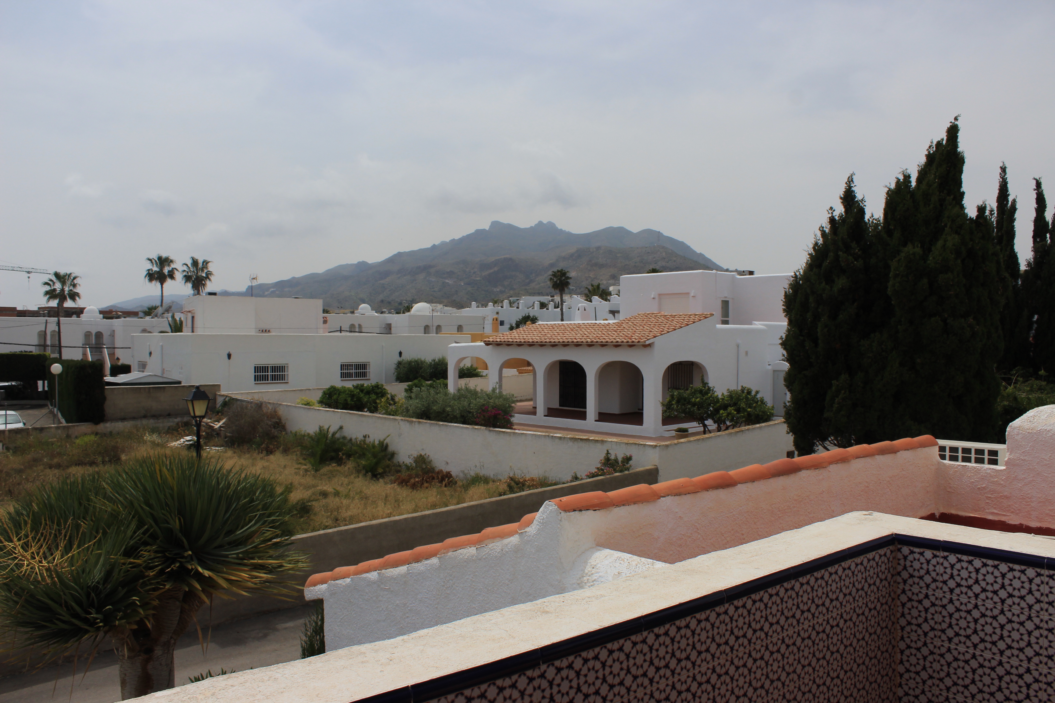
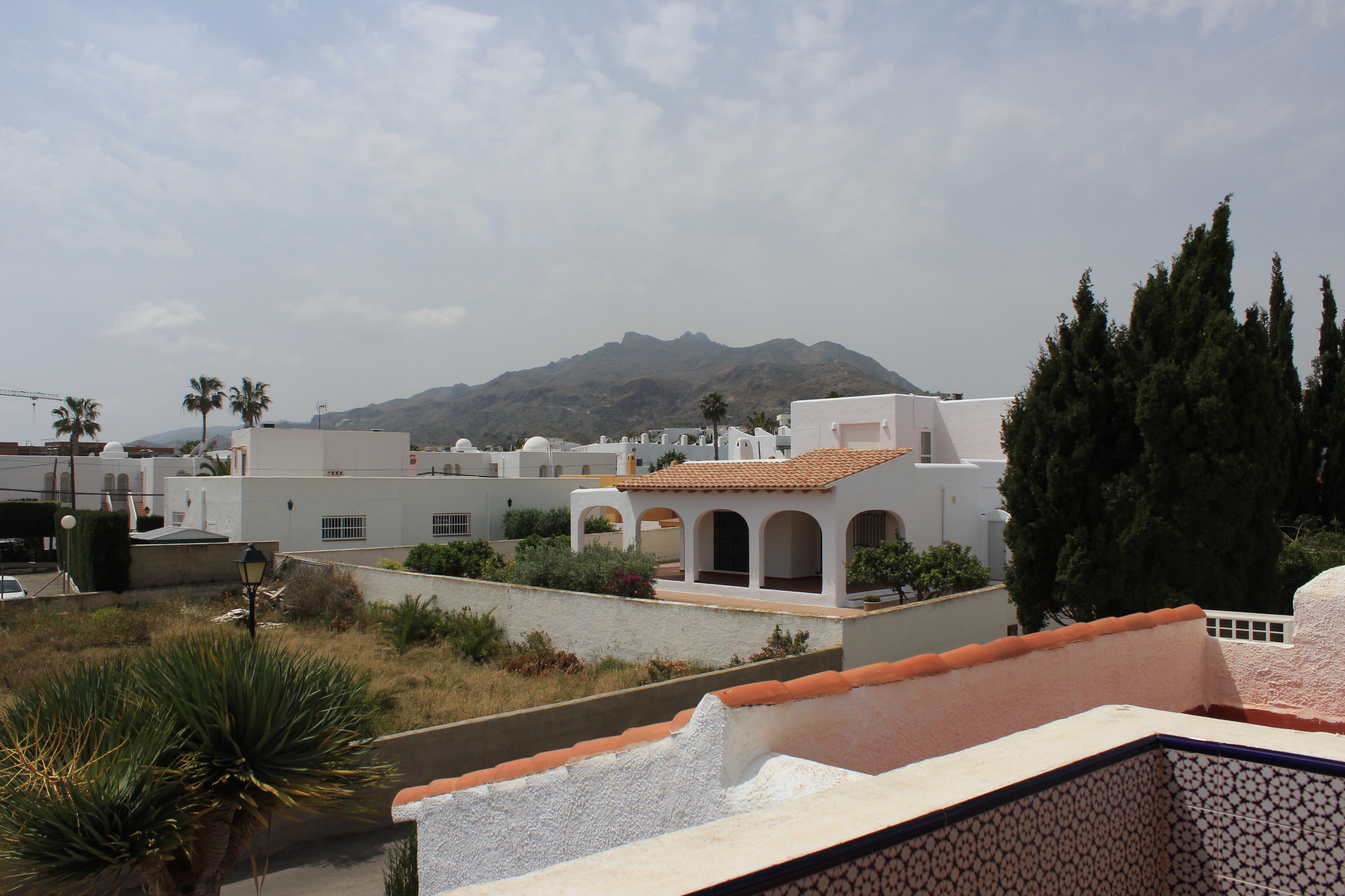
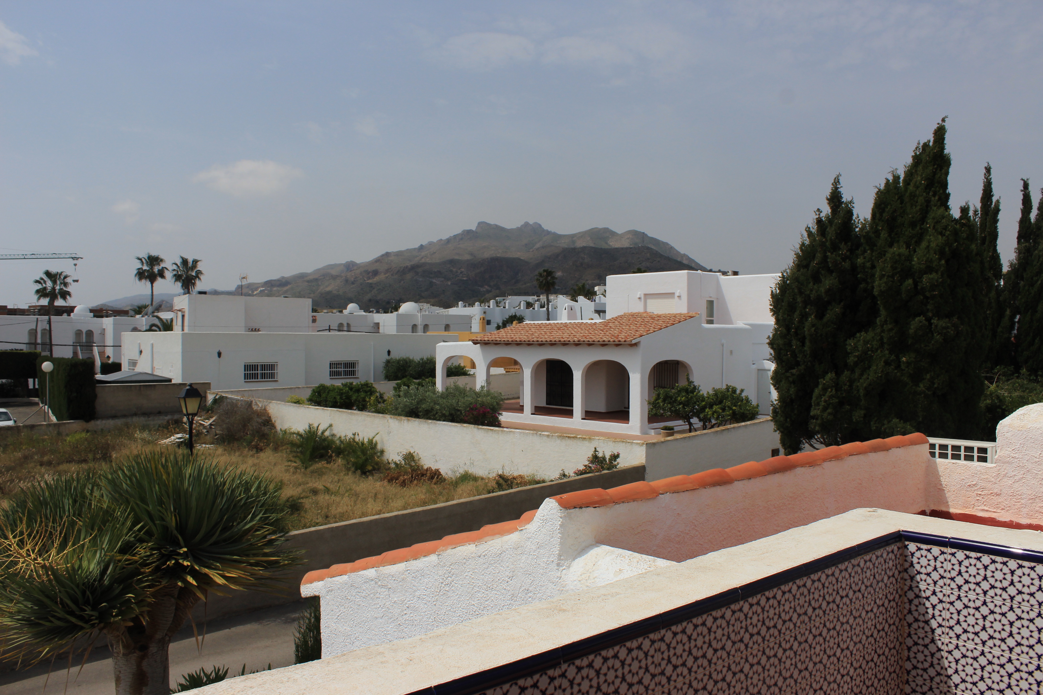
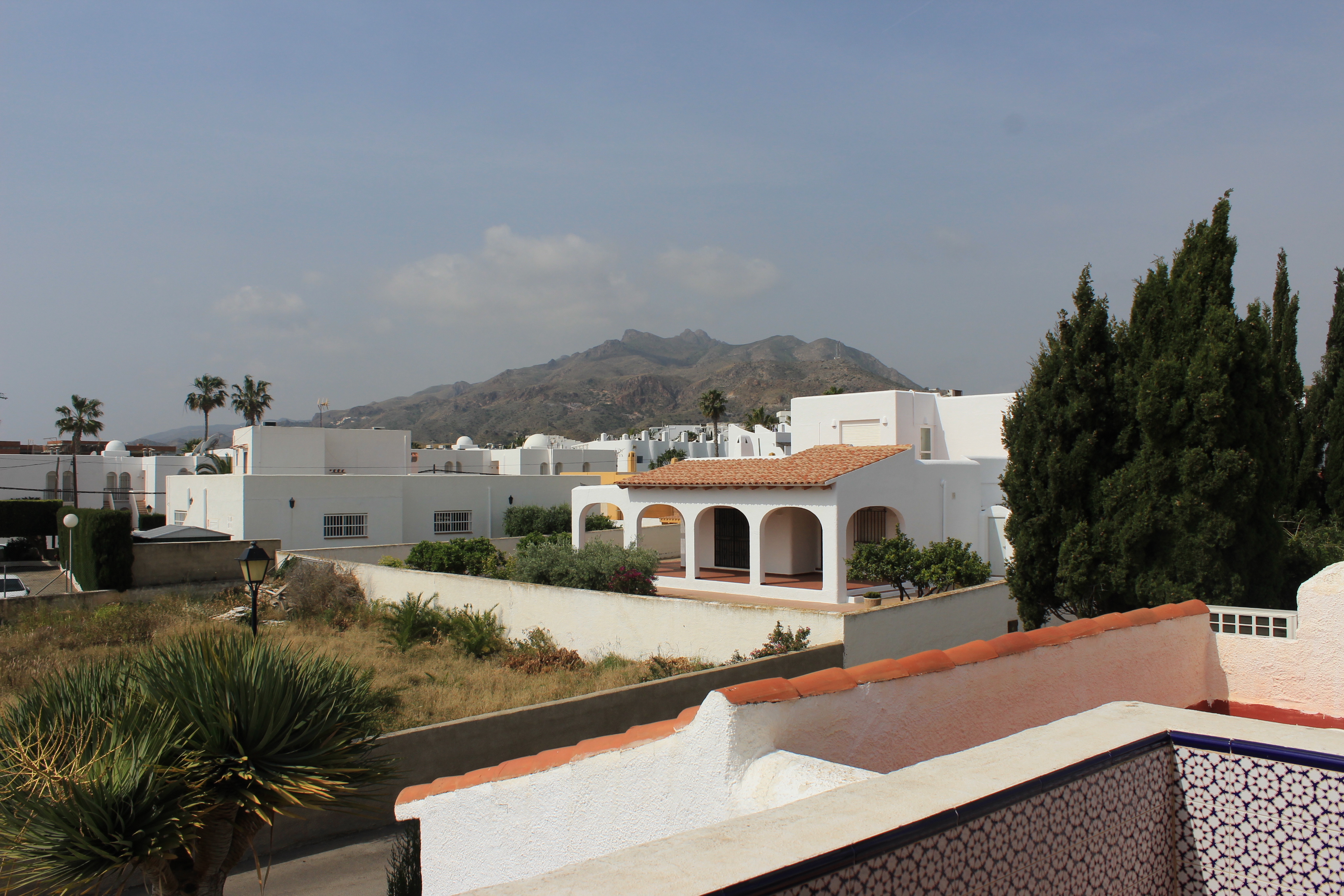
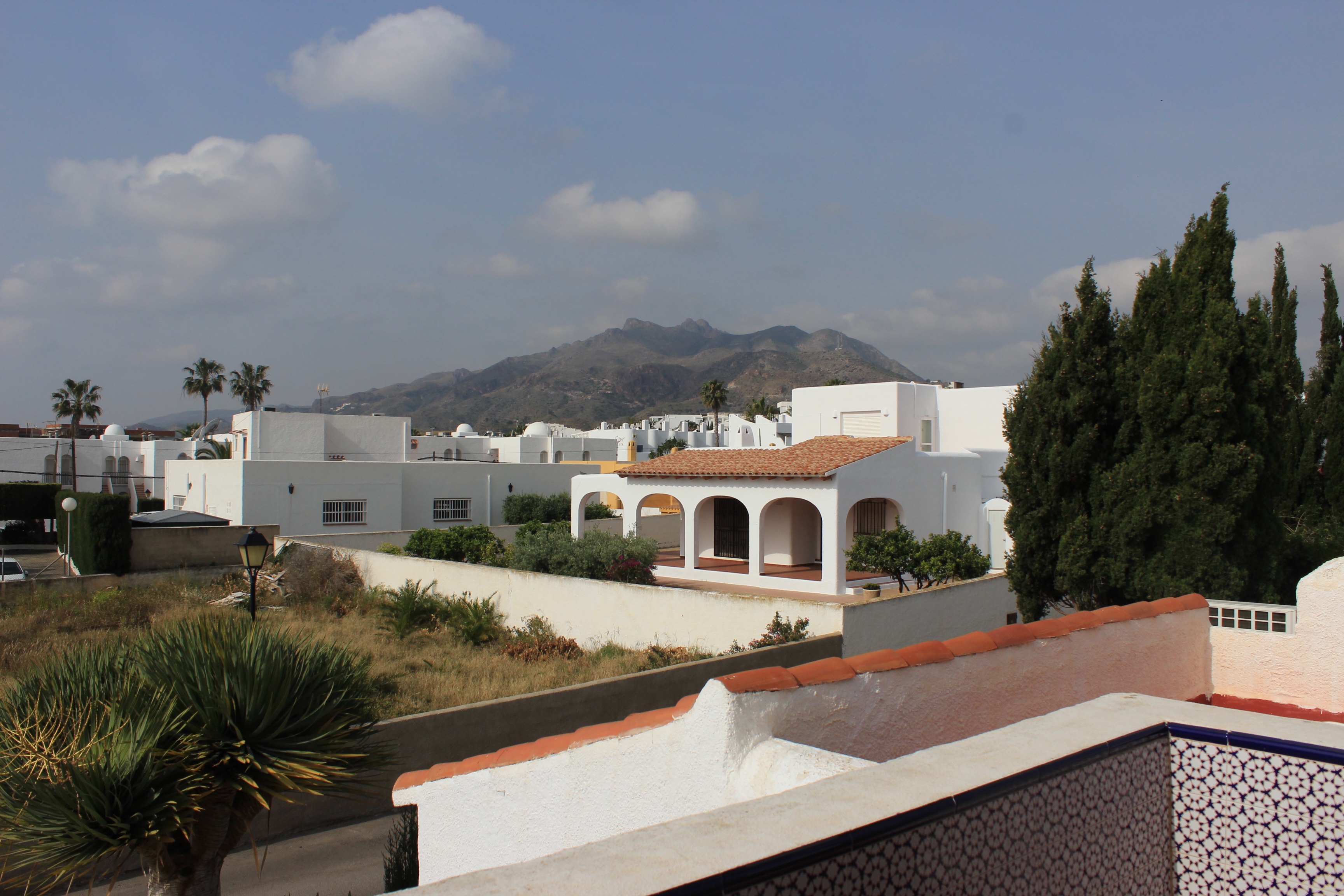
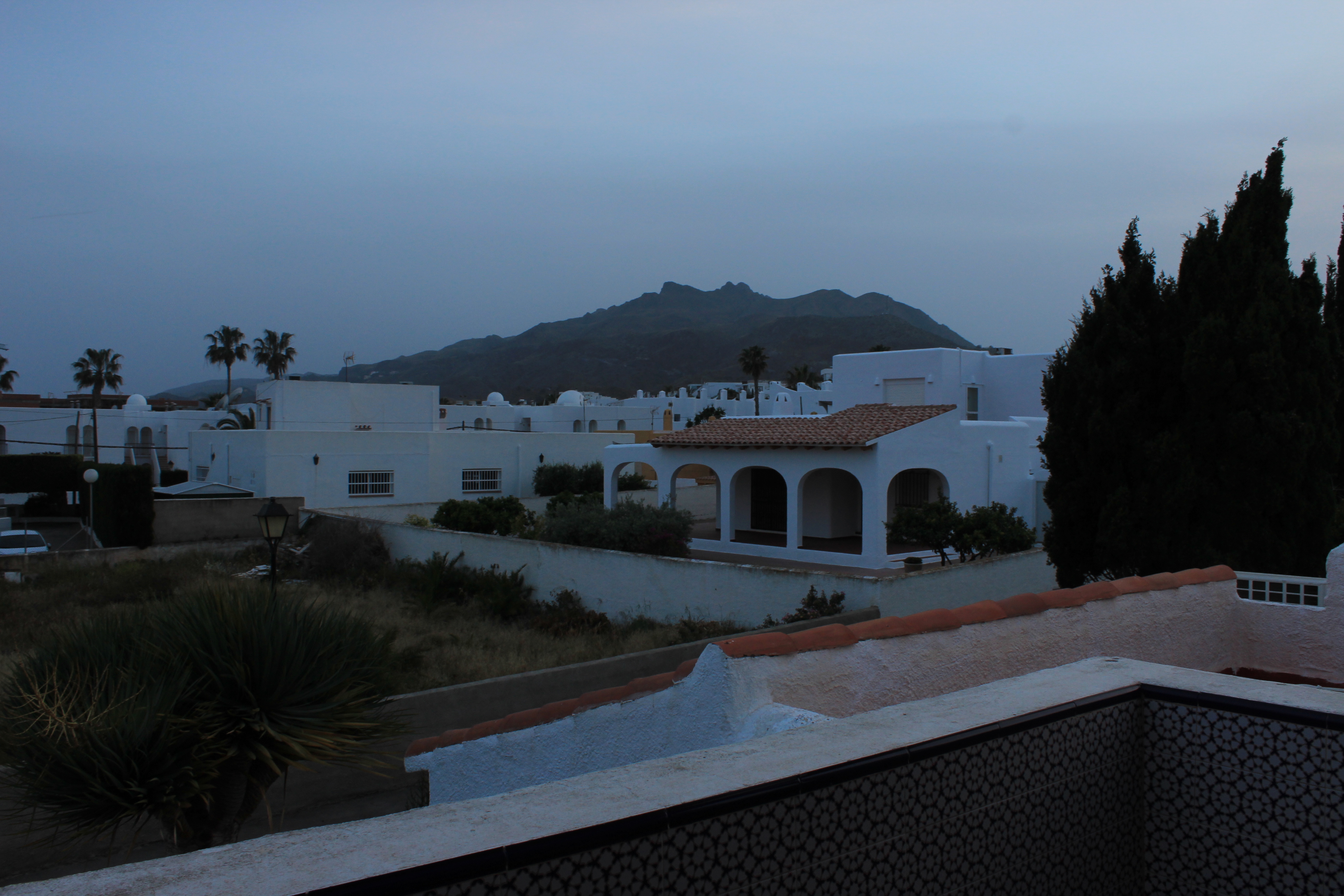
I decided to do another photo shoot where I capture pictures every hour, throughout the day, in the same location. I took pictures from a balcony in a villa adjacent to the beach. From this location I was able to obtain a clear view overlooking the mountains located behind the village of Mojacar. Before I began the photo shoot, I had to choose a position on the balcony so I knew where I would need take pictures from every hour. This allowed me to maintain the same view of the landscape throughout the photo shoot.
My second photo-shoot includes more heavy editing, as it involves merging 2 separate images so that the subject looks to be making their way through the scene. This photo-shoot is based around the fact that the subject is on the incorrect path, and has been placed in a scene that doesn’t match the context of what the subject represents (an office worker).
In order to do this, I used Photoshop to cut the subject from the background, in order to separate the body so that it can be edited onto the background:
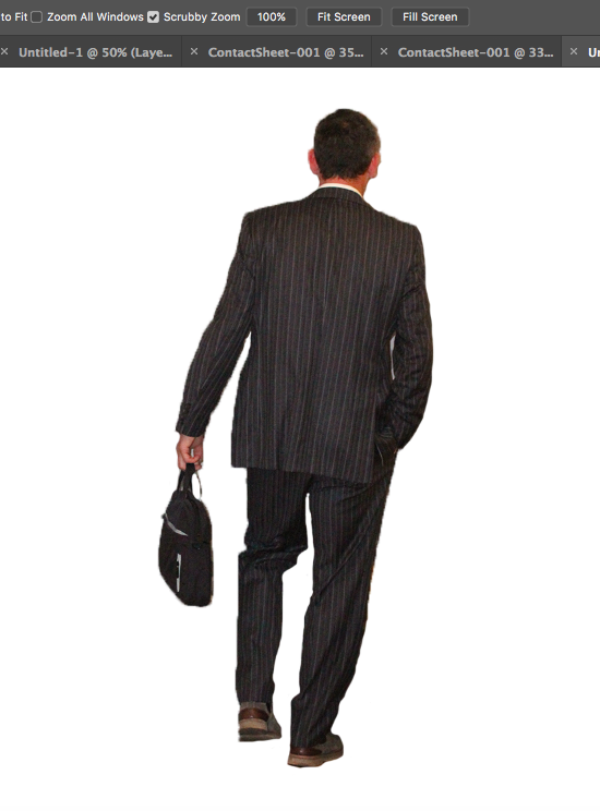
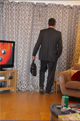
After the subject was separated from the original background (using the quick selection tool) I used the eraser tool to tidy the boarders:
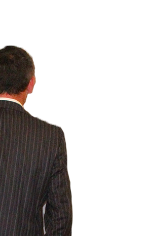
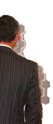
I then changed the colour gradient of the subject to greyscale, as I felt that by doing so, I could emphasise the separation and contrast between the background and the subject, and I would also be able to show the contrast between nature (the background) and the mundane reality of working life (represented by the subject), as the use of black and white coloring shows the negative effects that a repetitive modern job (such as working in an office) can have on an individual:
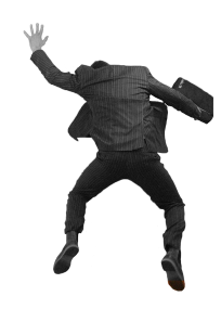
I then edited the subject onto the final background, which I chose from a selection of images I took of settings that did not seem to match the attire of the subject (e.g forests, beaches):
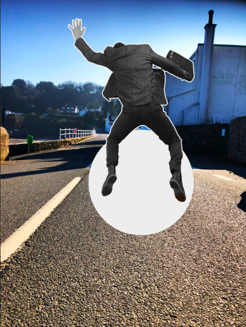
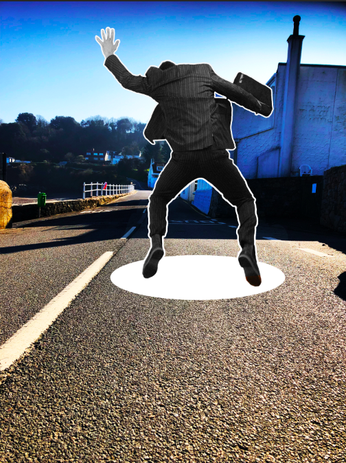
Final edits included either adding paper tears around the subject (as If they have been torn from their original journey/path and placed in a different one) or the addition of a “hole” through the scene, as if the subject is falling through the wrong scene while on their journey.
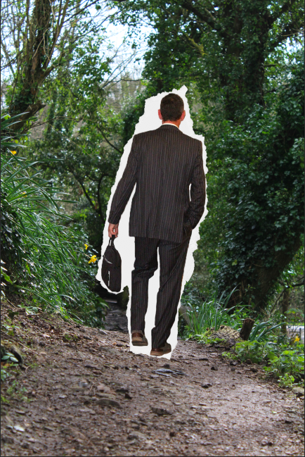
This was the process for all of the images, until I produced all of the final images.