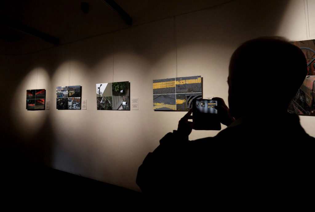
Virtual Gallery of Final Images


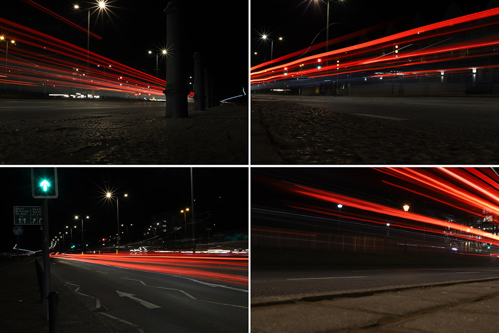


I have narrowed my final selection of images into groups of four, according to the theme into which they fit, all while still being related by the concept of journeys and pathways.
Set 1:
Set 1 is all about the harsh nature of time, and how we are eventually all forgotten. I wanted to use the idea of decay and deterioration to portray the just how insignificant we are really are as humans, and how there is nothing we can do to stop time from taking its course. However, I didn’t want to just go and find a dead animal and use it as a way to show the pointlessness of things in the grand scheme of time and space, etc. Instead I wanted to show the corrosion of something that should theoretically last longer than animals or people. I found that the abandoned tractor managed to convey a slightly stronger meaning and atmosphere of loneliness, even if it doesn’t give you the immediate visceral reaction of seeing a decaying animal.
Set 2:
Set 2 is much more focused around psycho-geography, and the notion of being constantly being watched by something or someone. It focuses on aspects of surveillance and security and the impact it can have. I linked the newspaper found in a hedge with the security cameras because at the angle the photo was taken from, with the main word visible in the headline being “convict”. The idea of being watched is also included as it is much easier to catch criminals due to the increase in cameras and technology, however I also wanted to highlight the impact that this new age of cameras can have on people that aren’t criminals. The idea behind the discarded coffee cup image is that all of your mistakes are recorded nowadays, and even the smallest things that you do in public will most likely be seen by someone or recorded, whether by a security camera, or a camera on a phone, once again showing how little privacy we really have in the modern era. My plan for framing this set it to gather a variety of small computer components (circuit boards etc.) and stick them onto the surrounding frame.
Set 3:
Set 3 is a slightly more overt way of looking at Journeys and Pathways as it focuses literally on the journey of a car going down a pathway. Yet despite how simple the idea is, it is a good way to visually show a “journey” as you can physically see where the car has been as it goes past the camera, and Because of this, light trails are great for literally showing a viewer the journey of a car.
Set 4:
Set 4 was inspired by the work of the Boyle Family’s work, specifically Mark Boyle, who created the group of images known as “The Ground We Walk On”. The concept is fairly straightforward, yet the images are so effective at showing something that we all interact with every day, but put very little thought into. The ground can show so much about the history of a place, with all of the small cracks in the side of a pavement to the small tire indentations on roadside lines, and to emphasize this in my images, I specifically went on this shoot while it was raining so I could get the most definition in different textures, as well as giving the images fairly flat and even lighting, without too many hard shadows.
Set 5:
Set 5 is another example of time changing the environment around us without people really noticing. For instance, the image on the bottom left with a small stream and sand banks either side shows this because there will never be the same formation of sand after the tide comes in. To contrast the freely changing sand, I also included images of Elizabeth Castle to show just how strong it is in comparison, even when the sea is at its strongest, the castle is not changed, yet the sea is still very slowly eroding the stone and rocks, which means in a few hundred/thousand years, the castle could start to lose structural integrity.
Set 6:
This Set of images was partially inspired by photographer John Davies and his work in taking pictures of heavily built up areas to show the repetition in modern life, and just how similar things that are “personal” are. I went on this shoot to originally follow the same style as Davies, but decided to put my own spin on it when I was editing. To show how small we are as people, I used a Tilt-Shift blur in Photoshop to create the sensation of a tiny model town that was taken with a macro lens. I found that this not only helped the images stand out more, but also helped to show how we think that we are in control, when in reality, there’s so much that can’t be controlled (just like how models in a model town are not in control)
Idea 1:
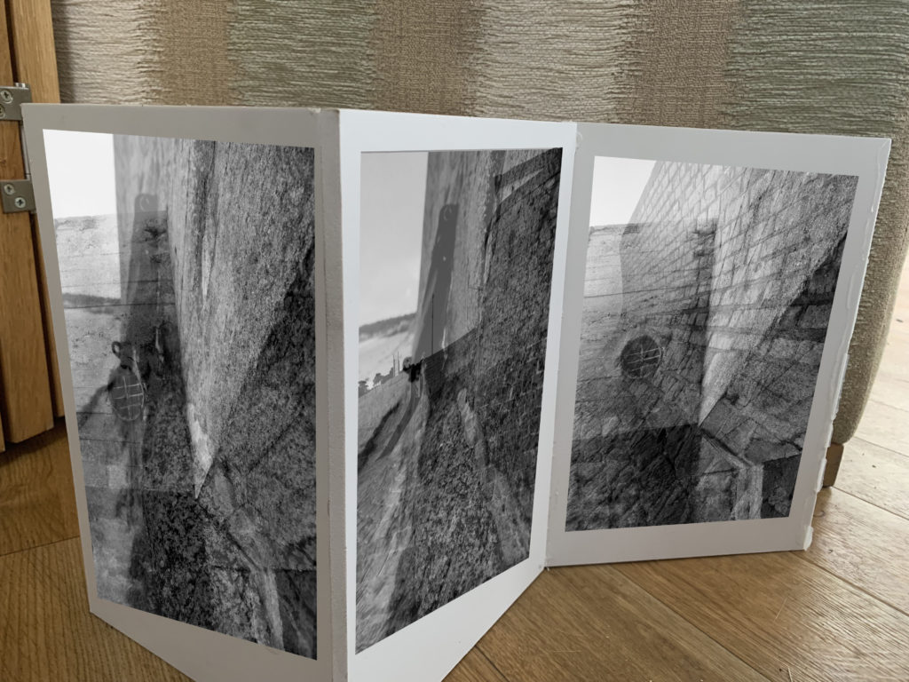
In my first idea I want to showcase my sea wall images using a sculpture/naturalistic style. I decided to get 3 planks of wood and attach them together to almost create a wall, the idea is to stick my wall photographs onto the wall to create a wall. The framing technique itself is abstract and creates a metaphorical meaning, but the images are being displayed in a naturalistic way, as they are not being folder or used to create an object. This juxtaposing idea will help to emphasis the importance of the sea walls during the war and will nicely showcase these successful outcomes. The three images will be printed as A5 images in black and white, in order for them to fit onto the wall.


Idea 2:
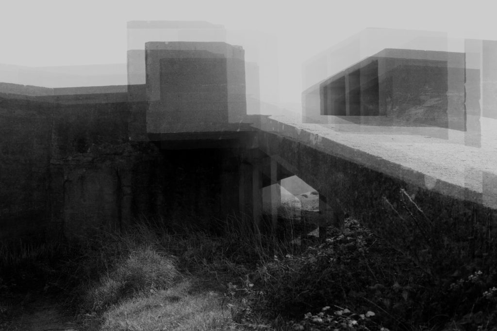
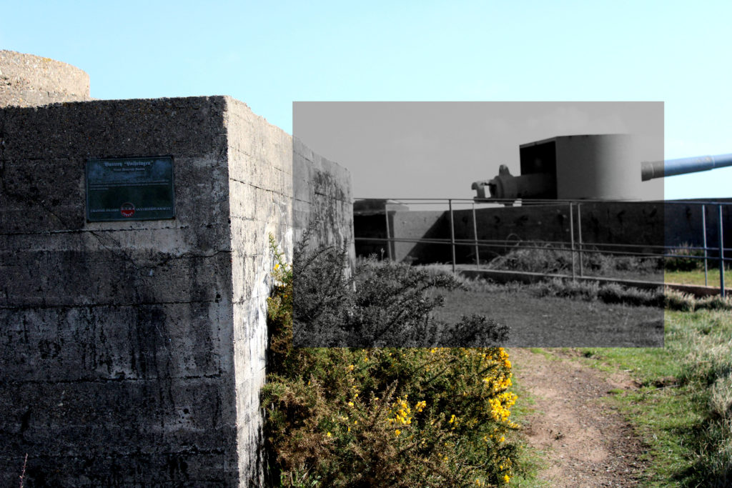
The next idea I want to showcase the most successful outcome, in my opinion, from the project. The abstract photograph was inspired by Khan, and allows viewers to rethink the purpose of the bunkers and reminds us of the purpose of the bunkers during Jersey’s Journey through WW2. The reason why I want to showcase this image is because I believe the edit is interesting to look at due to the distorted look, and how the formal elements work together to create this interesting piece. The image works best alone as it holds a lot of meaning and is powerful enough to stand alone. I intended to print this out as an A3 print and frame it in a black frame, which should help to emphasis the meaning and purpose of the bunkers. I decided to print the photograph as an A3 image as I wanted to showcase the size scale, how the bunkers are a large architecture in real life. Metaphorically, it showcases how the bunkers had the most impact during the second world war, which hold strong links to my project title.
Idea 3:
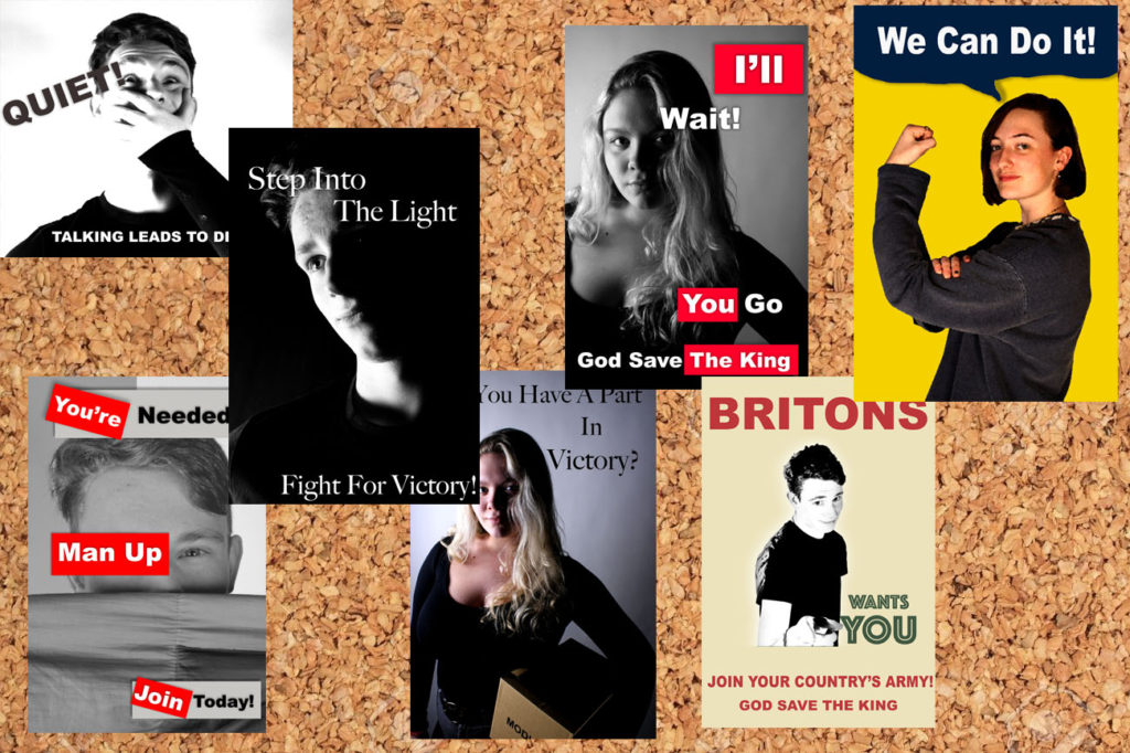
For my next final outcome I want to showcase my 7 propaganda images. I decided to display these images on a cork board in order to show contextual factors of the images. The cork board was occasionally used during the war to display propaganda, in work places and shops, so I decided to implement it into my work. Due to the images being not as successful I have decided to print them out as A5 images, it will ensure that they fit on the board. The photographs all work well together as they manipulate the viewers to believe and do what they say. Although this final piece is not as strong it will still showcase the development of the project and another aspect of Jersey’s Journey through the second world war.
Idea 4:
For my next final outcome I want to create a large version of Talmor’s work, using my images. This outcome will take more of the sculpture route as I randomly place fragments of an image on top of each other to create an overall distorted image, to take away connections and memories from the bunker. I will print out the three images below as A3 images and tear them up, then on a piece of foam board I will begin to randomly place the segments, ensuring the overlap and create a distorted piece. I am printing the images large to remind viewers of the actual size of the bunker and how they had a massive impact in Jersey’s Journey through World War 2 The idea will make the image will showcase formal elements such as form and shape due to the 3D element that it will hold. This idea is another successful photograph manipulation I produced as it clearly holds strong links to the project title.


Idea 5:
For my final outcome I want to display the three images which are in the style of Knez’s photography. I will display the three images by placing them on foam board next to each other with the images being 5cm apart from each other and 5cm away from the edge. This framing method takes the more contemporary route of framing and displaying, allowing the more naturalistic images to be displayed. I have decided to showcase these images as they have strong links to the project title and show my ability to manipulate my images in a different way. I really like the way the three images compliment each other and all work together to showcase how the bunkers have developed since the war and the Journey they have been through. I will print these images out as A4 images, I want them big to showcase the size but not as big as the other bunker images as the outcome is not as strong and as powerful as the other two ideas above.


Frozen Posies series
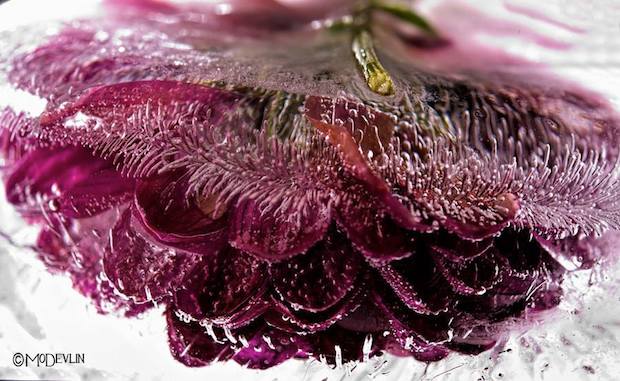
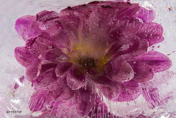
Devlin perfected the art of photographing fish in their aquatic environment. Mastering the dynamic of how light travels through water was only the first of many steps in the frozen flower process. That intense sense of spontaneity Devlin captures is the result of a very deliberate process. These images are not simply stumbled upon, but meticulously created.
Freezing his “models” is the most important part of the process. When tap water is frozen the impurities show themselves as clouded white ice. Devlin experiments and continues to perfect his ability to control the outcome of how the ice forms and captures the subject. Sometimes the bloom itself can be the source of impurity. Any substance, natural or added to the plant, may cause large areas of clouded ice. Blooms with high sap or sugar content or flowers purchased that have been given a preservative, pose the biggest challenge.
One thing that occurs and is cultivated through his photos is the appearance of “ice trailers.” These are simply bubbles that have been squeezed out of the organic material then stretched as the freezing process continued. The science behind their formation is amazing.
Flowers add to any room a feeling of beauty and grace. They are delicate beings, alive with sensuality. Mo Devlin’s Frozen Flowers capture all that and more. The ice adds a “look again” dimension to this gorgeous photography that draws us in and fires our imagination.

Sea Wall:
The three images below are my top outcomes from the sea wall photo shoot and edits, inspired by Gina Socrate. The photographs are considered successful as they showcase my ability to use and adjust camera settings for effect. It shows my ability to use different depth of fields, focus points and experimentation with different formal elements. The double exposure technique in these three photographs all clearly show a clear message of how the sea walls changed and developed during the second world war. In addition, the technique creates a unique and interesting outcome which changes our perception of the sea wall, justifying how they are successful.


Bunkers:
The next few images showcase my successful experimentation with the bunker images, which showcase another stage is Jersey’s Journey through the second world war. All of the images take a different approach to the idea, but are all as strong, in meaning, as one another. The four images have all been inspired by artist research and showcase my favorite outcomes from the bunker photo shoots. They can be considered successful as they show my ability to use different tools and approaches to manipulate my images, moreover it shows my competence to use and adjust camera settings for different effects.


Propaganda:
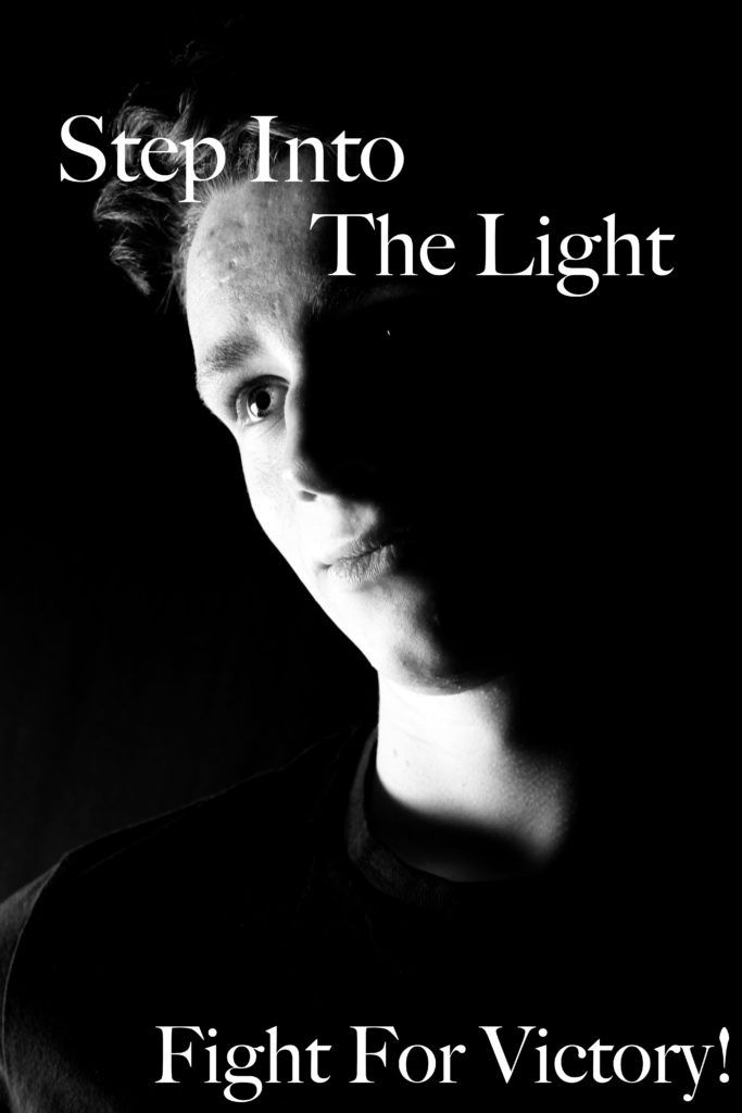
The next photo shoot and approach I took was looking at propaganda and the impact it had in Jersey’s Journey through the Second World War. Although the imagery is successful, I do not believe that it is as strong as the bunkers and the sea wall, due to the less links it has towards the project title. However, the images are successful as they showcase my ability of studio photography and the use of artificial lighting to achieve effects such as chiaroscuro. In addition, it shows how I am able to take a graphics design approach to manipulate my images.




“Marko Köppe, collage artist from the north of Germany, loves art, the classic art, like Leonardo da Vinci, Sandro Botticelli, Hieronymus Bosch, the modern classics, like Salvador Dalí, René Magritte, and also modern art like das Bauhaus and all its influence: Kurt Schwitters, Mark Rothko, Giorgio Morandi, Olafur Eliasson, Banksy, and so many more.
Nature, music, and especially life are important influences of inspiration, and together with the famous German proverb: Everything develops in the eyes of the viewer!, he starts to play around with the style, aesthetics, and contrast between pictures—tries to create something different, something new, that hits the eyes and through them the brain, the imagination, fantasy, the viewers’ internal feelings, wishes, and thoughts.”
https://flexiblepersona.com/marko/


For this project, I will be using photos from previous photo shoots and putting images of buildings from my New York trip in June 2018 on their faces. I will also taking some images from Google Images like butterfly wings, birds, leaves and other things from nature and also putting those on the photo. The concept of these photo is that I am taking things that I saw on my journey through New York and things you would see if you went on a walk through Jersey. I also wanted to show the contrast of New York and Jersey, as one is very modern and industrial whereas the other is more natural and neutral.


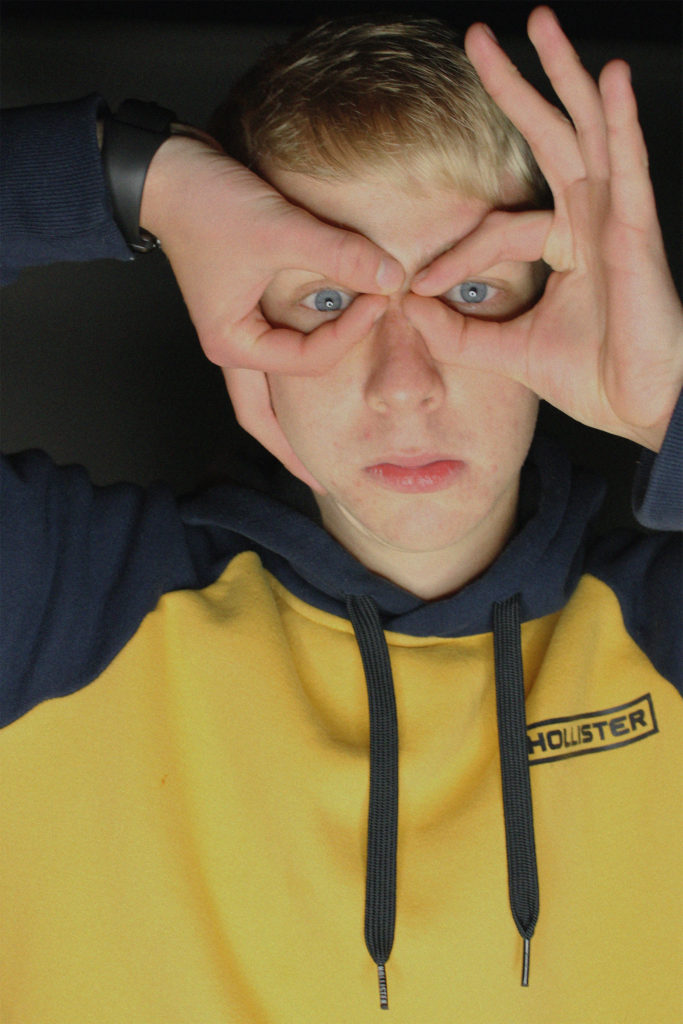


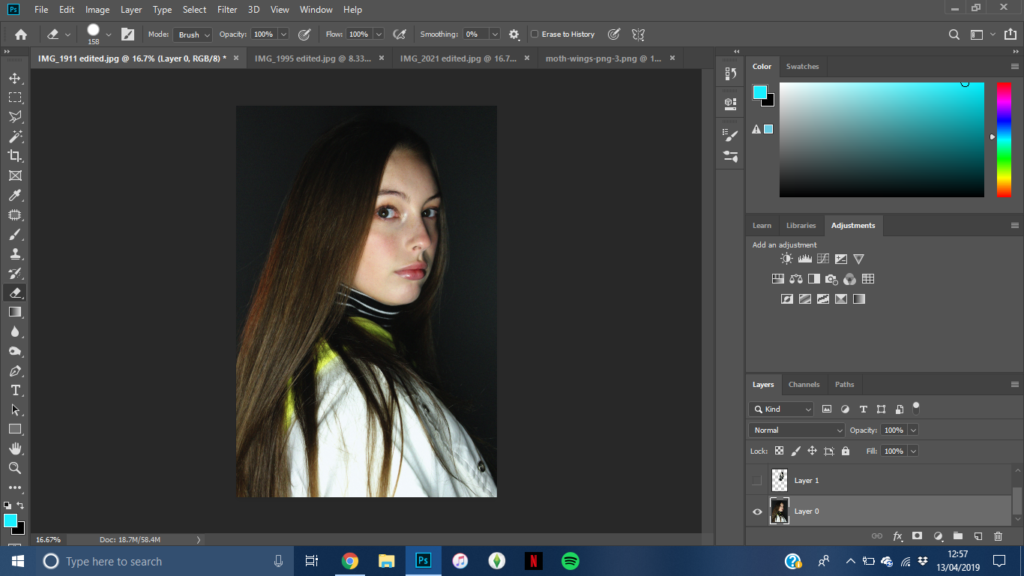




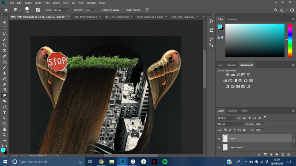






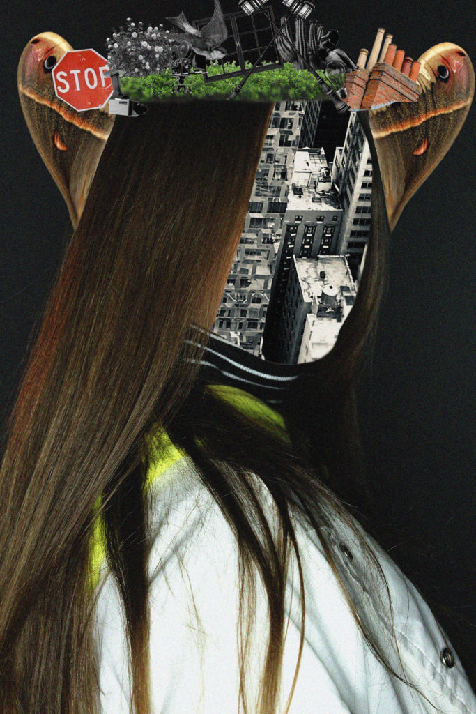
I am really pleased with how this photo turned out. I really like how the moth wings look like ears, and I like the contrast of the black and white images and the coloured images.

I really like the way I put the washing line on the hand. I think this photo is edited really well and I am happy with the outcome.


I really like how this photo turned out. I think I placed everything really well and I think I edited it quite well.







For each photo I tried to capture Marko Köppe editing style and I am really happy with the outcome of these final edited photos.
My second photo shoot idea was to freeze and press flowers. This was to show how I froze these plants at a moment in time and for a short period of time and stop its life cycle. This would also represent how at any given moment in time, a moment can be make or break to a living organism.

Most Successful Edits


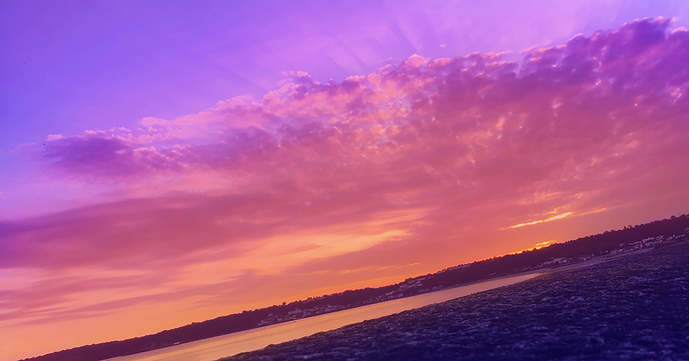
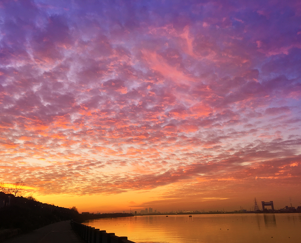
For my photoshoot for Paul Rieffer, I took images of sunsets at multiple different times, trying to get the most colour outcomes very time to make it easier for when it comes to editing my final images.
Contact sheets:


Final images:


I chose these final images because I believe they relate most to the photographer I am influenced by. They are interesting pictures of sunsets and include clouds and sky which can be manipulated and edited to look like Rieffer’s colourful work. All I would have to do is create multiple layers on top of each image and add colours such as purple, blue and yellow to patches where I think they would look the best, and then reduce the opacity until I get the desired outcome i’m looking for.
Edited images:

This is the photograph I have chosen to edit and finalise for this recreation, I feel my model is posed the best in this photograph and the angle is the best and it looks like it has the best potential to be the best recreation of the original Ad. I feel it has good lighting that can be edited and adjusted to fit right and create a good image and there is enough of a background showing for me to turn the back blue.

To begin with I began by editing the brightness and the contrast of the photograph, I adjusted both of them due to the style of the original ad being quite vibrant in its colours quite harsh which is why I adjusted the contrast and then as well the brightness as to be able to have the image as well lit.
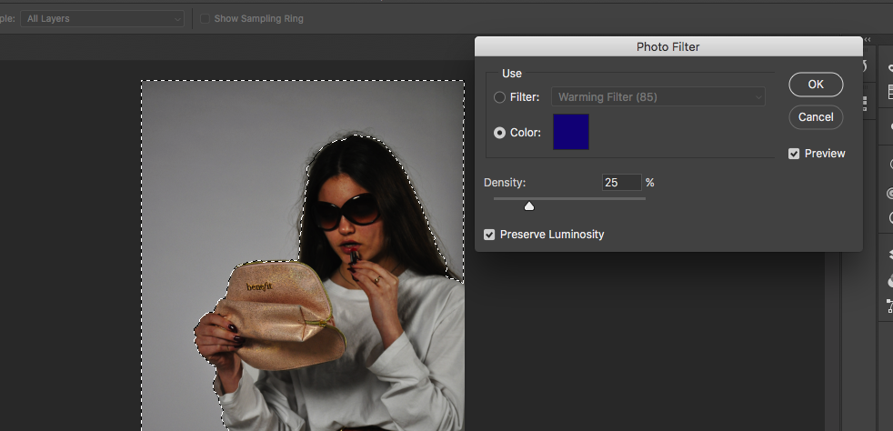

For the next part I selected around my subject and around the frame so that only the background was included in the selection I then went and played around with the colour photo filters to find the right shade of blue to put as the background of the image. I left the table unselected as although it was very low down in comparison to the original AD I did not feel I would be cropping it out so left it clear to be kept in the photograph.
Below shows my final outcome from the photoshoot and the editing, I feel this photoshoot and recreation turned out well as it shows a different side of the advertising in fashions as it is a recreation of a different time when fashion was having different sides between two very different decades, overall I feel it has been a successful outcome.
