When think about how to layout my images I thought that setting them as a window mount but there were some possible problems with it, firstly that the frames might distract from the images and that some are in portrait.
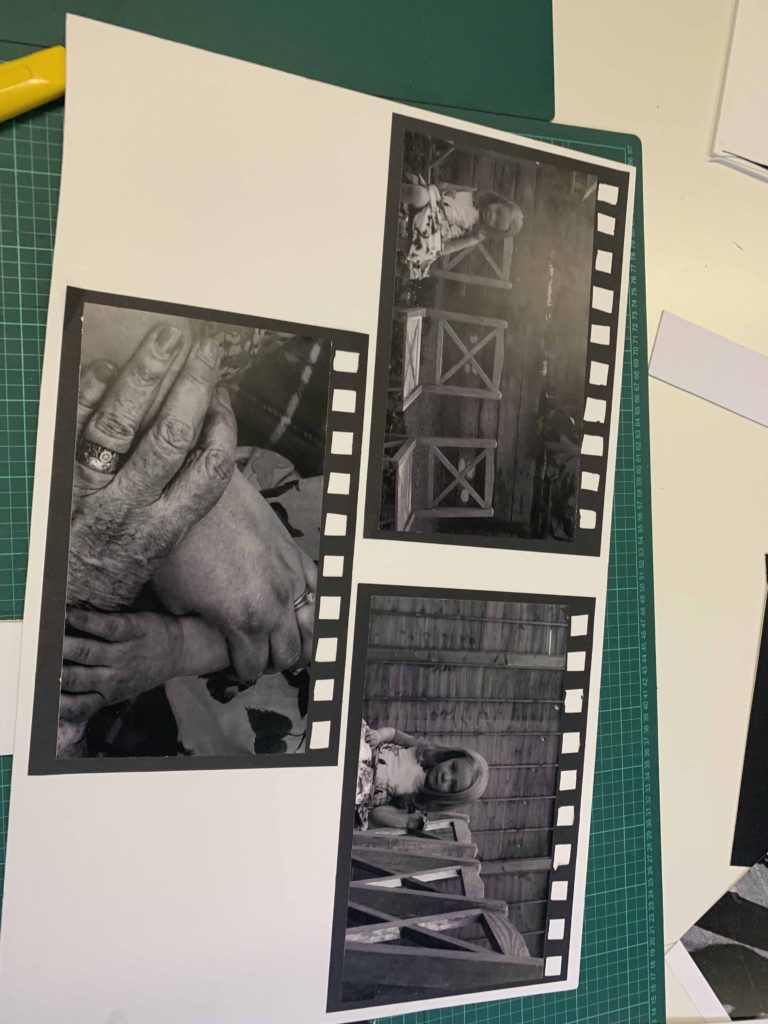
In the end the layout for the images that I decided upon is a grid with the layout being from light at the top to dark at the bottom. The two images that were lost would have gone at the bottom. The reason that I put the images on black card is because they are black and white images and the deep matte black and the glossy black and white on the images.
This presentation is made to twin with the negative slides and the light box as it is the same set of images and the negatives.
This is how they ended up and how I displayed them.
Analysis of images
First 3 – these images are inspired by Katies joy crawford and her use of double exposure. the images give a sense of confusion and uncertainty and show the distress someone goes through while dealing with anxiety and depression. the images are lacking colour but not black and white so it gives a sense of dullness and emotionlessness. i the lighting is dim but still bright enough to be able to capture any visible facial expression. the mounting bring in rule of thirds with the leadings lines in the top image brining your eyeline down the piece. i used soft lighting to enhance the lack colour. These link to journeys and pathways as it is my experience of my journeys through various mental health struggles. I found it a good way to express my feelings. Rather than a physical journey, it is a mental journey of struggle.
Second 3 – the images are inspired by Bill Volia’s still image of his film ‘birth life death. the framing is to resemble old film to bring in that resemblance to the video. the images are in black and white to give a moody look and to also bring out the shadows of the lines in the hands to distinguish between the others. and also give a dated look. i keep everything in focus but keep my subject in the centre. the textures of the hand accentuates the age which is what these series of images is focused. natural lighting. kept depth of field of the hands small so it seems dreamy. It links to journeys and pathways as the hands shows different generations and the different stages of life, starting with a young child, and progressing to adult/parent, then to elderly/grandparent. The child is alone in these images as it is meant to be she is the only one in her family left with other members sadly passing on. I wanted to keep the chairs empty and keep them in view to capture this emptiness. This is rather an existential view on the journey through life, and again, rather than being a physical journey, it is a metaphorical one.
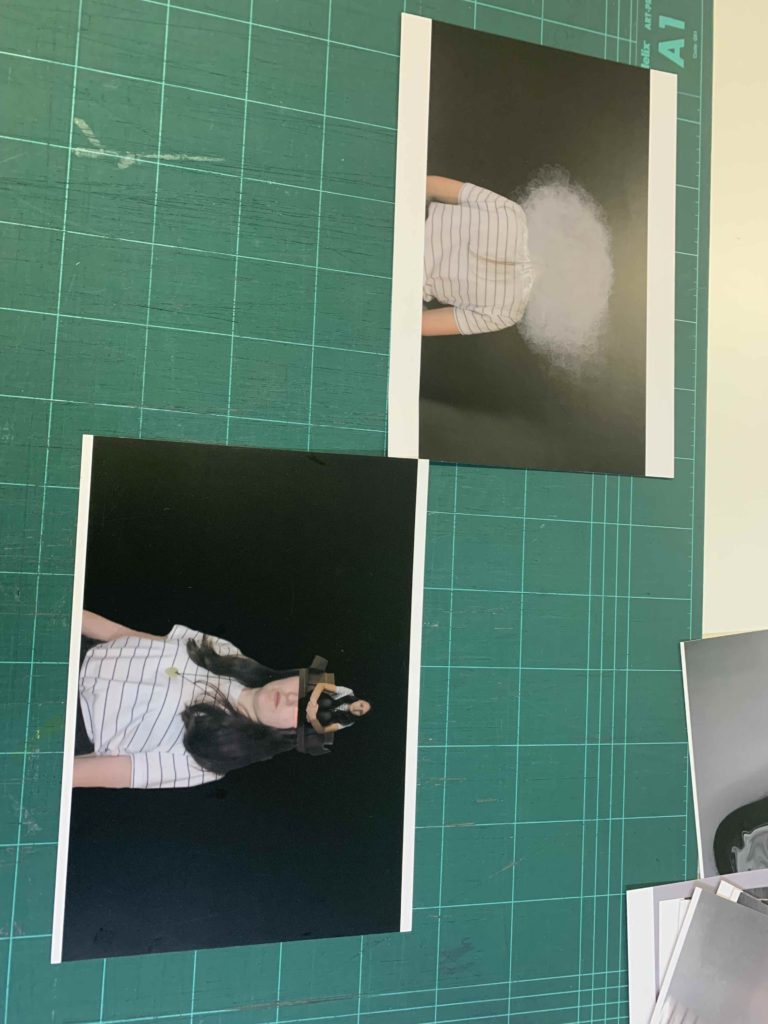
Third 2 – these images are also inspired by katie joy crawford, mainly her birdcage photo which i modelled the ‘box head’ and ‘clouded head’ directly after. i placed the clouded one at the top so its like head in the clouds which is what is feels like to deal with depression; a sense of disconnection. i used a black background to contrast the whites in the photograph. the textured cloud against the smooth background also shows the disjointed feeling depression gives you.the box is to represent how trapped you can feel inside your own mind dealing with these issues. i used harsh studio lighting to resemble the harshness of these thoughts. Again, this is represent my view on a journey through mental health and links to journeys and pathways through the idea of mental health journeys.
Final 2 – links to journeys and pathways as it is also embodying the ideas of mental health journey as well as a physical journey (walking along a path). She is stepping between the cracks as it links with the obsessive nature of OCD and also the childish superstition that stepping on cracks is bad luck. The blue boxes I edited in enhances the space she is stepping between and shows how he mind when in this place of mental state actually views this simple pathway.
I first placed out my images to see if my ideas I had out on paper would work. some of them, I realised wouldn’t, and others I ended up having better ideas once I played around with placing them. In the end I ended up using foam board to create different levels and I used black paper to create the look of old film slides. laying out the placement of photos and grouping them together really helped see what was effective and what wasn’t. I had so many more better ideas once I had the prints in front of me and was able to use my images more effectively.
During the Image selection process I decided to cut the amount of selected images down to 10. This was to remove images that looked too similar to each other as well as helping the images to flow as a set.
Below shows how my final outcomes turned out ones printed and displayed, I chose to display them on foam board and then onto black mount board as I feel this is what worked best with the photographs and it made them stand out off the page which I feel was effective in displaying the types of photographs that they are.
I am happy with the way that my final displays had turned out and the actual photographs themselves. I feel that putting them on foam board rather than a window mount helped to make a difference and stand out for the types of photographs they are in the style of adverts and what they are presenting.
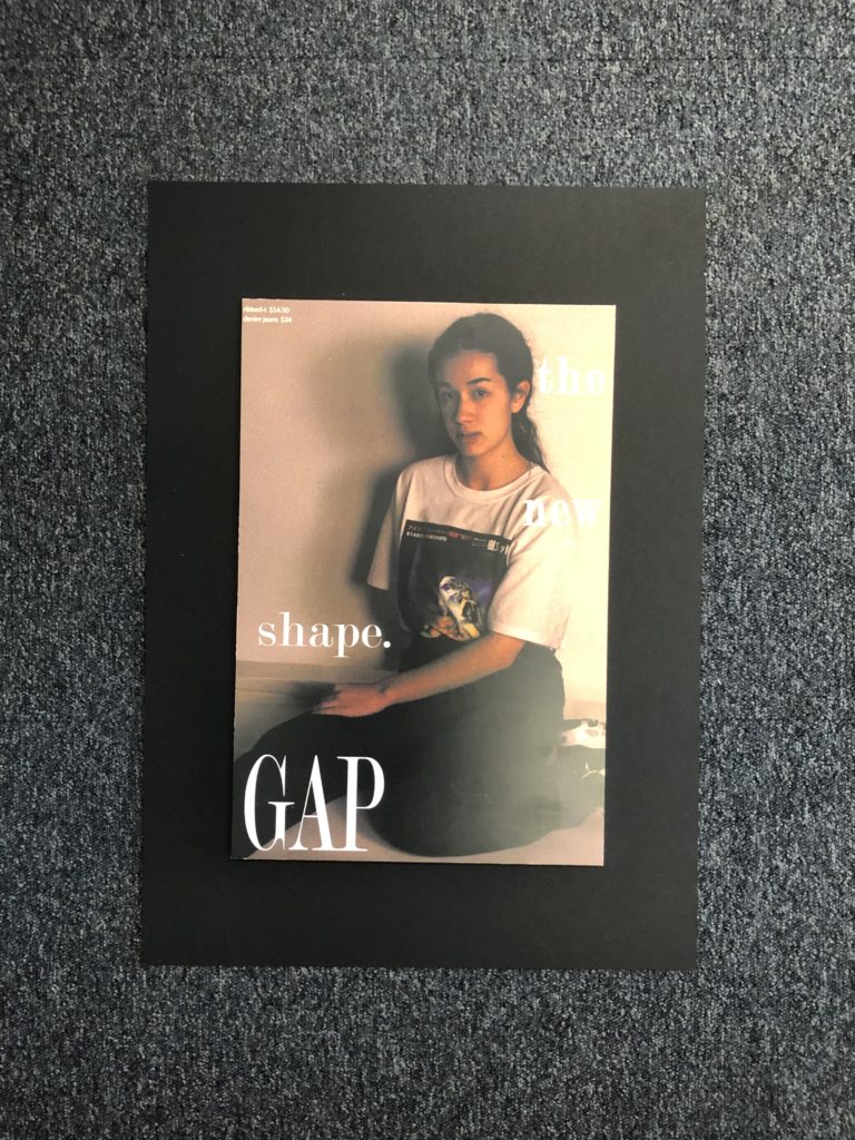
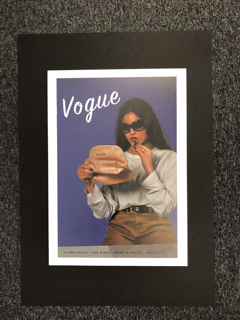
All of my final photographs have stemmed from inspiration and ideas from people such as Kourtney Roy and Cindy Sherman and the message that they also try to send across to people and the style and way that they portray those ideas I feel is effective and stand out which is one of the reasons as to why I placed my pieces on mount board. I feel that adding the writing and actual advert elements helped to make a better impact and I feel was more effective than just leaving the images as they were.
1983
2016
1994
1943
1939
1993
All Final Outcomes Together
Below shows a created image of a virtual gallery to suggest what my work could look like in a gallery and all displayed properly together. This helps to give a sense of all of the photographs being grouped together and how I may show them if I was to have a real gallery space to put them in and I feel helps to give it a different perspective.
Of the images taken in these photo shoots I have decided that I will be editing the 14 images attached above. The photos were all taken under natural lighting using an ISO of 100 and varying the shutter speed. The aperture varied between F4.5 and 5.6. Focal length varied between 24 and 55mm.
IMG_4782: I like the composition of the image and believe that the blue string will create a good contrast from the rest of the image.
IMG_4786: Similarly I like the turquoise color of the cord in this photo. I also like the out of focus fence in the foreground allowing the color of the cord to cut through.
IMG_4788: This image also features strong blue tones with similar composition to the previous images.
IMG_ 4810: I like this image because of how the lighting allows texture to be displayed in a relatively flat surface.
IMG_4811: I like the image composition and depth of field in the image, i believe it is somewhat similar in composition to some of Paul Grahams works.
IMG_4815: I like the image composition and depth of field in the image, i believe it is somewhat similar in composition to some of Paul Grahams works.
IMG_4824: I like the depth of color in this image as well as the strong shapes created by the trailer resulting in an interesting composure with the flowers interwoven in the structure.
IMG_4829: I like the strong shapes in the image as well as the wide range of colors and texture shown in the fence post.
IMG_4834: I chose this image as I like the strong shapes of the rebar and barbed wire. I also like the strong contrast it creates with the almost white background.
IMG_4839: Similarly to the previous image I like the strong contrast with the sky as well as the strong shapes formed by the chain link fence.
IMG_4842: I like the amount of detail in this image as well as the color palette.
IMG_4843: I like the strong angular shapes formed in this image as well as the strong contrast. I believe that this image somewhat resembles the work of Luigi Ghirri.
IMG_4853: I like the strong tonal contrast in this image as well as the depth of the texture on the surfaces.
IMG_4861: I like the composition of this image partly due to the similarity of the composition of the opening images to the first shoot as I believe that it helps to tie the whole collection together.
My only A3 print will be the set of images on the left and I will be mounting them on a foam board, and then on top of that I will be adding cut-outs of from the other set of A5 images (Right). I originally wanted to gather up some leaves and small computer parts to stick onto my A3 Print but after realizing I would not have time to gather all of the parts needed, I decided to change my idea. I will instead mount the A5 pictures on foam board to make them stand out on top of the image.
My framing idea for these two sets is to either have them side by side as above, or vertical, with the tractor being above the ground. I will have a large piece of card as a background, with two smaller foam boards holding each set within the larger piece.
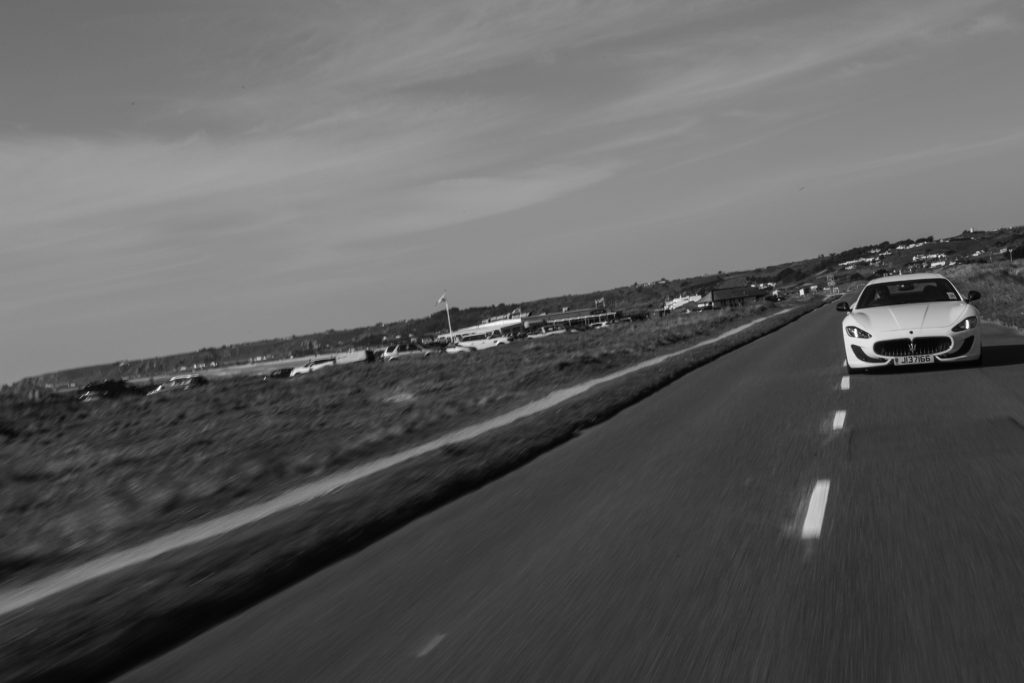
I Went out on two photo shoots for involving automotive photography; one where the car was driving on the road, and another focusing on the car whilst static with the sunset in the background. I wanted to show the car moving along the road while using a slower shutter speed to show the speed. Many aspects from this shoot were based on how fast things can move in life, where as the second shoot was much more about slowing down as a sort of contrast to the first set of images. I obviously wanted the images be based around the car itself, however I wanted to make sure there was more to the image than just an image of a car on the road, so I also incorporated the use of a rear view mirror in the car that I was travelling in, with the subject car traveling behind.
Contact Sheets:
Final Image Selection:
For this image I wanted to show the car in motion, so to do this I turned the shutter speed down to 1/40 and set the camera’s drive mode to high speed continuous so I would have more of a chance to get a clear image of the car. I then turned up the aperture to f/22 to counteract the longer exposure time. To get this shot I had the window of the “camera car” open, and pointed the camera out the side of the car as the “subject car” drove along side, matching the speed of the camera car. This meant that I could keep the subject sharp and clear, whilst the road is blurred. One thing I would improve about this image is using a slightly slower shutter speed, in order to make the car seem as though it is going faster, however because I was not using any kind of tripod or stabilizer, that result would have been much more difficult to achieve. I then threw together a quick edit in Lightroom, turning down highlights, shadows, etc. and generally making sure the whole photo was exposed slightly better. After this I then turned up the clarity to create slightly harder lines on the car, making the different shapes and curves much more defined.
For this image I wanted to include more scenery, so I shot at a slightly wider angle and made sure the subject car was further back than the previous photo, but instead of leaning out of the window, where the camera car would have been in the frame because of how far back the subject car was, I decided to open up the boot and shoot directly out the back of the car, this meant that I could include much more landscape in the background of the shot. Another advantage to shooting out of the back of the car is being able to include more of the road; and as I am shooting slightly wider than normal, the road looks larger as a result. This is also helped by the car being further behind.
For the final shoot, I wanted to include something that focused on the car itself, because even though it is not driving literally on a path/road, the whole concept of a car is that it can quickly take you from point A to point B, and that is what I wanted this image to encapsulate. I wanted to make sure that this set of images also linked strongly with Journeys and Pathways, which is why I did the shoot during a sunset; to show how fast we’re moving even when out of our cars.
“Rocio Montoya (Madrid, 1983) is a photographer, graphic / web designer and editor based in Madrid, Spain. Her specialty is the experimental photography, land on which has moved from its creative inception. Also passionate for the editorial design, in 2010 she founded DOZE Magazine, which has co-directed and designed until its closure in June 2014.
Her interest is particularly focused on the portrait, approached through different plastic techniques and always with photography as the essential basis of each final artwork . Throughout her career as an artist she make a personal exploration of behaviors and emotional states of the human being, transforming reality by manipulating the image to convey their perception of the environment through aesthetic experiences.
She immersed herself in the field of visual arts by curiosity to express her concerns and the need to seek beauty as a means of escape and personal enjoyment. Her admiration for painting and surrealism is evident in addressing their creations, which you can see a clear trend to recreate atmospheres and distant situations to pure documentary reality, characterized by a delicate, haunting and poetic graphic style.
The human body in synergy with nature, the female figure and the loss of identity are the conceptual basis of her work.
One of her most recent interests is illustration, a field in which she began to submerge more conscientiously in 2018. With techniques such as watercolor, graphite and gouache Rocio has tackles new creations with a powerful chromatic charge and with women again as protagonists.
In addition to her personal work, Rocio Montoya has done numerous fashion editorials and has worked as a newspaper photojournalist.” https://rociomontoya.com/bio/
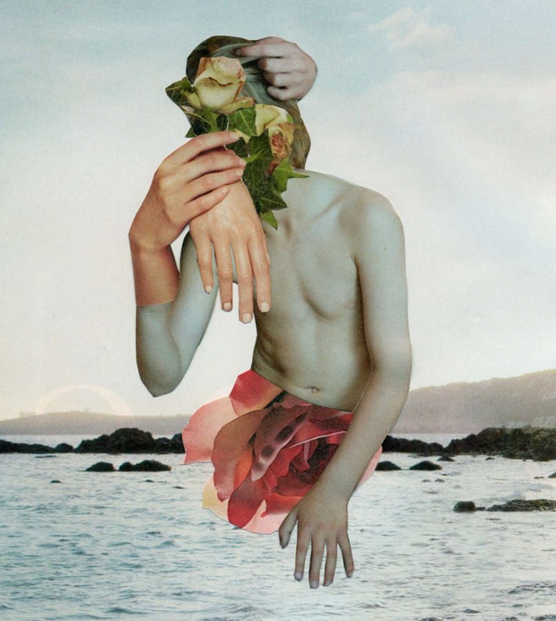
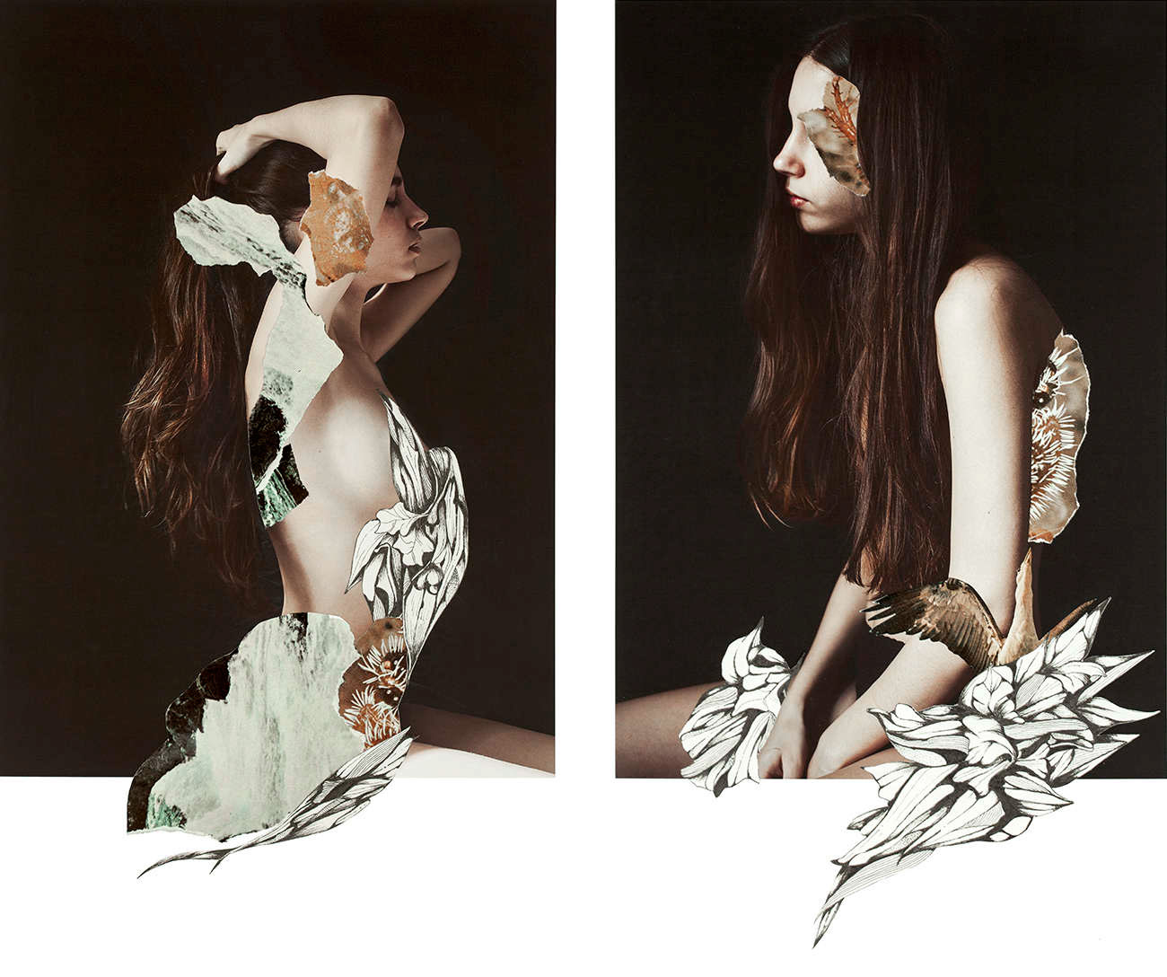
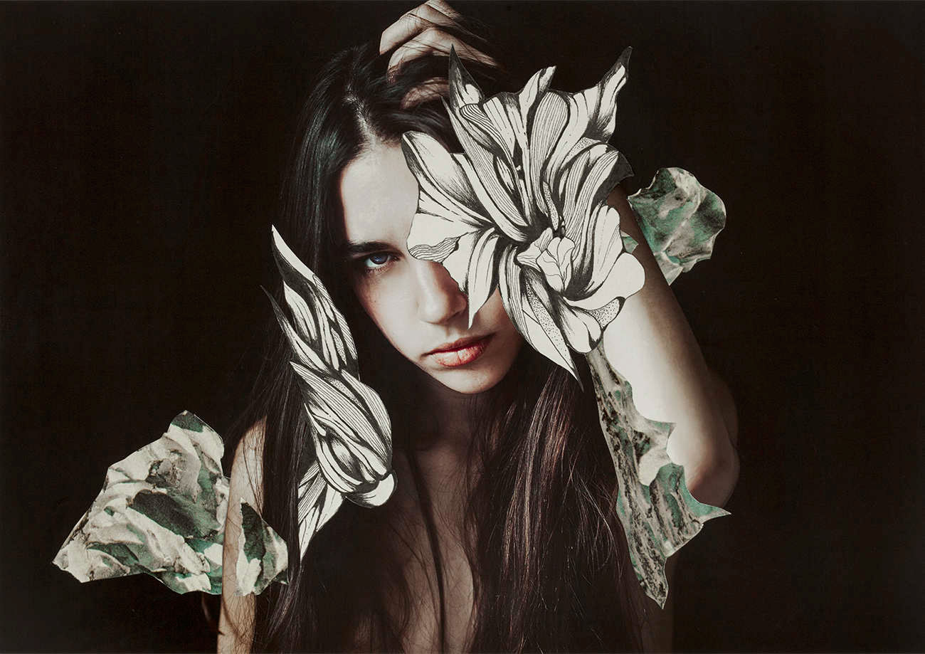
Examples of Her Work:
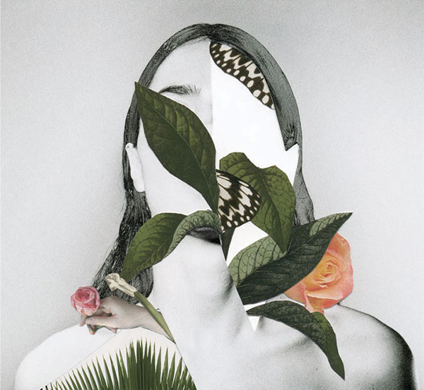
Rocio Montoya
Rocio Montoya
Rocio Montoya
Rocio Montoya Rocio Montoya
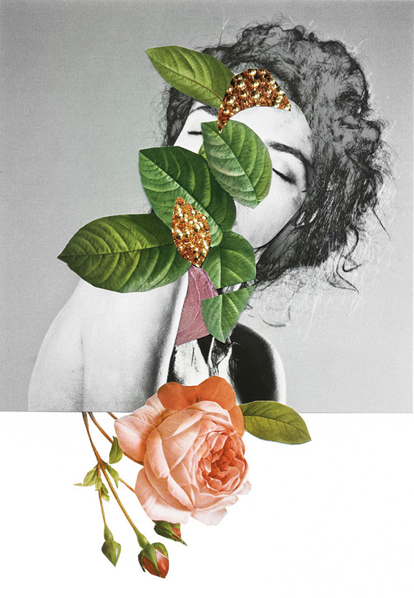
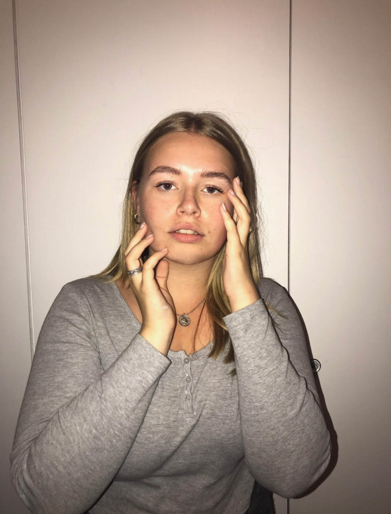
My Response:
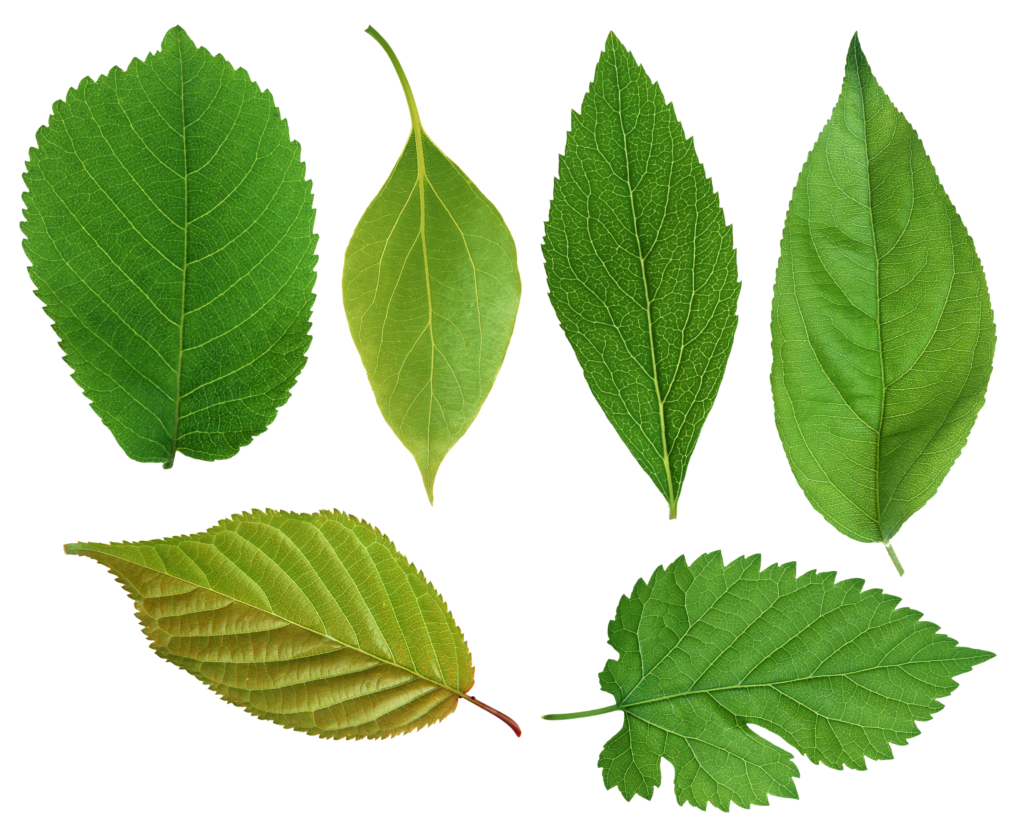
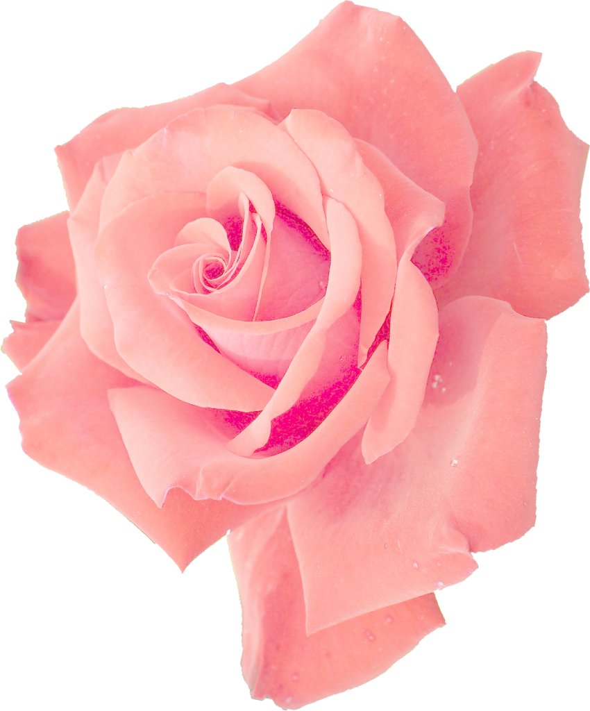
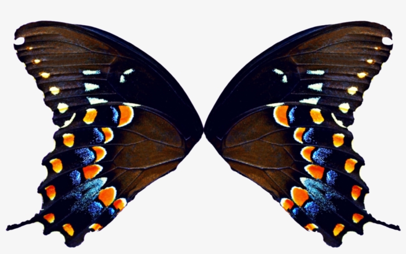
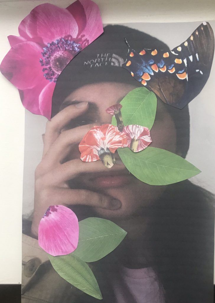
For my response, I will be printing out the photos and sticking photos of plants and vines onto the photo of the models. I will be linking it to the journey of life, the flowers and vines coming out of the models represents life itself.
Overall, I am really happy with how these photos came out. I think they capture Montoya’s style very well. I think if I had done them on the computer they would’ve looked a bit better, but I still like how they look on paper.