Category Archives: A02 Explore and Experiment

Filters

Author:
Category:

Recreation 3 // Balenciaga Paris | 80’s

For this photoshoot I will be taking another of the print advertisements that I have found to recreate in some way similar. I will again be keeping in mind Cindy Sherman and the way she embodies ‘characters’ and try to have my subject try this and have their own take on the image.

Background:

The era of the 80’s evokes very visual aesthetics that can be found specifically in this era. The high brands found in the 80’s prove to still set trends for today’s fashions, most of which people are familiar with Chanel, Versace, Armani and Balenciaga. The 80’s saw a rise in women moving into professions that were previously dominated by men. This trend sometimes lead women in these professions to not be taken seriously as they were often seen as primarily objects of desire rather than independent with ambition. This social issue created a movement named “Dress for success” or “Power dressing” with encourage the wearing of mote angular clothing that generally made them appear larger through the use of shoulder pads or sizable lapels and collars.

For these reasons I am choosing for my third recreation to produce a photograph resembling one of the Balenciaga adverts produced in 1983. I feel at this point I can show some of the developments of how woman and adverts were produced, in this era heavily woman were going into business work and were creating a new name for themselves.

Plan:

I will again be doing the photoshoot in the studio as this is most likely where the original was taken as it seems to be quite a stage studio like photograph with studio lights. I will also ask my subject to dress in a way similar to that of the original photograph, for example with a shirt of a similar style with the added skirt and bag. As it being a recreation I would like to get the outfit as similar as possible however there may be slight alterations of colours as to what is available however I would like to keep the same concept in place.

Third Recreation:

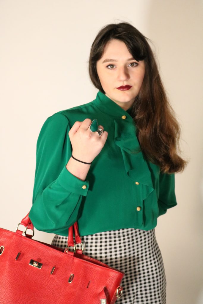
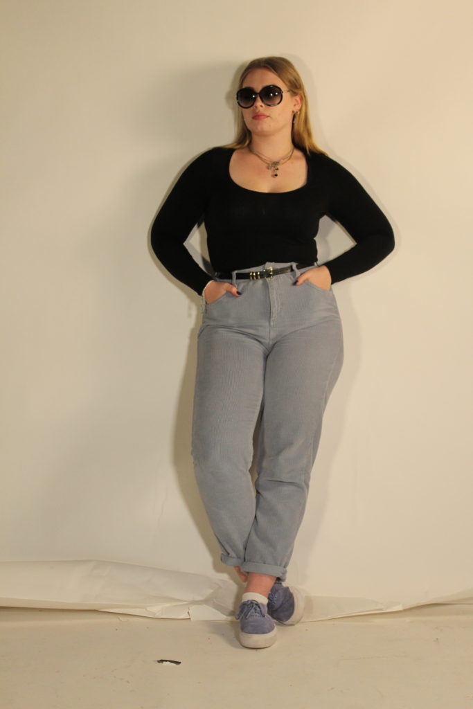
Above shows the advert I will be trying to produce. The photograph is a studio taken photograph that I will try to recreate. I dressed my model in a way that replicated what the original model was wearing as well as wearing a similar hair style to that of the original photograph.
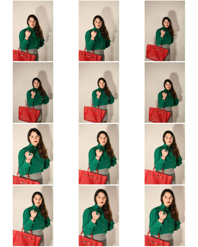
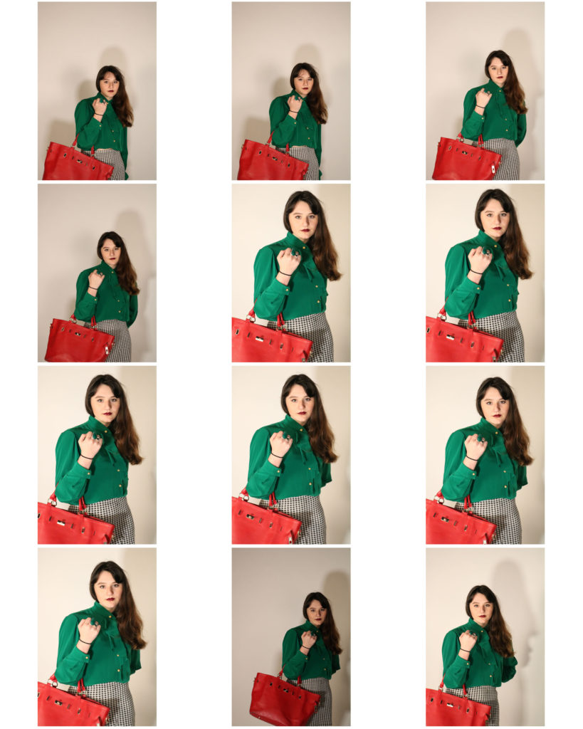
Above shows the contact sheet of my outcomes from the photoshoot. I feel the better photographs are the ones that are coming slighting closer to the model rather than the ones which are father away. Some of the photographs turned out slightly dark however I feel that the majority of the photographs worked well and how I wanted them to be produced.

Unedited Best Outcomes:

I feel that these three are my best outcomes from the photoshoot due to where my subject is positioned and how they are some of my more clear photographs. I am going to move forward and edit one of the following photographs too enhance it to be more like the original photograph.

Photo-shoot 1: Planning

For my first photo-shoot, I will be taking inspiration directly from photographer Bill Voila, and will be editing together a series of 3 photographs to present the journey an individual experiences from birth until after death, essentially condensing a whole life experience into 3 pivotal moments, including childhood, a main life event, and the changes that occur due to the death of an individual.

I will be using 3 different photo-shoots in 1 in order to produce the 3 different styles of images, that I will then merge together in order to form the layout for the final images.

Left: https://fashion-history.lovetoknow.com/fashion-history-eras/history-childrens-clothing
Middle: https://www.express.co.uk/news/uk/981563/Nurse-Margaret-Fortescue-World-War-1-anniversary-death
Right: https://www.flickr.com/photos/harlowirish/8155303100

The above image is a montage of image I found online (NOT my own images) in order to represent the layout that will be used in my own work. From left to right, the images will display a journey from childhood to adulthood, where a single event that represents the life work of the individual will be represented in the middle image. In contrast, the final image will be a representation of the death of the individual, with the way they are remembered/ have influenced the community presented as an example of how the journey through life doesn’t necessarily come to an abrupt end at death.

Examples of what I will use to represent the middle event of the subjects life include:

  • Securing a career/job
  • Achieving a life long goal
  • Illness or disease
  • Family crisis
  • Personal crisis
  • Loss (of family/job/house e.t.c)
  • Random event changes the direction of an individuals life

Examples of what I will use to represent the first event of the subjects life include:

  • Childhood/archival photos
  • Images of children playing
  • Life before the large event (showing contrast)

Examples of what I will use to represent the last event of the subjects life include:

  • What the world is like after the death of the subject
  • A representation of the reason behind the death of the subject
  • A scene showing the contrast between the beginning of life and what it looks like towards the end

Photoshoot 1 – Edits

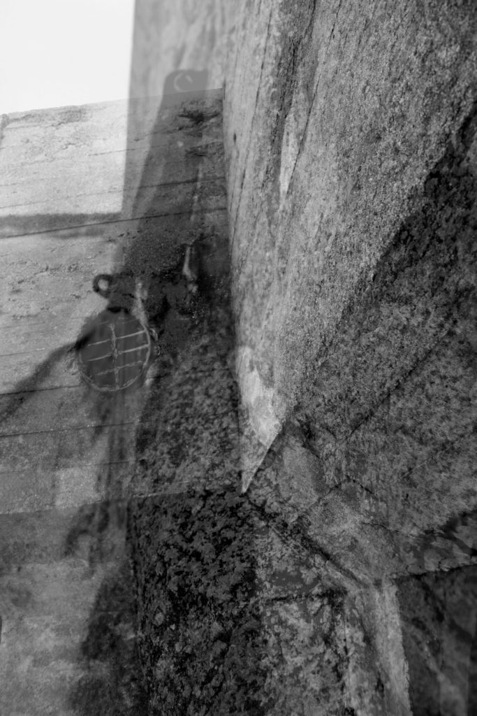
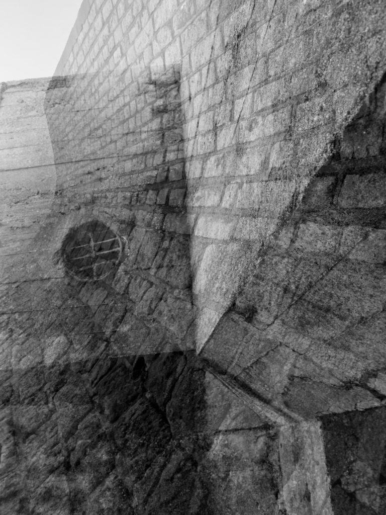
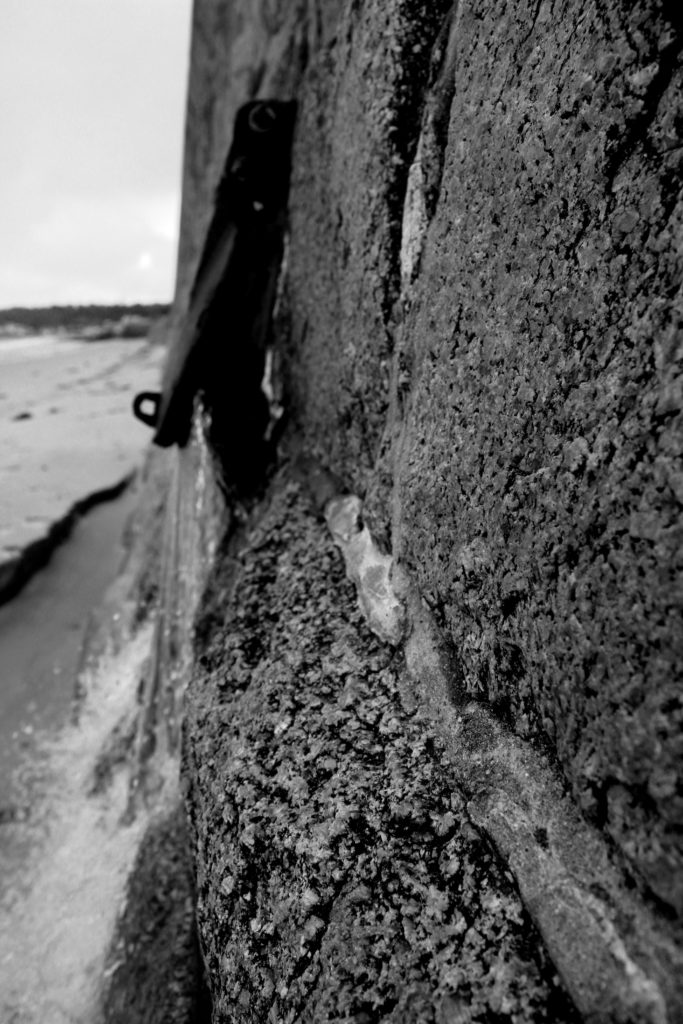
Within these edits I wanted to recreate the double exposure technique that Gina Socrates used in her photo shoot of capturing Jersey Sea wall. Doing this technique will allow to showcase the before and after of the sea wall, presenting the Journey of the sea wall in Jersey, plus showing a part of Jersey’s journey through the second world war. I decided to create three double exposures, using different images, to create different effects and present different formal elements.

To prepare the images, before combining them, adjusted the levels and curves, in order to have the textures of the walls to stand out (presenting the clear formal element of texture and shape). I then adjusted the hue and saturation in order to make the images black and white, which made a clear contrast in tonal regions. At first I experimented with changing the hue, in order to present the modern image of the wall to have a different look to the ‘older’ image to create a clear contrast and meet the aim of this photoshoot. However, I did not believe that this suited the effect I was trying to present and decided to turn the images back to black and white. Once I had all my images ready I opened up a new document, and placed both images onto the document. Using the transformation tool (ctrl + t), I adjusted the size of both images ensuring they fit onto the page. Then the image on the top layer, I turned down the opacity of the layer in order to reveal the layer underneath it. I then flatten the two layers and adjusted the levels again to ensure that the photographs had similar tonal contrast. I repeated this step with all the images until I received the outcomes I wanted.

My first edit has been the most successful as I believe that it clearly meets my artistic aim of present old vs new of the Jersey wall, presenting its Journey from the second world war. Moreover, I believe the two images used work together and create an overall visually stimulating photograph. The image shows successful photography techniques; for example the formal elements of texture, space and shape, clear focal points and depth of field, it also uses lines to help guide the viewers eyes around the image. This image has been the most successful edit from this process.
In my next edit I used two contrasting images, a macro image and wide angle image in order to show the contrast of the walls during the war and after the war. The two images fit nicely together and makes a visually pleasing image. Moreover, the formal element of texture and space which makes the image interesting to look at. Due to the two images being levelled differently, leads to the overall image being high in contrast, making the whole photograph as a whole look ascetically pleasing. Although, I like the way this image came out I believe that it is too busy and therefore not as successful as the first edit.
I believe that this edit is my least successful image from this process, but still wanted to showcase it in order to show the development process and my critical picking of images. The two images used do not work together, and makes an overall awkward looking image. Both images look similar and the effect is not as good with these two images. The space near the back of the image, also makes the image awkward looking and less pleasing to look at. Moreover, one of the images is a bit blurry, which shows a lack on camera control, however I used this to try and convey an old camera taking an image, but the effect did not work in my favour.

Comparison :

To compare my image to Gina Socrates there are multiple similarities and differences, but both present the same idea and contextual factors. One of the similarities is that we have both captured the same subject but have both taken different approaches in order to do so. I looked at macro images and focused on different areas of the wall which would showcase different formal elements. However, Socrates looks at the build up of the wall from a wider angle. In contrast, my images are presented in black and white as I wanted the texture and lines (detail) of the wall to clearly be presented to my viewers, however Socrates presents her images in colour with a hint of yellow/orange which also presents the texture of her subject. Personally, I believe that the black and white looks much better as it presents a more visually pleasing image overall, however, Socrates work is still successful. Another similarity is that we both took our photographs with the same aim, but both came out with different outcomes. We both used a double exposure effect in order to present the journey of Jersey’s seawall during the second world war, however she managed to do hers by changing the camera settings whereas mine where created using photoshop. Her blend of images is a lot smoother and the images fit nicely together, mine also do this but only slightly have areas where the two images do not fit (these are very small and therefore hard to notice. Moreover, my images are much sharper, presenting the formal elements much stronger creating a more powerful overall image, where as Socrates work are much weaker but still showcase a powerful image. My image is quite busy and lacks space, however Socrates work has more space and emptiness allowing time for the viewers to take in the message of her work. Overall, I believe that mine and socrates work share many similarities but showcase our preferred artistic style within the image. I also think that we have both come out with similar outcomes and therefore showing the success of my photoshoot and final images from the section of the project.

Adams – Face of Half Dome Monolith – Analysis

My favorite image of Adams is “Face of Half Dome”. The reason for this is because it is a sharp image that has a large amount of detail within it.

Technical

This image was taken on film in black and white originally. He also used a very high f-stop meaning that the image is sharp throughout. He also used a deep dark red filter.

Visual

The monolith is the main focus of the photo but there are other things like the ledge on the bottom right section of the photo and in the bottom left of the photo has detail showing the snow and the tree.

Contextual

Adams went to the spot where the photo was taken, first when he was 14 and then 11 years later, he want back to take this photo. When taking the photo he had his camera on a large tripod and had to take it on a two day hike to get to the spot.

Conceptual

The concept that Adams was aiming for and the point that he was trying to make to the viewer was that the American national parks are something that has undergone some change and he wanted to preserve the image before they changed beyond the point of no return. He also wanted to show the views with a level or Romanticism meaning that he would exaggerate the beauty and the views that he saw the ways that he did this is using colour filters and using very high focal lengths.

Le Hocq:Experiment 1

My Concept + Photo Shoot

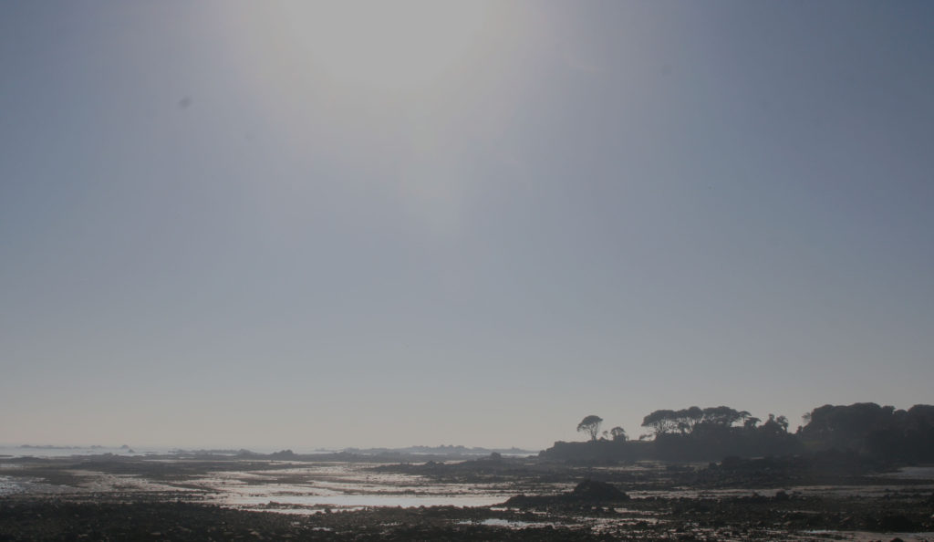
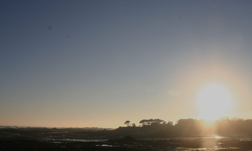
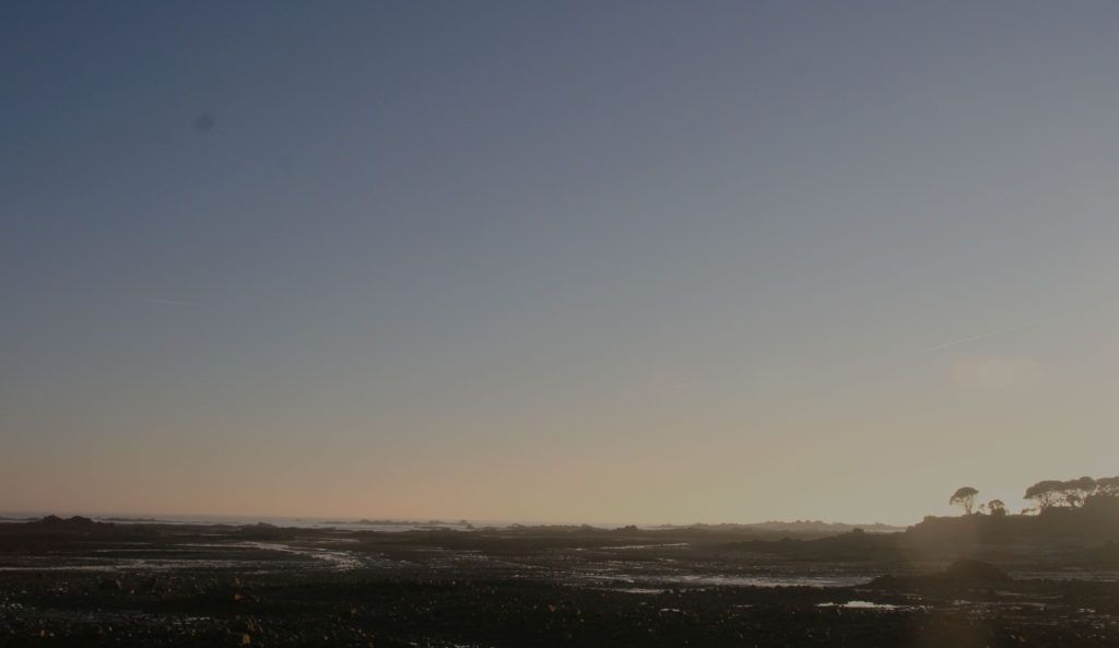
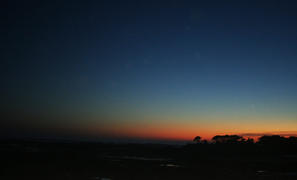
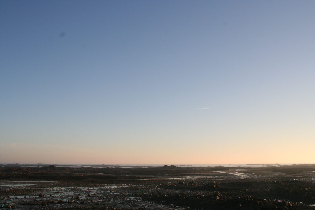
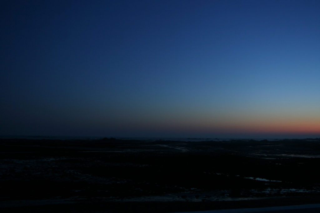
I wanted to focus on Le Hocq beach as I lived nearby and I wanted to be able to take pictures throughout the day. I wanted to capture the journey in which the sun, clouds, water takes on a typical day in Winter. I was lucky to have enough that the weather was good and the sky was clear, but that did mean I had to ensure my pictures weren’t over exposed due the harshness of the sun, this was difficult. I started taking pictures at 1 pm and took pictures every hour until 7 pm. I held my camera for the post part but for several photos I put my camera on the wall. The picture below aren’t of every hour but are the best to represent the movement of the sun and change in brightness. I aimed to create a timeline for an afternoon at the beach, to show the true beauty of one of my favourite beaches in Jersey.

trees 2pm
trees 4pm
trees 5pm
trees 7pm
front 4pm

Analysis

Overall I found my first experiment to be reasonably successful. If I were to do it again I would have used a tripod and kept it in the same place for the duration of the shoot in order to have more emphasis on the change in just one particular part of the beach, but this is useful to know for my next photo shoot. I feel like my photos are pretty self explanatory, as they are just a timeline of Le Hocq beach, I used a medium to large lens for my photos as I wanted to focus in on specific parts of the beach but also capture the full atmosphere. I edited my photos in Photoshop by lowering the brightness, increasing contrast and lowering the exposure for the pictures I took earlier in the day. These pictures are personal to me as they are the view I having being seeing for the last 8 years, day in day out, so for me it’s nothing special in day light, but when the sun goes down it creates a different scene for me, something familiar yet exciting. I wanted to empathize how repetitive views don’t always have to be boring, the weather changes, the sun position changes, the sky is never the same, clouds are always moving, they change shape, the sun is always moving.

First photo shoot planning

My first photo shoot will be based on cars, and partially the scenery around them. I will most likely edit them afterwards to look like grainy 90’s photos, this will give all the photos a common theme which will help them fit together more as an exhibition. The coursness might also help distract the eye from imperfections in the photos. I will also take some inspiration from Easton Chang (a photographer I have previously researched) in the form of using colour very sparingly in these photos. If

Editing and Developing: 2

Chosen Photograph:

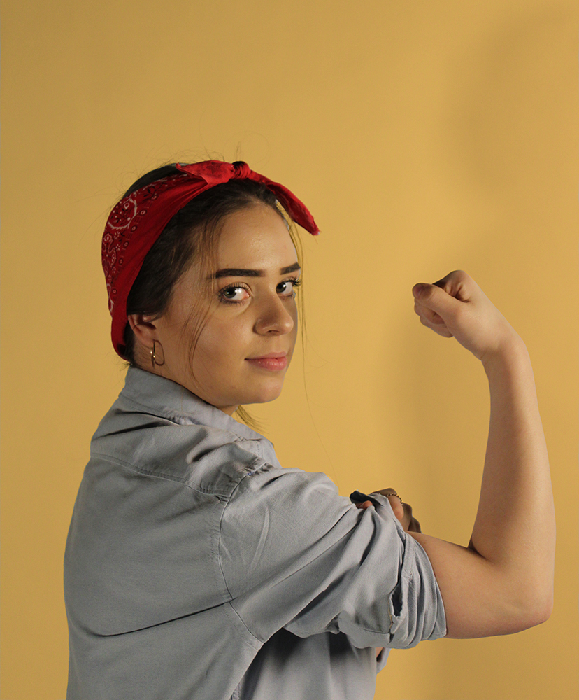
Above shows my chosen image to edit and experiment with, I have chosen this photograph as it was one of my most clear image and I feel that my subject is positioned well in the frame and there is good eye contact and facial expressions with the camera. The lighting is also good for in this photograph there is no need for too much adjusting of the brightness in this photograph which is why I have chosen to edit this photograph.

My aims while editing this photograph is to create a yellow tint in the background of the photograph to replicate the yellow background of the original poster as I feel this will really help the photograph to become better and enhance it.

Editing Process:

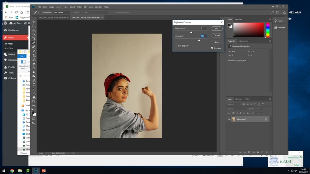
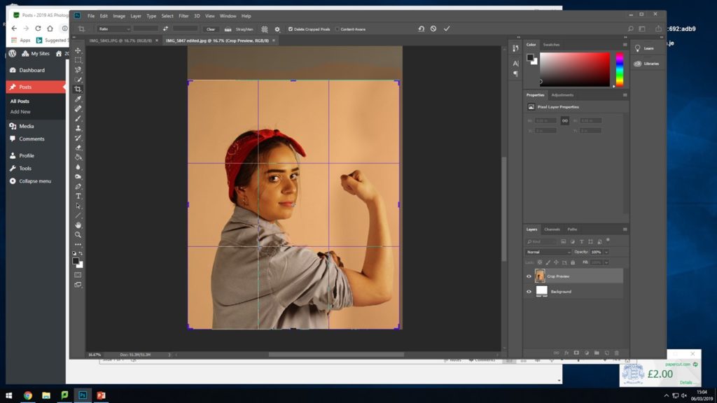
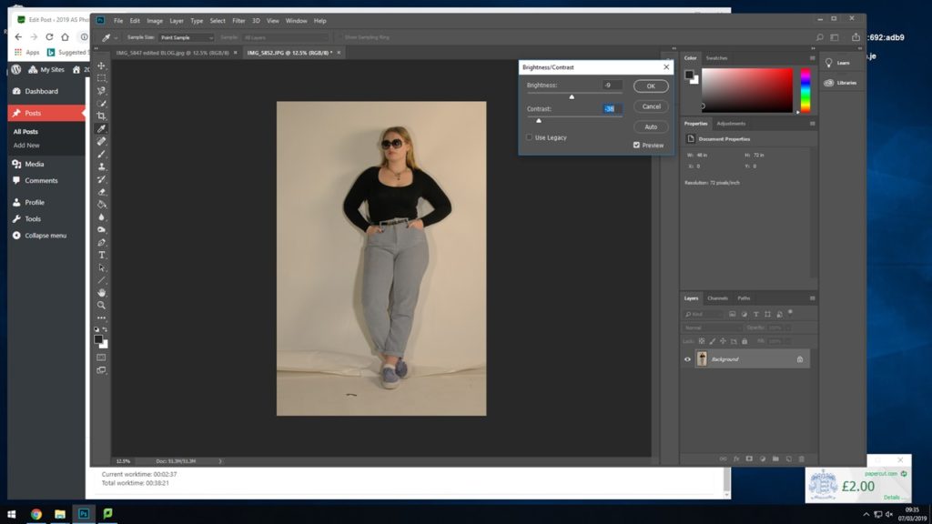
I began by adjusting the brightness and contrast so that I have a good base for adding on the filters for the colours.

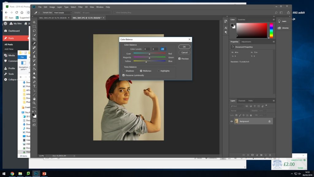
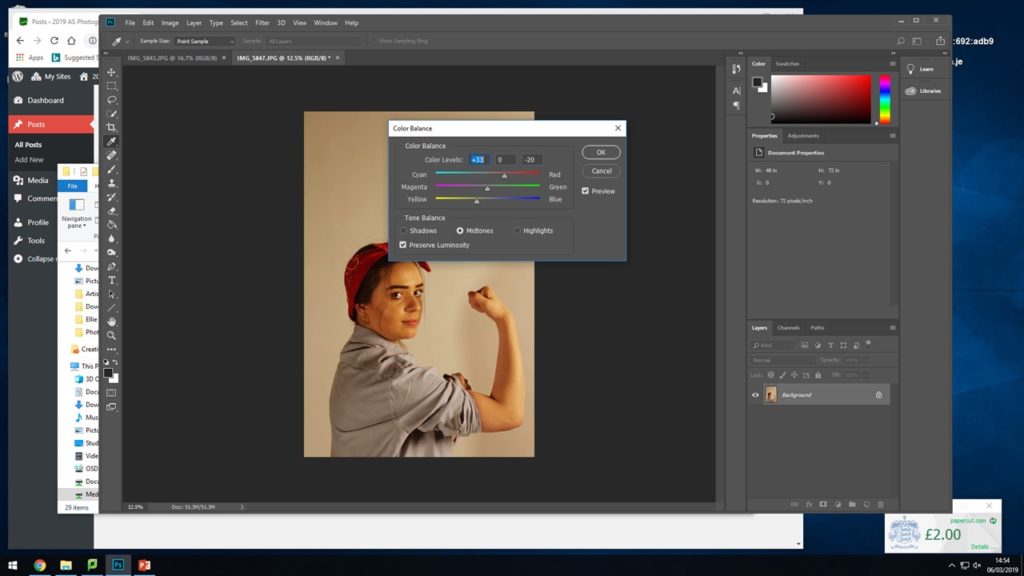
For the next two steps I experimented, adjusted and edited the strengths of the yellow and red colour tones coming through in the photograph. I did this so that there were already tints coming through and to make it easier to place the yellow warming on top.

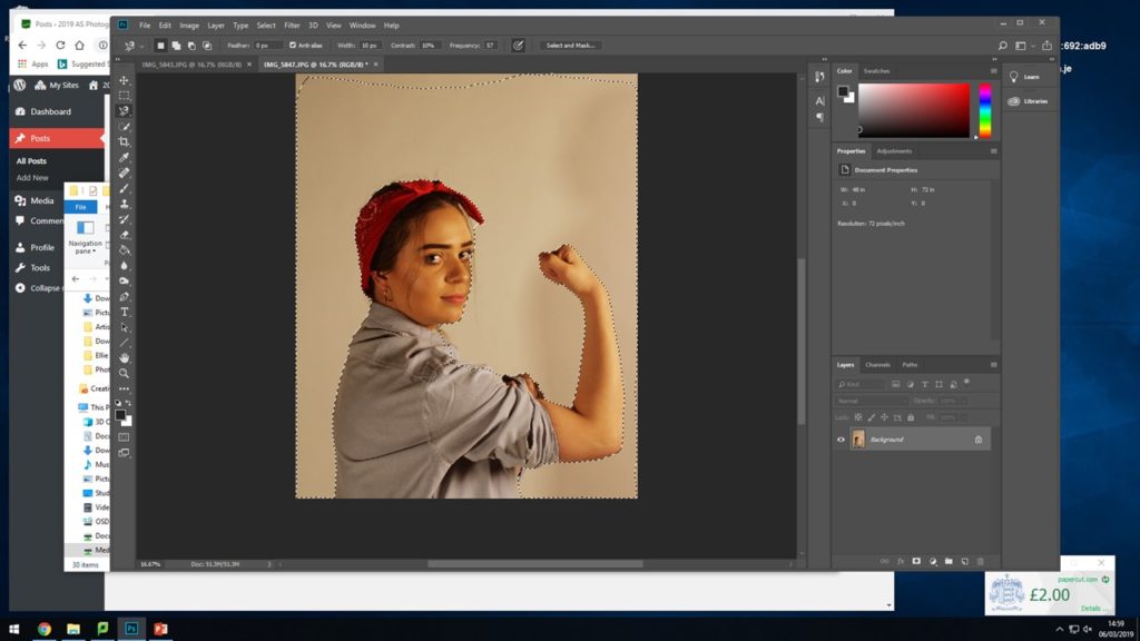
Here I selected the whole background area surrounding my subject, when adding on the warming and yellow filter I didn’t want them to mess and alter the colours and tones of the subject in the image, I wanted to try and keep the red and the blue of her shirt and head band so I selected al the way around her body and around the frame of the photograph to have a specific place to add the filters.

After adding on the filters I experimented with cropping the photograph down so that the subject fills more or less of the frame and see where it sits best as I did not want too much unnecessary blank space above her head.

Final Outcome:

This shows the final outcome for how I edited the photograph, I used the warming filter (81) as it had more yellow tones in which I felt worked well with the original photograph and also worked with this recreation. I feel this photoshoot and editing was a success and that it generated an accurate outcome I am happy with that I feel works well.

Recreation 2 // Rosie the Riveter | 40’s

Background:

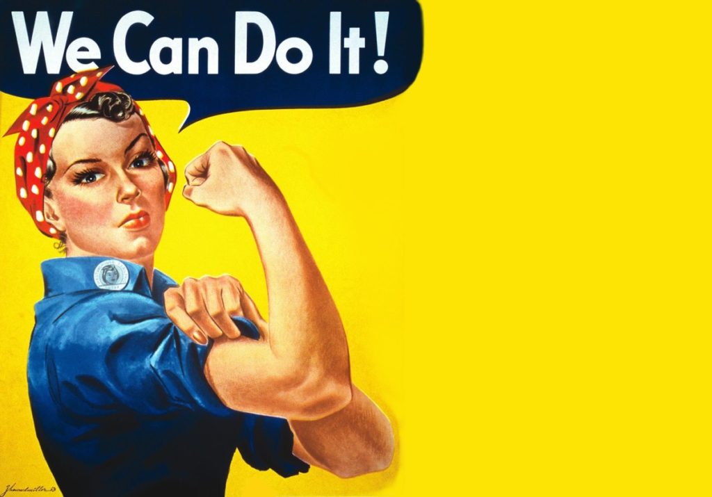
“We Can Do It!” is an American World War II wartime poster produced by J. Howard Miller in 1943 for Westinghouse Electric as an inspirational image to boost female worker morale. It was seen little during the war and was rediscovered early 1980’s and was widely reproduced, often called “We Can Do It!” but also called “Rosie the Riveter” after the iconic figure of a strong female war production worker. The image was used to promote feminism and other political issues begining in the 1980’s, it was incorporated in 2008 into campaign materials for several American politicians. Compared to all this during the war time the image was strictly internal to Westinghouse, displayed only during February 1943, and was not for recruitment but to exhort already-hired women to work harder. People have seized upon the uplifting attitude and message to remake it into many forms including self empowerment, campaign promotion and advertising.
I am choosing to recreate this specific poster to indicate the changes in this era of the 40’s as I feel it has that showing of development and progress and is a widely known poster, it represents how woman were being treated at the time and suggests towards how they were being advertised as they now took on ‘mans work’. I feel that it is a good example to show how women began to be portrayed when men weren’t there and then that it got picked back up during a strong female movement.

Plan:

For this photoshoot I will be taking the image in the studio to give me the best lighting for recreating these AD’s I will use two different subjects one in each of the images.  I am going to be dressing the subject in clothing that is almost exact or close to what the subject in the original image is wearing.

For the second recreation seen below I will adjust the persons hair and find clothes and props best suited to the photograph. The aim of this photoshoot is to create an accurate recreation of the photograph below and try to show and explain some of my inspirations coming from Cindy Sherman.

Second Recreation:

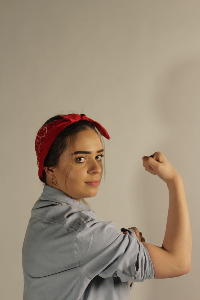
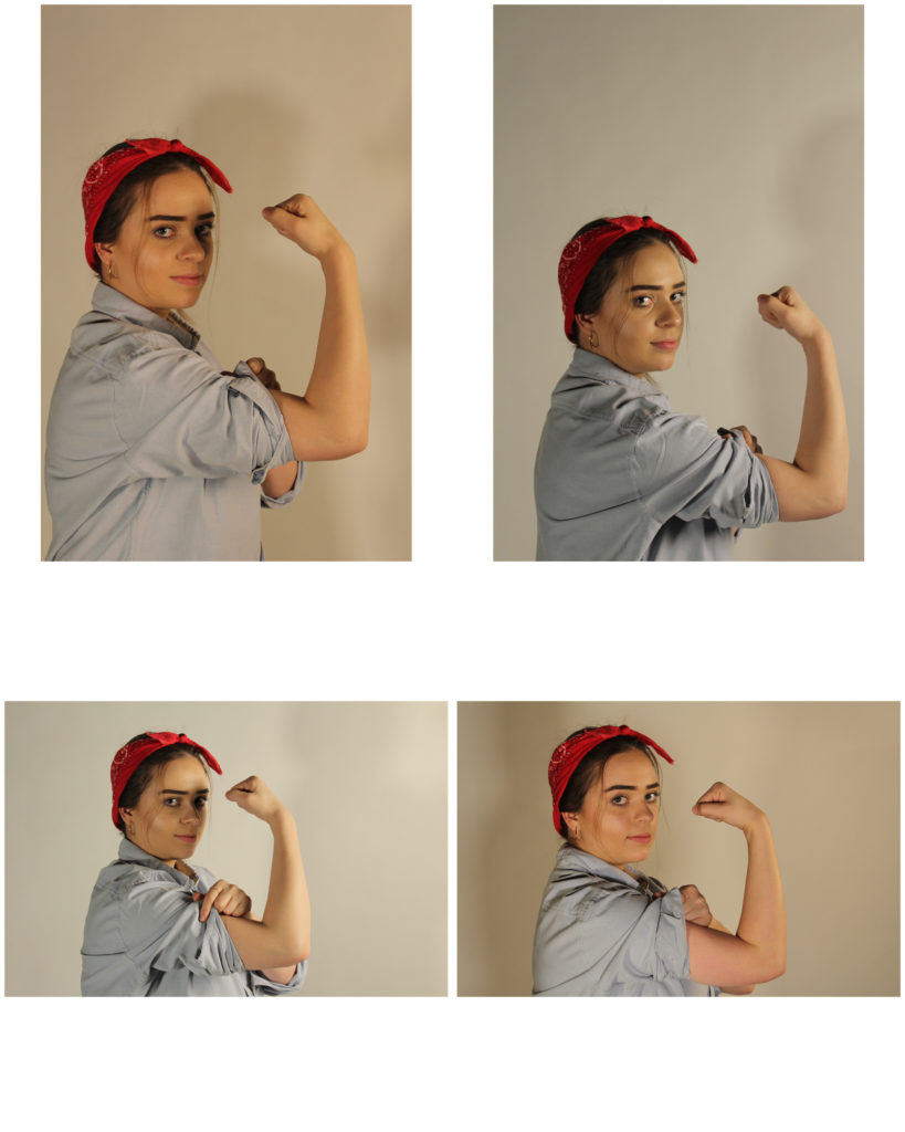
Above shows the Poster I was recreating, for this recreation I took the photographs in the studio as this enabled me to have a plain background as to edit the image on and the poster itself also has a plain background. I dressed my subject the same or similar as the figure in the original and took the time to get her to pose in the same manner.

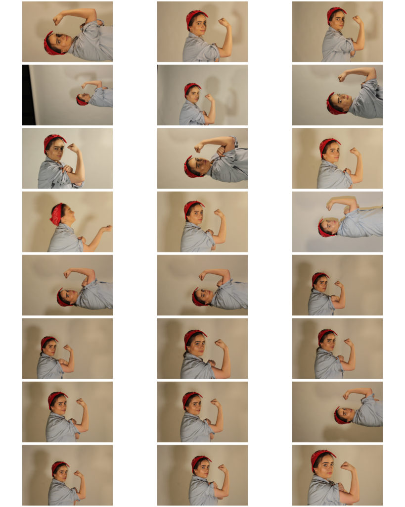
Above shows the contact sheet of my outcomes from the photoshoot, some of the photographs came out a little dark however I should be able to edit these images and fix that in Photoshop.

I feel I have tried to show my inspirations coming from Cindy Sherman through the work by having my subject en body the person in the original ad and begin to represent herself in that way.

Unedited Best Outcomes:

Below shows what I think to be my best outcomes before I am editing the images to enhance them more and edit them to be more like the recreation. These are the four I think are the best however I will only experiment with editing one or two of them.

Experimental photoshoots

Before I started to do photo shoots based on other photographers, I wanted to get a rough idea of what would be good to photograph to start me off on the theme of Journeys and Pathways. As an experimental photo shoot, I went out on multiple occasions and took pictures of what I thought could fit into the concept of the theme.

Contact sheets:

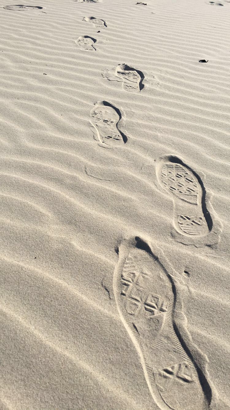
In these images I concentrated on getting images on which I thought could relate to the theme. I took images such as actual pathways, the water and waves coming in on the beach, pictures of my feet walking, pictures of the view from when I was on a plane, and footsteps on the beach.

Chosen images:

Final edited images:

In this image I decided to add more colour and to blur out the further steps to create more of a depth to the picture. To do this I first cropped the image to get out the unwanted parts in the background and then played around with the brightness and contrast, increasing them both equally to lighten the light areas and darken the shadows. I then went and increased the exposure a little bit, and increased the vibrance and saturation a significant amount, making the sand look more golden. I finished with changing the hues in the image.

What I like about this image is the neatness of it, the sand around the footsteps seem calm and natural, and then the footsteps in the sand bring some sort of chaos with them, messing the sand up as they go. This could portray the effects which the journey of someone can bring, making their imprint on the surroundings around them. I also like how the image becomes darker as it comes closer towards the camera, as it adds to the depth of the picture.

What I should have done to improve the picture was to maybe angle the camera more upwards, maybe getting more of the surrounding beach which would have added more to the image. I also think I should have maybe darkened the edges of the image when editing, which would have given it a nice effect and made the viewer focus more on the footsteps than the actual sand.

In this image I decided to edit it only a little bit. I first cropped the image so it was smaller and focused more on the moving leg, and then I went and increased the brightness and contrast in the picture. I then followed on by going straight onto the vibrance and increasing that only a little bit to give the image more of a colour to it, and then finished off by using the dodge tool to brighten the whites of the shoe, making it pop out against the dark background and rest of the shoe.

I like this image because it has a certain movement to it, as if the person in the image is in a rush to get to a certain destination, and I feel as if that’s clear in the image. While the surroundings are all blurred and moving, the foot in the middle of the image seems to be more focused than the rest of it, although it too was caught in the middle of movement like the rest of the image, and I feel like that gives it a nice affect.

However, I feel I could have done better with this image by getting it more focused on the foot and leg in the image. While it’s not as blurry as it’s surroundings, it’s still a bit out of focus and I think it would have been more successful if I had been able to get the camera to focus on it a bit more.

In this image, I wanted the viewer to focus more on the path and less on the beach surrounding it, so to do this I started editing this image by dropping it down to a point where the stone pathway was the only thing you can see in the middle of the image, removing the sky and most of the sea out of the photograph. I then blurred out the surroundings which were further out, and a little bit around the image to make it easier to focus on the pathway. And then, to add a bit of colour and light, I increased the brightness and contrast like i’ve done on my other images, and then increased the vibrance and played around with the hues until I got my desired outcome.

What I like about this image is that the stone pathway is right in the middle of the image and continues vertically until right to the end, which was the effect I was looking for. I also like how each side of the pathway are different, with one side being nice and sandy while the other side seems almost swamp-like and covered in seaweed, which could be interpreted in many different ways.

Although, what I don’t like about this image is the quality. Since I took it on my phone, it didn’t come out as good of quality as a digital camera would take it in, so I think i’ll be re-taking this image again but using my camera instead of my phone, and see what kind of results I get, and hope that it’s much higher quality then what the phone could give.

Editing and Developing: 1

Chosen Photograph:

Above shows the photograph I have chosen to edit in response to the fashion photograph I was recreating. I have chosen this image as it was one of my most clear photographs and I feel replicates the original best. I also feel that in this photograph the lighting was working well compared to some of the other outcomes I produced and the subject is standing in the most similar way to the original photograph.

My aims while editing this photograph is to not adjust the photograph too much but to adjust the light and contrast to then put a black and white filter over the top to then create an accurate final outcome.

Editing Process:

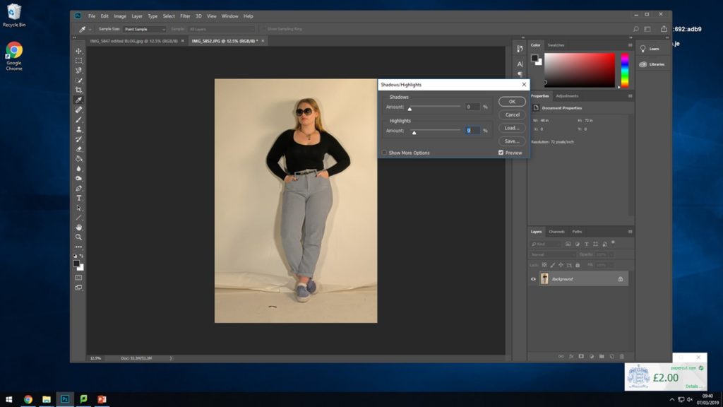
For the first step towards turning the photograph into black and white I started by adjusting the brightness and the contrast slightly so that I had the best amount of shadows and highlights that I felt would work well once in black and white.

Next I went in and only slightly adjusted the actual shadows and highlights just to enhance what I previously did with the brightness and the contrast.

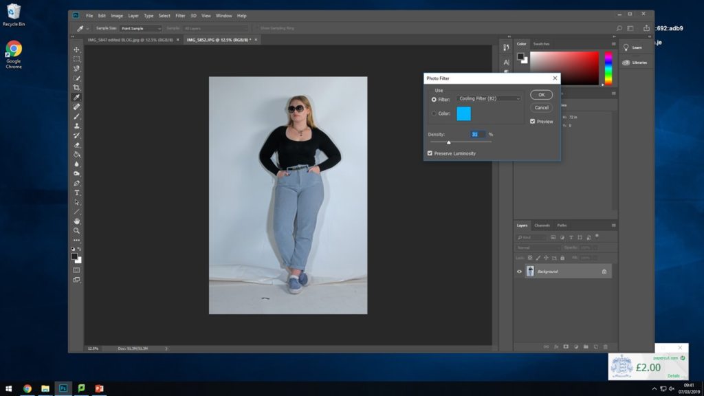
For the next step I experimented with placing a cooling filter over the top of the photograph to see how this would effect the image when putting it into black and white to take away the yellow and warm tones.

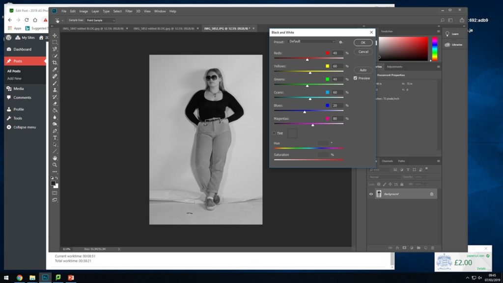
Finally I placed the black and white filter over the top of the photograph to recreate the final photograph best and to enhance this photograph itself more.

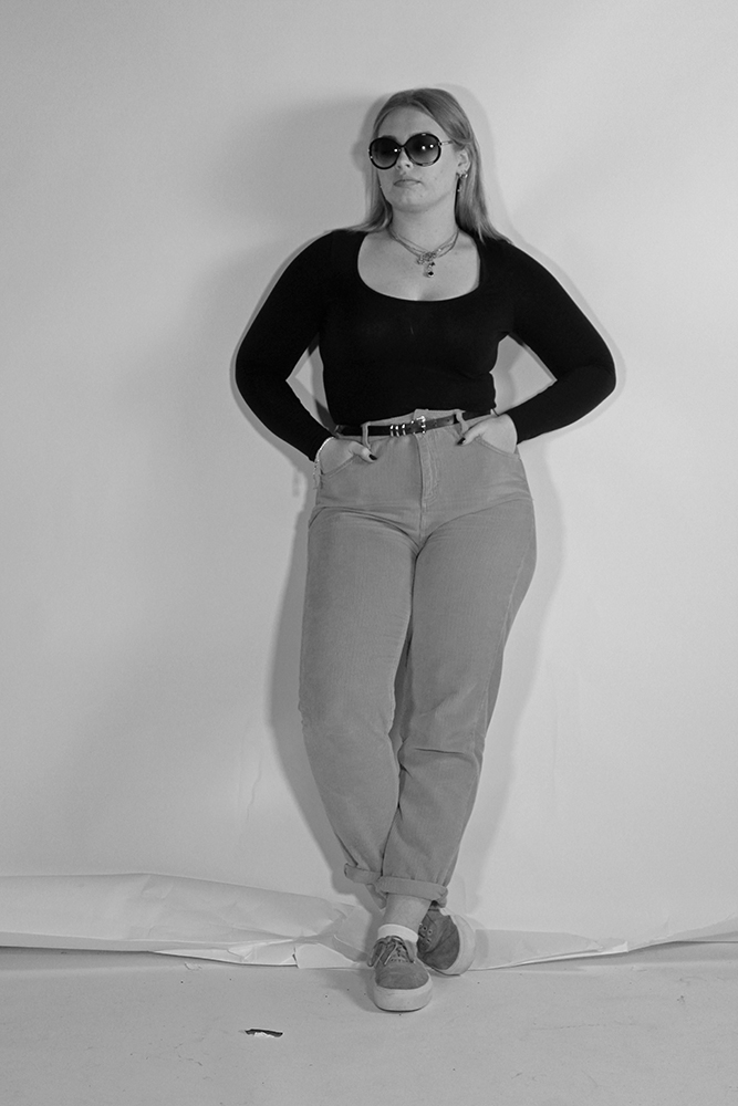
Final Outcome:

This shows the final outcome for my finished edited photograph, I feel the photograph worked well. I feel it works well in the black and white tones and placing the cooling filter over the top also worked well with enhancing the photograph.