Category Archives: A02 Explore and Experiment

Filters

Author:
Category:

A Life Between Propaganda and Reality – Alice Wielinga Case Study

Image result for alice wielinga

Alice Wielinga: ‘A Life Between Propaganda and Reality. In her North Korea – A Life between Propaganda and Reality series, Alice Wielinga links the documentary photographs she took in North Korea to the propaganda images produced by the government. Her pictures are part of the North Korean Perspectives exhibition, on display at the Museum of Contemporary Photography in Chicago, up until October 4, 2015.’

‘North Korean: A Life Between Propaganda and Reality’ is an ongoing project by Photographer Alice Wielinga. This project began in 2013, when at the time western media was following the steps of Kim Jong-Un closely during his missile test launches, Wielinga traveled 2500 kilometers through the inlands of North Korea.
“I decided to find out what was happening inside North Korea, behind its propaganda that masked such unfathomable despair and poverty. During my trip I collected propaganda material and took documentary photographs of the reality I encountered. In the final works, a dialogue between propaganda and reality has emerged, trying to reconcile the present and the future of the country nobody really seems to know.”

Image result for alice wielinga north korea

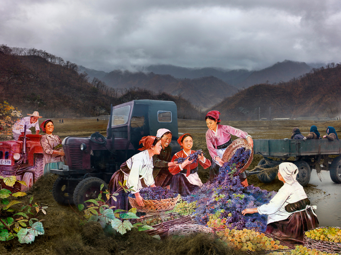
Wielinga’s main aim of her trip was show what the realities of North Korea were, compared to the idealistic version of the country: which is presented through propaganda throughout North Korea itself and other countries.

Analysis

The photo above is one of my favourites from this project, as I think it outlines her intentions the best and shows the greatest comparison between the two worlds. Beginning with the setting of the picture, on the real life version, it is gloomy, there is a lot of fog and mist. The trees are barren and there is no greenery in sight. In the pond, the difference between the two is very clear, the pond in reality is drying out and is surrounded by old debris from the area around it, there are broken boxes strewn everywhere and the buildings in the background are grey and seem to be decrepit, almost falling apart. The reality side overall looks like a wasteland. This juxtaposes the painting version of the scene. This was taken from an archive of government paintings of North Korea. The colours are vivid, the sun is shining and everything seems to be picturesque. There is no lack of greenery, the trees are full of leaves and there are flowers everywhere, this painting overall presents an idealistic view of the country, how it wants to be regarded by the rest of the world, who are forbidden entry. Lastly, the people in the image: in the realistic version their clothes are dark and look like government-issue workwear. In the painting they are wearing brightly coloured free flowing clothes, the women are wearing dresses and they all seem to have freedom. Which the outside world is aware that they definitely don’t have, everything in North Korea is controlled, even hairstyles. The facial expressions on each are also wildly different, in the painting they are smiling and laughing, happily getting on with their days work. In reality, the workers are forced, their faces are staring unknowingly at the camera and they look tired and worn out from the regime.

Brief History of Propaganda in North Korea:
Propaganda has been used throughout history to influence and sway public opinion, particularly in totalitarian states. Being subject to endless propaganda is common for North Koreans, especially anti-American propaganda. Throughout history it has become common knowledge that the North Korean State hates Americans, this is because in the Korean War, American planes dropped approximately 635,000 tons of explosives on North Korea (that’s more in three years than during the entire Pacific theater of World War II), including 32,000 tons of napalm.
That continued fear of deadly US military airstrikes helps the North Korean government to portray Americans as a far-away caricature, a faceless enemy that leveled their country and could do so again.
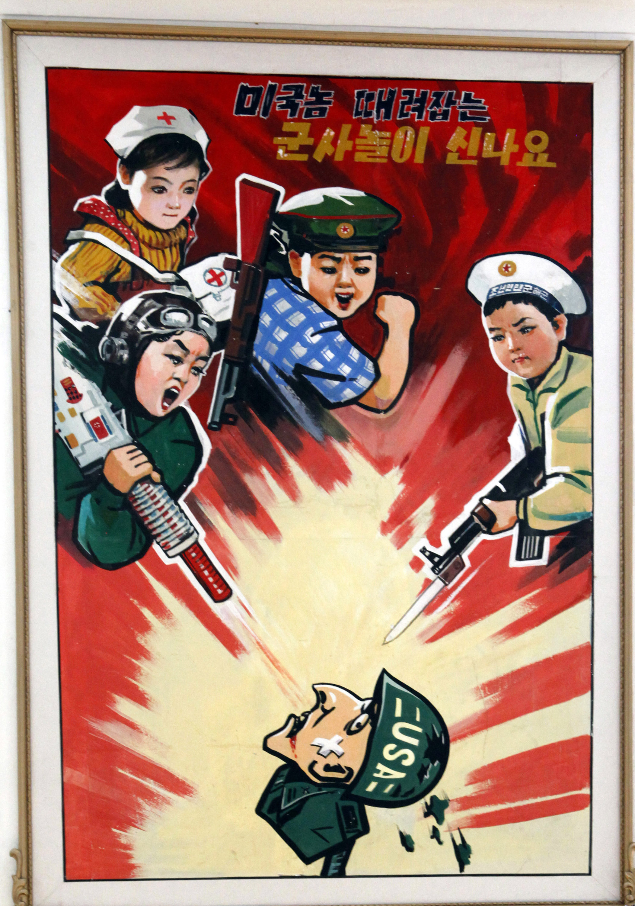
Above is a North Korean propaganda poster displayed at a kindergarten in 2012 in Pyongyang, North Korea. The Korean characters say “we love playing military games knocking down the American bastards.”
The North Korean state attempts to create a deep hatred for the United States. Kindergartners draw anti-American martial images. The Korean news media releases videos of the US military in flames. The June 25 anniversary of the start of the Korean War is “the day of struggle against US imperialism.”

Wielinga has also done a Ted-Talk since returning from the trip, where she explains what she learnt from working with North Korean Artists. I have linked this below. For my own work, I want to explore the technique in which Wielinga uses to bring the two realities together and bring a bit of awareness to certain topics, however on a smaller and less serious scale than North Korea.

Sources

https://edition.cnn.com/2017/07/26/asia/north-korea-united-states-relationship/index.htmlhttp://www.alicewielinga.nl/

Response to Stephen Calcutt

Stephen Calcutt

Image result for stephen calcutt photographer

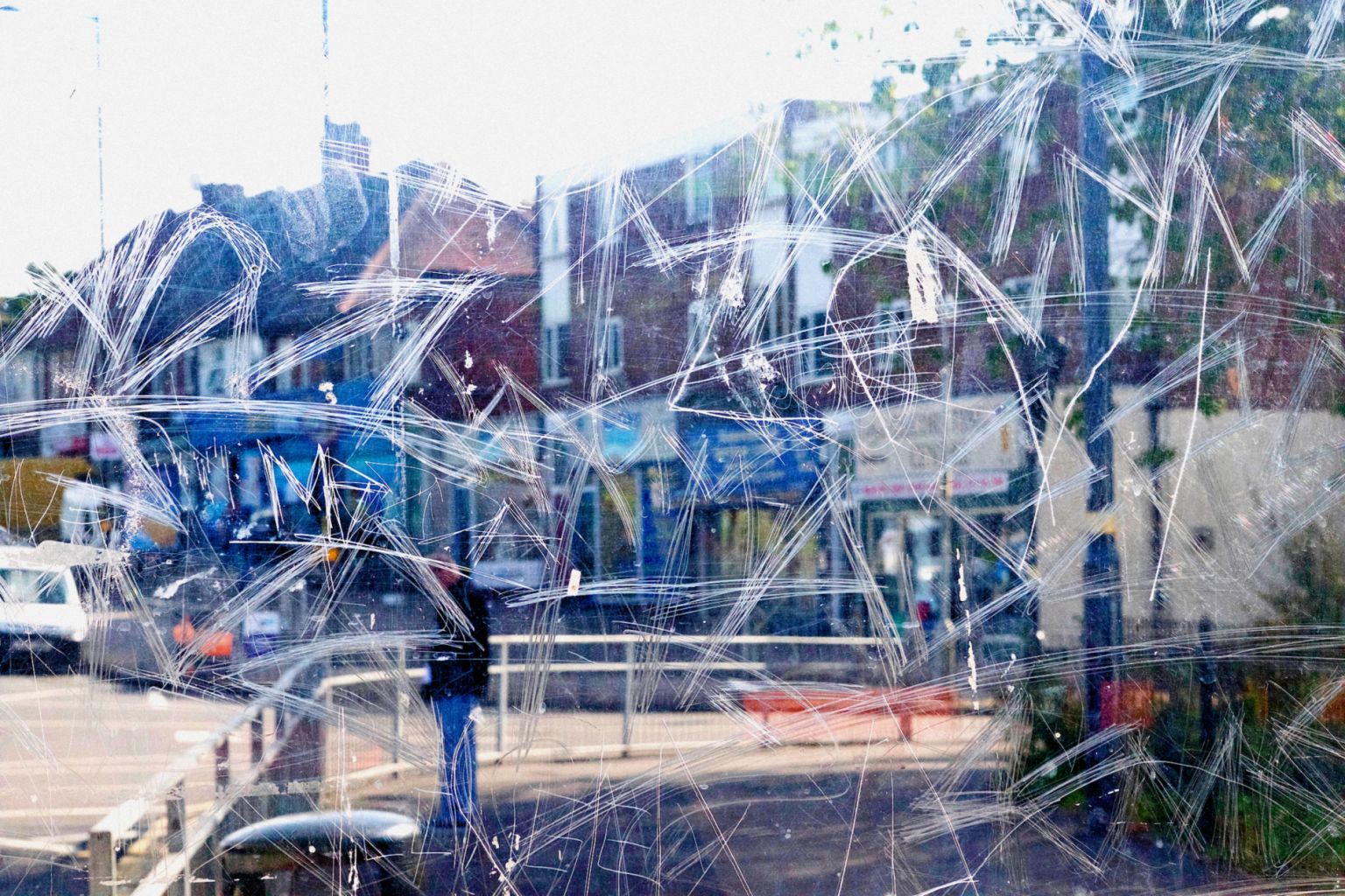
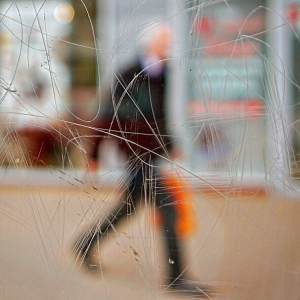
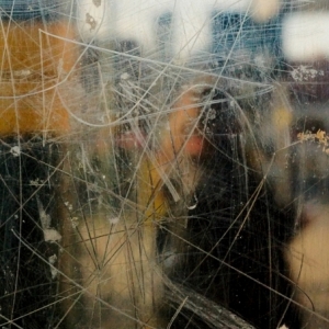
“Reflecting the work of abstract artists and following in the footsteps of photographers such as Saul Leiter. Stephens unique form of street photography is a consequence of frequenting bus stops and shelters around the City of Birmingham. Graffiti can be great art, however for Stephen, the etched, scrawled and scratched graffiti into the Plexiglass windows of the bus stop feels like a violation. The graffiti etched and scrawled in the bus stop windows seem to be expressions of frustration or anger, hate and  love  written into the Plexiglass.

The  windows full potential as a clear barrier between yourself and the elements are compromised when the view beyond is obscured, distorted and blurred by the scratches. The the graffiti etched window becomes a  lens. Stephen merges the graffiti and the view beyond, focusing his camera on the etched lines. The view beyond is put out of focus. The graffiti and view are merged  into a single plane. A new perspective is created, that retains and emphasises the energy of the graffiti. Its swirls, zigzags, lines and curves, slash across the abstracted view like paint strokes. At first glance, the photos may be mistaken for abstract paintings. Then closer inspection reveals they are in fact photographs.

The subject matter that is out of focus is also fairly mundane. Often when waiting for a bus the view is not particularly exciting. The human activity he prefers  capture is not very dramatic. When combined with the mundane graffiti and the mundane view it adds to his  desire to create a new  image that ordinarily would be uninteresting or unnoticed. Even the title of each work is mundane, the descriptions of each photograph are  very droll.

The  way he uses the camera for this project is like painting with light. He breaks the rules for getting a traditional photograph. He puts the view that is usually the focal point out of focus. Stephen then focuses on what would normally be avoided. However, the resulting images are very dynamic and often vibrant. There is a metamorphosis, the mundane graffiti and the often-mundane view are merged into a fresh new image. There is an attraction to the paradox that his work invokes. Stephen makes unique beautiful images out of the vandalised bus stop windows.

Stephen loves the images he produces. However, he doesn’t condone the vandalising of the bus stop windows that provide the lens for his work. The Bus Stop series is a unique approach to photography. Bus Stop brings the current social issue of a specific form of vandalism to the fore. The art works are  a product of modern vandalism. Vandalism that has found the Plexiglass windows of bus shelters an ideal medium to express feelings. Although Stephens work has so far been derived from the city of Birmingham it is an issue familiar to the many people of all ages who travel by bus in urban and rural settings across the UK. His  photography challenges people to look at the issue vandalism. From the protagonists to the observers of their markings. It also challenges people to see the potential beauty in mundanity.” https://www.stephencalcutt.com/about-me-stephen-calcutt

Examples of his work:

Image result for stephen calcutt photography
Stephen Calcutt
Image result for stephen calcutt photography
Stephen Calcutt
Image result for stephen calcutt photography
Stephen Calcutt
Image result for stephen calcutt photography
Bus Stop 91 – Stephen Calcutt
Image result for stephen calcutt photography
Stephen Calcutt
Image result for stephen calcutt photography
Bus Stop 16 – Stephen Calcutt

My Response:

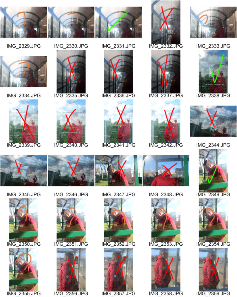
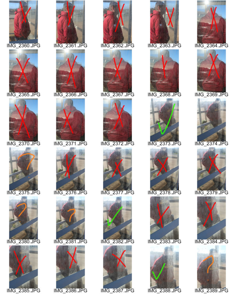
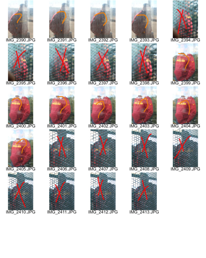
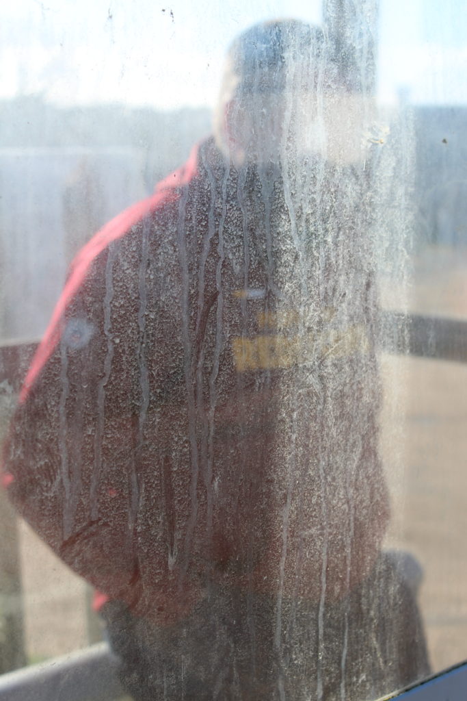
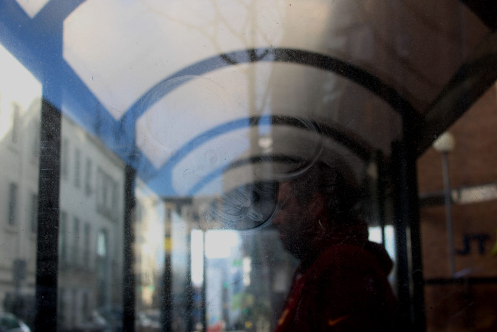
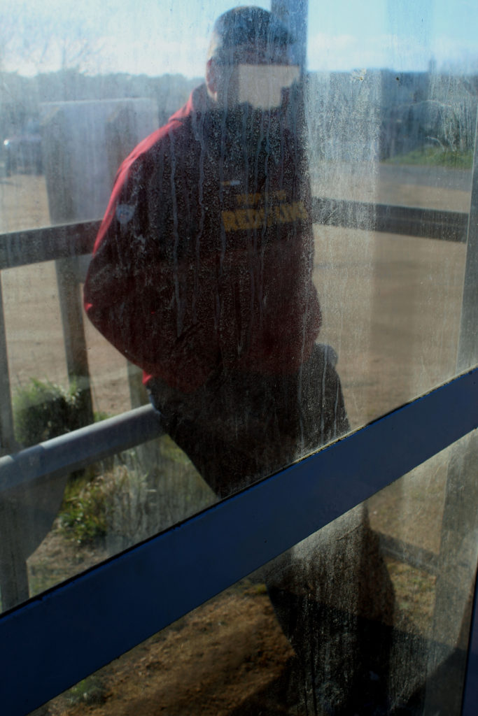
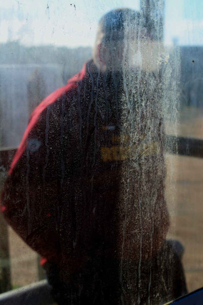
I will be taking photos around jersey at a few different bus stops so I can capture Stephen’s style. I will be using my canon camera to take these photos. I am linking this to Journeys and Pathways by showing the physical journey of taking a bus to get to your desired location. My step dad was the model for this photo shoot because I did this on a Sunday so there wasn’t a lot of people at the bus stops.

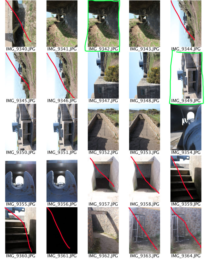
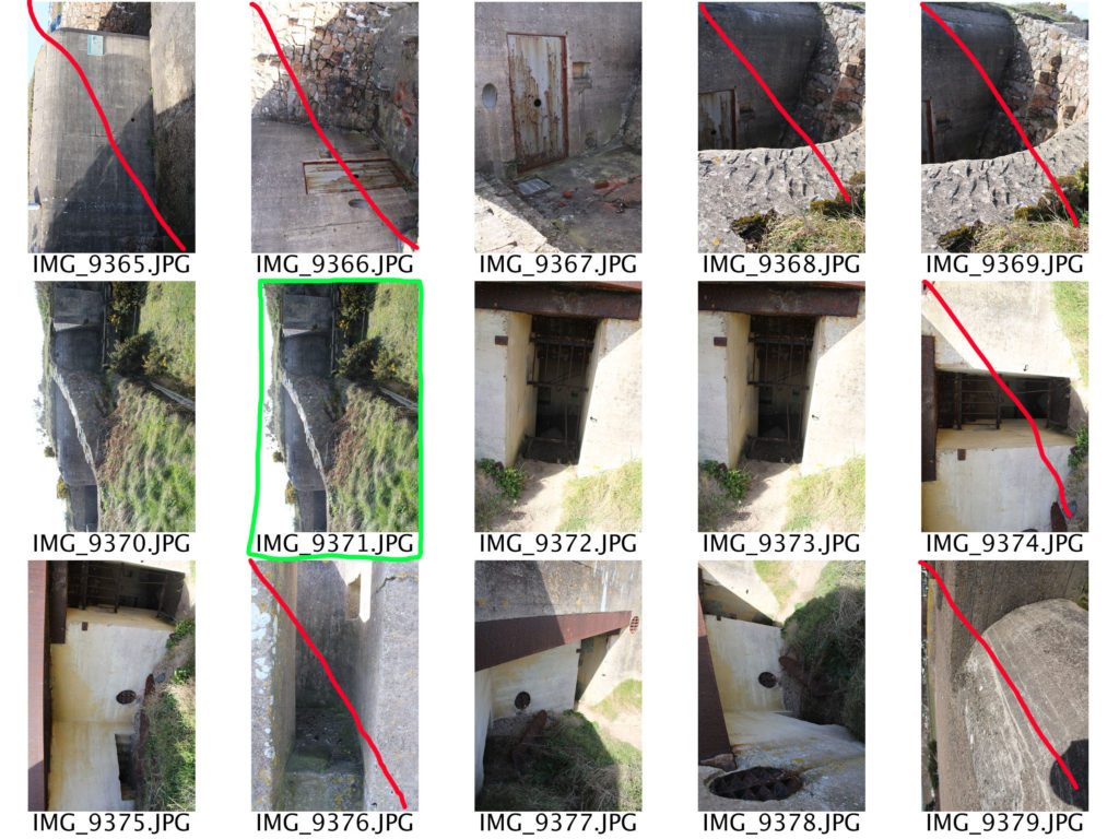
Contact Sheets:

Red – No

Orange – Maybe

Green – Yes

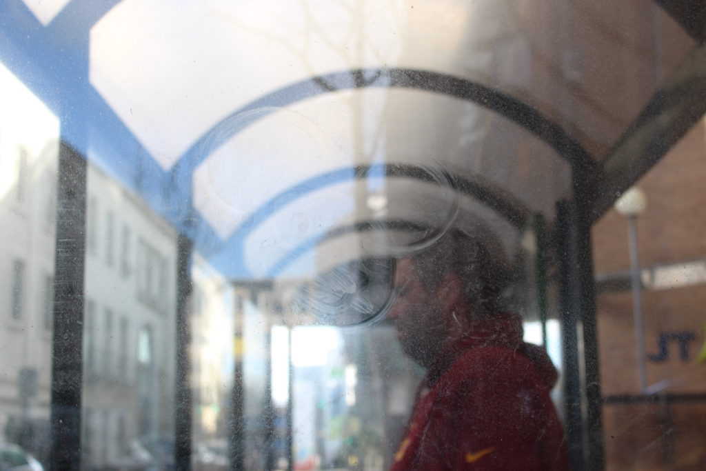
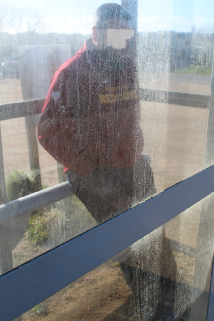
Final Images (Unedited):

I liked these final images but they were a little over exposed and needed editing.

Final Images (Edited):

I used Photo Shop to edit these images.

Overall, I am very happy with the outcomes of these edited photos. I think I capture Calcutt’s style really well, whilst still incorporating my style in the images.

Photoshoot 2 – Bunkers

Planning:

For my second photoshoot I want to capture Jersey’s bunkers in order to show another stage of Jersey’s journey through the second world war. The aim of the photoshoot was to showcase different camera techniques in order to showcase the use of the Jersey bunkers during the second world war. I am going to capture the bunkers down at Noirmont, as there are multiple bunkers to capture providing many photograph opportunities. Moreover, the background of the bunkers are almost empty down at Noirmont which makes my images more like the artists I studied, making stronger links. I intended to take landscape images to capture the whole bunker, but I also intended to capture portrait macro shots. I will be capturing the images at a straight on and worms eye angle to showcase Jersey’s bunkers. With regards to camera settings I will be using a quick shutter speed, low ISO (so I do not have an intended blur), the daylight white balance, and manual focus in order to create a short depth of field like my case studies used. Furthermore, I intended to explore the bunkers (so I am not just capturing a landscape image of the whole bunker) which provides my own exploration towards a subject matter. I am doing this to provide more images and different content to work with as well as being able to showcase different camera techniques.

Evaluation:

To evaluate this photoshoot I believe I have managed to produce some strong outcomes which show my ability to use different camera settings (shutter speed, ISO, white balance) to create different effects. Moreover, I have been able to show my recreation of my artist that I researched and further images showing my style of photography capturing the same subject. I think that my images present the theme of Jersey through the second world war as it showcases Jersey’s defence mechanisms and how they have been almost abandoned and isolated since the war presenting them almost like ruins showing there importance of the second world war, providing another aspect of Jersey’s journey through the second world war. As an action plan I intended to manipulate my stronger images like Virilio and Andrew’s photographs. Moreover, I want to experiment with different ways of showcasing Jersey’s bunkers, allowing me to experiment with photoshop to provide evidence of my knowledge and skill using the software.

Editing – Journeys And Pathways Test Shoot

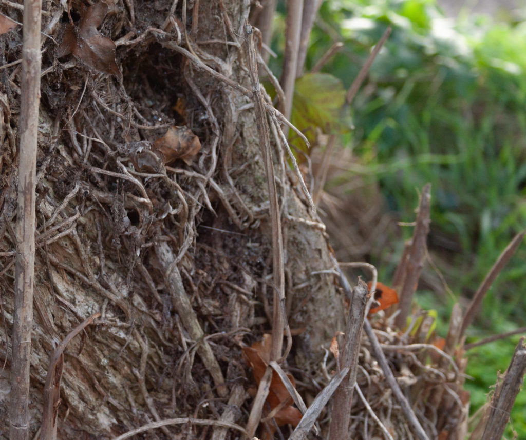
Some of my best images of the shoot were close up, almost macro photography and as such I have cropped them to emphasize the best qualities of the composition. I increased the exposure on most of the images as they were taken in the CR2 format and thus were rather dark. I also experimented with the color more than normal as I chose to carry out this photo shoot around noon with a grey sky, this resulted in images with flat lighting which allow colors to be easily adjusted. Individual colors had their hue, saturation and luminance manually adjusted. Other general edits include removing chromatic aberration and accounting for any distortion caused by the lens using light rooms lens correction filters.

Photo-shoot Plan

Where: I will be taking photos along my house off of Beaumont road.

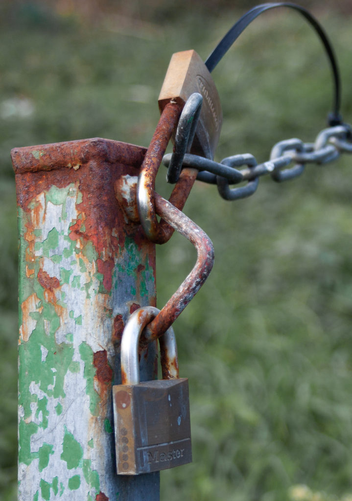
What: I will be photographing various barriers including fences, stop signs, no entry signs etc. I will attempt to include an aspect of Paul Graham’s style into these photos.

When: I will be taking these photos at mid-day in order to produce a flat lighting which will allow for more options when editing the photos.

Times of the day: Photoshoot 1

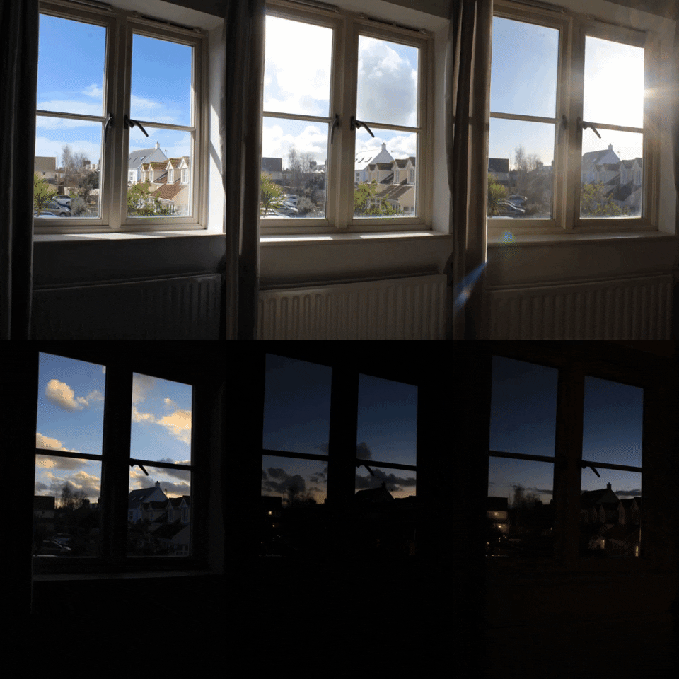
To respond to journeys and pathways I decided to photograph the sky throughout the day every hour so I would be able to capture the different positions of the sun as well as the movement of the clouds and the colours of the sky. I set my camera onto a tripod and placed it near a window so I could capture several images of the sky from inside my house. The viewer can then see the gradual progression from day to night from one viewpoint.

This project relates to the theme since it’s the journey of the day from sunrise to sunset. I started taking images at 11:00 am and finished around 7:00pm. Once the time got closer to 5pm, I decided to capture more images frequently since this time of the day is when the sky changes the most in terms of colour.

I decided to create a gif with these images on the website GIPHY to show how the sky changes throughout the day in a quick video that continues in a loop. I decided to have each image show up for 0.2 seconds to create a slideshow. 

Times when an image was taken
  • 11:20 am
  • 11:40 am
  • 12:00 pm
  • 2:50 pm
  • 3:30 pm
  • 4:00 pm
  • 4:30 pm
  • 5:20 pm
  • 6:00 pm
  • 6:20 pm
  • 6:40 pm
  • 6:50 pm
  • 7:00 pm
  • 7:10 pm
Evaluation

Creating a gif to present these images was a good idea since the viewer can rapidly see the movement of the sun and the clouds. The gif also turned out smooth when played since the images were all taken from one angle. Taking images through the window helped to frame the sky.

Future Photo Shoot Idea

An idea for a future photo shoot is to take several images throughout the day of the tides so the viewer can see the extreme change from low tide to high tide in Jersey. Jersey may be a small island, but it can boast some of the biggest tides in the world. When it recedes, the immense body of water seems to melt into the horizon, only to surge back to shore with alarming speed.

Response to the Boyle Family

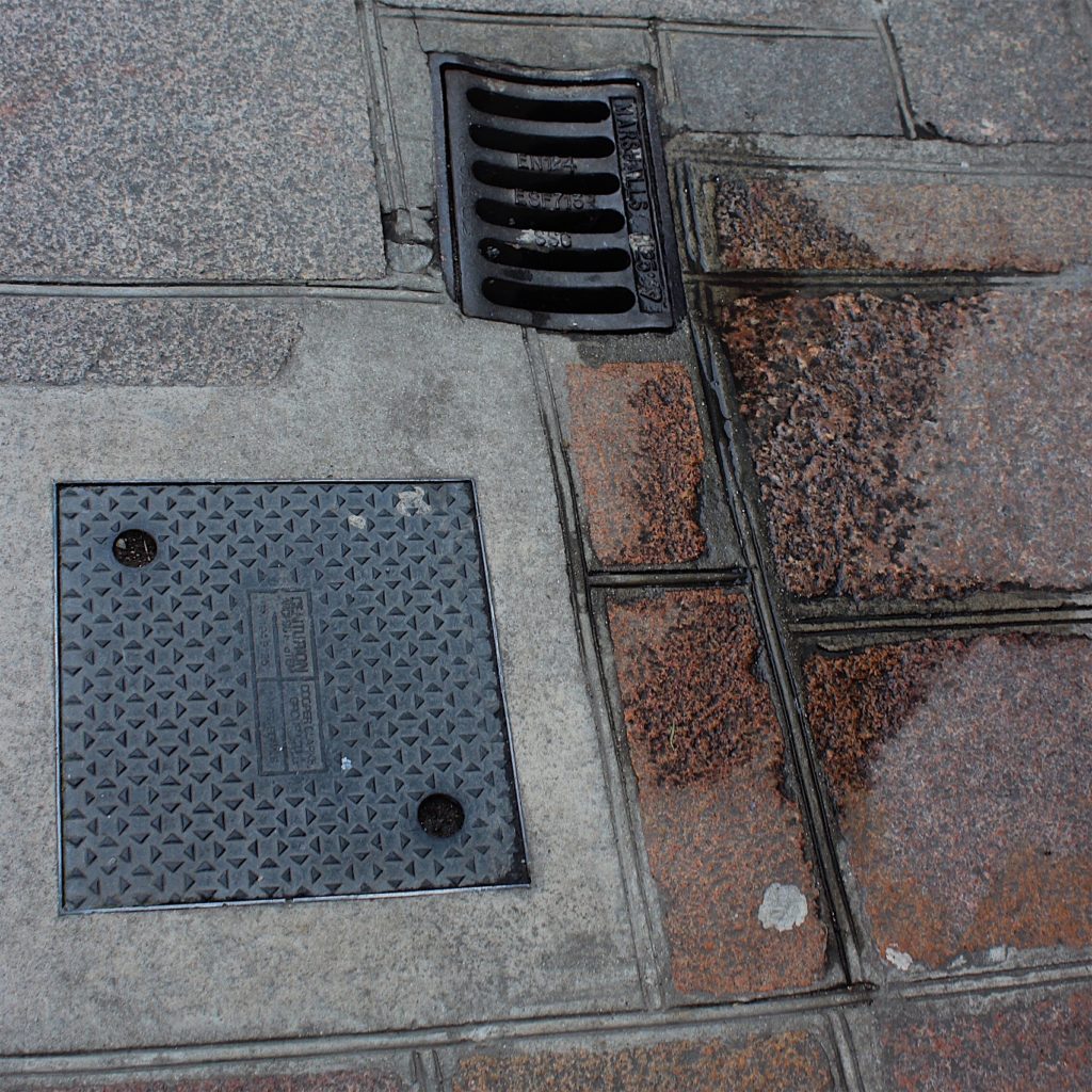
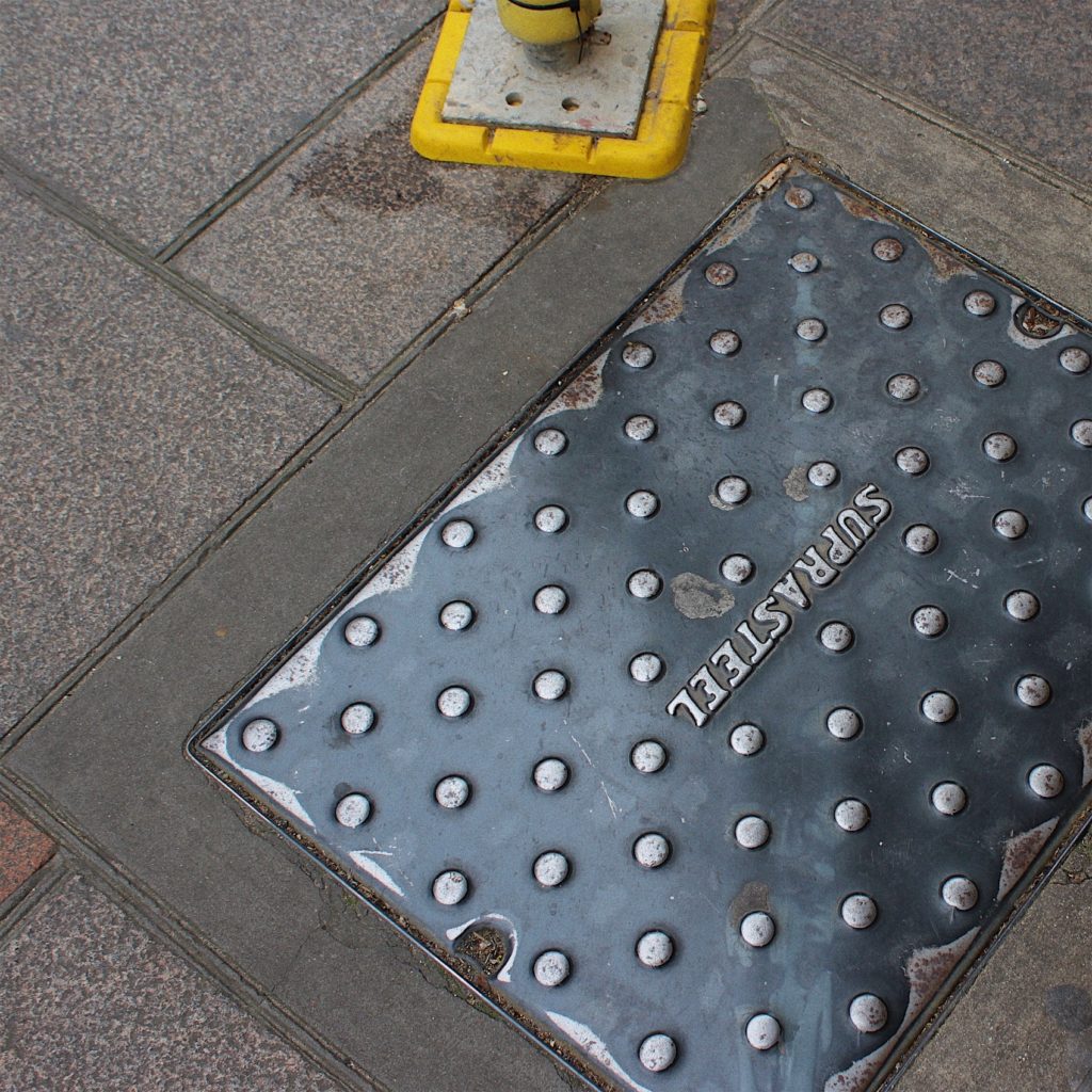
The photography work of the Boyle Family that I’m responding to typically examines the surface of the earth, road markings and manhole covers.

I walked around the urban area of St. Helier. I wanted my images to have the same style as the Boyle’s photographs by capturing pictures of the ground from my viewpoint. This displays the view that everyone sees on a day to day basis but never looks at twice.

When taking pictures, I made sure to show the various different qualities on the ground. Like the Boyle family, I wanted to capture images of street corners, roads with yellow markings, different textures of tarmac and cobbles.

Once I had enough photos, I made a contact sheet to help me select the best images. There is no editing on their images so I kept it minimalistic by slightly adjusting the contrast, brightness etc. I also cropped the images into a square since they had unwanted space around them.

Contact Sheet
My Response

Shoot one Plan

For my shoot I will be in the French alps, I plan to find high points on mountains that have large views with clear skies. I plan to take mostly photos with my digital camera and then exaggerating the colours in Photoshop afterwards then making it black and white but I will be taking my film camera with black and white film and I will be trying to use colour filters to get the result I want. However, where as Adams could look at his images straight after as he was using a field camera if I try and take the images in black and white on my film camera I will not be able to instantly see how my images have turned out.

Editing and Developing: 3

Chosen Photograph:

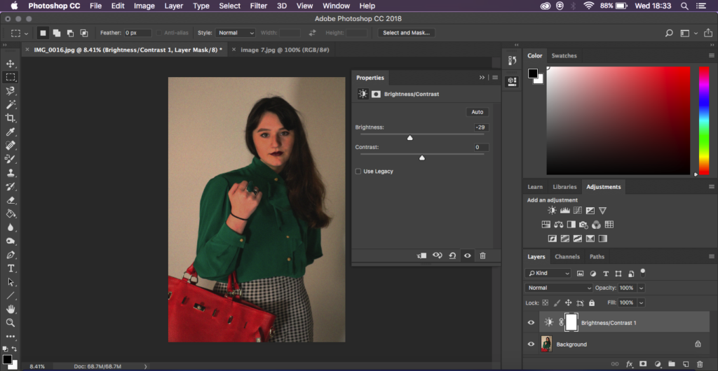
Above shows my chosen response to edit and enhance in response to my chosen advert. I have chosen this photograph as I feel my model is placed in one of the best positions and it is also one of my clearer images. As well as being clear I feel even though this photograph is slightly bright it gives me room to adjust this and experiment with it.

My aims for editing this photograph is to generate a response that clearly shows a resemblance and a link towards the original photograph and to also show some suggested inspiration towards Cindy Sherman.

Editing Process:

To being with I started by adjusting the brightness and the contrast of the photograph, the photograph I was recreating had quite dark tones and wasn’t too bright so I was trying to recreate and generate this.

Next, still keeping in mind the style of the original photograph I was recreating I decided to add ‘noise’ to the photograph to create a more believable recreation to create an almost blurred image without loosing any sharpness on the features.

Finally I went back in with the brightness and the contrast editing for the final touches to create it more similar to the original I was recreating.

Final Outcome:

This shows my final edited outcome, overall I feel happy with the way the photograph turned out in resemblance to the original. I feel I have created a successful photograph with what my aims were and that I have personally met them.