Category Archives: A01 Develop ideas (research)

Filters

Author:
Category:

Cindy Sherman

Cynthia Morris Sherman (born January 19, 1954) is an American photographer and film director, best known for her conceptual portraits.

She is best known for “Complete Untitled Film Stills,” a series of 70 black-and-white photographs which were meant to subvert the stereotypes of women in media (namely arthouse films and popular b-movies).  In the 1980s, Sherman used color film and large prints, and focused more on lighting and facial expression.

She is a key figure of the “Pictures Generation”, a loose circle of American artists who came to artistic maturity and critical recognition during the early 1980s, a period notable for the rapid and widespread proliferation of mass media imagery.  Sherman turned towards photography at the end of the 1970s in order to explore a wide range of common female social roles, or personas.  Sherman sought to call into question the seductive and often oppressive influences of mass-media.  Turning to self-portraits she extended role playing in fantasy Hollywood, fashion, mass advertising, an “girl-next-door” roles and poses.   She called her audiences attention to the powerful machinery and make-up that lay behind the countless images circulating in an incessantly public, “plugged in” culture.

A Collection of work by Cindy Sherman
  • Sherman’s photographic portraiture is both intensely grounded in the present while it extends long traditions in art that force the audience to reconsider common stereotypes and cultural assumptions, among the latter political satire, caricature, the graphic novel, pulp fiction, stand-up comedy (some of her characters are indeed uncomfortably “funny”), and other socially critical disciplines.  Sherman’s many variations on the methods of self-portraiture share a single, notable feature: in the vast majority of her portraits she directly confronts the viewer’s gaze.
I am taking Cindy Sherman as my starting inspiration photographer as she looks into and tries to put forward and show and present something similar as to what I would like to explore and look into with the presentations of media and ad’s.  As well as her use of tableaux photography as I will be generating recreations of advertisements and fashion ad’s taking them through the decades.  I feel her style of work is something I would like to try and explore and develop throughout the project.  I am finding my inspiration from her to do with the subjects she deals with and the styles of photographs that she generates.

Analysis (Below Image)

Contextual:  Sherman was generating this image in a time where she was maturing in the 1970s among the discovering of the American Womens’ Movement, later known as the rise of Feminism.  Sherman and her generation learned to see through mass media cliches and appropriate them in an ironic manner that made viewers self conscious about how artificial and highly constructed “female portraiture” could prove on close inspection.

Conceptual:  For this image Sherman is employing herself in the image to suggest the central character in the 1960s’ “coming of age” romance, the young female intellectual on the verge of discovering her “true womanhood”, or the prototypical virgin.

Technical:  The lighting in the image is coming from the top right of the photograph and is looking down on Sherman.  The light coming from that angle could be artificial light being used to create effect and light her well as to see everything in frame and still create shadows and tones.  The lens has it’s focus on Cindy herself we can see around the edges of the image that it is slightly blurred creating a sharp focus on her herself.

Visual:  Sherman stands on the right side of the photograph which fits well with the idea of the rule of thirds as she doesn’t stand directly in the centre.  As she leans and reaches upwards it creates a leading line for our eyes to travel all the way across her in a smooth way.  There is a lot of pattern and repetition with the books creating repeating lines in a manner that is pleasing to the eye.  The image being in black and white shows the range of tone in the photograph, her face is well lit creating lighter tones around her face, skin and hair and then we have some darker tones coming in around the book shelf where shadows would start to develop and the light may not be reaching.
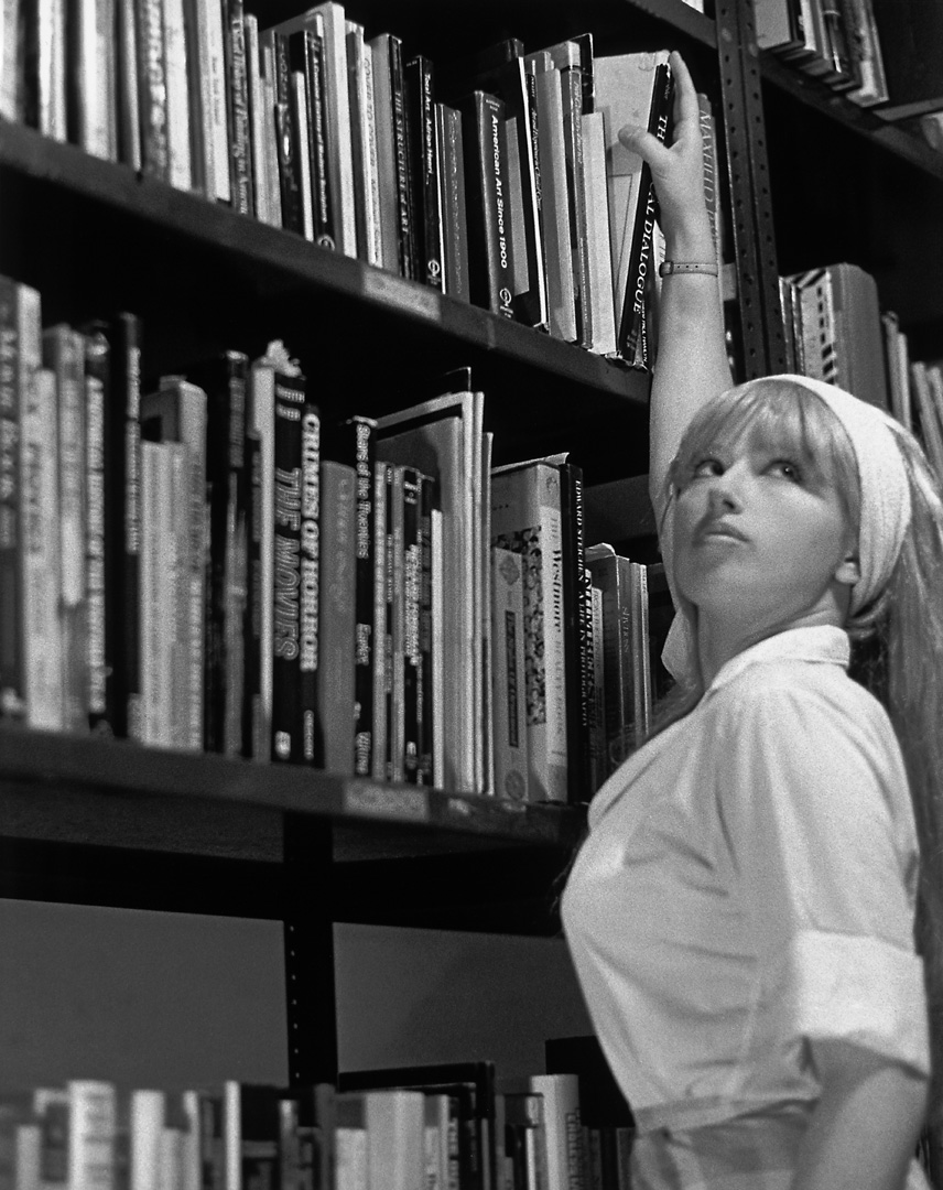
Cindy Sherman | Untitled Film Still #13 | 1978

Damian Chrobak – Case Study

Damian Chrobak

Image result for damian chrobak photography
https://c2.staticflickr.com/4/3372/3317315834_106b9c5902_z.jpg?zz=1

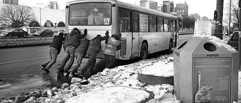
“Born in Jastrzebie Zdroj (Poland), Damian studied at the Academy of Photography in Warsaw. After his first year he decided to set off on a different path and began his search for a photography he could truly call his own. Born in 1977 in Jastrzebie Zdroj (Poland), Damian Chrobak has been a member of the Association of Polish Art Photographers since 2010 and is the founder of the Un-Posed street photography collective. After studying at the Academy of Photography in Warsaw, Poland, Damian moved to London in 2004, where he completed a Black & White Photography Course at the University of Arts in London. Since then he has been documenting the city’s street life. His work has been published in the United Kingdom, Germany, the United States of America, New Zealand, Poland and other European countries. He has also produced photographs for book and recording covers. He is currently based in London and working on documentary and street photography projects. Street photography is characterised by a high degree of sensitivity to aesthetic, psychological and sociological insight. The photographer plucks out from his surroundings seemingly random moments and reveals their significance. What is important for him in a photograph is a deeply humane reflection on the nature of the individual and society as a whole. The ordinary moments in everyday life often have a hidden meaning and can be interesting, humorous, bizarre or remarkable. Strolling through the streets of a twenty-first-century city, photographer tries to capture something timeless on film, an eternal truth about man, one which hasn’t changed for millennia.” http://un-posed.com/photographers/damian-chrobak

Examples of his work:

Image result for damian chrobak photography
Kaunas photo 2015 Damian Chrobak
Image result for damian chrobak photography
Damian Chrobak | PICDIT
Image result for damian chrobak photography
I see you book review. Copyright © Damian Chrobak
Image result for damian chrobak photography
Damian Chrobak
Image result for damian chrobak photography
Damian Chrobak
Damian Chrobak
Image result for damian chrobak photography
‘Polish Street’ Photography Exhibition by Damian Chrobak. ‘

Image Analysis:

Picture

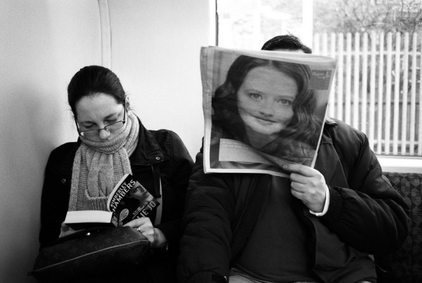
I will analysing this photo from Chrobak’s project “Everywhere I look, I’m Being Looked At”.

EVERYWHERE I LOOK, I’M BEING LOOKED AT – DAMIAN CHROBAK
Conceptual:

I think this photo focuses on the idea of consumption and its impact on changing and shaping our daily routine. This photograph depicts ordinary situations, combining it with advertisements and people. This picture gives the meaning of how we are constantly surrounded by visual media and how it shapes our thinking and routine. It is as if in every corner of town we have eyes wanting to catch every passerby with a penetrating gaze giving its message to every passer-by. This photograph speaks of urban life filled with flow of information, recording our habits, interests and weaknesses.

Visual:

This photo is in black and white which gives it a very retro and old feel to it, it also has a dark tone. I can see that he has used a little of texture such as noise, which gives a grainy texture to the photo. The viewpoint of this photo is on the the advertisement because it is staring right at you whilst the people are looking ahead of them. This creates a sense of a personal feel, as if the photo is staring right at you.

Technical:

The lighting for this photo appear to be natural lighting. The ISO is probably set high because the subway looks quite dark, the shutter speed is low because the people in the photo are motion blurred and distorted. The photo has quite a high contrast and is at the right exposure. The aperture is quite low as mostly everything is focused.

Contextual:

This photo was taken in the busy streets and metro stations of London. This conveys what city life is like in London. It also gives another perception that London is very crowded place, and people are always on the move. The eyes can also shows the deeper meaning that they are literally peering back at you, as if to remind us that we are always being watched.


Case Study – John Davies

Background:

John Davies is a British landscape photographer and is most known for long term projects documenting Britain and areas of industrial building and showing the evolution of buildings and landscapes. Davies studied photography at Mansfield School of Art, then moved on to study at Trent Polytechnic. He was nominated for the Deutsche Börse Photography Prize in 2008.

Davies use of high vantage points gives his pictures a very unique feeling, and has inspired me to try and capture some images at higher altitudes, on top of hills, buildings, etc. to try and get a view of the surrounding areas, especially in and around town.

Image analysis:

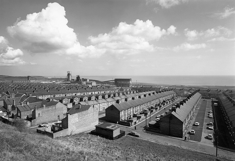
Easington Colliery (1983) by John Davies

This image by Davies stood out to me more than others as it shows the repetition that we face in modern life. Seeing the rows of houses trailing off into the distance is very impactful as you can see just how repetitive life is in the form of housing.

I find it interesting how all of the people living in these houses probably don’t realize just how similar their home is to everyone else’s around them, and although each house is different inside, with people obviously furnishing it to their liking and making it their own, from the outside everything is uniform and in order.

There is a strange sort of duality to the image that I find fascinating, as each house has its own story; some will be messy and contrasting the unvarying exteriors, where as others will be just as clean and pristine as the rows methodical layout of the buildings. However from the outside, you would never be able to tell which is which.

I find it alluring how coldly and systematically the houses were laid, simply due to the fact that a home is considered to be the most personal thing someone can have.  It is clear that the only reason the houses were made in this tightly packed, unoriginal way was for monetary value, but from this image, it makes the whole neighborhood look like a prison, especially with the buildings for mining in the background looking like guard towers, which gives the image a dark impression that something is wrong, like the whole town is trapped in this one tightly packed housing estate. Combine this with the freedom and spaciousness of the ocean in the background, and it once again, has this peculiar duality involving freedom and uniformity.

Artist Research – Gina Socrates

Gina Socrates:

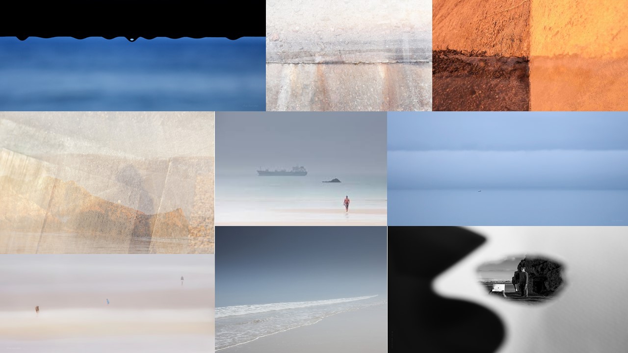
Mood Board of Gina Socrates

Gina Socrates is a current photographer who is based in Jersey.

  • “As a photographer, I draw inspiration from the island of Jersey on which I live: its sometime soft and delicate, sometime harsh and rugged coastline. Its traditional and contemporary architecture, its abundant flora and the individual characters of the locals.” – Gina Socrates
  • “This series of photographs contrasts the horrors of war implicit in the wall with the beauty of Jersey’s coast and the life which goes about upon it. Through the use of multiple exposures, other surrounding elements are brought into relief; elements which both modify the wall’s surface and its meaning: the beach, the sea, deckchairs, and shadows.”  – Gina Socrates

Gina Socrates

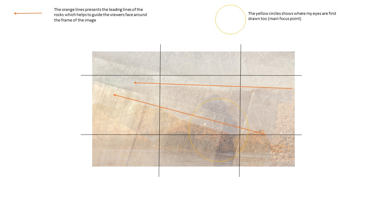
Contextually. the sea wall was built by the Nazi’s during the second world war, in order to prevent the British from reclaiming the island of Jersey. The wall was built by prisoners from Russia and Spain, who where hold captive by the Nazi’s. The sea wall has now become a key feature of Jersey Channel Islands, with it useful uses of prevent the island from being flooded at high tides. The seawall holds a lot of history which many islanders are not aware about. Photographer Socrates wanted to capture the seawall in order to present the history of it and to show the “contrast the horrors of war implicit in the wall with the beauty of Jersey’s coast and the life which goes about upon it.” Thus, presenting her artistic aim.  When first looking at the image my eyes are immediately drawn to the center of the image, where the subject of the wall/rocks are located. They then move around the image taking in the rest of the detail and scenery found. As an emotional response I can clearly see the metaphorical message trying to show how the sea wall has developed and how it was effected during the second world war, which can be considered emotional as it reflects the negative impact the war had to how beautiful the wall is in Jersey now a days. The image above is an example of a double exposure where two images overlay one another in order to make an overall abstract looking image. In the case we are able to see Jersey beautiful coast line (nowadays) and what looks to be a macro shot of dents and holes (presenting the horrors of the war). The main formal elements which have been presented seems to be space, texture and shape which are mainly presented through the double exposure technique. Both images are presented in color, however the hue seems to have been adjusted as the images look more yellow, which creates a vintage and rustic effect towards the image. This could have also been done by adjusting the white balance on the camera. The overall image seems to be in focus, which suggests that the shutter speed is likely to be quick. It is hard to tell, however I believe that the coastline image presents a large depth of field, which helps to maintain the image being completely focused. It seems that there is an intended blur, which could be because Socrates raised her ISO for one of the images, this has added to the overall vintage effect being created. On the other hand, the blur could have been added using a photograph editor on the computer.  Moreover, the aperture could have been set low, as the images seem quite light, which helps the two images to blend in nicely with one another. The two images captured are landscape and follow similar camera techniques, which makes the double exposure seem more natural, the two images fit nicely together. When visiting Socrates work at Jersey’s CCA Gallery, I discovered that the double exposure was created with the camera settings. She changed the settings so she took one image and then another and the camera merged the two images together. The contrasting images are put together to create an overall metaphorical image which successfully meets the aim of the photo shoot. In my opinion I really like her work as I believe that camera settings and her editing work together to create interesting and eye capturing photographs. Her image begins to present the idea of Journey and Pathways, as this is one element which impacted Jersey Channel Islands during the Second World War.

Physically showing the camera techniques used, In order to show my understanding of the techniques used to create an effective image.

Action Plan:

As an action plan I am wanting to recreate Gina’s photo shoot on Jersey’s sea wall. I want to be able to show the contrast of what the wall is used for now and how it was in the second world war. This will begin to develop my interpretation of Jersey through the second world war. I will look at using a double exposure and different techniques when manipulating my images on photo shoot.

Travis Huggett

Travis Huggett

Travis Huggett is a New York City-based photographer who grew up in Rhode Island. He earned a BFA in photography from The Pratt Institute in Brooklyn. Working primarily in portraiture, advertising and fashion, his photos have been exhibited in New York City, Boston and Connecticut. His work has been seen on billboards, as album covers, and on his mother’s mantelpiece.

His work consists of people getting on with their lives on a bus. It shows them taking a journey, whether that be from home to work or on their way to the airport to travel the world. It shows the reality of the real world.

For years I’d watched the buses move through the city streets at night, the interiors glowing, the windows framing the riders. They looked to me like photographs. In 2013 I started shooting through those windows. I would wait at bus stops and red lights, quickly scanning the windows for interesting subjects, hoping they’d be in the right seat, in the right light. Over time the photos started feeling less like individual portraits, and more like a broader portrait of my neighborhood and my city.’ – Travis Huggett

Image result for Travis Huggett
travis huggett

Visual response:

In this image you can see a man standing up on a bus, with at first glance he seems to be looking directly at the camera, however as you look closer he seems to be gazing off at something else, maybe at nothing, seeming unbothered or even too tired to care about the fact that a random stranger was taking an image of him. The way he looks gives us in insight into about hard and tiring the daily life of a person can be. The black outline of the window creates a simple yet effective boarder which frames and makes us focus on the subject. The dirtiness of the windows also adds a realistic factor to it, showing the true reality of every day lives of people in New York.

Technical response:

The subject seems to be more focused on compared to the people around him, who seem a little blurred and out of focus. From the image, and how he took it, it’s most likely that he used a long-lensed camera to get the close ups of the photographs he got. It doesn’t look like he did too much editing to the image, the most I think he did was adjust the lighting and the contrast, making the light in the image stand out more. Also, this photograph could also follow the rule of 3s, since there are three people in this image.

Contextual response:

This image was captured for one of his series called Last Night At The Bus Stop. Before he captured images like the one above, he would often feel a strong urge to, due to the interesting people, the light, the windows framing the subjects. He found those all interesting and thought he’d take advantage of it by shooting through the windows, catching interesting characters in their daily lives. He would wait at bus stops at night, look for people who he thought would be perfect for this photoshoot, and wait for them to get into a good light. Then he would take his image.

Mind-map of Ideas: Journeys and Pathways

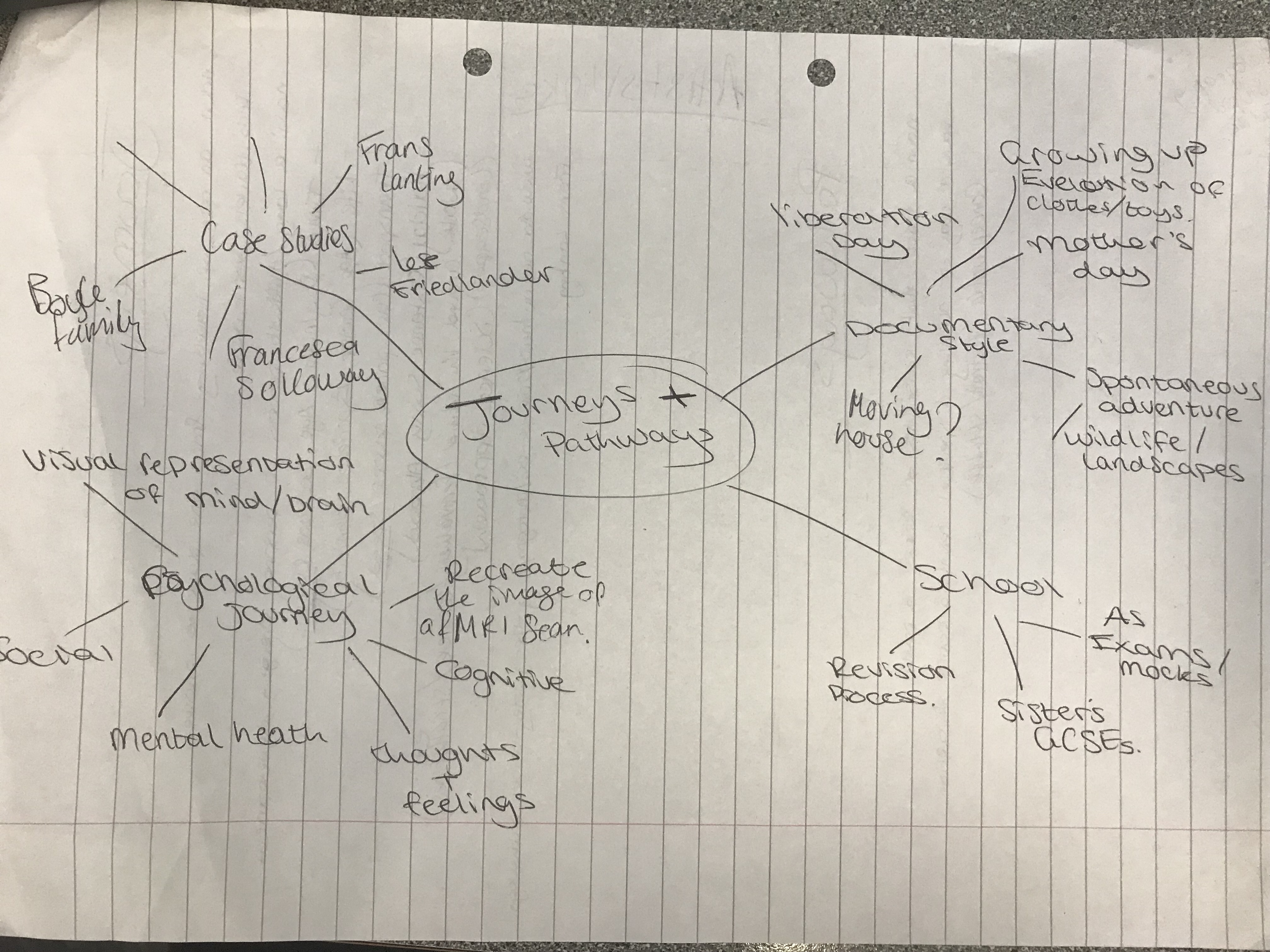
I  order to develop some first ideas for the Journeys & Pathways project, I created a mind-map that included different themes that I could follow up. The result of the mind-map can be seen below:

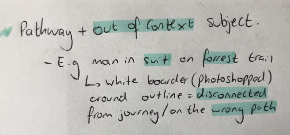
For this project, one of the ideas I am looking to focus on is the journeys and pathways taken by people, as I feel that it would make my work more easily relatable, and would give me room to try different concepts and approaches more easily. I therefore developed the “People” portion of the mind-map, and found that I would focus on people taking the wrong or opposite path/journey to the one expected of them, for example, the idea below:

I feel like taking multiple approaches to the Journeys & Pathways project would allow for me to finish with a wide range of possible final outcomes, and so I developed 3 different themes that I could use to focus my ideas more. These themes can be seen below:

The above themes will help to focus my ideas, as they provide an overall topic, that can then be used to further develop ideas. For example, by focusing on people taking the Wrong Path, I can develop ideas focusing on people who seem out of context in their environment, people making decisions based on other factors rather than their own wants/needs, or the consequences of poor decisions being made.

I took inspiration from the artist Bill Viola to form an idea that I would use a pattern of 3 photographs to depict the beginning and end of a life, along with a dramatic life event in the middle of the two. This way I can depict the journey of life in a compact and concise way.