Category Archives: A01 Develop ideas (research)

Filters

Author:
Category:

Case Study – Paul Graham

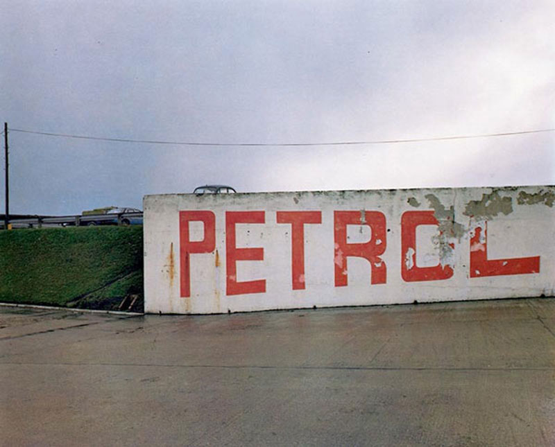
Paul Graham is an English born, self taught documentary photographer whose work has won various awards including the likes of the Deutsche Börse Photography Prize as well as the Hasselblad Award. Graham is a very prolific artist with many published works and exhibitions. As stated before he is a documentary photographer and as such most of his work features small aperture to capture a lot of detail in the scene. I like the flat tones he uses juxtaposed with strong colors, often sticking to two or three main colors as to not over saturate the image.

The image appears to use a high F stop due to the wide range of detail captured. The photo’s look as though they were taken using a Digital SLR with a low ISO due to the abundant natural lighting in the scene (using a higher ISO would leave the image overexposed) as well as the lack of noise in the image despite the age of the camera considering this work was published back in 1983. There is some slight color noise in the darkest areas of the photograph however this is likely due to the age/ quality of the sensor. There is a strong tonal contrast image between the lights and darks however the highlights aren’t too overpowering. The vibrancy of the colors despite such a flat scene suggests the use of a slow shutter in conjunction with a tripod due to the lack of any motion blur.

The image features two strong key colors, that being the orange of the paint as well as the bright green on the grass/ trees in the area accompanied by some more subtle blue tones. There as some light purple tones visible in the darker areas of the image. The image uses the Fibonacci curve as to draw attention to the writing on the wall. The images composition features very strong lines separating layers of the foreground and the background. There is a strong sense of texture created in the image by the rough surface of the concrete as well as the detail in the grass/ trees. The roofs of the houses almost create the effect of a repeating pattern.

Image result for paul graham photography

3. Project review No.1:

To start my ‘Journeys and Pathways’ project, I began by looking at The Boyle Family. I was intrigued by their approach and was fascinated by their accurate replications and attention to detail.

However, I decided against continuing with my own response to The Boyle Family as I didn’t want my final outcomes to have a similar style to that of The Boyle Family’s work.

Next, I want to look at the works of American photographer, Lee Friedlander.

Easton Chang case study

Easton Chang is an award winning photographer who specializes in capturing advertising and commercial photographs. His work is based in Sydney, Australia and comes to cover North America, Asia Pacific and Pan-Europe. He captures his automotive photographs in studio and on location to achieve the best results. He has received several awards for his creative and stunning photographs such as 2013 Australian Advertising Photographer of the Year, 2012 Australian Advertising Photographer of the Year and 2011 Automotive Photography Awards Judging Panel.

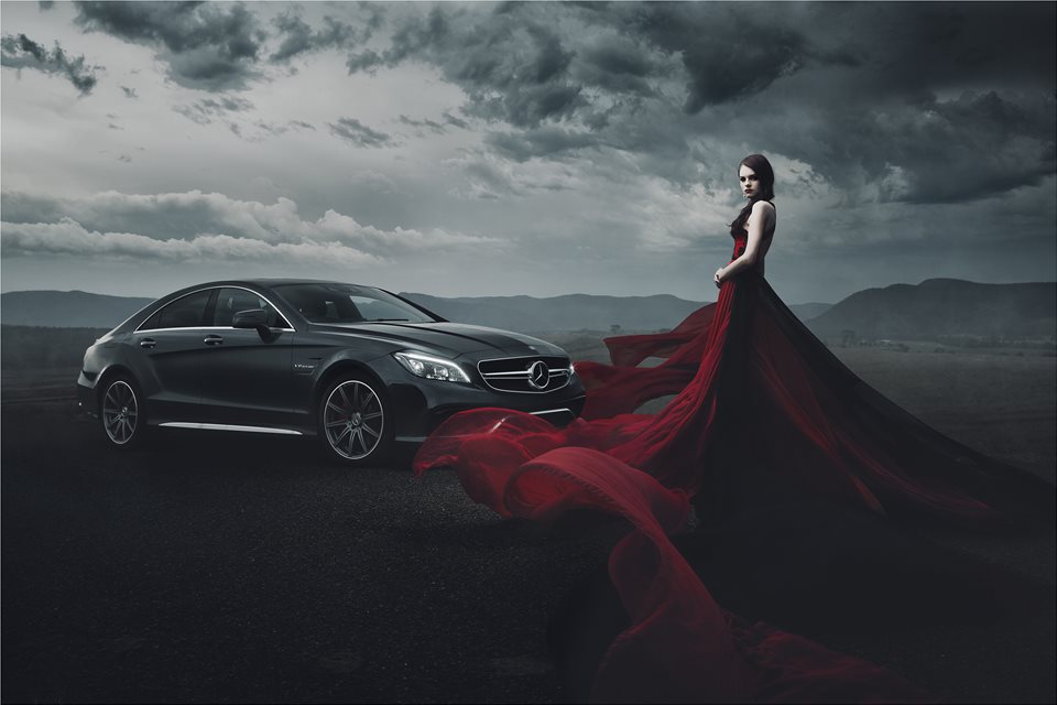
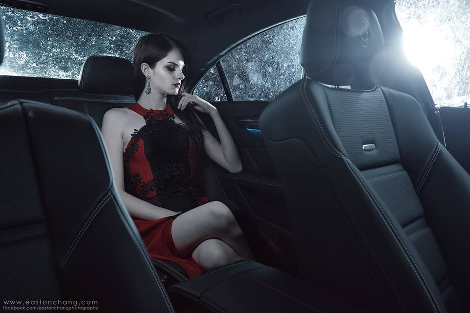
These are my favourite photos by Easton Chang:

This is my favourite photo by him, its main features are strong, bold shapes throughout. The sculpted shape of the car in the middleground strengthens the image and adds structure to it. The lighting of the photo helps achieve these shapes and lines, it is angled to catch the different depths of different areas of the car. The woman in the dress in the foreground as has very strong shapes But these aren’t as straight and organised as the ones of the car, but they have a deep red colour and real sense of depth which makes the photo much more eye catching. This is strengthened by the red dress being the only element of the photo which  has strong and brighter colour. It also draws your eyes to the right side of the photo, and away from the centre which is the weakest point of any image. The lighting also changes throughout the photo, as you look from left to right the photo gets much darker; the right side of the dress, the clouds, and even the mountains are much darker. The mountain range in the background adds more depth to the photo, it also helps minimize any blank space in the photo.

Overall, the lighting, structure, and layering help make the photo look sleek, eye catching, and full.

How/why the case study will influence my work:

He has influenced the way I will utilise colour in my photo shoots. Being very reserved with the use of colour makes the colour that is there more powerful. I will also be more careful with lighting in my photo shoots; using less lighting creates more shadows and makes shapes more prominent.

The Boyle Family

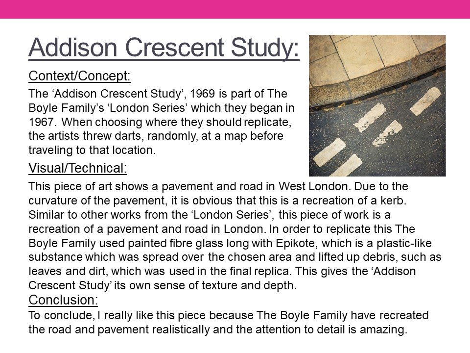
Mark Boyle who was born in Glasgow, collaborated with his partner Joan Hills during the 1960s. Their project ‘Journey to the surface of the Earth’ began in 1968 – 69. After being blindfolded, they threw darts at a world map, in order to pinpoint 1,000 areas of the earth’s surface to duplicate. When travelling to a selected site, the Boyles would throw a T-square in the air to select a random area to replicate. In the 1970s their two children assisted in producing these works. Together they operated under the name ‘Boyle Family’.

Image Analysis

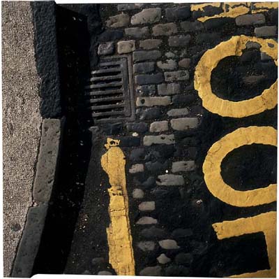
This photograph depicts a street corner and a road with yellow markings and different textures of tarmac and cobbles. The image shows exactly what you would see if you looked down onto an area of road and because of this I think the image was taken handheld due to the angle that is shown through the photograph. The colours of the photograph are typical and natural, along with the shadows and lighting created by the natural light. The road looks like it’s damaged and decaying which shows the viewer what you can find by simply looking at places that are usually overlooked. The photograph doesn’t have much depth, except for the curb but even this appears to be on the same level as the road, possibly because of the bird eye view style of the shot. The photograph reflects the time period, with a new style of making roads. The tarmac covering the cobbles shows the advancement in society as well as the destruction of the pattern. The photograph gives a profound sense of reality since the image is so simple yet effective since it displays the view that everyone would be able to see on a day to day basis, but would never look at twice.

Wolfgang Tillmans – Case Study

Alongside portraiture, landscape and intimate still lifes, Tillmans pushes the boundaries of the photographic form in abstract artworks that range from the sculptural to the immersive.

German-born, international in outlook and exhibited around the world, Tillmans spent many years in the UK and is currently based in Berlin. In 2000, he was the first photographer and first non-British artist to receive the Turner Prize.

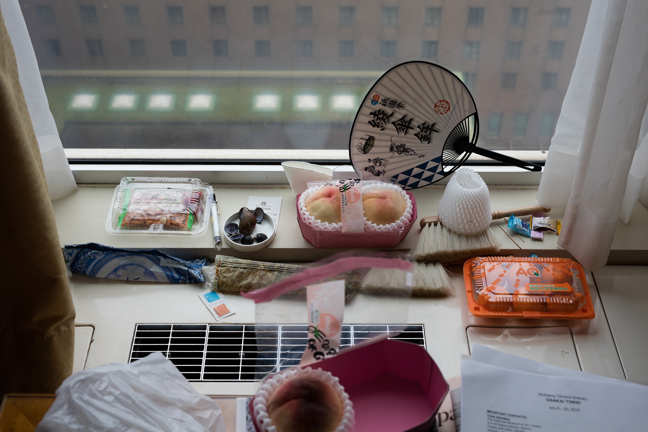
Osaka Still Life

Photo Analysis

Technical

Natural lighting has been used within this photo due to the light source being soft and warm toned casting soft shadows that follow the silhouette of the once alive crab. This warm toned helps bring out the warm colour palette of pinks and oranges. To capture this image, Tillmans used an analogue camera due to the warmth of the picture and the low contrast throughout the image.

Visual

The focus within the image in my opinion is the fly feasting on the lifeless colour-explosion. I think this because the whole image is soft toned and brightly coloured with the interruption of this black figure. At the bottom of the composition, the first exposed shell is facing ‘bottom up’ with the once living crab’s legs surrounding the exposed shell. In the middle of the image, there’s a gap on the left that gives a glimpse of a green basil leaf. At the top of the image, the rest of the exposed crab is facing upwards along with a fly on top of it.

My responses


Best Image

Visual:

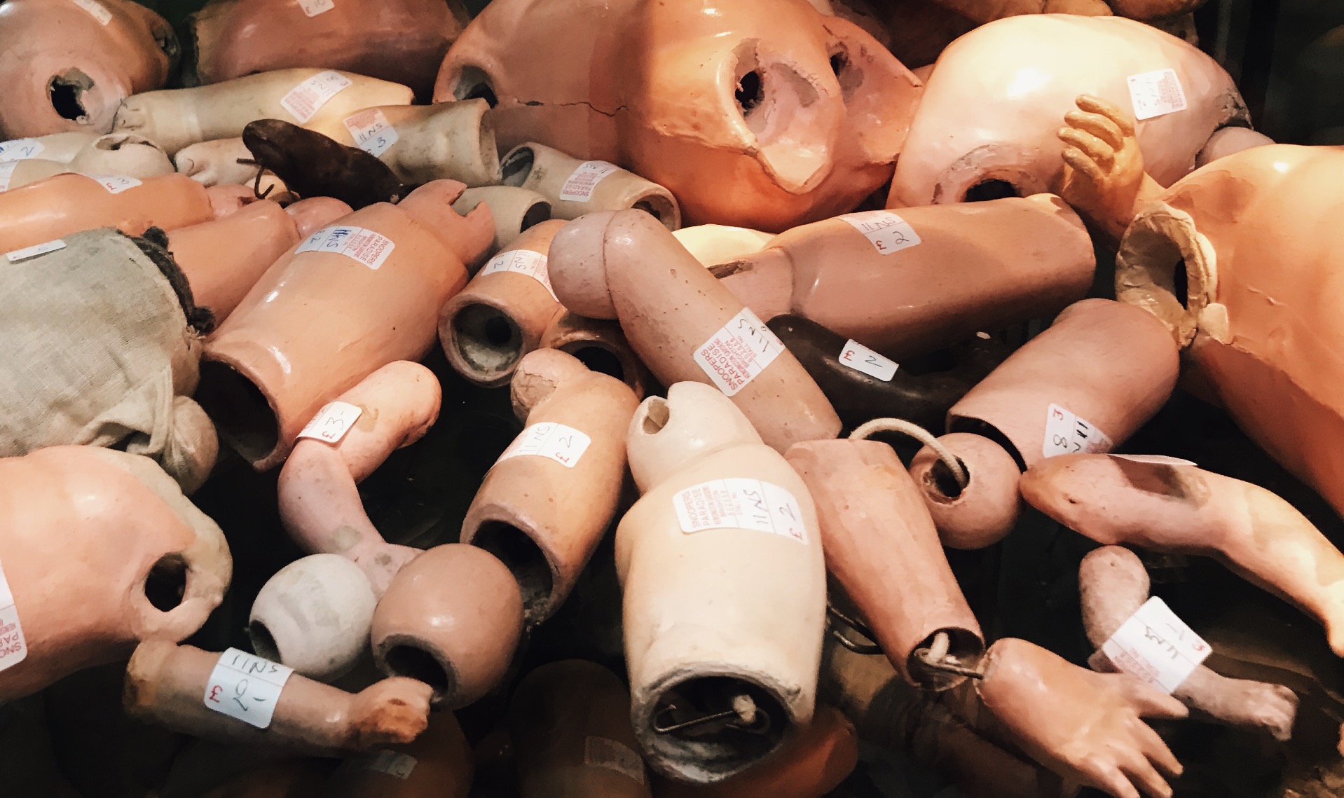
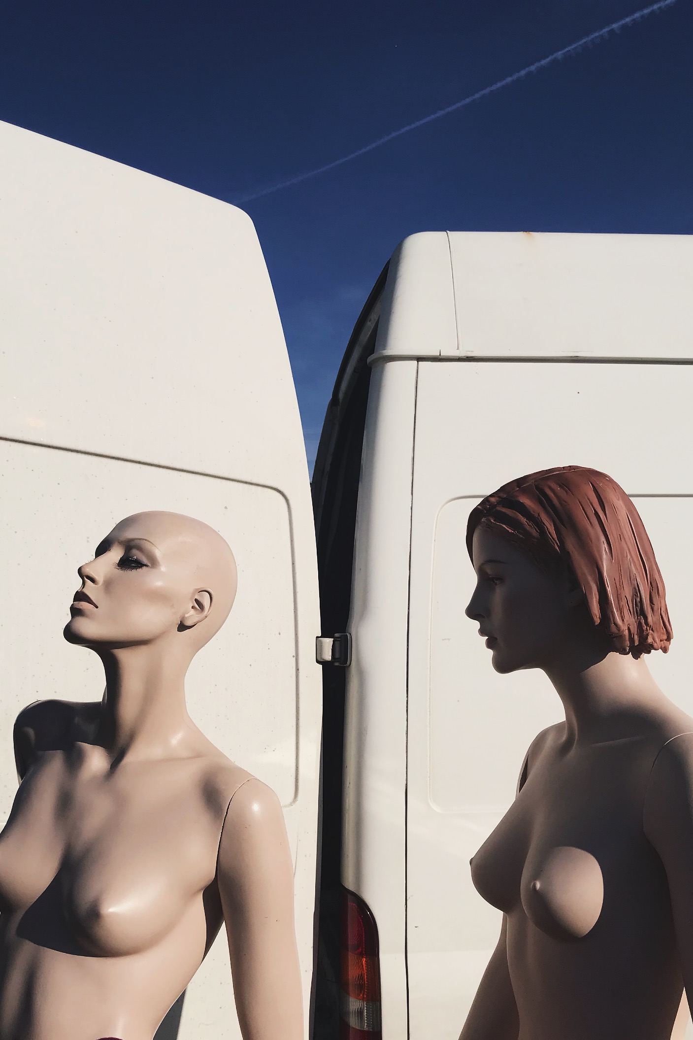
In this image i see this as a rule of three, the first section being the solid blue sky, then the white of the van then the bottom being the mannequins. This rule of 3 gives the viewer a pattern that is memorable and easily recognizable. I also like this because it hasn’t got a busy background making the central subject the mannequins. This picture was taken on a very early morning, this is casting sunlight onto the mannequins from the right direction, thus creating flowing shadows and contrast on the perfectly sculpted silhouettes. Due to this also being taken on film, the picture is very warm. 

Technical: 

Again, this image can be divided into a clear rule of three : solid blue at the stop, solid white in the middle, then the skin coloured mannequins. This contrast of colour palette due to the white and light blue complementing the fair skin tone of the mannequins. The shadows cast on the mannequins reinforces their “perfect” silhouette and refines their shape and posture.

Contextual:

I took this photo at a flea market in Brighton when the sun was just rising. I would’ve happily bought these mannequins home with me due to them having more refined bodies compared to boring plain white ones we have around us. I asked the seller where he found or got them from and he said that his husband worked for Selfridges in London and these specific Mannequins where left for rubbish just because they were never used. So this man took them home and used them to model his artworks and designs he made to promote and sell his work. 

Idea 1 – Journey of An Object

Objects help us identify what happened in our world’s history and happenings alongside stories of previous owners. Pictures show progression in how far we’ve come with politics/ fashion/trends/architecture/transport/culture/communities, all reflecting past times that could benefit future times. Old magazines and newspapers help us understand how minor events connected with major events. Personal trinkets tell stories how someone once lived their life reflecting what hobbies they liked alongside their occupations. History always benefits the future. We take all of our ideas from the past and either improve them or retain them so that we can evolve using these ideas. A way a building was built 50 years ago isn’t remotely the same as a building nowadays however those buildings helped us to adapt the ideas that work and use them again. 

Snooper’s Paradise

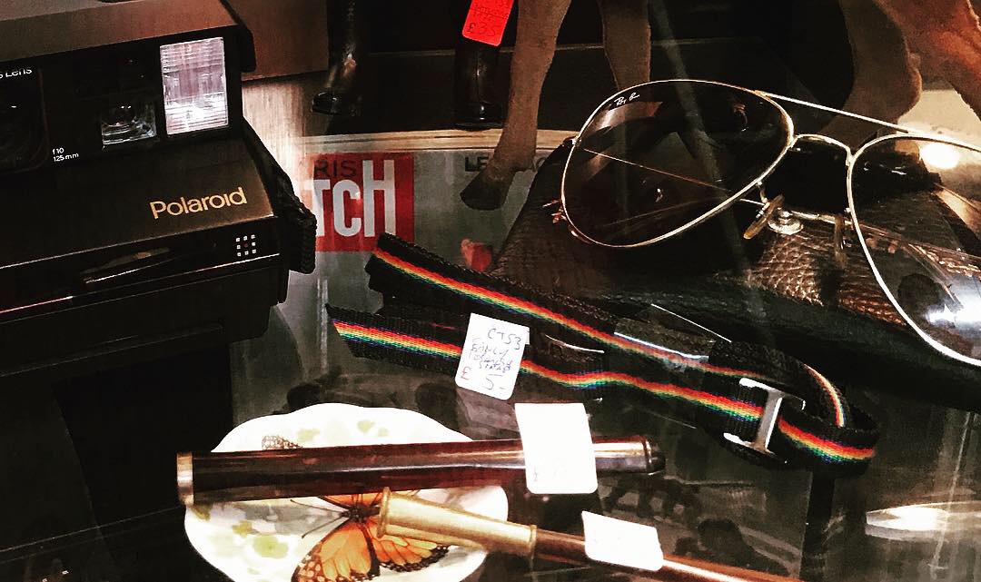
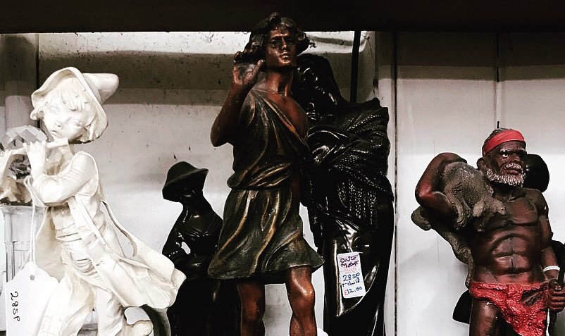
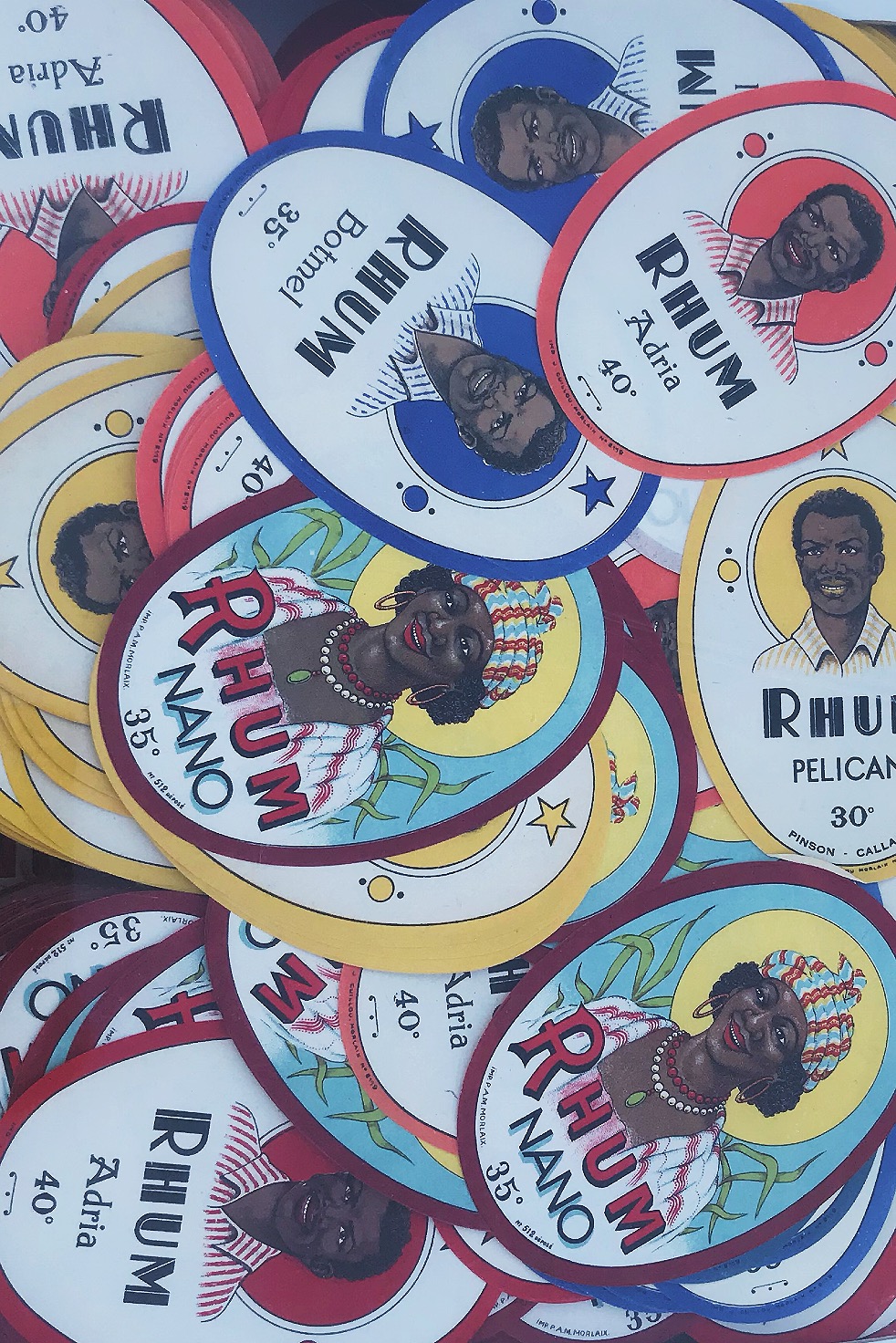
When first visiting Brighton, I was introduced to a shop in North Lane called ‘Snooper’s Paradise’. This shop has 3 floors of brick a brac history, from car number plates, to 300 year old books, cassette tapes, to stamps, this store has every part of history inside. This shop introduced me to my love of dated objects. I have purchased many old vinyls, cassette tapes, old magazines, photographs, sunglasses, crazy fashion and original 1935 glass bottles to use around the house. My love for old things is eternal, this is due to these objects reflecting simpler times where music was soulful, people where vibrant and fashion was outrageous. My favourite era is the 70’s, because people were encouraged to let go and feel free; hippies and naturists ruled the world. This free spirit helped people to speak up about any problems and political issues without hesitation making equality and race prime topics. 

On my most recent visit there, I purchased some items which I thought held the most history that I could capture in frames. I purchased: stamps, a competition rosette, a 1975 Playboy magazine, a photograph of an architect, a Vaseline container, train tickets and a cassette.

Photoshoot Idea

 My main photoshoot idea is to utilize the style of archival photography so that the only central focus within the composition is the object.

 The only examples I could find were only stock photos due to the fact that I want a specific look: object main focus, plain background.

For lighting, I would use 3 separate light sources: one that cancels out any shadows from behind, one light source coming from the left then another from the right. This surround lighting would create a complete white wash so that there is no shadows overcasting the objects or there surroundings.


Ansel Adams – Romanticism case study

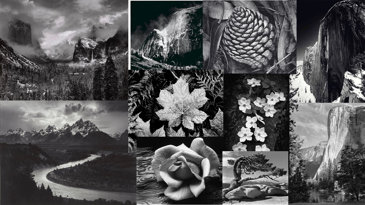
Ansel Adams was an American landscape photographer and environmentalist known for his Black And White images of the American West. Adams helped found the anti-pictorialist Group f/64, an association of photographers advocating “pure” photography that favoured sharp focus and the use of the full tonal range of a photograph.

Adams was a life-long advocate for environmental conservation, and his photographic practice was deeply entwined with this advocacy. At age 12, he was given his first camera during his first visit to Yosemite national park. He developed his early photographic work as a member of the Sierra Club. He was later contracted with the U.S Department of the interior to make photographs of U.S. National Parks; his work and his persistent advocacy helped expand the National Park system.

Adams went to to these national parks and then used his camera with a colour filter to make the picture look more dramatic than it actually was. He knew that one day the national parks would become tampered with and impure so he wanted to preserve the memory that he had, and what he saw at the time.

Here are some of his images:

He used his camera to place himself in areas where there is a large amount of action in the scene, he also had very little open sky showing in them and this meant that all the focus was on the trees, the mountains and the lakes.

He believed alot in the style of strait photography, this is that he used a very high f stop. The reason that he did this is because he believes that having a low f stop isn’t the way that we see the world and that having a low f stop is hiding the true reality. As I said earlier he was part of a group called f/64 they were a group of people who believed in taking photos with a high aperture.


Case Study:Dan Marker-Moore

Brief Biography:

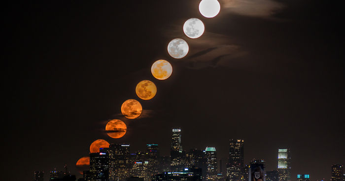
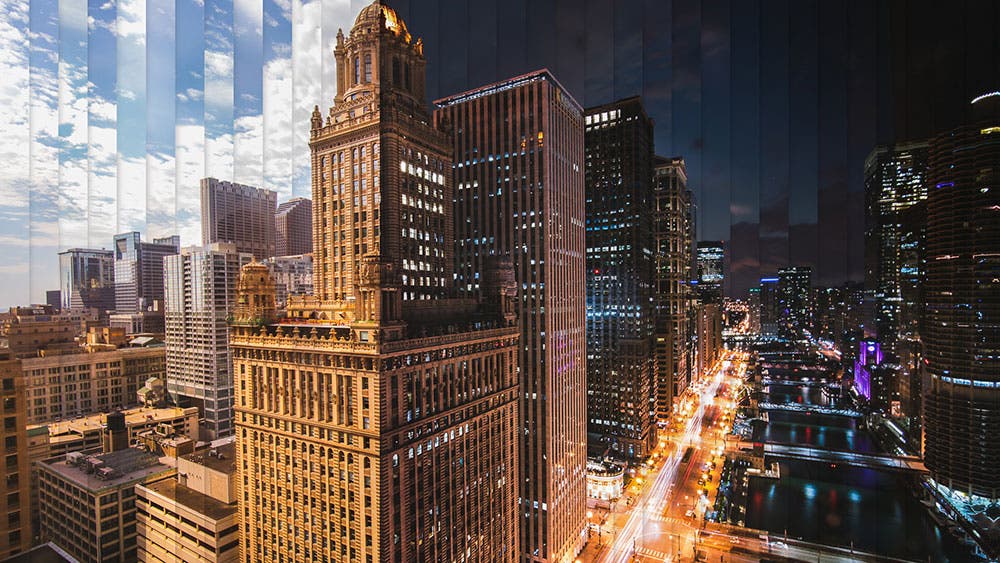
Dan is an American photographer and cinematographer. He specializes in landscapes, mainly cityscapes as he grew up in Chicago and then moved the New York.  Before he’s a photographer, he’s a motion graphics and animation artist by profession. The photos of his I am going to be focusing on are time slice photographs.  “A time slice is more than a photograph. A time slice takes a series of photographs and combines them into one single image. It takes slices of the same photograph offset in time from several seconds up to a few minutes.” Dan says he takes around 30,000 photos to complete his time slice work. He takes his photo’s over time in order to capture the environment at different times.DANORST_TimeSlice_London_BigBen_151214_3

Image result for dan marker moore

Image result for dan marker moore

Image result for dan marker moore

Image result for dan marker moore

Analysis:

Image result for dan marker moore

This photo of Dan’s is of Los Angeles at night. The famous skyscrapers of American city life in which he grew up around are at the foreground of this photo and the bright lights reflecting off the water. The emphasis in contrast between the dark sky and the vibrant buildings exaggerate the idea that cities never sleep. It suggests that city people never get breaks, they are constantly moving, light are always on, cars beeping, people running to work, it’s constant pandemonium. There is a clear rule of thirds in this photo, in the middle is the city, the top is the sky and the bottom is the water. This mirrors the repetitiveness of city life and how its extremely structured, everyone gets up early goes to work then finishes work, commutes back home and then its repeated the next day .This symbolizes the difference between us and nature, we create the noise and pollution and the environment just has to deal with it. In comparison to the stillness of the sky and the water, even over time it remains the same, quiet and calm but the city is the opposite. It has a very cold tone, creating and eerie mood almost horror like, the water is so still and not much movement of clouds is occurring. He would have used a wide angle lens and put his camera on a tripod, which would have been kept in the exact same position in order to be able to create an accurate time slice of the city.

Why?

I chose Dan as my case study because I liked his idea of time being explored in just one place. Also I liked the modern feel to Dan’s work and how he focused on the light of the night, as I feel like day photography is more common than night photography. As it shows a journey without moving, emphasizing the fact that you don’t have to travel far to experience change. As well as I thought it suited Jersey because it is very small and you run out of place to go to, I wanted to capture the true beauty of Jersey, as I feel like our generation are very unappreciative of Jersey in winter. My aim is to capture an afternoon at the beach to go against the idea that most of my generation has that everywhere is same old, same old.

Case Study – Luigi Ghirri

Luigi Ghirri is an Italian born artist and photographer. Ghirri has achieved a far reaching reputation as a pioneer of contemporary photography due to his very systematic approach to photography. His picture often feature very baron backgrounds with a strongly contrasting subject. His photography often features very strong lines and structures, often photographing man-made objects or natural objects featuring very strong geometric shapes.

Image result for luigi ghirri

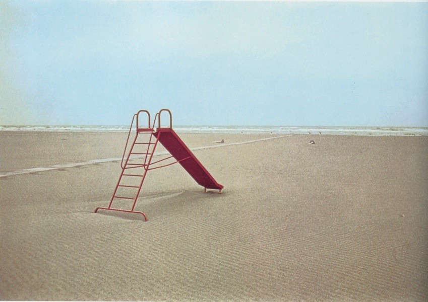
The lighting in the image is very flat and soft. This image is naturally lit however it seems as though it may have been overcast due to the lack of harsh shadows. It appears as thought the image was taken around mid-day as any shadows appear directly beneath the slide. The image appears to have been taken using a high F stop since the whole image is mostly in focus and there appears to be very little vignetting. There appears to be a considerable amount of grain and Gaussian blur in the image which suggests it is either taken on film (also suggested by slight discoloration on the right) or an old digital camera. The image looks rather cold.

The image features very flat tones across the background which is broken up by the strong contrast created by the bright red slide in the foreground. There is some texture created by the small ripples throughout the sand in the foreground. The piece features very strong lines  with a strong emphasis on triangles created by the slide and the small stream of water across the sound. The ripples in the sand create a repeating pattern until they slowly go out of focus as they reach the background.

The image creates an uncomfortable feeling due to the lack of human activity in an area that is supposed to be full of life. It creates an uncanny scene as something just appears to be out of place, perhaps the strong contrast created by the slide.

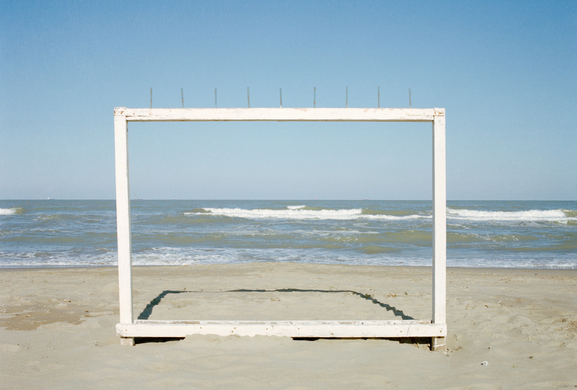
Image result for luigi ghirriImage result for luigi ghirriImage result for luigi ghirriImage result for luigi ghirri

The rest of this collection strongly stuck to the same look however most of them had stronger contrast and saturation then the image I analysed.

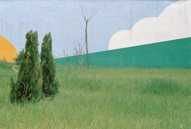
Image result for luigi ghirri

Luigi also has some interesting work which has been painted back in to which helps to emphasize the strong lines in the image.

Image result for luigi ghirriImage result for luigi ghirriImage result for luigi ghirri

I believe Luigi will influence my project as i like the subjects which he chooses to photograph and his strong use of contrasting colors. I find the idea of using flat tones to be interesting as well as it challenges you to use contrasting colors  instead of contrasting tones.