
Check out more of Solloway’s work here.

As a landscape and cityscape artist, Paul takes his viewers to the heart of some of the world’s most stunning travel destinations through his iconic and vibrant luxury fine art photography. His work has featured in exhibitions all over the world, from Times Square in New York to the Royal Albert Hall and Houses of Parliament in London, with gallery installations in Europe and Asia.
Paul returned to the UK in 2015 to focus on commercial projects, having spent the previous 3 years in Shanghai capturing vivid landscape and cityscape photographs of the eastern hemisphere.
With experience working on both sides of the lens, as a professional photographer Paul often sees things differently to others and he uses that ability to capture images which are truly unique.
Many of Reiffer’s images include stunning sunsets and sunrises paired with extremely colourful landscapes and skies.

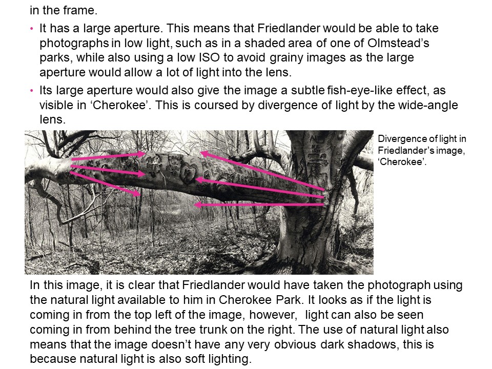
In this image you can clearly see city silhouetted against the setting sun and the ombre sky. The colours in the photo are saturated, the purple in the sky and the orange reflected on the water almost seeming unnatural, but giving the image a special effect. The image seems to be split into two parts, with the city and bridge being the line that separates the sky and the water. The photographer made a seemingly boring city into something almost mystical and magnificent. It’s clear how the photographer has manipulated this photo, increasing the contrast, saturation and light, and adding a certain filter to create the purple and orange effect. The lens the photographer seemed to have used it most likely to be a wide angle lens, to get the entire landscape into the image, and the light sensitivity of the image must be low, as it’s crisp and clear instead of a grainy texture which it would have if it had been increased.
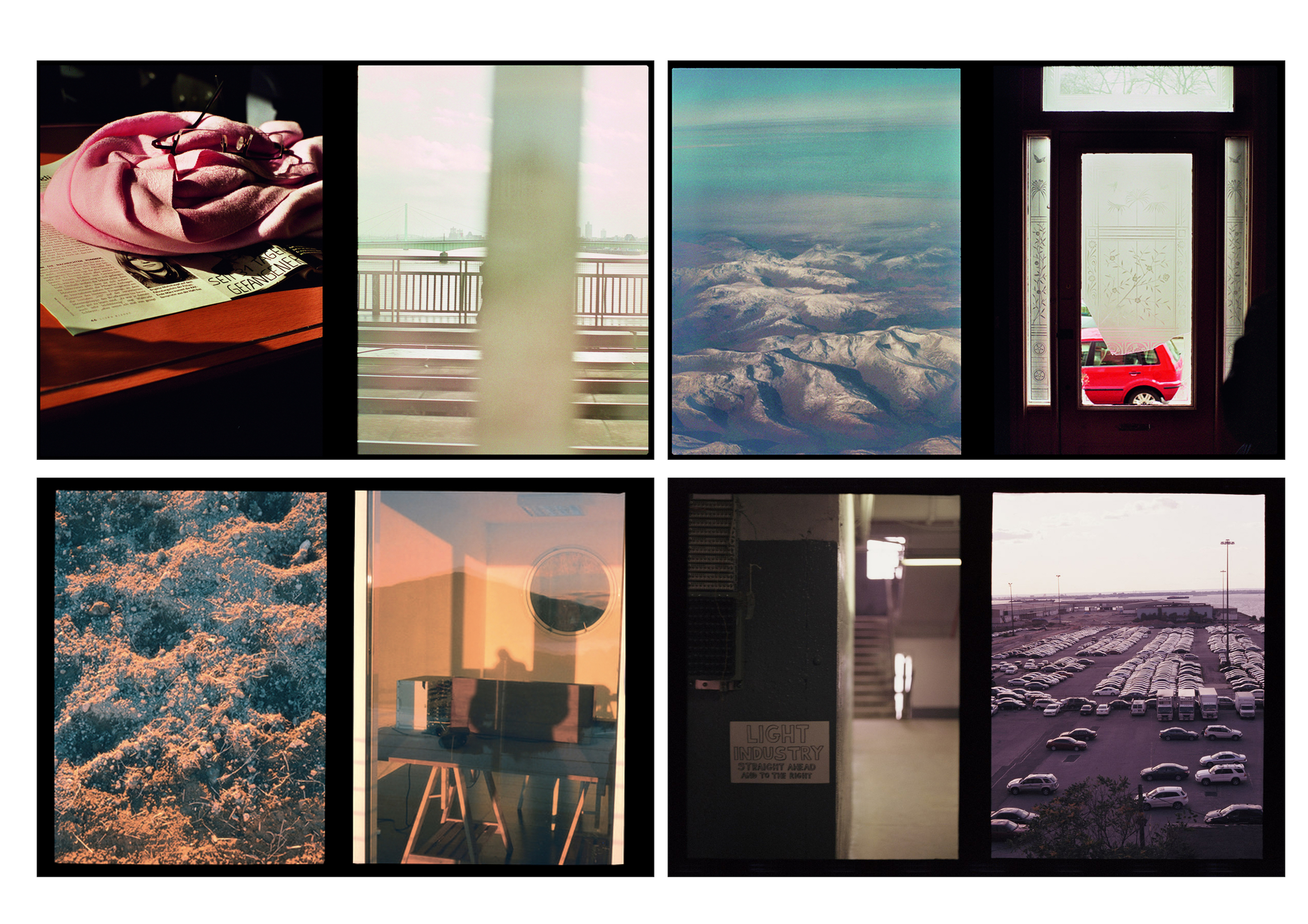
Luke Fowler is an artist and filmmaker, based in Glasgow. In 2016, he documented his artistic residency in Bamburg, Germany. Fowler created the double images by using a half camera frame, exposing two images in one frame. After developing the first roll, he was amazed by the resulting diptychs. This was the start of his new project, resulting in his book Two-Frame Films. The book addresses the fine line between photography and film.
In the book Fowler discusses how ‘the blink of any eye’ has a different meaning to us humans than it does with the camera. When we blink we are blind to the world in that instant. However, a camera takes in everything in that one blink when we press the button. Since we are blind in the instant when the photographic image captures everything, these images are a false representation of life. By printing two images side by side, he aims to emphasise the momentary nature of photography.
Sometimes it’s clear that two images are made in quick succession. Other pairs seem unrelated, possibly having been taken some time apart and in different locations. In other cases, although the two images seem unrelated in terms of subject, location and viewpoint, a poetic link creates a connection. This could be related to a particular quality of light, a compositional link, a colour or related atmosphere.
The way in which he combines the images in Two-Frame Films shows that Fowler is first and foremost a filmmaker, creating a narrative of, and an interaction between, multiple images. These new narratives created by the diptychs, question photography’s reliability as a way of documenting ‘real’ life in a single, still frame. He shows us how we can create a story, or tell our own story, through combining the chance fragments as exposed by photographs.
- From the GUP website
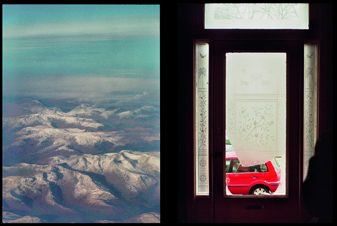
This image consists of two pictures with a black frame that surrounds them. The left image has been taken from a high level since it looks down upon the mountainous vast land. The right image has been taken inside a house. You can see that the front door has been broken since a part of the glass is missing which reveals a vivid red car on the other side. There is a connection between these two images. The right image represents being trapped indoors and seeking to go out on a road trip adventure since the broken glass reveals the desire to be outside. The left image depicts the outside world from above and shows the vast area of mountains which emphasises the amount of land there is to see and explore. Luke Fowler’s work explores the relationship between two juxtaposed images to affect the ways in which a viewer engages with the work. The diptych of the two still images enables us to explore the visual dialogue between them.
For my edits with the Bunkers I wanted to produce final images which looked like my artist research who inspired this photoshoot. However, when I started experimenting I found it hard to find a way to make my photograph look like Jonathon Andrew’s work as his lit up bunker was taken at nighttime with artificial lights lighting up the bunker, but I knew I could make an image look like Paul Virilio as his work was simple to edit. Due to the simplicity of Virilio edits, I decided to conducted further experimentation and research into potential ideas in order to showcase my photoshop skills and make more interesting images.

Further Experimentation Ideas
I decided to attempt an Idris Khan inspired edit. In order to get a better understanding of Khan’s work I have decided to create another case study which will allow me to see the requirements of his work, which I can then implement into my work.
Idris Khan:
Idris Khan is a British based photographer/artist who intends to showcase history, art and music through densely layered imagery. Khan is a Muslim , which is one of his interests within photography, people say that his work is “compressed memories”, which creates a more powerful meaning towards his photography. He can be considered a successful photographer as his work has been displayed in multiple exhibitions around the globe, from Canada to Switzerland. One of Khan’s most successful moments was being asked to create a new wall of drawing for an exhibition for the British Museum in London
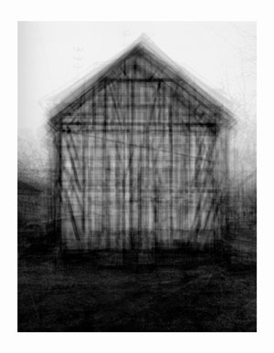
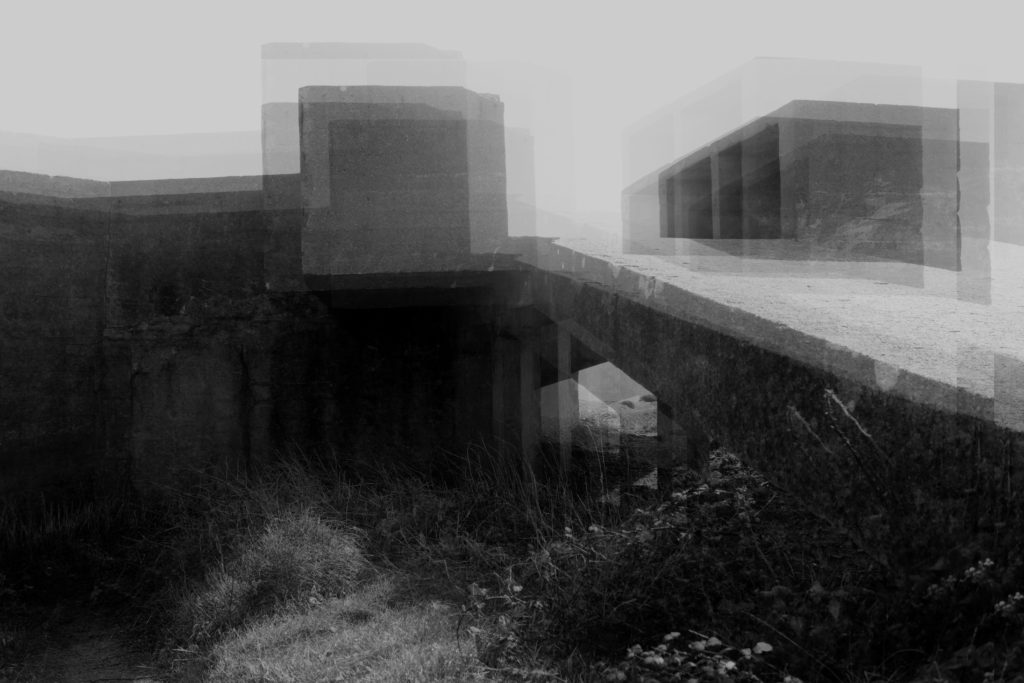
The image above is my favourite image that Khan has produced. Initially my eyes are drawn to the subject of the image which is the shed located in the centre of the frame. The more I look at the subject of the image the more detail I notice from the overlapping of the subject. The technique of overlapping has produced quite an abstract looking image but helps to present a narrative for the time of history he is trying to present. Technically speaking the overlapping may have been created on a photo manipulation software by duplicating, moving and Turing down the opacity of a lawyer, or it may have been created using a slow shutter speed. Having the slow shutter speed he could have moved his camera slightly which would have created this effect, however the image would be much more blurred than it is. In my opinion I think he has done this on a photo manipulation software which means a normal shutter speed was used. Alongside this I believe the ISO will have been raised as there is an intended blur and noise being created which has added to the texture which is being presented by the subject of the image. The depth of field being used seems to be narrow as the subject is mainly in focus with the background and foreground being slightly out of focus. The aperture Khan used may be slightly lower as the image seems to be naturally darker, so having this setting lower will make sense. In terms of the white balance I believe the image was taken using a normal outdoor white balance. The lighting is quite cold due to the grey and black which creates a eerie mood and helps to emphasis the historical aspect of the image. To achieve this I believe he took the image with natural lighting, but when the clouds covered the sun creating the coldness towards the image. The subject itself is the main focus point and presents the formal elements of Texture, through the overlapping, space, as the subject is located in the centre of the Fram creating a sense of space, shape, as the overlapping creates an overall abstract looking building. The image is presented in black and white which allows the image to show clear tonal contrast, presents the historical factors and adds to the overall eerie mood which is being created. Contextually, Khan wanted to showcase this building as an impressionistic drawing or blurred film, how things where when he was young. This was his artistic aim throughout this series. Conceptually, Khan wanted to present buildings but make them seem strangely imposing and alien like making viewers rethink about what the world is. To apply this concept into my work I will use a similar effect to make people rethink and understand the importance the bunkers had within the second world war in Jersey, thus helping to provide context to those who may not know why the bunkers actually exist.
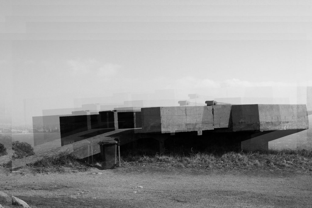
Below are my attempts at producing super imposed photographs like Khan:
In order to create these images I started off by levelling and adjusting the curves of the image to create effect. I then desaturated my image, and duplicated the layer. Once the layer was duplicated I turned down the opacity of the layer and moved it slightly, repeating the duplication process slightly until I was happy with my final outcomes.

Comparison:


I believe that my outcomes are very similar to Khan’s imagery showing my ability to take inspiration from an artist an applying it to my work. When editing my images I took the same aim as Khan which allowed me to produce such accurate responses. To compare we both have used the layering technique which makes a visually stimulating and abstract photograph which showcase a historical event. Moreover, they are both in black and white clearly presenting the formal elements of texture, space and shape. Both elements seem to have intended noise which means that my editing technique has made my image seem more like Khan’s creating another similarity. One difference is that my duplications are more spread out, as I much prefer the look when it is more spread out as it helps to guide my viewers eyes around the image. Another difference is that Khan’s image has more structure with the lines which allows the effect to stand out where as mine is much softer which makes a weaker effect. Both images have presented a cold atmosphere due to the lighting and editing being combined creating an overall eerie tone towards the two images. Khan’s image is much more darker where as my image presents a more natural look which overall does not make that much of a difference. I believe that my image has more historical context towards it creating a more powerful meaning compared to Khan’s. As shown both images are much like one another but both showcase our own artistic style, creating successful abstract images.
Action Plan:
To further this experimentation I have decided to print some of these outcomes on acetate, to which I will hold up to the camera lens and recapture some of these bunkers. Moreover, I will use them to use a back projector which will project my images onto abstract walls creating further experimentation and cool outcomes. In addition, I have printed on of the images into 8 different segments of A3 paper, I intend to stick these onto card creating a massive bunker, take this big image to the location and capture the bunker itself with the big image showing the big impact it has. This will be my further experimentation towards this area of research.
Background:
Boyle Family is a group of collaborative artists based in London. Mark Boyle and Joan Hills met in Harrogate, Yorkshire in 1957, Joan a single mother who had left her art and architecture studies to bring up her son and Mark was serving in the army. Within months they were collaborating, initially exhibiting their work under Boyle’s name until their work became widely known and they exhibited as Mark Boyle and Joan Hills. When their children, Sebastian born in 1962 and Georgia born in 1963, began to collaborate with them from the late 1970s onwards, the group became established as Boyle Family.
Best known for ‘earth’ photography, focusing on the different textures of the ground. These photographic works combine real material from the site they are using for the shoot (stones, dust, twigs etc) with paint and resins, preserving the form of the ground to make unique one-off pieces that suggest and offer new interpretations of the environment.
Photographic Analysis:

This style of image is a very unique way to show the journeys and pathways, as it not only shows the physical road/pavement that we walk on, but it also shows the history of the concrete, the paintwork, and cracked slabs on the pavement. It shows a different kind history that is so often overlooked. There are very distinguishable features in the textures which are amplified by the wet surface, helping show the more intricate details in the road, as well as creating more definition between cracks in the pavement.
In this photo you can see the light coming from the left side of the image. As there is only light coming in from one spot on the left, I would imagine that the light is artificial, however it could be the sun slightly shining through the clouds on an overcast day. Wherever the light source is coming from, it creates a very nice reflection that shows even more detail in the uneven surface of the road. Taken from standing height, I would imagine that the lens that Boyle used would have had a fairly ‘standard’ or ‘medium’ focal length for this picture, somewhere in the region of around 50-85mm.
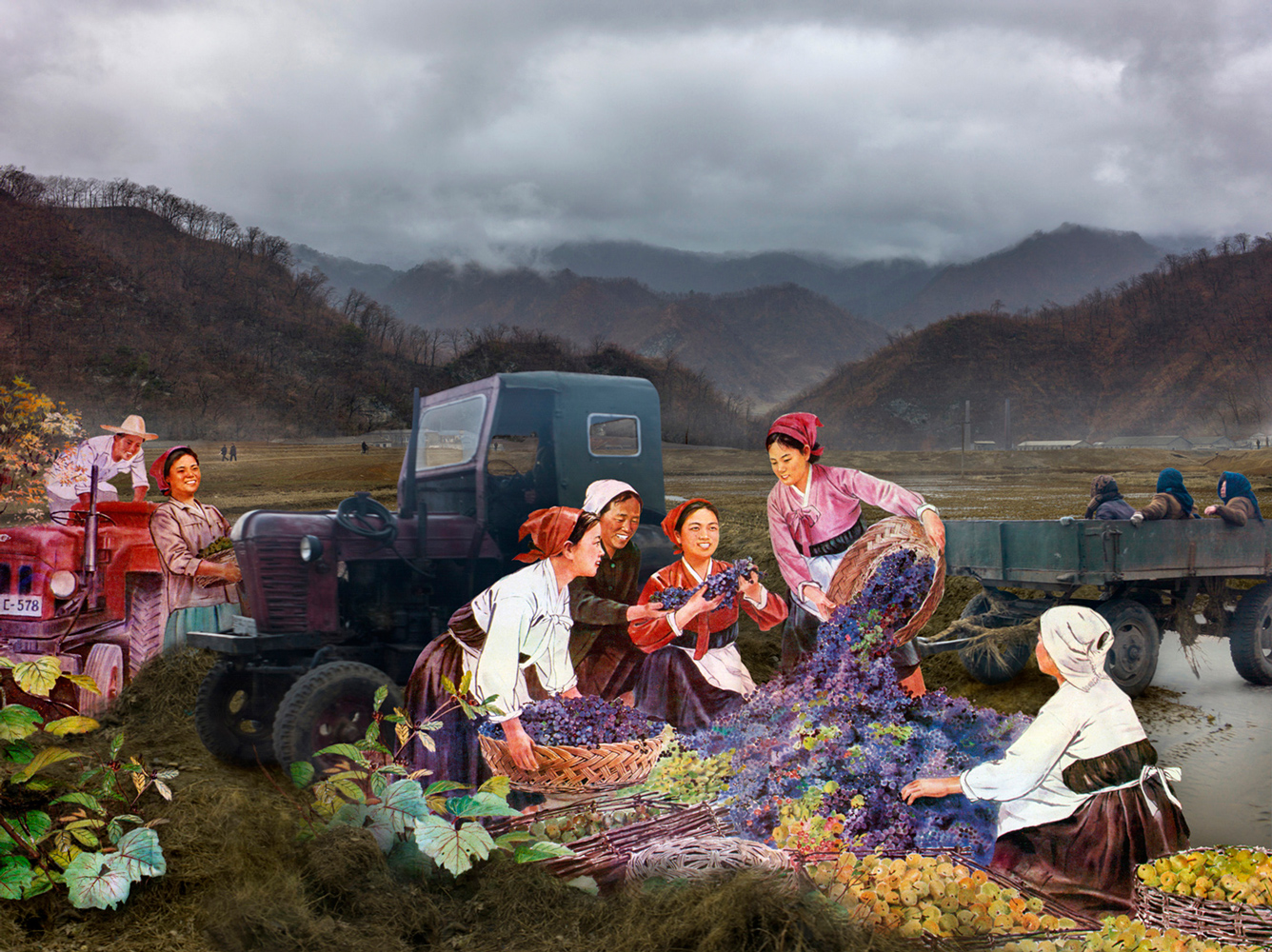
Alice Wielinga: ‘A Life Between Propaganda and Reality. In her North Korea – A Life between Propaganda and Reality series, Alice Wielinga links the documentary photographs she took in North Korea to the propaganda images produced by the government. Her pictures are part of the North Korean Perspectives exhibition, on display at the Museum of Contemporary Photography in Chicago, up until October 4, 2015.’
‘North Korean: A Life Between Propaganda and Reality’ is an ongoing project by Photographer Alice Wielinga. This project began in 2013, when at the time western media was following the steps of Kim Jong-Un closely during his missile test launches, Wielinga traveled 2500 kilometers through the inlands of North Korea.
“I decided to find out what was happening inside North Korea, behind its propaganda that masked such unfathomable despair and poverty. During my trip I collected propaganda material and took documentary photographs of the reality I encountered. In the final works, a dialogue between propaganda and reality has emerged, trying to reconcile the present and the future of the country nobody really seems to know.”

Wielinga’s main aim of her trip was show what the realities of North Korea were, compared to the idealistic version of the country: which is presented through propaganda throughout North Korea itself and other countries.
Analysis
The photo above is one of my favourites from this project, as I think it outlines her intentions the best and shows the greatest comparison between the two worlds. Beginning with the setting of the picture, on the real life version, it is gloomy, there is a lot of fog and mist. The trees are barren and there is no greenery in sight. In the pond, the difference between the two is very clear, the pond in reality is drying out and is surrounded by old debris from the area around it, there are broken boxes strewn everywhere and the buildings in the background are grey and seem to be decrepit, almost falling apart. The reality side overall looks like a wasteland. This juxtaposes the painting version of the scene. This was taken from an archive of government paintings of North Korea. The colours are vivid, the sun is shining and everything seems to be picturesque. There is no lack of greenery, the trees are full of leaves and there are flowers everywhere, this painting overall presents an idealistic view of the country, how it wants to be regarded by the rest of the world, who are forbidden entry. Lastly, the people in the image: in the realistic version their clothes are dark and look like government-issue workwear. In the painting they are wearing brightly coloured free flowing clothes, the women are wearing dresses and they all seem to have freedom. Which the outside world is aware that they definitely don’t have, everything in North Korea is controlled, even hairstyles. The facial expressions on each are also wildly different, in the painting they are smiling and laughing, happily getting on with their days work. In reality, the workers are forced, their faces are staring unknowingly at the camera and they look tired and worn out from the regime.
Brief History of Propaganda in North Korea:
Propaganda has been used throughout history to influence and sway public opinion, particularly in totalitarian states. Being subject to endless propaganda is common for North Koreans, especially anti-American propaganda. Throughout history it has become common knowledge that the North Korean State hates Americans, this is because in the Korean War, American planes dropped approximately 635,000 tons of explosives on North Korea (that’s more in three years than during the entire Pacific theater of World War II), including 32,000 tons of napalm.
That continued fear of deadly US military airstrikes helps the North Korean government to portray Americans as a far-away caricature, a faceless enemy that leveled their country and could do so again.
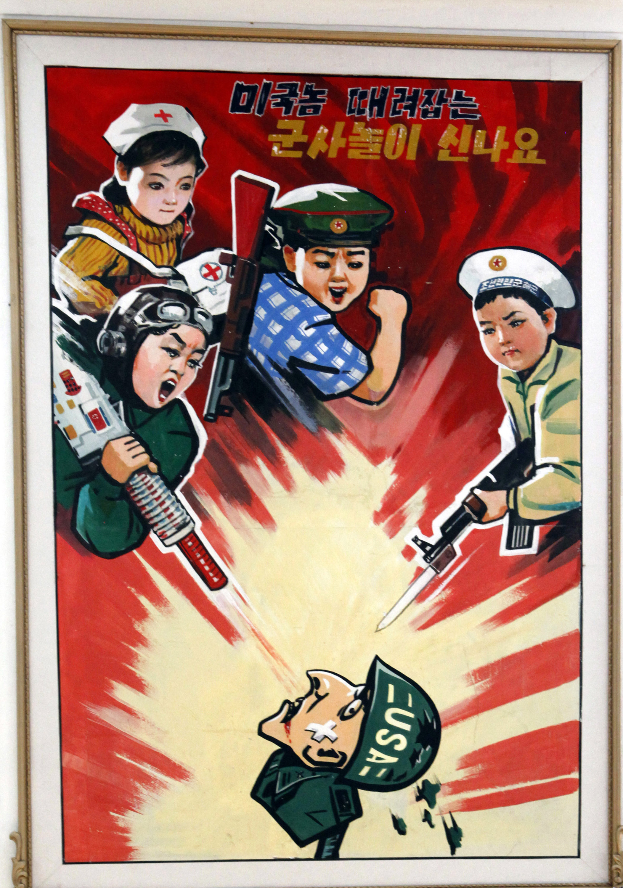
Above is a North Korean propaganda poster displayed at a kindergarten in 2012 in Pyongyang, North Korea. The Korean characters say “we love playing military games knocking down the American bastards.”
The North Korean state attempts to create a deep hatred for the United States. Kindergartners draw anti-American martial images. The Korean news media releases videos of the US military in flames. The June 25 anniversary of the start of the Korean War is “the day of struggle against US imperialism.”
Wielinga has also done a Ted-Talk since returning from the trip, where she explains what she learnt from working with North Korean Artists. I have linked this below. For my own work, I want to explore the technique in which Wielinga uses to bring the two realities together and bring a bit of awareness to certain topics, however on a smaller and less serious scale than North Korea.
Sources
https://edition.cnn.com/2017/07/26/asia/north-korea-united-states-relationship/index.htmlhttp://www.alicewielinga.nl/

“Reflecting the work of abstract artists and following in the footsteps of photographers such as Saul Leiter. Stephens unique form of street photography is a consequence of frequenting bus stops and shelters around the City of Birmingham. Graffiti can be great art, however for Stephen, the etched, scrawled and scratched graffiti into the Plexiglass windows of the bus stop feels like a violation. The graffiti etched and scrawled in the bus stop windows seem to be expressions of frustration or anger, hate and love written into the Plexiglass.
The windows full potential as a clear barrier between yourself and the elements are compromised when the view beyond is obscured, distorted and blurred by the scratches. The the graffiti etched window becomes a lens. Stephen merges the graffiti and the view beyond, focusing his camera on the etched lines. The view beyond is put out of focus. The graffiti and view are merged into a single plane. A new perspective is created, that retains and emphasises the energy of the graffiti. Its swirls, zigzags, lines and curves, slash across the abstracted view like paint strokes. At first glance, the photos may be mistaken for abstract paintings. Then closer inspection reveals they are in fact photographs.
The subject matter that is out of focus is also fairly mundane. Often when waiting for a bus the view is not particularly exciting. The human activity he prefers capture is not very dramatic. When combined with the mundane graffiti and the mundane view it adds to his desire to create a new image that ordinarily would be uninteresting or unnoticed. Even the title of each work is mundane, the descriptions of each photograph are very droll.
The way he uses the camera for this project is like painting with light. He breaks the rules for getting a traditional photograph. He puts the view that is usually the focal point out of focus. Stephen then focuses on what would normally be avoided. However, the resulting images are very dynamic and often vibrant. There is a metamorphosis, the mundane graffiti and the often-mundane view are merged into a fresh new image. There is an attraction to the paradox that his work invokes. Stephen makes unique beautiful images out of the vandalised bus stop windows.
Stephen loves the images he produces. However, he doesn’t condone the vandalising of the bus stop windows that provide the lens for his work. The Bus Stop series is a unique approach to photography. Bus Stop brings the current social issue of a specific form of vandalism to the fore. The art works are a product of modern vandalism. Vandalism that has found the Plexiglass windows of bus shelters an ideal medium to express feelings. Although Stephens work has so far been derived from the city of Birmingham it is an issue familiar to the many people of all ages who travel by bus in urban and rural settings across the UK. His photography challenges people to look at the issue vandalism. From the protagonists to the observers of their markings. It also challenges people to see the potential beauty in mundanity.” https://www.stephencalcutt.com/about-me-stephen-calcutt

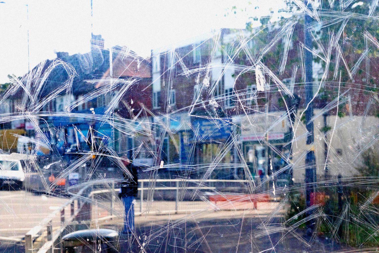

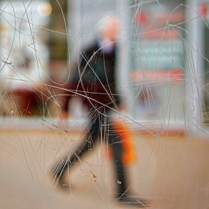

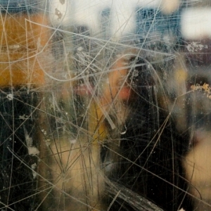
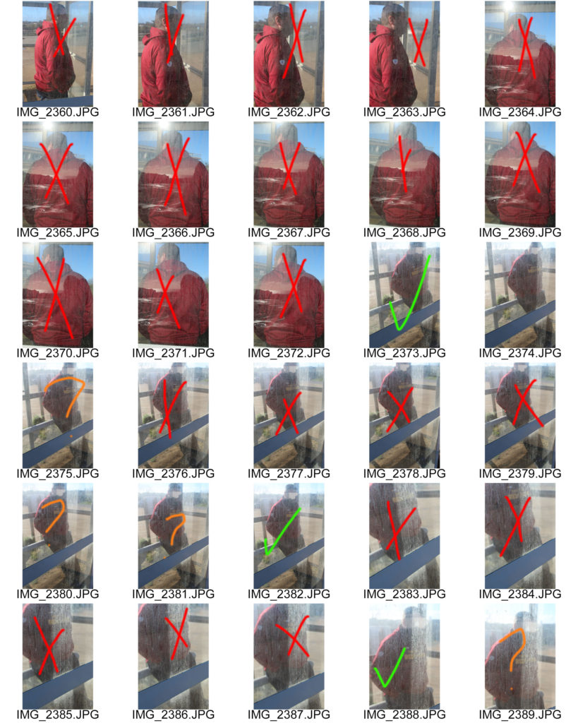
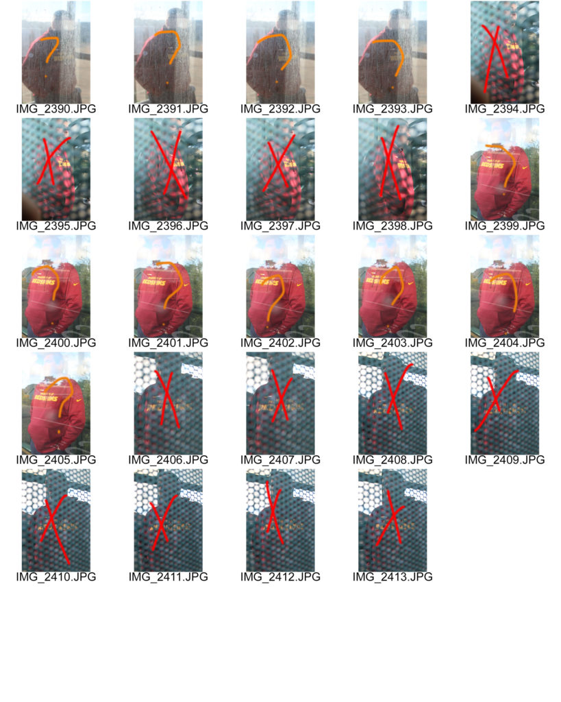
I will be taking photos around jersey at a few different bus stops so I can capture Stephen’s style. I will be using my canon camera to take these photos. I am linking this to Journeys and Pathways by showing the physical journey of taking a bus to get to your desired location. My step dad was the model for this photo shoot because I did this on a Sunday so there wasn’t a lot of people at the bus stops.
Red – No
Orange – Maybe
Green – Yes
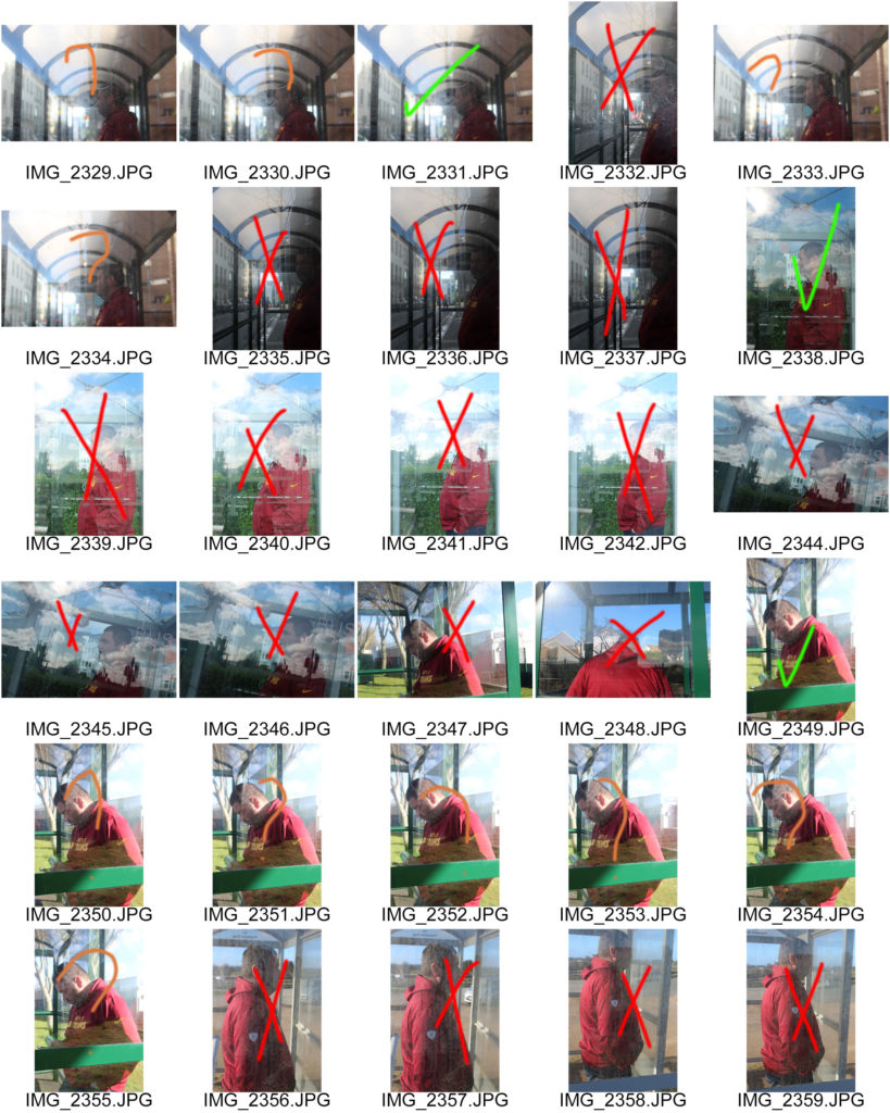
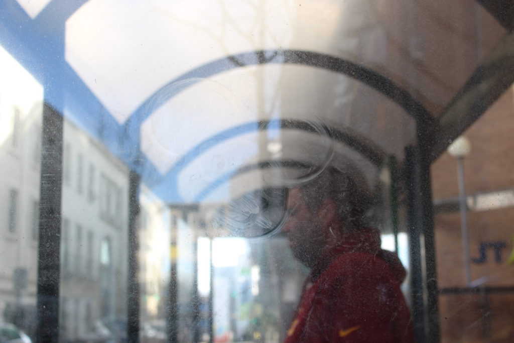
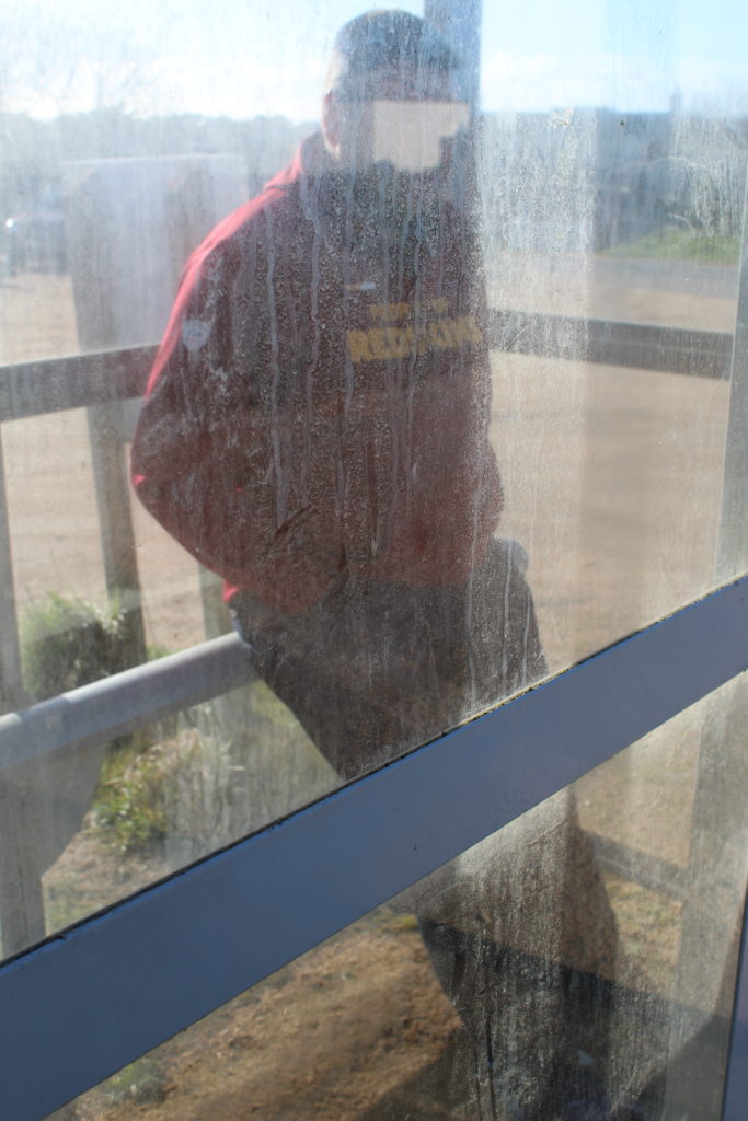
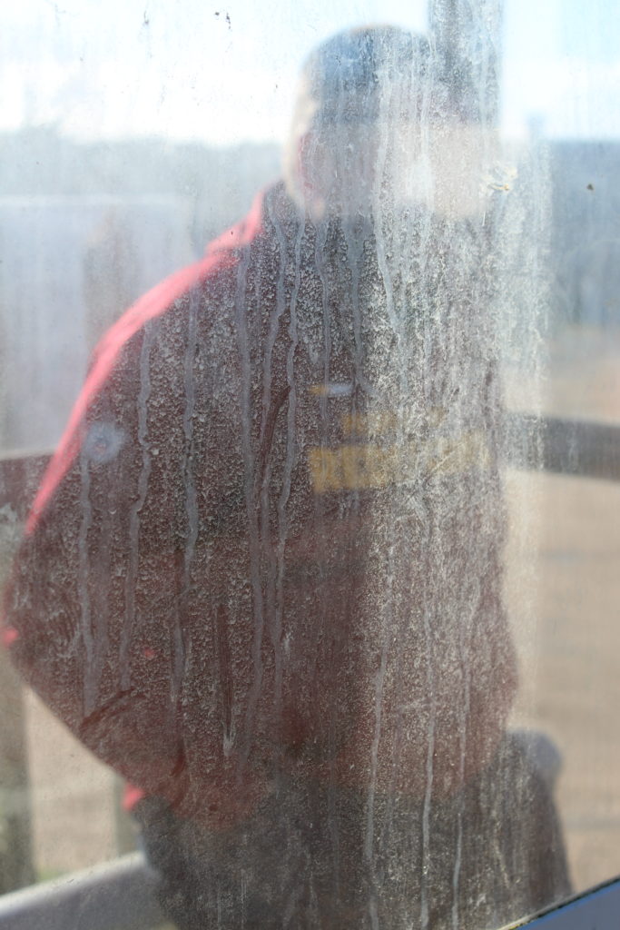
I liked these final images but they were a little over exposed and needed editing.
I used Photo Shop to edit these images.
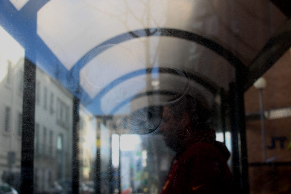
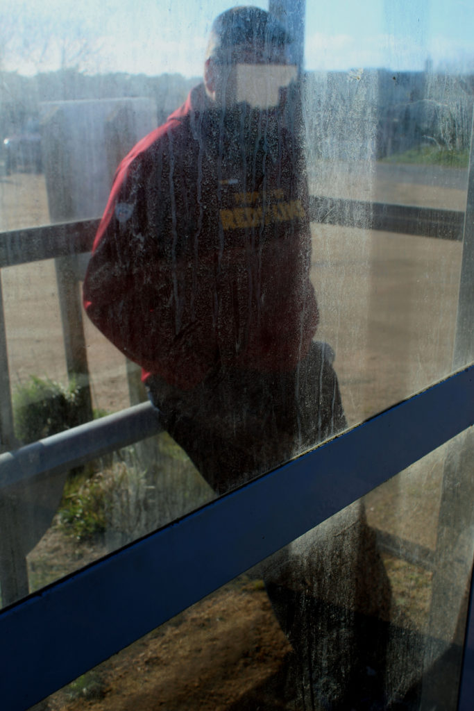
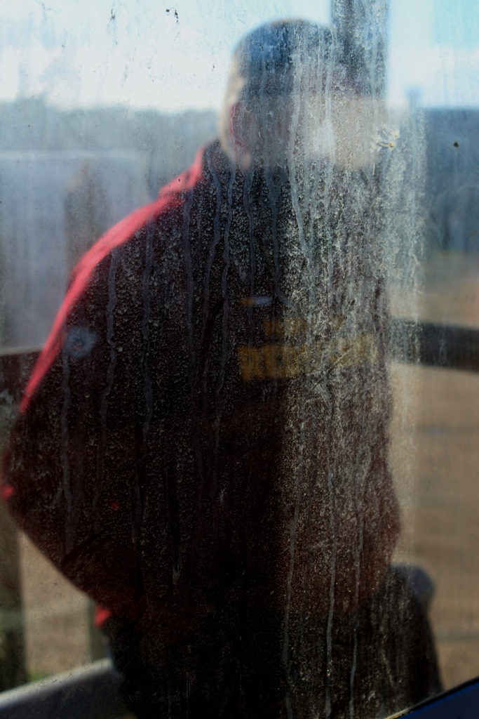
Overall, I am very happy with the outcomes of these edited photos. I think I capture Calcutt’s style really well, whilst still incorporating my style in the images.
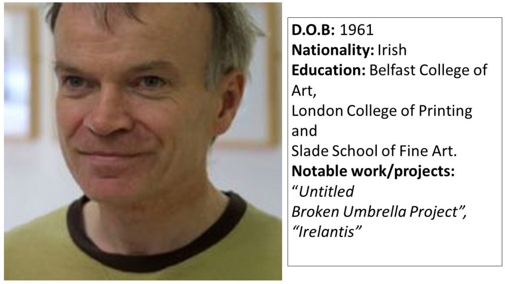
Sean Hillen is an Irish artist who’s work makes use of the photo-montage method in order to merge images together, showing the contrast between 2 contrasting scenarios that are linked together in a more figurative sense. Hillens work often approaches topics such as violence, politics, literature and history. After growing up in unison with the conflict in Northern Ireland, Hillen learned to appreciate the different meanings that could be portrayed by merging images together, to create an image that drew the eye of the viewer due to the colours and lack of context, but with closer inspection conveys a meaning of some description. Often, Hillens work contains meanings that are personal to him, and some of his work is created with aesthetic as a priority, rather than a meaning or reason.
“When you take a photograph, you take a whole world, a cosmos, with you. And then when you collide it with something else you have a whole new level of meaning, entering, penetrating, sliding against one another.” – Hillen
As my second photo-shoot involves merging contrasting images together to represent a subject being on an incorrect path (where the environment doesn’t match what the subject represents) I have focused my case study on Hillen.
Hillen uses photo-montage to create landscape images in which parts of the landscape completely contrast other sections, emphasizing a split between 2 wolds which have been forcibly merged together. Hillen’s work uses images from different settings and locations and merges them with their complete opposites, creating 1 single image in which the scene looks naturally and organically merged, but the context of the image is twisted or wrong.
Examples of Hillen’s work can be seen below:
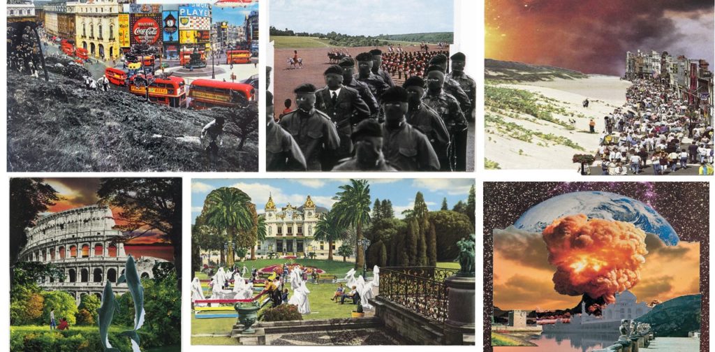
The contrast between the images Hillen uses in each piece of work is clear, and the use of bold colour and shapes allows for the images to clearly outline where the images physically come together, although they fit together smoothly.
I will be taking inspiration from Hillens work in order to produce my second photo-shoot, in which I will take an image of a a subject representing a certain career/lifestyle (e.g a suit to represent an office worker), and I will use a photo-montage technique to insert the subject into an environment that does not match the context of their background (e.g an office worker in a forest) to place emphasis on the theme of being on the wrong path/journey. I will be taking inspiration from Hillens out of context imagery, and the idea of merging 2 images together to create a more visual than figurative meaning.

