


Evaluation:
At the beginning of this project I had many ideas on different approaches I could take to showcase Journey’s and Pathway’s, after lots of thoughts and inspiration I decided to set my project to the Journey of Jersey through the Second World War. This title is very broad which allowed me to explore different aspects of Jersey’s war, such as Bunkers, Liberation Day, Sea Wall and Propaganda. It also provided me the opportunity to explore and research different aspects of the second world war and how it impacted Jersey, this was exciting for me as learning about the past is naturally something that interests me. I started off by exploring Gina Socrates work who captured Jersey Sea Wall, which was built not only to stop the tide hitting the island but to keep other armies from invading Jersey. A while back I viewed Socrates work at the CCA gallery where she explained her methodology of using the double exposure and explained why she conducted the photo shoot, her passion for her work and outcomes interested and excited me which allowed a successful first photo shoot. My first photo shoot was inspired by Socrates, where I explored capturing the subject of the sea wall at different viewpoints and with different shutter speeds. The exploration allowed me to showcase my ability of landscape photography and ability to adjust my camera settings and the use of natural lighting. When creating the edits of these images I wanted to replicate Socrates double exposure, which created a successful outcomes which showcased an aspect of Journey’s Jersey through the second world war. Although this shoot and edits where successful, I did not see any opportunity for further exploration. My next aspect of Jersey World War was Jersey’s bunkers and how they where used for the German army to help prevent other armies entering the island. For this shoot I looked at two artists who captured the same subject which was Jonathon Andrew and Paul Virilio, both artists produced high quality imagery of bunkers which helped inspired the way I captured the bunkers. Within this photo shoot I produced many successful outcomes which reinforced my competence of capturing landscape images, with different depth of field. When editing I struggled for inspiration in how to manipulate the images, as I wanted to keep the images socially acceptable and still showcase the same meaning as the artists researched. This is when I found and analysed the work of Idris Khan who distorted his subject by creating multiple layers, turning down the opacity of the layers and then slightly moving them. I liked the effect it had on his imagery and so tried in on my photograph, which lead to one of my strongest outcomes, it also inspired other editing ideas which shows further development towards the project. Due to the high success of this photo shoot and edits I decided to conduct another photo shoot using some of the imagery created, this lead to further exploration and my ability to think creatively. In this photo shoot I printed some of my work on acetate and held up to the camera lens to distort the bunkers in the background. I also printed out my most successful image into 8 A3 fragments which made up the whole picture, the idea behind this was to showcase how big the bunkers actually are and metaphorically how they had a massive impact during Jersey’s Journey through the Second World War. I managed to get some successful outcomes, but the images where not as good as the original photo shoot. The edits showcased my ability to use Photoshop and the different tools within the software to manipulate the images. I felt that I had explored bunkers a lot so I decided to move onto my next idea which was propaganda. I wanted to showcase how war propaganda was used to manipulate men to join into the wars army. I researched Barbara Kruger who created imagery like propaganda but addressed issues in 1945 society, as well as war propaganda and tableaux photography to understand what makes a successful propaganda. In the photo shoot I conducted it in a studio to showcase my ability to use artificial lighting and different types of lighting. It also allowed me to showcase my ability to explore and do tableaux photography. During the editing process I looked at using videography, I looked at using gifs of my model getting into the famous position. I also recreated Kruger’s work, then using war photography and Krugers work I created my own propaganda. Although I created successful outcomes, they where not as strong as my bunkers work but still showcase development and exploration towards the project. Due to a lack of time I was not able to conduct anymore photo shoots, I decided to do two more artists research to produce more edits. I research Knez and Talmor who looked at providing a way of reflecting on the past, but in different tones and ways. Then using successful images from my bunker shoot I decided to create edits in the same style. Doing this I produced many strong outcomes which I am now using as final pieces due to the success and meaning it holds. I believe that this project is successful as I have been able to produce many high quality photographs due to my competence in adjusting camera settings for effect. Moreover, I showed my competence of using Photoshop and hand crafts to manipulate my images. I have been able to explore multiple aspects of Jersey’s war in order to showcase the Islands Journey through the Second World War. If I had the opportunity to expand the project I would look at liberation day, and how the islanders celebrated when the Germans left the island, which would have linked with Martin Parr. To conclude, I believe that this project has been highly successful and I am proud with the final imagery produced.
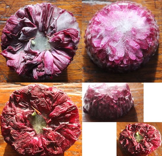
Set 1 is focusing on the idea of being ‘frozen in time’, freezing a living thing in time so we can observe its current state for longer.
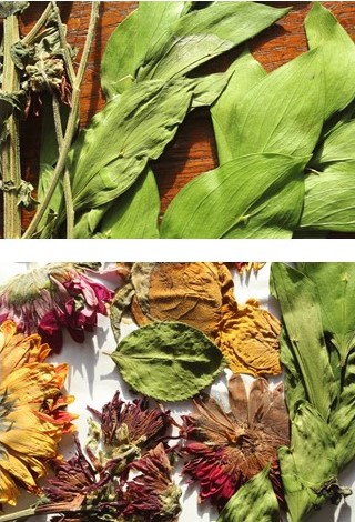
Set 2 focuses on again preserving something so that it can last longer and be admired for longer.
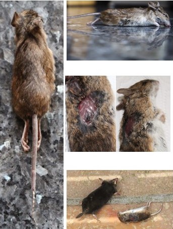
Set 3 focuses on the innocent deaths of rodents who can’t be preserved due to nature being its process at the moment of death, Hence why i wanted to capture them in their frozen moments so that the documentation of the death can be observed.
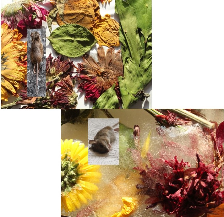
Set 4 shows how both ideas are linked, and both reflect different stages of the life cycle.
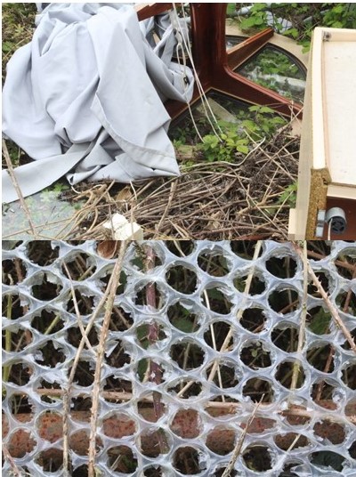
Set 5 reflects the disturbance of man and nature and how natures life cycle has been broken by man due to fly-tipping and miss-disposed rubbish.
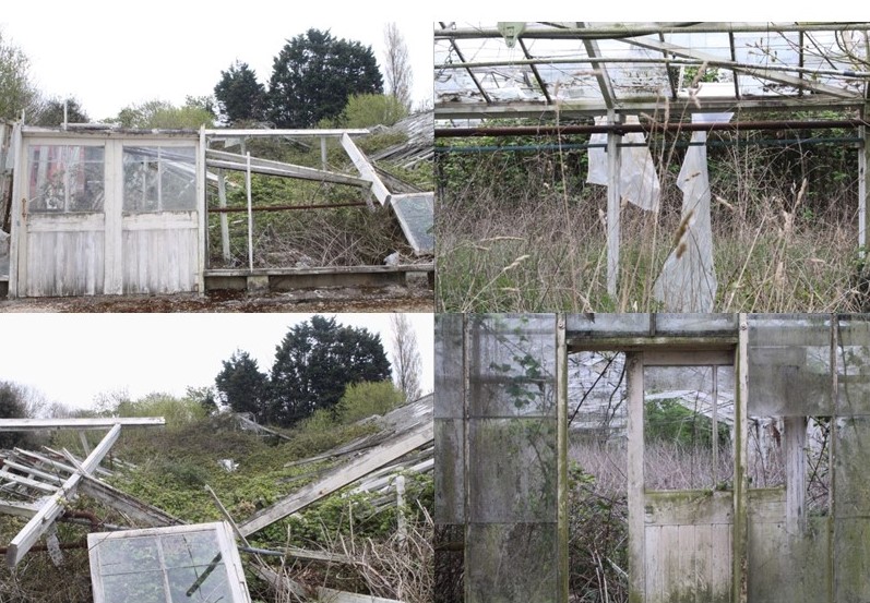
Set 6 again shows how humans have disrupted and abandoned a once cared for environment and left it to rot.

The photograph splits a Colorado environement in two. On the top Adam presents an ominous mountain with clouds similar to the classic nature photograph, while on the bottom he captures the harsh edges of mobile homes blasted with sunlight. The contrast between the angular houses and the smooth edge of the mountains creates an obvious conflict between humans and nature. It is a site of interaction between humans and the inhuman. The photograph works to recognise the American West as a landscape scattered with human development rather than an untouched natural environment.

Frank Gohlke deconstructs the viewers concept of landscape by depicting an empty parking lot in the foreground with only a glimpse of nature in the mountainous background. All together, the photo feels hollow with centred framing and a lack of human presence. Through the picture, Gohlke provides a negative view of the modern interaction between humans and nature.
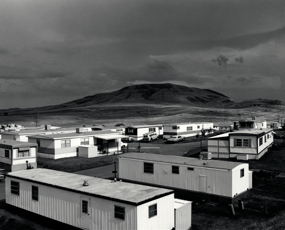

Side by side these photos reveal certain aspects of the new topographic aesthetic. They move from a celebration of nature to a critique of humanity’s desire for expansion. At the same time, the images create a sense of despair in their subjects through straight on angles and centre framing.
Stephen Shore is an American photographer known for his images of banal scenes in the United States, and for his pioneering use of colour in photography. He was the only photographer part of the New Topographics who shot in colour. It seemed to increase the sense of detachment in his photographs of intersections and streets. Shore was influenced by Ed Ruscha, the conceptualist of California cool. He trained his lenses on the uniquely banal architecture that was along the roadside landscape.

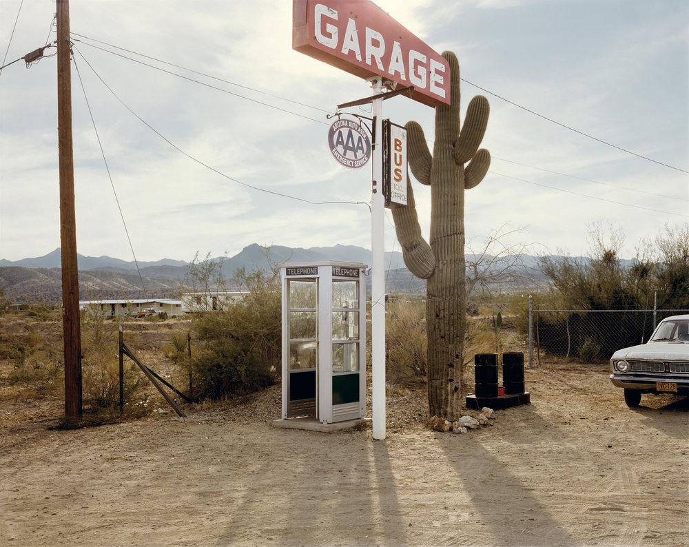

In this image the matching colours hold the image together: the red in the Pepsi sign resonates with the red in the “99 cent” hamburger sign. This picture shows the random and blunt effect of humans on the landscape, dependent on conveniences such as long distance communication systems and fast food. The abandoned telephone booth in the middle ground of the photo is one of the aspects showing how man has altered the landscape.
Lewis Baltz was a visual photographer who became an important figure in the New Topographics movement of the late 1970s.
His work is focused on searching for beauty in desolation and destruction. Baltz’s images describe the architecture of the human landscape. His pictures are the reflection of control and power that human beings have. Like his contemporaries Robert Adams and Stephen Shore, Baltz focused his camera on architecture of tract housing, office parking lots and industrial parks.
Lewis Baltz documents the changing American landscape of the 1970s in his series, “New Industrial Parks Near Irvine, California”. The project’s 51 pictures depict structural details, walls at mid distance, offices and parking lots of industrial parks. Contrast and geometry are important in these pictures, but what makes them consistent is Baltz’s attention to surface texture and lifeless subject matter.


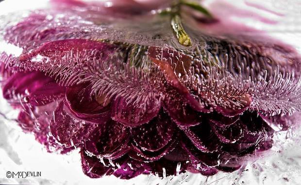
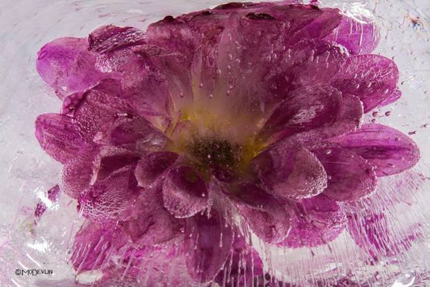
Frozen Posies series
Devlin perfected the art of photographing fish in their aquatic environment. Mastering the dynamic of how light travels through water was only the first of many steps in the frozen flower process. That intense sense of spontaneity Devlin captures is the result of a very deliberate process. These images are not simply stumbled upon, but meticulously created.
Freezing his “models” is the most important part of the process. When tap water is frozen the impurities show themselves as clouded white ice. Devlin experiments and continues to perfect his ability to control the outcome of how the ice forms and captures the subject. Sometimes the bloom itself can be the source of impurity. Any substance, natural or added to the plant, may cause large areas of clouded ice. Blooms with high sap or sugar content or flowers purchased that have been given a preservative, pose the biggest challenge.
One thing that occurs and is cultivated through his photos is the appearance of “ice trailers.” These are simply bubbles that have been squeezed out of the organic material then stretched as the freezing process continued. The science behind their formation is amazing.
Flowers add to any room a feeling of beauty and grace. They are delicate beings, alive with sensuality. Mo Devlin’s Frozen Flowers capture all that and more. The ice adds a “look again” dimension to this gorgeous photography that draws us in and fires our imagination.

Contemporary Approach:
The contemporary approach to displaying images is very naturalistic, and is the method used the most often. This is simply displaying images in a frame, window mount or next to each other. The simplistic method of framing allows the imagery to be shown off and the meaning of the photographs to clearly be displayed. This method should be used for more naturalistic photographs and any high quality images which showcase good camera skills and successful editing technique.


Sculpture:
Using sculpture to display our photographs is the opposite to the contemporary approach. This his when we use images to sculpt a bigger image or object. The method is much more hands on and showcases our photographs in a new and different way. This method can be considered more abstract but, showcases imagery in a unique way. Sculpture is most appropriate when wanting to display abstract images, images that work together and photographs which can be used to display the meaning in a different way.


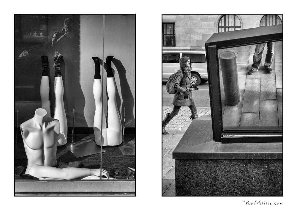
Diptych/ Two Frames:
The diptych method is when you display two images next to each other, which usually work well together or juxtapose one another to convey an overall meaning to the two images. The method of displaying these images is very much taking the contemporary route, so the imagery and framings is more naturalistic.
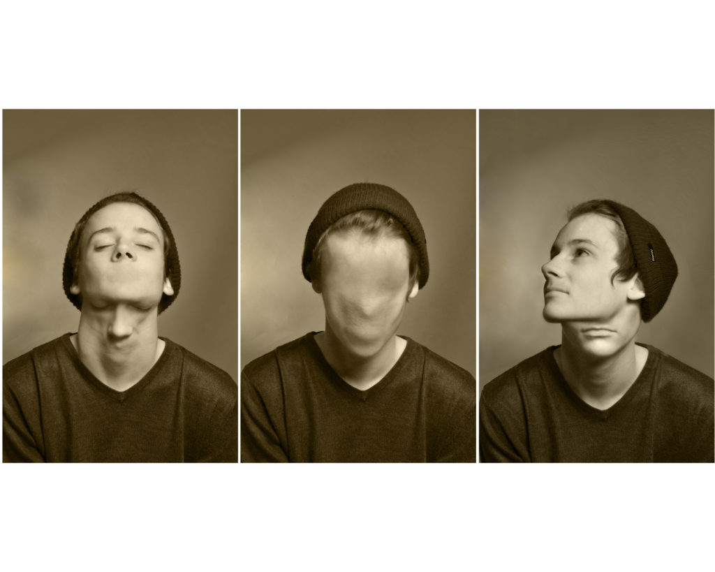
Triptych/ Three Frames:
The triptych method is when you display three images next to each other, these photographs usually work well together or juxtapose one another to convey an overall meaning to the two images. The method of displaying these images is very much taking the contemporary route, so the imagery and framings is more naturalistic.
Grid:
This method of framing is when we display multiple images together, as these images are apart of a photo series, work well together or juxtapose each other to convey an overall meaning to the two images. The method of displaying these images is very much taking the contemporary route, so the imagery and framings is more naturalistic.
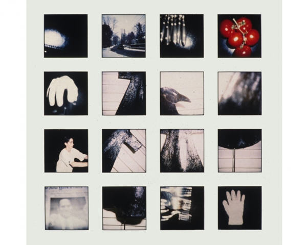
Eclectic:
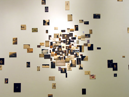
The Eclectic method of displaying is when we display multiple images of different sizes, shapes (landscape and portrait) in a random (spread out and different locations) manner in order to present a series of images. Usually these images are apart of a photo series, work well together or juxtapose each other to convey an overall meaning to the two images. The method of displaying these images is very much taking more of an abstract route to framing due to distorted and unorganised layout.
The New Topographics: photographs of a man altered landscape
The New Topographics was a term created by William Jenkins in 1975 to describe a group of American photographers such as Robert Adams and Lewis Baltz. Their pictures had a similar banal aesthetic, in that they were formal, mostly black and white prints of the urban landscape. They brought a new perspective to landscape photography that focused on an objective documentation of locations.
These images of the man altered landscape carried a political message and reflected the growing unease about how the natural landscape was being eroded by industrial development and the spread of cities. Work labeled New Topographics emphasised the relationship between man and nature through the documentation of Industrial intrusions on land and scenes of suburban sprawls, motels and parking lots.
These New Topographic photographers were less concerned with portraying an ideal image of nature and were more interested in showing plainly how man has altered it. They were photographing against the tradition of nature photography.


For this shoot I will be using 35mm film as it is the closest method I can use to how Adams took his photos. I will aim to produce 72 images with one roll being in colour being mainly based in the alps then with the second roll roughly 10 images from it will be taken in the alps and the remaining frames will be taken in the marsh lands near me as it is a natural site and there will also be some taken of a cliff face and large rocks.