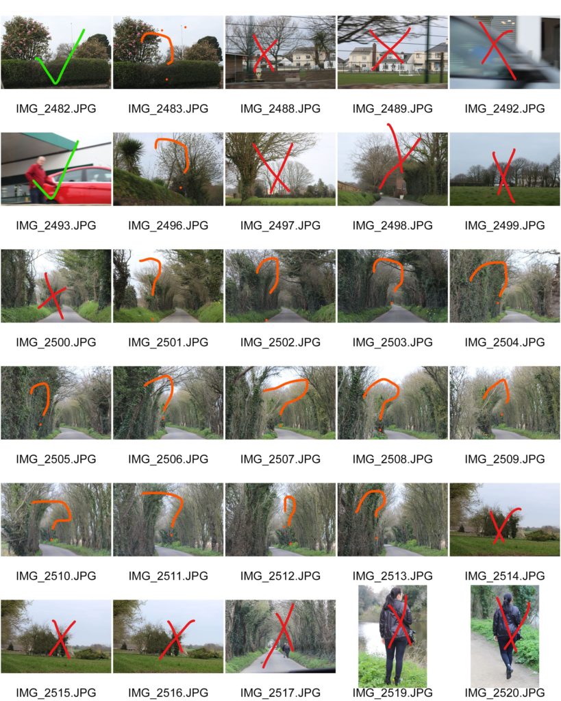
For this project, I went on a journey with my mum to the St Saviours abandoned hospital to show the state that it is was in. As I turned up to it, it was shocking to see it all boarded up and see warning posts all over the walls. I took photos of people on the way there.
Contact Sheets:
Even though some of the photos I took were good, they just weren’t what I was looking for and didn’t really link in with the theme I was doing.
His career began as a designer, creating award winning work for leading advertising agencies and global brands. In 2010 he transitioned to contemporary art.
As an artist, Mulford has developed his own distinct style—appropriating imagery and redefining the context. He has pioneered an innovative creative process that seamlessly blends vintage materials, modern technology, and traditional mediums.
For this project, I will be using photos from my beach photo shoot and my bus stop photo shoot. I will be using the style of the shapes of the beach photo on top of the bus stop photo. I will mix my style with Mulford’s style.
Final Outcomes (Editing Process):
First Image:
Placed the beach photo on top of the bus stop photoI then used the rectangular marquee tool to cut out sections of the beach photoFinal Outcome
I really like how this image turned out. I think the blue and colour of the sea and the brownish colour of the bus stop image work well really together. I also really like the contrast between the two images.
Second Image:
Placed the beach photo on top of the bus stop photo
I then used the rectangular marquee tool to cut out sections of the beach photo I then turned the background to black and whiteFinal Outcome
I am really happy with this photo. I think the black and white really compliments to the diamond shapes of the sea.
Third Image:
I first turned the image to black and white Placed the beach photo on top of the bus stop photo I then used the rectangular marquee tool to cut out sections of the beach photo Final Outcome
I am really happy with the outcome of this photo. I really like the simpleness of the four lines, I think it gives the photo a very clean and aesthetic feel to it. I also again like the contrast between the colour of the sea and the black white background photo.
For my final displays I decided to do a lot of overlaying of images. My first composition on the left is 3 A3 printed images stuck straight onto white card in a diagonal line, the top and bottom images also have smaller A5 images which where first stuck onto foam board then placed on top. I did this because firstly, to the eye it all fits together so having them apart would make the images lose their meanings, and secondly it continues my idea of the life cycle : natural material decomposes into soils then new things are planted until they die and decompose into the soil. My second composition is all of my off-cuts rearranged into an order that still makes sense. Although all of the images are mixed up, the idea of time being the killer is still present.
Overall, my project has been constantly evolving and adapting from day one. At the beginning of my project, I focused on ‘The Journey of an Object’, this was too simple for me and I wanted to challenge the idea of a journey of pathway. The journey I ended up focusing more was ‘The Circle Of Life’. I represented this with flowers frozen in ice – so I could physically freeze a moment in time and retain it, press flowers – so as they decay they stay flat and create their own composition, and I also captured deceased animals to capture their ever-lasting last moments and how their bodies responded to it. This collectively in my opinion, shows how time cannot be created or destroyed but can be held in a single moment.
My original interest for ‘The Circle Of Life’ came from a case study I did about Wolfgang Tillman’s still life photography. The specific image that inspired me was called ‘astro crusto’, an image that showed an open dead crab with a fly feasting on it. This sparked my whole idea of decay and time.This was all then followed by my case study of Heikki Leis who focused on the decay of food. I couldn’t really catch onto the idea of rotting food due to two variables, one being a time constraint (I didn’t have enough time to let my fruits and veg rot with a sufficient amount of decay present) and secondly handling these rotting foods causes many illnesses and put me off. However, thanks to some generous cats I was able to handle some deceased rodents easier because firstly they were brought into the house so I didn’t have to go and find them, and secondly the cats only bring them in as trophies so there was only puncture marks.
Editing wise, I kept it simple with just colour adjustments and cropping, however during this project I became more accustomed to the use of cameras and I could set them up for images that didn’t needing much editing due to me having already capturing what I wanted. For my final images, I decided to layer my images over each other because I think it really ties in my whole idea of ‘The Journey Of life’ and how death is inevitable.
Overall, I’m happy with the content i have produced because it all ties into one clear topic and they’re not reliant on editing and manipulation.
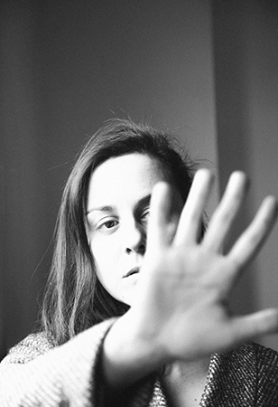
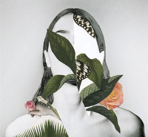
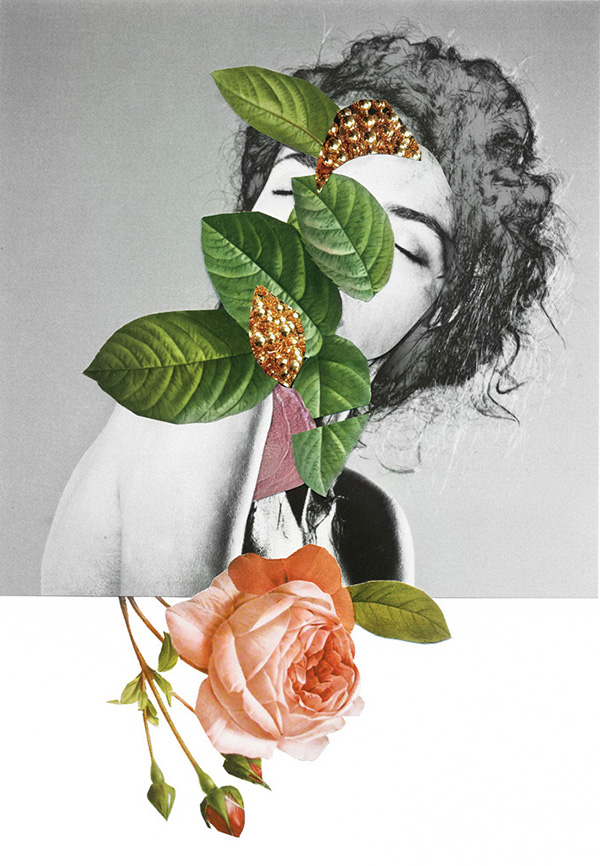
“Rocio Montoya (Madrid, 1983) is a photographer, graphic / web designer and editor based in Madrid, Spain. Her specialty is the experimental photography, land on which has moved from its creative inception. Also passionate for the editorial design, in 2010 she founded DOZE Magazine, which has co-directed and designed until its closure in June 2014.
Her interest is particularly focused on the portrait, approached through different plastic techniques and always with photography as the essential basis of each final artwork . Throughout her career as an artist she make a personal exploration of behaviors and emotional states of the human being, transforming reality by manipulating the image to convey their perception of the environment through aesthetic experiences.
She immersed herself in the field of visual arts by curiosity to express her concerns and the need to seek beauty as a means of escape and personal enjoyment. Her admiration for painting and surrealism is evident in addressing their creations, which you can see a clear trend to recreate atmospheres and distant situations to pure documentary reality, characterized by a delicate, haunting and poetic graphic style.
The human body in synergy with nature, the female figure and the loss of identity are the conceptual basis of her work.
One of her most recent interests is illustration, a field in which she began to submerge more conscientiously in 2018. With techniques such as watercolor, graphite and gouache Rocio has tackles new creations with a powerful chromatic charge and with women again as protagonists.
In addition to her personal work, Rocio Montoya has done numerous fashion editorials and has worked as a newspaper photojournalist.” https://rociomontoya.com/bio/
Examples of Her Work:
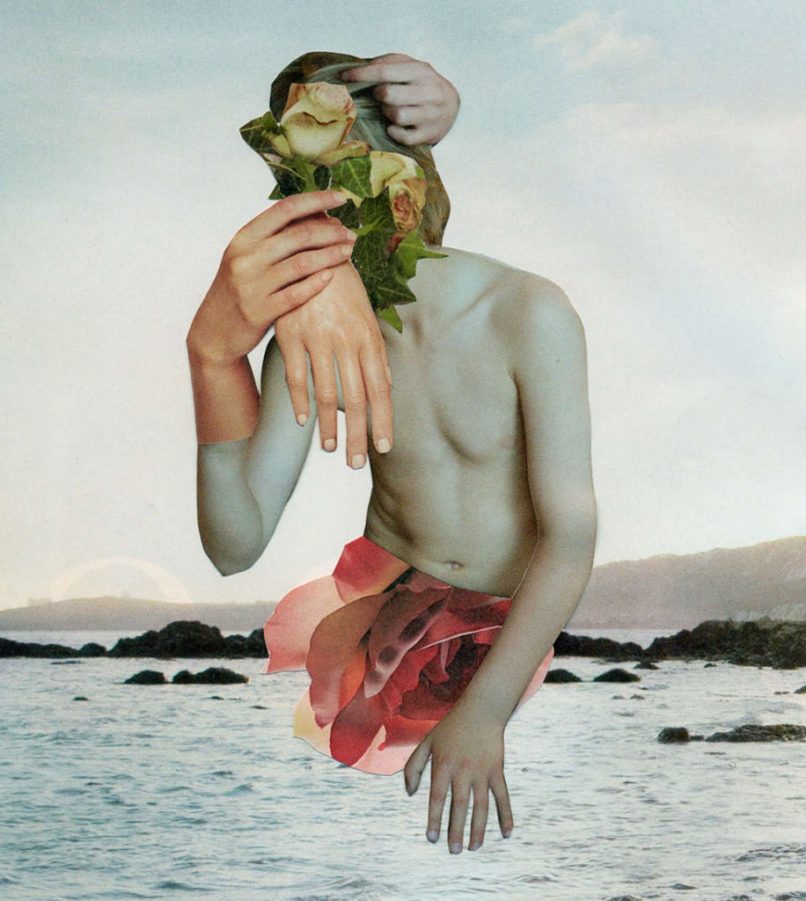
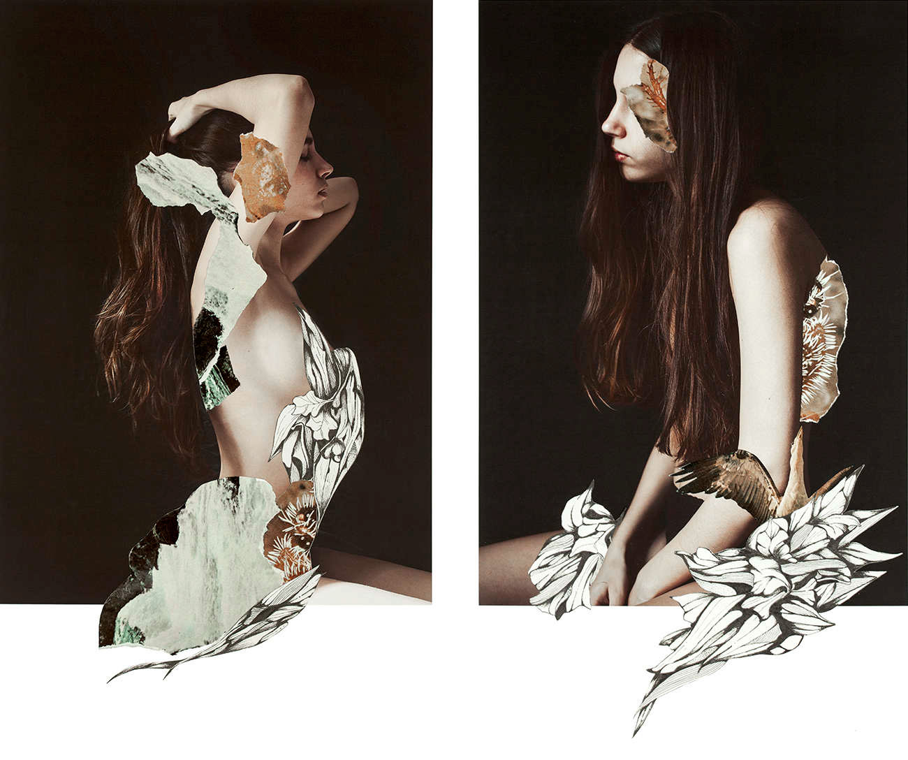
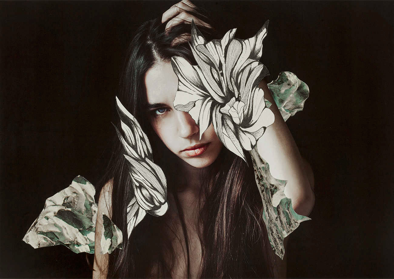
Rocio Montoya
Rocio Montoya
Rocio Montoya
Rocio Montoya Rocio Montoya
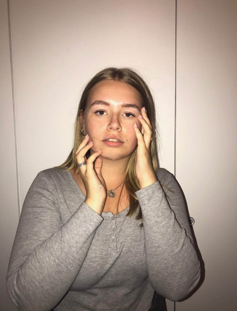
My Response:
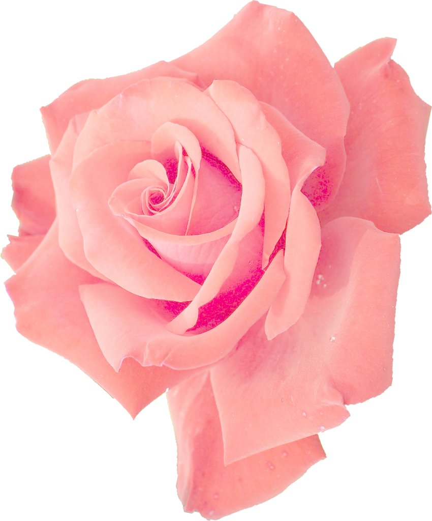
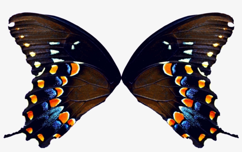
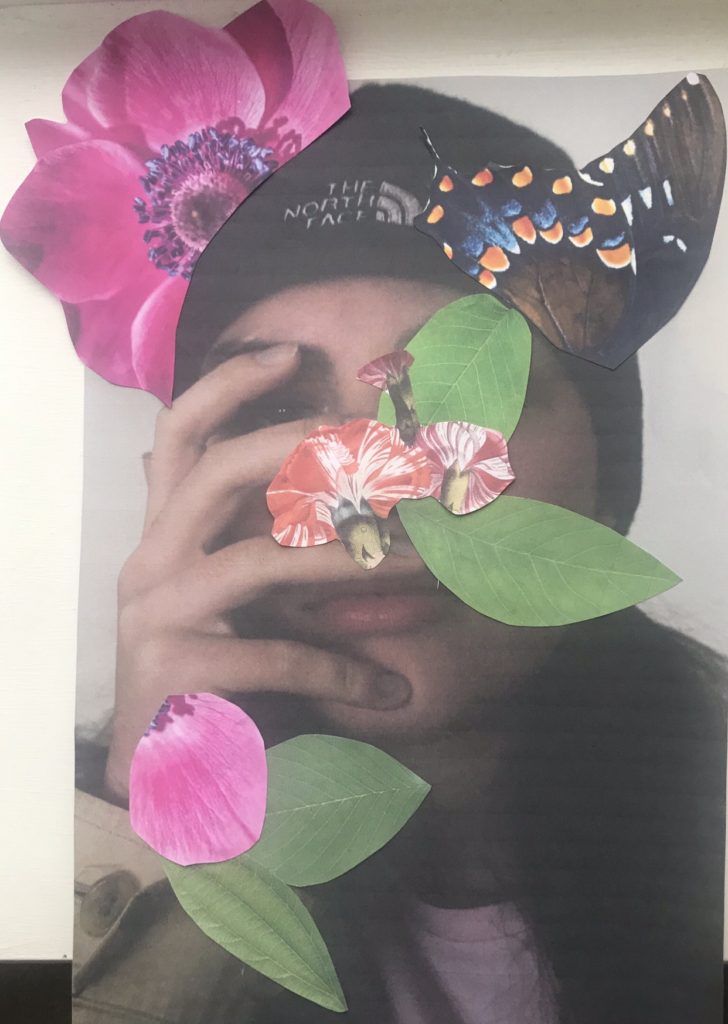
For my response, I will be printing out the photos and sticking photos of plants and vines onto the photo of the models. I will be linking it to the journey of life, the flowers and vines coming out of the models represents life itself.
Overall, I am really happy with how these photos came out. I think they capture Montoya’s style very well. I think if I had done them on the computer they would’ve looked a bit better, but I still like how they look on paper.
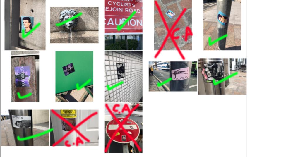
I devised a plan for a shorter and slightly less developed photo-shoot based on following the journey of advertisement for a brand. I came to notice a range of stickers placed around the centre of town, and decided to document the stickers, as they all came from the same source (the same brand). I found that in doing so, I was able to record a story of the town, following the journey around town by following the stickers. As a 4th, admittedly less developed photo-shoot, I decided to include these images in order to act as a mini-project, as it links to the “Journeys & Pathways” brief by showing the pathway marked out across town by these stickers, which led me myself on a journey around town. In this way, this photo-shoot had a more personal touch to it, and due to the fact it was taken in a natural, uncontrolled environment, the variety of these images is broad:
After deciding which images I would be using in the final edit (I had to decide on 12 in order to make the 4×3 final montage), I used photo-shop to edit together the images, and finalize the piece:
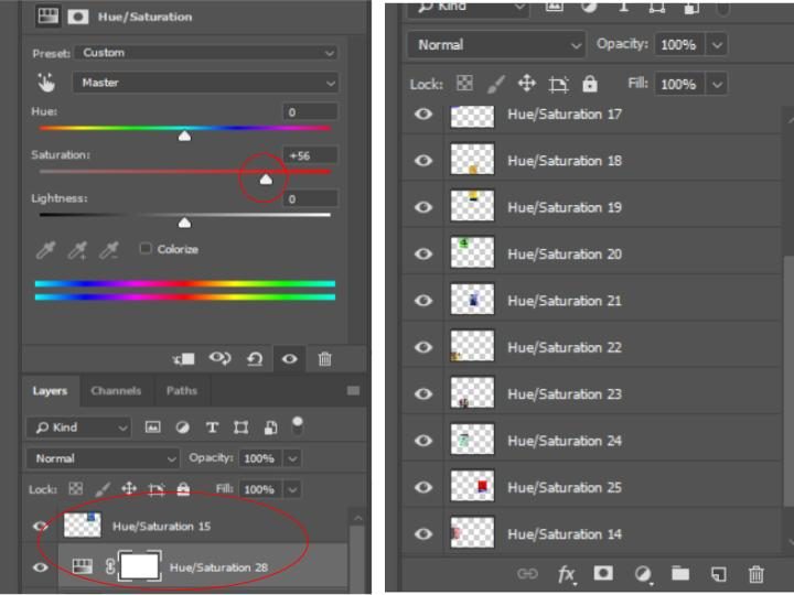
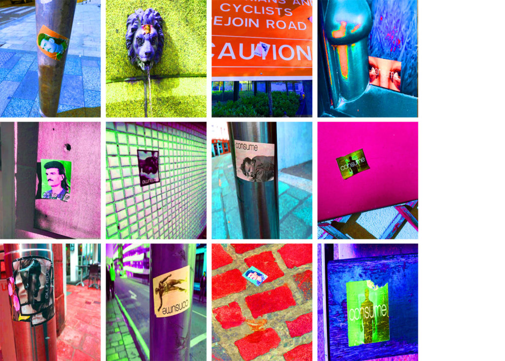
In order to make the final image, I adjusted the hue and saturation of each of the images in order to make the colors extremely bold. I did this as a way to show continuity through each of the images presented (as they now all have the same colour scheme and style) and also used it as a way to draw maximum attention to the image, and allowing each individual image to stand out on its own, due to its individual overall hue. The final image is seen below:
Below shows all of my outcomes from photo shoots after I have edited them as separate outcomes for their individual photo shoots I feel they have all been successful and that I can use them in some way to generate outcomes and a final display and outcomes while exploring my chosen idea through journeys and pathways.
For my initial ideas on ways that I can display and finalize my ideas and my photographs I thought about putting my photographs into a series together to show the progression of the different styles and takes on the way that women are and presented with the different times the original ad’s were produced.
Collectively all my edited outcome so far
Inspiration and Ideas:
A lot of my inspiration has come from Cindy Sherman and the way in which she develops her photographs and produces them, a lot of her work falls under different series that have themes and ideas that connect all of her images together, as well she develops photographs that I can relate my work to and my ideas and thoughts I am trying to put across in the photographs.
Cindy Sherman forces the audience to reconsider stereotypes and cultural assumptions her work for me speaks that it’s over exaggerating or not at all the realities of what people assume and when placed in this manner makes people realise as it is explicitly over exaggerated with the makeup or the way she is positioned or clothes and I feel this has a large impact on the way that the assumption can now be read.
For me the recreations of adverts was to show the journey and progession of advertising for women but also to highlight those representations by no longer having the ad with a professional model stood infront or as a painting or drawn verion of someone such as the Vogue 1939 ad or the Rosie Riveter poster, (both used real people howver they are not direct photographs) but instead have a regular person stood in front of the camera producing these ideal ads, as for me I feel it can help show and suggest exactly how these ad’s are representing women, I feel it has a slight impact by being able to see someone you may possibly know in those positions and clothes rather than someone who is always placed in them.
This was the idea and concept I have tried to take with me throughout the process in my head while developing these types of recreations and adverts.
Cindy Sherman’s Work
My Work
Displays and Outcome Ideas:
For my final outcomes my ideas that I have been thinking of have been to have a series of images either all of the same board or stood separately but displayed together. For this my idea was to fully recreate the ad so to have all of the writing across from the original ad to create it into a full recreation. I’d like my displays to be quite simple in the way that they show the photographs.
For ad’s with writing on and as proper print ad’s I have 6/7 I have one photograph that doesn’t fit the trend of the photographs and I don’t feel it would work to then have them all together and one out so I am generating other ideas to see if I could produce a different outcome for that photograph.
For this series I am tempted to produce my photographs in A3 as I feel they would look good and impact as large, however I also feel that producing them in A4 would create a good effect as magazines and places that the ad would usually be shown would be found at A4 size.
My 6 photographs that I have from print adverts I plan to have as a series displayed separately in one frame each but have them as a part of a collection
Or I demonstrate and display them all together in a style similar to the way I have presented them above and also below:
This is a suggestive style for the way that I could maybe present my images on one big board all together
For my extra outcome I feel I could do something with producing very simple separate images to display beside it to show a kind of journey or development and I will explore this idea as I edit and develop that image separate from my series of images.
“Born in Istanbul, graduated from Mimar Sinan Fine Arts University as an ceramic artist in 2010. She created “Choke Jungle” brand (co-founder) and started to design ceramic jewellry. Her ceramic works are featured by known magazines such as British Vogue, Elle and Marie Claire. She has been working on collage projects since 2012.”
Examples of her work:
“Natural Act”
“Natural act is composed by several collages based on the questions of the relation between nature and the humanity. It is basically a critical presentation referring to the fact that each of us is part of the nature. it seeks the answer whether greed, urbanization, mechanization and detaching from the nature is favorable or coherent for human or not. In that sense natural act appears with its all colors when our emotions are paralysed in the vital points of the cliche and dull city life.”
“boys” – Merve Ozaslan
“hoola” – Merve Ozaslan
“Play” – Merve Ozaslan
“Fun” – Merve Ozaslan
My Plan:
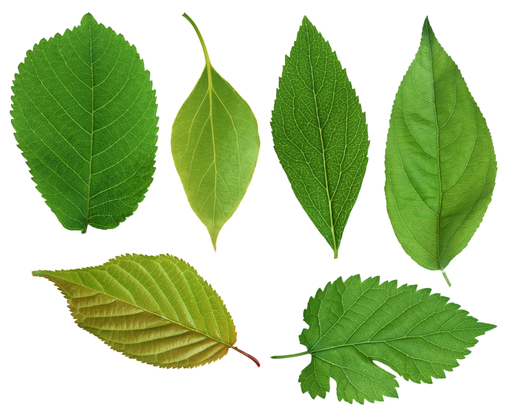
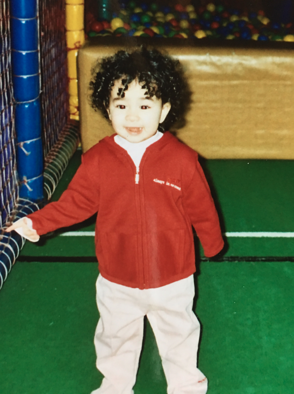
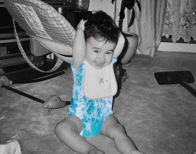
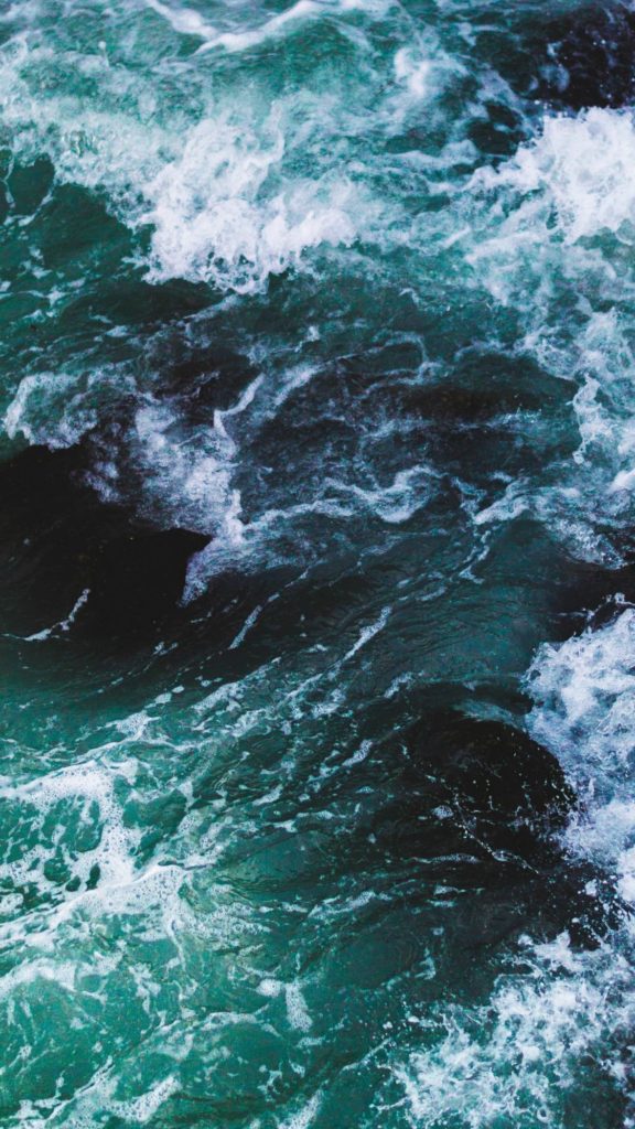
For this project, I will be using photos from when I was younger and using photos that I have taken of the beach and water to achieve a similar look to Ozaslan. I wanted to link the journey of growing up with this project, so I will be using photos from when I was a baby to when I was a child.
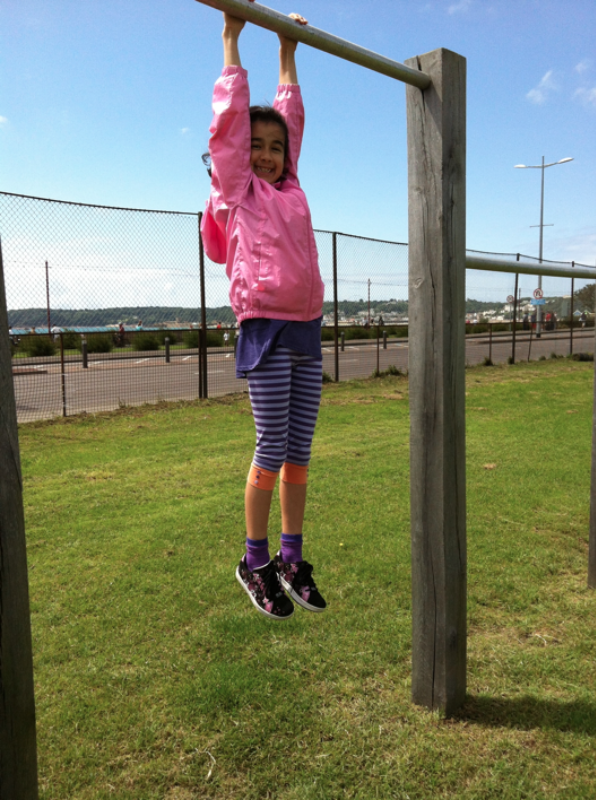
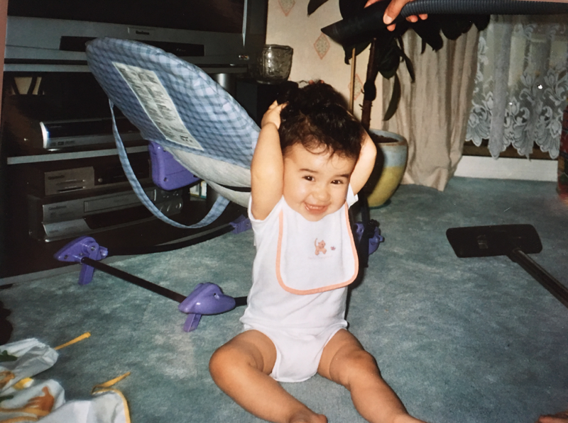
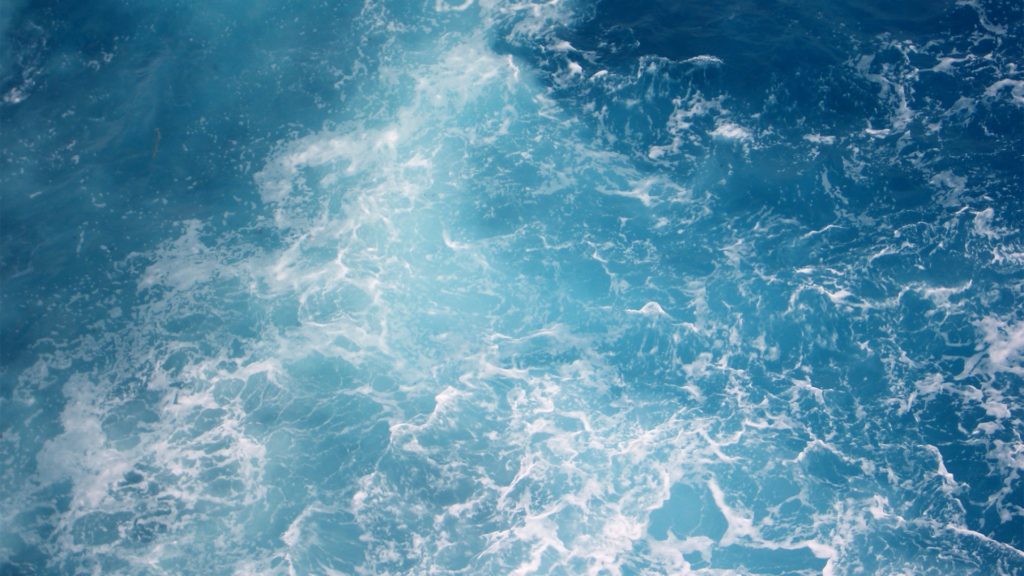
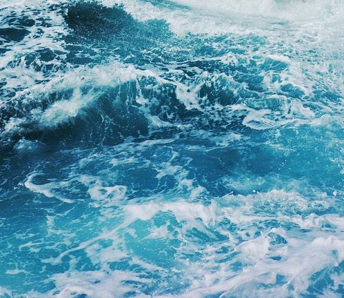
Photos I Will Be Using:
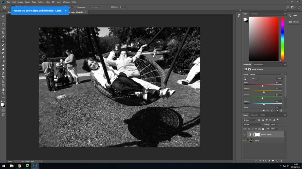
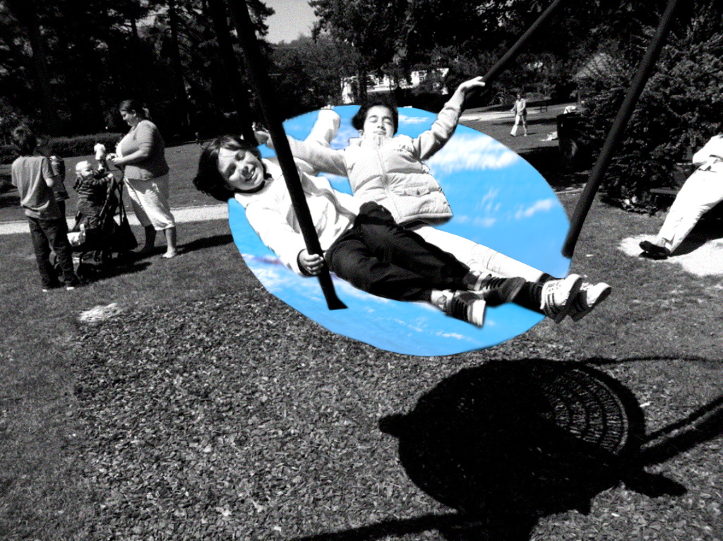
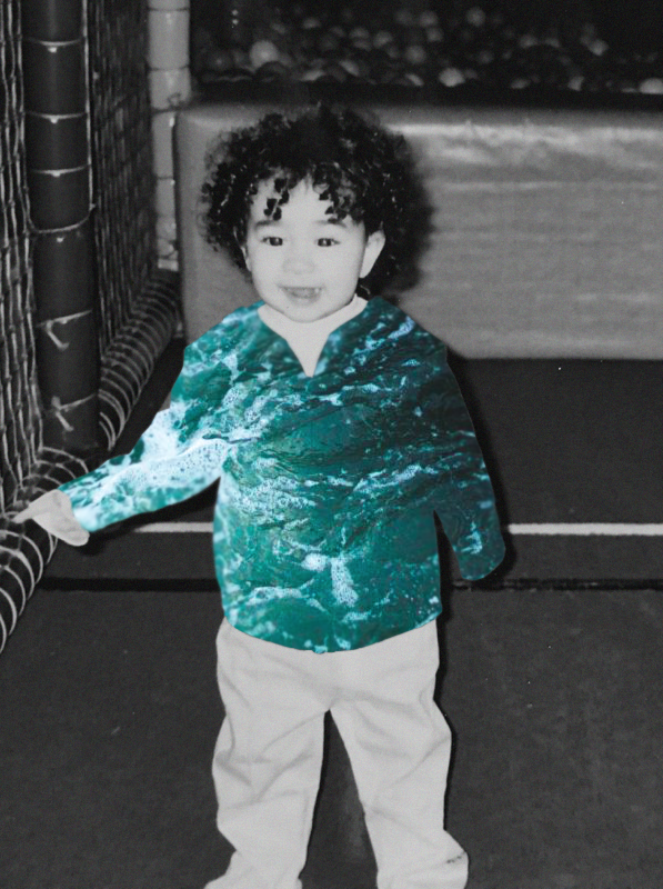
Editing Process For First Photo:
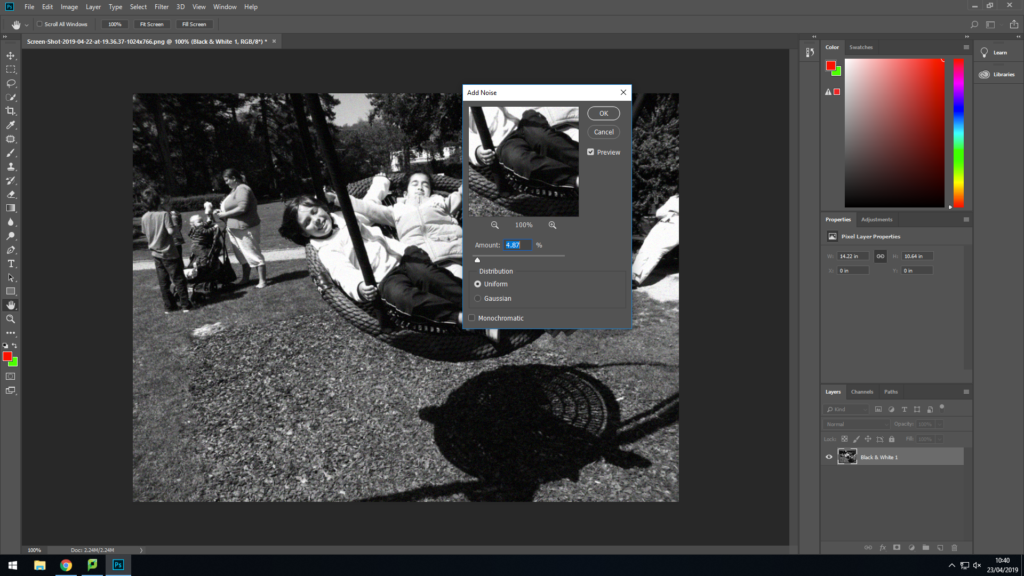
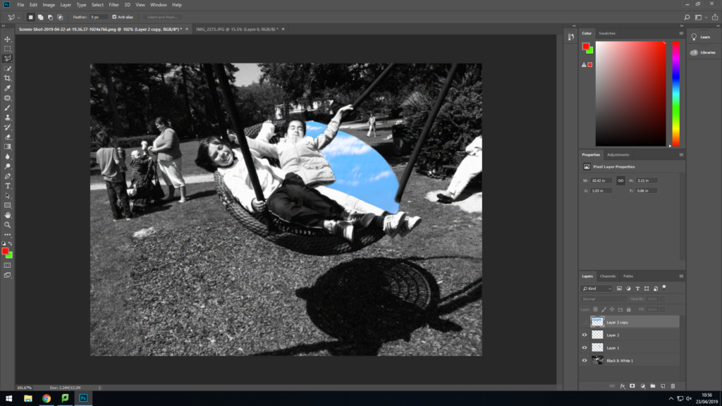
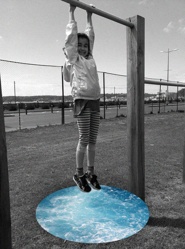
First I turned the image into black and white
I then added noise
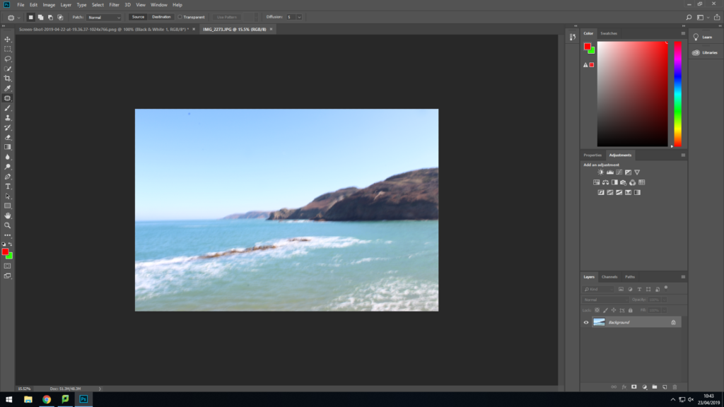
I then opened an image of the sea that I took
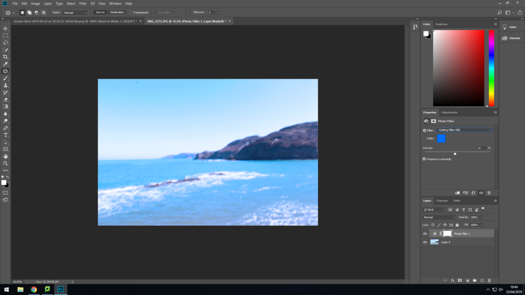
I then added a photo filter to make the photo more blue
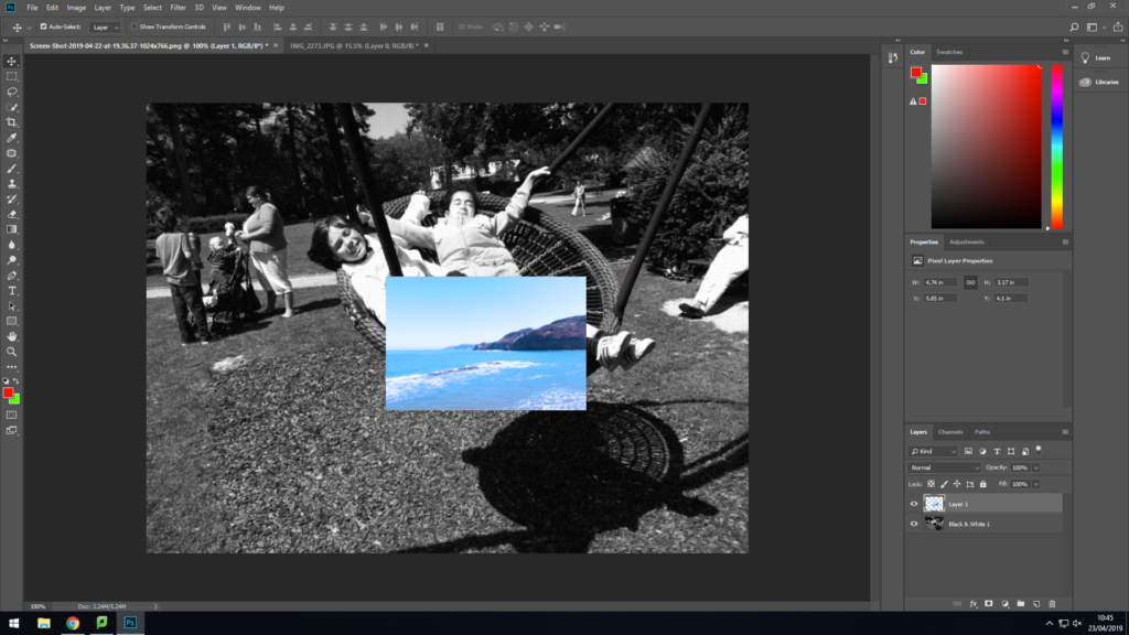
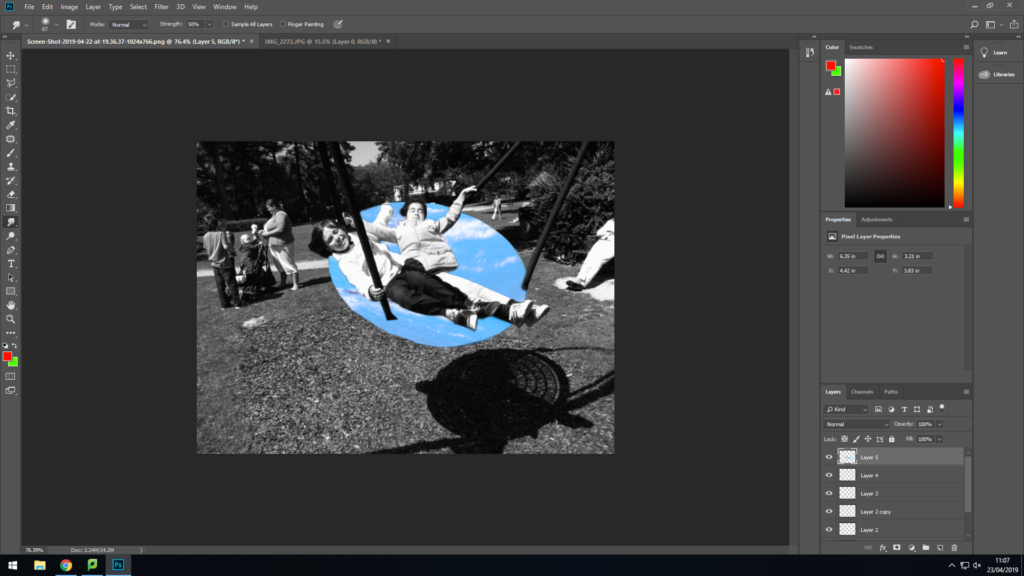
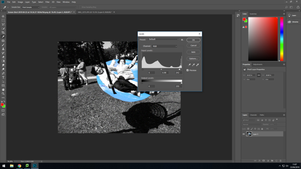
I then dragged the photo onto the black and white imageI then used the lasso tool to cut out the photo so it fits the swingThis was the final resultI then pressed ctrl, ALT, L and changed the contrast and exposure
I am pleased with how this photo turned out, but I think if I use better images of the ocean I think it’ll look much better. I think if i get images of the sea from google images it’ll make the photo better.
I really like how this photo turned out. I think the drop shadow around the sea looks really effective and like how the black and white makes it look more vintage.
3rd Photo:
From Google Images – NOT MY IMAGE
I really like how this photo turned out. I think the blue sea really stands out and brings attention to the model. I also think the use of noise adds a old and retro feel to the photo.
4th Photo:
From Google Images – NOT MY IMAGE
I really like the colour if the sea in this image. I think the green/blue colour stands out very well and compliments the black and white photo.
Best Image:
I personally think this is my best image from this project. The placement of the sea is perfect and it looks very smooth. I also really like the amount of noise I used in this photo.