Both images have used image and text to present a message and almost manipulate the viewers of the imagery to do as they say. Another similarity is the time at which they were created, they where both created during the war but for different reasons. Kruger created her manipulative posters to address current issues in 1945 society, like being gay and females rights, where as war propaganda was created to persuade people to leave their jobs and join the army, as that is what all men had to do. The target audience for both posters is different, Kruger’s work was aimed at anyone as she wanted to ensure that as many people are aware of these issues as possible, where as war propaganda was mainly aimed at men, as men where the gender who went and joined an army to fight in the war. Visually, both images are in black and white with colored text, which creates a color juxtaposition emphasizing the message within the message. In Kruger’s work the photograph of the man takes up the whole frame, leaving no sense of space, which reinforces the idea that we should do what the poster says. Where as, in the war propaganda we see Lord Kitchener in the center of the frame quite small, leaving a lot of space, which showcases the Lord’s importance making his message seem important. Conceptually, the two images are alike as they are both persuading viewers to do as they say, making them both successful pieces of propaganda. Both images have used male figures, as men where seen as more powerful and people where more likely to obey men during those days which justifies why the subject are that gender. In Kruger’s work she has used a chiaroscuro effect on the man to showcase how he wants to speak out but is still in doubt and scared, which emphasizes the text within the image. Where as, on the subject of the war propaganda it seems that one point or two point lighting was used on Kitchener as he is completely lit up, which may be because of his position within the war. Technically, the two images have some similarities with camera settings but also differ. One similarity is that a wide depth of field has been used as the model is completely in focus, and the models in both images are the only thing captures, making them the main focus point. In Kruger’s work there is intended noise in the model which suggests a higher ISO was used. Where as in the war propaganda there is no intended noise suggesting a low ISO. Both images have a quick shutter speed which captures the images as there is no blur on the models faces. As mentioned before both have used artificial lighting to capture the models allowing the different light up techniques to be made. In addition, the syntax of the sentences are very manipulative as it persuades and almost forces viewers to do as they say. In mu opinion I prefer Kruger’s work due to the lighting technique used, chiaroscuro, and the messages can still be utalized today. However, war propaganda has closer link to my project of the Journey of Jersey through the Second World War.
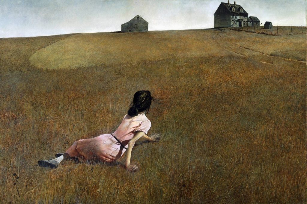
Andrew Wyeth was a US painter who was considered a realist painter, and worked in a regionalist style. He tended to paint landscapes and people, due the enjoyment it brung when he did this. Wyeth was often referred to as the man who paints his life, as he tended to paint the landscapes and people who has been apart of had an impact on his life. Age 20 was when Wyeth’s career as a painter took off as he put on the first one man exhibit in New York, where all of his work was made out of water colours. After that moment many took love to his work, as he continued painting what he enjoyed in the style he enjoyed. During his career he won many awards for the paintings he created and has many honours degrees, representing his intelligence and passion towards art.
In this simplistic painting we are presented with a young woman, in the foreground of the image, who is looking at the old and isolated buildings, located in the background, which presents an emotional connection between the girl and the building. The female seems to be wearing a pink dress, which reminds me of the time period of the 1930 – 40’s. Her hair is in a bun, which presents her as a working class citizen, which starts to present the contextual factor of the painting. She is located in a field, where the grass does not look healthy, which presents the ideology that the location has been left isolated for many years. Conceptually, I believe the painting it attempting to tell the story of the young girl who has a strong connection to the buildings, as she gases back at them to remember her past or experiences with the building. The actual conceptual meaning he wanted to portray was the story of him watching a young female, from the house which is seen in the background, crawl along the field due to her muscle disability, which outlines how fortunate we are to be the way we are. The painting almost creates tension as it almost feels like something bad is about to happen, and as spectators we are unable to do anything. The landscape painting was painted in 1948, so contextually his father had just recently passed away which made his art work more plaintive which presents his inner feelings towards the death of his father. Due to this, it helps to suggest why he decided to paint a woman with a muscle deficit and create the feeling that something bad is about to happen. Technically, Wyeth successfully presents the formal elements of space, shape, texture and tone through the highly realistic tableaux. Space is showcased by the use of proxemics of the girls and the isolated buildings. Texture and tone are shown through the detailed grass, the girl and buildings. It stands to reason that Wyeth used natural lighting, from the sun, as his light source as the location of the image is outside. The image is quite dark which foreshadows the terrible things that are about to happen to the woman. The main focus point is the young woman, due to her being in close proxemic, which builds an emotional relationship between her and the viewer. The closest building is also in focus, but the far building is out of focus, which suggests that a wide depth of field is being showcased in Wyeth’s work. If this was taken as a photograph it would Stand to reason that a quick shutter speed will be used and a low ISO as no intended blur or noise are being presented. Moreover, it makes sense that the white balance is set to an outdoor light mode, as the image does not seem to be ‘off’ in colour. Wyeth’s painting clearly outlines the criteria of a tableaux image, he has presented an in-depth story and message through the use of people and props, considered location and positioning of people and props and has carefully decided upon the way he creates the image.
Propaganda:
Propaganda Mood Board
The image above showcases one of Britains most popular pieces of propaganda during war time. Contextually, this poster was made in order to threaten and persuade many British men to join the army and fight for their country. Due to the poster, it lead to many of these men being killed at war as they listened to the subliminal message. Conceptually, the image was created to almost scare men into joining the army. Moreover, the way it’s worded makes the viewer feel important and that the country is relying on them which makes the message clear that that army will not be able to cope without you joining. We are presented with a portrait of Lord Kitchener, who was a senior British Army member, who is pointing towards the audience. His facial expressions is serious and can be considered threatening, which begins to position us to believe that we have to do what the poster is telling us otherwise there will be consequences. We are then presented with the word “Britons” at the top of the page in red. This makes the word seem important which makes us feel valued towards Briton, which again tricks us to believe and do what the poster is telling us. It then goes on to say “wants you” which again addresses us as someone important to Briton, tricking us into believe what is false. At the bottom, the text becomes very demanding due to the imperative sentences. “Join your country’s army”, forces us to do what it says. At the very bottom it says “God save the King”, which makes us believe that if we do what this poster is saying it will help the King and that we may be recognised, which again tricks us into doing what the poster is telling us to do. Technically speaking, the poster uses many techniques which makes it successful in what it does. The main focus point is of Kitchener who is pointing, which makes our eyes drawn to there first, so it makes us feel recognised and starts to build a relationship between us and the image. The producer also presents the main formal elements of space, texture through the layout of the poster. It seems very carefully thought out which presents the idea that the army is well thought out along side the plans, making it seem safer. Moreover, there is a use of colour the important parts are in colour with the less important parts in black and white, which helps to move our eyes around the frame of the image. The background is plane, which means there is nothing to distract us from the message being told by the poster. Everything in the poster is in clear focus which informs us that a wide depth of field is being used, along side a normal shutter speed. In addition, the image does not present noise which tells us the ISO is low as well as the aperture. The lighting used to capture Kitchener is unknown, but I believe that artificial lighting is used as his face showcases high tonal contrast and clear detail (further reinforced with the portrait being in black and white), which is not always achievable by natural lighting. Analysing this piece of propaganda has outlined how thought out the posters are, in order to manipulate people into doing what the message is telling them to do.
Barbara Kruger:
Kruger, born in 1945, is an American photographer/artist who enjoys experimenting with the idea of concept art and collagist. She enjoys working with black and white images and adding declarative captions in red and white. When studying she took a clear liking to graphic design for magazines which has inspired her style of her work. Kruger has strong political views and tended to implement them into her work to express her feeling towards issues in American society at that time. Her work has been very successful throughout her carrier and have been showcased in many exhibitions around the world.
Mood Board Showcasing Kruger’s work
When I first look at the photograph above my eye is drawn the the man, who is located in the centre of the frame, making him the main focus point of the image. The man is found having his hand covering his mouth and his eyes looking directly at the lens of the camera, making it seem as if he is trying to hide something. My eyes are then drawn the text which is located at the top and bottom of the frame, which begins to give detail into what he is trying to hide. At the top it says “your silence”, the pronoun your addresses the viewer making them connected to the message that is coming across, it is then followed by “silence” which makes us intrigued as to why some people are silent and that people are hiding something and we want to know what they are hiding. It is then followed by “will not” which is located just below the centre, due to it being close to the centre makes it the most important words which informs us that staying silent is not doing us any good. The final words are “protect you” which tells us that we need to speak up and address the issues. It ends in the same way it starts with direct address which helps to reinforce the relationship between us and the image. Overall, the image and text tricks us into speaking up as it is apparently going to do us good, which makes it more of a modern day piece of propaganda. Conceptually, Kruger is trying to address the issue that it is Okay to be gay and keeping quiet will only hurt you. This conceptual message was considered highly unacceptable in society in America at that time as only same sex marriage was prohibited in the country, clearly Kruger disagreed with this and wanted to showcase that it is okay to love who you want. Technically, the image showcases many camera techniques which makes it successful. The main thing I noticed is that Kruger has used a chiaroscuro technique to capture the face of the man. This tells us that one point artificial studio lighting was used to capture the image. The technique allows the tonal areas of the man to be clearly outlines and shows detailed facial structure. The man himself is in black and white and the background is plain, which makes the text seem more important, but helps to reinforce the message being told. The photograph seems to have noise which suggests that the ISO must have been high, which suggests that the aperture was slightly increased. All of the boy is in focus which tells us Kruger has used a wide depth of field, along side a quick shutter speed in order to capture the image. In addition, the text is presented in colour which creates a sense of entrapment and that the man is trapped in the dark and needs to get out. The colour is also used to attract viewers and make them actually read the text. This image could be considered a form of propaganda as it is an image trying to manipulate us to do something which was not accepted in society when it was first created. In my opinion I like the style of Kruger’s work as she clearly presents a strong message and has useful applications even in todays society.
Action Plan:
As an action plan I am now going to conduct a photoshoot where I am going to capture war propaganda but in the style of tableaux photography, in order to present another stage of Jersey’s Journey through the second world war. I intend to use different techniques which have been showcases in all three artists piece of work, in order to create successful imagery.
Propaganda is information which is extremely biased and subjective, it can be considered to be misleading. It tends to promote political view points in order to persuade viewers to believe in the information and viewpoint being provided. The imagery tends to use loaded language which produces an emotional response to the information which is being presented. In a 1929 literary debate with Edward Bernays, Everett Dean Martin argues that, “Propaganda is making puppets of us. We are moved by hidden strings which the propagandist manipulates.” There are 7 different types of propaganda which are:
Transfer – The act of relating something or someone we like or respect with product, this form tends to use symbols.
Testimonial – The use of well known, respected people to endorse a product or service.
Glittering/Generalities – The act of referring to words or ideas that evoke a positive emotional response from an audience.
Plain Folks – The use of everyday people to sell a product or service.
Bandwagon – Attempts to persuade the target audience to take a course of action. This technique reinforces peoples natural desires to be on the winning side.
Name Calling – Using names to evoke fear and hatred in the viewer.
Card Stacking – Strategy of showing the products best features, only telling half of the truth.
Why was Propaganda used during the war?
Propaganda was used during the war in order to persuade British men to fight in the war. The type of propaganda used was mainly bandwagon as the images tried to persuade audiences to take a course of action, to join the army and fight for their country. Due to the persuasive and misleading nature of propaganda it lead to many English men, young and old, joining the army and fighting, leading to millions of deaths. The posters never focused on the negative effect of joining the army, only the positives and why men should be joining. The images and captions were usually captivating, persuasive and can sometimes come across as threatening which almost forces viewers to do as the image says. As mentioned propaganda had a massive impact within the second world war, as it lead to many deaths, which will help to present another stage of Jersey’s journey through the second world war.
Propaganda Examples
What is Tableaux Vivant?
The phrase itself is a French phrase which translates to ‘living picture’. A tableaux vivant is a static scene where there is a singular or multiple models telling some sort of story. These paintings and images are usually well thought out, not only in terms of lighting and camera settings but also in terms of costume, positioning, background as all these factors contribute to the message being sent across to the receiver of the image. This type of imagery combines aspects of theatre and photography to create a staged reality.
Tableaux Vivant Examples.
How does Tableaux and Propaganda Link?
The two link, as my idea is to replicate some of the more well known propaganda images in the style of Tableaux vivant. This photography technique will allow me to carefully think and replicate the manipulative imagery and will allow the same conceptual and contextual elements to be presented to viewers. Doing this will allow the project to move onto another idea and also showcase a new element of the Journey of Jersey through the second world war, along side my knowledge and understanding of different photography techniques and styles
Action Plan:
As an action plan I intend to conduct artist research on a tableaux vivant photographer, propaganda during the war and a modern day version of propaganda, which will highlight the elements which go into making successful images. It will showcase the mind set I need to have and the different aspects and elements I have to think about to successfully create persuasive and manipulating imagery from the war. I will then use the photography studio to create such imagery, using the artificial lights, plain background and props and then carefully manipulate my images using photoshop. This is where I will be able to make my images look exactly like the original and will allow me to further explore the concept of propaganda and the effect it had on Jersey’s Journey through the second world war.
For my third sets of edits I wanted to showcase my ability to use different elements of photoshop in order to showcase further development into the importance of bunkers during Jersey’s journey through the second world war. Due to my top outcomes already looking somewhat distorted I wanted to keep the edits simple but still make them further distorted. My Initial ideas of edits are:
Colour Splash
Blur adjustment
Adjustment of Curves and Levels
Reveal Conceal
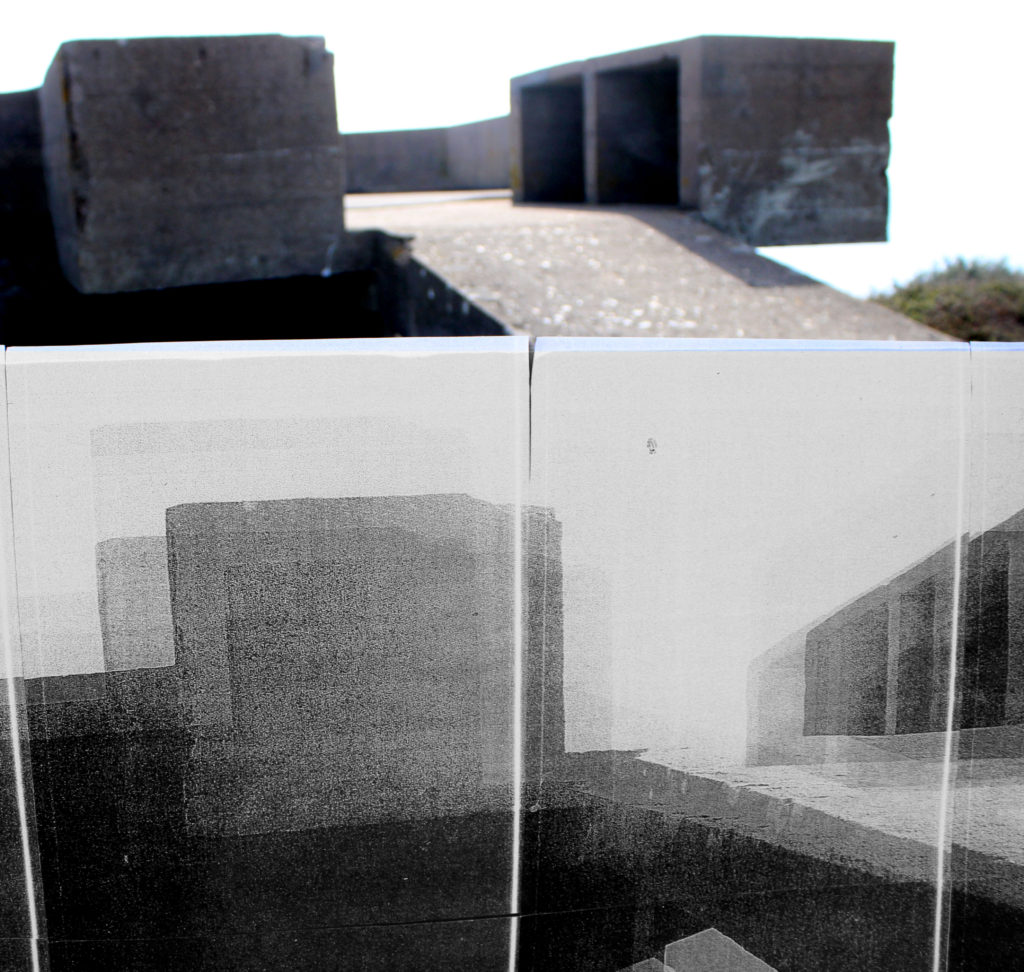
For my first experimentation I wanted to use the acetate as an image which was taken back in the war and the bunker behind it as an image taken from now, which begins to present Jersey’s Journey through WW2. The image itself looks as if the acetate is being peeled back to reveal the idea that the bunkers have been isolated since the war and nothing much has changed to them, which successfully allows the aim of the edit to be showcased. To make this idea seem more realistic I used the quick selection tool and selected the acetate part of the image, once selected I pressed ctrl + u and lowered the saturation so the acetate was in black and white and the background was in colour. Then I adjusted the levels and curves to allow detail to be shown within the edit. I believe that this is my top outcome from the photoshoot as it shows clear camera skills such as depth of field, focus, ISO and aperture. It clearly presents the formal elements of texture, shape and space due to the use of camera settings along side the editing use. Moreover, it showcases my ability to use different tool within photoshop in order to manipulate and image to create a certain effect. I really like the way the photograph has turned out as it is visually stimulating to look at and allows Jersey’s journey through WW2 to be presented.
In my second edit I used an image where the acetate was held up to the camera and the shadows of the bunker is found in the background of the image. Already, this image is very distorted so to add to the effect I decided to add a blur to the image which creates texture, almost as if I have raised the ISO on my camera to create noise. The idea behind this is to make my viewers rethink the way the bunkers look and realise the use of them during the second world war, which allows the journey of the subject to start to be presented within the viewers head. I believe that this image is successful as it allows contextual and conceptual, how and why the bunkers where used in the war (presented in a unpleasant way due to the blur and acetate and shadows) and how they have been left alone factors to easily be communicated to the receiver due to the distortion created. This image is also successful as it shows my ability to think creatively and critically towards what I am wanting to capture as well as my camera and photo manipulation techniques.
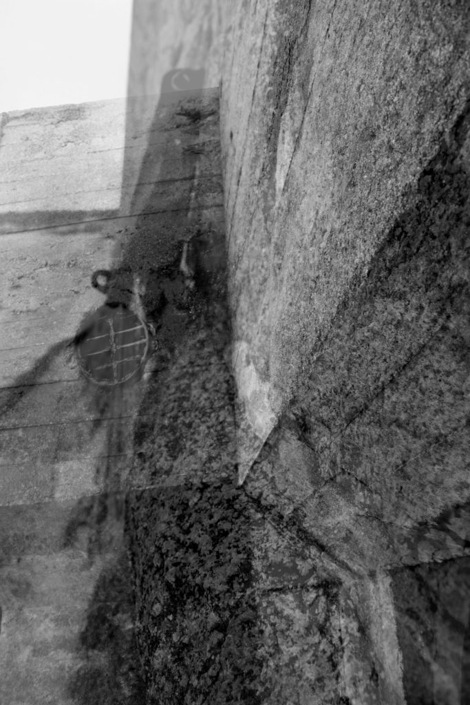
This next edit is not as successful as the others, needless to say I have decided to keep it in order to showcase my exploration and thought process. I selected this image as it is of the bunker and the massive image of the same bunker that I printed off. The idea was to showcase the size of how large the bunker is, which would metaphorically show how big of a role the bunkers had within the second world war. However, I do not believe that this idea is presented through the edit. I also used a colour splash to create this edit, having half in colour and half in black and white, same steps as the first edit. The final outcome is not great as the edit is not visually stimulating to look at, which is due to the image itself. The way it was taken is not the best as it is clear that I have used the wrong camera settings. In my opinion the conceptual factor is still slightly being presented, but the technical, visual and contextual aspects are not as strong which is making this edit less successful.
The idea behind this edit was to make the acetate blend into the sky, making it seem like a past memory, as I purposefully made the image over exposed. To do this I made this photograph naturally lighter by adjusting the levels and curves, I also cropped the image to take away the bottom of the image, which slightly distracted the viewers eyes. Although, I do like the way it looks I believe that it could have been more successful, there is something to it which is missing or needs changing which is making me not like the edit that much. I think it is due to it looking too artificial which takes away a strong link to the contextual factor. The edit clearly presents the journey of Jersey through WW2 and allows the conceptual factors to be presented, I think it is again the technical element which is lowering the successfulness of the image. Needless to say, I have been able to show my creativity to produce a new concept to present the same ideology.
Evaluation:
To evaluate I believe that I have been able to show my ability to think creatively to produce outcomes to a follow up photoshoot to an idea. I have been able to show clear further exploration to an initial idea and have been able to create links between the images and Jersey’s Journey through the second world war. The images themselves, showcase my ability to adjust and use camera settings to create different effects, and show that I have carefully thought out how and why I am capturing an image in that way. Furthermore, I have been able to show my ability to use photoshop to manipulate my images, using the different tool provided in order to create a stronger link between my photographs and the theme of Jersey’s journey through the second world war. Although, these edits are not my strongest set of edits produced I still believe that they have some elements which makes them strong, but they show my exploration to this theme. If I was to further manipulate these images I would look at printing out an image of a bunker in colour, then using the acetate I would place it over the top, which creates a distortion but also presents then VS now. This would be further development to the first edit and would show Jersey’s journey through WW2. Although I have enjoyed looking at Jersey’s bunkers and there importance I feel as if I have explored them in enough detail, and if I was to do further exploration it would be to much and the images would not be ‘as good’ as the images above and the first photoshoot.
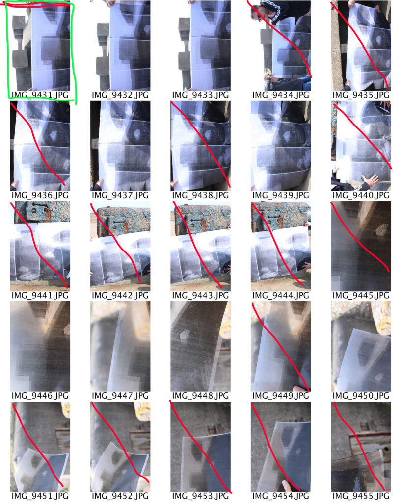
In this photo shoot I intended to go back to the bunkers and recapture some of my successful images using my images which have been printed out on acetate, A4 paper and and 8 A3 sheets of paper to build up a massive image of the bunker. Doing this allowed me to show further exploration into the bunker idea, as I felt that this idea allowed me to come up with multiple ideas and I wanted to be able to look at different ways of capturing the bunker. The idea was to hold the acetate images up to the lense in order to create a distorted image, I will also hold the acetate next to the bunkers and in different positions around the bunkers, I will also hold the 8 A3 images up to showcase the size comparison and wanted to emphasis how isolated the bunkers have been and to show how they change overtime. Moreover, I believe conducting this photo shoot will help to showcase Jersey’s journey through the second world war. I intend to use my DSLR canon camera with manual settings, which will allow me to control my white balance, ISO, shutter speed, focus and aperture. The shutter speed I will be using should be quick as I am not wanting to have an intended blur, I will also have the ISO low so there is no noise created. However, at some points I do intended to experiment with the ISO to really emphasis the idea that the bunkers have been isolated and almost make it seem like the images where taken during the war. I will be using artificial lighting, as the bunkers are outdoors and it will allows the images to seem more naturalistic and will portray my intended effect more successfully. At the moment I am unsure what I will do when it comes to editing the images, however I believe that ideas will come to me and allow me to show experimentation with my images.
Contact Sheets:
Evaluation:
To evaluate this shoot I believe that I have been able to produce some successful outcomes which showcases the bunkers as being isolated and also shows how they where used during Jersey’s Journey through the second world war. I believe the idea itself had a lot of thought and showed clear experimentation, but was harder to execute then I originally thought it would. One issue was that it was highly windy so I had to use assistance to hold up the images next to the bunkers so it did not blow away, which means that I will have to crop a lot of the images. Moreover, the acetate was not as see through as I thought it would so it only produced shadows of the bunker in the background when I held it up to the lens of the camera. Although this was an issue, it also helped to produce a strong outcome as it created abstract looking images which I believed presented the isolation of the bunkers in a new and different way. Another issue was that it was hard to hold the image and adjust the camera settings, so some of the images taken are over exposed, or the picture within the image is moving which has created a blur. Needless to say I have managed to collect some successful outcomes, which has allowed me to explore the bunkers in a new way to showcase there importance during Jersey’s second world war. In addition, I believe the good images show my ability to adjust and confidently use different camera settings to create different affects as well as showing my creativity towards a simplistic idea and subject.
Action Plan:
As an action plan I am still unsure how I want to edit the images, but I am sure when I start to manipulate the images I will be able to think creatively and produce strong outcomes from the photo shoot. I intend to level and adjust the curves, I want to experiment with the different types of blurs, use of layers and potentially using a color splash in order to showcase these images in to present how they are isolated and the bunkers importance during the second world war.
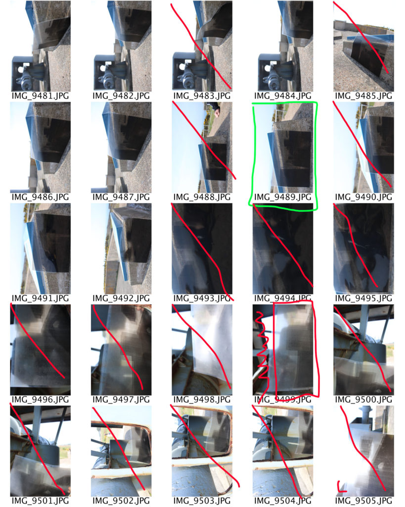
For my edits with the Bunkers I wanted to produce final images which looked like my artist research who inspired this photoshoot. However, when I started experimenting I found it hard to find a way to make my photograph look like Jonathon Andrew’s work as his lit up bunker was taken at nighttime with artificial lights lighting up the bunker, but I knew I could make an image look like Paul Virilio as his work was simple to edit. Due to the simplicity of Virilio edits, I decided to conducted further experimentation and research into potential ideas in order to showcase my photoshop skills and make more interesting images.
The image above is my final image which has the closest links to my artist Paul Virilio. The way I did this edit was I started off by levelling my image to ensure the textures of the walls where clearly visible, I then adjusted the curves in order to produce maximum effect. This was then followed by me lowering the saturation of the image, which created the image above. The image has strong structure which clearly presents the formal elements of texture, shape and space, which helps to showcase how the bunkers have been isolated and showcase the importance of the structure during the second world war.
Further Experimentation Ideas
Conceal Reveal
Building Float
Double Exposure
Idris Khan Inspired
I decided to attempt an Idris Khan inspired edit. In order to get a better understanding of Khan’s work I have decided to create another case study which will allow me to see the requirements of his work, which I can then implement into my work.
Idris Khan:
Idris Khan is a British based photographer/artist who intends to showcase history, art and music through densely layered imagery. Khan is a Muslim , which is one of his interests within photography, people say that his work is “compressed memories”, which creates a more powerful meaning towards his photography. He can be considered a successful photographer as his work has been displayed in multiple exhibitions around the globe, from Canada to Switzerland. One of Khan’s most successful moments was being asked to create a new wall of drawing for an exhibition for the British Museum in London
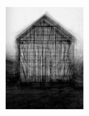
The image above is my favourite image that Khan has produced. Initially my eyes are drawn to the subject of the image which is the shed located in the centre of the frame. The more I look at the subject of the image the more detail I notice from the overlapping of the subject. The technique of overlapping has produced quite an abstract looking image but helps to present a narrative for the time of history he is trying to present. Technically speaking the overlapping may have been created on a photo manipulation software by duplicating, moving and Turing down the opacity of a lawyer, or it may have been created using a slow shutter speed. Having the slow shutter speed he could have moved his camera slightly which would have created this effect, however the image would be much more blurred than it is. In my opinion I think he has done this on a photo manipulation software which means a normal shutter speed was used. Alongside this I believe the ISO will have been raised as there is an intended blur and noise being created which has added to the texture which is being presented by the subject of the image. The depth of field being used seems to be narrow as the subject is mainly in focus with the background and foreground being slightly out of focus. The aperture Khan used may be slightly lower as the image seems to be naturally darker, so having this setting lower will make sense. In terms of the white balance I believe the image was taken using a normal outdoor white balance. The lighting is quite cold due to the grey and black which creates a eerie mood and helps to emphasis the historical aspect of the image. To achieve this I believe he took the image with natural lighting, but when the clouds covered the sun creating the coldness towards the image. The subject itself is the main focus point and presents the formal elements of Texture, through the overlapping, space, as the subject is located in the centre of the Fram creating a sense of space, shape, as the overlapping creates an overall abstract looking building. The image is presented in black and white which allows the image to show clear tonal contrast, presents the historical factors and adds to the overall eerie mood which is being created. Contextually, Khan wanted to showcase this building as an impressionistic drawing or blurred film, how things where when he was young. This was his artistic aim throughout this series. Conceptually, Khan wanted to present buildings but make them seem strangely imposing and alien like making viewers rethink about what the world is. To apply this concept into my work I will use a similar effect to make people rethink and understand the importance the bunkers had within the second world war in Jersey, thus helping to provide context to those who may not know why the bunkers actually exist.
Below are my attempts at producing super imposed photographs like Khan:
In order to create these images I started off by levelling and adjusting the curves of the image to create effect. I then desaturated my image, and duplicated the layer. Once the layer was duplicated I turned down the opacity of the layer and moved it slightly, repeating the duplication process slightly until I was happy with my final outcomes.
I believe that this is my strongest outcome, as I have successfully managed to copy the technique Khan has used, and have created an abstract photograph that has made viewers question what they are looking at and why it looks the way it does. The edit shows clear camera skill and editing technique and show my ability to make strong links with an artist.With this attempt I did not duplicate the layer as many times to create the effect, making it more simplistic. Although, it looks good I do not believe that it is as strong as the image above as the overall image is not that abstract or visually stimulating. Needless to say this image still looks good and makes us rethink the use of the Bunkers during the WW2 in Jersey.In my final attempt I went back to duplicating the layer several times but each time the opacity was turned down a little bit more, which makes the effect harder to see but when focused on the subject you are able to see it. This attempt is successful and I am happy with the way it looks.
Comparison:
Khan Work
My Work
I believe that my outcomes are very similar to Khan’s imagery showing my ability to take inspiration from an artist an applying it to my work. When editing my images I took the same aim as Khan which allowed me to produce such accurate responses. To compare we both have used the layering technique which makes a visually stimulating and abstract photograph which showcase a historical event. Moreover, they are both in black and white clearly presenting the formal elements of texture, space and shape. Both elements seem to have intended noise which means that my editing technique has made my image seem more like Khan’s creating another similarity. One difference is that my duplications are more spread out, as I much prefer the look when it is more spread out as it helps to guide my viewers eyes around the image. Another difference is that Khan’s image has more structure with the lines which allows the effect to stand out where as mine is much softer which makes a weaker effect. Both images have presented a cold atmosphere due to the lighting and editing being combined creating an overall eerie tone towards the two images. Khan’s image is much more darker where as my image presents a more natural look which overall does not make that much of a difference. I believe that my image has more historical context towards it creating a more powerful meaning compared to Khan’s. As shown both images are much like one another but both showcase our own artistic style, creating successful abstract images.
Action Plan:
To further this experimentation I have decided to print some of these outcomes on acetate, to which I will hold up to the camera lens and recapture some of these bunkers. Moreover, I will use them to use a back projector which will project my images onto abstract walls creating further experimentation and cool outcomes. In addition, I have printed on of the images into 8 different segments of A3 paper, I intend to stick these onto card creating a massive bunker, take this big image to the location and capture the bunker itself with the big image showing the big impact it has. This will be my further experimentation towards this area of research.
For my second photoshoot I want to capture Jersey’s bunkers in order to show another stage of Jersey’s journey through the second world war. The aim of the photoshoot was to showcase different camera techniques in order to showcase the use of the Jersey bunkers during the second world war. I am going to capture the bunkers down at Noirmont, as there are multiple bunkers to capture providing many photograph opportunities. Moreover, the background of the bunkers are almost empty down at Noirmont which makes my images more like the artists I studied, making stronger links. I intended to take landscape images to capture the whole bunker, but I also intended to capture portrait macro shots. I will be capturing the images at a straight on and worms eye angle to showcase Jersey’s bunkers. With regards to camera settings I will be using a quick shutter speed, low ISO (so I do not have an intended blur), the daylight white balance, and manual focus in order to create a short depth of field like my case studies used. Furthermore, I intended to explore the bunkers (so I am not just capturing a landscape image of the whole bunker) which provides my own exploration towards a subject matter. I am doing this to provide more images and different content to work with as well as being able to showcase different camera techniques.
Evaluation:
To evaluate this photoshoot I believe I have managed to produce some strong outcomes which show my ability to use different camera settings (shutter speed, ISO, white balance) to create different effects. Moreover, I have been able to show my recreation of my artist that I researched and further images showing my style of photography capturing the same subject. I think that my images present the theme of Jersey through the second world war as it showcases Jersey’s defence mechanisms and how they have been almost abandoned and isolated since the war presenting them almost like ruins showing there importance of the second world war, providing another aspect of Jersey’s journey through the second world war. As an action plan I intended to manipulate my stronger images like Virilio and Andrew’s photographs. Moreover, I want to experiment with different ways of showcasing Jersey’s bunkers, allowing me to experiment with photoshop to provide evidence of my knowledge and skill using the software.
The main similarity between both images is that they are capturing the same subject, bunkers which where used during the war, which informs us that the two images share the same contextual factors (How the bunkers have been neglected and isolated since the war). Needless to say the way they have gone about capturing the subject is very different to one another, which showcases their artistic style and preference. This is clearly shown as Andrew’s work is presented in color, which makes the bunker more appealing. An affordance of having the image in color is that it allows the environment to clearly be showcased allowing us to understand how the bunker seems to be in the middle of nowhere and how the time (night time) at which it was taken allows the setting to portray the contextual factor of bunker isolation. Where as Virilio’s work is in black and white which creates an eerie tone towards the image and showcases isolation in a more visual way. An affordance of having the image black and white allows a high tonal contrast, making all the lines, texture showcase how the bunker has been worn and torn during it’s time of isolation. Another similarity is that both images use a narrow depth of field, the subject of the images is the main focus point and the backgrounds a slightly out of focus, allowing viewers attention to be solely focused on the bunkers which showcases the images purpose. This is reinforced as the background of both images are plain making our eyes focus on the bunkers. Both images showcase the formal elements of shape, texture, line and form, which are all presented through the bunkers and the position of them in the frame. Technically speaking the two artists have used similar camera settings to capture their subject. They both have used a quick shutter speed, as there is no intended blur visible in the images. As mentioned before they both have a narrow depth of field, and have similar focus point. The ISO of both is likely to be similar (low) as there is no noise being presented within the images. Another similarity is that both photographs have used artificial lighting as the subject is located outside. However, Andrew’s work has the bunker more lit up compared to Virilio work which could suggest that he used a form of artificial lighting to capture his image. In addition, as it is night time in Andrew’s work there is less light in the background compared to Virilio’s image which seems to be taken during the day, allowing the sun to light up the whole image. Another way the two images are similar is that they share the same conceptual factors. This is they both wanted to showcase the aftermath of the war and how we are left with the bunkers which is constantly reminding us of what occured in the war. Moreover, both images nicely link into the project of the Journey of Jersey through the Second World War. In my opinion I prefer Andrew’s work, due to the way he lit up the front of the bunker, leaving the background dark as it illuminates the idea that the bunkers have been isolated. Needless to say, I do really like the way Virilio showcases the isolation of the Bunkers.
Paul Virilio is a French photographer, who was born and raised on the Northern coast of France. The Second World War created a big impact of his city, and impacted his personal life. His city was bombed and held captive by the German Navy. In 1958, Virilio conducted a phenomenological (he science of phenomena as distinct from that of the nature of being.) where he looked at military space and bunkers built by the Nazi’s during the Second World War.
“Historian of warfare, technology and photography, a philosopher of architecture, military strategy and cinema, and a politically engaged provocative commentator on history, terrorism, mass media and human-machine relations.” – Quite describing Virilio by two Geographers.
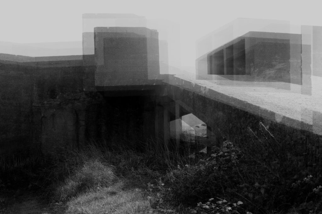
In the image above, the subject of the image is the bunker which is located in the centre of the frame, which is the main focus point of the image as my eyes are instantly lead there. My eyes then move towards the background which is empty, clearly presenting the formal element of space. This presents an eerie tone towards the image and presents the idea that the Bunkers are desolate and have not been used for a while. The bunker itself presents to formal element of texture and shape which are used to present and emphasise the contextual features of bunkers. The image itself is presented in black and white, which allows the image to show high tonal contrast, which shows how the Bunkers are almost worn out, as its been a long period of time since they where used in the second world war. A small depth of field is presented as the Bunker seems to be the subject most in focus, the background and grass in the foreground is slightly out of focus, which allows the viewers to mainly concentrate on the bunker. Moreover, the Bunker seems to be slightly lighter than the background which also makes the subject visually seem the most important in the image. The dark background is almost pathetic fallacy as it represents the depressing times the war brought to Jersey and represents the depressing reasons of the Bunkers. The image seems to be in focus, suggesting a quick shutter speed, and there is no intended blur which implies that a low ISO and a normal aperture was used to capture the image above. Contextually, the Bunkers where built by the Germans to protect themselves from other army’s and to make and reload their weapons. These Bunkers are located near the sea, allowing the Nazi’s to attack those trying to enter Jersey, moreover the bunkers where well hidden and hard to find. Conceptually, I believe Virilio was trying to present the aftermath of the war, and the marks it has made in certain locations, reminding us about the horrible times of the second world war. In my opinion I like the way Virilio has presented the bunkers as isolated and makes them seem ‘horrible’ reinforcing the idea that the bunkers where used for horrible purposes, making the image successful.
Jonathon Andrew:
Mood Board Showcase Jonathon Andrew’s PhotograpgyJonathon Andrew – Bunker
Jonathon Andrew was born in Manchester and currently lives and works in Amsterdam. He has many years of experiences capturing multiple locations. He travels the world capturing different aspects of different places, with his work being displayed in magazines such as National Geographic. His current project is capturing ruins of WW2 defence, so far these images have been presented in the Daily Mail and multiple blogs. Due to his success he has won many awards for his photographs and has helped teach lectures to students on how to capture landscape photography.
To analyse the photograph above, the main focus point is the bunker which is located in the centre of the frame. This is presented not only by the positioning of the bunker in the frame, but also by having the Bunker lit up and the background being darker. The image is taken at night time which allows the technique of lighting up the bunker to stand out more. The bunker itself clearly presents the formal elements of space, texture, shape and line. This is presented by the bunker being ‘worn out’ and old helping to present the contextual factors of the image. Space is presented through the location of the bunker, the subject is the centre of the frame and the background and foreground is empty, which represents how the bunker has been isolated leaving nothing left. The subject of the image is in focus and the background of the image is slightly out of focus which shows a narrow depth of field, it also showcases a quick shutter speed as the image has a clear focus. This is further supported by the ISO being low as there is no intended blur, and the aperture is low. The lighting used seems to be natural, but the white light surrounding the bunker seems artificial. A back light could have been placed behind the bunker or could have been added using a photo manipulation software. Contextually, the image is presenting the same contextual factors as Virilio, which is: the Bunkers where built by the Germans to protect themselves from other army’s and to make and reload their weapons. These Bunkers are located near the sea, allowing the Nazi’s to attack those trying to enter Jersey, moreover the bunkers where well hidden and hard to find. Conceptually, the image is presenting the impact of the bunkers during the war and is showcasing how the bunkers have been isolated but kept to remind people of the horrors of the war. In my opinion this piece is eye opening as it reminds viewers of the horror of war, through the Beauty of the bunker in this image, which almost creates a Juxtaposition within the image, making the photograph strong providing my reasoning to why I find the image interesting and successful.
Action Plan:
As an action plan I want to produce a photoshoot where I capture Jersey’s bunkers in order to showcase another aspect of Jersey’s journey through the second world war. This will present the defence mechanisms that was put in place by the Nazi’s. I have been inspired to follow in a similar style to Virilio but edit my images more like Andrew’s work, creating a combination of both photographers work.
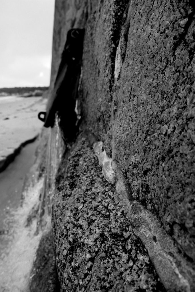
Within these edits I wanted to recreate the double exposure technique that Gina Socrates used in her photo shoot of capturing Jersey Sea wall. Doing this technique will allow to showcase the before and after of the sea wall, presenting the Journey of the sea wall in Jersey, plus showing a part of Jersey’s journey through the second world war. I decided to create three double exposures, using different images, to create different effects and present different formal elements.
To prepare the images, before combining them, adjusted the levels and curves, in order to have the textures of the walls to stand out (presenting the clear formal element of texture and shape). I then adjusted the hue and saturation in order to make the images black and white, which made a clear contrast in tonal regions. At first I experimented with changing the hue, in order to present the modern image of the wall to have a different look to the ‘older’ image to create a clear contrast and meet the aim of this photoshoot. However, I did not believe that this suited the effect I was trying to present and decided to turn the images back to black and white. Once I had all my images ready I opened up a new document, and placed both images onto the document. Using the transformation tool (ctrl + t), I adjusted the size of both images ensuring they fit onto the page. Then the image on the top layer, I turned down the opacity of the layer in order to reveal the layer underneath it. I then flatten the two layers and adjusted the levels again to ensure that the photographs had similar tonal contrast. I repeated this step with all the images until I received the outcomes I wanted.
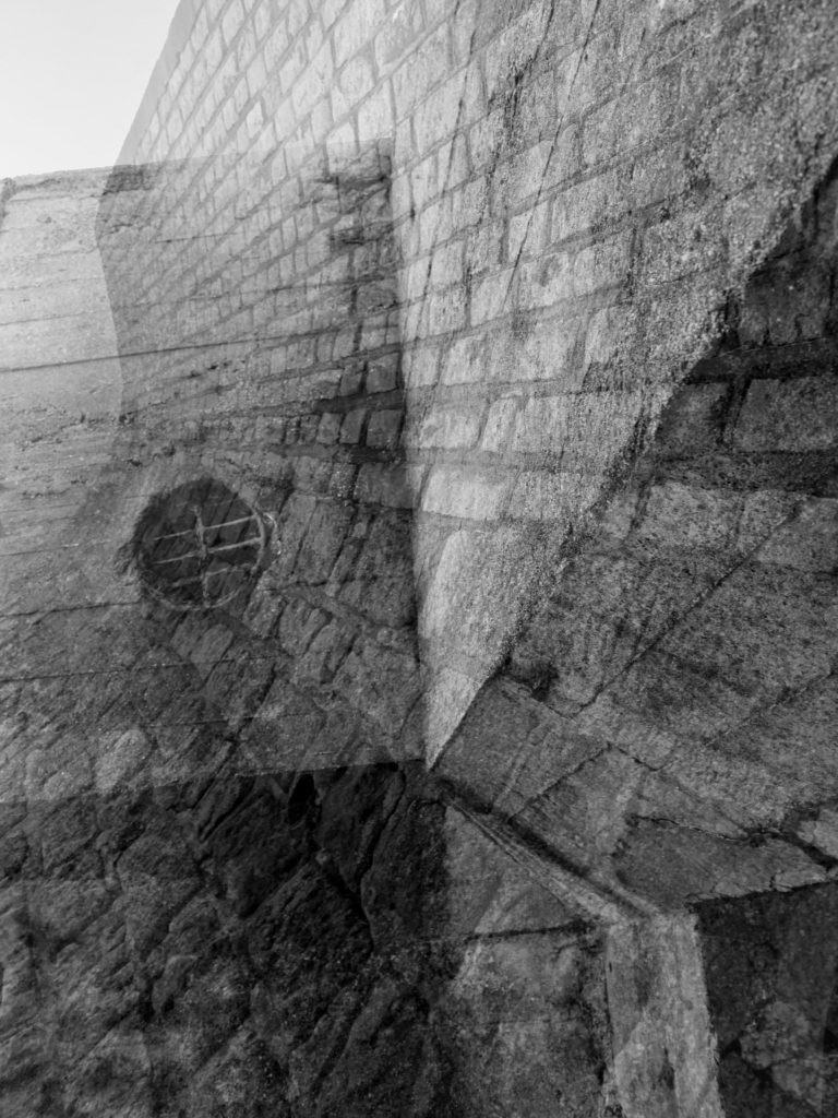
My first edit has been the most successful as I believe that it clearly meets my artistic aim of present old vs new of the Jersey wall, presenting its Journey from the second world war. Moreover, I believe the two images used work together and create an overall visually stimulating photograph. The image shows successful photography techniques; for example the formal elements of texture, space and shape, clear focal points and depth of field, it also uses lines to help guide the viewers eyes around the image. This image has been the most successful edit from this process.
In my next edit I used two contrasting images, a macro image and wide angle image in order to show the contrast of the walls during the war and after the war. The two images fit nicely together and makes a visually pleasing image. Moreover, the formal element of texture and space which makes the image interesting to look at. Due to the two images being levelled differently, leads to the overall image being high in contrast, making the whole photograph as a whole look ascetically pleasing. Although, I like the way this image came out I believe that it is too busy and therefore not as successful as the first edit.
I believe that this edit is my least successful image from this process, but still wanted to showcase it in order to show the development process and my critical picking of images. The two images used do not work together, and makes an overall awkward looking image. Both images look similar and the effect is not as good with these two images. The space near the back of the image, also makes the image awkward looking and less pleasing to look at. Moreover, one of the images is a bit blurry, which shows a lack on camera control, however I used this to try and convey an old camera taking an image, but the effect did not work in my favour.
Images Used
To Create
My Double
Exposure
Comparison :
My Image
Gina Socrates
To compare my image to Gina Socrates there are multiple similarities and differences, but both present the same idea and contextual factors. One of the similarities is that we have both captured the same subject but have both taken different approaches in order to do so. I looked at macro images and focused on different areas of the wall which would showcase different formal elements. However, Socrates looks at the build up of the wall from a wider angle. In contrast, my images are presented in black and white as I wanted the texture and lines (detail) of the wall to clearly be presented to my viewers, however Socrates presents her images in colour with a hint of yellow/orange which also presents the texture of her subject. Personally, I believe that the black and white looks much better as it presents a more visually pleasing image overall, however, Socrates work is still successful. Another similarity is that we both took our photographs with the same aim, but both came out with different outcomes. We both used a double exposure effect in order to present the journey of Jersey’s seawall during the second world war, however she managed to do hers by changing the camera settings whereas mine where created using photoshop. Her blend of images is a lot smoother and the images fit nicely together, mine also do this but only slightly have areas where the two images do not fit (these are very small and therefore hard to notice. Moreover, my images are much sharper, presenting the formal elements much stronger creating a more powerful overall image, where as Socrates work are much weaker but still showcase a powerful image. My image is quite busy and lacks space, however Socrates work has more space and emptiness allowing time for the viewers to take in the message of her work. Overall, I believe that mine and socrates work share many similarities but showcase our preferred artistic style within the image. I also think that we have both come out with similar outcomes and therefore showing the success of my photoshoot and final images from the section of the project.