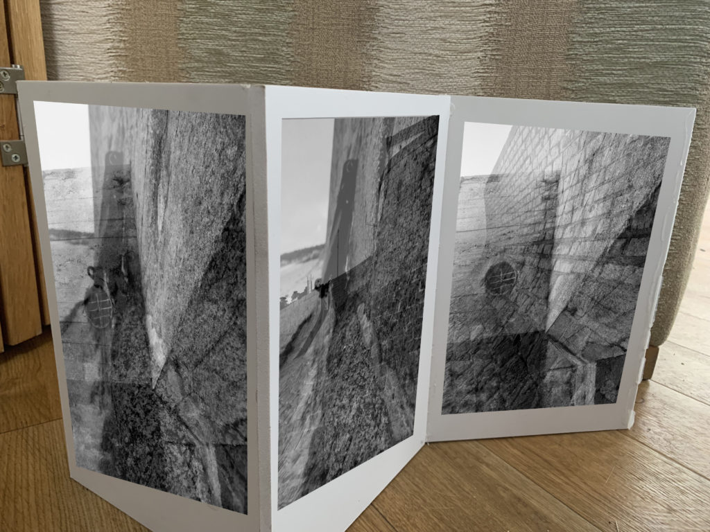
Below is a photograph which showcases all of my final outcomes for the Journey’s and Pathway’s Project. As you can see all of the outcomes work together to showcase the Journey of the Second World War, as it shows different aspects which impacted Jersey Journey. I have been able to display my final images in many ways, to showcase different meanings and affects. Overall, I am very happy with the way my outcomes have turned out as they meet the project title, and showcase my top outcomes.
My first final piece is my most successful outcome, the simplistic way of framing showcases the already abstract and distorted images of the bunker. The image itself is strong enough making it effective to display it by itself, Moreover, it has strong links to Jersey’s Journey through the Second World War. If I was to redo this edit I would look at using a black frame as it would help to present more of a tonal contrast, making the overall outcome more visually stimulating.
My next final outcomes showcases two images which was inspired by the artist Knez. Originally, I had three images to display but scrapped one of the images as it was not as strong as the other two. I vertically displayed the two images on foam board, allowing the contemporary framing method to be used. If I was to redo this final piece I would look at using a more abstract and sculptural way of framing, to some extent distort the way we view the images.
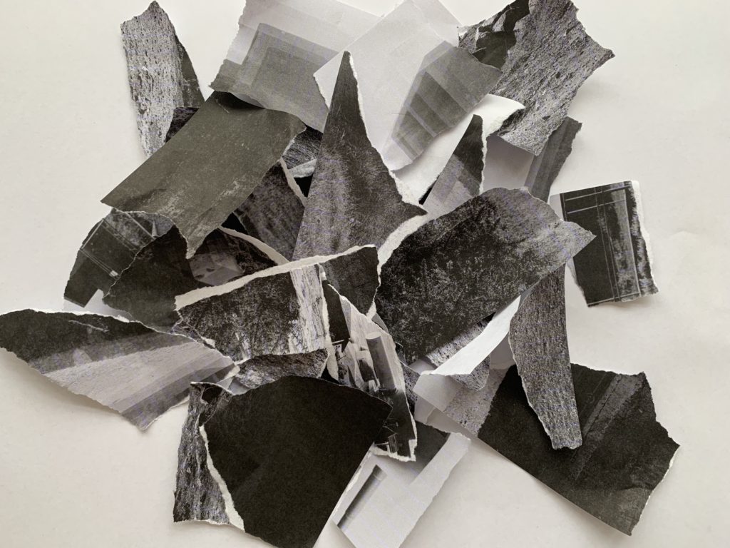
My next final outcome was inspired by Talmor, as I showcase three images which have been teared to create one final image. This image is successful as it is ascetically pleasing to look at and has close links to the artist. I placed the image segments on a large piece of foam board. I really like the way this outcome has come out, due to the uniqueness of the design and how the viewers eyes are guided around the image. To improve this idea I would look at using foam board to slightly raise some segments to make an eclectic way of framing and it would also help to add to the overall effect.
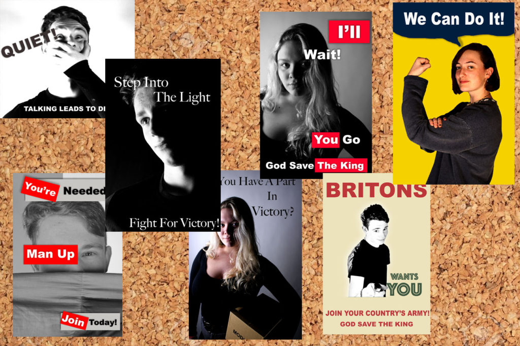
My next final outcome showcases my 7 top images from the propaganda section of the project. The way of displaying is simplistic and allows the different posters to showcase my competence in camera and editing techniques. All the images compliment each other and clearly showcases my project title, Journey of Jersey through the Second World War. In my opinion this final outcome would be more successful if I used a larger cork board as the posters would not be overlapping one another.
For my last final outcome I have displayed my three sea wall edits, which was inspired by Socrates. I really like the way the physical wall displays my images of the walls as it allows the viewers to really thing about the purpose of the sea walls, which emphasizes the Journey of Jersey through the Second World War. I like how the wall is white as it does not distract viewers from the actual images themselves, and compliments the images. To improve this final piece I would look at making the wall and images bigger to emphases the size of the wall, and metaphorically shows the big part the walls played in the second world war.
At the beginning of this project I had many ideas on different approaches I could take to showcase Journey’s and Pathway’s, after lots of thoughts and inspiration I decided to set my project to the Journey of Jersey through the Second World War. This title is very broad which allowed me to explore different aspects of Jersey’s war, such as Bunkers, Liberation Day, Sea Wall and Propaganda. It also provided me the opportunity to explore and research different aspects of the second world war and how it impacted Jersey, this was exciting for me as learning about the past is naturally something that interests me. I started off by exploring Gina Socrates work who captured Jersey Sea Wall, which was built not only to stop the tide hitting the island but to keep other armies from invading Jersey. A while back I viewed Socrates work at the CCA gallery where she explained her methodology of using the double exposure and explained why she conducted the photo shoot, her passion for her work and outcomes interested and excited me which allowed a successful first photo shoot. My first photo shoot was inspired by Socrates, where I explored capturing the subject of the sea wall at different viewpoints and with different shutter speeds. The exploration allowed me to showcase my ability of landscape photography and ability to adjust my camera settings and the use of natural lighting. When creating the edits of these images I wanted to replicate Socrates double exposure, which created a successful outcomes which showcased an aspect of Journey’s Jersey through the second world war. Although this shoot and edits where successful, I did not see any opportunity for further exploration. My next aspect of Jersey World War was Jersey’s bunkers and how they where used for the German army to help prevent other armies entering the island. For this shoot I looked at two artists who captured the same subject which was Jonathon Andrew and Paul Virilio, both artists produced high quality imagery of bunkers which helped inspired the way I captured the bunkers. Within this photo shoot I produced many successful outcomes which reinforced my competence of capturing landscape images, with different depth of field. When editing I struggled for inspiration in how to manipulate the images, as I wanted to keep the images socially acceptable and still showcase the same meaning as the artists researched. This is when I found and analysed the work of Idris Khan who distorted his subject by creating multiple layers, turning down the opacity of the layers and then slightly moving them. I liked the effect it had on his imagery and so tried in on my photograph, which lead to one of my strongest outcomes, it also inspired other editing ideas which shows further development towards the project. Due to the high success of this photo shoot and edits I decided to conduct another photo shoot using some of the imagery created, this lead to further exploration and my ability to think creatively. In this photo shoot I printed some of my work on acetate and held up to the camera lens to distort the bunkers in the background. I also printed out my most successful image into 8 A3 fragments which made up the whole picture, the idea behind this was to showcase how big the bunkers actually are and metaphorically how they had a massive impact during Jersey’s Journey through the Second World War. I managed to get some successful outcomes, but the images where not as good as the original photo shoot. The edits showcased my ability to use Photoshop and the different tools within the software to manipulate the images. I felt that I had explored bunkers a lot so I decided to move onto my next idea which was propaganda. I wanted to showcase how war propaganda was used to manipulate men to join into the wars army. I researched Barbara Kruger who created imagery like propaganda but addressed issues in 1945 society, as well as war propaganda and tableaux photography to understand what makes a successful propaganda. In the photo shoot I conducted it in a studio to showcase my ability to use artificial lighting and different types of lighting. It also allowed me to showcase my ability to explore and do tableaux photography. During the editing process I looked at using videography, I looked at using gifs of my model getting into the famous position. I also recreated Kruger’s work, then using war photography and Krugers work I created my own propaganda. Although I created successful outcomes, they where not as strong as my bunkers work but still showcase development and exploration towards the project. Due to a lack of time I was not able to conduct anymore photo shoots, I decided to do two more artists research to produce more edits. I research Knez and Talmor who looked at providing a way of reflecting on the past, but in different tones and ways. Then using successful images from my bunker shoot I decided to create edits in the same style. Doing this I produced many strong outcomes which I am now using as final pieces due to the success and meaning it holds. I believe that this project is successful as I have been able to produce many high quality photographs due to my competence in adjusting camera settings for effect. Moreover, I showed my competence of using Photoshop and hand crafts to manipulate my images. I have been able to explore multiple aspects of Jersey’s war in order to showcase the Islands Journey through the Second World War. If I had the opportunity to expand the project I would look at liberation day, and how the islanders celebrated when the Germans left the island, which would have linked with Martin Parr. To conclude, I believe that this project has been highly successful and I am proud with the final imagery produced.
In my first idea I want to showcase my sea wall images using a sculpture/naturalistic style. I decided to get 3 planks of wood and attach them together to almost create a wall, the idea is to stick my wall photographs onto the wall to create a wall. The framing technique itself is abstract and creates a metaphorical meaning, but the images are being displayed in a naturalistic way, as they are not being folder or used to create an object. This juxtaposing idea will help to emphasis the importance of the sea walls during the war and will nicely showcase these successful outcomes. The three images will be printed as A5 images in black and white, in order for them to fit onto the wall.
Idea 2:
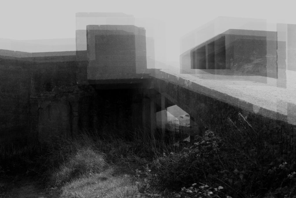
The next idea I want to showcase the most successful outcome, in my opinion, from the project. The abstract photograph was inspired by Khan, and allows viewers to rethink the purpose of the bunkers and reminds us of the purpose of the bunkers during Jersey’s Journey through WW2. The reason why I want to showcase this image is because I believe the edit is interesting to look at due to the distorted look, and how the formal elements work together to create this interesting piece. The image works best alone as it holds a lot of meaning and is powerful enough to stand alone. I intended to print this out as an A3 print and frame it in a black frame, which should help to emphasis the meaning and purpose of the bunkers. I decided to print the photograph as an A3 image as I wanted to showcase the size scale, how the bunkers are a large architecture in real life. Metaphorically, it showcases how the bunkers had the most impact during the second world war, which hold strong links to my project title.
Idea 3:
For my next final outcome I want to showcase my 7 propaganda images. I decided to display these images on a cork board in order to show contextual factors of the images. The cork board was occasionally used during the war to display propaganda, in work places and shops, so I decided to implement it into my work. Due to the images being not as successful I have decided to print them out as A5 images, it will ensure that they fit on the board. The photographs all work well together as they manipulate the viewers to believe and do what they say. Although this final piece is not as strong it will still showcase the development of the project and another aspect of Jersey’s Journey through the second world war.
Idea 4:
For my next final outcome I want to create a large version of Talmor’s work, using my images. This outcome will take more of the sculpture route as I randomly place fragments of an image on top of each other to create an overall distorted image, to take away connections and memories from the bunker. I will print out the three images below as A3 images and tear them up, then on a piece of foam board I will begin to randomly place the segments, ensuring the overlap and create a distorted piece. I am printing the images large to remind viewers of the actual size of the bunker and how they had a massive impact in Jersey’s Journey through World War 2 The idea will make the image will showcase formal elements such as form and shape due to the 3D element that it will hold. This idea is another successful photograph manipulation I produced as it clearly holds strong links to the project title.
Idea 5:
For my final outcome I want to display the three images which are in the style of Knez’s photography. I will display the three images by placing them on foam board next to each other with the images being 5cm apart from each other and 5cm away from the edge. This framing method takes the more contemporary route of framing and displaying, allowing the more naturalistic images to be displayed. I have decided to showcase these images as they have strong links to the project title and show my ability to manipulate my images in a different way. I really like the way the three images compliment each other and all work together to showcase how the bunkers have developed since the war and the Journey they have been through. I will print these images out as A4 images, I want them big to showcase the size but not as big as the other bunker images as the outcome is not as strong and as powerful as the other two ideas above.
The three images below are my top outcomes from the sea wall photo shoot and edits, inspired by Gina Socrate. The photographs are considered successful as they showcase my ability to use and adjust camera settings for effect. It shows my ability to use different depth of fields, focus points and experimentation with different formal elements. The double exposure technique in these three photographs all clearly show a clear message of how the sea walls changed and developed during the second world war. In addition, the technique creates a unique and interesting outcome which changes our perception of the sea wall, justifying how they are successful.
Bunkers:
The next few images showcase my successful experimentation with the bunker images, which showcase another stage is Jersey’s Journey through the second world war. All of the images take a different approach to the idea, but are all as strong, in meaning, as one another. The four images have all been inspired by artist research and showcase my favorite outcomes from the bunker photo shoots. They can be considered successful as they show my ability to use different tools and approaches to manipulate my images, moreover it shows my competence to use and adjust camera settings for different effects.
Propaganda:
The next photo shoot and approach I took was looking at propaganda and the impact it had in Jersey’s Journey through the Second World War. Although the imagery is successful, I do not believe that it is as strong as the bunkers and the sea wall, due to the less links it has towards the project title. However, the images are successful as they showcase my ability of studio photography and the use of artificial lighting to achieve effects such as chiaroscuro. In addition, it shows how I am able to take a graphics design approach to manipulate my images.
The contemporary approach to displaying images is very naturalistic, and is the method used the most often. This is simply displaying images in a frame, window mount or next to each other. The simplistic method of framing allows the imagery to be shown off and the meaning of the photographs to clearly be displayed. This method should be used for more naturalistic photographs and any high quality images which showcase good camera skills and successful editing technique.
Sculpture:
Using sculpture to display our photographs is the opposite to the contemporary approach. This his when we use images to sculpt a bigger image or object. The method is much more hands on and showcases our photographs in a new and different way. This method can be considered more abstract but, showcases imagery in a unique way. Sculpture is most appropriate when wanting to display abstract images, images that work together and photographs which can be used to display the meaning in a different way.
Diptych/ Two Frames:
The diptych method is when you display two images next to each other, which usually work well together or juxtapose one another to convey an overall meaning to the two images. The method of displaying these images is very much taking the contemporary route, so the imagery and framings is more naturalistic.
Triptych/ Three Frames:
The triptych method is when you display three images next to each other, these photographs usually work well together or juxtapose one another to convey an overall meaning to the two images. The method of displaying these images is very much taking the contemporary route, so the imagery and framings is more naturalistic.
Grid:
This method of framing is when we display multiple images together, as these images are apart of a photo series, work well together or juxtapose each other to convey an overall meaning to the two images. The method of displaying these images is very much taking the contemporary route, so the imagery and framings is more naturalistic.
Eclectic:
The Eclectic method of displaying is when we display multiple images of different sizes, shapes (landscape and portrait) in a random (spread out and different locations) manner in order to present a series of images. Usually these images are apart of a photo series, work well together or juxtapose each other to convey an overall meaning to the two images. The method of displaying these images is very much taking more of an abstract route to framing due to distorted and unorganised layout.
As previously researched Knez wanted to showcase the historical factors by using old vintage photographs of landmarks and holding the vintage image up to the landmark, in the exact same location but many years down the line, which presents the journey of the landmark. To implement this into my work I decided to use my successful images and showcase how the subject has changed overtime, showcasing the Journey of Jersey after the war and how these places have developed. I started off by making exact replications of Knez’s work. To do so I opened up the image I wanted to use twice, on one of the page I converted the image black and white (ctrl + u). I then placed the black and white image on top of the colour version of the same image. Using the rectangular marquee tool I selected an area I wanted to be black and white and selected layer via cut. I then deleted the black and white layer leaving me with the square in black and white and the original coloured image. The first image is the most successful as you are able to see the difference in the two colours and presents the same conceptual factors of Knez.
Comparison:
My Photograph
Knez’s Photograph
To compare my work to Knez’s work there are many similarities, the main one being I used the same method and ideology, to create my outcome, as Knez. We both used black and white images in the same location/angle of the coloured image to showcase how the landmark has changed. Due to this we both have presented the formal elements of space, tone, texture through the technique use. One main difference is that I produced my image using photoshop, making it seem more artificial, where as Knez actually used an old photograph and took it to the location, which make a more realistic image showcasing his excellent photographic skills. We both have used natural lighting to capture our subjects, which is mainly because the subjects are located outdoors, which again makes the image more naturalistic. We both went around the idea using the same artistic aim, however I wanted to showcase Jersey Journey after the second world war and Knez showcased how landmarks in Paris has changed, which presents a slight difference. Another major difference is that the subject being captured is completely different, which is due to the different conceptual factors we wanted to showcase. Similarly, both images use good camera skills: We both used a wide depth of field, quick shutter speed, low ISO and normal aperture. Using similar camera settings has allowed my replication to be more successful and showcase my ability to clearly and accurately replicate work. To conclude, I believe my image is very much like the artists, but still has my own artistic style within it, which makes it successful and one of my favourite outcomes produced.
Talmor Replication:
The image below is my attempt at creating Talmor’s work. I used three of my top bunker images to achieve this look. I printed all three in black and white on A4 paper. Once printed I then ripped them up and started randomly placing the sections in different locations on a piece of white A3 paper, ensuring they overlap. This simplistic craft idea distorts the viewers and makes them question what is being showcased. When they realise it is Jersey’s bunkers they then question why it is like the way it is, which allows the aim of Talmor to be presented, take away emotion, connection and connotations aways from building to make us think more subjectively about them. This allows us to understand that the bunkers had a massive impact in the journey of Jersey in the second world war, but showcases how we should remember what happened but not hold as much connection emphasising the Journey of Jersey. This powerful message is successfully conveyed in my work.
Images used
To replicate
Talmor’s work
Other Experimentations:
Comparison:
Talmor’s Work
My Work
The main similarity shared between both images is the technique used to create the photograph, we both tarred our images and randomly layered them on top of each other to create an overall abstract looking image. Another similarity, is that we both used the same artistic aim which was to detach viewers from any emotional/memories to the specific location. Contextually, we both have different contextual factors as to why we created them, Talmor’s was her own memories, where as mine is more general as it is the viewers memories of the war and the importance of Jersey’s bunkers during the second world war. Needless to say the subject in both images are different because of the different contextual factors. Another difference is that my image is in black and white where as Talmor’s is in colour, which makes my image have more tonal contrast making it more abstract and creates a more distorted look. My image is much more busier than Talmor’s as I have more tarred up bits and used three different images where as Talmor only used one image, which means the meaning of my image is more disguised and harder to work out. In addition, Talmor’s montage takes up the whole frame where as mine only takes up the centre, as it would have been too chaotic to take up the whole of the frame. Moreover, Talmor seems to have burnt the segments to distort and empty out connections , which showcases her emotion more within the image, where as I only tore my image into segments Similarly, both images have used similar camera settings such as natural lighting, quick shutter speed, low ISO and wide depth of field, making the actual segments very similar. Both images are successful in what they do, as you can see I understood the requirements to recreate Talmor’s work and implemented it into my response and still managed to add my own artistic style to it.
Craft Ideas:
After the high success of the image manipulation in the style of Knez and Talmor I decided to further explore there nature but in my own artistic style to showcase the Journey of Jersey through WW2
In this first Idea I printed out an image of a bunker, once in colour and once in black and white. I simply teared up the black and white image and carefully stuck it down to the coloured image to showcase the bunker’s journey after the second world war, which presents the ideology that nothing has changed as they have been left alone. I really like the way this edit has turned out as it showcases the same conceptual and contextual factors as the edit of the replication of Knez’s work, which outlines how this edit can be successful. It also clearly shows my ability to use other methods to manipulate my image and showcases further exploration into this project.
For my final edit I wanted to showcase how propaganda now a days means nothing and how we understand how it manipulated people back during the war, outlining the Journey of Jersey through/after the second world war. To achieve this I printed out the above, I then. cut out the head region in a square and screwed it up into a ball. I then unravelled the ball and took a picture of the creased paper. Then using photoshop I opened up the original image of the propaganda and the picture of the creased face. Using the quick selection tool I cut out the face and placed it onto the original image. Using ctrl + t, I adjusted it so it was the face was the right size and fit perfectly on my model. Finally I added a drop shadow to the creased face layer to make it stand out. I really like the way this edit has turned out as it changes the way we view the propaganda and allows us to realise how the poster has almost decayed as it’s lost meaning, as we begun to realise what propaganda was doing to us.
Evaluation:
To evaluate these edits I believe that I have produced some successful outcomes which showcases further exploration into the Journey of Jersey through the second world war. These edits begin to look at what Jersey is like after the war, presenting the Journey of Jersey after the war, but still have strong links to the original title of the project. I have been able to successfully replicate another artists work by using photoshop. I have also been able to showcase my ability to use hand crafts to manipulate my images, and shows my ability to use artists work to inspire mine. I have thoughtfully made decisions about how I will edit and manipulate my images to produce strong conceptual factor, which link to the contextual factors. Moreover, I was successfully able to replicate Talmor’s work and implement it into my theme, in order to showcase the ideology that people are trying to loose attachment from Jersey’s bunkers due to their role and impact during the Journey of Jersey through the second world war. It has allowed me to think differently about different ways of displaying images and has allowed my crafts skills to clearly be utilised and shown. The images produced are very successful and will be considered to be used as final images, in order to display my best work which showcases the Journey of Jersey through WW2.
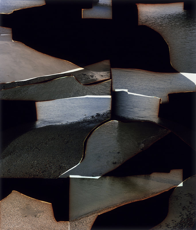
Both images are capturing a subject and showcasing its history, but in different ways. In Talmor’s imagery we are presented with a landscape which has been torn up to showcase a detachment of memory from the images. Where as Knez’s work showcases a landscape but holds a picture of the landscape taken a while ago to the landscape now a day at the same position and location, which is creating a journey of the landscape in a more positive light. The two artists have different approachs to showing a journey, but are both high successful in what they do. Contextually, Talmor wanted to destory any memory or attachment to that location due to negative experiences within that location. Where as, the contextual reasoning behind Knez’s work is showcasing how Paris has changed but the famous landmarks have not. In Talmor’s work there is a lack of space which suggests that the landmark should not hold any space in her head, which differs from Knez’s work as there is more space due to the location of the landmark and how Knez is trying to showcase it’s beauty. Talmor has created a very distorted outcome which almost revolts viewers making the location seem unpleasent. The background of both images are plain which allows the subject, in Talmers work it is the different fragments and in Knez’s work it is the architecture presented in the foreground of the image, to be the main focus point. Technically, both images share similar camera settings although they are very contrasting in what they do. Both have used a quick shutter speed to capture the images as there is no intended blur within the image. Alongside this they have both used a low ISO as there is no intended noise being presented. In addition, both have used artificial lighting which is shown in Talmer’s work as there is a reflection of a sunset in the water, and is clearly shown in Knez’s work as the landmark is outside and the sky suggests a sunny day. In both images it seems that a wide depth of field has been used as the whole frame is in focus, in Talmer’s work all the segments seem to be in focus which showcases this technique. Moreover, a normal white balance seems to be used (outdoor/sunlight) as the images do not seem to be off color. In addition, the images do not seem to be naturally lighter or darker which suggests the aperture is set to a normal setting. In my opinion I prefer Talmor’s photography due to the abstract nature of it and how there is no set way to look around the image and how it can be interpreted differently. However, I can still appreciate Knez’s work as it is just as successful in what it does.
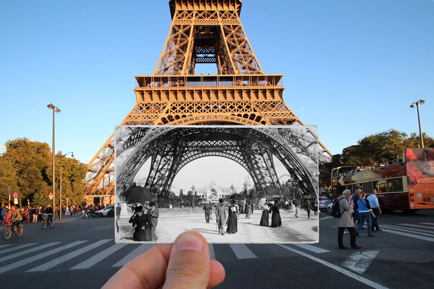
Julien Knez was a French photographer, who captured the city of Paris between 1871 and 1968. She took a photograph of a location in Paris and then went back to that same location many years later and recaptured the same building at the same angle. Knez had a passion for photography and this project was inspired from the love of his city. His artistic aim was to showcase the history of Paris, but show how it has developed into the modern age.
Mood Board showcasing Knez’s work Knez’s photograph of the Eiffel Tower
In the image above we are presented with the bottom of the Eiffel Tower, where a vintage picture of the subject is held up to the background of the image, creating a juxtaposing image. When first looking at the image we are drawn the vintage image in the centre of the frame in the foreground, as it is almost the odd thing out in the image. My eyes then move around the background absorbing what the message is getting across. Conceptually, Knez is showcasing how famous landmarks do not change it is what is around the landmark which changes. Contextually, it showcases how the landmark has importance to the French culture, and how it has been there for a long time due to this. As mentioned before the main focus point is the vintage image. The main formal elements being presented is space, tone, texture and line. This is presented through the way the two images work together to present the tower as a whole. Texture is very important to the image as it is mainly presented in the vintage image as it is seen in black and white, and also presented in the background of the modern structure for the tower, which helps to build the conceptual factor of the image. In order to create the juxtaposing image the vintage image is seen in black and white and the modern day image is in colour, which emphasises how it has not changed and creates a more powerful and visually stimulating image. When the vintage photo was taken, there would have been no DSLR, cameras and it was likely that film was used. This meant that all images where black and white, with a lot of noise being presented. Images would often have defects to them due to the developing of the image, in the image above we can see a white fade on the edge of the image which is a defect which was created when developing the image. In the modern image it is likely that a DSLR was used to capture it, meaning Knez has more control over the settings he used. Everything seems to be in focus, which suggests that a wide depth of field has been used along side a quick shutter speed. No noise is presented, suggesting a low ISO and the image is not darker or lighter meaning a normal aperture has been used. Moreover, the white balance seems to be set to an outdoor lighting as the image does not seem to be off colour. The lighting used is natural lighting as we can see the a little bit of a sun set in the background, and it stands to reason as the image was taken outdoors. In my opinion I like how the image overall presents the historical factors of Paris and meets the artistic aim of Knez. The photograph itself is ascetically pleasing to look at and is visually stimulating. You are able to see the in-depth thought process of Knez, and how he chose his camera settings to create this successful image.
Dafna Talmor:
Dafna Talmer is a London based visual artist who works with photographs, videos, curation and collaboration. Her imagery is displayed locally and internationally in many galleries, due to the success of her photography. At college she studied BA in Fine Arts and Photography, which opened up her eyes to photography, letting her career take flight. Her work has gained her many awards, such as the MACK First Book Award 2018. Her knowledge is now being shared with other students as she works as a university lecturer, but still keeps up photography as a hobby.
Mood Board Showcasing Talmor’s work
Talmor’s image
The image above is apart of Talmor’s constructed landscape series which was showcased in the Tate Modern art gallery in London. The image above is chaotic to say the least, the eyes are moving round the frame trying to gain an understanding of the image and what it happening, showcasing the abstract nature to it. After a while I realised it was an image or multiple images which have been ripped up and put together in a random order, the juxtaposition being used changes the way we view the piece of work. The images overlap each other, creating form, and it seems as if some have been slightly burnt, holding pejorative connotations towards the location. Conceptually, this has been done to transform a specific place – initially loaded with personal values, memories and connections – into a space that has verb emptied and become more subjective and universal towards other viewers. The photograph presents a metaphorical aspect as she tries to ’empty’ out the content of a photograph, by combining them in an unnatural way. Contextually, this may have been done as past memories of Talmor may have negative connotations, so by doing this the places apart of her past loose meaning and helps her to forget about the bad experiences. Visually, the image is very ‘in your face’ due to the lack of space and how the images do not connect, which in my eyes creates a more powerful meaning. The main formal elements being presented is space, line, tone, colour and shape, which is presented through the random positioning of the images and how the work together. This image is presented in colour which emphasises hows the image is being emptied and distorted to loose all connection with the location. Technically, the image is hard to analyse due to the image being torn and randomly placed. However, I do believe a quick shutter speed was used and there is no intended blur. The ISO is likely to be low as well as there is no intended noise being presented through each segment. The whole image seems to be in focus which suggests that a wide depth of field is being used as well as a normal aperture (f/5.6) as the whole image is in focus as well as the image not being naturally lighter or darker. It is clear to say that natural lighting has been used to capture the images as the image is of water which is located outside. We can clearly see a sunset in the water suggesting a reflection of light, due to the image being torn it destroys the beauty of the sunset showing how it is emptying the image, and the lighting itself is slightly darker, implying that no other lighting was used. In addition, it is likely that the white balance is set to a normal outdoor setting, as the image itself does not look off colour. In my opinion, I really like the abstract looking image of Talmor, as it captivates viewers into looking and working out what the image is, allowing the meaning to be conveyed. The image has pejorative connotations, but still pleases the viewers making it successful.
Action Plan:
As an action plan I want to create images which are inspired by Knez, showcasing how some of Jersey’s historical features has not changed since the war, showcasing how Jersey Journey after the war. As time is short, I do not have the time to conduct another photoshoot, so I intend to use the images I already have and use photoshop to create an outcome like the above image. I also want to experiment with handcraft to create outcomes like these, showing my ability to manipulate photographs not using a computer. I also want to make my own version of Talmor’s work using my bunker images, to empty the image and release all connotations and emotions towards Jersey’s bunkers, showcasing the Journey of Jersey through/after the second world war.
The aim of these edits was to replicate some of the famous propaganda which was used during the second world war, which had an impact on Jersey’s journey through this time period. I will also be experimenting with the images in the style of Kruger, and will also be creating some propaganda of my own which has taken inspiration from all the artists I have researched. These edits should show my ability to use photoshop to create, posters, where image and text are combined to create a powerful and meaningful final outcome. I want to experiment with colour, drop shadows, blur, pixilation and the use of moving images (GIF).
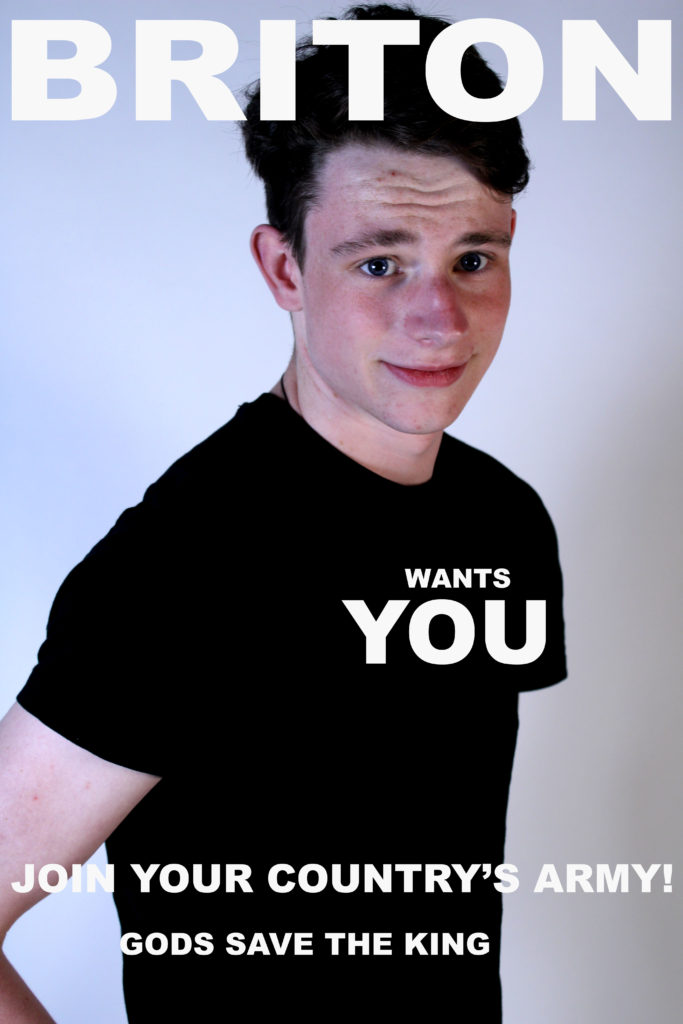
In my first edit I decided to replicate the ‘we can do it!’ propaganda which was used to motivate people to join the army and win the war. This edit is an example of tableaux photography as the image and text are used to tell a story and inform us on what we should be doing. In order to accomplish this edit, I started off by levelling the image for dramatic effect. I then used the quick selection tool to outline and cut out my model onto a separate layer, layer via cut. Then I created a new layer and moved it underneath the layer with my model on it, using the paint bucket tool I made the background a mustard yellow colour (like the original propaganda). I then wanted to showcase the pictures time frame, so I decided to add in my own noise, by going into filter and pixilate and experimenting with the different blurs to create the nose on my model. I then created a new layer and drew out the navy blue speech bubble to which the words will then be placed on. I then added the text using the text tool, the font was a standard bold and the colour is white. To make the bubble and text send out I added drop shadows to them, in the fx panel. I believe that this edit is very successful as it is a clear replication of the original image, moreover it shows my ability to critically make decisions and has shown further understanding of my photoshop skills.
In my next edit I decided to recreate the image with Lord Kitchener. This image was much harder to replicate as the steps involved where more complex, needless to say I managed to replicate it, but it is not as strong as the replication of the we can do it. To start off this edit I loaded up the image I wanted to use and levelled it for effect. I then cut out my model using the quick selection tool and layer via cut. I then deleted the background. In the original image the Lord seems like it is a drawing so I attempted to make my model a drawing. To do this I made the image black and white, and duplicated the layer by pressing ctrl +j. On the new layer I inverted my model, ctrl + I . Then I changed the blending mode to colour add, and added a Gaussian blur which made my model seem like he has been drawn. I then moved him to the middle of the page and made him smaller using the transformation tool, ctrl + t. I then simply added a background, a parcel paper colour, and added all the text, in the same colours as the original image, which created the final outcome. Although this edit is not as successful, I have been able to experiment with different tools and features of photoshop in order to create an outcome.
GIF:
A GIF is a lossless format for image files that supports both animated and static images.
In order to further explore the idea of replicating the more well known pieces of propaganda, I decided to make gif’s of my model’s moving into the famous stance. I made this decision as it almost modernises this idea of what propaganda is, and showcases how photography can be used to develop into using moving images. I wanted to keep both gifs simplistic and so I only levelled all of the images, and added in the text. I did not change the background colour or the blurs or the drawing. I made this decision as I wanted to emphasis how these posters still contain a lot of meaning even when you strip off some of the features, moreover it showcases the impact the images have on us in todays society. I am very pleased with how the two gifs turned out and believe they showcase the same meanings and showcase the journey of propaganda which influenced the journey of Jersey through WW2.
Images used to achieve this outcome:
Images used to achieve this outcome:
Barbara Kruger Inspired:
For my next two edits, I wanted to create propaganda which followed the style of Kruger’s work. One of the main elements of her work was the image was kept in black and white, and she would use boxes and the text to present colour, which meant the words had a more powerful meaning and impact. To achieve the edits below, I simply levelled them to adjust the dramatic effect. I then used the rectangular marquee tool to create the rectangles, which are filled with colour (this was done on different layers). I then adjusted the angle of the red boxes using the transformation tool, ctrl +t. I then added in the text using basic fonts and simplistic colours. Finally, I added drop shadows to make the boxes and words stand out. I think that these edits follow the style of Kruger accurately as they address something relevant in that times society, in this case it addresses joining the war. The top image in my eyes is the more successful one, as the image itself is successful due to the camera skills and settings. Moreover, I prefer the use of slanted words as it makes the poster more eye catching. Needless to say, they are both strong images as they have strong links with the artist, showcase my confidence in using different camera settings and show my ability to use the different tools in photoshop.
Comparison:
My Image
Kruger’s Image
In comparison, my final outcome holds a lot of similarities with Kruger’s work, but also showcase differences due to our own artistic style. One similarity is that we have both used men as out models and subjects, due to the target audience mainly being aimed at men, which allows the message to have more clarity and meaning. Moreover, both models are seen. covering their mouth, which showcases the idea that they should stay quiet, no questions and do exactly what the posters are telling them to do. Another similarity is that both images are presented in black and white, which allows the subject to more subtle and have the text stand out. As well as having the image show more tone throughout the piece. A major difference is that Kruger’s work presents more of a vintage vibe due to the noise which is being presented on the subject, which has been done through adjusting the ISO higher. Where as my image is more ‘modern’ as noise is not being created, however both effects work nicely to help convey meaning. Another difference is the text being used, Kruger’s text is talking about opening up about your sexuality, which was relevant at that time, but does not have strong links to WW2. I decided to create text which will convey meaning to the time period of WW2, where solider recruitment was high, which impacted Jersey’s journey through the second world war. Needless to say, my image took inspiration from Kruger’s colour scheme as I felt the colours worked to help draw attention to certain words, for emphasis, and overall worked well to help convey the representations being presented. Another key difference is the lighting, although we have both used artificial lighting, Kruger has used 1 point lighting to create a chiaroscuro effect. Where as, I used 2 point lighting to light up all of my models face, to create a wider depth of field, it also allows the whole face to be emphasised. As you can tell both images share a lot of similarities and the difference are due to our of photographic taste and preference.
Further Experimentations:
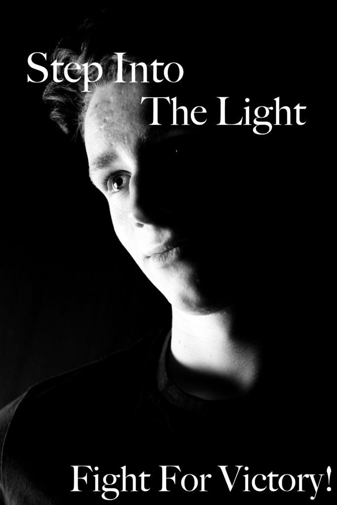
Then using the different techniques acquired from the remaking of propaganda and Kruger’s work I then used my creativity to caption and edit my images to create propaganda. When creating them I considered, font style, colour schemes, positioning of texts and how the image and text come together to create a meaning. The photographs themselves showcase photography techniques such as chiaroscuro which contrasts light and shadow, depth of field, formal elements and focus point. The images below clearly demonstrate these techniques. When editing all the images I started off by levelling them and adjusting the curves for dramatic effect. For the first image I then turned it black and white by adjusting the saturation slider, ctrl + U, and then added the text. The second image I made my image seem like a drawing by making it seem like the second piece of propaganda I created, by adjusting blending modes and adding a gaussian blur. The final image was kept in colour and had text added. In my opinion I like the way all of these edits have turned out, but critically speaking the image below is the most successful, as I believe the photograph (techniques and overall looks) and text work well together and produces the most powerful and persuading meaning, thus creating a successful piece of propaganda.
Displaying Idea:
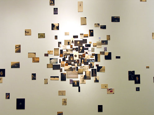
As I was creating these edits, I knew that I wanted to use them as a final piece but I was not sure how. It wasn’t until I was scrolling through Pinterest when I sore some propaganda from WW2 being displayed on a pin board, which sparked my idea to display my propaganda on a pin board. I believe that this idea showcases contextual factors, as it was a way of actually displaying the propaganda during the second world war, which will showcase part of Jersey’s Journey through the second world war. Moreover, It is a nice way to display all of the outcomes, as it is ascetically pleasing and all the images work together to create an overall powerful effect, and remind people about the impact propaganda has on people’s lives during the second world war.
Below is an image displaying how I would arrange the images on a cork board. I used a background image off a cork board (taken from google) and placed it on a new document on photoshop. I then added all of my propaganda onto the page, adjusting their size (ctrl + t). I then randomly placed them around the board, with them overlapping one another, creating a messy but ascetically pleasing effect.
Evaluation:
To evaluate these edits, I believe that I have produced strong outcomes which showcase my ability to critically decide on images, my competence in using different photoshop tools and my exploration to different ideas to present these images. I have been able to clearly replicate some of the more ‘famous’ propaganda, which showcases my ability of tableaux photography. I then transformed these edits into GIFs, which shows my ability to further explore an idea and showcase a different form and style of presenting a set of images. I then successfully created my own work which have been inspired by Kruger. The images showcase my ability to take inspiration but add my own artistic style to create an overall successful image. Afterwards, I then created my own propaganda using the different techniques, given by the artists, and different photoshop tools in order to create powerful propaganda. Then looking at displaying my works allows me to see how all the images work well together and present a strong final image, which impacts viewers on how propaganda played a massive role in Jersey during the second world war, which reinforces to project itself. In my opinion these edits are some of strongest so far, making this idea worth while and the most successful.
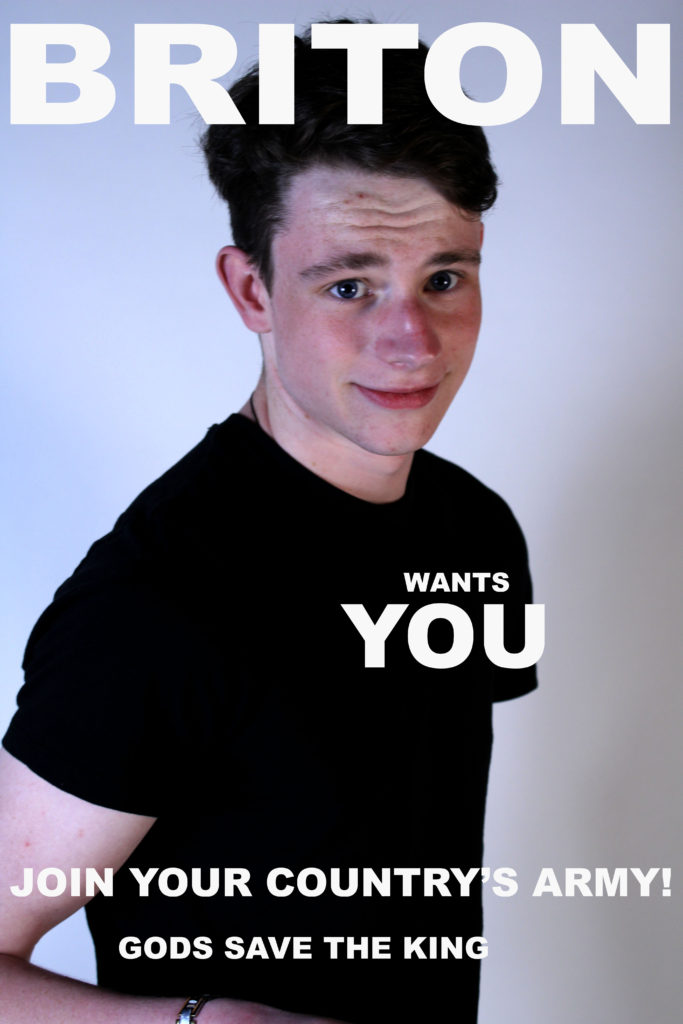
In this photoshoot my artistic aim is to recreate some of the ‘famous’ propaganda which was used during the second world war, in order to showcase another element which was vital for Jersey’s journey through the second world war. I am going to try and capture the images in the style of tableaux photography, where I use similar lighting, positing and poses in order to capture my images. I decided not to focus on costumes as me nor my models had outfits like the actual images, doing this allowed me to focus more on the positioning, pose and capturing and accurate replication. To capture these images I will be using the studio, with artificial lighting. I shall experiment with 1,2 and 3 point lighting and the warmth of the soft boxes in order to create different effects when capturing my models doing the poses. Using the different types of lighting will allow me to use different effects like chiaroscuro, which will allow me to showcase my camera skills and knowledge. I intend to keep the shutter speed at fast, as I do not want any blur, as the images will not be like the original images. However, to show further exploration I may decide to experiment with the shutter speed at the end of the shoot to see what types of images I can create and use for my own propaganda. I kept the ISO low throughout the photoshoot so there was no noise being created, and the aperture was also on a normal setting so the image was not darker nor lighter. My modals face is usually going to be my main focus point and so I will look and experiment with using different depth of fields in order to showcase this. Prop wise I will not be using very many as I wanted to make this photoshoot as simplistic as possible.
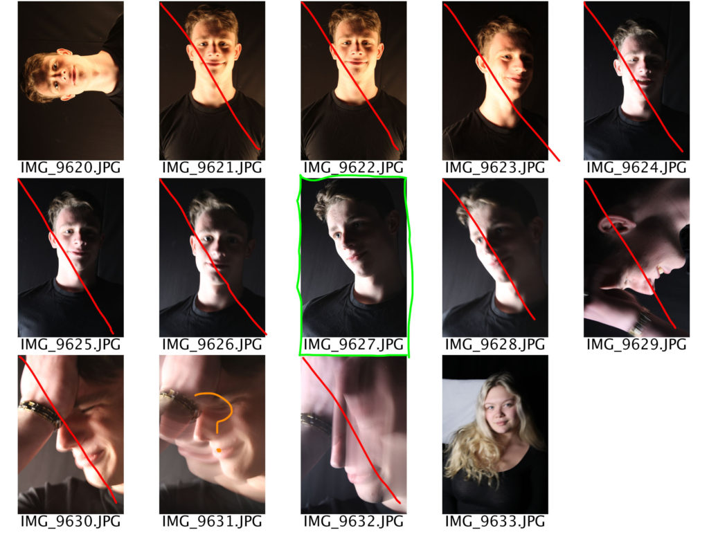
Contact Sheets:
Evaluation:
To evaluate this photoshoot I believe I have managed to capture many successful images which shows competence with camera skills in a photography studio. I was able to explore using my shutter speed, ISO and different types of lighting in order to create different effects. I believe that my images that I have captured are very much like the original ones, which shows my ability to follow the style of tableaux photography due to the research I have conducted. Moreover, I managed to think ahead while capturing these images, during the shoot I decided I wanted to make a gif (moving image) of one of my models moving into the pose of the propaganda I was recreating. Due to this decision of mine I managed to capture the first image have my model slightly move and repeat this, as if I was creating a stop frame animation. Not only have I managed to produce accurate recreations I also have produced images which are like Kruger’s work, which will allow me to explore her style in the editing process. One issue that I ran into was getting the model to do exactly what I said, and sometimes my instructions where not clear which lead to poor quality images and models in the wrong pose. However, when I realised this was an issue I ensured that my instructions where much clearer and this resolved the problem.
Action Plan:
As an action plan I intend to use my successful images in photoshop, to further replicate the propaganda I have chosen. Moreover, it will allow me to further explore the style of Kruger’s work and give me the opportunity to explore and utilise my ideas which I have thought of when I conducted the research to see what makes a successful propaganda poster. In addition, I will use the burst of images in order to create a gif of my model getting into the ‘famous’ position, and therefore will have to use a website online to make the gif or make the gif within photoshop using tutorials.