All posts by Niah D

Filters

Author:
Category:

St Saviours Abandoned Mental Hospital

For this project, I went on a journey with my mum to the St Saviours abandoned hospital to show the state that it is was in. As I turned up to it, it was shocking to see it all boarded up and see warning posts all over the walls. I took photos of people on the way there.

Contact Sheets:

Even though some of the photos I took were good, they just weren’t what I was looking for and didn’t really link in with the theme I was doing.

Editing and Selecting Final Images

For my final images, I wanted to play around with a few styles of photo montage, so I edited a photo around two times until I got the final image.

Final Selection:

Edits that didn’t make it:

These are some edits of photos that could of potentially made it, but I preferred the other photos more. I have also included the editing process of these images.

Editing Process:

I placed the beach photo on top of studio photo
Then I used the polygon lasso tool to cut out this shape into the beach photo
I then used the eraser tool to clean up the sides
I then used the paint tool to give it some more shadow and depth
I then duplicated the layer and placed it on the other eye
Final Outcome

I do like this photo, but I think it is too simple and I prefer the other one more.

Final Display

Below are my mounted and displayed final pieces for the theme “Journey’s and Pathway’s”. I am very happy with how these displays turned out and I was able to capture exactly what I wanted to present.

Final Display 1
Final Display 2
Final Display 3

Gallery Display:

Below is what my photos would look like displayed in a gallery –

Overall I am very happy with how the displays turned out because they look very effective and well made.

Final Images in Gallery

Comparing Final Images to Marko Köppe

My final images are inspired by Marko Köppe’s style as I love how he uses random photos of things that relate to the main part of the image. I think I was able to capture his style but still keep my style in the photos.

I think this photo shows Köppe’s style the best, but still shows that it is my own style as well. I also think I managed to get down his aesthetic perfectly.

I also think these three photos capture Köppe’s style really well and I think they were edited really well.

Ryan Mulford

“Ryan Mulford (b. 1987) is an American artist.

His career began as a designer, creating award winning work for leading advertising agencies and global brands. In 2010 he transitioned to contemporary art.

As an artist, Mulford has developed his own distinct style—appropriating imagery and redefining the context. He has pioneered an innovative creative process that seamlessly blends vintage materials, modern technology, and traditional mediums.

Mulford lives and works in Northern California.”
https://www.ryanmulford.com/about-ryan-mulford

Examples of his work:

Ryan Mulford
Ryan Mulford
Ryan Mulford

My Plan:

For this project, I will be using photos from my beach photo shoot and my bus stop photo shoot. I will be using the style of the shapes of the beach photo on top of the bus stop photo. I will mix my style with Mulford’s style.

Final Outcomes (Editing Process):

First Image:

Placed the beach photo on top of the bus stop photo
I then used the rectangular marquee tool to cut out sections of the beach photo
Final Outcome

I really like how this image turned out. I think the blue and colour of the sea and the brownish colour of the bus stop image work well really together. I also really like the contrast between the two images.

Second Image:


Placed the beach photo on top of the bus stop photo

I then used the rectangular marquee tool to cut out sections of the beach photo
I then turned the background to black and white
Final Outcome

I am really happy with this photo. I think the black and white really compliments to the diamond shapes of the sea.

Third Image:

I first turned the image to black and white

Placed the beach photo on top of the bus stop photo

I then used the rectangular marquee tool to cut out sections of the beach photo
Final Outcome

I am really happy with the outcome of this photo. I really like the simpleness of the four lines, I think it gives the photo a very clean and aesthetic feel to it. I also again like the contrast between the colour of the sea and the black white background photo.

Rocio Montoya

“Rocio Montoya (Madrid, 1983) is a photographer, graphic / web designer and editor based in Madrid, Spain. Her specialty is the experimental photography, land on which has moved from its creative inception. Also passionate for the editorial design, in 2010 she founded DOZE Magazine, which has co-directed and designed until its closure in June 2014.

Her interest is particularly focused on the portrait, approached through different plastic techniques and always with photography as the essential basis of each final artwork . Throughout her career as an artist she make a personal exploration of behaviors and emotional states of the human being, transforming reality by manipulating the image to convey their perception of the environment through aesthetic experiences.

She immersed herself in the field of visual arts by curiosity to express her concerns and the need to seek beauty as a means of escape and personal enjoyment. Her admiration for painting and surrealism is evident in addressing their creations, which you can see a clear trend to recreate atmospheres and distant situations to pure documentary reality, characterized by a delicate, haunting and poetic graphic style.

The human body in synergy with nature, the female figure and the loss of identity are the conceptual basis of her work.

One of her most recent interests is illustration, a field in which she began to submerge more conscientiously in 2018. With techniques such as watercolor, graphite and gouache Rocio has tackles new creations with a powerful chromatic charge and with women again as protagonists.

In addition to her personal work, Rocio Montoya has done numerous fashion editorials and has worked as a newspaper photojournalist.”
https://rociomontoya.com/bio/

Examples of Her Work:

Rocio Montoya

Rocio Montoya

Rocio Montoya

Rocio Montoya

Rocio Montoya

My Response:

For my response, I will be printing out the photos and sticking photos of plants and vines onto the photo of the models. I will be linking it to the journey of life, the flowers and vines coming out of the models represents life itself.

Photos I Will Be Using:


https://www.onlygfx.com/6-pink-rose-png-transparent/

https://www.pngkit.com/view/u2w7a9t4w7w7q8e6_butterfly-wings-png-butterfly-wings/

http://www.pngpix.com/download/flower-png-transparent-image-3

Final Outcomes:

Overall, I am really happy with how these photos came out. I think they capture Montoya’s style very well. I think if I had done them on the computer they would’ve looked a bit better, but I still like how they look on paper.

Exam Evaluation

When given the theme Journey’s and Pathway’s, I immediately had an idea about a physical journey, such as an outing of some sort. At the beginning, I wanted to stick with just landscapes, but as I carried on, I started working more with photo montage. I really enjoyed working with photo montage as I think some of my best photos have been from using that method of photography. Also, I really enjoyed street photography and capturing people’s journeys to their final destinations.

The first photographer I decided to research was Andrew S. Gray. I had already looked at this photographer in my Pre AS task, but I wanted to further explore his work and his technique of taking photos. I enjoyed working with ICM as it creates very interesting and unique photos, and I really liked the final images I had from this section of my journeys and pathways theme.

The next portion of this theme I explored bus journeys. I found the photographer Stephen Calcutt on Pinterest. He goes around London and takes photos of people through vandalised bus stops. I really like how he mixes the bus stops with the people, kind of a juxtaposition of life and death. I think the photos I took for this portion were very good and I liked how I edited them on photo shop.

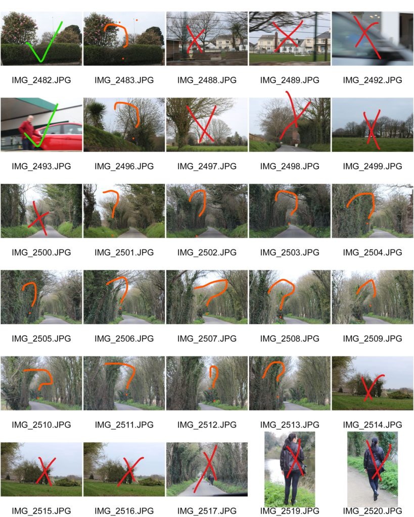
Next, the idea of physical journeys sparked my ideas and street photography instantly came to mind. I researched a bunch of street photographers and found the photographer Damian Chrobak. I really liked the simpleness and emotions that his work portrayed, so I decided to go to town and take photos that captured uniqueness and individuality. I am really happy with how these sets of photos came out and one photo from this project was probably one of my favourite photos from this theme.

After working more street photography, I looked at buildings and car journeys. I went to the St Saviours abandoned hospital with my mum and on the way there, I took some photos of things I saw. I wasn’t satisfied with the photos I took as I feel they were lacking something special and they just looked okay, which isn’t what I was looking for.

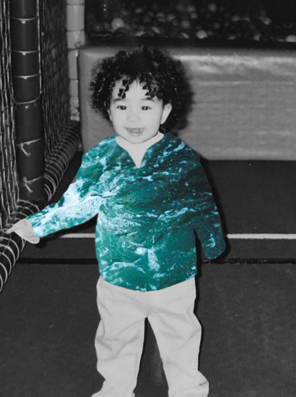
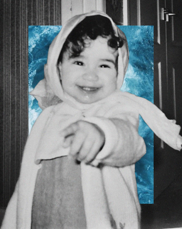
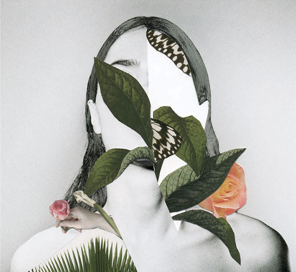
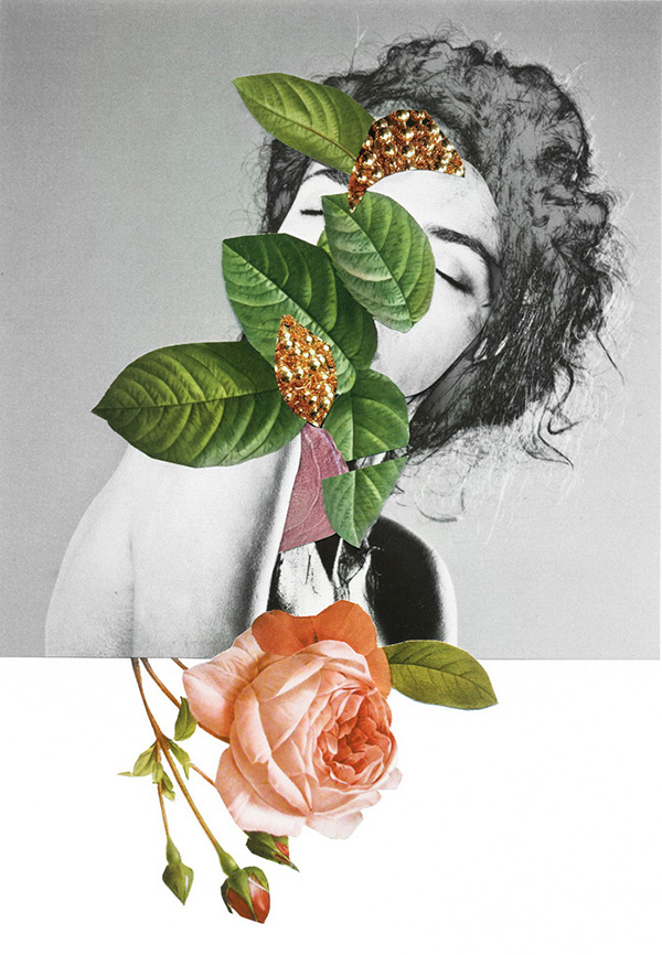
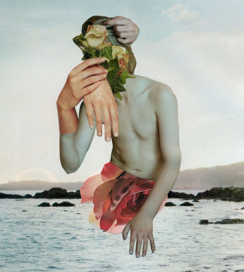
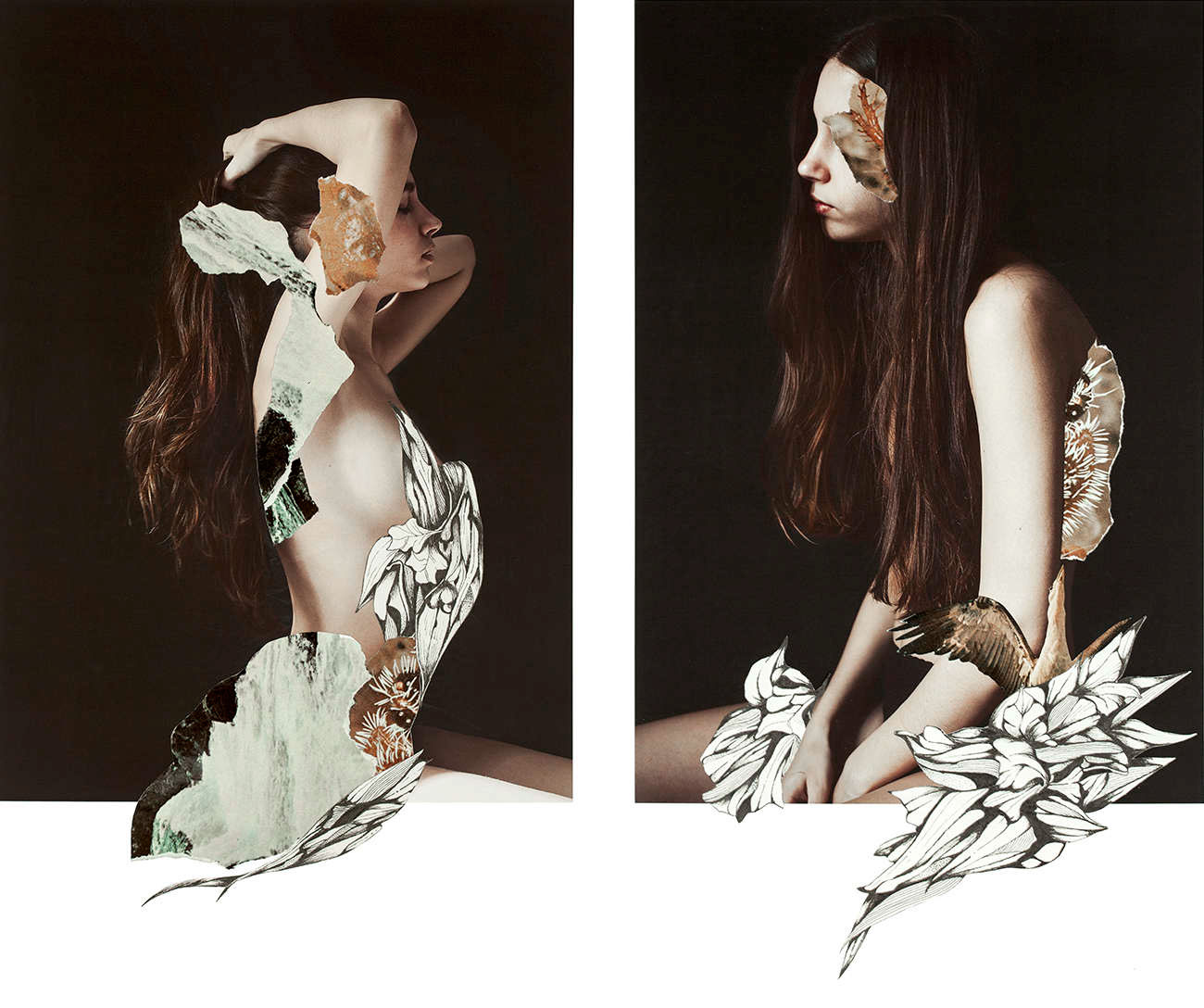
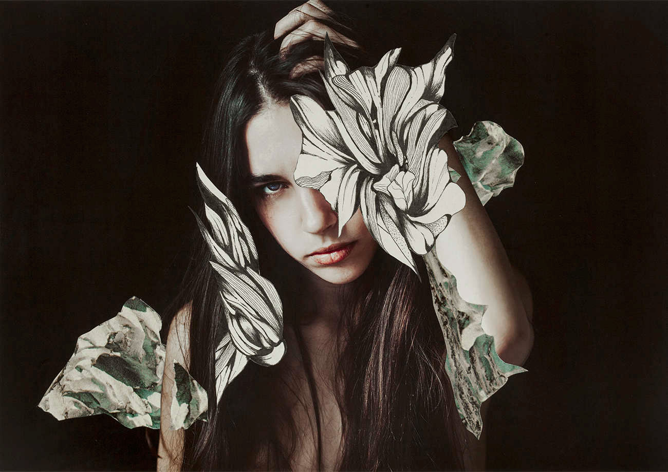
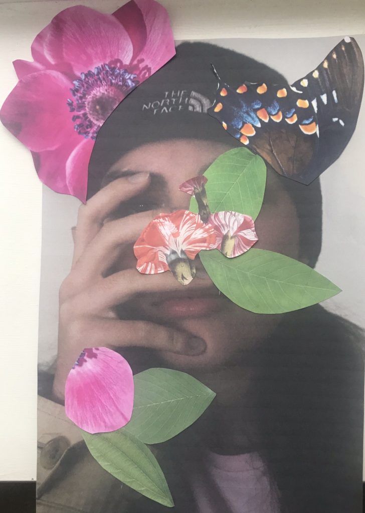
Next, I started looking more into photo montage. I found 4 artists that I really loved and wanted to pull inspiration from. Ryan Mulford, Rocio Montoya, Merve Ozaslan and Marko Köppe. I really liked how all these photographers edited there photos, and I really like editing photos on photo shop with this style of photography. I also printed photos out and stuck other photos on top of them. I really enjoyed working in this style, which is why my final photos for this exam were all photo montage.

Overall, I am really happy with the outcome of this theme and I really enjoyed using different techniques and styles. One thing that I could’ve done better was to open up my ideas a bit and explore different types of photography and print out a few more photos, but I am still satisfied with how I did things.

Display For Exam Outcomes

Image Set One:

For my first set of A5 images, I will be putting them on a large piece of foam board. I decided to keep the background white as I feel black clashes with the images. Also, the white background makes the photos stand out.

Image Set 2:

For my second set of photos, I will be putting them on a A3 piece of black card. I think this makes the photos stand out and the contrast between the black and blue works really well.

Third Image:

For my third image I will be mounting it onto foam board as I want the photo to be the center of attention, and if there was a background, I think it would take away from the image.