All posts by Lillie M

Filters

Author:
Category:

Recreation 6 // Gap | 90’s

This being my second recreation from the 1990’s I aim to show a different take on the modernizing fashion compared to what I previously looked at.

Background:

For the most of the decade 1990’s fashion was defined by a return of minimalist fashion. While it was not quite as loud as the eighties, the nineties took that attitude and tried to be a little smarter and classier. Common items of clothing brought in were crop tips, silk shirts and denim everything. In the early 90’s several late 80’s trends remained very prominent among both sexes, however the popularity of grunge and alternative rock music helped bring simple, unkempt grunge look into the mainstream. The anti-conformist approach to fashion led the popularization of the casual chic look, that included t-shirts, jeans, hoodies and sneakers, a trend which continued into the 2000’s.

Plan:

For this photoshoot I will have my model pose in the same position as that of the photograph. My model will be wearing loose fitting jeans and a white tucked in t-shirt. For the lighting I will have it placed coming from one side of her rather than both sides like I have with my other photographs.

Sixth Recreation:

Above shows the original advert I am going to be recreating, I feel this is a good advert to recreate as it is simple but I also feel effective in showing a change in fashion and adverts and women. I will be taking the photograph in the studio and use lighting and editing to recreate the photograph.
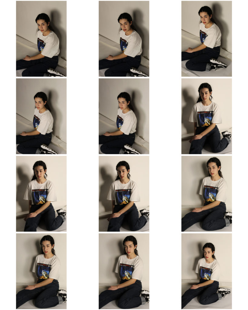
Above shows the contact sheet of my outcomes from the photoshoot. Overall I feel it has been successful and has worked well. I had my model face the other direction compared to the original as it was more efficient for the lights but also just to have my own variation. Some of the photographs were unsuccessful and were blurry due to shaking or just being out of focus on the camera however I did produce some successful outcomes.

Unedited Best Outcomes:

These I feel are my best outcomes from the photoshoot. I feel that they work best as they are my most clear images but I also think I got the best angles on some of these responses. I also feel that the shadow is working kind of well in the first photograph, I feel it is a little bit strong and harsh in the second and this will be due to my position in front of the subject as well as the lights. I like the last image as it doesn’t have any shadows around it and I feel it is working well.

Female in Focus // The Male Gaze

The Male Gaze

  • In feminist theory the male gaze is the act of depicting women and the world, in the visual arts and literature, from a masculine, heterosexual perspective that presents and represents women as sexual objects for the pleasure of the male viewer

Kourtney Roy: Deconstructing the Male Gaze

https://www.bjp-online.com/2019/03/female-in-focus-kourtney-roy-deconstructs-the-male-gaze/
Article about Courtney Roy

Kourtney Roy is a photographer born in Northern Ontario in 1981. She produced a series titled ‘The Ideal Women’ in which Roy is both the objectifier and the object: the photographer and the ‘ideal woman’ photographed. In contrast to her use of bold aesthetics, Roy’s reference to the male gaze in The Ideal Women is subtle. This reflects her understanding of gender discrimination in both the photography industry and society at large, she reflects “Discriminatory behaviour has been so conditioned that we often accept it as natural, as opposed to learned behaviour”. For Roy the practice of celebrating female artists in relation to their womanhood epitomises this. She cites Georgia O’Keeffe, who famously “The men liked to put me down as the best woman painter. I think I am one of the best painters.”

Roy’s distinctive approach and aesthetic runs through all of her work, be it personal or commercial. The careful compositions, bold colours and immaculate hair and make-up, inspire each still with a cinematic air.

I feel I can look on and take inspiration from Roy and relate her work to mine as I also am aiming to show ideas of female representations and how they have been presented through time and the media in what could be seen as the male gaze especially for some of the recreations of that of Guess and even Balenciaga.

Kourtney Roy | From the series ‘The Ideal Woman’

Women in Art

How Art has shaped female beauty ideals throughout history

  • History provides us a record, and from it one basic, inescapable, truth stands out: the ideals women are asked to embody, regardless of culture or continent, have been hammered out almost exclusively by men. This fact, more than any sort of evolutionary determinism, has meant that a fairly narrow range of attributes resurfaces across eras, returning every couple of decades or so like a new strain of the flu.
  • Physical ideals are changeable, manifestations of the cultures they come from, yet some aspects change more readily than others. Even when produced by those of their own gender, images of women have historically followed a pattern set down by males. Little about Artemisia Gentileschi’s Sleeping Venus(1625-1630), for example, suggests its female maker. In it, as in virtually all pictures of women, passivity is the norm, whether manifested as softness, slack musculature, or a deferential pose. Another abiding trait, the outline of the hourglass, reminds us that the Female is always a sort of clock, which we try to freeze at the moment of youth.

According to a story by Pliny the Elder, a Roman writer from the first century C.E, the first drawing ever made (and supposed the origin of painting) was by a women named Dibutades, who traced the silhouette of her lover on a wall. Whether chosen to be believed or not it is worth noting that although western mythology tells us that a woman was the first artist, her female successors received little attention until the end of the 20th Century. From antiquity onwards, only a few small sample of women found themselves into the tale of great artists. Even then, they were often described as unusually talented women who overcame the limitations of their gender in order to excel in what was known as a masculine field. British artist Mary Beale was a successful portrait artist in the late 1600’s but much of her success was attributed to the fact that her husband oversaw their studio and presented her works as experiments in the painting methods he developed.

Women have often been the subject of the art rather than the artist. In the modern Renaissance movements around the 1700’s women were often feature nude and very curvy and full, typically what the ideal was then.


The Origin of Painting: Dibutades Tracing the Portrait of a Shepherd | A painting recreating the scene | Painted in 1785 Musée National du Château, Versailles | Around the time until 1860 there was a wide spread vogue for paintings that evoked the origins of painting

Editing and developing: 5

Chosen Photograph:

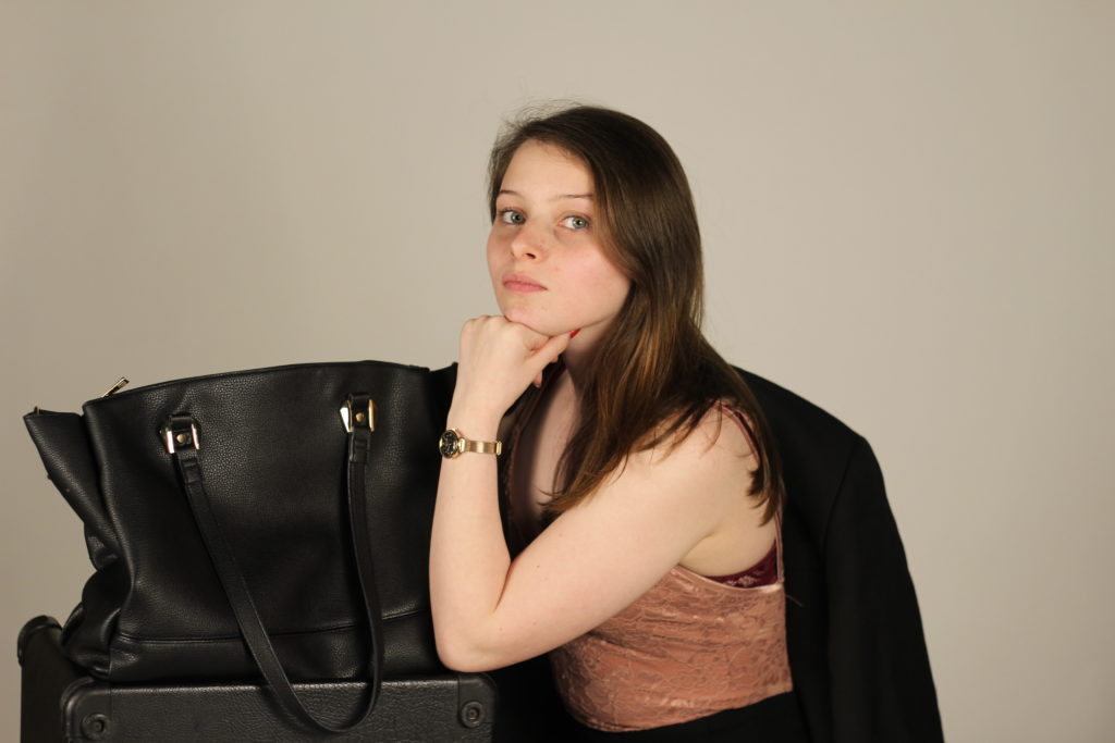
Above shows the photograph I have chosen to edit and develop, this I feel is my best photograph as I feel it has the best composition in relation to the original advert. I think that the lighting is good and gives me room to work with the photograph and edit it. I think that I am a good distance away from the subject in this photograph as it gives me the ability to edit the image like the advert with having her head come into the boarder and also means she is not too small in the frame or large.

Editing Process:

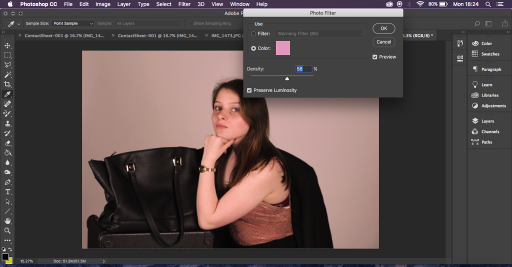
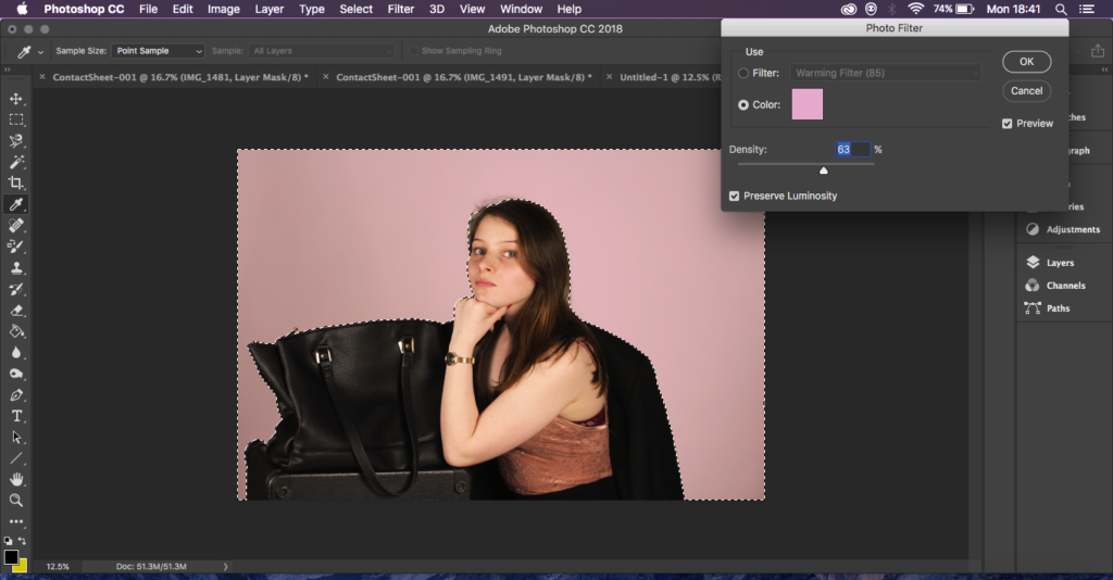
For the first two steps I adjusted the brightness and placed a pink hue across the whole photograph. I did this to get the pink tones out that the original photograph has and also to make the photograph not so dark. To have the pink show through well.

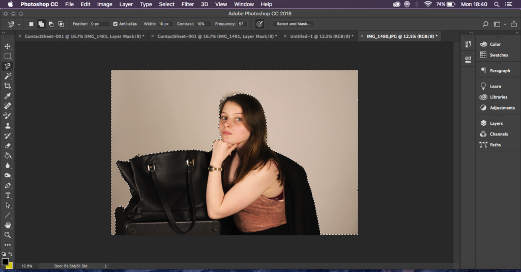
Next I went and used the magnetic lasso tool and made my way all from the bottom and all the way around my subject and then around the frame, I did this so that I would just have the background of my image selected and then I could go in and make the background an even more vibrant pink to match the original without changing the colours and tones on my subject.

Next I went and unlocked the layer so that I could take the polygonal lasso tool and cut away the top of my image leaving the top of her head out of the frame with a clear background so that I could then move it.

Lastly I created a separate white document that was larger than my image and placed the cut out image on top to give it a white boarder like the original ad, I then cropped down the boarder to get it all the right size and merged the layers.

Final Outcome:

I am happy with the way that my final editing turned out, I feel I have replicated the original photograph as best I can and it has worked well in showing a development of ads and how they’re used which is what I wanted to generate.

Recreation 5 // Louis Vuitton x Marilyn Monroe | 2016

Background:

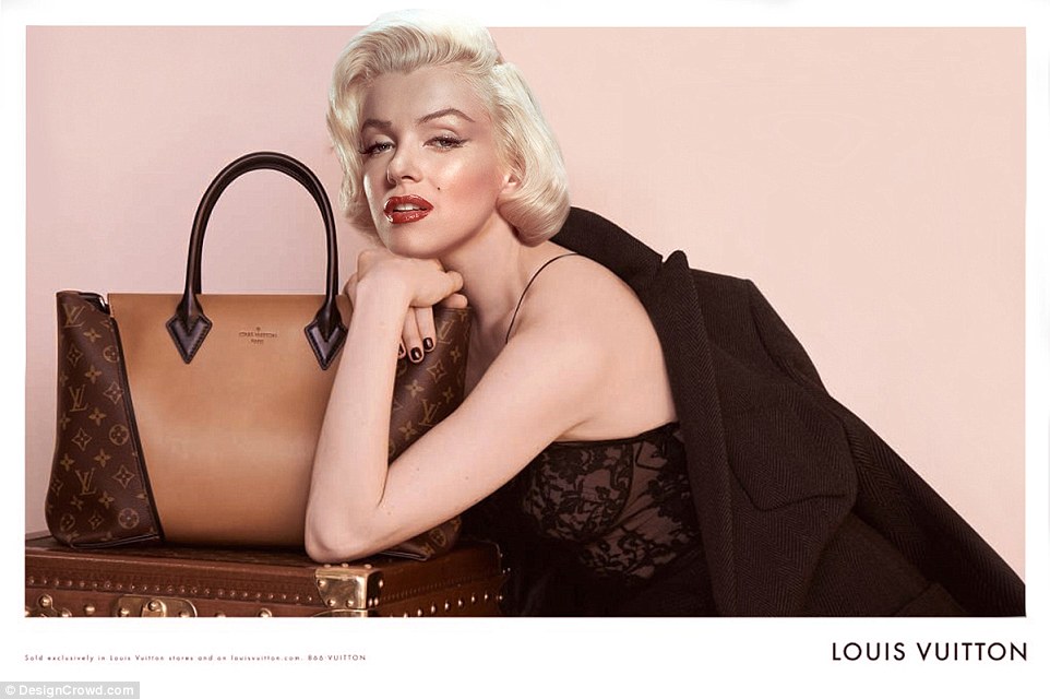
This advert that I am going to reproduce of Marilyn Monroe is an advert that has come from a a company named DesignCrowd that began crowdsourcing for freelance designers, it asked its users to photoshop the world’s ‘Most famous and missed pop culture icons’ into modern advertisements and campaigns. Many of the designers submitted several ads with Marilyn Monroe as the face, one of these being the Louis Vuitton advert below.

Plan:

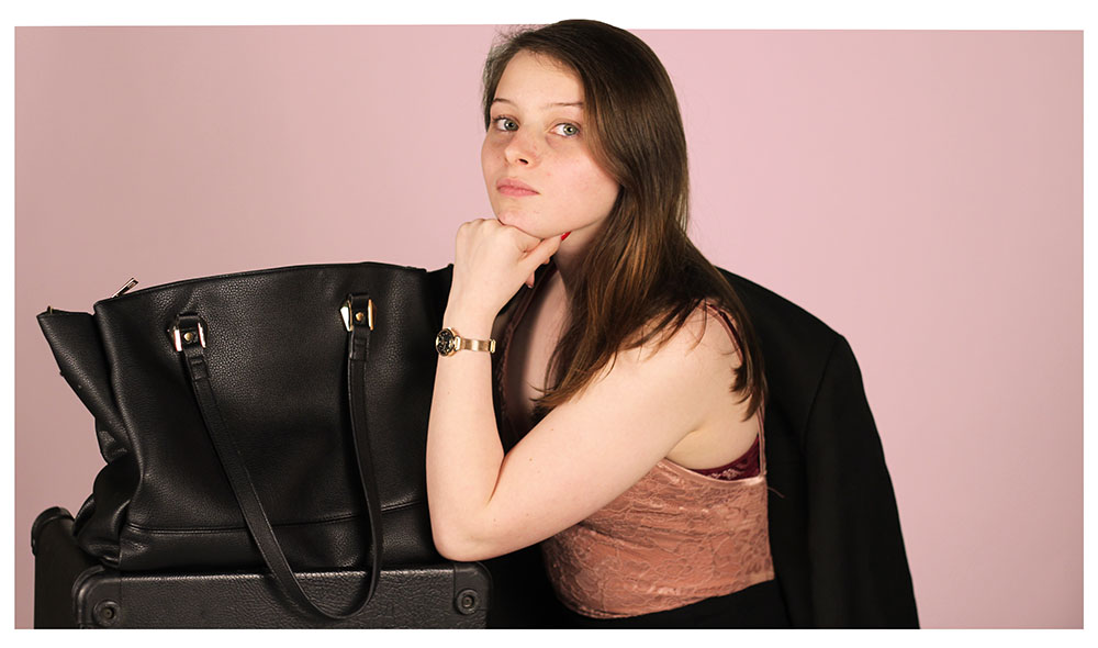
For this photoshoot I will be taking the camera back into the studio, taking a model that I feel will work well with the style of photograph. I will have the model dressed in clothing similar to that of the original. I have a bodysuit able to use for the shirt the original is wearing and access to a suit jacket to have my model wear. I will have them recreate their makeup in a similar way with the use of a red lipstick and enhanced blush to have it resemble the original.

Fifth Recreation:

Above shows the advert I will be recreating in this photoshoot. I will be taking the picture in the studio and will edit it according to how the photographs turn out, this may include altering the colour of the background as there will be a white screen in the studio and the original photograph can be seen to have a blush pink tone in the background of the photograph.

Above shows the contact sheet of my unedited outcomes, I feel many of them turned out well with what I had, one of the struggles that I came across was the access to props in the photograph, I had to improvise with what I had, for example using the bottom of a music speaker to recreate the look of a trunk and a bag that I had handy for the bag on top. Despite this I feel my images worked well as I got a good composition in relation to the original and they are clear and well lit.

Unedited Best Outcomes:

Below shows what I feel are my best images while unedited, I feel these ones had a good range of composition and the lighting is working well. My favourite is the far end image as I feel it works best as it isn’t too close to my subject and has everything I need in shot. I feel the middle photograph could be improved by moving the bag in shot and the first I have the camera slightly far away however compared to all of the outcomes I produced they are my most successful with lighting, clarity and composition.

Editing and Developing: 4

Chosen Photograph:

I have chosen this photograph to work with as I feel it made for the best potential with the facial expression my subject is making as well as the positioning of the camera for keeping her legs slightly out of frame for the purpose of having the best recreation I can. I aim to edit the photograph to give it the grainy tones of the original ad as well as turning it into black and white.

Editing Process:

For the first part of editing I turned the photograph into black and white and then shifted some of the colours so that the shirt turned into a darker black like the original photograph.

Secondly I went and added noise to create the grainy effect, I feel using this has worked well for me in previous images so have used it again to create the effect I am looking for.

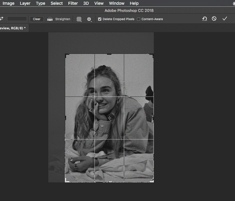
Lastly I went through and cropped the photograph so that the subject took up most of the frame as this is what is happening in the original photograph and I feel works best.

Final Outcome:

Below shows my final edited outcome, I feel it as worked well, not as well as some of my previous recreations however I do believe it still works, I feel I have been able to show well a different side of advertising in the 90’s in the ways they represented women, this being due to the facial expression of my subject and the way she is lying which could be seen as sexualised or in a flirtatious manner which is what I was trying to put across which I feel was coming through in the original ad.

Recreation 4 // Guess | 90’s

Background:

Throughout the 1990’s supermodels dominated the fashion industry. In 1994, one year after the following advert was produced, grunge clothing rapidly declined as fashion became more feminine and form-fitting, high-shine fabrics such as satin and silk became very popular. The most common look among young women was to wear the short black slip dress worn over a tight undersized t-shirt. Anna Nicole Smith was not the first Guess Girl, however she is one of the most memorable. The late model’s work for the denim brand helped skyrocket her to stardom and yielded one of the most iconic ad campaigns of all time.

Plan:

For this recreation I will be setting up a sheet of fabric on the studio floor to mimic the idea of sheets underneath my model. For the benefit of my model I am planning to angle the camera slightly differently and have the shirt more closed so not to show anything that may be seen as too revealing. I am going to have my model wear a button down shirt and tights as well as trying to find heals to recreate the outfit in the original advert.

Fourth Recreation:

Above shows the advert I plan to recreate, I have chosen to recreate this as I feel it shows a different side to some of the fashions that dominated the 90’s as it shows that even in a time where denim and grunge dominated women were still advertised as objects and in an overly sexualised way.

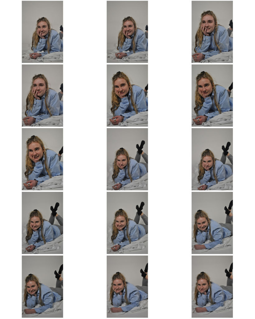
Below shows a contact sheet of the outcomes of the photoshoot, I came across some difficulties while doing the shoot as for finding heels and a shirt long enough to cover so the images didn’t turn out exactly how I had expected however I still think with some editing I could produce a good outcome.

Unedited Best Outcomes:

Below shows the three images I feel worked best, this is because I think either the facial expressions or the positioning of the camera is working well for these images. For the first image I really like the facial expression my subject has however I feel that having the trousers on the legs in the images ruins the recreation slightly. The second I feel works well for both facial expression and positioning as you can’t see so much the covered legs so I feel makes for a more accurate recreation. The third is slightly further away however I feel works well for both the angle and the facial expression.

Women In Propaganda

Looking into the United States in World War II and specifically the representations of women in the propaganda
http://oberlinlibstaff.com/omeka_hist244/exhibits/show/homefront/propaganda

Although the war crisis led to new realms of autonomy for women on the home front, women also became targets of propaganda that emphasized women’s sexual and domestic roles in ways that limited their sense of agency during the war years. Through different and, often, contradictory avenues of propaganda women were presented as victims, domestic beings, and as threats. Wartime propaganda portrayed women as sexually vulnerable victims in danger of the hyper-sexual desires of the enemy. This cannot however be said the same for all women in propaganda as in some cases they were shown as strong or taking on man’s roles such as Rosie the Riveter.

The examples below show and discuss the representations of women I feel should be questioned and are wrong and it all shows how women were used as an object in the wartime propaganda.

Women Seen As Domestic Figures:

More so than at any previous time in the US history women were breaking out of their traditional gendered roles by participating in the labour force, join the military, wartime propaganda helped to limit them to the classic roles of mothers, faithful girlfriends who contributed to the war effort solely through domestic means.

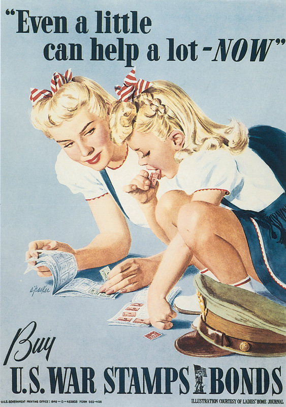
Unlike the infamous ‘Rosie the Riveter’ posters generated during the war, much of propaganda posters became tools to emphasize the significance of women’s war effort in the domestic realm. The trope of the mother-daughter duo illustrated in posters such as ‘Even a little can help a lot -NOW’ and ‘We’ll  have lots to eat this winter, won’t we Mother?” emphasize the significance of women both as domestic beings canning foods and pasting stamps and as mothers reproducing children who will become assets to society. This branch of propaganda maintains traditional femininity and domesticity, thus suggesting that when men return home from the war they will be returning to a normal life where women raise children and tend to the house while men earn money.

Women as Victims:

One way in which women’s sexual and domestic roles became defined by propaganda was through propaganda designed to encourage enlistment and the purchase of war bonds by depicting the outcome on the home-front if the US were to lose. The main theme that the propaganda campaign chose to focus on was the effects of the war on women. The majority of this propaganda portrayed women in one of two ways. First, and more frequently, women were depicted as young, innocent victims of sexual violence inflicted by hyper-sexual enemy soldiers. The other way in which women were illustrated was as helpless mothers clinging to their children as enemy violence threatens to annihilate them and their homes. Both of these depictions reduce women’s agency as passive participants in the war effort and illustrate them solely as vulnerable victims of enemy violence.      

Not only does the war bonds campaign provoke fears about mother and, thus, family vulnerability in the face of the enemy, but it also emphasizes the susceptibility of young American women to the hypersexual desires of enemy men. Once again, the narrative of American men needing to defend and preserve the honor and morality of American women is used to benefit the war effort.

Women As A Threat:

In contrast to posters of women as the weak, vulnerable victims of sexual desires, an entire campaign designed to fight venereal diseases (VD’s) recast women’s sexuality as a threat to soldiers the nuclear family, and, thus, the nation. This poster campaign often illustrated women as “bad girls”—dangerous and “loose,” in contrast with other campaigns depicting the “good girl” image of smiley mothers and housewives. The venereal disease propaganda is particularly gendered both in who appears on posters and who the targeted audience is.

The fact that women are demonized based on their sexual behaviors illustrates the larger societal need to control women’s morality and sexuality. Instead of being liberating, women gaining more autonomy over their bodies became a threat to the fundamental values of the American nuclear family. Women who were sexually active did not fulfill their traditional gender role and became outcasts who were looked down upon for having ‘loose’ morality.

Editing and Developing: 3
Chosen Photograph:

Above shows my chosen response to edit and enhance in response to my chosen advert. I have chosen this photograph as I feel my model is placed in one of the best positions and it is also one of my clearer images. As well as being clear I feel even though this photograph is slightly bright it gives me room to adjust this and experiment with it.

My aims for editing this photograph is to generate a response that clearly shows a resemblance and a link towards the original photograph and to also show some suggested inspiration towards Cindy Sherman.

Editing Process:

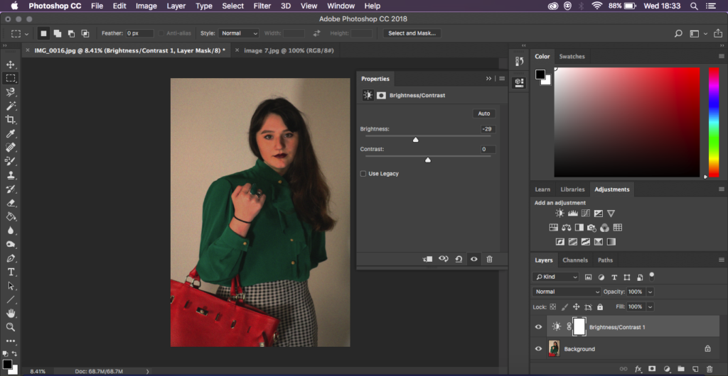
To being with I started by adjusting the brightness and the contrast of the photograph, the photograph I was recreating had quite dark tones and wasn’t too bright so I was trying to recreate and generate this.

Next, still keeping in mind the style of the original photograph I was recreating I decided to add ‘noise’ to the photograph to create a more believable recreation to create an almost blurred image without loosing any sharpness on the features.

Finally I went back in with the brightness and the contrast editing for the final touches to create it more similar to the original I was recreating.

Final Outcome:

This shows my final edited outcome, overall I feel happy with the way the photograph turned out in resemblance to the original. I feel I have created a successful photograph with what my aims were and that I have personally met them.

Recreation 3 // Balenciaga Paris | 80’s

For this photoshoot I will be taking another of the print advertisements that I have found to recreate in some way similar. I will again be keeping in mind Cindy Sherman and the way she embodies ‘characters’ and try to have my subject try this and have their own take on the image.

Background:

The era of the 80’s evokes very visual aesthetics that can be found specifically in this era. The high brands found in the 80’s prove to still set trends for today’s fashions, most of which people are familiar with Chanel, Versace, Armani and Balenciaga. The 80’s saw a rise in women moving into professions that were previously dominated by men. This trend sometimes lead women in these professions to not be taken seriously as they were often seen as primarily objects of desire rather than independent with ambition. This social issue created a movement named “Dress for success” or “Power dressing” with encourage the wearing of mote angular clothing that generally made them appear larger through the use of shoulder pads or sizable lapels and collars.

For these reasons I am choosing for my third recreation to produce a photograph resembling one of the Balenciaga adverts produced in 1983. I feel at this point I can show some of the developments of how woman and adverts were produced, in this era heavily woman were going into business work and were creating a new name for themselves.

Plan:

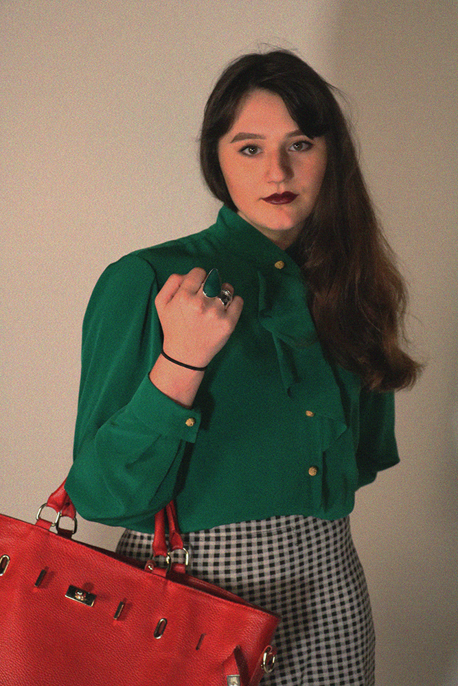
I will again be doing the photoshoot in the studio as this is most likely where the original was taken as it seems to be quite a stage studio like photograph with studio lights. I will also ask my subject to dress in a way similar to that of the original photograph, for example with a shirt of a similar style with the added skirt and bag. As it being a recreation I would like to get the outfit as similar as possible however there may be slight alterations of colours as to what is available however I would like to keep the same concept in place.

Third Recreation:

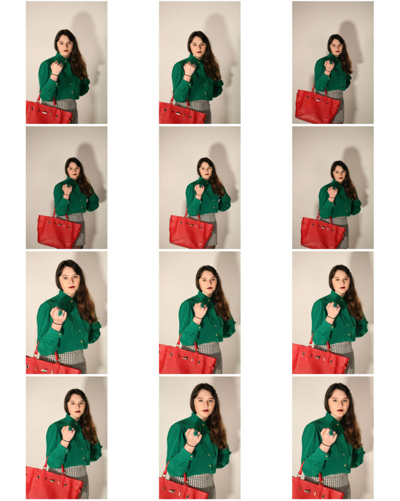
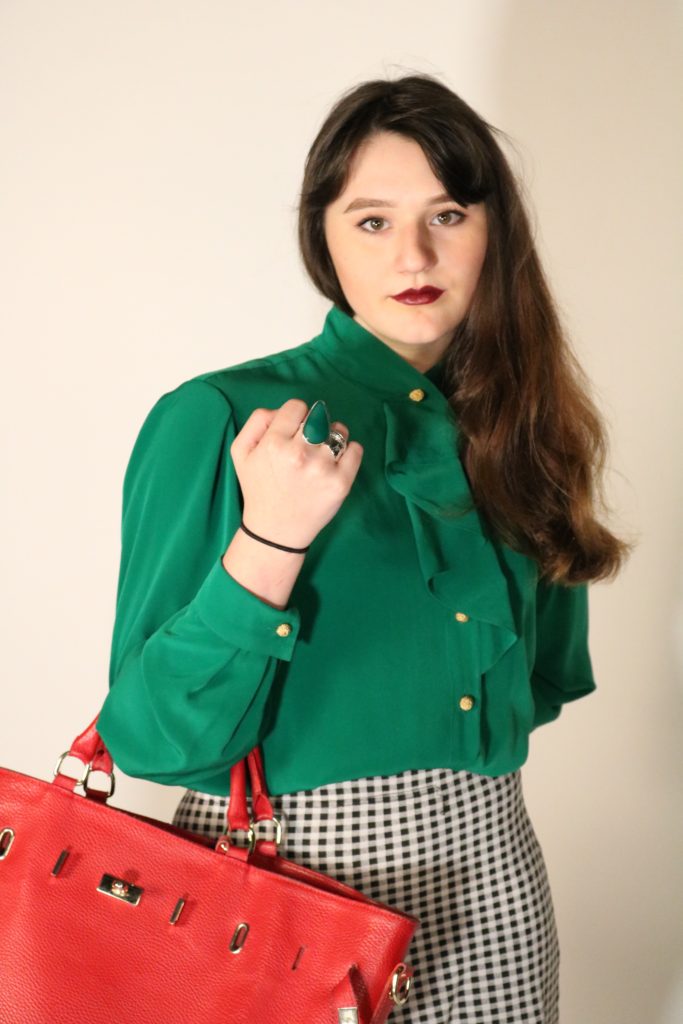
Above shows the advert I will be trying to produce. The photograph is a studio taken photograph that I will try to recreate. I dressed my model in a way that replicated what the original model was wearing as well as wearing a similar hair style to that of the original photograph.

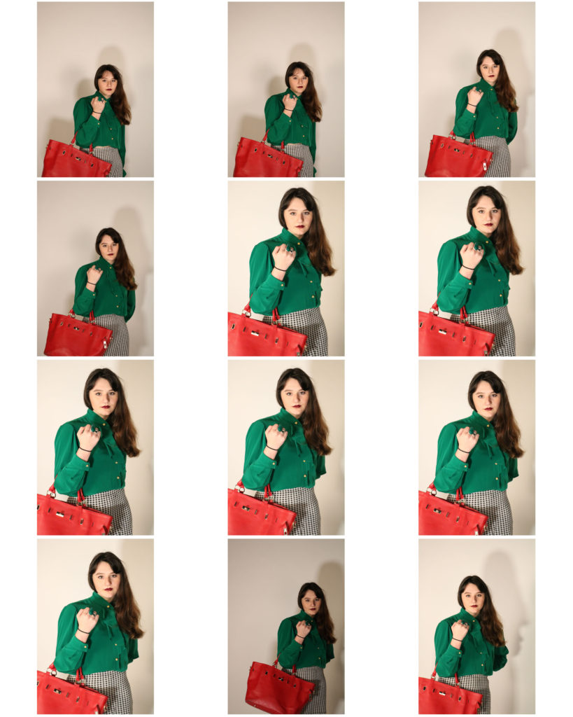
Above shows the contact sheet of my outcomes from the photoshoot. I feel the better photographs are the ones that are coming slighting closer to the model rather than the ones which are father away. Some of the photographs turned out slightly dark however I feel that the majority of the photographs worked well and how I wanted them to be produced.

Unedited Best Outcomes:

I feel that these three are my best outcomes from the photoshoot due to where my subject is positioned and how they are some of my more clear photographs. I am going to move forward and edit one of the following photographs too enhance it to be more like the original photograph.

Guerrilla Girls // Manet’s Olympia

Guerrilla Girls

Tate Website Article about the Guerrilla Girls

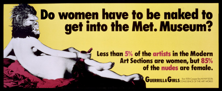
Guerrilla Girls is an anonymous group of feminist, female artists devoted to fighting sexism and racism within the art world. The group formed in New York City in 1985 with the mission of bringing gender and racial inequality into focus within the greater arts community. The group employs culture jamming in the form of posters, books, billboards and public appearances to expose discrimination and corruption. To remain anonymous, member don gorilla masks and use pseudonyms that refer to deceased female artists. According to GG1 identities are concealed because issues matter more than individual identities.

Many feminist artists in the 1970’s dared to imagine that female artists could produce authentically and radically different art, undoing the prevailing visual paradigm. Shaped by the 1970’s women’s movement, the Guerrilla Girls resolved to devise new strategies. Most noticeably, they realized that 1970s-era tools such as pickets and marches proved ineffective.

Throughout their existence, the Guerrilla Girls have gained the most attention for their bold protest art. Their projects (mostly posters at first) express observations, concerns, and ideals regarding numerous social topics. Their art has always been fact-driven and informed by the group’s unique approach to data collection.

The Guerrilla Girls are drawing attention to and trying to rid of sexism as well as racism, I can relate what the Guerrilla girls do and their message to my work by looking at the links that I am aiming to show the changes or the no changes in the way women are portrayed and put forward in some of the era’s where the male gaze was very prominent.

I can also relate the Guerrilla Girls to the ideas of Cindy Sherman as her photography aims to force the audience to reconsider common stereotypes and cultural assumptions, among the latter political sarire, caricature, the graphic novel, pulp fiction, stand-up comedy (some of her characters are indeed uncomfortably “funny”).

Both the Guerrilla Girls and Cindy Sherman show that they are against the objectification of women and the idea of the male gaze. I feel I can gain inspiration and ideas from them as I look to move the project forward and look more closely at the time periods I am recreating the adverts from to understand where women stood at that time to then reflect on how they are being presented in those ads.

My Blog Post Surrounding Cindy Sherman
Cindy Sherman’s Work

Manet’s Olympia and it’s Impact

One of the figures who Inaugurated modernism to the history of the art is the renowned French Painter Édouard Manet. As one of his most celebrated paintings Olympia shook the society and made a huge impact on the upcoming generations of artists. The highly controversial composition was painted in 1853 and exposed to the public 2 years later. It represents a nude woman in a leisure pose with a servant bringing flowers. The daring look of a shameless woman caused quite a stir and the public considered the painting indecent since it displayed a sex worker in her boudoir. In relation with that is the fact that the very name Olympia was associated with sex workers in 1860’s Paris.

Manet’s Olympia has been used during the 1970’s as an important reference in the context of the male gaze proposed by the feminist movement. Especially the Black feminists argued that Manet did not include the figure of the maid for the artistic convention, but to create an ideological binary between black and white, good and bad, clean and dirty.