All posts by Lillie M

Filters

Author:
Category:

Overall Project Evaluation

In the first couple of days of the project I struggled to generate clear ideas of where I wanted to take my project, initially in the begining the first ideas that were coming to my mind surrounded looking at buildings from new ones to old ones and also portraits of aging and photographing that journey of aging in both people and buildings howver after I had done some brainstorming and thinking I came across the idea of looking into the idea of the journey of adverts throughout the past couple of hundred years, (the final time span being from 1939-2016) specifically looking at women in adverts, this interested me as I thought it was different and is something that I enjoyed the sound of that I thought could be quite fun.

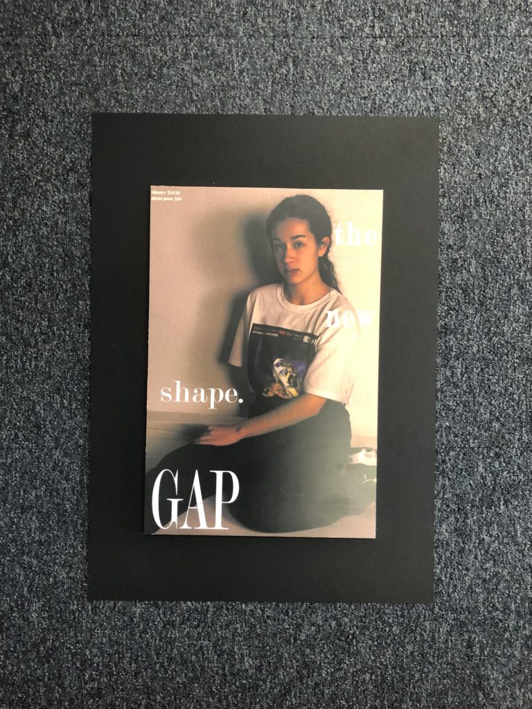
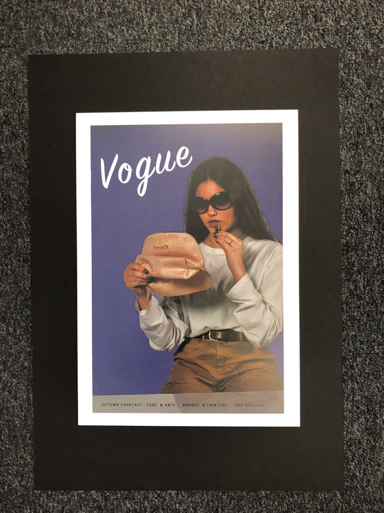
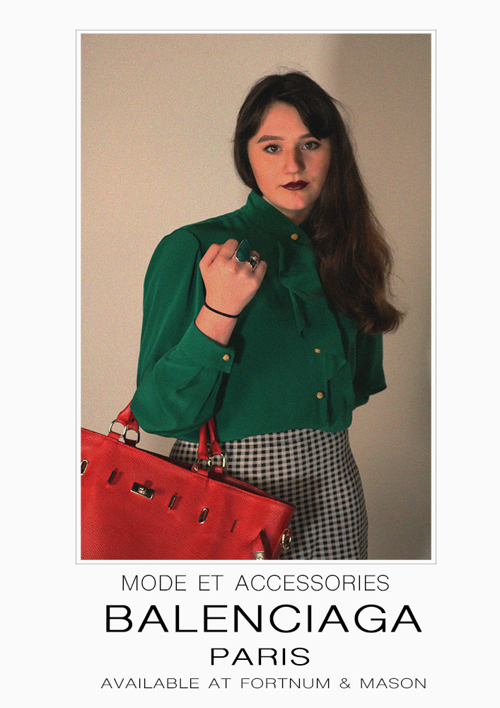
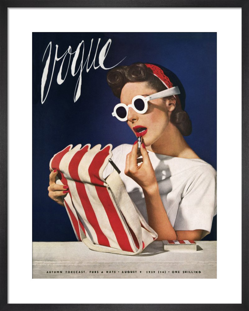
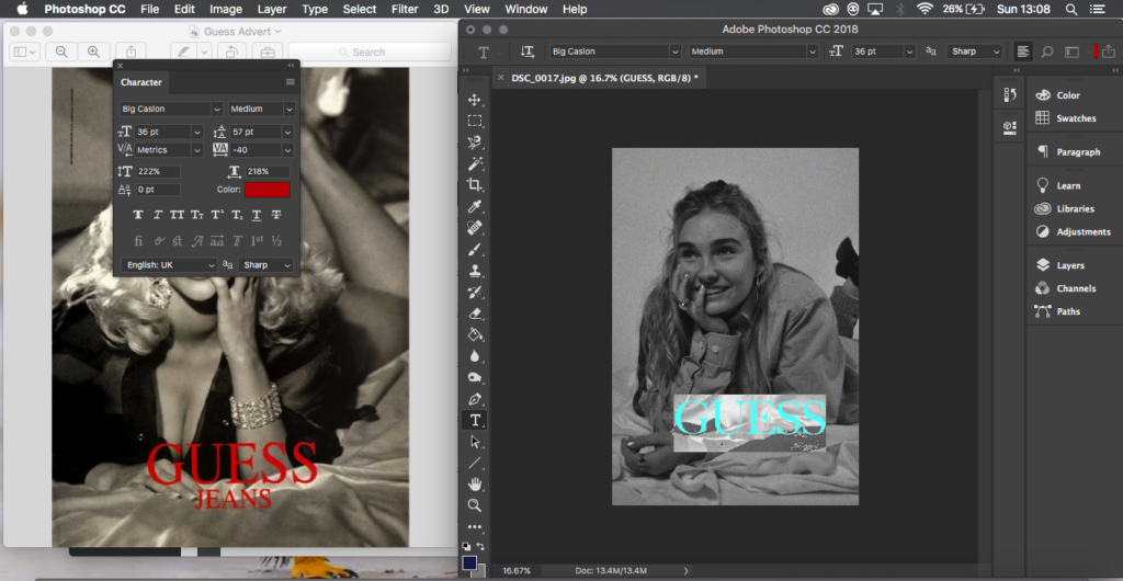
I started out by looking into Cindy Sherman and how she works and what ideas and photographs she produces as she is an artist who generates images questioning the representations and ideas of women and ideals, I feel for me Sherman was a very useful artist to have looked into as it helped me to generate ideas easily. From looking in depth at Cindy Sherman I decided to start recreating images some more famous than others from adverts across a 100 year time span, the first couple of shoots worked well and gradually throughout the project I developed more and came to a collection of 8. While developing these photo-shoots I also researched into feminist movements such as Feminist Art and the Guerrilla Girls as well as Kourtney Roy and again Cindy Sherman, from researching these I found the wide in-depth thoughts that go into challenging feminism and looking at how it had developed. This made me want to produce two very different ads from the same era (1993 and 1994) this allowed me to show not only a difference of the journey across decades but also across a 1 year time span which seemed interesting to me the drastically different way that they were being represented.

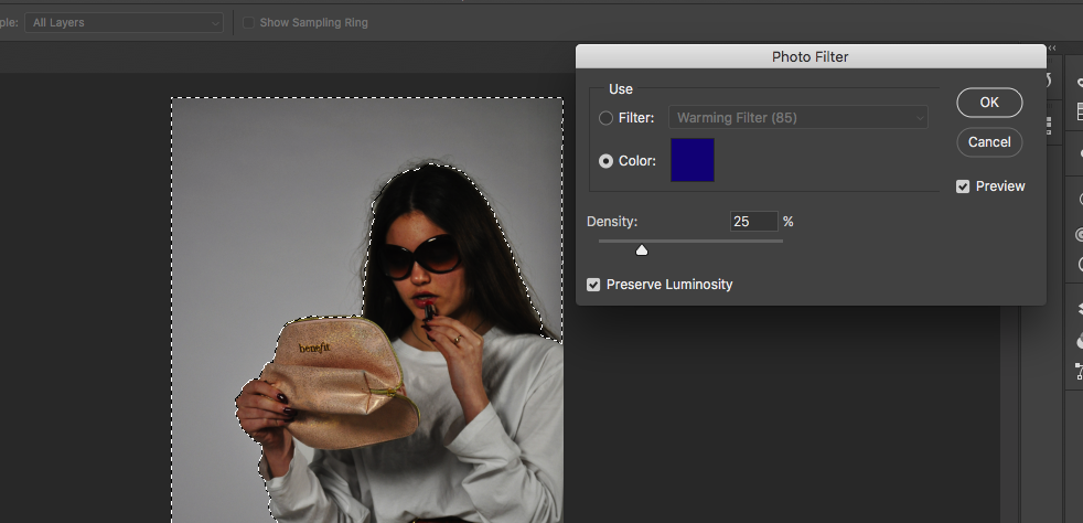
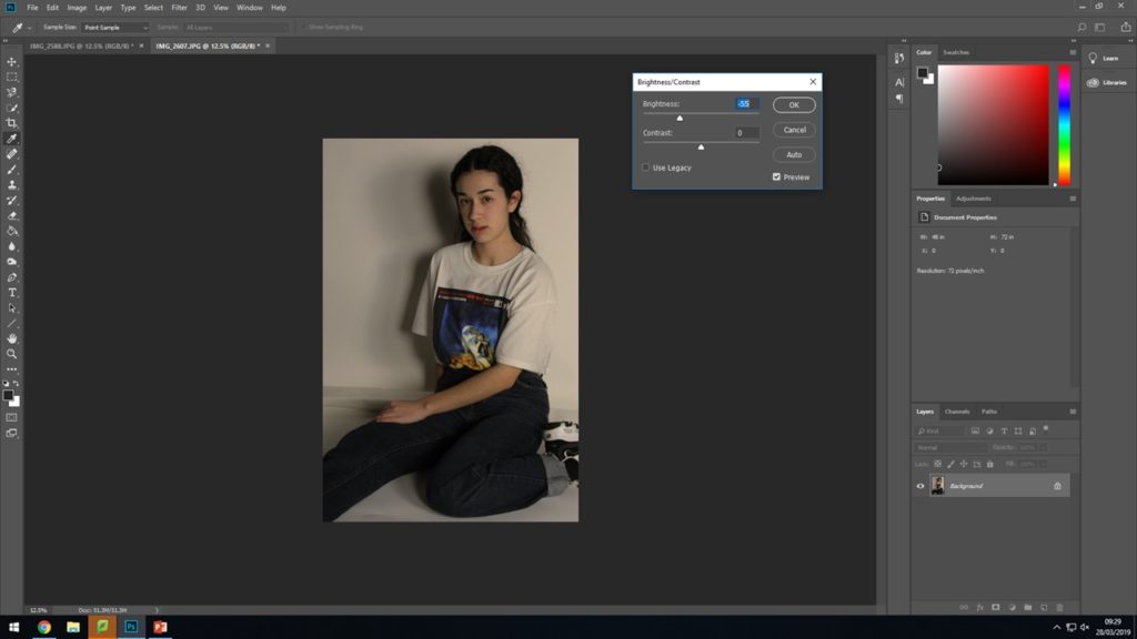
Overall I am happy with the way that my final images developed and finished not only as individual prints but as well on the mount and foam board, I feel I have been able to explore on a bit of a different take on the title of journeys and pathways and have explored something I enjoy. I think my final outcomes have been successful and work together well in the series, I think that I have been able to show my ideas well and continually expressed my thoughts at various times and reinforced my ideas around why I was generating the images and recreations that I was. I would have like to generate another outcome with my unused image had I had more time to develop the extra image needed however I still think that it was a useful experiment and recreation at the begining of the project to be able to start myself off into my ideas. I am happy with the way that this project allowed me to develop more of my editing skills which I feel have got better as I have been able to develop them, however I don’t feel I was able to develop my camera skills as much as generally across the project I was working in the studio with artificial lights which stayed roughly the same throughout all of my photo-shoots.

Overall I am happy with the final images that I was able to produce and how I came to my final images during the project as a whole and I feel it was quite successful.

Final Finished Displays and Mounts

Below shows how my final outcomes turned out ones printed and displayed, I chose to display them on foam board and then onto black mount board as I feel this is what worked best with the photographs and it made them stand out off the page which I feel was effective in displaying the types of photographs that they are.

I am happy with the way that my final displays had turned out and the actual photographs themselves. I feel that putting them on foam board rather than a window mount helped to make a difference and stand out for the types of photographs they are in the style of adverts and what they are presenting.

All of my final photographs have stemmed from inspiration and ideas from people such as Kourtney Roy and Cindy Sherman and the message that they also try to send across to people and the style and way that they portray those ideas I feel is effective and stand out which is one of the reasons as to why I placed my pieces on mount board. I feel that adding the writing and actual advert elements helped to make a better impact and I feel was more effective than just leaving the images as they were.

Below shows a created image of a virtual gallery to suggest what my work could look like in a gallery and all displayed properly together. This helps to give a sense of all of the photographs being grouped together and how I may show them if I was to have a real gallery space to put them in and I feel helps to give it a different perspective.

Comparing and Contrasting

Here I will be comparing and contrasting one of my own outcomes and one image created by Cindy Sherman as she is who I feel has influenced me most and would therefore be good to compare my work with.

Cindy Sherman’s work shows the three-quarter length, Italian Renaissance-style portrait as Sherman takes on the persona of the Mona Lisa. Wearing a 15th-century style Italianate dress, Sherman allies herself with one of art history’s most famous, iconic paintings. I can compare this to my photograph as I have generated an image where my subject takes on the idea and almost persona of Anna Nicole Smith who became one of the most memorable of the Guess Girls. For my recreation I tried to create a recognisable image when placed next to the original but with slight differences, the original is seductive almost and I wanted to place a young ordinary girl in as the subject to produce different ideas of the way women are represented to show my subject in a way that people would normally be against, this idea of sexualising young girls is thought of as bad however a professional model was and sometimes still is okay which is the ideas I tried to take on with showing this advert in a different way. For Cindy Sherman the photograph of her as the Mona Lisa is no true replica, the photo is meant to call to mind the original, without literally copying it which is a little different to what I have done which shows a contrast between my work and Sherman’s. This idea of not literally copying is that Sherman creates a mental distance between the real and the imitation just barely apparent, yet somehow haunting. One might say that Sherman suggests that viewers rethink their familiarity with the original and question how its conventions of depiction continue to condition the way that even we, hundreds of years later, regard every representation of the ‘female’. This is some of the ideas I was trying to put across and as comparing the two photographs can show similarities in the way that they are set out and the production behind them howver also shows the contrasts in Sherman’s work and my recreations in the accuracy in the way they are produced.

Final Outcomes and Displays

Below shows all of my outcomes that I have produced for this series I will be displaying my photographs on black mount board and on separate boards and have them as a collection series. This shows them edited and next to their outcomes and a suggested idea of the individual displays.

GAP 1994

This is one of my two outcomes for the 1990’s, I chose to do two for this era and then choose this specific ad as I feel it represents something different that was happening with the use of more diverse advertising slowly starting to come into play around this time especially for women. I feel this ad has a different tone to the other 90’s one it seems to be aimed at a different age of girls and I feel is showing something to do with the way advertising was developing for women and shows part of the journey that it was on.

I feel that my outcome was successful in that it looks like the original ad. At some points the image seemed to be turning too dull or too dark while editing howver I feel I found a good place and that the writing helps to enforce the ideas I have been trying to show of having a familiar face in an ad give you a different perspective maybe.

Guess 1993

This was the second ad I chose from the 1990’s and I did this as it was the one era I found had one of the most drastic different types of ads and this was a good ad to represent that, the way that the original subject is lying it’s main representation is sexualising women with what minimal clothes she’s wearing and her position. This is a large difference compared to the GAP advert where the clothes are covering and it is more innocent compared to this which is why I chose those two as I feel it shows a large development and difference that was occurring only 2 years apart.

I feel my recreation is more successful with the full edits in place of the writing, before I think it was an okay image and recreations however it wasn’t perfect due to having the outfit difficulties of trousers and no heels however I feel this in a way does help to enforce that thought of real people, familiar faces in these ad’s and that can create a different reaction, this is what I feel makes this outcome successful.

Rosie the Riveter 1943

I chose to do this recreation as it is one of the most famous ad’s or posters that I feel exists from this time even though it wasn’t at the time of it’s release I feel it has become a big symbol of strong females and feminism and this is why I chose it, the ad was produced only around the time when men weren’t there to do the work in the early 40’s and then wasn’t seen till feminism movements began and I feel that is important in how to think about how women are portrayed and at what times they are portrayed in certain ways.

I feel that this image was one of my better recreations and one of my most successful images with how it turned out in the camera originally and after editing, I feel it fits well with what I am trying to produce and show and the image works well. If to do it again I would have my subject more towards me however I do feel that it was one of my more successful photographs.

Balenciaga 1983

This ad I chose as I feel it is quite explicit in the era it is representing as the 80’s has quite distinct looks, for me this ad was saying and representing two things which is why I chose it: One that this was the starting decade of the working business women which is empowering but two, it also still has the tight pencil skirts the fitted waist and pouted lipstick covered lips which to me speaks that although moving forward had not moved away from this almost sexual representation which is why I chose this ad.

I feel that my outcome for this was good as it shows similar attributes to the original, I feel if done again I could turn my subject more towards me face on however I feel the tilt in her stand still makes the photograph work well.

Vogue 1939

This ad I chose as it was quite difficult to find something do-able around this era for me but as well out of those I found I felt this one stood out to me from the year that it was taken and how it looked, the ad was produced n 1939 the begining of the war and women were still being portrayed as having to make themselves up with makeup and I feel it shows a contrast how just 4 years on women were being pushed into overalls to work in factories which is why I felt this should be the ad from this era I recreate.

I feel my outcome worked well in the end with being a good depiction, although I don’t feel it is my strongest image I feel it still works well and has the elements it needs, I had struggles with props and the heights of chairs however I still feel that my image works well as a recreation and in showing the development.

Louis Vuitton Modern

This is my final outcome for my modern day recreations, I chose to incorporate this and this specific outcome as I feel it symbolizes something about how women are still portrayed and the role they have. Marilyn Monroe is not just a missed pop culture icon, she is a symbol of what once was seen as the ideal female and continues to be shown as sexual in the modern day by her facial expression and position in the ad. This is why I chose this ad as it shows how even though the journey of feminism has come far, older faces are still used in subtle ways in maybe not the way wanted.

I feel my outcome was successful and worked well with what I had and I am happy to include it into my final series with the last editing I feel it brings it together. I slightly enjoy how the bag and box I have used do not look similar to the ad as I feel it creates a statement as it doesn’t look as expensive and done up which is what is usually portrayed and I feel has turned a difficulty into a slight positive.

Mock Up Displays:

Below shows the mock ups of how I plan to individually present my outcomes as a collection and in a simple manner as I feel they look good and work well almost showing as display posters with just a frame.

Final Editing

Below shows my final editing and adjustments to the photographs I plan to use as a series. I have placed them next to their original Ad’s and have included some of the editing processes that I took to reach my outcomes as some took more editing and developing than others.

Balenciaga 1980’s:

To edit this photograph I placed my outcome onto an A4 document and scaled it in a similar way to the original advert so that there is some boarder around the photograph and more space at the bottom. Next I created a small single line clear box around the photograph as this is a detail from the original ad I wanted to keep. Next everything was very simple and using the text tool I typed in what the original ad had written and scaled everything with the spaces and size of text as well as trying to find the best writing font I could to match the original.

‘We Can Do it’ 1940’S:

This editing process was slightly more complicated for me that the others I’d had done, while looking at the original ad I could spot that the figures head went slightly over the speech bubble and this would be something I would attempt to do. First I duplicated the background layer so I had two of my image, I then traced around the subject and the frame with the polygonal lasso tool so that only the background was selected and this enabled me to delete it so that I was left with a layer that had only the figure on it, next I went and found the shape tool for a speech bubble and sized and added on on top the top of the photograph. In the layers I moved the speech bubble to be under the layer with just the figure so that her head would go over it, I then spent my time resizing the bubble. After I went on to add the text and spent time sizing it and finding a good font, like the bubble I placed the text layer underneath the figure layer so that the subjects head would slightly reach over like the original.

Guess 1993:

For this piece of editing I just had my image and the original side by side and by eye I created text and turned it to red and tried to find the best font I possibly could to match that of the original ad, this was some of the simpler editing as I just needed to add text to the image.

GAP 1994:

This editing was simple like the above however I feel was effective, for this image I did go back and work into the actual image itself, enhancing it so that the colours weren’t so dull and were popping a bit more, after that simper with the Guess advert I had the original and mine next to each other and I placed text in and tried to find the best match for font and align the words in the same way. For this one I also added the prices that were in the original image as I felt this could be effective and gave it more of an advert feel.

Finalising

All outcomes from photo-shoots:

Below shows all of my outcomes from photo shoots after I have edited them as separate outcomes for their individual photo shoots I feel they have all been successful and that I can use them in some way to generate outcomes and a final display and outcomes while exploring my chosen idea through journeys and pathways.

For my initial ideas on ways that I can display and finalize my ideas and my photographs I thought about putting my photographs into a series together to show the progression of the different styles and takes on the way that women are and presented with the different times the original ad’s were produced.

Inspiration and Ideas:

A lot of my inspiration has come from Cindy Sherman and the way in which she develops her photographs and produces them, a lot of her work falls under different series that have themes and ideas that connect all of her images together, as well she develops photographs that I can relate my work to and my ideas and thoughts I am trying to put across in the photographs.

Cindy Sherman forces the audience to reconsider stereotypes and cultural assumptions her work for me speaks that it’s over exaggerating or not at all the realities of what people assume and when placed in this manner makes people realise as it is explicitly over exaggerated with the makeup or the way she is positioned or clothes and I feel this has a large impact on the way that the assumption can now be read.

For me the recreations of adverts was to show the journey and progession of advertising for women but also to highlight those representations by no longer having the ad with a professional model stood infront or as a painting or drawn verion of someone such as the Vogue 1939 ad or the Rosie Riveter poster, (both used real people howver they are not direct photographs) but instead have a regular person stood in front of the camera producing these ideal ads, as for me I feel it can help show and suggest exactly how these ad’s are representing women, I feel it has a slight impact by being able to see someone you may possibly know in those positions and clothes rather than someone who is always placed in them.

This was the idea and concept I have tried to take with me throughout the process in my head while developing these types of recreations and adverts.

Displays and Outcome Ideas:

For my final outcomes my ideas that I have been thinking of have been to have a series of images either all of the same board or stood separately but displayed together. For this my idea was to fully recreate the ad so to have all of the writing across from the original ad to create it into a full recreation. I’d like my displays to be quite simple in the way that they show the photographs.

For ad’s with writing on and as proper print ad’s I have 6/7 I have one photograph that doesn’t fit the trend of the photographs and I don’t feel it would work to then have them all together and one out so I am generating other ideas to see if I could produce a different outcome for that photograph.

  • For this series I am tempted to produce my photographs in A3 as I feel they would look good and impact as large, however I also feel that producing them in A4 would create a good effect as magazines and places that the ad would usually be shown would be found at A4 size.
  • My 6 photographs that I have from print adverts I plan to have as a series displayed separately in one frame each but have them as a part of a collection
  • Or I demonstrate and display them all together in a style similar to the way I have presented them above and also below:
  • For my extra outcome I feel I could do something with producing very simple separate images to display beside it to show a kind of journey or development and I will explore this idea as I edit and develop that image separate from my series of images.

Editing and Developing: 7

Chosen Photograph:

This is the photograph I have chosen to edit and finalise for this recreation, I feel my model is posed the best in this photograph and the angle is the best and it looks like it has the best potential to be the best recreation of the original Ad. I feel it has good lighting that can be edited and adjusted to fit right and create a good image and there is enough of a background showing for me to turn the back blue.

Editing Process:

To begin with I began by editing the brightness and the contrast of the photograph, I adjusted both of them due to the style of the original ad being quite vibrant in its colours quite harsh which is why I adjusted the contrast and then as well the brightness as to be able to have the image as well lit.

For the next part I selected around my subject and around the frame so that only the background was included in the selection I then went and played around with the colour photo filters to find the right shade of blue to put as the background of the image. I left the table unselected as although it was very low down in comparison to the original AD I did not feel I would be cropping it out so left it clear to be kept in the photograph.

Final Outcome:

Below shows my final outcome from the photoshoot and the editing, I feel this photoshoot and recreation turned out well as it shows a different side of the advertising in fashions as it is a recreation of a different time when fashion was having different sides between two very different decades, overall I feel it has been a successful outcome.

Recreation 7 // Vogue | 30’s

Background:

The 1930’s is the interwar period – an era often overlooked in favour of the vibrancy of the roaring ’20s, the make-do-and-mend attitude of the 40’s and the subsequent grandiosity of Christian Dior’s New Look of 1947. The Wall Street Crash in 1929 started a fundamental change to how people lived their lives, with no money to spend companies started researching cheaper methods of manufacturing clothes and cheaper fabrics were being created to replace the decadent fabrics of the 20’s. There was a return to lay-like glamour in the 30’s. Dresses were designed to show off curves of women, they accentuated the waist but not in an extreme was like the corset wearing years of previous decades. There was a business like influence with two piece outfits being worn.

Plan:

For this recreation I will be taking a famous ad from the 1930’s to recreate, I am planning to do it in the studio to have a plain background for me to edit back into and deal with. I will have my model sit at a table and chair and recreate the pose of the original model. I will attempt to have a good recreation of clothes and stance of the of the original model.

Eight Recreation:

Above shows the famous ad that I will be recreating from the 1930’s this specific ad was produced in 1939 photographed by Horst P. Horst, and features the fashion model Muriel Maxwell in an all-American color palette.

Above shows my contact sheet of outcomes from the photoshoot. I feel some of my images turned out quite successful, I had some issues with the height of the stool and the table in comparison to each other however I feel the images still worked well and have the potential to work and be edited to look like a good recreation.

Unedited Best Outcomes:

I feel these two photographs are my best outcomes from the photoshoot, I feel the first photograph has a good angle and positioning to see the subject in the frame however I feel the second has good lighting to be able to go through and edit the photograph and generate a good recreation, however I feel the angle for the second image doesn’t have as good and angle compared to the first.

Feminist Art Movement

What is the Feminist Art Movement

Article ::
https://artsandculture.google.com/theme/owJCnOKeoTaiKw

Feminist art is art by artists created consciously in light of developments in feminist art theory in the early 1970’s. Though hard to pinpoint it’s thought Linda Nochlin’s essay Why Have There Been No Great Women Artists? first sparked debate when published in 1971, she explored the social and economic factors that had prevented talented women from achieving the same status as their male counterparts.

Building on that idea were parts of John Berger’s book Ways of Seeing in 1972, which, among other things, explored differences in representation of men and women, Berger concluded ‘Men look at women. Women watch themselves being looked at’, essentially saying Western art was replicating the unequal relationships already embedded in society.

As what’s known occasionally as the first wave feminist art, women artist began to create work that dealt with the feminine experience, they began to explore vaginal imagery, menstrual blood, body art, conceptual films and using techniques previously dismissed as ‘women’s work’ such as embroidery.

One of the most Iconic works of this time is Judy Chicago’s The Dinner Party (shown above). The installation shows 39 place settings arranged along a triangular table for various mythical and historical women. The piece functioned as a symbolic history of women in western civilization. Below shows a test place setting that the artist created for author Virginia Woolf.

The progress made by previous generations of feminist artists as meant that many contemporary creatives working in the 21st century no longer feel the responsibility to identify as ‘women artists’ or openly address a women’s perspective in their work. Rather many artists produce work that is focused on their individual concerns as opposed to a general feminist message.

This can be seen in the work of artists like Tracy Emin or Cindy Sherman, whose self-portraits take on the role of iconic stereotypes and questions the male gaze. While Sherman doesn’t identify as a feminist artist herself, her practice grew from and is connected to the first and second generation of feminist artists.

My work I feel can take on some of these ideas especially relating to Cindy Sherman, ideas of not forceful feminism anymore however just slightly pointing out and bringing out photographs to get people to notice things and look at things differently in terms of feminism and females in relation to males. Cindy Sherman has been my biggest influence throughout the project for me personally as I try to generate ideas from looking at the way she works and generated images that allowed people to generate their own ideas.

Editing and Developing: 6

Chosen Photograph:

Above shows the photograph I have chosen to edit and develop, I have chosen this image as I believe it is one of my better photographs with the lighting being slightly darker which is what I intended for the photograph and also I feel my subject is well positioned in the frame.

Editing Process:

To begin I started by adjusting the brightness and contrast of the photograph, I lowered the brightness instead of raising it as the original ad is quite dark and that is the tone of light I am aiming for.

Next I went through and placed a noise filter of the image to create the effect of what the original ad looked like with it not being a completely clear and crisp image and I feel this is what I can do to add that effect.

Lastly I added a warming filter across my photo to bring out the warmer and yellow tones in the photograph and to not have so many of the cold tones throughout the photograph.

Final Outcome:

This shows my final outcome after I have been through my editing process, overall I am happy with my photograph and how it turned out, I feel it replicates the original ad well and I have been able to generate a response to the ad and the ideas of how ads are changing and showing a way in which women are presented.