For my final images, i’ve decided to plan out how i’m going to be placing the pictures, and how i’m going to present them.
A5 images:
For these 6 images, I was originally going to stick them onto a large cube, however since i wasn’t able to make the cube in time, i decided i was going to stick them onto a large piece of card instead, in descending order like shown in above. However, i had the images on the left more elevated then the others, which made it resemble stepping stones.
A4:
For this image, I decided I would cut it up into 6 strips, and then stick them to a small piece of black board, with each piece becoming higher and higher as it went along, since I stuck pieces of card together to create this effect. I did this to make it similar to stairs.
A3:
For these images, I decided the best I could do was to cut out window cuts into a large piece of card, and place them into the cut outs. Since one of the images was longer than the other one, I decided to place it underneath, giving it a neater and nicer look.
For Journeys and pathways, I looked at multiple different ideas which could relate to the theme. At first, I wasn’t basing my photoshoots off of any photographer, simply taking pictures of things which I believed related to my theme, or could be edited in a way which made it relate. This included any pathway, water movements, sunsets and sunrises, clouds, and movements done by living things, such as myself or animals I was able to take pictures of. This started me off and gave me a wide range of photos which I could play with, and possibly use for future case study responses if it related to the photographer.
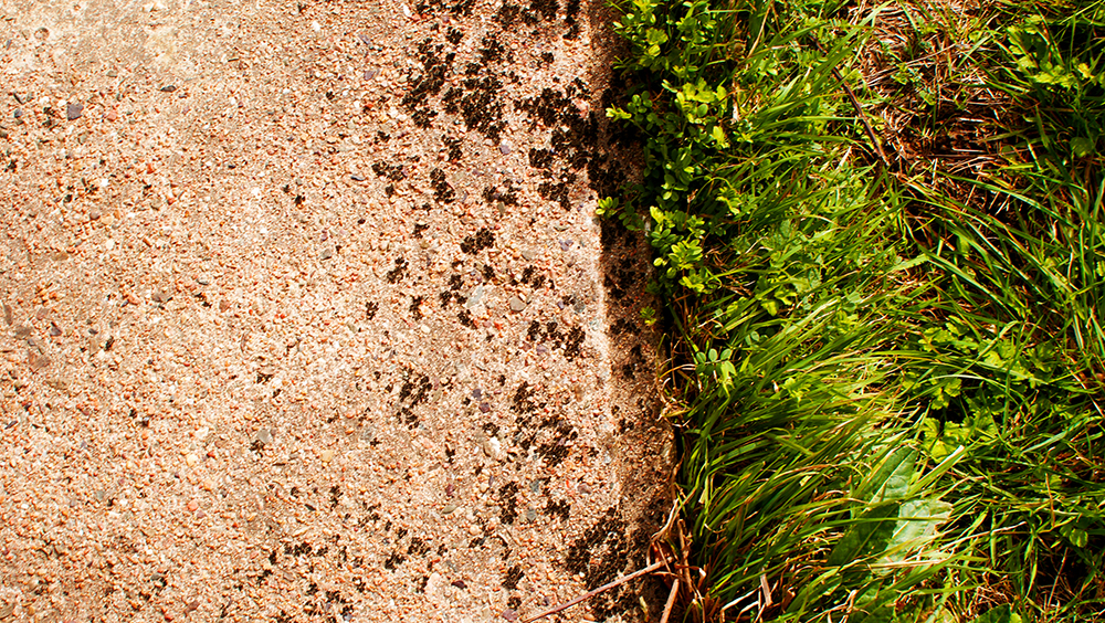
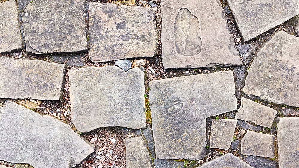
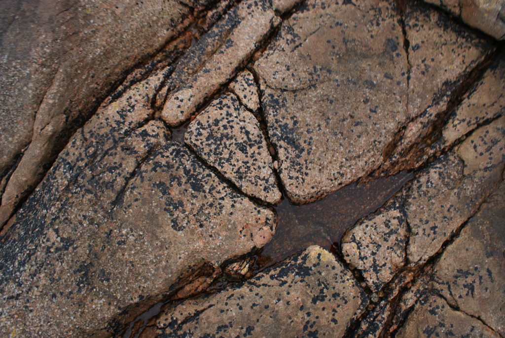
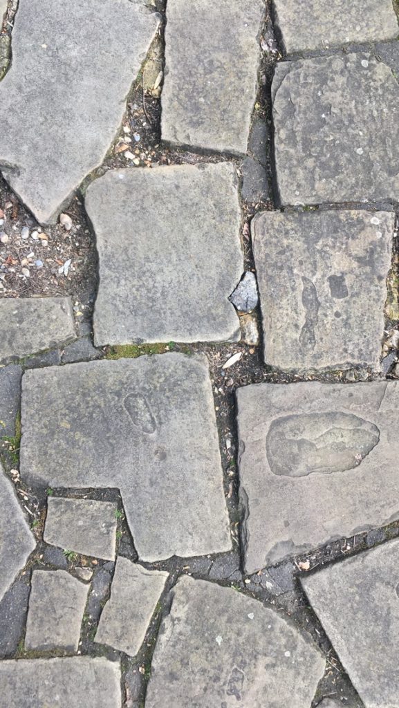
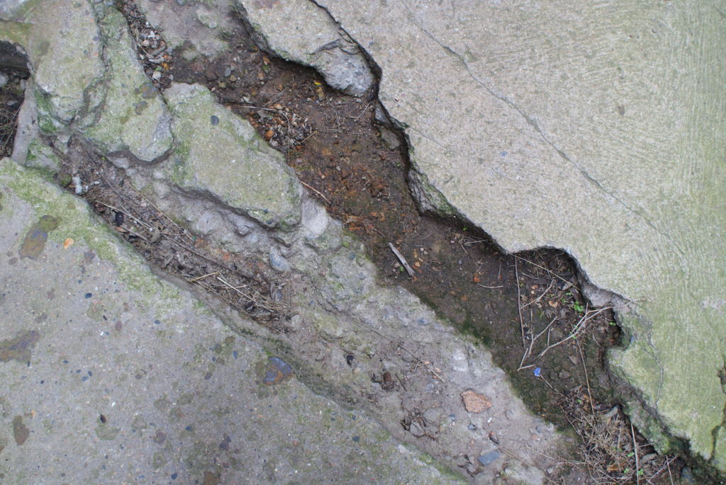
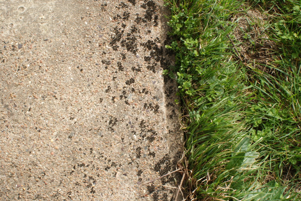
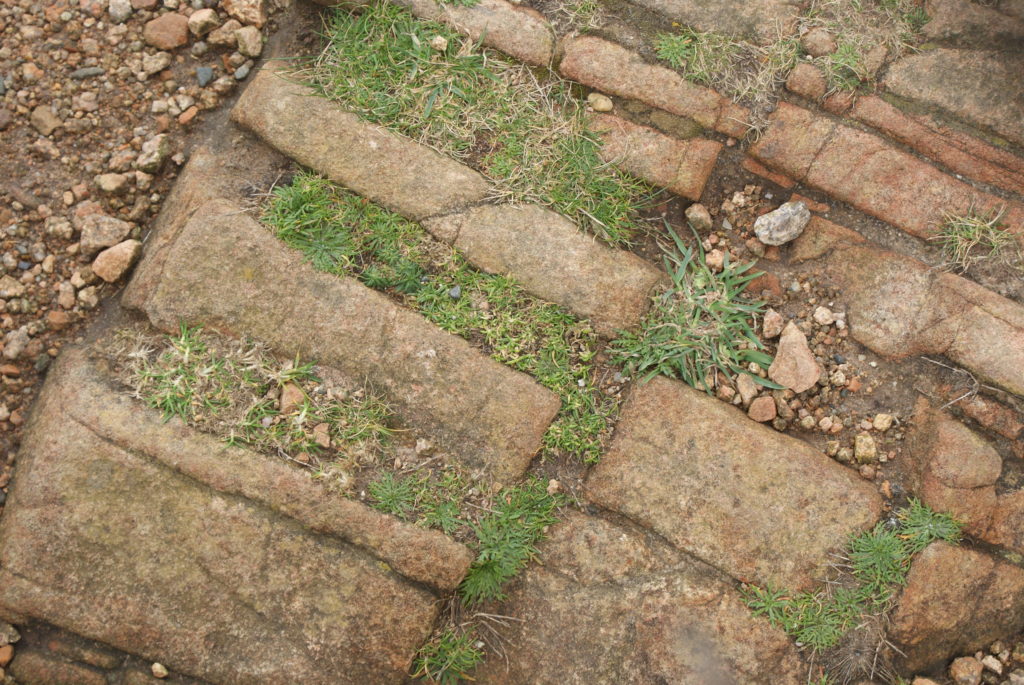
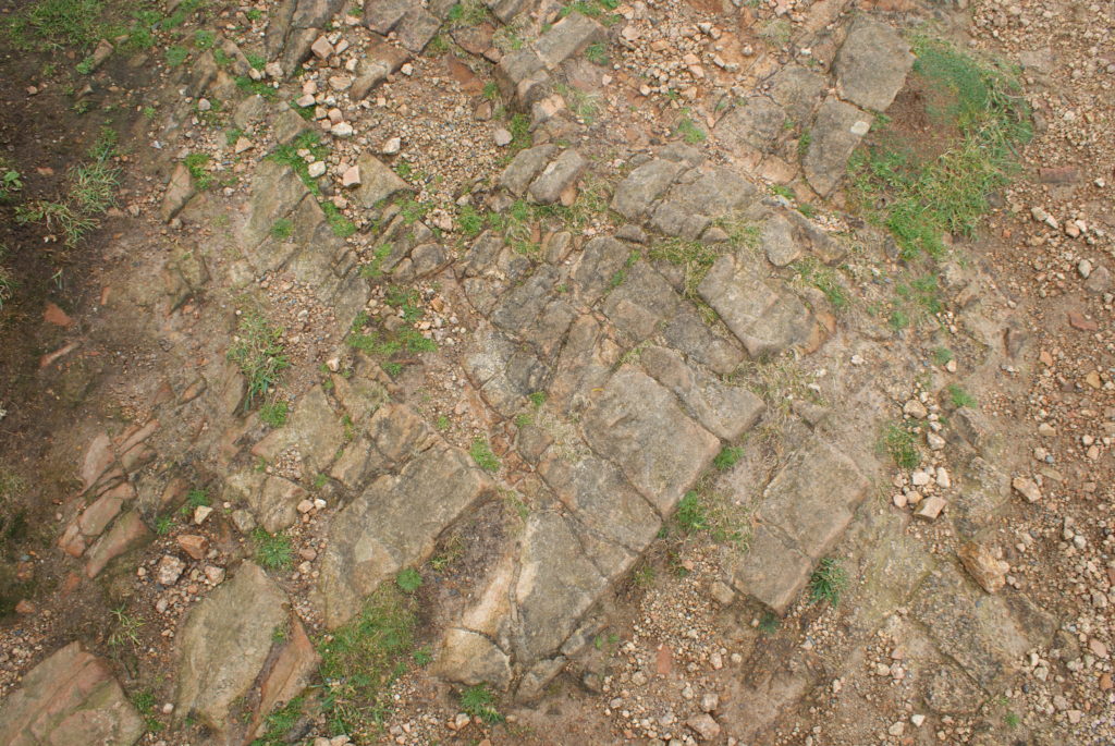
I then started to look at The Boyle Family, a group of photographers who travel around and take pictures of floors which they find interesting, unique and has some sort of history to it. I chose these photographers as the way they took the images related to the themes, where they traveled around many different places to find the right picture, and what they took photos of, pictures of floors which have been on their own journey, changing over time. The photoshoots I took for these were simple and needless to say, I enjoyed taking the abstract images. I managed to take around 300 images, from places all around Jersey and Central London, many of which have some interesting history behind it. I chose 6 of the 300 images I took, and was originally going to display them on a large cube, but as I wasn’t able to make it in time for the exam, and wouldn’t have enough time during the exam, I decided to put them on a large piece of black card instead, with them doing down in the middle, and with one side of the images being more elevated than the others, in some way making them look like stepping stones.
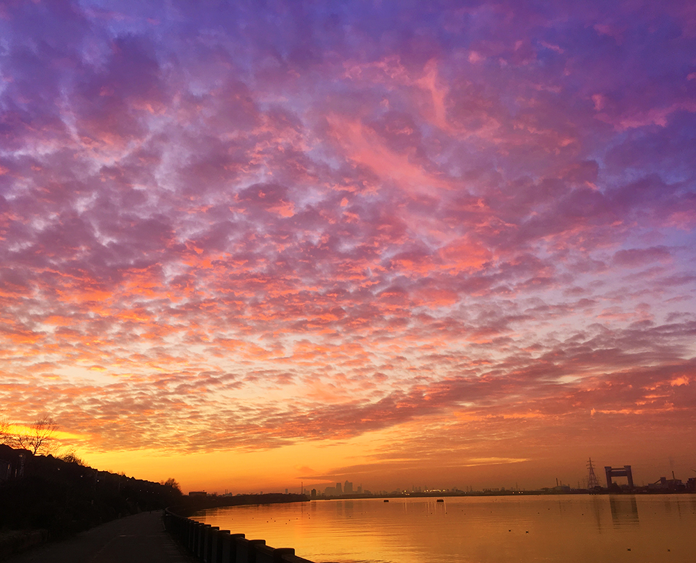
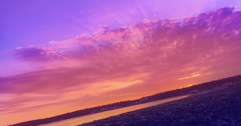
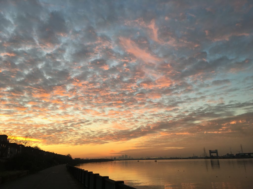
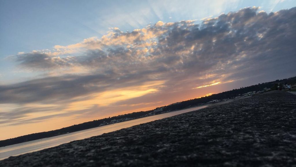
For my second photoshoot, I looked at Paul Reiffer, a photographer who takes stunning pictures of scenery, mainly in the sunset and sunrise area. I chose him because he did what I wanted to do since I started the theme of Journeys and Pathways, pictures of sunsets, which can relate to my theme as the sun makes a journey across the sky daily. Reiffer’s images are particularly colourful, with many colours such as purple, blues, yellows and oranges. I enjoyed taking pictures based off of this photographer the most, as i’ve always been interested in landscape and colourful scenery, For my final images, I chose two of those which I based off of him, one being a sunset in St.Helier and the other being one at the River Thames in London. To get it as colourful as his, I added colours on different layers on top, and then reduced the capacities until i got the desired outcome I wanted. To display them, what I did was create two window cuts into a large piece of black card, with one of the images being longer than the other below it, as that’s how it was when it was printed out.
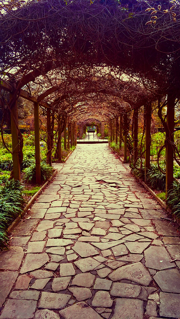
For my final photoshoot, I focused on Mikko . Although I wasn’t able to replicate the nighttime skies he implemented into his photos, I still based my photos on his pathway works, finding interesting pathways which could be edited in a way which made it stand out. I chose one image for my final piece, and it was of a pathway in Peckham Park, London. I first edited it in photoshop, increasing contrast, brightness and vibrance. When it came to framing it, I cut it into 6 separate pieces, and then stuck them onto a small piece of black card, with each strip getting higher and higher as it went along, since I stuck strips of card together to make platforms. I did this to make it similar to how stairs look, which could also relate to the theme of Journeys and Pathways.
Overall, I enjoyed this theme from the start. There were lots of ideas I could implement into my work and it was hard limiting them down to only a few choices, however I am pleased with my final pieces and how they turned out.
For all of these images, I took the same approach when it came to the editing. I increase the brightness and contrast in each of them, to lighten them up but also give them depth and shadows, and then changed the curves and exposure. I then went onto the vibrance, hues, saturation and colour balance and changed them all in the same way, increasing the vibrance significantly, the saturation only a little bit to add bit of a more intensity to the colour, brought the hues into the negative part of -15, and changed the colour balance to the number squence of 10, -5, -10, which in the end resulted out with the images i’ve come out with now.
A4:
To edit this image, I went to increase the colour dramatically. I added an extra layer and used the paint tool with the soft edged brush to add a little bit of orange in the middle of the image, which you can barely pick up when you look at it, but still makes a difference compared to the original image. I then increased the brightness, vibrance and contrast in the image, and played around with the colour balance, hues and saturation to get to outcome I have now.
A3:
After cropping them to my desired length, cutting out anything unnecessary, I went to edit them in the style of Paul Reiffer. To do this, I added extra layers on top of the original image and used the paint tool with a soft edge brush to add colours such as blue, purple, pink, orange and yellow. I then reduced the opacity low enough until I got my desired effect, and then merged all the layers down so it made one layer in total. I did this to add more vibrant colours to the images and make them stand out in a way which Reiffer’s work does. After this, I played around with the brightness, contrast, and vibrance, increasing them all and making the colours stand out more. I then changed the hues and colour balance, having the images have more of a blue, purple and yellow tint to it.
For my final response to the theme of Journeys and Pathways, I chose these images:
A5:
SONY DSCSONY DSCSONY DSCSONY DSCSONY DSC
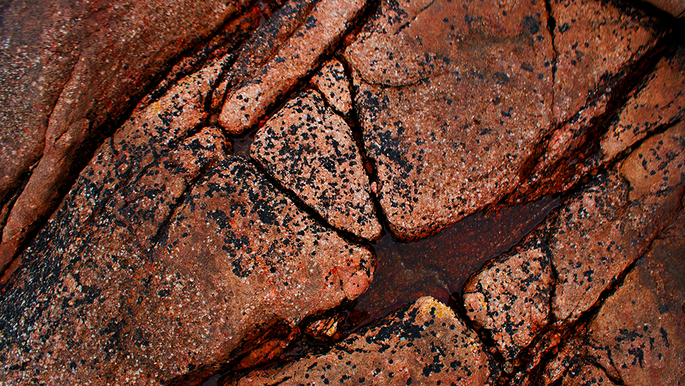
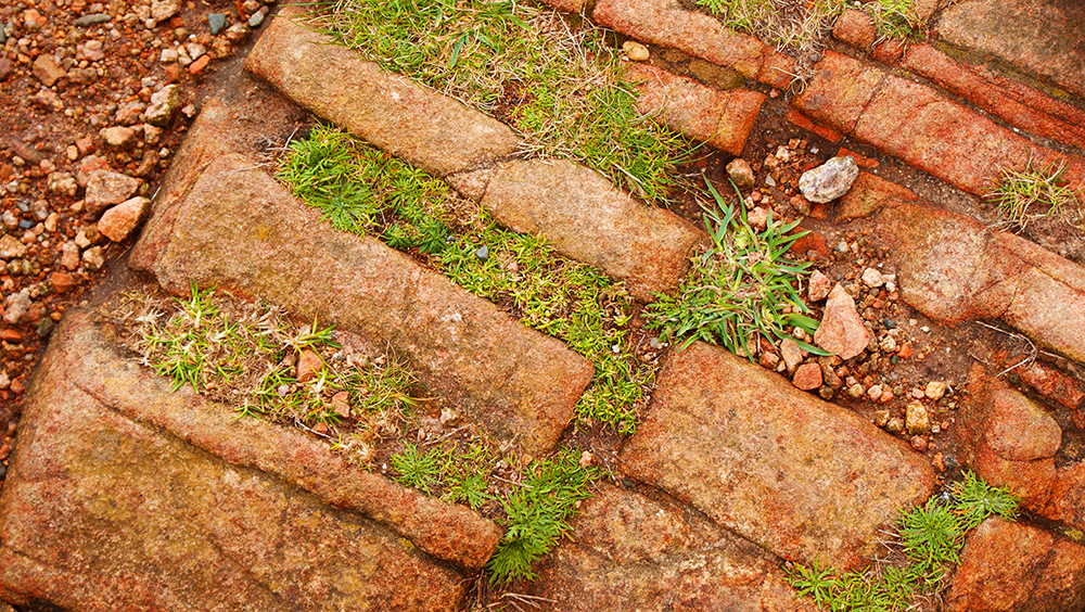
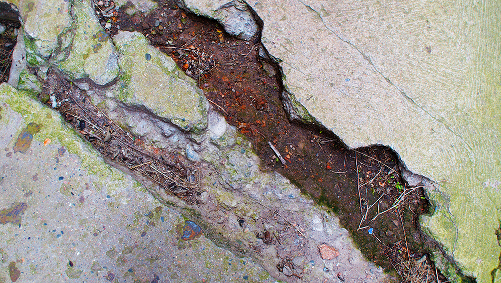
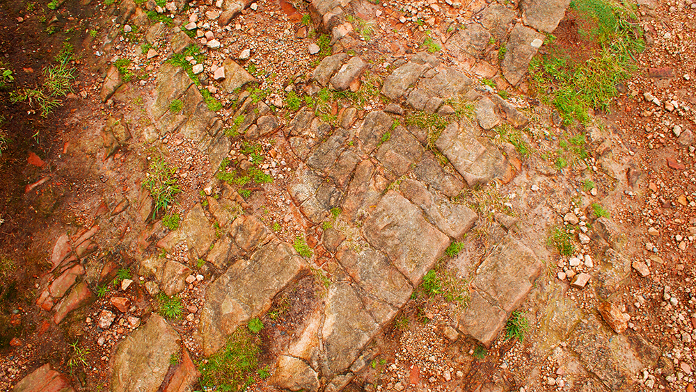
I chose all of these images because I beleive they relate to the theme of Journeys and Pathways, and each of the places where these images have been taken have a history and have been through a journey. For example, the first image of the rock is from Corbiere, the lighthouse in Jersey, where a groundskeeper drowned while trying to rescue visitors who were stranded at the lighthouse when the tide came in. The second image is from The Sexby Garden in Peckham, central London, where the park was created in 1906 on land which used to belong to the last farm in Peckham. The third image is from Noirmont in Jersey, the floor where German soldiers walked over when they invaded the island and built their bunkers and cannon holders. And the last two images are from Grosnez castle in Jersey, which was created in 1330 to provide local farmers refugee from French attacks, but was mostly destroyed in the mid 1600’s. These images were inspired by The Boyle Family, who go around taking pictures of floors which seem interesting.
A4:
I chose this image alone because I think there can be much done to it which can result in an amazing final image. Although I wasn’t inspired by any photographer when taking this image, I believe that I could distantly relate it to the work which Mikko Largerstedt does. Although this image wasn’t taken at night, it does focus on the aspect of a pathway, which some of Largerstedt’s works do. With some editing and adding of colour and vibrancy, I believe I could relate it even more to his work.
A3:
These images were chosen because I think they were the best out of all the pictures I took for sunsets and sunrises. They both seem dramatic with the clouds and the colours, with the setting and rising suns hidden from view but their light still significantly visible in the images. I also think they’d work best with the photographer Paul Rieffer, who takes pictures of stunning sunrises and sunsets with amazing colours and views. With some editing, I believe I can replicate what Rieffer does.
For my photoshoot for Paul Rieffer, I took images of sunsets at multiple different times, trying to get the most colour outcomes very time to make it easier for when it comes to editing my final images.
Contact sheets:
Final images:
Final images:
I chose these final images because I believe they relate most to the photographer I am influenced by. They are interesting pictures of sunsets and include clouds and sky which can be manipulated and edited to look like Rieffer’s colourful work. All I would have to do is create multiple layers on top of each image and add colours such as purple, blue and yellow to patches where I think they would look the best, and then reduce the opacity until I get the desired outcome i’m looking for.
As a continuation of my experimental photo shoot to collect images which I could use in the future, and to gain ideas of what I could focus on for my final piece, I took a few more images which I believe could relate to the theme of Journeys and Pathways.
As a landscape and cityscape artist, Paul takes his viewers to the heart of some of the world’s most stunning travel destinations through his iconic and vibrant luxury fine art photography. His work has featured in exhibitions all over the world, from Times Square in New York to the Royal Albert Hall and Houses of Parliament in London, with gallery installations in Europe and Asia.
Paul returned to the UK in 2015 to focus on commercial projects, having spent the previous 3 years in Shanghai capturing vivid landscape and cityscape photographs of the eastern hemisphere.
With experience working on both sides of the lens, as a professional photographer Paul often sees things differently to others and he uses that ability to capture images which are truly unique.
Many of Reiffer’s images include stunning sunsets and sunrises paired with extremely colourful landscapes and skies.
Paul Reiffer
In this image you can clearly see city silhouetted against the setting sun and the ombre sky. The colours in the photo are saturated, the purple in the sky and the orange reflected on the water almost seeming unnatural, but giving the image a special effect. The image seems to be split into two parts, with the city and bridge being the line that separates the sky and the water. The photographer made a seemingly boring city into something almost mystical and magnificent. It’s clear how the photographer has manipulated this photo, increasing the contrast, saturation and light, and adding a certain filter to create the purple and orange effect. The lens the photographer seemed to have used it most likely to be a wide angle lens, to get the entire landscape into the image, and the light sensitivity of the image must be low, as it’s crisp and clear instead of a grainy texture which it would have if it had been increased.
Boyle Family is a group of collaborative artists based in London. Mark Boyle and Joan Hills met in Harrogate, Yorkshire in 1957, Joan a single mother who had left her art and architecture studies to bring up her son and Mark was serving in the army. Within months they were collaborating, initially exhibiting their work under Boyle’s name until their work became widely known and they exhibited as Mark Boyle and Joan Hills. When their children, Sebastian born in 1962 and Georgia born in 1963, began to collaborate with them from the late 1970s onwards, the group became established as Boyle Family.
Boyle Family is best known for the earth studies: three-dimensional casts of the surface of the earth which record and document random sites with great accuracy. These works combine real material from the site (stones, dust, twigs etc) with paint and resins, preserving the form of the ground to make unique one-off pieces that suggest and offer new interpretations of the environment.
Their project ‘Journey to the Surface of the Earth’ was launched in 1968 – 69. After being blindfolded, they threw darts at a world map, in order to pinpoint 1,000 areas of the earth’s surface to duplicate. On travelling to a selected site, the Boyles would throw a T-square in the air to select a random area to replicate.
The Boyle Family
Visual:
In this image done by the Boyle Family you can clearly see what is the side of the road and part of the pavement next to it. At first glance there’s not much to the image, but with closer inspection you can see all kinds of details and history within the part of the floor they decided to take. You can see every individual texture on the surface, the cracks on the pavement and the light hitting the bumpy surface of the road.
Technical:
The lighting coming from the left side of this image seems a bit artificial, as if coming off of a street light since it’s only lighting up that part of the image and, from what I see, nothing else. As this image is actually a painting replicated from a photo that the Boyles took, it’s hard to asses the technical factors of it but what I can say is that, to take this image which they painted from, it looks like they might have used a long-lensed camera to get that close-up, focused effect in the image.
Before I started to do photo shoots based on other photographers, I wanted to get a rough idea of what would be good to photograph to start me off on the theme of Journeys and Pathways. As an experimental photo shoot, I went out on multiple occasions and took pictures of what I thought could fit into the concept of the theme.
Contact sheets:
In these images I concentrated on getting images on which I thought could relate to the theme. I took images such as actual pathways, the water and waves coming in on the beach, pictures of my feet walking, pictures of the view from when I was on a plane, and footsteps on the beach.
Chosen images:
Final edited images:
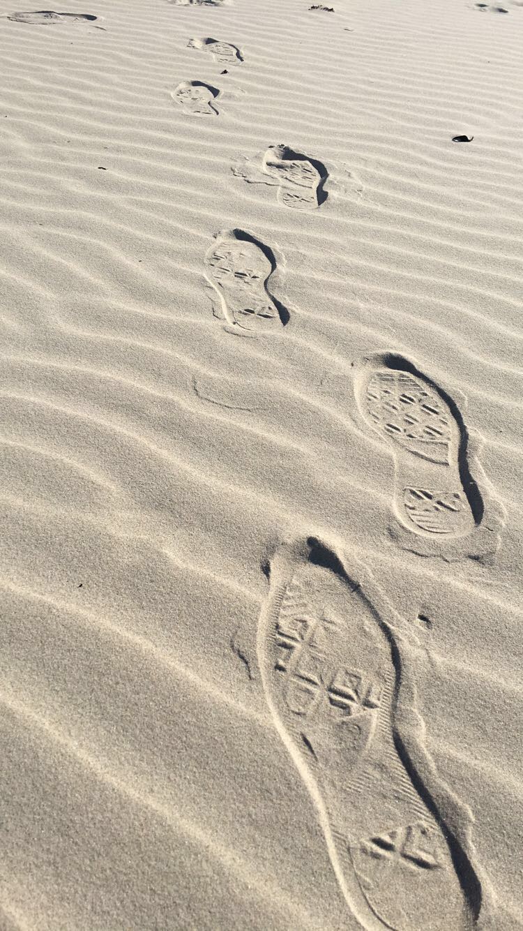
In this image I decided to add more colour and to blur out the further steps to create more of a depth to the picture. To do this I first cropped the image to get out the unwanted parts in the background and then played around with the brightness and contrast, increasing them both equally to lighten the light areas and darken the shadows. I then went and increased the exposure a little bit, and increased the vibrance and saturation a significant amount, making the sand look more golden. I finished with changing the hues in the image.
What I like about this image is the neatness of it, the sand around the footsteps seem calm and natural, and then the footsteps in the sand bring some sort of chaos with them, messing the sand up as they go. This could portray the effects which the journey of someone can bring, making their imprint on the surroundings around them. I also like how the image becomes darker as it comes closer towards the camera, as it adds to the depth of the picture.
What I should have done to improve the picture was to maybe angle the camera more upwards, maybe getting more of the surrounding beach which would have added more to the image. I also think I should have maybe darkened the edges of the image when editing, which would have given it a nice effect and made the viewer focus more on the footsteps than the actual sand.
In this image I decided to edit it only a little bit. I first cropped the image so it was smaller and focused more on the moving leg, and then I went and increased the brightness and contrast in the picture. I then followed on by going straight onto the vibrance and increasing that only a little bit to give the image more of a colour to it, and then finished off by using the dodge tool to brighten the whites of the shoe, making it pop out against the dark background and rest of the shoe.
I like this image because it has a certain movement to it, as if the person in the image is in a rush to get to a certain destination, and I feel as if that’s clear in the image. While the surroundings are all blurred and moving, the foot in the middle of the image seems to be more focused than the rest of it, although it too was caught in the middle of movement like the rest of the image, and I feel like that gives it a nice affect.
However, I feel I could have done better with this image by getting it more focused on the foot and leg in the image. While it’s not as blurry as it’s surroundings, it’s still a bit out of focus and I think it would have been more successful if I had been able to get the camera to focus on it a bit more.
In this image, I wanted the viewer to focus more on the path and less on the beach surrounding it, so to do this I started editing this image by dropping it down to a point where the stone pathway was the only thing you can see in the middle of the image, removing the sky and most of the sea out of the photograph. I then blurred out the surroundings which were further out, and a little bit around the image to make it easier to focus on the pathway. And then, to add a bit of colour and light, I increased the brightness and contrast like i’ve done on my other images, and then increased the vibrance and played around with the hues until I got my desired outcome.
What I like about this image is that the stone pathway is right in the middle of the image and continues vertically until right to the end, which was the effect I was looking for. I also like how each side of the pathway are different, with one side being nice and sandy while the other side seems almost swamp-like and covered in seaweed, which could be interpreted in many different ways.
Although, what I don’t like about this image is the quality. Since I took it on my phone, it didn’t come out as good of quality as a digital camera would take it in, so I think i’ll be re-taking this image again but using my camera instead of my phone, and see what kind of results I get, and hope that it’s much higher quality then what the phone could give.
Travis Huggett is a New York City-based photographer who grew up in Rhode Island. He earned a BFA in photography from The Pratt Institute in Brooklyn. Working primarily in portraiture, advertising and fashion, his photos have been exhibited in New York City, Boston and Connecticut. His work has been seen on billboards, as album covers, and on his mother’s mantelpiece.
His work consists of people getting on with their lives on a bus. It shows them taking a journey, whether that be from home to work or on their way to the airport to travel the world. It shows the reality of the real world.
‘For years I’d watched the buses move through the city streets at night, the interiors glowing, the windows framing the riders. They looked to me like photographs. In 2013 I started shooting through those windows. I would wait at bus stops and red lights, quickly scanning the windows for interesting subjects, hoping they’d be in the right seat, in the right light. Over time the photos started feeling less like individual portraits, and more like a broader portrait of my neighborhood and my city.’ – Travis Huggett
travis huggett
Visual response:
In this image you can see a man standing up on a bus, with at first glance he seems to be looking directly at the camera, however as you look closer he seems to be gazing off at something else, maybe at nothing, seeming unbothered or even too tired to care about the fact that a random stranger was taking an image of him. The way he looks gives us in insight into about hard and tiring the daily life of a person can be. The black outline of the window creates a simple yet effective boarder which frames and makes us focus on the subject. The dirtiness of the windows also adds a realistic factor to it, showing the true reality of every day lives of people in New York.
Technical response:
The subject seems to be more focused on compared to the people around him, who seem a little blurred and out of focus. From the image, and how he took it, it’s most likely that he used a long-lensed camera to get the close ups of the photographs he got. It doesn’t look like he did too much editing to the image, the most I think he did was adjust the lighting and the contrast, making the light in the image stand out more. Also, this photograph could also follow the rule of 3s, since there are three people in this image.
Contextual response:
This image was captured for one of his series called Last Night At The Bus Stop. Before he captured images like the one above, he would often feel a strong urge to, due to the interesting people, the light, the windows framing the subjects. He found those all interesting and thought he’d take advantage of it by shooting through the windows, catching interesting characters in their daily lives. He would wait at bus stops at night, look for people who he thought would be perfect for this photoshoot, and wait for them to get into a good light. Then he would take his image.