
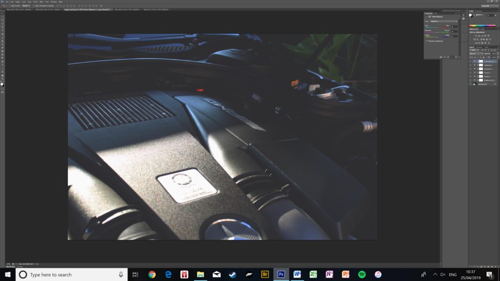
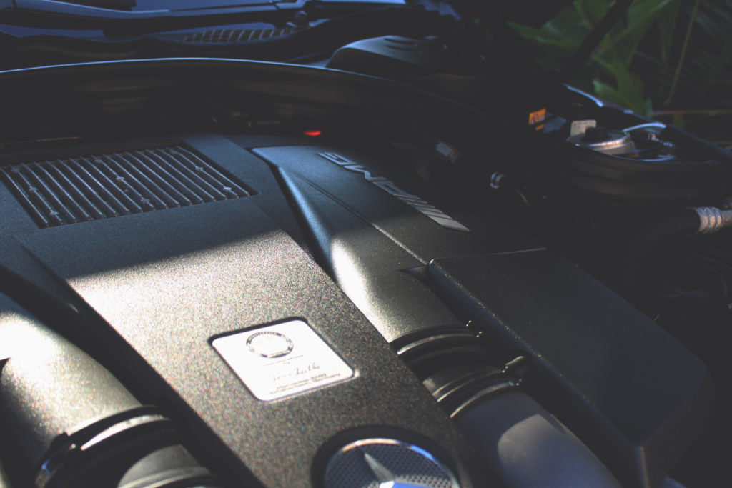


The following images are my favourites from the second photo shoot; they have all been edited in varying amounts, from colour grading to applying colour masks and special effects.


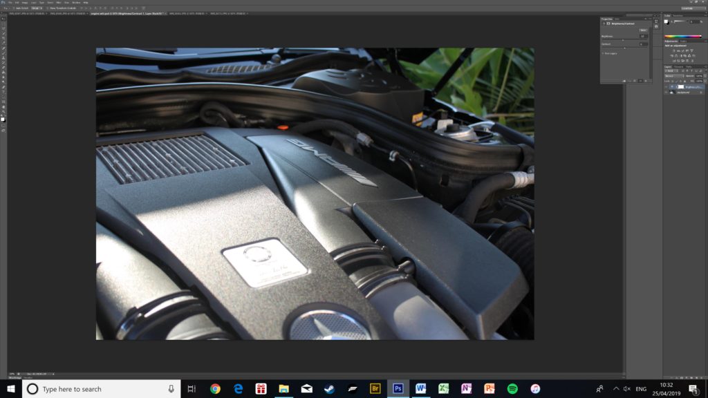
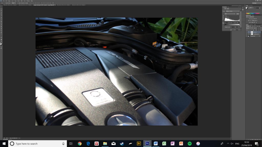
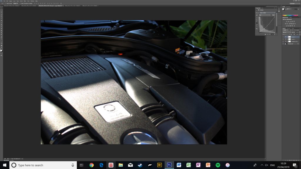
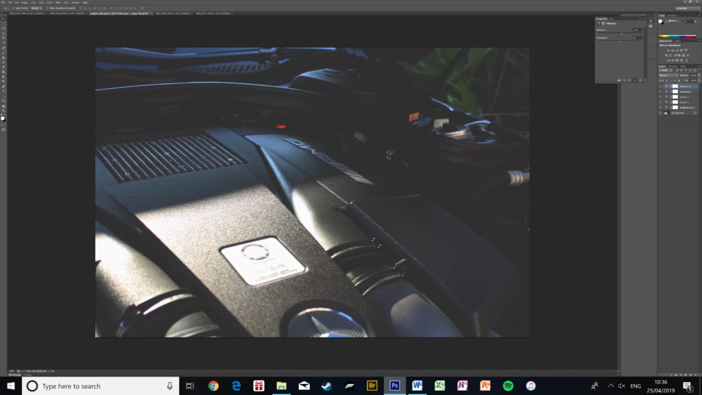
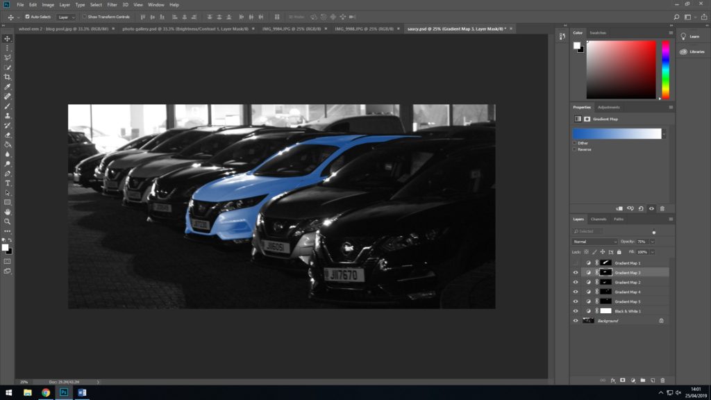
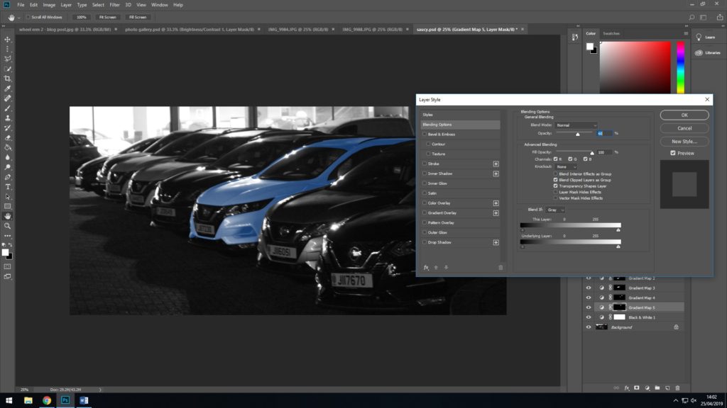
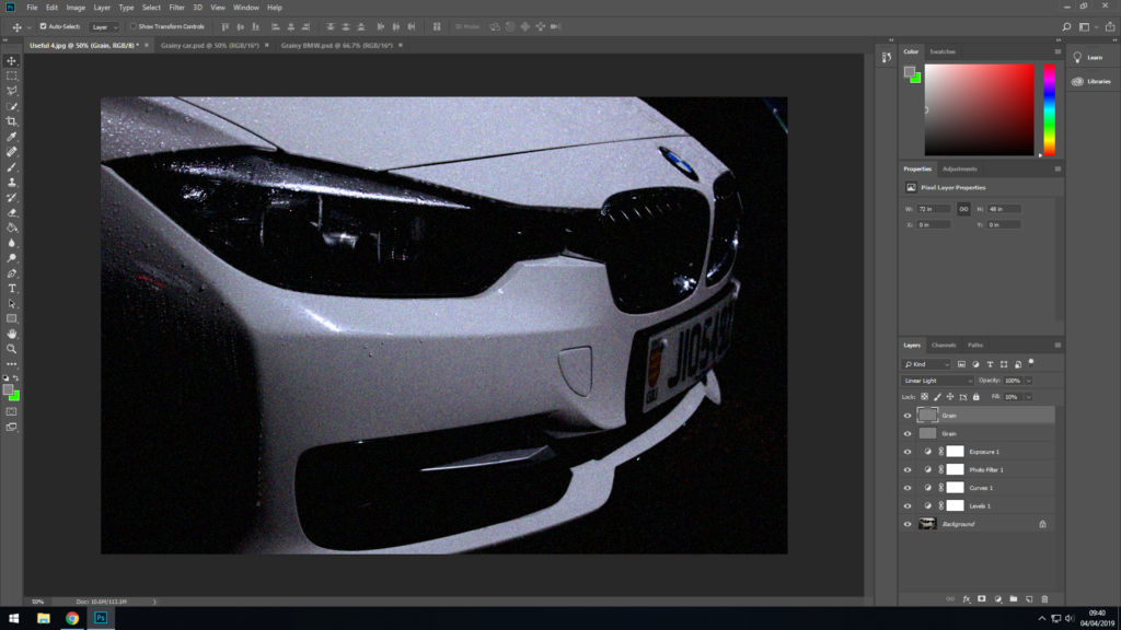
This is the editing process of one of the photos from my second photo shoot. It mostly focuses on colour grading
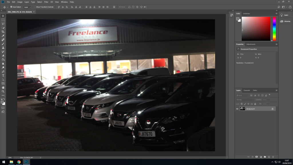
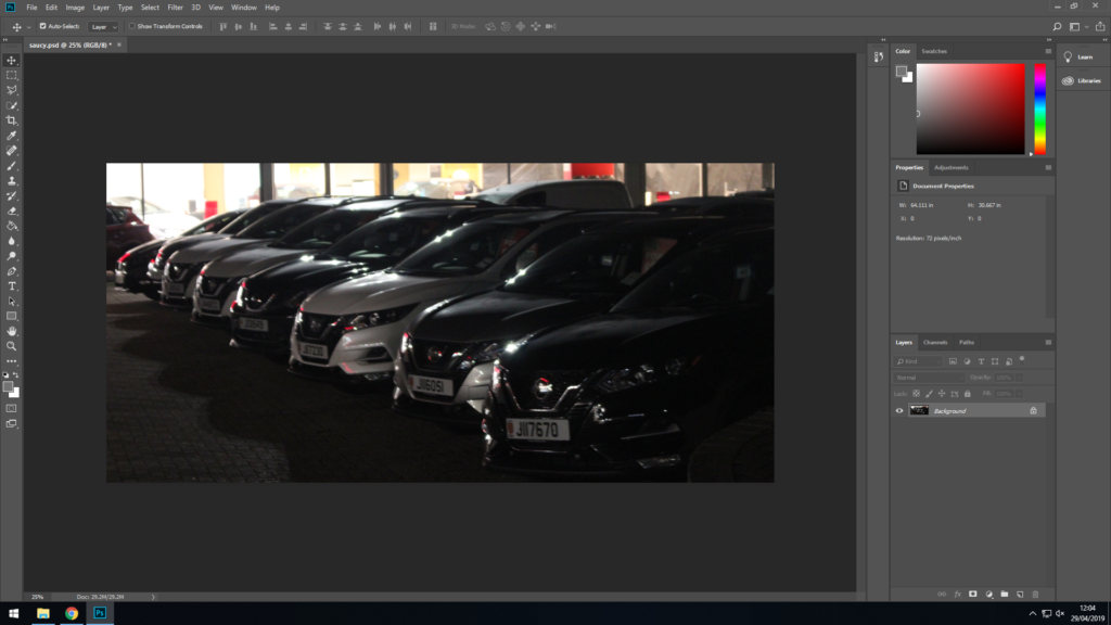
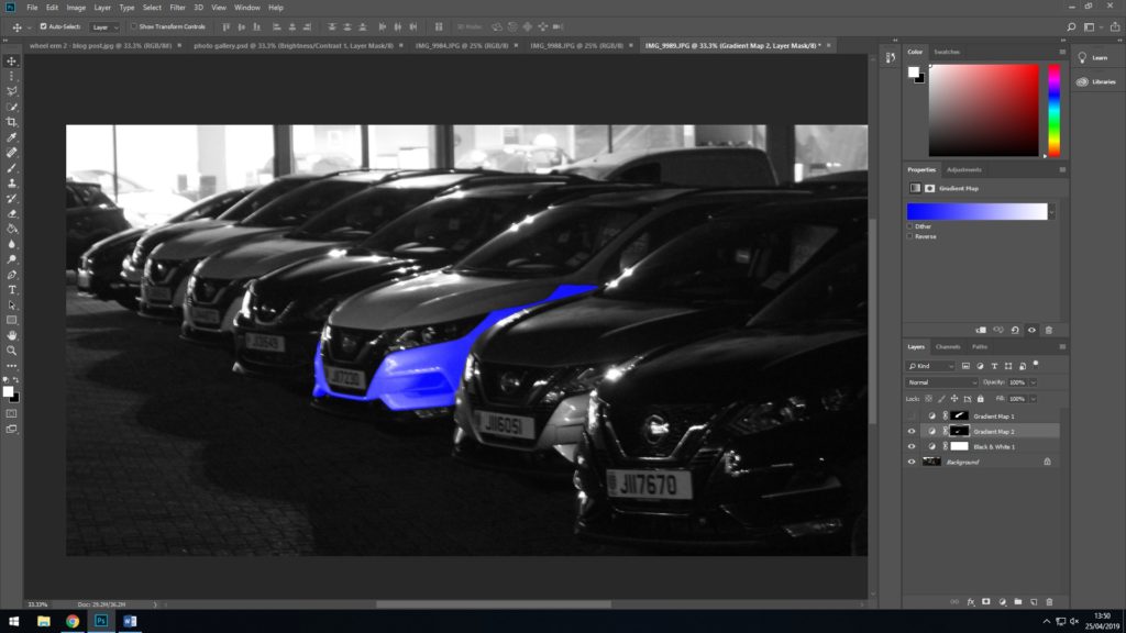
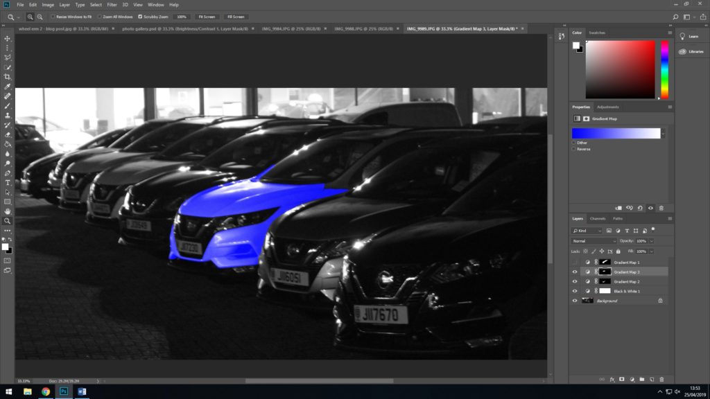
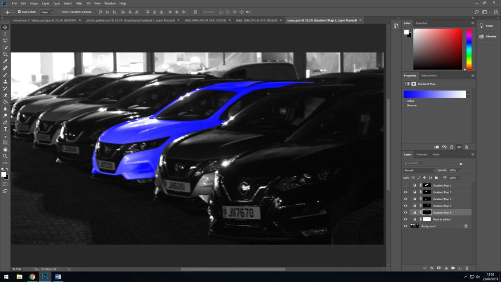
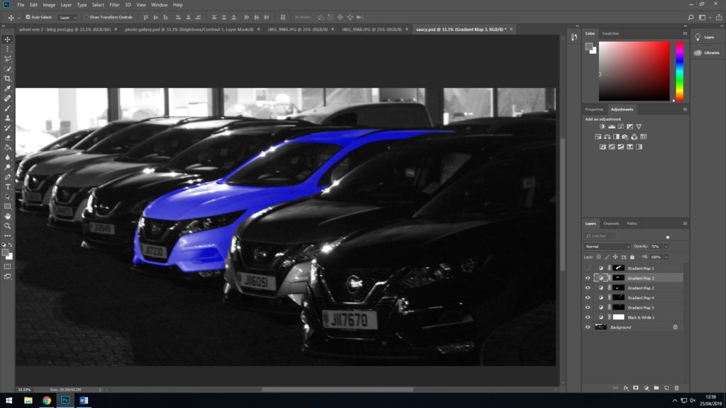
The following three images are screenshots of the steps in which I applied the colour mask to the photo. I did it in steps so that if I made an error I wouldn’t need to start over.
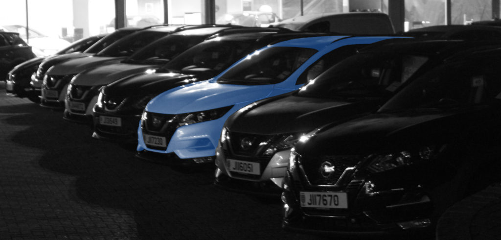
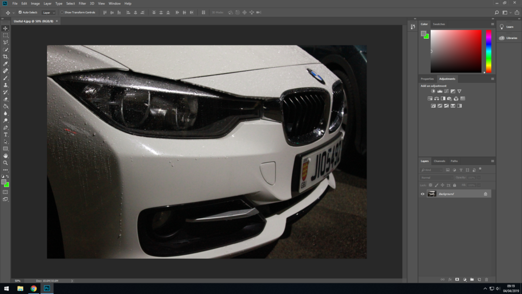
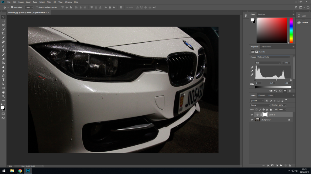
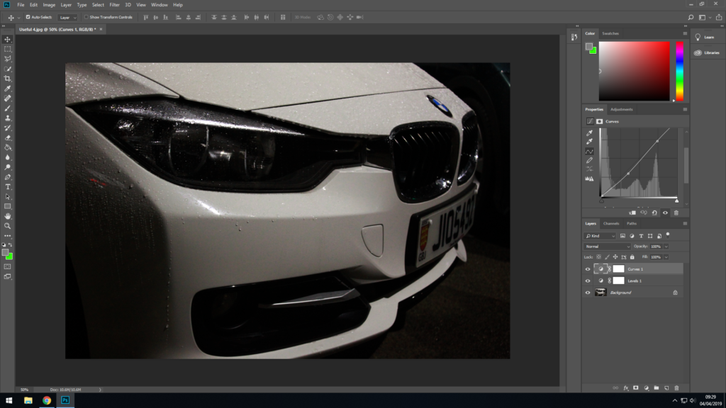
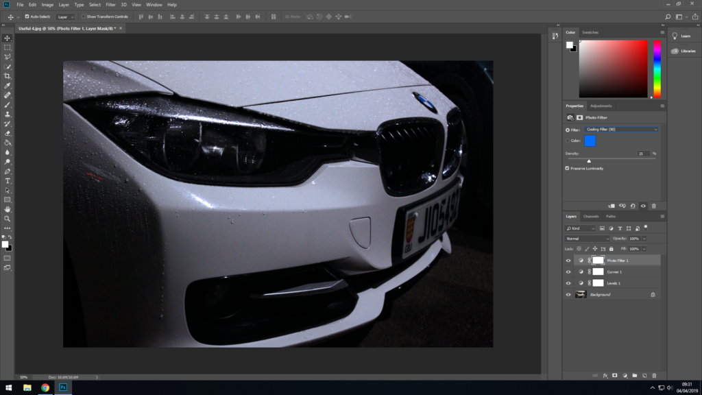
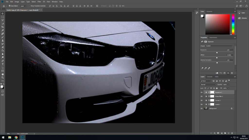
These are the two final photos I have come up with after editing the original.
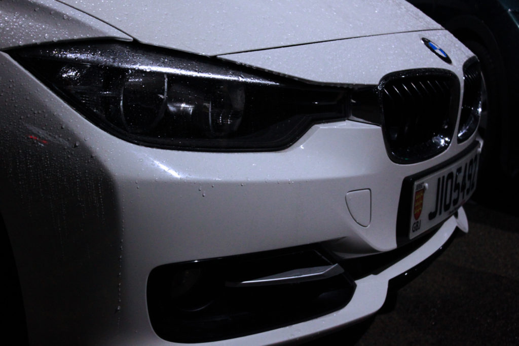
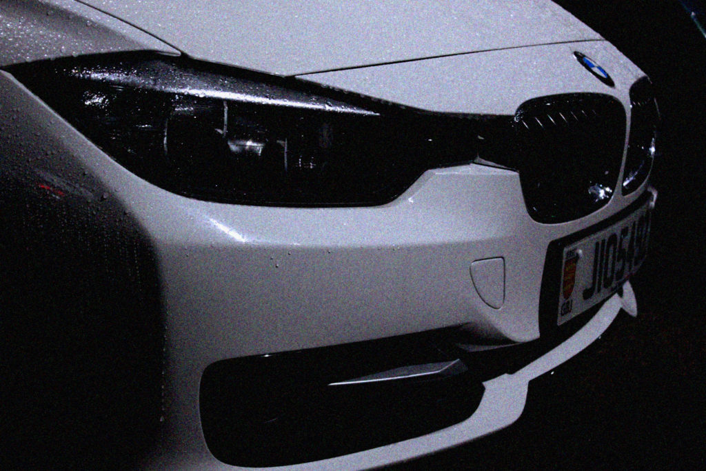
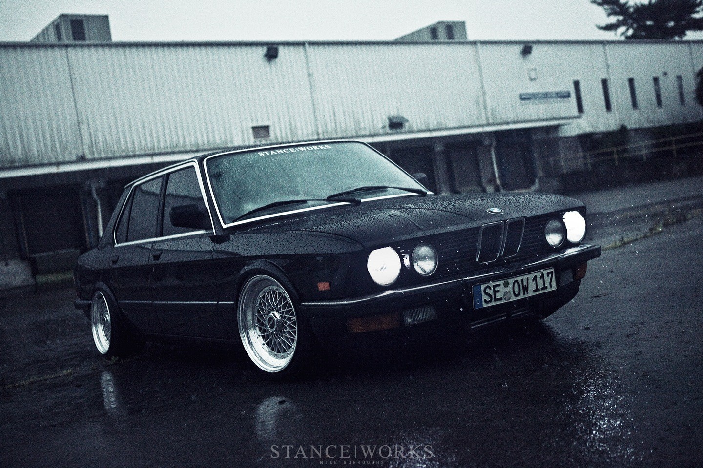
In this photo shoot I learned from the mistakes I made in the first photo shoot and took sharper images at more intriguing angles. It was also raining during this photo shoot; which helped reflect lights off the paintwork of the cars and make them more shiny in general, as well as create extra details which make the photos look sharper.

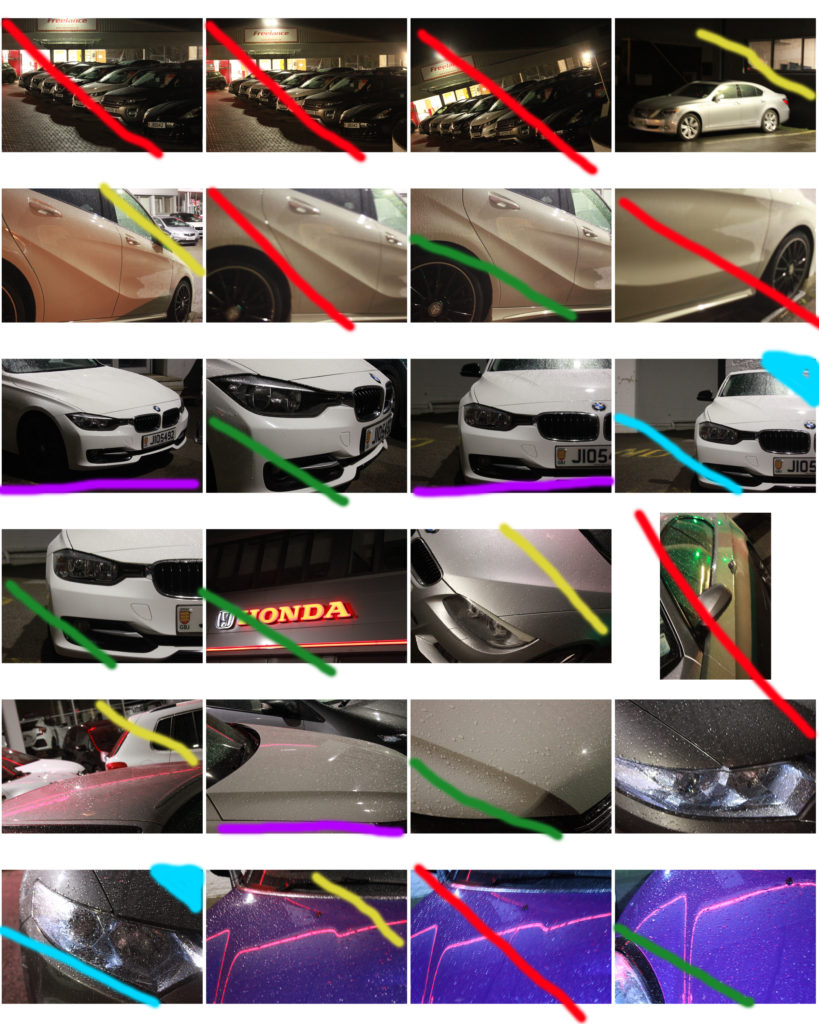

These are the final images from this photo shoot. They aren’t as good as I wanted them to be, but I have learnt from this photoshoot so I won’t make the same mistakes in the next shoot.
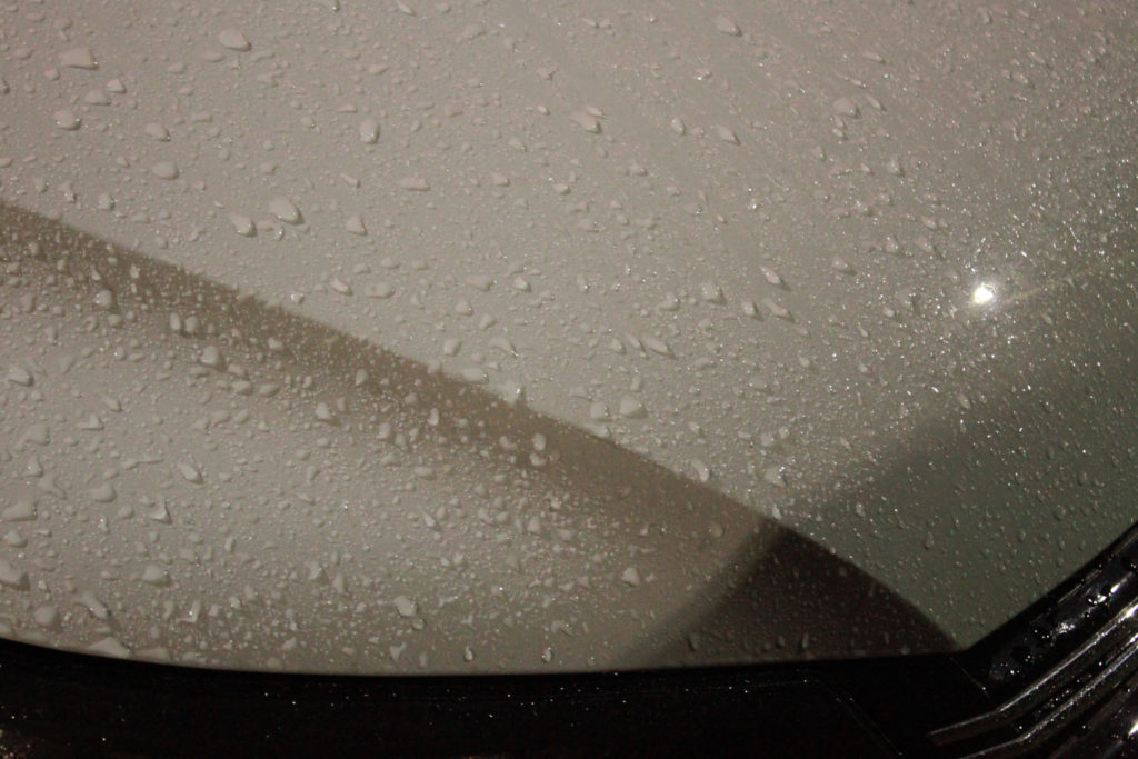


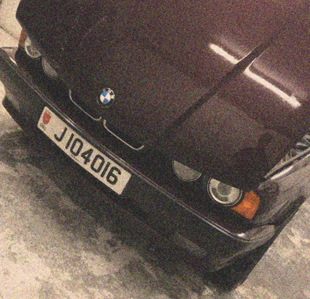
Although this photo shoot was supposed to be inspired by Easton Chang, I have decided to use it as more of a test to experiment what I enjoy/am best at taking photos of, that’s where the lack of theme throughout the photos comes from. I will use my next photo shoot to take the best photos I possibly can using the knowledge I’ve learned from this test.
I have decided to scrap most of the images from this photo shoot as they are either slightly blurry, or not to the standard I anticipated them to be. However, there are one or two photos which I liked from this shoot and have therefore used.
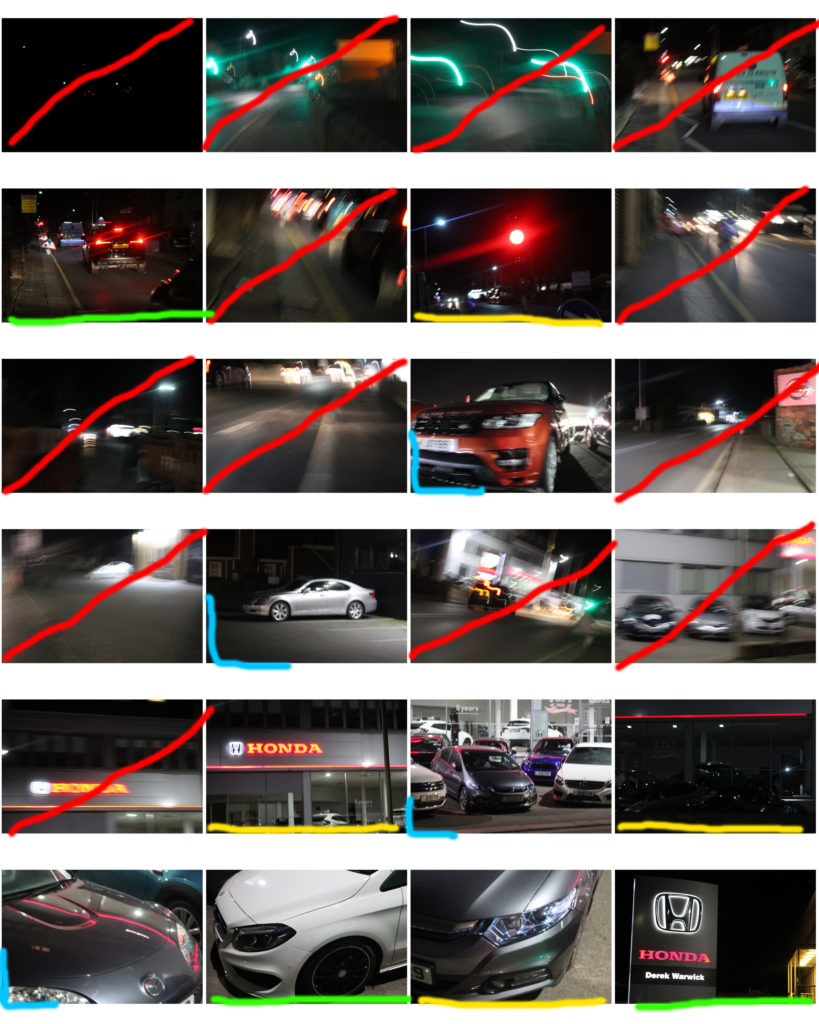
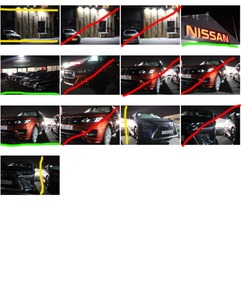
My first photo shoot will be based on cars, and partially the scenery around them. I will most likely edit them afterwards to look like grainy 90’s photos, this will give all the photos a common theme which will help them fit together more as an exhibition. The coursness might also help distract the eye from imperfections in the photos. I will also take some inspiration from Easton Chang (a photographer I have previously researched) in the form of using colour very sparingly in these photos. If
Easton Chang is an award winning photographer who specializes in capturing advertising and commercial photographs. His work is based in Sydney, Australia and comes to cover North America, Asia Pacific and Pan-Europe. He captures his automotive photographs in studio and on location to achieve the best results. He has received several awards for his creative and stunning photographs such as 2013 Australian Advertising Photographer of the Year, 2012 Australian Advertising Photographer of the Year and 2011 Automotive Photography Awards Judging Panel.
These are my favourite photos by Easton Chang:
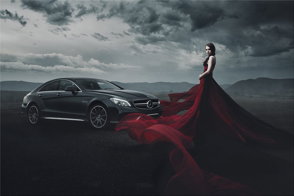
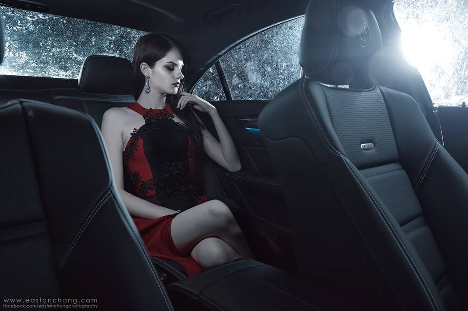

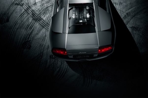
 This is my favourite photo by him, its main features are strong, bold shapes throughout. The sculpted shape of the car in the middleground strengthens the image and adds structure to it. The lighting of the photo helps achieve these shapes and lines, it is angled to catch the different depths of different areas of the car. The woman in the dress in the foreground as has very strong shapes But these aren’t as straight and organised as the ones of the car, but they have a deep red colour and real sense of depth which makes the photo much more eye catching. This is strengthened by the red dress being the only element of the photo which has strong and brighter colour. It also draws your eyes to the right side of the photo, and away from the centre which is the weakest point of any image. The lighting also changes throughout the photo, as you look from left to right the photo gets much darker; the right side of the dress, the clouds, and even the mountains are much darker. The mountain range in the background adds more depth to the photo, it also helps minimize any blank space in the photo.
Overall, the lighting, structure, and layering help make the photo look sleek, eye catching, and full.
How/why the case study will influence my work:
He has influenced the way I will utilise colour in my photo shoots. Being very reserved with the use of colour makes the colour that is there more powerful. I will also be more careful with lighting in my photo shoots; using less lighting creates more shadows and makes shapes more prominent.
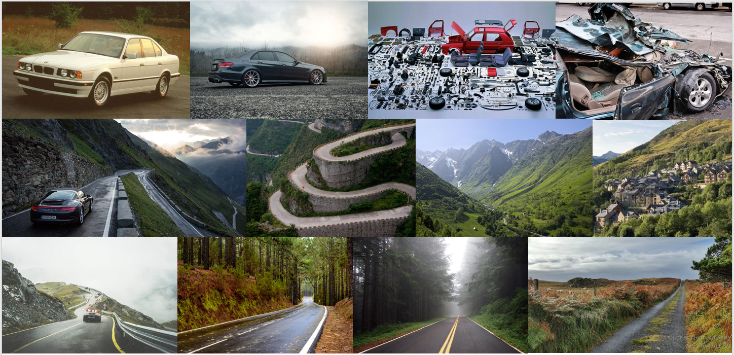 I’ve put the themes which I am most interested in doing into this mood board.
These are taking a more literal approach to the theme of ‘journeys and pathways’ as cars are one of if not the most popular mode of transport in modern society. As well as roads literally being pathways to travel along.
I am interested in photographing cars because it allows me to search for strong lines and shapes in the bodywork, whilst photographing roads also gives a chance to explores strong shapes, and sometimes curves.