All posts by Kristiana A

Filters

Author:
Category:

Evaluation

EVALUATING THE JOURNEYS AND PATHWAYS UNIT:

The overall course of action during this project I feel was very good. I started the unit not knowing the sort of path I wanted to go down in terms of the type of photos I should be capturing and creating. In the past we had explored both minimalism and portraiture but I had yet to do anything regarding landscape photography so therefore I was keen to explore this theme this unit. A major aspect of landscape photography is the theme of landscape romanticism, the depiction of landscapes in art – natural scenery such as mountains, valleys, trees, rivers, and forests, especially where the main subject is a wide view – with its elements arranged into a coherent and sublime composition. As art is one of my areas of interest also, I decided to experiment with this theme.

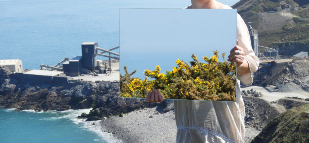
The first few photo shoot I did were quite all over the place as I did not exactly know how to Tackle the subject. I chose locations which were very well know for their natural beauty yet the final outcomes of each photo shoot were underwhelming and far from what I wanted. About half way through the project I came across a photographer called Cody William Smith on the internet. Some time ago he did a series using mirrors and landscapes, reflecting various aspects of the environment within the mirrors, with very impressive and interesting outcomes.

I decided to attempt a very similar concept as this, so I went out and purchased a large rectangular mirror, Smith used a circular one in his own photography. I did not completely want to copy his concept therefore the theme which I wanted to tackle was the urbanization of landscape. This was something which I realized during my previous photo shoots at Sorel point and Corbier. Each location was effected differently with human impact. At Corbier, the rocky shoreline was home to Corbier lighthouse, and Sorel point had physically been impacted by the quarry which was set up there some time ago, digging away at the cliff and eroding it away.

The first photo shoot which I did for this concept was quite minimal as I was not quite sure yet in what I wanted to have reflected in the mirror. To my surprise, this very experimental photo shoot turned out to be one of my most successful, I was able to capture some of the most beautiful imagery I had ever before in photography since the start of the course. I was so pleased with the outcomes in fact that I decided to take the most successful images from that shoot and automatically make them my final pieces. The images although very minimal and subtle, captured perfectly what I wanted them to.

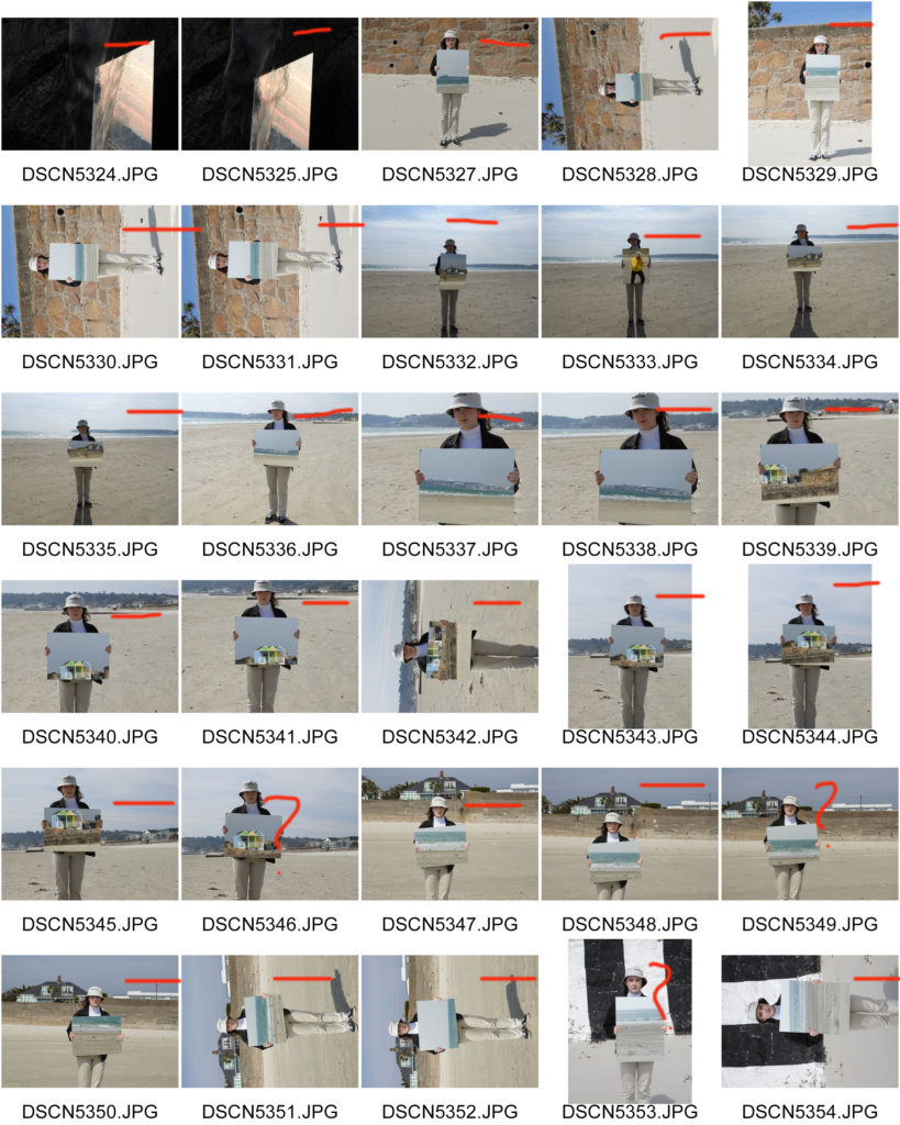
Eager to make the them of landscape urbanization more apparent in my work, I revisited Sorel point to directly capture the impact of the granite quarry. I took along with me a model, who was able to bridge the gap between nature and human impact with the presence of her hands. This again turned out to be a very successful photo shoot, with some very impressive final outcomes.

The editing process of all my final outcomes was very minimal, simply cropping, adjusting the brightness, contrast and saturation of the images. Coming up with the idea for my display box was also quite easy as I expressed the symbolism of some of the aspects in the images in a physical form. The final display boxes were also everything I hoped they would be. The only minor inconvenience I experienced whilst making them was that I expected my final prints to fill the entirety of the page instead of a small slither, yet I soon realized this was my own mistake as I cropped some of the images so much that they were now in a panoramic format instead of filling up an entire page.
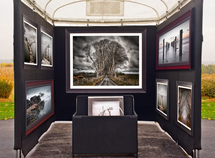
VIRTUAL DISPLAY:

Final Display Outcome

PIECE 1:

Even though both of my final displays are virtually the same, they both have various different aesthetic differences. The first set of images is fairly simplistic and minimal. The way in which we see the human impact is very subtle, for example in image 2, in the reflection we can see a man made structure yet it is surrounded by a dull and calm sea. The color pallet of the first set is a lot more subdued therefore making them great to pair with images which may be more complex or dramatic in other aspects. Both displays compliment each other nicely with the repeated display boxes and the images inside them. They are a sort of mirror image of one another, both metaphorically and physically.

PIECE 2:

Even though both of my final displays are virtually the same, they both have various different aesthetic differences. Set 2 , although similar, has some key differences which make it perfect to pair with set 1. They both follow the same theme and tackle similar issues, yet the addition of a model in set 2 means that more symbolism is added to the images. It is very much like set 1 but additional elements. Instead of having a subtle color pallet, the images are bright and saturated. They include organic and man made structures in them such as the quarry in the backdrop and the various rock formations around it. It is a lot more clear what the suggested theme is in these images as opposed to set 1, allowing the viewer to understand them with the aid of set 2. The theme of surreal nature and landscape romanticism is also a lot more apparent in set 2. The vast expanses of sea and high cliff tops in the backdrop allow the viewer to feel a sense of awe whilst looking at the images.

Making of Final Display

THE PROCESS OF MAKING MY FINAL DISPLAY:

STEP 1: In order to display my final images in a clear and interesting way I came up with the idea of displaying them inside of a cube. The first step in making the whole display was cutting out the appropriate materials. Initially I wanted all 6 faces of the cube to be clear but I ended up using 3 faces of fiber board instead. This made it a lot easier to work with as the clear acrylic sheets can be easily scratched and therefore can end up looking messy after working with them. Each face of the cube is 210 mm x 210 mm, which is the same length as the shorter side of an A4 sheet of paper. I did these measurements purposely as it would make measuring out and cutting my final prints a lot easier.

STEP 2: The next step in assembling my final display piece we gluing all the components together. The easiest way I found to do this was using a glue gun. I thoroughly coated each side of the acrylic and stuck them together, repeating this process with the fiber board.

STEP 4:I then moved onto painting the edges and part of the sides white. I did this as when I was measuring out my prints and seeing if they fit the display, I found that a small error margin was inevitable. I used white acrylic paint to make the whole piece look a lot more uniform and neat. It also meant that there was a more seamless transition between the white boarders of the prints and the edges of the display. It was overall a lot more harmonious looking,

STEP 5:I then moved onto sticking in place my final prints onto the fiber board. I used spray mount adhesive in order to secure the pieces to the wood, coating each piece thoroughly with the glue, sticking it down and using a ruler to smooth out any bumps. I used a Stanley knife to even out any rough edges of the wood and display.

STEP 6:Finally I put on the clear side of the cube and used a cloth to remove dust and other particles of the surface of the acrylic.

IMAGES OF THE PROCESS:

Assembling the materials into one half of the cube
Measuring the inside of the cube and marking the images to fit
Cutting the images to scale
Painting the edges of the cube white in order to look more uniform and neat
Using spray mount in order to stick the images to each side of the cube

Final Piece Display Idea

THE IDEA:

In order to display and present my work, I have decided to take a totally different approach to the conventional, making a sort of cube in order to showcase my work. Each element of the display will have a symbolic meaning attached to it, linking it all in with my overall theme of landscape urbanization and the title “journeys and pathways”. I have devised a plan on making my final display step by step which I will record whilst making it. The final outcome will hopefully resemble the product which I have made a mock up of below.

SYMBOLISM:

CUBE:

A cube is symbolic of many things yet the aspect which I am focusing on is the relation it has to industry and man made structures. Being such a precise and linear object, it is totally different to what we see in nature. There is nothing organic or nature about this sort of form, therefore this is why I thought this would nicely juxtapose the images which I have created that include nature. It is also symbolic of the start of surrealism in art and the evolution of art. Cubism is an early-20th-century avant-garde art movement that revolutionized European painting and sculpture, and inspired related movements in music, literature and architecture. One primary influence that led to Cubism was the representation of three-dimensional form in the late works of Paul Cézanne.

CLEAR GLASS/ACRYLIC:

The clear glass/acrylic which I will be using whilst making the cubes is symbolic of untouched nature. The faces which I will be covering with the images will be representative of the parts of our landscape which have been altered by humans, the images showing clearly the sort of impact we have had. It also allows the viewer to see each image much more clearly as opposed to if the images were opaque.

CLEAR IMAGES:

A possible aspect which I am still debating about is if to make the images clear, being printed on a clear sheet of paper as opposed to card. This is more for viewing reasons. making it easier to see the rest of the images which are situated underneath.

PLACEMENT/ARRANGEMENT:

For this display, I am making two cubes which will display each set of images separately. Although theoretically the cube would have 6 faces to display work upon, I will only be displaying work on 3 of them. There are two reasons for this choice. Firstly in terms of visuals, the bottom face of the cube would be obscured from view therefore it would not be able to be seen . The other reason for this choice is that the clear faces of the cube would be symbolic of untouched nature which we still have here in Jersey.

MOCK UP OF FINAL IDEA

Different Types of Displays

EXAMPLES OF CREATIVE DISPLAY IDEAS:

For my final selection of photos, I was keen to display them in a way which is unique and unconventional therefore I wanted to take inspiration from other artists who display their work in ways which are different. I didn’t want to stick to the traditional method of simply mounting or framing my images as I feel as though this would take away from my theme and intended message which I am aiming to deliver with my images. In order to show my images to their full potential I think it is important to display the images in a way which is creative yet subtle so as to not take away from the images themselves.

PROJECTION/FILTERS:

PHOTO-BOOK:

SEE THROUGH IMAGES/LAYERING:

POSTCARDS:


INCOPORATING OBJECTS:

MOUNTING/FRAMING:

Making the Final Selection

WHY I CHOSE THESE IMAGES:

The main reason for me selecting these final six images was due to the fact that they follow the theme of my overall project very well which is the exploration of landscape urbanization around Jersey. The first set of images is fairly simplistic and minimal. The way in which we see the human impact is very subtle, for example in image 2, in the reflection we can see a man made structure yet it is surrounded by a dull and calm sea. The color pallet of the first set is a lot more subdued therefore making them great to pair with images which may be more complex or dramatic in other aspects. Set 2 , although similar, has some key differences which make it perfect to pair with set 1. They both follow the same theme and tackle similar issues, yet the addition of a model in set 2 means that more symbolism is added to the images. It is very much like set 1 but additional elements. Instead of having a subtle color pallet, the images are bright and saturated. They include organic and man made structures in them such as the quarry in the backdrop and the various rock formations around it. It is a lot more clear what the suggested theme is in these images as opposed to set 1, allowing the viewer to understand them with the aid of set 2. The theme of surreal nature and landscape romanticism is also a lot more apparent in set 2. The vast expanses of sea and high cliff tops in the backdrop allow the viewer to feel a sense of awe whilst looking at the images.

SET 1
SET 1
SET 1
SET 2
SET 2
SET 2

Journey of Urbanization/Unknown journeys: Landscape Romanticism 3

HOW: For this photo shoot, I used my regular DSLR camera in order to capture the images.

WHERE: These images were taken again at Sorel point in St.John where I conducted my first photo shoot, this time focusing on the granite mining site there.

WHEN: This image was taken during the early/mid morning meaning that the shadows which are cast are at a very steep angle, giving different shadows than if it were to be taken during mid-day.

WHO: I attempted to incorporate both the landscape and people into my work, being representative of the human impact upon Jersey.

WHAT: The difference between this photo shoot and my previous which included the mirror is the inclusion of a model which is symbolic of the human impact on nature and landscapes.

WHY: One of the themes which I was trying to convey through my work was landscape romanticism therefore I tried to capture the sublime nature of the landscape and how it has been altered through man-made forces which are clearly reflected in the mirror.

MOST SUCCESSFUL IMAGE:

CRITICAL ANALYSIS:

VISUAL:

The first thing which strikes the viewer whilst looking at this image is the mirror which is in the hands of the model, in it we can see the reflection of the Ronez quarry plant. This was the exact point which I wanted to capture in my photography, the impact we humans have on the landscape itself. The plant itself is mining away at the side of the cliff, excavating the rock and altering the coastline over time. There is a clear juxtaposition in the image between the undisturbed nature in the backdrop of the image and the quarry plant being reflected in the mirror. Another very effective aspect of the image is the lack of a face the model has, being hidden behind the mirror and only having her arms and torso showing. it gives the model and ambiguity and removes any character or recognizable features, making her less of a focal point in the image. In a way this image also represents how we are a part of nature, we were created equally, yet in the reflection we see the man made quarry plant, separated from nature therefore part of a separate reality. There is also a sense of the surreal and natures power with the presence of the vast expanse of sea in the background of the image. It almost goes on forever as the line between the sky and sea is hazy. As it was a very bright and clear day when this image was captured, the colors are striking and powerful. In the reflection though, everything seems to be just that bit more monotone and dull, again representative of the ways in which we have harmed the planet and the less than promising future we are heading into.

TECHNICAL:

The day on which I conducted this photo shoot, I was greeted with ideal weather conditions. No wind and very clear skies. Due to the very bright weather conditions, I had to lower the ISO of my camera down to 100 to avoid having over exposed images. During this photo shoot I also experimented with capturing panoramic images, yet I soon realized that the logistics of framing and displaying one of these pieces would be very difficult therefore I scrapped the idea. Again the logistics of carrying a heavy mirror down a cliff path was quite challenging yet I didn’t want to compromise and stuck with it, producing some very impressive images at the end of it. I set the white balance of my camera to 5500 k as this is ideal for using outside in direct sunlight, creating images which aren’t too cool or too warm. The aperture of my camera was set at f/4.8 this meant that the exposure of the image wasn’t too high and the focus was universal.

CONCEPTUAL:

When exploring the theme of landscape urbanization, one of the largest impacts humans have is the change in environment through mining, physically changing the shape and makeup of the landscape itself. Mining is the extraction of minerals and other geological materials of economic value from deposits on the earth. Mining has the potential to have severely adverse effects on the environment including loss of biodiversity, erosion, contamination of surface water, ground water, and soil. The formation of sinkholes is also possible. Other than environmental damage, mining may also affect the surrounding population’s health as a result of contamination caused by the leakage of chemicals.

CONTEXTUAL:

There were five products for which the island was famous, many years ago, only one of which is still extracted in any quantity. The best known is granite, a primary rock, composed of crystals of quartz, felspar and mica, all closely united.

Jersey has three main colors in granite: red, pink and white, the shade of the stone being dictated by the impurity of the felspar.

The use of the colourful local granite has done much to enhance the Island, so much more than the dank black granite achieves for Guernsey. Complementary to the hard granite is the soft rotten granite which was quarried in large amounts as gravel. A most splendid example of this stone may be seen at the lower end of Les Varines, in St Saviour, where the walls forming the sides of the road may be presumed to be, upon passing by, of solid red stone. Upon closer inspection, however, it crumbles at the slightest touch.

Granite is, by virtue of its hardness, difficult to produce in large quantities, and so, to provide the large quantities necessary to satisfy the demands made by the 18th and 19th century housebuilders, quarries for an inferior secondary rock, Diorite, were opened up.

This stone is softer than granite, and may be dressed in a very short time with very little work. It was used for walls of gardens and houses, in the latter being used with cornerstones of granite or of the ‘new fangled’ bricks.

OTHER SUCCESSFUL IMAGES:

CONTACT SHEETS:

Journey of Urbanization/Unknown journeys: Landscape Romanticism 2

PHOTO SHOOT PLANNING:

WHO:In this photo shoot, in comparison to the other one was keen to involve a model, not only does it have symbolic meaning, being the catalyst for the urbanization of landscape but also represents the impact individual people have on the landscape.

WHERE:The images were taken at St.Aubin’s bay, a large and open beach which was perfect for capturing the surreal qualities of nature and the sea.

HOW: In order to capture the images I used a large rectangular mirror and had my model hold it, pointing it in different directions upon my request, tying in with the whole theme of unknown journeys/a double journey. I used my regular DSLR camera to capture the images.

WHEN: The images were captured on quite an overcast day without any blue skies therefore in a few of the images it appears as though the sky is white. I went out around late morning/mid day to capture the images.

WHY: With this photo shoot, I was taking a different approach to the title “journeys and pathways”, selecting the theme of unknown journeys/a double journey to focus on. I used a mirror to capture the other side of the landscape, one which we cannot see from the perspective we stand at. The incorporation of a model also allowed me to add more symbolic meaning to the images.

SUCCESSFUL OUTCOMES:

IMAGE 1
IMAGE 2

CRITICAL ANALYSIS (IMAGE 1):

TECHNICAL:

As with my other images in my previous photo shoot, logistically it was one of the hardest photo shoots I have done due to the fact that it involved props which needed to be transported as opposed to just taking images of the landscape or people who are already there. Good weather conditions were also essential for this photo shoot as I did not want rainy weather which could interfere with the reflections in the mirror. In terms of camera settings, I set the ISO fairly low at 100 as it was a very bright day and wanted to avoid overexposure as much as possible. It was also oddly hazy on that day due to the clouds above which dispersed even yet very powerful sunlight upon the landscape. I set the white balance of my camera to 5500 k as this is ideal for using outside in direct sunlight, creating images which aren’t too cool or too warm. The aperture of my camera was set at f/4.8 this meant that the exposure of the image wasn’t too high and the focus was universal.

VISUAL:

The most striking thing when looking at the image is the juxtaposition of the color of the black and white wall and the beautifully brown and orange granite rocks. They meet in a way which separates the two very distinctly. One of the straight edges of the mirror also contributes to this as it meets perfectly in the middle of the two. There is a very clear foreground and background of the image. The model and the mirror being the focal point and in the foreground of the image and the wall being in the background. Although the wall is not the focal point of the image, it does draw a lot of attention to itself due to the color and differentiation in texture. The two oppose each other with the linear pattern of the black and white wall and the irregular and organic shapes of the rocks on the other side. Fitting wit the theme of landscape urbanization, it is all about the surroundings and not the model. The slight wind on that day means the models face is covered with her own hair, this further takes away the attention and blanks out the identity of the model, undistinguished and anonymous. The hazy day allowed for very even and powerful light to be evenly distributed across the image, therefore I increased the contrast in photo shop in order to prevent the model and the environment from looking washed out and dull.

CONTEXTUAL:

In the 19th century the Industrial Revolution in Jersey took place on the shoreline – this was where the shipyards were and the beach between First Tower and West Park was the site of some of the island’s largest shipbuilders. Deslandes, Le Vesconte and Grandin between them built over 100 vessels here. The remains of the yards lie beneath Victoria Avenue. In 1860, when Jersey was the fourth largest ship building centre in the British Isles, George Deslandes priced a job at £14 per ton. This was £3 per ton cheaper than builders on the mainland. However, the industry began to go into decline in the late 1860s and 1870s as Jersey was unable to build the more modern iron ships. The new railway built between St Helier and St Aubin did not help as it cut through the yards. However on a bizarre note, the train service was halted for two days in January 1875 when a ship became stuck on the tracks as it was being launched from the Deslandes yard.

source:
https://www.jerseyheritage.org/heritage-landscape/first-tower

CONCEPTUAL:

One of the themes which I wanted to explore in my own work was the journey of urbanization and also unknown journeys. When conceptualizing the mirror idea and getting inspired by the photographer Cody William Smith, I realized that an interesting aspect of the images, they show reality which we cannot see from one perspective, only being revealed when you place a mirror can you see this reality. This further contributes to the surreal aspects of landscape romanticism, as not only are you showing one perspective, but multiple, in a way creative a hyper reality in the image. I also like the fact that a lot of the images appear photo-shopped when reality it is all done with a mirror and camera and very simply edited in the selection process. Increasing small things such as saturation or fixing the exposure of the images. Another large theme which I am keen to explore with this method is landscape urbanization. In image 1 and 4, you can again see two perspectives, one of the untouched sea and shoreline and the other the urbanization and industrialization of Jersey. Humans have altered and changed the natural landscape we have all around us with homes, businesses and industries.

EXPERIMENTING WITH OVER SATURATION:

IMAGE 3
IMAGE 4

In photography the term ‘saturation’ describes the depth or intensity of color present within an image. Saturation is also referred to as ‘chroma’; The more saturated an image is the more colorful and vibrant it will appear, less color saturation will make an image appear subdued or muted.

The over saturation of the image above means that there are aspects of it which appear more unreal and different, I waned to experiment with this aspect of photo shop as sometimes images which are over saturated can be quite effective and different. Sometimes mistakes which we try to avoid can become an interesting aspect of an image which overall works harmoniously and adds rather than distracts the viewer.

CONTACT SHEETS:

Theme of Landscape Urbanization

WHAT IS LANDSCAPE URBANIZATION:

Over the years, numerous landscape studies have described the impacts of urbanization, such as fragmentation of habitats, loss of farmland and loss of historical connections and previously coherent cultural landscapes. Thus, the story of how landscapes fall victim to urbanization (and, more generally, to the march of societal progress) has been told and retold. While the object being lost varies, the overall story remains the same. The course of events seems to have been decided in advance: landscape sacrificed for the progress of cities. The process of urbanization is thereby depicted as a fight between city and countryside, a fight in which the countryside loses every time. Rural landscapes of the past are set in contrast to advancing suburbs, shattered habitats, shrinking farmland and placelessness. Documenting, analyzing and raising public awareness of losses of past landscape qualities is no doubt an important task for landscape research, but is it the only one?

Urbanisation: Reductionist approaches to urbanisation have come to focus on quantitative measurements of a limited number of parameters for such a long time that these limited and very specific insights into urbanisation seem to have affected (or even replaced) the very idea of a complex and multidimensional process. This issue provides richer illustrations of the process by widening the scope of the features studied.

Landscape: Rather than viewing landscape as a passive arena for urbanisation, this special issue discusses the complex role of landscape and engages in landscape theory to gain a greater understanding of the processes of urbanisation.

Histories: With histories, in the plural, this special issue opens the way for a more diverse understanding of urbanization, beyond the standard modern perception of urban progress/expansion and rural decline. While these three concepts form a common base, use of relational thinking in the papers included in this special issue offers ways of altering and revisiting existing ideas of landscape, histories and urbanization.

LANDSCAPE URBANIZATION IN PHOTOGRAPHY: