When think about how to layout my images I thought that setting them as a window mount but there were some possible problems with it, firstly that the frames might distract from the images and that some are in portrait.
In the end the layout for the images that I decided upon is a grid with the layout being from light at the top to dark at the bottom. The two images that were lost would have gone at the bottom. The reason that I put the images on black card is because they are black and white images and the deep matte black and the glossy black and white on the images.
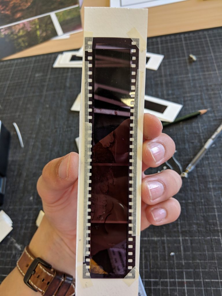
This presentation is made to twin with the negative slides and the light box as it is the same set of images and the negatives.
To present I wanted to show the film and push the fact that I was using film. I could have done this by printing the images and then saying that they were taken on film but using the slides also gives a certain aesthetic with the fact that the colours are inverted on the negative slides.
The way that I framed the negatives is by cutting a hollow rectangle out of some hard card and then sticking the negative to this in the order that they were taken, I then numbered the frames so that they could be easily kept in order. Finally, I made a small box from foam to contain the 6 sides that are not on the light box.
My thought for framing the images is that I will buy a light box that is designed for displaying little letters, I will then custom make holders for the rows of negatives and then the light behind will show the pictures that is on them. Because the images from my second shoot are in black and white they will be only slightly inverted but the images that were taken in colour from the third shoot will be very different colour wise.
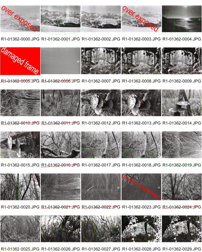
I decided that I wanted to narrow down my 23 images that came from the contact sheet down as I didn’t want more than 10 images from this shoot.
The way that I decided which images to keep was if there was more than one image showing the same scene but either with small changes or a different focal point i would choose from them. I would also see some that might not fit the style of romanticism, this means some that are a bit dark and gloomy from the marshlands would be out.
Here are the images that I chose:
1
2
3
4 [portrait]
5
6
7
8 [portrait]
9
10
I selected image one because it was the best exposed image from the few that were taken in the mountain and partly because it has the large lens flares in the top section.
This image just has a nice composition and shows the beach and the sun without having too much going on within it so it doesn’t distract the viewer from the main focus of the image.
I used this image because it has the fallen tree on the top and another below it to create a kind of frame that draws the viewers attention to the center of the photo, the problem that I have is that is was quite dark and I had to use a wide aperture meaning that it doesn’t reflect Adams work amazingly but i still feel that it follows the theme of Romanticism.
This image is inspired by the work that Adams did with close ups of small things like flowers and pine cones, once again I have contrasted Adams work by having a relatively blown out background because it was dark and and I didn’t have space to use a tripod.
This image was taken with the intent of showing the reflection of the trees on the pond that was below it.
This image is the reverse of image 3 (looking through the same hole but the other way) it also has a different style of ‘frame’ as the ivy is drooping down into the center of the image. It also has a shallow depth of field so the background it not perfectly in view.
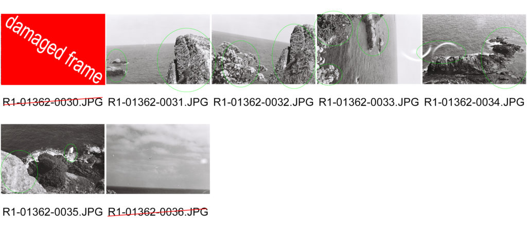
This image is taken to show the Romanticism in the sea and the coastline, I have achieved this by framing the rock in the front of the frame and having the rough sea and the waves crashing against the rock in the left of the frame. There is also a small development fault in the middle of the frame that can only be seen properly in print.
This image shows the drama in the sea and then there is a lot of detail in the plants in the bottom left of the frame there is also also of groups of rocks in the sea and there are some small development in the empty sea on the right of the image. At the top of the image there is a large area of light leakage which also follows onto the next frame.
In this photo there is a lot going on but the things that are happening are simple and nothing too over dramatic so there is a lot of subtle detail for the viewer to explore. Some of the aspects of the image are: two curved light leaks on the left, rough-ish sea, waves hitting the rocks, small development fault below the light leakage on the left and finally there is a small lens flare in the top middle section of it.
Once again this image shows the waves the rocks and some plant s but what sets this one apart is there is a large scratch in the middle right of the image it helps draw attention to the rocks and the waves. This was also taken with a high aperture so the rock in the front is in focus and sharp and so are the rocks in the distance where the waves are crashing.
From this photo shoot I have produced a set of images that I feel has the essence of Ansel Adams in and my inspiration can be clearly seen from them. I have decided not to edit these images or retouch them in any way because i tried to frame them correctly and i want them to be as they were taken as it was a set of images taken using 35mm film and I didn’t want to fix any ‘imperfections’ as they are are what make film photography what it is.
For this shoot I will be using 35mm film as it is the closest method I can use to how Adams took his photos. I will aim to produce 72 images with one roll being in colour being mainly based in the alps then with the second roll roughly 10 images from it will be taken in the alps and the remaining frames will be taken in the marsh lands near me as it is a natural site and there will also be some taken of a cliff face and large rocks.
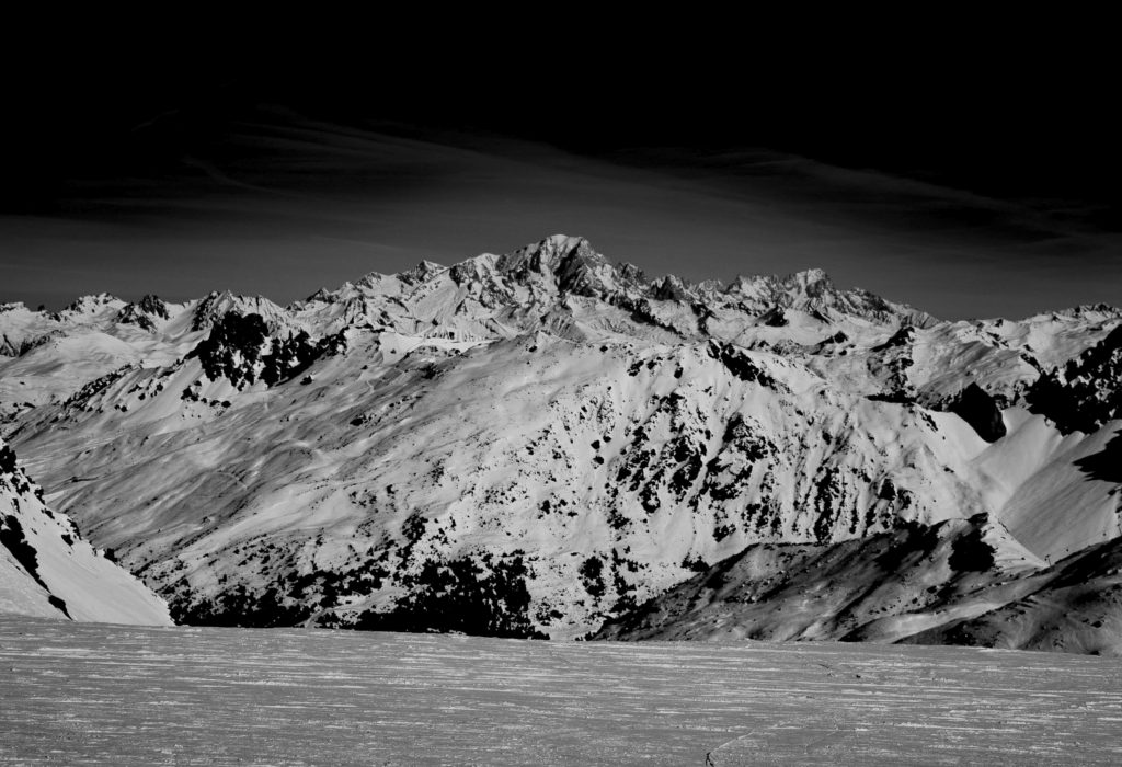
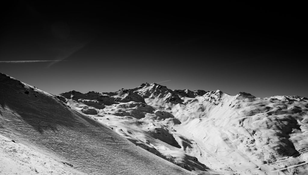
This image was taken with the intent of showing the contrast from the light and shadow on the mountain. The reason I chose this scene was that it was an untouched face and there were no ski tracks on it and no-one had used it so it was still ‘pure’. This image is called Monolith the half face dome by Ansel Adams and it was the main inspiration for this image as it shows the snow, the rock race and the trees.
When comparing my image to it there are lots of similarities but his image has a greater sense of perspective and depth withe the cliff face being the main subject but he also has the cliff and trees to the right and then the mountains in the distance. Whereas my image only has the far mountains and some trees in the slightly closer section.
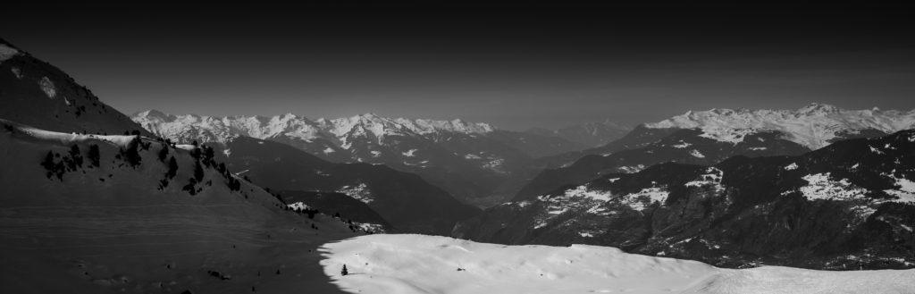
This image was taken to emphasise the one peak in the middle of the image, it also shows the valley in front of it and the other peaks to the side of it and there is a small bit of the ski run in the foreground but it somewhat helps to show perspective. This image is cathedral peak and lake by Ansel Adams; withing it there is an amazing composition with the rocks being close and just below with the lake leading into the mountain with the boarder being broken up by trees and snow. There is also a dramatic and cloudy sky. Because he has used a very wide depth of filed so that everything in the image is in focus.
In comparison my image has clear elements of Adams in that there is a good sense of depth of field with the run in the front and some smaller mountains to the side and everything leads up to the main focus, the mountain, even though the sky was completely blue for me so i had to dramatise it in post with things like gradient filters and highlights.This image shows another peak but it is of a mountain that has run coming down to the bottom right of the frame and there is a slope to the left of the frame that has some tracks on it which gives some more shadows and texture. This image is called cathedral CA by Ansel Adams and in it it has the lower set of mountains and then a cloud splitting it from the higher peak just above it, the colour composition goes from dark at the bottom then getting lighter and lighter then the sky at the top is dark again.
When editing the images in light room I converted them first to black and white then changed the exposure, shadows, contrast etc. until I had an image that had the desired level of contrast and made sure that I was using Adams’ work as a reference the whole time. My aim wasn’t and isn’t to make images that could be his but to use his methods and his themes to try and show the landscapes that I know and love as they are changing and when I saw the way that Adams did it felt that that it was a good way to do it felt that that it was a good way to do it. In the edit I decided to add a gradient filter to the top of some of the images to draw attention away from the sky as it is dead space in these images so the filter brings it back down to the actual landscape, the filter does this without completely removing the sky from the image.
When shooting I only took a few images as there were limited views that I thought were suitable for me to link to Ansel Adams. The things marked in red either need to be fixed or aren’t good and the orange boxes are where the images need to be cropped.
All of my images were taken with a high aperture, the reason for this is so that as much of the image is sharp and in focus at once. This was done because Ansel was a large believer of using high apertures so the true nature of the image is shown and that there was nothing that couldn’t clearly be seen in the image.
All edits and final images I do will be making the images into black and white because all of Adams work was in black and white and it is easier to make the images imposing and bold and it is easier to make the parts I want to stand out, stand out.
When I went to take my photos I made sure to wait for a day when it wasn’t snowing and the sun was right. I also timed my photos so that the sun was always behind or above me when I was taking the photos so that there was no sun in the frame of the photos because at this altitude the sun is very powerful and the snow makes it stronger and brighter. Ideally I would have taken the photos when there was a bit of cloud in the sky to add some drama so the lighting but there wasn’t a day where it was possible.
For my shoot I will be in the French alps, I plan to find high points on mountains that have large views with clear skies. I plan to take mostly photos with my digital camera and then exaggerating the colours in Photoshop afterwards then making it black and white but I will be taking my film camera with black and white film and I will be trying to use colour filters to get the result I want. However, where as Adams could look at his images straight after as he was using a field camera if I try and take the images in black and white on my film camera I will not be able to instantly see how my images have turned out.