All posts by Gabrielle B

Filters

Author:
Category:

Final images

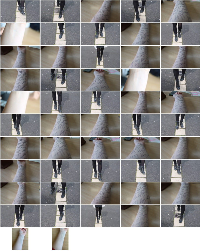
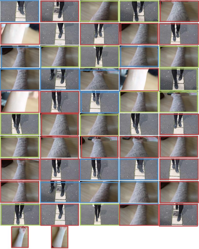
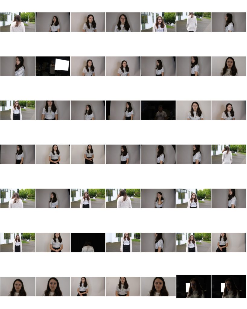
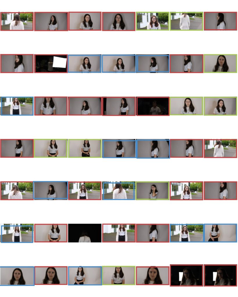
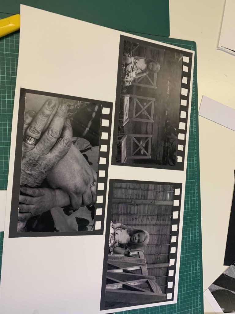
This is how they ended up and how I displayed them.

Analysis of images

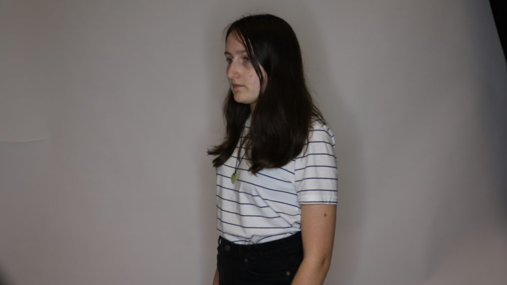
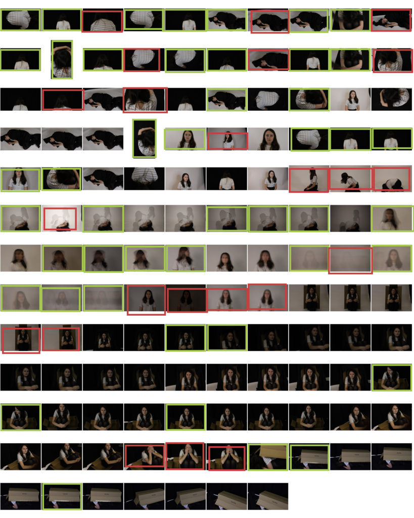
First 3 – these images are inspired by Katies joy crawford and her use of double exposure. the images give a sense of confusion and uncertainty and show the distress someone goes through while dealing with anxiety and depression. the images are lacking colour but not black and white so it gives a sense of dullness and emotionlessness. i the lighting is dim but still bright enough to be able to capture any visible facial expression. the mounting bring in rule of thirds with the leadings lines in the top image brining your eyeline down the piece. i used soft lighting to enhance the lack colour. These link to journeys and pathways as it is my experience of my journeys through various mental health struggles. I found it a good way to express my feelings. Rather than a physical journey, it is a mental journey of struggle.

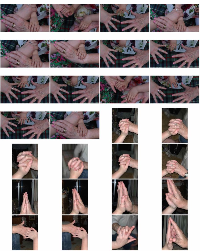
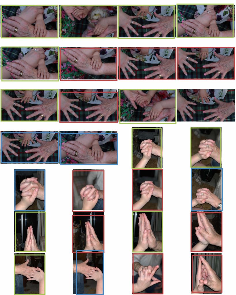
Second 3 – the images are inspired by Bill Volia’s still image of his film ‘birth life death. the framing is to resemble old film to bring in that resemblance to the video. the images are in black and white to give a moody look and to also bring out the shadows of the lines in the hands to distinguish between the others. and also give a dated look. i keep everything in focus but keep my subject in the centre. the textures of the hand accentuates the age which is what these series of images is focused. natural lighting. kept depth of field of the hands small so it seems dreamy. It links to journeys and pathways as the hands shows different generations and the different stages of life, starting with a young child, and progressing to adult/parent, then to elderly/grandparent. The child is alone in these images as it is meant to be she is the only one in her family left with other members sadly passing on. I wanted to keep the chairs empty and keep them in view to capture this emptiness. This is rather an existential view on the journey through life, and again, rather than being a physical journey, it is a metaphorical one.

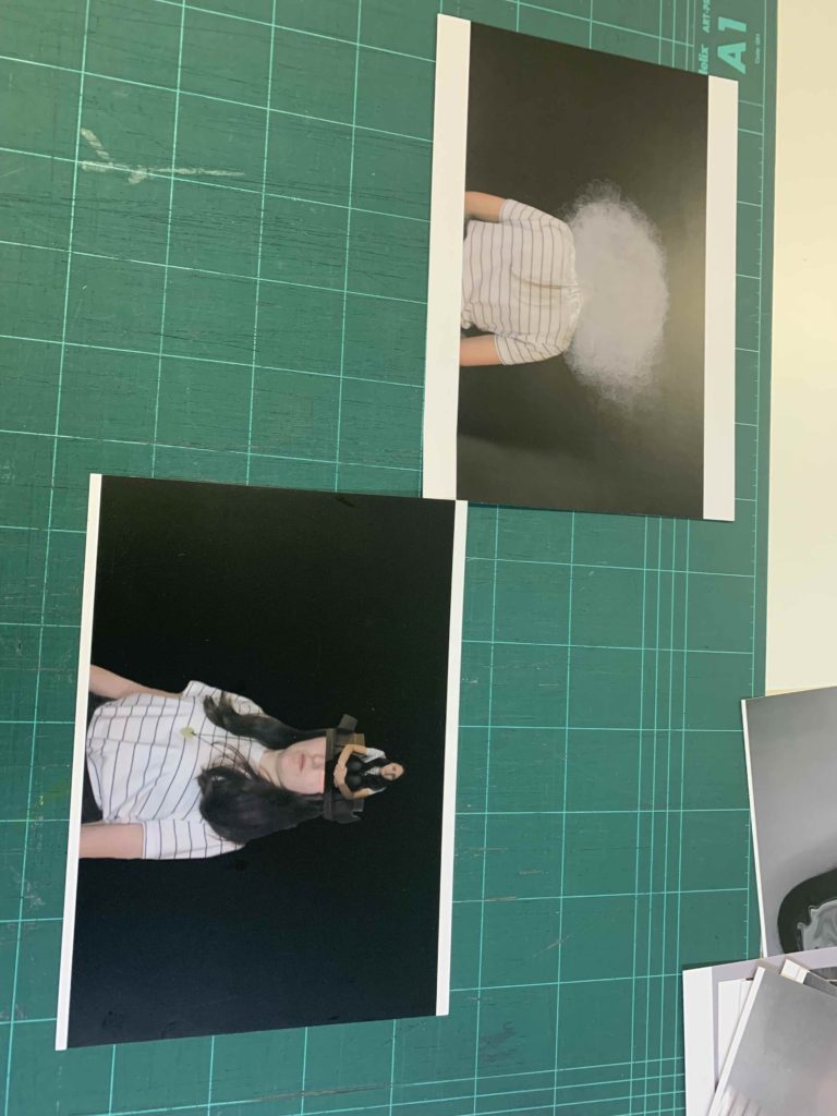
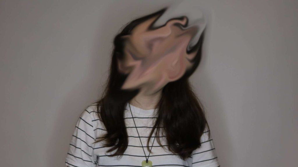
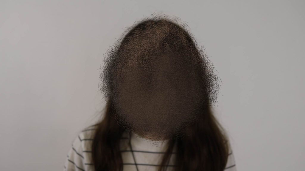
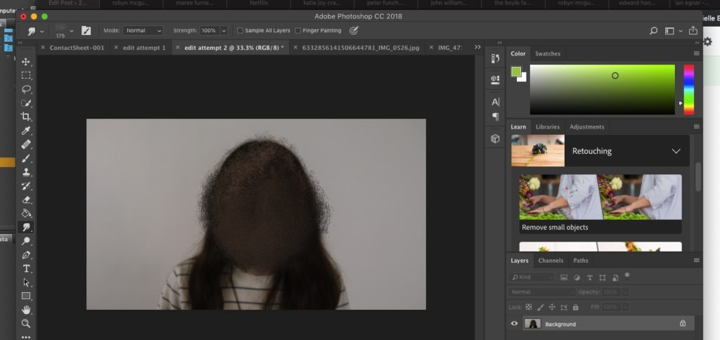
Third 2 – these images are also inspired by katie joy crawford, mainly her birdcage photo which i modelled the ‘box head’ and ‘clouded head’ directly after. i placed the clouded one at the top so its like head in the clouds which is what is feels like to deal with depression; a sense of disconnection. i used a black background to contrast the whites in the photograph. the textured cloud against the smooth background also shows the disjointed feeling depression gives you.the box is to represent how trapped you can feel inside your own mind dealing with these issues. i used harsh studio lighting to resemble the harshness of these thoughts. Again, this is represent my view on a journey through mental health and links to journeys and pathways through the idea of mental health journeys.

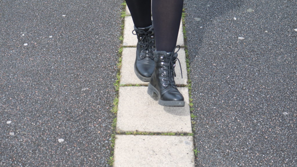
Final 2 – links to journeys and pathways as it is also embodying the ideas of mental health journey as well as a physical journey (walking along a path). She is stepping between the cracks as it links with the obsessive nature of OCD and also the childish superstition that stepping on cracks is bad luck. The blue boxes I edited in enhances the space she is stepping between and shows how he mind when in this place of mental state actually views this simple pathway.

Final Images displaying practices

I first placed out my images to see if my ideas I had out on paper would work. some of them, I realised wouldn’t, and others I ended up having better ideas once I played around with placing them. In the end I ended up using foam board to create different levels and I used black paper to create the look of old film slides. laying out the placement of photos and grouping them together really helped see what was effective and what wasn’t. I had so many more better ideas once I had the prints in front of me and was able to use my images more effectively.

Display possibilities

This is how I’m planning to display my final images when my prints are ready. I will position the images of the Subject walking so in the first image she is taking the step and the second one is her having taken the step.

I will place the photo of the hands in the centre of the the two images of my other subject to break them up. i will have them in a line so it looks like an old film strip to resemble Bill Volias ‘birth life death’ film, which inspired that shoot.

Photoshoot contact sheets and editing experiments

these contact sheets are to show a detailed progression of my thoughts and ideas on the subject of my chosen photographer. By doing this in the process i am understanding his way of working and his artistic eye and what he wants to capture emotionally and physically in the photo.


idea 1, photoshoot 1 – katie joy crawford
green mean good images red mean bad. the good images are generally the ones that have my ideal exposure and have a pleasing composure with and interesting subject. most of the images i took using multiple exposures came out well however they came out looking rather similar and so times the position of the subject matter sometimes was off. otherwise the images came out resembling my vision for this particular photoshoot.
edit experiment
step 1
step 2
step 3
step 4
idea 1 photoshoot 2 – john william keedy
my vision for this shoot was to demonstrate the stereotypical characteristics of OCD. images i liked had the model stepping between cracks as that could show precision.some of the images in red she’s stepping of the cracks therefore making my message invalid. the ones in green show nicely her moving between the cracks. the other images show compulsive and obsessive nature by having a tally thingy marked multiple times on the arm of the subject seemingly endless. the red ones are out of focus and/or are not framed correctly. the blue ones represent the ones that i could use for editing but aren’t really strong enough for my final images sleclection.

idea 1 photoshoot 3 – edward honaker
aim of this was to gain images mostly for manipulation and editing purposes. the ones in red are ones that i couldn’t use editing due to the position of the subject r the exposure. the lighting was also off in these images. the ones in green the subjects facial expressions are what i was wanting ad she its facing how i want to her.
edit experiment 1
edit experiment 2
idea 2 photoshoot 1 – robyn mcgufficke
idea 2 photoshoot 2 – bill volia
ones i chose framed well lighting nice fitted with my artist ones not not framed good boring or didn’t capture what i wanted or my settings weren’t right
idea 3 – photoshoot 1 – peter funch
photoshoot i didn’t like. boring images hard to find good ones. the ones i liked were the ones that had the most people in similar to my artist. i wanted these to come out more candid which some did but others didn’t have much content at all.
idea 3 photoshoot 2 – boyle family

green interesting because matched artist and lighting good an red either boring or just didn’t look right.