MY FINAL EDITED IMAGES

MY FINAL EDITED IMAGES
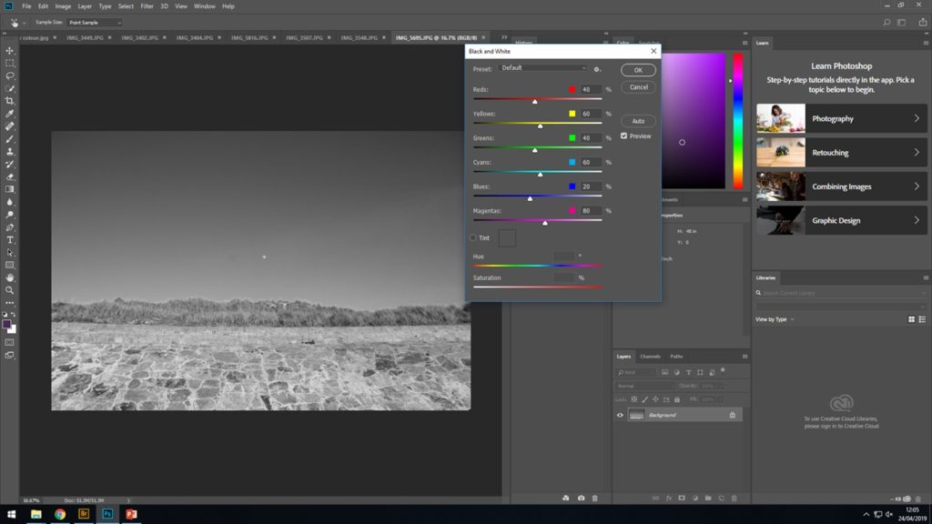
Black and white grass VS the coloured grass
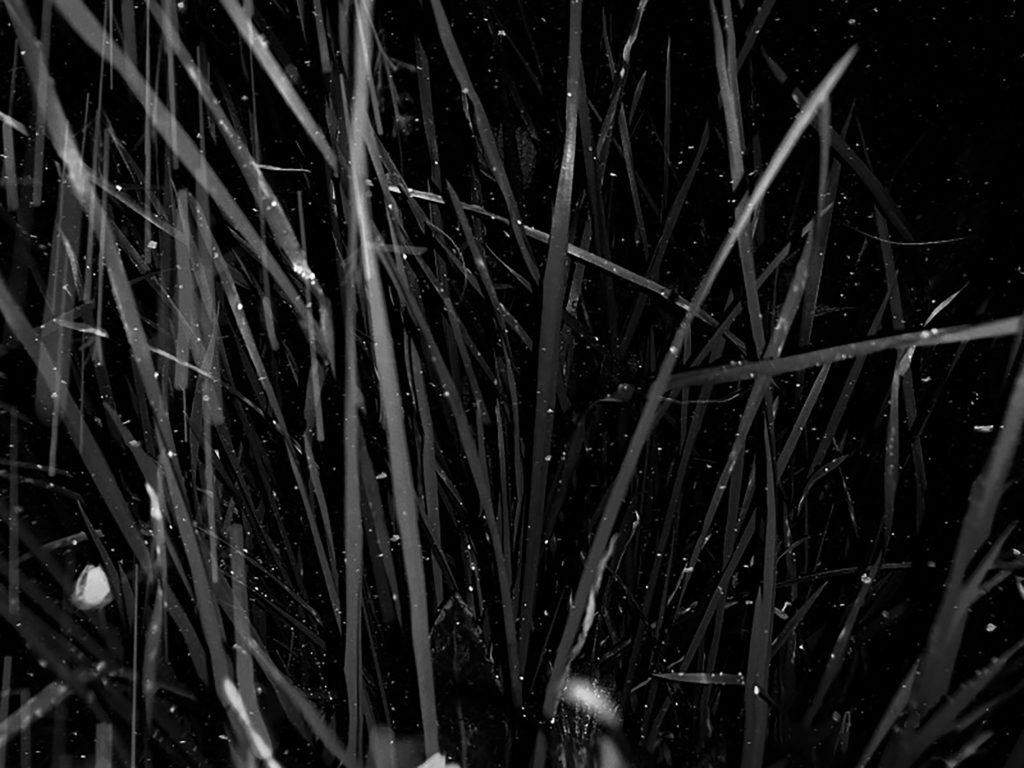
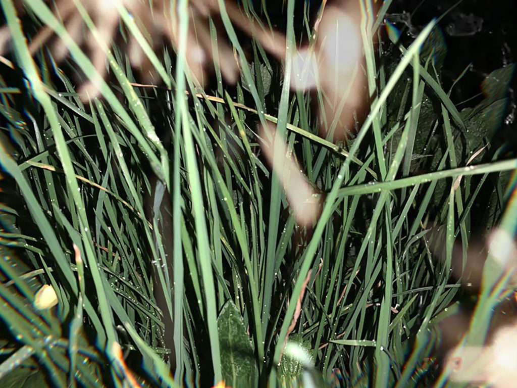
My second favorite piece that I have created were my images of grass using both a black/white adjustment and a colored one enabling me to present the contrast between them. This also allows to emphasis how simply just the color of the image can affect the overall feeling and end results followed by many different types of interpretations. Firstly the black and white image presents us with a much darker type of image with a clear use of flash to capture the photograph. Alongside this the original image would have had a low exposure around the point that the flash reflected of the main subject’s area. The same with both these images I used a canon camera with a much smaller lens enabling me too focus on smaller and minimal subjects however led to an overall greater quality of the end result image. For this first image I evidently used a black and white adjustment to filter into the bright green grass to quite the opposite this gave the image a much colder and darker overall finish to the image. The photograph does have some features of textures due to the white spotty like over lay which add more depth and feeling to it and furthers the idea of the photographing giving a 3D effect. On the other hand the arrangement of the image is somewhat disorganized in the sense of lacking symmetry, due to the disorientated grass leaves in an irregular pattern almost completely avoiding the point of symmetry and straight line. With this all in consideration the colored grass image is all very similar how in contrast provides the opposite feeling for example the green grass image gives off a much warmer and vibrant feeling alongside the fact the image somewhat feelings clearer and of higher quality due to the more obvious shadows from the background adding a further 3D affect compared to the darker images. When displaying these images it was essential that I continued to shows the idea of the two photographs in a complete contrast therefore I presented the images of contrasting shade that complement the end images. The dark, black and white imaged was framed on a black frame compared to the colored grass image which was presented on a white frame, providing more evidence of over comparison. Overall I was extremely pleased with the end result of these two images, although this was not my original intention for this particular set of photographs I’m glad this idea followed on from the previous black and white images.
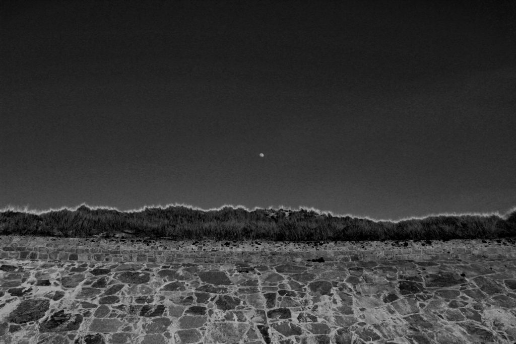
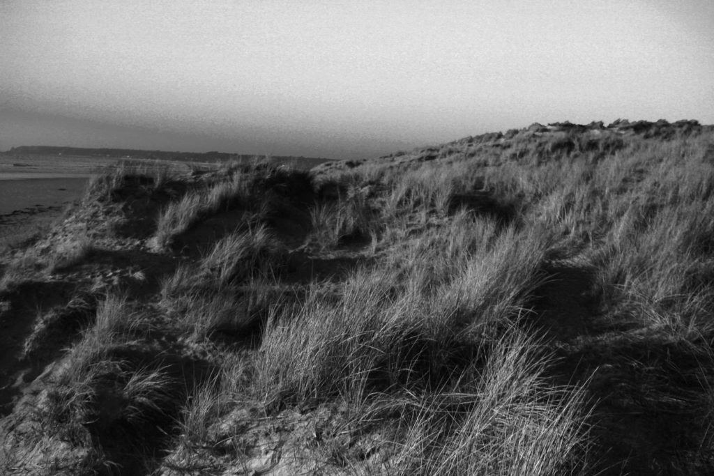
Overall I was extremely happy with the final outcome of this image as when picturing the final outcome in my head and then the final outcome proved to be extremely similar. This image is effective due to the contrasting in shades of black and white. As previously mentioned in the editing blog for this image, it was essential to me whether the photograph stayed in color or convert to black and white that the moon was clear and completely contracting with the sky color in order to give the most dramatic effect. I can happily say I believe I achieved, with not only the moon standing out in the white shade against the grey sky back ground, but along the top of the bank I have managed to enhance the yellow tips of the plants in order to create a further more powerful effect on the overall image. The due to the editing of the black and white shades the lighting of this image had proven to become much darker than the initial image and has removed most removed most natural lighting effects and almost gives off the feeling that a flash was used overall to me producing a much colder and evidently darker image, with burst of white and light grey shade beaming through. The photograph clearly is intense due to the differential shades being portrayed throughout with a regular exposure enabling the darker shades to be edited on to the image. As previously mentioned I used a 18-33mm canon lens to help capture this image, this image allowed a large zoom out to be able to capture a large majority of the wall, moon and sky. Visually the photograph has a clear sense of symmetry due to the the straight wall, clear sky and the moon being center, this to be provides a more aesthetically pleasing view to the eyes. Of course portraying an organised layout and proves the view point to be pretty much looking straight ahead at the wall, however could be argued with a slight angle up more towards the sky and the top of the wall. On the other hand the images very much lack texture this could be due to the sharp shades used and the lack of shadows being presented leading to a more 2D feel. Overall I am extremely happy with this image, if I were to redo this photograph I would try figure out a way to interpret texture to give a further feeling leading to even more opportunities for interpretation.
My editing procedure;
For my second images I went in the same direction as my previous image as i almost wanted to create a collection of similar images which would further be evident when framing up and displaying my photographs.
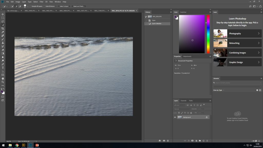
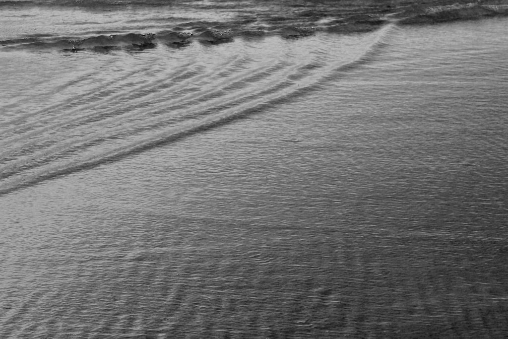
After finally selecting the best image related to water ripples from among the rest, I opened it up on to Photoshop and proceeded to IMAGE > ADJUST > BLACK AND WHITE and from there I began to play around until I was able to finish the image with enhanced wave and ripple in the ocean to give off the best effect. The detailed ripples was something i wanted to be the main focus of the image.
THE FINAL IMAGE
ANOTHER EDIT THAT USED A SIMILAR METHOD
After i had tried similar techniques with the previous images i wanted to try something else that would further the editing skills of my image and add something more to the photograph to encourage a more detail photo to be produced. As well as still having Stephen Gill in mind i went on to the idea of adding more layers to the original images. For this image i used the previous steps to create a detailed and focused black and white images, then followed by adding what looks like white dots to help improve the texture and overall felling of the image.
This was the final image that came out;
Now that i had fully completed four black and white images with a mixture of landscapes, greenery and the ocean, it was time i took a different path with of course still considering Stephen Gills work and what made his photograph work so well. Firstly to branch out i added color, i used the same image of the grass as from the above black and white image and kept in the original color, although saturated the image to add more texture and create a deeper feeling of a 3D effect. Then as previously mentioned over laid that now in color looks like extra lights or just part of the plants that had become blurry. I now plan to display these tow images together in a contrasting way to help emphasis contrast and the distortion of the shapes placed on top of the photograph and how this has very much added to the overall feeling of the image.
As carrying on with inspiration still from Stephen Gill and experimenting further with what i had done in the images above i produced the following two images, however unlike Stephen Gill in these last images i used people as the background subject rather than the plants, landscapes or the ocean. However to me this made the over lays look a lot better and improved the overall feeling of the images. For these photograph and filtered and edited to a much higher level with adding white lines and circular colored shapes to give the idea and effect of them being reflected off other light from the image. Overall adding a much warmer and theatrical aspect to the final images.
FIRST FINAL IMAGE EDITS;
Firstly, after careful selection decided on my final images that I wanted to look into further for more editing. Then i opened the image up in adobe Photoshop and worked on from there.
Next, was deciding how I wanted to approach the photograph and what i wanted to change if anything. I needed to think ahead and picture what I wanted the final product to look like. This is where I made the decision that black and white filters would be most effective as I would be able to enhance each of the natural colors in the original photo to different shade of black and white in order to create the most successful photograph.
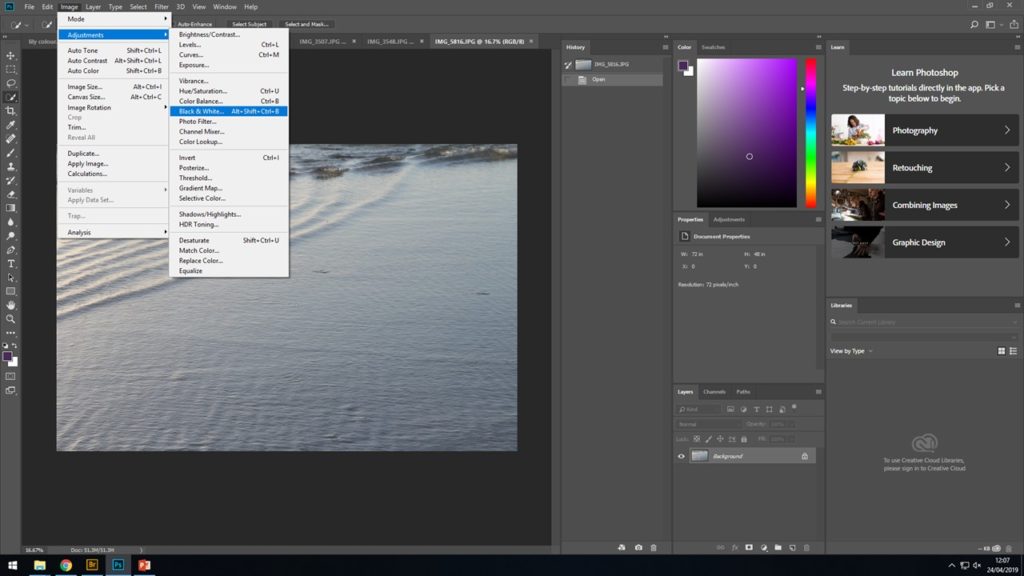
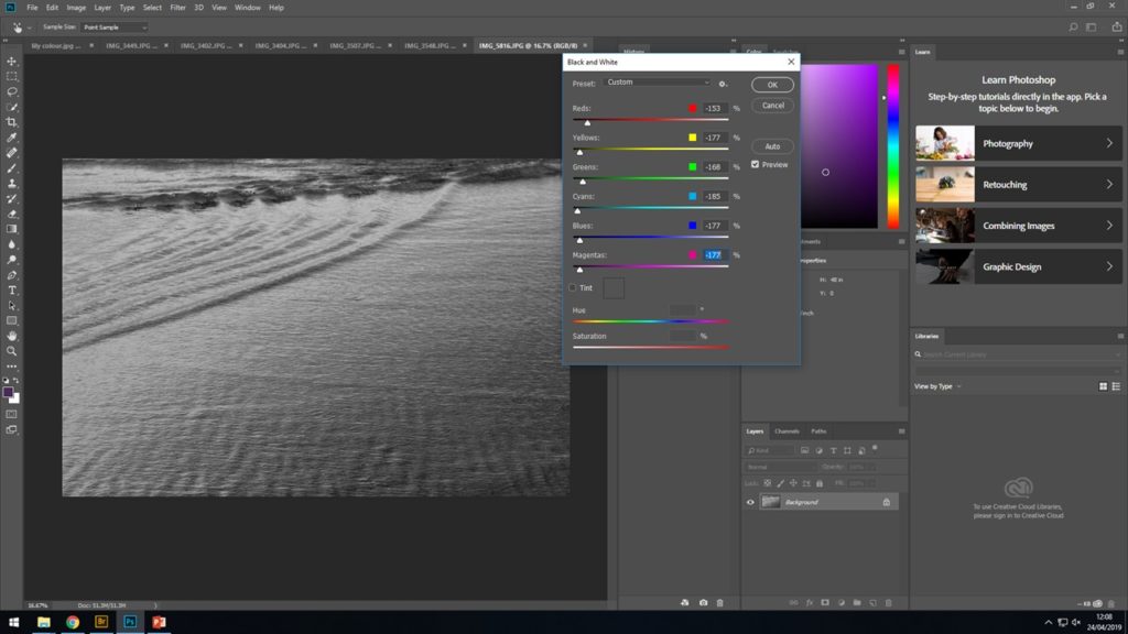
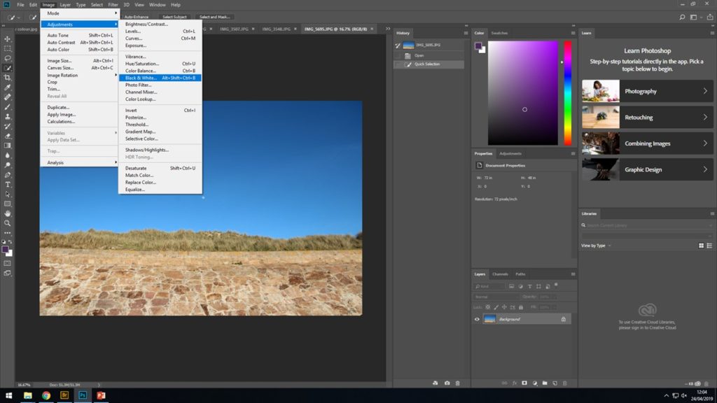
To achieve this look select IMAGE > ADJUST > BLACK AND WHITE…
After selecting the previous instructions a box will appear with the different color representing different shade of black and white. By scrolling up and down on this it will change the darkness and brightness of each shade on each different color on the photograph
When considering how dark to have the background (the sky) i wanted to make sure the the bright moon could still clearly be seen and contrast the white moon as much as i could with a black sky in order to give a strong effect and leading to a more abstract image to be produced. I spent a while messing around with the different intensity of the image to see what i could create and what controller changed which color from the original color
After a long time of selecting different shades of black and white to represent the different colors, i finally produced my final image that i was happy with.
^FINAL RESULT AFTER EDITING ^
After finally finishing my first project on The Boyle Family, i wanted to look further in another artist that i could be more influenced and inspired by when producing my final pieces. The next step was finding this new artist, after looking around at previous artists and recommendations I came across a man called Stephen Gill. This is who i have decided to look further into and try base a lot of my work of. Now that i had selected my final artist that i wanted to concentrate on the next step was creating an action plan in order to create the most beneficial final piece and course work.
Things to consider:
After considering all factor when going in to this project it was now time to answer them. By doing this process it will enable me to stay focused and concentrate on what i need to do in order to crate the best final pieces
WHO IS STEPHEN GILL-
Stephen Gill is a British photographer, who main inspiration comes from his immediate surroundings of inner city life in East London and more recently Sweden with an attempt to make work that reflects, responds and describes the times we live in.
His work is often made up of long-term photo studies exploring and responding to the subjects in great depth.
After working mainly in black and white from 1984, his practice since the mid 1990s was mostly in color. Stephen Gil is also know for his bazaar technique when creating an image. For example, some of Gills technique to get particular effects on the image were, by using a magnifying glass to concentrate the sunlight onto some of the negatives in order to etch markings directly onto the image or sometimes Gill would even dip his negatives into the sea.
THE WHERE-
Wen looking into Stephen Gills work a large selection of his images were simply just landscape in which he had then con onto manipulate to create the final product. Finding landscape appropriate in Jersey was no a challenge it was the time of day that I needed to consider as well as-the weather.
After careful consideration for my first photo shoot i decided to head to St Ouens as sunset and see what I could find that deemed appropriate, and for my second photo shoot i wanted to completely contrast this idea so i headed into some local lanes just after sunset and where the lighting was much darker and required flash
HOW AND WHAT-
I had now selected my artist, where I was going to take my photos and how many photo shoot I was going to have the next was what I am going to photograph. As previously mentioned Stephen Gill was a very intricate artist and often used landscape photos and then over laying other images on leaves and plants. So I decide to consider the following when going out on my photo shoots: Landscapes, including the sea and sea walls, plants and trees that I deemed appropriate when thinking of Stephen Gills work or anything else that catches my eye. Finally the camera, I took out my canon camera with a 18mm-135mm lens, this provides a wide range and will give me better focus control.
Technical;
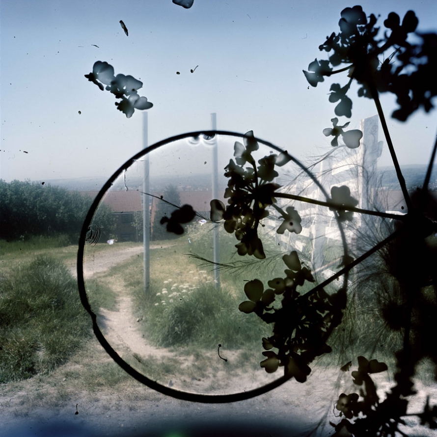
When first looking at this image it is clear that there is an initial contrast of light and dark presented straight away. Firstly the background image, the photograph is represented as a image taken in daylight, from a high up location due to the smaller buildings that can be seen in the background, this give the image a good view point when looking at the image itself. To me this adds more depth which is essential for a decent image to be produced. With an evident use of high over exposure to ensure the clear contrast between the background image and the much darker shapes placed on top. On the other hand the use of the over whelming white blurs seeping through from behind the heavy black print in front is a consistent technique used through out Stephan Gills other work. The temperature of this photograph provides us with a much colder feeling due to the use of paler shade used and the idea of the color emerging from the image, the over exposure almost leads to all the main colors to become extremely pale. However this help emphasis the much darker shapes on top which is clearly a critical point to be bought across from the image.
Visual;
As previously mentioned the main color presented in the image are much paler than what would be presented in real life, this would be due to the over exposure used from the camera to give a much colder and harsher effect and lead to a much further evident contract between the background image and the dark shapes presented in front of the photograph. These black images presented in front of the photograph give the image depth and texture which yet again adds more detail enabling different view and perspective from the viewer to be interpreted. The texture of the photograph to me is still represented in a flat smooth way rather than a ’lumpy’ texture, although there is a clear texture that must be presented due to the over lays on the images. The black images in front to me give an almost stain like feel this can be seen through the circle which could be translated to a coffee mug stain. On the other hand the other patterns are more of a floral type or a plant pattern that have been possibly imposed on the image by using chiffon giving the overall feel to the images and the essential contrast. As mentioned the texture of the images isn’t necessarily rough or uneven but the photograph for sure gives a strong 3D effect. The organisation of the image to be proves to be unorganized and almost random display of the gloomier images, with the placement of the plants and circular ring being placed out of center and unsymmetrical, although I believe this to add the end product and feeling of the image.
Contextual;
For the creation of these images Gill in Brighton and Hove during 2010 added features of objects and creatures that he had found and picked up from the his local surrounding, use his natural environment to help produce his most famous work, and the introduced that into the body of the camera to give this new effect. Gill hoped through this particular approach it would encourage the spirit of the place to clamber aboard the images and be encapsulated in the film emulsion, like objects embedded in amber. The aim was to evoke the feeling of the area at the same time as describing its appearance. Gill said that this particular technique gave him less control, and provided a considerable an element of surprise, as how the image ended up was not always a plan and was for sure at times not what was expected. Some results included some highly detailed macro recordings amongst and within the landscape of the portraits. Gill said ‘ like to think of these photographs as in-camera photo-grams in which conflict or harmony has been randomly formed in the final image depending on where the objects landed.’ Some of Gills technique to get these particular effects on the image were, by using a magnifying glass to concentrate the sunlight onto some of the negatives in order to etch markings directly onto the image or sometimes Gill would even dip his negatives into the sea.
Conceptual;
The types of images Stephan Gill produced left a wide option for different interpretations and different ideas to be produced from the viewers of the images, this was due to the different types of backgrounds hat were over exposed and the dark shapes over laid on top of the original image. That’s one of the best things about Stephan Gills work there is so much opportunity for personal explanations of what the images means and represents.
For this first photo shoot I set out in the evening and I wanted to capture much darker images with minimal exposure in order to create a much darker and effective photograph. For this particular photo shoot i ended up photographing a the majority of plants, trees and nature and to me that would allow me to have more opportunities for editing in the future. Along side that factor, when photographing these images positioning and point of view of the camera was something I really wanted to concentrate on. I included image where the camera was pointing straight down, straight up, in front off and at diagonals.

Red= I will definitely not use, either not focused enough, no what I expect or simply just have better images that I can use instead
Yellow= I will maybe use or maybe use part of the image (cropping) or with the right effects and editing will end up being efficient to use
Green= I will most likely lose, really like that particular photo, or particular part of the photo
For this photos shoot I wanted to do something completely different to the previous shoot in order to allow me to a have a variety of images. First of all I chose my location that would have the best sunset lighting so grasp the best quality images with the correct warmth feeling. I ended up going to St Ouens before sunset and simply walking along the beach and taking images of anything that caught my eye at the time. The ripples in the water with the sun reflecting of the water gave an extremely good effect, along side the foot print in the sand. This is where I got one of my final pieces from, of the stone wall and bright blue sky, and placed with the perfect moon.

Red= I will definitely not use, either not focused enough, no what I expect or simply just have better images that I can use instead
Yellow= I will maybe use or maybe use part of the image (cropping) or with the right effects and editing will end up being efficient to use
Green= I will most likely lose, really like that particular photo, or particular part of the photo
Mood boards showing a mixture of Stephan Gill’s work. His work shows clear use of double exposure giving a strong and powerful effect to the images. He also presents the idea of overlaying different images, almost giving an ink splodge effect. I believe this to add great detail to the image and it add excitement and sense of individuality as if differs from the norm photograph that a regularly taken. To me, a lot of Gill’s photographs have a rather cold feeling towards the image with over exposure commonly used i the background to enhance the contrast between the light in the background against the dark (often black) markings on top. This clearly helps emphasis all the aspects of the image creating a more visually pleasing image.

Ideas and questions to ask myself when creating my own work inspired by Stephen Gill

Stephen gill born in 1971 Bristol, UK began his love for photography at an extremely young age due to the influence from his father and his interest in insect which created Gill’s initial interest with collecting bits of pond life to inspect under his own microscope.
Gill now focuses on his inspirations from the surroundings of the inner city life in East London and heading towards looking at Sweden as well and looking into the idea of reflecting and portraying images that help describe and emphasis the times we are currently live in. His work is often made up of long-term photo studies exploring and responding to the subjects in great depth. Throughout his career Gill has experimented with a large array of trials for examples, he mainly worked with black and white imagery from 1984 then followed by a lot more colour interpreted in his work in mid 1990s.
It’s said that until around 2003 his work has been said to have an extremely descriptive and typographical approach towards the subjects.
After working mainly in black and white from 1984, his practice since the mid 1990s was mostly in colour.Eight of his photo studies made between 1997 and 2003 were assembled and published as chapters in a book called Field Studies in 2004, which also toured as an exhibition. As previously mentioned Gill enjoyed to experiment and in January 2003 he bought a Bakelite 1960s box camera produced by Coronet for only 50 pence from Hackney Wick Sunday market, which was near where he lived at the time. The camera had a plastic lens, and lacked focus and exposure control.
Over the next four years he had used the camera to photograph within the extremely varied environment of Hackney Wick, including waterways and allotments; and to make portraits of people at the Sunday market and who lived and worked in the area.
It was then announced that the area Gill had been focusing his photography on would be redo eloped for the 2012 summer Olympics and 2012 Summer Paralympics.
Gill claims that this finished body of work was steered, informed and shaped by the place itself. And his approach to making the work was more reacting, responding and being carried by the subject rather than seeking out ideas that were already formed in the mind. This stage of photography he named as an idea as starting over or walking away from the old. It was important that his content was first as he believed it played an important role in rather than the technique.
An obsession with this part of London lasted over ten years and led to many different series including – Hackney Wick, Archaeology in Reverse, Warming Down, Buried, Off Ground, A Series of Disappointments, Talking to Ants and Best Before End.Best Before End looks at the phenomenon of energy drink consumption. This time rather than describing the subject, Gill used the drinks as an aid to make the finished images as the negatives partly processed in energy drinks of different kinds. It allowed the drinks to shift and alter the images with a small amount of manual intervention.
