All posts by Eleanor G

Filters

Author:
Category:

Peter Blake

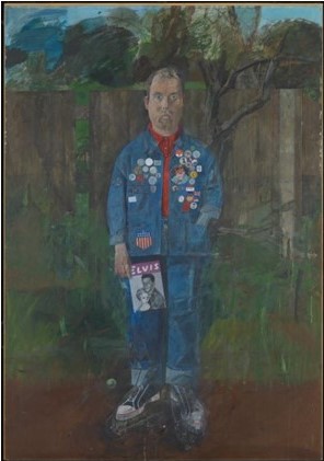
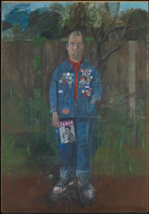
Self-Portrait with Badges 1961

Peter Blake’s work reflects his fascination with all popular culture, and the beauty to be found in everyday objects and surroundings. Many of his works feature found printed materials such as photographs, comic strips or advertising texts, combined with bold geometric patterns and the use of primary colours. The works perfectly capture the ethos of the sixties, but are also contemporary. There is also a strain of sentimentality and nostalgia running throughout his work, with particular focus towards childhood innocence and reminiscence. Blake is renowned for his connection with the music industry, having produced iconic album covers for the Beatles, Paul Weller, The Who, and Oasis.
Analysis

This self-portrait by the then 29-year-old Blake became an instant pop art classic. Having clinched the 1961 junior John Moores painting prize, it was featured in the Sunday Times’ first colour supplement and in Ken Russell’s documentary Pop Goes the Easel.

It’s an ironic riff on Thomas Gainsborough’s The Blue Boy, its blue silk outfit replaced by denim, a fabric rich in social history. Blake’s 501s were a coveted rarity at the time, though Elvis (as depicted on the magazine Blake carries) had by then abandoned work wear in favour of tasseled satin.

The titular badges are not limited to sew-on patches celebrating American culture. Everything here is a prop recalling the symbolic attributes of portraiture. But, as stand-ins for identity, it’s all as paper thin as the magazine he’s holding.

Balding and sad-eyed, Blake seems prematurely aged. His suburban plot is both a far cry from the great plains of the American dream and Gainsborough’s 18th-century landscapes. In fact, the other art-historical shadow here is Watteau’s superlatively lonely clown, Pierrot.

My response
Wolfgang Tillmans – Case Study

Alongside portraiture, landscape and intimate still lifes, Tillmans pushes the boundaries of the photographic form in abstract artworks that range from the sculptural to the immersive.

German-born, international in outlook and exhibited around the world, Tillmans spent many years in the UK and is currently based in Berlin. In 2000, he was the first photographer and first non-British artist to receive the Turner Prize.

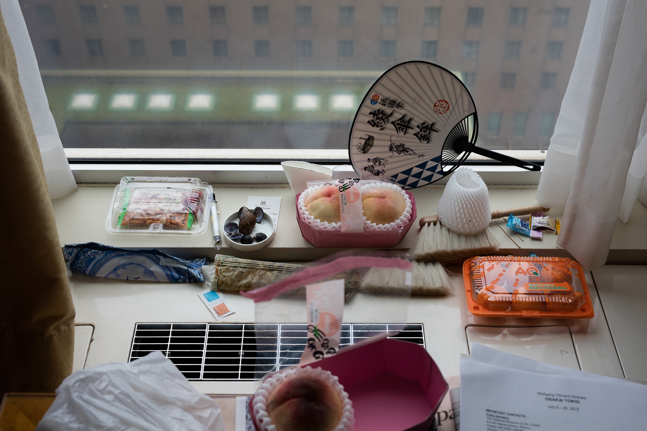
Osaka Still Life

Photo Analysis

Technical

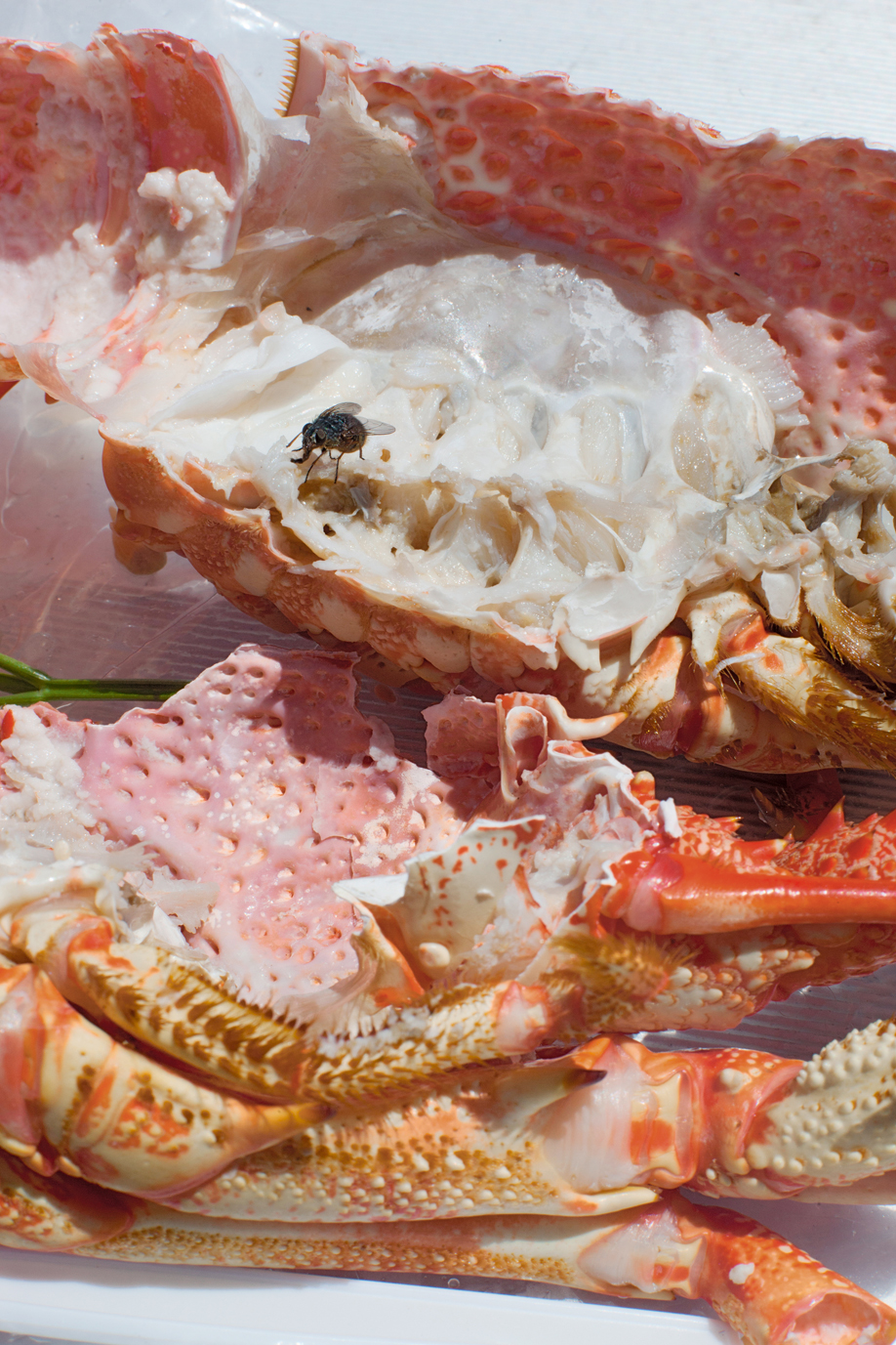
Natural lighting has been used within this photo due to the light source being soft and warm toned casting soft shadows that follow the silhouette of the once alive crab. This warm toned helps bring out the warm colour palette of pinks and oranges. To capture this image, Tillmans used an analogue camera due to the warmth of the picture and the low contrast throughout the image.

Visual

The focus within the image in my opinion is the fly feasting on the lifeless colour-explosion. I think this because the whole image is soft toned and brightly coloured with the interruption of this black figure. At the bottom of the composition, the first exposed shell is facing ‘bottom up’ with the once living crab’s legs surrounding the exposed shell. In the middle of the image, there’s a gap on the left that gives a glimpse of a green basil leaf. At the top of the image, the rest of the exposed crab is facing upwards along with a fly on top of it.

My responses


Best Image

Visual:

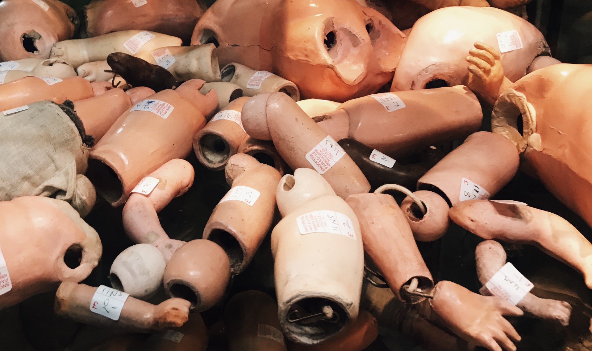
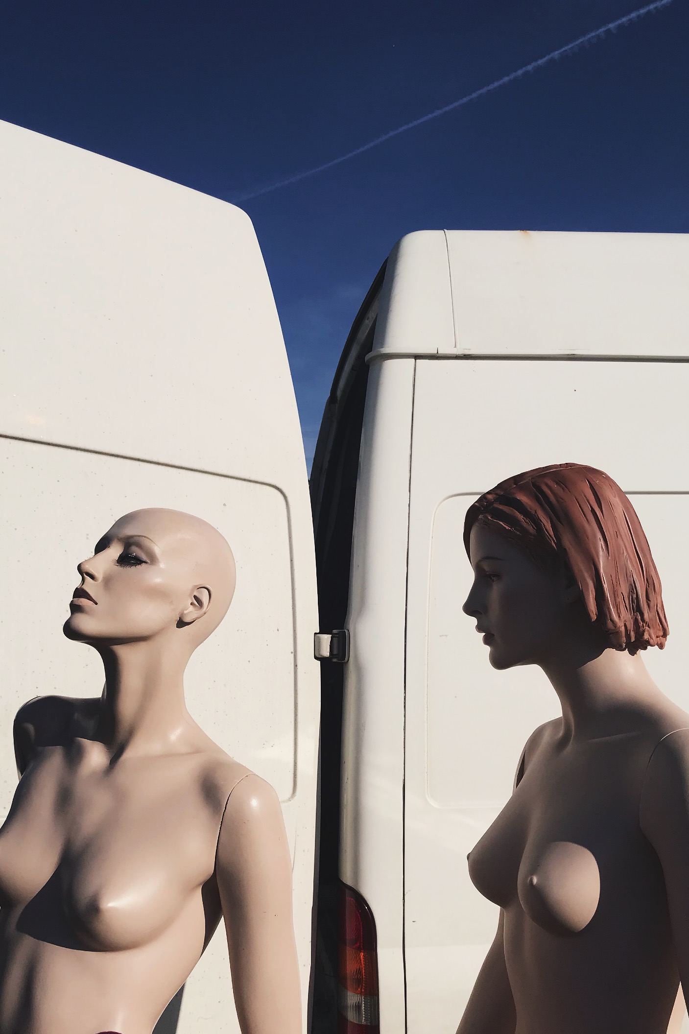
In this image i see this as a rule of three, the first section being the solid blue sky, then the white of the van then the bottom being the mannequins. This rule of 3 gives the viewer a pattern that is memorable and easily recognizable. I also like this because it hasn’t got a busy background making the central subject the mannequins. This picture was taken on a very early morning, this is casting sunlight onto the mannequins from the right direction, thus creating flowing shadows and contrast on the perfectly sculpted silhouettes. Due to this also being taken on film, the picture is very warm. 

Technical: 

Again, this image can be divided into a clear rule of three : solid blue at the stop, solid white in the middle, then the skin coloured mannequins. This contrast of colour palette due to the white and light blue complementing the fair skin tone of the mannequins. The shadows cast on the mannequins reinforces their “perfect” silhouette and refines their shape and posture.

Contextual:

I took this photo at a flea market in Brighton when the sun was just rising. I would’ve happily bought these mannequins home with me due to them having more refined bodies compared to boring plain white ones we have around us. I asked the seller where he found or got them from and he said that his husband worked for Selfridges in London and these specific Mannequins where left for rubbish just because they were never used. So this man took them home and used them to model his artworks and designs he made to promote and sell his work. 

Idea 1 – Journey of An Object

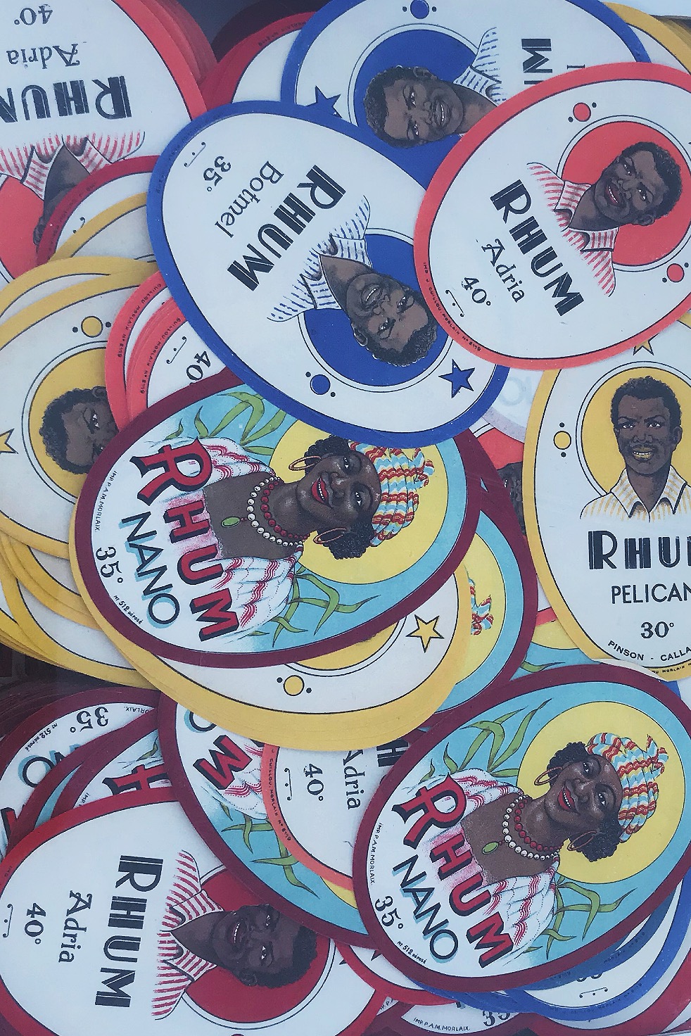
Objects help us identify what happened in our world’s history and happenings alongside stories of previous owners. Pictures show progression in how far we’ve come with politics/ fashion/trends/architecture/transport/culture/communities, all reflecting past times that could benefit future times. Old magazines and newspapers help us understand how minor events connected with major events. Personal trinkets tell stories how someone once lived their life reflecting what hobbies they liked alongside their occupations. History always benefits the future. We take all of our ideas from the past and either improve them or retain them so that we can evolve using these ideas. A way a building was built 50 years ago isn’t remotely the same as a building nowadays however those buildings helped us to adapt the ideas that work and use them again. 

Snooper’s Paradise

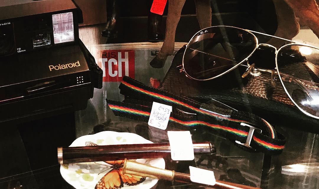
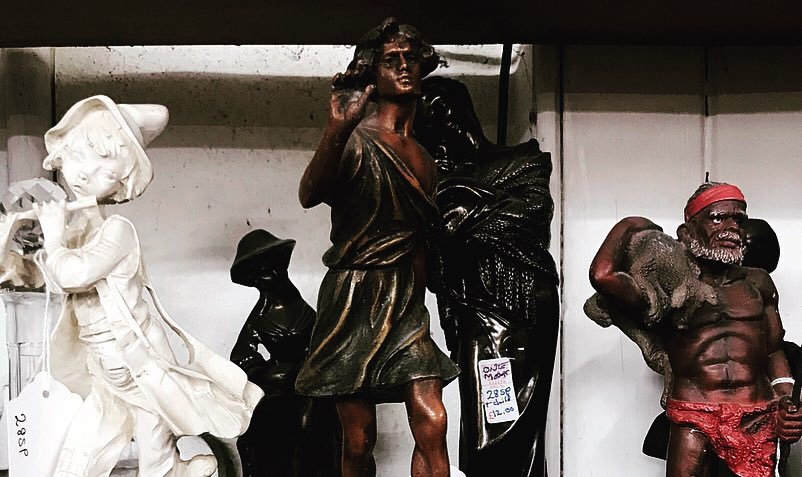
When first visiting Brighton, I was introduced to a shop in North Lane called ‘Snooper’s Paradise’. This shop has 3 floors of brick a brac history, from car number plates, to 300 year old books, cassette tapes, to stamps, this store has every part of history inside. This shop introduced me to my love of dated objects. I have purchased many old vinyls, cassette tapes, old magazines, photographs, sunglasses, crazy fashion and original 1935 glass bottles to use around the house. My love for old things is eternal, this is due to these objects reflecting simpler times where music was soulful, people where vibrant and fashion was outrageous. My favourite era is the 70’s, because people were encouraged to let go and feel free; hippies and naturists ruled the world. This free spirit helped people to speak up about any problems and political issues without hesitation making equality and race prime topics. 

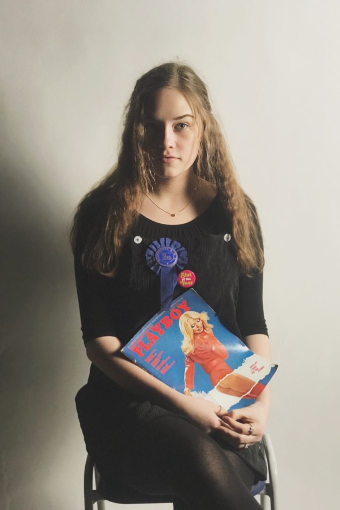
On my most recent visit there, I purchased some items which I thought held the most history that I could capture in frames. I purchased: stamps, a competition rosette, a 1975 Playboy magazine, a photograph of an architect, a Vaseline container, train tickets and a cassette.

Photoshoot Idea

 My main photoshoot idea is to utilize the style of archival photography so that the only central focus within the composition is the object.

 The only examples I could find were only stock photos due to the fact that I want a specific look: object main focus, plain background.

For lighting, I would use 3 separate light sources: one that cancels out any shadows from behind, one light source coming from the left then another from the right. This surround lighting would create a complete white wash so that there is no shadows overcasting the objects or there surroundings.


Photo shoot Ideas

Idea 1

Journey of an Object

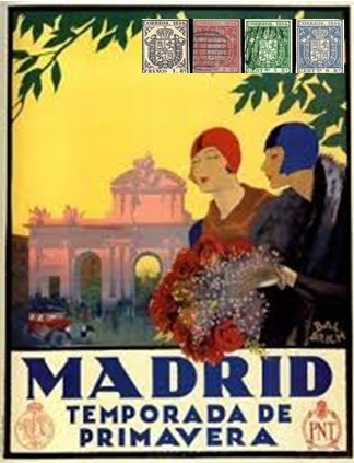
My first idea involves documenting images of old objects and antiques, and then attach the journey of the object to the image. So for example, I have a set of stamps from Spain 1923, I photograph them then overlay them on top of either posters or postcards from the same time frame.

Rough Example

Idea 2

Incorporation

Use the objects from the first shoot and try and incorporate them into a modern setting. For example a 1965 Horse Riding Rosette could be added onto either someones bag or jacket where they have modern badges.

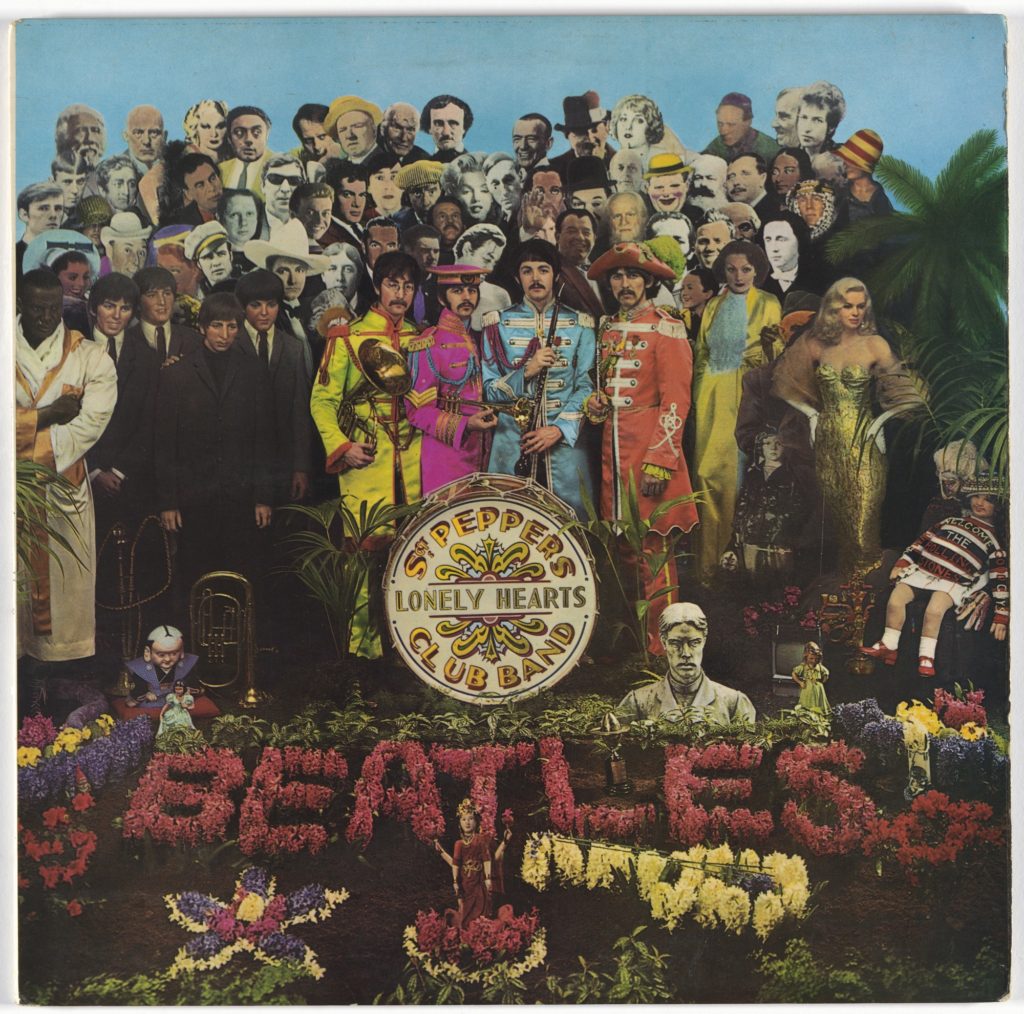
Peter Blake

Idea 3

Decay

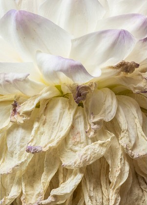
Completely contrasting to my other ideas, i could show the journey of decay or life through either a molding food over time or a wilting flower.

Stocksy United – Wilting Dahlia

Journeys and Pathways

For my original response to our stimuli of ‘Journeys and Pathways’, i want to focus on the idea how something has adapted or evolved. My ideas include:

The journey of an object-an antiques journey to where it is now

Coming of age-the journey of the gap between being an adult or a child

Comparing old portraits of people versus what they look like now

Older people reflecting their younger side for example: tattoos they got when they were younger or someone trying on their wedding dress/suit and revisiting the feeling they had on the day

Surf history of Jersey-showing how much places like the Watersplash and St. Ouens have changed and how the crowds have adapted