All posts by Emily C

Filters

Author:
Category:

Photo-shoot 3: Planning

For my third photoshoot I have decided to take inspiration from the use of triptychs, and from my original mind map idea of documenting how objects change over time (their journey through their existence/usage). In order to do this, I decided to use objects that have a relatively short lifespan (such as flowers or ice cubes) and so their decay/the changes they experience through their “life” can be easily documented and the differences are more obvious and natural than, for example, physically changing the appearance of a human subject to show progress and change.

The following contact sheets are the results of my photo-shoots in which I documented the progress of various objects through their natural “lifetime”:
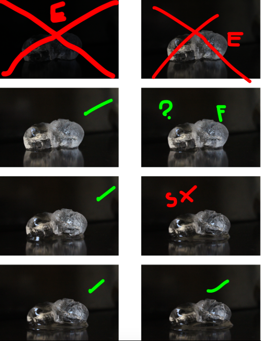
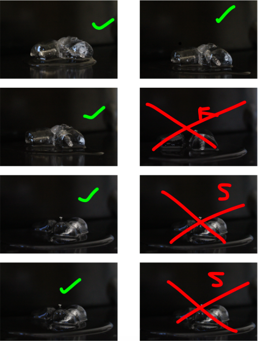
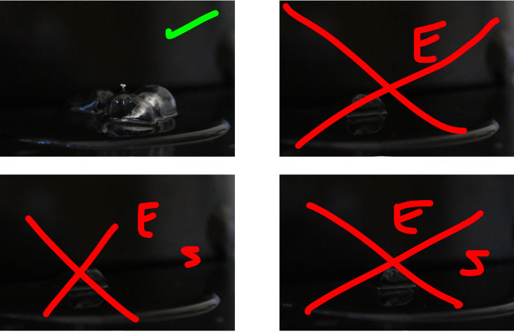
The above shoot captured my first subject, an ice cube, as it melted in a studio setting:

Key: Red E: Over/under exposed – Green E: Slightly over/under exposed – Red S: Subject incorrectly placed – Green F: Slightly out of focus – Red F: out of focus – Green tick: In final selection – Red Cross: rejected – Green “?”: Possible final
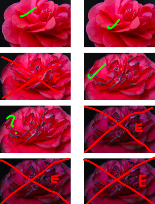
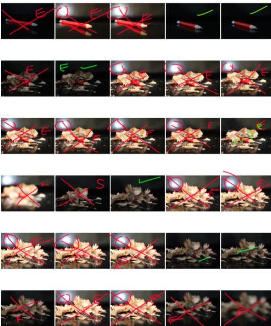
The above contact sheets show my second photoshoot, depicting the wilting/dying of a flower in a studio setting:

Key: Red E: Over/under exposed – Green E: Slightly over/under exposed – Red S: Subject incorrectly placed – Green F: Slightly out of focus – Red F: out of focus – Green tick: In final selection – Red Cross: rejected – Green “?”: Possible final
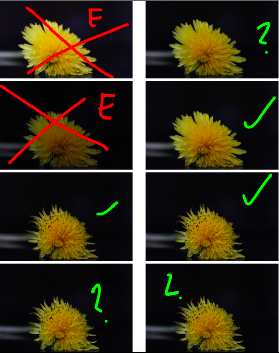
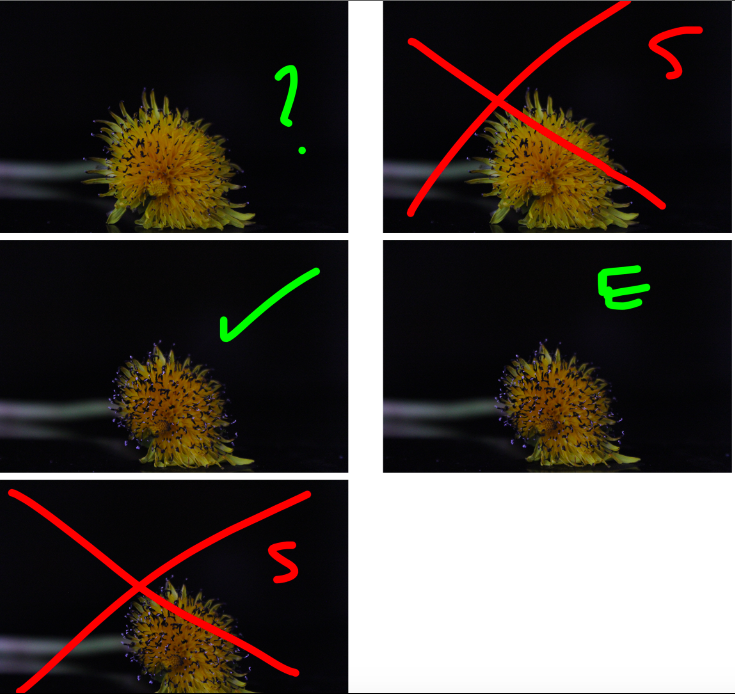
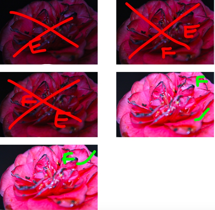
My 3rd shoot is much like my second, except I experimented with different subjects (flowers) in order to experiment how the colour gradient, size and shape would effect the final image:

Key: Red E: Over/under exposed – Green E: Slightly over/under exposed – Red S: Subject incorrectly placed – Green F: Slightly out of focus – Red F: out of focus – Green tick: In final selection – Red Cross: rejected – Green “?”: Possible final
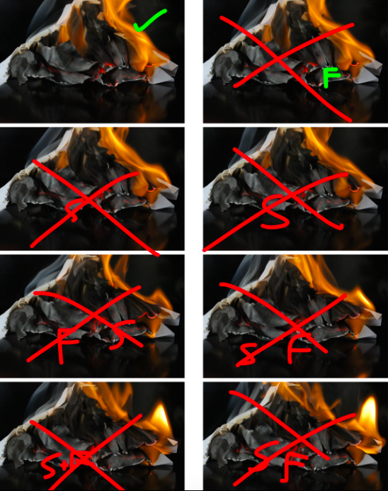
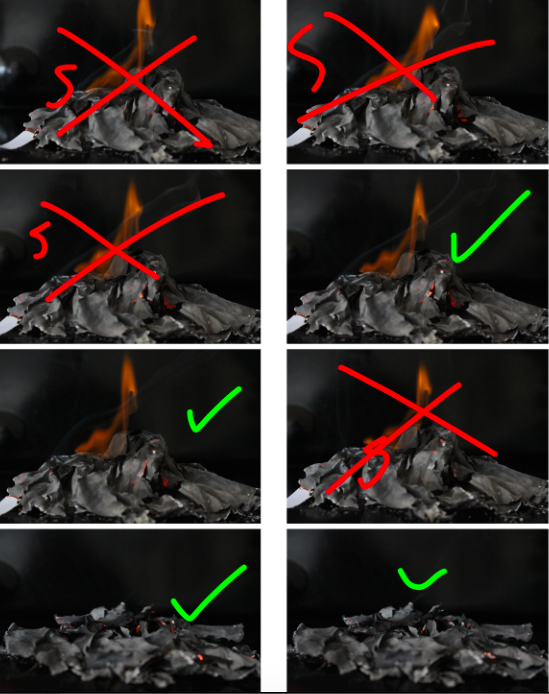
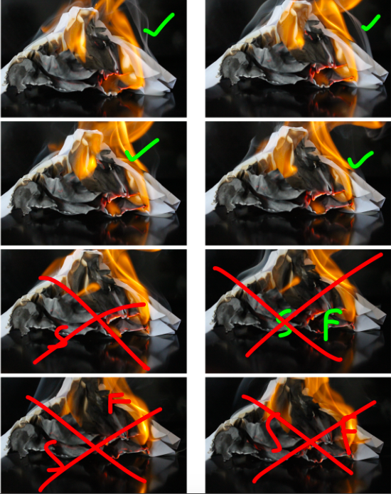
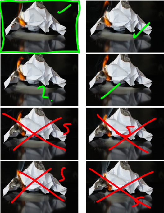
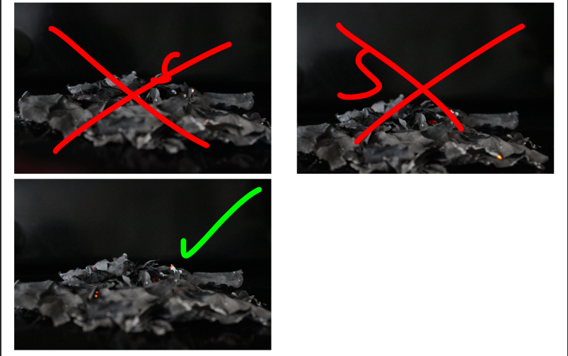
The above photo-shoot is an example of a deterioration that occurs unnaturally (setting paper on fire) and shows the journey of the paper through the different stages of its physical form/shape before it becomes ash. On a more metaphorical level it represents how quickly something can deteriorate, from perfection to literal “rubble” due to adverse conditions:

Key: Red E: Over/under exposed – Green E: Slightly over/under exposed – Red S: Subject incorrectly placed – Green F: Slightly out of focus – Red F: out of focus – Green tick: In final selection – Red Cross: rejected – Green “?”: Possible final
Triptych

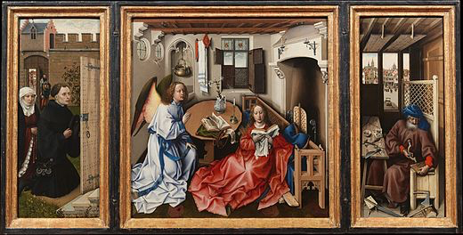
A triptych is a piece of artwork that makes use of 3 separate but connected panels in order to tell a story across the 3 panels without using any moving imagery or effects. Triptychs were commonly used during the Middle Ages as a way to convey Biblical stories through images. Triptychs have more recently been widely replaced by the use of videos and recordings, which show the more intricate details of a progressing story without the need to “clump” significant events into just 3 images.

Triptychs were commonly used to convey Bible stories during periods where art was stationary (there was no multi-media) – Source: Merode Alterpiece
Source – https://www.thoughtco.com/triptych-drawing-definition-1123079

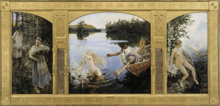
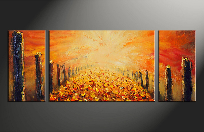
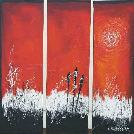
Although Triptychs were historically used to convey literal stories, myths and legends, modern triptychs often incorporate different meanings into the artwork displayed, and are often used as a way to display a continuous piece of art using 3 panels, separating the piece and allowing for attention to be drawn to each separate section, while also displaying the full piece in an eye-catching and interesting way.

Source – https://vvvart.com/abstract-triptych-modern-orange-art-panoramic-oil-paintings-canvas-wall-decor/
Source – https://linusgallery.com/juried-exhibitions/abstracts-artist-kerry-wallace-three-figure-triptych/

Triptychs can be used to both tell a continuous story, or to display a continuous piece of literal artwork. For my project into Journeys & Pathways, I have decided to focus on displaying many of my final pieces as triptychs, as I believe in doing so I am able to literally display each photograph as a piece in a journey, with the first and final panels representing 2 ends of the same journey. In doing this, I will be able to use both literal and metaphorical terms when developing my photographs, as the images will represent more metaphorical journeys and pathways, whereas the display of the images in a triptych will allow for all 3 images to be brought together, and physically displayed as a journey that can be followed easily by the viewer by looking from one panel to the next.

Vanitas Photography

A vanitas photograph or painting is a symbolic form of art which emphasizes the pointlessness of pleasure (such as wealth), the reality of morality and the certainty of death. Typically the subject within the images juxtapose one another, with symbols of wealth and security placed next to subjects representing death, showing the futility of joy due to the fact that it is, in the end, meaningless.

Vanitas artwork and photography makes use of multiple subjects placed next to each other in order to show the contrast between life and death, bringing the 2 polar opposites together in 1 image to emphasise their differences. As some of my work will take inspiration from the process of life and the journey towards death for the subjects of the photographs, I will be taking inspiration from vanities photography in order to use the multiple panels next to each other (triptych) to separate the different subjects, which in turn represent (at the left panel) life, youth and beauty and, (on the right panel) death, deterioration and the end of the journey, and thus my work takes inspiration from vanities artwork.

Source: http://nealauch.com/still
Source: https://www.pinterest.com/pin/185632815864013089/

Vanitas artwork and photography is used by a small number of modern artists, who use it to create images that represent gluttony, and use modern privileges in life (technology, modern food, luxuries) while placing them next to a representation of death in order to convey the futility of all of these luxuries.

Photo-shoot Mood-boards:

I have created a mood-board for each of the ideas/concepts I have developed for the “Journeys & Pathways” project. Along with the inspiration I have taken from my artist research, I also took inspiration from examples of similar concepts and ideas online, and have developed a mood-board based on these findings, which will help with my inspiration for the different ideas:


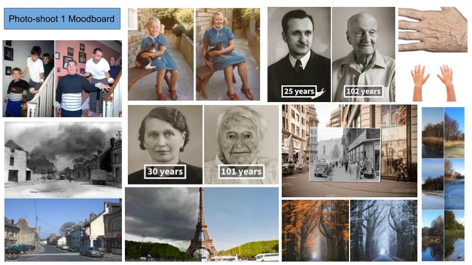
My first photo-shoot involves recreating vintage/archival/past images using the same subjects and the same environment, in order to show the differences and similarities between the 2 times, showing the development of the subject and how their journey through life effected their looks, attitude and the environment around them. I have taken inspiration from other photographers who have recreated vintage images, as well as images that show objects and monuments at different times, displaying the differences and similarities depending on the environment.

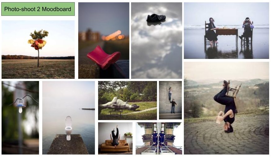
My second photo-shoot involves placing subjects in an opposing or incorrect context or environment, to create a contrast between the subject and the background, showing that the subject is on the incorrect or a countering path to one they should be on. In order to make this mood-board, I took inspiration from images that depict subjects in odd places, where they do not belong. I also researched into images using human subjects, where the people have been placed in the incorrect settings so that their involvement in the image does not make sense to the viewer, and rather creates an element of confusion and mystery.

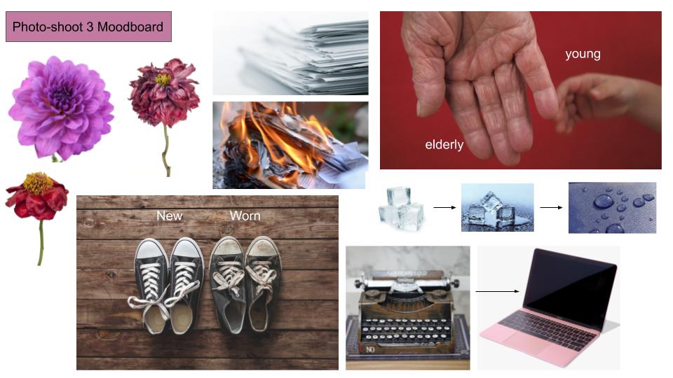
My third photo-shoot revolves around showing the decay of objects through their lives, and documenting the different stages of this process. I have taken inspiration from a variety of objects (household objects, flowers, people) in order to provide myself with the chance to work with multiple objects.

Photo-shoot 2: Planning

For my second photo-shoot for the Journeys and Pathways project, I will be focusing on the idea of representing the concept of being on the wrong path or journey, emphasizing the contrast between the subject and the location they are found in (showing that they are on the wrong path in a more literal sense).

In order to follow the theme of a subject being on the wrong path, I will be taking landscape images of different landscapes and environmental situations, and will be editing images of subjects (representing different professions and lifestyles through clothing) into these images, as if they have been torn from their original path and stuck in an out of context, contextually inaccurate environment. I will be using a photo-montage style of editing in order to achieve this, and the final images will look similar to the below image;
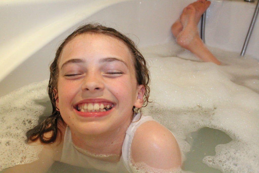
Image of subject: https://www.istockphoto.com/th/photos/one-man-only

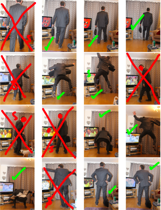
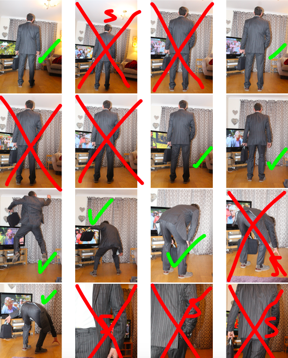
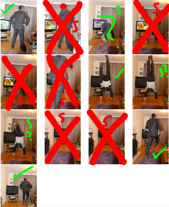
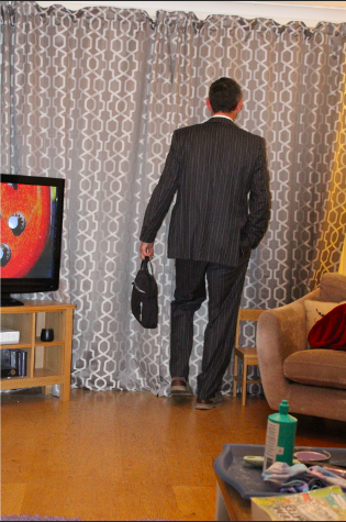
My first set of images includes all of the images that will be used as the subjects of the final images. These images are taken before the editing process, which will remove the background of the subjects, and will insert them into the correct environment image:
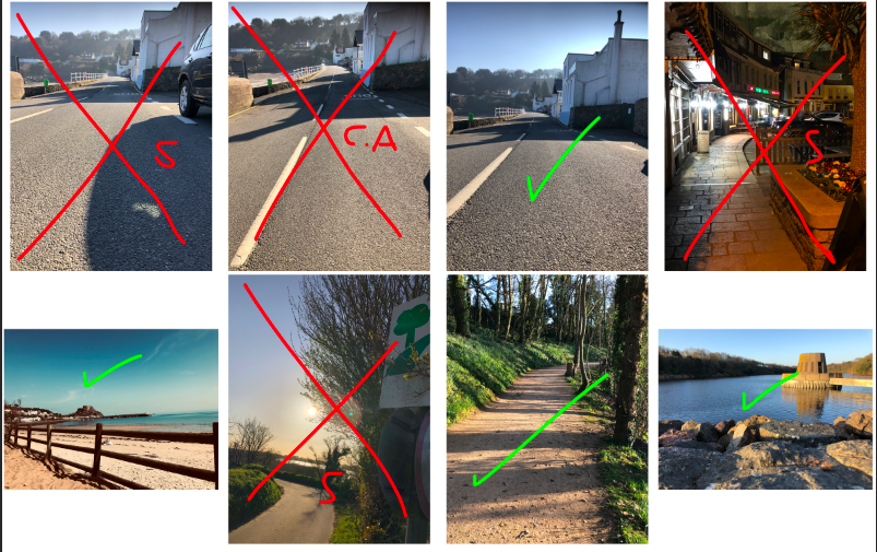
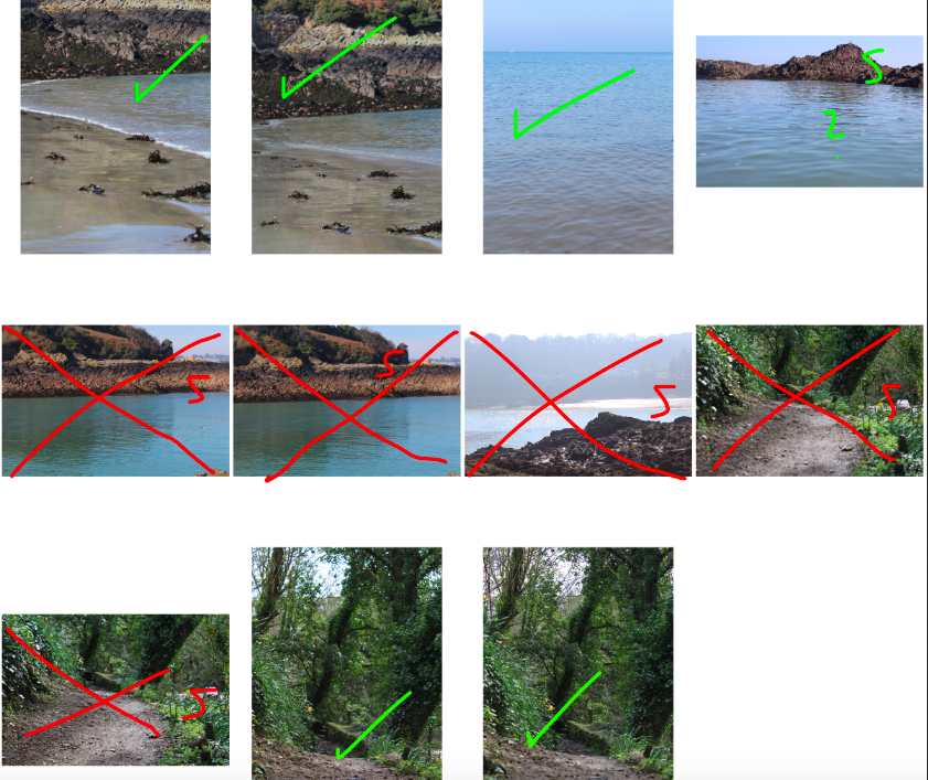
This photo-shoot will involve multiple locations and multiple representations of subject careers and backgrounds. For my first set of images, I compiled images to be used as the backgrounds. The following contact sheet contains all background images:

Photo-shoot 2: Editing

My second photo-shoot includes more heavy editing, as it involves merging 2 separate images so that the subject looks to be making their way through the scene. This photo-shoot is based around the fact that the subject is on the incorrect path, and has been placed in a scene that doesn’t match the context of what the subject represents (an office worker).

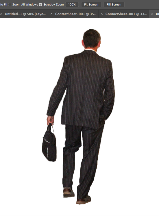
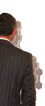
In order to do this, I used Photoshop to cut the subject from the background, in order to separate the body so that it can be edited onto the background:

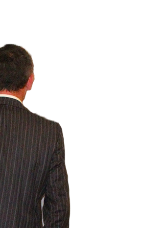
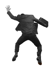
After the subject was separated from the original background (using the quick selection tool) I used the eraser tool to tidy the boarders:

I then changed the colour gradient of the subject to greyscale, as I felt that by doing so, I could emphasise the separation and contrast between the background and the subject, and I would also be able to show the contrast between nature (the background) and the mundane reality of working life (represented by the subject), as the use of black and white coloring shows the negative effects that a repetitive modern job (such as working in an office) can have on an individual:

I then edited the subject onto the final background, which I chose from a selection of images I took of settings that did not seem to match the attire of the subject (e.g forests, beaches):
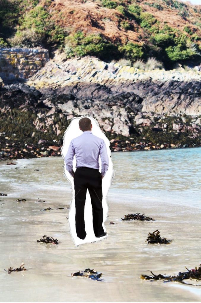
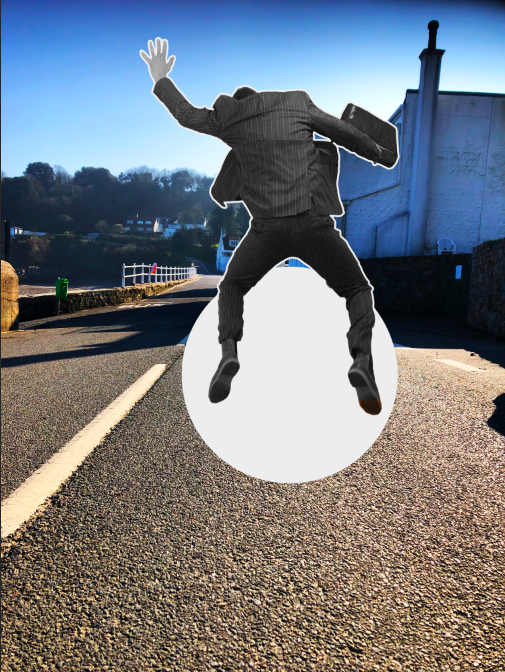
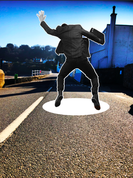
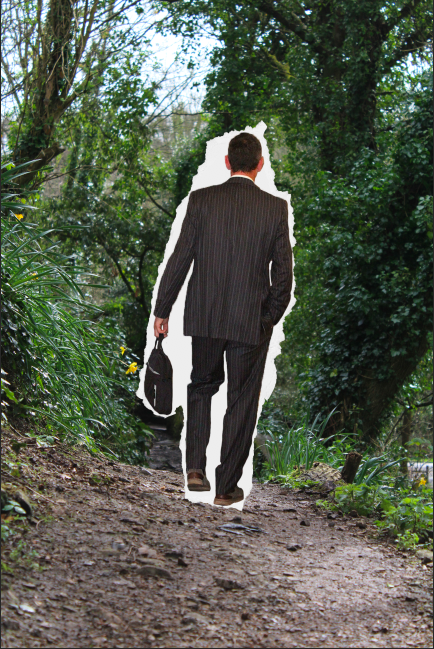
Final edits included either adding paper tears around the subject (as If they have been torn from their original journey/path and placed in a different one) or the addition of a “hole” through the scene, as if the subject is falling through the wrong scene while on their journey.
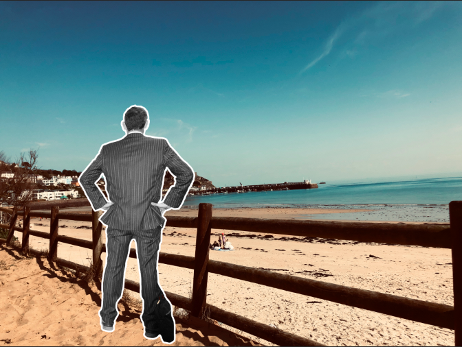
here is an example in which I used a torn paper effect, as if the subject has been removed from his original path and placed on a random/incorrect one.
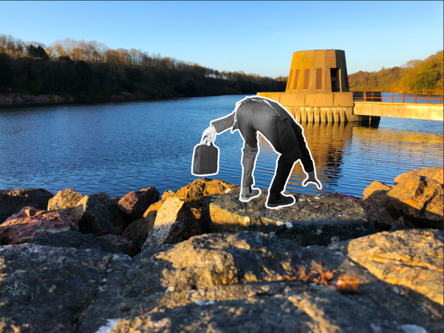
This was the process for all of the images, until I produced all of the final images.
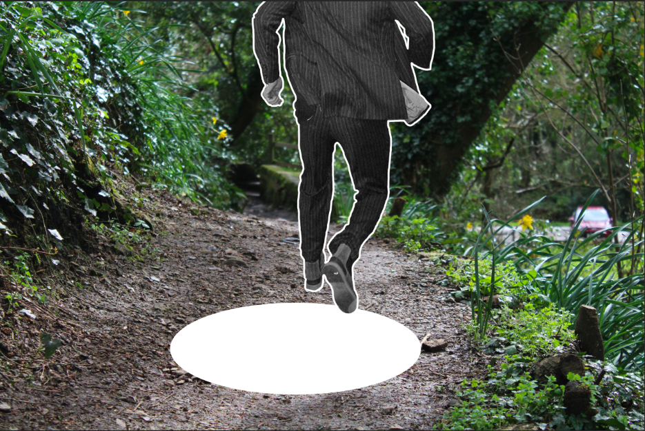
Photo-shoot 1: Editing

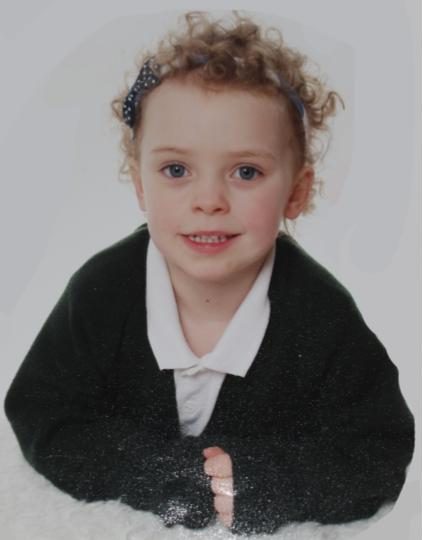
During the editing process for my final images, I made use of Photoshop in order to edit the saturation and colour of the images (which was the main point of focus). I did this in order to match the style of image with the original images, in order to create more points to compare the 2 images. This often requires raising the saturation and lowering the brightness, to give the effect that the new image was old.

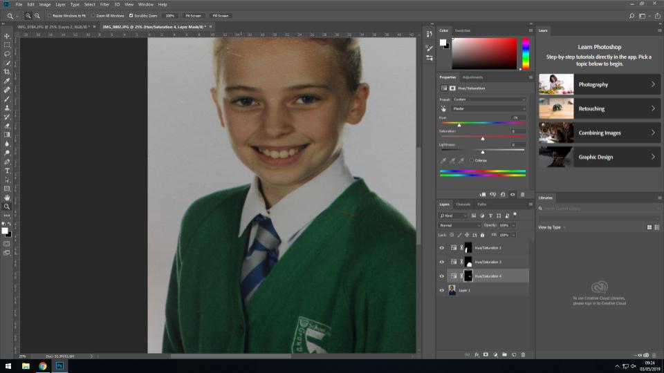
In order to make the new image more similar to the original (and therefore provide more continuity) I edited the newer image so that the jumper of the subject was a similar colour to the jumper of the same subject in the original image. I did this by using the quick select tool to highlight the jumper, before using the saturation tool to change the colour from blue to green. This gave a point of similarity between the 2 images, and allows for the viewer to focus more on the differences in the subjects face, posture etc rather than the colors (which hold less meaning).

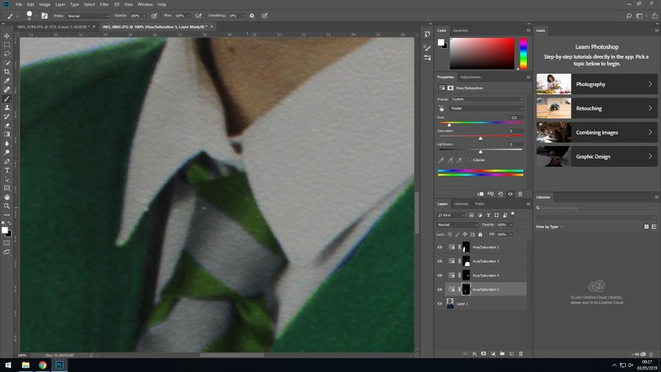
I also edited the colour of the tie in order to match the rest of the image. As the tie was a smaller area with a less simple shape, I used the lasso tool to do this, and the saturation option to change the saturation to a greener shade. This allowed for continuity to be carried throughout the subjects whole outfit.

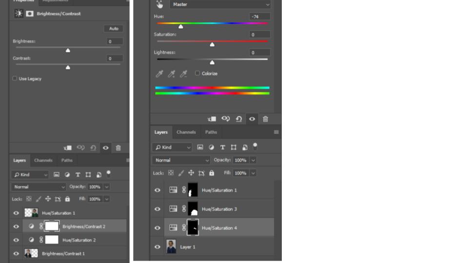
The original image is the subject at an earlier stage in their life, and so to match the tones of the original image with the newer image, I lowered the brightness and heightened the contrast in order to change the overall tones of the image.

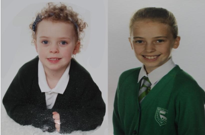
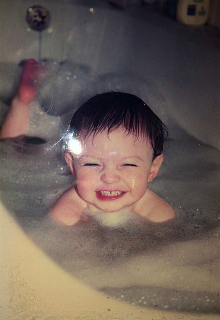
Above is the original image on the right, and the edited image on the left. The left image has been cropped, and the background expanded to create a square image, and the brightness and contrast have been edited so that they better match the newer image in terms of tone and lighting.

The final image is a side by side comparison of the 2 images, showing how the subject has developed through her life, without drawing attention away from the important aspects of the image (such as the facial structure changes, the hair growth, and other aspects that have changed that are not simply the clothing):

For the second image, I changed the saturation and contrast of the newer image to allow for the tones to match slightly more with the original image:

Image before editing

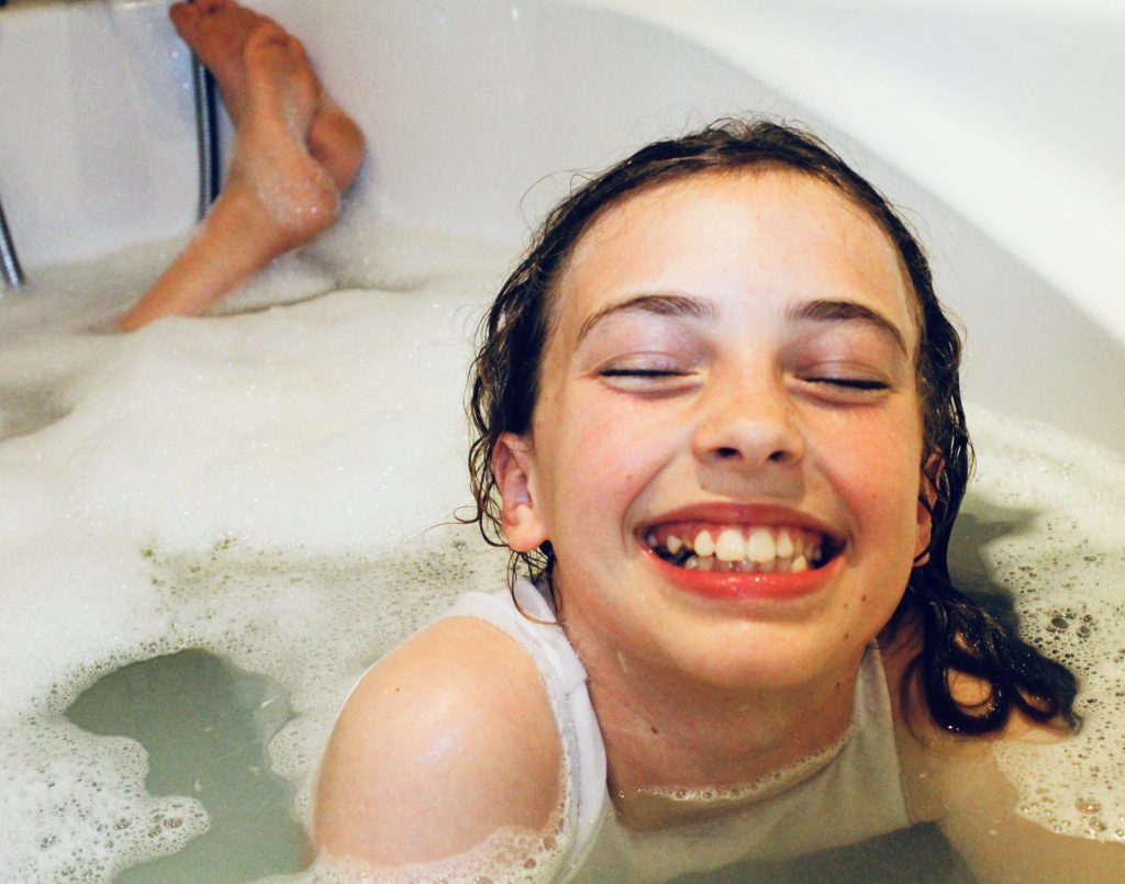
The original image I took involved the subject facing the wrong way, and so in Photoshop I simply flipped the image to resolve this, and have the subject facing in the same general direction as the original subject. In addition to this, I raised the saturation and contrast substantially to give the image a more orange overtone, which I feel both draws more attention to the image, and gives it a more vintage feel (showing similarity between the original and new image so that attention is not drawn just to the difference in shades and colors).

Image after editing

This image will be displayed with the archival image below, showing the contrast between the 2 images, and the difference in the subject, showing how she has changed over the years between the 2 images.

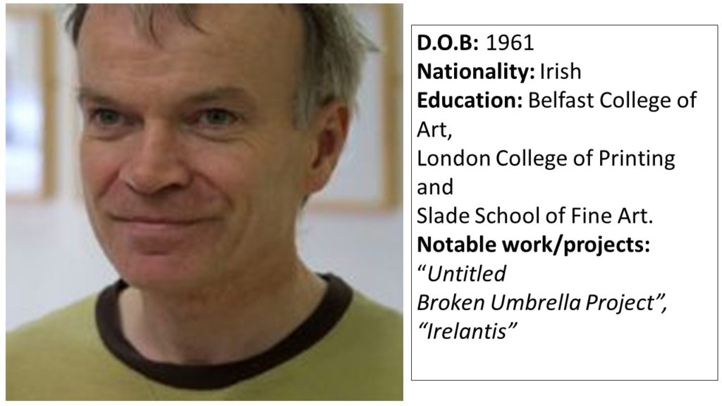
Case Study: Sean Hillen

Sean Hillen is an Irish artist who’s work makes use of the photo-montage method in order to merge images together, showing the contrast between 2 contrasting scenarios that are linked together in a more figurative sense. Hillens work often approaches topics such as violence, politics, literature and history. After growing up in unison with the conflict in Northern Ireland, Hillen learned to appreciate the different meanings that could be portrayed by merging images together, to create an image that drew the eye of the viewer due to the colours and lack of context, but with closer inspection conveys a meaning of some description. Often, Hillens work contains meanings that are personal to him, and some of his work is created with aesthetic as a priority, rather than a meaning or reason.

“When you take a photograph, you take a whole world, a cosmos, with you. And then when you collide it with something else you have a whole new level of meaning, entering, penetrating, sliding against one another.” – Hillen

As my second photo-shoot involves merging contrasting images together to represent a subject being on an incorrect path (where the environment doesn’t match what the subject represents) I have focused my case study on Hillen.

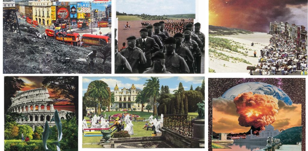
Hillen uses photo-montage to create landscape images in which parts of the landscape completely contrast other sections, emphasizing a split between 2 wolds which have been forcibly merged together. Hillen’s work uses images from different settings and locations and merges them with their complete opposites, creating 1 single image in which the scene looks naturally and organically merged, but the context of the image is twisted or wrong.

Examples of Hillen’s work can be seen below:

The contrast between the images Hillen uses in each piece of work is clear, and the use of bold colour and shapes allows for the images to clearly outline where the images physically come together, although they fit together smoothly.

I will be taking inspiration from Hillens work in order to produce my second photo-shoot, in which I will take an image of a a subject representing a certain career/lifestyle (e.g a suit to represent an office worker), and I will use a photo-montage technique to insert the subject into an environment that does not match the context of their background (e.g an office worker in a forest) to place emphasis on the theme of being on the wrong path/journey. I will be taking inspiration from Hillens out of context imagery, and the idea of merging 2 images together to create a more visual than figurative meaning.