Below are my final images displayed in their frames as final pieces:

Below are my final images displayed in their frames as final pieces:
I have decided to display my final pieces in a range of different ways that are shown and explained below:

1)For my first display, I will be displaying the images from photo-shoot 2 on foam board, all 3 separate images that are not physically connected, but will be shown next to one another. I have decided on this as I feel it is the best way to draw maximum attention to all 3 images, and as they are bright, A3 images, I feel that by not adding a boarder, the colors and brightness of the images can be better emphasized.

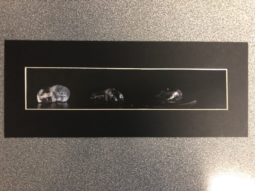
2)The ice images from my 3rd photo-shoot will be displayed on black display card, with a frame that boarders the whole image. I will not be using the frame to separate the images, as I feel that by leaving the image and not segmenting it, I can better create a sense of continuity between the 3 images, showing the ongoing journey of the ice from solid to melted.
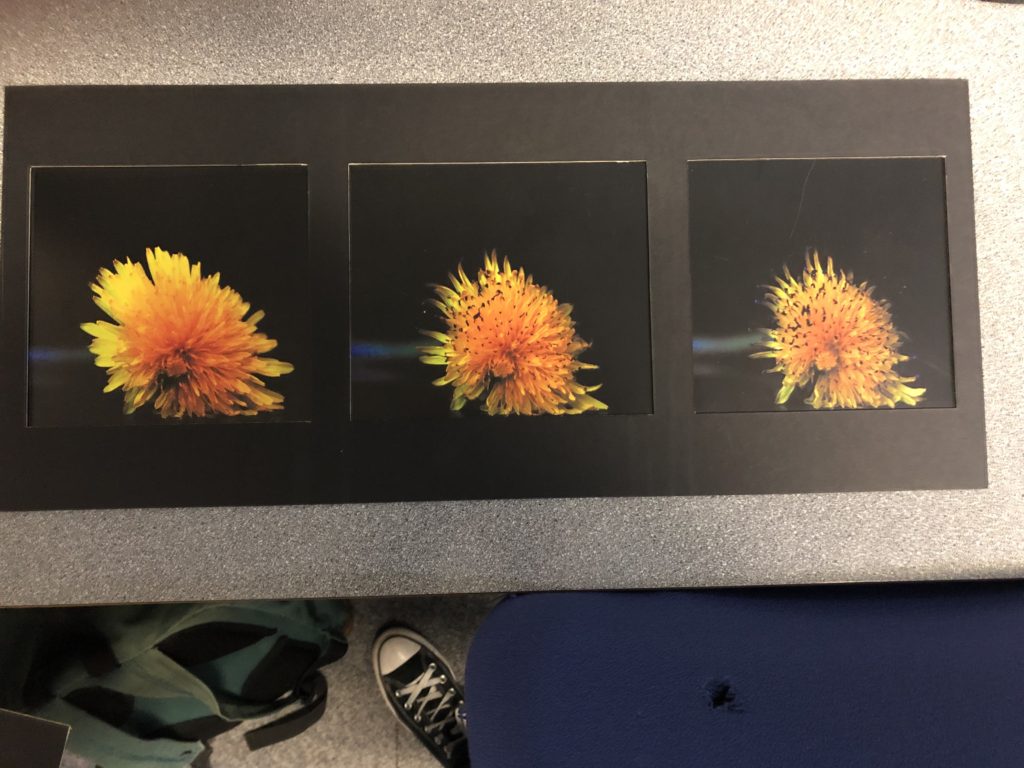
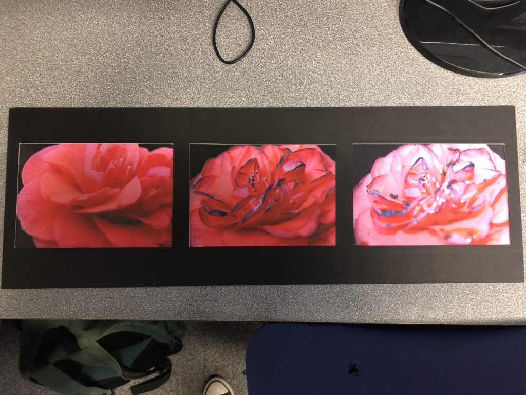
3+4) The other 2 3-panel images will be displayed using the same framing technique, but will have the frame separating the 3 panels. I will be doing this as I feel in this circumstance, each image is different ans separate enough to show the 3 images as 2 completely separate points in time of the flowers lifetime. I feel that by basically framing each image individually while overall having them framed together, I can draw attention to each individual image and the differences between them, while also showing that the whole image together represents the journey of the same flower over time.
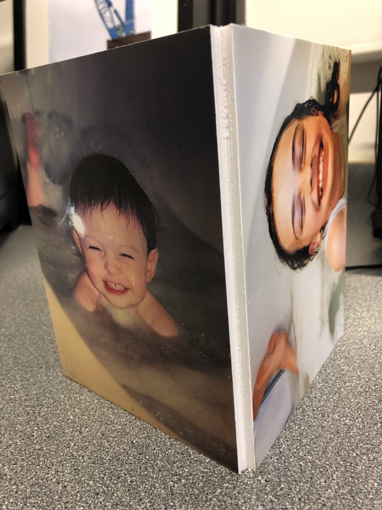
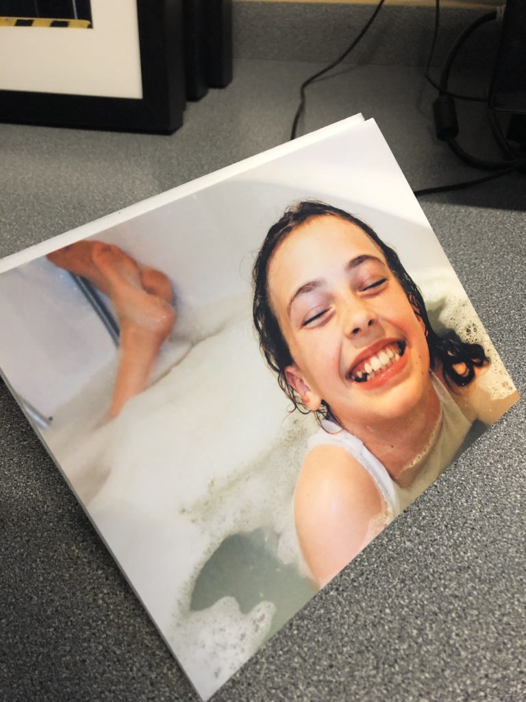
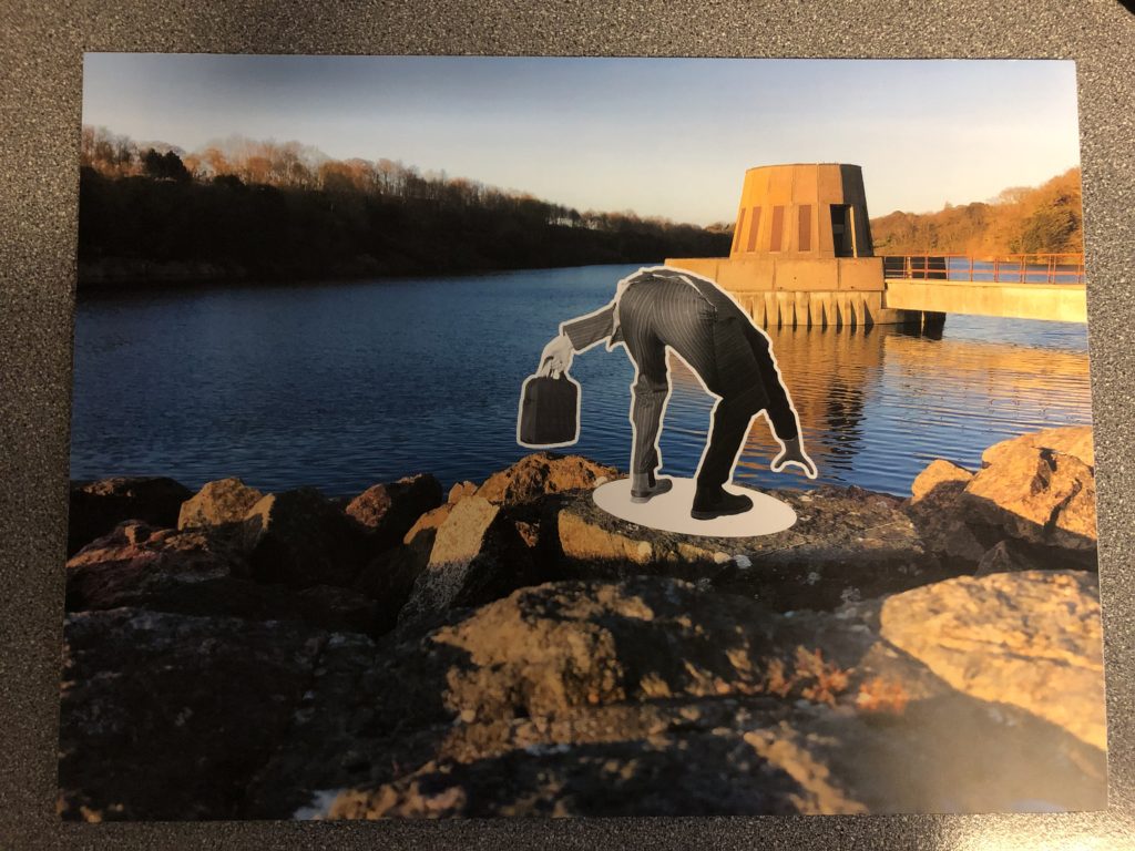
5)The final display includes 2 images, that will be displayed together to show the similarities and differences between them. One of the images is portrait, while the other is landscape. They will be displayed perpendicular to one another, (making a right angle between the 2 images) in a portrait display. I will do this, as the final product will be able to stand either vertically or horizontally. As one image is portrait and the other landscape, I feel that this will disconnect the 2 images, as one will always be turned the wrong way whichever way the display is stood. By disconnecting the 2 images in this way, I will be able to emphasis the contrast between the 2 time periods, while still displaying them in the same display.
Overall, I feel that this project, developed from the title “Journeys & Pathways” has been a success. I feel like my approach to the project and final ideas fit appropriately with the brief given, and I feel that they represent an original and intriguing take on the brief itself.
My ideas developed throughout the beginning of the project, and I was able to settle on 3 very different yet individually distinct and strong ideas, that I would develop in order to produce a range of final outcomes that match with the brief for “Journeys & Pathways”. My ideas included 3 different styles of photo-shoot and ideas, and these were:
I feel that all 3 of these ideas and the concepts behind them fit well with the “Journeys & Pathways” brief, as they all fit the theme of following a subject on a journey, and documenting their progress through that journey.
In terms of my images themselves, I feel like they have the correct ratio of camera skill to editing, and I feel like the editing that I have included enhances certain aspects of the original image, rather than completely altering the image or distracting from the subjects and overall meaning. I feel like the different ideas and photo-shoots show a variety of skills, for example the idea including a subject “falling through” the wrong scene includes more editing in order to show the subject as disconnected from the background, whereas the photo-shoot that involved recreating archival images used less editing, and more skill surrounding the camera angle and the position of the subjects within the frame was used. I feel that, overall, this project has allowed me to experiment with a range of skills from editing to camera skills, which I feel I have successfully shown throughout the process.
My final images have all been chosen based on a variety of factors, such as the quality of the image, the quality of the editing, and the way in which it can be used to convey the correct meaning when displayed in a physical format. I have produced a range of final images that will be displayed in a variety of ways, from together in a series, to individually, in order to best showcase the images, to best present their link to the “Journeys & Pathways” brief.
To conclude, I feel like the “Journeys & Pathways” project has been a success. I feel like I have been able to effectively stick to the brief, while showcasing a range of skills. I also feel that my final images effectively convey the meaning they were originally intended to, and I am pleased with the final outcomes of my project.
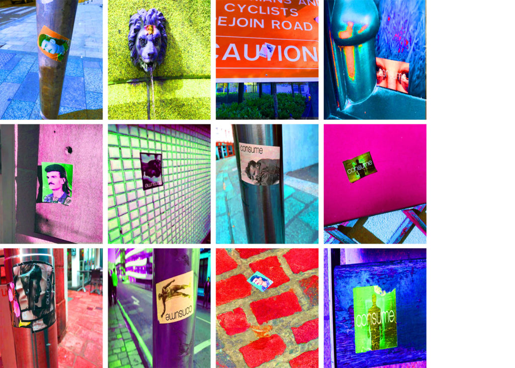
I devised a plan for a shorter and slightly less developed photo-shoot based on following the journey of advertisement for a brand. I came to notice a range of stickers placed around the centre of town, and decided to document the stickers, as they all came from the same source (the same brand). I found that in doing so, I was able to record a story of the town, following the journey around town by following the stickers. As a 4th, admittedly less developed photo-shoot, I decided to include these images in order to act as a mini-project, as it links to the “Journeys & Pathways” brief by showing the pathway marked out across town by these stickers, which led me myself on a journey around town. In this way, this photo-shoot had a more personal touch to it, and due to the fact it was taken in a natural, uncontrolled environment, the variety of these images is broad:
After deciding which images I would be using in the final edit (I had to decide on 12 in order to make the 4×3 final montage), I used photo-shop to edit together the images, and finalize the piece:
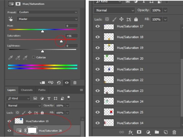
In order to make the final image, I adjusted the hue and saturation of each of the images in order to make the colors extremely bold. I did this as a way to show continuity through each of the images presented (as they now all have the same colour scheme and style) and also used it as a way to draw maximum attention to the image, and allowing each individual image to stand out on its own, due to its individual overall hue. The final image is seen below:
For my first photo-shoot, I have decided to focus on taking inspiration from the photographer Chris Porsz , and have decided to recreate archival photographs from the past (using the same now grown subjects) in order to portray the journey of the subjects through their life, and to show the changes they have undergone in the time between the 2 images being taken. The comparisons will be easier to make due to the fact that the subjects will be recreating the same poses in the same environments, thus showing a reflection between the 2 time periods, and showing the differences and similarities between the subject then, and now.
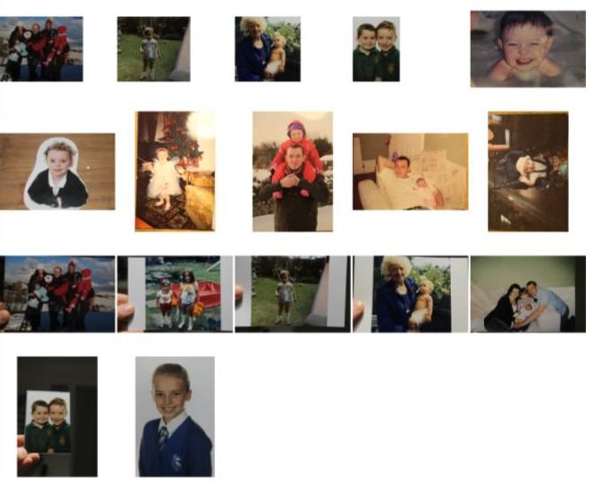
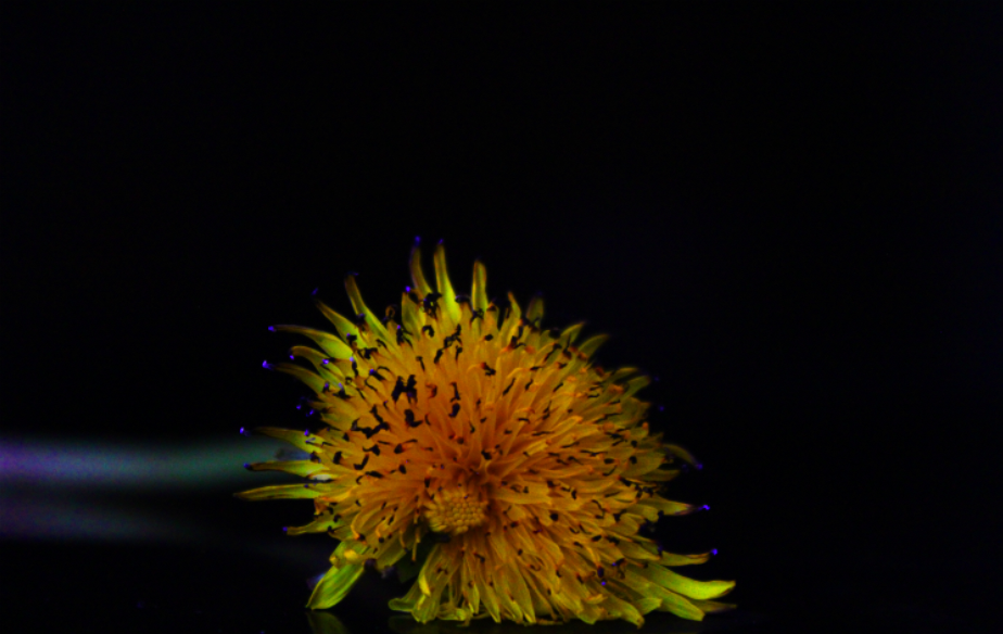
The below images are the archival images that I may be recreating using the same subjects:


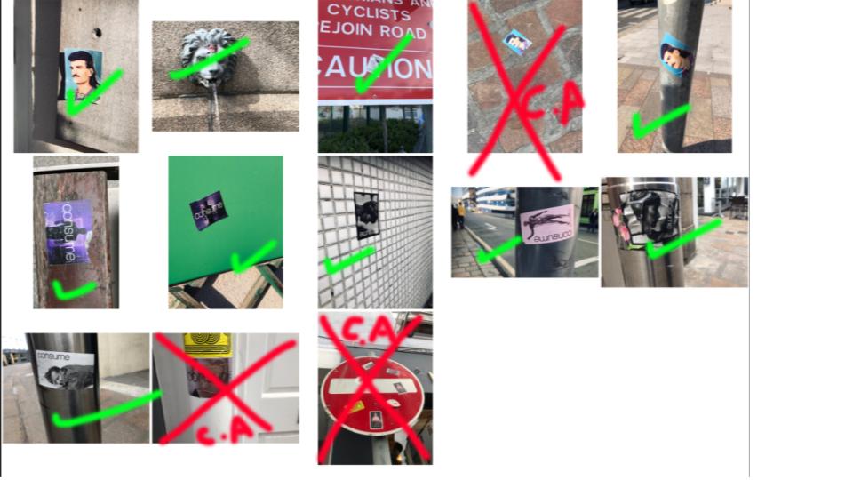
The following images are contact sheets showing my decision making process for the images that I will carry through to the editing process:
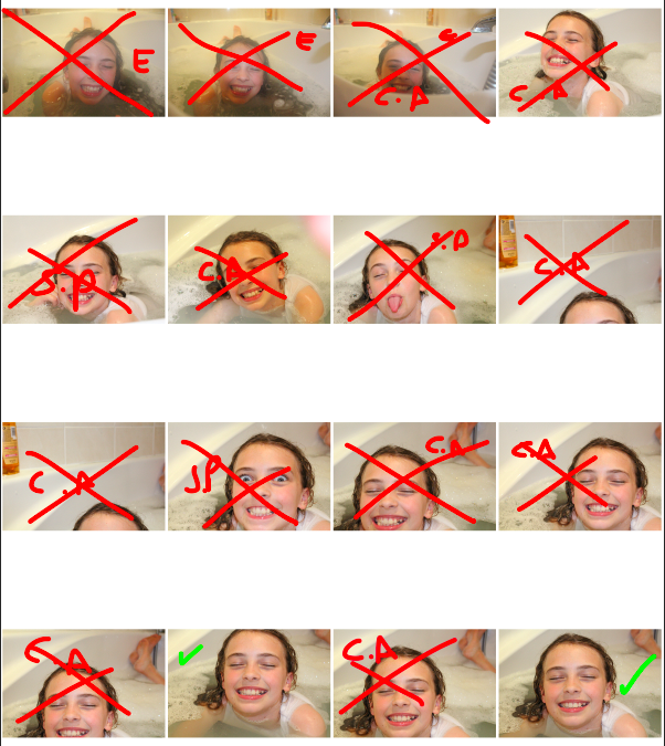
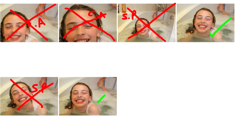
Key: Red S.P = subject posted incorrectly – Red cross = rejected image – Red C.A = camera angle is incorrect – Green tick = possible final image
I also edited the original, archival images in order to make them seem more 2D and flat, rather than lying on the original background that i took the images on. The contact sheet for the archival images is below:
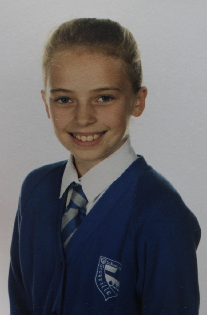
On top of the above contact sheet, I have also made use of Photoshop in order to edit some of the images rather than taking multiple photographs of subjects, I have used a single image that is more recent (e.g a school photo) and have edited it to match the original so that the 2 can be compared. Below is an example of an image I will be editing to match the original:
The below images are my final images for this project, and I will be physically displaying physical versions of them in a variety of ways:


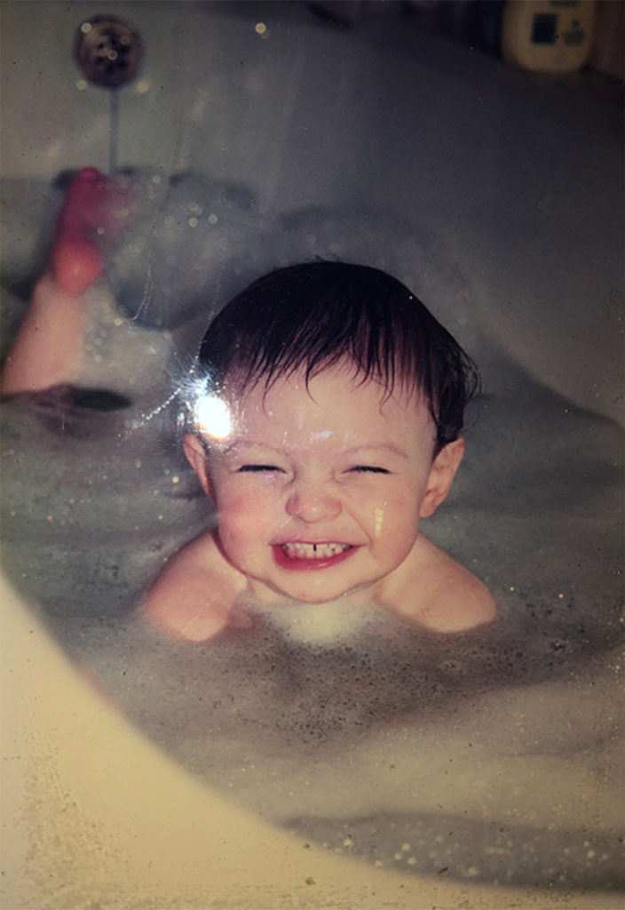
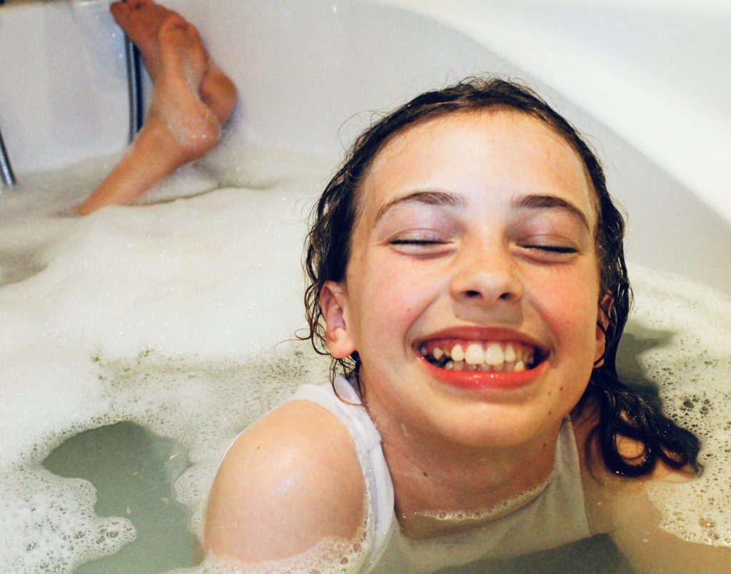

Chris Porsz is a street photographer who, during the late ’90s began his long term project, “Reunions”. He captured a series of images showing the culture and people of Britain during this time. his images included a range of individuals in different professions, groups of children of varying ages, couples, and different identities that were common at the time (from punk to goth). Porsz then brought this project to a conclusion, by, 30 years later, tracking down the subjects of his original photographs, and having them reenact the original images:


Porsz’s photography shows the contrast between the original image and the modern takes, as the differences between the (often young) original subjects and their now maturer selves, along with the changes to the environment over the years, helps to display the journey of the individuals through their lives, through the use of just 2 images. Porsz work is an example of the drastic change that can occur within the space of 3 decades, but his ability to recreate the images using the same subjects in the same positions helps to give a sense of continuity, showing that the subjects memories of the original image (and who they were at the time) is still with them, and remains a part of their identity regardless of the time passing.
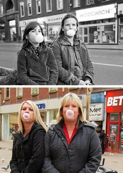


Chris’ work has inspired me in creating my first photo-shoot, which will be centred around recreating archival images using the same subjects in the same positions. This links to the Journeys & Pathways theme of the project, as it will allow for the viewer to see the differences and similarities between the subjects and how they have changed over the period of time between the original image and now, and will help to draw together the 2 different periods of time, creating a loop where the subject is shown to be the same individual that they were when the original image was taken, while still displaying changes and differences that make them the person they are today. The images will show the journey of the individual through their life, from the person they were, to the person they now are.
For my final images I have decided on the following layout:

This layout remains the same throughout this photo-shoot. The following are the images I will use in each of these panels, along with the final layouts:


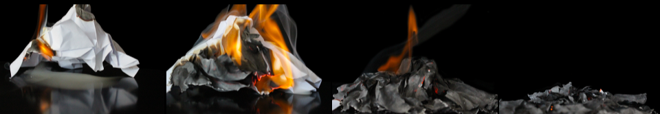
These final images are created to represent the process of the object, from its original state to its final state, after being exposed to different factors, such as fire, heat and time. By taking inspiration from both vanitas art and the use of triptychs, I have produced a way to show the process (journey) of the objects through these stages, ultimately showing the fragility of perfection, and how easily it can be destroyed.
Below I have analysed a selection of images from my final choices in order to give a better understanding of the thought process behind choosing them, why I edited them, and what I will use them to represent in my final display:
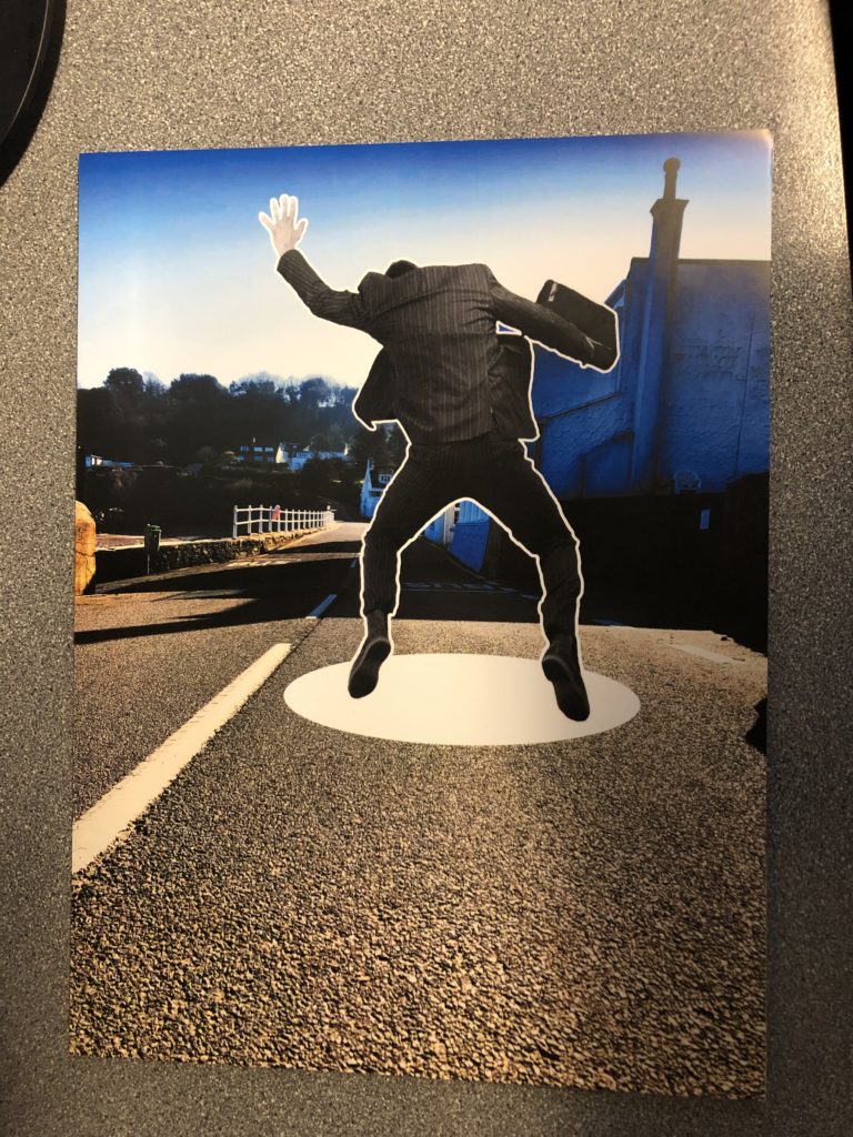
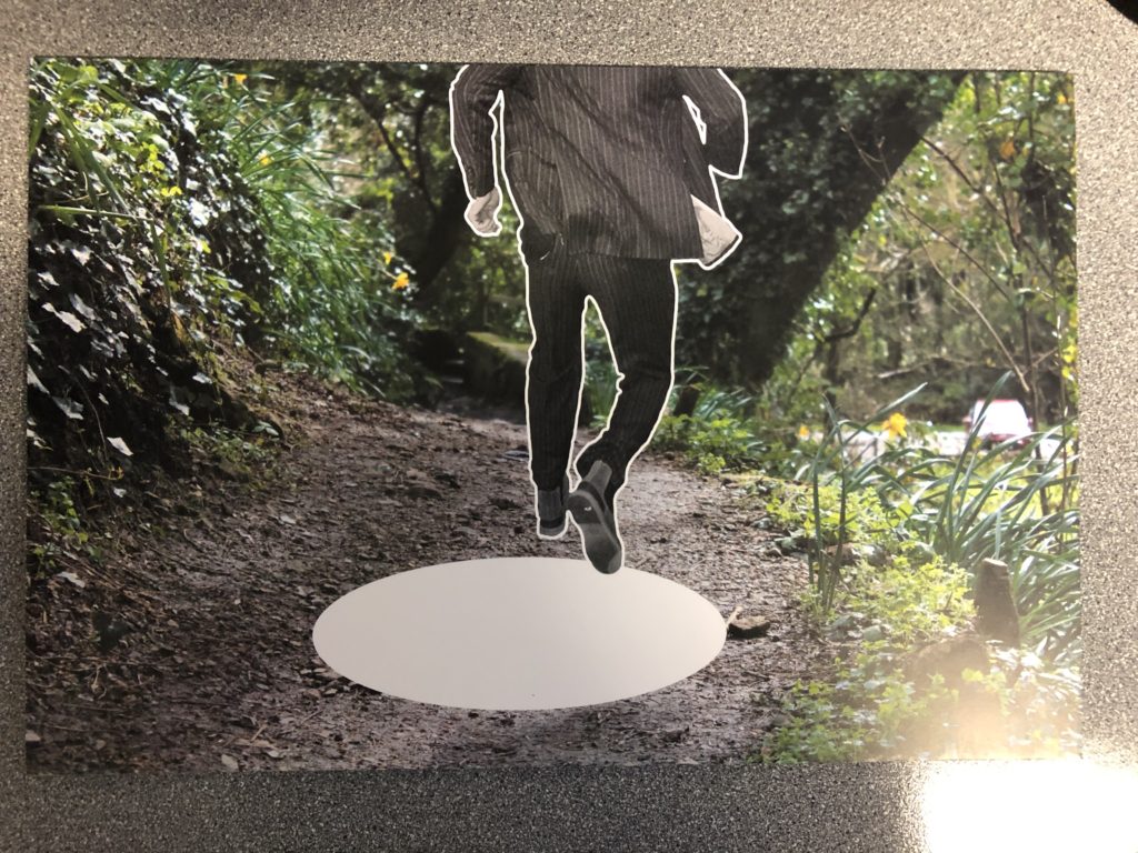
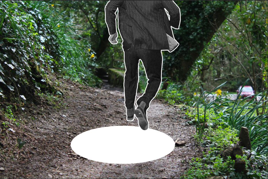
I have chosen the above image as one of my final images, as I feel it is one of the more successful finals from the editing process. I have edited the saturation and contrast of the image, in order to create a slightly unrealistic and bold colour scheme for the image, which I feel helps to show the contrast between all of the shapes in the background, creating a more cartoon like, unrealistic appearance. I feel that by creating this effect, the viewer can see the subject as falling through a completely different scene, which is made more realistic and possible by the concept that the scene may be fictional and not real. Therefore, the image seems more likely to the viewer, and therefore they are able to concentrate on the image more easily. As well as the background saturation and contrast being edited, I added a white outline to the subject and a “hole” below the subject. The white outline is used in order to separate the subject from the background, and to create the effect that the subject is a sticker, which has been added to the incorrect background. I decided that this was more effective than using a ripped paper effect, as it is cleaner and sharper, and more easily differentiates between the subjects outline and the background while still maintaining the shape of the subject, and unlike the ripped paper effect, this outline does not create a large amount of white space, which distracts from image itself. In total, I have used this image to create the effect that the subject is falling through the image, into the hole blow. I have made it as obvious as possible that the subject does not belong in the image, by creating a “sticker” effect, and heightening the contrast in colour between the subject and the background. This way, the message that the subject has been placed on the “Wrong Journey” or “Wrong Path” is made clear, and follows with the exam title “Journeys & Pathways”.
The above 2 images are additions to the first, and will be displayed with the first image as they follow the same concept and appearance, but using different backgrounds and subject poses. I have decided to display these 3 images, as i feel that they give a wide variation of the different backgrounds and subjects, which will help to emphasize the different journeys and pathways that the subject has been placed in that are incorrect and wrong (thus continuity is shown through the different images, much like a story-board).
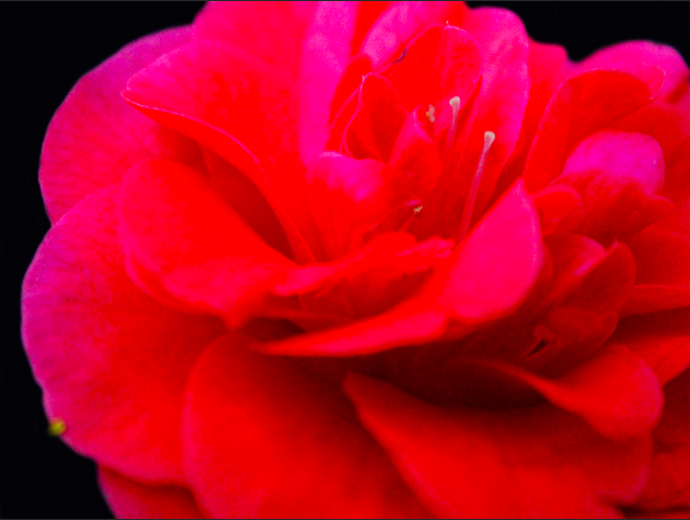
I have chosen the above image as a final image, as I feel that it is one of the best outcomes from the photo-shoot involving the use of 3 panels, and the representation of a decaying flower, with each panel representing a different stage in the decay. To create the above image, I made use of the editing process, and either lowered of heightened the saturation and contrast in order to give the effect that the flower was loosing its colour, and therefore the decline of the flower can also be emphasized not only through its physical appearance in terms of shape, but also the different colors between the panels. By editing the background so that all backgrounds present as the same shade of black, I am able to draw all of the viewers attention to the foreground containing the subject, and in addition, when displaying the work the 3 frames backgrounds will merge into 1, showing the connection between the 3 panels (as they all represent the same flowers 1 lifetime) while also separating the panels in order to show different stages of the same life. In total, this image is used to represent the journey of a fragile object (a flower) through its life, representing each stage of its decline through a single image (which help to emphasize the shortness and fragility of life and health) from the beginning of the flowers life (its healthiest) to the end (as it dies). This concept follows the Journeys & Pathways title, as it follows the objects journey through life, health and death.
The above images are also examples of images that I have chosen as my final outcomes. The concept behind this photo-shoot was to recreate archival images using the same subjects and locations in order to show the development of the subject and the environment over the course of time between the 2 images. I feel like the above images are the best examples of recreating the original images, as I feel that the subject and the environment are posed correctly to mimic the original image, and the editing process I went through in order to make the new image seem slightly more worn (and similar to the original) has allowed for the similarities between the images to be seen not only in the subject and environment, but also in the colour and style of the photograph. I feel like this image is a good example of showing the journey of life, from beginning through to the present, as it displays the similarities and differences between the 2 time periods effectively, and through the use of only 2 images, allowing the viewer to get an inside look in on the subjects life, while still only being restricted to 2 images, leaving questions unanswered such as the identity of the subject, along with what event led up to their present life, and how their journey has effected who they are as a person in the present.
After deciding on the final 3 images for each of the final pieces, I used Photoshop to fit the images together, and edit them in order to present them as their final displays. All final images for my 3rd photo-shoot make use of 3 (or in some cases 4) images, inspired by triptych art display, and the overall meaning and presentation of the images is inspired by the vanities movement in art.

In order to emphasise the deterioration of the flowers as they wilted in more than a very blatant visual way, I also adjusted the saturation of each panel. As the flower continued to decay, I further decreased the saturation of the image, dulling the colour of the petals, which links with the fact the flower is journeying from its colourful prime, to its wilting and decaying form.

The editing process also involved tightening/lowering the contrast of the image in order to reduce/increase the contrast between the colours in the image, which in turn either draws attention to the different shapes within the flower (making each shape sharp and crisp) or dulls the lines between the shapes (emphasising the flatness and dullness of the flower as it wilts).
In order to make sure the 3 panels looked as similar (in terms of location) as possible, I made sure that the background of all of the images was the same colour (using the paint tool in Photoshop). This way, the backgrounds of the panels seem to merge together, whereas the foreground (subjects) are still separated. This process allows for the final image to feel more like the journey of a single object, as it is processed from one stage to the next, while still maintaining that each panel depicts a very different stage in the journey.
The final image can be seen blow, and makes use of 3 images in panels (a triptych) to show the different stages on the journey of a flower from its prime, through its life, to it’s resulting, decayed ending.

The other final images from this photo-shoot also followed the same process (saturation, contrast, brightness and editing of the background) and the results of these can be seen below:


Above are all of the final outcomes for this photo-shoot, all of which make use of multiple panels in order to display the journey of each object.