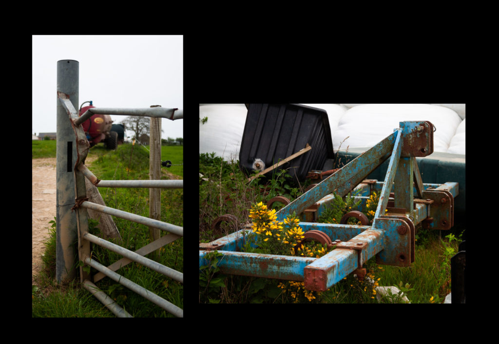
I have decided that I will first back my images with foam board and present them on a piece of black card in 3 different configurations. This will leave 2 images that I liked however didn’t fit with the image sets.


I chose the images to group together based on color palette, composition as well as the tonal balance of the images.

I chose not to include this image in the 3 compositions since I found it too dissimilar from the other images. I also didn’t want to change the orientation of the piece as I thought it would take away from the strong shapes in the image.

I found this image too similar to one of my A3 prints to include in the compositions. It also wouldn’t fit on the black card in my original compositions. This was another image in which i didn’t want to change the orientation.
