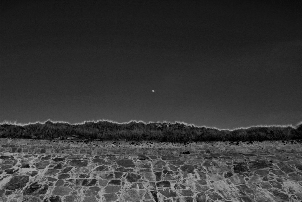
Overall I was extremely happy with the final outcome of this image as when picturing the final outcome in my head and then the final outcome proved to be extremely similar. This image is effective due to the contrasting in shades of black and white. As previously mentioned in the editing blog for this image, it was essential to me whether the photograph stayed in color or convert to black and white that the moon was clear and completely contracting with the sky color in order to give the most dramatic effect. I can happily say I believe I achieved, with not only the moon standing out in the white shade against the grey sky back ground, but along the top of the bank I have managed to enhance the yellow tips of the plants in order to create a further more powerful effect on the overall image. The due to the editing of the black and white shades the lighting of this image had proven to become much darker than the initial image and has removed most removed most natural lighting effects and almost gives off the feeling that a flash was used overall to me producing a much colder and evidently darker image, with burst of white and light grey shade beaming through. The photograph clearly is intense due to the differential shades being portrayed throughout with a regular exposure enabling the darker shades to be edited on to the image. As previously mentioned I used a 18-33mm canon lens to help capture this image, this image allowed a large zoom out to be able to capture a large majority of the wall, moon and sky. Visually the photograph has a clear sense of symmetry due to the the straight wall, clear sky and the moon being center, this to be provides a more aesthetically pleasing view to the eyes. Of course portraying an organised layout and proves the view point to be pretty much looking straight ahead at the wall, however could be argued with a slight angle up more towards the sky and the top of the wall. On the other hand the images very much lack texture this could be due to the sharp shades used and the lack of shadows being presented leading to a more 2D feel. Overall I am extremely happy with this image, if I were to redo this photograph I would try figure out a way to interpret texture to give a further feeling leading to even more opportunities for interpretation.

