My editing procedure;
For my second images I went in the same direction as my previous image as i almost wanted to create a collection of similar images which would further be evident when framing up and displaying my photographs.
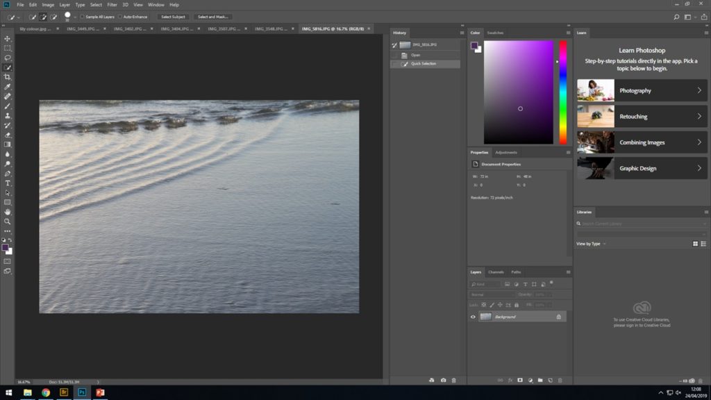
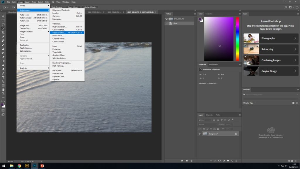
After finally selecting the best image related to water ripples from among the rest, I opened it up on to Photoshop and proceeded to IMAGE > ADJUST > BLACK AND WHITE and from there I began to play around until I was able to finish the image with enhanced wave and ripple in the ocean to give off the best effect. The detailed ripples was something i wanted to be the main focus of the image.
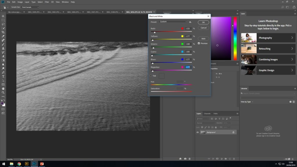
THE FINAL IMAGE
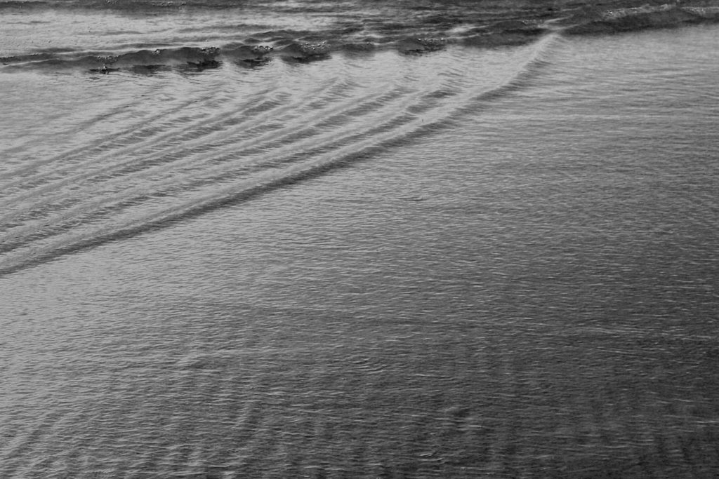
ANOTHER EDIT THAT USED A SIMILAR METHOD
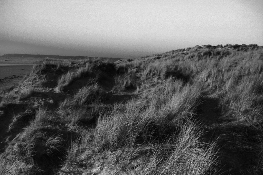
After i had tried similar techniques with the previous images i wanted to try something else that would further the editing skills of my image and add something more to the photograph to encourage a more detail photo to be produced. As well as still having Stephen Gill in mind i went on to the idea of adding more layers to the original images. For this image i used the previous steps to create a detailed and focused black and white images, then followed by adding what looks like white dots to help improve the texture and overall felling of the image.
This was the final image that came out;
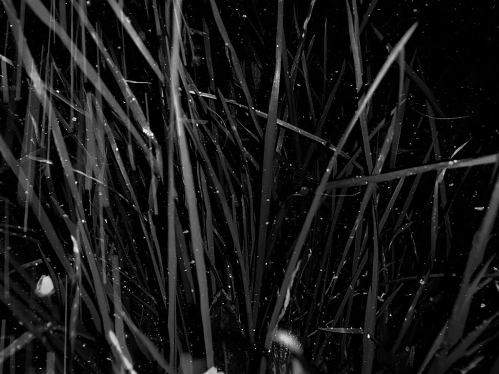
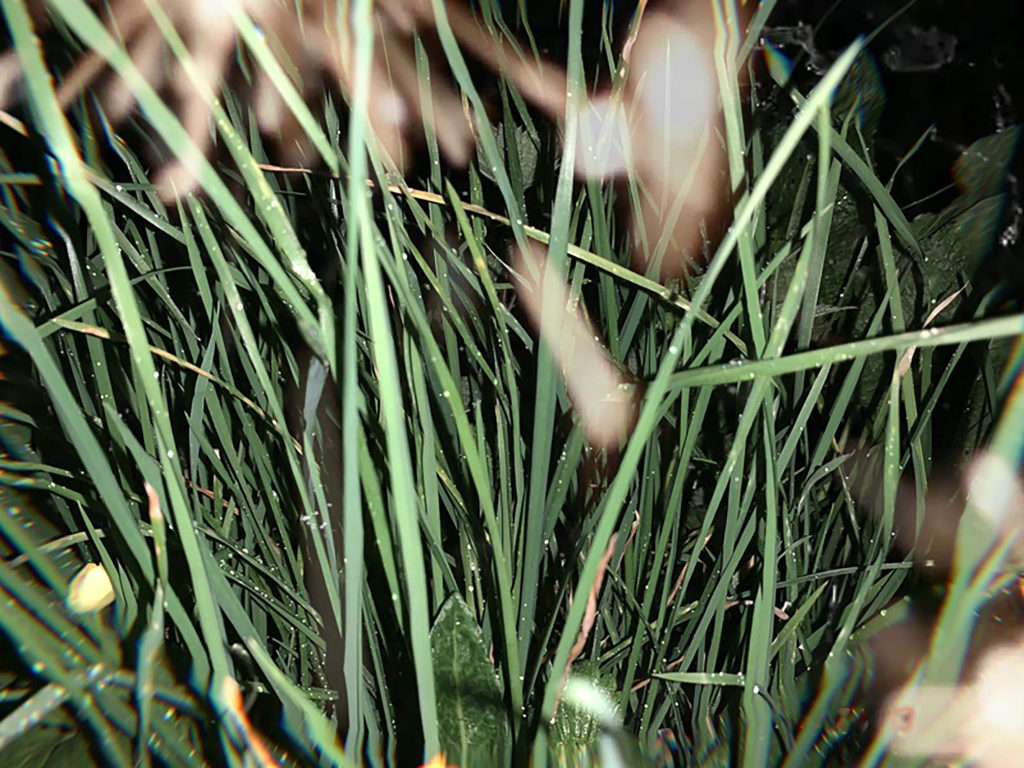
Now that i had fully completed four black and white images with a mixture of landscapes, greenery and the ocean, it was time i took a different path with of course still considering Stephen Gills work and what made his photograph work so well. Firstly to branch out i added color, i used the same image of the grass as from the above black and white image and kept in the original color, although saturated the image to add more texture and create a deeper feeling of a 3D effect. Then as previously mentioned over laid that now in color looks like extra lights or just part of the plants that had become blurry. I now plan to display these tow images together in a contrasting way to help emphasis contrast and the distortion of the shapes placed on top of the photograph and how this has very much added to the overall feeling of the image.
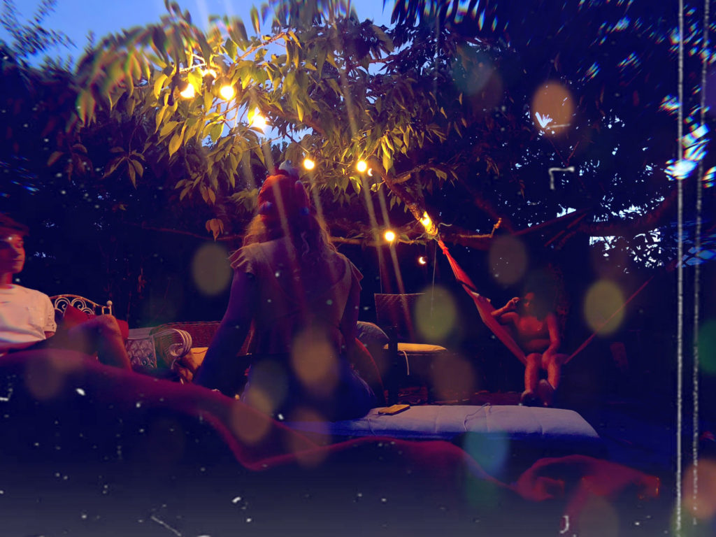
As carrying on with inspiration still from Stephen Gill and experimenting further with what i had done in the images above i produced the following two images, however unlike Stephen Gill in these last images i used people as the background subject rather than the plants, landscapes or the ocean. However to me this made the over lays look a lot better and improved the overall feeling of the images. For these photograph and filtered and edited to a much higher level with adding white lines and circular colored shapes to give the idea and effect of them being reflected off other light from the image. Overall adding a much warmer and theatrical aspect to the final images.
