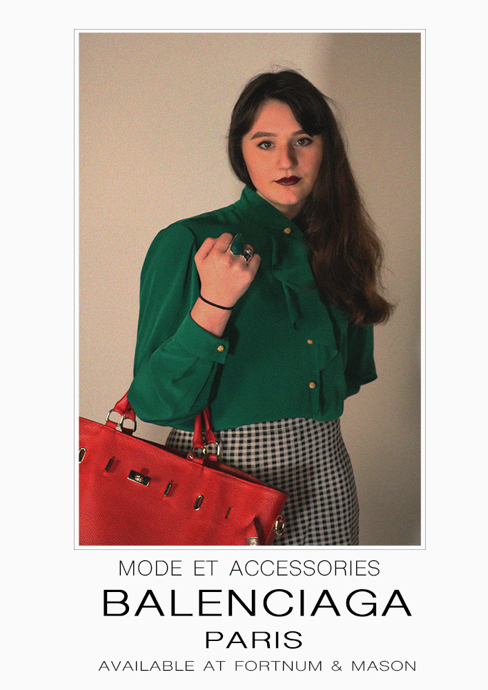
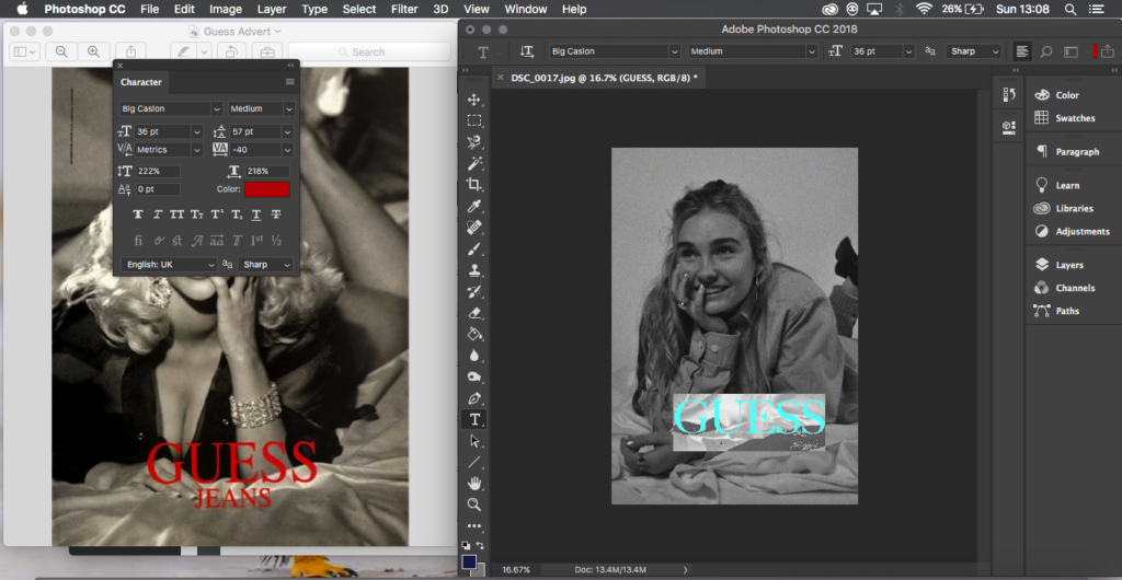
Below shows my final editing and adjustments to the photographs I plan to use as a series. I have placed them next to their original Ad’s and have included some of the editing processes that I took to reach my outcomes as some took more editing and developing than others.
Balenciaga 1980’s:

Editing 1 
Editing 2
To edit this photograph I placed my outcome onto an A4 document and scaled it in a similar way to the original advert so that there is some boarder around the photograph and more space at the bottom. Next I created a small single line clear box around the photograph as this is a detail from the original ad I wanted to keep. Next everything was very simple and using the text tool I typed in what the original ad had written and scaled everything with the spaces and size of text as well as trying to find the best writing font I could to match the original.

My Recreation
‘We Can Do it’ 1940’S:

Editing 1 


Editing 2 

Editing 3
This editing process was slightly more complicated for me that the others I’d had done, while looking at the original ad I could spot that the figures head went slightly over the speech bubble and this would be something I would attempt to do. First I duplicated the background layer so I had two of my image, I then traced around the subject and the frame with the polygonal lasso tool so that only the background was selected and this enabled me to delete it so that I was left with a layer that had only the figure on it, next I went and found the shape tool for a speech bubble and sized and added on on top the top of the photograph. In the layers I moved the speech bubble to be under the layer with just the figure so that her head would go over it, I then spent my time resizing the bubble. After I went on to add the text and spent time sizing it and finding a good font, like the bubble I placed the text layer underneath the figure layer so that the subjects head would slightly reach over like the original.

My Recreation
Guess 1993:

Editing 1 
Editing 2
For this piece of editing I just had my image and the original side by side and by eye I created text and turned it to red and tried to find the best font I possibly could to match that of the original ad, this was some of the simpler editing as I just needed to add text to the image.

My Recreation
GAP 1994:

Editing 1
This editing was simple like the above however I feel was effective, for this image I did go back and work into the actual image itself, enhancing it so that the colours weren’t so dull and were popping a bit more, after that simper with the Guess advert I had the original and mine next to each other and I placed text in and tried to find the best match for font and align the words in the same way. For this one I also added the prices that were in the original image as I felt this could be effective and gave it more of an advert feel.

My Recreation
