Background:
The 1930’s is the interwar period – an era often overlooked in favour of the vibrancy of the roaring ’20s, the make-do-and-mend attitude of the 40’s and the subsequent grandiosity of Christian Dior’s New Look of 1947. The Wall Street Crash in 1929 started a fundamental change to how people lived their lives, with no money to spend companies started researching cheaper methods of manufacturing clothes and cheaper fabrics were being created to replace the decadent fabrics of the 20’s. There was a return to lay-like glamour in the 30’s. Dresses were designed to show off curves of women, they accentuated the waist but not in an extreme was like the corset wearing years of previous decades. There was a business like influence with two piece outfits being worn.
Plan:
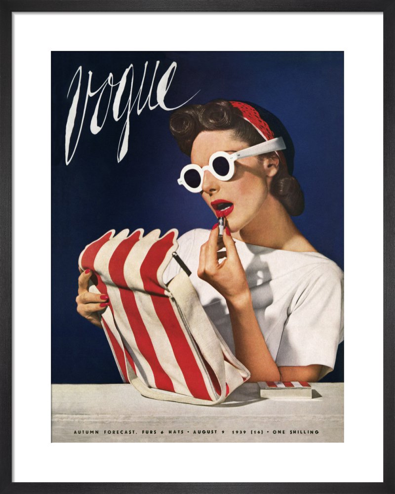
For this recreation I will be taking a famous ad from the 1930’s to recreate, I am planning to do it in the studio to have a plain background for me to edit back into and deal with. I will have my model sit at a table and chair and recreate the pose of the original model. I will attempt to have a good recreation of clothes and stance of the of the original model.
Eight Recreation:

Vogue Cover Poster | US July 1939
Above shows the famous ad that I will be recreating from the 1930’s this specific ad was produced in 1939 photographed by Horst P. Horst, and features the fashion model Muriel Maxwell in an all-American color palette.

Contact Sheets of Outcomes
Above shows my contact sheet of outcomes from the photoshoot. I feel some of my images turned out quite successful, I had some issues with the height of the stool and the table in comparison to each other however I feel the images still worked well and have the potential to work and be edited to look like a good recreation.
Unedited Best Outcomes:
I feel these two photographs are my best outcomes from the photoshoot, I feel the first photograph has a good angle and positioning to see the subject in the frame however I feel the second has good lighting to be able to go through and edit the photograph and generate a good recreation, however I feel the angle for the second image doesn’t have as good and angle compared to the first.

Best Outcome 1 
Best Outcome 2

