
Alongside portraiture, landscape and intimate still lifes, Tillmans pushes the boundaries of the photographic form in abstract artworks that range from the sculptural to the immersive.
German-born, international in outlook and exhibited around the world, Tillmans spent many years in the UK and is currently based in Berlin. In 2000, he was the first photographer and first non-British artist to receive the Turner Prize.

Photo Analysis
 Technical
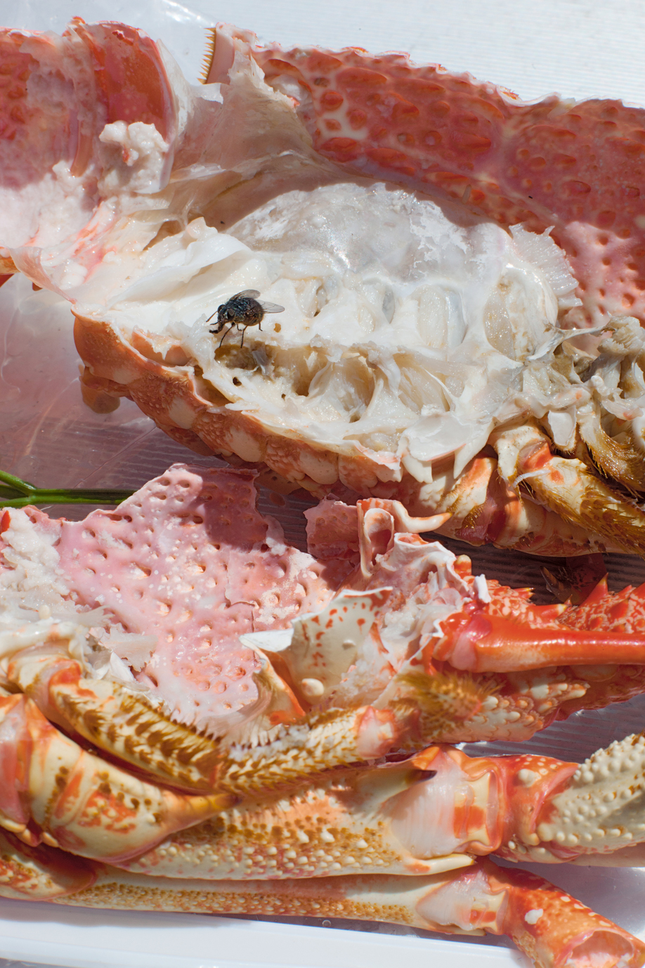
Natural lighting has been used within this photo due to the light source being soft and warm toned casting soft shadows that follow the silhouette of the once alive crab. This warm toned helps bring out the warm colour palette of pinks and oranges. To capture this image, Tillmans used an analogue camera due to the warmth of the picture and the low contrast throughout the image.
Visual
The focus within the image in my opinion is the fly feasting on the lifeless colour-explosion. I think this because the whole image is soft toned and brightly coloured with the interruption of this black figure. At the bottom of the composition, the first exposed shell is facing ‘bottom up’ with the once living crab’s legs surrounding the exposed shell. In the middle of the image, there’s a gap on the left that gives a glimpse of a green basil leaf. At the top of the image, the rest of the exposed crab is facing upwards along with a fly on top of it.
My responses


Best Image
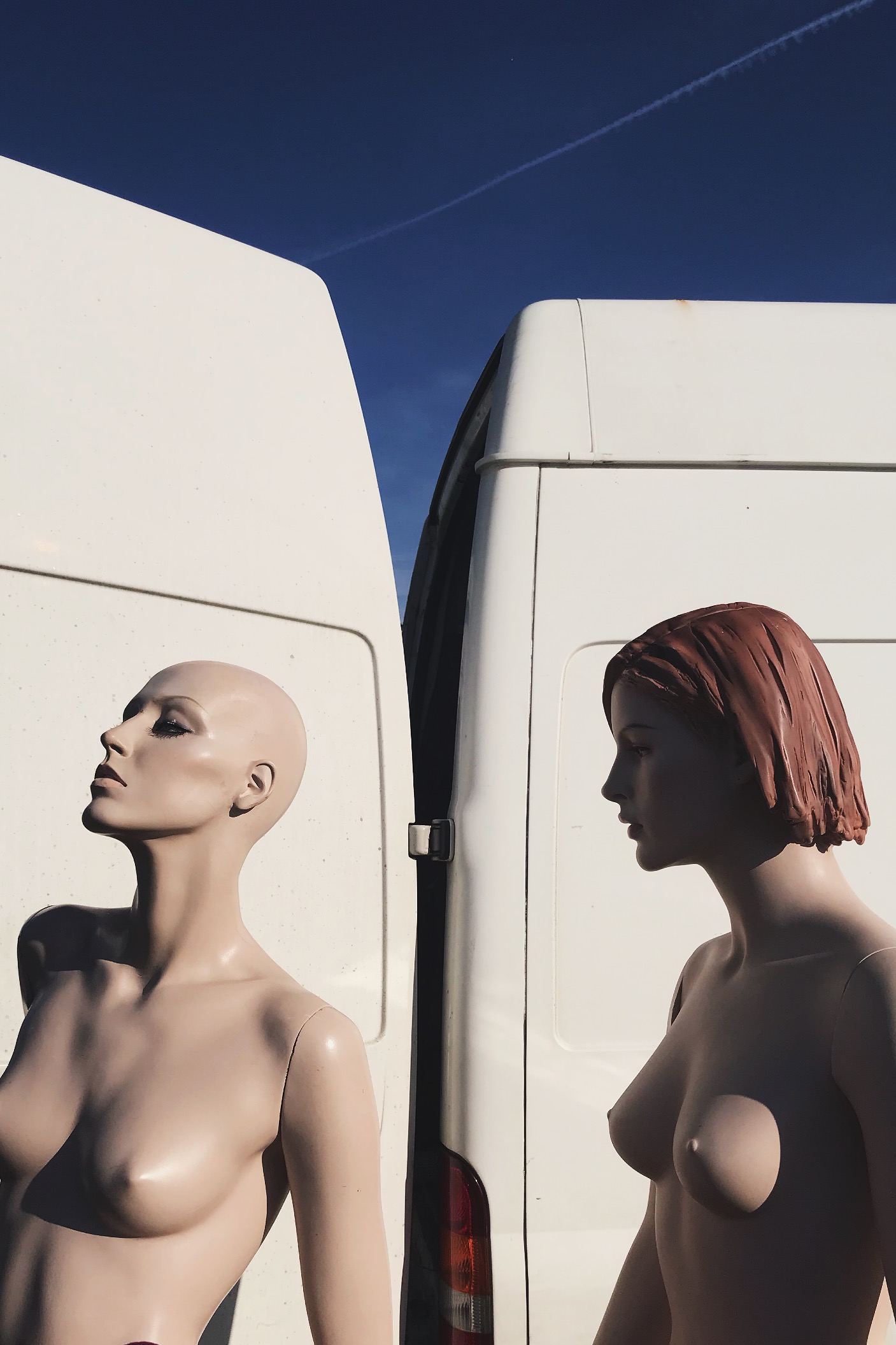
Visual:
In this image i see this as a rule of three, the first section being the solid blue sky, then the white of the van then the bottom being the mannequins. This rule of 3 gives the viewer a pattern that is memorable and easily recognizable. I also like this because it hasn’t got a busy background making the central subject the mannequins. This picture was taken on a very early morning, this is casting sunlight onto the mannequins from the right direction, thus creating flowing shadows and contrast on the perfectly sculpted silhouettes. Due to this also being taken on film, the picture is very warm.
Technical:
Again, this image can be divided into a clear rule of three : solid blue at the stop, solid white in the middle, then the skin coloured mannequins. This contrast of colour palette due to the white and light blue complementing the fair skin tone of the mannequins. The shadows cast on the mannequins reinforces their “perfect” silhouette and refines their shape and posture.
Contextual:
I took this photo at a flea market in Brighton when the sun was just rising. I would’ve happily bought these mannequins home with me due to them having more refined bodies compared to boring plain white ones we have around us. I asked the seller where he found or got them from and he said that his husband worked for Selfridges in London and these specific Mannequins where left for rubbish just because they were never used. So this man took them home and used them to model his artworks and designs he made to promote and sell his work.