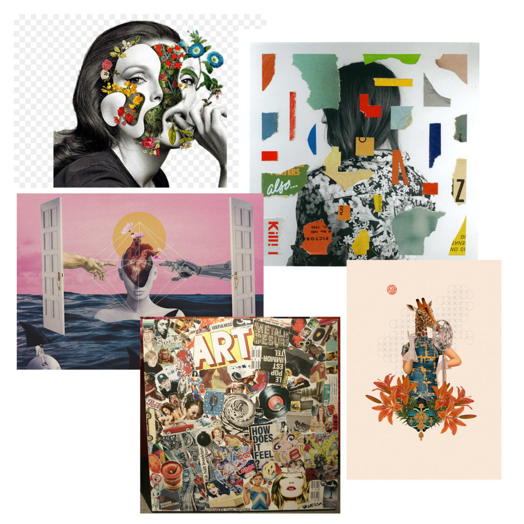
moodboard


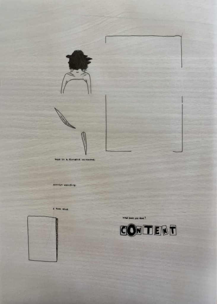
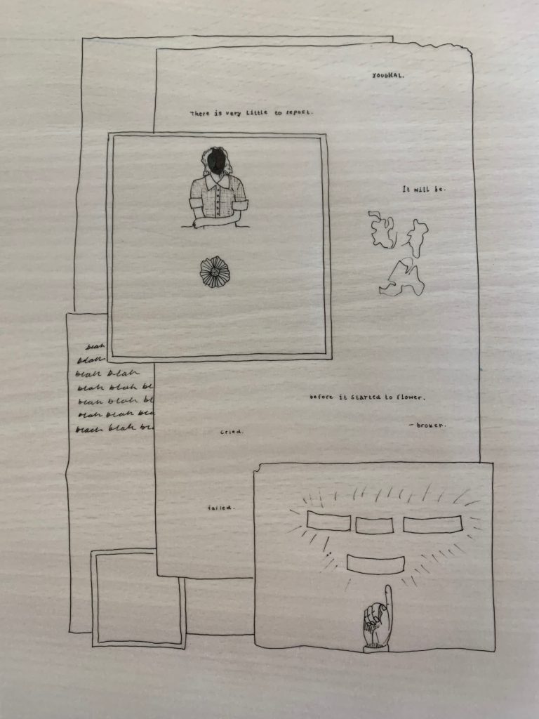
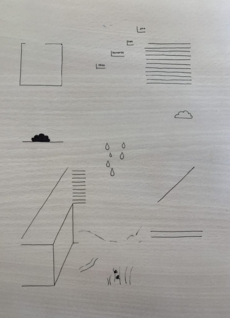
To add another dimension and altitude to my final pieces I decided to experiment with overlays and tracing paper. I chose tracing paper over acetate as it gives the image underneath a hazy, unclear, almost forgotten demeanour to it – like the memories I’m reminiscing over that I can barely remember without great brain power and strength.
Starting out, I printed the collages that I had edited on photoshop, and then proceeded to layer tracing paper over the top of each one. Before this I visualised the whole entire photograph and noted the most eye catching elements of each. Using a black ink pen, I carefully traced what was underneath of the tracing paper, often making sure to check that it was lining up with the original print out.
Below are the final outcomes without the original image underneath.

For my final displays I decided to do a lot of overlaying of images. My first composition on the left is 3 A3 printed images stuck straight onto white card in a diagonal line, the top and bottom images also have smaller A5 images which where first stuck onto foam board then placed on top. I did this because firstly, to the eye it all fits together so having them apart would make the images lose their meanings, and secondly it continues my idea of the life cycle : natural material decomposes into soils then new things are planted until they die and decompose into the soil. My second composition is all of my off-cuts rearranged into an order that still makes sense. Although all of the images are mixed up, the idea of time being the killer is still present.


My only A3 print will be the set of images on the left and I will be mounting them on a foam board, and then on top of that I will be adding cut-outs of from the other set of A5 images (Right). I originally wanted to gather up some leaves and small computer parts to stick onto my A3 Print but after realizing I would not have time to gather all of the parts needed, I decided to change my idea. I will instead mount the A5 pictures on foam board to make them stand out on top of the image.


My framing idea for these two sets is to either have them side by side as above, or vertical, with the tractor being above the ground. I will have a large piece of card as a background, with two smaller foam boards holding each set within the larger piece.
I Went out on two photo shoots for involving automotive photography; one where the car was driving on the road, and another focusing on the car whilst static with the sunset in the background. I wanted to show the car moving along the road while using a slower shutter speed to show the speed. Many aspects from this shoot were based on how fast things can move in life, where as the second shoot was much more about slowing down as a sort of contrast to the first set of images. I obviously wanted the images be based around the car itself, however I wanted to make sure there was more to the image than just an image of a car on the road, so I also incorporated the use of a rear view mirror in the car that I was travelling in, with the subject car traveling behind.
Contact Sheets:


Final Image Selection:

For this image I wanted to show the car in motion, so to do this I turned the shutter speed down to 1/40 and set the camera’s drive mode to high speed continuous so I would have more of a chance to get a clear image of the car. I then turned up the aperture to f/22 to counteract the longer exposure time. To get this shot I had the window of the “camera car” open, and pointed the camera out the side of the car as the “subject car” drove along side, matching the speed of the camera car. This meant that I could keep the subject sharp and clear, whilst the road is blurred. One thing I would improve about this image is using a slightly slower shutter speed, in order to make the car seem as though it is going faster, however because I was not using any kind of tripod or stabilizer, that result would have been much more difficult to achieve. I then threw together a quick edit in Lightroom, turning down highlights, shadows, etc. and generally making sure the whole photo was exposed slightly better. After this I then turned up the clarity to create slightly harder lines on the car, making the different shapes and curves much more defined.
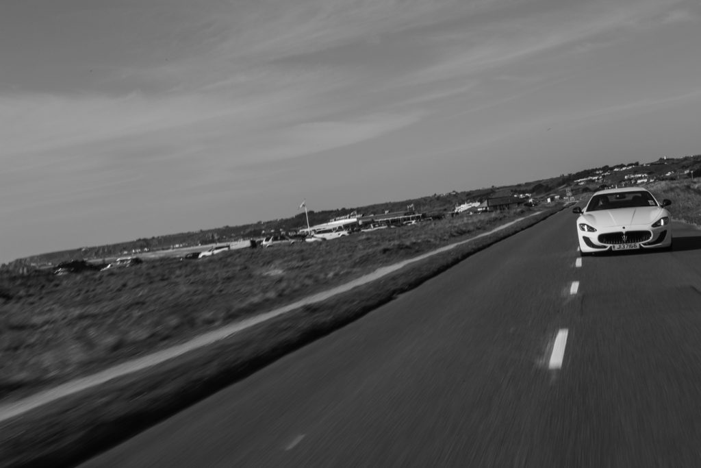
For this image I wanted to include more scenery, so I shot at a slightly wider angle and made sure the subject car was further back than the previous photo, but instead of leaning out of the window, where the camera car would have been in the frame because of how far back the subject car was, I decided to open up the boot and shoot directly out the back of the car, this meant that I could include much more landscape in the background of the shot. Another advantage to shooting out of the back of the car is being able to include more of the road; and as I am shooting slightly wider than normal, the road looks larger as a result. This is also helped by the car being further behind.

For the final shoot, I wanted to include something that focused on the car itself, because even though it is not driving literally on a path/road, the whole concept of a car is that it can quickly take you from point A to point B, and that is what I wanted this image to encapsulate. I wanted to make sure that this set of images also linked strongly with Journeys and Pathways, which is why I did the shoot during a sunset; to show how fast we’re moving even when out of our cars.
Below is a photograph which showcases all of my final outcomes for the Journey’s and Pathway’s Project. As you can see all of the outcomes work together to showcase the Journey of the Second World War, as it shows different aspects which impacted Jersey Journey. I have been able to display my final images in many ways, to showcase different meanings and affects. Overall, I am very happy with the way my outcomes have turned out as they meet the project title, and showcase my top outcomes.


My first final piece is my most successful outcome, the simplistic way of framing showcases the already abstract and distorted images of the bunker. The image itself is strong enough making it effective to display it by itself, Moreover, it has strong links to Jersey’s Journey through the Second World War. If I was to redo this edit I would look at using a black frame as it would help to present more of a tonal contrast, making the overall outcome more visually stimulating.

My next final outcomes showcases two images which was inspired by the artist Knez. Originally, I had three images to display but scrapped one of the images as it was not as strong as the other two. I vertically displayed the two images on foam board, allowing the contemporary framing method to be used. If I was to redo this final piece I would look at using a more abstract and sculptural way of framing, to some extent distort the way we view the images.

My next final outcome was inspired by Talmor, as I showcase three images which have been teared to create one final image. This image is successful as it is ascetically pleasing to look at and has close links to the artist. I placed the image segments on a large piece of foam board. I really like the way this outcome has come out, due to the uniqueness of the design and how the viewers eyes are guided around the image. To improve this idea I would look at using foam board to slightly raise some segments to make an eclectic way of framing and it would also help to add to the overall effect.

My next final outcome showcases my 7 top images from the propaganda section of the project. The way of displaying is simplistic and allows the different posters to showcase my competence in camera and editing techniques. All the images compliment each other and clearly showcases my project title, Journey of Jersey through the Second World War. In my opinion this final outcome would be more successful if I used a larger cork board as the posters would not be overlapping one another.

For my last final outcome I have displayed my three sea wall edits, which was inspired by Socrates. I really like the way the physical wall displays my images of the walls as it allows the viewers to really thing about the purpose of the sea walls, which emphasizes the Journey of Jersey through the Second World War. I like how the wall is white as it does not distract viewers from the actual images themselves, and compliments the images. To improve this final piece I would look at making the wall and images bigger to emphases the size of the wall, and metaphorically shows the big part the walls played in the second world war.
Technical;
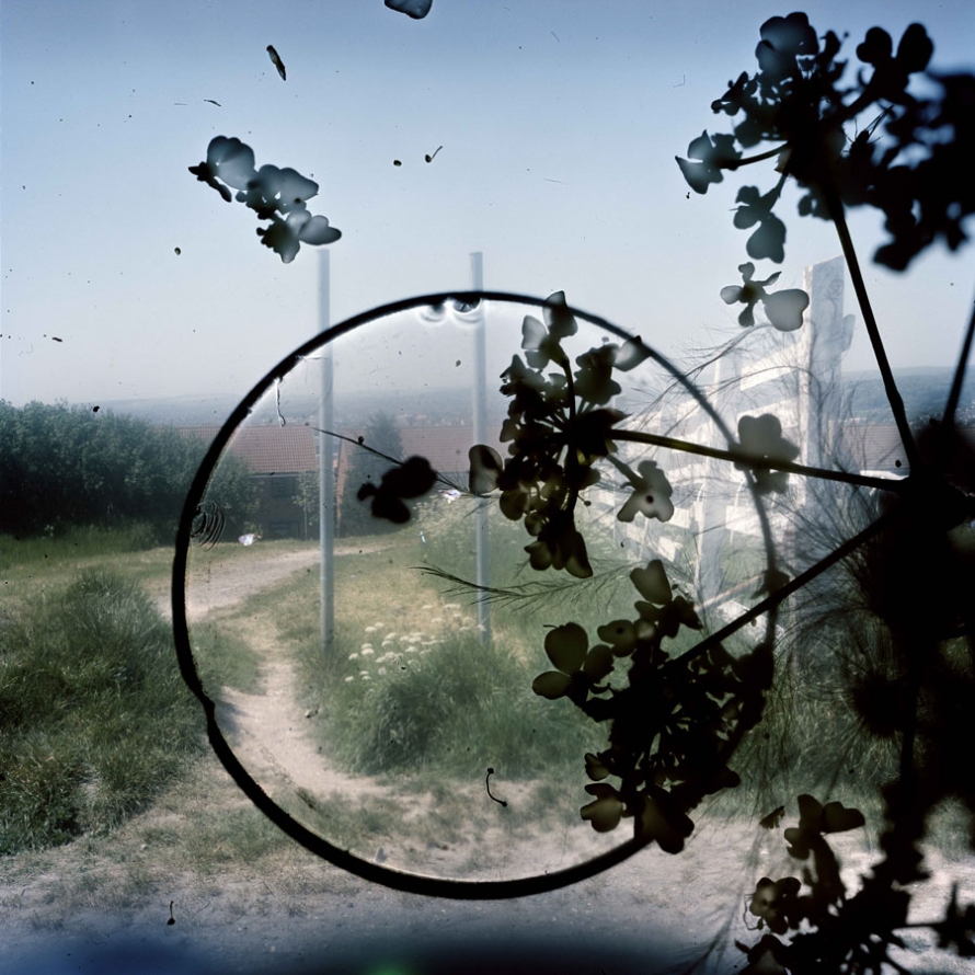
When first looking at this image it is clear that there is an initial contrast of light and dark presented straight away. Firstly the background image, the photograph is represented as a image taken in daylight, from a high up location due to the smaller buildings that can be seen in the background, this give the image a good view point when looking at the image itself. To me this adds more depth which is essential for a decent image to be produced. With an evident use of high over exposure to ensure the clear contrast between the background image and the much darker shapes placed on top. On the other hand the use of the over whelming white blurs seeping through from behind the heavy black print in front is a consistent technique used through out Stephan Gills other work. The temperature of this photograph provides us with a much colder feeling due to the use of paler shade used and the idea of the color emerging from the image, the over exposure almost leads to all the main colors to become extremely pale. However this help emphasis the much darker shapes on top which is clearly a critical point to be bought across from the image.
Visual;
As previously mentioned the main color presented in the image are much paler than what would be presented in real life, this would be due to the over exposure used from the camera to give a much colder and harsher effect and lead to a much further evident contract between the background image and the dark shapes presented in front of the photograph. These black images presented in front of the photograph give the image depth and texture which yet again adds more detail enabling different view and perspective from the viewer to be interpreted. The texture of the photograph to me is still represented in a flat smooth way rather than a ’lumpy’ texture, although there is a clear texture that must be presented due to the over lays on the images. The black images in front to me give an almost stain like feel this can be seen through the circle which could be translated to a coffee mug stain. On the other hand the other patterns are more of a floral type or a plant pattern that have been possibly imposed on the image by using chiffon giving the overall feel to the images and the essential contrast. As mentioned the texture of the images isn’t necessarily rough or uneven but the photograph for sure gives a strong 3D effect. The organisation of the image to be proves to be unorganized and almost random display of the gloomier images, with the placement of the plants and circular ring being placed out of center and unsymmetrical, although I believe this to add the end product and feeling of the image.
Contextual;
For the creation of these images Gill in Brighton and Hove during 2010 added features of objects and creatures that he had found and picked up from the his local surrounding, use his natural environment to help produce his most famous work, and the introduced that into the body of the camera to give this new effect. Gill hoped through this particular approach it would encourage the spirit of the place to clamber aboard the images and be encapsulated in the film emulsion, like objects embedded in amber. The aim was to evoke the feeling of the area at the same time as describing its appearance. Gill said that this particular technique gave him less control, and provided a considerable an element of surprise, as how the image ended up was not always a plan and was for sure at times not what was expected. Some results included some highly detailed macro recordings amongst and within the landscape of the portraits. Gill said ‘ like to think of these photographs as in-camera photo-grams in which conflict or harmony has been randomly formed in the final image depending on where the objects landed.’ Some of Gills technique to get these particular effects on the image were, by using a magnifying glass to concentrate the sunlight onto some of the negatives in order to etch markings directly onto the image or sometimes Gill would even dip his negatives into the sea.
Conceptual;
The types of images Stephan Gill produced left a wide option for different interpretations and different ideas to be produced from the viewers of the images, this was due to the different types of backgrounds hat were over exposed and the dark shapes over laid on top of the original image. That’s one of the best things about Stephan Gills work there is so much opportunity for personal explanations of what the images means and represents.
Overall, my project has been constantly evolving and adapting from day one. At the beginning of my project, I focused on ‘The Journey of an Object’, this was too simple for me and I wanted to challenge the idea of a journey of pathway. The journey I ended up focusing more was ‘The Circle Of Life’. I represented this with flowers frozen in ice – so I could physically freeze a moment in time and retain it, press flowers – so as they decay they stay flat and create their own composition, and I also captured deceased animals to capture their ever-lasting last moments and how their bodies responded to it. This collectively in my opinion, shows how time cannot be created or destroyed but can be held in a single moment.
My original interest for ‘The Circle Of Life’ came from a case study I did about Wolfgang Tillman’s still life photography. The specific image that inspired me was called ‘astro crusto’, an image that showed an open dead crab with a fly feasting on it. This sparked my whole idea of decay and time.This was all then followed by my case study of Heikki Leis who focused on the decay of food. I couldn’t really catch onto the idea of rotting food due to two variables, one being a time constraint (I didn’t have enough time to let my fruits and veg rot with a sufficient amount of decay present) and secondly handling these rotting foods causes many illnesses and put me off. However, thanks to some generous cats I was able to handle some deceased rodents easier because firstly they were brought into the house so I didn’t have to go and find them, and secondly the cats only bring them in as trophies so there was only puncture marks.
Editing wise, I kept it simple with just colour adjustments and cropping, however during this project I became more accustomed to the use of cameras and I could set them up for images that didn’t needing much editing due to me having already capturing what I wanted. For my final images, I decided to layer my images over each other because I think it really ties in my whole idea of ‘The Journey Of life’ and how death is inevitable.
Overall, I’m happy with the content i have produced because it all ties into one clear topic and they’re not reliant on editing and manipulation.


I chose these two images to be paired for one of my final outcomes because they respond to The New Topographic, which I have been focusing on through the ‘journeys and pathways’ project. The New Topographic relates to the project because it is showing man altered landscapes, often connected by roads and urban developments.
These two images present the same subject from two different viewpoints. The building appears as a substantial part of each scene emphasising the dominance of urban structures over the natural features. Cables form an integral part of the urban landscape dominating the skyline, competing with the natural beauty of the palm trees.
For my first pair of A4 images, I will be displaying them onto white card because of the clean and simple look it creates. The white card will match the white building that can be seen on both images.
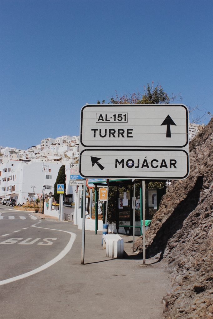

This pair of images also respond to The New Topographic but are from a different photo shoot. The image on the left depicts a sign showing the direction into Mojacar town. Road signs are often seen in photography work labelled The New Topographic because they appear as intrusions in the landscape being both bold and obnoxious. The image on the right depicts a close up view of the white washed houses that can be seen from a distance on the left hand image. The houses appear cluttered and demonstrate the impact people have on the landscape and how urban development is increasingly taking over.
For my second pair of A4 images, I will be displaying them onto white card. The white card is colour coordinated with the road sign and the moorish houses. I didn’t select black because it would create contrast and fail to produce the simplistic look that I’m after. Additionally black would clash with my images.

I wanted one of my final outcomes to show my response to Luke Fowler who creates two frame films which are juxtaposed yet linked to each other in pairs. This pair is different when it comes to the lighting but the same in composition and subject.
For my third pair of A4 images, I will also have a window frame to reveal the images. I decided to use black card to replicate Luke Fowlers style of two frame film. The black card will frame these two images together and replicate the photographers style.

I have experimented in the project ‘journeys and pathways’ by taking pictures throughout the day every hour. Taking pictures of the tide every hour was one of my strongest outcomes because it shows the journey of the tide from high to low. The composition in each photo is the same and the viewer can see the gradual progression of change.
For my last set of images I decided to mount them onto white card to keep it simplistic and so the viewer can focus on the movement of the tides. Before mounting them onto the card I will stick each individual photo onto foam board so the images appear raised to capture the viewers attention.