presentation

To present my final pieces, I wanted to try something diverse and ordinary instead of exhibiting them in the usual window mount situation.

I’ve decided to embroider the tracing paper onto my original print and hang it with small golden bull dog clips and string. If I had chosen to present my final works in a window mount I sense that it would over power the delicacy and fragility of the final outcome, and as presenting your images is just as important as the image itself, I wanted to make sure they both complimented each other fairly.

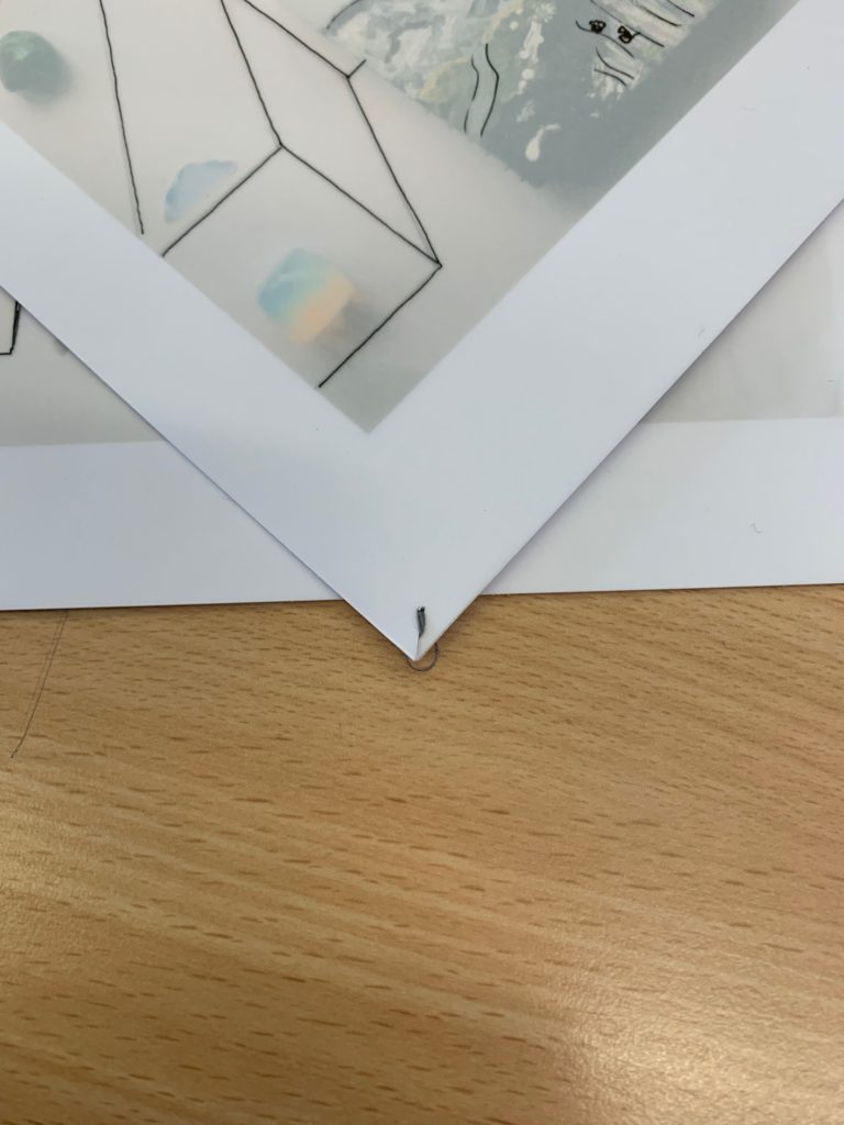
Starting off, I punctured holes in each corner of the photographs and stitched tracing paper and original print together with a needle and grey thread.
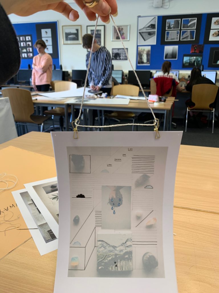
After this, I attached two small gold bull dog clips to the top of each piece and then tied the string through each hole to form a hanger.

A close up of the hanger method and picture of all three final pieces.

The order that the works will go in.

Comparing Final Images to Heath Ledger

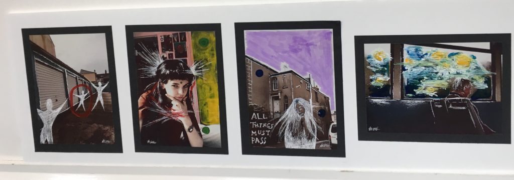
Differences: To begin, Ledger’s work (left) was taken on real film between the late 90s/00s whereas I edited mine (right) to look more like real film even though it was taken in 2019 on an iPhone. I added a filter and increased the graininess. His original photo is black and white and he has added colour with paints,etc unlike mine which was a crisp colour photo which I later added a filter onto. The facial expressions are also different. in my opinion neither look staged, especially as in Ledger’s, the woman is presumably just looking out the window and half smiling: this seems like a natural pose. In mine, the pose seems slightly forced because my friend is looking directly into the camera and doing a hand gesture. However this isn’t the case. I actually just took out my phone and randomly took a photo of her because I liked the lighting and background, then pulled that pose as a joke.

Similarities: The first Ledger-style edit I made to my photo was adding the dots on the forehead and in the background, this is because I really liked the way it looked on his and tied it all together. I also like just the simple sap green colour as it gives off a hippie-like vibe, with all earthy colours. Next I decided to fill in some of the background with yellow acrylic paint like Ledger has done in his, just to add more colour and block out unnecessary things in the background, I also did with this with a pink marker to add another medium and texture into the mix. The last thing I did inspired by him was using the white ink to scratch into the paper and frame the figure. I also added some to the shiny parts of her hair and some coming off her head as I thought that looked cool.

Overall, I did really like how my set of images turned out, I think I researched into Ledger enough and acknowledge the methods and mediums that he used to create these, but also added in my own personal touches, drawings etc. of what I wanted aswell.

Final Display Outcome

PIECE 1:

Even though both of my final displays are virtually the same, they both have various different aesthetic differences. The first set of images is fairly simplistic and minimal. The way in which we see the human impact is very subtle, for example in image 2, in the reflection we can see a man made structure yet it is surrounded by a dull and calm sea. The color pallet of the first set is a lot more subdued therefore making them great to pair with images which may be more complex or dramatic in other aspects. Both displays compliment each other nicely with the repeated display boxes and the images inside them. They are a sort of mirror image of one another, both metaphorically and physically.

PIECE 2:

Even though both of my final displays are virtually the same, they both have various different aesthetic differences. Set 2 , although similar, has some key differences which make it perfect to pair with set 1. They both follow the same theme and tackle similar issues, yet the addition of a model in set 2 means that more symbolism is added to the images. It is very much like set 1 but additional elements. Instead of having a subtle color pallet, the images are bright and saturated. They include organic and man made structures in them such as the quarry in the backdrop and the various rock formations around it. It is a lot more clear what the suggested theme is in these images as opposed to set 1, allowing the viewer to understand them with the aid of set 2. The theme of surreal nature and landscape romanticism is also a lot more apparent in set 2. The vast expanses of sea and high cliff tops in the backdrop allow the viewer to feel a sense of awe whilst looking at the images.

Final Finished Displays and Mounts

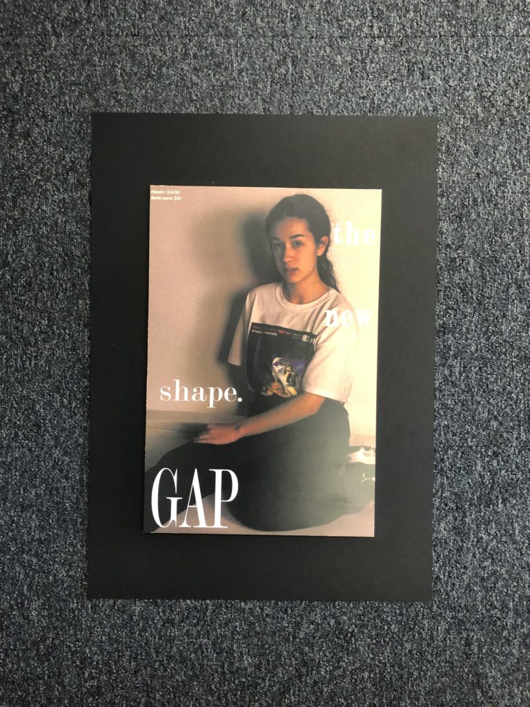
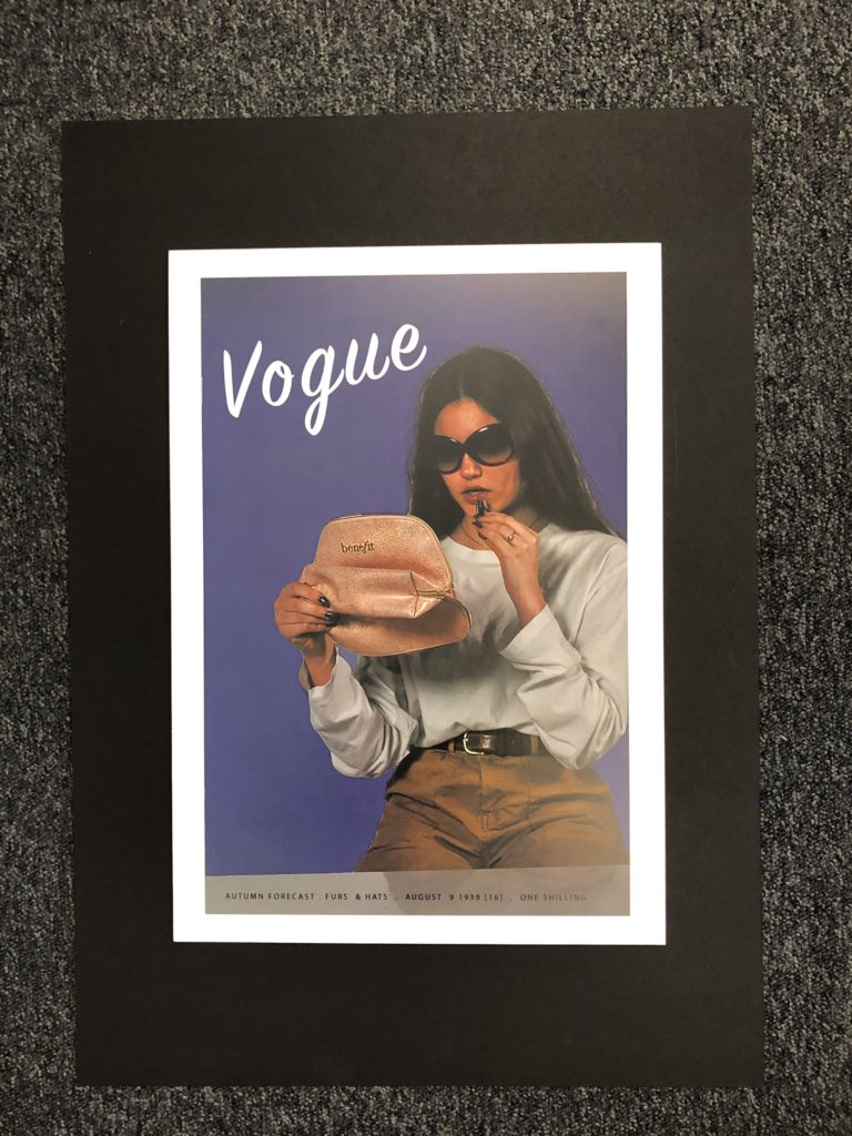
Below shows how my final outcomes turned out ones printed and displayed, I chose to display them on foam board and then onto black mount board as I feel this is what worked best with the photographs and it made them stand out off the page which I feel was effective in displaying the types of photographs that they are.

I am happy with the way that my final displays had turned out and the actual photographs themselves. I feel that putting them on foam board rather than a window mount helped to make a difference and stand out for the types of photographs they are in the style of adverts and what they are presenting.

All of my final photographs have stemmed from inspiration and ideas from people such as Kourtney Roy and Cindy Sherman and the message that they also try to send across to people and the style and way that they portray those ideas I feel is effective and stand out which is one of the reasons as to why I placed my pieces on mount board. I feel that adding the writing and actual advert elements helped to make a better impact and I feel was more effective than just leaving the images as they were.

Below shows a created image of a virtual gallery to suggest what my work could look like in a gallery and all displayed properly together. This helps to give a sense of all of the photographs being grouped together and how I may show them if I was to have a real gallery space to put them in and I feel helps to give it a different perspective.

Creating Displays

To display my responses to Journeys and Pathways, I am going to create 2 different displays in order to showcase them as finished products. The first will be of my heath ledger responses, I am going to back the original images with black card and then spray mount them onto a rectangle piece of white foam board. I think this method is simple & doesn’t take too much time like making a window mount would be. For my second display which is the archive recreation one, I am planning to have a vertical display of 3 pieces. I am going to use think black card and cut it to size. Then I am going to use fixative to stick the vintage photo down and then do the same for the acetate but put it slightly coming off at an angle.

Final display 1 next to a white wall.
Final display 2 next to a white wall.

Displaying Process

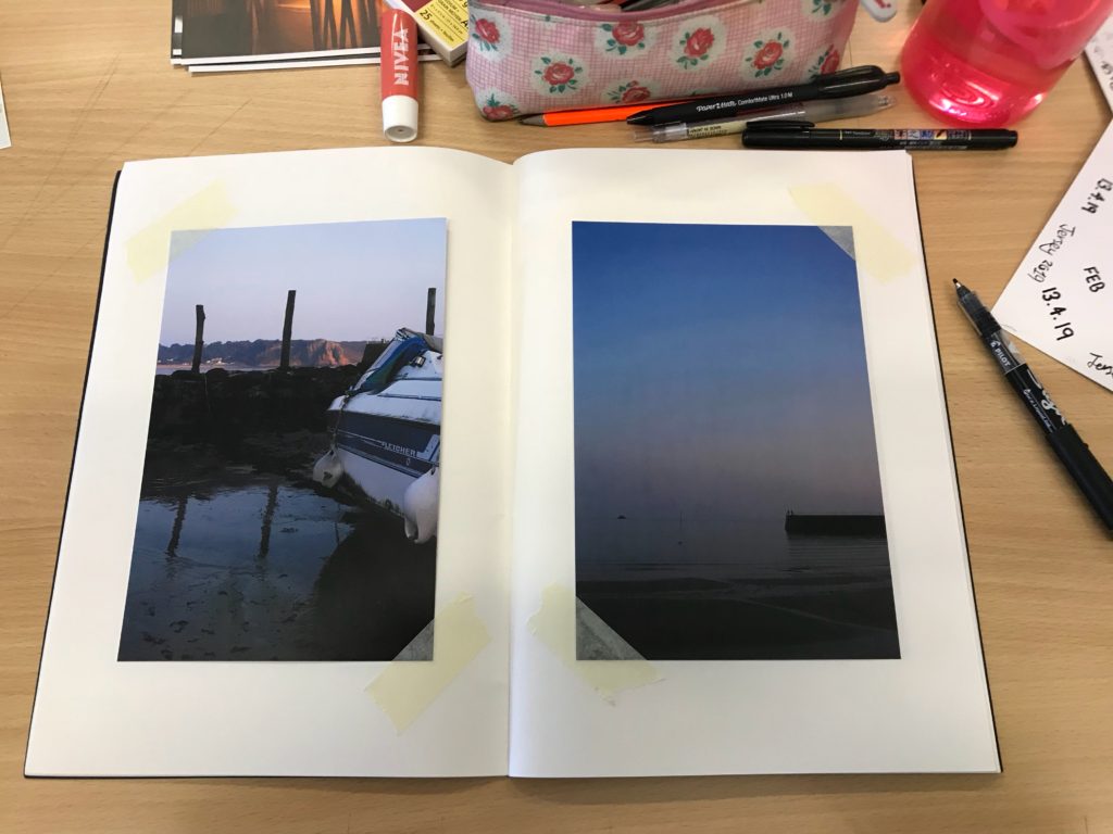
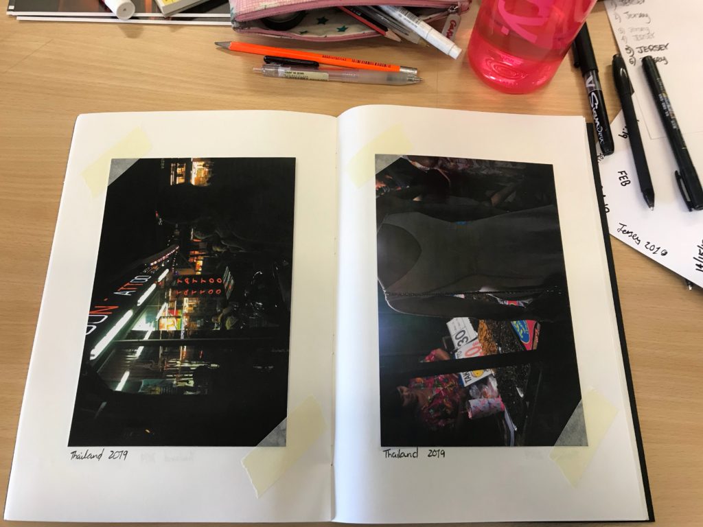
I decided to display my work in a book, as I wanted to create something that has meaning to my overall concept. I made is as a scrapbook for a persons holiday to Jersey and Thailand to express the theme of journeys and how tourism is important to both destinations.

-The first step was collecting all 24 of my prints.

-Next I trimmed them all, to get rid of the white borders, to make them feel like authentic photos printed out after a holiday.

-I arranged them in an order, looking at colour combinations and which ones worked well together, either by contrast or similarity.

-I measured them to make them as straight and central as possible.

-After I had placed them correctly, I used masking tape to stick down opposite corners. I chose to use tape instead of spray glue as I felt it looked more like a real scrapbook, rather than just a book of photos.

-To finish I added ‘Jersey 2019’ and ‘Thailand 2019’, again to add that sense of authenticity to it.

EVALUATION 2/3

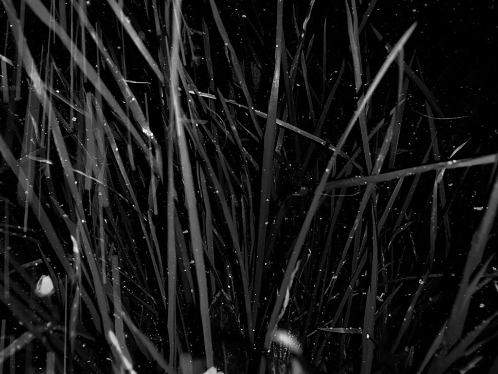
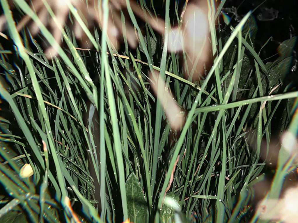
Black and white grass VS the coloured grass

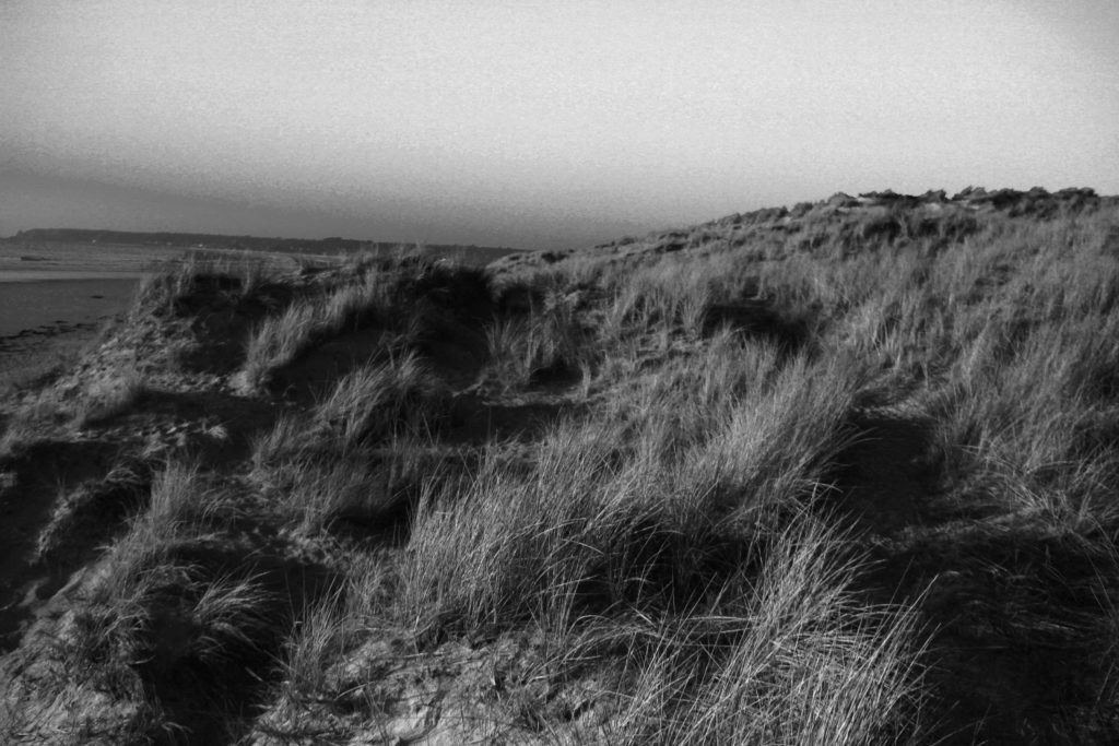
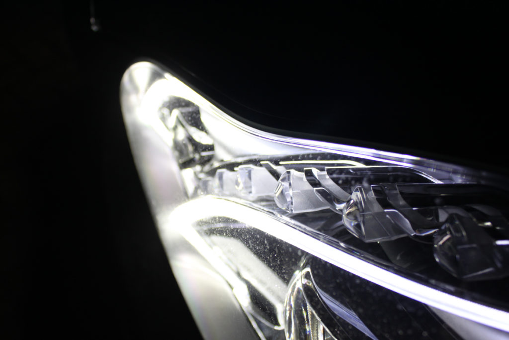
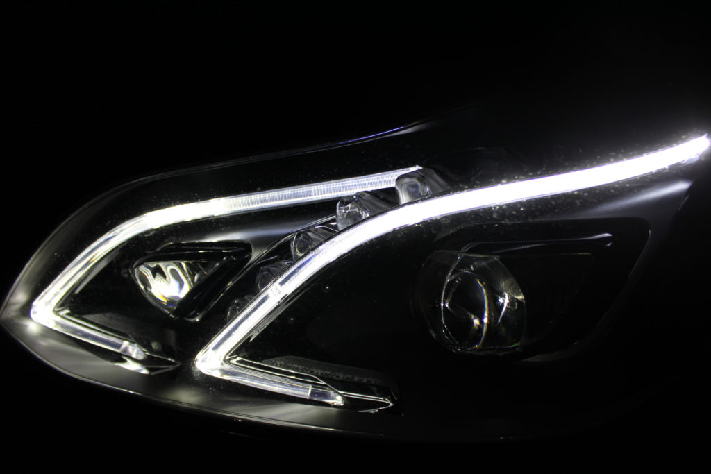
My second favorite piece that I have created were my images of grass using both a black/white adjustment and a colored one enabling me to present the contrast between them. This also allows to emphasis how simply just the color of the image can affect the overall feeling and end results followed by many different types of interpretations. Firstly the black and white image presents us with a much darker type of image with a clear use of flash to capture the photograph. Alongside this the original image would have had a low exposure around the point that the flash reflected of the main subject’s area. The same with both these images I used a canon camera with a much smaller lens enabling me too focus on smaller and minimal subjects however led to an overall greater quality of the end result image. For this first image I evidently used a black and white adjustment to filter into the bright green grass to quite the opposite this gave the image a much colder and darker overall finish to the image. The photograph does have some features of textures due to the white spotty like over lay which add more depth and feeling to it and furthers the idea of the photographing giving a 3D effect. On the other hand the arrangement of the image is somewhat disorganized in the sense of lacking symmetry, due to the disorientated grass leaves in an irregular pattern almost completely avoiding the point of symmetry and straight line. With this all in consideration the colored grass image is all very similar how in contrast provides the opposite feeling for example the green grass image gives off a much warmer and vibrant feeling alongside the fact the image somewhat feelings clearer and of higher quality due to the more obvious shadows from the background adding a further 3D affect compared to the darker images. When displaying these images it was essential that I continued to shows the idea of the two photographs in a complete contrast therefore I presented the images of contrasting shade that complement the end images. The dark, black and white imaged was framed on a black frame compared to the colored grass image which was presented on a white frame, providing more evidence of over comparison. Overall I was extremely pleased with the end result of these two images, although this was not my original intention for this particular set of photographs I’m glad this idea followed on from the previous black and white images.
Making of Final Display

THE PROCESS OF MAKING MY FINAL DISPLAY:

STEP 1: In order to display my final images in a clear and interesting way I came up with the idea of displaying them inside of a cube. The first step in making the whole display was cutting out the appropriate materials. Initially I wanted all 6 faces of the cube to be clear but I ended up using 3 faces of fiber board instead. This made it a lot easier to work with as the clear acrylic sheets can be easily scratched and therefore can end up looking messy after working with them. Each face of the cube is 210 mm x 210 mm, which is the same length as the shorter side of an A4 sheet of paper. I did these measurements purposely as it would make measuring out and cutting my final prints a lot easier.

STEP 2: The next step in assembling my final display piece we gluing all the components together. The easiest way I found to do this was using a glue gun. I thoroughly coated each side of the acrylic and stuck them together, repeating this process with the fiber board.

STEP 4:I then moved onto painting the edges and part of the sides white. I did this as when I was measuring out my prints and seeing if they fit the display, I found that a small error margin was inevitable. I used white acrylic paint to make the whole piece look a lot more uniform and neat. It also meant that there was a more seamless transition between the white boarders of the prints and the edges of the display. It was overall a lot more harmonious looking,

STEP 5:I then moved onto sticking in place my final prints onto the fiber board. I used spray mount adhesive in order to secure the pieces to the wood, coating each piece thoroughly with the glue, sticking it down and using a ruler to smooth out any bumps. I used a Stanley knife to even out any rough edges of the wood and display.

STEP 6:Finally I put on the clear side of the cube and used a cloth to remove dust and other particles of the surface of the acrylic.

IMAGES OF THE PROCESS:

Assembling the materials into one half of the cube
Measuring the inside of the cube and marking the images to fit
Cutting the images to scale
Painting the edges of the cube white in order to look more uniform and neat
Using spray mount in order to stick the images to each side of the cube